36
Evaluation By Victor Chi-Chung Chan
| Date post: | 08-Aug-2015 |
| Category: |
Education |
| Upload: | victor-chan |
| View: | 15 times |
| Download: | 0 times |

EvaluationBy Victor Chi-Chung Chan

In what ways does your media product use, develop or challenge forms and conventions of real media products?
My production follows most of the conventions of magazine in the design, especially the layout. Generally, magazines’ front cover contains the title of the magazine, main image, and some headings/sub-headings to explain what the contents are in the magazine.
Like the title, I put my magazine’s title on the top of the front cover. Therefore the audience can easily recognise my product. The main image cover most of the cover, since photo would attract the audience than words. I followed this convention to place my main image, which also the photo of its cover story. Because of its large size of picture, audiences immediately know the members of the picture is the highlight of this issue. At the bottom right of the front cover, a barcode with price underneath is placed. This is a traditional design so the audience can easily see the price.
Title
Barcode&Price
Main image
Front Cover

So it is not hard to observe that the layout of the magazine mostly follows the conventions of music magazine, it also happens on the theme. Since the genres of my project I decided it to be Rock N’ Roll and Metal, the style of it is usually gothic and evil.
In my magazine, I followed these conventions. The fonts style, especially the title - Linvin’ Rock and the band name of the cover story, is in gothic style.
Gothic Style font
For the tones, colour scheme is the best element to present the tone of my product. The themes of the Rock and Metal genres are usually about death; evil or even anti-Christ, blood is an idea the bands usually put in their music. So I use the colour red and black for the main tone, red represents blood and black represents darkness, a theme of devil can be expressed in the colour scheme.
In the contents page, black and red dominate the whole page, because it’s my magazine’s style. The fonts are red and the background of the page (excluding images) is black. In the double page spread, the background is also in dark-red with the texture of woods, which has a tone of depression.
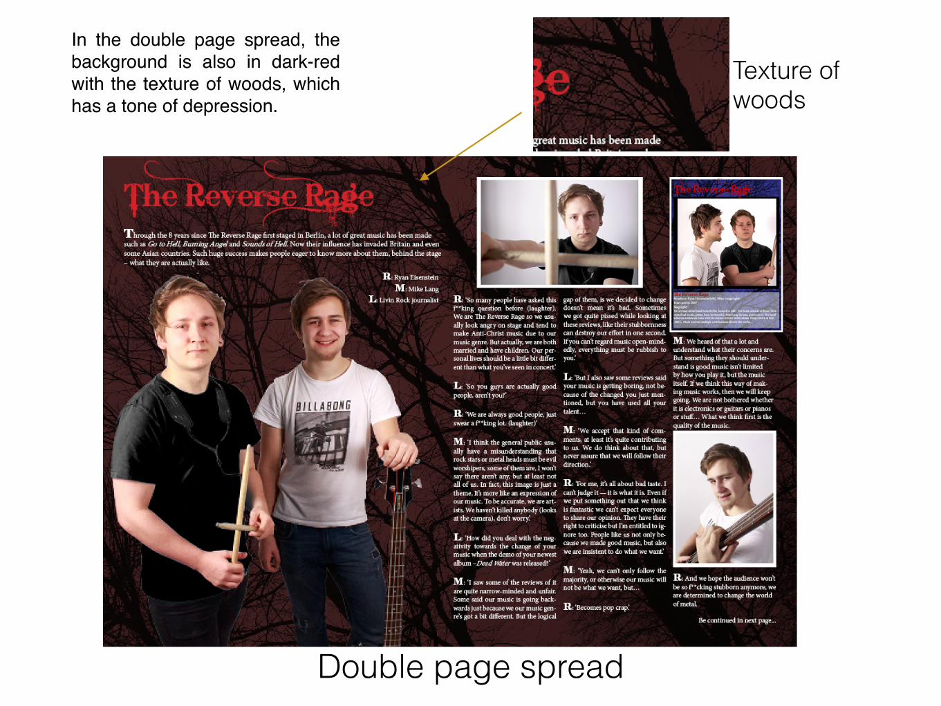
In the double page spread, the background is also in dark-red with the texture of woods, which has a tone of depression.
Double page spread
Texture of woods

Variation:All the conventions I followed are about how to catch audience’s attention, they are the best ways to transfer my idea to the audience visually. But there are still some variations I have in my production to impact the old ways of magazines.
Since the theme of Rock and Metal are usually about goth, which the history can be traced back to thousands of years ago. As a result, the style of it is old and historical. But in my project, I planned to make it different. I preserved the traditions but also added futuristic ideas into the magazine, because the issue of my production is about the prediction of the industry of future. This is a challenge for me because the theme of the genres is old but I mixed futuristic elements, like font style and colour scheme, into it. The secondary colour scheme is blue and white. They sound a bit opposite to red and black, that’s the impact I just mentioned. I observed there are many sci-fi movies are covered by colour blue, so I adapted blue to represent future. Also white represents brightness, opposite to darkness. In the style of the photography, white is the background of the photo shoot. It provides an impression of we are looking at the future.
White Background
Blue

Futuristic Font
To explain the idea of this impact, I added a tagline on the front cover – ‘The futuristic issue’ and ‘The music guide of the future’. I emphasise ‘future’ on the front cover, even in the font style. I believe audience would be interested in how we put this idea into an old-fashioned theme. The product makes a chemical effect in it.

How does your media product represent particular social groups?
There are some stereotypes of this music genres, it’s also represented in my project. The age of the models is the one I considered carefully. In fact, the age range of Rock and Metal is very wide. There are some young bands existing, present rebellion like Asking Alexandria, to old artists like Ozzy Osbourne. But in my project, I chose not to cover all the age range. My theme of the issue is future, so I picked the models who look young to represent like they are the future of the industry since they can last long in this industry. Everything is new from them; young social group is a good representative for future. In my cover story, two members of Reverse Rage represent young generation.
Young Generation

Male models were adapted for the photo shoot. As a matter of fact, males are more than females in this industry, so the reason I chose males is quite reasonable. In the stereotype of male, they are portrayed as strong, superior in many media. So the models in my photo shoot look confident. I deliberately used low angle for the image on contents page. Low angle can provide an impression to make characters look menacing and in-charge. The clothing of male artists is portrayed casual in my photoshoot. In fact, the fashion of Rock and Metal can be variable. There are quite many costumes in these genres. But I eventually chose my models dressing simple. Because I observed the music artists nowadays are dressing quite casually. They usually just put on T-shirts, instead of gothic costumes like 1980’s. Simplicity is a trend in this generation, so I told my models to dress T-shirts in pure colours. It ended up the members of the band in cover story dress black and white respectively.
Low angle used for contents page image
Strong arm of the male model

The social groups are quite variable; there are not many stereotypes in Rock and Metal genres. But there is one social group not often appears in these genres. It’s talking about racial group. Coloured people do not often appear in British Rock and Metal, especially African people. They are usually fixed to appear in Hip Hop music, but in Rock and Metal, most of the artists are white. Therefore, all the models in my project are white people.

What kind of media institution might distribute your media product and why?
Institutions are companies that would publish magazines. The famous ones are IPC Media (NME), Future plc (Metal Hammer, Classic Rock), etc.
(NME)
(Metal Hammer, Classic Rock)
(Q Magazine, Kerrang!, Mojo)

The first thing I would avoid is choosing the institution who have published magazines sharing similar audience group with me. The blueprint of my project is adapted from NME magazine. So the styles are quite similar to NME magazine, which is published by IPC Media. Therefore, I would not choose IPC Media. According to the data, there are many institutions have published magazines with Rock/Metal genre, but not all of them share the same age range of audiences. Therefore, I choose Future plc to distribute my product.
NME: Young maleTarget readers:
Metal Hammer: Young male Classic Rock: 35+, male
Q Magazine: Median age 29 Kerrang!: Median age 22 Mojo: Median age 37

There are two magazines published by Future plc - Classic Rock and Metal Hammer. According to the audience profile, the target audience of the audience of Classic Rock is mature adults whom mean age is 37. Since my magazine’s mean age is 18, so they won’t overlap each other. Metal Hammer’s age of target audience is quite young, there is no exact number but they claim they are young male who are quite similar to my product. But Metal Hammer mainly focuses on Metal genre, it does not cover Rock N’ Roll. So my target audience will be different with other magazines published by Future plc and it will not compete with them.
Metal Hammer: Young male Metal genre
Livin’ Rock: Young male ~18 Metal and Rock genre
Classic Rock: 35+, male Rock N’ Roll genre
different genre
different target reader

My magazine is not only published in a magazine form, but also in other media. In my magazine, there are competition and festival organised by my media group. The competition aims to choose some new bands who are willing to involve into the music industry. For the festival, we will invite the most influential bands worldwide in Livin’ Rock Fest. It also interact with the competition, the final four will perform and the champion will be chosen in the festival. The festival will be held in different city every year. In my production, there are following news about the Linvin’ Rock Competition and festival on the contents page. Audience can win free tickets to the Livin’ Rock Fest in Paris. It helps me extend the influence to worldwide.
Competition Livin’ Rock Festival
Image from contents page
Image from contents page
Image from front cover

Who would be the audience for your media product?
My target audience has been clear since I’ve done my audience research.
In the result of the audience research, most respondents are students (29 out of 38) and young adults around 18. Males are more than females about a half. Therefore, we knew what the tendency towards music in this audience range is. My product can be planned for young audience who are mostly students.
Students(~70%)
Mean age: ~18.02

It also reflects they like Rock N’ Roll the most (60.53%), followed by Pop (42.11%) and Metal (26.32%). As a result, I decided my magazine is made for young adult students, who like Rock N’ Roll and Heavy Metal. The reason I didn't choose Pop even they are ranked second audience love the most, is Pop is not so related to Rock or Metal much. Instead, Rock and Metal can be combined in one magazine since they are usually performed by bands.

It is not only because of the questionnaire result, the interview with the teenagers also reflect a similar idea. According to the interview in the audience research, two interviewees called Lewis and Tom, they mentioned that they like red and blue for the colours, because they are kind of dark people. I interpret them as rebellious teenagers. So I picked Rock and Metal because they are the symbol of rebellion. The theme of the genres is usually about demons and death, it fits the young audiences’ tastes.

Since the audience are mostly students. I assume that their purchasing power is quite low because they focus on study instead of work. It is reflected on the questionnaire. They prefer a cheaper price for the magazine, like £2-3 (30.77%), and it is the price range they usually spend for music magazines for a regular magazine. So I eventually decided to price £2.20, a price which students can afford.
As a result, according to the data above, I decided my magazine is set for young adults, around 18. They are the representative of rebellion, so they like Rock N’ Roll and Heavy Metal. Since they are usually students who don't have a high purchasing power so the price of my magazine is quite cheap which is £2.20.

How did you attract/address your audience?There are a lot elements can attract the audience. But most audience want some actual stuff which can only provided by the magazine. This is the feature can make the magazine unique. Every audience wants to have more features in an issue. Since they are not satisfied by the information or news anymore. In this generation, these information can be found on the internet, there must be other media will spread the information from your magazine. Therefore, if I can add something collectable, audience will be more satisfied by the actual materials instead of words only.In my product, I decided to add an A3 poster in each issue. Posters are quite common but usefully attract audience. They would like to collect posters because posters can be posted for a long period; customers think it’s worth buying.
More than that, I also designed a trading card for the cover story artists. Trading card is a bit different since it is portable. Customers can even exchange the cards with each other. In order to address the audience these features, I use blue bubbles to impact the red on front cover. So customers can be attracted when they first see the cover. Then in the contents page, I use the same colour to lead the audience to the page where the poster and reading card are.
on front cover on contents page
Trading card design
on front cover
on contents page
Memo notes to address the
audience about this features

It’s not hard to observe that blue is the leading colour to these special features. In addition to poster and trading card, there is another stuff which audience can get from the magazine. The value of this is much higher than them - they have a opportunity to win free tickets of Livin’ Rock Festival in Paris by buying this issue. In the bottom of the cover, I also used blue to address this feature. There is a blue line with white fonts on the bottom to address this message: ‘WIN: TICKETS TO THE 4-DAY LIVIN ROCK FESTIVAL IN PARIS’. I put it on the bottom since they are not the most important. Because audience are not 100% chance of getting the tickets, so I put them in the bottom as it is a secondary bonus.
Only colour is not enough to get their attention. In order to address them the poster and trading card are free, I deliberately added ‘FREE’ in a large font inside the bubbles. So customers will not doubt about if it is free or not. The message is very clear, we have to tell the audience what’s good in the magazine in an obvious and clear way. For the free tickets of Livin Rock Festival, I avoid to mislead the audience that they will surely get the tickets. So I use ‘WIN’ to imply this is a lucky draw. The language must be used very carefully to avoid misleading, but also can attract the audience.
on front cover on front cover
Plug:
Bottom line on front cover
Inside the contents page

Special features are not the only things to attract the audience. I also address the theme of the issue clearly. There is a big tagline – The futuristic issue, it’s telling the audience this issue is about the prediction towards the future of the industry.
Inside the contents page, the topics of the articles, interviews are concentrated on future, such as new technology, future plans of the bands, etc. Audience will have a clear vision about what topics the issue will contain. This is a good idea that to have all topics concentrated. So the audience would have more ideas that what the issue focuses on. If they know more about the topics, then they will be more likely to buy it if the theme is what they are interested.
Tagline
Theme
Inside the contents page
“How will they impact the world!” - This is about the future plans of the band.

What have you learnt about technologies from the process of constructing this product?In the whole project, we relied on the use of technology, because we need many software and hardware to help us visualise our ideas. From the beginning, we used Microsoft Office Powerpoint, Words. Then we used a program called Survey Monkey to make the questionnaire. We had to upload our progress to the internet, so I used Blogger and Slideshare as a platform to present my work. Google Drive as well, it is a good tool to back up my files in case there is any accident that the files don't work on Slideshare anymore. After that Adobe Premiere was used to visualise my interview recordings. During the post-production period, I used Photoshop to make the front cover and contents page. Also InDesign was used to make the double page spread.
Apart from the software, hardware is also important to digitalise all the actual stuff. During the audience research, there was an interview for the teenagers. I used recorder to record the sound of the interview. During the production phase, I used a DSLR to take the pictures for my product. And at last: computer, the hardware I used for most of the time, from research to post-production.
Adobe Premiere (left) Photoshop (middle) InDesign (right)
Microsoft Office Powerpoint (left) Words (right)

The first thing I learnt is how technology helps me gather information during the research period. All the research, such as the reader profile of music magazine, I understood their target audience’s tendency, so my project can be specific for certain audience. I analysed these famous magazines to get their method to success. For example, most of the magazines about Rock and Pop, their target audience are teenagers to young adults. Then we can conclude that, if we want to attract younger customers, Rock and Pop would be the best genres we should focus on.
Internet is not only a method of receiving information, I also used internet as a tool to spread messages. During the audience research, we had to study the tendency of people around us. So we made a questionnaire to get these data in order to plan the direction of the product. The more respondents, the information would be more accurate. But I didn't use pens and notes to get these data by asking people one by one. Instead, I learnt how to create a questionnaire on the internet by using Survey Monkey. The message can be spread out quickly. More than that, this brilliant website even helped me calculate the percentage of each item of a question. Therefore I saved a lot time on calculation; I could focus on other progress.

After I had gathered all the information, I used Powerpoint to organise them. It is a useful program that I can present my work in many slides with a lot of pictures to illustrate my ideas. The information can be more organised since I could order and categorise the information. People can read my plan and analysis easily.
In the interview, I chose to record but not to film it. So it was supposed to be only sound instead of videos. But still created it in a video format. I didn't film the whole video because I knew it would make any difference except we can see the interviewees’ mouth moving. Therefore, I decided to only record it then I added pictures and subtitles in a video. I used Adobe Premiere for this progress. I had used it before but this time I had to add a lot of words into it. I also added pictures into it in order to make it look interesting and dynamic. Because there were lots of contents in the interview, so many were required. I had to breakdown the recording into many parts, I learnt how to edit a short-length video from that.
Some of the pictures I used in the video:

During the post-production period, I leant how the use Photoshop to edit my photos. In fact, I had studied Photoshop before; I knew some basic functions of it since I’ve been using it for photography. But this time, I could even fix some mistakes and make changes for something I couldn't control during the photo shooting. Initially I planned my models would be wearing black and white T-shirts, but one of my models didn't have a full-black T-shirt. I continued the photoshoot on that day then I tried to fix this problem on Photoshop. I learnt how to use the quick selection tool to select his T-shirt. After that I turned this part to black-and-white. Also there were some spots on my models’ faces, in order to make their faces look smooth, I used the ‘spot healing brush tool’ to erase them.
Before After
Before After

One more piece of software I learnt to use is InDesign. Before that, I only knew how to use Photoshop to complete designs. But then I learnt to use InDesign since I was suggested to use it. It is a really good program that helped me composite the double page spread. Like the space between the paragraphs and columns, I could set the whole composition before I start. The resolution also ended up in a higher quality than made in Photoshop. That just enhanced my knowledge about using more programs to do designing work.
Gap between columns

Apart from the software, hardware is also important which I couldn't do without it. During the research phase, I had to record an interview about what nowadays teenagers like. I learnt how to use the voice recorder. For the photoshoot, camera was essential. But I study photography so I didn't have many problem on working a camera. Instead, this was the first time I took photos in a studio. I learnt how to operate studio lights. It is quite an interesting experience to me because I could actually make something the professional photographers do. They are very essential for the production because it helped me visualise my ideas.
In studio

Looking back at your preliminary task, what do you feel you have learnt in the progression from it to the full product?
In the whole progression, I now have more ideas and knowledges about designing a magazine through all the progression.
Looking back at the preliminary task, we were trying to create a cover page and a dummy contents page for college magazine. The front cover was not designed thoughtfully; it wasn’t an appeal to audience. Like the use of colours, I didn’t consider what the colour scheme should be used. The colour of the title and the background overlap each other. The language is also not effectively sending message to the audience; customers would not know what the cover story actually about. I wasn’t considerate on doing it because I didn't have any pre-production before making it.
Preliminary Task
Front cover Contents page dummy

Then when we started our actual project, the first thing we did was analysing other magazines. This is an important part before we started the planning the production. In the magazine analysis, we picked three music magazines’ front covers, contents pages and double page spreads. I chose Metal Hammer, NME and Classic Rock to analyse. I gained some basic ideas of how those magazines attracting the audiences’ attention. Every tiny detail on a page is the designers’ careful plan, such as the colour scheme, props, costumes or even font size. Overall, they first make all the details matching each other; the whole tone will be comfortable to audience. Like Metal Hammer, they mainly used a tone of goth and darkness. So the designers wouldn't add other elements to go against this theme. The second thing I learnt from magazine analysis is what we can add to attract audience that the magazine is worth buying. General customers like to get more stuff with a lowest price. So I should think about what I can add into the magazine. In the magazines i had analysed, they all had some special features such as posters or chance to win free tickets. Because audiences aren't not satisfied by information only. Instead, there should some actual materials for them. Therefore, it will persuade them to buy.
Pages from the analysis
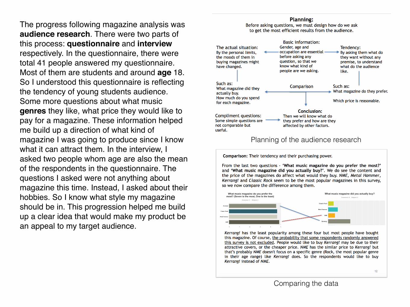
The progress following magazine analysis was audience research. There were two parts of this process: questionnaire and interview respectively. In the questionnaire, there were total 41 people answered my questionnaire. Most of them are students and around age 18. So I understood this questionnaire is reflecting the tendency of young students audience. Some more questions about what music genres they like, what price they would like to pay for a magazine. These information helped me build up a direction of what kind of magazine I was going to produce since I know what it can attract them. In the interview, I asked two people whom age are also the mean of the respondents in the questionnaire. The questions I asked were not anything about magazine this time. Instead, I asked about their hobbies. So I know what style my magazine should be in. This progression helped me build up a clear idea that would make my product be an appeal to my target audience.
Planning of the audience research
Comparing the data

After the research, it’s time for me to work on my product. Since I had finished researching, I could create my own ideas based on the information I’d got. We first created reader profile. So I would have a clear idea of what my audience were going to be. This is a very important step. I always looked back at the audience profile to remind myself what target audience my music magazine was for. For example, what do they like, is there anything I could do to please them?
Reader Profile Style
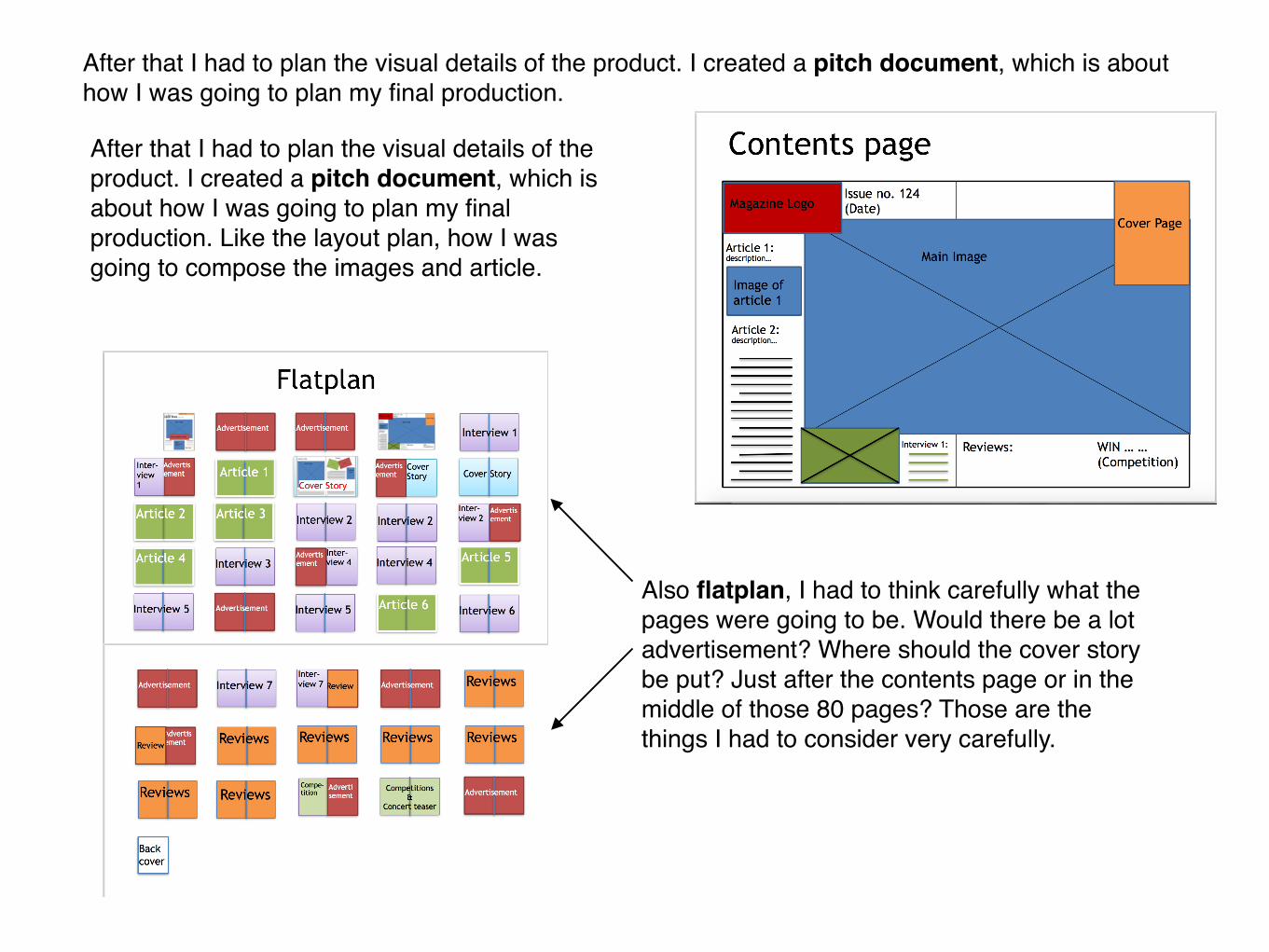
After that I had to plan the visual details of the product. I created a pitch document, which is about how I was going to plan my final production.
After that I had to plan the visual details of the product. I created a pitch document, which is about how I was going to plan my final production. Like the layout plan, how I was going to compose the images and article.
Also flatplan, I had to think carefully what the pages were going to be. Would there be a lot advertisement? Where should the cover story be put? Just after the contents page or in the middle of those 80 pages? Those are the things I had to consider very carefully.

I also planned the sample stylesheet for the colour scheme so the whole product would look comfortable. And the last thing is photography planning, all the pictures appear in my production should be planned in here. Since I had learnt the conventions of the magazine design, I also wanted to make some changes from it. I mixed the gothic style of Metal genre with a futuristic style from electronic music.
And the last thing is photography planning, all the pictures appear in my production should be planned in here. Since I had learnt the conventions of the magazine design, I also wanted to make some changes from it. I mixed the gothic style of Metal genre with a futuristic style from electronic music.
Sample of photography planning

When all those planning were finished, I could finally began my photoshoot. This is quite a new thing to me even I study photography so I should have no problem with operating a camera. But it was the first time I took pictures in a studio. So it was quite hard to visualise my ideas from my mind. I had planned what the production would look like, but I wasn't familiar with it so the pictures didn't look the same with what I had planned. In order to solve the problems, I did some research about studio lighting. Then I adapted a simple lighting method - 3 point lighting. The next time I had the photoshoot again, I controlled the main light, fill light and the reflective background as a back light. The photos ended up quite beautiful, the models looked very dynamic.
IMG_8945.JPG
IMG_8949.JPG
IMG_8962.JPG
IMG_8966.JPG
IMG_8970.JPG
IMG_8974.JPG
IMG_8946.JPG
IMG_8955.JPG
IMG_8963.JPG
IMG_8967.JPG
IMG_8971.JPG
IMG_8975.JPG
IMG_8947.JPG
IMG_8956.JPG
IMG_8964.JPG
IMG_8968.JPG
IMG_8972.JPG
IMG_8976.JPG
IMG_8948.JPG
IMG_8961.JPG
IMG_8965.JPG
IMG_8969.JPG
IMG_8973.JPG
IMG_8977.JPG
Contact sheet

The photoshoot didn't take me so much time, because I had to spend a lot time on post-production. It is about how I would make them look from only some photos to an attractive magazine product. I used Photoshop for the contents page and front cover, plus InDesign for the double page spread. It was a real challenge for me because I’m not good at design. Fortunately, my planning helped me a lot and it led me the direction of my production.

In the whole project, we spent a lot time in research and planning. It makes me understand the importance of pre-production. Making a magazine is about knowing what the audiences want. Through the pre-production, we sorted out what would attract audience the most. Then I design my magazine’s features to be fitted to audiences.
Preliminary Task
Front cover
Contents page dummy
Final product
Front cover
Contents page

Through the 8 years since The Reverse Rage first staged in Berlin, a lot of great music has been made such as Go to Hell, Burning Angel and Sounds of Hell. Now their influence has invaded Britain and even some Asian countries. Such huge success makes people eager to know more about them, behind the stage – what they are actually like.
R: ‘So many people have asked this f**king question before (laughter). We are The Reverse Rage so we usu-ally look angry on stage and tend to make Anti-Christ music due to our music genre. But actually, we are both married and have children. Our per-sonal lives should be a little bit differ-ent than what you’ve seen in concert.’
L: ‘So you guys are actually good people, aren’t you?’
R: ‘We are always good people, just swear a f**king lot. (laughter)’
M: ‘I think the general public usu-ally have a misunderstanding that rock stars or metal heads must be evil worshipers, some of them are, I won’t say there aren’t any, but at least not all of us. In fact, this image is just a theme, It’s more like an expression of our music. To be accurate, we are art-ists. We haven’t killed anybody (looks at the camera), don’t worry.’
L: ‘How did you deal with the neg-ativity towards the change of your music when the demo of your newest album –Dead Water was released?’
M: ‘I saw some of the reviews of it are quite narrow-minded and unfair. Some said our music is going back-wards just because we our music gen-re’s got a bit different. But the logical
gap of them, is we decided to change doesn’t mean it’s bad. Sometimes we got quite pissed while looking at these reviews, like their stubbornness can destroy our effort in one second. If you can’t regard music open-mind-edly, everything must be rubbish to you.’
L: ‘But I also saw some reviews said your music is getting boring, not be-cause of the changed you just men-tioned, but you have used all your talent…
M: ‘We accept that kind of com-ments, at least it’s quite contributing to us. We do think about that, but never assure that we will follow their direction.’
R: ‘For me, it’s all about bad taste. I can’t judge it — it is what it is. Even if we put something out that we think is fantastic we can’t expect everyone to share our opinion. They have their right to criticise but I’m entitled to ig-nore too. People like us not only be-cause we made good music, but also we are insistent to do what we want.’
M: ‘Yeah, we can’t only follow the majority, or otherwise our music will not be what we want, but…
R: ‘Becomes pop crap.’
The Reverse RageR: Ryan EisensteinM: Mike Lang
L: Livin Rock journalist
M: We heard of that a lot and understand what their concerns are. But something they should under-stand is good music isn’t limited by how you play it, but the music itself. If we think this way of mak-ing music works, then we will keep going. We are not bothered whether it is electronics or guitars or pianos or stuff… What we think first is the quality of the music.
R: And we hope the audience won’t be so f**cking stubborn anymore, we are determined to change the world of metal.
Be continued in next page...
Double page spread


