17
EVALUATION Name: Nikita Da Silva Candidate Number: 6627 Center Name: St. Paul’s Catholic College Center Number: 64770
| Date post: | 15-Aug-2015 |
| Category: |
Education |
| Upload: | nikitadasilva |
| View: | 69 times |
| Download: | 3 times |

EVALUATION
Name: Nikita Da SilvaCandidate Number: 6627Center Name: St. Paul’s Catholic CollegeCenter Number: 64770


In what ways does your Media product use, develop or challenge forms and conventions of real media products?
The magazine, across the 4-pages, ‘repeats’ (Steve Neale) codes and conventions from well know music magazines such as Billboard in which I used as inspiration for my production magazine. I have ensured that I have used all the codes and conventions: masthead, main image, cover lines, barcode, Issue, date, price, convergence.The style of my production magazine has also been firmly based upon and used Billboards design. As The writing is placed vertically down the left side of the magazine as it is in the Billboard magazine. There has been repetition of colour in comparison to to the billboard magazine – Black and stone colour and the use of a dark pink in order to highlight the main headline and in corporate in the rest of the magazine to appeal to the audiences needs and gratifications. Also, there has been convergence used such as web sites and social networking in order to allow easy access of the audience. This would therefore appeal to the target audience of 16-25 year olds as they are in most use of social media, this would therefore allow the audience to create a relationship between the audience and media product, which will increase awareness.My double page spread is based upon Billboards as inspiration as my main image has been put in the middle of the page – as they are the center of the readerships attention. However, in my double page spread the writing has been molded around the main image through the use of the pen tool.
However, there are also some ways in which this
Billboard magazine, forms and conventions, differ from my own media product as, this Billboard magazine does not feature a strapline, which is considered a key code and convention of a magazine. To stand out compared to other similar media products.I have shown how I have used my magazine of inspiration in order to develop my media product, as I have put the star appeal in the middle of the page, so that it is the center of attention and the first thing to capture the audiences eye. This is the therefore represented on the Double page spread in which I have displayed the interview around the star appeal in order to demonstrate the star appeal as the center of attention in this article and so everything is focused around her, like the writing is shaped around her. My media product differs from Billboards magazine as theirs does not feature an editorial, where as mine does. The use of an editorial is important in order to allow the audience to create a personal relationship with the editor (Katz). Also, through the use of many different cover lines my media product is then able to appeal to the uses and gratifications of many different social groups (Katz) rather than attract the audience through only the use of star appeal, which may not appeal to everyone. Moreover, mine has used photos in order to support cover lines in order to appeal to the other needs and gratifications of the target audience.
How does your media product represent particular social groups?
My media product represents a target group of 16-26, as it appeals to a wide range of different genres, and is specifically focused on party goers. This would then appeal to students and young people of socio-economic needs of grade E to D. The genre is shown through the main image of ‘star appeal’ (Dyer) which the audience will create a personal relationship with. This magazine aims to create a diversion from everyday life for the audience which is represented through the strapline: ‘The UK’s favourite escape’ – suggesting that this diversion is for relaxation for stressful every day life of college or work. However, uses of this media product may differ from each individual as it may appeal to someone simple because they like the ‘star appeal’ (Dyer), Ariana Grande featured within it and as the main image- who may be their idol and would want to achieve the success she has done. Through exclusive interviews with Ariana Grande, the audience will see her as a model and find ways to relate to her and create a personal identity (Katz). The use of a vibrant pink colour stands out on the page and represents my female target audience.
What kind of media institution (Publisher) might distribute your media product and why?
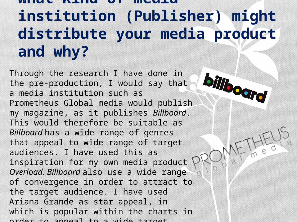
Through the research I have done in the pre-production, I would say that a media institution such as Prometheus Global media would publish my magazine, as it publishes Billboard. This would therefore be suitable as Billboard has a wide range of genres that appeal to wide range of target audiences. I have used this as inspiration for my own media product Overload. Billboard also use a wide range of convergence in order to attract to the target audience. I have used Ariana Grande as star appeal, in which is popular within the charts in order to appeal to a wide target audiences needs and gratifications.
Who would be the audience for your media product and why?
My media product is aimed at females aged between 16-26. This is therefore conveyed through the use of pink to highlight key features within my magazine, as pink is mostly stereotyped as a feminine colour and therefore would appeal to women. Also, through the use of star appeal (Dyer), Ariana Grande, represents herself in a feminine manor and is representative of an idol for many women all over the world. According to Katz Uses and gratification theory, my music magazine will appeal to a target audience of 16-26 as it aims to create a diversion from everyday life, such as a college or university student wanting something they can read in order to relax and take their mind off exams and work. Moreover, another individual may appeal to this magazine as they are attracted by the use of star appeal (Dyer), Ariana Grande and see them as a role model in which they wish to create a personal identity (Katz) in which they find find ways to relate to. Through Maslow’s Hierarchy, people will see the star appeal (Dyer), Ariana Grande, as a success and social climbers will want to improve their status in order to reach and achieve all the fame and fortune Ariana Grande has done through her success within the music industry.
How did you attract/address your audience? My magazine attracts an audience of 16-26 through the use of ‘star
appeal’ Ariana Grande who is a well known successful artist who would attract my target audience. She is considered to be a role model through her fame and fortune she has gotten through success, so therefore the target audience will aspire to be like her (personal relationship, Katz). I have used codes and conventions such as the use of cover lines to appeal to a wide range of different target audience according to their uses and gratifications (Katz). Moreover, the use of convergence within my media product specifically attracts my target audience of 16-26 as they are most in touch with social media and will therefore use convergence such as Twitter and Facebook to create a personal relationship with the magazine (Katz). In order to attract a female audience of 16-26, I have used the influence of feminine colour, pink, in order to appeal to my target audience so they feel that the magazine will fit their needs. The cover lines I have used will appeal to the target audience as modern artists are ones in which young people of 16-26 will listen to and they will relate to as role models so it will meet their needs and gratifications (Katz). Through the use off puff, I am able to appeal to my target audience by offering the chance to win something which they may be attracted to.

What have you learnt about technologies from the process of constructing this product?
Through use use of technologies used to create my media product ‘Overload’ I have learnt and developed on my knowledge on use of software Photoshop. Through the use of the magic wand tool I was then able to get rid of the background of my image and have the main image of star appeal (Dyer) on its own. I then used the rubber tool in order to touch up and ensure that it looked precise and the picture looked of professional quality.Also, I used a gradient fill on the shape at the top of my magazine of my front cover as well as on the contents page which then fades out into the background colour. This therefore incorporates the pink colour used in the main headline. Moreover, I have also demonstrated use of the pen tool on my double page spread as I have shaped the writing around the star appeal in order to demonstrate the star appeal as the center of attention in this article and so everything is focused around her, like the writing is shaped around her.

Before manipulation
After manipulation
Photography planning – front cover
Initially I used a full body shot on my front cover and challenged my magazine of inspiration. However, this didn’t look effective as it left too much space around the image and therefore showed focus around the cover lines more than the image its self. I manipulated and cropped out the background, in order to make my main image stand out on my magazine. I increased the brightness, vibrancy and saturation in order to make the photo look more professional and therefore appeal to my audience.
I then decided to retake my photos and use a mid shot. I then used the quick selection tool and the rubber to remove the background of the photo. I increased the brightness, vibrancy and saturation in order to highlight it as a main part of my page. Therefore, through the use of a mid shot, my main image covers most of the page in order to appeal to the uses and gratifications of my audience. It takes up most of the front cover and therefore focuses it as the main part of the magazine to appeal to its target audience. Her smile represents her to be friendly in which will appeal to the audience, as they will create a personal relationship with the star appeal as they see her as a role model.

Contents - photography
After manipulation Before manipulation
In this photo, I have shown Ariana sitting and looking down. This therefore represents the innocence of women in which the audience may relate to, therefore creating a personal relationship between the audience and the magazine. I have then manipulated this using the quick selection tool and the rubber on Photoshop to remove the background. Through increasing the brightness, vibrancy and saturation in order to make it stand out more and make it look more professional. When increasing the size of the image I held down on shift to ensure that the image was not distorted.

Double page spread - photography
After manipulation Before manipulation
This photo shows the star appeal, Ariana Grande, is the middle of the double page spread as she is the center of attention in which the target audience is focused on. It therefore suggests that the page is focused around her which is why the writing is shaped around her through the use of the pen tool. I manipulated her by getting rid of the back ground, through the use of the quick selection and rubber tool on Photoshop. I then increased the vibrancy and contrast in order to make it stand out on the page. This therefore makes my magazine look more professional and stand out to the target audience. When increasing the size of the image I held down on shift to ensure that the image was not distorted.

Analysing my Front Cover
Main ImageStrapline
Masthead
Main headline
Barcode
Date
Issue
Price
Cover lines
Puff
Convergence

Analysing my Contents PageEditorial
Page Number
Editor details
Picture of editor
Page numbers
Cover lines
Magazine masthead

Analysing my Double Page spread Interview
Page numberMagazine masthead
Brief introduction
Magazine responsibilities
Interview
Interviewees initials
Convergence
Images
Convergence
Editor initials
Pull out quote
Main Image

Looking back at your Preliminary task, what do you feel you have learnt in the progression from it to the full product?
Having looking back to the preliminary task I feel that I have become more aware of and developed my knowledge on the use of Photoshop, and now am extensively aware of the many different tools and how to use them in order to make an effective media product. I have specifically demonstrated this through Also, through my research and my own production work I am now able to see what is effect in attracting your specific target audience. And therefore what codes and conventions are most important in attracting their target audience. I discovered this through feedback received from my audience feedback. A main feature that I changed after audience feedback as the purple colour was too dominating on the page and therefore made it hard to read the cover lines through.


