9
USE Masthead behind the Main image Sticker Main Image (Male) Barcode
| Date post: | 12-Aug-2015 |
| Category: |
Education |
| Upload: | sadia-tasneem |
| View: | 46 times |
| Download: | 0 times |

USE
Masthead behind the Main image
Sticker
Main Image (Male)
Barcode

Develop
Compared to the magazine on the right- the sticker is positioned in a different way- to make it stand out as the sticker on the right magazine is placed small on the Masthead so isn’t very visible to the readers.
Masthead both behind the main image but placed in a different position.
The main image used on my magazine and the one on the right have similar postures with similar looking clothes that are seen to be casual with the theme of black, red and white especially for the male gender
Masthead and cover text follow the theme of orange and white.
Barcode placed on the side of a magazine.

Challenge
I used the “VIBE” magazine to inspire me on my magazine, I looked at 3 “VIBE” magazines and looked at their background colours and then decided on the colour of grey after comparing them together, to make my magazine look unique.
Instead of having the name of the person in the main image at the top left of the magazine, I placed it on the bottom left.
The sticker on my magazine is coloured in yellow and is barely used on any of the “VIBE” magazines.
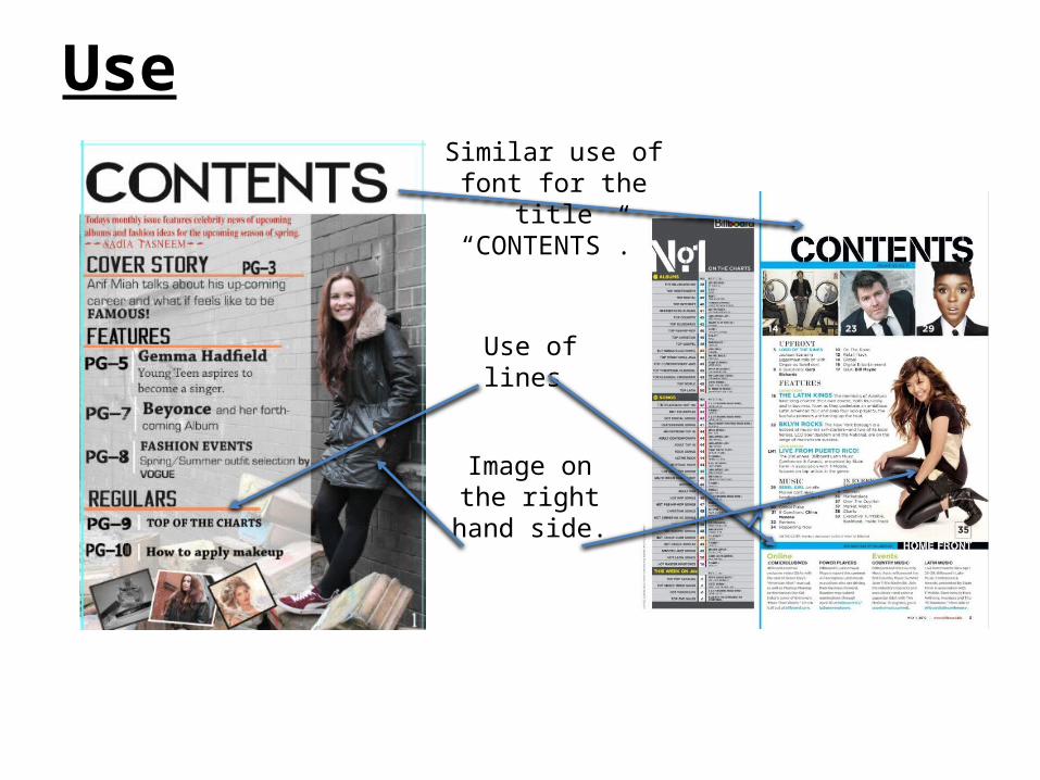
Use
Use of lines
Image on the right hand
side.
Similar use of font for the title “CONTENTS”.

DevelopPage numbers are bigger and bold compared to the billboard magazine
The use of lines have been developed as in the billboard there’s vertical as well as horizontal lines but my magazine only involves horizontal lines
The title “Contents” is one sided on the “billboard” magazine whereas on my magazine I decided that the title should have a Centre alignment and more bold.

ChallengeThe image used challenges the image used on the image on the “billboard: magazine as there’s a difference in the levels in terms of the person who’s posing.
The use of the lines are challenged in terms of how thick they are in comparison to the billboard magazine. On my magazine the lines used are quite thin, this is because I was limited on space.

Use
Used the idea of a single image on the left hand side of the page.
Similar clothing and accessories.

Develop
The images differ in terms of the angles of the shot as for the double page spread on the right hand side has a close up of a celebrity whereas my magazine has a medium close up.
As you can see from the double page spread on the right hand side across the text is a watermark, I didn't’t want to to use a watermark because it would look too similar.

Challenge
I have challenged the ways in which the columns are organized as you can see that the magazine on the left has wider columns compared to mine.
The celebrities face isn’t revealed unlike mine where although the person is wearing glasses you can see more of the face and therefore will catch my readers eye as there’s the use of direct form of address.


