14
Evaluation SPARKLE CRUNK TAMMY LEE DAVIES Jacob Ayling-Ellis
| Date post: | 13-Apr-2017 |
| Category: |
Education |
| Upload: | jacob-ellis |
| View: | 173 times |
| Download: | 0 times |

EvaluationSPARKLE CRUNK
TAMMY LEE DAVIES
Jacob Ayling-Ellis

The cover

cover follows the conventions of album art for the
genre of danceBright eye catching colours A real image is used but with a cartoon
effect to bring something different to the mix
This is a similar album cover to the ones produced by the large record label knows as head candi.
Why did I choose this image?

Feed back
Talking to fellow pupils and the general public
General opinion is good Like bright colours, feels like an album
you could see in the shops and is loud and shouts out.
Didn’t like the artist’s name said it felt to country rather than dance.

Back
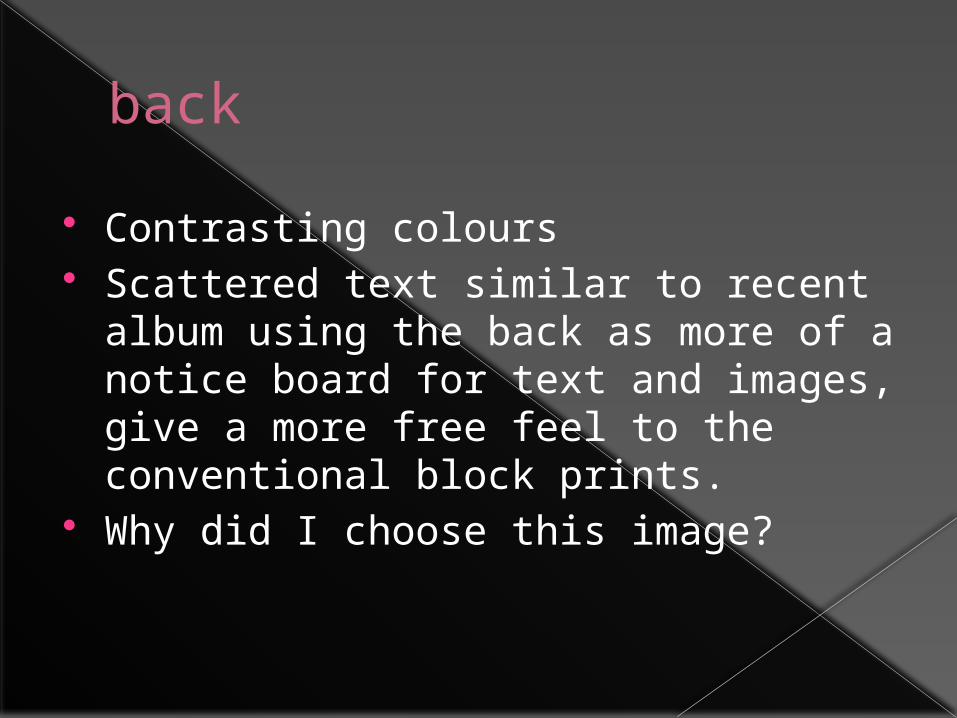
back Contrasting colours Scattered text similar to recent album
using the back as more of a notice board for text and images, give a more free feel to the conventional block prints.
Why did I choose this image?

feedback Confusing layout
Clever looking back cover
Attractive and appealing artwork some preferred the back cover to the front

advert

Advert
HMV style advertising
Use of reviews
Closly following media conventions

Music video
Follows a typical dance video narrative
Lots of jump cuts to the beat
Typical female star
Punchy movements mimic the music
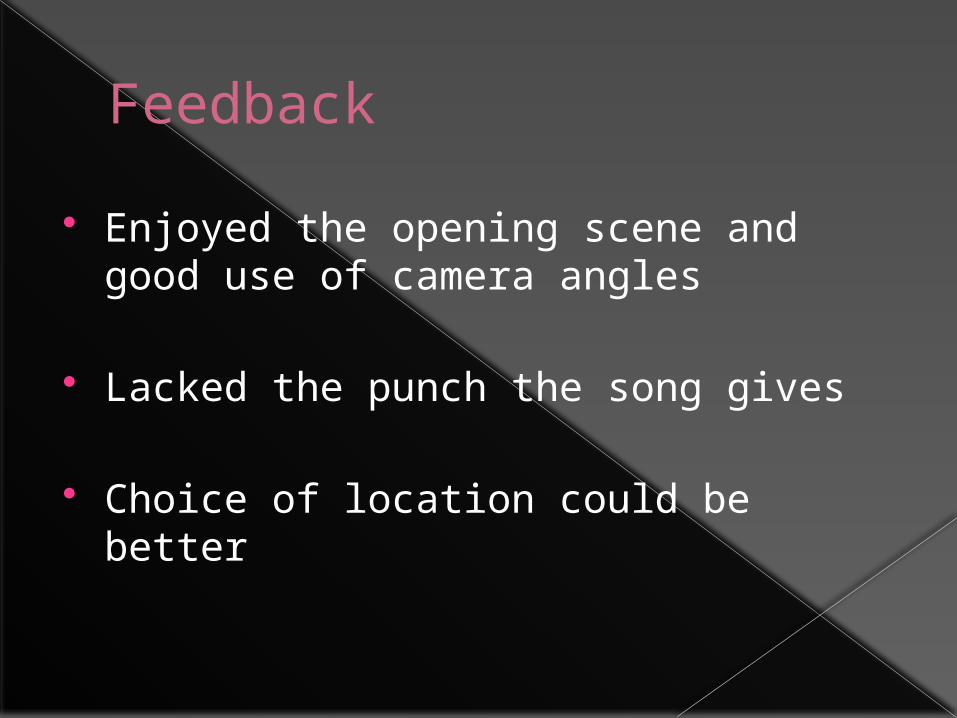
Feedback Enjoyed the opening scene and good
use of camera angles
Lacked the punch the song gives
Choice of location could be better
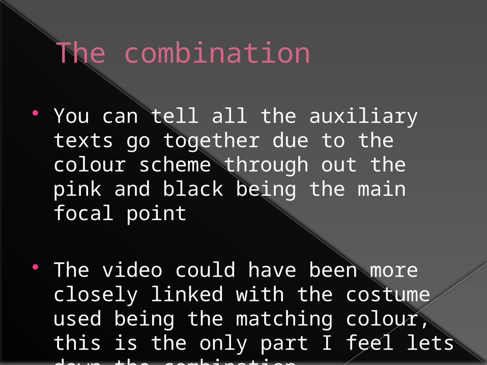
The combination You can tell all the auxiliary texts go
together due to the colour scheme through out the pink and black being the main focal point
The video could have been more closely linked with the costume used being the matching colour, this is the only part I feel lets down the combination.

publisherG.I.M.P 2
publisher G.I.M.P 2
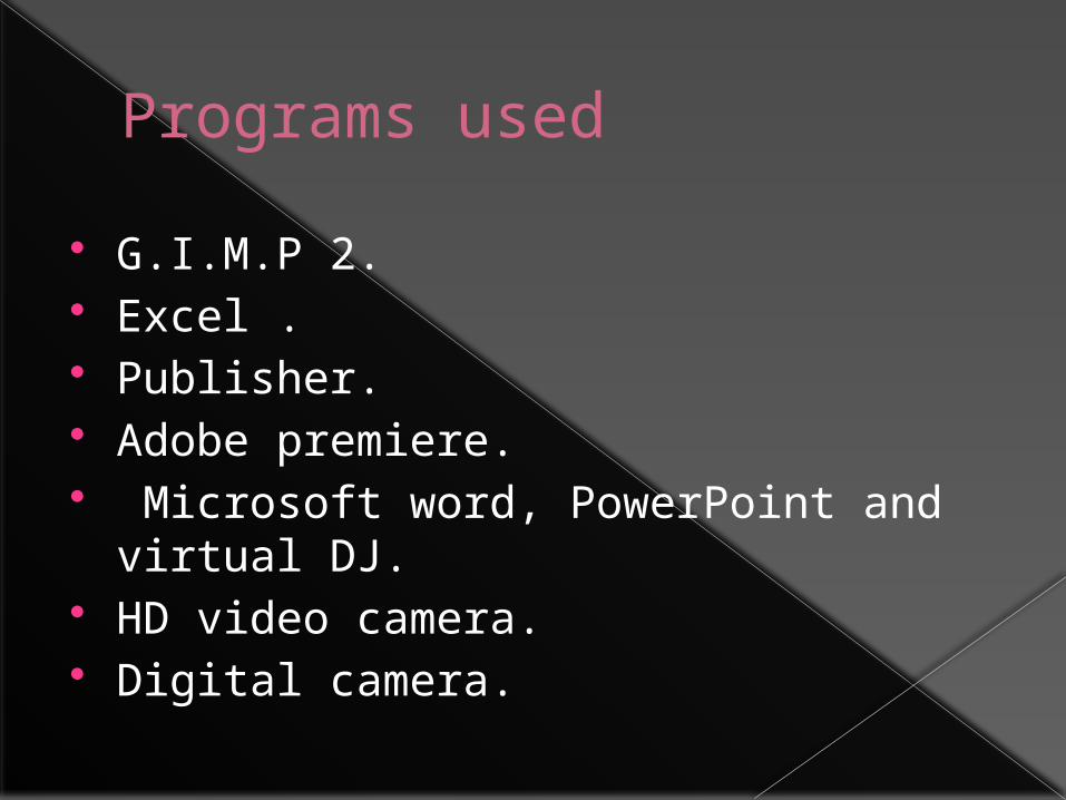
Programs used G.I.M.P 2. Excel . Publisher. Adobe premiere. Microsoft word, PowerPoint and virtual
DJ. HD video camera. Digital camera.


