7
Horror teaser trailer Film Poster Film Magazine Front Cover Qu.1 – In what ways does your media product use, develop or challenge forms and conventions of real media products?
| Date post: | 11-Aug-2015 |
| Category: |
Entertainment & Humor |
| Upload: | ammorg12 |
| View: | 132 times |
| Download: | 0 times |
Horror teaser trailer
Film Poster
Film Magazine Front Cover
Qu.1 – In what ways does your media product use, develop or
challenge forms and conventions of real media
products?
2
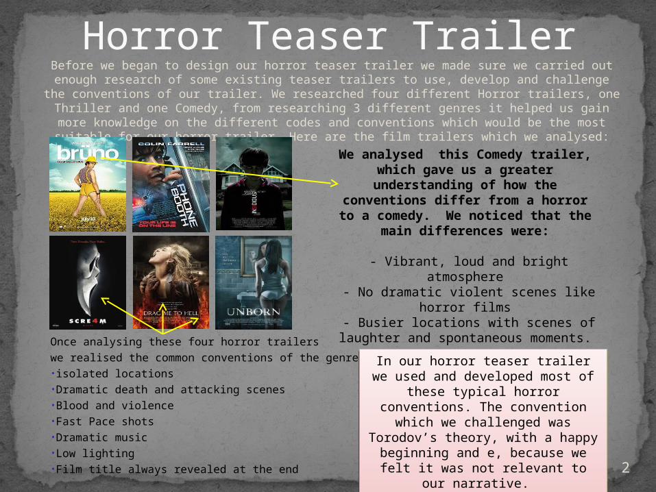
Before we began to design our horror teaser trailer we made sure we carried out enough research of some existing teaser trailers to use, develop and challenge the conventions of
our trailer. We researched four different Horror trailers, one Thriller and one Comedy, from researching 3 different genres it helped us gain more knowledge on the different
codes and conventions which would be the most suitable for our horror trailer. Here are the film trailers which we analysed:
Horror Teaser Trailer
Once analysing these four horror trailers
we realised the common conventions of the genre were:•isolated locations•Dramatic death and attacking scenes•Blood and violence•Fast Pace shots•Dramatic music•Low lighting•Film title always revealed at the end
In our horror teaser trailer we used and developed most of these typical horror conventions. The convention which we challenged was Torodov’s theory, with a happy beginning and
e, because we felt it was not relevant to our narrative.
In our horror teaser trailer we used and developed most of these typical horror conventions. The convention which we challenged was Torodov’s theory, with a happy beginning and
e, because we felt it was not relevant to our narrative.
We analysed this Comedy trailer, which gave us a greater
understanding of how the conventions differ from a horror to
a comedy. We noticed that the main differences were:
- Vibrant, loud and bright atmosphere - No dramatic violent scenes like horror
films - Busier locations with scenes of
laughter and spontaneous moments.
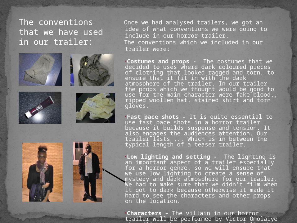
Once we had analysed trailers, we got an idea of what conventions we were going to include in our horror trailer.The conventions which we included in our trailer were:
•Costumes and props - The costumes that we decided to uses where dark coloured pieces of clothing that looked ragged and torn, to ensure that it fit in with the dark atmosphere of the trailer. In our trailer the props which we thought would be good to use for the main character were fake blood,, ripped woollen hat, stained shirt and torn gloves.
•Fast pace shots – It is quite essential to use fast pace shots in a horror trailer because it builds suspense and tension. It also engages the audiences attention. Our trailer lasts ... Which is in between the typical length of a teaser trailer.
•Low lighting and setting - The lighting is an important aspect of a trailer especially for a horror genre, so we will ensure that we use low lighting to create a sense of mystery and dark atmosphere for our trailer. We had to make sure that we didn’t film when it got to dark because otherwise it made it hard to see the characters and other props on the location.
•Characters – The villain in our horror trailer will be performed by Victor Omolaiye who will be the homeless man who stalks the young girl. The victim will be performed by Morgan Fontinelle who will be the young vulnerable girl.
The conventions that we have used in our trailer:
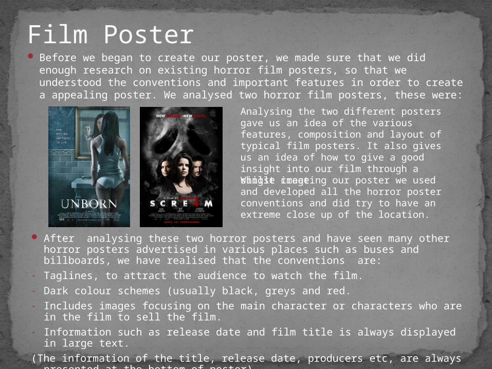
Before we began to create our poster, we made sure that we did enough research on existing horror film posters, so that we understood the conventions and important features in order to create a appealing poster. We analysed two horror film posters, these were:
Film Poster
Analysing the two different posters gave us an idea of the various features, composition and layout of typical film posters. It also gives us an idea of how to give a good insight into our film through a single image.
After analysing these two horror posters and have seen many other horror posters advertised in various places such as buses and billboards, we have realised that the conventions are:
- Taglines, to attract the audience to watch the film.- Dark colour schemes (usually black, greys and red.- Includes images focusing on the main character or characters who are in the film
to sell the film.- Information such as release date and film title is always displayed in large text.
(The information of the title, release date, producers etc, are always presented at the bottom of poster)
Whilst creating our poster we used and developed all the horror poster conventions and did try to have an extreme close up of the location.
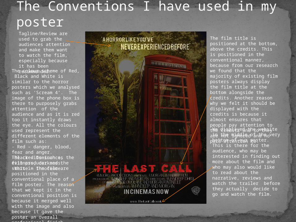
The Conventions I have used in my poster
The credits such as the film producer and the stars in the film are positioned in the conventional place of a film poster. The reason that we kept it in the conventional position is because it merged well with the image and also because it gave the poster an overall professional finish.
Tagline/Review are used to grab the audiences attention and make them want to watch the film, especially because it has been recommended.
The colour scheme of Red, Black and White is similar to the horror posters which we analysed such as ‘Scream 4’. The image of the phone box is there to purposely grabs attention of the audience and as it is red too it instantly draws the eye. All the colours used represent the different elements of the film such as:- Red – danger, blood, fear and anger.-Black – Dominance, evilness, darkness.-White – Innocence.
The film title is positioned at the bottom, above the credits. This is positioned in the conventional manner, because from our research we found that the majority of existing film posters always display the film title at the bottom alongside the credits. Another reason why we felt it should be displayed with the credits is because it almost ensures that people pay attention to the credits and so they are not ignored and no paid attention to.
We displayed the website in the middle of the very bottom of our poster. This is there for the audience, who may be interested in finding out more about the film and who may also would like to read about the narrative, reviews and watch the trailer before they actually decide to go and watch the film.
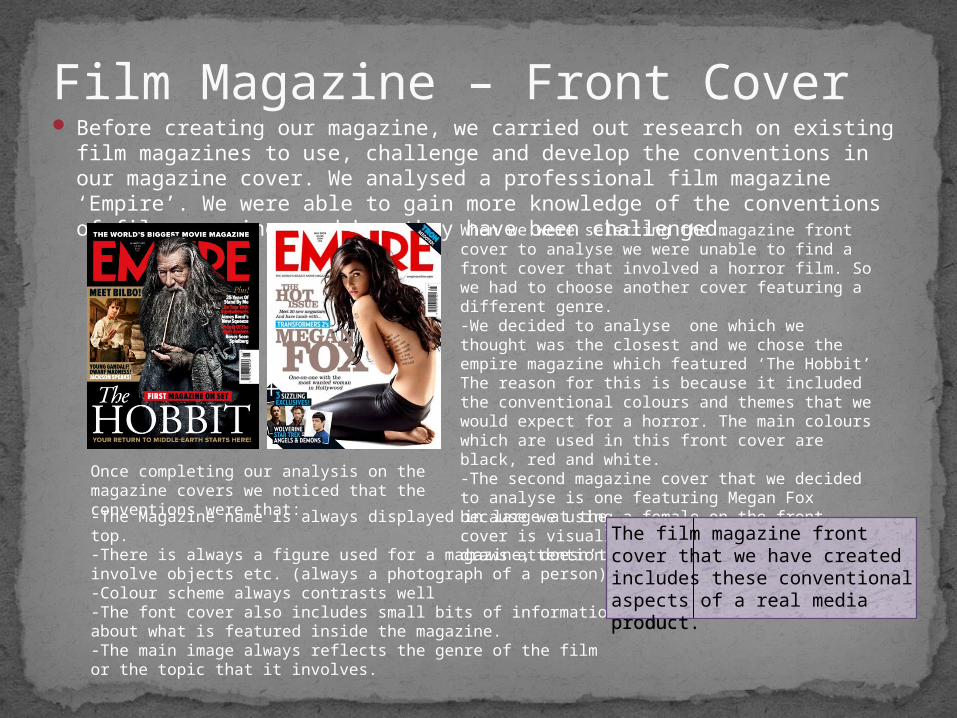
Before creating our magazine, we carried out research on existing film magazines to use, challenge and develop the conventions in our magazine cover. We analysed a professional film magazine ‘Empire’. We were able to gain more knowledge of the conventions of film magazines and how they have been challenged.
Film Magazine – Front Cover
When we were selecting the magazine front cover to analyse we were unable to find a front cover that involved a horror film. So we had to choose another cover featuring a different genre. -We decided to analyse one which we thought was the closest and we chose the empire magazine which featured ‘The Hobbit’ The reason for this is because it included the conventional colours and themes that we would expect for a horror. The main colours which are used in this front cover are black, red and white. -The second magazine cover that we decided to analyse is one featuring Megan Fox because we using a female on the front cover is visually appealing and instantly draws attention.
-The Magazine name is always displayed in large at the top.-There is always a figure used for a magazine, doesn’t involve objects etc. (always a photograph of a person)-Colour scheme always contrasts well-The font cover also includes small bits of information about what is featured inside the magazine.-The main image always reflects the genre of the film or the topic that it involves.
Once completing our analysis on the magazine covers we noticed that the conventions were that:
The film magazine front cover that we have created includes these conventional aspects of a real media product.
The film magazine front cover that we have created includes these conventional aspects of a real media product.
Conventions I have used in my magazine front cover
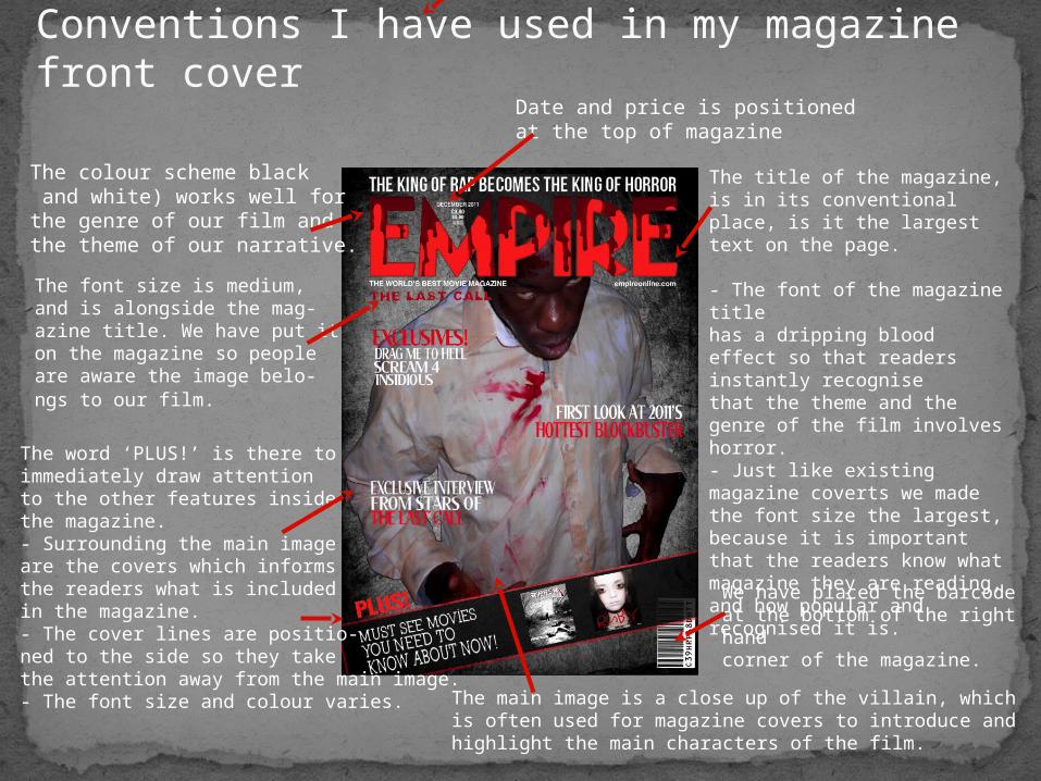
The colour scheme black and white) works well for the genre of our film and the theme of our narrative.
Date and price is positionedat the top of magazine
The font size is medium,and is alongside the mag-azine title. We have put it on the magazine so people are aware the image belo-ngs to our film.
The word ‘PLUS!’ is there toimmediately draw attention to the other features inside the magazine. - Surrounding the main image are the covers which informs the readers what is includedin the magazine. - The cover lines are positio-ned to the side so they take the attention away from the main image.- The font size and colour varies.
We have placed the barcode at the bottom of the right hand corner of the magazine.
The main image is a close up of the villain, which is often used for magazine covers to introduce and highlight the main characters of the film.
The title of the magazine, is in its conventional place, is it the largest text on the page.
- The font of the magazine title has a dripping blood effect so that readers instantly recognisethat the theme and the genre of the film involves horror. - Just like existing magazine coverts we made the font size the largest, because it is important that the readers know what magazine they are reading, and how popular and recognised it is.


