14
Question 1
| Date post: | 18-Jul-2015 |
| Category: |
Technology |
| Upload: | emmaroddy |
| View: | 169 times |
| Download: | 0 times |

Question 1

In my PowerPoint I will be showing how the elements of our media product both challenge, use and develop the conventions of real media products.


Conventions Of Teaser Trailers.
• Variety of types of shots and camera movement.
• Titles including: film title, main cast, production company, release date, age ratings and social media links.
• Use of dark colours.• Use of creepy music. • Elements relatable to the Genre.

Conventions Of Film Posters
• Film title• Main image• Tagline• Billing block• Main Cast name• Film quotes• Review quotes• Release dates• Production company logos

Conventions Of A Magazine Cover
• Magazine title• Film title• Film Tagline• Main image • Quotes/reviews• Main Actors• Magazine info,• Price/website/barcode/
what’s included in the magazine
• Information on other films

IdentsTo the left are two Idents that we looked at for inspiration before creating our own. We used and developed the first idea of using moon. In the bbc ident the moon doesn’t move but the parts around it does where as our moon has been created to move as well as the text. We kept ours simple and used darker colours. From the name ‘iris productions’ we decided it appropriate to use an eye which we though also conformed the horror genre. We liked the idea from the second ident which shows clear genre links but we challenged the ideas of having objects in a typical ‘dark spooky room’ and focused on having a human eye relating more to our zombie specific genre. We also instead of these Idents being quite long in time length chose to have ours short to fit in with the length of the teaser. We have used common conventions such as the short length of text and using a main image relatable to the genre. Also through the use of dark and contrasting colours such as black white and grey. We however did challenge the conventions and decide against having any background music or sounds in our ident and instead leave it silent.

It is common for horror or zombie trailers to use a variety of pace and use quick changes to make them more exciting.
This clip is from the teaser for zombieland, this shows the use of quick changes in pace. This is the kind of effect that we tried to create in our own teaser. There's is used throughout the movement of the main character where as we challenged that by having our camera move around the deadly still character.
From this clip we also like the use of quickly panning around the character so you can see them from different angles which we achieved in our teaser.
Another common convention that we expanded on in our teaser, that is shown in the zombieland trailer is the use of dark lighting but having a spotlight or a source of lighting only on the main character drawing the main focus to them.

Another common element of a teaser trailer is Titles. Teasers do not have as many as normal trailers do is as there is a lot to fit into a small amount of time. We used a similar style for our titles, we put a fade to and from black in and put the title on top of it so there was a contrast and the titles stood out. The colours also stuck in with our colour theme, keeping it consistent and relating back to our genre. Some of the titles did however go over the images when it worked with out any issues.
Overall we used about 8 titles, which is a few more than normal teaser trailers use and more relatable to normal length trailers. We included all the important titles that teasers use and then added some titles that told the audience a bit more about the storyline, this challenges the conventions of teaser trailers as teasers are supposed to be short an not give too much information away about the storyline.
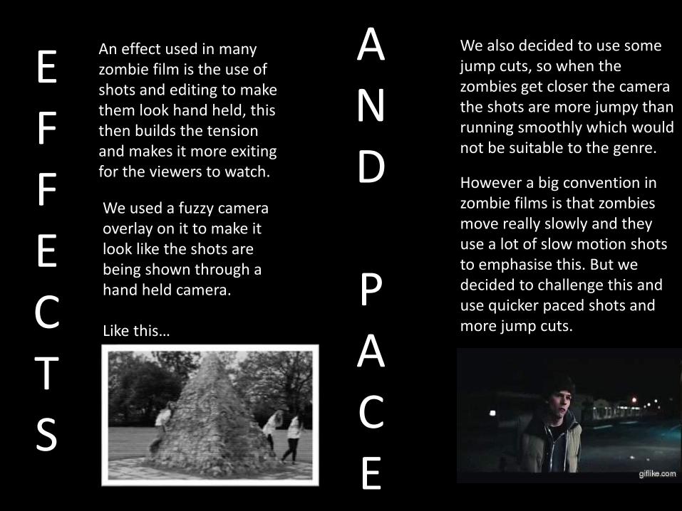
We used a fuzzy camera overlay on it to make it look like the shots are being shown through a hand held camera.
Like this…
An effect used in many zombie film is the use of shots and editing to make them look hand held, this then builds the tension and makes it more exiting for the viewers to watch.
We also decided to use some jump cuts, so when the zombies get closer the camera the shots are more jumpy than running smoothly which would not be suitable to the genre.
However a big convention in zombie films is that zombies move really slowly and they use a lot of slow motion shots to emphasise this. But we decided to challenge this and use quicker paced shots and more jump cuts.
EFFECTS
AND
PACE
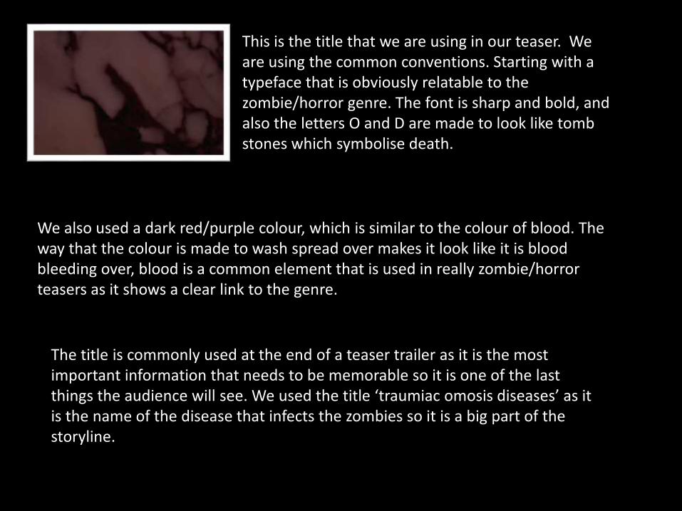
This is the title that we are using in our teaser. We are using the common conventions. Starting with a typeface that is obviously relatable to the zombie/horror genre. The font is sharp and bold, and also the letters O and D are made to look like tomb stones which symbolise death.
We also used a dark red/purple colour, which is similar to the colour of blood. The way that the colour is made to wash spread over makes it look like it is blood bleeding over, blood is a common element that is used in really zombie/horror teasers as it shows a clear link to the genre.
The title is commonly used at the end of a teaser trailer as it is the most important information that needs to be memorable so it is one of the last things the audience will see. We used the title ‘traumiac omosis diseases’ as it is the name of the disease that infects the zombies so it is a big part of the storyline.

VS
We used this page as the last thing that the audience would see. The same as this one from warm bodies, we included a production company , an age rating and social media or website addresses, which they will hopefully look into to find out more about the film itself. We included this information last similarly to warm bodies, this done because excluding the tittle this is important information that the audience need to remember.
It also included the information about the releasing of the film such as the date and where it will be shown, this is so the audience know and remember where and when to go and see it if they enjoyed the trailer they just watched.

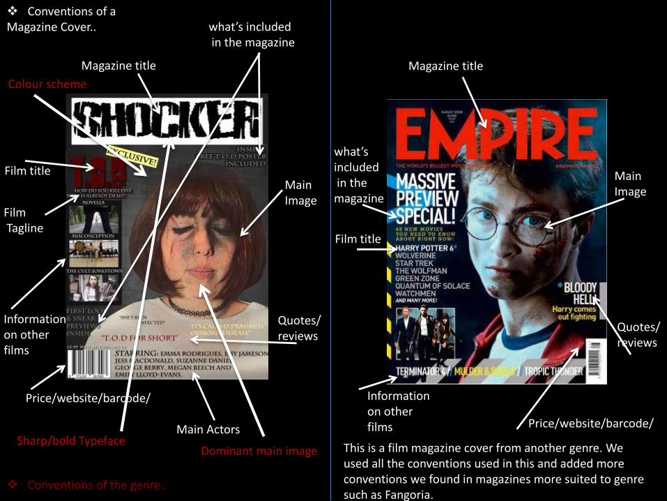
Conventions of a Magazine Cover..
Conventions of the genre..
Production company logos
Film title
Main images
Tagline
Billing block
Main Cast name
Review quotes
Release datesAge Rating
Dark colour scheme
Zombie Typeface
Use of characters
Film title Main Cast name
TaglineMain images
Release datesAge Rating
Production company logos
Billing block
Use of characters
Use ofcolours
Use of mise en scene -specifically setting
For inspiration we looked at this, we used all of the conventions in this zombie film and added in more conventions found in postersthat were not from the zombie genre as well.
Conventions of a Magazine Cover..
Conventions of the genre..
Informationon other films
Magazine title
Film title
FilmTagline
Quotes/reviews
Price/website/barcode/
what’s includedin the magazine
Main Actors
MainImage
Dominant main image
Colour scheme
Sharp/bold Typeface
Magazine title
what’s includedin the magazine
MainImage
Film title
Informationon other films
Quotes/reviews
Price/website/barcode/
This is a film magazine cover from another genre. We used all the conventions used in this and added more conventions we found in magazines more suited to genre such as Fangoria.


