8
Q.1. In what ways does your media product use, develop or challenge forms and conventions of real media products?
| Date post: | 15-Aug-2015 |
| Category: |
Education |
| Upload: | phillipsellie17 |
| View: | 33 times |
| Download: | 0 times |

Q.1. In what ways does your media product use, develop or
challenge forms and conventions of real media products?

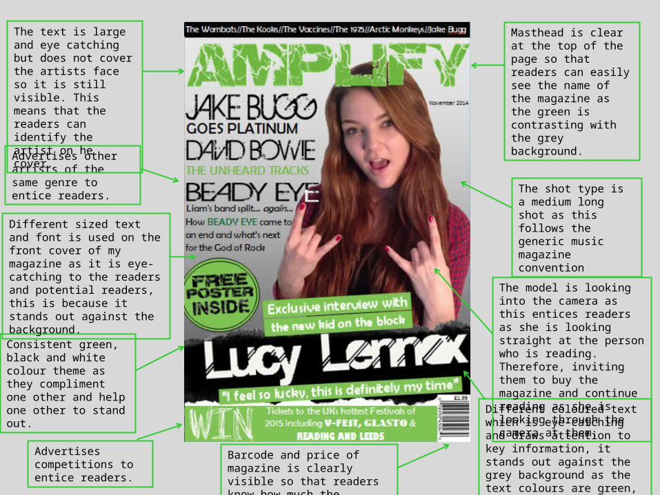
Colour theme NME use is yellow, red and black.
Different sized text and font which is eye-catching and draws people in as it is interesting information.
It features what will be inside the magazine.
Medium long shot of model.
Celebrity figure used on front cover to attract fans and admirers of the celebrity.
Masthead is positioned to the side so it doesn’t overlap the image.
Different coloured text which is eye-catching and draws attention to key information.
Advertises competitions to entice readers.
Advertises other artists of the same genre to entice readers.Price is visible so that the
public know how much it costs.
The writing does no cover the face of the model on the magazine.
Tells the public what issue of the magazine it is so they know how many have been published.
The model is looking at the camera to entice readers to buy the magazine and invite them in.
Large, bold title to catch the readers eye as it stands out, it covers the model but not their face.
Magazine Front Cover
Advertises competitions to entice readers.
Consistent green, black and white colour theme as they compliment one other and help one other to stand out.
Different sized text and font is used on the front cover of my magazine as it is eye-catching to the readers and potential readers, this is because it stands out against the background.
Different coloured text which is eye-catching and draws attention to key information, it stands out against the grey background as the text colours are green, black and white.
The shot type is a medium long shot as this follows the generic music magazine convention
Advertises other artists of the same genre to entice readers.
Masthead is clear at the top of the page so that readers can easily see the name of the magazine as the green is contrasting with the grey background.
The model is looking into the camera as this entices readers as she is looking straight at the person who is reading. Therefore, inviting them to buy the magazine and continue reading as she is looking through the camera at them.
Barcode and price of magazine is clearly visible so that readers know how much the magazine costs.
The text is large and eye catching but does not cover the artists face so it is still visible. This means that the readers can identify the artist on he cover.
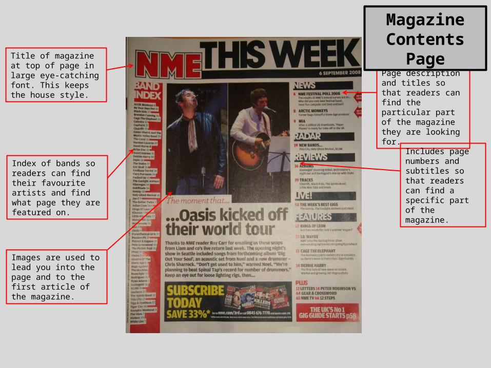
Title of magazine at top of page in large eye-catching font. This keeps the house style.
Page description and titles so that readers can find the particular part of the magazine they are looking for.
Images are used to lead you into the page and to the first article of the magazine.
Includes page numbers and subtitles so that readers can find a specific part of the magazine.
Index of bands so readers can find their favourite artists and find what page they are featured on.
Magazine Contents Page
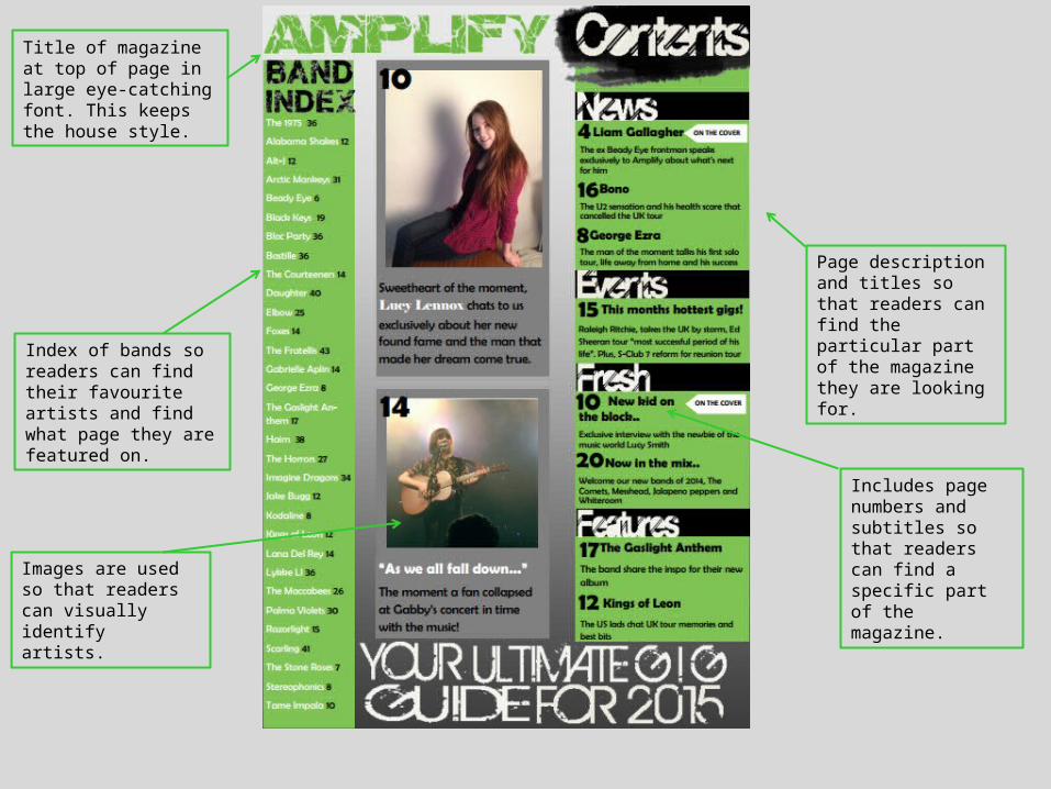
Title of magazine at top of page in large eye-catching font. This keeps the house style.
Index of bands so readers can find their favourite artists and find what page they are featured on.
Includes page numbers and subtitles so that readers can find a specific part of the magazine.
Page description and titles so that readers can find the particular part of the magazine they are looking for.
Images are used so that readers can visually identify artists.
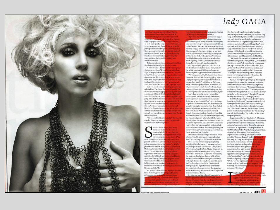

What is the purpose of the photograph of the artist? Why is the mise-en-scene important? How has the picture been edited? What is the effect of the artist looking at the camera? How much space does the image take? The purpose of the photograph of the artist is to
show readers who the article is about and to attract fans and admirers. The mise-en-scene is important because the image needs to look interesting to engage the readers. She is posing in front of a white background to keep the same theme of the red, white and black. The image has been edited to black and white so that it fits in with the magazine colour scheme which is red, white and black. The photo is
large and bold to catch the attention of the readers, it’s a close up shot to show the detail of the artist. The image is interesting to intrigue the readers and they may want to read the article to find out an explanation of the photo.
Why is the representation of the artist important? How is it consistent throughout the entire feature and with the front cover? The representation of the artist is important as it means that the readers can make a decision as to how interested they are in the artist and whether they want to read the article or not. If the artist looks uninteresting then its likely the readers will not be interested in reading
the article as they will think they are boring. The large image is to make the artist stand out to the audience.
What kind of information is included in the interview? What does the artist talk about? How is the interview relayed to the reader? Lady Gaga has spoken about her Royal Variety performance from 2009 and her lifestyle. The text is positioned on the left hand page as
we read from left to right.
Why has the web address been included? The web address has been included so that readers can subscribe to the magazine. Also, it encourages people to visit the website in case they have any queries or problems with the magazine, they may also be able to find out
more information from the website.
How is this a typical spread from Q magazine? What stylistic features are consistent? Why is branding/maintaining a house style important? The house style has been maintained throughout as they have used a consistent house theme or red, white and black.
These colours are the same as the Q logo. This maintains the brand identity which is key as it means the brand is reliable and can be easily recognised.
The interview starts with an enlarged letter in a Serif font. Is this typical of all magazines? Why do you think this is a popular feature? Multiple magazines use this feature as it helps the reader know
where the interview starts and where they can start reading from.
What is the purpose of the smaller version of the masthead in the corner of the page? The purpose of displaying the smaller masthead in the corner of the page is to continue the house style of the
magazine and to maintain the brand identity.
Why are the page numbers important? Its important that the page numbers are included so they can be cross referenced in the contents page making it easier to find the page.
What do you notice about the layout of the text? How many columns are typical? What kind of font has been used and what font size? There are 3 columns which are aligned on the left hand side of the columns. No hyphens have been used therefore it is easy to read and looks more professional. The colour of the font is vibrant and stands out on the background and is easy to read. Once again, it is easy to read as the font style is simplistic and the writing is a small size so that lots of information
can be included.
Why is the date included on the page? The date is displayed in the corner of the page to show how recent the interview is. This is only allows readers to get an understanding of how accurate the
information is and how recent it is.
Why is the artists name positioned at the top of the page and in a larger font than the text? The artists name is enlarged and positioned at the top of the page so that it stands out to the readers. They can briefly look through the magazine and will be able to clearly see what/who the article is
about. They will then be able to know whether they want to read the full article.


