11
Looking back at your preliminary task, what do you feel you have learnt in the progression from it being a full product? Evaluation Question 7
| Date post: | 06-Aug-2015 |
| Category: |
Self Improvement |
| Upload: | rebeccawild2212 |
| View: | 95 times |
| Download: | 0 times |
Looking back at your preliminary task, what do you feel you have learnt in the
progression from it being a full product?
Evaluation Question 7
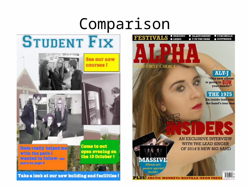
Comparison
Overall
Overall I feel I have made a much better magazine with my music magazine than with my college magazine, as I learnt so much and made a lot of mistakes with my college magazine that I did not make with my music magazine as I learned from them. I feel I have improved with my font size, fonts used, colours used, layout and general details.In my college magazine I did not include the important information such as the date, price and barcode etc which was a big mistake as it meant my magazine looked very unrealistic.Spelling was also something I made a mistake on with my college magazine as I accidently wrote “come to out” rather than “come to our”. On my music magazine I made a conscious effort to get my spelling perfect and I proof read my work to make sure I did not make any further mistakes.
Colour SchemeIn my student/college magazine I used a variety of different bright colours paired with a very subtle background, also some of my images were half black and white/half colour or distorted colours. The mix of all these colours left my student magazine looking quite messy and unorganised, which was a disadvantage. I feel the magazine looked very childish with all the different colours. I picked colours that related to the colours of the college in my preliminary task, but I feel this just made my magazine look to garish and overrun with unnecessary colours, especially seen as the colours used were very bright.Therefore, in my music magazine I chose to use a very limited amount colours, to make my magazine look more professional. I mainly used red and gold through out my magazine (alongside black and white) but for the front cover I chose to also use a pop of blue for the cover lines and puff. I felt this would make my magazine just that little bit more interesting and make it stand out more. I kept the majority of the descriptive writing black as it is easy to read and also stands out from the coloured background.
Font and Font SizeWhen I created my college magazine I was unaware of websites such as DaFont.com which allow you to download custom fonts to use with in Photoshop, therefore the fonts on my college magazine were quite basic as they were ones that were prebuilt into Photoshop. I also used all of the same font and font size on the cover of my student magazine (except for the masthead), which again made it look unrealistic and unprofessional. In my music magazine I downloaded the font ‘Human Error’ from DaFont.com which gave me a unique looking masthead which stood out, and looked professional as it was not a font from PowerPoint. For the masthead on my music magazine I chose to have it only cover half of the front cover as it was too large and did not look right when it covered the whole top of the magazine as I also had a banner above it. This was different to my student magazine as I made the masthead fit the whole top of the cover, I did not feel this worked very well though as the masthead was still quite small.For my cover lines and main sell line I used a variety of different font sizes as I wanted some parts to be more eye catching than others. This worked better than on my college magazine as on the cover of my college magazine no parts really stood out as the same font and font size was used throughout.
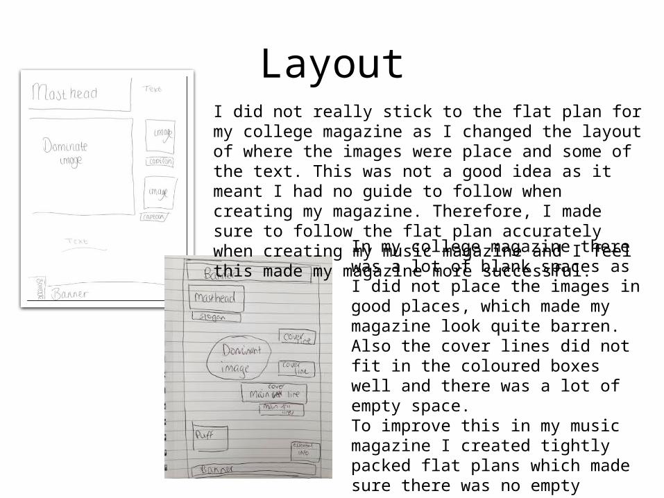
LayoutI did not really stick to the flat plan for my college magazine as I changed the layout of where the images were place and some of the text. This was not a good idea as it meant I had no guide to follow when creating my magazine. Therefore, I made sure to follow the flat plan accurately when creating my music magazine and I feel this made my magazine more successful.
In my college magazine there was a lot of blank spaces as I did not place the images in good places, which made my magazine look quite barren. Also the cover lines did not fit in the coloured boxes well and there was a lot of empty space. To improve this in my music magazine I created tightly packed flat plans which made sure there was no empty spaces.
Comparison
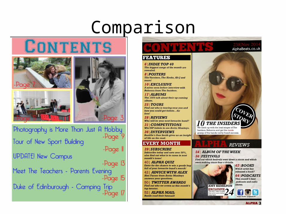
Layout and ContentThe layout was one of the things I was most unhappy with in my college magazine as feel it looks very unprofessional and does not resemble any magazine I have seen before. Having the images above the features column did not work well so on my music magazine I made sure to have them at the side rather than above.In my music magazine I also added a lot more features as in my college magazine I only had five listed, which is not very many for a magazine. I also did not include the word ‘page’ before the page number in my music magazine as I felt it was unnecessary as my target audience would understand what the numbers meant.I included social media links in my music magazine as I know my target audiences are regular social media uses and I felt it was important to let them engage with the magazine on different media platforms such as Twitter, Facebook and Instagram.
Continuity There isn't much continuity in my student magazine as I used bright and bold colours on my cover but then more muted and pastel colours for my contents page. This makes it look more like the cover and contents are from two different magazines. I also did not use the same text for both pages, the only text I kept was the text from the masthead as I used it for the word ‘contents’ . The masthead was not included on my contents page and so I felt continuity was something I really lacked with my student magazine and wanted to have with my music magazine.In my music magazine I used the same colour scheme throughout, although I did not include the colour blue on my contents page or DPS (but this was as the blue was simply to attract my target audiences attention). I used the same base font throughout, whilst adding other fonts in some places so that my magazine did not only use one font. I feel by keeping these aspects the same throughout my music magazine I have been able to create a brand identity and people will now associate the colours used/fonts used/my masthead with my magazine.
Details
When creatign my student magazine I wasn’t really sure what small details to include in my contents page therefore I just created soemthing quite basic which was not very realistic. I tried to add in lots of little details to my music magazine’s contents page which I had noticed in other magazines such as a website, social media links, image captions and page numbers. I feel this makes my magazine look genuine as I have included all of the little things which other magazines also include.
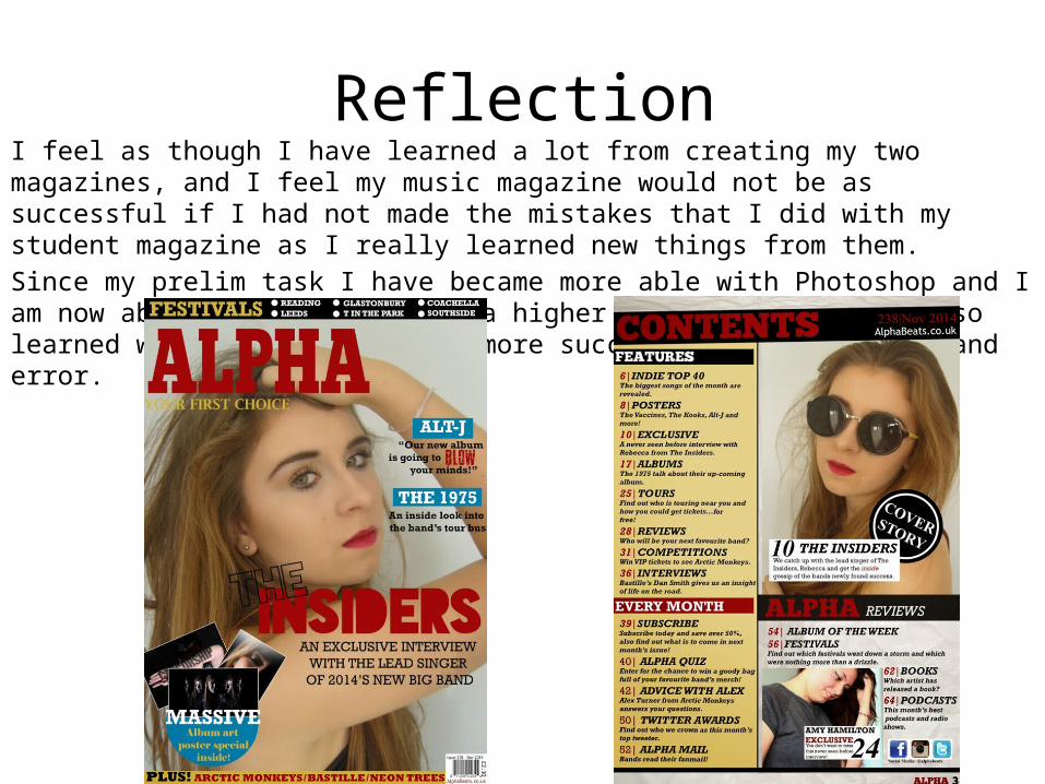
ReflectionI feel as though I have learned a lot from creating my two magazines, and I feel my music magazine would not be as successful if I had not made the mistakes that I did with my student magazine as I really learned new things from them.Since my prelim task I have became more able with Photoshop and I am now able to edit images to a higher quality and I have also learned what makes a magazine more successful through trial and error.


