The Article <<magazine>> Narrative Compositing & Compositions Type Sound Contextual Studies Navigation & Systems Final Layout & Compositing Final Video Screenshots 6 12 26 36 46 48 56 62 72 Contents 1 C O N T E N T S
Transcript
The Article <<magazine>>
Narrative
Compositing & Compositions
Type
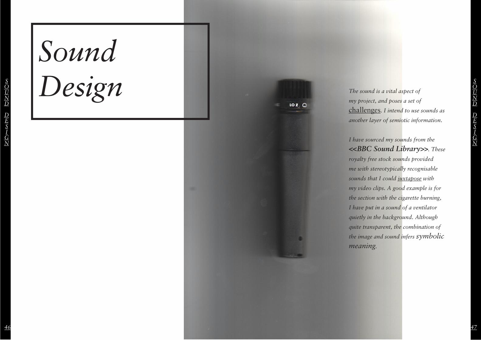
Sound
Contextual Studies
Navigation & Systems
Final Layout & Compositing
Final Video Screenshots
6
12
26
36
46
48
56
62
72
Contents
1
CONTENTS
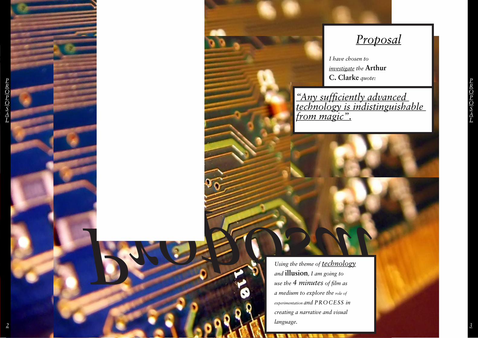
Proposal
PROPOSAL
PROPOSAL
2 3
ProposalI have chosen to
investigate the Arthur C. Clarke quote:
“Any sufficiently advanced technology is indistinguishable from magic”.
Using the theme of technology
and illusion, I am going to
use the 4 minutes of film as
a medium to explore the role of
experimentation and PROCESS in
creating a narrative and visual
language.
4 5
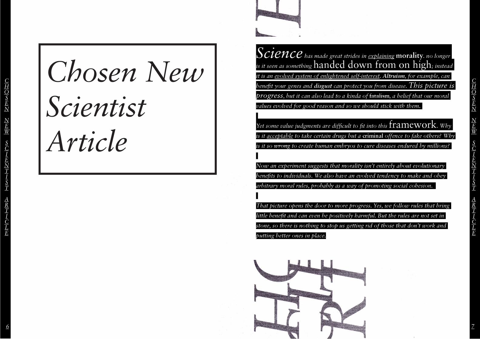
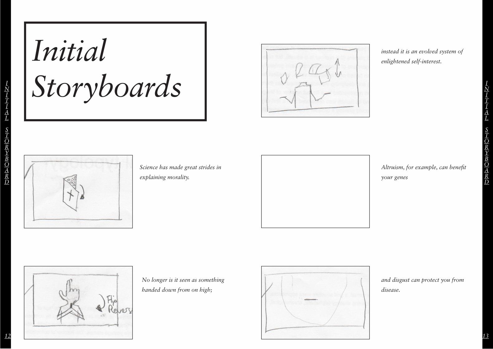
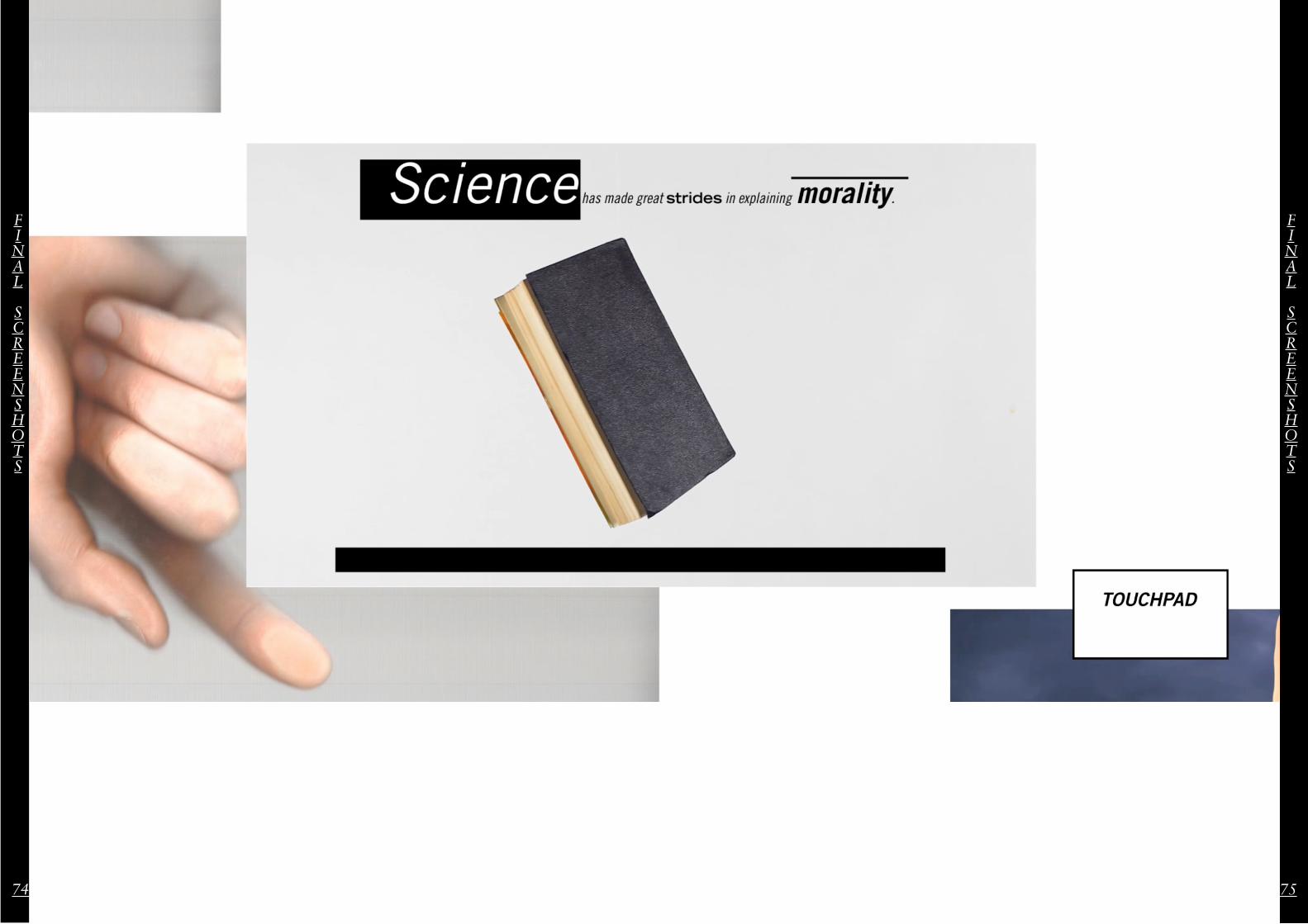
Science has made great strides in explaining morality. no longer
is it seen as something handed down from on high; instead
it is an evolved system of enlightened self-interest. Altruism, for example, can
benefit your genes and disgust can protect you from disease. This picture is progress, but it can also lead to a kinda of fatalism, a belief that our moral
values evolved for good reason and so we should stick with them.
Yet some value judgments are difficult to fit into this framework. Why
is it acceptable to take certain drugs but a criminal offence to fake others? Why
is it so wrong to create human embryos to cure diseases endured by millions?
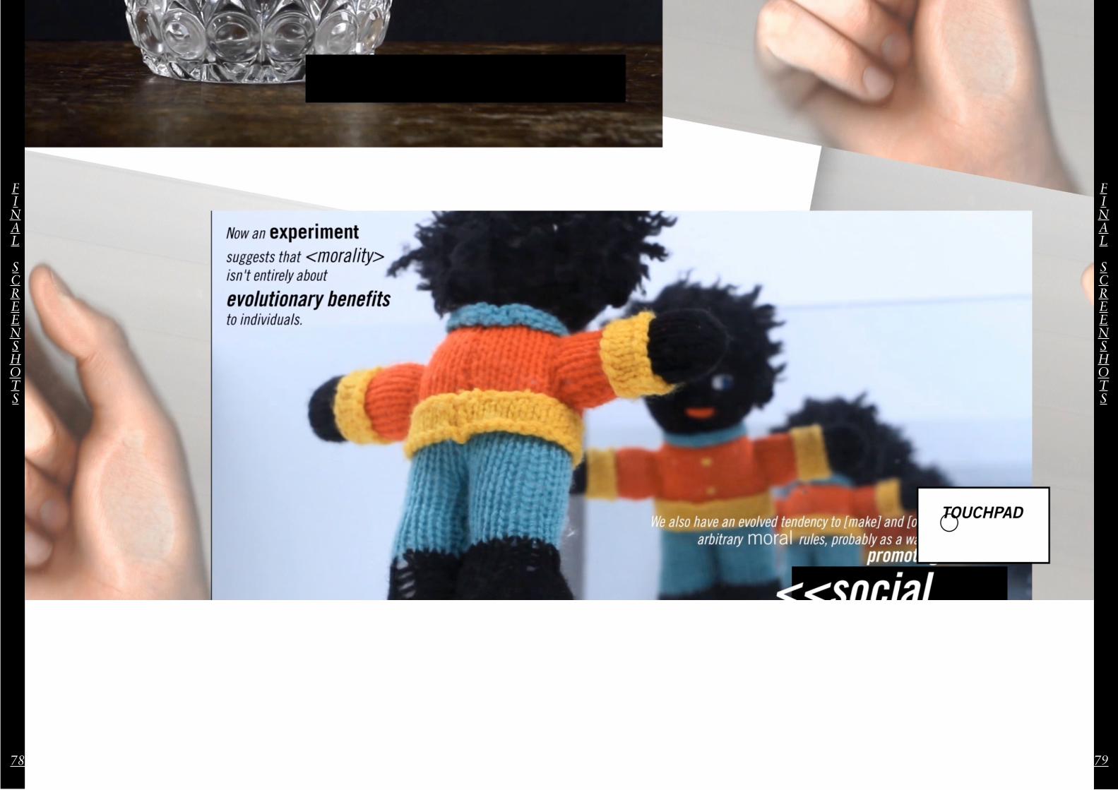
Now an experiment suggests that morality isn’t entirely about evolutionary
benefits to individuals. We also have an evolved tendency to make and obey
arbitrary moral rules, probably as a way of promoting social cohesion.
That picture opens the door to more progress. Yes, we follow rules that bring
little benefit and can even be positively harmful. But the rules are not set in
stone, so there is nothing to stop us getting rid of those that don’t work and
putting better ones in place.
CHOSEN
NEW
SCIENTIST
ARTICLE
CHOSEN
NEW
SCIENTIST
ARTICLE
6 7
Chosen New Scientist Article
CHOSEN
NEW
SCIENTIST
ARTICLE
PREFACHOSEN
NEW
SCIENTIST
ARTICLE
8 9
A New Dimension of Magazine
“I think there’s a place for it and it’s up to us as the writers to translate the physical, tactile beauty of a printed publication into words that resonate online. It’s exactly the same as when we go and review shows. There’s no substitute for feeling a book/magazine or seeing a painting up close but that doesn’t mean we should just ignore them. It’s a good challenge.”
Rob Alderson
ItsNiceThat
<<Em
ail Interview>>
What are your thoughts on digitally representing physical work?
EMAIL
INTERVIEW
EMAIL
INTERVIEW
10 11
INITIAL
STORYBOARD
INITIAL
STORYBOARD
12 13
Science has made great strides in
explaining morality.
No longer is it seen as something
handed down from on high;
instead it is an evolved system of
enlightened self-interest.
Altruism, for example, can benefit
your genes
and disgust can protect you from
disease.
Initial Storyboards
INITIAL
STORYBOARD
INITIAL
STORYBOARD
14 15
a belief that our moral values
evolved for good reason and so we
should stick with them.
This picture is progress, but it can
also lead to a kinda of fatalism,
Yet some value judgments are
difficult to fit into this framework.
Why is it acceptable to take certain
drugs but a criminal offence to fake
others?
Why is it so wrong to create human
embryos to cure diseases endured
by millions?
Now an experiment suggests
that morality isn’t entirely about
evolutionary benefits to individuals.
INITIAL
STORYBOARD
INITIAL
STORYBOARD
16 17
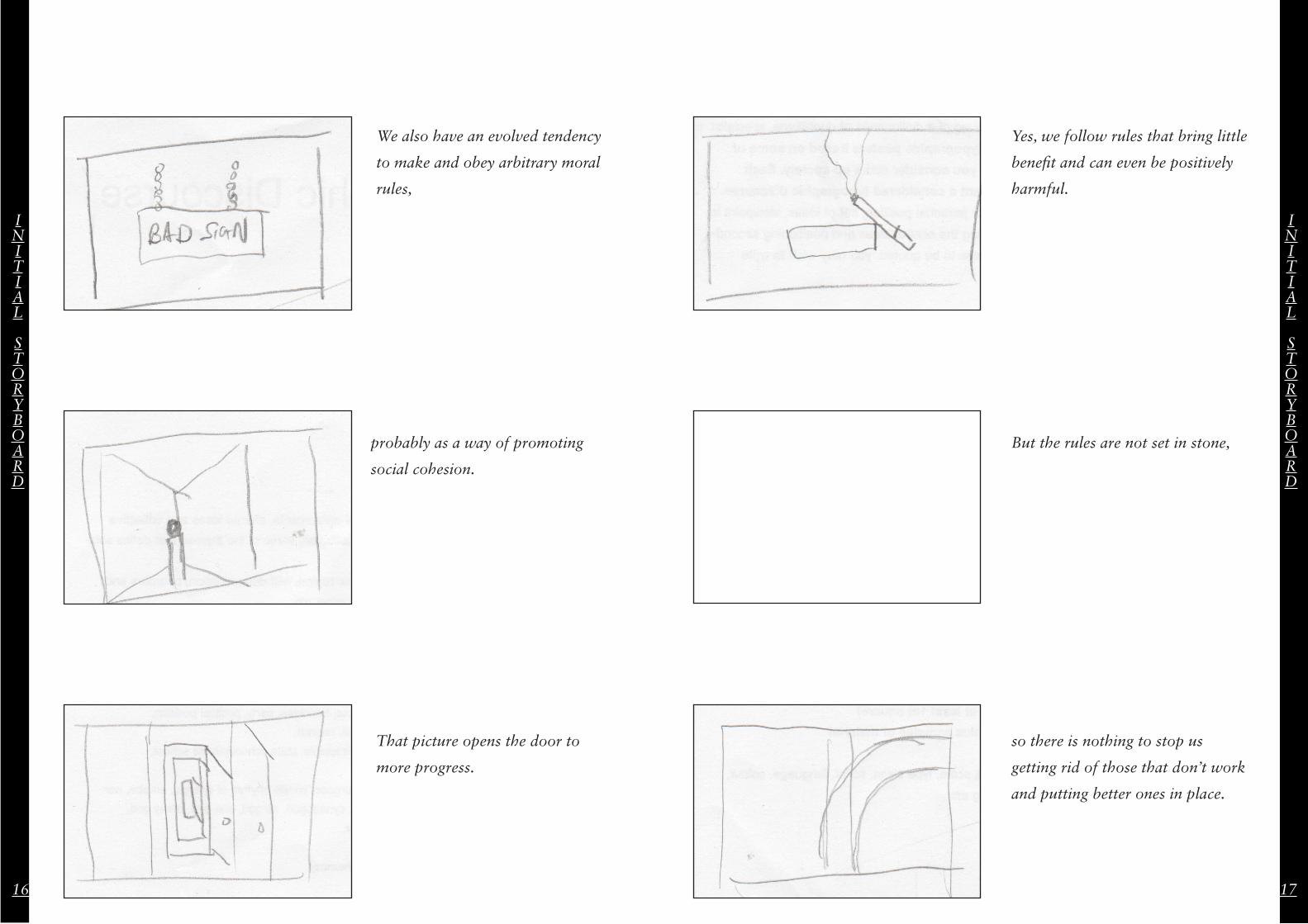
probably as a way of promoting
social cohesion.
We also have an evolved tendency
to make and obey arbitrary moral
rules,
That picture opens the door to
more progress.
Yes, we follow rules that bring little
benefit and can even be positively
harmful.
But the rules are not set in stone,
so there is nothing to stop us
getting rid of those that don’t work
and putting better ones in place.
SYMBOLS
&
SEMIOTICS
SYMBOLS
&
SEMIOTICS
18 19
Symbols &Semiotics
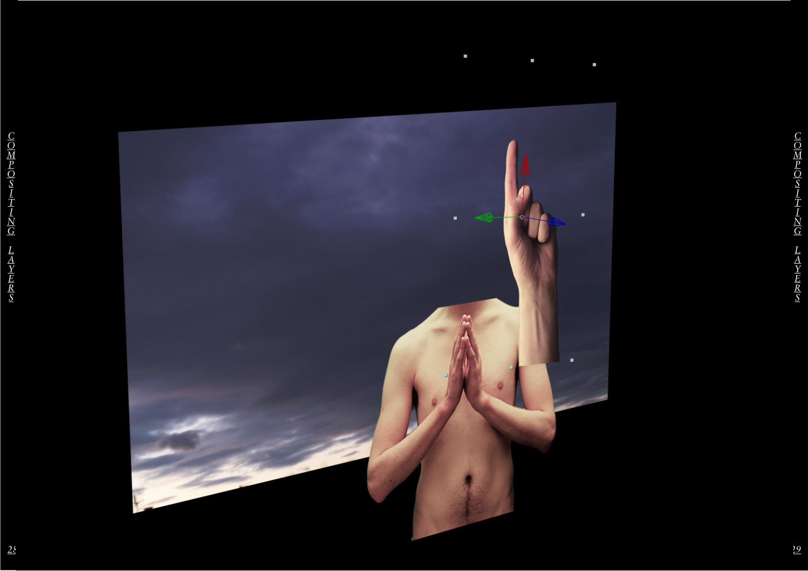
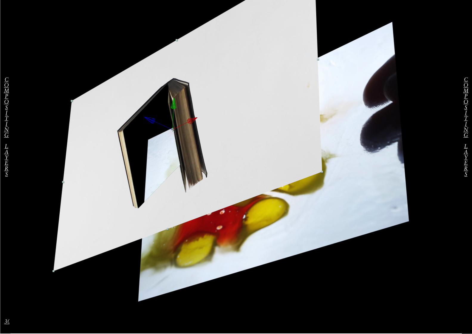
Semiotics and symbols play a big part in illustrating the article I have chosen. Because the text is not visually explicit, often describing morals and choices, I have chosen to infer meaning through semiotics. For example using a bible to illustrate morality.
20 21
Primary FootageB
EHIND
THE
SCENES
BEHIND
THE
SCENES
22 23
PRIMARY
FOOTAGE
PRIMARY
FOOTAGE
24 25
Bad Print[er]
I attempted to print the
frames of clips with a
broken printer and then
scan them back in to
animate but this process
added an aesthetic I didn’t
want in my film: a faux
silent film effect.
FAULTY
PROCESS
FAULTY
PROCESS
26 27
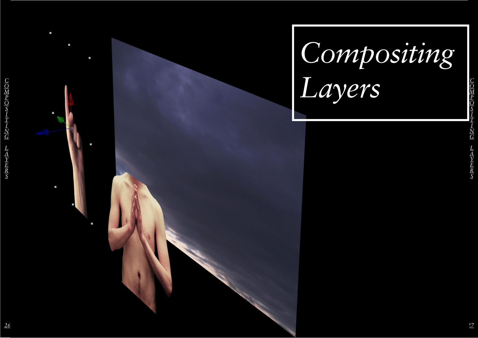
CompositingLayersC
OMPOSITING
LAYERS
COMPOSITING
LAYERS
28 29
COMPOSITING
LAYERS
COMPOSITING
LAYERS
30 31
COMPOSITING
LAYERS
COMPOSITING
LAYERS
32 33
COMPOSITING
LAYERS
COMPOSITING
LAYERS
34 35
Final Com
positionsFINAL
COMPOSITIONS
FINAL
COMPOSITIONS
TYPOGRAPHY
TYPOGRAPHY
36 37
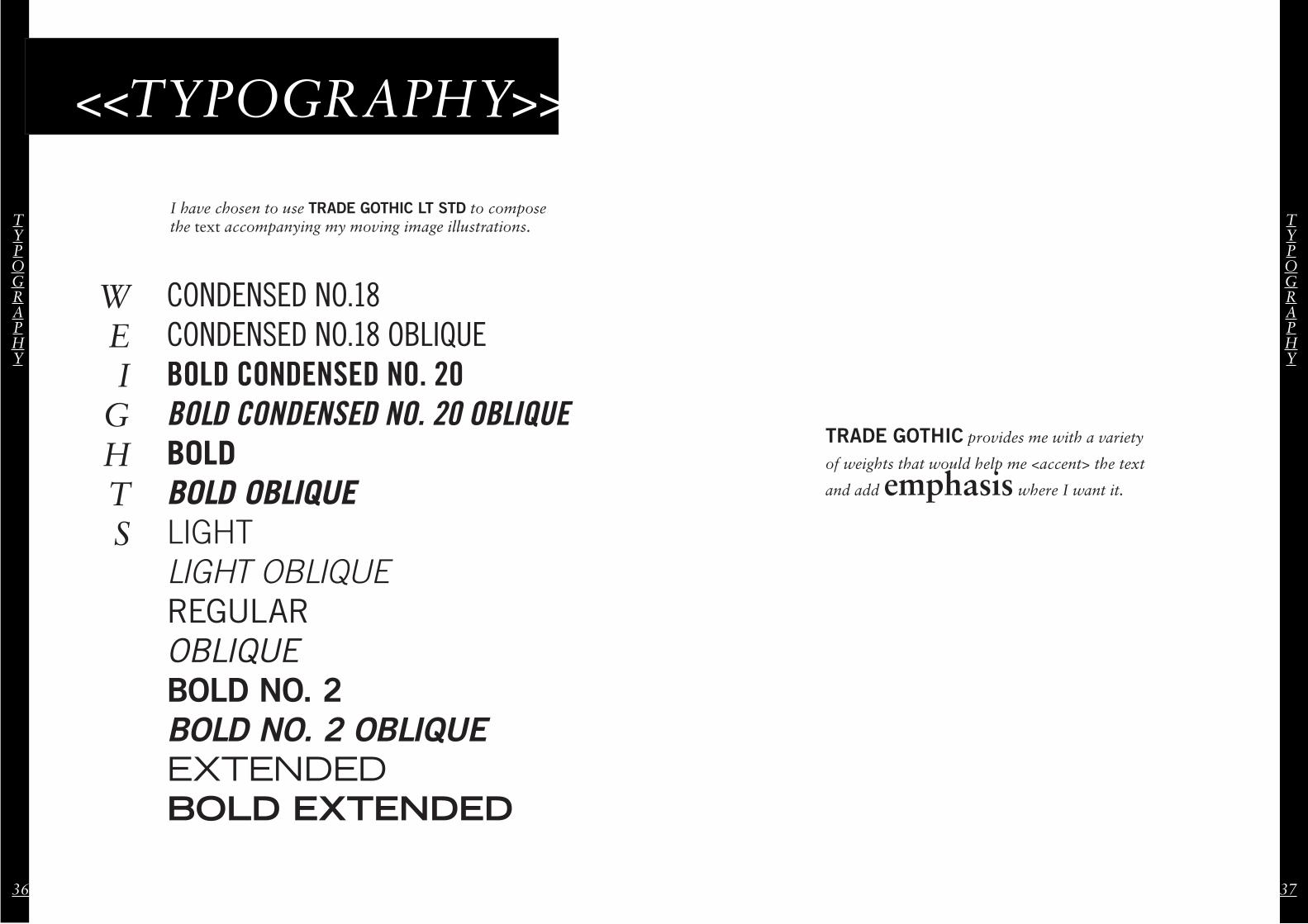
<<TYPOGRAPHY>>W
I have chosen to use TRADE GOTHIC LT STD to compose the text accompanying my moving image illustrations.
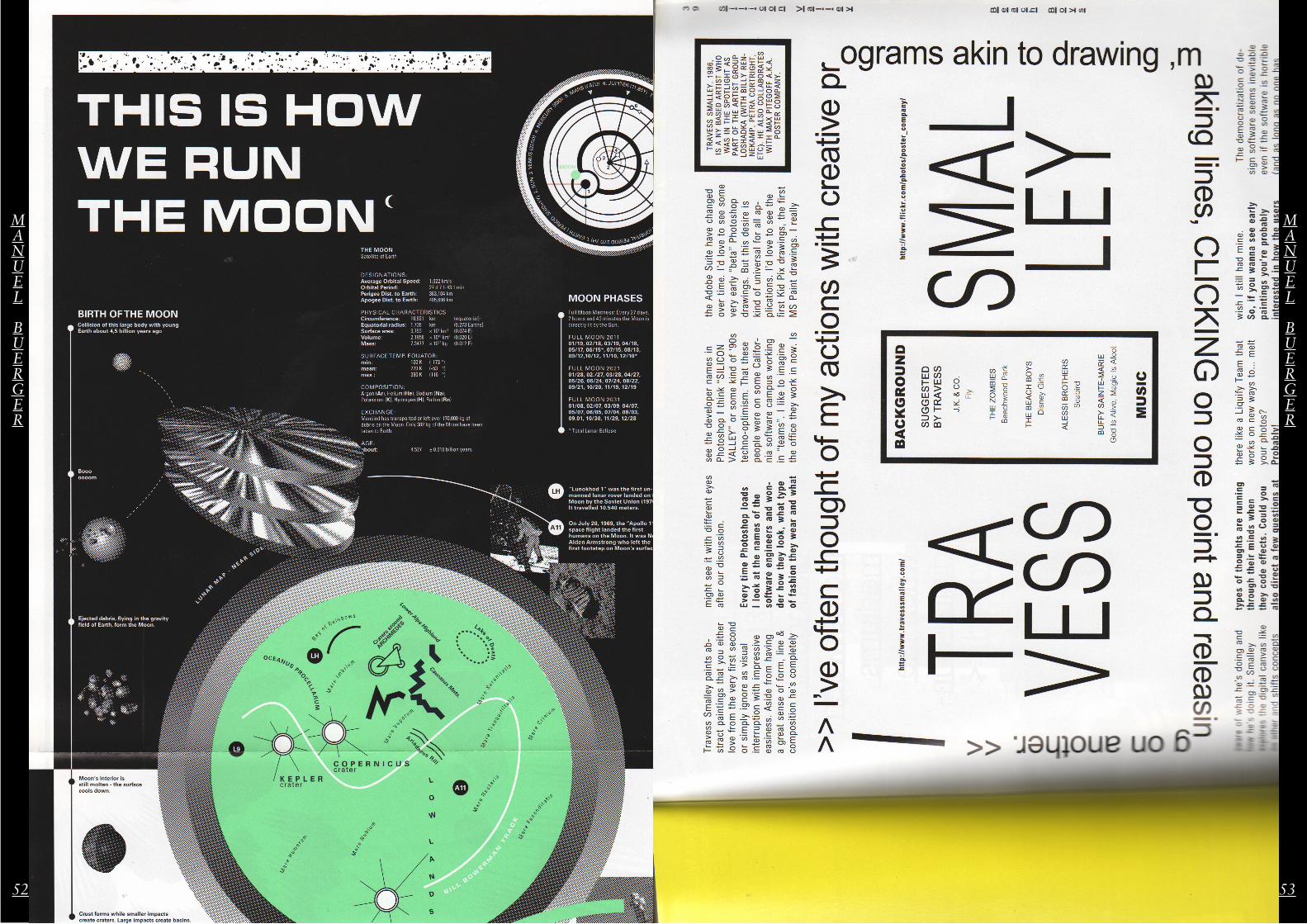
2. Two pages of LODOWN, from an issue art directed by Manuel.
This comprises of stills and an indepth description of a symposium he gave concerning slippery design and the discourse of semiotics. Although only provided with a condensed version of the presentation, semiotics and symbols play a critical role in my work, making it very relevant to my project.
48 49
MANUEL
BUERGER
MANUEL
BUERGER
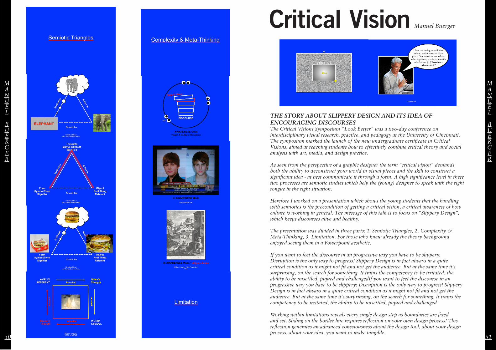
Critical Vision Manuel Buerger
THE STORY ABOUT SLIPPERY DESIGN AND ITS IDEA OF ENCOURAGING DISCOURSESThe Critical Visions Symposium “Look Better” was a two-day conference on interdisciplinary visual research, practice, and pedagogy at the University of Cincinnati. The symposium marked the launch of the new undergraduate certificate in Critical Visions, aimed at teaching students how to effectively combine critical theory and social analysis with art, media, and design practice.
As seen from the perspective of a graphic designer the term “critical vision” demands both the ability to deconstruct your world in visual pieces and the skill to construct a significant idea - at best communicate it through a form. A high significance level in these two processes are semiotic studies which help the (young) designer to speak with the right tongue in the right situation.
Herefore I worked on a presentation which shows the young students that the handling with semiotics is the precondition of getting a critical vision, a critical awareness of how culture is working in general. The message of this talk is to focus on “Slippery Design”, which keeps discourses alive and healthy.
The presentation was divided in three parts: 1. Semiotic Triangles, 2. Complexity & Meta-Thinking, 3. Limitation. For those who knew already the theory background enjoyed seeing them in a Powerpoint aesthetic.
If you want to feet the discourse in an progressive way you have to be slippery: Disruption is the only way to progress! Slippery Design is in fact always in a quite critical condition as it might not fit and not get the audience. But at the same time it‘s surprinsing, on the search for something. It trains the competency to be irritated, the ability to be unsettled, piqued and challengedIf you want to feet the discourse in an progressive way you have to be slippery: Disruption is the only way to progress! Slippery Design is in fact always in a quite critical condition as it might not fit and not get the audience. But at the same time it‘s surprinsing, on the search for something. It trains the competency to be irritated, the ability to be unsettled, piqued and challenged
Working within limitations reveals every single design step as boundaries are fixed and set. Sliding on the border line requires reflection on your own design process! This reflection generates an advanced consciousness about the design tool, about your design process, about your idea, you want to make tangible.
50 51
MANUEL
BUERGER
MANUEL
BUERGER
52 53
MANUEL
BUERGER
MANUEL
BUERGER
STRUCTURALIST
FILM
STRUCTURALIST
FILM
54 55
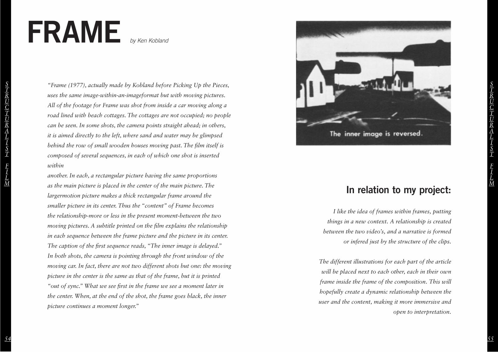
FRAME by Ken Kobland
“Frame (1977), actually made by Kobland before Picking Up the Pieces,
uses the same image-within-an-imageformat but with moving pictures.
All of the footage for Frame was shot from inside a car moving along a
road lined with beach cottages. The cottages are not occupied; no people
can be seen. In some shots, the camera points straight ahead; in others,
it is aimed directly to the left, where sand and water may be glimpsed
behind the row of small wooden houses moving past. The film itself is
composed of several sequences, in each of which one shot is inserted
within
another. In each, a rectangular picture having the same proportions
as the main picture is placed in the center of the main picture. The
largermotion picture makes a thick rectangular frame around the
smaller picture in its center. Thus the “content” of Frame becomes
the relationship-more or less in the present moment-between the two
moving pictures. A subtitle printed on the film explains the relationship
in each sequence between the frame picture and the picture in its center.
The caption of the first sequence reads, “The inner image is delayed.”
In both shots, the camera is pointing through the front window of the
moving car. In fact, there are not two different shots but one: the moving
picture in the center is the same as that of the frame, but it is printed
“out of sync.” What we see first in the frame we see a moment later in
the center. When, at the end of the shot, the frame goes black, the inner
picture continues a moment longer.”
In relation to my project:
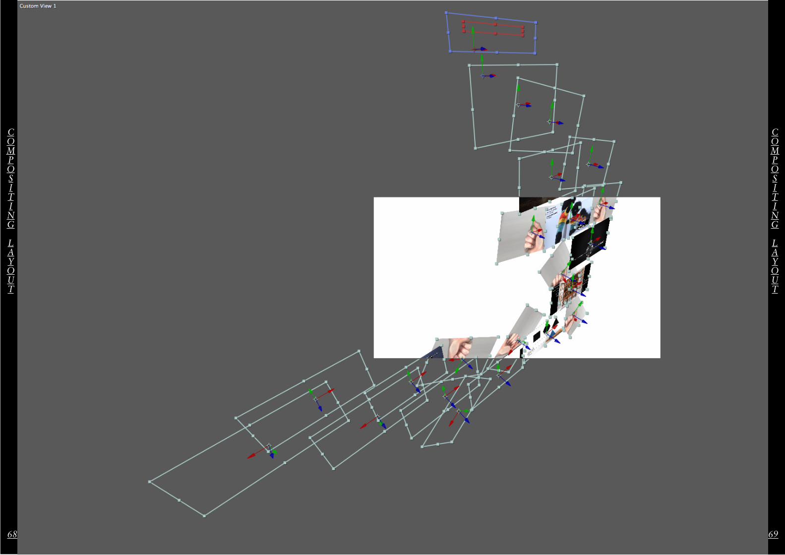
I like the idea of frames within frames, putting
things in a new context. A relationship is created
between the two video’s, and a narrative is formed
or infered just by the structure of the clips.
The different illustrations for each part of the article
will be placed next to each other, each in their own
frame inside the frame of the composition. This will
hopefully create a dynamic relationship between the
user and the content, making it more immersive and
open to interpretation.
56 57
Navigation
TOUCHPAD
I have superimposed a <<touchpad>> onto the final video that illustrates how you are supposed to navigate the composition, inferring the necessity for direct contact with the screen for example on an ipad or installation.
NAVIGATIONAL
SYSTEM
NAVIGATIONAL
SYSTEM
EDITORIAL NARRATIVE
EDITORIAL NARRATIVE
58 59
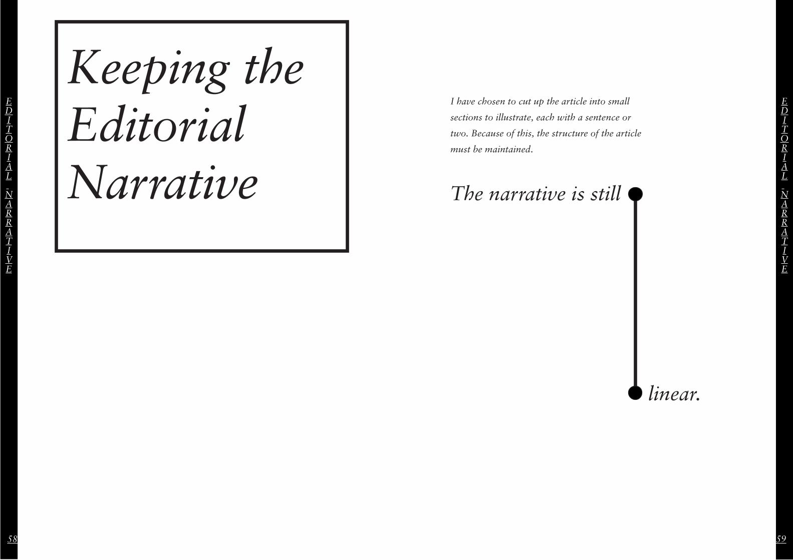
Keeping the Editorial Narrative
I have chosen to cut up the article into small
sections to illustrate, each with a sentence or
two. Because of this, the structure of the article