1 Excel and Statistical Analysis Jonathan B. Hill Dept. of Economics University of North Carolina – Chapel Hill In this document basic principles for analyzing data with Microsoft’s Excel software will be detailed. Many assignments with require the information provided in the document. It is assumed that you know how to boot-up Excel from your personal computer’s Start Menu, as well as open existing Excel files and save files. CONTENTS Topic Page 1. Data Arrangement: Rows, Columns, Observations 2 1.1 Rows and Columns 2 1.2 Observations 2 2. Creating News Variables as Functions of Existing Variables 3 2.1 Creating One New Variable for One Observation 3 2.2 Creating One New Variable for All Observations 4 2.3 Examples 3. Statistical Analysis: Mean, Variance, Standard Deviation 5 3.1 Sample Mean , Mode and Median 5 3.2 Sample Variance and Standard Deviation 7 3.3 Descriptive Statistics : Tool Package 8 4. Relative Frequency and Histograms 10 4.1 Frequency 10 4.2 Relative Frequency 11 4.3 Histogram 12 5. Probability Distribution Functions 14 5.1 Discreet Distribution Functions 14 Binomial and Poisson 5.2 Continuous Distribution Functions 17 Normal and Student's t 6. Bivariate Analysis: Sample Covariance and Correlation 20 6.1 Sample Covariance 20 6.2 Sample Correlation 21 7. Interval Estimation 23 8. Graphics: Charts, Tables and Figures 25 8.1 Scatter Plots 25 8.2 Time-Series: Line Plots 27 8.3 Editing Graphs and Figures 29
Transcript
1
Excel and Statistical AnalysisJonathan B. Hill
Dept. of EconomicsUniversity of North Carolina – Chapel Hill
In this document basic principles for analyzing data with Microsoft’s Excel software will be detailed. Manyassignments with require the information provided in the document. It is assumed that you know how toboot-up Excel from your personal computer’s Start Menu, as well as open existing Excel files and savefiles.
CONTENTS
Topic Page
1. Data Arrangement: Rows, Columns, Observations 21.1 Rows and Columns 21.2 Observations 2
2. Creating News Variables as Functions of Existing Variables 32.1 Creating One New Variable for One Observation 32.2 Creating One New Variable for All Observations 42.3 Examples
3. Statistical Analysis: Mean, Variance, Standard Deviation 53.1 Sample Mean, Mode and Median 53.2 Sample Variance and Standard Deviation 73.3 Descriptive Statistics: Tool Package 8
4. Relative Frequency and Histograms 104.1 Frequency 104.2 Relative Frequency 114.3 Histogram 12
5. Probability Distribution Functions 145.1 Discreet Distribution Functions 14
Binomial and Poisson5.2 Continuous Distribution Functions 17
8. Graphics: Charts, Tables and Figures 258.1 Scatter Plots 258.2 Time-Series: Line Plots 278.3 Editing Graphs and Figures 29
2
1. Data Arrangement: Rows, Columns, Observations
1.1 Rows and ColumnsWhen you boot-up Excel, a spread sheet of “cells” appears with column labels in letters (e.g. A, B, etc..)and row labels in Arabic numerals (e.g. 1, 2, etc..). For example, the upper-left corned of the spread-sheetwill appear as follows:
A B C1234
A vertical stack of cells is a “column”. For example, column “A” is the stackA
A horizontal layer of cells is a “row”. For example, the 3rd row is the layer
A B C123
4
1.2 Observations [Individual People/Time Period in a Sample of Data]Your data assignments will include Excel data files. For example, consider data on work-hours, hourlywage, education and age of 4 people:
A B C D1 hours wage ed age2 34 7.5 12 203 50 20.8 18 374 40 5.75 16 505 30 12.90 14 42
The data files will always contain column headers with variable names. The data is read as follows.Clearly, the columns contain individual variables. For example, columns C contains information on theyears of education the 4 people have. Moreover, in the 2nd row is the first person in our sample of data. Thisperson works 34 hours/week, earns $7.50/hour, has 12 years of education and is 20 years old. In thismanner, the rows contain information for one person. We call one such set of information for one personan “observation”. Thus, the fourth observation comprises 30 work hours, a wage of $12.90, 14 years ofeducation, and an age of 42. Our sample, therefore, has n = 4 observations.
Similarly, we could have data that changes over time, like GNP, the CPI and inflation for 1988,1989 and 1990
A B C D1 YEAR GNP CPI INFL2 19883 19894 1990
Thus, one year, say 1988, and its GNP, CPI and inflation rate, represents one observation.
3
2. Creating News Variables as Functions of Existing Variables
2.1 Creating One New Variable for One ObservationOften, we want to create new columns of data based on the existing data in our data file. For example, ifour file contains information on one firm’s revenue [REV] and cost-per-unit [COST] of production for 4separate years (1998, 1999, 2000, 2001), we can use an empty column to create a new profit variable,PROFIT= REV – COST.
A B C D1 YEAR REV COST2 1998 100 873 1999 76 754 2000 490 5005 2001 80 40
2.2.1 First, we want to create a new column label, in column D, for the PROFIT variable.Simply place the cursor over the cell in row 1, column D (denoted as cell "D1"), click, and type“PROFIT”:
A B C D1 YEAR REV COST PROFIT2 1998 100 873 1999 76 754 2000 490 5005 2001 80 40
2.2.2 Next, we want to use the data in the 2nd row (the first year in our sample) to create thenew profit variable for the year 1998. Point and click-on column D, row 2 (i.e. cell D2), just below the newlabel, PROFIT. We will use Excel’s ability to perform mathematical operations. Type “=”, then type in thecell coordinates containing the first year’s revenues, “B2” (always letters/columns first), then type “-”, thenthe coordinates containing cost, “C2”:
A B C D1 YEAR REV COST PROFIT2 1998 100 87 =B2-C23 1999 76 754 2000 490 5005 2001 80 40
Finally, hit Enter. Excel will perform the operation for you:
A B C D1 YEAR REV COST PROFIT2 1998 100 87 133 1999 76 754 2000 490 5005 2001 80 40
2.2 Creating One New Variable for All ObservationsExcel beautifully allows us to perform the same operation for all other years in the sample simply byclicking and dragging the cursor. Click-on the cell containing the first year’s profit. The cell will besurrounded by black with a small box in the lower-right corner:
A B C D1 YEAR REV COST PROFIT2 1998 100 87 133 1999 76 754 2000 490 5005 2001 80 40
4
Point the cursor over small blacken box in the lower right corner of the cell: Excel will change the shape ofthe cursor to a small cross. Then, click, hold, and drag down: Excel will automatically perform the samearithmetic operation for the first cell in all subsequent cells. Once you reach the 5th row (i.e. cell D5), stopdragging, and release the mouse-button. The result is
A B C D1 YEAR REV COST PROFIT2 1998 100 87 133 1999 76 75 14 2000 490 500 -105 2001 80 40 40
2.3 ExamplesWe want to the use labor data from above to create a yearly wage income variable. Mathematically, yearlywage income is
yearweeks
hourwages
weekhourswork
year
incomewage 52 (thus, the units are $'s)
A B C D E1 hours wage ed age2 34 7.5 12 203 50 20.8 18 374 40 5.75 16 505 30 12.90 14 42
In column E, row 1 (cell E1), type “income_wage”, or whatever variable name you prefer, as long as itlogically describes the content of the data:
A B C D E1 hours wage ed age income_wage2 34 7.5 12 203 50 20.8 18 374 40 5.75 16 505 30 12.90 14 42
Click-on column E, row 2 (cell E2), type “=A2*B2*52”, then enter. Notice that multiplication is performedwith the asterisk “*”. The result is a yearly wage income of $13260/year:
A B C D E1 hours wage ed age income_wage2 34 7.5 12 20 132603 50 20.8 18 374 40 5.75 16 505 30 12.90 14 42
Place the cursor above the small black box in the lower right corned of E2, click, hold, and drag down tothe 5th row (cell E5). The outcome is
A B C D E1 hours wage ed age income_wage2 34 7.5 12 20 132603 50 20.8 18 37 540804 40 5.75 16 50 119605 30 12.90 14 42 20124
5
3. Statistical Analysis: Mean, Variance, Standard Deviation
In the present sub-section, we will study how to use Excel for basic statistical analysis of data. Thetheory required for the subsequent discourse is contained in Newbold, Chapter 2.
The data that we inspect in any situation or environment is necessarily a sample taken from alarger population: we cannot (typically) have the entire population of data. Thus, all data analysis is of thesample statistic form.
3.1 Sample Mean, Mode and MedianConsider the sample of data on work-hours, wage, education, age, and newly created variable, yearly wageincome = income_wage:
A B C D E F1 hours wage ed age income_wage2 34 7.5 12 20 132603 50 20.8 18 37 540804 40 5.75 16 50 119605 30 12.90 14 42 2012467
For ease of reference, we can use the 7th row to contain a label for the "mean", as well as the sample meansof each variable. Thus, type in cell A7 the title "MEAN".
A B C D E F1 hours wage ed age income_wage2 34 7.5 12 20 132603 50 20.8 18 37 540804 40 5.75 16 50 119605 30 12.90 14 42 2012467 MEAN
3.1.1 Sample Mean for one Variable (e.g. work-hours)For the sample mean (i.e. average) of work-hours, click-on cell B7, and type the command
=average(B2:B5)
A B C D E F1 hours wage ed age income_wage2 34 7.5 12 20 132603 50 20.8 18 37 540804 40 5.75 16 50 119605 30 12.90 14 42 2012467 MEAN =average(B2:B5)
This command will tell Excel to derive the sample mean of the numbers contained in cells B2 - through -B5, which identically represents the work hours data. Once you type the above command in, hit ENTER,and Excel will fill the cell with the sample average:
A B C D E F1 hours wage ed age income_wage2 34 7.5 12 20 132603 50 20.8 18 37 540804 40 5.75 16 50 119605 30 12.90 14 42 2012467 MEAN 38.5
6
3.1.2 Sample Mean for All VariablesRecall the point, click and drag method for easily creating observations of a newly created variable. Wewill employ the same technique. Click-on cell B7, in which the sample mean of "hours" is contained. Thecell will be highlighted with black around the edges, and a small box in the lower right corner:
A B C D E F1 hours wage ed age income_wage2 34 7.5 12 20 132603 50 20.8 18 37 540804 40 5.75 16 50 119605 30 12.90 14 42 2012467 MEAN 38.5
Point the cursor over the small black box until it changes into a small black cross, click and drag to theright over cells C7 - F7. Excel will not copy the numerical value "38.5" into the subsequent cells. Rather,Excel will copy the formula for the average in those cells, updating the column of data used as you moveright. The result is sample averages for all variables:
A B C D E F1 hours wage ed age income_wage2 34 7.5 12 20 132603 50 20.8 18 37 540804 40 5.75 16 50 119605 30 12.90 14 42 2012467 MEAN 38.5 11.7375 15 37.25 24856
3.1.3 Formatting Cells for Decimal PlacesThe above results are somewhat messy in the sense that the sample mean of hours has one decimal place,the sample mean of wages has 4 decimal places, etc. We would like to standardize the representation bydisplaying all numbers with only two decimal places. Click-on cell B7. Place the cursor above the center ofthe cell, and NOT the small box in the corner. Click and drag over cells B7 - F7. The cells with becomehighlighted.
A B C D E F1 hours wage ed age income_wage2 34 7.5 12 20 132603 50 20.8 18 37 540804 40 5.75 16 50 119605 30 12.90 14 42 2012467 MEAN 38.5 11.7375 15 37.25 24856
Go to the task-bar on the top of the screen, click-on FORMAT, CELL, NUMBER. Once done, Excel willhave displayed a pop-up box with a choice of the number of decimal places. Choose "2". Click-on "ok" onthe bottom of the pop-up box.
A B C D E F1 hours wage ed age income_wage2 34 7.5 12 20 132603 50 20.8 18 37 540804 40 5.75 16 50 119605 30 12.90 14 42 2012467 MEAN 38.50 11.74 15.00 37.25 24856.00
Excel will round values in the case when the true numerical value has more than the prescribed number ofdecimal places (in this care, two).
7
3.1.4 Sample Mode and Median
For sample modes and medians, use the command “=mode(…)”and “=median(…)”. As a separateexample, consider two columns of data labeled simply X and Y. Using the methods describe above, we cancalculate the samples of the two variables:
A B C1 X Y2 1 23 1 74 0 05 -1 067 MEAN .25 2.2589
For clarity, type “MODE” and “MEDIAN” in cells A8 and A9 , respectively. In cell B8, type
=mode(B2:B5)
Then, hit ENTER. The mode of variable X is 1.00, the most frequently occurring value in the sample of 4observations. For the sake of speed, click on cell B8, place the cursor above the small black box in thelower right corner, click, hold, and drag over cell C8. The mode of variable Y is 0.00. Formatting the cellsso numerical values have 2 decimal places, we now have
A B C1 X Y2 1 23 1 74 0 05 -1 067 MEAN .25 2.258 MODE 1.00 0.009 MEDIAN
Next, in cell B9, type “=median(B2:B5)”, then ENTER. Click and drag for variable Y. The result, afterformatting, is
A B C1 X Y2 1 23 1 74 0 05 -1 067 MEAN .25 2.258 MODE 1.00 0.009 MEDIAN .50 1.00
3.2 Sample Variance and Standard DeviationAny subsequent statistical operation in Excel requires only knowledge of the proper command. All
further steps are identical to those outlined for the sample mean.For the sample variance, type "VARIANCE" in cell A8, and in cell B8 use the command
=var(B2:B5)
Then type ENTER, and click-and-drag over the remaining cells, C8 - F8.
8
For the sample standard deviation, type "STAND. DEV." in cell A9, then type in cell B9
=stdev(B2:B5)
Then type ENTER, and click-and-drag over the remaining cells, C9 - F9. After the numerical values in thecells have been standardized to two decimal places, we obtain
A B C D E F1 hours wage ed age income_wage2 34 7.5 12 20 132603 50 20.8 18 37 540804 40 5.75 16 50 119605 30 12.90 14 42 2012467 MEAN 38.50 11.74 15.00 37.25 24856.008 VARIANCE 75.67 45.76 6.67 160.92 392402677.339 STAND. DEV. 8.70 6.76 2.58 12.69 19809.16
3.3 “Descriptive Statistics” Excel Package
3.3.1 Deriving All Descriptive StatisticsExcel provides a very simple mechanism for obtaining an array of sample descriptive statistics of
your data. Consider the spread-sheet
A B C D E F1 hours wage ed age income_wage2 34 7.5 12 20 132603 50 20.8 18 37 540804 40 5.75 16 50 119605 30 12.90 14 42 20124
In the main Excel tool-bar, click-on TOOLS, DATA ANALYSIS, DESCRIPTIVESTATISTCS, then OK.
In the area to the right of Input Range, type in the cell range in which your data is stored. In thiscase, we type
B1: F5
Notice that we include the 1st row with the variable labels. Click-on Labels in First Row. Click-onSummary Statistics for standard sample statistics. Click-on Confidence Level for Mean in order togenerate the CI-length. Excel sends the output to another “sheet” which can be accessed by clicking-on thesheet with the highest number at the bottom of the screen (e.g. Sheet 4). The result is
hours wage ed age income_wage
Mean 38.5 Mean 11.7375 Mean 15 Mean 37.25 Mean 24856
Standard Error 4.349329 Standard Error 3.382392 Standard Error 1.290994 Standard Error 6.342647 Standard Error 9904.578
Median 37 Median 10.2 Median 15 Median 39.5 Median 16692
Mode #N/A Mode #N/A Mode #N/A Mode #N/A Mode #N/A
Standard Deviation 8.698659 Standard Deviation 6.764783 Standard Deviation 2.581989 Standard Deviation 12.68529 Standard Deviation 19809.16
Maximum 50 Maximum 20.8 Maximum 18 Maximum 50 Maximum 54080
Sum 154 Sum 46.95 Sum 60 Sum 149 Sum 99424
Count 4 Count 4 Count 4 Count 4 Count 4
9
3.3.2 Descriptive Statistics Output
“NA”: Denotes “not applicable” in the event a unique answer does not exist.
Standard Error: Denotes the sample mean divided by the estimated standard deviation of the samplemean:
n
s
XXse
x2
Range: Denotes the difference between the maximum and minimum values.
Count: Denotes the number of actual data points.
Skew: Measures the degree of skew in the distribution of X . A large positive skew implies askew to the right (disproportionate probability of relatively small/negative values); alarge negative skew implies a skew to the right (disproportionate probability of relativelylarge/positive values).
Kurtosis: Measures the thickness of the tails of the distribution. Random variables with a highvariance have a greater odds of taking on relatively large values, hence the middle realmof the distribution is flat, and the tails are thick: this denotes a large kurtosis. Randomvariables with a low variance have a smaller odds of taking on relatively large values,hence the middle realm of the distribution is tall, and the tails are thin: this denotes asmall kurtosis.
10
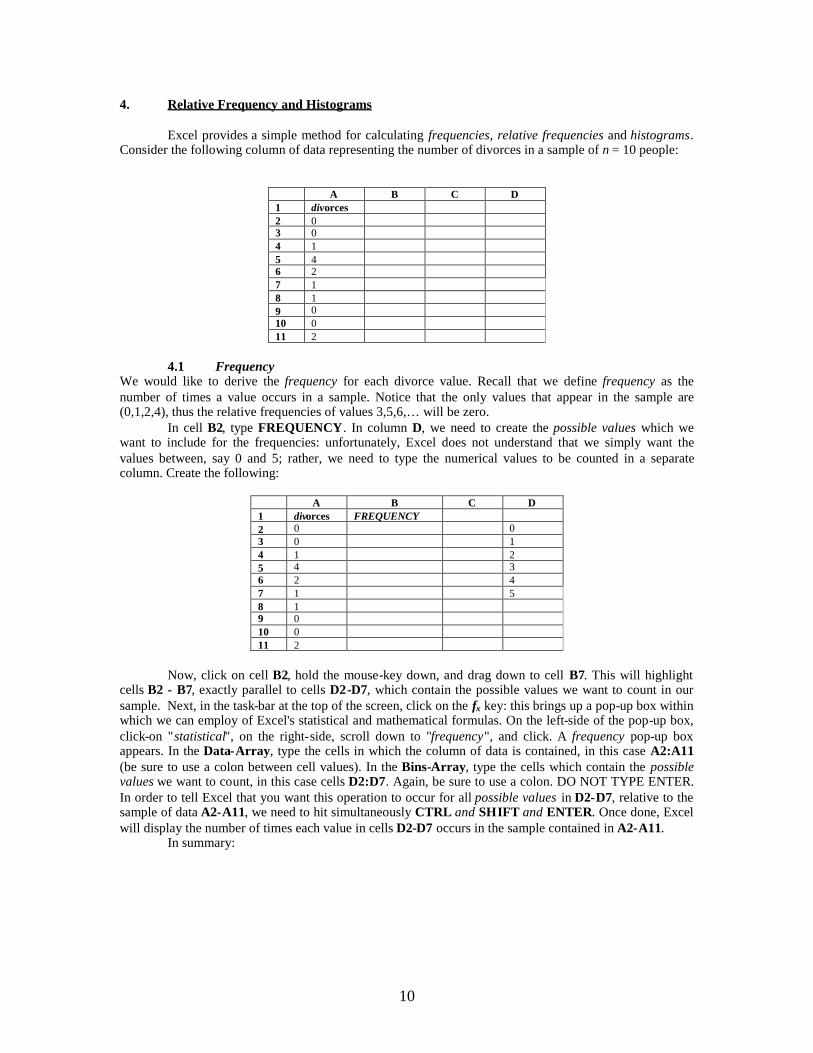
4. Relative Frequency and Histograms
Excel provides a simple method for calculating frequencies, relative frequencies and histograms.Consider the following column of data representing the number of divorces in a sample of n = 10 people:
A B C D1 divorces2 03 04 15 46 27 18 19 010 011 2
4.1 FrequencyWe would like to derive the frequency for each divorce value. Recall that we define frequency as thenumber of times a value occurs in a sample. Notice that the only values that appear in the sample are(0,1,2,4), thus the relative frequencies of values 3,5,6,… will be zero.
In cell B2, type FREQUENCY. In column D, we need to create the possible values which wewant to include for the frequencies: unfortunately, Excel does not understand that we simply want thevalues between, say 0 and 5; rather, we need to type the numerical values to be counted in a separatecolumn. Create the following:
A B C D1 divorces FREQUENCY2 0 03 0 14 1 25 4 36 2 47 1 58 19 010 011 2
Now, click on cell B2, hold the mouse-key down, and drag down to cell B7. This will highlightcells B2 - B7, exactly parallel to cells D2-D7, which contain the possible values we want to count in oursample. Next, in the task-bar at the top of the screen, click on the fx key: this brings up a pop-up box withinwhich we can employ of Excel's statistical and mathematical formulas. On the left-side of the pop-up box,click-on "statistical", on the right-side, scroll down to "frequency", and click. A frequency pop-up boxappears. In the Data-Array, type the cells in which the column of data is contained, in this case A2:A11(be sure to use a colon between cell values). In the Bins-Array, type the cells which contain the possiblevalues we want to count, in this case cells D2:D7. Again, be sure to use a colon. DO NOT TYPE ENTER.In order to tell Excel that you want this operation to occur for all possible values in D2-D7, relative to thesample of data A2-A11, we need to hit simultaneously CTRL and SHIFT and ENTER. Once done, Excelwill display the number of times each value in cells D2-D7 occurs in the sample contained in A2-A11.
In summary:
11
i. Highlight cells
A B C D1 divorces FREQUENCY
2 0 0
3 0 1
4 1 2
5 4 3
6 2 4
7 1 5
8 1
9 0
10 0
11 2
ii. Click on the fx key, click on statistical, then frequency. Type in A2:A11 in the Data-Array, and type in D2:D7 in the Bins-Array.
iii. Hit simultaneously CTRL and SHIFT and ENTER. The result:
A B C D1 divorces FREQUENCY2 0 4 03 0 3 14 1 2 25 4 0 36 2 1 47 1 0 58 19 010 011 2
Thus, the value 0 occurs 4 times, 1 occurs 2 times, 2 occurs twice, 3 never occurs, 4 occurs onces, zero 5's,and of course, zero 6's, etc.
4.2 Relative FrequencyRecall that the relative frequency is the frequency relative to the sample size. Thus, for example, therelative frequency of the value of 0 divorces represents the percent of the sample which has this value ofdivorces. In this case, the relative frequency of 0 is 4/10 = .4 0, or 40% of the people in our sample have avalue of 0 divorces. To derive the relative frequency, simply use column C, and perform a basic new-variable derivation, as detailed in Section 1.
Type "REL. FREQ." in cell C1 . Click on cell C2, type
=B2/10
then hit ENTER. Excel will derive 4/10 for you, and present .40. To derive the rest of the relativefrequencies, click on cell C2, hold the cursor over the small black box in the lower right corner, click, holdand drag down over cells C3 - C7. The result, after formatting the numerical values to have 2 decimalplaces, is
12
A B C D1 divorces FREQUENCY REL. FREQ.2 0 4 0.40 03 0 3 0.30 14 1 2 0.20 25 4 0 0.00 36 2 1 0.10 47 1 0 0.00 58 19 010 011 2
Clearly, the relative frequencies must sum to 1.00 (one).
4.3 HistogramA simple method of graphically representing an array of relative frequencies if the histogram. We will useExcel's ability to create graphs to build a histogram: further details on graphs and figures is presented inSection 8.
4.3.1 Create the Rough Figure ShapeFirst, highlight the cells that contain the relative frequency information, as well as the label "REL.
FREQ.":
A B C D
1 divorces FREQUENCY REL. FREQ.
2 0 4 0.40 0
3 0 3 0.30 1
4 1 2 0.20 2
5 4 0 0.00 3
6 2 1 0.10 4
7 1 0 0.00 5
8 19 010 011 2
Next, go to the task bar at the top of the screen, click on the little colored bar-chart that is twobuttons to the left of the screen percent size [e.g. 100%]. A pop-up box appears. Click on "StandardTypes", then "Column". Then, click on "Next": Excel will show you the basic set-up of the resulting chart.Click on "Next" again: a pop-up box allowing for substantial alterations of the basic outlook of the bar-chart appears. Type in the Title as "Relative Frequency of Divorces", type is Category X as "Number ofDivorces", and type in Category Y as "f(x)/n". If you want to remove the grid-lines, click-on Gridlines, andclick-on any box with a check-mark in it: this will remove the mark, and remove the associated grid-lines.Because the legend (the graph box that describes the variable) is redundant, click-on Legend, then click offthe mark on "Show Legend". Finally, click on Finish at the bottom of the pop-up box. The result is thefollowing histogram:
Relative Frequency of Divorces
0.00
0.20
0.40
0.60
1 2 3 4 5 6
Number of Divorces
f(x
)/n
13
4.3.2 Refine the X-axisObserve that unless we tell Excel otherwise, it will automatically display X-axis values starting at
1: For our histogram purposes, however, this is in error: the smallest number of divorces possible is, ofcourse, zero.
In order to specify to Excel the correct X-axis array of values, in our case 0 – 5, perform thefollowing task. First, recall that column D contains the possible values, 0 – 5. Now, point the cursor overthe white-area of the chart, and click once: this highlight the chart with small black dots around the border.Go to the task-bar at the top of the screen, click on CHART, SOURCE DATA, then SERIES. At thebottom of the pop-up box, there is a white-area next to “Category (X) Axis”. Click once in this area: thisplaces Excel’s cursor in the box. Now, move the mouse cursor over the cell that contains the first possiblevalue, 0: in our case, the cell is D2. Click once and hold, dragging the cursor down over all cells thatcontain possible, cells D2 – D7. Once you reach cell D7 , let go of the mouse button: Excel willautomatically fill in the cell range D2 – D7 into the white area to the right of “Category (X) Axis”. Oncethis is done, click on OK at the bottom of the pop-up box.
The result is as follows:
See Section 8 for further information about graph/chart/figure formatting.
Relative Frequency of Divorces
0
0.1
0.2
0.3
0.4
0.5
0 1 2 3 4 5
Number of Divorces
f(x)
/n
14
5. Probability Distribution Functions
Excel provides a simple means for deriving the probability distribution functions or cumulativedistribution functions for a variety of discreet and continuous random variables. In this section, we willstudy Excel’s built in mathematical operations relating to the pdf’s of the binomial, the poission, normaland Student’s t distributions.
5.1 Discreet Distribution Functions
5.1.1 Binomial DistributionConsider the following set-up. We have 5 people drawn from a population in which p = 35% are smokers.We want to tabulate the probability distribution function of the number of smokers X in our group of n = 5people. The easiest way to derive the probability distribution function is by first creating a columncontaining all possible values of X, in this case (0,1,2,3,4,5):
A B C1 X2 03 14 25 36 47 5
Now, in cell B1 type P(X). In cell B2, type the command
=binomdist(A2, 5, .35, false)
Then hit ENTER. The command “false” indicates that we want a probability distribution function, andNOT a cumulative distribution function. The result is
A B C1 x PX(X=x)2 0 0.1160293 1 0.3123864 2 0.3364165 3 0.1811476 4 0.0487707 5 0.005252
Consider, next, deriving the cumulative distribution function, F(X < x). Type FXX < x) in cell C1,click on cell C2, and type the command
=binomdist(A2, 5, .35, true)
Next, click on cell C2, the hold the cursor above the small black box, click and drag over cells C3-C7. Theresult, after formatting the cells to show 4 decimal places, is the complete cdf for x = (0,1,2,3,4,5):
A B C1 x PX(X=x) FX( x)2 0 0.1160 0.11603 1 0.3124 0.42844 2 0.3364 0.76485 3 0.1811 0.94606 4 0.0488 0.99477 5 0.0053 1.0000
15
Graphically, we can employ the techniques discussed in Sections 4 and 8 for creating a bar-chartof the pdf and cdf. Consider the pdf contained in cells C2-C7. Highlight the cells C2-C7 , and create a bar-chart using said techniques. Remember to change the X-axis values: our random variable’s possible valuesstart at 0, and the cells that contain the possible values, in our case, are A2-A7. The result is:
5.1.2 PoissonThe poisson distribution is helpful for modeling the probability of discreet occurrences of some event, x. Inparticular, the random variable must be zero or positive and discreet. For example, the number of times avolcano erupts in a year can be assumed to be a poisson random variable.
Recall the probability distribution function of a poisson random variable of x occurrences:
!)(
xe
xPx
where it can be shown the parameter satisfies
][][ xVxE
Excel provides a means for deriving P(x) based on x and the mean, . In this case, you can thevalues of x and contained in cells, or you can simply use Excel to derive a probability by typing thevalues in directly. Consider the latter quick method, and consider a blank grid spread:
A B1234
Suppose you want to derive P(x = 5) for a poisson random variable x with mean = 2. Click on any cell,say A1, and type
=poisson(5,2,false)
where "false" dictates that we want the probability at the point x = 5, and NOT the cumulative distributionup to x = 5. Hit ENTER, and Excel displays the odds of such an event:
A B1 .036089234
If you have an array of values x from the same poisson distribution (i.e. with the same mean and variance,), then type in cell values instead of numerical values. For example, consider the following array of x 'sfrom a poisson distribution where = 2:
PDF for Binomial Random Variable (n = 5, = .35)
0
0.1
0.2
0.3
0.4
0 1 2 3 4 5
x
P(X
=x)
16
A B1 x2 03 14 25 3
Click on cell B2, and type the command=poisson(A2,2,false)
Then hit ENTER. Subsequently, point and click on cell B2, aim the cursor above the small black box, clickand drag down over the remaining cells, B3-B5. The result is P(x) for x = 0,1,2,…,9:
We can use the graphical methods described in Section 4 on histograms to create a figure for theabove probability distribution. Highlight the cells containing the probabilities, B2-B11, and using themethods described in Section 4 (for the title, and x-axis and y-axis labels), create a bar graph. We obtain:
Intuitively, for a poisson random variable x with a mean of 2, there will be great odds that the actual valueof x will be near 1 (i.e. 0,1,2,3,4). Hence, the pdf is stacked near 2 (high probability values at 0,1,2,3,4).
For a cumulative distribution value, simply use "true" instead of "false":
Probability Distribution of aPoison Random Variable
00.05
0.10.150.2
0.250.3
0 1 2 3 4 5 6 7 8 9x
P(X
=x
)
17
A simple bar-chart plot of the CDF, above, follows:
5.2 Continuous Distribution FunctionsFor all subsequent probability derivations, the only changes from the above methods in the particularcommand required. We can derive continuous probabilities P(x a) for normally or t-distributed randomvariables x by typing in the value a directly, or by using cells that contain various a 's.
5.2.1 Normal Distribution
5.2.1.1 Probabilities from any Normal Distribution
Let),(~ 2Nx
and suppose we want to derive)( axP
For example, let= 2 ,2 = 16 and a = 3. For direct computation, directly type in any cell
=normdist(3,2,16,true)
where "true" denotes that we want the cumulative distribution up to the value a. The result is .524918.Using the same procedure as with Binomial or Poisson random variables, we can instead use cell
values that contain a rather than directly typing in a.
5.2.1.2 Probabilities from The Standard Normal
Let)1,0(~ Nz
and suppose we want to derive)( azP
For example, let a = 1.23. For direct computation, directly type in any cell
=normsdist(1.23)
The result is .89065.
CDF for a Poisson Random Variable
0
0.20.4
0.60.8
11.2
0 1 2 3 4 5 6 7 8 9
xF(
x)
18
5.2.1.3 Cut-off Values of the Standard Normal
Suppose instead of a probability, for given a, we want some a for a given probability p. Forexample, suppose we want some a such that
95.)( azP
In any cell in Excel, type
=normsinv(.95)
The result is 1.644853.
5.2.2 Student's t Distribution
5.2.2.1 Probabilities from the t-Distribution
Excel provides a built-in operation for deriving "tail" probabilities of t-distributed random variables, x. Wedefine a "one-tail" probability as, for example,
)2( tP
or
)2( tP
and a "two-tailed" probability as)2or2()2|(| ttPtP
Suppose we want to derive the two-tailed probability
)75.1|(| tP
which is identical to
)75.1or75.1( ttP
for a t distributed random variable, x, with 5 degrees of freedom:
5~)75.1or75.1( ttttP
For a cumulative probability derivation of a t distributed random variable, x, use the following command:
=tdist(1.75,5,2)
where the final "2" denotes that we want a two-tailed derivation rather than a one-tailed probability. Theresult is .140522.
For a one-tailed probability,
)75.1( tP
19
use
=tdist(1.75,5,1)
and we obtain half of the two-tailed probability, .070261.
5.2.2.2 Two-Tailed Cut-off Values from the t-Distribution
As in the normal case, we have an inverse function for t-random variables that returns some a for agiven probability p. For example, suppose we want some a such that
25~010.)()()|(| ttatPatPatP
In Excel, type
=tinv(.01, 15)
The result is 2.787438.
20
6. Sample Bivariate Analysis: Sample Covariance and Correlation
A primary concern in the analysis of data is not measures of central tendency and dispersion, perse. Rather, we are interested in how economic phenomena relate to each other. For example, we might askwhether income tax increases will diminish net tax revenues collected and therefore threaten the solvencyof certain welfare programs. This topic is ultimately left for Econ. 120B and 120C, Econometrics 1 and 2,however the initial step entails the analysis of simple linear relationships by measures of covariance andcorrelation. Details on the theory of covariance and correlation can be found in Newbold, Chapter 4.
6.1 Sample CovarianceConsider the labor data again, without means, variances and standard deviations present:
A B C D E F1 hours wage ed age income_wage2 34 7.5 12 20 132603 50 20.8 18 37 540804 40 5.75 16 50 119605 30 12.90 14 42 2012467 MEAN 38.50 11.74 15.00 37.25 24856.008 VARIANCE 75.67 45.76 6.67 160.92 392402677.339 STAND. DEV. 8.70 6.76 2.58 12.69 19809.16
We would like to measure the degree of linear of dependence between work hours, wages education andage.
For the sample covariance between the relevant variables, we need to set up an area in the spread-sheet that can contain this information. Here, we will place the covariance information below the mean andvariance information. Type in cell A11 the title "COVARIANCE", and re-type the variable names in cellsC11 - F11 and B11 - B14:
A B C D E F1 hours wage ed age income_wage2 34 7.5 12 20 132603 50 20.8 18 37 540804 40 5.75 16 50 119605 30 12.90 14 42 2012467 MEAN 38.50 11.74 15.00 37.25 24856.008 VARIANCE 75.67 45.76 6.67 160.92 392402677.339 STAND. DEV. 8.70 6.76 2.58 12.69 19809.161011 COVARIANCE hours wage ed age12 hours13 wage14 ed15 age
We will fill out the table completely in order to make a point below. Click-on cell C12 in order to derivethe sample covariance between hours and hours. Type the command
=covar(B2:B5, B2:B5)
Excel will use the data in cells B2 - B5 (i.e. work hours) to derive the covariance between hours and itself.Type ENTER to complete the task. Note that the sample covariance between a variable and it self issimply a sample estimate of the variance. However, it is not an unbiased sample estimate of the variance.Specifically, Excel uses the following formula for sample covariance:
n
iii yyxx
nyx
1
^ 1),(cov
21
Thus, the sample between, say, x and x is
n
ii xx
nxx
1
2^ 1),(cov
which is a biased estimator of the variance. The unbiased variance estimator that Excel uses is
n
ii xx
nxx
1
2^
11),(var
Next, perform the task for the covariance between hours and wages. Click-on cell D12, and type
=covar(B2:B5, C2:C5)
Then type ENTER. Excel will use the data for work hours (cells B2 - B5) and the data for wages (cells C2- C5) to derive the sample covariance. Repeat this task for all other combinations of variables (hours, ed),(hours,age), (wage,wage), (wage,ed), (wage,age), (ed,ed), (ed,age) and (age,age). We find, after formattingthe numbers to have four decimal places
A B C D E F1 hours wage ed age income_wage2 34 7.5 12 20 132603 50 20.8 18 37 540804 40 5.75 16 50 119605 30 12.90 14 42 2012467 MEAN 38.50 11.74 15.00 37.25 24856.008 VARIANCE 75.67 45.76 6.67 160.92 392402677.339 STAND. DEV. 8.70 6.76 2.58 12.69 19809.161011 COVARIANCE hours wage ed age12 hours 56.7500 26.1063 14.5000 13.385013 wage 34.3217 8.1875 0.003114 ed 5.0000 14.750015 age 120.6875
Now, recall that the covariance is symmetric, hence
),(),(^^
XYCOVYXCOV
which means we can ignore the rest of the cells. For example, the sample covariance between hours andwages in cell D12 is 26.1063. Likewise, the sample covariance between wages and hours would be26.1063, which could redundantly be placed in cell C13. Thus, the above covariance "table" is consideredcomplete.
6.2 Sample CorrelationConsider the correlation between hours and wages. Deriving the sample correlation is performed in amanner identical to the derivation of the covariance, except we use the command in cell D18 (see thepresentation, below)
=correl(B2:B5, C2:C5)
Like covariance, the sample correlation is symmetric, thus we do need to find the correlation betweenwages and hours. Recall that the correlation between a variable and itself is simple 1, thus you only need to
22
perform the operation for couples of different variables. Consider using the cells beneath the covariancecells. We can type "CORRELATION" in cell A17, and use the cells to the right to fill in the correlationderivations. After formatting the cells to allow for 5 decimal places, we obtain the following:
A B C D E F1 hours wage ed age income_wage2 34 7.5 12 20 132603 50 20.8 18 37 540804 40 5.75 16 50 119605 30 12.90 14 42 2012467 MEAN 38.50 11.74 15.00 37.25 24856.008 VARIANCE 75.67 45.76 6.67 160.92 392402677.339 STAND. DEV. 8.70 6.76 2.58 12.69 19809.161011 COVARIANCE hours wage ed age12 hours 56.7500 26.1063 14.5000 13.385013 wage 34.3217 8.1875 0.003114 ed 5.0000 14.750015 age 120.68751617 CORRELATION hours wage ed age18 hours .59153 .86080 .1616119 wage .62500 .0000520 ed .6004521 age
23
7. Interval Estimation
Consider the task of estimating a 95% Confidence Interval for the true mean of some variable.Recall that the confidence interval itself is
),()(%95 KXKXCI
where K satisfies
95.)( KxKP
Excel assumes the variable in question is either normally distributed, or the sample size is largeenough so that, by the Central Limit Theorem (see Newbold, Chapter 6), the sample mean will be nearlynormally distributed .
After some simplification (see Newbold, Chapter 8), we can solve directly for K based on Excel'sdistributional assumptions:
nK
96.1
Of course, we do not know the true standard deviation, thus we must give Excel a sample estimate of.In order to calculate a 95% confidence interval length, K, perform the following. Suppose the
sample size is 4, as it is in the previous section, and suppose an estimate of the standard deviation iscontained in cell B9, as it is for the variable hours, above. Click-on an empty cell (say, cell B24 for thevariable hours), the type
=confidence(.05, B9, 4)
then hit ENTER.Notice that the above command is specifically contoured to our needs. The general command
format is
=confidence(, , n)
where satisfies the (1 - )% confidence interval size, denotes the true standard deviation, and ndenotes the number of individuals in our group.
Excel will derive K and place it in the chosen cell. For clarity, we can type "95% CI: K" in cellA24, “95% Lower” in A25 and “95% Upper” in A26. Notice that we re-typed the variable names for easeof reference. The result is
A B C D E F1 hours wage ed age income_wage2 34 7.5 12 20 132603 50 20.8 18 37 540804 40 5.75 16 50 119605 30 12.90 14 42 2012467 MEAN 38.50 11.74 15.00 37.25 24856.008 VARIANCE 75.67 45.76 6.67 160.92 392402677.339 STAND. DEV. 8.70 6.76 2.58 12.69 19809.1610…2223 hours wage ed age income_wage24 95% CI: K 8.52451625 95% Lower26 95% Upper
Thus, the 95% CI for the sample of hours is
24
)02.47,98.29()52.850.38,52.850.38(
)52.8,52.8()(%95
xxCI
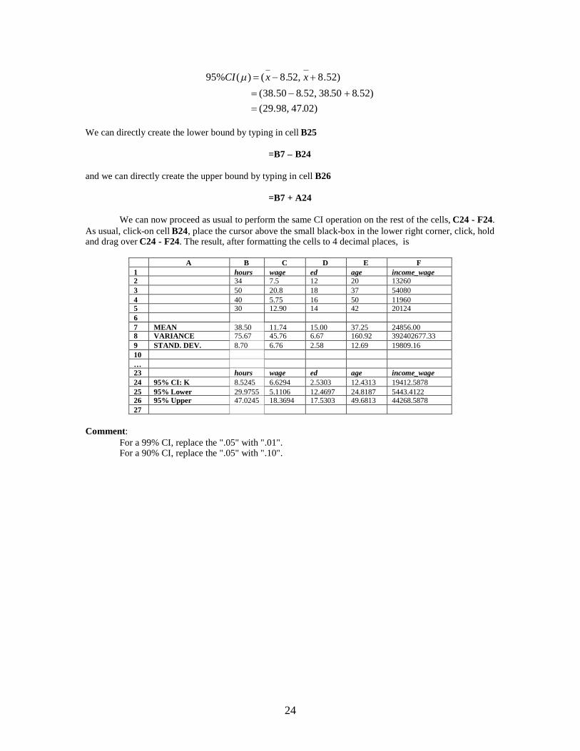
We can directly create the lower bound by typing in cell B25
=B7 – B24
and we can directly create the upper bound by typing in cell B26
=B7 + A24
We can now proceed as usual to perform the same CI operation on the rest of the cells, C24 - F24.As usual, click-on cell B24, place the cursor above the small black-box in the lower right corner, click, holdand drag over C24 - F24. The result, after formatting the cells to 4 decimal places, is
A B C D E F1 hours wage ed age income_wage2 34 7.5 12 20 132603 50 20.8 18 37 540804 40 5.75 16 50 119605 30 12.90 14 42 2012467 MEAN 38.50 11.74 15.00 37.25 24856.008 VARIANCE 75.67 45.76 6.67 160.92 392402677.339 STAND. DEV. 8.70 6.76 2.58 12.69 19809.1610…23 hours wage ed age income_wage24 95% CI: K 8.5245 6.6294 2.5303 12.4313 19412.587825 95% Lower 29.9755 5.1106 12.4697 24.8187 5443.412226 95% Upper 47.0245 18.3694 17.5303 49.6813 44268.587827
Comment:For a 99% CI, replace the ".05" with ".01".For a 90% CI, replace the ".05" with ".10".
25
8. Graphics: Charts, Tables and Figures
8.1 Scatter Plots: Two Variable Relationships
A scatter-plot present points (X,Y) in two-dimensional Euclidean space. For example, in the(WAGE,ED) space, a point would represent an individuals hourly wages and level of education:
ED151413121110
98
4 5 6 7 8 9 10 11 12 13 14 15 16 WAGE
Consider a sample of n = 10 years of aggregate U.S. health care expenditure, EXP_HEALTH, andreal income, INCOME.
We want to create a scatter-plot with income on the X-axis and health care expenditures on the income onthe X-axis and health care expenditures on the Y-axis.
This point denotes an individual's (WAGE, ED) = ($5.25/hour, 13 years)
26
Income versus Health Expenditure
0
5
10
15
20
25
0 1 2 3 4 5
Income
Hea
lth
Exp
end
itu
re
1. Click on cell A1 (the label INCOME), hold and drag over cells A1-A11 and B1-B11. That is,highlight the labels and data for expenditure and income:
A B
1 INCOME EXP_HEALTH
2 9.3 0.998
3 11.2 1.499
4 17.1 4.285
5 13.8 1.573
6 10.9 2.021
7 15.3 2.26
8 12.8 1.953
9 14.6 2.103
10 21.2 3.428
11 19.3 2.277
2. Next, go to the task bar at the top of the screen, click on INSERT, then CHART. A pop-up baxappears: for a scatter-plot, on the left side of the pop-up box, click on “standard types”, then “XY(Scatter)”. Click on NEXT at the bottom of the box: Excel will show you the graph with itsdefault style. We will add a title, axes labels and remove the grid-lines, next.
3. Click on NEXT again. Click on TITLE, and type “Income versus Health Expenditure”. UnderCategory (X) axis, type “Income”; under Value (Y) axis, type “Health Expenditure”. Click onGRIDLINES, and remove any check-marks by clicking on them: this will turn off all gridlines.Finally, click on LEGEND, and remove the check-mark in the legend box by clicking on it.
The result is the following polished scatter plot:
Comment1. Notice that a very clear linear relationship seems to exist: as real income increases,
consumers can afford more health care and subsequently purchase more health care.Indeed, the sample correlation between the two economic variates is .74, a strong positivevalue.
2. For editing (point colors, X-axis, background color, etc.), see the discourse under TimeSeries, below).
27
8.2 Time-Series: Line Plots: Multiple Variable Representations, PDF's, CFD'sOften, or data exists over time. Examples include GNP, the CPI, production indices, inflation rate,exchange rates, asset returns and stock market indices, etc. It is often usual to present such information in aconcise manner on the same graph.
Consider data U.S. GDP (in billions $), the money supply MS (in billions $) and gross privatedomestic investment GPDI:
In the following discourse, we will look at various graphical presentations of the above data.
8.2.1 Smooth Lines
Creating the FigureHighlight the data and labels by clicking on cell A1, hold and drag over cells A1-D23. The "year" variablehas already been formatted to be understood by Excel to be, in fact, a year. When we include this variablein a graph, Excel will not plot it: rather, Excel will use the year-formatted data for a time-line on the X-axis.
Next, go to the task bar, click-on INSERT , then CHART, then COSTUM TYPES, scroll down,and finally click-on Smooth Lines.
Click on NEXT: Excel shows you the default style of the figure. Click on NEXT again: a pop-upbox appears for title and label editing. Click on TITLE, and type under Chart Title, "U.S. Macro Data:1970-1991", or whatever you deem appropriate. Under Value (Y) Axis, type "Billions of $": this willprovide a Y-axis label explaining that the data is in billions of U.S. dollars (i.e. GDP = 1010.7 denotes1010.7billion = 1.0107 trillion dollars).
28
Finally, click on FINISH. Excel will present you the following figure:
8.3 Editing Graphs and FiguresConsider the figure we created for Gross Domestic Product and Investment data:
The year orientation is difficult to read, and we might want to change the yellow color of the linerepresenting GDPI over time to some darker hue. Also, for style (according to your personal interests aswell as readability for the viewer of your figure), we may want to remove the dark background color, oreved remove the outline boundary line of the entire figure, as well as re-locate the legend, and change thefont of the test used.
Line ColorIn order to change a line's color, double click on the line itself, and a pop-up box appears. Click onPATTERN, then COLOR, and chose a darker hue: here, we will choose a shade of green.
Background AreaIn order to remove the dark background, double click on the dark background itself, go to AREA and clickon NONE.
U.S. Macro Data: 1970-1991
0
1000
2000
3000
4000
5000
6000
197019
7119
7219
7319
741 97
519
7619
7719
7819
7919
8019
8119
8219
8319
841 98
519
8619
8719
8819
8919
9019
91B
illio
no
f$ GDP
MS
GDPI
U.S. Macro Data: 1970-1991
0
1000
2000
3000
4000
5000
6000
1970
1971
1972
1973
1974
1975
1976
1977
1978
1979
1980
1981
1982
1983
1984
1985
1986
1987
1988
1989
1990
1991
Bill
ion
of$ GDP
MS
GDPI
U.S. Macro Data: 1970-1991
0
1000
2000
3000
4000
5000
6000
1970
1971
1972
1973
1974
1975
1976
1977
1978
1979
1980
1981
1982
1983
1984
1985
1986
1987
1988
1989
1990
1991
Bill
ion
of$
GDP
MS
GDPI
29
BordersI prefer figures without outer boundaries. To create this effect, double click-on the white-area between theouter box and the inner box. A pop-up box appears: go to BORDER, and click on NONE. Also, we canremove the border around the legend: double-click on the legend, in the pop-up box, under BORDER, andclick on NONE,
X-Axis Label and OrientationFinally, to orient the year denominations, double click on the X-axis itself, then click on ALIGNMENT,and notice that a little line appears sprouting from the word Text . Click on this line, hold and drag the lineto an upward orientation. If you want the numerical values on the Y-axis to display dollar signs, doubleclick on the Y-axis, click on Number, Currency, go to Symbol, and click on $. Next to Decimal Places,because we like round numbers on the axes, type 0. We obtain:
FontsIf you prefer a different than the default font (usually 12-point), click ONCE on the white-area between theouter and inner boxes. Excel will "highlight" the figure by placing small black boxes in the outer corners.Next, at the top of the screen, in the task bar, change the font size to 10, or 8, or what-have-you. I prefer 10-point font.
Using the Left and Right Y-AxesFinally, some data is difficult to see because we represent it on the same Y-axis as data
with a very different size structure. For example, above, clearly GDP is much larger than GDPI, andtherefore some of the small year-to-year nuances of GDPI is lost in the large Y-axis used for GDP. Thereare, however, two Y-axes, the left and standard Y-axis, and the right Y-axis. Consider placing GDPI on itsown Y-axis, to the right. Click on the green, GDPI, line: a pop-up box appears. Click on Axis, then click onSecondary. Excel will orient the GDPI data on the right-side Y-axis, using a more convenient range ofnumerical values that befits the smaller values of the GDPI. Now, we can see specific year-to-year changes
U.S. Macro Data: 1970-1991
0
1000
2000
3000
4000
5000
6000
1970
1971
1972
1973
1974
1975
1976
1977
1978
1979
1980
1981
1982
1983
1984
1985
1986
1987
1988
1989
1990
1991
Bill
ion
of$
GDP
MS
GDPI
U.S. Macro Data: 1970-1991
$0
$1,000
$2,000
$3,000
$4,000
$5,000
$6,000
1970
1971
1972
1973
1974
1975
1976
1977
1978
1979
1980
1981
1982
1983
1984
1985
1986
1987
1988
1989
1990
1991
Bill
ion
of$ GDP
MS
GDPI
30
that were somewhat over-shadowed, above. As before, we can double click on the right Y-axis, click onNumber, Currency, go to Symbol, and click on $.
Figure TitleIf you want to enhance the figure title (increase font size, use italics, bold, etc.), click on the title
once, place the cursor anywhere above the title characters (the cursor should change in shape to a littleline), and click. Excel will now allow you to edit the title. You can highlight the title, and using the task barat the top of the screen, change the characters to italics, bold, change the font, etc. We will change thefont to 12-point and use bold:


![(5) C n & Excel Excel 7 v) Excel Excel 7 )Þ77 Excel Excel ... · (5) C n & Excel Excel 7 v) Excel Excel 7 )Þ77 Excel Excel Excel 3 97 l) 70 1900 r-kž 1937 (filllß)_] 136.8cm 136.8cm](https://static.documents.pub/doc/80x56/5f71a890b98d435cfa116d55/5-c-n-excel-excel-7-v-excel-excel-7-77-excel-excel-5-c-n-.jpg)


