96
Explore Data: Data Science + Visualization Roelof Pieters PhD candidate at KTH & Data Science consultant. @graphific
| Date post: | 28-Jul-2015 |
| Category: |
Presentations & Public Speaking |
| Upload: | roelof-pieters |
| View: | 1,502 times |
| Download: | 1 times |

Explore Data:Data Science + Visualization
Roelof PietersPhD candidate at KTH & Data Science consultant.
@graphific

(much thanks & graph love to fellow presenter Jay Solomon* / Augify)
*who unfortunately couldn't make it today
Visualizations are everywhere


Data Science Visualization

High friction softwareScientific Visualization Output from Algorithms
Data Science Visualization

Data journalismInfographic designVisualisation tools
Data Science Visualization
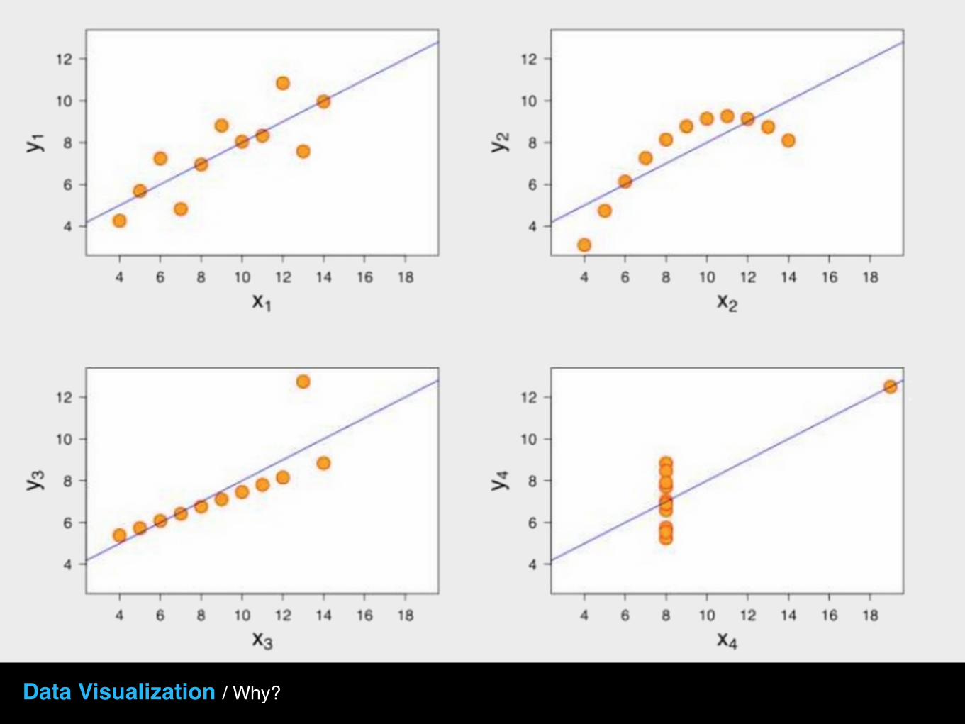
Data Visualization / Why?
Title
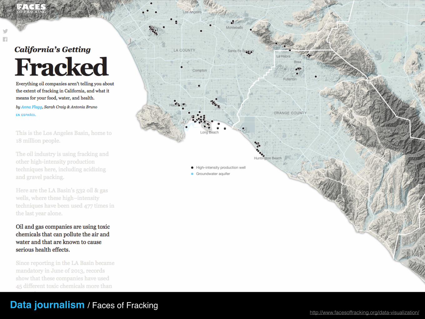
Data journalism / Faces of Frackinghttp://www.facesoffracking.org/data-visualization/
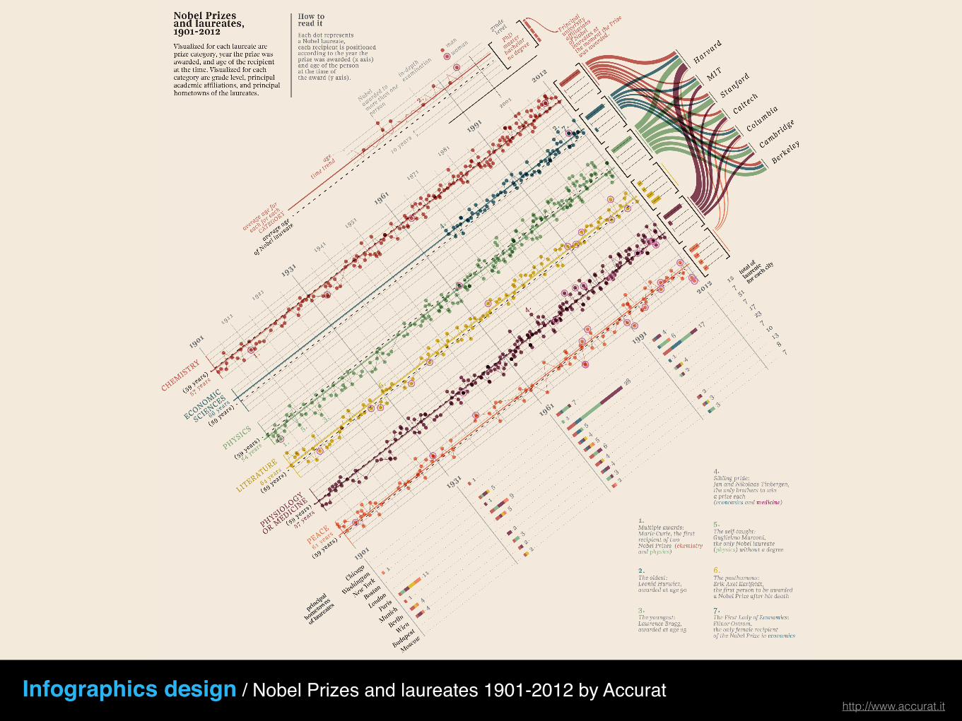
Infographics design / Nobel Prizes and laureates 1901-2012 by Accurathttp://www.accurat.it
Gephi gephi.github.io
Tableau www.tableausoftware.com
Bokeh bokeh.pydata.org/en/latest/
Processing processing.org
R-ggplot2 ggplot2.org
Visualisation tools
d3.js d3js.org
What is a Visualization?

Visualization is data communicated visually “with clarity, precision and efficiency” (Tufte)
Defined?

But it is more than that,
The role of visualization is to communicate data meaning through stories

The goal of visualization is to aid our understanding of data by leveraging the human visual system's highly-tuned ability to see patterns, spot trends, and identify outliers.
Well-designed visual representations can replace cognitive calculations with simple perceptual inferences and improve comprehension, memory, and decision making.
By making data more accessible and appealing, visual representations may also help engage more diverse audiences in exploration and analysis.
The challenge is to create effective and engaging visualizations that are appropriate to the data. A Tour Through the Visualization Zoo. Jeffrey Heer, Michael Bostock, and Vadim Ogievetsky.

The challenge is to create effective and engaging visualizations that are appropriate to the data.
A Tour Through the Visualization Zoo. Jeffrey Heer, Michael Bostock, and Vadim Ogievetsky.

This is a.. ?
and don’t you forget it :)
This is a Graph This is a Chart

Some interesting books…

How do you move from data to visualization?
How do you determine the appropriate visualization for your data?
How do you use visualizations to create meaning and extract valuable insights?
And many questions..

What’s in a Visualization?

Visual Storytelling Experience1 2 3
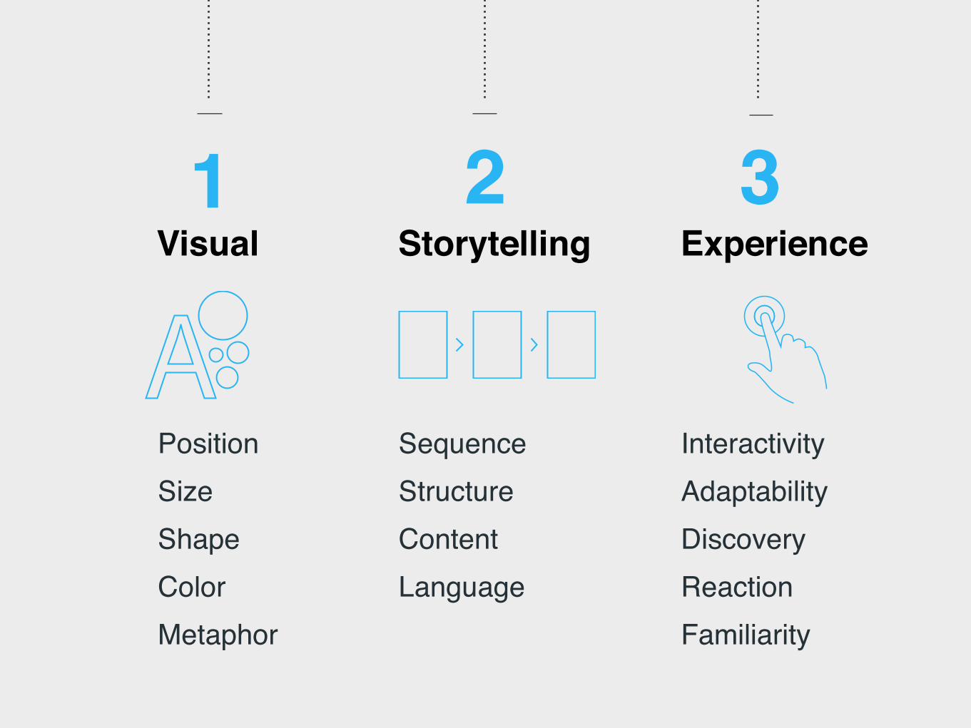
Position SizeShape ColorMetaphor
Sequence StructureContentLanguage
InteractivityAdaptabilityDiscoveryReactionFamiliarity
Visual Storytelling Experience1 2 3

1How do you make data visual?Visual

The goal of visualization is to aid our understanding of data by leveraging the human visual system's highly-tuned ability to see patterns, spot trends, and identify outliers.A Tour Through the Visualization Zoo. Jeffrey Heer, Michael Bostock, and Vadim Ogievetsky.

How would you visualize proportion?
Pie Donut Nightingale Voronoi
Stacked area chart Stacked bar Treemap

72% 68% 50% 47%
“Sneaker pickup”
videos
“First Impressions”
videos
Product “Review”
videos
“Haul” videos
Every decision counts; position, size and shape.
Growing genres of product reviews on youtubehttps://www.thinkwithgoogle.com/articles/i-want-to-buy-moments.html

72% 68% 50% 47%“Sneaker pickup”
videos
“First Impressions”
videos
Product “Review”
videos
“Haul” videos
Every decision counts; position, size and shape.
(Our version)
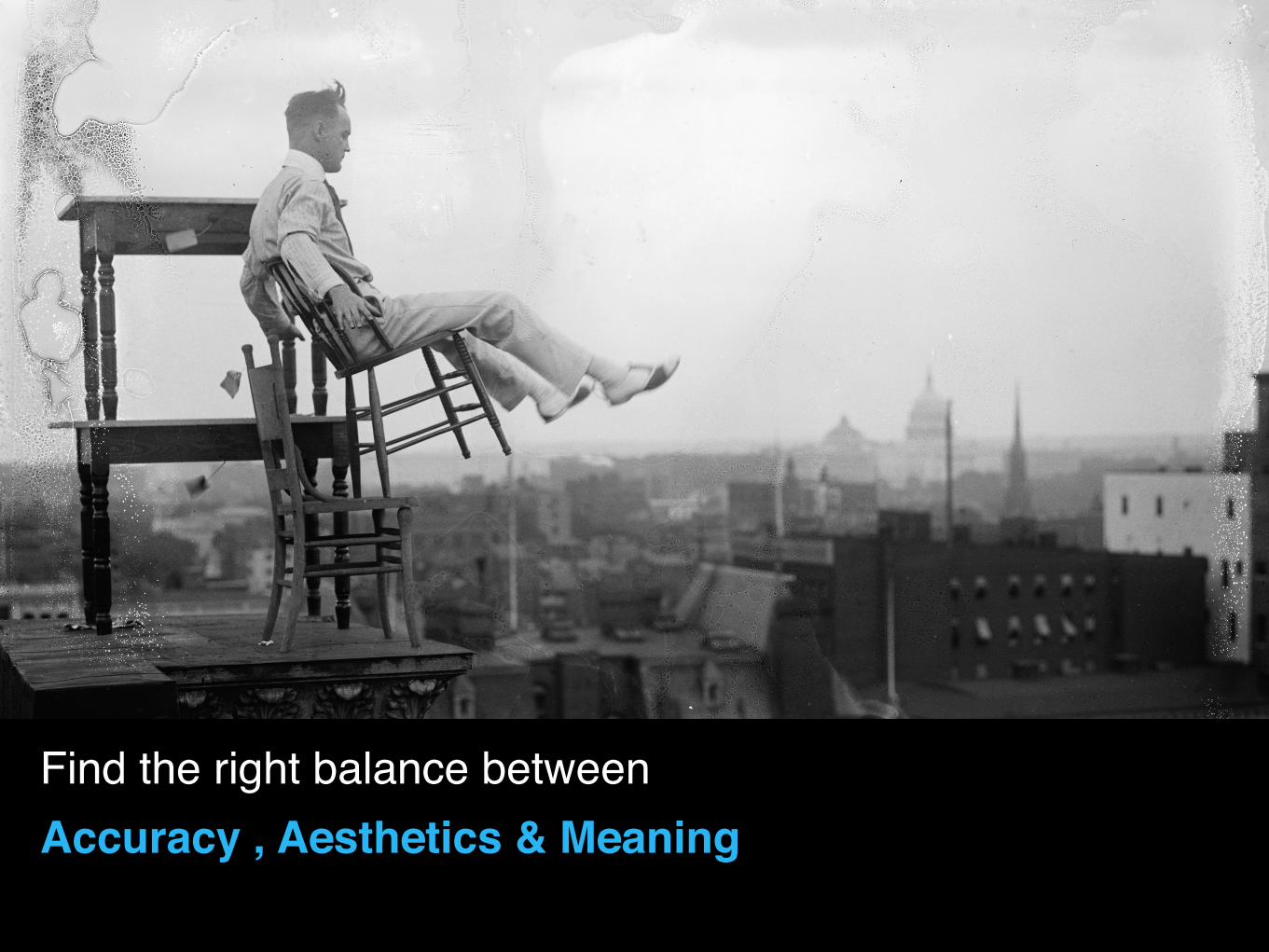
Find the right balance between Accuracy , Aesthetics & Meaning

http://www.nytimes.com/newsgraphics/2014/01/05/poverty-map/Color as a natural quantifier (Tufte)
http://www.nytimes.com/newsgraphics/2014/01/05/poverty-map/
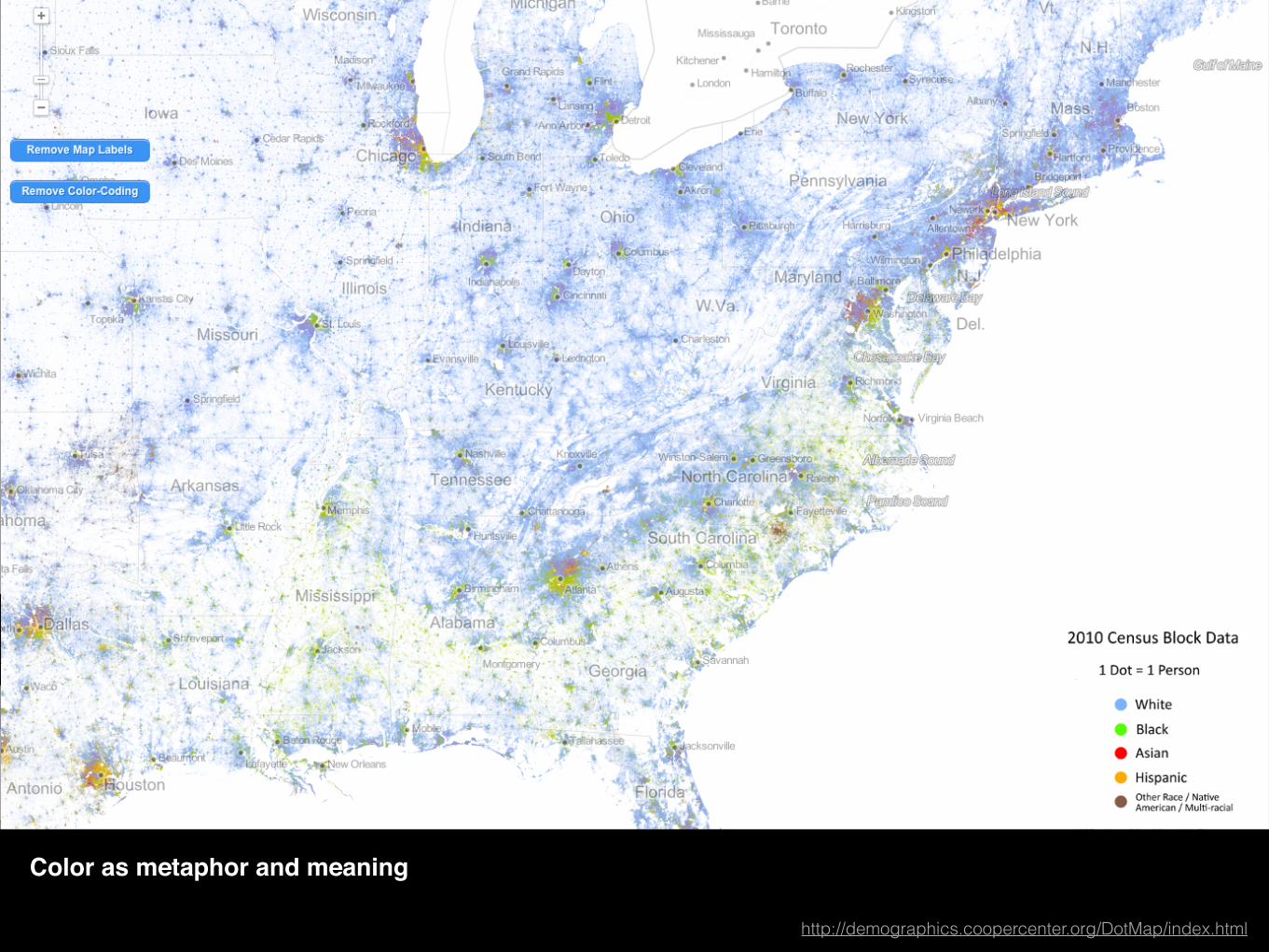
http://www.nytimes.com/newsgraphics/2014/01/05/poverty-map/Color as metaphor and meaning
http://demographics.coopercenter.org/DotMap/index.html
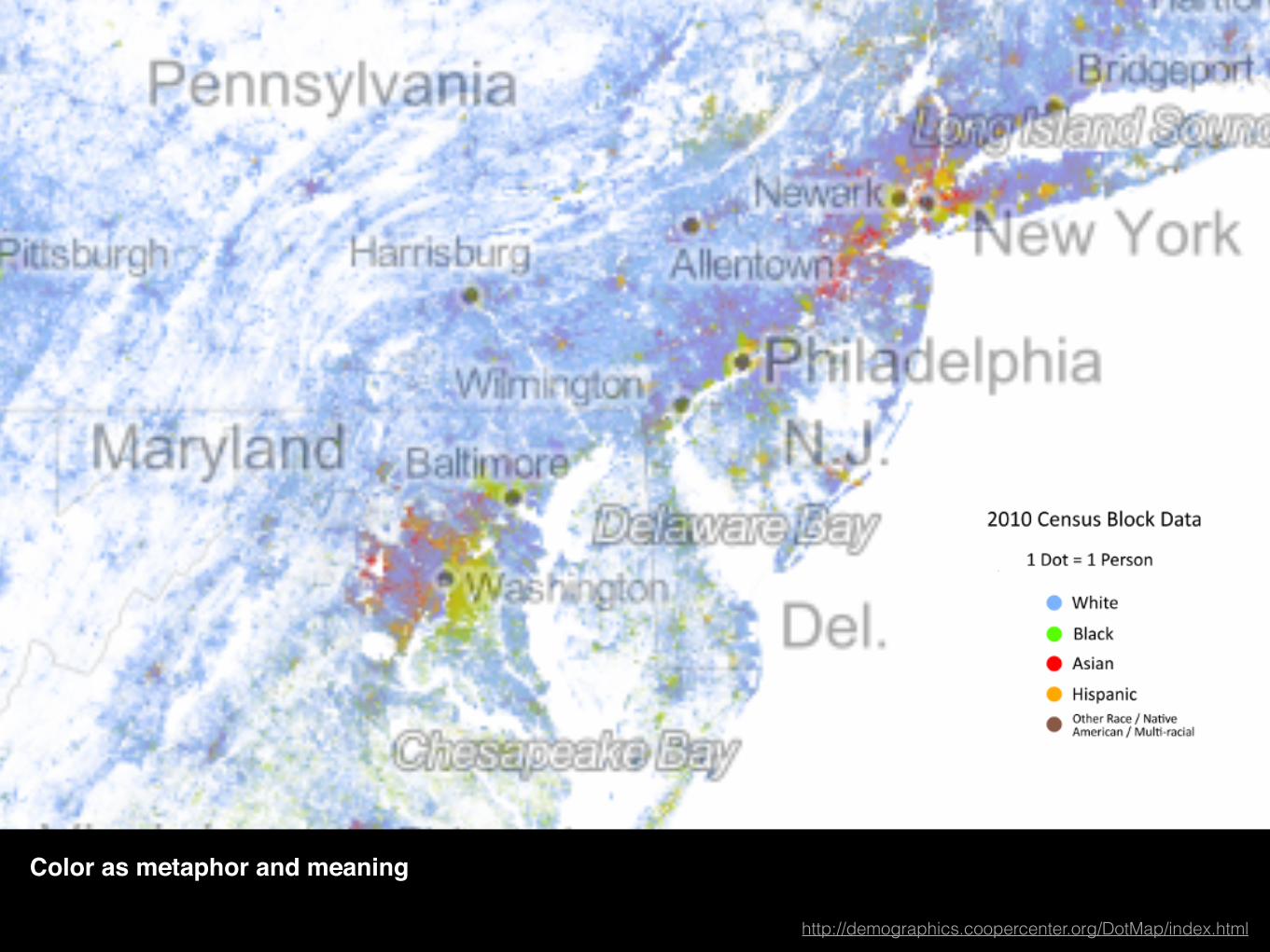
http://www.nytimes.com/newsgraphics/2014/01/05/poverty-map/Color as metaphor and meaning
http://demographics.coopercenter.org/DotMap/index.html

http://www.nytimes.com/newsgraphics/2014/01/05/poverty-map/
From “Envisioning Information”, Tufte. General Bathymetric Chan of the Oceans, International Hydrographic Organization (Ottawa, Canada, 5th edition, 1984), 5.06.
Color as metaphor and meaning

Title
http://drones.pitchinteractive.com
http://www.nytimes.com/newsgraphics/2014/01/05/poverty-map/Shape as visual metaphor
http://drones.pitchinteractive.com

http://www.nytimes.com/newsgraphics/2014/01/05/poverty-map/Shape as visual metaphor
http://chrisharrison.net/projects/bibleviz/BibleVizArc7.png

2How do you tell a story with data?Storytelling
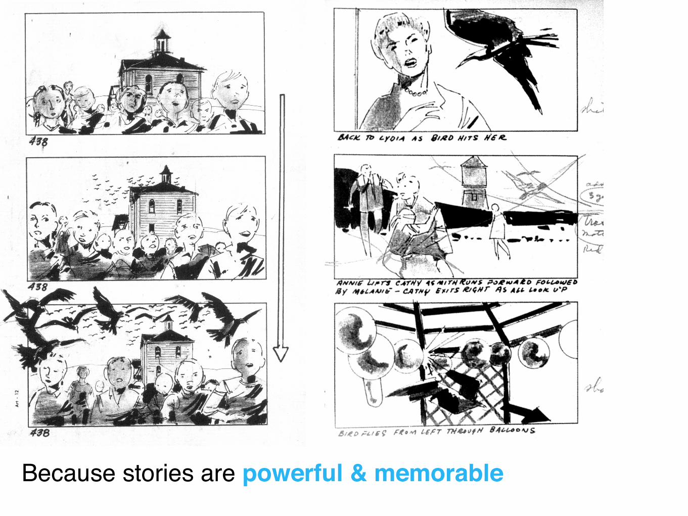
Because stories are powerful & memorable
Stories are made of conceptually separable episodes or sub-goals in a chain of actions that form the story’s plot.
Stories contain microstructures via the particular details of an event and macro-structure via the relationship of those events to one another in the plot
A Deeper Understanding of Sequence in Narrative Visualizsation. Hullman, Drucker, Riche…
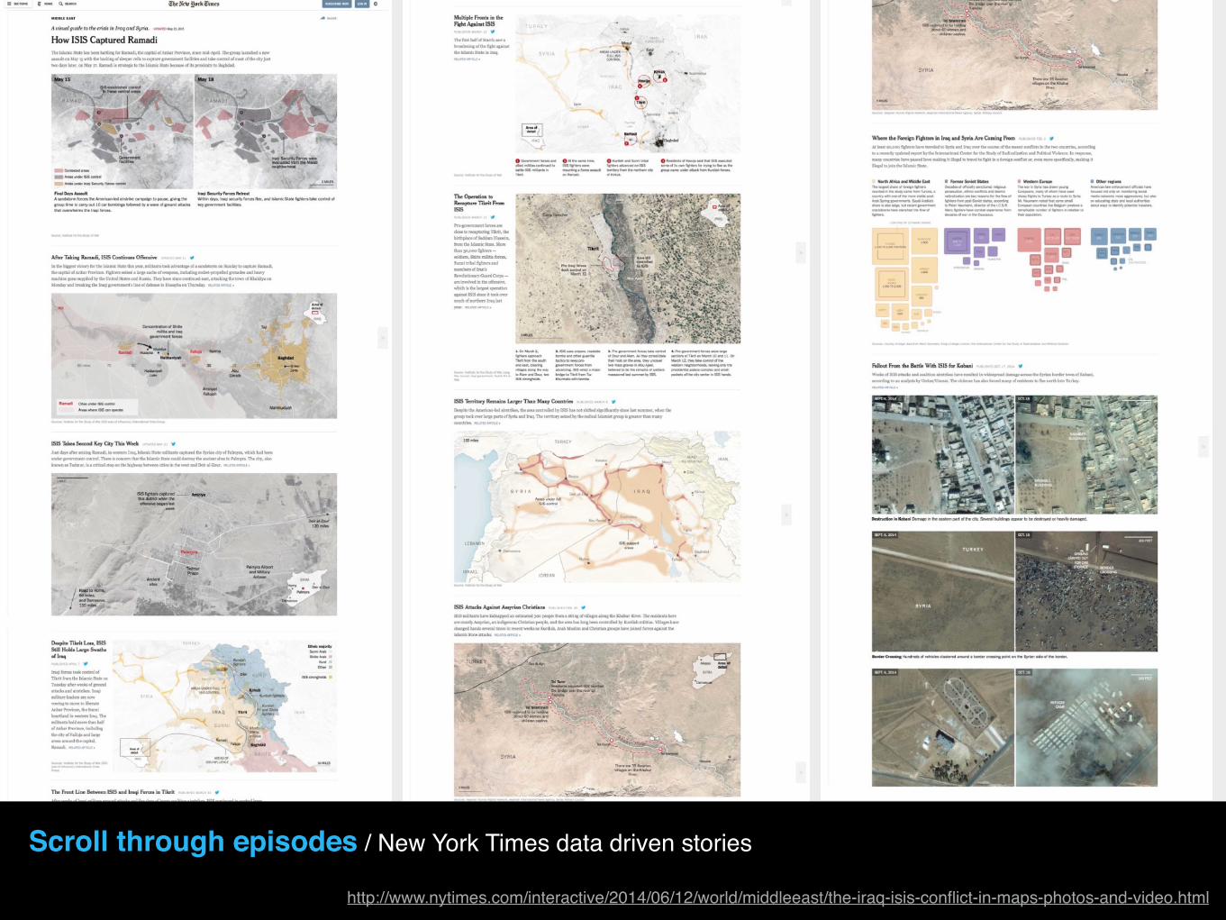
Scroll through episodes / New York Times data driven stories
http://www.nytimes.com/interactive/2014/06/12/world/middleeast/the-iraq-isis-conflict-in-maps-photos-and-video.html

Animated sequence / 2015 Measles outbreak
http://www.bloomberg.com/graphics/2015-measles-outbreaks/

Animated sequence / 2015 Measles outbreak
http://www.bloomberg.com/graphics/2015-measles-outbreaks/

Animated sequence / Bloomberg business
http://www.bloomberg.com/news/articles/2015-03-04/u-s-companies-are-stashing-2-1-trillion-overseas-to-avoid-taxes

Layering the data / Poverty Tracker, CPRC
http://povertytracker.robinhood.org

Interactive visualization / New York Times
http://www.nytimes.com/interactive/2014/upshot/buy-rent-calculator.html
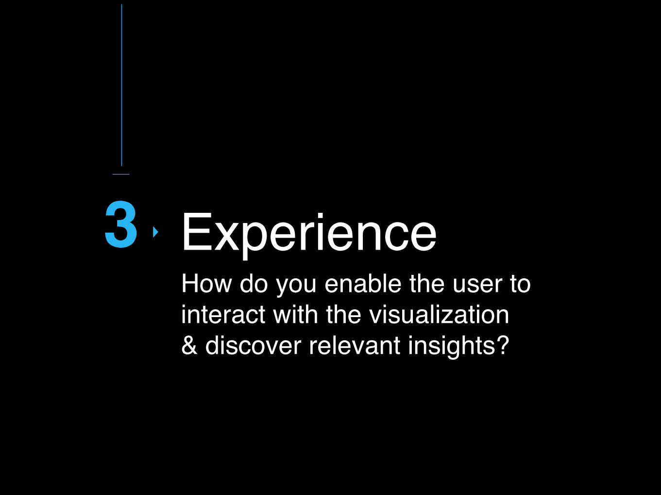
3How do you enable the user to interact with the visualization & discover relevant insights?
Experience
What is the story you want to tell?Unfocused query generates irrelevant story
#1 Query

What is the story you want to tell?
Identify appropriate data
Determine what question to ask
Guide through suggestions
=
INSIGHT

Like a novel, a narrative can be read through the
characters, the context, the events, the emotional
landscape

Enable exploration and discovery Reveal the data at several levels of detail, from a broad overview to the fine structure
#3 Filter
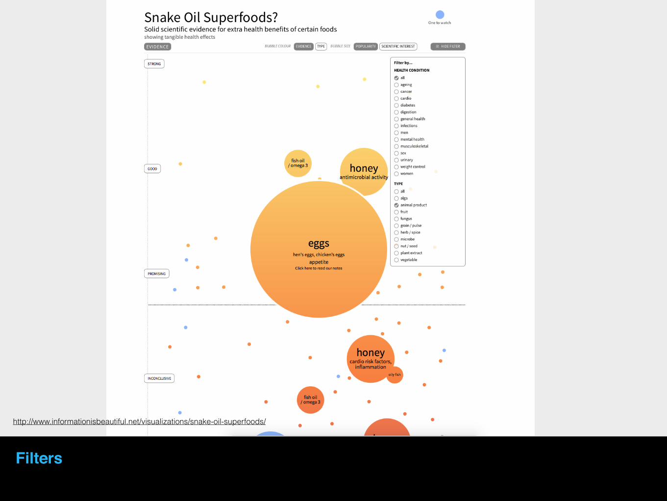
http://www.informationisbeautiful.net/visualizations/snake-oil-superfoods/
Filters
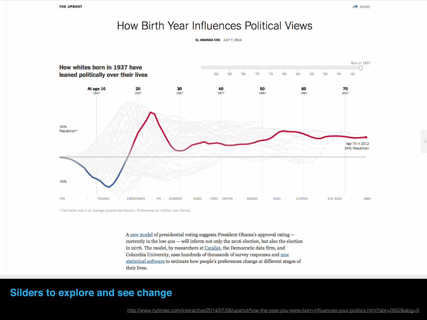
Silders to explore and see change http://www.nytimes.com/interactive/2014/07/08/upshot/how-the-year-you-were-born-influences-your-politics.html?abt=0002&abg=0

‘What if’ scenariohttp://www.nytimes.com/interactive/2014/11/04/health/visuals-ebola-model.html

http://www.nytimes.com/interactive/2014/11/04/health/visuals-ebola-model.html
‘What if’ scenario
Sometimes less is more Think of layering and separation of the data visualization, reduce the noise and let the content shine
#4 Options
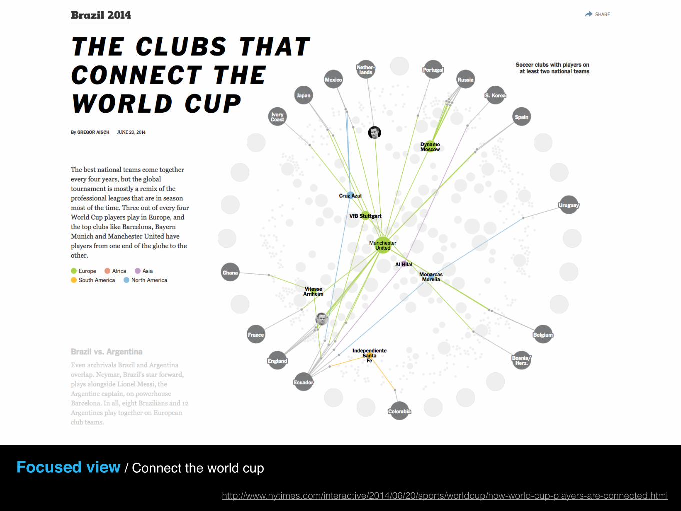
Focused view / Connect the world cup
http://www.nytimes.com/interactive/2014/06/20/sports/worldcup/how-world-cup-players-are-connected.html

Reduce the noise / What can you discover when you reduce the noise? Outliers, focused question and answer….
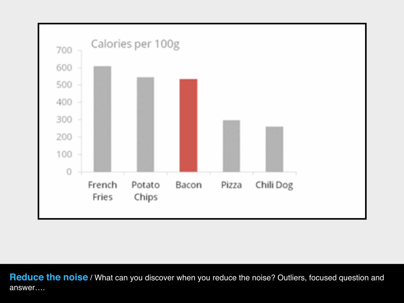
Reduce the noise / What can you discover when you reduce the noise? Outliers, focused question and answer….

Reduce the noise / What can you discover when you reduce the noise? Outliers, focused question and answer….

Divide the story to relevant portions. A complex graph may not be enough. Look at the micro vs. macro stories and how they help extract insights.
Try different metrics
#5 Insights

Small multiples / A visual guide to the crisis in Iraq and Syria.
http://www.nytimes.com/interactive/2014/06/12/world/middleeast/the-iraq-isis-conflict-in-maps-photos-and-video.html

Interactive linked small multiples / Close the gap
http://ri.id.au/closethegap

#7 Experiment & test your hypothesis… Until you find the best visual representation

Visualization that answers a question: Who is most affected?
http://www.nytimes.com/interactive/2013/05/27/science/drunk-driving-2011.html?_r=0
What about graphs?

Internet as a Graph
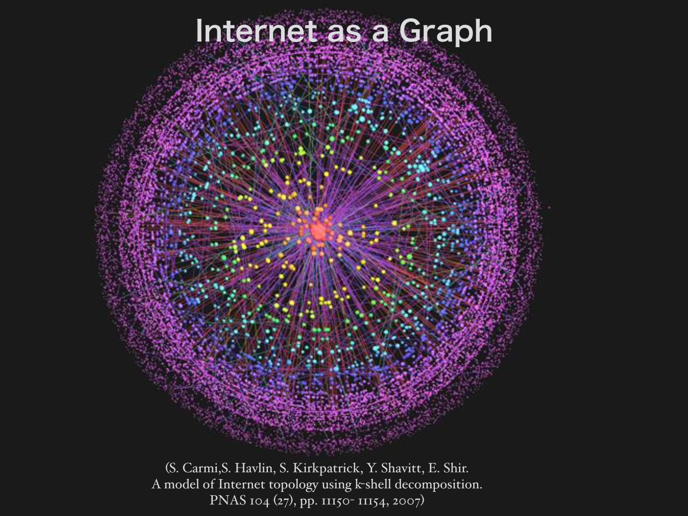
(S. Carmi,S. Havlin, S. Kirkpatrick, Y. Shavitt, E. Shir. A model of Internet topology using k-shell decomposition.
PNAS 104 (27), pp. 11150- 11154, 2007)
Internet as a Graph
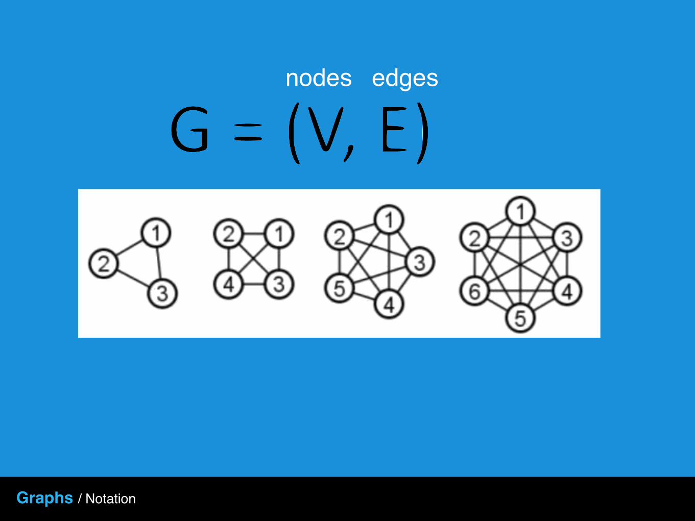
Graphs / Notation
nodes edges

Graphs / Notation
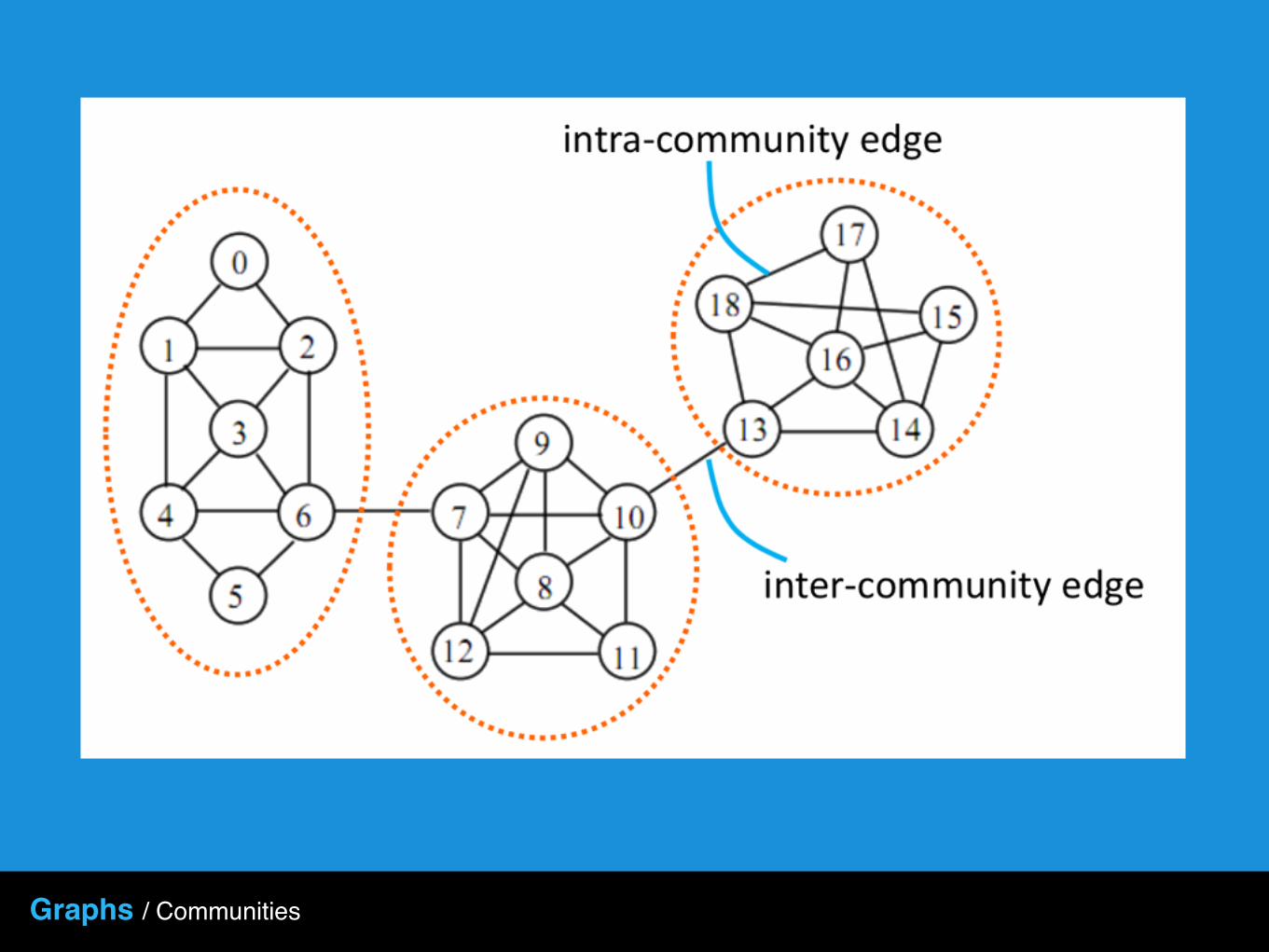
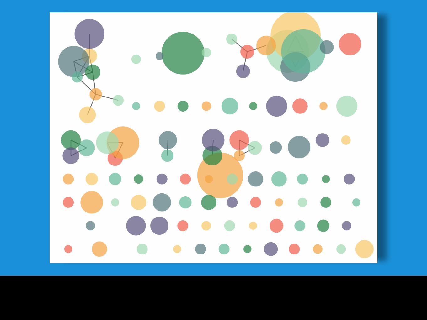
Graphs / Communities

Graphs / Community Attributes
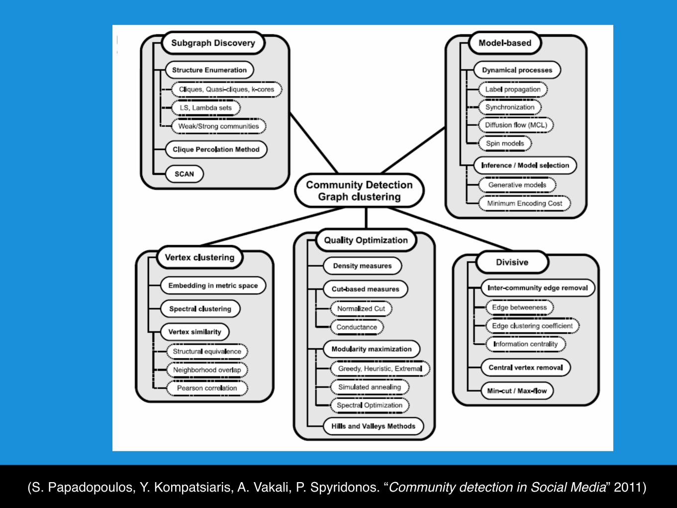
(S. Papadopoulos, Y. Kompatsiaris, A. Vakali, P. Spyridonos. “Community detection in Social Media” 2011)


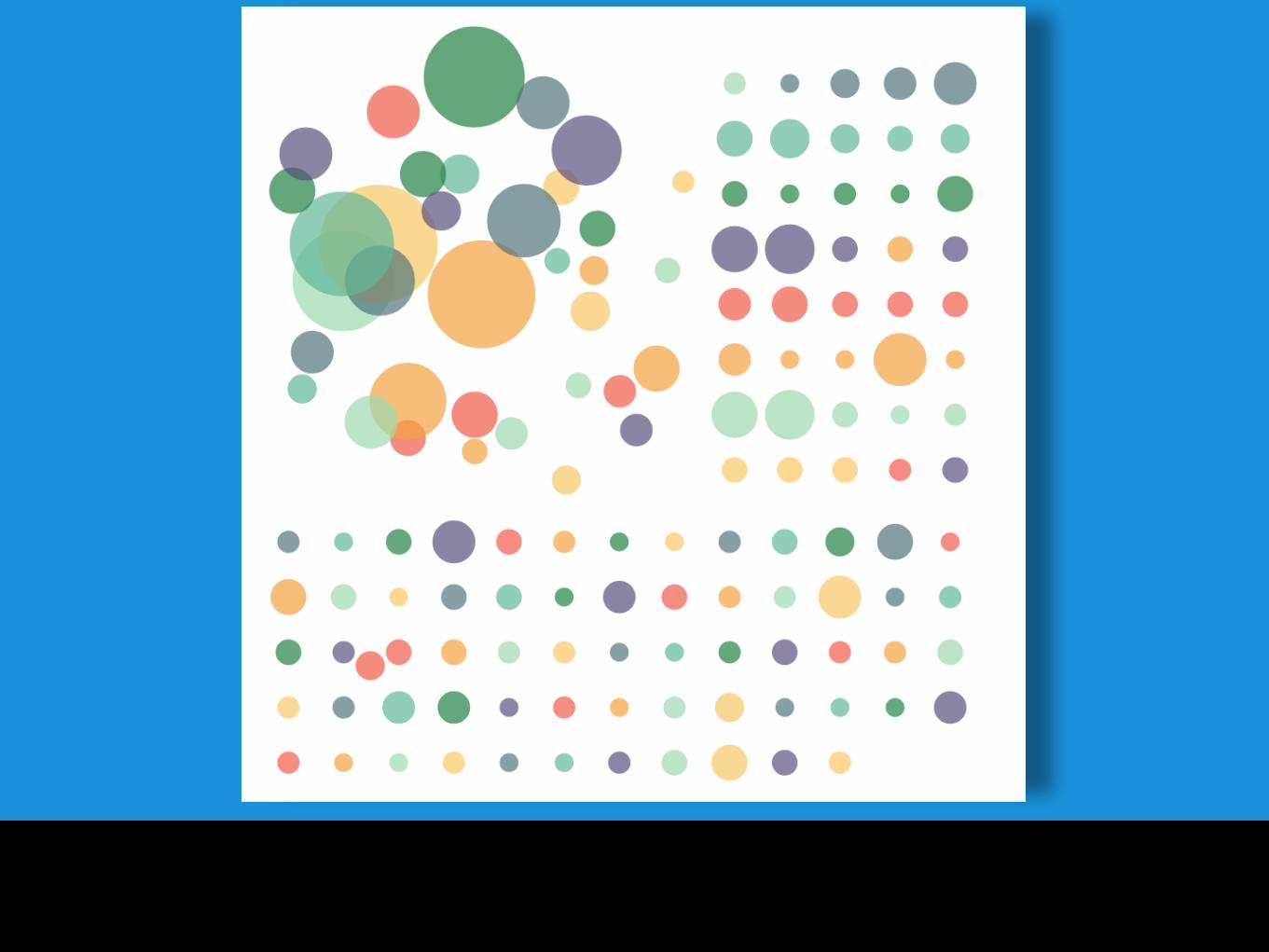
Connected Network
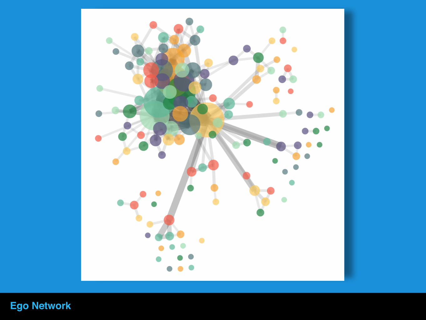
Ego Network

Demo Time
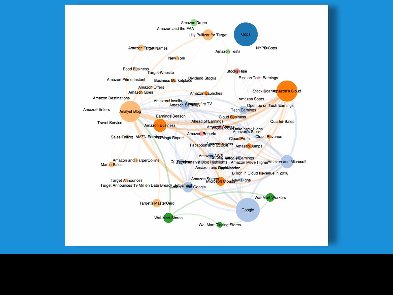

Chinese Conversation Networks on Weibo

Topic Networks

Topic Networks for Crisis Management and detection of interconnected topics

Conversation Networks

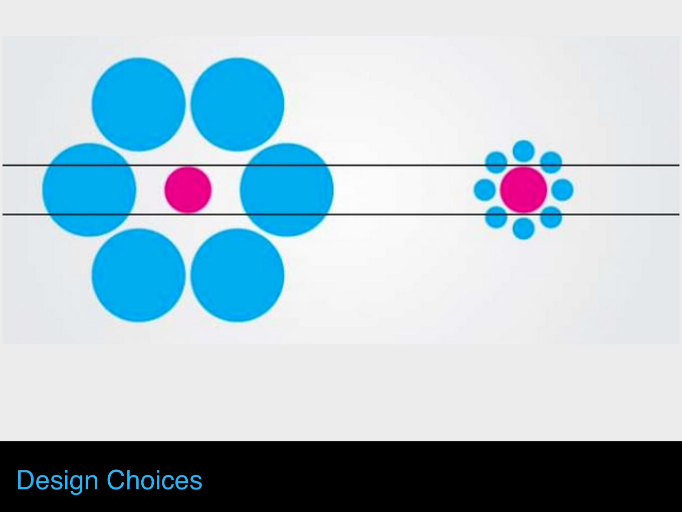
Design Choices
Design Choices

Design Choices

Design Choices

Design Choices

Design Choices

Design Choices

Thank you for your attention!