April 2019 Financial Alignment Initiative Massachusetts One Care: Third Evaluation Report Prepared for Sai Ma Centers for Medicare & Medicaid Services Center for Medicare & Medicaid Innovation Mail Stop WB-06-05 7500 Security Boulevard Baltimore, MD 21244-1850 Submitted by Edith G. Walsh RTI International 307 Waverly Oaks Road, Suite 101 Waltham, MA 02452-8413 RTI Project Number 0214448.001.007.000.000.006
Transcript
April 2019
Financial Alignment Initiative Massachusetts One Care:
Third Evaluation Report
Prepared for
Sai Ma Centers for Medicare & Medicaid Services Center for Medicare & Medicaid Innovation
Mail Stop WB-06-05 7500 Security Boulevard
Baltimore, MD 21244-1850
Submitted by
Edith G. Walsh RTI International
307 Waverly Oaks Road, Suite 101 Waltham, MA 02452-8413
RTI Project Number 0214448.001.007.000.000.006
_________________________________ RTI International is a registered trademark and a trade name of Research Triangle Institute.
FINANCIAL ALIGNMENT INITIATIVE MASSACHUSETTS ONE CARE: THIRD EVALUATION REPORT
by
Muskie School of Public Service, University of Southern Maine Elizabeth Gattine, JD Frances Jimenez, BA
RTI International Matthew Toth, PhD
Paul Moore, MA Joyce Wang, MPH
Emily Vreeland, MS Lanre Adisa, BA
Wayne L. Anderson, PhD Angela M. Greene, MS, MBA
Project Director: Edith G. Walsh, PhD
Federal Project Officers: Sai Ma
RTI International
CMS Contract No. HHSM-500-2014-00037i TO#7
April 2019
This project was funded by the Centers for Medicare & Medicaid Services under contract no. HHSM-500-2014-00037i TO #7. The statements contained in this report are solely those of the authors and do not necessarily reflect the views or policies of the Centers for Medicare & Medicaid Services. RTI assumes responsibility for the accuracy and completeness of the information contained in this report.
[This page intentionally left blank.]
ACKNOWLEDGEMENTS
We would like to thank the Commonwealth officials who contributed information reflected in this Evaluation Report through interviews during site visits and quarterly telephone calls. We also thank the Medicare-Medicaid enrollees, managed care plan staff, consumer advocates, and other stakeholders who also answered our questions about their experience and perspectives on the demonstrations. We gratefully acknowledge the many contributions of CMS staff, especially our COR, Sai Ma, and our former COR, Daniel Lehman. We also thank other staff at RTI International, the Urban Institute and the University of Southern Maine, who helped to gather information and produce tables for this report. Christopher Klotschkow, Roxanne Snaauw, and Catherine Boykin provided excellent editing and document preparation.
2. Demonstration Overview ........................................................................................................5 2.1 Demonstration Description and Goals ...........................................................................5 2.2 Changes in Demonstration Design.................................................................................6 2.3 Overview of State Context .............................................................................................6
3. Update on Demonstration Implementation .............................................................................9 3.1 Integration of Medicare and Medicaid ...........................................................................9
3.1.1 Joint Management of Demonstration .................................................................9 3.1.2 Operational Integration ....................................................................................10 3.1.3 Integrated Service Delivery .............................................................................10
3.2 Eligibility and Enrollment............................................................................................12 3.2.1 Eligibility and Enrollment Processes ...............................................................12 3.2.2 Phases of Enrollment .......................................................................................13 3.2.3 Disenrollment Experience ................................................................................14 3.2.4 Enrollment Outreach ........................................................................................14 3.2.5 Contacting and Locating Enrollees ..................................................................15
3.3 Care Coordination ........................................................................................................16 3.3.1 Assessment and Care Coordination Model ......................................................16 3.3.2 The Assessment and Care Planning Process ....................................................16 3.3.3 LTS Coordination and LTS Coordinator Role.................................................21
3.4 Stakeholder Engagement .............................................................................................22 3.4.1 Commonwealth Open Meetings ......................................................................23 3.4.2 Implementation Council Meetings ...................................................................23 3.4.3 Member Advisory Board Meetings .................................................................24
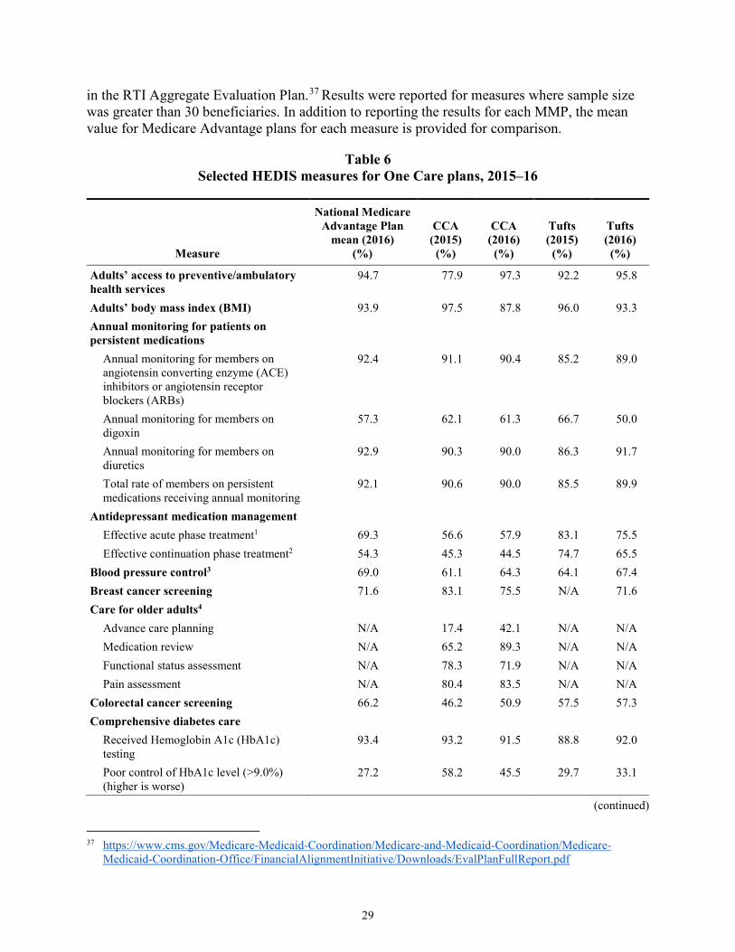
3.6 Quality of Care .............................................................................................................27 3.6.1 One Care Quality Measures .............................................................................27 3.6.2 Quality Management Structures and Activities ...............................................27 3.6.3 Independent Quality Activities ........................................................................28 3.6.4 Results for Selected Quality Measures ............................................................29
4. Beneficiary Experience .........................................................................................................33 4.1 Methods and Data Sources...........................................................................................33 4.2 Impact of the Demonstration on Beneficiaries ............................................................34
vi
4.2.1 Overall Satisfaction with the Demonstration ...................................................34 4.2.2 New or Expanded Benefits ..............................................................................36 4.2.3 Medical and Specialty Services .......................................................................37 4.2.4 Care Coordination Services .............................................................................38 4.2.5 Quality and Access to Care ..............................................................................39 4.2.6 Personal Health Outcomes and Quality of Life ...............................................40 4.2.8 Beneficiary Protections ....................................................................................41
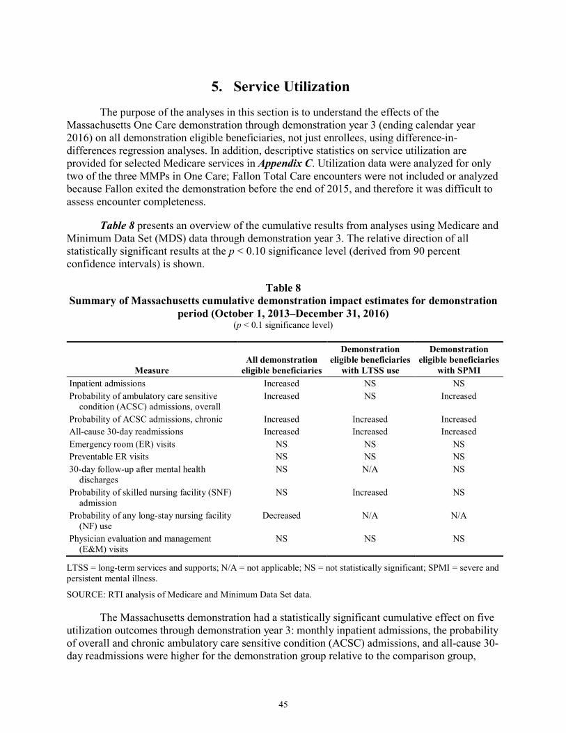
5. Service Utilization ................................................................................................................45 5.1 Overview of Benefits and Services ..............................................................................47 5.2 Impact Analyses on the Demonstration Eligible Population .......................................47
5.2.1 Descriptive Statistics on the Demonstration Eligible Population ....................56 5.2.2 Impact Analysis on Demonstration Eligible Beneficiaries with LTSS
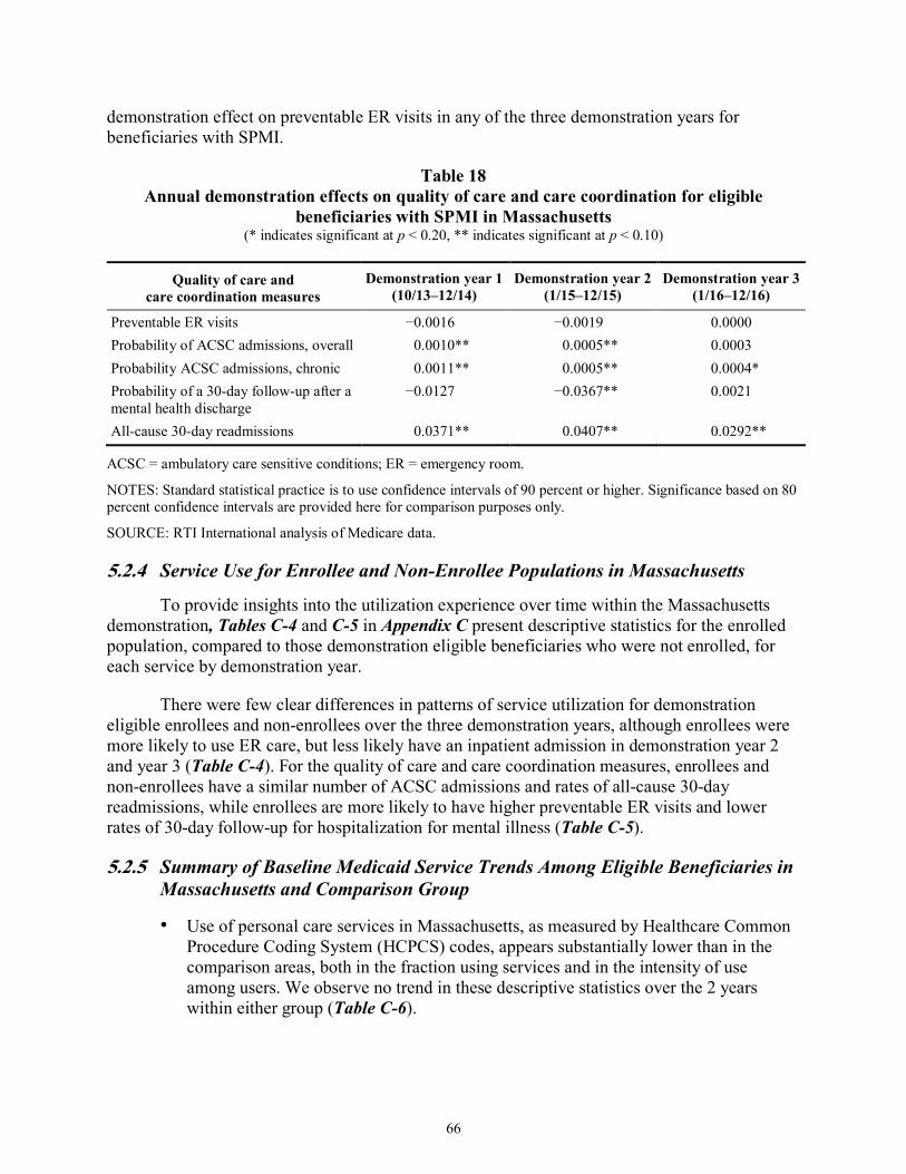
Use ...................................................................................................................56 5.2.3 Impact Analyses on the Demonstration Eligible Population with SPMI .........61 5.2.4 Service Use for Enrollee and Non-Enrollee Populations in
Massachusetts ..................................................................................................66 5.2.5 Summary of Baseline Medicaid Service Trends Among Eligible
Beneficiaries in Massachusetts and Comparison Group ..................................66 5.2.6 Summary of Massachusetts One Care Enrollee Utilization of
Medicaid-Type Services Derived from Encounter Data ..................................67 5.2.7 Service Use by Demographic Characteristics of Eligible Beneficiaries ..........68
7. Conclusions ...........................................................................................................................89 7.1 Implementation Successes, Challenges, and Lessons Learned ....................................89 7.2 Demonstration Impact on Service Utilization and Costs .............................................89 7.3 Next Steps ....................................................................................................................90
Appendixes A Comparison Group Methodology for Massachusetts Demonstration Year 3 ........... A-1 B Analysis Methodology ...............................................................................................B-1 C Descriptive Tables .....................................................................................................C-1 D Sensitivity Analysis Tables ....................................................................................... D-1
vii
List of Tables
Number Page
1 Percentage of members that One Care plans were unable to reach following three attempts, within 90 days of enrollment, by quarter ............................................................. 15
2 Care coordination staffing ................................................................................................... 18 3 Total percentage of enrollees whose assessment was completed within 90 days of
enrollment ............................................................................................................................ 18 4 Members with care plans within 90 days of enrollment ...................................................... 19 5 Members with care goals ..................................................................................................... 20 6 Selected HEDIS measures for One Care plans, 2015–16 .................................................... 31 7 Beneficiary overall satisfaction, 2015–17 ........................................................................... 36 8 Summary of Massachusetts cumulative demonstration impact estimates for
demonstration period (October 1, 2013–December 31, 2016) ............................................ 45 9 Massachusetts annual demonstration impact estimates for all demonstration eligible
beneficiaries (October 1, 2013–December 31, 2016) .......................................................... 46 10 Annual demonstration effects on service utilization for eligible beneficiaries in
Massachusetts ...................................................................................................................... 50 11 Annual demonstration effects on probability of long-stay nursing facility use for
eligible beneficiaries in Massachusetts ................................................................................ 50 12 Adjusted means and impact estimate for eligible beneficiaries in the demonstration
and comparison groups in Massachusetts through December 31, 2016 .............................. 51 13 Annual demonstration effects on quality of care and care coordination for eligible
beneficiaries in Massachusetts ............................................................................................. 54 14 Adjusted means and impact estimate for eligible beneficiaries in the demonstration
and comparison groups for Massachusetts through demonstration year 3 .......................... 55 15 Annual demonstration effects on service utilization for eligible beneficiaries,
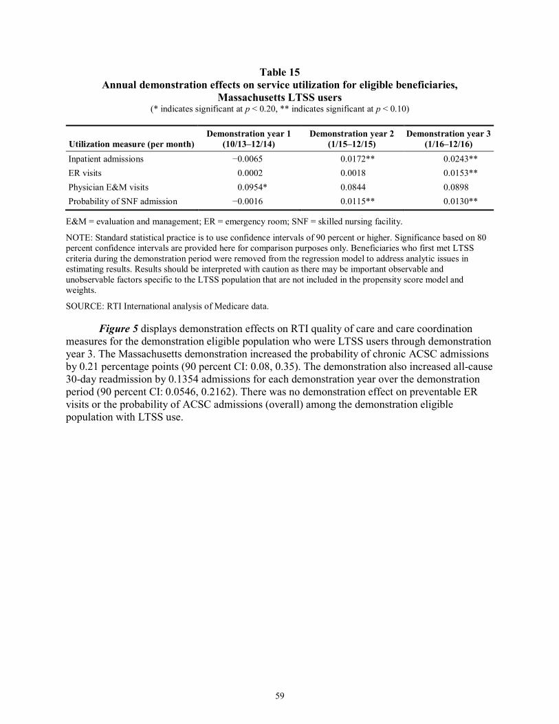
Massachusetts LTSS users ................................................................................................... 59 16 Annual demonstration effects on quality of care and care coordination for eligible
beneficiaries with LTSS use in Massachusetts .................................................................... 61 17 Annual demonstration effects on service utilization for eligible beneficiaries with
SPMI in Massachusetts ........................................................................................................ 63 18 Annual demonstration effects on quality of care and care coordination for eligible
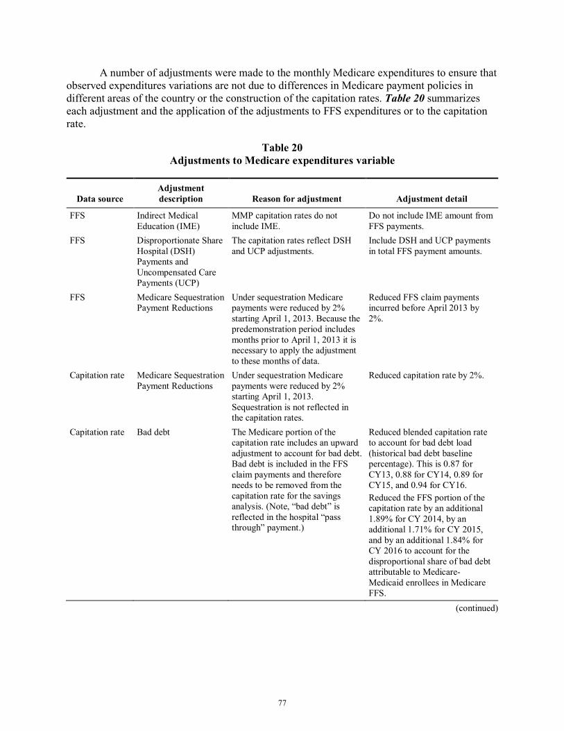
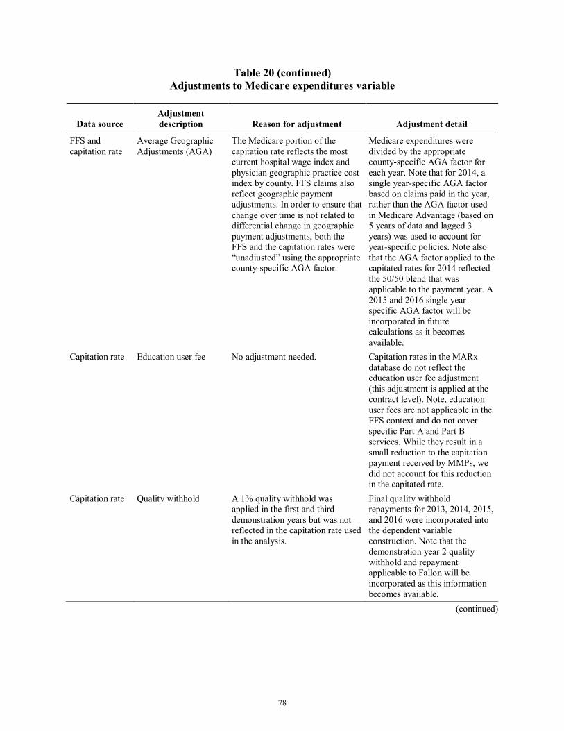
beneficiaries with SPMI in Massachusetts .......................................................................... 66 19 Data sources for monthly Medicare expenditures ............................................................... 76 20 Adjustments to Medicare expenditures variable .................................................................. 77 21 Mean monthly Medicare expenditures for One Care eligibles and comparison
group, predemonstration period and demonstration period 1, unweighted ......................... 82 22 Mean monthly Medicare expenditures for One Care eligibles and comparison
group, predemonstration period and demonstration period 2, unweighted ......................... 82 23 Mean monthly Medicare expenditures for One Care eligibles and comparison
group, predemonstration period and demonstration period 3, unweighted ......................... 83 24 Mean monthly Medicare expenditures for One Care eligibles and comparison
group, predemonstration period and demonstration period 1, weighted ............................. 83
viii
25 Mean monthly Medicare expenditures for One Care eligibles and comparison group, predemonstration period and demonstration period 2, weighted ............................. 84
26 Mean monthly Medicare expenditures for One Care eligibles and comparison group, predemonstration period and demonstration period 3, weighted ............................. 84
27 Demonstration effects on Medicare savings for eligible beneficiaries—Difference-in-difference regression results, One Care eligibles and comparison group ....................... 85
28 Adjusted means and overall impact estimate for eligible beneficiaries in the demonstration and comparison groups, One Care eligibles and comparison group ............ 86
ix
List of Figures
Number Page
1 Demonstration effects on service utilization for eligible beneficiaries in Massachusetts—Difference-in-differences regression results for the demonstration period, October 1, 2013–December 31, 2016 ...................................................................... 48
2 Demonstration effects on long-stay nursing facility use for eligible beneficiaries in Massachusetts—Difference-in-differences regression results for the demonstration period, October 1, 2013–December 31, 2016 ...................................................................... 49
3 Demonstration effects on RTI quality of care measures for eligible beneficiaries in Massachusetts—Difference-in-differences regression results for the demonstration period, October 1, 2013–December 31, 2016 ...................................................................... 52
4 Demonstration effects on service utilization for eligible beneficiaries with LTSS use in Massachusetts—Difference-in-differences regression results for the demonstration period, October 1, 2013–December 31, 2016 .............................................. 57
5 Demonstration effects on RTI quality of care and care coordination for eligible beneficiaries with LTSS use in Massachusetts—Difference-in-differences regression results for the demonstration period, October 1, 2013–December 31, 2016 ..................................................................................................................................... 60
6 Demonstration effects on service utilization for eligible beneficiaries with SPMI in Massachusetts—Difference-in-differences regression results for the demonstration period, October 1, 2013–December 31, 2016 ...................................................................... 62
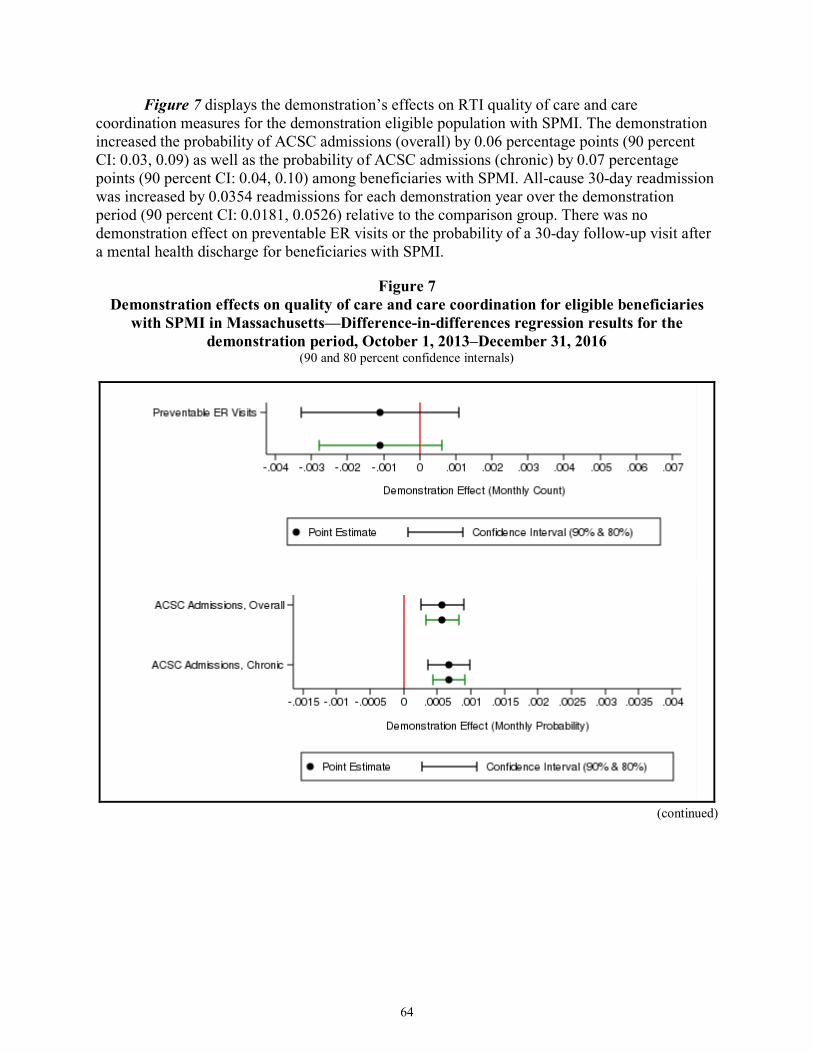
7 Demonstration effects on quality of care and care coordination for eligible beneficiaries with SPMI in Massachusetts—Difference-in-differences regression results for the demonstration period, October 1, 2013–December 31, 2016 ....................... 64
8 Percent with use of selected Medicare services ................................................................... 69 9 Service use among all demonstration eligible beneficiaries with use of service per
1,000 user months ................................................................................................................ 70 10 Service use among all demonstration eligible beneficiaries per 1,000 eligible
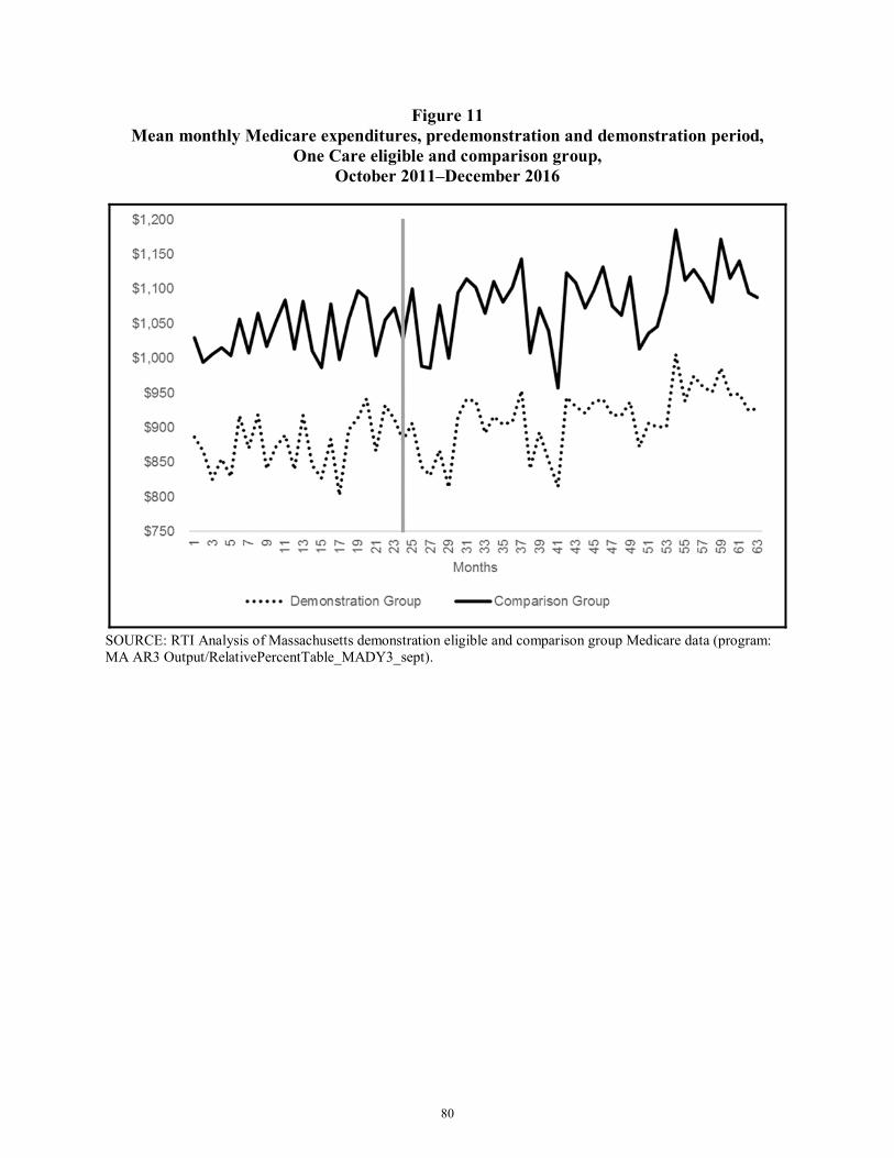
months .................................................................................................................................. 71 11 Mean monthly Medicare expenditures, predemonstration and demonstration period,
One Care eligible and comparison group, October 2011–December 2016 ......................... 80 12 Mean monthly Medicare expenditures (weighted), predemonstration and
demonstration period, One Care eligibles and comparison group, October 2011–December 2016 .................................................................................................................... 81
x
[This page intentionally left blank.]
ES-1
Executive Summary The Medicare-Medicaid Coordination Office and the Innovation Center at the Centers for
Medicare & Medicaid Services (CMS) have created the Medicare-Medicaid Financial Alignment Initiative to test, in partnerships with States, integrated care models for Medicare-Medicaid enrollees. CMS contracted with RTI International to monitor the implementation of the demonstrations and to evaluate their impact on beneficiary experience, quality, utilization, and cost. The evaluation will include a final aggregate evaluation and State-specific evaluations.
The demonstration in Massachusetts, known as One Care, was implemented October 1, 2013. Three health plans were competitively selected by the Commonwealth and CMS to operate Medicare-Medicaid Plans (MMPs), but one health plan withdrew from participation in the demonstration as of September 30, 2015. One MMP operates in nine counties, with partial coverage in one county; the second MMP operates in three counties, with partial coverage in one county. MMPs provide care coordination and flexible benefits under a capitated payment model. CMS and the Commonwealth provide payments to finance all Medicare and Medicaid services.
One Care is the only demonstration under the Financial Alignment Initiative that limits enrollment to Medicare-Medicaid beneficiaries aged 21 to 64 at the time of enrollment. Medicare-Medicaid beneficiaries enrolled in Medicare Parts A and B and eligible for Part D and MassHealth Standard or MassHealth CommonHealth are eligible to enroll in One Care. Beneficiaries who have any other comprehensive private or public insurance, receive home and community-based service (HCBS) waiver services, or reside in an intermediate care facility for individuals with intellectual disabilities are not eligible to enroll in One Care. One Care enrollees who turn 65 may remain in the demonstration if they meet certain eligibility requirements. One Care operates in 9 of Massachusetts’ 14 counties, including Essex, Franklin, Hampden, Hampshire, Middlesex, Norfolk, Plymouth, Suffolk, and Worcester Counties.1
This Third Evaluation Report for the Massachusetts One Care demonstration describes the demonstration’s implementation and early analysis of its impacts. The report includes findings from qualitative data for 2017 and quantitative results for October 1, 2013, through December 31, 2016. Data sources include key informant interviews, beneficiary focus groups, the Consumer Assessment of Healthcare Providers and Systems (CAHPS) survey results, Medicare claims data, the Minimum Data Set nursing facility assessments, MMP encounter data for Medicare and Medicaid services, and other demonstration data. Future analyses also will include Medicaid claims and encounters as those data become available.
Highlights
• Overall, MassHealth, CMS, the MMPs, and the stakeholder community continue to express strong support for One Care, emphasizing it is the right care model for this population. MassHealth continues to be committed to sustaining One Care.
1 Partial coverage of Plymouth County includes the towns Billerica, Chelmsford, Dracut, Lowell, North Billerica,
North Chelmsford, Tewksbury, Tyngsborough, and Westford.
ES-2
• The most significant changes in 2017 to One Care involved eligibility and enrollment requirements. During the timeframe of this report, changes to MassHealth eligibility requirements expanded the group of individuals able to remain in the demonstration after the age of 65. Enrollment changes included implementing regularly scheduled passive enrollment on a quarterly basis targeting new Medicare-Medicaid beneficiaries as well as other eligible beneficiaries and allowing passive enrollment in counties with only one MMP and counties only partially served by the demonstration. In an effort to increase enrollment, one MMP increased its service coverage area into parts of Middlesex County.
• As of December 31, 2017, a total of 102,909 Medicare-Medicaid beneficiaries were eligible for the demonstration and a total of 18,563 beneficiaries, or approximately 18 percent of beneficiaries, were enrolled in One Care. From December 31, 2016, to December 31, 2017, enrollment in One Care increased by almost 30 percent.
• The MMPs continue to report differing financial experiences. One MMP that initially reported gains in the early implementation period now reports projected financial losses. Another MMP that initially reported losses in the early demonstration period now reports improved financial performance with projected gains.
• Although the demonstration has matured, representatives from the MMPs reported that some operational design features of the demonstration, including submission of encounter data and other regulatory requirements, continue to lack integration between Medicare and Medicaid.
• Results from the 2017 CAHPS survey show that most respondents reported a high degree of satisfaction with their health and drug plans; almost 90 percent of One Care respondents reported that their plans usually or always provided them the information they needed.
• Strong stakeholder engagement continues to be a key feature of One Care: MassHealth and CMS added two new CAHPS questions into the 2018 survey as a result of stakeholder feedback; MassHealth officials attended a meeting of Rhode Island’s Implementation Council and shared observations with the One Care Implementation Council; and MassHealth reported wanting to replicate the robust structure of One Care’s stakeholder processes across its other initiatives.
• Some RTI focus group participants reported that services received from One Care had helped them to engage, or re-engage, in life activities or hobbies they enjoyed. In some cases, participants attributed improved quality of life and well-being to receiving appropriate behavioral health services.
• As reported by One Care plans, the number of grievances per 1,000 enrollees in 2017 did not exceed 38.3 in any one quarter; the number of appeals per 1,000 enrollees in 2017 did not exceed 9.0 in any one quarter. MassHealth officials reported that generally, many of these involved enrollment issues or involved dental or
ES-3
transportation services. Through broader MassHealth reforms, the Commonwealth is attempting to streamline programs and create consistent metrics to allow for comparison across programs, including One Care. MassHealth has leveraged lessons learned from One Care in the design of these broader reforms.
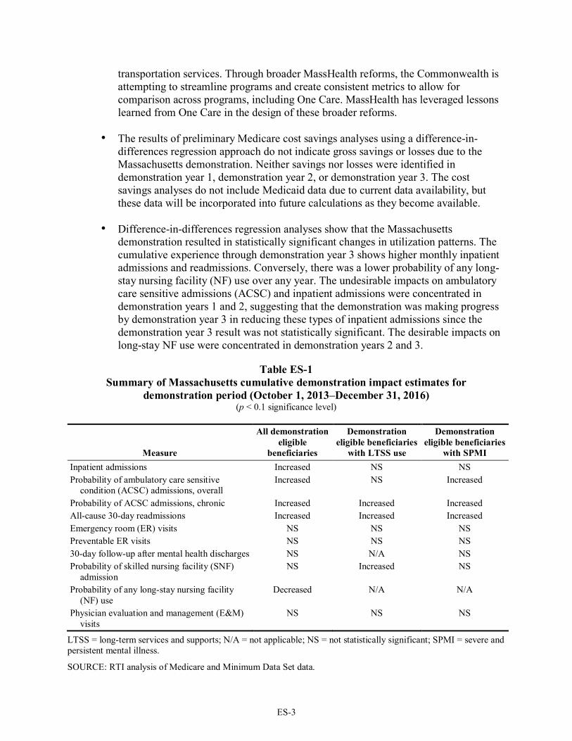
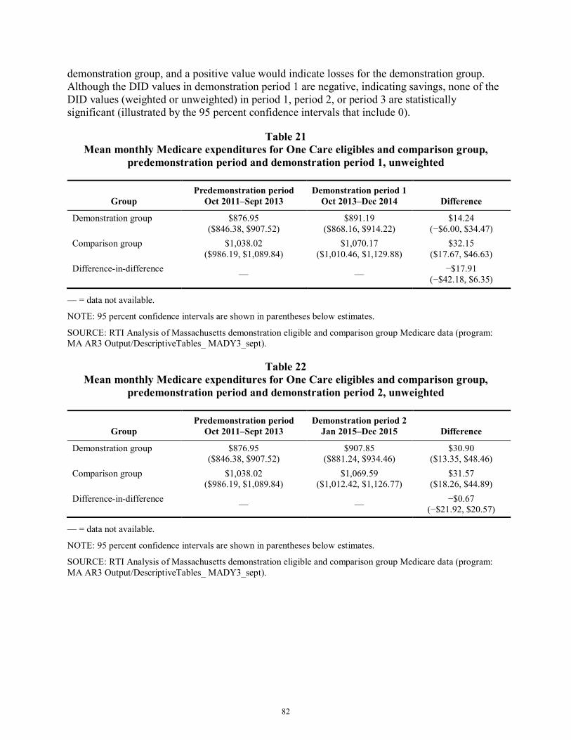
• The results of preliminary Medicare cost savings analyses using a difference-in-differences regression approach do not indicate gross savings or losses due to the Massachusetts demonstration. Neither savings nor losses were identified in demonstration year 1, demonstration year 2, or demonstration year 3. The cost savings analyses do not include Medicaid data due to current data availability, but these data will be incorporated into future calculations as they become available.
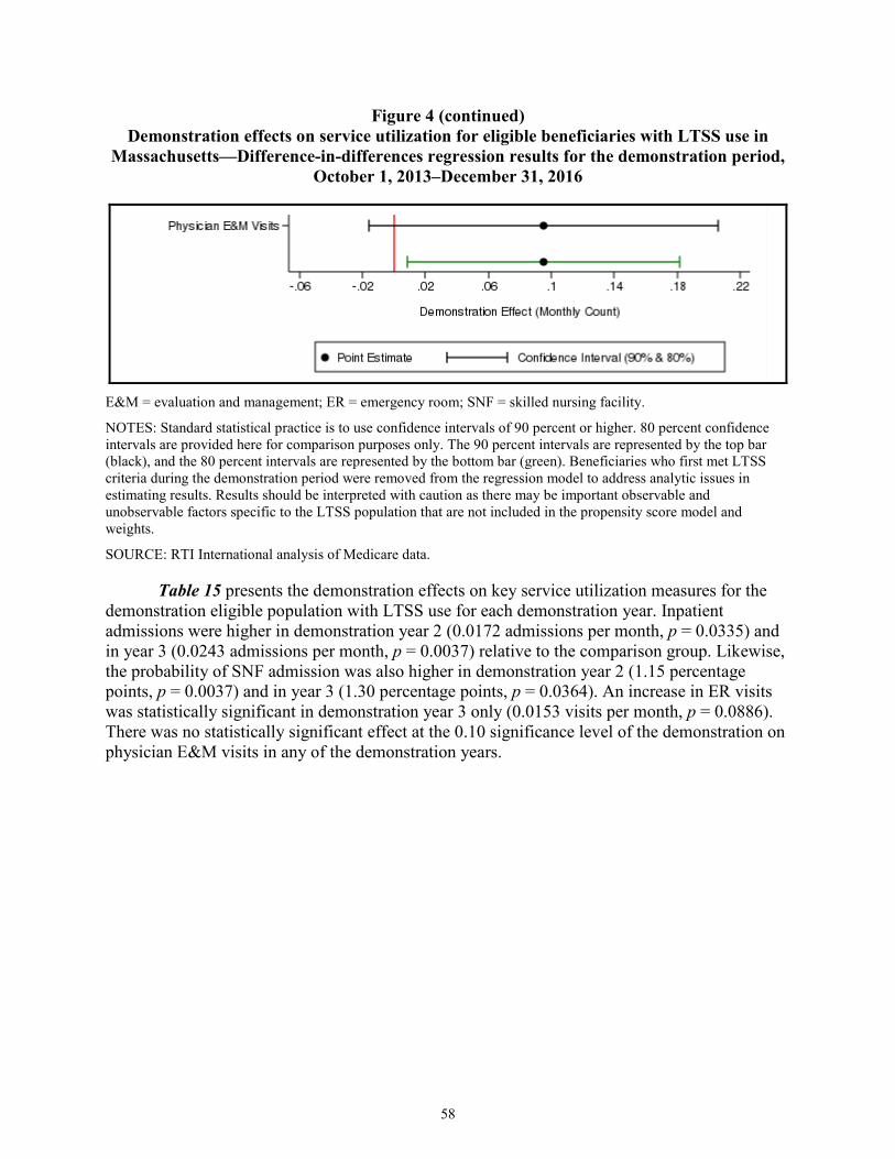
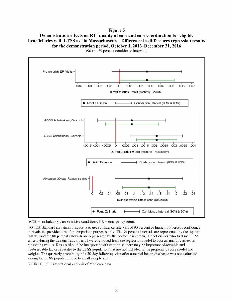
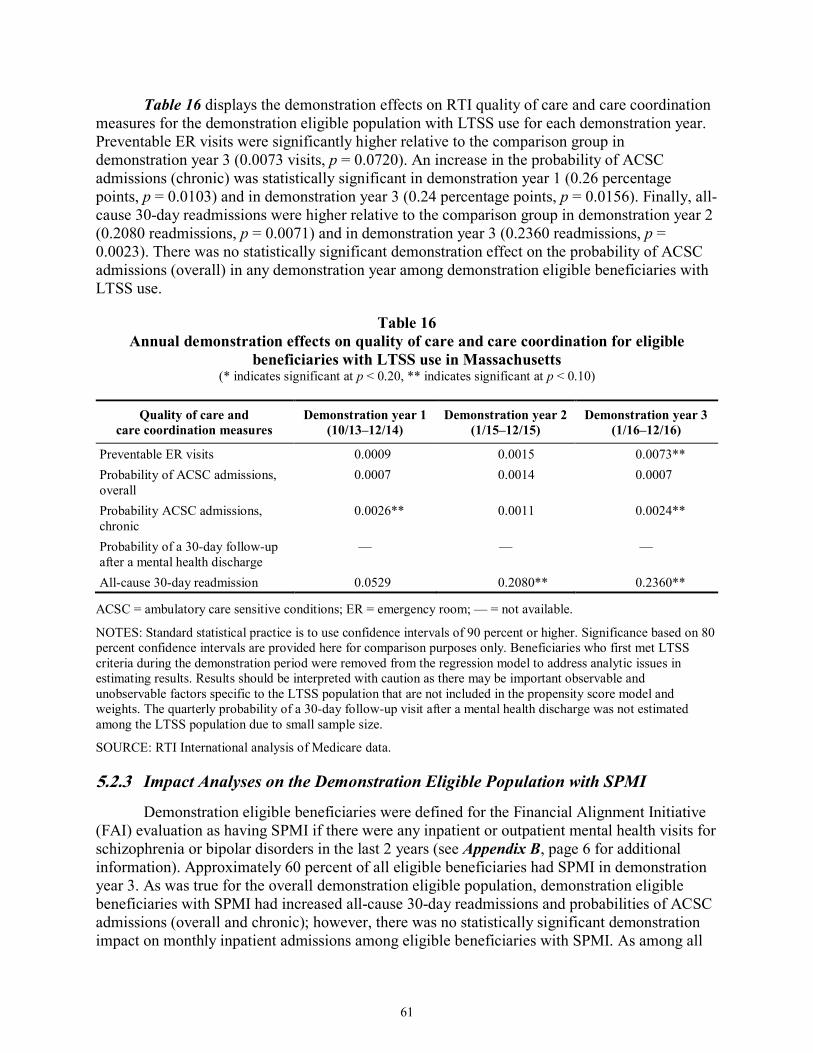
• Difference-in-differences regression analyses show that the Massachusetts demonstration resulted in statistically significant changes in utilization patterns. The cumulative experience through demonstration year 3 shows higher monthly inpatient admissions and readmissions. Conversely, there was a lower probability of any long-stay nursing facility (NF) use over any year. The undesirable impacts on ambulatory care sensitive admissions (ACSC) and inpatient admissions were concentrated in demonstration years 1 and 2, suggesting that the demonstration was making progress by demonstration year 3 in reducing these types of inpatient admissions since the demonstration year 3 result was not statistically significant. The desirable impacts on long-stay NF use were concentrated in demonstration years 2 and 3.
Table ES-1 Summary of Massachusetts cumulative demonstration impact estimates for
Probability of skilled nursing facility (SNF) admission
NS NS NS
Probability of any long-stay nursing facility (NF) use
NS Decreased Decreased
Physician evaluation and management (E&M) visits
Increased NS NS
NS = not statistically significant.
SOURCE: RTI analysis of Medicare and Minimum Data Set data.
1
1. Evaluation Overview
1.1 Purpose The Medicare-Medicaid Coordination Office (MMCO) and the Innovation Center at the
Centers for Medicare & Medicaid Services (CMS) have created the Medicare-Medicaid Financial Alignment Initiative to test, in partnerships with States, integrated care models for Medicare-Medicaid enrollees. CMS contracted with RTI International to monitor the implementation of the demonstrations under the Financial Alignment Initiative and to evaluate their impact on beneficiary experience, quality, utilization, and cost. This report includes qualitative evaluation information for the fourth demonstration year (calendar year [CY] 2017), with key updates from early 2018. This report provides updates to the previous reports in key areas, including enrollment, care coordination, beneficiary experience, and stakeholder engagement activities, and discusses the challenges, successes, and emerging issues identified during the reporting period. Results on quality of care, service utilization, and costs for the entire predemonstration and demonstration periods spanning October 1, 2011 to December 31, 2016 are also presented.
The First Annual Report, which includes extensive background information about the demonstration, can be found here: https://www.cms.gov/Medicare-Medicaid-Coordination/Medicare-and-Medicaid-Coordination/Medicare-Medicaid-Coordination-Office/FinancialAlignmentInitiative/Downloads/MASSFirstAnnualEvalReport.pdf. The Second Evaluation Report can be found here: https://www.cms.gov/Medicare-Medicaid-Coordination/Medicare-and-Medicaid-Coordination/Medicare-Medicaid-Coordination-Office/FinancialAlignmentInitiative/FinancialModelstoSupportStatesEffortsinCareCoordination.html.
1.2 Data Sources Data sources used to prepare this report include the following.
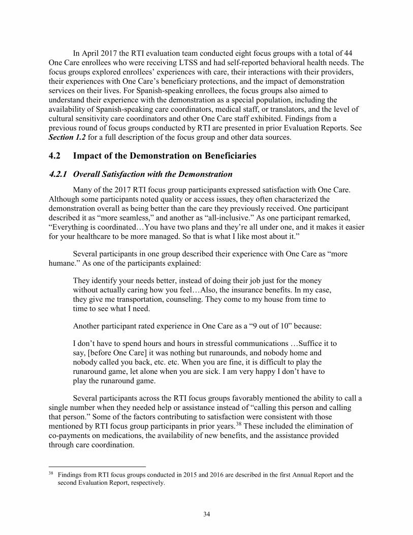
Key informant interviews. The RTI evaluation team conducted a virtual site visit through telephone interviews in Massachusetts from October 2017 to January 2018. The team interviewed the following individuals: Commonwealth of Massachusetts (the Commonwealth) officials, including MassHealth (Massachusetts’ Medicaid program) policy leaders, operations, contract and quality management staff; officials from CMS’ regional and central offices; representatives from One Care Medicare-Medicaid plans (MMPs); representatives from community-based organizations (CBOs), including the Independent Living Centers (ILCs), Recovery Learning Communities (RLCs), and Aging Services Access Points (ASAPs); stakeholders from the Implementation Council; and representatives from the One Care Ombudsman program.
Focus groups. The RTI evaluation team conducted eight focus groups in Massachusetts in calendar year 2017. Two focus groups were held in Springfield on April 4, 2017 with Hispanic participants. Six focus groups were held in Boston on April 5–6, 2017 consisting of two groups with African Americans, two groups with participants with behavioral health needs, and two
groups with participants with long-term services and supports (LTSS) needs. A total of 44 One Care enrollees participated.
Surveys. Medicare requires all Medicare Advantage plans, including One Care plans, to conduct an annual assessment of beneficiary experiences using the Medicare Advantage and Prescription Drug Plan Consumer Assessment of Healthcare Providers and Systems (CAHPS) survey instrument. In addition, the RTI evaluation team added 10 supplemental questions to the CAHPS survey and MassHealth added nine questions. This report includes survey results for a small subset of the 2017 survey questions. Findings are available at the MMP level only. The frequency count for some survey questions may be suppressed because too few enrollees responded to the question. Comparisons with findings from all Medicare Advantage plans are available for core CAHPS survey questions but not for the RTI supplemental questions. In addition to survey requirements specific to the demonstration, MassHealth conducted Commonwealth-sponsored surveys of beneficiary experience. Results were only available for the Fallon Transition Survey at the time of reporting, and are included in this report.
Demonstration data. The RTI evaluation team reviewed data provided quarterly by Massachusetts through the State Data Reporting System (SDRS). These reports include eligibility, enrollment, opt-out, and disenrollment data, and information reported by Massachusetts on its integrated delivery system, care coordination, benefits and services, quality management, stakeholder engagement, financing and payment, and a summary of successes and challenges. This report also uses data for quality measures reported by One Care plans and submitted to CMS’ implementation contractor, NORC at the University of Chicago (hereafter referred to as NORC).2,3 Data reported to NORC include core quality measures that all MMPs are required to report, as well as State-specific measures that One Care plans are required to report. Due to reporting inconsistencies, plans occasionally resubmit data for prior demonstration years; therefore, these data are considered preliminary.
Demonstration policies, contracts, and other materials. The RTI evaluation team reviewed a wide range of demonstration documents, including demonstration and Commonwealth-specific information on the CMS website;4 and other publicly available materials on Massachusetts’ One Care website5 and the Massachusetts’ Executive Office of Health and Human Services (EOHHS) website.6 The RTI evaluation team routinely reviewed
2 Data are reported for January 2017 through December2017. 3 The technical specifications for reporting requirements are in the Medicare-Medicaid Capitated Financial
Alignment Model Core Reporting Requirements document, which is available at https://www.cms.gov/Medicare-Medicaid-Coordination/Medicare-and-Medicaid-Coordination/Medicare-Medicaid-Coordination-Office/FinancialAlignmentInitiative/MMPInformationandGuidance/MMPReportingRequirements.html.
available minutes and presentations from MassHealth Open Meetings7 and Implementation Council meetings.8
Conversations with CMS and MassHealth officials. To monitor demonstration progress, the RTI evaluation team engages in periodic phone conversations with officials from MassHealth and CMS. These might include discussions about new policy clarifications designed to improve plan performance, quality improvement work group activities, and contract management team actions.
Complaints and appeals data. Complaint (also referred to as grievance) data are from three separate sources: (1) complaints from beneficiaries reported by One Care plans to MassHealth, and separately to CMS’ implementation contractor, NORC;9 (2) complaints received by MassHealth or 1-800-Medicare and entered into the CMS electronic Complaint Tracking Module; and (3) qualitative data obtained by RTI on complaints. Appeals data are generated by MMPs and reported to MassHealth and NORC. This report also includes data compiled and received by the Medicare Independent Review Entity (IRE), Maximus, for January 2014–December 2017, as well as critical incidents and abuse data reported by One Care MMPs to MassHealth and NORC.
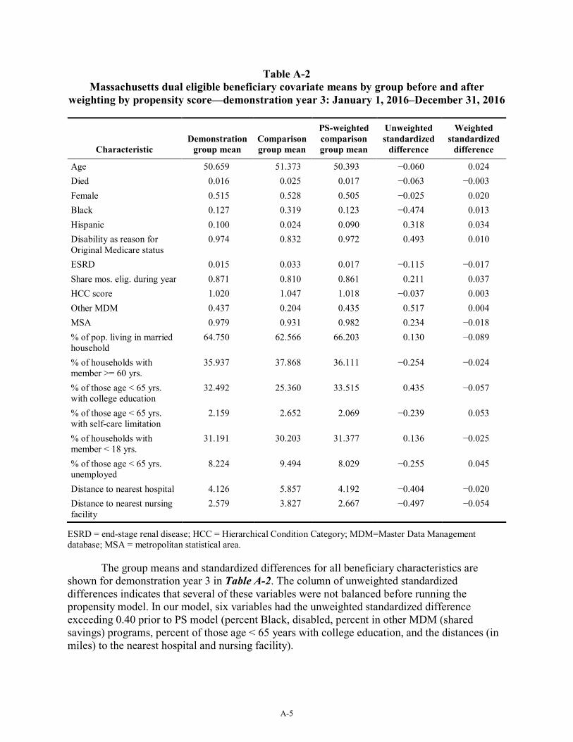
Service utilization data. Evaluation Report analyses used data from many sources. First, the Commonwealth provided quarterly finder files containing identifying information on all demonstration eligible beneficiaries in the demonstration period. Second, RTI obtained administrative data on beneficiary demographic, enrollment, and service use characteristics from CMS data systems for both demonstration and comparison group members. Third, these administrative data were merged with Medicare claims and Medicare and Medicaid encounter data, as well as the Minimum Data Set.
Cost savings data. Two primary data sources were used to support the savings analyses, capitation payments and Medicare claims. Medicare capitation payments paid to One Care plans during the demonstration period were obtained for all demonstration enrollees from CMS Medicare Advantage and Part D Inquiry System (MARx) data. The capitation payments were the final reconciled payments paid by the Medicare program after taking into account risk score reconciliation and any associated retroactive adjustments in the system at the time of the data pull (July 2018). Quality withholds were applied to the capitation payments (quality withholds are not reflected in the MARx data), as well as to quality withhold repayments for the first three demonstration period and risk corridor payments or recoupments through 2015 based on data provided by CMS. Fee-for-service (FFS) Medicare claims were used to calculate expenditures for all comparison group beneficiaries, demonstration beneficiaries in the baseline period, and
7 https://www.mass.gov/service-details/one-care-open-meetings 8 https://www.mass.gov/service-details/one-care-implementation-council 9 The technical specifications for reporting requirements are in the Medicare-Medicaid Capitated Financial
Alignment Model Core Reporting Requirements document, which is available at: https://www.cms.gov/Medicare-Medicaid-Coordination/Medicare-and-Medicaid-Coordination/Medicare-Medicaid-Coordination-Office/FinancialAlignmentInitiative/MMPInformationandGuidance/MMPReportingRequirements.html.
demonstration eligible beneficiaries who were not enrolled during the demonstration period. FFS claims included all Medicare Parts A and B services.
5
2. Demonstration Overview
2.1 Demonstration Description and Goals Key objectives of the Massachusetts demonstration, known as One Care, include
improving the beneficiary experience in accessing care, delivering person-centered care, promoting independence in the community, improving quality, and eliminating cost shifting between Medicare and Medicaid (MOU, 2012, pp. 2–3). Implemented October 1, 2013, One Care integrates the full array of functions performed by Medicare and Medicaid. Massachusetts received federal funding to support the implementation of the demonstration as well as federal funding to support the One Care Ombudsman program and options counseling for Medicare-Medicaid enrollees.
Targeted case management services and rehabilitation option services are not included as part of the integrated One Care benefit; they continue to be provided as part of the Medicaid FFS system. As in Medicare Advantage, Medicare hospice services continue to be provided as part of the Medicare FFS system. One Care is the only demonstration under the Financial Alignment Initiative that limits enrollment to Medicare-Medicaid beneficiaries age 21 to 64 at the time of enrollment.10 One Care enrollees who turn 65 may remain in the demonstration if they meet eligibility requirements for MassHealth Standard or MassHealth CommonHealth. One Care operates in nine of the Commonwealth’s 14 counties11 and is served by two MMPs. CMS and MassHealth have agreed to extend the demonstration through December 31, 2019.12, 13
In interviews with the RTI evaluation team, Commonwealth and MMP officials, as well as stakeholders, voiced strong support of the demonstration’s integrated care model to serve the needs of One Care’s population. MassHealth officials at the leadership level reiterated their continuing support for One Care:
We think One Care is exactly the right sort of model. We want to double down and continue investing in it to make it work. There’s no question in our mind about it. We do have to work together with our federal partners, our plans, local folks to figure out how to make the program stable and sustainable. We believe we’re seeing good results in the interim.
The First Annual Report, which includes extensive background information about the demonstration, can be found here: https://www.cms.gov/Medicare-Medicaid-
10 Beneficiaries enrolled in any of the following programs are eligible for the demonstration only if they disenroll
from the program and meet the other eligibility criteria: a Medicare Advantage plan; Program of All-Inclusive Care for the Elderly (PACE); Employer Group Waiver Plans (EGWPs), other employer-sponsored plans, or plans receiving a Retiree Drug Subsidy (RDS); or the CMS Independence at Home (IAH) demonstration. Enrollees using home and community-based services (HCBS) waiver services or residing in an intermediate care facility for individuals with intellectual disabilities (ICF/IDD) are not eligible to enroll (MOU, 2012, pp. 8–9).
11 Essex, Franklin, Hampden, Hampshire, Middlesex, Norfolk, Plymouth (partial), Suffolk and Worcester. 12 See https://www.mass.gov/files/documents/2018/06/15/fifth-one-care-contract-addendum.pdf 13 In June 2018, MassHealth released a draft concept paper for a proposed Dual Demonstration 2.0, which would
provide Federal authorities and flexibilities for Medicare-Medicaid beneficiaries served by One Care and Senior Care Options (SCO). The proposal will be discussed as part of the next Evaluation Report. See: https://www.mass.gov/files/documents/2018/06/13/duals-demonstration-2-0.pdf
Coordination/Medicare-and-Medicaid-Coordination/Medicare-Medicaid-Coordination-Office/FinancialAlignmentInitiative/Downloads/MASSFirstAnnualEvalReport.pdf. The Second Evaluation Report can be found here: https://www.cms.gov/Medicare-Medicaid-Coordination/Medicare-and-Medicaid-Coordination/Medicare-Medicaid-Coordination-Office/FinancialAlignmentInitiative/FinancialModelstoSupportStatesEffortsinCareCoordination.html.
2.2 Changes in Demonstration Design The changes in demonstration design that occurred in 2017 primarily impacted eligibility
and enrollment. As described more fully in Section 3.2.1, eligibility requirements were modified to expand the group of individuals able to remain in the demonstration after the age of 65; these changes did not impact eligibility requirements for enrolling in the demonstration (see Section 3.2, Eligibility and Enrollment). The initial design of One Care did not allow passive enrollment in counties with only one MMP or in counties only partially served by the demonstration. This requirement was changed effective January 1, 2017, to allow passive enrollment in both of those situations. Other modifications to the three-way contract have been under discussion primarily between CMS and the Commonwealth but have yet to be finalized as of the writing of this report. Finalized contract changes will be discussed in the next Evaluation Report.
2.3 Overview of State Context MassHealth has historically mandated Medicaid managed care enrollment for most of its
members. Until One Care, Medicare-Medicaid enrollees under age 65 remained ineligible to enroll in Medicaid managed care. This group of beneficiaries included those with the most complex conditions, highest costs, and in greatest need of care coordination and care management. They encompassed a high proportion of people with behavioral health needs who did not have access to the diversionary behavioral health services available to the MassHealth-only members with similar needs. One Care provided a mechanism for the Commonwealth to provide comprehensive care coordination and integrated service delivery.
More recently, MassHealth has leveraged its 1115(a) demonstration waiver to enact broad restructuring reforms of its healthcare delivery system.14 Although these reforms do not directly include One Care, MassHealth officials reported leveraging its experience with One Care as part of its 1115(a) demonstration waiver reforms. In March 2018, MassHealth began the full implementation of its Medicaid Accountable Care Organizations (ACOs) with 17 health care organizations. At the same time, MassHealth completed a re-procurement process for managed care organizations (MCOs) and intends to bring LTSS into the scope of covered services and capitation for MCOs in 2020. Both the ACO and MCO models are designed to provide greater integration of behavioral health and LTSS services.
ACOs and MCOs are expected to contract with Community Partners to enhance behavioral health and LTSS expertise in the delivery of care coordination as well as assessment and care planning activities. MassHealth officials reported that these new ACO and MCO
14 The 1115(a) waiver demonstration includes requests for Delivery System Reform Incentive Payment (DSRIP)
funding for upfront investments to support delivery system transformation over 5 years, with explicit funding to build community capacity for behavioral health and LTSS providers and health-related social services.
models will largely align with the principles of One Care to provide member-centered, coordinated, and culturally competent care, and that these reforms were modeled off of “what we saw and really liked about the One Care program.”
8
[This page intentionally left blank.]
9
3. Update on Demonstration Implementation In this section, we provide updates on important aspects of the demonstration that have
occurred since the Second Evaluation Report. This includes updates on integration efforts, enrollment, care coordination activities, stakeholder engagement activities, financing and payment, and quality management strategies.
Highlights
• CMS and MassHealth officials who serve on the Contract Management Team (CMT) continue to report a collaborative relationship in jointly managing the demonstration; the CMT structure changed to consolidate CMT operational and policy meetings.
• Enrollment processes were changed in 2017 to allow for passive enrollment in counties served only by one MMP or in counties partially served by the demonstration and to implement regularly scheduled passive enrollment on a quarterly basis.
• Although the overall design of the care coordination model has not changed, MMPs continue to modify and refine their practices based on their experiences to better meet the needs of One Care beneficiaries.
• Strong stakeholder engagement continues to be a key feature of One Care. The Implementation Council began its second term in June 2017 with the selection and onboarding of 13 new and returning Council members.
• The two MMPs participating in the demonstration reported different cost experiences, with one plan reporting projected profits and the other projecting losses for 2017.
• Massachusetts initiated a restructuring of its ombudsman services for implementation in 2018, including ombudsman services for One Care, across multiple MassHealth managed care and accountable care programs to better track trends and identify systematic issues and improvements.
3.1 Integration of Medicare and Medicaid This section discusses the joint management of the demonstration, as well as updates to
the successes and challenges of developing an integrated delivery system at the plan and provider level. This section also describes the development of new or innovative service delivery models.
3.1.1 Joint Management of Demonstration
Management of the demonstration continues through the CMS-State Contract Management Team (CMT).15 According to CMT members from CMS, the CMT no longer holds a separate operational meeting but rather has incorporated operational components into the CMT policy group meeting. The CMT now meets monthly, rather than biweekly, with the MMPs.
15 The design and structure of the CMT is described in prior Evaluation Reports.
10
During demonstration year 4, the CMT focused on programmatic improvements, the future procurement for new MMPs, passive enrollment, and review of CAHPS and other data. Set agenda items include routine review of items such as grievances and appeals and monitoring access to care issues.
CMS officials described a high degree of transparency from the MMPs that has allowed for “a very information-rich oversight” of the demonstration, which, in their experience, is unique to One Care. Representatives from CMS, the Commonwealth and MMPs continue to describe the partnership as highly collaborative. One CMS official noted that, “Massachusetts, in my opinion, is among the States with the strongest, unwavering commitment to making sure this demonstration is successful.”
3.1.2 Operational Integration
Although the demonstration has matured over several years, representatives from the MMPs reported that some operational design features of the demonstration continue to lack integration between Medicare and Medicaid. One MMP official reported that streamlining encounter data submissions as well as marketing and materials submissions would “be administratively beneficial for both the plans and the State.” Another MMP official noted that, “with respect to utilization management, there’s a lot of Medicare activity that is living inside of a Medicaid sort of infrastructure, so that definitely poses a challenge for us.” One MMP official described their experience as follows:
I think that if you’re building a program like this from the ground up and you’re not necessarily building it on a Medicare Advantage platform, it’s a very heavy lift to do …all of the data validation, and all of the reporting and audit requirements for the Medicare Advantage…. [Y]ou have to be an expert at Medicare Advantage, and you have to understand Medicaid so it’s twice as much work than to do one or the other. And becoming compliant with CMS requirements … is a heavy lift in and of itself…it’s hard to get the admin that supports that.
One MMP official commented that One Care did not seem to provide any significant opportunities for operational efficiencies that were not already available through Senior Care Options (SCO), a MassHealth program serving Medicare-Medicaid beneficiaries age 65 years and older.
3.1.3 Integrated Service Delivery
Under One Care, a single entity (the One Care plan) is responsible for coordinating all medical, acute, behavioral health, LTSS, and pharmacy benefits. Each plan is responsible for coordinating medical and behavioral health services through its internal care coordinator or clinical case manager; and for coordinating LTSS through an LTS Coordinator, located at a community-based organization. For beneficiaries, the demonstration provides a single point of contact and accountability for coordination of care. The care coordination components of the demonstration represent new services for this population; prior to the One Care demonstration, enrollees had limited, if any, access to care coordination services. Care coordination processes are discussed more fully in Section 3.3.
11
MassHealth has continued investing in training efforts to support the integrated care model being provided by MMPs and contracted One Care providers through an online platform that includes webinars, online modules, and taped conferences.16 Two webinars were offered in 2017: “Engaging One Care Enrollees in Assessments and Care Planning” and “The Role of Peers in One Care.”
The One Care model has provided the opportunity for plans to develop or pilot new service delivery models.17 One stakeholder views this as an important contribution of the demonstration:
One Care is providing one of the greatest opportunities for innovation, at a population-based level, to develop best practices in integrated care and being creative in the delivery of LTSS and BH [behavioral health] services. If we do not take advantage of the opportunity of the demonstration, not only will the consumer community be directly harmed that’s in One Care, but also other consumers, in the State and nationally, will be negatively impacted because they won’t benefit from what could be a great incubator of new ways of doing things.
As noted in the First Annual Report, one MMP developed two new community-based residential programs as an alternative to inpatient psychiatric services. Another initiative aims to improve access to care and decrease care costs by partnering with community paramedics to deliver on-site primary care treatment. According to MMP officials, this pilot has diverted almost 90 percent of individuals who have used the service from utilizing the emergency room.18 According to an MMP official:
It’s an incredible service for our members and something that all of the healthcare system needs to look toward. The members really like it, the clinicians really like it, and it is incredibly satisfying to be able to keep people out of the hospital, people who don’t want to go to the hospital in the first place.
Other examples of innovative services being offered or facilitated by MMPs include one MMP providing medically tailored home delivered meals aimed at reducing more costly healthcare;19 an MMP partnering with a homeless shelter to provide cellphones to enrollees who are homeless so that they can communicate with their care coordinator; and a pilot program aimed at reducing home health visits by utilizing a system of medication reminders. Examples of new or innovative services reported by One Care beneficiaries are included in Section 4.1, Beneficiary Experience.
With limited exceptions, MMP officials reported that they have continued to reimburse most contracted providers on an FFS basis. Representatives from one MMP reported the plan had been exploring alternate payment models and that it anticipates taking steps toward alternate payment arrangements in 2018. Both MMPs reported that, overall, providers have been wary of
16 MassHealth’s training initiatives are described in more detail in prior Evaluation Reports. The One Care Shared
Learning website can be accessed at: https://onecarelearning.ehs.state.ma.us/ 17 Some of these pilots include, but are not limited to, One Care enrollees. 18 https://nam.edu/event/improving-care-high-need-patients-webinar-series/ 19 https://www.healthaffairs.org/doi/10.1377/hlthaff.2017.0999
taking on potential risk that is associated with a small base of members, especially by providers who view the One Care population as challenging, and because of early financial instability in the demonstration. MassHealth officials reported considering how to more strongly encourage and incentivize plans to pursue alternative payment models, including value-based purchasing, as well as “innovation in general and the plans being able to test things out.”
3.2 Eligibility and Enrollment This section provides updates on eligibility and enrollment processes, including
integration of eligibility systems, enrollment methods, and outreach. This section also outlines significant events affecting enrollment patterns during the timeframe covered by this report. The Commonwealth reported via RTI’s SDRS that as of December 31, 2017, a total of 18,563 beneficiaries were enrolled in One Care out of a total of 102,909 Medicare-Medicaid beneficiaries eligible for the demonstration. From December 31, 2016, to December 31, 2017, enrollment in One Care increased by almost 30 percent. Approximately 85 percent of the demonstration’s enrollees were served by CCA, and approximately 15 percent were served by Tufts Health Unify.
3.2.1 Eligibility and Enrollment Processes
Massachusetts is the only demonstration under the Financial Alignment Initiative that limits eligibility to Medicare-Medicaid beneficiaries age 21 through 64 at the time of enrollment. A change in the MassHealth eligibility requirements occurred during the timeframe of this report which expanded the group of individuals able to remain in the demonstration after the age of 65.20 This eligibility change was viewed by MassHealth officials as a beneficial mechanism for continued growth in One Care enrollment.
MassHealth continues to report the same challenges in integrating Medicare and Medicaid eligibility and enrollment processes as those reported in previous years, such as enrollment errors caused by discrepancies in beneficiary information between Medicare and MassHealth systems.21 In the latter part of 2017, MassHealth implemented an online enrollment system for One Care enrollees to supplement other MassHealth enrollment processes. The online enrollment process allows beneficiaries to enroll, re-enroll, or change MMPs.22 Initial use was modest, with about 40 enrollments in the first few months of operations; MassHealth officials reported they are now engaged in more active promotion of the system:
20 MassHealth offers several types of Medicaid coverage to eligible individuals. Previously, the opportunity to
remain in the demonstration after the age of 65 was limited to individuals who met eligibility requirements for MassHealth Standard. As part of the Commonwealth’s amendment to its 1115(a) waiver, MassHealth received approval for a new Medicaid eligibility group based on the Commonwealth’s state funded CommonHealth eligibility. This change conveyed MassHealth eligibility on certain individuals who otherwise were not eligible for MassHealth Standard. Implementation of this change began year-end 2016 and continued into the first quarter of 2017.
21 Implementation and operational issues related to integrated Medicare and Medicaid eligibility and enrollments processes are described more fully in prior Evaluation Reports.
22 As implemented, the online system does not allow beneficiaries to disenroll or opt-out of the demonstration.
13
For the most part, the reactions [to the online system] have been very positive. Over the past couple years, we have had a lot of stakeholder interest in setting up an online enrollment portal, so we were very excited that this was something we were able to do for members.
3.2.2 Phases of Enrollment
During demonstration year 4, beneficiaries were able to opt into the demonstration at any time or be passively (automatically) enrolled. MassHealth described enrollment efforts in 2017 as evolving from stabilizing the demonstration after the withdrawal of an MMP in 2015 to moving forward and engaging in efforts to grow the demonstration.23
Beginning January 1, 2017, MassHealth implemented quarterly passive enrollment targeting new Medicare-Medicaid beneficiaries as well as other eligible beneficiaries. As part of the selection process for passive enrollment, MassHealth developed a matching system to ensure that, where possible, beneficiaries were assigned to MMPs based on existing relationships with in-network providers. In assessing overall plan capacity, MassHealth also took into consideration passive enrollment activities in other MassHealth programs in which the MMP participated.24 MMPs may choose whether to participate in passive enrollment enrollments in a given quarter based on their ability to support increased enrollment.
Implementation of quarterly passive enrollment coincided with changes to the design of passive enrollment. Initially, passive enrollment was not allowed in counties with only one MMP or in counties only partially served by the demonstration. Effective January 1, 2017, CMS and MassHealth modified One Care’s enrollment guidance to allow for passive enrollment in both of these situations. This change primarily impacted CCA as it operates as the sole MMP in six counties and part of Middlesex County. CCA accepted passive enrollment in all quarterly phases of passive enrollment conducted in 2017. CCA officials expressed strong support for continued passive enrollment activities. Approximately 1,000 beneficiaries were being assigned to the MMP per quarter but the plan expressed an interest in bringing passive enrollment assignments closer to 1,000 beneficiaries per month.
In an effort to grow enrollment, Tufts expanded its coverage area to include ten towns in Middlesex County effective February 1, 2017.25 Tufts previously had operated only in Suffolk and Worcester counties. The quarterly passive enrollment phase effective April 1, 2017 included beneficiaries who were assigned to Tufts in the new coverage area.26 Tufts declined passive enrollment for the quarterly phase effective October 1, 2017. Although representatives from Tufts reported they had established an initial enrollment goal of 6,000 enrollees for calendar year 23 The withdrawal of Fallon Total Care from participation in the demonstration is discussed in the Second
Evaluation Report. 24 At times, MassHealth passively enrolled individuals meeting MassHealth eligibility for the Commonwealth’s
Senior Care Options (SCO) program simultaneously with One Care passive enrollment; both MMPs participate in the SCO program.
25 Billerica, Chelmsford, Dracut, Lowell, North Billerica, North Chelmsford, Tewksbury, Tyngsborough, and Westford.
26 Before its expansion into parts of Middlesex County, Tufts had operated only in Suffolk and Worcester counties. CCA operates in Essex, Franklin, Hampden, Hampshire, Middlesex, Norfolk, Plymouth (partial), Suffolk, and Worcester counties.
14
2017, the number of enrollees was approximately half that in December 2017. In part, both the plan and MassHealth officials noted that application of the provider matching system, described above, did not support continued passive enrollment for the MMP in the new areas of Middlesex County on that basis. Additionally, representatives of the plan also reported that they suspended participation in passive enrollment activities due to financial considerations. The financial structure of the demonstration and the cost experiences of the MMPs are discussed in Section 3.5 below.
3.2.3 Disenrollment Experience
Both MMPs reported focusing efforts on involuntary disenrollment due to beneficiaries not completing financial reviews required for Medicaid eligibility. This gap in eligibility and the subsequent disenrollment has been a consistent challenge throughout the demonstration. MassHealth and the MMPs reported working together to more proactively identify enrollees who have been identified for redetermination to prevent loss of, or to quickly restore, Medicaid eligibility. As reported in the Second Evaluation Report, one MMP in particular had reported concerns about the impact of voluntary disenrollments. Although representatives from the MMP reported that they were beginning to see some stabilization in these rates, disenrollments continued to be an area of focus:
Generally, what we’ve experienced since day one is we’ll take in [enrollees] at any given time…and within 6 months we’ll have somewhere between [a] 30 percent and 40 percent decay rate….We’re rendering a lot of services up front, doing everything we need to get the members situated and care plans and meet their needs, so we have this big bump up [in costs]. And then before you have the long tail that would actually offset some of those costs, the members are disenrolling from us, for a variety of reasons.
To better understand the disenrollment patterns and factors, MassHealth conducted a survey in 2017 of beneficiaries who voluntarily disenrolled from One Care. Those results were not available as of the writing of this report and will be reported in the next Evaluation Report.
3.2.4 Enrollment Outreach
MassHealth has continued to partner with the University of Massachusetts Medical School (UMMS) for “drop-in” events where beneficiaries could start the enrollment process and, in some cases, complete enrollment on-site. At a number of these events, MassHealth provided snacks and token items branded for One Care, such as gloves and tote bags, to encourage participation and increase demonstration visibility. As one example, MassHealth partnered with the City of Boston for an event attended by staff from both MMPs that targeted chronically homeless individuals; individuals were able to connect with housing and health care resources including information on the demonstration. MassHealth has also continued to market and present on One Care at selected conferences and meetings. One MassHealth official noted:
It’s been really important to work collectively with the [Implementation] Council to provide these opportunities… On the one hand, admittedly we get very few folks who specifically receive the passive enrollment notice and flyer who come by. But I think having a stronger presence in the community—and we’ve started
15
to do some repeat places where we feel like we get a lot of action—has been helpful in strengthening our presence, and the general knowledge about who’s aware of One Care. It’s something that we continue to evaluate, and I don’t know that we’ve found the perfect strategy yet.
3.2.5 Contacting and Locating Enrollees
As reported in the previous Evaluation Reports, MMPs continue to report some difficulties in locating enrollees for the initial assessments, particularly enrollees who had been passively enrolled. However, both MMPs reported increasing success based on efforts to better connect with hard-to-reach beneficiaries. As one plan noted:
We are reaching almost 70 percent of people within 30 days. This is remarkable compared to what we were doing in July of 2014, when we were reaching about half the assigned population in 90 days. We have gotten much better at [reaching enrollees] and that has been really impactful.
Some examples of approaches used by the MMPs include using claims data to track individuals, establishing dedicated units of staff to find hard-to-reach enrollees, and maintaining flexibility about when and where enrollees want to communicate, whether by phone or in person, and meeting in the enrollee’s home or elsewhere in the community.
Table 1 shows the percentage of enrollees that the plans were unable to reach. By the last quarter of 2014, One Care plans were unable to reach nearly one-third of their enrollees (32.8 percent). This percentage gradually decreased in subsequent years. The lowest percentage of unreachable members (17.5 percent) occurred in the fourth quarter of 2017; however, the 2017 data have not yet been validated and should be considered preliminary.
Table 1 Percentage of members that One Care plans were unable to reach following three attempts,
CY = calendar year. NOTES: Data are not available for Quarter 4, 2013. Fallon Total Care withdrew from the demonstration on September 30, 2015. Data for Fallon are available through Quarter 3, 2015. Data presented for Quarter 4, 2015 and after represent totals for the remaining two plans. a CY 2017 data have not yet been validated and should be considered preliminary.
SOURCE: RTI analysis of MMP reported data for Core Measure 2.1, as of March 2018. The technical specifications for this measure are in the Medicare-Medicaid Capitated Financial Alignment Model Core Reporting Requirements document, which is available at: https://www.cms.gov/Medicare-Medicaid-Coordination/Medicare-and-Medicaid-Coordination/Medicare-Medicaid-Coordination-Office/FinancialAlignmentInitiative/MMPInformationandGuidance/MMPReportingRequirements.html.
3.3 Care Coordination This section provides a summary of the care coordination model for One Care. It
highlights the status of and major accomplishments in key care coordination components and processes: assessment, care planning, LTSS coordination and the Independent Living and Long-term Services and Supports coordinator role, and information exchange.
3.3.1 Assessment and Care Coordination Model
Care coordination continues to be the hallmark of the One Care delivery model and is seen by many as integral to helping beneficiaries access the full spectrum of needed services and to improving quality and ultimately, reducing costs. For medical and behavioral health services, MMPs must offer care coordination to all enrollees through a care coordinator or, for members with complex needs, a clinical case manager. Furthermore, plans are required to conduct a comprehensive assessment of the full range of members’ needs and preferences; to work with an Integrated Care Team to meet those needs; and to develop an individualized care plan for each member. Of note, One Care provides all enrollees the option of having an LTS Coordinator from a community-based organizations (CBOs) to coordinate long-term services and supports.27 The design of One Care’s assessment and care coordination model is more fully described in the First Annual Report. Although the care coordination design has not changed, the approach to implementing the model continues to evolve over time and differs by plan.
3.3.2 The Assessment and Care Planning Process
Plans have continued to focus on improving their assessment processes. As one plan noted, “when you get out earlier, you can start care management earlier.” With the return of passive enrollment, both plans use contracted services, rather than their own staff for at least some initial assessments. For example, one MMP reported working with a contracted agency of community health nurses to ensure there were no delays in completing assessments on new passively enrolled members. The plan reported that this model also allowed the plan to decrease labor costs when it did not have assessment demand. The MMP noted it was important to have assessors that understood the complexity of One Care beneficiaries and their service needs.
The MMPs continue to refine and modify their care coordination practices to better meet the needs of One Care beneficiaries. For example, one plan broadened the requirements for licensure and types of care coordination services it provides, matching enrollees with high social service needs to outreach workers, people with substance use disorders to social workers, and those who are medically complex with advance practice clinicians. For members who do not want to engage with the MMP, staff check in telephonically to ensure that services are well-coordinated. As one MMP represented noted:
Truly, what we’ve found is that the population overall is very complex, not surprisingly, and it also created a need for us to be nimble and provide a fairly complex care coordination/care management model.
27 The design of the Independent Living and Long-term Services and Supports (LTS) Coordinator role is described
in prior reports.
17
Membership of the Integrated Care Team also varies based on the complexity of an enrollee’s care needs, from multiple participants including supports for behavioral health and LTSS to a team consisting solely of a telephonic care coordinator and the enrollee’s primary care practitioner. In the latter case, that care coordinator has access to other integrated team members should a need arise (e.g. the enrollee is hospitalized and needs a discharge visit). One MMP provides every enrollee with a nurse or a behavioral health clinician as the primary care coordinator, although these individuals work in partnership, at times, based on an enrollee’s needs.
One MMP has also focused on enhanced care coordination approaches aimed at more effectively and efficiently meeting enrollees’ needs. Examples included tracking and reaching out to enrollees with reoccurring admissions, or those who do not get prescriptions filled or miss medical appointments. Representatives from both plans, as well as MassHealth officials and other stakeholders, provided anecdotal stories about the success of care coordination services for One Care enrollees. As a representative of one MMP noted, “The best letters [and phone calls] I get are from members that say how their care coordinator changed their life.”
Representatives from both plans provided examples about the importance of integrated care and incorporating principles of integration into MMP and provider practices. As discussed in prior Evaluation Reports, the exchange of behavioral health information continues to be an area of focus for plans and stakeholders. A few participants in the RTI focus groups reported a reluctance to share information, particularly behavioral health information, among providers and their plans. As one MMP representative noted:
There remains a structural issue that is a barrier to integration that I can’t see any of us being able to overcome, which is that around consent and confidentially. It remains a requirement, for obvious reasons, that members and patients have to give some degree of consent for free exchange of information. That has and will probably continue to be a major barrier in terms of integration.
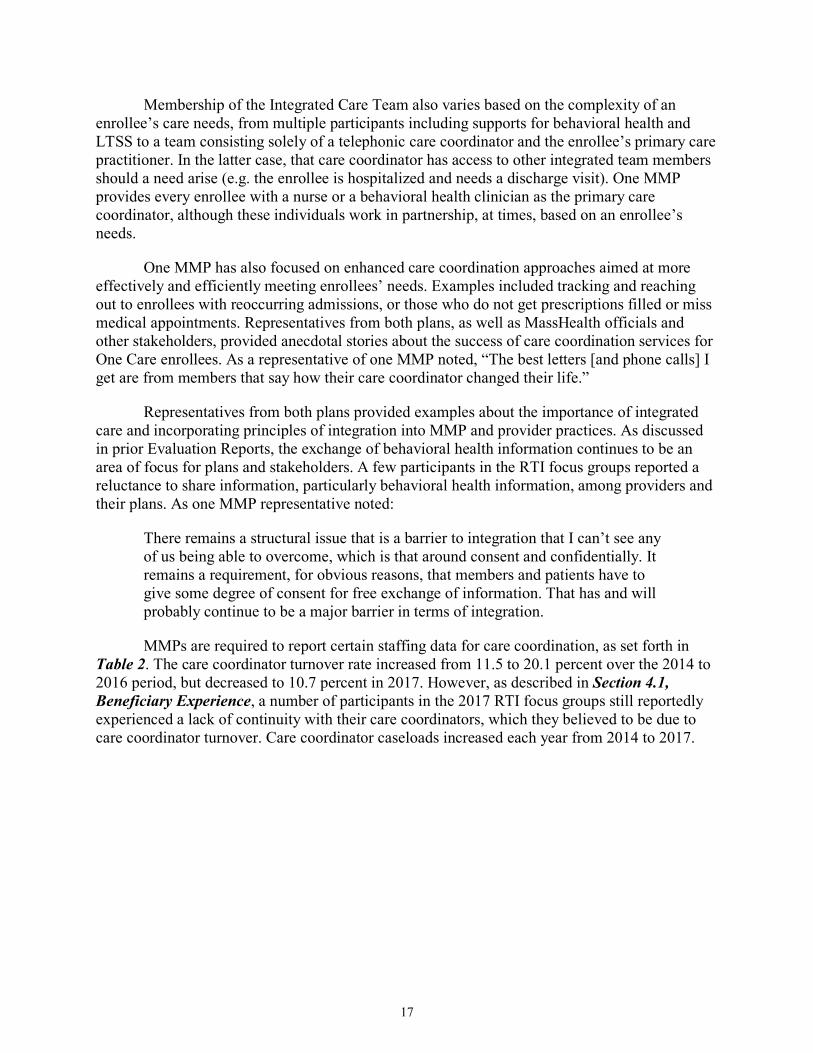
MMPs are required to report certain staffing data for care coordination, as set forth in Table 2. The care coordinator turnover rate increased from 11.5 to 20.1 percent over the 2014 to 2016 period, but decreased to 10.7 percent in 2017. However, as described in Section 4.1, Beneficiary Experience, a number of participants in the 2017 RTI focus groups still reportedly experienced a lack of continuity with their care coordinators, which they believed to be due to care coordinator turnover. Care coordinator caseloads increased each year from 2014 to 2017.
18
Table 2 Care coordination staffing
Calendar year
Total number of care coordinators
(FTE)
Percentage of care coordinators assigned to care management and
conducting assessments
Member load per care coordinator assigned to care management and conducting
NOTES: Data are not available for the fourth quarter of 2013. Fallon Total Care withdrew from the demonstration on September 30, 2015. Data presented for 2015 represent totals for the remaining two plans.
SOURCE: RTI analysis of MMP reported data for Core Measure 5.1, as of April 2018. The technical specifications for this measure are in the Medicare-Medicaid Capitated Financial Alignment Model Core Reporting Requirements document, which is available at: https://www.cms.gov/Medicare-Medicaid-Coordination/Medicare-and-Medicaid-Coordination/Medicare-Medicaid-Coordination-Office/FinancialAlignmentInitiative/MMPInformationandGuidance/MMPReportingRequirements.html
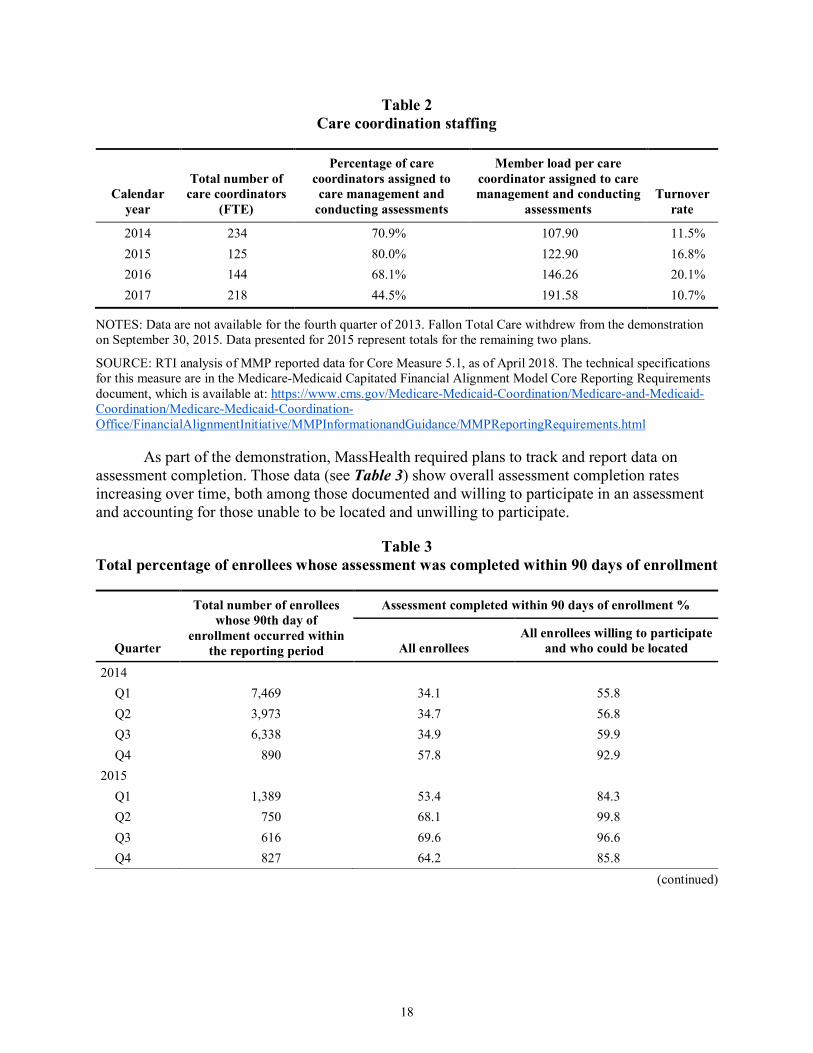
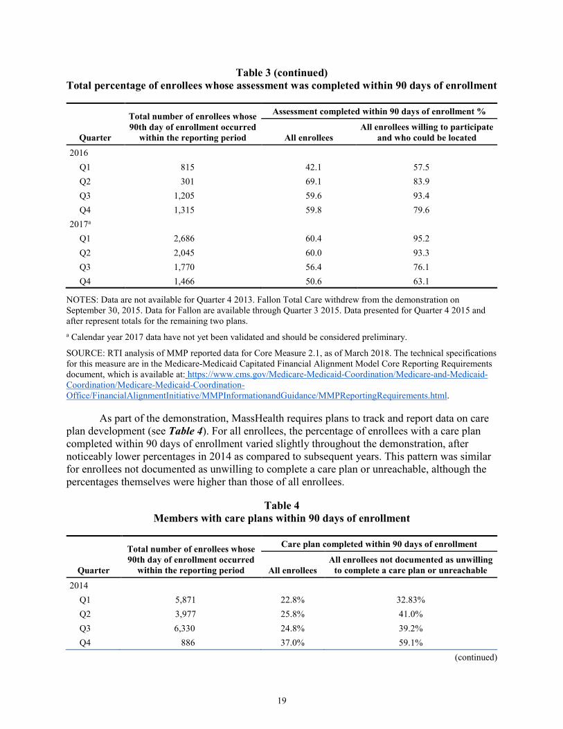
As part of the demonstration, MassHealth required plans to track and report data on assessment completion. Those data (see Table 3) show overall assessment completion rates increasing over time, both among those documented and willing to participate in an assessment and accounting for those unable to be located and unwilling to participate.
Table 3 Total percentage of enrollees whose assessment was completed within 90 days of enrollment
Quarter
Total number of enrollees whose 90th day of
enrollment occurred within the reporting period
Assessment completed within 90 days of enrollment %
All enrollees All enrollees willing to participate
NOTES: Data are not available for Quarter 4 2013. Fallon Total Care withdrew from the demonstration on September 30, 2015. Data for Fallon are available through Quarter 3 2015. Data presented for Quarter 4 2015 and after represent totals for the remaining two plans. a Calendar year 2017 data have not yet been validated and should be considered preliminary.
SOURCE: RTI analysis of MMP reported data for Core Measure 2.1, as of March 2018. The technical specifications for this measure are in the Medicare-Medicaid Capitated Financial Alignment Model Core Reporting Requirements document, which is available at: https://www.cms.gov/Medicare-Medicaid-Coordination/Medicare-and-Medicaid-Coordination/Medicare-Medicaid-Coordination-Office/FinancialAlignmentInitiative/MMPInformationandGuidance/MMPReportingRequirements.html.
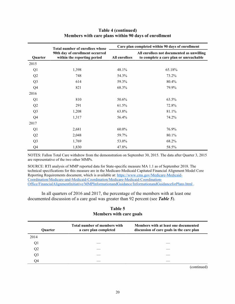
As part of the demonstration, MassHealth requires plans to track and report data on care plan development (see Table 4). For all enrollees, the percentage of enrollees with a care plan completed within 90 days of enrollment varied slightly throughout the demonstration, after noticeably lower percentages in 2014 as compared to subsequent years. This pattern was similar for enrollees not documented as unwilling to complete a care plan or unreachable, although the percentages themselves were higher than those of all enrollees.
Table 4 Members with care plans within 90 days of enrollment
Quarter
Total number of enrollees whose 90th day of enrollment occurred
within the reporting period
Care plan completed within 90 days of enrollment
All enrollees All enrollees not documented as unwilling
NOTES: Fallon Total Care withdrew from the demonstration on September 30, 2015. The data after Quarter 3, 2015 are representative of the two other MMPs.
SOURCE: RTI analysis of MMP reported data for State-specific measure MA 1.1 as of September 2018. The technical specifications for this measure are in the Medicare-Medicaid Capitated Financial Alignment Model Core Reporting Requirements document, which is available at: https://www.cms.gov/Medicare-Medicaid-Coordination/Medicare-and-Medicaid-Coordination/Medicare-Medicaid-Coordination-Office/FinancialAlignmentInitiative/MMPInformationandGuidance/InformationandGuidanceforPlans.html .
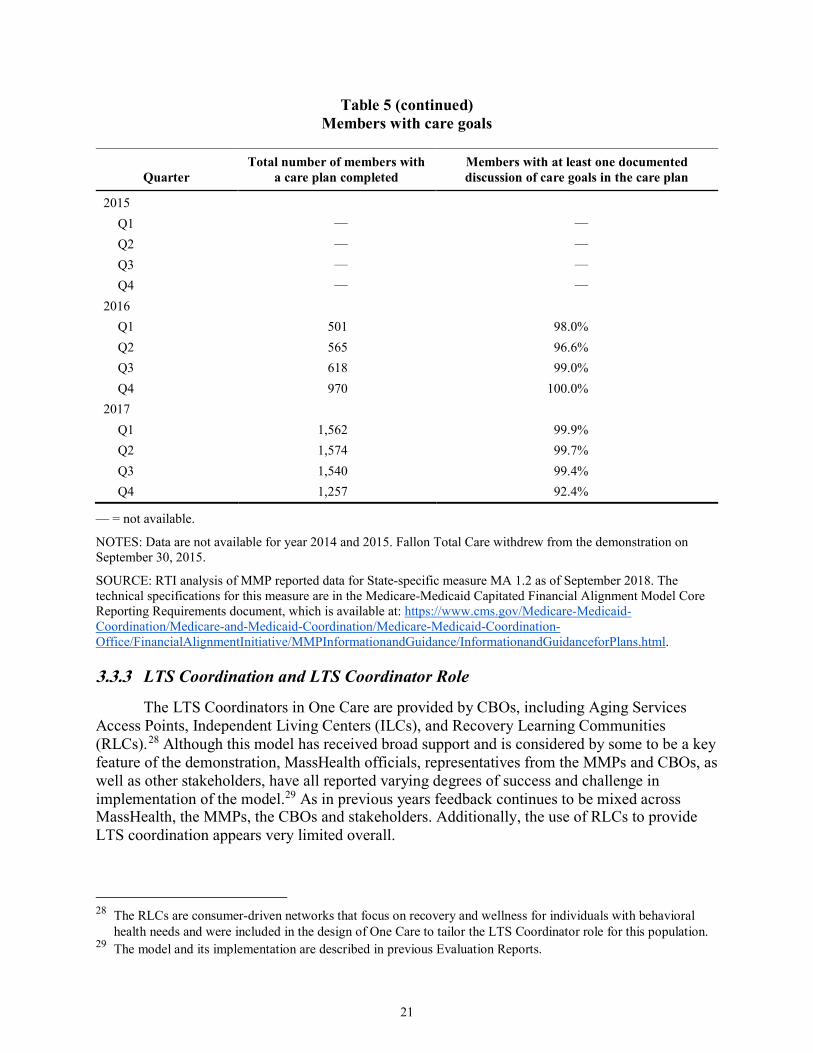
In all quarters of 2016 and 2017, the percentage of the members with at least one documented discussion of a care goal was greater than 92 percent (see Table 5).
Table 5 Members with care goals
Quarter Total number of members with
a care plan completed Members with at least one documented discussion of care goals in the care plan
NOTES: Data are not available for year 2014 and 2015. Fallon Total Care withdrew from the demonstration on September 30, 2015.
SOURCE: RTI analysis of MMP reported data for State-specific measure MA 1.2 as of September 2018. The technical specifications for this measure are in the Medicare-Medicaid Capitated Financial Alignment Model Core Reporting Requirements document, which is available at: https://www.cms.gov/Medicare-Medicaid-Coordination/Medicare-and-Medicaid-Coordination/Medicare-Medicaid-Coordination-Office/FinancialAlignmentInitiative/MMPInformationandGuidance/InformationandGuidanceforPlans.html.
3.3.3 LTS Coordination and LTS Coordinator Role
The LTS Coordinators in One Care are provided by CBOs, including Aging Services Access Points, Independent Living Centers (ILCs), and Recovery Learning Communities (RLCs).28 Although this model has received broad support and is considered by some to be a key feature of the demonstration, MassHealth officials, representatives from the MMPs and CBOs, as well as other stakeholders, have all reported varying degrees of success and challenge in implementation of the model.29 As in previous years feedback continues to be mixed across MassHealth, the MMPs, the CBOs and stakeholders. Additionally, the use of RLCs to provide LTS coordination appears very limited overall.
28 The RLCs are consumer-driven networks that focus on recovery and wellness for individuals with behavioral
health needs and were included in the design of One Care to tailor the LTS Coordinator role for this population. 29 The model and its implementation are described in previous Evaluation Reports.
At the time of the 2017 RTI telephonic site visit, MassHealth officials reported being in a “positive place” with respect to the implementation status of LTS Coordinators following convening a work group in the previous year to address this challenge. They reported that work resulted in better identification of roles and responsibilities and had addressed some of the billing and reimbursement issues that had been identified previously. MMPs generally also reported improvements and a continued focus in this area. One MMP noted a strong partnership on the clinical side of the relationship; some administrative challenges, though improved, continued. Officials of one MMP reported developing a new assessment in 2017 to be used by LTS Coordinators to better standardize assessment of functional need and service need development.
Overall, one CBO representative noted that the role was still a “lighter involvement” than the CBO had initially anticipated, with limited ability to recommend services beyond standardized services allowed by the MMP. Another CBO representative noted that even if the LTS Coordinator was not always fully integrated into the interdisciplinary care team (ICT), the model was more integrated than before One Care. One particular challenge noted by representatives from some CBOs was the rate of turnover in MMP staff, requiring CBO staff to frequently educate and train new MMP staff about the original intent and ideals of the LTS Coordinator role. CBO representatives also noted different processes and procedures across the MMPs, including different levels of access to centralized enrollee records. Clarifying the role of the LTS Coordinator for beneficiaries continues to present challenges. As one MMP officials noted:
There’s still confusion among the members about the LTS Coordinator, but it’s less about what services they may provide and more because they have three or four different folks who seem to be helping them with these things, and they’re just not sure who’s doing what. But their satisfaction levels with the LTS Coordinator when they have one, in terms of meeting their needs, is very high.
3.4 Stakeholder Engagement Strong stakeholder engagement has continued to be a key feature of the One Care
demonstration through activities of the consumer-led Implementation Council and the MMPs’ Member Advisory Boards. This section describes stakeholder engagement activities during the period of this report and the impact of those efforts on the demonstration. Notably, the Commonwealth reported that two additional CAHPS survey questions specific to persons with disabilities were approved for calendar year 2018 after MassHealth and CMS received feedback from stakeholders in the disability community, including one Council member. MassHealth and CMS officials cited the addition of these two questions to the CAHPS survey as an example of successful federal-State collaboration in jointly managing the demonstration.
3.4.1 Commonwealth Open Meetings
MassHealth held three public Open Meetings during demonstration year 4, which were convened in April, May, and November 2017.30 The first two Open Meetings discussed the procurement of the MassHealth Health Plan Ombudsman program, which serves all MassHealth
30 Agenda and meeting minutes can be accessed at: https://www.mass.gov/service-details/one-care-open-meetings.
managed care enrollees as of July 2018. MMP-level quality performance results and financial data from the MMPs were discussed at the third Open Meeting.
3.4.2 Implementation Council Meetings
The first term of the Implementation Council expired at the end of 2016. The Council began its second term in June 2017 with the selection and onboarding of 13 new and returning Council members. The Council continues to be consumer-led; by design, more than half of all members are required to be One Care enrollees or family members or guardians of One Care enrollees. At year end, the Council had formed one subcommittee to develop the Council work plan, and planned to develop three work groups to support the Council’s work plan. The 2017––2018 work plan focuses primarily on enhancing communication access for One Care enrollees, particularly those who are deaf or hard of hearing; supporting enhanced integration of medical care, LTSS, and durable medical equipment; and supporting the sustainability of One Care.
Officials from MassHealth, CMS and the MMPs, along with the One Care Ombudsman, continue to participate in all Council meetings. MMP and CMS officials were invited to “have a seat at the table” as non-voting participants after Council members learned about the structure of the Implementation Council established in Rhode Island’s demonstration, in which CMS and MMP officials regularly participate in meetings. This addition has been viewed positively by the Council “because they [CMS and the MMPs] can be part of the conversation.”
The Implementation Council generally meets monthly but because of the re-solicitation of Council members, there were six meetings in 2017.31 Most were focused on onboarding processes for Council members and creating a work plan. In addition to its monthly meeting, the Implementation Council convened a Listening Session on December 8, 2017 to solicit direct feedback from One Care members about their experience in One Care and provide enrollees with information about the Implementation Council, the One Care Ombudsman, and MMP Member Advisory Boards. See Section 4.1, Beneficiary Experience, for a summary of the discussions.
The Implementation Council continues to be a primary source of feedback for MassHealth and CMS on the demonstration and has led to occasional operational and policy changes. For example, at the suggestions of a Council member, MassHealth will begin to require a domain in assessments asking about an enrollee’s sexual orientation and gender identity to better address that individual’s needs. Additionally, proposed changes described in the three-way contract draft amendment incorporate input and feedback from the Implementation Council (MassHealth presentation to Implementation Council. January 8, 2018).
While noting a close and collaborative working relationship with MassHealth, one stakeholder reported that it can still be difficult at times to engage in open dialogue due to the bandwidth issues and the “protectionist” approach of MassHealth:
31 Agenda and meeting minutes of the Implementation Council can be accessed at: https://www.mass.gov/service-
If there’s always a defensive mode, that doesn’t lead to dialogue… when questions are raised about how things are being done, it’s not an attack. It may feel like it but it’s not an attack.
MassHealth described their relationship with the Council as a working relationship that has evolved over time. As noted in prior Evaluation Reports, MassHealth officials have reported that One Care’s stakeholder structure has set a new standard for public engagement. During the 2017 RTI telephonic site visit, MassHealth officials reported trying to replicate the robust structure of One Care’s Implementation Council across its ACO and MCO initiatives; they also reported that the stakeholder group for the Senior Care Options program has been influenced by One Care’s Council activities.
3.4.3 Member Advisory Board Meetings
As a requirement of the demonstration, each MMP operates a Member Advisory Board (MAB) to solicit feedback on enrollee experience and improve service delivery design. In meetings of the MABs, enrollees reportedly highlighted issues related to transportation services, access to dental services, and other experiences with receiving care from providers during 2017. One MMP official noted that they have shifted the focus of their MAB meetings in the past year from solely seeking feedback to gaining input from enrollees on how to modify programmatic elements and service delivery to be more “consumer focused.” This included discussions on improving conversations between staff and enrollees about denial of services, and how enrollees define “quality of care,” specifically around the LTS Coordinator role and experiences with transportation and dental services. Both MMPs view the MABs as a “very helpful” feature of the demonstration for engaging stakeholders and informing programmatic improvements.
3.5 Financing and Payment
This section outlines changes in financing and payment since demonstration year 3, relevant findings related to these changes, and an overview of cost experience as reported by MassHealth officials and MMP representatives.
3.5.1 Rate Methodology
CMS and MassHealth are each responsible for a portion of the overall capitation rate that is paid to MMPs.32 The Medicare Parts A and B rate component is risk adjusted using the Medicare Advantage CMS-Hierarchical Condition Category (HCC) and CMS HCC end-stage renal disease (ESRD) models. The Medicare Part D payment is risk adjusted using the Part D RxHCC model. The Medicaid component is risk adjusted through the assignment of one of six rating categories based on the enrollee’s clinical status and care setting. These are described more fully in prior Evaluation Reports.
32 As described more fully in previous Evaluation Reports, MMPs receive three monthly payments for each
enrollee: one amount from CMS reflecting coverage of Medicare Parts A/B; one amount from CMS reflecting coverage of Medicare Part D services; and one amount from MassHealth reflecting coverage of Medicaid services. CMS makes a monthly payment reflecting coverage of Medicare Parts A and B services and a separate amount reflecting Part D services.
25
MassHealth in conjunction with CMS released the calendar year 2017 Final Rate Report February 2017; the report details the calendar year 2017 Medicaid and Medicare components of the capitation rates and other supporting information.33 The Medicare component incorporated new revisions to the CMS-CC Risk Adjustment Model to better predict costs for beneficiaries based on their dual status and aged/disabled status. MassHealth reported that the Medicaid rate increase included a $3.6 million investment in complex care management.
As initially implemented, the financial structure of the demonstration also included establishment of savings percentages, performance incentives, high cost risk pools and risk corridors. Earlier reports discuss these in greater detail and provide information on the changes over the course of the first three years of the demonstration. There were no changes to these financing methodologies in 2017, other than scheduled adjustments as set forth in the three-way contract as amended. For example, the demonstration’s savings percentages increased from 0.0 percent in calendar year 2016 to 0.25 percent for calendar year 2017, as established in the contract addendum executed in June 2016. The contract addendum also increased the quality withhold percent in demonstration year 4 to 1.25 percent from 1 percent the previous year (three-way contract addendum, June 2016).
3.5.2 Reported Cost Experience
Overall, the two MMPs have reported different cost experiences with One Care. One MMP initially took on higher enrollment and reported losses in the first two years of the demonstration; the other grew enrollment more slowly and reported positive gains during that same period. At this point in the demonstration, the cost experiences of the two MMPs have shifted: the MMP that initially experienced losses has stabilized financially over the last 2 years and is projecting gains for 2017, whereas the other MMP is now projecting financial losses.
Representatives from one of the MMPs described their financial results as “extraordinary” and reported that initial projections indicated that the MMP would have amounts due back to regulators under the terms of the risk corridors established by the three-way contract.34 Overall, they attributed this net positive operating margin to several factors, including enrollment growth that allowed the plan to spread fixed costs over a greater number of enrollees. Other factors included enrollees being reassessed into higher premiums/rating categories without a comparable increase in medical costs for those enrollees, attributed in part to effective assessment and care management; and improved Medicare rates for Medicare-Medicaid beneficiaries.
Representatives from the other MMP noted that having a relatively small number of enrollees meant that small changes in enrollee mix or the number of catastrophic cases could significantly impact the MMP’s financial position. Specifically, the MMP reported that some of its losses were driven by the service costs of beneficiaries that transitioned to the plan when Fallon Total Care withdrew as an MMP from the demonstration in late 2015. The MMP noted that the 500 or so enrollees who transitioned from Fallon came in with a much higher entry cost 33 For more detail, see Demonstration to Integrate Care for Dual Eligible Individuals CY 2017 Final Rate Report
for CCA and Tufts (February 2017), retrieved from https://www.mass.gov/service-details/one-care-capitated-rate-reports.
34 The risk corridors for One Care are described in the second Evaluation Report.
than the plan’s existing membership; MMP officials also noted that the costs on those enrollees generally accelerated rather than reverting to the mean.
The MMP noted a similar trend in successive waves of enrollment, with each wave coming in at a higher starting point from a medical cost perspective than the previous one. Representatives from the MMP also believed this trend was due in part to the limited size and geographic coverage of the plan:
The longer you stay in [the same geography] and you’re not expanding… your member base, what we’re getting is higher-risk members on capitation rates that for the most part were substandard. So that is certainly a compounding factor to each of the financial losses.
The MMP reported those trends appeared to be settling down, particularly in the in the latter half of 2017.
Although the MMP had set an initial goal of increasing its enrollment to 6,000 beneficiaries, it scaled back that goal in light of the financial losses that were projected in early 2017. Representatives from the MMP noted that although operations had since stabilized to some degree in the latter half of 2017, they had concerns that adding volume based on the projected cost trajectories could result in more significant financial loss. In terms of increasing enrollment, the MMP was in the process of evaluating its service territory and other considerations to determine how best to move forward in 2018. The plan also noted the importance of enrollee retention to capture longer term savings and offset up front investments in assessments and initial service use to address previously unmet needs of new enrollees.
MassHealth officials reported an interest in working with the plan to better understand the root causes for the plan’s financial performance, including any potential issues around enrollee retention. MassHealth officials also expressed an interest in looking more closely at provider pricing in One Care to compare rates of reimbursement to Medicare or Medicaid fee for service rates. In part, MassHealth and MMP officials noted that not having some of the enrollment levers typically available in Medicaid managed care (e.g., fixed enrollment periods) created operational challenges in establishing sufficient enrollment to influence market behavior. MassHealth officials also noted that the membership mix in terms of rating categories differed across the two plans but “[they] were still trying to understand why and how various factors might be impacting on the differing cost experiences of the two MMPs.” They expressed interest in looking at individual level data, including encounters, but recognized that this type of detailed analysis was a longer term strategy.
Overall, MassHealth leadership reiterated their support of the demonstration’s integrated care model and noted that their goal of increased access to this model is dependent on ensuring that the demonstration is financially sustainable. One MassHealth official reported that the Commonwealth was “significantly subsidizing the Medicare dollar” and that greater flexibility was needed around the pricing of the model:
It’s hard to make the economics work for us from the State standpoint, meaning more spend on LTSS is a good thing that results in reduced medical spend, but the
27
economics of that are hard to capture [unless we] get the right flexibilities [to support] enrolling people into the program.
MassHealth, including its leadership, expressed confidence in being able to work collaboratively in partnership with CMS to achieve this goal.
3.6 Quality of Care This section provides information on the quality measures for the demonstration and
updates on the quality management structure for the demonstration and includes HEDIS results. Results of quality measures for the demonstration period are discussed in Section 5, Service Utilization. Selected results of CAHPS data are discussed in Section 4, Beneficiary Experience.
3.6.1 One Care Quality Measures
As described in the First Annual Report, the demonstration design requires that MMPs report standardized quality measures. In October 2017, CMS released updated Core Reporting Requirements for calendar year 2018 with changes intended to “streamline, clarify, and simplify the measure specifications.” The Commonwealth reported that MassHealth and CMS have also been working together to update State-specific reporting requirements as applicable, in order to ensure that the new revisions do not cause a duplication of efforts between State- and core-specific requirements. MassHealth described this revision process as “very collaborative” and that working with CMS on quality measures has “only gotten easier as time has gone on.”
MassHealth noted that the majority of the reporting requirements continue to be helpful to the management of the demonstration; however, as one MassHealth official stated, “[the measures] don’t really give us a lot of information about outcomes and I don’t think that was necessarily what their purpose was.” As described in the Second Evaluation Report, MMP representatives continued to question the added value of some of the required reporting measures.
3.6.2 Quality Management Structures and Activities
MassHealth, CMS, the MMPs, and other independent organizations have a role in quality oversight of One Care.35 Dedicated officials within MassHealth’s One Care team oversee quality metrics and reporting on a daily basis. MassHealth officials also reported a shift toward an agency wide approach in quality monitoring, in order to align quality oversight and monitoring across MassHealth programs. MassHealth officials reported that they are increasingly focused on finding efficiencies and streamlining processes “to align the [quality] measures between the broader payment reform program, One Care, SCO, and the portfolio of unusual LTSS services that are in our State plan…[s]o that whichever model somebody chooses, you’re getting an aligned vision of what the quality looks like.” In 2017, MassHealth also launched a new webpage on One Care’s website to share One Care data reports and quality information with the public.36
35 The overall quality management structure and activities for One Care are described in the First Annual Report. 36 https://www.mass.gov/service-details/one-care-data-reports-and-quality-information.
Both MMPs continue to participate in the required quality activities, including a chronic care improvement project and a quality improvement project (QIP). According to the Commonwealth, oversight of QIPs has shifted from joint review between MassHealth and CMS to a State-only review. MassHealth worked with both MMPs to ensure measurement accuracy between the proposed interventions, the member sample, and the objectives of the QIP, after reported measurement challenges with one MMP’s QIP. MassHealth conducted a number of efforts in 2017 to streamline Commonwealth- and MMP-level processes and programming related to QIPs, including revising quality reporting forms and timelines, and encouraging overlap of QIP programming with the plans’ other product lines.
3.6.3 Independent Quality Activities
The Implementation Council plays a key role in monitoring access to health care and compliance with the Americans with Disabilities Act, tracking quality of services, and promoting accountability and transparency. In light of MassHealth’s broader reforms, one Council member reported that supporting the alignment of One Care quality measures with quality activities across Massachusetts’ health care delivery system is a priority of the Council.
The One Care Ombudsman (OCO) program is responsible for providing independent advocacy on behalf of beneficiaries and for identifying broader systematic issues impacting quality of care. The OCO reports on provision of individual enrollee services, outreach efforts, and number and type of complaints escalated to either MassHealth or the MMP on a quarterly basis to MassHealth. The OCO regularly attends and presents on quality issues, such as enrollee inquiries and complaints received, at the monthly Implementation Council meetings.
In 2017, Massachusetts began restructuring MassHealth ombudsman services to create one ombudsman program to serve multiple MassHealth managed care and accountable care programs; ombudsman services for One Care are anticipated to be incorporated into this larger initiative. MassHealth released a procurement for ombudsman services in October 2017 which was implemented under the name “My Ombudsman” on July 1, 2018. In developing the procurement, MassHealth leveraged lessons learned from the OCO. MassHealth anticipates that a wide-reaching ombudsman program will allow for tracking trends and patterns related to service access for dual eligible individuals and others living with disabilities across populations and programs, and to more clearly identify systemic policy issues and potential improvements.
Under Medicaid regulations (42 CFR Part 438, Subpart E), State Medicaid agencies contract with an External Quality Review organization (EQRO) on an annual basis to provide an independent assessment of their managed care plan performance. The EQRO conducts performance measure validation and validates each plan’s chronic care and QIPs.
3.6.4 Results for Selected Quality Measures
Thirteen Medicare HEDIS measures for MMP enrollees are reported in Table 6. RTI identified these measures after reviewing the list of measures we previously identified in RTI’s Aggregate Evaluation Plan as well as the available HEDIS data on these measures for completeness, reasonability, and sample size. Detailed descriptions of the measures can be found
29
in the RTI Aggregate Evaluation Plan.37 Results were reported for measures where sample size was greater than 30 beneficiaries. In addition to reporting the results for each MMP, the mean value for Medicare Advantage plans for each measure is provided for comparison.
Table 6 Selected HEDIS measures for One Care plans, 2015–16
Measure
National Medicare Advantage Plan
mean (2016) (%)
CCA (2015)
(%)
CCA (2016)
(%)
Tufts (2015)
(%)
Tufts (2016)
(%)
Adults’ access to preventive/ambulatory health services
94.7 77.9 97.3 92.2 95.8
Adults’ body mass index (BMI) 93.9 97.5 87.8 96.0 93.3 Annual monitoring for patients on persistent medications
Annual monitoring for members on angiotensin converting enzyme (ACE) inhibitors or angiotensin receptor blockers (ARBs)
92.4 91.1 90.4 85.2 89.0
Annual monitoring for members on digoxin
57.3 62.1 61.3 66.7 50.0
Annual monitoring for members on diuretics
92.9 90.3 90.0 86.3 91.7
Total rate of members on persistent medications receiving annual monitoring
Table 6 (continued) Selected HEDIS measures for One Care plans, 2015–16
Measure
National Medicare Advantage Plan
mean (2016) (%)
CCA (2015)
(%)
CCA (2016)
(%)
Tufts (2015)
(%)
Tufts (2016)
(%)
Good control of HbA1c level (<8.0%) 62.2 35.0 45.5 62.0 59.9 Received eye exam (retinal) 70.0 66.2 67.4 63.1 68.6 Received medical attention for nephropathy
95.6 93.7 93.9 93.7 93.2
Blood pressure control (<140/90 mm Hg) 69.0 60.8 67.6 69.7 67.4 Disease modifying anti-rheumatic drug therapy in rheumatoid arthritis
76.6 84.3 84.4 N/A N/A
Follow-up after hospitalization for mental illness (30 days)
53.2 72.1 78.7 76.6 79.5
Initiation and engagement of alcohol and other drug (AOD) dependence treatment
Initiation of AOD treatment5 32.3 43.3 43.1 40.0 47.9 Engagement of AOD treatment6 3.5 11.3 12.7 13.16 15.6
Plan all-cause readmissions (average adjusted probability total)
— 22.0 23.0 22.2 24.0
Ambulatory care (per 1,000 members) Outpatient visits 9,181.9 12,192.0 12,572.5 9,581.0 9,389.3 Emergency department visits 637.8 1,418.6 1,350.2 1,446.3 1,308.9
1 Represents the percentage of members who remained on an antidepressant medication for at least 84 days (12 weeks). 2 Represents the percentage of members who remained on an antidepressant medication for at least 180 days (6 months). 3 The following criteria were used to determine adequate blood pressure control: less than 140/90 mm Hg for members 18–59 years of age; diagnosis of diabetes and <140/90 mm Hg for members 60–85 years of age; no diagnosis of diabetes and <150/90 mm Hg for members 60–85 years of age. 4 For the Care for Older Adults measures, few enrollees are age 65 or older. Also, there is no Medicare Advantage benchmark for these measures as they are only required for Special Needs Plans and MMPs. 5 Represents percentage of members who initiate treatment through an inpatient AOD admission, outpatient visit, intensive outpatient encounter or partial hospitalization within 14 days of the diagnosis. 6 Represents the percentage of members who initiated treatment and who had two or more additional services with a diagnosis of AOD within 30 days of the initiation visit.
NOTES: N/A = not applicable; — = not available or the number of enrollees in the plan’s provided HEDIS data available for inclusion in the measure was less than 30, and therefore not reported per RTI’s decision rule for low addressing sample size. Detailed descriptions of HEDIS measures presented can be found in the RTI Aggregate Evaluation Plan: https://www.cms.gov/Medicare-Medicaid-Coordination/Medicare-and-Medicaid-Coordination/Medicare-Medicaid-Coordination-Office/FinancialAlignmentInitiative/Downloads/EvalPlanFullReport.pdf
SOURCE: RTI analysis of 2015 and 2016 HEDIS measures.
We provide national benchmarks from Medicare Advantage plans, where available, understanding that Medicare Advantage enrollees and demonstration enrollees may have different health and sociographic characteristics. Previous studies on health plan performance reveal poorer quality ratings for plans serving a higher proportion of dual eligible beneficiaries and beneficiaries with disabilities. HEDIS measure performance is slightly worse among plans active in areas with lower income and populations with a higher proportion of minorities (Office of the Assistant Secretary for Planning and Evaluation, 2016). Benchmarks should be considered with that limitation in mind. These findings on Massachusetts MMP HEDIS measure performance are likely to change over time as MMPs gain more experience in working with enrollees. Monitoring trends over time in MMP performance may be more important than the comparison to the national Medicare Advantage plans given the population differences. Several years of HEDIS results are likely needed to know how well MMPs perform relative to each other and whether they perform above or below any potential benchmark.
For each measure, results across CCA and Tufts vary, and there was not a consistent trend across measures for one MMP versus the other. Results reported below compare the two plans, with the exception of some measures where sample size was less than 30 beneficiaries. For four of the 13 reported measures, both plans performed better than the national Medicare Advantage benchmark value in 2016. These measures were adults’ access to preventive/ ambulatory health services, breast cancer screening, follow-up after hospitalization for mental illness, and initiation and engagement of alcohol and other drug dependence treatment. Tufts performed better than the benchmark on antidepressant medication management. CCA performed better on disease modifying anti-rheumatic drug therapy in rheumatoid arthritis. For the remaining measures, both plans performed below the 2016 benchmark value.
Performance on HEDIS measures remained relatively stable between 2015 and 2016. However, both plans experienced decreases in the percentages of enrollees with antidepressant medication management. Both CCA and Tufts experienced increases in the percentage of enrollees on persistent medications, particularly angiotensin converting enzyme (ACE) inhibitors, angiotensin receptor blockers (ARBs), and diuretics. Both the percentage of enrollees whose blood pressure was adequately controlled and the percentage of enrollees who initiated and engaged in alcohol and other drug (AOD) dependence treatments increased between 2015 and 2016 for both CCA and Tufts. CCA experienced a nearly 20 percent increase in the number of enrollees who had an ambulatory or preventive care visit in the measurement year. CCA also saw an increase in eye exams, blood pressure control, and control of HbA1c levels (<8.0 percent) for those receiving diabetes care. Tufts experienced an increase in the percentage of beneficiaries on persistent medications receiving annual monitoring. CCA experienced increases in most Care for Older Adults measures, with over 20 percentage point increases in each of the advanced care planning and medication review measures. Ambulatory care per 1,000 members for outpatient visits increased between 2015 and 2016 for both CCA and Tufts, while ambulatory care for emergency department visits decreased for both plans.
32
[This page intentionally left blank]
33
4. Beneficiary Experience
One of the main goals of the demonstration under the Financial Alignment Initiative is to improve the beneficiary experience accessing Medicare and Medicaid. This section highlights beneficiary experience with One Care, and provides information on beneficiary protections, data related to complaints and appeals, and critical incident and abuse reports. The section also includes information on the experience of special populations.
4.1 Methods and Data Sources In line with all Medicare Advantage plans, One Care plans conducted annual assessments
of beneficiary experiences using a Medicare Advantage and Prescription Drug Plan CAHPS survey instrument, which included question items added for the Financial Alignment Initiative evaluation of capitated model demonstrations. This section presents results from the 2015, 2016 and 2017 CAHPS surveys. This section provides national benchmarks from Medicare Advantage plans, where available, understanding that Medicare Advantage enrollees and demonstration enrollees may have different health and sociographic characteristics which would affect the results. There are differences in the populations served by the One Care demonstration and the Medicare Advantage population, including health and socioeconomic characteristics that must be considered in the comparison of the demonstration to the national Medicare Advantage contracts.
This section also presents findings from key informant interviews with MassHealth officials, One Care plan representatives, CBO staff, One Care Ombudsman staff and Implementation Council members. Complaint, grievance, and appeals data are also discussed in this section. Sources of these data include CMS’s Complaint Tracking Module, Report covering [October 2013–December 2017] MMP reported data for Core Measure 4.2; and IRE data for January 2014–December 2017. Data sources also include excerpts from a MassHealth survey conducted in the summer of 2016 in partnership with the University of Massachusetts Medical School (UMMS), of 1,532 randomly selected beneficiaries who had previously been enrolled with Fallon Total Care (Fallon), an MMP that withdrew from the demonstration in late 2015. Sixty-five percent of the respondents in the sample had transitioned to the FFS system, whereas 35 percent had enrolled with a different One Care plan.
Highlights
• RTI focus group participants generally expressed satisfaction with One Care, often referencing the receipt of new or expanded services.
• Most RTI focus group participants were able to identify a person responsible for coordinating their care; many participants also reported care coordinator turnover.
• MassHealth and the One Care Ombudsman reported that the majority of grievances and appeals filed in 2017 primarily concerned denials for dental services or quality issues related to transportation services.
34
In April 2017 the RTI evaluation team conducted eight focus groups with a total of 44 One Care enrollees who were receiving LTSS and had self-reported behavioral health needs. The focus groups explored enrollees’ experiences with care, their interactions with their providers, their experiences with One Care’s beneficiary protections, and the impact of demonstration services on their lives. For Spanish-speaking enrollees, the focus groups also aimed to understand their experience with the demonstration as a special population, including the availability of Spanish-speaking care coordinators, medical staff, or translators, and the level of cultural sensitivity care coordinators and other One Care staff exhibited. Findings from a previous round of focus groups conducted by RTI are presented in prior Evaluation Reports. See Section 1.2 for a full description of the focus group and other data sources.
4.2 Impact of the Demonstration on Beneficiaries
4.2.1 Overall Satisfaction with the Demonstration
Many of the 2017 RTI focus group participants expressed satisfaction with One Care. Although some participants noted quality or access issues, they often characterized the demonstration overall as being better than the care they previously received. One participant described it as “more seamless,” and another as “all-inclusive.” As one participant remarked, “Everything is coordinated…You have two plans and they’re all under one, and it makes it easier for your healthcare to be more managed. So that is what I like most about it.”
Several participants in one group described their experience with One Care as “more humane.” As one of the participants explained:
They identify your needs better, instead of doing their job just for the money without actually caring how you feel…Also, the insurance benefits. In my case, they give me transportation, counseling. They come to my house from time to time to see what I need.
Another participant rated experience in One Care as a “9 out of 10” because:
I don’t have to spend hours and hours in stressful communications …Suffice it to say, [before One Care] it was nothing but runarounds, and nobody home and nobody called you back, etc. etc. When you are fine, it is difficult to play the runaround game, let alone when you are sick. I am very happy I don’t have to play the runaround game.
Several participants across the RTI focus groups favorably mentioned the ability to call a single number when they needed help or assistance instead of “calling this person and calling that person.” Some of the factors contributing to satisfaction were consistent with those mentioned by RTI focus group participants in prior years.38 These included the elimination of co-payments on medications, the availability of new benefits, and the assistance provided through care coordination.
38 Findings from RTI focus groups conducted in 2015 and 2016 are described in the first Annual Report and the
second Evaluation Report, respectively.
35
One Care stakeholders, including representatives from the Implementation Council and the One Care Ombudsman program, also provided positive feedback about beneficiary experience. As one stakeholder noted:
I am convinced more than ever that the One Care design is working really, really well for a lot of people with complex healthcare needs. We hear time and time again how the flexibility and additional services make it a much better quality of life for a lot of people.
As indicated in Table 7 below, most 2017 CAHPS survey respondents reported a high degree of satisfaction with their health and drug plans. When asked to provide an overall rating (on a scale of 0 to 10 with 10 being the best) of their One Care plan, most survey respondents ranked it as a 9 or 10. Most survey respondents reported that they “usually” or “always” received the information they needed from their One Care plan. Rates of beneficiary satisfaction across these measures for both MMPs are higher in 2017 than the first two demonstration years. As representatives from MassHealth, CMS and the MMPs noted, the CAHPS results generally show high satisfaction; One Care plans overall performed at or above the national distribution for Medicare Advantage and MMP contracts each year for all measures of beneficiary satisfaction considered.
Of note, MassHealth conducted a survey in 2016 of beneficiaries who had been enrolled with Fallon, the MMP that withdrew from the demonstration in late 2015; the survey included beneficiaries who had either transitioned to a new One Care plan or back to FFS. Findings from this survey were made available in 2017.39 Participants were asked about their experiences with the transition, to compare their experiences and perceptions of care received while enrolled in Fallon to their new care. Although overall satisfaction with care was generally high for respondents moving back to the FFS system (66 percent) or to another MMP (69 percent), respondents who transitioned back to the FFS system were significantly more likely to rate their experience with the FFS system as worse compared to their experience with Fallon in meeting their needs for medications, dental care, and personal care services. In a number of other areas, there were no notable differences. As one MassHealth official noted:
[We were hoping] we would get a really clear picture [from the survey results] of not just the FFS to One Care but the One Care to FFS experience, when people at least knew what they were comparing One Care to or comparing FFS to. It wasn’t as clear as I expected it to be for most people.
Feedback on enrollee satisfaction with One Care was also solicited during a town hall listening session hosted by the Implementation Council on December 8, 2017. Sixty-seven enrollees participated, either by phone or in person at one of four sites. In general, enrollees reported satisfaction with both One Care coverage and benefits, as well as with their care coordinator. Common themes voiced at the listening session were consistent with focus group findings and included lack of continuity with either their care coordinator or LTS Coordinator
39 Survey findings were presented to the Implementation Council at its July 25, 2017 meeting. The presentation can
be accessed at: https://www.mass.gov/files/documents/2017/08/31/170725-fallon-transition-survey-report.pdf
due to high turnover, issues with utilizing transportation services, and lack of awareness of supports available through the interdisciplinary care team (ICT).40
Table 7 Beneficiary overall satisfaction, 2015–17
CAHPS survey item Year
National distribution—all
MA contracts (%)
National distribution—all MMP contracts
(%)
MA distribution—
MMP contracts (%)
CCA (%)
Tufts (%)
Percent rating health plan 9 or 10 on scale of 0 0(worst) to 10 (best)
2015 62 (n=148,335)
51 (n=5,141)
— 70 (n=324)
62 (n=189)
2016 61 (n=142,984)
59 (n=9,765)
— 77 (n=342)
58 (n=169)
2017 64 (n=188,484)
63 (n=14,662)
73 (n=544)
75 (n=328)
64 (n=221)
Percent rating drug plan 9 or 10 on scale of 0 (worst) to 10 (best)
2015 62 (n=136,044)
56 (n=5042)
— 76 (n=324)
62 (n=185)
2016 61 (n=132,613)
61 (n=9,617)
— 78 (n=343)
67 (n=168)
2017 63 (n=172,033)
64 (n=14,087)
77 (n=514)
78 (n=301)
70 (n=218)
Percent reporting that health plan “usually” or “always” gave them information they needed
2015 80 (n=45,457)
73 (n=2,058)
— 83 (n=162)
86 (n=90)
2016 81 (n=42,677)
79 (n=3,669)
— 82 (n=154)
76 (n=92)
2017 87 (n=84,304)
86 (n=8,234)
89 (n=317)
90 (n=176)
89 (n=143)
MA = Medicare Advantage; MMP = Medicare-Medicaid Plan.
NOTES: (—) Indicates data not available. Data for Fallon Total Care is not available after 2015 due to the MMP’s withdrawal from the demonstration; data for Fallon Total Care for 2015 were reported in prior Evaluation Reports.
SOURCE: CAHPS data for 2015–17.
4.2.2 New or Expanded Benefits
A key design feature of One Care is that it offers new and expanded benefits to enrollees. As detailed in prior Evaluation Reports, these benefits include diversionary health services, expanded Medicaid services, and new community LTSS. Consistent with prior RTI focus groups, many participants across the different focus groups cited the elimination of pharmacy co-pays as an important advantage of the demonstration. In the words of one focus group participant, “One of the biggest things [about One Care] is not worrying about having to skip a prescription because I don’t have the copay to pay for it.”
40 The full summary of the December 8 Listening Session can be accessed at:
Many of the RTI focus group participants provided specific examples of new or expanded benefits they received under One Care. Examples included dental services, eyeglasses and contact lenses, acupuncture, nutrition classes, grab bars, homemaker services, transportation for grocery shopping, peer supports, and in-home behavioral health services. Although a few participants mentioned getting gym memberships, others reported being told by their plan that gym memberships were not a covered benefit. Overall, participants’ knowledge of available benefits under One Care varied; some participants were aware of the benefits offered through One Care, although others expressed surprise at hearing about these benefits from other focus group participants.
A few participants noted that the availability of these services was important even if they did not need them:
[I like] having as much independence as I can and depending on people to help me with things when it’s necessary. And when it’s not, I want to try to at least do some of it myself. But knowing I have [the services], it’s just a good thing.
4.2.3 Medical and Specialty Services
A combined set of Medicare and Medicaid benefits is offered as part of a single benefit package under the demonstration. Benefits include coordination by the One Care plans of all medical services, including primary care, behavioral health, specialty care, and prescription medications. Most RTI focus group participants expressed general satisfaction with their providers. Participants reported that being able to keep their doctor was an important consideration when choosing to participate in the demonstration.
Some participants were dissatisfied with frequent turnover in some types of providers, particularly among primary care physicians and behavioral health counselors:
My therapist, I lost her not long ago because she moved on to bigger and better…as far as PCPs [primary care physicians] are concerned, ha. I’ve had more PCPs than you can shake a stick at.
A few participants commented negatively on being given “interim” providers who they saw only for a few months; one participant attributed this to clinics that were associated with teaching hospitals.
Feedback was mixed from focus group participants on whether their providers worked as a team and communicated well with each other. Some participants described the team as being comprised of their primary care physician and specialists; some included their care coordinator when describing their team and others did not. A few focus group participants did not believe there was communication between their providers or did not feel there was a team approach. One participant reported not wanting communication between the care coordinator and other providers.
38
4.2.4 Care Coordination Services
Care coordination is a central component of the One Care demonstration intended to ensure comprehensive assessment of enrollees’ medical, behavioral health, and LTSS needs, and to coordinate services across the various service systems and providers. By design, One Care enrollees may have multiple people coordinating their care. As discussed in Section 3.3, Care Coordination, plans have implemented different models of delivery for care coordination. As part of the design of One Care, enrollees are also offered an LTS Coordinator who is independent of the plans to coordinate LTSS needs.
Almost all participants across the RTI focus groups identified a person (or persons) responsible for coordinating their care, although it was not always clear if that individual was a care coordinator at the MMP, an individual conducting assessments, an LTS Coordinator, or a social worker or other person affiliated with a provider agency or organization. Only a few participants reported not having a care coordinator or not knowing they had a person to call who could help them. Several participants could identify their care coordinator by name. Most participants spoke favorably about the person helping them or the care coordination services they were receiving. Common themes related to satisfaction with care coordination services included the ability to access new services, having a place to get information, facilitating easier access to services, and reduced stress. Some examples of feedback included:
When I had MassHealth, I always had to call about everything even if it meant that I had to be on the phone one hour dealing with that machine, waiting for someone to answer. Now I have the option to call [my care coordinator] to make any inquiries and it doesn’t take that long either.
It’s like a personal relationship that you create with them. At least mine. Not all the time, but most of the time, she is paying attention to when I have an appointment and she tries to be there for my appointments.
[Care coordination services] have taken a lot of stress away. You don’t have to really think about things now because they are telling you what is available and what your needs are is in there…I like the ability to call up the coordinator and just have it done.
A few participants reported that their care coordinator also assisted them with housing needs, although the reported level of assistance varied. For example, one participant reported being given a list of phone numbers to call, whereas another participant’s care coordinator provided all the paperwork to the individual and helped with filling out the forms.
Some focus group participants, however, reported negative experiences with their care coordination services, usually citing a lack of responsiveness or competence of their care coordinator. The following are some examples of participant feedback:
I have problems with case managers… the reason I picked the plan was because they said I would have a medical coordinator or case manager. A case manager was assigned to me to make sure everything went smoothly for all my behavioral health and [medical care] …and she didn’t follow through. So, I look up one day,
39
she was gone...they assign me another one. She was supposed to come out. She never showed. She was just too busy.
[My care coordinator] doesn’t know anything, even to the smallest issue.
A number of participants across the RTI focus groups reported that their care coordinator had changed several times since enrolling in One Care; a few commented that their care coordinator was overworked and responsible for too many people, and that this resulted in a lack of personalized service.41
4.2.5 Quality and Access to Care
Most participants, though not all, reported that they did not need to switch providers when they joined One Care. A few participants mentioned having to change their primary care practitioner or a specialist. As in prior years, participants reported that their decision to enroll in the demonstration was influenced by whether particular providers were participating in One Care. As one participant noted:
It’s not easy starting with a new psychologist after you’ve known yours for so long, a psychiatrist who already knows what you’re like…To start over again? No way.
Many participants reported satisfaction with their ability to access care since enrolling in the demonstration and reported access to services and providers had improved:
They have gotten me a walker. They have gotten me diabetic sneakers. They’ve gotten me a bed. They have gotten me so much stuff that I have never had before. And it was a struggle to have MassHealth or Medicare before [One Care] entered my life. All I have to do is just ask, and when you ask, they go through the procedures they have to go through and come back later and say, “Okay, you’re approved.”
Some participants reported favorably on their ability to access some services from their home; this included in-home medical and behavioral health services as well as being able to have prescription medications mailed to their homes. Some reported access to medical and specialist care was the same since enrolling in One Care; others reported it had improved. Participants reported wait times for some providers, especially for behavioral health services. Several participants felt that dental services were limited, both in terms of provider availability and coverage.
Similar to prior years, a number of focus group participants reported issues and complaints about non-emergency transportation; lack of this service impeded access to appointments and other needed services. Issues included no-shows and wait times. Some participants reported they no longer used the transportation services because of quality issues; one participant reported being provided a bus pass because of the poor quality of the other
41 Care coordinator staffing ratios and turnover rates are reported in Section 3.3, Care Coordination.
40
transportation services. A few participants noted that requiring transportation to be scheduled at least 48 hours in advance created barriers for the scheduling of some appointments.
A few participants mentioned service delays of up to several months in getting in-home equipment such as hand rails and grab bars due to the number of authorizations required. Other participants reported being offered homemaker services, in some cases more than once, but those services were never provided. Several participants across the RTI focus groups reported receiving bills in error for health care services, including ambulance services, primary care physician visits, and behavioral health services. In most cases, participants were working with their care coordinators or with the provider directly to resolve the situation.
Participants offered several suggestions for improving One Care: covering additional medications such as lidocaine patches; improving supervision over homemaker services; improving information to beneficiaries about benefits covered by One Care; increasing the number of care coordination staff; increasing the variety of vendors for homemaker and laundry services; maintaining updated provider directories; and offering more comprehensive dental services. One participant expressed interest in having more choices for community mental health residential placements as an alternative to inpatient hospitalization.
4.2.6 Personal Health Outcomes and Quality of Life
A key goal of One Care is to positively impact health outcomes and quality of life for beneficiaries. Generally, most RTI focus group participants reported that the demonstration had positively impacted their lives. Many of the participants attributed this to the services they received as well as the care coordination services that reduced stress. One participant reported an improved quality of life both because of receiving dental services (“I’m smiling [now]”) but also because One Care overall had promoted a change in attitude:
I’ve changed my thought process about my health… Just that now I’m concerned about my health. At the end of the day, I smile because I’m in good health.
Some participants reported that their health had deteriorated since enrolling with One Care, but very few attributed this to the demonstration. One participant commented that even though his heath was worse, “if I had been under some other plan, it would have been an absolute disaster.” The few participants who reported a worsening quality of life or deteriorated health condition due to One Care generally attributed that to the quality of provider services or specific access issues they had experienced.
Some of the RTI focus group participants also reported that One Care had allowed them to engage, or re-engage, in life activities or hobbies they enjoyed. In some cases, participants attributed improved quality of life and well-being to receiving appropriate behavioral health services. Participants provided other examples of improvements in quality of life, including greater independence, being listened to instead of being ignored, and getting help they needed even when they had not previously realized they needed help. One participant reported:
I am now looking for a job again… [Before One Care] I was virtually depending on government funds and the like. And now, thanks to the insurance that covered all these benefits, I can look for a job.
41
4.2.7 Experience of Special Populations
This section summarizes the beneficiary experience for One Care special populations, including individuals with LTSS or behavioral health needs, and racial/ethnic or linguistic minorities. Because of the population served by One Care, many of the experiences of RTI focus group participants with behavioral health or LTSS needs are described as part of beneficiary experiences reported above and are not repeated here.
Although many focus group participants did not report feeling that they were being treated differently based on race or ethnicity, a few participants reported feeling that they were treated disrespectfully because of their race or that they did not always receive the care or referrals they needed. As one participant remarked:
[I felt] hostility…and racism against Latinos. Because she was very, very rude to me. She wanted me to do things I couldn’t do. And she tried to harass me. That’s how I felt. But what I sensed in her was contempt against Latinos, and I felt very bad about that.
Spanish-speaking participants reported that language needs were an important aspect of receiving health care. Most participants who were Spanish-speaking reported having providers who spoke Spanish or being provided interpreter services. Participants generally reported receiving handbooks and other information from their plans in Spanish. A few participants reported problems with communication because of language barriers or disabilities such as hearing impairment.
4.2.8 Beneficiary Protections
The One Care demonstration was designed to “ensure that strong protections of enrollee health, safety, and access to high quality health and supportive services are in place” (Commonwealth Proposal, February 16, 2012, p. 23). Protections include, but are not limited to, complaint and appeals processes that provide an avenue for beneficiaries to seek redress when they have issues or disagree with decisions made by One Care plans or providers, and the availability of an Ombudsman Program to advocate for the beneficiary. Enrollees have the right to file a grievance, also known as a complaint, directly with their One Care MMP, MassHealth, Medicare or the One Care Ombudsman (OCO). Enrollees are also able to appeal decisions made by a One Care plan to deny, limit, terminate, or suspend a service or procedure through an appeals process developed by CMS and MassHealth.42
Plans are required to record all grievances and track related actions and resolutions, which are then reported to MassHealth and CMS on a monthly basis. The OCO is similarly required to maintain a documentation and tracking system for grievances and appeals, and reports these to MassHealth on a quarterly basis.43 Beginning in September 2017, MassHealth expanded the detail with which plans reported complaints about service authorizations and
42 The processes under One Care for filing a grievance and appeal are described in the first Annual Report and the
second Evaluation Report. 43 Grievance and appeals reporting processes under MMPs and the OCO are described in the first Annual Report
and the second Evaluation Report.
42
denials to include the following subcategories: behavioral health, durable medical equipment, home health, LTSS (broken down by a variety of subcategories, including, for example, Personal Care Attendant (PCA) homemaker heavy chore service, PCA companion services, and home delivered meals), dental (with additional subcategories), transportation, and other. MassHealth reported that this breakdown allows for more detail in reporting service denials.
The OCO reported that approximately two-thirds of its caseload consists of assisting individuals with behavioral health needs. The OCO has been able to resolve the majority of cases brought forward in favor of the beneficiary. The OCO maintained a 90-95 percent approval rating from beneficiaries who utilized ombudsman services throughout 2017, according to the OCO Consumer Satisfaction Survey. Overall, participants in the RTI focus groups appeared to better recognize the OCO than in prior years. A number of focus group participants expressed some level of familiarity with the OCO, either with its name or its role; several participants reported having the OCO’s magnet on their refrigerators. One participant reported successfully contacting the OCO about issues with transportation services.
Following is a summary of grievance (complaint) and appeals data received from (1) data reported by MMPs on complaints made directly to them;44 (2) data reported on the CTM for complaints received by MassHealth and 1-800-Medicare;45 (3) qualitative information received from key informant interviews;46 (4) data reported by the Independent Review Entity (IRE), which is a second-level review of appeals;47 and (5) qualitative information collected by the evaluation team. Reporting periods vary across these sources.
In the first 2 years of the demonstration (Quarter 4 2013 through 201448, and 2015), the number of grievances per 1,000 enrollees reported by MMPs displayed a general upward trend, reaching a high of 77 in the last quarter of 2015. In 2016 the number of grievances per 1,000 enrollees began declining and declined in each quarter. This measure fluctuated in 2017, with an increase in the first quarter of 2017 compared to the fourth quarter of 2016, followed by declines in the second and third quarters of 2017 and an increase to 35 in the fourth quarter of 2017.49 The number of complaints reported to 1-800-Medicare decreased from the fourth quarter of 2013 through 2014 (demonstration year 1) (68) to 2016 (31), with a slight increase in the number of complaints from 2016 to 2017 (33).50 In 2017, the highest proportion of complaints were related to enrollment and disenrollment issues and benefits, access and quality of care. Compared with
44 MMP Reported Data provided to RTI by CMS. 45 Data obtained from the Complaint Tracking Module (CTM) within HPMS by RTI. 46 Information obtained by RTI during site visits. 47 Data provided to RTI by CMS. 48 Demonstration year 1 includes Quarter 4, 2013, and calendar year 2014. All demonstration years after
demonstration year 1 are full calendar years. E.g., demonstration year 2 is calendar year 2015. 49 Source: RTI analysis of MMP reported data for Core Measure 4.2, as of March 2018. The technical
specifications for this measure are in the Medicare-Medicaid Capitated Financial Alignment Model Core Reporting Requirements document, which is available at: https://www.cms.gov/Medicare-Medicaid-Coordination/Medicare-and-Medicaid-Coordination/Medicare-Medicaid-Coordination-Office/FinancialAlignmentInitiative/FinancialModelstoSupportStatesEffortsinCareCoordination.html.
50 Demonstration year 1 (October 2013–December 2014), demonstration year 2 (January 2015–December 2015) demonstration year 3 (January 2016–December 2016), demonstration year 4 (January 2017–December 2017).
prior years, a higher proportion of complaints were related to improper, insufficient or delayed claims payment in 2017.
The OCO reported that the volume of calls the ombudsman received in 2017 is consistent with previous years; however, the ratio of complaints to inquiries has changed, with an increased number of complaints over inquiries at this point in the demonstration. The majority of complaints received by the ombudsman concerned accessing benefits, particularly dental services. The OCO also noted that in 2017 there was an uptick in complaints regarding the length of time involving redeterminations and reauthorizations, as well as increased beneficiary confusion around the various members of the ICT, especially the LTS Coordinator. Although the OCO is unsure of the exact causes of the increased complaints, a representative from the OCO indicated there is a need for greater provider and beneficiary education around the benefits of One Care and the role of members of the ICT.
There has been no clear trend in the number of appeals per 1,000 enrollees over the first four years of the demonstration although on average appeals from year to year increased. The highest number of appeals per 1,000 enrollees was in the second quarter of 2016 (9.7) with the lowest in the first quarter of 2015 (2.1). Although the absolute number of appeals consistently increased over the course of the demonstration (from 24 in the first quarter of 2014 to a high of 168 in the fourth quarter of 2017), the numbers of appeals in all quarters and years still reflect less than 1 percent of the total number of enrollees. Over the course of the demonstration, a higher proportion of appeals resulted in a fully favorable outcome for the beneficiary, increasing from 20.8 percent in the first quarter of 2014 to between 55 percent and 60 percent in each quarter of 201751; the portion of adverse outcomes decreased from 70.8 percent in the first quarter of 2014 to between 30 percent and 36 percent in each quarter of 2017. The number of appeals referred to the IRE ranged over the course of the demonstration, initially increasing from 25 in 2014 to 55 in 2015, decreasing to 40 in 2016, and increasing again to 56 in 2017. In 2016 and 2017, a majority of appeals (65 percent and 80 percent, respectively) were upheld. In 2016, the highest percentage of appeals were over turned in favor of beneficiaries; of the 40 appeals received, one-quarter were overturned. Of the 96 appeals to the IRE in 2016 and 2017 combined, the most common categories of appeals were related to practitioner services (33), durable medical equipment (17), and acute inpatient hospital services (13).
MassHealth reported that trends in grievances and appeals are consistent with trends from previous years, in both volume and type. MassHealth reported that enrollment and disenrollment complaints typically are due to improper loss of eligibility after redetermination. MassHealth and the OCO reported that the majority of grievances and appeals filed primarily concern denials for dental services that are not covered or the quality of transportation services. CMS officials reported that there is not a clear picture of the exact causes contributing to the increased complaints concerning dental services, but that “[s]peaking very broadly, communication issues
51 Source: RTI analysis of MMP reported data for Core Measure 4.2, as of March 2018. The technical
specifications for this measure are in the Medicare-Medicaid Capitated Financial Alignment Model Core Reporting Requirements document, which is available at: https://www.cms.gov/Medicare-Medicaid-Coordination/Medicare-and-Medicaid-Coordination/Medicare-Medicaid-Coordination-Office/FinancialAlignmentInitiative/FinancialModelstoSupportStatesEffortsinCareCoordination.html.
[about the scope of the dental benefit] are probably the overriding thing. I don’t think there’s any malfeasance where the plans are just closing the door on access to care, per se.”
MassHealth and the OCO noted a need for provider education around plan processes and covered services, as some grievances and appeals are due to a lack of provider knowledge, which has resulted in incorrect denials of services. As one MassHealth official reported:
[T]he member is seeing an out-of-network [provider] that is not used to the One Care plan’s authorization and billing processes. So instead of the dental providers outreaching the plans directly, they tell the member that they’ve been denied. The member calls the plan saying why has it been denied, so it’s more of a provider issue.
Massachusetts requires MMPs to report on the number of critical incident and abuse reports received among members receiving LTSS.52 The number of reports received per 1,000 members receiving LTSS remains low; however, the number appeared to be trending upward in 2016 and 2017. The highest number of reports per 1,000 members receiving LTSS occurred in Quarter three of 2017 and Quarter four of 2017, 3.8 and 4.9 respectively. In the prior year, this number did not exceed 2.0 reports per 1,000 members.53
52 Critical incident refers to any actual or alleged event or situation that creates a significant risk of substantial or
serious harm to the physical or mental health, safety or well-being of a member. Abuse refers to: Willful use of offensive, abusive, or demeaning language by a caretaker that causes mental anguish; Knowing, reckless, or intentional acts or failures to act which cause injury or death to an individual or which places that individual at risk of injury or death; Rape or sexual assault; Corporal punishment or striking of an individual; Unauthorized use or the use of excessive force in the placement of bodily restraints on an individual; and Use of bodily or chemical restraints on an individual which is not in compliance with federal or state laws and administrative regulations.
53 Source: RTI analysis of MMP reported data for State-specific measure MA 2.1, as of March 2018. The technical specifications for this measure are available at: https://www.cms.gov/Medicare-Medicaid-Coordination/Medicare-and-Medicaid-Coordination/Medicare-Medicaid-Coordination-Office/FinancialAlignmentInitiative/FinancialModelstoSupportStatesEffortsinCareCoordination.html
5. Service Utilization The purpose of the analyses in this section is to understand the effects of the
Massachusetts One Care demonstration through demonstration year 3 (ending calendar year 2016) on all demonstration eligible beneficiaries, not just enrollees, using difference-in-differences regression analyses. In addition, descriptive statistics on service utilization are provided for selected Medicare services in Appendix C. Utilization data were analyzed for only two of the three MMPs in One Care; Fallon Total Care encounters were not included or analyzed because Fallon exited the demonstration before the end of 2015, and therefore it was difficult to assess encounter completeness.
Table 8 presents an overview of the cumulative results from analyses using Medicare and Minimum Data Set (MDS) data through demonstration year 3. The relative direction of all statistically significant results at the p < 0.10 significance level (derived from 90 percent confidence intervals) is shown.
Table 8 Summary of Massachusetts cumulative demonstration impact estimates for demonstration
Probability of ACSC admissions, chronic Increased Increased Increased All-cause 30-day readmissions Increased Increased Increased Emergency room (ER) visits NS NS NS Preventable ER visits NS NS NS 30-day follow-up after mental health
discharges NS N/A NS
Probability of skilled nursing facility (SNF) admission
NS Increased NS
Probability of any long-stay nursing facility (NF) use
Decreased N/A N/A
Physician evaluation and management (E&M) visits
NS NS NS
LTSS = long-term services and supports; N/A = not applicable; NS = not statistically significant; SPMI = severe and persistent mental illness.
SOURCE: RTI analysis of Medicare and Minimum Data Set data.
The Massachusetts demonstration had a statistically significant cumulative effect on five utilization outcomes through demonstration year 3: monthly inpatient admissions, the probability of overall and chronic ambulatory care sensitive condition (ACSC) admissions, and all-cause 30-day readmissions were higher for the demonstration group relative to the comparison group,
46
whereas the probability of any long-stay nursing facility (NF) use was lower. There was no statistically significant difference between the demonstration and comparison groups in monthly emergency room (ER) visits, preventable ER visits, monthly physician evaluation and management (E&M) visits, and the probability of skilled nursing facility (SNF) admissions.
For most outcome measures, the relative direction of the impact estimates for the population receiving long-term supports and services (LTSS) and for those with severe and persistent mental illness (SPMI) were similar to the findings for the overall demonstration eligible population. One exception was in the LTSS population for which differences in monthly inpatient admissions and the probability of ACSC admissions (overall) were not statistically significant, while the probability of SNF admission was higher for the demonstration group relative to the comparison group. Likewise, for the SPMI population, there was not a statistically significant difference in monthly inpatient admissions between the demonstration and comparison groups.
Table 9 summarizes annual impact estimates for all demonstration eligible beneficiaries. The undesirable impacts on ACSC inpatient admissions were concentrated in demonstration years 1 and 2, suggesting that the demonstration was making progress by demonstration year 3 in reducing these types of inpatient admissions since the demonstration year 3 result was not statistically significant. The desirable impacts on long-stay NF use were concentrated in demonstration years 2 and 3.
Table 9 Massachusetts annual demonstration impact estimates for all demonstration eligible
30-day follow-up after mental health discharges NS Decreased NS
Probability of skilled nursing facility (SNF) admission
NS NS NS
Probability of any long-stay nursing facility (NF) use
NS Decreased Decreased
Physician evaluation and management (E&M) visits
Increased NS NS
NS = not statistically significant.
SOURCE: RTI analysis of Medicare and Minimum Data Set data.
47
5.1 Overview of Benefits and Services Under One Care, eligible beneficiaries enroll in a One Care plan that covers Medicare
and Medicaid services, as well as new or expanded services available under the demonstration. Generally, these new services include a set of diversionary behavioral health services that have been available to Medicaid-only beneficiaries enrolled in managed care but have not otherwise been a covered service for Medicare-Medicaid beneficiaries in Massachusetts; services expanded in amount, duration, or scope over Medicaid State Plan services; and new community-based services. Targeted case management services and rehabilitation option services are not included as part of the integrated One Care benefit, but they continue to be provided as part of the Medicaid fee-for-service (FFS) system. As in Medicare Advantage, Medicare hospice services continue to be provided as part of the Medicare FFS system.
5.2 Impact Analyses on the Demonstration Eligible Population The population analyzed in this section includes all beneficiaries who met demonstration
eligibility criteria in Massachusetts or in the comparison areas for Massachusetts. For context, in Massachusetts, approximately 14 percent of eligible beneficiaries in demonstration year 3 whose utilization was analyzed were enrolled in One Care. Appendix A provides a description of the comparison group for Massachusetts. Please see Section 3.2 for details on demonstration eligibility. Subsections following this section present the results for demonstration eligible beneficiaries with any use of LTSS (defined as receipt of any institutional long-stay NF services because RTI did not have data in the demonstration period to identify correctly those with home and community-based services (HCBS) among the eligible but not enrolled population) and for demonstration eligible beneficiaries with SPMI. This report also presents results on traditionally Medicaid-reimbursed services such as HCBS and behavioral health services for One Care enrollees.
Appendix B contains a description of the evaluation design, the comparison group identification methodology, data used, measure definitions, and regression methodology used in estimating demonstration impacts using a difference-in-differences approach. The regression methodology accounts for differences between the demonstration and comparison groups over the predemonstration period (October 1, 2011 to September 30, 2013) and the demonstration period (October 1, 2013–December 31, 2016) to provide estimates of demonstration impact.
Regression results for all demonstration eligible beneficiaries over the entire demonstration period show at the 90 percent confidence interval (CI) that the Massachusetts demonstration increased inpatient admissions, all-cause 30-day readmissions, and the probability of chronic and overall ACSC admissions, while reducing the probability of any long-stay NF use. The statistical significance of these changes varied by demonstration year.
Figures 1 and 2 display the Massachusetts demonstration’s effect on key service utilization measures for the demonstration group relative to the comparison group through demonstration year 3. The demonstration increased monthly inpatient admissions by 0.0015 admissions per month (90 percent CI: 0.0005, 0.0025). The demonstration also resulted in a 0.47 percentage point decrease (90 percent CI: –0.60, –0.34) in the probability of any long-stay NF
48
use over each demonstration year. There was no statistically significant demonstration effect on ER visits, physician E&M visits, or the probability of SNF admission.
Figure 1 Demonstration effects on service utilization for eligible beneficiaries in Massachusetts—
Difference-in-differences regression results for the demonstration period, October 1, 2013–December 31, 2016
(90 and 80 percent confidence intervals)
E&M = evaluation and management; ER = emergency room; SNF = skilled nursing facility. NOTES: Standard statistical practice is to use confidence intervals of 90 percent or higher. 80 percent confidence intervals are provided here for comparison purposes only. The 90 percent intervals are represented by the top bar (black), and the 80 percent intervals are represented by the bottom bar (green). SOURCE: RTI International analysis of Medicare data.
49
Tables 10 and 11 present the demonstration’s effects on service utilization relative to the predemonstration period for each of the demonstration years. Each number in Table 10 presents the monthly change in the measure during each demonstration year reported, whereas the numbers reported in Table 11 present the yearly change in the measure during each demonstration year reported. There was an increase in inpatient admissions in demonstration year 2 by 0.0026 admissions per month for the demonstration group relative to the comparison group (p = 0.0014). Physician E&M visits increased by 0.0696 visits per month for the demonstration group in year 1 relative to the comparison group (p =0.0001). The probability of any long-stay NF use decreased for the demonstration group relative to the comparison group in demonstration years 2 and 3, with percentage point decreases of 0.47 (p < 0.0001) in year 2 and 0.76 (p < 0.0001) in year 3. This measure is defined as the number of individuals who stayed in a NF for 101 days or more, who were long-stay after the first month of demonstration eligibility, and includes both new admissions from the community and those with a continuation of a stay in a NF. There were no statistically significant effects of the demonstration on ER visits or the probability of SNF admission in any of the three demonstration years.
Figure 2 Demonstration effects on long-stay nursing facility use for eligible beneficiaries in
Massachusetts—Difference-in-differences regression results for the demonstration period, October 1, 2013–December 31, 2016
(90 and 80 percent confidence intervals)
NF = nursing facility.
NOTES: Standard statistical practice is to use confidence intervals of 90 percent or higher. 80 percent confidence intervals are provided here for comparison purposes only. The 90 percent interval is represented by the top bar (black), and the 80 percent interval is represented by the bottom bar (green).
SOURCE: RTI International analysis of Minimum Data Set data.
50
Table 10 Annual demonstration effects on service utilization for eligible beneficiaries in
Massachusetts (* indicates significant at p < 0.20, ** indicates significant at p < 0.10)
Utilization measure (per month)
Demonstration year 1 (10/13–12/14)
Demonstration year 2 (1/15–12/15)
Demonstration year 3 (1/16–12/16)
Inpatient admissions 0.0005 0.0026** 0.0015* ER visits −0.0016 0.0003 0.0015 Physician E&M visits 0.0696** 0.0094 0.0150 Probability of SNF admission 0.0001 0.0003* −0.0001
E&M = evaluation and management; ER = emergency room; SNF = skilled nursing facility.
NOTES: Standard statistical practice is to use confidence intervals of 90 percent or higher. Significance based on 80 percent confidence intervals are provided here for comparison purposes only.
SOURCE: RTI International analysis of Medicare data.
Table 11 Annual demonstration effects on probability of long-stay nursing facility use for eligible
beneficiaries in Massachusetts (* indicates significant at p < 0.20, ** indicates significant at p < 0.10)
Utilization measure (per demonstration year)
Demonstration year 1 (10/13–12/14)
Demonstration year 2 (1/15–12/15)
Demonstration year 3 (1/16–12/16)
Probability of any long-stay NF use
−0.0012* −0.0047** −0.0076**
NF = nursing facility.
NOTES: Standard statistical practice is to use confidence intervals of 90 percent or higher. Significance based on 80 percent confidence intervals are provided here for comparison purposes only.
SOURCE: RTI International analysis of Minimum Data Set data.
Table 12 provides estimates of the regression-adjusted mean values of the utilization measures for the demonstration and comparison groups for the predemonstration and demonstration periods for each service. The purpose of this table is to understand the magnitude of the difference-in-differences estimate relative to the adjusted mean outcome value in each period. The values in the third and fourth columns represent the post-regression, mean predicted value of the outcomes for each group in each period, based on the composition of a reference population (the comparison group in the demonstration period). These values show how different the two groups were in each period as well as the relative direction of any potential effect in each group over time. In addition to the graphic representation above, the difference-in-differences estimate is also provided for reference, along with the p-value, and the relative percent change of the difference-in-differences estimate compared to an average mean use rate for the comparison group over the entire demonstration period.
51
Table 12 Adjusted means and impact estimate for eligible beneficiaries in the demonstration and comparison groups in Massachusetts
through December 31, 2016
Measure Group
Adjusted mean for predemonstration
period
Adjusted mean for demonstration
period Relative difference
(%)
Regression-adjusted difference-in-
differences (90% confidence interval) p-value
Inpatient admissions Demonstration group 0.0415 0.0376 3.8 0.0015 0.0005, 0.0025
0.0113
Comparison group 0.0452 0.0393 ER visits Demonstration group 0.0998 0.0947 NS 0.0000
0.0027, 0.0027 0.9797
Comparison group 0.1005 0.0953 Physician E&M visits Demonstration group 0.9673 0.9918 NS 0.0325
−0.0007, 0.0656 0.1071
Comparison group 0.9678 0.9588 Probability of SNF admission
Demonstration group 0.0042 0.0034 NS 0.0001 −0.0001, 0.0003
0.5299
Comparison group 0.0061 0.0048 Probability of any long-stay NF use
Demonstration group 0.0258 0.0143 −12.2 −0.0047 −0.006, −0.0033
<0.0001
Comparison group 0.0515 0.0382
E&M = evaluation and management; ER = emergency room; NF = nursing facility; NS = not statistically significant; SNF = skilled nursing facility.
NOTE: Standard statistical practice is to use confidence intervals of 90 percent or higher.
SOURCE: RTI International analysis of Medicare and Minimum Data Set data.
52
To interpret the adjusted mean values in the third and fourth columns, as an example, the adjusted mean of monthly inpatient admissions was lower for the demonstration group than for the comparison group in both the predemonstration period and demonstration period. Similarly, the adjusted mean of the probability of any long-stay NF use was also lower for the demonstration group than for the comparison group in both the predemonstration period and demonstration period.
To help interpret the relative percentage difference reported in the fifth column, the difference-in-differences estimate for monthly inpatient admissions implies an annual relative percentage increase of 3.8 percent in inpatient admissions as a result of the demonstration.
Regression results on RTI quality of care and care coordination measures for all demonstration eligible beneficiaries over the entire demonstration period show, at the 90 percent CI, that the Massachusetts demonstration increased all-cause 30-day readmissions as well as the probabilities of chronic and overall ACSC admissions. The increase in all-cause 30-day readmissions was statistically significant (p < 0.10) in each of the three demonstration years, while the increase in the probabilities of chronic and overall ACSC admissions was statistically significant (p < 0.10) in the first two demonstration years only.
Figure 3 displays the Massachusetts demonstration’s effects on RTI quality of care and care coordination measures for the demonstration group relative to the comparison group through demonstration year 3. The Massachusetts demonstration increased the probability of monthly any ACSC admission for overall conditions (0.04 percentage points; 90 percent CI: 0.02, 0.07) and chronic conditions (0.05 percentage points; 90 percent CI: 0.03, 0.07). The Massachusetts demonstration also increased all-cause 30-day readmissions (0.0310 admissions for each demonstration year over the demonstration period; 90 percent CI: 0.0181, 0.0439). There was no statistically significant demonstration effect on preventable ER visits or the probability of any 30-day follow-up after a mental health discharge over the demonstration period in whole.
Figure 3 Demonstration effects on RTI quality of care measures for eligible beneficiaries in
Massachusetts—Difference-in-differences regression results for the demonstration period, October 1, 2013–December 31, 2016
(90 and 80 percent confidence intervals)
(continued)
53
Table 13 presents the demonstration’s effects on the RTI quality of care and care coordination measures for each demonstration year. The probability of ACSC admissions (overall) was significantly higher in the first two periods (0.08 percentage points, p < 0.0001 in demonstration year 1; and 0.03 percentage points p = 0.0959 in demonstration year 2). Likewise, the probability of ACSC admissions (chronic) was also significantly higher in the first two periods (0.09 percentage points, p < 0.0001 in demonstration year 1; and 0.03 percentage points
Figure 3 (continued) Demonstration effects on RTI quality of care measures for eligible beneficiaries in
Massachusetts—Difference-in-differences regression results for the demonstration period, October 1, 2013–December 31, 2016
ACSC = ambulatory care sensitive condition; ER = emergency room.
NOTES: Standard statistical practice is to use confidence intervals of 90 percent or higher. 80 percent confidence intervals are provided here for comparison purposes only. The 90 percent intervals are represented by the top bar (black), and the 80 percent intervals are represented by the bottom bar (green).
SOURCE: RTI International analysis of Medicare data.
54
p = 0.0394 in demonstration year 2). There was a 3.67 percentage point decline in the quarterly probability of a 30-day follow-up visit after a mental health discharge in the demonstration group, relative to the comparison group, in demonstration year 2 only (p = 0.0598). The increase in all-cause 30-day readmissions for the demonstration group relative to the comparison group was statistically significant in all three demonstration years (0.0248 readmissions, p = 0.0223 in demonstration year 1; 0.0375 readmissions, p = 0.0017 in demonstration year 2; and 0.0315 readmissions, p = 0.0010 in demonstration year 3). There was no statistically significant effect on preventable ER visits in any of the demonstration years.
Table 13 Annual demonstration effects on quality of care and care coordination for eligible
beneficiaries in Massachusetts (* indicates significant at p < 0.20, ** indicates significant at p < 0.10)
Quality of care and care coordination measures
Demonstration year 1 (10/13–12/14)
Demonstration year 2 (1/15–12/15)
Demonstration year 3 (1/16–12/16)
Preventable ER visits −0.0016* −0.0011 −0.0003 Probability of ACSC admissions, overall 0.0008** 0.0003** 0.0002 Probability ACSC admissions, chronic 0.0009** 0.0003** 0.0002 Probability of a 30-day follow-up after a mental health discharge
ACSC = ambulatory care sensitive conditions; ER = emergency room.
NOTES: Standard statistical practice is to use confidence intervals of 90 percent or higher. Significance based on 80 percent confidence intervals are provided here for comparison purposes only.
SOURCE: RTI International analysis of Medicare data.
Table 14 provides estimates for the regression-adjusted mean value for each of the demonstration and comparison groups for the predemonstration and demonstration periods for the RTI quality of care and care coordination measures. The purpose of this table is to understand the magnitude of the difference-in-differences estimates for quality of care outcomes relative to the adjusted mean values in each period. The values in the third and fourth columns represent the post-regression, mean predicted value of the outcomes for each group in each period, based on the composition of a reference population (the comparison group in the demonstration period). These values show how different the two groups were in each period and the relative direction of any potential effect in each group over time. In addition to the graphic representation above, the difference-in-differences estimate is also provided for reference, along with the p-value and the relative percent change of the difference-in-differences estimate compared to an average mean use rate for the comparison group during the entire demonstration period.
55
Table 14 Adjusted means and impact estimate for eligible beneficiaries in the demonstration and comparison groups for Massachusetts
through demonstration year 3
Measure Group
Adjusted mean for predemonstration
period
Adjusted mean for demonstration
period
Relative differenc
e (%)
Regression-adjusted difference-in-differences
estimate (90% confidence
interval) p-value
Preventable ER visits Demonstration group 0.0437 0.0423 NS −0.0010 −0.0025, 0.0004
0.2434
Comparison group 0.0452 0.0448 Probability of ACSC admission, overall
Demonstration group 0.0040 0.0039 10.8 0.0004 0.0002, 0.0007
0.0025
Comparison group 0.0047 0.0041 Probability of ACSC admission, chronic
Demonstration group 0.0028 0.0030 19.0 0.0005 0.0003, 0.0007
<0.0001
Comparison group 0.0031 0.0027 Probability of a 30-day follow-up after a mental health discharge
Demonstration group 0.5538 0.5881 NS −0.0132 −0.0377, 0.0112
0.3733
Comparison group 0.4571 0.4957 All−cause 30-day readmission Demonstration group 0.3783 0.4488 7.3 0.0310
0.0181, 0.0439 <0.0001
Comparison group 0.3819 0.4221
ACSC = ambulatory care sensitive conditions; ER = emergency room; NS = not statistically significant.
NOTE: Standard statistical practice is to use confidence intervals of 90 percent or higher.
SOURCE: RTI International analysis of Medicare data.
56
To interpret the adjusted mean values in the third and fourth columns, as an example, the adjusted mean of the probability of ACSC admissions (overall) was lower for the demonstration group than for the comparison group in both the predemonstration period and the demonstration period. Alternatively, the adjusted mean of the probability of ACSC admissions (chronic) was lower for the demonstration group than for the comparison group in the predemonstration period only and higher than that for the comparison group during the demonstration period.
To help interpret the relative percentage difference reported in the fifth column, the difference-in-differences estimate for all-cause 30-day readmissions implies an annual relative percentage increase of 7.3 percent as a result of the demonstration; and the difference-in-differences estimate for the probability of ACSC admissions implies an annual relative percentage increase of 10.8 percent (overall) and 19.0 percent (chronic) as a result of the demonstration.
5.2.1 Descriptive Statistics on the Demonstration Eligible Population
In addition to the findings presented for the demonstration eligible population in this section, Appendix C, Tables C-1 through C-3 present descriptive statistics for the demonstration eligible population for each service for the predemonstration and demonstration years to help understand the utilization experience over time. We examined 12 Medicare service utilization measures, seven RTI quality of care measures, and five nursing facility-related measures derived from the MDS. No testing was performed between groups or years. The results reflect the underlying experience of the two groups, and not the difference-in-differences estimates presented earlier.
The demonstration and comparison groups were similar across many of the service utilization measures in each of the predemonstration (baseline) years and the demonstration years (Table C-1). There was no notable difference in institutional or non-institutional service utilization between the comparison and demonstration group across the baseline and demonstration period. Similarly, the demonstration group was similar to the comparison group on many, but not all, of the RTI quality of care and care coordination measures (Table C-2). Key differences included higher rates of all-cause 30-day readmission for the demonstration group. Finally, there are more differences between the demonstration group and comparison group in long-stay nursing facility utilization (Table C-3), including fewer new long-stay NF admissions and fewer long-stay NF users in the demonstration group. Demonstration eligible beneficiaries also had a lower percentage with severe cognitive impairment relative to the comparison group.
5.2.2 Impact Analysis on Demonstration Eligible Beneficiaries with LTSS Use
Demonstration eligible beneficiaries were defined as using LTSS in a demonstration year if they received any institutional services. Approximately 1.5 percent of all eligible beneficiaries in demonstration year 3 were LTSS users. As was true for the overall demonstration eligible population, demonstration eligible beneficiaries with LTSS use had higher all-cause 30-day readmissions and a higher probability of ACSC admissions (chronic only) relative to the comparison group. In contrast to all demonstration eligible beneficiaries, those with LTSS use had a higher probability of SNF admission. The demonstration had no overall impact on inpatient admissions, ER visits, preventable ER visits, physician E&M visits, or the probability of ACSC (overall) admissions for demonstration eligible beneficiaries with LTSS use. However,
57
in demonstration year 3, LTSS users in the demonstration group had higher inpatient admissions, ER visits, SNF admissions, preventable ER visits, all-cause 30-day readmissions, and probability of ACSC chronic admissions, relative to the comparison group.
Figure 4 displays the demonstration’s effects on key service utilization measures among demonstration eligible beneficiaries who were LTSS users in the demonstration group relative to the comparison group through demonstration year 3. The demonstration led to an increase in the probability of SNF admission (0.54 percentage points, 90 percent confidence interval: 0.08, 1.01 percentage points). There were no statistically significant effects on inpatient admissions, ER visits, or physician E&M visits among demonstration eligible beneficiaries with LTSS use.
Figure 4 Demonstration effects on service utilization for eligible beneficiaries with LTSS use in
Massachusetts—Difference-in-differences regression results for the demonstration period, October 1, 2013–December 31, 2016
(90 and 80 percent confidence internals)
(continued)
58
Table 15 presents the demonstration effects on key service utilization measures for the demonstration eligible population with LTSS use for each demonstration year. Inpatient admissions were higher in demonstration year 2 (0.0172 admissions per month, p = 0.0335) and in year 3 (0.0243 admissions per month, p = 0.0037) relative to the comparison group. Likewise, the probability of SNF admission was also higher in demonstration year 2 (1.15 percentage points, p = 0.0037) and in year 3 (1.30 percentage points, p = 0.0364). An increase in ER visits was statistically significant in demonstration year 3 only (0.0153 visits per month, p = 0.0886). There was no statistically significant effect at the 0.10 significance level of the demonstration on physician E&M visits in any of the demonstration years.
Figure 4 (continued) Demonstration effects on service utilization for eligible beneficiaries with LTSS use in
Massachusetts—Difference-in-differences regression results for the demonstration period, October 1, 2013–December 31, 2016
E&M = evaluation and management; ER = emergency room; SNF = skilled nursing facility.
NOTES: Standard statistical practice is to use confidence intervals of 90 percent or higher. 80 percent confidence intervals are provided here for comparison purposes only. The 90 percent intervals are represented by the top bar (black), and the 80 percent intervals are represented by the bottom bar (green). Beneficiaries who first met LTSS criteria during the demonstration period were removed from the regression model to address analytic issues in estimating results. Results should be interpreted with caution as there may be important observable and unobservable factors specific to the LTSS population that are not included in the propensity score model and weights.
SOURCE: RTI International analysis of Medicare data.
59
Table 15 Annual demonstration effects on service utilization for eligible beneficiaries,
Massachusetts LTSS users (* indicates significant at p < 0.20, ** indicates significant at p < 0.10)
Utilization measure (per month) Demonstration year 1
(10/13–12/14) Demonstration year 2
(1/15–12/15) Demonstration year 3
(1/16–12/16) Inpatient admissions −0.0065 0.0172** 0.0243** ER visits 0.0002 0.0018 0.0153** Physician E&M visits 0.0954* 0.0844 0.0898 Probability of SNF admission −0.0016 0.0115** 0.0130**
E&M = evaluation and management; ER = emergency room; SNF = skilled nursing facility.
NOTE: Standard statistical practice is to use confidence intervals of 90 percent or higher. Significance based on 80 percent confidence intervals are provided here for comparison purposes only. Beneficiaries who first met LTSS criteria during the demonstration period were removed from the regression model to address analytic issues in estimating results. Results should be interpreted with caution as there may be important observable and unobservable factors specific to the LTSS population that are not included in the propensity score model and weights.
SOURCE: RTI International analysis of Medicare data.
Figure 5 displays demonstration effects on RTI quality of care and care coordination measures for the demonstration eligible population who were LTSS users through demonstration year 3. The Massachusetts demonstration increased the probability of chronic ACSC admissions by 0.21 percentage points (90 percent CI: 0.08, 0.35). The demonstration also increased all-cause 30-day readmission by 0.1354 admissions for each demonstration year over the demonstration period (90 percent CI: 0.0546, 0.2162). There was no demonstration effect on preventable ER visits or the probability of ACSC admissions (overall) among the demonstration eligible population with LTSS use.
60
Figure 5 Demonstration effects on RTI quality of care and care coordination for eligible
beneficiaries with LTSS use in Massachusetts—Difference-in-differences regression results for the demonstration period, October 1, 2013–December 31, 2016
(90 and 80 percent confidence intervals)
ACSC = ambulatory care sensitive conditions; ER = emergency room. NOTES: Standard statistical practice is to use confidence intervals of 90 percent or higher. 80 percent confidence intervals are provided here for comparison purposes only. The 90 percent intervals are represented by the top bar (black), and the 80 percent intervals are represented by the bottom bar (green). Beneficiaries who first met LTSS criteria during the demonstration period were removed from the regression model to address analytic issues in estimating results. Results should be interpreted with caution as there may be important observable and unobservable factors specific to the LTSS population that are not included in the propensity score model and weights. The quarterly probability of a 30-day follow-up visit after a mental health discharge was not estimated among the LTSS population due to small sample size. SOURCE: RTI International analysis of Medicare data.
61
Table 16 displays the demonstration effects on RTI quality of care and care coordination measures for the demonstration eligible population with LTSS use for each demonstration year. Preventable ER visits were significantly higher relative to the comparison group in demonstration year 3 (0.0073 visits, p = 0.0720). An increase in the probability of ACSC admissions (chronic) was statistically significant in demonstration year 1 (0.26 percentage points, p = 0.0103) and in demonstration year 3 (0.24 percentage points, p = 0.0156). Finally, all-cause 30-day readmissions were higher relative to the comparison group in demonstration year 2 (0.2080 readmissions, p = 0.0071) and in demonstration year 3 (0.2360 readmissions, p = 0.0023). There was no statistically significant demonstration effect on the probability of ACSC admissions (overall) in any demonstration year among demonstration eligible beneficiaries with LTSS use.
Table 16 Annual demonstration effects on quality of care and care coordination for eligible
beneficiaries with LTSS use in Massachusetts (* indicates significant at p < 0.20, ** indicates significant at p < 0.10)
Quality of care and care coordination measures
Demonstration year 1 (10/13–12/14)
Demonstration year 2 (1/15–12/15)
Demonstration year 3 (1/16–12/16)
Preventable ER visits 0.0009 0.0015 0.0073** Probability of ACSC admissions, overall
0.0007 0.0014 0.0007
Probability ACSC admissions, chronic
0.0026** 0.0011 0.0024**
Probability of a 30-day follow-up after a mental health discharge
ACSC = ambulatory care sensitive conditions; ER = emergency room; — = not available.
NOTES: Standard statistical practice is to use confidence intervals of 90 percent or higher. Significance based on 80 percent confidence intervals are provided here for comparison purposes only. Beneficiaries who first met LTSS criteria during the demonstration period were removed from the regression model to address analytic issues in estimating results. Results should be interpreted with caution as there may be important observable and unobservable factors specific to the LTSS population that are not included in the propensity score model and weights. The quarterly probability of a 30-day follow-up visit after a mental health discharge was not estimated among the LTSS population due to small sample size.
SOURCE: RTI International analysis of Medicare data.
5.2.3 Impact Analyses on the Demonstration Eligible Population with SPMI
Demonstration eligible beneficiaries were defined for the Financial Alignment Initiative (FAI) evaluation as having SPMI if there were any inpatient or outpatient mental health visits for schizophrenia or bipolar disorders in the last 2 years (see Appendix B, page 6 for additional information). Approximately 60 percent of all eligible beneficiaries had SPMI in demonstration year 3. As was true for the overall demonstration eligible population, demonstration eligible beneficiaries with SPMI had increased all-cause 30-day readmissions and probabilities of ACSC admissions (overall and chronic); however, there was no statistically significant demonstration impact on monthly inpatient admissions among eligible beneficiaries with SPMI. As among all
62
demonstration eligible beneficiaries, the demonstration had no impact on ER visits, preventable ER visits, physician E&M visits, the probability of SNF admission, or the quarterly probability of a 30-day follow-up visit after a mental health discharge among demonstration eligible beneficiaries with SPMI.
Figure 6 displays the demonstration’s effects on key service utilization measures for the demonstration eligible population with SPMI. There was no statistically significant impact on inpatient admissions, ER visits, physician E&M visits, or the probability of SNF admission among beneficiaries with SPMI.
Figure 6 Demonstration effects on service utilization for eligible beneficiaries with SPMI in
Massachusetts—Difference-in-differences regression results for the demonstration period, October 1, 2013–December 31, 2016
(continued)
63
Table 17 displays the demonstration effects on key service utilization measures among beneficiaries with SPMI for each demonstration year. Monthly physician E&M visits were significantly higher relative to the comparison group in demonstration year 1 only (0.0550 visits per month; p = 0.0286), and there was a statistically significant increase in inpatient admissions in demonstration year 2 (0.0025 admissions per month, p = 0.0461). There were no statistically significant effects of the demonstration on ER visits or on the probability of SNF admission among beneficiaries with SPMI in any of the three demonstration years.
Table 17 Annual demonstration effects on service utilization for eligible beneficiaries with SPMI in
Massachusetts (* indicates significant at p < 0.20, ** indicates significant at p < 0.10)
Utilization measure (per month) Demonstration year 1
(10/13–12/14) Demonstration year 2
(1/15–12/15) Demonstration year 3
(1/16–12/16) Inpatient admissions −0.0008 0.0025** 0.0004 ER visits −0.0020 −0.0016 0.0017 Physician E&M visits 0.0550** −0.0195 −0.0112 Probability of SNF admission −0.0003* 0.0002 −0.0001
E&M = evaluation and management; ER = emergency room; SNF = skilled nursing facility.
NOTES: Standard statistical practice is to use confidence intervals of 90 percent or higher. Significance based on 80 percent confidence intervals are provided here for comparison purposes only.
SOURCE: RTI International analysis of Medicare data.
Figure 6 (continued) Demonstration effects on service utilization for eligible beneficiaries with SPMI in
Massachusetts—Difference-in-differences regression results for the demonstration period, October 1, 2013–December 31, 2016
E&M = evaluation and management; ER = emergency room; SNF = skilled nursing facility.
NOTES: Standard statistical practice is to use confidence intervals of 90 percent or higher. 80 percent confidence intervals are provided here for comparison purposes only. The 90 percent intervals are represented by the top bar (black), and the 80 percent intervals are represented by the bottom bar (green).
SOURCE: RTI International analysis of Medicare data.
64
Figure 7 displays the demonstration’s effects on RTI quality of care and care coordination measures for the demonstration eligible population with SPMI. The demonstration increased the probability of ACSC admissions (overall) by 0.06 percentage points (90 percent CI: 0.03, 0.09) as well as the probability of ACSC admissions (chronic) by 0.07 percentage points (90 percent CI: 0.04, 0.10) among beneficiaries with SPMI. All-cause 30-day readmission was increased by 0.0354 readmissions for each demonstration year over the demonstration period (90 percent CI: 0.0181, 0.0526) relative to the comparison group. There was no demonstration effect on preventable ER visits or the probability of a 30-day follow-up visit after a mental health discharge for beneficiaries with SPMI.
Figure 7 Demonstration effects on quality of care and care coordination for eligible beneficiaries
with SPMI in Massachusetts—Difference-in-differences regression results for the demonstration period, October 1, 2013–December 31, 2016
(90 and 80 percent confidence internals)
(continued)
65
Table 18 displays the demonstration effects on RTI quality of care and care coordination measures for the demonstration eligible population with an SPMI for each demonstration year. The Massachusetts demonstration increased the probability of monthly ACSC admissions (overall) in demonstration year 1 (0.10 percentage points, p < 0.0001) and in demonstration year 2 (0.05 percentage points, p = 0.0895). Likewise, the probability of monthly ACSC admissions (chronic) increased in demonstration year 1 (0.11 percentage points, p < 0.0001) and in demonstration year 2 (0.05 percentage points, p = 0.0273). However, there was no statistically significant demonstration impact on the probability of ACSC admissions (overall or chronic) in demonstration year 3 among eligible beneficiaries with SPMI. Similar to the overall eligible population, there was a 3.67 percentage point decline in the quarterly probability of a 30-day follow-up visit after a mental health discharge in demonstration year 2 among those in the demonstration group, relative to the comparison group (p = 0.0300). All-cause 30-day readmissions were higher relative to the comparison group in all three demonstration years (0.0371 readmissions, p = 0.0046 in year 1; 0.0407 readmissions, p = 0.0102 in year 2; and 0.0292 readmissions, p = 0.0523 in year 3). Finally, there was no statistically significant
Figure 7 (continued) Demonstration effects on quality of care and care coordination for eligible beneficiaries
with SPMI in Massachusetts—Difference-in-differences regression results for the demonstration period, October 1, 2013–December 31, 2016
ACSC = ambulatory care sensitive conditions; ER = emergency room.
NOTES: Standard statistical practice is to use confidence intervals of 90 percent or higher. 80 percent confidence intervals are provided here for comparison purposes only. The 90 percent intervals are represented by the top bar (black), and the 80 percent intervals are represented by the bottom bar (green).
SOURCE: RTI International analysis of Medicare data.
66
demonstration effect on preventable ER visits in any of the three demonstration years for beneficiaries with SPMI.
Table 18 Annual demonstration effects on quality of care and care coordination for eligible
beneficiaries with SPMI in Massachusetts (* indicates significant at p < 0.20, ** indicates significant at p < 0.10)
Quality of care and care coordination measures
Demonstration year 1 (10/13–12/14)
Demonstration year 2 (1/15–12/15)
Demonstration year 3 (1/16–12/16)
Preventable ER visits −0.0016 −0.0019 0.0000 Probability of ACSC admissions, overall 0.0010** 0.0005** 0.0003 Probability ACSC admissions, chronic 0.0011** 0.0005** 0.0004* Probability of a 30-day follow-up after a mental health discharge
ACSC = ambulatory care sensitive conditions; ER = emergency room.
NOTES: Standard statistical practice is to use confidence intervals of 90 percent or higher. Significance based on 80 percent confidence intervals are provided here for comparison purposes only.
SOURCE: RTI International analysis of Medicare data.
5.2.4 Service Use for Enrollee and Non-Enrollee Populations in Massachusetts
To provide insights into the utilization experience over time within the Massachusetts demonstration, Tables C-4 and C-5 in Appendix C present descriptive statistics for the enrolled population, compared to those demonstration eligible beneficiaries who were not enrolled, for each service by demonstration year.
There were few clear differences in patterns of service utilization for demonstration eligible enrollees and non-enrollees over the three demonstration years, although enrollees were more likely to use ER care, but less likely have an inpatient admission in demonstration year 2 and year 3 (Table C-4). For the quality of care and care coordination measures, enrollees and non-enrollees have a similar number of ACSC admissions and rates of all-cause 30-day readmissions, while enrollees are more likely to have higher preventable ER visits and lower rates of 30-day follow-up for hospitalization for mental illness (Table C-5).
5.2.5 Summary of Baseline Medicaid Service Trends Among Eligible Beneficiaries in Massachusetts and Comparison Group
• Use of personal care services in Massachusetts, as measured by Healthcare Common Procedure Coding System (HCPCS) codes, appears substantially lower than in the comparison areas, both in the fraction using services and in the intensity of use among users. We observe no trend in these descriptive statistics over the 2 years within either group (Table C-6).
67
• Other home and community-based services (HCBS) appear to have increased in Massachusetts since the 2-year baseline period, due to an increased percentage of beneficiaries using those services. In the comparison areas, utilization fell somewhat, due to a drop in the percentage using any services.
• Long-stay nursing facility care, less common in Massachusetts than in the comparison areas, appears to have dropped by about one-third in Massachusetts and held steady in the comparison group. Average days per user were stable, so the drop in Massachusetts was due to a decreased percentage of beneficiaries receiving this service.
• The rate of use of behavioral health services, although higher in Massachusetts than in the comparison group, appears to have fallen substantially between the 2 baseline years. The drop is larger than we would expect, and we suspect it may be due to administrative lags in the submission of claims rather than a true drop in service use.
• Non-emergency medical transportation in Massachusetts, used by a much larger share of beneficiaries than in the comparison areas, appears to have increased somewhat during the baseline period.
Data for both the baseline and demonstration periods are calculated based on HCPCS codes included in FFS claims submitted by providers or managed care encounters submitted by MMPs, but caution should be taken in comparing levels of service use across the baseline and demonstration periods. First, data from the demonstration period include only MMP enrollees while data from the baseline period include both those who eventually enroll in a demonstration plan and those who do not. Thus, the demonstration period data come from a self-selected group of beneficiaries who may have different demands for services. Second, the HCPCS codes used to define service use were included in instructions for coding given to MMPs in Massachusetts. To our knowledge, no similar list of codes was given to FFS providers. As a result, the apparent increases in the use of personal care, other HCBS, and behavioral health services—sometimes as large as a 10-fold increase—may reflect not only the self-selected nature of enrollees but also a difference in coding behavior by plans.
5.2.6 Summary of Massachusetts One Care Enrollee Utilization of Medicaid-Type Services Derived from Encounter Data
• Personal care service use among enrollees increased steadily over the first three demonstration periods, primarily through increased numbers of users. Intensity of use among users remained stable over the 3 years (Table C-7).
• During the second demonstration period, both the share of enrollees using other HCBS services and the intensity of use among users increased, but both measures fell somewhat in the third period as the percentage of enrollees receiving these services declined.
• There was no appreciable change in long-stay nursing care according to the encounter data as submitted by MMPs. The demonstration year 3 result reflects service use
68
among the few service users, whereas there was no appreciable service use in earlier years.
• Behavioral health service use increased somewhat over the three demonstration periods, both in the percentage of enrollees using such services and in the intensity of use among users.
• Non-emergency medical transportation increased over the three periods, both in the share of enrollees using the service and in the average number of days on which the service was used in a month. Some of this increase may be the result of a change in the billing practice in October 2016 by a vendor.
5.2.7 Service Use by Demographic Characteristics of Eligible Beneficiaries
To examine any differences in racial and ethnic groups, Figures 8, 9, and 10 provide month-level results for five settings of interest for Massachusetts’ eligible beneficiaries: inpatient admissions, emergency department visits (non-admit), hospice admissions, primary care E&M visits, and outpatient therapy (physical therapy [PT], occupational therapy [OT], and speech therapy [ST]) visits. Results across these five settings are displayed using three measures: percentage with any use of the respective service, counts per 1,000 eligible beneficiaries with any use of the respective service, and counts per 1,000 demonstration eligible beneficiaries.
Figure 8 presents the percentage of use of selected Medicare services. Black beneficiaries had slightly higher inpatient admissions and emergency department visits, relative to other racial categories. A higher percentage of Whites had monthly primary care visits, relative to other races. However, a higher percentage of Black beneficiaries received outpatient therapy visits in a month, compared to other races.
Regarding counts of services used among users of each respective service, as presented in Figure 9, there were limited differences across racial groups for inpatient admissions, emergency department visits, hospice use, and physician E & M visits. However, Black and White beneficiaries received more outpatient therapy visits in months where there was any use, relative to other racial groups.
Figure 10 presents counts of services across all Massachusetts demonstration eligible beneficiaries regardless of having any use of the respective services. Trends for utilization across all service settings were broadly similar to those displayed in Figure 8.
69
Figure 8 Percent with use of selected Medicare services
2.9
52.0
0.3
7.5
3.4
3.3
46.1
0.2
8.9
4.1
2.3
46.8
0.1
8.5
2.9
1.7
42.8
0.2
3.4
1.8
0 10 20 30 40 50 60
Outpatient Therapy (PT, OT, ST) Visits
Primary Care E&M Visits
Hospice Admissions
Emergency Department Visits (Non-Admit)
Inpatient Admissions
Asian Hispanic Black White
Figure 9 Service use among all demonstration eligible beneficiaries with use of service per 1,000 user months
Figure 10 Service use among all demonstration eligible beneficiaries per 1,000 eligible months
517.4
959.4
3.2
98.3
40.0
611.0
856.5
2.3
119.2
48.5
287.3
827.1
0.9
107.4
32.4
255.2
709.2
2.0
39.8
20.7
0 200 400 600 800 1,000 1,200
Outpatient Therapy (PT, OT, ST) Visits
Primary Care E&M Visits
Hospice Admissions
Emergency Department Visits (Non-Admit)
Inpatient Admissions
Asian Hispanic Black White
72
[This page intentionally left blank.]
73
6. Cost Savings Calculation
As part of the capitated financial alignment model, Massachusetts, CMS, and health plans have entered into a three-way contract to provide services to Medicare-Medicaid enrollees (CMS, 2013). Participating health plans receive prospective blended capitation payment to provide both Medicare and Medicaid services for enrollees. CMS and Massachusetts developed risk adjusted capitation rates for Medicare Parts A, B, and D, and Medicaid services to reflect the characteristics of enrollees. The Medicare component of the payment is risk adjusted using CMS’ hierarchical risk adjustment model. The rate development process is described in greater detail in the Memorandum of Understanding and the three-way contract, and a description of the risk adjusted Medicare components of the rate are described in the Final Rate Reports (MassHealth and CMS). As noted in Chapter 3, in April 2016, CMS finalized the revised risk adjustment model for Medicare Advantage for payment year 2017 in the calendar year 2017 Final Rate Notice and Call Letter. See Section 3.5.1 for additional information about this change.
The capitation payment incorporates savings assumptions over the course of the demonstration. The same savings percentage is prospectively applied to both the Medicare and Medicaid components of the capitation payment, so that both payers can recognize proportional savings from this integrated payment approach, regardless of whether the savings is driven disproportionately by changes in utilization of services typically covered by Medicare or Medicaid. The goal of this methodology is to minimize cost shifting, to align incentives between Medicare and Medicaid, and to support the best possible outcomes for enrollees.
This chapter presents preliminary Medicare Parts A and B savings calculations for the first 39 months of the demonstration period using an intent-to-treat (ITT) analytic framework that includes beneficiaries eligible for the demonstration rather than only those who enrolled. Approximately 103,000 Medicare-Medicaid beneficiaries in Massachusetts were eligible for and 18,000 (18 percent) enrolled in the demonstration as of December 2017.
Highlights
• RTI conducted a preliminary estimate of Medicare savings using a difference-in-differences analysis examining beneficiaries eligible for the demonstration in the Massachusetts demonstration area and comparison areas.
• The results of the preliminary cost analyses of beneficiaries eligible for the demonstration do not show statistically significant savings or losses as a result of the demonstration. This aligns with CMS expectations, given rate structure and modifications during the demonstration period covered.
• The low rate of enrollment in the demonstration (approximately 18 percent of eligible beneficiaries actually enrolled) is one potential reason for the finding of no statistically significant savings or losses among beneficiaries eligible for the demonstration. For example, limited enrollment may have limited the potential impact on costs.
74
The Medicare calculation presented here uses the capitation rate for beneficiaries enrolled in the demonstration, and not the actual payments that plans made to providers for services, so the savings are calculated from the perspective of the Medicare program. A similar approach will be applied to the Medicaid savings calculation when data is available. Part D costs are not included in the savings analysis.
The results shown here reflect quality withhold repayments the first three demonstration periods and risk corridor payments and recoupments through 2015. Note that Medicare and Medicaid savings calculations will be conducted by RTI for each year of the demonstration as data are available.
The following sections discuss the analytic approach and results of these analyses.
6.1 Evaluation Design To assess the impact of the demonstration on Medicare costs for Medicare-Medicaid
enrollees, RTI used an ITT approach comparing the population eligible for the Massachusetts demonstration with a comparison group not affected by the demonstration. An ITT approach diminishes the potential for selection bias and highlights the effect of the demonstration on all beneficiaries in the demonstration eligible population. All Medicare-Medicaid enrollees eligible for the demonstration constitute the evaluation sample, regardless of whether they enrolled in the demonstration or actively participated in the demonstration care model. Therefore, the analyses presented here cover demonstration eligible beneficiaries including those who opted out, or who participated but subsequently disenrolled; who were eligible but were not contacted by the Commonwealth or participating plans; and those who enrolled but did not seek services.
Beneficiaries eligible for the demonstration were identified using quarterly files submitted by the Commonwealth of Massachusetts. These files include information on all beneficiaries eligible for the demonstration, as well as indicators for whether each beneficiary was enrolled.
A comparison group was identified in two steps. First, RTI identified comparison areas that are most similar to Massachusetts with regard to area-level measures of health care market characteristics such as Medicare and Medicaid spending and State policy affecting Medicaid-Medicare enrollees. Second, beneficiaries were selected using a propensity score model (described in further detail below). Further discussion of the comparison group selection process is detailed in Appendix A.
RTI used a difference-in-differences (DID) approach to evaluate the impact of the demonstration on Medicare costs. DID refers to an analytic strategy whereby two groups—one affected by the policy intervention and one not affected by it—are compared on an outcome of interest before and after the policy intervention. The predemonstration period included 2 years prior to the start of the Massachusetts demonstration (October 1, 2011–September 30, 2013), the first demonstration period (demonstration year 1) included the first 15 months of the demonstration (October 1, 2013–December 31, 2014), the second demonstration period (demonstration year 2) included calendar year 2015 (January 1, 2015–December 31, 2015), and
75
the third demonstration period (demonstration year 3) included calendar year 2016 (January 1, 2016–December 31, 2016).
To estimate the average treatment effect on the demonstration eligible population for monthly Medicare expenditures, RTI ran generalized linear models (GLMs) with a gamma distribution and a log link. This is a commonly used approach in analysis of skewed data or in cases where a high proportion of observations may have values equal to zero. The model also employed propensity score weighting and adjusted for clustering of observations at the county level.
The GLM model included indicators for demonstration period, an indicator for assignment to the demonstration group versus the comparison group, and an interaction term for demonstration period and demonstration assignment. The model also included demographic variables and area-level variables. The interaction term represents the combined effect of being part of the demonstration eligible group during the demonstration periods and is the key policy variable of interest. The interaction term is a way to measure the impact of both time and demonstration group status. Separate models were run to distinguish between overall savings (pre- versus postdemonstration) as well as savings for each demonstration period. Because the difference-in-difference variable was estimated using a non-linear model, RTI employed a post-estimation procedure to obtain the marginal effects of demonstration impact. The aggregation of the individual marginal effects represents the net demonstration impact and are reported below.
• Demographic variables included in the model were:
– gender,
– race, and
– ESRD status.
• Area-level variables included in the savings model were:
– Medicare spending per Medicare-Medicaid enrollee age 19 or older
– Medicare Advantage penetration rate
– Medicaid-to-Medicare FFS fee index for all services
– Medicaid spending per Medicare-Medicaid enrollee age 19 or older
– Proportion of Medicare-Medicaid enrollees using
▪ Nursing facilities age 65 or older
▪ Home and community-based services (HCBS) age 65 or older
▪ Personal care age 65 or older
76
▪ Medicaid managed care age 19 or older
– Population per square mile, and physicians per 1,000 population
Additional area-based variables—such as the percent of adults with a college degree and proximity to hospitals or nursing facilities—were used as proxies for sociodemographic indicators and local area characteristics. Note that these variables were also used in the comparison group selection process. Though the One Care program targets beneficiaries younger than age 65, these variables are meant to control for health care market characteristics generally and will not bias the savings calculation for Massachusetts. Individual beneficiary demographic characteristics are controlled for in the models and are also accounted for in the propensity score weights used in the analysis.
In addition to the variables noted here, the propensity score weights used in the cost savings analyses also include Hierarchical Condition Category (HCC) risk score. HCC risk score is not included as an independent variable in the regression models predicting costs because HCC risk score is directly related to capitated payments. Due to the potential for differences in diagnoses coding for enrollees compared to beneficiaries in FFS after the start of the demonstration, the HCC risk score used to calculate the weights was “frozen” to the value at the start of the demonstration period. Diagnoses codes are the basis for risk score calculations, and by freezing the score prior to any potential impact of the demonstration, we are able to control for baseline health status using diagnosis codes available prior to the demonstration.
6.2 Medicare Expenditures: Constructing the Dependent Variable RTI gathered predemonstration and demonstration monthly Medicare expenditure data
for both the demonstration and comparison groups from two data sources. Capitation payments paid to One Care plans during the demonstration period were obtained for all demonstration enrollees from CMS Medicare Advantage and Prescription Drug system (MARx) data. The capitation payments were the final reconciled payments paid by the Medicare program after taking into account risk score reconciliation and any associated retroactive adjustments in the system at the time of the data pull (July 2018). Medicare claims were used to calculate expenditures for all comparison group beneficiaries, demonstration beneficiaries in the predemonstration period, and demonstration eligible beneficiaries who were not enrolled during the demonstration period as summarized in Table 19. These FFS claims included all Medicare Parts A and B services.
Table 19 Data sources for monthly Medicare expenditures
Group Predemonstration
October 1, 2011–September 30, 2013 Demonstration period
October 1, 2013–December 31, 2016
Demonstration group Medicare FFS Capitation rate for enrollees Medicare FFS for non-enrollees
Comparison group Medicare FFS Medicare FFS
FFS = fee for service.
77
A number of adjustments were made to the monthly Medicare expenditures to ensure that observed expenditures variations are not due to differences in Medicare payment policies in different areas of the country or the construction of the capitation rates. Table 20 summarizes each adjustment and the application of the adjustments to FFS expenditures or to the capitation rate.
Table 20 Adjustments to Medicare expenditures variable
Data source Adjustment description Reason for adjustment Adjustment detail
FFS Indirect Medical Education (IME)
MMP capitation rates do not include IME.
Do not include IME amount from FFS payments.
FFS Disproportionate Share Hospital (DSH) Payments and Uncompensated Care Payments (UCP)
The capitation rates reflect DSH and UCP adjustments.
Include DSH and UCP payments in total FFS payment amounts.
FFS Medicare Sequestration Payment Reductions
Under sequestration Medicare payments were reduced by 2% starting April 1, 2013. Because the predemonstration period includes months prior to April 1, 2013 it is necessary to apply the adjustment to these months of data.
Reduced FFS claim payments incurred before April 2013 by 2%.
Under sequestration Medicare payments were reduced by 2% starting April 1, 2013. Sequestration is not reflected in the capitation rates.
Reduced capitation rate by 2%.
Capitation rate Bad debt The Medicare portion of the capitation rate includes an upward adjustment to account for bad debt. Bad debt is included in the FFS claim payments and therefore needs to be removed from the capitation rate for the savings analysis. (Note, “bad debt” is reflected in the hospital “pass through” payment.)
Reduced blended capitation rate to account for bad debt load (historical bad debt baseline percentage). This is 0.87 for CY13, 0.88 for CY14, 0.89 for CY15, and 0.94 for CY16. Reduced the FFS portion of the capitation rate by an additional 1.89% for CY 2014, by an additional 1.71% for CY 2015, and by an additional 1.84% for CY 2016 to account for the disproportional share of bad debt attributable to Medicare-Medicaid enrollees in Medicare FFS.
(continued)
78
Table 20 (continued) Adjustments to Medicare expenditures variable
Data source Adjustment description Reason for adjustment Adjustment detail
FFS and capitation rate
Average Geographic Adjustments (AGA)
The Medicare portion of the capitation rate reflects the most current hospital wage index and physician geographic practice cost index by county. FFS claims also reflect geographic payment adjustments. In order to ensure that change over time is not related to differential change in geographic payment adjustments, both the FFS and the capitation rates were “unadjusted” using the appropriate county-specific AGA factor.
Medicare expenditures were divided by the appropriate county-specific AGA factor for each year. Note that for 2014, a single year-specific AGA factor based on claims paid in the year, rather than the AGA factor used in Medicare Advantage (based on 5 years of data and lagged 3 years) was used to account for year-specific policies. Note also that the AGA factor applied to the capitated rates for 2014 reflected the 50/50 blend that was applicable to the payment year. A 2015 and 2016 single year-specific AGA factor will be incorporated in future calculations as it becomes available.
Capitation rate Education user fee No adjustment needed. Capitation rates in the MARx database do not reflect the education user fee adjustment (this adjustment is applied at the contract level). Note, education user fees are not applicable in the FFS context and do not cover specific Part A and Part B services. While they result in a small reduction to the capitation payment received by MMPs, we did not account for this reduction in the capitated rate.
Capitation rate Quality withhold A 1% quality withhold was applied in the first and third demonstration years but was not reflected in the capitation rate used in the analysis.
Final quality withhold repayments for 2013, 2014, 2015, and 2016 were incorporated into the dependent variable construction. Note that the demonstration year 2 quality withhold and repayment applicable to Fallon will be incorporated as this information becomes available.
(continued)
79
Table 20 (continued) Adjustments to Medicare expenditures variable
Data source Adjustment description Reason for adjustment Adjustment detail
Capitation rate Risk corridor Risk corridor payments or recoupments are based on reconciliation after application of high cost risk pool or risk adjustment methodologies.
Final risk corridor payments and recoupments were incorporated into the dependent variable construction for demonstration year 1 and demonstration year 2. Risk corridor payments and recoupments for demonstration year 3 will be incorporated as final information becomes available.
The capitation payments MARx reflect the savings assumptions applied to the One Care and Medicare components of the rate (1 percent for April 1, 2014–December 31, 2014, and zero percent for calendar year 2015 and 2016), but do not reflect the risk corridor payments or the quality withhold amounts (withhold of 1 percent in the first demonstration period, zero percent in the second demonstration period for two of the three plans and two percent for one of the plans, and 1 percent in the third demonstration period). The results shown here reflect quality withhold repayments for the three demonstration periods and the risk corridor payments and recoupments for both the first and second demonstration periods.
6.3 Results The first step in the analysis was to plot the unweighted mean monthly Medicare
expenditures for both the demonstration group and the comparison group. Figure 11 indicates that the demonstration group and the comparison group had parallel trends in mean monthly expenditures during the 24-month predemonstration period, which is an important assumption to the DID analysis.
80
Figure 11 Mean monthly Medicare expenditures, predemonstration and demonstration period,
One Care eligible and comparison group, October 2011–December 2016
SOURCE: RTI Analysis of Massachusetts demonstration eligible and comparison group Medicare data (program: MA AR3 Output/RelativePercentTable_MADY3_sept).
81
Figure 12 demonstrates the same plot of mean monthly Medicare expenditures for both the demonstration group and the comparison group, after applying the propensity weights and establishes the parallel trends for both groups.
Figure 12 Mean monthly Medicare expenditures (weighted), predemonstration and demonstration
period, One Care eligibles and comparison group, October 2011–December 2016
SOURCE: RTI Analysis of Massachusetts demonstration eligible and comparison group Medicare data (program: MA AR3 Output/RelativePercentTable_MADY3_sept).
Table 21, Table 22, and Table 23 show the mean monthly Medicare expenditures for the demonstration group and comparison group in the predemonstration and each demonstration period, unweighted. The unweighted tables show an increase in mean monthly Medicare expenditures during demonstration periods 1, 2, and 3 for both the demonstration group and the comparison group. The unweighted mean increase in demonstration period 1 was $14.24 for demonstration eligible beneficiaries and $32.15 for the comparison group. Increases were also shown for demonstration periods 1, 2, and 3 for both the demonstration group and the comparison group in the weighted tables (Table 24, Table 25, and Table 26).
The DID values in each table represent the overall impact on savings using descriptive statistics. These effects are descriptive in that they are arithmetic combinations of simple means, without controlling for covariates. The change in the demonstration group minus the change in the comparison group is the DID value. This value would be equal to zero if the differences between predemonstration and the demonstration period were the same for both the demonstration group and the comparison group. A negative value would indicate savings for the
82
demonstration group, and a positive value would indicate losses for the demonstration group. Although the DID values in demonstration period 1 are negative, indicating savings, none of the DID values (weighted or unweighted) in period 1, period 2, or period 3 are statistically significant (illustrated by the 95 percent confidence intervals that include 0).
Table 21 Mean monthly Medicare expenditures for One Care eligibles and comparison group,
predemonstration period and demonstration period 1, unweighted
NOTE: 95 percent confidence intervals are shown in parentheses below estimates.
SOURCE: RTI Analysis of Massachusetts demonstration eligible and comparison group Medicare data (program: MA AR3 Output/DescriptiveTables_ MADY3_sept).
Table 22 Mean monthly Medicare expenditures for One Care eligibles and comparison group,
predemonstration period and demonstration period 2, unweighted
NOTE: 95 percent confidence intervals are shown in parentheses below estimates.
SOURCE: RTI Analysis of Massachusetts demonstration eligible and comparison group Medicare data (program: MA AR3 Output/DescriptiveTables_ MADY3_sept).
83
Table 23 Mean monthly Medicare expenditures for One Care eligibles and comparison group,
predemonstration period and demonstration period 3, unweighted
NOTE: 95 percent confidence intervals are shown in parenthesis below estimates.
SOURCE: RTI Analysis of Massachusetts demonstration eligible and comparison group Medicare data (program: MA AR3 Output/DescriptiveTables_ MADY3_sept).
Table 24 Mean monthly Medicare expenditures for One Care eligibles and comparison group,
predemonstration period and demonstration period 1, weighted
NOTE: 95 percent confidence intervals are shown in parenthesis below estimates.
SOURCE: RTI Analysis of Massachusetts demonstration eligible and comparison group Medicare data (program: MA AR3 Output/DescriptiveTables_ MADY3_sept).
Table 26 Mean monthly Medicare expenditures for One Care eligibles and comparison group,
predemonstration period and demonstration period 3, weighted
NOTE: 95 percent confidence intervals are shown in parenthesis below estimates.
SOURCE: RTI Analysis of Massachusetts demonstration eligible and comparison group Medicare data (program: MA AR3 Output/DescriptiveTables_ MADY3_sept).
6.3.1 Regression Analysis
While the descriptive statistics are informative, to get a more accurate estimate of savings, RTI conducted a multivariate regression analysis to estimate savings controlling for beneficiary and area-level characteristics. Given the structure of the data, RTI used the GLM procedure in Stata with a gamma distribution and a log link, and adjusted for clustering at the county level.
In addition to controlling for beneficiary and market area characteristics, the model included a time trend variable (coded as months 1–63), a dichotomous variable for whether the observation was from the predemonstration or demonstration period (“Post”), a variable to
85
indicate whether the observation was from a beneficiary in the comparison group or the demonstration group (“Intervention”), and an interaction term (“Intervention*Post”) which is the DID estimate in the multivariate model for the net effect of demonstration eligibility. We also ran a model specific to the year of the demonstration and for this we included a dummy variable for each year of the demonstration (“DemoYear1”, “DemoYear2”, and “DemoYear3”) and three interaction terms (“Intervention*DemoYear1”,“Intervention*DemoYear2”, and “Intervention*DemoYear3").
Table 27 shows the main results from the DID analysis for demonstration years 1, 2, 3 and for the entire demonstration period, controlling for beneficiary demographics and market characteristics. To obtain the effect of the demonstration from the non-linear model we calculated the marginal effect of coefficient of the interaction term. The marginal effect of the demonstration for the intervention group over the three demonstration periods in aggregate was positive ($5.26) but losses were small and not statistically significant, indicating that there were no net losses to Medicare as a result of the demonstration using the ITT analysis framework. The estimate of the effect of the demonstration in period 1 indicated −$10.42 in savings, $9.82 in losses for demonstration period 2, and $20.09 in losses for demonstration period 3; however, these findings were not statistically significant, indicating no effect of the demonstration using the ITT framework.
Table 27 Demonstration effects on Medicare savings for eligible beneficiaries—Difference-in-
difference regression results, One Care eligibles and comparison group
1 80 percent confidence intervals are provided for comparison purposes only.
SOURCE: RTI Analysis of Massachusetts demonstration eligible and comparison group Medicare data (program: MA AR3 Output/DescriptiveTables_MADY3_sept).
Table 28 shows the magnitude of the DID estimate relative to the adjusted mean outcome value in the predemonstration and demonstration periods. The second and third columns represent the post-regression, mean predicted savings or loss for each group and period, based on the composition of a reference population (the comparison group in the demonstration period). These values show how different the three groups were in each period, and the relative direction of any potential effect in each group over time. The remaining columns show the DID estimate (the coefficient on Intervention*Post), the p-value demonstrating significance, and the relative
86
percent change of the DID estimate compared to the mean monthly Medicare expenditures for the comparison group in the entire demonstration period.
The adjusted mean for monthly expenditures decreased between the predemonstration and demonstration period for the demonstration and comparison groups. The DID estimate of 5.26 (the coefficient on Intervention*Post) is positive, but the losses are not statistically significant (p < 0.7213), indicating that there were no statistically significant losses in Medicare Parts A and B from the demonstration, using the ITT analysis framework. The adjusted coefficient on the DID estimate for the demonstration overall ($5.26, in Table 28) is between the marginal effect of the DID estimate from demonstration year 1 (−$10.42 in Table 27), the marginal effect of the DID estimate from demonstration year 2 ($9.82, in Table 27), and the marginal effect of the DID estimate from demonstration year 3 ($20.09, in Table 27). The DID estimate for demonstration years 1, 2, and 3 in aggregate reflected an annual relative cost increase of 0.54 percent, but this was not statistically significant.
Table 28 Adjusted means and overall impact estimate for eligible beneficiaries in the demonstration
and comparison groups, One Care eligibles and comparison group
Group
Adjusted mean for predemonstration
period
Adjusted mean for demonstration
period
Relative difference
(%) Adjusted coefficient
DID p-value
Demonstration group $906.61 ($836.69, $976.52)
$887.46 ($827.61, $947.31) 0.54 5.26
95% CI (-23.65, 34.17)
90% CI (−19.00, 29.52)
0.7213 Comparison group $1,004.11
($960.87, $1,047.35) $977.32
($928.30, $1,026.35)
CI = confidence interval; DID = difference-in-differences
SOURCE: RTI Analysis of Massachusetts demonstration eligible and comparison group Medicare data (program: MA AR3 Output/ RelativePercentTable_MADY3 and MA AR3 Output/DescriptiveTables_MADY3-sept).
In addition to the cost savings analysis on all eligible beneficiaries (ITT approach), RTI conducted several sensitivity analyses to provide additional information on potential savings or losses associated with the demonstration overall and for the subset of beneficiaries enrolled in the demonstration. These sensitivity analyses included (1) simulating capitated rates for eligible enrollees not enrolled in the demonstration and comparing these rates to actual FFS expenditures; (2) predicting FFS expenditures for beneficiaries enrolled in the demonstration and comparing to the actual capitated rates; and (3) calculating a DID estimate based on a subgroup of beneficiaries enrolled in the demonstration with at least 3 months of eligibility in the baseline period. The results of these analyses are presented in Appendix D.
The findings of the sensitivity analyses indicate that the predicted capitated rates are not statistically significantly different than actual FFS expenditures for non-enrollees and that predicted FFS expenditures are lower than actual capitated rates for enrollees. The enrollee subgroup DID analysis indicates additional costs compared to a comparison group, and this finding is statistically significant. Note that these analyses do not control for unobservable characteristics that may be related to the decision to enroll in the demonstration. The enrollee
87
subgroup DID analysis was conducted to learn more about the potential impact of the demonstration on the subset of beneficiaries touched by the demonstration for at least 3 months. Note that similar 3-month eligibility criteria were applied to the comparison group for the baseline and demonstration periods for this analysis and weights were recalculated. The enrollee subgroup analysis is limited by the absence of person-level data on characteristics that potentially would lead an individual in a comparison area to enroll in a similar demonstration, and thus the results should be considered in the context of this limitation.
6.4 Discussion
The results of the preliminary multivariate analyses presented here do not indicate statistically significant savings or losses during the first 39 months of the Massachusetts demonstration. The savings calculated here are based on capitation rates paid for enrollees and the FFS expenditures for eligible beneficiaries that did not enroll in the demonstration. The estimates do not take into account actual payments for services incurred by enrollees and paid by the One Care plans.
One potential reason that savings were not identified in these analyses is that that there was not sufficient time for the program to demonstrate impact. For example, limited enrollment could limit the potential impact on costs because there was “no critical mass” achieved. It is also important to note that given the ITT framework used to calculate savings, all eligible beneficiaries, regardless of their enrollment status were included in the calculation. However, enrollment in Massachusetts was modest at best during the first 39 months of the demonstration. Approximately 103,000 Medicare-Medicaid beneficiaries in Massachusetts were eligible for and over 18,000 (18 percent) enrolled in the demonstration as of December 2017. The large majority of the eligible beneficiaries (82 percent) were not enrolled in a One Care plan and were therefore receiving usual FFS Medicare. While the ITT framework helps mitigate selection bias in evaluating the impact of an intervention, it may be more challenging to detect savings in an ITT framework where enrollment penetration is so low. It should also be noted that the demonstration year 2 and demonstration year 3 results for the enrollee subgroup in part reflect a risk adjustment-related change that increased the capitation payments for eligible individuals enrolled in Massachusetts MMPs in 2015. The associated risk adjustment change, which took effect across Medicare Advantage in 2017, will not be reflected in our analyses because the comparison groups are exclusively beneficiaries in Medicare FFS.
The preliminary nature of these results is important to note, as they do not include final risk corridor data for demonstration year 3 (CY 2016). CMS has tentatively completed analysis of the One Care MMPs’ risk corridor data for demonstration year 3. This analysis suggests approximately $7.3 million to be recouped by CMS and Massachusetts from CCA (with the Medicare portion of this recoupment approximately $3.0 million) and a payment of approximately $1.1 million due to Tufts (with the Medicare portion of this payment approximately $0.7 million). The net Medicare impact of the payment and recoupment combined is approximately $2.3 million. This risk corridor recoupment and payment are not included in the cost savings analysis in this report given the timing of finalizing this analysis.
Once Medicaid data become available to the Federal evaluator, and a similar calculation can be conducted on the Medicaid costs, it will be possible to have a more complete
88
understanding of potential savings from the first 3 years of the Massachusetts demonstration. In the meantime, preliminary analysis conducted by the Commonwealth of Massachusetts suggests the potential for savings to Medicaid and Medicare over time due to reduced inpatient and acute service utilization. Specifically, the Commonwealth has seen evidence that One Care Plans’ investment in Medicaid-covered services (e.g., LTSS) creates savings on Medicare-covered services (e.g., inpatient hospital, emergency department). The Commonwealth suggests that observed increases in Medicaid community LTSS under the demonstration is likely due, in part, to under-utilization prior to the demonstration due to a lack of navigation, care planning, and coordination in the FFS environment prior to the Financial Alignment Initiative. Massachusetts has also found that continuous enrollment for an extended period of time (18+ months) appears to be a key factor in achieving reduced acute and inpatient utilization and savings.54
RTI will continue to examine these results and will rerun the analyses when complete information on risk corridors become available. Additional Medicare and Medicaid savings calculations will be conducted by the evaluation contractor for each year of the demonstration as data are available. Future reports will show updated results for the first 3 years of the demonstration based on data reflecting additional claims runout, risk score reconciliation, and any retroactive adjustments.
54 These estimates are assessed and provided by the Commonwealth of Massachusetts and are independent from
analyses presented in this report. CMS has not validated these estimates.
89
7. Conclusions
7.1 Implementation Successes, Challenges, and Lessons Learned Overall, MassHealth officials, One Care MMPs, and other stakeholders reported strong
collaboration and continue to voice support for One Care, emphasizing that it is the right care model for this population. At the State level, support for One Care is evidenced in part by the decision to extend the demonstration through December 31, 2019, and by its incorporation of One Care’s goals of member-centered, coordinated and culturally competent care into broader MassHealth reforms related to its 1115(a) demonstration waiver. MassHealth, MMPs, enrollees and other stakeholders continue to report success stories from One Care. In RTI focus groups, many participants reported overall satisfaction with One Care although they also identified areas for improvement. The MMPs continue to modify and refine their practices, including those around the delivery of care coordination, to better meet the needs of One Care’s population.
Although the Implementation Council did not convene meetings in the first half of 2017 due to the re-solicitation of members, strong stakeholder involvement continues to be a hallmark of the demonstration. As an example, MassHealth and CMS agreed to add two additional CAHPS survey questions based on feedback MassHealth and CMS received from stakeholders in the disability community. Commonwealth officials also report efforts to incorporate the more robust stakeholder model designed for One Care into its other reforms and programs.
Many of the demonstration changes in 2017 impacted eligibility and enrollment. Enrollment continued to build in 2017, increasing from approximately 16,000 to 18,500 by year end. To help grow enrollment, passive enrollment requirements were changed to allow passive enrollment in areas of the Commonwealth served by only one MMP and in counties only partially served by One Care. Other changes affecting enrollment included one MMP extending its coverage area and implementation of regularly scheduled quarterly passive enrollment. Even with these changes, the MMPs reported different enrollment experiences, with one plan seeking additional passive enrollment and the other suspending its participation in passive enrollment at the end of 2017. MassHealth also instituted online enrollment system for One Care in 2017; officials also reported that the challenges of integrating Medicare and Medicaid eligibility continued.
In addition to integrating eligibility systems, representatives from the MMPs continued to note some operational systems challenges in integrating Medicare and Medicaid. These challenges related to internal processes at the plans and the resulting administrative costs of operating One Care in compliance with Medicare, Medicaid and demonstration requirements. Administrative costs, along with other factors, have influenced the financial performance of the MMPs. The cost experience of the MMPs participating in One Care has varied among MMPs and changed over the course of the demonstration. This, along with enrollment activities, are areas of focus for continued monitoring.
7.2 Demonstration Impact on Service Utilization and Costs Difference-in-differences (DID) regression results of demonstration impacts show that
the Massachusetts demonstration resulted in statistically significant changes in utilization
90
patterns, including changes in RTI quality of care and care coordination measures. These changes include higher monthly inpatient admissions (including inpatient admissions for overall and chronic ambulatory care sensitive conditions [ACSC]) and all-cause 30-day readmissions. Conversely, there was a lower probability of any long-stay nursing facility (NF) use over the year. The demonstration had no impact on monthly emergency room (ER) visits, preventable ER visits, physician evaluation and management (E&M) visits, or the probability of skilled nursing facility (SNF) admissions. The impacts on inpatient admissions were concentrated in demonstration year 2, whereas the impacts on long-stay NF use were concentrated in demonstration years 2 and 3. The impacts on ACSC overall and chronic inpatient admissions and all-cause 30-day readmission were concentrated in demonstration years 1 and 2, suggesting that the demonstration was making progress by demonstration year 3 in reducing these types of inpatient admissions since the demonstration year 3 result was not statistically significant. Massachusetts may be providing additional Medicaid-funded community-based follow-up services that are more extensive than those provided through Medicare funding.
Results from subgroup analyses for the LTSS population—defined as those who used institutional long-stay NF services—were somewhat different from the broader demonstration eligible population described above. Among types of inpatient admissions among the LTSS population, as compared to the results on the all eligibles population, the results suggest that only the ACSC chronic care inpatient admissions and all-cause 30-day readmissions were higher, but the probability of SNF admission was also higher for this population. On the other hand, results for the population with a severe and persistent mental illness (SPMI) were qualitatively similar to those for the overall demonstration eligible population, except that inpatient admissions (as opposed to ACSC admissions and all-cause 30-day readmissions) were unchanged. Among One Care enrollees, non-personal care HCBS services appear to have increased since the predemonstration period, due to an increased percentage of beneficiaries using those services.
The observed service use changes for the overall demonstration eligible population, as well as the SPMI subgroup, may be interpreted to be a result of the demonstration, including the provision of new and expanded diversionary behavioral health services to One Care enrollees. One MMP also developed two new enhanced crisis stabilization units to serve beneficiaries in the community who would otherwise be served in an institutional setting. Generally, however, the DID results indicate that reducing reliance on institutional service use and increasing community-based service use for the One Care eligible population continues to be challenging.
The results of Medicare cost savings analyses using a DID regression approach on beneficiaries eligible for the One Care demonstration do not indicate statistically significant savings or losses as a result of the Massachusetts demonstration across the first three demonstration periods.
7.3 Next Steps The RTI evaluation team will continue to collect information on a quarterly basis from
Commonwealth officials through the online State Data Reporting System, covering enrollment statistics and updates on key aspects of implementation. The RTI evaluation team will continue conducting quarterly calls with the One Care Commonwealth and CMS staff and will request the results of any evaluation activities conducted by the Commonwealth or other entities, such as
91
results from the CAHPS and State-specific demonstration measures the plans are required to report to CMS. RTI will conduct additional qualitative and quantitative analyses over the course of the demonstration.
As noted previously, the demonstration has been extended through December 2019, which will provide further opportunities to evaluate the demonstration’s performance. The next report will include a qualitative update on demonstration implementation and descriptive analyses of quality and utilization measures for those eligible for the demonstration and for an out-of-State comparison group.
92
[This page intentionally left blank.]
R-1
References Berkowitz S., Terranova J., Hill C., et al.: Meal Delivery Programs Reduce the Use of Costly Health Care in Dually Eligible Medicare and Medicaid Beneficiaries. https://www.healthaffairs.org/doi/full/10.1377/hlthaff.2017.0999 .. April 2018. As obtained on April 5, 2018.
Centers for Medicare & Medicaid Services (CMS): Addendum to Contract for Capitated Model between Centers for Medicare & Medicaid Services in Partnership with The Commonwealth of Massachusetts and Commonwealth Care Alliance, Inc. and Tufts Health Public Plans, Inc. https://www.cms.gov/Medicare-Medicaid-Coordination/Medicare-and-Medicaid-Coordination/Medicare-Medicaid-Coordination-Office/FinancialAlignmentInitiative/Downloads/MassachusettsContractAmendment.pdf. June 17, 2016.
Centers for Medicare & Medicaid Services (CMS): Amended Three-Way Contract for Capitated Model between Centers for Medicare & Medicaid Services in Partnership with The Commonwealth of Massachusetts and Commonwealth Care Alliance, Inc., Fallon Community Health Plan, Network Health, LLC. https://www.cms.gov/Medicare-Medicaid-Coordination/Medicare-and-Medicaid-Coordination/Medicare-Medicaid-Coordination-Office/FinancialAlignmentInitiative/Downloads/MassachusettsContract.pdf. December 28, 2015. As obtained on May 25, 2017.
Centers for Medicare & Medicaid Services (CMS): Amended Three-Way Contract for Capitated Model between Centers for Medicare & Medicaid Services in Partnership with The Commonwealth of Massachusetts and Commonwealth Care Alliance, Inc., Network Health, LLC. https://www.mass.gov/files/documents/2018/06/15/fifth-one-care-contract-addendum.pdf. June 11, 2018. As retrieved June 26, 2018.
Center for Medicare & Medicaid Services (CMS): Letter to the States of Washington, Massachusetts and Minnesota from Tim Engelhardt. https://www.cms.gov/Medicare-Medicaid-Coordination/Medicare-and-Medicaid-Coordination/Medicare-Medicaid-Coordination-Office/FinancialAlignmentInitiative/Downloads/FAExtensionMemo011917.pdf. January 19, 2017.
Centers for Medicare & Medicaid Services (CMS): Medicare-Medicaid Capitated Financial Alignment Model Reporting Requirements. Effective October 1, 2017. Baltimore: CMS. https://www.cms.gov/Medicare-Medicaid-Coordination/Medicare-and-Medicaid-Coordination/Medicare-Medicaid-Coordination-Office/FinancialAlignmentInitiative/MMPInformationandGuidance/MMPReportingRequirements.html. February 28, 2018.
Centers for Medicare & Medicaid Services (CMS) and the Commonwealth of Massachusetts: Memorandum of Understanding (MOU) Regarding a Federal-State Partnership to Test a Capitated Financial Alignment Model for Medicare-Medicaid Enrollees. Demonstration to Integrate Care for Dual Eligible Beneficiaries. https://www.cms.gov/Medicare-Medicaid-Coordination/Medicare-and-Medicaid-Coordination/Medicare-Medicaid-Coordination-Office/Downloads/MassMOU.pdf. Baltimore and Boston: CMS and the Commonwealth of Massachusetts, August 22, 2012.
Centers for Medicare & Medicaid Services (CMS): Three-Way Contract for Capitated Model between Centers for Medicare & Medicaid Services in Partnership with The Commonwealth of Massachusetts and Commonwealth Care Alliance, Inc., Fallon Community Health Plan, Network Health, LLC. http://www.cms.gov/Medicare-Medicaid-Coordination/Medicare-and-Medicaid-Coordination/Medicare-Medicaid-Coordination-Office/Downloads/MassachusettsContract.pdf. July 11, 2013.
Gattine, E, Fralich J., Booth, M., et al.: Financial Alignment Initiative Annual Report: One Care: MassHealth plus Medicare, Contract No. HHSM500201000021i TO #3. Waltham, MA. RTI International. Contract No. HHSM500201000021i TO #3. Waltham, MA. RTI International. September 1, 2016. https://www.cms.gov/Medicare-Medicaid-Coordination/Medicare-and-Medicaid-Coordination/Medicare-Medicaid-Coordination-Office/FinancialAlignmentInitiative/Downloads/MASSFirstAnnualEvalReport.pdf.
Henry, A., Gettens, J., Behl-Chadha, B., & Valencia, R.: The Experiences of One Care Members Transitioning from Fallon Total Care: Findings from the Fallon Transition Survey. https://www.mass.gov/service-details/one-care-ombudsman-oco-reports-to-the-implementation-council. June 2017. As obtained on April 3, 2018.
MassHealth: Letter to CMS Regarding Demonstration Extension from Daniel Tsai. https://www.mass.gov/files/documents/2017/08/31/letter-of-intent-extend-one-care-demonstration-feb-2017.pdf. February 16, 2017.
MassHealth: MassHealth Ombudsman for Members with Disabilities in Managed and Integrated Care Programs. https://www.mass.gov/files/documents/2017/11/03/170519-slides.pdf. May 19, 2017. As obtained on April 12, 2018.
MassHealth: Medicare-Medicaid Integration Demonstration for Massachusetts (Duals Demonstration 2.0). https://www.mass.gov/files/documents/2018/06/13/duals-demonstration-2-0.pdf. June 2018. As obtained August 16, 2018.
MassHealth: MMP Enrollment Guidance, Appendix 5. https://www.cms.gov/Medicare-Medicaid-Coordination/Medicare-and-Medicaid-Coordination/Medicare-Medicaid-Coordination-Office/FinancialAlignmentInitiative/Downloads/MAApp5.pdf. As obtained on April 3, 2018.
MassHealth: One Care MassHealth plus Medicare Demonstration to Integrate Care for Dual Eligibles: Open Meeting. Presentation. https://www.mass.gov/files/documents/2017/12/05/171114-One%20Care%20Open%20Meeting-Quality%20and%20Finance%20Data.pdf. November 14, 2017.
MassHealth: One Care Monthly Enrollment Reports, January 2017–January 2018. http://www.mass.gov/eohhs/consumer/insurance/one-care/one-care-enrollment-reports.html. As obtained on April 5, 2018.
MassHealth: The MassHealth Waiver: Amendment and Extension, 2017–2022. https://www.mass.gov/files/documents/2017/11/03/ma-1115-waiver-summary.pdf. As obtained on April 12, 2018.
MassHealth and the Centers for Medicare & Medicaid Services (CMS): Demonstration to Integrate Care for Dual Eligible Individuals (One Care)—Commonwealth Care Alliance CY 2017 Updated Final Rate Report. https://www.mass.gov/files/documents/2017/08/31/duals-demonstration-payment-rates-for-cca-feb-2017.pdf. February 13, 2017.
MassHealth and the Centers for Medicare & Medicaid Services (CMS): Demonstration to Integrate Care for Dual Eligible Individuals (One Care)—Tufts Health Public Plan CY 2017 Updated Final Rate Report. https://www.mass.gov/files/documents/2017/08/31/duals-demonstration-payment-rates-for-tufts-feb-2017.pdf. February 13, 2017.
National Academy of Medicine: Improving Care for High-Needs Patients: A Webinar Series. https://nam.edu/event/improving-care-high-need-patients-webinar-series/ . February 16, 2018. As obtained on April 3, 2018.
One Care Implementation Council: December 8, 2017, Listening Session Final Report. https://www.mass.gov/files/documents/2018/02/02/Implementation%20Council%20December%208%202017%20Listening%20Session%20Final%20Report.pdf. n.d. As obtained on April 10, 2018.
One Care Implementation Council: Implementation Council 2017–2018 Work Plan. https://www.mass.gov/files/documents/2018/03/09/Implementation%20Council%20Workplan%201-31-18%20FINAL.pdf. January 31, 2018. As obtained on April 3, 2018.
One Care Ombudsman: One Care Implementation Council. Presentation. https://www.mass.gov/files/documents/2017/12/05/oc-ombudsman-presentation-10-10-2017.pdf. October 10, 2017.
One Care Ombudsman: One Care Implementation Council. Presentation. https://www.mass.gov/files/documents/2018/02/02/One%20Care%20Ombudsman%20Presentation%20January%209%202018.pdf. January 9, 2018.
RTI International: Evaluation team telephonic site visit interviews with Commonwealth officials and other key informants and stakeholders (e.g., representatives of the Implementation Council, One Care plan) at MassHealth, October 11, 2017–January 25, 2018.
RTI International: State Data Reporting System (SDRS). 2017.
Walsh, E. G., Anderson, W., Greene, A. M., et al.: Measurement, Monitoring, and Evaluation of State Demonstrations to Integrate Care for Dual Eligible Individuals: Aggregate Evaluation Plan. Contract No. HHSM500201000021i TO #3. Waltham, MA. RTI International. http://www.cms.gov/Medicare-Medicaid-Coordination/Medicare-and-Medicaid-Coordination/Medicare-Medicaid-Coordination-Office/FinancialAlignmentInitiative/Evaluations.html. December 16, 2013.
Appendix A: Comparison Group Methodology for Massachusetts
Demonstration Year 3 CMS contracted with RTI International to monitor the implementation of demonstrations
under the Financial Alignment Initiative (FAI) and to evaluate their impact on beneficiary experience, quality, utilization, and cost. This appendix presents the comparison group selection and assessment results for the FAI demonstration in the state of Massachusetts.
Results for comparison group selection and assessment analyses are prepared for each demonstration year. The First Annual Report for Massachusetts that was publicly released in September 2016 describes the comparison group identification methodology in detail along with findings from demonstration year 1.
This report provides the comparison group results for the third performance year for the One Care demonstration in Massachusetts (MA) (January 1, 2016 to December 31, 2016), and notes any major changes in the results since the previous performance year. The first MA demonstration year covered five quarters (October 1, 2013 to December 31, 2014) and the second demonstration year covered four quarters (January 1, 2015 to December 31, 2015).
Demonstration and Comparison Group Characteristics The MA demonstration area consists of three large urban metropolitan statistical areas
(MSAs) (Boston-Cambridge-Newton; Worcester; and Springfield) plus one Rest-of-State area containing rural areas. The comparison area is composed of 116 counties in 24 MSAs. These geographic areas have not changed since the Massachusetts First Annual Report. At time of eligibility, all targeted beneficiaries in the two groups are younger than 65 years of age.
The number of demonstration group beneficiaries has remained stable over the two baseline years and the three demonstration years, ranging between 106,039 to 117,986 per year. In the comparison group, which is almost twice the size of the demonstration group, the number of beneficiaries has also been relatively stable (from 177,284 to 214,860 per year).
Propensity Score Estimates RTI’s methodology uses propensity scores to examine initial differences between the
demonstration and comparison groups in each analysis period and then to weight the data to improve the match between them. The comparability of the two groups is examined with respect to both individual beneficiary characteristics as well as the overall distributions of propensity scores.
A propensity score (PS) is the predicted probability that a beneficiary is a member of the demonstration group conditional on a set of observed variables. Our PS models include a combination of beneficiary-level and region-level characteristics measured at the ZIP code (ZIP Code Tabulation Area) level. The Massachusetts First Annual Report provides a detailed description of these characteristics and how the PSs are calculated.
A-2
One change in the specification of the propensity score model is two new explanatory variables. One is for Black beneficiaries and the other is for those involved in other Medicare shared-savings initiatives (such as Accountable Care Organizations, which are prevalent in Massachusetts). The covariate for Black beneficiaries has been added to the model because they now represent more than 10 percent of the beneficiaries in either the demonstration or comparison groups. In the First Evaluation Report, before the addition of the shared savings programs covariate, any beneficiaries from practices participating in Medicare shared savings programs (labeled Other MDM for Master Data Management programs in our tables) were omitted from the analyses. Individuals aligned with Medicare shared savings initiatives are included in this report and the second evaluation report, both of which include the explanatory variables.
The logistic regression coefficients and z-values for the covariates included in the propensity model for Massachusetts demonstration year 3 are shown in Table A-1. In the revised specification, the two variables most strongly associated with group status are the two new variables noted above. Demonstration beneficiaries in Massachusetts are much less likely to be Black (12.7 percent vs. 31.9 percent) and more likely to be part of a Medicare shared savings program (43.7 percent vs. 20.4 percent) than their comparison group counterparts. In addition, there are ZIP code-level group differences associated with rates of college-educated adults under the age of 65 and the distances to hospitals and nursing facilities. The magnitude of the group differences for all variables prior to PS weighting may also be seen in Table A-2.
Propensity Score Overlap The distributions of PSs by group for demonstration year 3 are shown in Figure A-1
before and after propensity weighting. Estimated scores covered nearly the entire probability range in both groups. Like the previous analyses, the unweighted comparison group (dashed line) is characterized by a spike in predicted probabilities in the range from 0 to 0.20. Inverse Probability of Treatment Weighting pulls the distribution of weighted comparison group PSs (dotted line) very close to that of the demonstration group (solid line).
Any beneficiaries who have estimated PSs below the smallest estimated value in the demonstration group are removed from the comparison group. Because of the very broad range of PSs found in the Massachusetts demonstration data, 3,153 beneficiaries were removed from the comparison group in demonstration year 3.
A-3
Table A-1 Logistic regression estimates for Massachusetts propensity score models
in demonstration year 3
Characteristic
Demonstration year 3
Coef. Standard error z-score
Age (years) 0.013 0.000 33.320 Died during year −0.306 0.032 −9.570 Female (0/1) −0.227 0.009 −25.540 Black (0/1) −1.389 0.012 −112.040 Hispanic (0/1) 0.960 0.019 49.630 Disability as reason for Original Medicare status (0/1) 2.158 0.022 98.880 ESRD (0/1) −0.177 0.032 −5.490 Share mos. elig. during year (prop.) 0.163 0.016 10.220 HCC risk score −0.086 0.006 −14.610 Other MDM 0.884 0.009 97.090 MSA (0/1) −0.312 0.027 −11.710 % of pop. living in married household −0.020 0.001 −37.630 % of households with member >= 60 yrs. −0.006 0.001 −8.850 % of those age < 65 yrs. with college education 0.030 0.000 72.370 % of those age < 65 yrs. with self-care limitation −0.044 0.003 −14.740 % of households with member < 18 yrs. 0.040 0.001 60.680 % of those age < 65 yrs. unemployed −0.050 0.001 −33.530 Distance to nearest hospital (mi.) −0.033 0.002 −21.640 Distance to nearest nursing facility (mi.) −0.189 0.003 −59.240 Intercept −2.233 0.064 −34.950
Figure A-1 Distribution of beneficiary-level propensity scores in the Massachusetts demonstration and
comparison groups, weighted and unweighted, January 1, 2016–December 31, 2016
Group Comparability Covariate balance refers to the extent to which the characteristics used in the PS model
are similar (or “balanced”) for the demonstration and comparison groups. Group differences are measured by a standardized difference (the difference in group means divided by the pooled standard deviation of the covariate). An informal standard has developed that groups are considered comparable if the standardized covariate difference is less than 0.10 standard deviations.
A-5
Table A-2 Massachusetts dual eligible beneficiary covariate means by group before and after
weighting by propensity score—demonstration year 3: January 1, 2016–December 31, 2016
Characteristic Demonstration
group mean Comparison group mean
PS-weighted comparison group mean
Unweighted standardized
difference
Weighted standardized
difference
Age 50.659 51.373 50.393 −0.060 0.024 Died 0.016 0.025 0.017 −0.063 −0.003 Female 0.515 0.528 0.505 −0.025 0.020 Black 0.127 0.319 0.123 −0.474 0.013 Hispanic 0.100 0.024 0.090 0.318 0.034 Disability as reason for Original Medicare status
0.974 0.832 0.972 0.493 0.010
ESRD 0.015 0.033 0.017 −0.115 −0.017 Share mos. elig. during year 0.871 0.810 0.861 0.211 0.037 HCC score 1.020 1.047 1.018 −0.037 0.003 Other MDM 0.437 0.204 0.435 0.517 0.004 MSA 0.979 0.931 0.982 0.234 −0.018 % of pop. living in married household
64.750 62.566 66.203 0.130 −0.089
% of households with member >= 60 yrs.
35.937 37.868 36.111 −0.254 −0.024
% of those age < 65 yrs. with college education
32.492 25.360 33.515 0.435 −0.057
% of those age < 65 yrs. with self-care limitation
2.159 2.652 2.069 −0.239 0.053
% of households with member < 18 yrs.
31.191 30.203 31.377 0.136 −0.025
% of those age < 65 yrs. unemployed
8.224 9.494 8.029 −0.255 0.045
Distance to nearest hospital 4.126 5.857 4.192 −0.404 −0.020 Distance to nearest nursing facility
The group means and standardized differences for all beneficiary characteristics are shown for demonstration year 3 in Table A-2. The column of unweighted standardized differences indicates that several of these variables were not balanced before running the propensity model. In our model, six variables had the unweighted standardized difference exceeding 0.40 prior to PS model (percent Black, disabled, percent in other MDM (shared savings) programs, percent of those age < 65 years with college education, and the distances (in miles) to the nearest hospital and nursing facility).
A-6
The results of PS weighting for Massachusetts demonstration year 3 are illustrated in the far-right column (weighted standardized differences) in Table A-2. Propensity weighting reduced the standardized differences below the threshold level of an absolute value of 0.1 for all the covariates in our model.
Summary Similar to the demonstration year 2 analysis, our Massachusetts demonstration year 3
analyses added two new covariates (Black and other Medicare savings program participation) to our propensity model and included beneficiaries participating in shared savings programs. The Massachusetts demonstration and comparison groups were initially distinguished by differences in 15 variables. However, PS weighting successfully reduced all covariate discrepancies below the threshold for standardized differences. As a result, the weighted Massachusetts groups are adequately balanced with respect to all 19 variables we consider for comparability.
In addition, we performed PS weighting on a subgroup of demonstration enrollees (approximately 14 percent of the eligible demonstration population) using a comparison group defined as follows: (1) The demonstration enrollees are those with at least one month of enrollment during the 3-year demonstration period as well as one month of eligibility during the 2-year baseline period, and (2) The corresponding comparison group beneficiaries are those with at least one month of eligibility in both the 3-year demonstration period and the 2-year baseline period. The PS weighting analysis on enrollees and their associated comparison group yielded very similar results to the main analysis on the all eligible population presented in this appendix. The comparison group for enrollees is used only in cost savings analyses to be presented separately.
B-1
Appendix B: Analysis Methodology
Methodology We briefly describe the overall evaluation design, the data used, and the populations and
measures analyzed.
Evaluation Design
RTI International is using an intent-to-treat (ITT) approach for the quantitative analyses conducted for the evaluation, comparing the eligible population under each State demonstration with a similar population that is not affected by the demonstration (i.e., a comparison group). ITT refers to an evaluation design in which all Medicare-Medicaid enrollees eligible for the demonstration constitute the evaluation sample, regardless of whether they actively participated in demonstration models. Thus, under the ITT framework, analyses include all beneficiaries eligible for the demonstration, including those who are eligible but are not contacted by the Commonwealth or participating providers to enroll in the demonstration or care model; those who enroll but do not engage with the care model; and a group of similar eligible individuals in the comparison group.
Results for sub-populations within each of the demonstration and comparison groups are also presented in this section (e.g., those with any LTSS use in the demonstration and comparison groups; those with any behavioral health claims in the demonstration and comparison groups). In addition, one group for which descriptive results are also reported are not compared to the comparison group because this group does not exist within the comparison group: Massachusetts demonstration enrollees. For this group, we compare them to in-State non-enrollees.
Comparison Group Identification
The comparison group will serve to provide an estimate of what would have happened to the demonstration group in the absence of the demonstration. Thus, the comparison group members should be similar to the demonstration group members in terms of their characteristics and health care and long-term services and supports (LTSS) needs, and they should reside in areas that are similar to the demonstration State in terms of the health care system and the larger environment. For this evaluation, identifying the comparison group members entailed two steps: (1) selecting the geographic area from which the comparison group would be drawn and (2) identifying the individuals who would be included in the comparison group.
To construct Massachusetts’s comparison group, we used both in-state and out-of-State areas. We compared demonstration and potential comparison areas on a range of measures, including spending per Medicare-Medicaid enrollee by each program, the shares of LTSS delivered in facility-based and community settings, and the extent of Medicare and Medicaid managed care penetration. Using statistical analysis, we selected the individual comparison metropolitan statistical areas (MSAs) that most closely match the values found in the demonstration area on the selected measures. We also considered other factors when selecting
B-2
comparison States, such as timeliness of Medicaid data submission to CMS. We identified a comparison group from MSAs in Alabama, Kentucky, Maryland, Massachusetts, Mississippi, North Carolina, Pennsylvania, Virginia, West Virginia, and Wisconsin at least as large as the eligible population in Massachusetts. For details of the comparison group identification strategy, see Appendix A.
Data
Evaluation Report analyses used data from a number of sources. First, the State provided quarterly finder files containing identifying information on all demonstration eligible beneficiaries in the demonstration period. Second, RTI obtained administrative data on beneficiary demographic, enrollment, and service use characteristics from CMS data systems for both demonstration and comparison group members. Third, these administrative data were merged with Medicare claims and encounter data on utilization of Medicare services, as well as the MDS.
Medicaid service data on use of LTSS, behavioral health, and other Medicaid-reimbursed services were available for One Care enrollees in the baseline and demonstration periods. CMS administrative data identifying eligible beneficiaries who used any Medicaid-reimbursed long-stay nursing home services or any Medicare behavioral health services were also available, so that their Medicare service use could be presented in this report. Future reports will continue to include findings on Medicaid service use once data are available.
Populations and Services Analyzed
The populations analyzed in the report include all demonstration eligible beneficiaries, as well as the following special populations: those receiving any long-stay nursing home services; those with any behavioral health service use in the last 2 years for a severe and persistent mental illness (SPMI); and demonstration enrollees.
For each group and service type analyzed, we provide estimates of three access to care and utilization measures: the percent of demonstration eligible beneficiaries with any use of a service and counts of service use for both all eligible beneficiaries and users of the respective service.
The 12 service settings analyzed include both institutional (inpatient, inpatient psychiatric, inpatient non-psychiatric, emergency department visits not leading to admission, emergency department psychiatric visits, observation stays, skilled nursing facility, and hospice) and community settings (primary care, outpatient as well as independent physical, speech, and occupational therapy, durable medical equipment, and other hospital outpatient services).
In addition, five quality measures representing specific utilization types of interest are presented: 30-day all-cause risk-standardized readmission rate; preventable emergency room visits; ACSC overall composite rate (AHRQ PQI#90); ACSC chronic composite rate (AHRQ PQI#92); and depression screening rate.
Five nursing facility-related measures are presented from the Minimum Data Set: two measures of annual NF utilization (admission rate and percentage of long-stay NF users) and
B-3
three characteristics of new long-stay NF residents at admission (functional status, percent with severe cognitive impairment, percent with low level of care need).
The analyses were conducted for each of the years in the 2-year predemonstration period (October 1, 2011 to September 30, 2013) and for the first, second, and third demonstration periods (October 1, 2013 to December 31, 2014, January 1 to December 31, 2015, and January 1, 2016 to December 31, 2016) for both the demonstration and comparison groups in each of the five analytic periods.
Table B-1 presents descriptive statistics on the independent variables used in multivariate difference-in-differences (DID) regressions for impact analyses. Independent variables include demographic and health characteristics and market- and area-level characteristics. Results are presented for six groups: all demonstration eligibles in the FAI State, its comparison group, demonstration enrollees, non-enrollees, demonstration eligibles with any long-stay NF use, and demonstration eligibles with an SPMI.
In demonstration period 3, there were 113,801 eligible beneficiaries in the demonstration group, and 211,665 beneficiaries in the comparison group. Age 45 and older was the most prevalent age category across all groups. In both the comparison and demonstration groups, about 70 to 72 percent were 45 years and older. Across most groups, the majority of eligible beneficiaries were female (51.5 to 55.9 percent), with exception of LTSS users. Across all groups, the majority were white (59.1 to 79.2 percent in the enrolled and LTSS groups, respectively), and had disability as their reason for original entitlement to Medicare (83.3 to 97.9 percent in the comparison and enrolled populations, respectively). The average percentage of months with full-dual eligibility during the year ranged from 79.2 percent to 90 percent for LTSS users and those with SPMI diagnosis. HCC scores ranged from 1.01 to 1.90 in the eligible population and in the those with LTSS users, respectively.
There were limited differences in area- and market-level characteristics. Those who were in the comparison group resided in counties with slightly higher average Medicare spending per dual, relative to those in the demonstration group ($18,114 vs $16,854, respectively). Additionally, those with LTSS use resided in counties with a higher percentage of adults with a college education, relative to the demonstration group overall and the comparison group (37 percent vs. 32.5 and 33.5 percent, respectively).
B-4
Table B-1 Characteristics of demonstration eligible beneficiaries in current demonstration year by group
Market characteristics Medicare spending per dual, ages 19+ ($) 16,854 18,114 16,798 16,863 17,037 16,870 MA penetration rate 0.2 0.2 0.2 0.2 0.2 0.2 Medicaid-to-Medicare fee index (FFS) 0.8 0.7 0.8 0.8 0.8 0.8 Medicaid spending per dual, ages 19+ ($) 22,484 22,337 22,548 22,473 22,474 22,485 Fraction of duals using NF, ages 65+ 0.2 0.3 0.2 0.2 0.2 0.2 Fraction of duals using HCBS, ages 65+ 0.1 0.1 0.1 0.1 0.1 0.1 Fraction of duals using personal care, ages 19+ 0.0 0.0 0.0 0.0 0.0 0.0 Patient care physicians per 1,000 population 1.1 0.9 1.1 1.1 1.1 1.1
Area characteristics % of pop. living in married households 64.7 66.2 59.2 65.7 68.1 65.1 % of adults with college education 32.5 33.5 30.9 32.8 37.0 33.2 % of adults who are unemployed 8.2 8.0 9.1 8.1 7.5 8.1 % of adults with self-care limitations 2.2 2.1 2.4 2.1 1.9 2.1 Distance to nearest hospital 4.1 4.2 3.4 4.2 4.0 4.1 Distance to nearest nursing home 2.6 2.7 2.2 2.6 2.6 2.6 % of household with individuals younger than 18 31.2 31.4 30.8 31.3 30.3 31.0 % of household with individuals older than 60 35.9 36.1 33.9 36.3 36.5 35.8
Demonstration eligible beneficiaries. Beneficiaries are identified in a given month if they were a Medicare-Medicaid enrollee and met any other specific demonstration eligibility criteria. Beneficiaries in the demonstration period are identified from quarterly State finder files, whereas beneficiaries in the 2-year baseline period preceding the demonstration implementation date are identified by applying the eligibility criteria in each separate baseline quarter.
Additional special populations were identified for the analyses as follows:
• Enrollees. A beneficiary was defined as an enrollee if they were enrolled in the demonstration during the demonstration period.
• Age. Age was defined as a categorical variable where beneficiaries were identified as 21 to 44, and 45 years and older during the observation year (e.g., baseline period 1, baseline period 2, and demonstration periods 1, 2, and 3.)
• Gender. Gender was defined as binary variable where beneficiaries were either male or female.
• Race. Race was defined as a categorical variable where beneficiaries were categorized as White, African American, Hispanic, or Asian.
• LTSS. A beneficiary was defined as using LTSS if there was any use of institutional based services during the observation year. Information on home and community-based services to identify the LTSS population was not available for use in Medicare analyses.
• SPMI. A beneficiary was defined as having a SPMI if a beneficiary had incurred a claim for severe and persistent mental illness within the past 2 years.
Detailed Utilization and Expenditure Measure Definitions
For any health care service type, the methodology for estimating average monthly utilization and the percentage of users takes into account differences in the number of eligibility months across beneficiaries. Because full-benefit dual eligibility status for the demonstration can vary by month over time for any individual, the methodology used determines dual eligibility status for the demonstration for each person on a monthly basis during a baseline or demonstration period. That is, an individual is capable of meeting the demonstration’s eligibility criteria for up to 12 months during the observation year. The methodology adds the total months of full-benefit dual eligibility for the demonstration across the population of interest and uses it in the denominator in the measures in Section 1.3, creating average monthly utilization information for each service type. The methodology effectively produces average monthly use statistics for each year that account for variation in the number of dual eligible beneficiaries in each month of the observation year.
B-7
The utilization measures below were calculated as the aggregate sum of the unit of measurement (e. g. counts) divided by the aggregated number of eligible member months [and user months] within each group (g) where group is defined as (1) Massachusetts Base Year 1, (2) Comparison Base Year 1, (3) Massachusetts Base Year 2, (4) Comparison Base Year 2, (5) Massachusetts Demonstration Period 1, (6) Comparison Demonstration Period 1, (7) Massachusetts Demonstration Period 2, (8) Comparison Period 2, (9) Massachusetts Demonstration Period 3, (10) Comparison Period 3.
We calculated the average number of services per 1,000 eligible months and per 1,000 user months by beneficiary group (g). We defined user month as an eligible month where the number of units of utilization used [for a given service] was greater than zero. We weight each observation using yearly propensity weights. The average yearly utilization outcomes are measured as:
Where
Yɡ = average count of the number services used [for a given service] per eligible or user month within group g.
Ȥiɡ = the total units of utilization [for a given service] for individual i in group g. niɡ = the total number of eligible/user months for individual i in group g.
The denominator above is scaled by such that the result is interpreted in terms of
average monthly utilization per 1,000 eligible beneficiaries. This presentation is preferable, compared with per eligible, because some of the services are used less frequently and would result in small estimates.
The average percentage of users [of a given service] per eligible month during the baseline or demonstration year is measured as follows:
Where
Uig = average percentage of users [for a particular service] in a given month among beneficiaries in group g.
Xig = the total number of eligible months of service use for an individual i in group g niɡ = the total number of eligible or user months for an individual i in group g.
𝑌𝑌𝑔𝑔 = Σ𝑖𝑖𝑔𝑔𝑍𝑍𝑖𝑖𝑔𝑔
11,000 ∗ Σ𝑖𝑖𝑔𝑔𝑛𝑛𝑖𝑖𝑔𝑔
11,000
𝑈𝑈 =Σ𝑖𝑖𝑔𝑔𝑋𝑋𝑖𝑖𝑔𝑔Σ𝑖𝑖𝑔𝑔𝑛𝑛𝑖𝑖𝑔𝑔
x 100
( )
B-8
Quality of Care and Care Coordination Measures
Similar to the utilization measures, the quality of care and care coordination measures were calculated as the aggregated sum of the numerator divided by the aggregated sum of the denominator for each respective outcome within each beneficiary group.
Average 30-day all-cause risk-standardized readmission was calculated as follows:
Where
C = the national average of 30-day readmission rate, .238. Xig = the total number of readmissions for individual i in group g. niɡ = the total number of hospital admissions for individual i in group g. Probg = the annual average adjusted probability of readmission for individuals in
group g. The average adjusted probability equals:
Average adjusted probability of readmission by demonstration group
Demonstration group Average adjusted probability
of readmission
Baseline period 1 Massachusetts 0.212 Comparison 0.223
Baseline period 2
Massachusetts 0.214 Comparison 0.223
Demonstration period 1
Massachusetts 0.221 Comparison 0.228
Demonstration period 2
Massachusetts 0.220 Comparison 0.227
Demonstration period 3
Massachusetts 0.226 Comparison 0.229
B-9
Average 30-day follow-up in a physician or outpatient setting after hospitalization for mental illness was calculated as follows:
𝑀𝑀𝑀𝑀𝑀𝑀𝑈𝑈 =Σ𝑖𝑖𝑖𝑖𝑥𝑥𝑖𝑖𝑖𝑖Σ𝑖𝑖𝑖𝑖n𝑖𝑖𝑖𝑖
Where
MHFU = the average rate of 30-day follow-up care after hospitalization for a mental illness for individuals in group g.
Xig = the total number of discharges from a hospital stay for mental health that had a follow-up for mental health within 30 days of discharge for individual i in group g.
niɡ = the total number of discharges from a hospital stay for mental health for individual i in group g.
Average ACSC admissions per 1,000 eligible beneficiaries, overall and chronic composite (PQI #90 and PQI #92) was calculated as follows:
𝐴𝐴𝐶𝐶𝑆𝑆𝐶𝐶𝑖𝑖𝑖𝑖 =Σ𝑖𝑖𝑖𝑖𝑥𝑥𝑖𝑖𝑖𝑖
11000 ∗ Σ𝑖𝑖𝑖𝑖n𝑖𝑖𝑖𝑖
Where
ACSCg = the average number of ACSC admissions per 1,000 eligible months for overall/chronic composites for individuals in group g.
Xig = the total number of discharges that meet the criteria for AHRQ PQI #90 [or PQI #92] for individual i in group g.
niɡ = the total number of eligible months for individual i in group g.
Preventable ER visits per 1,000 eligible months was calculated as follows:
𝐸𝐸𝑅𝑅𝑖𝑖𝑖𝑖 =Σ𝑖𝑖𝑖𝑖𝑥𝑥𝑖𝑖𝑖𝑖
11000 ∗ Σ𝑖𝑖𝑖𝑖n𝑖𝑖𝑖𝑖
Where
ERg = the average number of preventable ER visits per 1,000 eligible months for individuals in group g.
Xig = the total number ER visits that are considered preventable based in the diagnosis for individual i in group g.
niɡ = the total number of eligible months for individual i in group g.
(
(
)
)
B-10
Average number of beneficiaries per 1,000 eligible months who received depression screening during the observation year was calculated as follows:
𝐷𝐷𝑖𝑖 =Σ𝑖𝑖𝑖𝑖𝑥𝑥𝑖𝑖𝑖𝑖
11000 ∗ Σ𝑖𝑖𝑖𝑖n𝑖𝑖𝑖𝑖
Where
Dg = the average number of beneficiaries per 1,000 eligible months who received depression screening in group g
Xig = the total number eligible beneficiaries age 65+ who ever received depression screening in group g.
niɡ = the total number of eligible months among beneficiaries in group g.
Average rate of beneficiaries per positive depression screening who received a follow-up plan during the observation year was calculated as follows:
𝑃𝑃𝐷𝐷𝑖𝑖 =Σ𝑖𝑖𝑖𝑖𝑥𝑥𝑖𝑖𝑖𝑖Σ𝑖𝑖𝑖𝑖n𝑖𝑖𝑖𝑖
Where
PDg = the average number of beneficiaries per positive depression screening who received a follow-up plan among beneficiaries in group g.
Xig = the total number beneficiaries who received a positive depression screen and a follow-up plan in group g.
niɡ = the total number of beneficiaries who received a positive depression screen in group g.
Minimum Data Set Measures
Two measures of annual nursing facility-related utilization are derived from the MDS. The rate of new long-stay NF admissions per 1,000 eligible beneficiaries is calculated as the number of NF admissions for whom there is no record of NF use in the 100 days prior to the current admission and who subsequently stay in the NF for 101 days or more. Individuals are included in this measure only if their NF admission occurred after their first month of demonstration eligibility. The percentage of long-stay NF users is calculated as the number of individuals who have stayed in a NF for 101 days or more, who were long-stay after the first month of demonstration eligibility. The probability of any long-stay NF use includes both new admissions from the community and continuation of a stay in a NF.
Characteristics of new long-stay NF residents at admission are also included in order to monitor nursing facility case mix and acuity levels. Functional status and low level of care need are determined by the Resource Utilization Groups Version IV (RUG-IV). Residents with low care need are defined as those who did not require physical assistance in any of the four late-loss activities of daily living (ADLs) and who were in the three lowest RUG-IV categories. Severe
( )
B-11
cognitive impairment is assessed by the Brief Interview for Mental Status, poor short-term memory, or severely impaired decision-making skills.
Regression Methodology for Determining Demonstration Impact
The regressions across the entire demonstration period compare all demonstration eligible beneficiaries in the FAI State to its comparison group. The regression methodology accounts for both those with and without use of the specific service (e.g., for inpatient services, both those with and without any inpatient use). A restricted DID equation will be estimated as follows:
where separate models will be estimated for each dependent variable. PostYear is an indicator of whether the observation is from the pre- or postdemonstration period, Demonstration is an indicator of whether the beneficiary was in the demonstration group, and PostYear * Demonstration is an interaction term. Demographics and Market represent vectors of beneficiary and market characteristics, respectively.
Under this specification, the coefficient β0 reflects the comparison group predemonstration period mean adjusted for demographic and market effects, β1 reflects the average difference between postperiod and predemonstration period in the comparison group, β2 reflects the difference in the demonstration group and comparison group at predemonstration, and β3 is the overall average demonstration effect during the demonstration period. This last term is the DID estimator and the primary policy variable of interest, but in all regression models, because of nonlinearities in the underlying distributions, post-regression predictions of demonstration impact are performed to obtain the marginal effects of demonstration impact.
In addition to estimating the model described in the equation above, a less restrictive model was estimated to produce year-by-year effects of the demonstration. The specification of the unrestricted model is as follows:
This equation differs from the previous one in that separate DID coefficients are estimated for each year. Under this specification, the coefficients β3-k would reflect the impact of the demonstration in each respective year, whereas the previous equation reflects the impact of the entire demonstration period. This specification measures whether changes in dependent variables occur in the first year of the demonstration only, continuously over time, or in some other pattern. Depending on the outcome of interest, we will estimate the equations using logistic regression, Generalized Linear Models with a log link, or count models such as negative binomial or Poisson regressions (e.g., for the number of inpatient admissions). We used regression results to calculate the marginal effects of demonstration impact. We checked for multicollinearity to further specify the covariates used in the regression model.
B-12
Impact estimates across the entire demonstration period are determined using the DID methodology and presented in figures for all demonstration eligible beneficiaries, and then for two special populations of interest—demonstration eligible beneficiaries with any LTSS use, and demonstration eligible beneficiaries with SPMI. A table follows each figure displaying the annual demonstration DID effect for each separate demonstration period for each of these populations. In each figure, the point estimate is displayed for each measure, as well as the 90 percent confidence interval (black) and the 80 percent confidence interval (green). The 80 percent confidence interval is narrower than the 90 percent confidence interval. If the confidence interval includes the value of zero, it is not statistically significant at that confidence level.
For only the full demonstration eligible population and not each special population, an additional table presents estimates of the regression-adjusted mean values of the utilization measures for the demonstration and comparison groups by year for each service. The purpose of this table is to understand the magnitude of the DID estimate relative to the adjusted mean outcome value in each period. The adjusted mean values show how different the two groups were in each period, and the relative direction of any potential effect in each group over time. The values in the third and fourth columns represent the post-regression, mean predicted value of the outcomes for each group and period, based on the composition of a reference population (the comparison group in the demonstration period). The DID estimate is also provided for reference, along with the p-value and the relative percent change of the DID estimate compared to an average mean use rate for the comparison group in the entire demonstration period.
The relative percent annual change for the DID estimate for each outcome measure is calculated as [Overall DID effect] / [Adjusted mean outcome value of comparison group in the demonstration period].
Table B-2 provides an illustrative example of the regression output for each independent variable in the negative binomial regression on monthly inpatient admissions across the entire demonstration period.
B-13
Table B-2 Negative binomial regression results on monthly inpatient admissions
Post period −0.1403 0.0152 −9.2100 0.0000 Demonstration group −0.0841 0.0403 −2.0900 0.0370 Interaction of post period x demonstration group 0.0398 0.0163 2.4500 0.0140 Trend 0.0006 0.0006 1.0200 0.3050 Age −0.0023 0.0011 −2.0600 0.0390 Female −0.0130 0.0133 −0.9800 0.3270 Black −0.0357 0.0268 −1.3300 0.1830 Asian −0.5608 0.0715 −7.8500 0.0000 Other race −0.3530 0.0387 −9.1300 0.0000 Hispanic −0.2617 0.0357 −7.3300 0.0000 Disability as reason for original Medicare entitlement 0.0870 0.0185 4.7000 0.0000 End-stage renal disease 1.4466 0.0340 42.5500 0.0000 Hierarchical condition category (HCC) score 0.4406 0.0079 55.7900 0.0000 Percent of months of demonstration eligibility −1.0316 0.0354 −29.1300 0.0000 Metropolitan statistical area (MSA) residence 0.0098 0.0630 0.1600 0.8760 Percent of households with family member greater than or equal to 60 years old
−0.0058 0.0010 −5.7500 0.0000
Percent of households with family member less than 18 years old
−0.0062 0.0012 −5.2500 0.0000
Percent of adults with college education −0.0013 0.0007 −1.9600 0.0500 Percent adult unemployment rate 0.0048 0.0018 2.7000 0.0070 Percent of adults with self-care limitation −0.0038 0.0075 −0.5100 0.6130 Distance to nearest hospital −0.0027 0.0031 −0.8700 0.3840 Distance to nearest nursing home −0.0027 0.0056 −0.4900 0.6230 Medicare Advantage penetration rate −0.1361 0.2042 −0.6700 0.5050 Medicaid spending per full-benefit dual eligible 0.0000 0.0000 1.4700 0.1410 Nursing facility users per full-benefit dual eligible over 65 0.4167 0.2954 1.4100 0.1580 State plan personal care users per full-benefit dual eligible over 65
−0.9635 0.5292 −1.8200 0.0690
Home and community-based services (HCBS) users per full-benefit dual eligible over 65
1.0359 0.2776 3.7300 0.0000
Medicaid-to-Medicare fee index 0.1306 0.4126 0.3200 0.7520 Patient care physicians per 1,000 (total) population 0.2196 0.0839 2.6200 0.0090 Participating in shared savings program 0.1668 0.0383 4.3500 0.0000 Intercept −2.9894 0.4542 −6.5800 0.0000
B-14
[This page intentionally left blank.]
C-1
Appendix C: Descriptive Tables
Tables in Appendix C present results on the average percentage of demonstration eligible beneficiaries using selected Medicare service types during the months in which they met demonstration eligibility criteria in the predemonstration and demonstration periods. In addition, average counts of service use are presented across all such eligible months, and for the subset of these months in which eligible beneficiaries were users of each respective service type. Data is shown for the predemonstration and demonstration period for both Massachusetts eligible beneficiaries (a.k.a. the demonstration group) and the comparison group. Similar tables of Medicaid service utilization are also presented, as well as tables for the RTI quality of care and care coordination measures.
Tables are presented for the overall demonstration eligible population (Tables C-1 through C-3), followed by tables on Massachusetts demonstration eligible beneficiaries who enrolled in the demonstration and those who did not enroll (Tables C-4 through C-5). Finally, Tables C-6 and C-7 present results on services traditionally paid by Medicaid, first for all demonstration and comparison group eligibles, and then for One Care enrollees.
C-2
Table C-1 Proportion and utilization for institutional and non-institutional services for the Massachusetts demonstration eligible
beneficiaries and comparison groups
Measures by setting Group Baseline year
1 Baseline year
2 Demonstration
period 1 Demonstration
period 2 Demonstration
period 3
Number of demonstration beneficiaries 108,347 117,966 96,589 103,679 113,801 Number of comparison beneficiaries 176,882 188,447 198,235 204,198 211,665 Institutional setting Inpatient admissions1 Demonstration group
% with use 3.5 3.4 3.3 3.3 3.2 Utilization per 1,000 user months 1,178.0 1,170.1 1,094.9 1,111.2 1,169.6 Utilization per 1,000 eligible months 41.4 39.6 38.5 38.7 36.9
Inpatient admissions Comparison group % with use 3.5 3.5 3.3 3.3 3.3 Utilization per 1,000 user months 1,165.1 1,165.1 1,161.5 1,154.3 1,154.7 Utilization per 1,000 eligible months 40.2 40.5 38.4 37.8 38.2
Inpatient psychiatric Demonstration group % with use 0.8 0.7 0.7 0.7 0.6 Utilization per 1,000 user months 1,083.4 1,085.4 1,026.8 1,038.8 1,083.3 Utilization per 1,000 eligible months 8.5 8.0 7.9 7.7 7.0
Inpatient psychiatric Comparison group % with use 0.7 0.7 0.7 0.6 0.6 Utilization per 1,000 user months 1,100.3 1,108.8 1,094.5 1,082.2 1,092.1 Utilization per 1,000 eligible months 7.7 7.9 7.5 6.5 6.7
(continued)
C-3
Table C-1 (continued) Proportion and utilization for institutional and non-institutional services for the Massachusetts demonstration eligible
beneficiaries and comparison groups
Measures by setting Group Baseline year
1 Baseline year
2 Demonstration
period 1 Demonstration
period 2 Demonstration
period 3
Inpatient non-psychiatric Demonstration group
% with use 2.8 2.7 2.6 2.7 2.6 Utilization per 1,000 user months 1,164.8 1,156.8 1,079.2 1,096.9 1,158.4 Utilization per 1,000 eligible months 32.9 31.6 30.6 31.0 29.9
Inpatient non-psychiatric Comparison group % with use 2.8 2.8 2.7 2.7 2.8 Utilization per 1,000 user months 1,150.9 1,145.4 1,146.4 1,142.7 1,139.0 Utilization per 1,000 eligible months 32.5 32.5 30.8 31.2 31.5
Emergency department use (non-admit) Demonstration group % with use 7.7 7.6 7.5 7.7 7.5 Utilization per 1,000 user months 1,320.0 1,314.9 1,264.9 1,280.7 1,328.5 Utilization per 1,000 eligible months 101.9 99.7 100.3 101.9 100.1
Emergency department use (non-admit) Comparison group % with use 6.9 6.9 7.1 7.4 7.2 Utilization per 1,000 user months 1,337.1 1,321.9 1,329.0 1,315.8 1,312.1 Utilization per 1,000 eligible months 92.1 91.1 94.4 97.4 94.3
Emergency department use (psychiatric) Demonstration group % with use 0.8 0.8 0.9 0.9 0.9 Utilization per 1,000 user months 1,282.6 1,321.5 1,298.6 1,325.0 1,361.2 Utilization per 1,000 eligible months 10.6 10.7 12.0 12.5 11.9
Emergency department use (psychiatric) Comparison group % with use 0.6 0.6 0.6 0.6 0.5 Utilization per 1,000 user months 1,239.4 1,235.8 1,231.0 1,251.1 1,210.5 Utilization per 1,000 eligible months 7.0 7.0 7.0 7.3 6.4
(continued)
C-4
Table C-1 (continued) Proportion and utilization for institutional and non-institutional services for the Massachusetts demonstration eligible
beneficiaries and comparison groups
Measures by setting Group Baseline year
1 Baseline year
2 Demonstration
period 1 Demonstration
period 2 Demonstration
period 3
Observation stays Demonstration group % with use 0.7 0.8 0.8 0.8 0.9 Utilization per 1,000 user months 1,070.5 1,073.9 1,012.8 1,021.2 1,073.0 Utilization per 1,000 eligible months 7.5 8.3 8.6 8.5 9.5
Observation stays Comparison group % with use 0.6 0.6 0.7 0.8 0.8 Utilization per 1,000 user months 1,060.8 1,060.8 1,066.5 1,059.3 1,056.6 Utilization per 1,000 eligible months 6.0 6.8 7.7 8.0 8.4
Skilled nursing facility Demonstration group % with use 0.4 0.4 0.4 0.4 0.3 Utilization per 1,000 user months 1,091.1 1,089.2 979.7 1,003.3 1,091.0 Utilization per 1,000 eligible months 4.0 4.3 3.9 3.9 3.7
Skilled nursing facility Comparison group % with use 0.5 0.5 0.5 0.5 0.5 Utilization per 1,000 user months 1,094.9 1,089.4 1,080.4 1,088.7 1,082.3 Utilization per 1,000 eligible months 5.2 5.9 5.0 4.9 5.4
Hospice Demonstration group % with use 0.2 0.2 0.1 0.1 0.1 Utilization per 1,000 user months 1,048.4 1,037.6 901.6 933.9 1,026.8 Utilization per 1,000 eligible months 1.6 1.6 1.2 1.1 1.1
Hospice Comparison group % with use 0.2 0.2 0.2 0.2 0.2 Utilization per 1,000 user months 1,063.8 1,033.9 1,017.0 1,026.6 1,023.0 Utilization per 1,000 eligible months 2.3 2.2 2.0 2.2 2.2
(continued)
C-5
Table C-1 (continued) Proportion and utilization for institutional and non-institutional services for the Massachusetts demonstration eligible
beneficiaries and comparison groups
Measures by setting Group Baseline year
1 Baseline year
2 Demonstration
period 1 Demonstration
period 2 Demonstration
period 3
Non-institutional setting Primary care E&M visits Demonstration group
% with use 43.1 49.8 52.2 51.6 51.9 Utilization per 1,000 user months 1,678.6 1,756.2 1,733.1 1,745.4 1,835.0 Utilization per 1,000 eligible months 722.7 874.5 955.9 940.3 951.8
Primary care E&M visits Comparison group % with use 42.1 47.8 49.7 52.3 52.8 Utilization per 1,000 user months 1,702.5 1,773.3 1,784.6 1,834.0 1,856.5 Utilization per 1,000 eligible months 717.2 847.3 886.2 959.2 980.5
Outpatient therapy (PT, OT, ST) Demonstration group % with use 2.5 2.5 2.4 2.4 2.5 Utilization per 1,000 user months 9,554.2 9,389.2 9,409.9 9,237.3 9,935.0 Utilization per 1,000 eligible months 236.8 232.2 242.6 239.5 247.9
Outpatient therapy (PT, OT, ST) Comparison group % with use 2.5 2.5 2.5 2.8 3.1 Utilization per 1,000 user months 13,999.5 13,559.5 15,673.3 16,039.8 16,798.4 Utilization per 1,000 eligible months 346.0 343.5 393.8 444.8 520.0
Independent therapy (PT, OT, ST) Demonstration group % with use 1.3 1.3 1.4 1.4 1.5 Utilization per 1,000 user months 9,607.7 9,723.8 10,990.7 10,936.0 11,693.9 Utilization per 1,000 eligible months 120.7 123.7 158.4 160.0 173.9
Independent therapy (PT, OT, ST) Comparison group % with use 1.3 1.3 1.4 1.6 1.7 Utilization per 1,000 user months 10,827.2 11,447.4 12,726.2 13,674.6 14,018.4 Utilization per 1,000 eligible months 139.9 153.0 183.5 220.4 241.5
(continued)
C-6
Table C-1 (continued) Proportion and utilization for institutional and non-institutional services for the Massachusetts demonstration eligible
beneficiaries and comparison groups
Measures by setting Group Baseline year
1 Baseline year
2 Demonstration
period 1 Demonstration
period 2 Demonstration
period 3
Other hospital outpatient services Demonstration group % with use 37.3 36.6 36.2 36.0 36.2 Utilization per 1,000 user months — — — — — Utilization per 1,000 eligible months — — — — —
Other hospital outpatient services Comparison group % with use 21.5 22.1 22.4 23.4 24.1 Utilization per 1,000 user months — — — — — Utilization per 1,000 eligible months — — — — —
— = data not available. E&M= evaluation and management; OT = occupational therapy, PT = physical therapy, ST = speech therapy. 1 Includes acute admissions, inpatient rehabilitation, and long-term care hospital admissions.
SOURCE: RTI International analysis of Medicare data.
C-7
Table C-2 Quality of care and care coordination outcomes for demonstration eligible and comparison beneficiaries
Comparison group 19.7 19.7 19.0 18.7 18.6 Preventable ER visits per eligible months
Demonstration group 0.0482 0.0466 0.0455 0.0457 0.0440
Comparison group 0.0437 0.0435 0.0453 0.0461 0.0433 Rate of 30-day follow-up after hospitalization for mental illness (%)
Demonstration group 59.3 59.7 58.8 53.8 50.7
Comparison group 50.6 52.1 52.9 49.7 43.7 Ambulatory care sensitive condition admissions per 1,000 eligible months—overall composite (AHRQ PQI # 90)
Demonstration group 0.0039 0.0037 0.0041 0.0041 0.0043
Comparison group 0.0040 0.0040 0.0037 0.0045 0.0048 Ambulatory care sensitive condition admissions per 1,000 eligible months—chronic composite (AHRQ PQI # 92)
Demonstration group 0.0023 0.0022 0.0029 0.0030 0.0031
Comparison group 0.0024 0.0024 0.0022 0.0031 0.0033 Screening for clinical depression per eligible months
Demonstration group 0.0001 0.0008 0.0021 0.0036 0.0028
Comparison group 0.0001 0.0007 0.0018 0.0034 0.0037
SOURCE: RTI International analysis of Medicare data
C-8
Table C-3 Minimum Data Set long-stay nursing facility utilization and characteristics at admission for the
Massachusetts demonstration and comparison groups
Measures by setting Group
Pre-demonstration
year 1
Pre-demonstration
year 2 Demonstration
period 1 Demonstration
period 2 Demonstration
period 3
Annual nursing facility utilization Number of demonstration beneficiaries Demonstration group 87,900 95,775 80,214 89,447 98,649 New long-stay nursing facility admissions per 1,000 eligibles
3.3 2.8 3.7 2.3 2.9
Number of comparison beneficiaries Comparison group 113,229 120,644 121,401 128,739 129,417 New long-stay nursing facility admissions per 1,000 eligibles
4.4 4 3.9 3.4 3.6
Number of demonstration beneficiaries Demonstration group 89,522 97,559 81,087 90,272 99,439 Long-stay nursing facility users as % of eligibles
2.1 2.1 1.5 1.2 1.1
Number of comparison beneficiaries Comparison group 118,773 126,170 125,874 133,750 135,431 Long-stay nursing facility users as % of eligibles
5.1 4.8 4 4.1 4.8
Characteristics of new long-stay nursing facility residents at admission
Number of admitted demonstration beneficiaries
Demonstration group 294 269 296 206 290
Number of admitted comparison beneficiaries
Comparison group 497 482 478 443 460
Functional status (RUG-IV ADL scale) Demonstration group 6.5 7.3 6.8 7.3 7.2 Functional status (RUG-IV ADL scale) Comparison group 7.5 7.3 7.6 7.6 7.9 Percent with severe cognitive impairment Demonstration group 14.4 13.5 14 17.9 14.7 Percent with severe cognitive impairment Comparison group 24.1 23 15.7 20.1 19.2 Percent with low level of care need Demonstration group 2.6 3.9 3.3 2.5 1.8 Percent with low level of care need Comparison group 2.3 4.4 2.4 3.1 1.6
SOURCE: RTI International analysis of Minimum Data Set data.
C-9
Table C-4 Proportion and utilization for institutional and non-institutional services for the Massachusetts demonstration enrollees and
non-enrollees
Measures by setting Group Demonstration
period 1 Demonstration
period 2 Demonstration
period 3
Number of enrollees 13,934 12,956 16,158 Number of non-enrollees 82,655 90,723 97,643 Institutional setting Inpatient admissions1 Enrollees
% with use 2.4 2.9 2.2 Utilization per 1,000 user months 1,489.1 1,907.7 1,136.0 Utilization per 1,000 eligible months 27.5 33.8 24.5
Inpatient admissions Non-enrollees % with use 3.3 3.3 3.3 Utilization per 1,000 user months 1,646.2 1,230.0 1,172.5 Utilization per 1,000 eligible months 39.2 39.2 38.4
Inpatient psychiatric Enrollees % with use 0.4 0.6 0.6 Utilization per 1,000 user months 939.9 1,347.9 1,094.5 Utilization per 1,000 eligible months 4.6 6.6 6.5
Inpatient psychiatric Non-enrollees % with use 0.7 0.7 0.6 Utilization per 1,000 user months 1,631.3 1,216.0 1,082.2 Utilization per 1,000 eligible months 8.1 7.8 6.9
Inpatient non-psychiatric Enrollees % with use 2.0 2.4 1.6 Utilization per 1,000 user months 1,651.7 2,071.5 1,117.0 Utilization per 1,000 eligible months 22.9 27.2 18.1
(continued)
C-10
Table C-4 (continued) Proportion and utilization for institutional and non-institutional services for the Massachusetts demonstration enrollees and
non-enrollees
Measures by setting Group Demonstration
period 1 Demonstration
period 2 Demonstration
period 3
Inpatient non-psychiatric Non-enrollees % with use 2.7 2.7 2.7 Utilization per 1,000 user months 1,601.5 1,198.1 1,161.8 Utilization per 1,000 eligible months 31.1 31.5 31.5
Emergency department use (non-admit) Enrollees % with use 7.4 8.5 8.5 Utilization per 1,000 user months 1,260.5 1,528.8 1,372.2 Utilization per 1,000 eligible months 99.6 116.9 117.0
Emergency department use (non-admit) Non-enrollees % with use 7.4 7.5 7.3 Utilization per 1,000 user months 1,864.7 1,392.1 1,319.9 Utilization per 1,000 eligible months 97.4 99.1 96.5
Emergency department use (psychiatric) Enrollees % with use 1.0 1.1 1.1 Utilization per 1,000 user months 1,428.4 1,776.0 1,344.6 Utilization per 1,000 eligible months 14.0 16.9 14.6
Emergency department use (psychiatric) Non-enrollees % with use 0.8 0.9 0.8 Utilization per 1,000 user months 1,834.5 1,440.8 1,366.0 Utilization per 1,000 eligible months 11.2 11.7 11.3
(continued)
C-11
Table C-4 (continued) Proportion and utilization for institutional and non-institutional services for the Massachusetts demonstration enrollees and
non-enrollees
Measures by setting Group Demonstration
period 1 Demonstration
period 2 Demonstration
period 3
Observation stays Enrollees % with use 0.6 0.9 1.2 Utilization per 1,000 user months 519.7 837.6 1,087.9 Utilization per 1,000 eligible months 6.0 9.2 13.1
Observation stays Non-enrollees % with use 0.8 0.8 0.8 Utilization per 1,000 user months 1,437.0 1,019.9 1,070.3 Utilization per 1,000 eligible months 8.6 8.3 8.9
Skilled nursing facility Enrollees % with use 0.2 0.3 0.3 Utilization per 1,000 user months 797.4 1,125.8 1,083.8 Utilization per 1,000 eligible months 2.6 3.5 3.6
Skilled nursing facility Non-enrollees % with use 0.4 0.4 0.3 Utilization per 1,000 user months 1,639.5 1,193.2 1,092.4 Utilization per 1,000 eligible months 4.1 3.9 3.7
Hospice Enrollees % with use 0.0 0.0 0.0 Utilization per 1,000 user months 625.0 852.5 1,000.0 Utilization per 1,000 eligible months 0.3 0.4 0.5
Hospice Non-enrollees % with use 0.1 0.1 0.1 Utilization per 1,000 user months 1,625.3 1,057.4 1,028.5 Utilization per 1,000 eligible months 1.3 1.2 1.2
(continued)
C-12
Table C-4 (continued) Proportion and utilization for institutional and non-institutional services for the Massachusetts demonstration enrollees and
non-enrollees
Measures by setting Group Demonstration
period 1 Demonstration
period 2 Demonstration
period 3
Non-institutional setting Primary care E&M visits Enrollees
% with use 43.2 42.9 45.9 Utilization per 1,000 user months 1,836.2 1,748.1 1,809.7 Utilization per 1,000 eligible months 813.0 747.9 830.4
Primary care E&M visits Non-enrollees % with use 53.0 52.8 52.7 Utilization per 1,000 user months 2,529.9 1,879.5 1,837.8 Utilization per 1,000 eligible months 967.2 968.3 968.4
Outpatient therapy (PT, OT, ST) Enrollees % with use 1.5 1.9 2.0 Utilization per 1,000 user months 3,903.3 5,567.5 5,382.2 Utilization per 1,000 eligible months 74.8 104.2 107.6
Outpatient therapy (PT, OT, ST) Non-enrollees % with use 2.5 2.5 2.6 Utilization per 1,000 user months 14,625.4 10,413.2 10,521.0 Utilization per 1,000 eligible months 266.8 259.2 269.3
(continued)
C-13
Table C-4 (continued) Proportion and utilization for institutional and non-institutional services for the Massachusetts demonstration enrollees and
non-enrollees
Measures by setting Group Demonstration
period 1 Demonstration
period 2 Demonstration
period 3
Independent therapy (PT, OT, ST) Enrollees % with use 1.1 0.7 1.0 Utilization per 1,000 user months 11,463.5 8,761.1 10,678.1 Utilization per 1,000 eligible months 111.1 83.8 107.1
Independent therapy (PT, OT, ST) Non-enrollees % with use 1.4 1.5 1.6 Utilization per 1,000 user months 14,942.5 11,239.1 11,806.3 Utilization per 1,000 eligible months 161.8 171.5 184.4
Other hospital outpatient services Enrollees % with use 26.2 31.6 32.8 Utilization per 1,000 user months — — — Utilization per 1,000 eligible months — — —
Other hospital outpatient services Non-enrollees % with use 36.7 36.6 36.5 Utilization per 1,000 user months — — — Utilization per 1,000 eligible months — — —
— = data not available. E&M = evaluation and management; OT = occupational therapy; PT = physical therapy; ST = speech therapy. 1 Includes acute admissions, inpatient rehabilitation, and long-term care hospital admissions.
SOURCE: RTI International analysis of Medicare data.
C-14
Table C-5 Quality of care and care coordination outcomes for demonstration enrollees and non-enrollees for the Massachusetts
demonstration
Quality and care coordination measures Group Demonstration
period 1 Demonstration
period 2 Demonstration
period 3
30-day all-cause risk-standardized readmission rate (%) Enrollees 20.3 20.4 18.6 Non-enrollees 20.2 21.3 19.8 Preventable emergency room visits per eligible months Enrollees 0.0454 0.0527 0.0520 Non-enrollees 0.0447 0.0450 0.0423 Rate of 30-day follow-up after hospitalization for mental illness (%) Enrollees 40.8 39.6 46.3 Non-enrollees 61.0 56.5 51.2 Ambulatory care sensitive condition admissions per eligible months—overall composite (AHRQ PQI # 90)
Enrollees 0.0021 0.0043 0.0023
Non-enrollees 0.0043 0.0042 0.0045 Ambulatory care sensitive condition admissions per eligible months—chronic composite (AHRQ PQI # 92)
Enrollees 0.0016 0.0034 0.0018
Non-enrollees 0.0030 0.0030 0.0032 Screening for clinical depression per eligible months Enrollees 0.0005 0.0004 0.0003 Non-enrollees 0.0026 0.0043 0.0032
SOURCE: RTI International analysis of Medicare data
C-15
Table C-6 Medicaid utilization among Massachusetts and comparison group eligible beneficiaries
Service
Baseline period 1 Massachusetts October 2011–
September 2012
Baseline period 1 comparison group
October 2011–September 2012
Baseline period 2 Massachusetts October 2012–
September 2013
Baseline period 2 comparison group
October 2012–September 2013
Home and community-based services (HCBS) Personal care
Users as % of enrollees per enrollee month (%) 2.0 4.6 2.1 4.7 Service days per enrollee month 0.03 1.21 0.03 1.26 Service days per user month 1.35 26.42 1.31 26.70
Other HCBS services Users as % of enrollees per enrollee month (%) 2.7 20.8 4.8 18.6 Service days per enrollee month 0.65 5.53 1.19 4.87 Service days per user month 24.65 26.54 24.82 26.22
Institutional services Medicaid long-stay nursing
Users as % of enrollees per enrollee month (%) 1.2 2.9 0.8 2.9 Service days per enrollee month 0.34 0.85 0.23 0.84 Service days per user month 27.54 29.19 27.27 29.22
Non-institutional services Behavioral health services
Users as % of enrollees per enrollee month (%) 8.9 1.0 2.5 0.9 Service days per enrollee month 0.21 0.03 0.06 0.02 Service days per user month 2.36 2.43 2.28 2.52
Non-emergency transportation Users as % of enrollees per enrollee month (%) 8.6 0.9 9.3 0.6 Service days per enrollee month 0.96 0.13 1.06 0.07 Service days per user month 11.25 14.70 11.40 10.80
SOURCE: RTI International analysis of Medicaid data.
C-16
Table C-7 Medicaid utilization among Massachusetts One Care enrollees
Service
Demonstration period 1
October 2013–December 2014
Demonstration period 2
January 2015–December 2015
Demonstration period 3
January 2016–December 2016
Home and community-based services (HCBS) Personal care
Users as % of enrollees per enrollee month (%) 6.7 8.9 10.2 Service days per enrollee month 1.70 2.24 2.57 Service days per user month 25.42 25.24 25.11
Other HCBS services Users as % of enrollees per enrollee month (%) 12.5 17.7 14.9 Service days per enrollee month 1.83 2.96 2.45 Service days per user month 14.64 16.79 16.37
Institutional services Medicaid long-stay nursing
Users as % of enrollees per enrollee month (%) 0.0 0.0 0.1 Service days per enrollee month 0.00 0.00 0.02 Service days per user month 0.00 0.00 19.13
Non-institutional services Behavioral health services
Users as % of enrollees per enrollee month (%) 32.6 34.7 34.9 Service days per enrollee month 1.66 1.90 2.12 Service days per user month 5.09 5.48 6.09
Non-emergency transportation Users as % of enrollees per enrollee month (%) 10.5 13.6 15.3 Service days per enrollee month 0.41 0.56 0.72 Service days per user month 3.94 4.11 4.71
SOURCE: RTI International analysis of Medicare/Medicaid encounter data.
D-1
Appendix D: Sensitivity Analysis Tables
Tables in Appendix D present results from sensitivity analyses focusing on the Massachusetts demonstration cost saving models.
D.1 Predicting Medicare Capitated Rates for Non-Enrollees
D.1.1 Sample Identification
• Eligible but non-enrolled Massachusetts beneficiaries in demonstration period 1 (October 1, 2013–December 31, 2014). Predicted Medicare capitated rates were calculated using the beneficiary risk score and the county of residence.
D.1.2 Calculating the Medicare Capitated Rate for Eligible but Non-Enrolled Beneficiaries
• Predicted Medicare capitated rates were calculated using the monthly beneficiary risk score (final resolved) and the base rate associated with the beneficiary’s county of residence. Differences in ESRD, non-ESRD, and dialysis risk scores and base rates were taken into account.
• Mean predicted Medicare capitated rates were compared to mean Medicare FFS expenditures (non-Winsorized). Note that bad debt was removed from the Medicare capitated rate as this is not reflected in Medicare FFS payments. Sequestration was reflected in both the FFS payments and the capitated payment. Disproportionate share hospital payments and uncompensated care payment amounts were included in the FFS expenditures as these amounts are reflected in the capitated rates.
Table D-1 Observed Medicare FFS and predicted cap rates for eligible but not enrolled beneficiaries
Variable Observed Mean Std. err. Std. dev. [95% conf. interval]
RTI also tested the accuracy of the predicted capitated rate by generating a predicted capitated rate for enrollees and comparing it to the actual capitated rate from the plan payment files. RTI’s mean predicted capitated rate for enrollees was $891.3 compared to an actual capitated rate of $889.7 (difference of $1.5). Observed FFS and predicted capitated values reflect parallel adjustments.
D-2
D.2 Predicting Medicare FFS Expenditures for Enrollees The goal of this analysis is the converse of what is presented in Table D-1. Here, we look
at predicted Medicare FFS expenditures for enrollees based on a model predicting Medicare FFS expenditures for non-enrollees.
D.2.1 Methods
A dataset with observations from base year 2 and from demonstration year 1 was created from the full data set to allow us to look at Medicare expenditures between the two periods. Beneficiary expenditures were summed across all months of each period and then “annualized” to represent the full 12 months of base year 1 (or 15 months of base year 2).
The estimation process involved two steps. First, using non-enrollees, we regressed demonstration year 1 expenditures on base year 2 expenditures, base year 2 Hierarchical Condition Category (HCC) score, and a set of base year 2 demographic and area-level variables. We used an unlogged dependent variable and ran ordinary least squares (OLS) models with and without propensity score weights (using the frozen HCC scores in the composition of the weights). The data were clustered by Federal Information Processing Standards code. This model explained 26.8 percent of the variation in expenditures for non-enrollees.
In the second step, we used the covariate values for demonstration enrollees estimated in the OLS non-enrollee model (from step 1) to calculate predicted expenditures for enrollees. We compared the predicted expenditure values for enrollees to the actual capitated payments made under the demonstration.
D.2.2 Results
Table D-2 shows enrollees had lower predicted Medicare expenditures in base year 2 ($8,825 for enrollees versus $11,313 for non-enrollees) and a mean HCC score below 1 (0.969 for enrollees versus 1.022 for non-enrollees).
Table D-3 shows that actual Medicare capitated per member per month (PMPM) payments for enrollees were, on average, $22 per month higher than the predicted mean Medicare expenditures for enrollees in demonstration year 1. Mean predicted Medicare expenditures for enrollees were $2,962 lower than actual expenditures for non-enrollees (mean = $16,279, not shown). Translating these findings into monthly Medicare expenditures, the mean predicted FFS expenditures for enrollees was $887 per month which was $198 per month lower than actual mean expenditures for non-enrollees ($1,085, not shown in Table D-3).
D-3
Table D-2 Mean values of model covariates by group
Covariate
Non-enrolled, both comparison group and eligible
(observations = 215,198) Enrolled
(N = 21,880)
FFS expenditures in base year 2 $11,313 $8,825 HCC score in base year 2 1.022 0.969 Age 46.029 46.25 Also in another CMS demonstration 0.427 0.473 Female 0.520 0.519 Black 0.249 0.164 Asian 0.014 0.017 Other 0.014 0.026 Hispanic 0.047 0.146 Disabled 0.933 0.955 ESRD 0.025 0.011 Patient care physicians per 1,000 population 0.930 1.019 % of households with member >= 60 years 35.085 32.772 % of households with member < 18 years 31.790 32.981 % of those aged < 65 years, with college education 26.903 26.922 % of those aged < 65 years, unemployed 11.169 11.868 % of those aged < 65 years, with self-care limitation 2.331 2.497 Fraction of duals with Medicaid managed care, ages 19 0.297 0.093 Medicare Advantage penetration rate 0.207 0.229 % of pop. living in married household 64.384 59.676 Population per square mile, all ages 1,067 981 Medicaid spending per dual, ages 19+ $21,723 $22,682 Medicare spending per dual, ages 19+ $17,444 $16,436 Fraction of duals using nursing facilities, ages 65+ 0.261 0.258 Fraction of duals using personal care, ages 65+ 0.041 0.047 Distance to nearest hospital (miles) 5.293 3.796 Distance to nearest nursing home (miles) 3.380 2.604
The enrollee subgroup analyses focused on a subgroup of beneficiaries identified as enrolled for at least 3 months in the demonstration period and with at least 3 months of baseline eligibility. Note that a subset of the comparison group developed for the ITT analysis was used in the enrollee subgroup analyses. Comparison group beneficiaries used in the enrollee subgroup analyses were required to have at least 3 months of eligibility in the demonstration period (October 1, 2013–December 31, 2016) and at least 3 months of eligibility in the predemonstration period (October 1, 2011–September 30, 2013), analogous to the criteria for identifying enrollees. The results indicate additional costs associated with enrollees. This enrollee subgroup analysis is limited by the absence of person-level data on characteristics that potentially would lead an individual in a comparison area to enroll in a similar demonstration, and thus the results should be considered in the context of this limitation.
Table D-4 Mean monthly Medicare expenditures for One Care eligibles and comparison group,
enrollee subgroup analysis, predemonstration period and demonstration period 1, weighted
95 percent confidence intervals are shown in parenthesis below estimates.
SOURCE: RTI Analysis of Massachusetts demonstration eligible and comparison group Medicare data (program: MA AR3 Output/EnroleeSubGroup3months_MADY3_sept).
D-5
Table D-5 Mean monthly Medicare expenditures for One Care eligibles and comparison group,
enrollee subgroup analysis, predemonstration period and demonstration period 2, weighted
95 percent confidence intervals are shown in parenthesis below estimates.
SOURCE: RTI Analysis of Massachusetts demonstration eligible and comparison group Medicare data (program: MA AR3 Output/ EnroleeSubGroup3months_MADY3_sept).
Table D-6 Mean monthly Medicare expenditures for One Care eligibles and comparison group,
enrollee subgroup analysis, predemonstration period and demonstration period 3, weighted
95 percent confidence intervals are shown in parenthesis below estimates.
SOURCE: RTI Analysis of Massachusetts demonstration eligible and comparison group Medicare data (program: MA AR3 Output/ EnroleeSubGroup3months_MADY3_sept).
DID = difference-in-differences. 1 80 percent confidence intervals are provided for comparison purposes only.
SOURCE: RTI Analysis of Massachusetts demonstration eligible and comparison group Medicare data (program: MA AR3 Output/ EnroleeSubGroup3months_MADY3_sept).