154
E D R FIND YOUR TYPE AUDRIE LATHROP TYPOGRAPHY 02 | SPRING 2011
| Date post: | 08-Mar-2016 |
| Category: |
Documents |
| Upload: | audrie-lathrop |
| View: | 224 times |
| Download: | 2 times |

TYPE
FIND YOUR
FIND YOUR TYPEAUDRIE LATHROP TYPOGRAPHY 02 | SPRING 2011

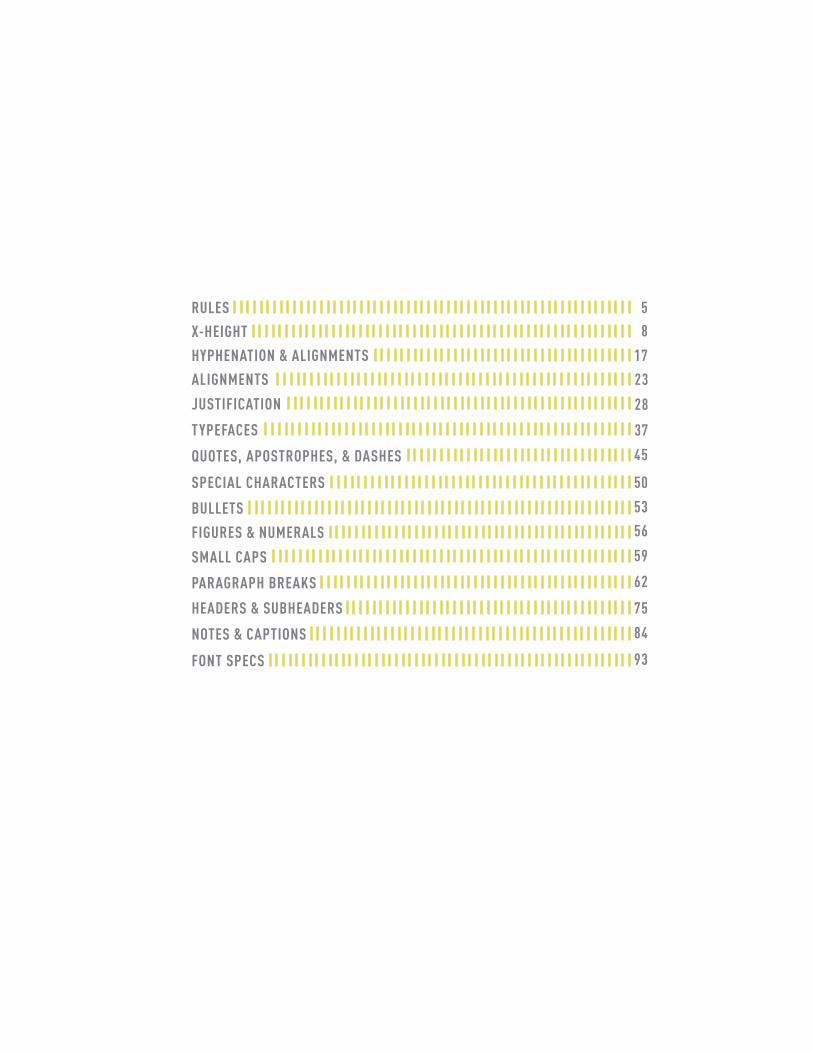
RULES 5
X-HEIGHT 8
HYPHENATION & ALIGNMENTS 17
ALIGNMENTS 23
JUSTIFICATION 28
TYPEFACES 37
QUOTES, APOSTROPHES, & DASHES 45
SPECIAL CHARACTERS 50
BULLETS 53
FIGURES & NUMERALS 56
SMALL CAPS 59
PARAGRAPH BREAKS 62
HEADERS & SUBHEADERS 75
NOTES & CAPTIONS 84
FONT SPECS 93

4
RULES RULES RULES RULES RULES RULES RULES RULES RULES RULES RULES RULES RULES RULES RULES RULES RULES RULES RULES RULES RULES RULES RULES RULES RULES RULES RULES RULES RULES RULES RULES RULES RULES RULES RULES RULES RULES RULES RULES RULES RULES RULES RULES RULES RULES RULES RULES RULES RULES RULES RULES RULES RULES RULES RULES RULES RULES RULES RULES RULES RULES RULES RULES RULES RULES RULES RULES RULES RULES RULES RULES RULES RULES RULES RULES RULES RULES RULES RULES RULES RULES RULES RULES RULES RULES RULES RULES RULES RULES RULES RULES RULES RULES RULES RULES RULES RULES RULES RULES RULES RULES RULES RULES RULES RULES RULES RULES RULES RULES RULES RULES RULES RULES RULES RULES RULES RULES RULES RULES RULES RULES RULES RULES RULES RULES RULES RULES RULES RULES RULES RULES RULES RULES RULES RULES RULES RULES RULES RULES RULES RULES RULES RULES RULES RULES RULES RULES RULES RULES RULES RULES RULES RULES RULES RULES RULES RULES RULES RULES RULES RULES RULES RULES RULES RULES RULES RULES RULES RULES RULES RULES RULES RULES RULES RULES RULES RULES RULES RULES RULES RULES RULES RULES RULES RULES RULES RULES RULES RULES RULES RULES RULES RULES RULES RULES RULES RULES RULES RULES RULES RULES RULES RULES RULES RULES RULES RULES RULES RULES RULES RULES RULES RULES RULES RULES RULES RULES RULES RULES RULES RULES RULES RULES RULES RULES RULES RULES RULES RULES RULES RULES RULES RULES RULES RULES RULES RULES RULES RULES RULES RULES RULES RULES RULES RULES RULES RULES RULES RULES RULES RULES RULES RULES RULES RULES RULES RULES RULES RULES RULES RULES RULES RULES RULES RULES RULES RULES RULES RULES RULES RULES RULES RULES RULES RULES RULES RULES RULES RULES RULES RULES RULES RULES RULES RULES RULES RULES RULES RULES RULES RULES RULES RULES RULES RULES RULES RULES RULES RULES RULES RULES RULES RULES RULES RULES RULES RULES RULES RULES RULES RULES RULES RULES RULES RULES RULES RULES RULES RULES RULES RULES RULES RULES RULES RULES RULES RULES RULES RULES RULES RULES RULES RULES RULES RULES RULES RULES RULES RULES RULES RULES RULES RULES RULES RULES RULES RULES RULES RULES RULES RULES RULES RULES RULES RULES RULES RULES RULES RULES RULES RULES RULES RULES RULES RULES RULES RULES RULES RULES RULES RULES RULES RULES RULES RULES RULES RULES RULES RULES RULES RULES RULES RULES RULES RULES RULES RULES RULES RULES RULES RULES RULES RULES RULES RULES RULES RULES RULES RULES RULES RULES RULES RULES RULES RULES RULES RULES RULES RULES RULES RULES RULES RULES RULES RULES RULES RULES RULES RULES RULES RULES RULES RULES RULES RULES RULES RULES RULES RULES RULES RULES RULES RULES RULES RULES RULES RULES RULES RULES RULES RULES RULES RULES RULES RULES RULES RULES RULES RULES RULES RULES RULES RULES RULES RULES RULES RULES RULES RULES RULES RULES RULES RULES RULES RULES RULES RULES RULES RULES RULES RULES RULES RULES RULES RULES RULES RULES RULES RULES RULES RULES RULES RULES RULES RULES RULES RULES RULES RULES RULES RULES RULES RULES RULES RULES RULES RULES RULES RULES RULES RULES RULES RULES RULES RULES RULES RULES RULES RULES RULES RULES RULES RULES RULES RULES RULES RULES RULES

RULES

USE ONLY ONE SPACE BETWEEN SENTENCES. USE REAL QUOTATION MARKS. USE REAL APOSTROPHES. MAKE SURE THE APOSTROPHES ARE WHERE THEY BELONG. HANG THE PUNCTUATION OFF THE ALIGNED EDGE. USE EN OR EM DASHES, USE CONSISTENTLY. KERN ALL HEADLINES WHERE NECES-SARY. NEVER USE THE SPACEBAR TO ALIGN TEXT, ALWAYS SET TABS AND USE THE TAB KEY. LEAVE NO WIDOWS OR ORPHANS. AVOID MORE THAN 3 HYPHENATIONS IN A ROW. AVOID TOO MANY HYPHENATIONS IN ANY PARA-GRAPH. AVOID HYPHENATING OR LINE BRAKES OF NAMES AND PROPER NOUNS. LEAVE A LEAST 2 CHARACTERS ON THE LINE AND 3 FOLLOWING. AVOID BEGINNING CONSECUTIVE LINES WITH THE SAME WORD. AVOID ENDING CONSECUTIVE LINES WITH THE SAME WORD. AVOID ENDING LINES WITH THE WORDS: THE, OF, AT, A, BY.. NEVER HYPHENATE A WORDS IN A HEADLINE AND AVOID HYPHENATION IN A CALLOUT. NEVER JUSTIFY THE TEXT ON A SHORT LINE. KEEP THE WORD SPACING CONSISTENT. TIGHTEN UP THE LEADING IN LINES WITH ALL CAPS OR WITH FEW ASCENDERS AND DESCENDERS. USE A ONE-EM FIRST-LINE INDENT ON ALL INDENTED PARA-GRAPHS. ADJUST THE SPACING BETWEEN PARAGRAPHS. EITHER INDENT THE FIRST LINE OF PARAGRAPHS OR ADD EXTRA SPACE BETWEEN THEM – NOT BOTH. USE A DECIMAL OR RIGHT-ALIGNED TAB FOR THE NUMBERS IN NUMBERED PARAGRAPHS. NEVER HAVE ONE LINE IN A PARAGRAPH IN THE COLOMN OR FOLLOWING. NEVER COMBINE TWO SERIF FONTS ON ONE PAGE. RARELY COMBINE TWO SANS SERIF FONTS ON ONE PAGE. RARELY COMBINE MORE THAN THREE TYPEFACES ON ONE PAGE. USE THE SPECIAL CHARAC-TERS WHENEVER NECESSARY, INCLUDING SUPER- AND SUBSCRIPT. SPEND THE TIME TO CREATE NICE FRACTION OR CHOSE A FONT THAT HAS FRAC-TIONS. IF A CORRECTLY SPELLED WORD NEEDS AN ACCENT MARK, USE IT.

7
X-HEIGHT X-HEIGHT X-HEIGHT X-HEIGHT X-HEIGHT X-HEIGHT X-HEIGHT X-HEIGHT X-HEIGHT X-HEIGHT X-HEIGHT X-HEIGHT X-HEIGHT X-HEIGHT X-HEIGHT X-HEIGHT X-HEIGHT X-HEIGHT X-HEIGHT X-HEIGHT X-HEIGHT X-HEIGHT X-HEIGHT X-HEIGHT X-HEIGHT X-HEIGHT X-HEIGHT X-HEIGHT X-HEIGHT X-HEIGHT X-HEIGHT X-HEIGHT X-HEIGHT X-HEIGHT X-HEIGHT X-HEIGHT X-HEIGHT X-HEIGHT X-HEIGHT X-HEIGHT X-HEIGHT X-HEIGHT X-HEIGHT X-HEIGHT X-HEIGHT X-HEIGHT X-HEIGHT X-HEIGHT X-HEIGHT X-HEIGHT X-HEIGHT X-HEIGHT X-HEIGHT X-HEIGHT X-HEIGHT X-HEIGHT X-HEIGHT X-HEIGHT X-HEIGHT X-HEIGHT X-HEIGHT X-HEIGHT X-HEIGHT X-HEIGHT X-HEIGHT X-HEIGHT X-HEIGHT X-HEIGHT X-HEIGHT X-HEIGHT X-HEIGHT X-HEIGHT X-HEIGHT X-HEIGHT X-HEIGHT X-HEIGHT X-HEIGHT X-HEIGHT X-HEIGHT X-HEIGHT X-HEIGHT X-HEIGHT X-HEIGHT X-HEIGHT X-HEIGHT X-HEIGHT X-HEIGHT X-HEIGHT X-HEIGHT X-HEIGHT X-HEIGHT X-HEIGHT X-HEIGHT X-HEIGHT X-HEIGHT X-HEIGHT X-HEIGHT X-HEIGHT X-HEIGHT X-HEIGHT X-HEIGHT X-HEIGHT X-HEIGHT X-HEIGHT X-HEIGHT X-HEIGHT X-HEIGHT X-HEIGHT X-HEIGHT X-HEIGHT X-HEIGHT X-HEIGHT X-HEIGHT X-HEIGHT X-HEIGHT X-HEIGHT X-HEIGHT X-HEIGHT X-HEIGHT X-HEIGHT X-HEIGHT X-HEIGHT X-HEIGHT X-HEIGHT X-HEIGHT X-HEIGHT X-HEIGHT X-HEIGHT X-HEIGHT X-HEIGHT X-HEIGHT X-HEIGHT X-HEIGHT X-HEIGHT X-HEIGHT X-HEIGHT X-HEIGHT X-HEIGHT X-HEIGHT X-HEIGHT X-HEIGHT X-HEIGHT X-HEIGHT X-HEIGHT X-HEIGHT X-HEIGHT X-HEIGHT X-HEIGHT X-HEIGHT X-HEIGHT X-HEIGHT X-HEIGHT X-HEIGHT X-HEIGHT X-HEIGHT X-HEIGHT X-HEIGHT X-HEIGHT X-HEIGHT X-HEIGHT X-HEIGHT X-HEIGHT X-HEIGHT X-HEIGHT X-HEIGHT X-HEIGHT X-HEIGHT X-HEIGHT X-HEIGHT X-HEIGHT X-HEIGHT X-HEIGHT X-HEIGHT X-HEIGHT X-HEIGHT X-HEIGHT X-HEIGHT X-HEIGHT X-HEIGHT X-HEIGHT X-HEIGHT X-HEIGHT X-HEIGHT X-HEIGHT X-HEIGHT X-HEIGHT X-HEIGHT X-HEIGHT X-HEIGHT X-HEIGHT X-HEIGHT X-HEIGHT X-HEIGHT X-HEIGHT X-HEIGHT X-HEIGHT X-HEIGHT X-HEIGHT X-HEIGHT X-HEIGHT X-HEIGHT X-HEIGHT X-HEIGHT X-HEIGHT X-HEIGHT X-HEIGHT X-HEIGHT X-HEIGHT X-HEIGHT X-HEIGHT X-HEIGHT X-HEIGHT X-HEIGHT X-HEIGHT X-HEIGHT X-HEIGHT X-HEIGHT X-HEIGHT X-HEIGHT X-HEIGHT X-HEIGHT X-HEIGHT X-HEIGHT X-HEIGHT X-HEIGHT X-HEIGHT X-HEIGHT X-HEIGHT X-HEIGHT X-HEIGHT X-HEIGHT X-HEIGHT X-HEIGHT X-HEIGHT X-HEIGHT X-HEIGHT X-HEIGHT X-HEIGHT X-HEIGHT X-HEIGHT X-HEIGHT X-HEIGHT X-HEIGHT X-HEIGHT X-HEIGHT X-HEIGHT X-HEIGHT X-HEIGHT X-HEIGHT X-HEIGHT X-HEIGHT X-HEIGHT X-HEIGHT X-HEIGHT X-HEIGHT X-HEIGHT X-HEIGHT X-HEIGHT X-HEIGHT X-HEIGHT X-HEIGHT X-HEIGHT T X-HEIGHT X-HEIGHT X-HEIGHT X-HEIGHT X-HEIGHT X-HEIGHT X-HEIGHT X-HEIGHT X-HEIGHT X-HEIGHT X-HEIGHT X-HEIGHT X-HEIGHT X-HEIGHT X-HEIGHT X-HEIGHT X-HEIGHT X-HEIGHT X-HEIGHT X-HEIGHT X-HEIGHT X-HEIGHT X-HEIGHT X-HEIGHT X-HEIGHT X-HEIGHT X-HEIGHT X-HEIGHT X-HEIGHT X-HEIGHT X-HEIGHT X-HEIGHT X-HEIGHT X-HEIGHT X-HEIGHT X-HEIGHT X-HEIGHT X-HEIGHT X-HEIGHT X-HEIGHT X-HEIGHT X-HEIGHT X-HEIGHT X-HEIGHT X-HEIGHT X-HEIGHT X-HEIGHT X-HEIGHT X-HEIGHT X-HEIGHT X-HEIGHT X-HEIGHT X-HEIGHT X-HEIGHT X-HEIGHT X-HEIGHT X-HEIGHT X-HEIGHT X-HEIGHT X-HEIGHT X-HEIGHT X-HEIGHT X-HEIGHT X-HEIGHT X-HEIGHT X-HEIGHT X-HEIGHT X-HEIGHT X-HEIGHT X-HEIGHT X-HEIGHT X-HEIGHT X-HEIGHT X-HEIGHT X-HEIGHT X-HEIGHT X-HEIGHT X-HEIGHT X-HEIGHT X-HEIGHT X-HEIGHT X-HEIGHT X-HEIGHT X-HEIGHT X-HEIGHT X-HEIGHT X-HEIGHT X-HEIGHT X-HEIGHT X-HEIGHT X-HEIGHT X-HEIGHT X-HEIGHT X-HEIGHT X-HEIGHT X-HEIGHT X-HEIGHT X-HEIGHT X-HEIGHT X-HEIGHT X-HEIGHT X-HEIGHT X-HEIGHT X-HEIGHT X-HEIGHT X-HEIGHT X-HEIGHT X-HEIGHT X-HEIGHT X-HEIGHT X-HEIGHT X-HEIGHT X-HEIGHT X-HEIGHT X-HEIGHT X-HEIGHT X-HEIGHT X-HEIGHT X-HEIGHT X-HEIGHT X-HEIGHT X-HEIGHT

X-HEIGHT
9
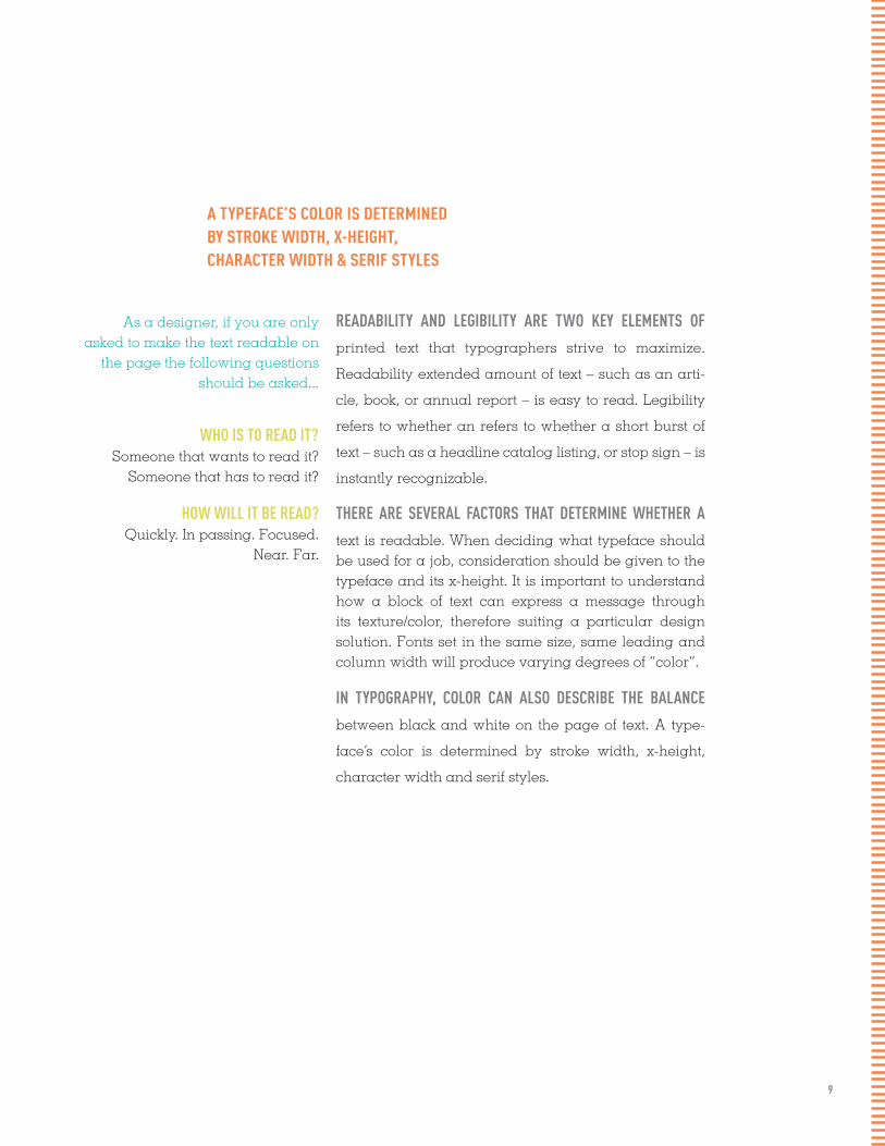
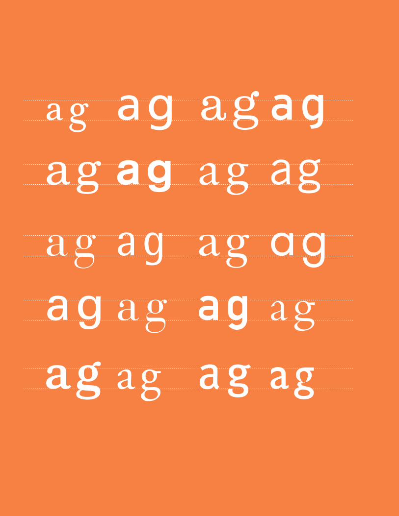
A TYPEFACE’S COLOR IS DETERMINED BY STROKE WIDTH, X-HEIGHT, CHARACTER WIDTH & SERIF STYLES
READABILITY AND LEGIBILITY ARE TWO KEY ELEMENTS OF
printed text that typographers strive to maximize.
Readability extended amount of text – such as an arti-
cle, book, or annual report – is easy to read. Legibility
refers to whether an refers to whether a short burst of
text – such as a headline catalog listing, or stop sign – is
instantly recognizable.
THERE ARE SEVERAL FACTORS THAT DETERMINE WHETHER A
text is readable. When deciding what typeface should be used for a job, consideration should be given to the typeface and its x-height. It is important to understand how a block of text can express a message through its texture/color, therefore suiting a particular design solution. Fonts set in the same size, same leading and column width will produce varying degrees of “color”.
IN TYPOGRAPHY, COLOR CAN ALSO DESCRIBE THE BALANCE
between black and white on the page of text. A type-
face’s color is determined by stroke width, x-height,
character width and serif styles.
As a designer, if you are only asked to make the text readable on
the page the following questions should be asked...
WHO IS TO READ IT?Someone that wants to read it?
Someone that has to read it?
HOW WILL IT BE READ? Quickly. In passing. Focused.
Near. Far.
10
11
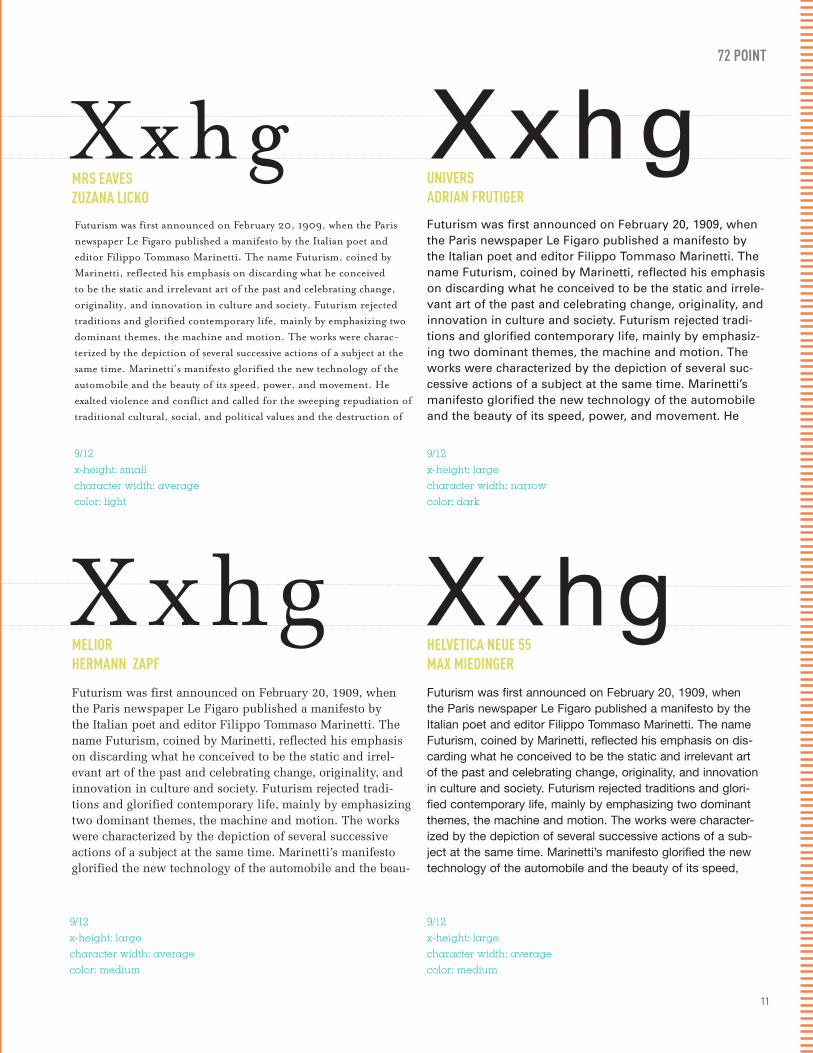
Futurism was first announced on February 20, 1909, when the Paris newspaper Le Figaro published a manifesto by the Italian poet and editor Filippo Tommaso Marinetti. The name Futurism, coined by Marinetti, reflected his emphasis on discarding what he conceived to be the static and irrelevant art of the past and celebrating change, originality, and innovation in culture and society. Futurism rejected traditions and glorified contemporary life, mainly by emphasizing two dominant themes, the machine and motion. The works were charac-terized by the depiction of several successive actions of a subject at the same time. Marinetti’s manifesto glorified the new technology of the automobile and the beauty of its speed, power, and movement. He exalted violence and conflict and called for the sweeping repudiation of traditional cultural, social, and political values and the destruction of
MRS EAVESZUZANA LICKO
9/12 x-height: smallcharacter width: average color: light
Xxhg72 POINT
Futurism was first announced on February 20, 1909, when the Paris newspaper Le Figaro published a manifesto by the Italian poet and editor Filippo Tommaso Marinetti. The name Futurism, coined by Marinetti, reflected his emphasis on discarding what he conceived to be the static and irrele-vant art of the past and celebrating change, originality, and innovation in culture and society. Futurism rejected tradi-tions and glorified contemporary life, mainly by emphasiz-ing two dominant themes, the machine and motion. The works were characterized by the depiction of several suc-cessive actions of a subject at the same time. Marinetti’s manifesto glorified the new technology of the automobile and the beauty of its speed, power, and movement. He
UNIVERSADRIAN FRUTIGER
9/12x-height: large character width: narrow color: dark
Xxhg
Futurism was first announced on February 20, 1909, when the Paris newspaper Le Figaro published a manifesto by the Italian poet and editor Filippo Tommaso Marinetti. The name Futurism, coined by Marinetti, reflected his emphasis on discarding what he conceived to be the static and irrel-evant art of the past and celebrating change, originality, and innovation in culture and society. Futurism rejected tradi-tions and glorified contemporary life, mainly by emphasizing two dominant themes, the machine and motion. The works were characterized by the depiction of several successive actions of a subject at the same time. Marinetti’s manifesto glorified the new technology of the automobile and the beau-
MELIORHERMANN ZAPF
9/12 x-height: large character width: average color: medium
XxhgFuturism was first announced on February 20, 1909, when the Paris newspaper Le Figaro published a manifesto by the Italian poet and editor Filippo Tommaso Marinetti. The name Futurism, coined by Marinetti, reflected his emphasis on dis-carding what he conceived to be the static and irrelevant art of the past and celebrating change, originality, and innovation in culture and society. Futurism rejected traditions and glori-fied contemporary life, mainly by emphasizing two dominant themes, the machine and motion. The works were character-ized by the depiction of several successive actions of a sub-ject at the same time. Marinetti’s manifesto glorified the new technology of the automobile and the beauty of its speed,
HELVETICA NEUE 55MAX MIEDINGER
9/12 x-height: large character width: average color: medium
Xxhg
12
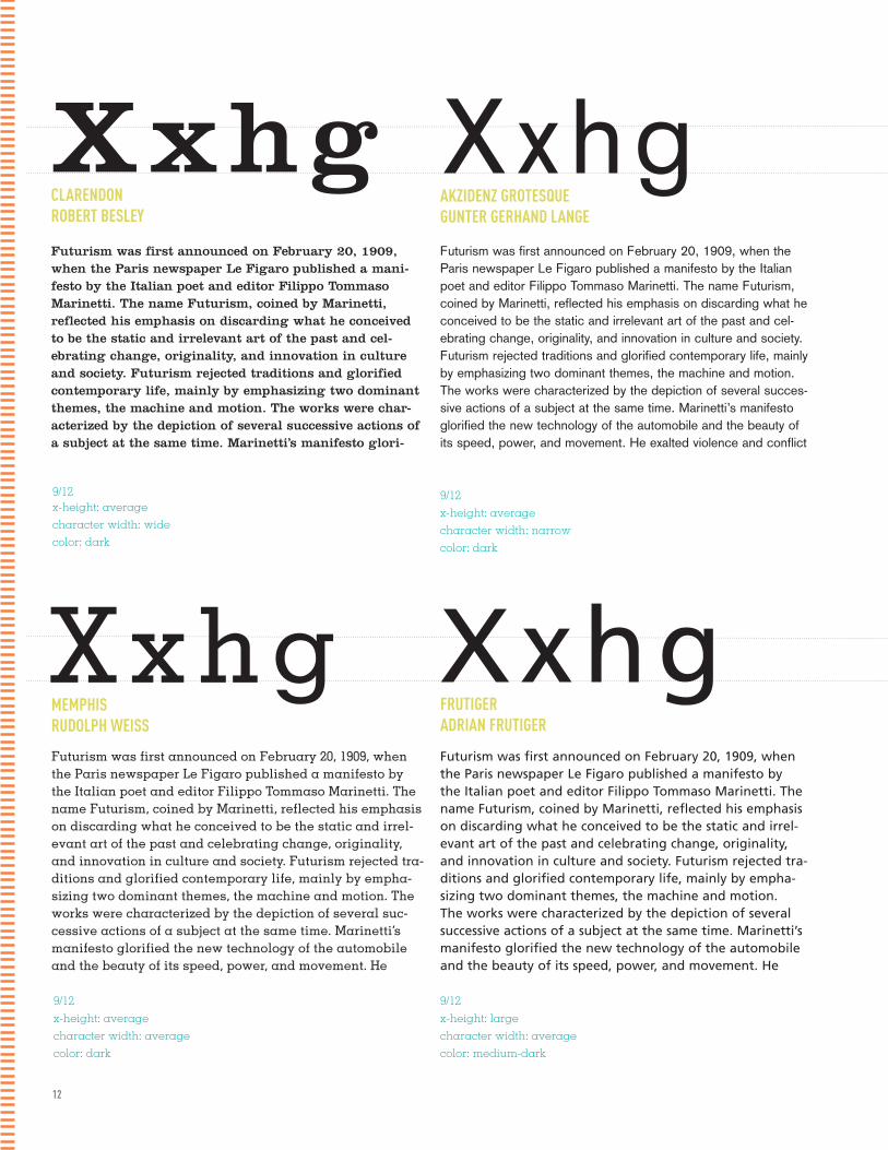
Futurism was first announced on February 20, 1909, when the Paris newspaper Le Figaro published a mani-festo by the Italian poet and editor Filippo Tommaso Marinetti. The name Futurism, coined by Marinetti, reflected his emphasis on discarding what he conceived to be the static and irrelevant art of the past and cel-ebrating change, originality, and innovation in culture and society. Futurism rejected traditions and glorified contemporary life, mainly by emphasizing two dominant themes, the machine and motion. The works were char-acterized by the depiction of several successive actions of a subject at the same time. Marinetti’s manifesto glori-
CLARENDONROBERT BESLEY
9/12 x-height: average character width: wide color: dark
XxhgFuturism was first announced on February 20, 1909, when the Paris newspaper Le Figaro published a manifesto by the Italian poet and editor Filippo Tommaso Marinetti. The name Futurism, coined by Marinetti, reflected his emphasis on discarding what he conceived to be the static and irrelevant art of the past and cel-ebrating change, originality, and innovation in culture and society. Futurism rejected traditions and glorified contemporary life, mainly by emphasizing two dominant themes, the machine and motion. The works were characterized by the depiction of several succes-sive actions of a subject at the same time. Marinetti’s manifesto glorified the new technology of the automobile and the beauty of its speed, power, and movement. He exalted violence and conflict
AKZIDENZ GROTESQUEGUNTER GERHAND LANGE
9/12x-height: averagecharacter width: narrow color: dark
Xxhg
Futurism was first announced on February 20, 1909, when the Paris newspaper Le Figaro published a manifesto by the Italian poet and editor Filippo Tommaso Marinetti. The name Futurism, coined by Marinetti, reflected his emphasis on discarding what he conceived to be the static and irrel-evant art of the past and celebrating change, originality, and innovation in culture and society. Futurism rejected tra-ditions and glorified contemporary life, mainly by empha-sizing two dominant themes, the machine and motion. The works were characterized by the depiction of several suc-cessive actions of a subject at the same time. Marinetti’s manifesto glorified the new technology of the automobile and the beauty of its speed, power, and movement. He
MEMPHISRUDOLPH WEISS
9/12 x-height: average character width: averagecolor: dark
XxhgFuturism was first announced on February 20, 1909, when the Paris newspaper Le Figaro published a manifesto by the Italian poet and editor Filippo Tommaso Marinetti. The name Futurism, coined by Marinetti, reflected his emphasis on discarding what he conceived to be the static and irrel-evant art of the past and celebrating change, originality, and innovation in culture and society. Futurism rejected tra-ditions and glorified contemporary life, mainly by empha-sizing two dominant themes, the machine and motion. The works were characterized by the depiction of several successive actions of a subject at the same time. Marinetti’s manifesto glorified the new technology of the automobile and the beauty of its speed, power, and movement. He
FRUTIGERADRIAN FRUTIGER
9/12 x-height: large character width: average color: medium-dark
Xxhg

13
Futurism was first announced on February 20, 1909, when the Paris newspaper Le Figaro published a mani-festo by the Italian poet and editor Filippo Tommaso Marinetti. The name Futurism, coined by Marinetti, reflected his emphasis on discarding what he conceived to be the static and irrelevant art of the past and cel-ebrating change, originality, and innovation in culture and society. Futurism rejected traditions and glorified contemporary life, mainly by emphasizing two domi-nant themes, the machine and motion. The works were characterized by the depiction of several successive actions of a subject at the same time. Marinetti’s mani-
VOLTAKONRAD BAUER & WALTER BAUM
9/12 x-height: average character width: widecolor: dark
XxhgFuturism was first announced on February 20, 1909, when the Paris newspaper Le Figaro published a manifesto by the Italian poet and editor Filippo Tommaso Marinetti. The name Futurism, coined by Marinetti, reflected his emphasis on discarding what he conceived to be the static and irrelevant art of the past and celebrating change, originality, and inno-vation in culture and society. Futurism rejected traditions and glorified contemporary life, mainly by emphasizing two dominant themes, the machine and motion. The works were characterized by the depiction of several successive actions of a subject at the same time. Marinetti’s manifesto glorified the new technology of the automobile and the beauty of its
INTERSTATETOBAIS FRERE-JONES
9/12x-height: largecharacter width: narrow color: dark
Xxhg
Futurism was first announced on February 20, 1909, when the Paris newspaper Le Figaro published a manifesto by the Italian poet and editor Filippo Tommaso Marinetti. The name Futurism, coined by Marinetti, reflected his emphasis on discarding what he conceived to be the static and irrelevant art of the past and celebrating change, originality, and innovation in culture and society. Futurism rejected traditions and glori-fied contemporary life, mainly by emphasizing two dominant themes, the machine and motion. The works were characterized by the depiction of several successive actions of a subject at the same time. Marinetti’s manifesto glorified the new technology of the automobile and the beauty of its speed, power, and movement. He exalted violence and conflict and called for the sweeping repudiation of traditional cultural, social, and political values and the destruction of such cultural institutions as muse-
FILOSOFIAZUZANA LICKO
9/12 x-height: smalcharacter width: narrow color: light
X x h gFuturism was first announced on February 20, 1909, when the Paris newspaper Le Figaro published a manifesto by the Italian poet and editor Filippo Tommaso Marinetti. The name Futurism, coined by Marinetti, reflected his emphasis on discarding what he conceived to be the static and irrelevant art of the past and cel-ebrating change, originality, and innovation in culture and society. Futurism rejected traditions and glorified contemporary life, mainly by emphasizing two dominant themes, the machine and motion. The works were characterized by the depiction of several succes-sive actions of a subject at the same time. Marinetti’s manifesto glorified the new technology of the automobile and the beauty of its speed, power, and movement. He exalted violence and conflict and called for the sweeping repudiation of traditional cultural, social,
SCALA SANSMARTIN MAJOOR
9/12 x-height: averagecharacter width: average color: medium
Xxhg
14
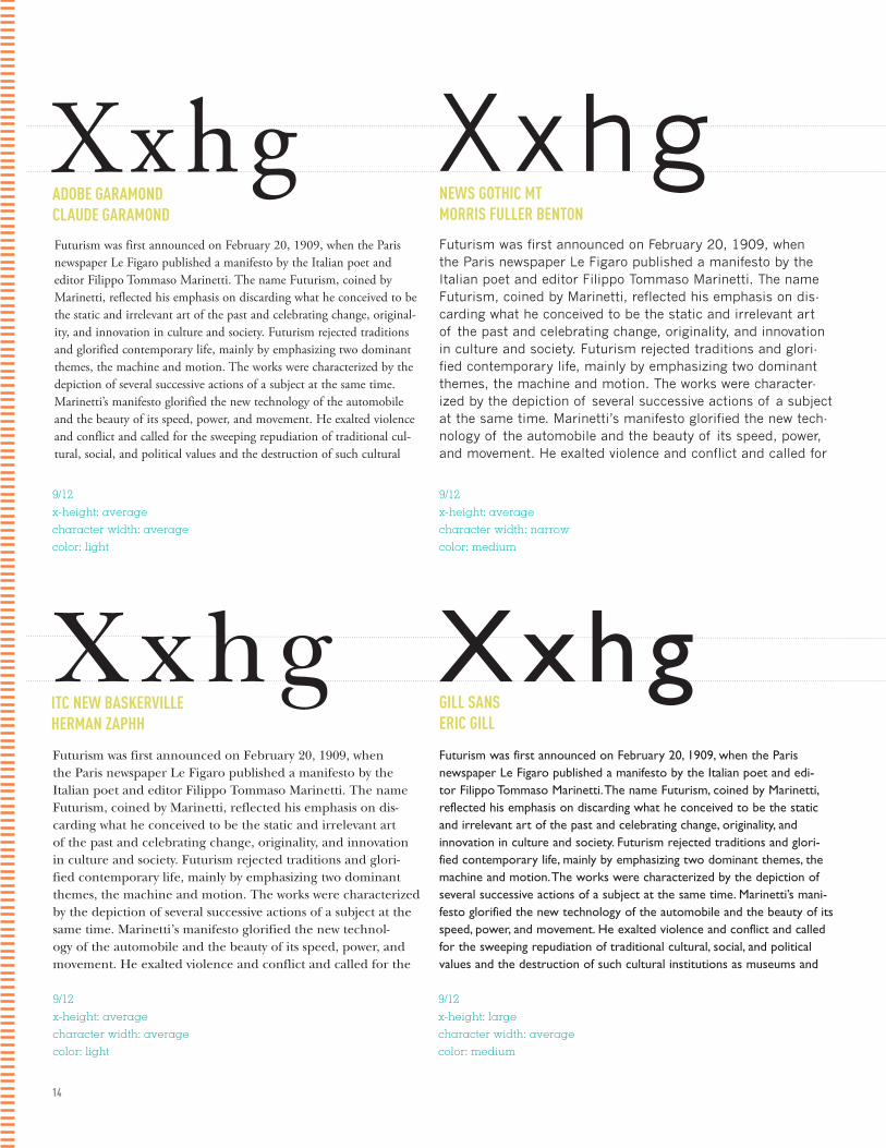
Futurism was first announced on February 20, 1909, when the Paris newspaper Le Figaro published a manifesto by the Italian poet and editor Filippo Tommaso Marinetti. The name Futurism, coined by Marinetti, reflected his emphasis on discarding what he conceived to be the static and irrelevant art of the past and celebrating change, original-ity, and innovation in culture and society. Futurism rejected traditions and glorified contemporary life, mainly by emphasizing two dominant themes, the machine and motion. The works were characterized by the depiction of several successive actions of a subject at the same time. Marinetti’s manifesto glorified the new technology of the automobile and the beauty of its speed, power, and movement. He exalted violence and conflict and called for the sweeping repudiation of traditional cul-tural, social, and political values and the destruction of such cultural
ADOBE GARAMOND CLAUDE GARAMOND
9/12 x-height: average character width: average color: light
XxhgFuturism was first announced on February 20, 1909, when the Paris newspaper Le Figaro published a manifesto by the Italian poet and editor Filippo Tommaso Marinetti. The name Futurism, coined by Marinetti, reflected his emphasis on dis-carding what he conceived to be the static and irrelevant art of the past and celebrating change, originality, and innovation in culture and society. Futurism rejected traditions and glori-fied contemporary life, mainly by emphasizing two dominant themes, the machine and motion. The works were character-ized by the depiction of several successive actions of a subject at the same time. Marinetti’s manifesto glorified the new tech-nology of the automobile and the beauty of its speed, power, and movement. He exalted violence and conflict and called for
NEWS GOTHIC MTMORRIS FULLER BENTON
9/12x-height: averagecharacter width: narrowcolor: medium
Xxhg
Futurism was first announced on February 20, 1909, when the Paris newspaper Le Figaro published a manifesto by the Italian poet and editor Filippo Tommaso Marinetti. The name Futurism, coined by Marinetti, reflected his emphasis on dis-carding what he conceived to be the static and irrelevant art of the past and celebrating change, originality, and innovation in culture and society. Futurism rejected traditions and glori-fied contemporary life, mainly by emphasizing two dominant themes, the machine and motion. The works were characterized by the depiction of several successive actions of a subject at the same time. Marinetti’s manifesto glorified the new technol-ogy of the automobile and the beauty of its speed, power, and movement. He exalted violence and conflict and called for the
ITC NEW BASKERVILLEHERMAN ZAPHH
9/12 x-height: average character width: average color: light
XxhgFuturism was first announced on February 20, 1909, when the Paris newspaper Le Figaro published a manifesto by the Italian poet and edi-tor Filippo Tommaso Marinetti. The name Futurism, coined by Marinetti, reflected his emphasis on discarding what he conceived to be the static and irrelevant art of the past and celebrating change, originality, and innovation in culture and society. Futurism rejected traditions and glori-fied contemporary life, mainly by emphasizing two dominant themes, the machine and motion. The works were characterized by the depiction of several successive actions of a subject at the same time. Marinetti’s mani-festo glorified the new technology of the automobile and the beauty of its speed, power, and movement. He exalted violence and conflict and called for the sweeping repudiation of traditional cultural, social, and political values and the destruction of such cultural institutions as museums and
GILL SANSERIC GILL
Xxhg
9/12 x-height: large character width: average color: medium

15
Futurism was first announced on February 20, 1909, when the Paris newspaper Le Figaro published a manifesto by the Italian poet and editor Filippo Tommaso Marinetti. The name Futurism, coined by Marinetti, reflected his emphasis on dis-carding what he conceived to be the static and irrelevant art of the past and celebrating change, originality, and innovation in culture and society. Futurism rejected traditions and glori-fied contemporary life, mainly by emphasizing two dominant themes, the machine and motion. The works were character-ized by the depiction of several successive actions of a subject at the same time. Marinetti’s manifesto glorified the new tech-nology of the automobile and the beauty of its speed, power, and movement. He exalted violence and conflict and called
DIDOTFIRMIN DIDOT
9/12 x-height: average character width: average color: light
XxhgFuturism was first announced on February 20, 1909, when the Paris newspaper Le Figaro published a manifesto by the Italian poet and edi-tor Filippo Tommaso Marinetti. The name Futurism, coined by Marinetti, reflected his emphasis on discarding what he conceived to be the static and irrelevant art of the past and celebrating change, original-ity, and innovation in culture and society. Futurism rejected traditions and glorified contemporary life, mainly by emphasizing two dominant themes, the machine and motion. The works were characterized by the depiction of several successive actions of a subject at the same time. Marinetti’s manifesto glorified the new technology of the automobile and the beauty of its speed, power, and movement. He exalted violence and conflict and called for the sweeping repudiation of traditional cul-tural, social, and political values and the destruction of such cultural
ROTIS SANS SERIFOTL AICHER
9/12x-height: largecharacter width: narrowcolor: light
Xxhg
Futurism was first announced on February 20, 1909, when the Paris newspaper Le Figaro published a manifesto by the Italian poet and editor Filippo Tommaso Marinetti. The name Futurism, coined by Marinetti, reflected his emphasis on discarding what he conceived to be the static and irrelevant art of the past and celebrating change, originality, and innovation in culture and society. Futurism rejected traditions and glorified contemporary life, mainly by emphasizing two dominant themes, the machine and motion. The works were charac-terized by the depiction of several successive actions of a subject at the same time. Marinetti’s manifesto glorified the new technology of the automobile and the beauty of its speed, power, and movement. He exalted violence and conflict and called for the sweeping repudia-tion of traditional cultural, social, and political values and the
BEMBOSTANLEY MORISON
9/12 x-height: small character width: widecolor: light
XxhgFuturism was first announced on February 20, 1909, when the Paris newspaper Le Figaro published a mani-festo by the Italian poet and editor Filippo Tommaso Marinetti. The name Futurism, coined by Marinetti, reflected his emphasis on discarding what he con-ceived to be the static and irrelevant art of the past and celebrating change, originality, and innovation in culture and society. Futurism rejected traditions and glorified contemporary life, mainly by emphasizing two dominant themes, the machine and motion. The works were characterized by the depiction of several succes-sive actions of a subject at the same time. Marinetti’s manifesto glorified the new technology of the auto-
CLICKERGREG THOMPSON
Xxhg
9/12 x-height: large character width: average color: dark
16
HYPHENATION ALIGNMENT HYPHENATION ALIGNMENT HYPHENATION ALIGNMENT HYPHENATION ALIGNMENT HYPHENATION ALIGNMENT HYPHENATION ALIGNMENT HYPHENATION ALIGNMENT HYPHENATION ALIGNMENT HYPHENATION ALIGNMENT HYPHENATION ALIGNMENT HYPHENATION ALIGNMENT HYPHENATION ALIGNMENT HYPHENATION ALIGNMENT HYPHENATION ALIGNMENT HYPHENATION ALIGNMENT HYPHENATION ALIGNMENT HYPHENATION ALIGNMENT HYPHENATION ALIGNMENT HYPHENATION ALIGNMENT HYPHENATION ALIGNMENT HYPHENATION ALIGNMENT HYPHENATION ALIGNMENT HYPHENATION ALIGNMENT HYPHENATION ALIGNMENT HYPHENATION ALIGNMENT HYPHENATION ALIGNMENT HYPHENATION ALIGNMENT HYPHENATION ALIGNMENT HYPHENATION ALIGNMENT HYPHENATION ALIGNMENT HYPHENATION ALIGNMENT HYPHENATION ALIGNMENT HYPHENATION ALIGNMENT HYPHENATION ALIGNMENT HYPHENATION ALIGNMENT HYPHENATION ALIGNMENT HYPHENATION ALIGNMENT HYPHENATION ALIGNMENT HYPHENATION ALIGNMENT HYPHENATION ALIGNMENT HYPHENATION ALIGNMENT HYPHENATION ALIGNMENT HYPHENATION ALIGNMENT HYPHENATION ALIGNMENT HYPHENATION ALIGNMENT HYPHENATION ALIGNMENT HYPHENATION ALIGNMENT HYPHENATION ALIGNMENT HYPHENATION ALIGNMENT HYPHENATION ALIGNMENT HYPHENATION ALIGNMENT HYPHENATION ALIGNMENT HYPHENATION ALIGNMENT HYPHENATION ALIGNMENT HYPHENATION ALIGNMENT HYPHENATION ALIGNMENT HYPHENATION ALIGNMENT HYPHENATION ALIGNMENT HYPHENATION ALIGNMENT HYPHENATION ALIGNMENT HYPHENATION ALIGNMENT HYPHENATION ALIGNMENT HYPHENATION ALIGNMENT HYPHENATION ALIGNMENT HYPHENATION ALIGNMENT HYPHENATION ALIGNMENT HYPHENATION ALIGNMENT HYPHENATION ALIGNMENT HYPHENATION ALIGNMENT HYPHENATION ALIGNMENT HYPHENATION ALIGNMENT HYPHENATION ALIGNMENT HYPHENATION ALIGNMENT HYPHENATION ALIGNMENT HYPHENATION ALIGNMENT HYPHENATION ALIGNMENT HYPHENATION ALIGNMENT HYPHENATION ALIGNMENT HYPHENATION ALIGNMENT HYPHENATION ALIGNMENT HYPHENATION ALIGNMENT HYPHENATION ALIGNMENT HYPHENATION ALIGNMENT HYPHENATION ALIGNMENT HYPHENATION ALIGNMENT HYPHENATION ALIGNMENT HYPHENATION ALIGNMENT HYPHENATION ALIGNMENT HYPHENATION ALIGNMENT HYPHENATION ALIGNMENT HYPHENATION ALIGNMENT HYPHENATION ALIGNMENT HYPHENATION ALIGNMENT HYPHENATION ALIGNMENT HYPHENATION ALIGNMENT HYPHENATION ALIGNMENT HYPHENATION ALIGNMENT HYPHENATION ALIGNMENT HYPHENATION ALIGNMENT HYPHENATION ALIGNMENT HYPHENATION ALIGNMENT HYPHENATION ALIGNMENT HYPHENATION ALIGNMENT HYPHENATION ALIGNMENT HYPHENATION ALIGNMENT HYPHENATION ALIGNMENT HYPHENATION ALIGNMENT HYPHENATION ALIGNMENT HYPHENATION ALIGNMENT HYPHENATION ALIGNMENT HYPHENATION ALIGNMENT HYPHENATION ALIGNMENT HYPHENATION ALIGNMENT HYPHENATION ALIGNMENT HYPHENATION ALIGNMENT HYPHENATION ALIGNMENT HYPHENATION ALIGNMENT HYPHENATION ALIGNMENT HYPHENATION ALIGNMENT HYPHENATION ALIGNMENT HYPHENATION ALIGNMENT HYPHENATION ALIGNMENT HYPHENATION ALIGNMENT HYPHENATION ALIGNMENT HYPHENATION ALIGNMENT HYPHENATION ALIGNMENT HYPHENATION ALIGNMENT HYPHENATION ALIGNMENT HYPHENATION ALIGNMENT HYPHENATION ALIGNMENT HYPHENATION ALIGNMENT HYPHENATION ALIGNMENT HYPHENATION ALIGNMENT HYPHENATION ALIGNMENT HYPHENATION ALIGNMENT HYPHENATION ALIGNMENT HYPHENATION ALIGNMENT HYPHENATION ALIGNMENT HYPHENATION ALIGNMENT HYPHENATION ALIGNMENT HYPHENATION ALIGNMENT HYPHENATION ALIGNMENT HYPHENATION ALIGNMENT HYPHENATION ALIGNMENT HYPHENATION ALIGNMENT HYPHENATION ALIGNMENT HYPHENATION ALIGNMENT HYPHENATION ALIGNMENT HYPHENATION ALIGNMENT HYPHENATION ALIGNMENT HYPHENATION ALIGNMENT HYPHENATION ALIGNMENT HYPHENATION ALIGNMENT HYPHENATION ALIGNMENT HYPHENATION ALIGNMENT HYPHENATION ALIGNMENT HYPHENATION ALIGNMENT HYPHENATION ALIGNMENT HYPHENATION ALIGNMENT HYPHENATION ALIGNMENT HYPHENATION ALIGNMENT HYPHENATION ALIGNMENT HYPHENATION ALIGNMENT HYPHENATION ALIGNMENT HYPHENATION ALIGNMENT HYPHENATION ALIGNMENT HYPHENATION ALIGNMENT HYPHENATION ALIGNMENT

&HYPHENATIONALIGNMENTS
HYPHENATION ALIGNMENT HYPHENATION ALIGNMENT HYPHENATION ALIGNMENT HYPHENATION ALIGNMENT HYPHENATION ALIGNMENT HYPHENATION ALIGNMENT HYPHENATION ALIGNMENT HYPHENATION ALIGNMENT HYPHENATION ALIGNMENT HYPHENATION ALIGNMENT HYPHENATION ALIGNMENT HYPHENATION ALIGNMENT HYPHENATION ALIGNMENT HYPHENATION ALIGNMENT HYPHENATION ALIGNMENT HYPHENATION ALIGNMENT HYPHENATION ALIGNMENT HYPHENATION ALIGNMENT HYPHENATION ALIGNMENT HYPHENATION ALIGNMENT HYPHENATION ALIGNMENT HYPHENATION ALIGNMENT HYPHENATION ALIGNMENT HYPHENATION ALIGNMENT HYPHENATION ALIGNMENT HYPHENATION ALIGNMENT HYPHENATION ALIGNMENT HYPHENATION ALIGNMENT HYPHENATION ALIGNMENT HYPHENATION ALIGNMENT HYPHENATION ALIGNMENT HYPHENATION ALIGNMENT HYPHENATION ALIGNMENT HYPHENATION ALIGNMENT HYPHENATION ALIGNMENT HYPHENATION ALIGNMENT HYPHENATION ALIGNMENT HYPHENATION ALIGNMENT HYPHENATION ALIGNMENT HYPHENATION ALIGNMENT HYPHENATION ALIGNMENT HYPHENATION ALIGNMENT HYPHENATION ALIGNMENT HYPHENATION ALIGNMENT HYPHENATION ALIGNMENT HYPHENATION ALIGNMENT HYPHENATION ALIGNMENT HYPHENATION ALIGNMENT HYPHENATION ALIGNMENT HYPHENATION ALIGNMENT HYPHENATION ALIGNMENT HYPHENATION ALIGNMENT HYPHENATION ALIGNMENT HYPHENATION ALIGNMENT HYPHENATION ALIGNMENT HYPHENATION ALIGNMENT HYPHENATION ALIGNMENT HYPHENATION ALIGNMENT HYPHENATION ALIGNMENT HYPHENATION ALIGNMENT HYPHENATION ALIGNMENT HYPHENATION ALIGNMENT HYPHENATION ALIGNMENT HYPHENATION ALIGNMENT HYPHENATION ALIGNMENT HYPHENATION ALIGNMENT HYPHENATION ALIGNMENT HYPHENATION ALIGNMENT HYPHENATION ALIGNMENT HYPHENATION ALIGNMENT HYPHENATION ALIGNMENT HYPHENATION ALIGNMENT HYPHENATION ALIGNMENT HYPHENATION ALIGNMENT HYPHENATION ALIGNMENT HYPHENATION ALIGNMENT HYPHENATION ALIGNMENT HYPHENATION ALIGNMENT HYPHENATION ALIGNMENT HYPHENATION ALIGNMENT HYPHENATION ALIGNMENT HYPHENATION ALIGNMENT HYPHENATION ALIGNMENT HYPHENATION ALIGNMENT HYPHENATION ALIGNMENT HYPHENATION ALIGNMENT HYPHENATION ALIGNMENT HYPHENATION ALIGNMENT HYPHENATION ALIGNMENT HYPHENATION ALIGNMENT HYPHENATION ALIGNMENT HYPHENATION ALIGNMENT HYPHENATION ALIGNMENT HYPHENATION ALIGNMENT HYPHENATION ALIGNMENT HYPHENATION ALIGNMENT HYPHENATION ALIGNMENT HYPHENATION ALIGNMENT HYPHENATION ALIGNMENT HYPHENATION ALIGNMENT HYPHENATION ALIGNMENT HYPHENATION ALIGNMENT HYPHENATION ALIGNMENT HYPHENATION ALIGNMENT HYPHENATION ALIGNMENT HYPHENATION ALIGNMENT HYPHENATION ALIGNMENT HYPHENATION ALIGNMENT HYPHENATION ALIGNMENT HYPHENATION ALIGNMENT HYPHENATION ALIGNMENT HYPHENATION ALIGNMENT HYPHENATION ALIGNMENT HYPHENATION ALIGNMENT HYPHENATION ALIGNMENT HYPHENATION ALIGNMENT HYPHENATION ALIGNMENT HYPHENATION ALIGNMENT HYPHENATION ALIGNMENT HYPHENATION ALIGNMENT HYPHENATION ALIGNMENT HYPHENATION ALIGNMENT HYPHENATION ALIGNMENT HYPHENATION ALIGNMENT HYPHENATION ALIGNMENT HYPHENATION ALIGNMENT HYPHENATION ALIGNMENT HYPHENATION ALIGNMENT HYPHENATION ALIGNMENT HYPHENATION ALIGNMENT HYPHENATION ALIGNMENT HYPHENATION ALIGNMENT HYPHENATION ALIGNMENT HYPHENATION ALIGNMENT HYPHENATION ALIGNMENT HYPHENATION ALIGNMENT HYPHENATION ALIGNMENT HYPHENATION ALIGNMENT HYPHENATION ALIGNMENT HYPHENATION ALIGNMENT HYPHENATION ALIGNMENT HYPHENATION ALIGNMENT HYPHENATION ALIGNMENT HYPHENATION ALIGNMENT HYPHENATION ALIGNMENT HYPHENATION ALIGNMENT HYPHENATION ALIGNMENT HYPHENATION ALIGNMENT HYPHENATION ALIGNMENT HYPHENATION ALIGNMENT HYPHENATION ALIGNMENT HYPHENATION ALIGNMENT HYPHENATION ALIGNMENT HYPHENATION ALIGNMENT HYPHENATION ALIGNMENT HYPHENATION ALIGNMENT HYPHENATION ALIGNMENT HYPHENATION ALIGNMENT HYPHENATION ALIGNMENT HYPHENATION ALIGNMENT HYPHENATION ALIGNMENT HYPHENATION ALIGNMENT HYPHENATION ALIGNMENT HYPHENATION ALIGNMENT HYPHENATION ALIGNMENT HYPHENATION ALIGNMENT HYPHENATION ALIGNMENT HYPHENATION ALIGNMENT
18
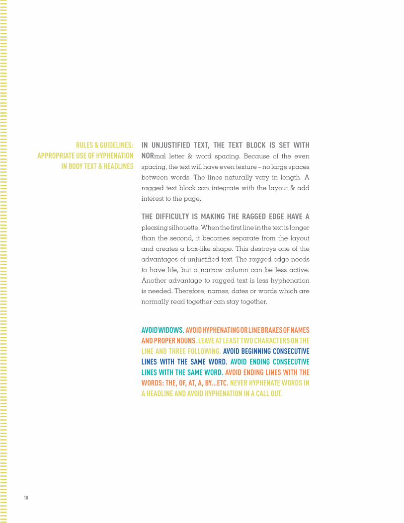
RULES & GUIDELINES: APPROPRIATE USE OF HYPHENATION
IN BODY TEXT & HEADLINES
AVOID WIDOWS. AVOID HYPHENATING OR LINE BRAKES OF NAMES AND PROPER NOUNS. LEAVE AT LEAST TWO CHARACTERS ON THE LINE AND THREE FOLLOWING. AVOID BEGINNING CONSECUTIVE LINES WITH THE SAME WORD. AVOID ENDING CONSECUTIVE LINES WITH THE SAME WORD. AVOID ENDING LINES WITH THE WORDS: THE, OF, AT, A, BY...ETC. NEVER HYPHENATE WORDS IN A HEADLINE AND AVOID HYPHENATION IN A CALL OUT.
IN UNJUSTIFIED TEXT, THE TEXT BLOCK IS SET WITH NORmal letter & word spacing. Because of the even
spacing, the text will have even texture – no large spaces
between words. The lines naturally vary in length. A
ragged text block can integrate with the layout & add
interest to the page.
THE DIFFICULTY IS MAKING THE RAGGED EDGE HAVE A pleasing silhouette. When the first line in the text is longer
than the second, it becomes separate from the layout
and creates a box-like shape. This destroys one of the
advantages of unjustified text. The ragged edge needs
to have life, but a narrow column can be less active.
Another advantage to ragged text is less hyphenation
is needed. Therefore, names, dates or words which are
normally read together can stay together.
19
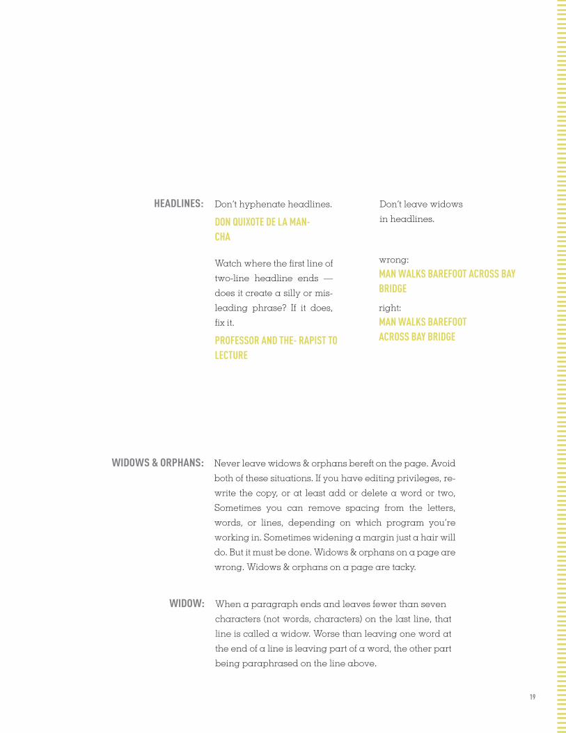
WIDOWS & ORPHANS: Never leave widows & orphans bereft on the page. Avoid
both of these situations. If you have editing privileges, re-
write the copy, or at least add or delete a word or two,
Sometimes you can remove spacing from the letters,
words, or lines, depending on which program you’re
working in. Sometimes widening a margin just a hair will
do. But it must be done. Widows & orphans on a page are
wrong. Widows & orphans on a page are tacky.
WIDOW: When a paragraph ends and leaves fewer than seven
characters (not words, characters) on the last line, that
line is called a widow. Worse than leaving one word at
the end of a line is leaving part of a word, the other part
being paraphrased on the line above.
HEADLINES: Don’t hyphenate headlines.
DON QUIXOTE DE LA MAN- CHA
Watch where the first line of
two-line headline ends —
does it create a silly or mis-
leading phrase? If it does,
fix it.
PROFESSOR AND THE- RAPIST TO LECTURE
Don’t leave widows
in headlines.
wrong:
MAN WALKS BAREFOOT ACROSS BAY BRIDGE
right:
MAN WALKS BAREFOOT ACROSS BAY BRIDGE

20
LINE BREAKS: Look for bad line breaks throughout every line of body copy. Do this only on
a final copy after all editing has been done.
MAKE SURE HEADLINE TEXT IS JUSTIFIED APPROPRIATELY. USE LINE BREAKS (SHIFT RETURN) TO BUMP TEXT TO NEXT LINE WHEN NEEDED. USE KERNING TO BRING A HYPHENATED WORD TOGETHER IF NECESSARY. NEVER HYPHENATE PEOPLE’S NAME. TRY SUBSTITUTING A SHORT OR LONG WORD TO MAKE TEXT FIT.
ORPHAN: When the last line of a paragraph, be it ever so long, won’t fit at the bottom
of a column and must end itself at the top of the next column, that is an
orphan. ALWAYS correct this.
RIVERS: In typography, rivers, or rivers of white, are visually unattractive gaps appearing to run down a paragraph of text. They can occur with any spacing, though they are most noticeable with wide word spaces caused by either full text justification or monospaced fonts.

21
BEFORE: CASING ADDER BAT 01
Heresy borsch-boil starry a 02
boarder borsch boil gam
plate lung, lung a gore in- 03
ner ladle wan-hearse torn
coiled Mutt-fill.
Mutt-fill worsen mush of- 04
fter torn, butted hatter putty
gut borsch-boil tame, an off
oiler pliers honor tame, door
moist cerebrated worse Cas- 05
ing. Casing worsted sickened
basement, any hatter betting or-
phanage off .526 (fife toe
sex). 06
Casing worse gut lurking
an furry poplar—spatially
wetter gull coiled Any-bally.
Any-bally worse Casing’s
sweat-hard, any harpy cobble
wandered toe gat merit, 07
bought Casing worse tow pore toe
becalm Any-bally’s 08
horsebarn. (Boil pliers honor Mutt-
fill tame dint gat mush offer celery;
infect, day gut nosing atoll.)
Butt less gat earn wetter star-
ry. 09
CASING ADDER BATHeresy borsch-boil starry
a boarder borsch boil gam
plate lung, lung a gore inner
ladle wan-hearse torn coiled
Mutt-fill.
Mutt-fill worsen mush
offter torn, butted hatter putty
gut borsch-boil tame, an
off oiler pliers honor tame,
door moist cerebrated worse
Casing. Cas- ing worsted sick-
ened basement, any hatter
betting orphanage off .526
(fife toe sex).
Casing worse gut lurking
an furry poplar—spatially
wetter gull coiled Any-bally.
Any-bally worse Casing’s
sweat-hard, any harpy cobble
wandered toe gat merit, bought
Casing worse tow pore toe
becalm Any-bally’s horsebarn.
(Boil pliers honor Mutt-fill
tame dint gat mush offer celery;
infect, day gut nosing atoll.)
Boughtt less gat earn wetter
muffin starry.
AFTER:
01 Justify the headline so it stays on one line. 02 Use a line break (shift+return)
to bump “a” down to the next line, where it fits very nicely. 03 Kern the line a
tiny bit to bring the rest of the word up. 04 Type a dischy in front of the word to
bump it down. 05 Never hyphenate a person’s name. I had to go up a few lines,
bump “off” down,which bumped the other line endings down. 06 Fix widow. 07 There is plenty of room to squeeze “bought” on this line, perhaps by kerning the
line a tiny bit. 08 “Horsebarn” is a good long word that could be hyphenated;
type a dischy. Better yet, when “bought” moved up, it gave enough room to
move “horsebarn” up. If not, try opening the text box a wee bit. 09 Edit: to get rid
of that terrible widow, exchange a short word for a long word
CORRECTIONS:

22
ALIGNMENT ALIGNMENT ALIGNMENT ALIGNMENT ALIGNMENT ALIGNMENT ALIGNMENT ALIGNMENT ALIGNMENT ALIGNMENT ALIGNMENT ALIGNMENT ALIGNMENT ALIGNMENT ALIGNMENT ALIGNMENT ALIGNMENT ALIGNMENT ALIGNMENT ALIGNMENT ALIGNMENT ALIGNMENT ALIGNMENT ALIGNMENT ALIGNMENT ALIGNMENT ALIGNMENT ALIGNMENT ALIGNMENT ALIGNMENT ALIGNMENT ALIGNMENT ALIGNMENT ALIGNMENT ALIGNMENT ALIGNMENT ALIGNMENT ALIGNMENT ALIGNMENT ALIGNMENT ALIGNMENT ALIGNMENT ALIGNMENT ALIGNMENT ALIGNMENT ALIGNMENT ALIGNMENT ALIGNMENT ALIGNMENT ALIGNMENT ALIGNMENT ALIGNMENT ALIGNMENT ALIGNMENT ALIGNMENT ALIGNMENT ALIGNMENT ALIGNMENT ALIGNMENT ALIGNMENT ALIGNMENT ALIGNMENT ALIGNMENT ALIGNMENT ALIGNMENT ALIGNMENT ALIGNMENT ALIGNMENT ALIGNMENT ALIGNMENT ALIGNMENT ALIGNMENT ALIGNMENT ALIGNMENT ALIGNMENT ALIGNMENT ALIGNMENT ALIGNMENT ALIGNMENT ALIGNMENT ALIGNMENT ALIGNMENT ALIGNMENT ALIGNMENT ALIGNMENT ALIGNMENT ALIGNMENT ALIGNMENT ALIGNMENT ALIGNMENT ALIGNMENT ALIGNMENT ALIGNMENT ALIGNMENT ALIGNMENT ALIGNMENT ALIGNMENT ALIGNMENT ALIGNMENT ALIGNMENT ALIGNMENT ALIGNMENT ALIGNMENT ALIGNMENT ALIGNMENT ALIGNMENT ALIGNMENT ALIGNMENT ALIGNMENT ALIGNMENT ALIGNMENT ALIGNMENT ALIGNMENT ALIGNMENT ALIGNMENT ALIGNMENT ALIGNMENT ALIGNMENT ALIGNMENT ALIGNMENT ALIGNMENT ALIGNMENT ALIGNMENT ALIGNMENT ALIGNMENT ALIGNMENT ALIGNMENT ALIGNMENT ALIGNMENT ALIGNMENT ALIGNMENT ALIGNMENT ALIGNMENT ALIGNMENT ALIGNMENT ALIGNMENT ALIGNMENT ALIGNMENT ALIGNMENT ALIGNMENT ALIGNMENT ALIGNMENT ALIGNMENT ALIGNMENT ALIGNMENT ALIGNMENT ALIGNMENT ALIGNMENT ALIGNMENT ALIGNMENT ALIGNMENT ALIGNMENT ALIGNMENT ALIGNMENT ALIGNMENT ALIGNMENT ALIGNMENT ALIGNMENT ALIGNMENT ALIGNMENT ALIGNMENT ALIGNMENT ALIGNMENT ALIGNMENT ALIGNMENT ALIGNMENT ALIGNMENT ALIGNMENT ALIGNMENT ALIGNMENT ALIGNMENT ALIGNMENT ALIGNMENT ALIGNMENT ALIGNMENT ALIGNMENT ALIGNMENT ALIGNMENT ALIGNMENT ALIGNMENT ALIGNMENT ALIGNMENT ALIGNMENT ALIGNMENT ALIGNMENT ALIGNMENT ALIGNMENT ALIGNMENT ALIGNMENT ALIGNMENT ALIGNMENT ALIGNMENT ALIGNMENT ALIGNMENT ALIGNMENT ALIGNMENT ALIGNMENT ALIGNMENT ALIGNMENT ALIGNMENT ALIGNMENT ALIGNMENT ALIGNMENT ALIGNMENT ALIGNMENT ALIGNMENT ALIGNMENT ALIGNMENT ALIGNMENT ALIGNMENT ALIGNMENT ALIGNMENT ALIGNMENT ALIGNMENT ALIGNMENT ALIGNMENT ALIGNMENT ALIGNMENT ALIGNMENT ALIGNMENT ALIGNMENT ALIGNMENT ALIGNMENT ALIGNMENT ALIGNMENT ALIGNMENT ALIGNMENT ALIGNMENT ALIGNMENT ALIGNMENT ALIGNMENT ALIGNMENT ALIGNMENT ALIGNMENT ALIGNMENT ALIGNMENT ALIGNMENT ALIGNMENT ALIGNMENT ALIGNMENT ALIGNMENT ALIGNMENT ALIGNMENT ALIGNMENT ALIGNMENT ALIGNMENT ALIGNMENT ALIGNMENT ALIGNMENT ALIGNMENT ALIGNMENT ALIGNMENT ALIGNMENT ALIGNMENT ALIGNMENT ALIGNMENT ALIGNMENT ALIGNMENT ALIGNMENT ALIGNMENT ALIGNMENT ALIGNMENT ALIGNMENT ALIGNMENT ALIGNMENT ALIGNMENT ALIGNMENT ALIGNMENT ALIGNMENT ALIGNMENT ALIGNMENT ALIGNMENT ALIGNMENT ALIGNMENT ALIGNMENT ALIGNMENT ALIGNMENT ALIGNMENT ALIGNMENT ALIGNMENT ALIGNMENT ALIGNMENT ALIGNMENT ALIGNMENT ALIGNMENT ALIGNMENT ALIGNMENT ALIGNMENT ALIGNMENT ALIGNMENT ALIGNMENT ALIGNMENT ALIGNMENT ALIGNMENT ALIGNMENT ALIGNMENT ALIGNMENT ALIGNMENT ALIGNMENT ALIGNMENT ALIGNMENT ALIGNMENT ALIGNMENT ALIGNMENT ALIGNMENT ALIGNMENT ALIGNMENT ALIGNMENT ALIGNMENT ALIGNMENT ALIGNMENT ALIGNMENT ALIGNMENT ALIGNMENT ALIGNMENT ALIGNMENT ALIGNMENT ALIGNMENT ALIGNMENT ALIGNMENT ALIGNMENT ALIGNMENT ALIGNMENT ALIGNMENT ALIGNMENT ALIGNMENT ALIGNMENT ALIGNMENT ALIGNMENT ALIGNMENT ALIGNMENT ALIGNMENT ALIGNMENT ALIGNMENT ALIGNMENT ALIGNMENT

ALIGNMENTS
24
”“
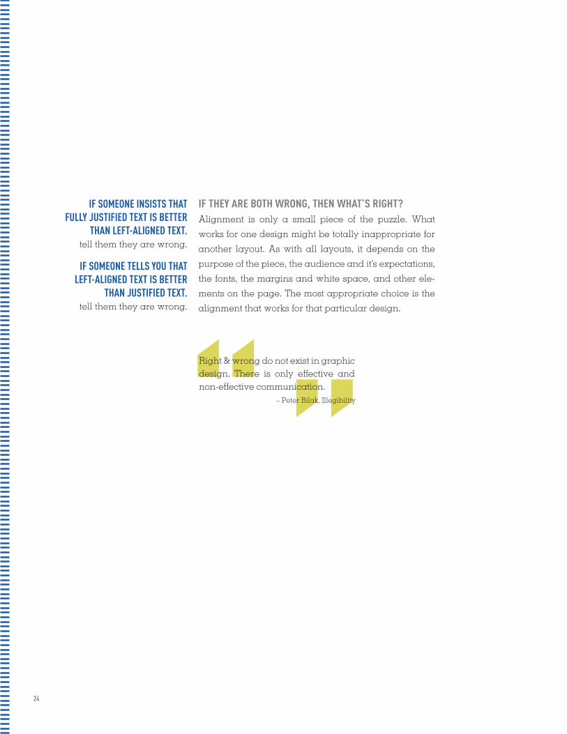
IF SOMEONE INSISTS THAT FULLY JUSTIFIED TEXT IS BETTER
THAN LEFT-ALIGNED TEXT.tell them they are wrong.
IF SOMEONE TELLS YOU THAT LEFT-ALIGNED TEXT IS BETTER
THAN JUSTIFIED TEXT.tell them they are wrong.
Alignment is only a small piece of the puzzle. What
works for one design might be totally inappropriate for
another layout. As with all layouts, it depends on the
purpose of the piece, the audience and it’s expectations,
the fonts, the margins and white space, and other ele-
ments on the page. The most appropriate choice is the
alignment that works for that particular design.
Right & wrong do not exist in graphic design. There is only effective and non-effective communication.
– Peter Bilak, Illegibility
IF THEY ARE BOTH WRONG, THEN WHAT’S RIGHT?

25
THERE IS NOTHING INHERENTLY WRONG WITH CENTERED text. As with ragged right or fully-justified text alignment, what works for one design might be totally inappropriate for another layout. There are simply fewer situations where centered text is appropriate.
WHEN IN DOUBT,DON'T CENTER IT
AS WITH ALL LAYOUTS, ALIGNMENT DEPENDS ON THE purpose of the piece, the audience and its expectations, the fonts, the margins and white space, and other elements on the page. The most appropriate choice is the alignment that works for that particular design.
NO MATTER WHAT ALIGNMENT YOU USE, REMEMBER TO pay close attention to hyphenation and word/ character spacing as well to insure that your text is as readable as possible.
THERE WILL UNDOUBTEDLY BE WELL-MEANING FRIENDS, business associates, clients, and others who will question your choices. Be prepared to explain why you chose the alignment you did and be prepared to change it (and make necessary adjustments to keep it looking good) if the person with final approval still insists on something different.
OFTEN CONSIDERED MORE INFORMAL, FRIENDLIER THAN JUSTIFIED TEXT. THE RAGGED RIGHT EDGE ADDS AN ELEMENT OF WHITE SPACE. MAY REQUIRE EXTRA ATTENTION TO HYPHENATION TO KEEP RIGHT MARGIN FROM BEING TOO RAGGED. GENERALLY TYPE SET LEFT-ALIGNED IS EASIER TO WORK WITH (REQUIRES LESS TIME, ATTENTION, AND TWEAKING FROM THE DESIGNER TO MAKE IT LOOK GOOD).
LEFT-ALIGNED, RAGGED RIGHT:

26
JUSTIFIED TEXT: Traditionally many books, newsletters, and newspapers use full-justification as a means of packing as much information onto the page as possible to cut down on the number of pages needed. While the alignment was chosen out of necessity, it has become so familiar to us that those same types of publications set in left-aligned text would look odd, even unpleasant.
You may find that fully-justified text is a necessity either due to space constraints or expectations of the audience. If possible though, try to break up dense blocks of texts with ample subheadings, margins, or graphics.
OFTEN CONSIDERED MORE FORMAL, LESS FRIENDLY THAN LEFT-ALIGNED TEXT. USUALLY ALLOWS FOR MORE CHARACTERS PER LINE, PACKING MORE INTO THE SAME AMOUNT OF SPACE (THAN THE SAME TEXT SET LEFT-ALIGNED). MAY REQUIRE EXTRA ATTENTION TO WORD AND CHARACTER SPACING AND HYPHENATION TO AVOID UNSIGHTLY RIVERS OF WHITE SPACE RUNNING THROUGH THE TEXT. MAY BE MORE FAMILIAR TO READERS IN SOME TYPES OF PUBLICATIONS, SUCH AS BOOKS AND NEWSPAPERS. SOME PEOPLE ARE NATURALLY DRAWN TO THE “NEATNESS” OF TEXT THAT LINES UP PERFECTLY ON THE LEFT AND RIGHT.
27
JUSTIFICATION JUSTIFICATION JUSTIFICATION JUSTIFICATION JUSTIFICATION JUSTIFICATION JUSTIFICATION JUSTIFICATION JUSTIFICATION JUSTIFICATION JUSTIFICATION JUSTIFICATION JUSTIFICATION JUSTIFICATION JUSTIFICATION JUSTIFICATION JUSTIFICATION JUSTIFICATION JUSTIFICATION JUSTIFICATION JUSTIFICATION JUSTIFICATION JUSTIFICATION JUSTIFICATION JUSTIFICATION JUSTIFICATION JUSTIFICATION JUSTIFICATION JUSTIFICATION JUSTIFICATION JUSTIFICATION JUSTIFICATION JUSTIFICATION JUSTIFICATION JUSTIFICATION JUSTIFICATION JUSTIFICATION JUSTIFICATION JUSTIFICATION JUSTIFICATION JUSTIFICATION JUSTIFICATION JUSTIFICATION JUSTIFICATION JUSTIFICATION JUSTIFICATION JUSTIFICATION JUSTIFICATION JUSTIFICATION JUSTIFICATION JUSTIFICATION JUSTIFICATION JUSTIFICATION JUSTIFICATION JUSTIFICATION JUSTIFICATION JUSTIFICATION JUSTIFICATION JUSTIFICATION JUSTIFICATION JUSTIFICATION JUSTIFICATION JUSTIFICATION JUSTIFICATION JUSTIFICATION JUSTIFICATION JUSTIFICATION JUSTIFICATION JUSTIFICATION JUSTIFICATION JUSTIFICATION JUSTIFICATION JUSTIFICATION JUSTIFICATION JUSTIFICATION JUSTIFICATION JUSTIFICATION JUSTIFICATION JUSTIFICATION JUSTIFICATION JUSTIFICATION JUSTIFICATION JUSTIFICATION JUSTIFICATION JUSTIFICATION JUSTIFICATION JUSTIFICATION JUSTIFICATION JUSTIFICATION JUSTIFICATION JUSTIFICATION JUSTIFICATION JUSTIFICATION JUSTIFICATION JUSTIFICATION JUSTIFICATION JUSTIFICATION JUSTIFICATION JUSTIFICATION JUSTIFICATION JUSTIFICATION JUSTIFICATION JUSTIFICATION JUSTIFICATION JUSTIFICATION JUSTIFICATION JUSTIFICATION JUSTIFICATION JUSTIFICATION JUSTIFICATION JUSTIFICATION JUSTIFICATION JUSTIFICATION JUSTIFICATION JUSTIFICATION JUSTIFICATION JUSTIFICATION JUSTIFICATION JUSTIFICATION JUSTIFICATION JUSTIFICATION JUSTIFICATION JUSTIFICATION JUSTIFICATION JUSTIFICATION JUSTIFICATION JUSTIFICATION JUSTIFICATION JUSTIFICATION JUSTIFICATION JUSTIFICATION JUSTIFICATION JUSTIFICATION JUSTIFICATION JUSTIFICATION JUSTIFICATION JUSTIFICATION JUSTIFICATION JUSTIFICATION JUSTIFICATION JUSTIFICATION JUSTIFICATION JUSTIFICATION JUSTIFICATION JUSTIFICATION JUSTIFICATION JUSTIFICATION JUSTIFICATION JUSTIFICATION JUSTIFICATION JUSTIFICATION JUSTIFICATION JUSTIFICATION JUSTIFICATION JUSTIFICATION JUSTIFICATION JUSTIFICATION JUSTIFICATION JUSTIFICATION JUSTIFICATION JUSTIFICATION JUSTIFICATION JUSTIFICATION JUSTIFICATION JUSTIFICATION JUSTIFICATION JUSTIFICATION JUSTIFICATION JUSTIFICATION JUSTIFICATION JUSTIFICATION JUSTIFICATION JUSTIFICATION JUSTIFICATION JUSTIFICATION JUSTIFICATION JUSTIFICATION JUSTIFICATION JUSTIFICATION JUSTIFICATION JUSTIFICATION JUSTIFICATION JUSTIFICATION JUSTIFICATION JUSTIFICATION JUSTIFICATION JUSTIFICATION JUSTIFICATION JUSTIFICATION JUSTIFICATION JUSTIFICATION JUSTIFICATION JUSTIFICATION JUSTIFICATION JUSTIFICATION JUSTIFICATION JUSTIFICATION JUSTIFICATION JUSTIFICATION JUSTIFICATION JUSTIFICATION JUSTIFICATION JUSTIFICATION JUSTIFICATION JUSTIFICATION JUSTIFICATION JUSTIFICATION JUSTIFICATION JUSTIFICATION JUSTIFICATION JUSTIFICATION JUSTIFICATION JUSTIFICATION JUSTIFICATION JUSTIFICATION JUSTIFICATION JUSTIFICATION JUSTIFICATION JUSTIFICATION JUSTIFICATION JUSTIFICATION JUSTIFICATION JUSTIFICATION JUSTIFICATION JUSTIFICATION JUSTIFICATION JUSTIFICATION JUSTIFICATION JUSTIFICATION JUSTIFICATION JUSTIFICATION JUSTIFICATION JUSTIFICATION JUSTIFICATION JUSTIFICATION JUSTIFICATION JUSTIFICATION JUSTIFICATION JUSTIFICATION JUSTIFICATION JUSTIFICATION JUSTIFICATION JUSTIFICATION JUSTIFICATION JUSTIFICATION JUSTIFICATION

JUSTIFICATION
29JUSTIFICATION
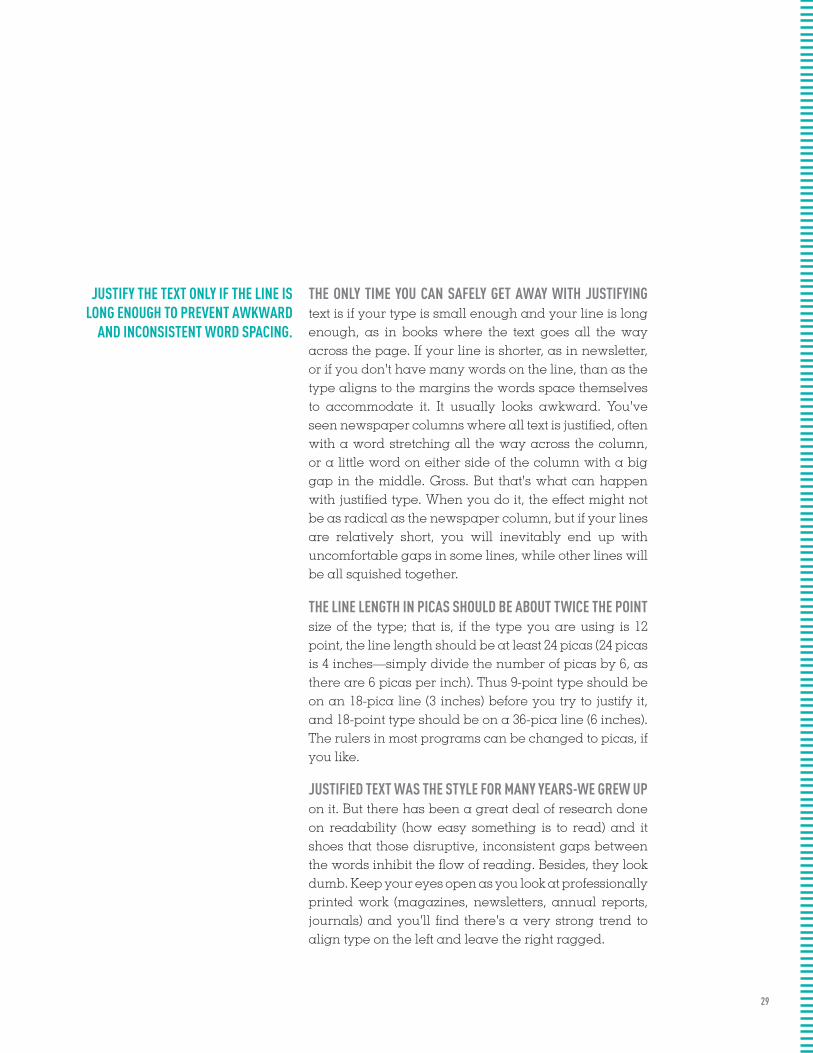
JUSTIFY THE TEXT ONLY IF THE LINE IS LONG ENOUGH TO PREVENT AWKWARD
AND INCONSISTENT WORD SPACING.
THE ONLY TIME YOU CAN SAFELY GET AWAY WITH JUSTIFYING text is if your type is small enough and your line is long enough, as in books where the text goes all the way across the page. If your line is shorter, as in newsletter, or if you don't have many words on the line, than as the type aligns to the margins the words space themselves to accommodate it. It usually looks awkward. You've seen newspaper columns where all text is justified, often with a word stretching all the way across the column, or a little word on either side of the column with a big gap in the middle. Gross. But that's what can happen with justified type. When you do it, the effect might not be as radical as the newspaper column, but if your lines are relatively short, you will inevitably end up with uncomfortable gaps in some lines, while other lines will be all squished together.
THE LINE LENGTH IN PICAS SHOULD BE ABOUT TWICE THE POINT size of the type; that is, if the type you are using is 12 point, the line length should be at least 24 picas (24 picas is 4 inches—simply divide the number of picas by 6, as there are 6 picas per inch). Thus 9-point type should be on an 18-pica line (3 inches) before you try to justify it, and 18-point type should be on a 36-pica line (6 inches). The rulers in most programs can be changed to picas, if you like.
JUSTIFIED TEXT WAS THE STYLE FOR MANY YEARS-WE GREW UP on it. But there has been a great deal of research done on readability (how easy something is to read) and it shoes that those disruptive, inconsistent gaps between the words inhibit the flow of reading. Besides, they look dumb. Keep your eyes open as you look at professionally printed work (magazines, newsletters, annual reports, journals) and you'll find there's a very strong trend to align type on the left and leave the right ragged.
30
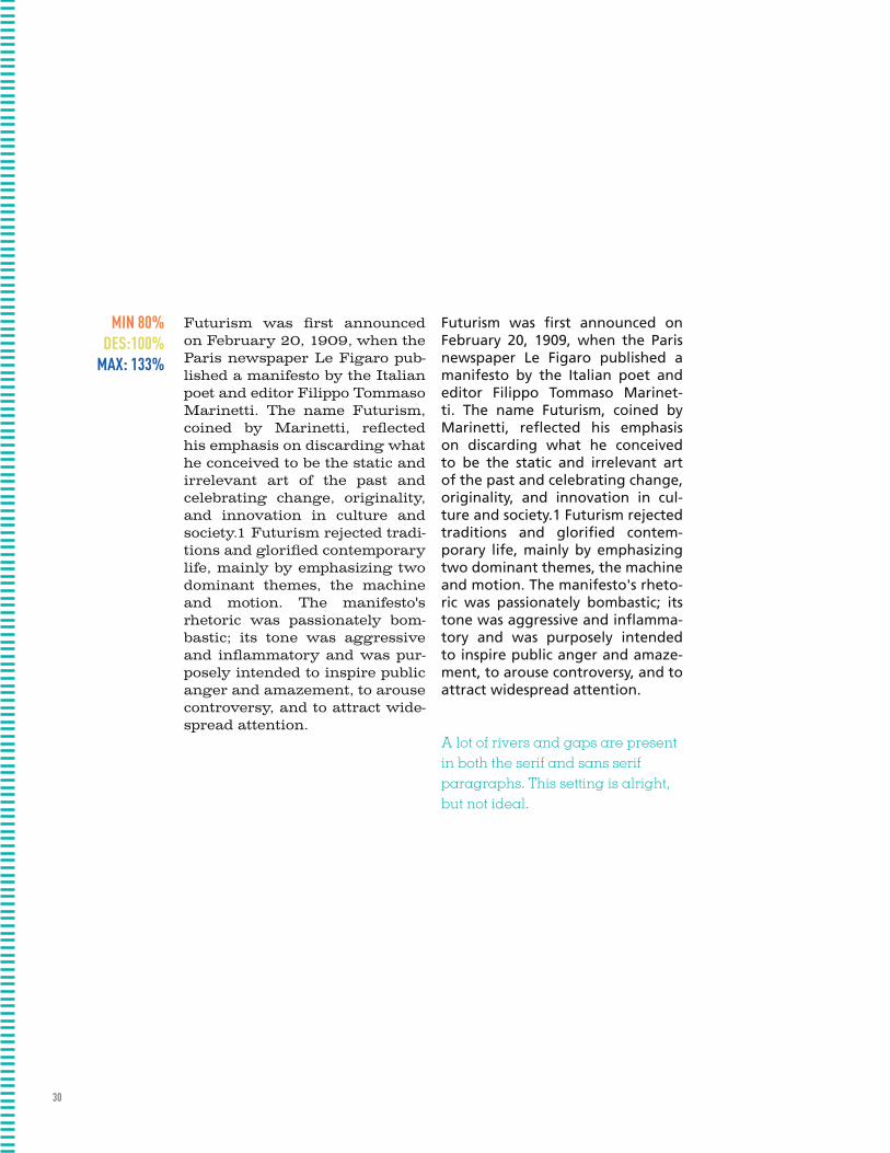
Futurism was first announced on February 20, 1909, when the Paris newspaper Le Figaro pub-lished a manifesto by the Italian poet and editor Filippo Tommaso Marinetti. The name Futurism, coined by Marinetti, reflected his emphasis on discarding what he conceived to be the static and irrelevant art of the past and celebrating change, originality, and innovation in culture and society.1 Futurism rejected tradi-tions and glorified contemporary life, mainly by emphasizing two dominant themes, the machine and motion. The manifesto's rhetoric was passionately bom-bastic; its tone was aggressive and inflammatory and was pur-posely intended to inspire public anger and amazement, to arouse controversy, and to attract wide-spread attention.
Futurism was first announced on February 20, 1909, when the Paris newspaper Le Figaro published a manifesto by the Italian poet and editor Filippo Tommaso Marinet-ti. The name Futurism, coined by Marinetti, reflected his emphasis on discarding what he conceived to be the static and irrelevant art of the past and celebrating change, originality, and innovation in cul-ture and society.1 Futurism rejected traditions and glorified contem-porary life, mainly by emphasizing two dominant themes, the machine and motion. The manifesto's rheto-ric was passionately bombastic; its tone was aggressive and inflamma-tory and was purposely intended to inspire public anger and amaze-ment, to arouse controversy, and to attract widespread attention.
A lot of rivers and gaps are present in both the serif and sans serif paragraphs. This setting is alright, but not ideal.
MIN 80% DES:100%
MAX: 133%
MIN 100% DES 130%
MAX 200%

31
Futurism was first announced on February 20, 1909, when the Paris newspaper Le Figaro pub-lished a manifesto by the Italian poet and editor Filippo Tomma-so Marinetti. The name Futur-ism, coined by Marinetti, reflect-ed his emphasis on discarding what he conceived to be the stat-ic and irrelevant art of the past and celebrating change, origi-nality, and innovation in culture and society.1 Futurism rejected traditions and glorified contem-porary life, mainly by emphasiz-ing two dominant themes, the machine and motion. The mani-festo's rhetoric was passionately bombastic; its tone was aggres-sive and inflammatory and was purposely intended to inspire public anger and amazement, to arouse controversy, and to at-tract widespread attention.
Futurism was first announced on February 20, 1909, when the Paris newspaper Le Figaro published a manifesto by the Italian poet and editor Filippo Tommaso Marinet-ti. The name Futurism, coined by Marinetti, reflected his emphasis on discarding what he conceived to be the static and irrelevant art of the past and celebrating change, originality, and innovation in cul-ture and society.1 Futurism rejected traditions and glorified contempo-rary life, mainly by emphasizing two dominant themes, the machine and motion. The manifesto's rheto-ric was passionately bombastic; its tone was aggressive and inflamma-tory and was purposely intended to inspire public anger and amaze-ment, to arouse controversy, and to attract widespread attention.
Rivers still feel very prominent in both sets of text. A slight improvement, but still not fantastic.
MIN 100% DES 130%
MAX 200%

32
Futurism was first announced on February 20, 1909, when the Paris newspaper Le Figaro pub-lished a manifesto by the Italian poet and editor Filippo Tomma-so Marinetti. The name Futur-ism, coined by Marinetti, reflect-ed his emphasis on discarding what he conceived to be the stat-ic and irrelevant art of the past and celebrating change, origi-nality, and innovation in culture and society.1 Futurism rejected traditions and glorified contem-porary life, mainly by emphasiz-ing two dominant themes, the machine and motion. The mani-festo's rhetoric was passionately bombastic; its tone was aggres-sive and inflammatory and was purposely intended to inspire public anger and amazement, to arouse controversy, and to at-tract widespread attention.
Futurism was first announced on February 20, 1909, when the Paris newspaper Le Figaro published a manifesto by the Italian poet and editor Filippo Tommaso Marinet-ti. The name Futurism, coined by Marinetti, reflected his emphasis on discarding what he conceived to be the static and irrelevant art of the past and celebrating change, originality, and innovation in cul-ture and society.1 Futurism rejected traditions and glorified contem-porary life, mainly by emphasizing two dominant themes, the machine and motion. The manifesto's rheto-ric was passionately bombastic; its tone was aggressive and inflamma-tory and was purposely intended to inspire public anger and amaze-ment, to arouse controversy, and to attract widespread attention.
Rivers are still scattered throughout both the serif and sans serif blocks of text. Not a huge improvement, but a little better.
MIN 95% DES 100%
MAX 110%
MIN 85% DES 85%
MAX 95%

33
Futurism was first announced on February 20, 1909, when the Paris newspaper Le Figaro pub-lished a manifesto by the Italian poet and editor Filippo Tommaso Marinetti. The name Futurism, coined by Marinetti, reflected his emphasis on discarding what he conceived to be the static and ir-relevant art of the past and cel-ebrating change, originality, and innovation in culture and society.1 Futurism rejected tradi-tions and glorified contemporary life, mainly by emphasizing two dominant themes, the machine and motion. The manifesto's rhetoric was passionately bom-bastic; its tone was aggressive and inflammatory and was pur-posely intended to inspire public anger and amazement, to arouse controversy, and to attract wide-spread attention.
Futurism was first announced on February 20, 1909, when the Paris newspaper Le Figaro published a manifesto by the Italian poet and editor Filippo Tommaso Marinetti. The name Futurism, coined by Mari-netti, reflected his emphasis on dis-carding what he conceived to be the static and irrelevant art of the past and celebrating change, origi-nality, and innovation in culture and society.1 Futurism rejected tra-ditions and glorified contemporary life, mainly by emphasizing two dominant themes, the machine and motion. The manifesto's rheto-ric was passionately bombastic; its tone was aggressive and inflamma-tory and was purposely intended to inspire public anger and amaze-ment, to arouse controversy, and to attract widespread attention.
Rivers still feel very prominent in both sets of text. A slight improvement, but still not fantastic.
MIN 85% DES 85%
MAX 95%
34
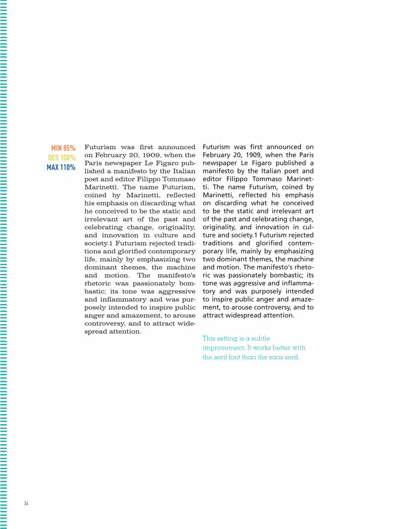
Futurism was first announced on February 20, 1909, when the Paris newspaper Le Figaro pub-lished a manifesto by the Italian poet and editor Filippo Tommaso Marinetti. The name Futurism, coined by Marinetti, reflected his emphasis on discarding what he conceived to be the static and irrelevant art of the past and celebrating change, originality, and innovation in culture and society.1 Futurism rejected tradi-tions and glorified contemporary life, mainly by emphasizing two dominant themes, the machine and motion. The manifesto's rhetoric was passionately bom-bastic; its tone was aggressive and inflammatory and was pur-posely intended to inspire public anger and amazement, to arouse controversy, and to attract wide-spread attention.
Futurism was first announced on February 20, 1909, when the Paris newspaper Le Figaro published a manifesto by the Italian poet and editor Filippo Tommaso Marinet-ti. The name Futurism, coined by Marinetti, reflected his emphasis on discarding what he conceived to be the static and irrelevant art of the past and celebrating change, originality, and innovation in cul-ture and society.1 Futurism rejected traditions and glorified contem-porary life, mainly by emphasizing two dominant themes, the machine and motion. The manifesto's rheto-ric was passionately bombastic; its tone was aggressive and inflamma-tory and was purposely intended to inspire public anger and amaze-ment, to arouse controversy, and to attract widespread attention.
MIN 85% DES 100%
MAX 110%
This setting is a subtle improvement. It works better with the serif font than the sans serif.
MIN 75% DES 90%
MAX 100%
35
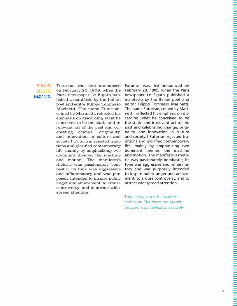
Futurism was first announced on February 20, 1909, when the Paris newspaper Le Figaro pub-lished a manifesto by the Italian poet and editor Filippo Tommaso Marinetti. The name Futurism, coined by Marinetti, reflected his emphasis on discarding what he conceived to be the static and ir-relevant art of the past and cel-ebrating change, originality, and innovation in culture and society.1 Futurism rejected tradi-tions and glorified contemporary life, mainly by emphasizing two dominant themes, the machine and motion. The manifesto's rhetoric was passionately bom-bastic; its tone was aggressive and inflammatory and was pur-posely intended to inspire public anger and amazement, to arouse controversy, and to attract wide-spread attention.
Futurism was first announced on February 20, 1909, when the Paris newspaper Le Figaro published a manifesto by the Italian poet and editor Filippo Tommaso Marinetti. The name Futurism, coined by Mari-netti, reflected his emphasis on dis-carding what he conceived to be the static and irrelevant art of the past and celebrating change, origi-nality, and innovation in culture and society.1 Futurism rejected tra-ditions and glorified contemporary life, mainly by emphasizing two dominant themes, the machine and motion. The manifesto's rheto-ric was passionately bombastic; its tone was aggressive and inflamma-tory and was purposely intended to inspire public anger and amaze-ment, to arouse controversy, and to attract widespread attention.
MIN 75% DES 90%
MAX 100%
This setting works the best with both fonts. The rivers are greatly reduced, and the text flows nicely.
36
TYPEFACES TYPEFACES TYPEFACES TYPEFACES TYPEFACES TYPEFACES TYPEFACES TYPEFACES TYPEFACES TYPEFACES TYPEFACES TYPEFACES TYPEFACES TYPEFACES TYPEFACES TYPEFACES TYPEFACES TYPEFACES TYPEFACES TYPEFACES TYPEFACES TYPEFACES TYPEFACES TYPEFACES TYPEFACES TYPEFACES TYPEFACES TYPEFACES TYPEFACES TYPEFACES TYPEFACES TYPEFACES TYPEFACES TYPEFACES TYPEFACES TYPEFACES TYPEFACES TYPEFACES TYPEFACES TYPEFACES TYPEFACES TYPEFACES TYPEFACES TYPEFACES TYPEFACES TYPEFACES TYPEFACES TYPEFACES TYPEFACES TYPEFACES TYPEFACES TYPEFACES TYPEFACES TYPEFACES TYPEFACES TYPEFACES TYPEFACES TYPEFACES TYPEFACES TYPEFACES TYPEFACES TYPEFACES TYPEFACES TYPEFACES TYPEFACES TYPEFACES TYPEFACES TYPEFACES TYPEFACES TYPEFACES TYPEFACES TYPEFACES TYPEFACES TYPEFACES TYPEFACES TYPEFACES TYPEFACES TYPEFACES TYPEFACES TYPEFACES TYPEFACES TYPEFACES TYPEFACES TYPEFACES TYPEFACES TYPEFACES TYPEFACES TYPEFACES TYPEFACES TYPEFACES TYPEFACES TYPEFACES TYPEFACES TYPEFACES TYPEFACES TYPEFACES TYPEFACES TYPEFACES TYPEFACES TYPEFACES TYPEFACES TYPEFACES TYPEFACES TYPEFACES TYPEFACES TYPEFACES TYPEFACES TYPEFACES TYPEFACES TYPEFACES TYPEFACES TYPEFACES TYPEFACES TYPEFACES TYPEFACES TYPEFACES TYPEFACES TYPEFACES TYPEFACES TYPEFACES TYPEFACES TYPEFACES TYPEFACES TYPEFACES TYPEFACES TYPEFACES TYPEFACES TYPEFACES TYPEFACES TYPEFACES TYPEFACES TYPEFACES TYPEFACES TYPEFACES TYPEFACES TYPEFACES TYPEFACES TYPEFACES TYPEFACES TYPEFACES TYPEFACES TYPEFACES TYPEFACES TYPEFACES TYPEFACES TYPEFACES TYPEFACES TYPEFACES TYPEFACES TYPEFACES TYPEFACES TYPEFACES TYPEFACES TYPEFACES TYPEFACES TYPEFACES TYPEFACES TYPEFACES TYPEFACES TYPEFACES TYPEFACES TYPEFACES TYPEFACES TYPEFACES TYPEFACES TYPEFACES TYPEFACES TYPEFACES TYPEFACES TYPEFACES TYPEFACES TYPEFACES TYPEFACES TYPEFACES TYPEFACES TYPEFACES TYPEFACES TYPEFACES TYPEFACES TYPEFACES TYPEFACES TYPEFACES TYPEFACES TYPEFACES TYPEFACES TYPEFACES TYPEFACES TYPEFACES TYPEFACES TYPEFACES TYPEFACES TYPEFACES TYPEFACES TYPEFACES TYPEFACES TYPEFACES TYPEFACES TYPEFACES TYPEFACES TYPEFACES TYPEFACES TYPEFACES TYPEFACES TYPEFACES TYPEFACES TYPEFACES TYPEFACES TYPEFACES TYPEFACES TYPEFACES TYPEFACES TYPEFACES TYPEFACES TYPEFACES TYPEFACES TYPEFACES TYPEFACES TYPEFACES TYPEFACES TYPEFACES TYPEFACES TYPEFACES TYPEFACES TYPEFACES TYPEFACES TYPEFACES TYPEFACES TYPEFACES TYPEFACES TYPEFACES TYPEFACES TYPEFACES TYPEFACES TYPEFACES TYPEFACES TYPEFACES TYPEFACES TYPEFACES TYPEFACES TYPEFACES TYPEFACES TYPEFACES TYPEFACES TYPEFACES TYPEFACES TYPEFACES TYPEFACES TYPEFACES TYPEFACES TYPEFACES TYPEFACES TYPEFACES TYPEFACES TYPEFACES TYPEFACES TYPEFACES TYPEFACES TYPEFACES TYPEFACES TYPEFACES TYPEFACES TYPEFACES TYPEFACES TYPEFACES TYPEFACES TYPEFACES TYPEFACES TYPEFACES TYPEFACES TYPEFACES TYPEFACES TYPEFACES TYPEFACES TYPEFACES TYPEFACES TYPEFACES TYPEFACES TYPEFACES TYPEFACES TYPEFACES TYPEFACES TYPEFACES TYPEFACES TYPEFACES TYPEFACES TYPEFACES TYPEFACES TYPEFACES TYPEFACES TYPEFACES TYPEFACES TYPEFACES TYPEFACES TYPEFACES TYPEFACES TYPEFACES TYPEFACES TYPEFACES TYPEFACES TYPEFACES TYPEFACES TYPEFACES TYPEFACES TYPEFACES TYPEFACES TYPEFACES TYPEFACES TYPEFACES TYPEFACES TYPEFACES TYPEFACES TYPEFACES TYPEFACES TYPEFACES TYPEFACES TYPEFACES TYPEFACES TYPEFACES TYPEFACES TYPEFACES TYPEFACES TYPEFACES TYPEFACES TYPEFACES TYPEFACES TYPEFACES TYPEFACES TYPEFACES

TYPEFACES
38
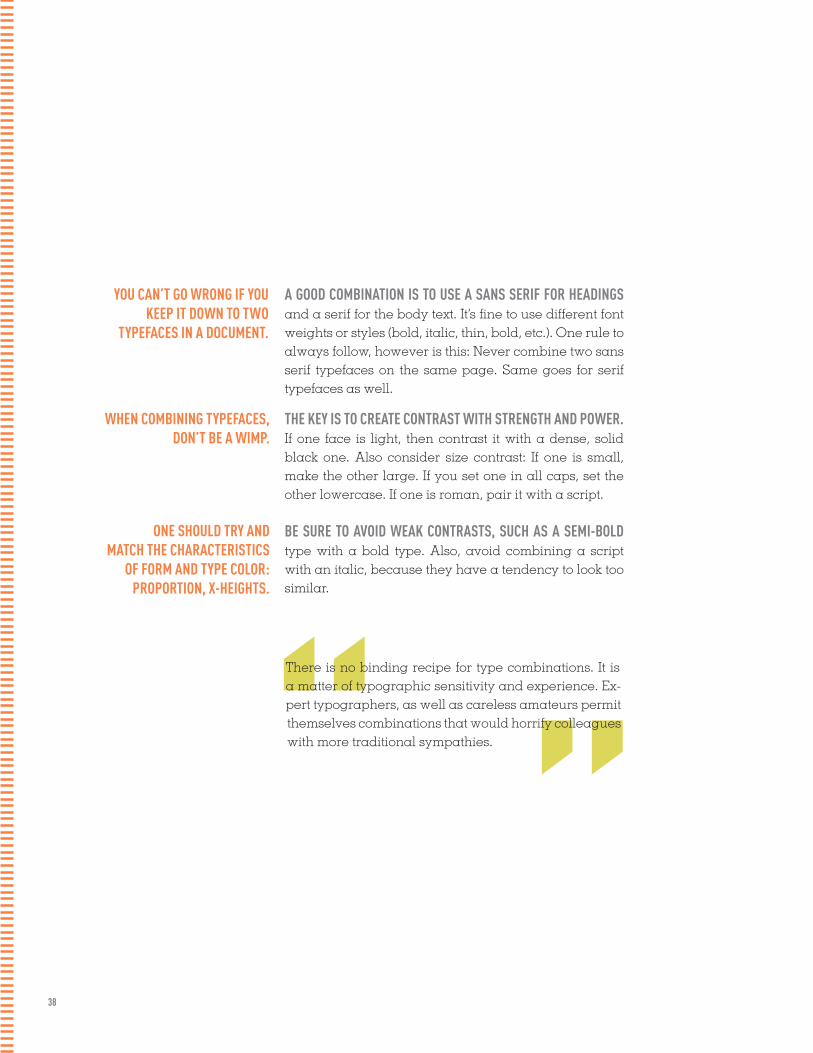
YOU CAN’T GO WRONG IF YOU KEEP IT DOWN TO TWO
TYPEFACES IN A DOCUMENT.
A GOOD COMBINATION IS TO USE A SANS SERIF FOR HEADINGS and a serif for the body text. It’s fine to use different font weights or styles (bold, italic, thin, bold, etc.). One rule to always follow, however is this: Never combine two sans serif typefaces on the same page. Same goes for serif typefaces as well.
THE KEY IS TO CREATE CONTRAST WITH STRENGTH AND POWER. If one face is light, then contrast it with a dense, solid black one. Also consider size contrast: If one is small, make the other large. If you set one in all caps, set the other lowercase. If one is roman, pair it with a script.
BE SURE TO AVOID WEAK CONTRASTS, SUCH AS A SEMI-BOLD type with a bold type. Also, avoid combining a script with an italic, because they have a tendency to look too similar.
WHEN COMBINING TYPEFACES, DON’T BE A WIMP.
ONE SHOULD TRY AND MATCH THE CHARACTERISTICS
OF FORM AND TYPE COLOR: PROPORTION, X-HEIGHTS.
”“There is no binding recipe for type combinations. It is a matter of typographic sensitivity and experience. Ex-pert typographers, as well as careless amateurs permit themselves combinations that would horrify colleagues with more traditional sympathies.

39
WORDS IN LIBERTYA Prologue to Futurism: Futurism was first announced on February 20, 1909, when the Paris newspaper Le Figaro published a manifesto by the Italian poet and editor Filippo Tommaso Marinetti. The name Futurism, coined by Marinetti, reflected his emphasis on discarding what he con-ceived to be the static and irrelevant art of the past and celebrating change, originality, and innovation in culture and society.1 Futurism rejected tradi-tions and glorified contemporary life, mainly by emphasizing two dominant themes, the machine and motion. The manifesto’s rhetoric was passionate-ly bombastic; its tone was aggressive and inflammatory and was purposely intended to inspire public anger and amazement, to arouse controversy, and to attract widespread attention.
WORDS IN LIBERTYA Prologue to Futurism: Futurism was first announced on February 20, 1909, when the Paris newspaper Le Figaro published a manifesto by the Italian poet and editor Filippo Tommaso Marinetti. The name Futur-ism, coined by Marinetti, reflected his emphasis on discarding what he conceived to be the static and irrelevant art of the past and celebrating change, originality, and innovation in culture and society.1 Futurism re-jected traditions and glorified contemporary life, mainly by emphasizing two dominant themes, the machine and motion. The manifesto’s rhetoric was passionately bombastic; its tone was aggressive and inflammatory and was purposely intended to inspire public anger and amazement, to arouse controversy, and to attract widespread attention.
aa BB ee GG ggFrutiger (bold) 16pt : humanist and Garamond 24pt: Old Style
Frutiger and Garamond work well together in this setting mainly be- cause of their contrast in stroke width and color. Frutiger had to be set in a bolder stroke so as to create more visual contrast between the two. Overall, Garamond reflects Frutiger's friendly, light style.
aa BB ee GG ggAkzidenz Grotesque 16pt : grotesque and Bembo 24pt: Old Style
These fonts also present a nice sense of contrast, with Akzidenz Grotesque being set in bold. Bembo's larger x-height offsets the boldness of Akzidez Grotesque.
40
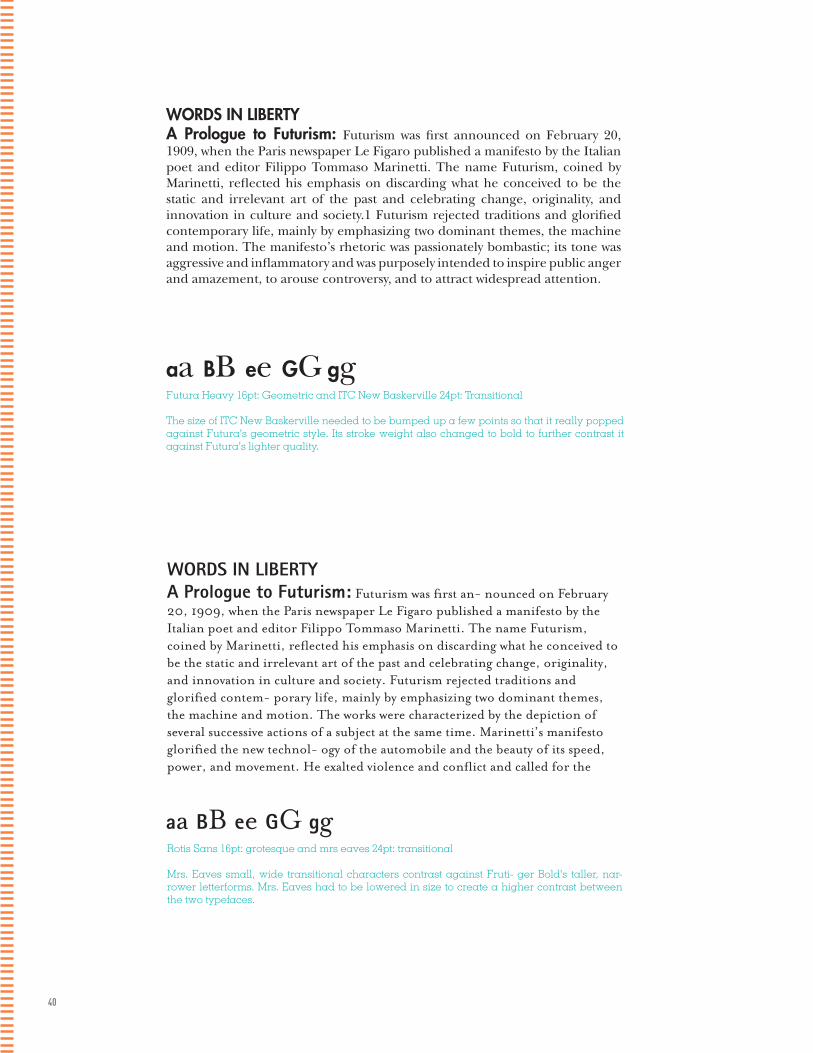
WORDS IN LIBERTYA Prologue to Futurism: Futurism was first announced on February 20, 1909, when the Paris newspaper Le Figaro published a manifesto by the Italian poet and editor Filippo Tommaso Marinetti. The name Futurism, coined by Marinetti, reflected his emphasis on discarding what he conceived to be the static and irrelevant art of the past and celebrating change, originality, and innovation in culture and society.1 Futurism rejected traditions and glorified contemporary life, mainly by emphasizing two dominant themes, the machine and motion. The manifesto’s rhetoric was passionately bombastic; its tone was aggressive and inflammatory and was purposely intended to inspire public anger and amazement, to arouse controversy, and to attract widespread attention.
Futura Heavy 16pt: Geometric and ITC New Baskerville 24pt: Transitional
The size of ITC New Baskerville needed to be bumped up a few points so that it really popped against Futura's geometric style. Its stroke weight also changed to bold to further contrast it against Futura's lighter quality.
aa BB ee GG gg
WORDS IN LIBERTYA Prologue to Futurism: Futurism was first an- nounced on February 20, 1909, when the Paris newspaper Le Figaro published a manifesto by the Italian poet and editor Filippo Tommaso Marinetti. The name Futurism, coined by Marinetti, reflected his emphasis on discarding what he conceived to be the static and irrelevant art of the past and celebrating change, originality, and innovation in culture and society. Futurism rejected traditions and glorified contem- porary life, mainly by emphasizing two dominant themes, the machine and motion. The works were characterized by the depiction of several successive actions of a subject at the same time. Marinetti’s manifesto glorified the new technol- ogy of the automobile and the beauty of its speed, power, and movement. He exalted violence and conflict and called for the
Rotis Sans 16pt: grotesque and mrs eaves 24pt: transitional
Mrs. Eaves small, wide transitional characters contrast against Fruti- ger Bold's taller, nar-rower letterforms. Mrs. Eaves had to be lowered in size to create a higher contrast between the two typefaces.
aa BB ee GG gg

41
WORDS IN LIBERTYA Prologue to Futurism: Futurism was first announced on February 20, 1909, when the Paris newspaper Le Figaro published a manifesto by the Italian poet and editor Filippo Tommaso Marinetti. The name Futurism, coined by Marinetti, reflect- ed his emphasis on discarding what he conceived to be the static and irrelevant art of the past and celebrating change, originality, and innovation in culture and society. Futurism rejected traditions and glorified contemporary life, mainly by emphasizing two dominant themes, the machine and motion. The works were characterized by the depiction of several successive actions of a subject at the same time. Marinetti’s manifesto glorified the new technology of the automobile and the beauty of its speed, power, and movement. He exalted violence and conflict and called for the sweeping repudiation of traditional cultural, social, and political values and
aa BB ee GG ggDidot 16pt: Modern and Interstate 24pt: Geometric Sans
Didot bold and Interstate Light condensed work together because they compliment each other with their slender form and strokes. Didot's boldness, however, provides enough contrast between itself and interstate.
WORDS IN LIBERTYA Prologue to Futurism: Futurism was first an- nounced on February 20, 1909, when the Paris newspaper Le Figaro published a manifesto by the Italian poet and editor Filippo Tommaso Marinetti. The name Futurism, coined by Marinetti, reflected his emphasis on discarding what he conceived to be the static and irrelevant art of the past and celebrating change, originality, and innovation in culture and society. Futurism rejected traditions and glorified contem- porary life, mainly by emphasizing two dominant themes, the machine and motion. The works were characterized by the depiction of several successive actions of a subject at the same time. Marinetti’s manifesto glorified the new technology of the automobile and the beauty of its speed, power, and movement. He exalted violence and conflict and called for the sweeping repudiation of traditional cultural, social, and political values and the destruction of such cultural institutions as museums and libraries.
aa BB ee GG ggFilosofia 16pt : Modern and News Gothic 24pt: Grotesque
News Gothic compliments Filosophia nicely. They're both rather tall and condensed, but are different enough to tell apart. Contrast is created with a bold News Gothic.

42
WORDS IN LIBERTYA Prologue to Futurism: Futurism was first an- nounced on February 20, 1909, when the Paris newspaper Le Figaro published a manifesto by the Italian poet and editor Filippo Tommaso Marinetti. The name Futurism, coined by Marinetti, reflected his emphasis on discarding what he conceived to be the static and irrelevant art of the past and celebrating change, originality, and innovation in culture and society. Futurism rejected traditions and glorified contem- porary life, mainly by emphasizing two dominant themes, the machine and motion. The works were characterized by the depiction of several successive actions of a subject at the same time. Marinetti’s manifesto glorified the new technology of the automobile and the beauty of its speed, power, and movement. He exalted violence and conflict and called for the sweeping repudiation of traditional cultural, social, and political values and the destruction of such cultural institutions as museums and libraries.
aa BB ee GG ggSwift 16pt : Transitional and Futura 24pt: Geometric
Swift's angular characteristics work well with Futura's geometric forms. Both are heavier in stroke weight, but swift is lighter.
WORDS IN LIBERTYA Prologue to Futurism: Futurism was first an- nounced on February 20, 1909, when the Paris news- paper Le Figaro published a manifesto by the Italian poet and editor Filippo Tommaso Marinetti. The name Futurism, coined by Marinetti, reflected his empha- sis on discarding what he conceived to be the static and irrelevant art of the past and celebrating change, originality, and innovation in culture and society. Fu- turism rejected traditions and glorified contemporary life, mainly by emphasizing two dominant themes, the machine and motion. The works were characterized by the depiction of several successive actions of a subject at the same time. Marinetti’s manifesto glorified the new technology of the automobile and the beauty of its speed, power, and movement. He exalted violence and conflict and called for the sweeping repudiation of traditional cultural, social, and political values and the destruction of such cultural institutions as museums and libraries.
aa BB ee GG gg Bookman 16pt : New Transitional and Trade Gothic 24pt: Grotesque
Trade Gothic's bold, condensed nature contrast Bookman's tran- sitional bracketed serifs and curved strokes. Bookman has a wide stroke at times and the darkness expressed there goes well with Trade Gothic's black letterforms.

43
WORDS IN LIBERTYA Prologue to Futurism: Futurism was first an- nounced on February 20, 1909, when the Paris newspaper Le Figaro published a manifesto by the Italian poet and editor Filippo Tommaso Marinetti. The name Futurism, coined by Marinetti, reflected his emphasis on discarding what he conceived to be the static and irrelevant art of the past and celebrating change, originality, and innovation in culture and society. Futurism rejected traditions and glorified contem- porary life, mainly by emphasizing two dominant themes, the machine and motion. The works were characterized by the depiction of several successive actions of a subject at the same time. Marinetti’s manifesto glorified the new technology of the automobile and the beauty of its speed, power, and movement. He exalted violence and conflict and called for the sweeping repudiation of traditional cultural, social, and political values and the destruction of such cultural institutions as museums and libraries.
aa BB ee GG gg Futura 16pt: Geometric and Belizio 24pt: Slab Serif
In this conposition, Belizio's thick, curvelinar forms as well as its dark color contrast well with Futura's light geometric shapes.
WORDS IN LIBERTYA Prologue to Futurism: Futurism was first an- nounced on February 20, 1909, when the Paris newspaper Le Figaro published a manifesto by the Italian poet and editor Filippo Tommaso Marinetti. The name Futurism, coined by Marinetti, reflected his emphasis on discarding what he conceived to be the static and irrelevant art of the past and celebrating change, originality, and innovation in culture and society. Futurism rejected traditions and glorified contem- porary life, mainly by emphasizing two dominant themes, the machine and motion. The works were characterized by the depiction of several successive actions of a subject at the same time. Marinetti’s manifesto glorified the new technology of the automobile and the beauty of its speed, power, and movement. He exalted violence and conflict and called for the sweeping repudiation of traditional cultural, social, and political values and the destruction of such cultural institutions as museums and libraries.
Gill Sans 16pt : Humanist and Volta 24pt: Slab Serif
The humanist qualities of Gill Sans work with Volta's thick color to create a well-balanced composition. Volta is in medium, Gill Sans is in light.
aa BB ee GG gg
44
QUOTES QUOTES QUOTES QUOTES QUOTES QUOTES QUOTES QUOTES QUOTES QUOTES QUOTES QUOTES APOSTROPHES APOSTROPHES APOSTROPHES APOSTROPHES APOSTROPHES APOSTROPHES APOSTROPHES DASHES DASHES DASHES DASHES DASHES DASHES DASHES DASHES DASHES DASHES DASHES DASHES QUOTES QUOTES QUOTES QUOTES QUOTES QUOTES QUOTES QUOTES QUOTES QUOTES QUOTES QUOTES APOSTROPHES APOSTROPHES APOSTROPHES APOSTROPHES APOSTROPHES APOSTROPHES APOSTROPHES DASHES DASHES DASHES DASHES DASHES DASHES DASHES DASHES DASHES DASHES DASHES DASHES QUOTES QUOTES QUOTES QUOTES QUOTES QUOTES QUOTES QUOTES QUOTES QUOTES QUOTES QUOTES APOSTROPHES APOSTROPHES APOSTROPHES APOSTROPHES APOSTROPHES APOSTROPHES APOSTROPHES DASHES DASHES DASHES DASHES DASHES DASHES DASHES DASHES DASHES DASHES DASHES DASHES QUOTES QUOTES QUOTES QUOTES QUOTES QUOTES QUOTES QUOTES QUOTES QUOTES QUOTES QUOTES APOSTROPHES APOSTROPHES APOSTROPHES APOSTROPHES APOSTROPHES APOSTROPHES APOSTROPHES DASHES DASHES DASHES DASHES DASHES DASHES DASHES DASHES DASHES DASHES DASHES DASHES QUOTES QUOTES QUOTES QUOTES QUOTES QUOTES QUOTES QUOTES QUOTES QUOTES QUOTES QUOTES APOSTROPHES APOSTROPHES APOSTROPHES APOSTROPHES APOSTROPHES APOSTROPHES APOSTROPHES DASHES DASHES DASHES DASHES DASHES DASHES DASHES DASHES DASHES DASHES DASHES DASHES QUOTES QUOTES QUOTES QUOTES QUOTES QUOTES QUOTES QUOTES QUOTES QUOTES QUOTES QUOTES APOSTROPHES APOSTROPHES APOSTROPHES APOSTROPHES APOSTROPHES APOSTROPHES APOSTROPHES DASHES DASHES DASHES DASHES DASHES DASHES DASHES DASHES DASHES DASHES DASHES DASHES QUOTES QUOTES QUOTES QUOTES QUOTES QUOTES QUOTES QUOTES QUOTES QUOTES QUOTES QUOTES APOSTROPHES APOSTROPHES APOSTROPHES APOSTROPHES APOSTROPHES APOSTROPHES APOSTROPHES DASHES DASHES DASHES DASHES DASHES DASHES DASHES DASHES DASHES DASHES DASHES DASHES QUOTES QUOTES QUOTES QUOTES QUOTES QUOTES QUOTES QUOTES QUOTES QUOTES QUOTES QUOTES APOSTROPHES APOSTROPHES APOSTROPHES APOSTROPHES APOSTROPHES APOSTROPHES APOSTROPHES DASHES DASHES DASHES DASHES DASHES DASHES DASHES DASHES DASHES DASHES DASHES DASHES QUOTES QUOTES QUOTES QUOTES QUOTES QUOTES QUOTES QUOTES QUOTES QUOTES QUOTES QUOTES APOSTROPHES APOSTROPHES APOSTROPHES APOSTROPHES APOSTROPHES APOSTROPHES APOSTROPHES DASHES DASHES DASHES DASHES DASHES DASHES DASHES DASHES DASHES DASHES DASHES DASHES QUOTES QUOTES QUOTES QUOTES QUOTES QUOTES QUOTES QUOTES QUOTES QUOTES QUOTES QUOTES APOSTROPHES APOSTROPHES APOSTROPHES APOSTROPHES APOSTROPHES APOSTROPHES APOSTROPHES DASHES DASHES DASHES DASHES DASHES DASHES DASHES DASHES DASHES DASHES DASHES DASHES QUOTES QUOTES QUOTES QUOTES QUOTES QUOTES QUOTES QUOTES QUOTES QUOTES QUOTES QUOTES APOSTROPHES APOSTROPHES APOSTROPHES APOSTROPHES APOSTROPHES APOSTROPHES APOSTROPHES DASHES DASHES DASHES DASHES DASHES DASHES DASHES DASHES DASHES DASHES DASHES DASHES QUOTES QUOTES QUOTES QUOTES QUOTES QUOTES QUOTES QUOTES QUOTES QUOTES QUOTES QUOTES APOSTROPHES APOSTROPHES APOSTROPHES APOSTROPHES APOSTROPHES APOSTROPHES APOSTROPHES DASHES DASHES DASHES DASHES DASHES DASHES DASHES DASHES DASHES DASHES DASHES DASHES QUOTES QUOTES QUOTES QUOTES QUOTES QUOTES QUOTES QUOTES QUOTES QUOTES QUOTES QUOTES APOSTROPHES APOSTROPHES APOSTROPHES APOSTROPHES APOSTROPHES APOSTROPHES APOSTROPHES DASHES DASHES DASHES DASHES DASHES DASHES DASHES DASHES DASHES DASHES DASHES DASHES QUOTES QUOTES QUOTES QUOTES QUOTES QUOTES QUOTES QUOTES QUOTES QUOTES QUOTES QUOTES APOSTROPHES APOSTROPHES APOSTROPHES APOSTROPHES APOSTROPHES APOSTROPHES APOSTROPHES
"ES
APOSTROPHES DASHES
QUOTES QUOTES QUOTES QUOTES QUOTES QUOTES QUOTES QUOTES QUOTES QUOTES QUOTES QUOTES APOSTROPHES APOSTROPHES APOSTROPHES APOSTROPHES APOSTROPHES APOSTROPHES APOSTROPHES DASHES DASHES DASHES DASHES DASHES DASHES DASHES DASHES DASHES DASHES DASHES DASHES QUOTES QUOTES QUOTES QUOTES QUOTES QUOTES QUOTES QUOTES QUOTES QUOTES QUOTES QUOTES APOSTROPHES APOSTROPHES APOSTROPHES APOSTROPHES APOSTROPHES APOSTROPHES APOSTROPHES DASHES DASHES DASHES DASHES DASHES DASHES DASHES DASHES DASHES DASHES DASHES DASHES QUOTES QUOTES QUOTES QUOTES QUOTES QUOTES QUOTES QUOTES QUOTES QUOTES QUOTES QUOTES APOSTROPHES APOSTROPHES APOSTROPHES APOSTROPHES APOSTROPHES APOSTROPHES APOSTROPHES DASHES DASHES DASHES DASHES DASHES DASHES DASHES DASHES DASHES DASHES DASHES DASHES QUOTES QUOTES QUOTES QUOTES QUOTES QUOTES QUOTES QUOTES QUOTES QUOTES QUOTES QUOTES APOSTROPHES APOSTROPHES APOSTROPHES APOSTROPHES APOSTROPHES APOSTROPHES APOSTROPHES DASHES DASHES DASHES DASHES DASHES DASHES DASHES DASHES DASHES DASHES DASHES DASHES QUOTES QUOTES QUOTES QUOTES QUOTES QUOTES QUOTES QUOTES QUOTES QUOTES QUOTES QUOTES APOSTROPHES APOSTROPHES APOSTROPHES APOSTROPHES APOSTROPHES APOSTROPHES APOSTROPHES DASHES DASHES DASHES DASHES DASHES DASHES DASHES DASHES DASHES DASHES DASHES DASHES QUOTES QUOTES QUOTES QUOTES QUOTES QUOTES QUOTES QUOTES QUOTES QUOTES QUOTES QUOTES APOSTROPHES APOSTROPHES APOSTROPHES APOSTROPHES APOSTROPHES APOSTROPHES APOSTROPHES DASHES DASHES DASHES DASHES DASHES DASHES DASHES DASHES DASHES DASHES DASHES DASHES QUOTES QUOTES QUOTES QUOTES QUOTES QUOTES QUOTES QUOTES QUOTES QUOTES QUOTES QUOTES APOSTROPHES APOSTROPHES APOSTROPHES APOSTROPHES APOSTROPHES APOSTROPHES APOSTROPHES DASHES DASHES DASHES DASHES DASHES DASHES DASHES DASHES DASHES DASHES DASHES DASHES QUOTES QUOTES QUOTES QUOTES QUOTES QUOTES QUOTES QUOTES QUOTES QUOTES QUOTES QUOTES APOSTROPHES APOSTROPHES APOSTROPHES APOSTROPHES APOSTROPHES APOSTROPHES APOSTROPHES DASHES DASHES DASHES DASHES DASHES DASHES DASHES DASHES DASHES DASHES DASHES DASHES QUOTES QUOTES QUOTES QUOTES QUOTES QUOTES QUOTES QUOTES QUOTES QUOTES QUOTES QUOTES APOSTROPHES APOSTROPHES APOSTROPHES APOSTROPHES APOSTROPHES APOSTROPHES APOSTROPHES DASHES DASHES DASHES DASHES DASHES DASHES DASHES DASHES DASHES DASHES DASHES DASHES QUOTES QUOTES QUOTES QUOTES QUOTES QUOTES QUOTES QUOTES QUOTES QUOTES QUOTES QUOTES APOSTROPHES APOSTROPHES APOSTROPHES APOSTROPHES APOSTROPHES APOSTROPHES APOSTROPHES DASHES DASHES DASHES DASHES DASHES DASHES DASHES DASHES DASHES DASHES DASHES DASHES QUOTES QUOTES QUOTES QUOTES QUOTES QUOTES QUOTES QUOTES QUOTES QUOTES QUOTES QUOTES APOSTROPHES APOSTROPHES APOSTROPHES APOSTROPHES APOSTROPHES APOSTROPHES APOSTROPHES DASHES DASHES DASHES DASHES DASHES DASHES DASHES DASHES DASHES DASHES DASHES DASHES QUOTES QUOTES QUOTES QUOTES QUOTES QUOTES QUOTES QUOTES QUOTES QUOTES QUOTES QUOTES APOSTROPHES APOSTROPHES APOSTROPHES APOSTROPHES APOSTROPHES APOSTROPHES APOSTROPHES DASHES DASHES DASHES DASHES DASHES DASHES DASHES DASHES DASHES DASHES DASHES DASHES QUOTES QUOTES QUOTES QUOTES QUOTES QUOTES QUOTES QUOTES QUOTES QUOTES QUOTES QUOTES APOSTROPHES APOSTROPHES APOSTROPHES APOSTROPHES APOSTROPHES APOSTROPHES APOSTROPHES DASHES DASHES DASHES DASHES DASHES DASHES DASHES DASHES DASHES DASHES DASHES DASHES QUOTES QUOTES QUOTES QUOTES QUOTES QUOTES QUOTES QUOTES QUOTES QUOTES QUOTES QUOTES APOSTROPHES APOSTROPHES APOSTROPHES APOSTROPHES APOSTROPHES APOSTROPHES APOSTROPHES

46
QUOTATION MARKS: Use real quotation marks – never those grotesque, generic marks that actually symbolize ditto, inch or foot marks. Most software applications will convert the typewriter quotes automatically as you type. Check the preferences for your application – you’ll find a check box to tell your application to automaticallyset smart quotes.
It is necessary to know how to set them yourself:
“ OPENING DOUBLE QUOTE: OPTION + [ ” CLOSING DOUBLE QUOTE: OPTION + SHIFT + [ ‘ OPENING SINGLE QUOTE: OPTION + ] ’ CLOSING SINGLE QUOTE: OPTION + SHIFT + ]
Bridge Clearance: 16' 7"The young man stood 6' 2"The length of the wall is 153' 9"
USAGE EXAMPLES:
APOSTROPHES: FOR POSSESSIVES: TURN THE PHRASE AROUND. THE apostrophe will be placed after whatever word you end up with. For example, in the phrase “the boys’ camp”, to know where to place the apostrophe, say to yourself:
“The camp belongs to the boys.” The “phrase the boy’s camp” says “The camp belongs to the boy.”
The big exception to this is “its.” “Its” used as a possessive never has a contraction. The word it only has an apostrophe as a contraction – “it’s” always means “it is” or “it has.” Always. It may be easier to remember if you recall that yours, hers, and his don’t use apostrophes – and neither should its.
For contractions: The apostrophe replaces the missing letter. For example: you're always means you are; the apostrophe is replacing the a from are. That’s an easy way to distinguish it from your as in your house and to make sure you don’t say: Your going to the store.

47
As previously noted, it’s means “it is”; the apostrophe is indicating where the i is left out. Don’t means “do not”; the apostrophe is indicating where the o is left out.For omission of letters: In a phrase such as Rock ’n’ Roll, there should be an apostrophe before and after the n, because the a and the d are both left out. And don’t turn the first apostrophe around – just because it appears in front of the letter does not mean you need to use the opposite single quote. An apostrophe is still the appropriate mark (not ‘n’).
In a phrase such as House o’ Fashion, the apostrophe takes the place of the f. There is not earthly reason for an apostrophe to be set before the o.
In a phrase such as Gone Fishin’ the same pattern is followed – the g is missing. In a date when part of the year is left out, an apostrophe needs to indicate the missing year. In the 80s would mean the temperature; In the ’80s would mean the decade. (Notice there is no apostrophe before the s. Why would there be? It is not possessive, nor is it a contraction – it is simply plural.)
DASHES: NEVER USE TWO HYPHENS INSTEAD OF A DASH. INSTEAD USE HYPHENS, EN DASHES, and em dashes appropriately.
Everyone knows what a hyphen is – that tiny little dash that belongs in some words, like mother-in-law, or in phone numbers. It’s also used to break a word at the end of a line, of course.
You might have been taught to use a double hyphen to indicate a dash, like so : -- . This is a typewriter convention because typewriters didn’t have the real dash used in professional typesetting. On a Mac, no one needs to use the double hyphen – we have a professional em dash, the long one, such as you see in this sentence. We also have an en dash, which is shorter than the em dash.

48
HYPHEN - EN DASH – EM DASH —
A HYPHEN IS ONE THIRD OF THE EM RULE AND IS USED TO LINK words. It serves as a compound modifier where two words become one, such as x-height. A hyphen is also used to break works at syllables in text blocks.
An en dash is half of the em rule (the width of a capital N) and is used between words that indicate a duration, such as time or months or years. Use it where you might otherwise use the word “to.”
In a page layout application, the en dash can be used with a thin space on either side of it. If you want you can kern it so it is not a full space.
USAGE EXAMPLES:
HYPHEN:
EN DASH:
October – December 6:30 – 8:45 A.M. 4 – 6 years of age
OPTION + -
EM DASH: SHIFT + OPTION + -
The em dash is twice as long as the en dash – it’s about the size of a capital letter M in whatever size and typeface you’re using at the moment. This dash is often used in place of a colon or parentheses, or it might indicate an abrupt change in thought, or it’s used in a spot where a period is too strong and a comma is too weak.
Our equivalent on the typewriter was the double hyphen, but now we have a real em dash. Using two hyphens (or worse, one) where there should be an em dash makes your look very unprofessional.
When using an em dash, no space is used on either side.

49
SPECIAL CHARACTERS SPECIAL CHARACTERS SPECIAL CHARACTERS SPECIAL CHARACTERS SPECIAL CHARACTERS SPECIAL CHARACTERS SPECIAL CHARACTERS SPECIAL CHARACTERS SPECIAL CHARACTERS SPECIAL CHARACTERS SPECIAL CHARACTERS SPECIAL CHARACTERS SPECIAL CHARACTERS SPECIAL CHARACTERS SPECIAL CHARACTERS SPECIAL CHARACTERS SPECIAL CHARACTERS SPECIAL CHARACTERS SPECIAL CHARACTERS SPECIAL CHARACTERS SPECIAL CHARACTERS SPECIAL CHARACTERS SPECIAL CHARACTERS SPECIAL CHARACTERS SPECIAL CHARACTERS SPECIAL CHARACTERS SPECIAL CHARACTERS SPECIAL CHARACTERS SPECIAL CHARACTERS SPECIAL CHARACTERS SPECIAL CHARACTERS SPECIAL CHARACTERS SPECIAL CHARACTERS SPECIAL CHARACTERS SPECIAL CHARACTERS SPECIAL CHARACTERS SPECIAL CHARACTERS SPECIAL CHARACTERS SPECIAL CHARACTERS SPECIAL CHARACTERS SPECIAL CHARACTERS SPECIAL CHARACTERS SPECIAL CHARACTERS SPECIAL CHARACTERS SPECIAL CHARACTERS SPECIAL CHARACTERS SPECIAL CHARACTERS SPECIAL CHARACTERS SPECIAL CHARACTERS SPECIAL CHARACTERS SPECIAL CHARACTERS SPECIAL CHARACTERS SPECIAL CHARACTERS SPECIAL CHARACTERS SPECIAL CHARACTERS SPECIAL CHARACTERS SPECIAL CHARACTERS SPECIAL CHARACTERS SPECIAL CHARACTERS SPECIAL CHARACTERS SPECIAL CHARACTERS SPECIAL CHARACTERS SPECIAL CHARACTERS SPECIAL CHARACTERS SPECIAL CHARACTERS SPECIAL CHARACTERS SPECIAL CHARACTERS SPECIAL CHARACTERS SPECIAL CHARACTERS SPECIAL CHARACTERS SPECIAL CHARACTERS SPECIAL CHARACTERS SPECIAL CHARACTERS SPECIAL CHARACTERS SPECIAL CHARACTERS SPECIAL CHARACTERS SPECIAL CHARACTERS SPECIAL CHARACTERS SPECIAL CHARACTERS SPECIAL CHARACTERS SPECIAL CHARACTERS SPECIAL CHARACTERS SPECIAL CHARACTERS SPECIAL CHARACTERS SPECIAL CHARACTERS SPECIAL CHARACTERS SPECIAL CHARACTERS SPECIAL CHARACTERS SPECIAL CHARACTERS SPECIAL CHARACTERS SPECIAL CHARACTERS SPECIAL CHARACTERS SPECIAL CHARACTERS SPECIAL CHARACTERS SPECIAL CHARACTERS SPECIAL CHARACTERS SPECIAL CHARACTERS SPECIAL CHARACTERS SPECIAL CHARACTERS SPECIAL CHARACTERS SPECIAL CHARACTERS SPECIAL CHARACTERS SPECIAL CHARACTERS SPECIAL CHARACTERS SPECIAL CHARACTERS SPECIAL CHARACTERS SPECIAL CHARACTERS SPECIAL CHARACTERS SPECIAL CHARACTERS SPECIAL CHARACTERS SPECIAL CHARACTERS SPECIAL CHARACTERS SPECIAL CHARACTERS SPECIAL CHARACTERS SPECIAL CHARACTERS SPECIAL CHARACTERS SPECIAL CHARACTERS SPECIAL CHARACTERS SPECIAL CHARACTERS SPECIAL CHARACTERS SPECIAL CHARACTERS SPECIAL CHARACTERS SPECIAL CHARACTERS SPECIAL CHARACTERS SPECIAL CHARACTERS SPECIAL CHARACTERS SPECIAL CHARACTERS SPECIAL CHARACTERS SPECIAL CHARACTERS SPECIAL CHARACTERS SPECIAL CHARACTERS SPECIAL CHARACTERS SPECIAL CHARACTERS SPECIAL CHARACTERS SPECIAL CHARACTERS SPECIAL CHARACTERS SPECIAL CHARACTERS SPECIAL CHARACTERS SPECIAL CHARACTERS SPECIAL CHARACTERS SPECIAL CHARACTERS SPECIAL CHARACTERS SPECIAL CHARACTERS SPECIAL CHARACTERS SPECIAL CHARACTERS SPECIAL CHARACTERS SPECIAL CHARACTERS SPECIAL CHARACTERS SPECIAL CHARACTERS SPECIAL CHARACTERS SPECIAL CHARACTERS SPECIAL CHARACTERS SPECIAL CHARACTERS SPECIAL CHARACTERS SPECIAL CHARACTERS SPECIAL CHARACTERS SPECIAL CHARACTERS SPECIAL CHARACTERS SPECIAL CHARACTERS SPECIAL CHARACTERS SPECIAL CHARACTERS SPECIAL CHARACTERS SPECIAL CHARACTERS SPECIAL CHARACTERS
SPECIAL CHARACTERS SPECIAL CHARACTERS SPECIAL CHARACTERS SPECIAL CHARACTERS SPECIAL CHARACTERS SPECIAL CHARACTERS SPECIAL CHARACTERS SPECIAL CHARACTERS SPECIAL CHARACTERS SPECIAL CHARACTERS SPECIAL CHARACTERS SPECIAL CHARACTERS SPECIAL CHARACTERS SPECIAL CHARACTERS SPECIAL CHARACTERS SPECIAL CHARACTERS SPECIAL CHARACTERS SPECIAL CHARACTERS SPECIAL CHARACTERS SPECIAL CHARACTERS SPECIAL CHARACTERS SPECIAL CHARACTERS SPECIAL CHARACTERS SPECIAL CHARACTERS SPECIAL CHARACTERS SPECIAL CHARACTERS SPECIAL CHARACTERS SPECIAL CHARACTERS SPECIAL CHARACTERS SPECIAL CHARACTERS SPECIAL CHARACTERS SPECIAL CHARACTERS SPECIAL CHARACTERS SPECIAL CHARACTERS SPECIAL CHARACTERS SPECIAL CHARACTERS SPECIAL CHARACTERS SPECIAL CHARACTERS SPECIAL CHARACTERS SPECIAL CHARACTERS SPECIAL CHARACTERS SPECIAL CHARACTERS SPECIAL CHARACTERS SPECIAL CHARACTERS SPECIAL CHARACTERS SPECIAL CHARACTERS SPECIAL CHARACTERS SPECIAL CHARACTERS SPECIAL CHARACTERS SPECIAL CHARACTERS SPECIAL CHARACTERS SPECIAL CHARACTERS SPECIAL CHARACTERS SPECIAL CHARACTERS SPECIAL CHARACTERS SPECIAL CHARACTERS SPECIAL CHARACTERS SPECIAL CHARACTERS SPECIAL CHARACTERS SPECIAL CHARACTERS SPECIAL CHARACTERS SPECIAL CHARACTERS SPECIAL CHARACTERS SPECIAL CHARACTERS SPECIAL CHARACTERS SPECIAL CHARACTERS SPECIAL CHARACTERS SPECIAL CHARACTERS SPECIAL CHARACTERS SPECIAL CHARACTERS SPECIAL CHARACTERS SPECIAL CHARACTERS SPECIAL CHARACTERS SPECIAL CHARACTERS SPECIAL CHARACTERS SPECIAL CHARACTERS SPECIAL CHARACTERS SPECIAL CHARACTERS SPECIAL CHARACTERS SPECIAL CHARACTERS SPECIAL CHARACTERS SPECIAL CHARACTERS SPECIAL CHARACTERS SPECIAL CHARACTERS SPECIAL CHARACTERS SPECIAL CHARACTERS SPECIAL CHARACTERS SPECIAL CHARACTERS SPECIAL CHARACTERS SPECIAL CHARACTERS SPECIAL CHARACTERS SPECIAL CHARACTERS SPECIAL CHARACTERS SPECIAL CHARACTERS SPECIAL CHARACTERS SPECIAL CHARACTERS SPECIAL CHARACTERS SPECIAL CHARACTERS SPECIAL CHARACTERS SPECIAL CHARACTERS SPECIAL CHARACTERS SPECIAL CHARACTERS SPECIAL CHARACTERS SPECIAL CHARACTERS SPECIAL CHARACTERS SPECIAL CHARACTERS SPECIAL CHARACTERS SPECIAL CHARACTERS SPECIAL CHARACTERS SPECIAL CHARACTERS SPECIAL CHARACTERS SPECIAL CHARACTERS SPECIAL CHARACTERS SPECIAL CHARACTERS SPECIAL CHARACTERS SPECIAL CHARACTERS SPECIAL CHARACTERS SPECIAL CHARACTERS SPECIAL CHARACTERS SPECIAL CHARACTERS SPECIAL CHARACTERS SPECIAL CHARACTERS SPECIAL CHARACTERS SPECIAL CHARACTERS SPECIAL CHARACTERS SPECIAL CHARACTERS SPECIAL CHARACTERS SPECIAL CHARACTERS SPECIAL CHARACTERS SPECIAL CHARACTERS SPECIAL CHARACTERS SPECIAL CHARACTERS SPECIAL CHARACTERS SPECIAL CHARACTERS SPECIAL CHARACTERS SPECIAL CHARACTERS SPECIAL CHARACTERS SPECIAL CHARACTERS SPECIAL CHARACTERS SPECIAL CHARACTERS SPECIAL CHARACTERS SPECIAL CHARACTERS SPECIAL CHARACTERS SPECIAL CHARACTERS SPECIAL CHARACTERS SPECIAL CHARACTERS SPECIAL CHARACTERS SPECIAL CHARACTERS SPECIAL CHARACTERS SPECIAL CHARACTERS SPECIAL CHARACTERS SPECIAL CHARACTERS SPECIAL CHARACTERS SPECIAL CHARACTERS SPECIAL CHARACTERS SPECIAL CHARACTERS SPECIAL CHARACTERS SPECIAL CHARACTERS SPECIAL CHARACTERS SPECIAL CHARACTERS SPECIAL CHARACTERS SPECIAL CHARACTERS SPECIAL CHARACTERS SPECIAL CHARACTERS

SPECIALCHARACTERS

51
THE FOLLOWING IS A LIST OF THE MOST OFTEN-USED SPECIAL CHARACTERS
AND ACCENT MARKS
“ OPTION + [ ” OPTION + SHIFT + [ ‘ OPTION + ] ’ OPTION + SHIFT + ] – OPTION + HYPHEN — OPTION + SHIFT + HYPHEN ... OPTION + ; • OPTION+8FI OPTION + SHIFT + 5 FI OPTION + SHIFT + 6 © OPTION + G ™ OPTION + 2 ® OPTION + R ° OPTION + SHIFT + 8 ¢ OPTION + $ ⁄ OPTION + SHIFT + 1 ¡ OPTION + 1 ¿ OPTION + SHIFT + ? £ OPTION + 3 Ç OPTION + C Ç OPTION + SHIFT + C
REMEMBER, TO SET AN ACCENT MARK OVER A LETTER, PRESS THE OPTION KEY
AND THE LETTER, THEN PRESS THE LETTER YOU WANT UNDER IT
´ OPTION E` OPTION ~¨ OPTION U ˜ OPTION N ˆ OPTION I
52
BULLETS BULLETS BULLETS BULLETS BULLETS BULLETS BULLETS BULLETS BULLETS BULLETS BULLETS BULLETS BULLETS BULLETS BULLETS BULLETS BULLETS BULLETS BULLETS BULLETS BULLETS BULLETS BULLETS BULLETS BULLETS BULLETS BULLETS BULLETS BULLETS BULLETS BULLETS BULLETS BULLETS BULLETS BULLETS BULLETS BULLETS BULLETS BULLETS BULLETS BULLETS BULLETS BULLETS BULLETS BULLETS BULLETS BULLETS BULLETS BULLETS BULLETS BULLETS BULLETS BULLETS BULLETS BULLETS BULLETS BULLETS BULLETS BULLETS BULLETS BULLETS BULLETS BULLETS BULLETS BULLETS BULLETS BULLETS BULLETS BULLETS BULLETS BULLETS BULLETS BULLETS BULLETS BULLETS BULLETS BULLETS BULLETS BULLETS BULLETS BULLETS BULLETS BULLETS BULLETS BULLETS BULLETS BULLETS BULLETS BULLETS BULLETS BULLETS BULLETS BULLETS BULLETS BULLETS BULLETS BULLETS BULLETS BULLETS BULLETS BULLETS BULLETS BULLETS BULLETS BULLETS BULLETS BULLETS BULLETS BULLETS BULLETS BULLETS BULLETS BULLETS BULLETS BULLETS BULLETS BULLETS BULLETS BULLETS BULLETS BULLETS BULLETS BULLETS BULLETS BULLETS BULLETS BULLETS BULLETS BULLETS BULLETS BULLETS BULLETS BULLETS BULLETS BULLETS BULLETS BULLETS BULLETS BULLETS BULLETS BULLETS BULLETS BULLETS BULLETS BULLETS BULLETS BULLETS BULLETS BULLETS BULLETS BULLETS BULLETS BULLETS BULLETS BULLETS BULLETS BULLETS BULLETS BULLETS BULLETS BULLETS BULLETS BULLETS BULLETS BULLETS BULLETS BULLETS BULLETS BULLETS BULLETS BULLETS BULLETS BULLETS BULLETS BULLETS BULLETS BULLETS BULLETS BULLETS BULLETS BULLETS BULLETS BULLETS BULLETS BULLETS BULLETS BULLETS BULLETS BULLETS BULLETS BULLETS BULLETS BULLETS BULLETS BULLETS BULLETS BULLETS BULLETS BULLETS BULLETS BULLETS BULLETS BULLETS BULLETS BULLETS BULLETS BULLETS BULLETS BULLETS BULLETS BULLETS BULLETS BULLETS BULLETS BULLETS BULLETS BULLETS BULLETS BULLETS BULLETS BULLETS BULLETS BULLETS BULLETS BULLETS BULLETS BULLETS BULLETS BULLETS BULLETS BULLETS BULLETS BULLETS BULLETS BULLETS BULLETS BULLETS BULLETS BULLETS BULLETS BULLETS BULLETS BULLETS BULLETS BULLETS BULLETS BULLETS BULLETS BULLETS BULLETS BULLETS BULLETS BULLETS BULLETS BULLETS BULLETS BULLETS BULLETS BULLETS BULLETS BULLETS BULLETS BULLETS BULLETS BULLETS BULLETS BULLETS BULLETS BULLETS BULLETS BULLETS BULLETS BULLETS BULLETS BULLETS BULLETS BULLETS BULLETS BULLETS BULLETS BULLETS BULLETS BULLETS BULLETS BULLETS BULLETS BULLETS BULLETS BULLETS BULLETS BULLETS BULLETS BULLETS BULLETS BULLETS BULLETS BULLETS BULLETS BULLETS BULLETS BULLETS BULLETS BULLETS BULLETS BULLETS BULLETS BULLETS BULLETS BULLETS BULLETS BULLETS BULLETS BULLETS BULLETS BULLETS BULLETS BULLETS BULLETS BULLETS BULLETS BULLETS BULLETS BULLETS BULLETS BULLETS BULLETS BULLETS BULLETS BULLETS BULLETS BULLETS BULLETS BULLETS BULLETS BULLETS BULLETS BULLETS BULLETS BULLETS BULLETS BULLETS BULLETS BULLETS BULLETS BULLETS BULLETS BULLETS BULLETS BULLETS BULLETS BULLETS BULLETS BULLETS BULLETS BULLETS BULLETS BULLETS BULLETS BULLETS BULLETS BULLETS BULLETS BULLETS BULLETS BULLETS BULLETS BULLETS BULLETS BULLETS BULLETS BULLETS BULLETS BULLETS BULLETS BULLETS BULLETS BULLETS BULLETS BULLETS BULLETS BULLETS BULLETS BULLETS BULLETS BULLETS BULLETS BULLETS BULLETS BULLETS BULLETS BULLETS BULLETS BULLETS BULLETS BULLETS BULLETS BULLETS BULLETS BULLETS BULLETS BULLETS BULLETS BULLETS BULLETS BULLETS BULLETS BULLETS BULLETS BULLETS BULLETS BULLETS BULLETS BULLETS BULLETS BULLETS BULLETS BULLETS BULLETS BULLETS BULLETS BULLETS BULLETS BULLETS BULLETS BULLETS BULLETS BULLETS BULLETS BULLETS BULLETS BULLETS BULLETS BULLETS BULLETS BULLETS BULLETS BULLETS BULLETS BULLETS BULLETS BULLETS BULLETS BULLETS BULLETS BULLETS BULLETS BULLETS BULLETS BULLETS BULLETS BULLETS

BULLETS
BULLETS BULLETS BULLETS BULLETS BULLETS BULLETS BULLETS BULLETS BULLETS BULLETS BULLETS BULLETS BULLETS BULLETS BULLETS BULLETS BULLETS BULLETS BULLETS BULLETS BULLETS BULLETS BULLETS BULLETS BULLETS BULLETS BULLETS BULLETS BULLETS BULLETS BULLETS BULLETS BULLETS BULLETS BULLETS BULLETS BULLETS BULLETS BULLETS BULLETS BULLETS BULLETS BULLETS BULLETS BULLETS BULLETS BULLETS BULLETS BULLETS BULLETS BULLETS BULLETS BULLETS BULLETS BULLETS BULLETS BULLETS BULLETS BULLETS BULLETS BULLETS BULLETS BULLETS BULLETS BULLETS BULLETS BULLETS BULLETS BULLETS BULLETS BULLETS BULLETS BULLETS BULLETS BULLETS BULLETS BULLETS BULLETS BULLETS BULLETS BULLETS BULLETS BULLETS BULLETS BULLETS BULLETS BULLETS BULLETS BULLETS BULLETS BULLETS BULLETS BULLETS BULLETS BULLETS BULLETS BULLETS BULLETS BULLETS BULLETS BULLETS BULLETS BULLETS BULLETS BULLETS BULLETS BULLETS BULLETS BULLETS BULLETS BULLETS BULLETS BULLETS BULLETS BULLETS BULLETS BULLETS BULLETS BULLETS BULLETS BULLETS BULLETS BULLETS BULLETS BULLETS BULLETS BULLETS BULLETS BULLETS BULLETS BULLETS BULLETS BULLETS BULLETS BULLETS BULLETS BULLETS BULLETS BULLETS BULLETS BULLETS BULLETS BULLETS BULLETS BULLETS BULLETS BULLETS BULLETS BULLETS BULLETS BULLETS BULLETS BULLETS BULLETS BULLETS BULLETS BULLETS BULLETS BULLETS BULLETS BULLETS BULLETS BULLETS BULLETS BULLETS BULLETS BULLETS BULLETS BULLETS BULLETS BULLETS BULLETS BULLETS BULLETS BULLETS BULLETS BULLETS BULLETS BULLETS BULLETS BULLETS BULLETS BULLETS BULLETS BULLETS BULLETS BULLETS BULLETS BULLETS BULLETS BULLETS BULLETS BULLETS BULLETS BULLETS BULLETS BULLETS BULLETS BULLETS BULLETS BULLETS BULLETS BULLETS BULLETS BULLETS BULLETS BULLETS BULLETS BULLETS BULLETS BULLETS BULLETS BULLETS BULLETS BULLETS BULLETS BULLETS BULLETS BULLETS BULLETS BULLETS BULLETS BULLETS BULLETS BULLETS BULLETS BULLETS BULLETS BULLETS BULLETS BULLETS BULLETS BULLETS BULLETS BULLETS BULLETS BULLETS BULLETS BULLETS BULLETS BULLETS BULLETS BULLETS BULLETS BULLETS BULLETS BULLETS BULLETS BULLETS BULLETS BULLETS BULLETS BULLETS BULLETS BULLETS BULLETS BULLETS BULLETS BULLETS BULLETS BULLETS BULLETS BULLETS BULLETS BULLETS BULLETS BULLETS BULLETS BULLETS BULLETS BULLETS BULLETS BULLETS BULLETS BULLETS BULLETS BULLETS BULLETS BULLETS BULLETS BULLETS BULLETS BULLETS BULLETS BULLETS BULLETS BULLETS BULLETS BULLETS BULLETS BULLETS BULLETS BULLETS BULLETS BULLETS BULLETS BULLETS BULLETS BULLETS BULLETS BULLETS BULLETS BULLETS BULLETS BULLETS BULLETS BULLETS BULLETS BULLETS BULLETS BULLETS BULLETS BULLETS BULLETS BULLETS BULLETS BULLETS BULLETS BULLETS BULLETS BULLETS BULLETS BULLETS BULLETS BULLETS BULLETS BULLETS BULLETS BULLETS BULLETS BULLETS BULLETS BULLETS BULLETS BULLETS BULLETS BULLETS BULLETS BULLETS BULLETS BULLETS BULLETS BULLETS BULLETS BULLETS BULLETS BULLETS BULLETS BULLETS BULLETS BULLETS BULLETS BULLETS BULLETS BULLETS BULLETS BULLETS BULLETS BULLETS BULLETS BULLETS BULLETS BULLETS BULLETS BULLETS BULLETS BULLETS BULLETS BULLETS BULLETS BULLETS BULLETS BULLETS BULLETS BULLETS BULLETS BULLETS BULLETS BULLETS BULLETS BULLETS BULLETS BULLETS BULLETS BULLETS BULLETS BULLETS BULLETS BULLETS BULLETS BULLETS BULLETS BULLETS BULLETS BULLETS BULLETS BULLETS BULLETS BULLETS BULLETS BULLETS BULLETS BULLETS BULLETS BULLETS BULLETS BULLETS BULLETS BULLETS BULLETS BULLETS BULLETS BULLETS BULLETS BULLETS BULLETS BULLETS BULLETS BULLETS BULLETS BULLETS BULLETS BULLETS BULLETS BULLETS BULLETS BULLETS BULLETS BULLETS BULLETS BULLETS BULLETS BULLETS BULLETS BULLETS BULLETS BULLETS BULLETS BULLETS BULLETS BULLETS BULLETS BULLETS BULLETS BULLETS BULLETS BULLETS BULLETS BULLETS BULLETS BULLETS

54
THIS VERY USEFUL TYPOGRAPHIC ELEMENT CAN ADD EMPHASIS,
CLARITY AND VISUAL INTEREST TO ALL KINDS OF COPY.
SIMPLY PUT, A BULLET IS A LARGE DOT USED TO DRAW attention to each item in a list or series. The items can be single words, phrases, sentences or paragraphs. Even if you use the bullet that is part of your font, don’t automatically assume it’s the right size: it might need to be altered in scale or position to make it look balanced next to the text.
BULLETS SHOULD BE CENTERED ON EITHER THE CAP height or x-height, depending on the nature of your copy. If all of your items begin with a cap, center the bullet on the cap, or a bit lower so it balances with the negative spaces created by the lowercase. If your items all begin with lowercase characters, center the bullets on the x-height. Insert some space after the bullet to avoid crowding.
THE PREFERRED WAY TO ALIGN BULLETS IS WITH THE left margin. You can also have the bullets overhang the margin, and keep all your text aligned with the left margin. Whichever style you choose, your listing will look best if items that run more than one line are indented so that the copy aligns with itself, and not with the bullet on the first line.
TO BE MORE CREATIVE, SUBSTITUTE SYMBOLS OR dingbats for the actual bullets. Try squares, triangles or check marks (just not all at once, as shown in the illustration!). Keep these simple and in proportion with the rest of your text.
MAKE SURE TO TAKE ADVANTAGE OF THE BASELINE SHIFT feature when using dingbats or ornaments as bullets. Sometime dinbats or webdings can be too large, so all you have to do is reduce its size. If the character is not aligned, use the baseline shift to move it up to where it ought to be.
USAGE EXAMPLES: z lovely g surlyu ghastly | womanly ? saintly b ungodly 2 stately , sprightly
• lovely • surly• ghastly • womanly • saintly • ungodly • stately • sprightly

55
FIGURES NUMERALS FIGURES NUMERALS FIGURES NUMERALS FIGURES NUMERALS FIGURES NUMERALS FIGURES NUMERALS FIGURES NUMERALS FIGURES NUMERALS FIGURES NUMERALS FIGURES NUMERALS FIGURES NUMERALS FIGURES NUMERALS FIGURES NUMERALS FIGURES NUMERALS FIGURES NUMERALS FIGURES NUMERALS FIGURES NUMERALS FIGURES NUMERALS FIGURES NUMERALS FIGURES NUMERALS FIGURES NUMERALS FIGURES NUMERALS FIGURES NUMERALS FIGURES NUMERALS FIGURES NUMERALS FIGURES NUMERALS FIGURES NUMERALS FIGURES NUMERALS FIGURES NUMERALS FIGURES NUMERALS FIGURES NUMERALS FIGURES NUMERALS FIGURES NUMERALS FIGURES NUMERALS FIGURES NUMERALS FIGURES NUMERALS FIGURES NUMERALS FIGURES NUMERALS FIGURES NUMERALS FIGURES NUMERALS FIGURES NUMERALS FIGURES NUMERALS FIGURES NUMERALS FIGURES NUMERALS FIGURES NUMERALS FIGURES NUMERALS FIGURES NUMERALS FIGURES NUMERALS FIGURES NUMERALS FIGURES NUMERALS FIGURES NUMERALS FIGURES NUMERALS FIGURES NUMERALS FIGURES NUMERALS FIGURES NUMERALS FIGURES NUMERALS FIGURES NUMERALS FIGURES NUMERALS FIGURES NUMERALS FIGURES NUMERALS FIGURES NUMERALS FIGURES NUMERALS FIGURES NUMERALS FIGURES NUMERALS FIGURES NUMERALS FIGURES NUMERALS FIGURES NUMERALS FIGURES NUMERALS FIGURES NUMERALS FIGURES NUMERALS FIGURES NUMERALS FIGURES NUMERALS FIGURES NUMERALS FIGURES NUMERALS FIGURES NUMERALS FIGURES NUMERALS FIGURES NUMERALS FIGURES NUMERALS FIGURES NUMERALS FIGURES NUMERALS FIGURES NUMERALS FIGURES NUMERALS FIGURES NUMERALS FIGURES NUMERALS FIGURES NUMERALS FIGURES NUMERALS FIGURES NUMERALS FIGURES NUMERALS FIGURES NUMERALS FIGURES NUMERALS FIGURES NUMERALS FIGURES NUMERALS FIGURES NUMERALS FIGURES NUMERALS FIGURES NUMERALS FIGURES NUMERALS FIGURES NUMERALS FIGURES NUMERALS FIGURES NUMERALS FIGURES NUMERALS FIGURES NUMERALS FIGURES NUMERALS FIGURES NUMERALS FIGURES NUMERALS FIGURES NUMERALS FIGURES NUMERALS FIGURES NUMERALS FIGURES NUMERALS FIGURES NUMERALS FIGURES NUMERALS FIGURES NUMERALS FIGURES NUMERALS FIGURES NUMERALS FIGURES NUMERALS FIGURES NUMERALS FIGURES NUMERALS FIGURES NUMERALS FIGURES NUMERALS FIGURES NUMERALS FIGURES NUMERALS FIGURES NUMERALS FIGURES NUMERALS FIGURES NUMERALS FIGURES NUMERALS FIGURES NUMERALS FIGURES NUMERALS FIGURES NUMERALS FIGURES NUMERALS FIGURES NUMERALS FIGURES NUMERALS FIGURES NUMERALS FIGURES NUMERALS FIGURES NUMERALS FIGURES NUMERALS FIGURES NUMERALS FIGURES NUMERALS FIGURES NUMERALS FIGURES NUMERALS FIGURES NUMERALS FIGURES NUMERALS FIGURES NUMERALS FIGURES NUMERALS FIGURES NUMERALS FIGURES NUMERALS FIGURES NUMERALS FIGURES NUMERALS FIGURES NUMERALS FIGURES NUMERALS FIGURES NUMERALS FIGURES NUMERALS FIGURES NUMERALS FIGURES NUMERALS FIGURES NUMERALS FIGURES NUMERALS FIGURES NUMERALS FIGURES NUMERALS FIGURES NUMERALS FIGURES NUMERALS FIGURES NUMERALS FIGURES NUMERALS FIGURES NUMERALS FIGURES NUMERALS FIGURES NUMERALS FIGURES NUMERALS FIGURES NUMERALS FIGURES NUMERALS FIGURES NUMERALS FIGURES NUMERALS FIGURES NUMERALS FIGURES NUMERALS FIGURES NUMERALS FIGURES NUMERALS FIGURES NUMERALS FIGURES NUMERALS FIGURES NUMERALS FIGURES NUMERALS FIGURES NUMERALS FIGURES NUMERALS FIGURES NUMERALS FIGURES NUMERALS FIGURES NUMERALS FIGURES NUMERALS FIGURES NUMERALS FIGURES NUMERALS FIGURES NUMERALS FIGURES NUMERALS FIGURES NUMERALS FIGURES NUMERALS FIGURES NUMERALS FIGURES NUMERALS FIGURES NUMERALS FIGURES NUMERALS FIGURES NUMERALS FIGURES NUMERALS FIGURES NUMERALS FIGURES NUMERALS FIGURES NUMERALS FIGURES NUMERALS FIGURES NUMERALS FIGURES NUMERALS FIGURES NUMERALS FIGURES NUMERALS FIGURES NUMERALS

&NUMERALSFIGURES
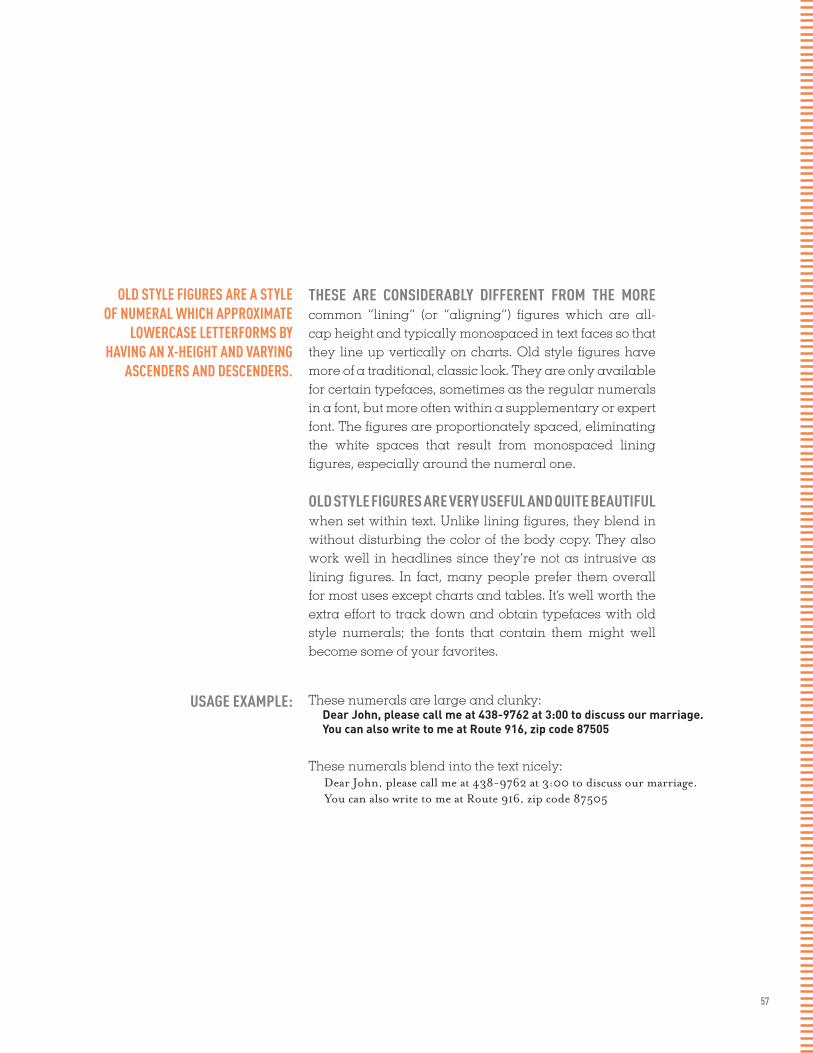
57
OLD STYLE FIGURES ARE A STYLE OF NUMERAL WHICH APPROXIMATE
LOWERCASE LETTERFORMS BY HAVING AN X-HEIGHT AND VARYING
ASCENDERS AND DESCENDERS.
THESE ARE CONSIDERABLY DIFFERENT FROM THE MORE common “lining” (or “aligning”) figures which are all-cap height and typically monospaced in text faces so that they line up vertically on charts. Old style figures have more of a traditional, classic look. They are only available for certain typefaces, sometimes as the regular numerals in a font, but more often within a supplementary or expert font. The figures are proportionately spaced, eliminating the white spaces that result from monospaced lining figures, especially around the numeral one.
OLD STYLE FIGURES ARE VERY USEFUL AND QUITE BEAUTIFUL when set within text. Unlike lining figures, they blend in without disturbing the color of the body copy. They also work well in headlines since they’re not as intrusive as lining figures. In fact, many people prefer them overall for most uses except charts and tables. It’s well worth the extra effort to track down and obtain typefaces with old style numerals; the fonts that contain them might well become some of your favorites.
USAGE EXAMPLE: These numerals are large and clunky: Dear John, please call me at 438-9762 at 3:00 to discuss our marriage. You can also write to me at Route 916, zip code 87505
These numerals blend into the text nicely: Dear John, please call me at 438-9762 at 3:00 to discuss our marriage. You can also write to me at Route 916, zip code 87505

58
SMALL CAPS SMALL CAPS SMALL CAPS SMALL CAPS SMALL CAPS SMALL CAPS SMALL CAPS SMALL CAPS SMALL CAPS SMALL CAPS SMALL CAPS SMALL CAPS SMALL CAPS SMALL CAPS SMALL CAPS SMALL CAPS SMALL CAPS SMALL CAPS SMALL CAPS SMALL CAPS SMALL CAPS SMALL CAPS SMALL CAPS SMALL CAPS SMALL CAPS SMALL CAPS SMALL CAPS SMALL CAPS SMALL CAPS SMALL CAPS SMALL CAPS SMALL CAPS SMALL CAPS SMALL CAPS SMALL CAPS SMALL CAPS SMALL CAPS SMALL CAPS SMALL CAPS SMALL CAPS SMALL CAPS SMALL CAPS SMALL CAPS SMALL CAPS SMALL CAPS SMALL CAPS SMALL CAPS SMALL CAPS SMALL CAPS SMALL CAPS SMALL CAPS SMALL CAPS SMALL CAPS SMALL CAPS SMALL CAPS SMALL CAPS SMALL CAPS SMALL CAPS SMALL CAPS SMALL CAPS SMALL CAPS SMALL CAPS SMALL CAPS SMALL CAPS SMALL CAPS SMALL CAPS SMALL CAPS SMALL CAPS SMALL CAPS SMALL CAPS SMALL CAPS SMALL CAPS SMALL CAPS SMALL CAPS SMALL CAPS SMALL CAPS SMALL CAPS SMALL CAPS SMALL CAPS SMALL CAPS SMALL CAPS SMALL CAPS SMALL CAPS SMALL CAPS SMALL CAPS SMALL CAPS SMALL CAPS SMALL CAPS SMALL CAPS SMALL CAPS SMALL CAPS SMALL CAPS SMALL CAPS SMALL CAPS SMALL CAPS SMALL CAPS SMALL CAPS SMALL CAPS SMALL CAPS SMALL CAPS SMALL CAPS SMALL CAPS SMALL CAPS SMALL CAPS SMALL CAPS SMALL CAPS SMALL CAPS SMALL CAPS SMALL CAPS SMALL CAPS SMALL CAPS SMALL CAPS SMALL CAPS SMALL CAPS SMALL CAPS SMALL CAPS SMALL CAPS SMALL CAPS SMALL CAPS SMALL CAPS SMALL CAPS SMALL CAPS SMALL CAPS SMALL CAPS SMALL CAPS SMALL CAPS SMALL CAPS SMALL CAPS SMALL CAPS SMALL CAPS SMALL CAPS SMALL CAPS SMALL CAPS SMALL CAPS SMALL CAPS SMALL CAPS SMALL CAPS SMALL CAPS SMALL CAPS SMALL CAPS SMALL CAPS SMALL CAPS SMALL CAPS SMALL CAPS SMALL CAPS SMALL CAPS SMALL CAPS SMALL CAPS SMALL CAPS SMALL CAPS SMALL CAPS SMALL CAPS SMALL CAPS SMALL CAPS SMALL CAPS SMALL CAPS SMALL CAPS SMALL CAPS SMALL CAPS SMALL CAPS SMALL CAPS SMALL CAPS SMALL CAPS SMALL CAPS SMALL CAPS SMALL CAPS SMALL CAPS SMALL CAPS SMALL CAPS SMALL CAPS SMALL CAPS SMALL CAPS SMALL CAPS SMALL CAPS SMALL CAPS SMALL CAPS SMALL CAPS SMALL CAPS SMALL CAPS SMALL CAPS SMALL CAPS SMALL CAPS SMALL CAPS SMALL CAPS SMALL CAPS SMALL CAPS SMALL CAPS SMALL CAPS SMALL CAPS SMALL CAPS SMALL CAPS SMALL CAPS SMALL CAPS SMALL CAPS SMALL CAPS SMALL CAPS SMALL CAPS SMALL CAPS SMALL CAPS SMALL CAPS SMALL CAPS SMALL CAPS SMALL CAPS SMALL CAPS SMALL CAPS SMALL CAPS SMALL CAPS SMALL CAPS SMALL CAPS SMALL CAPS SMALL CAPS SMALL CAPS SMALL CAPS SMALL CAPS SMALL CAPS SMALL CAPS SMALL CAPS SMALL CAPS SMALL CAPS SMALL CAPS SMALL CAPS SMALL CAPS SMALL CAPS SMALL CAPS SMALL CAPS SMALL CAPS SMALL CAPS SMALL CAPS SMALL CAPS SMALL CAPS SMALL CAPS SMALL CAPS SMALL CAPS SMALL CAPS SMALL CAPS SMALL CAPS SMALL CAPS SMALL CAPS SMALL CAPS SMALL CAPS SMALL CAPS SMALL CAPS SMALL CAPS SMALL CAPS SMALL CAPS SMALL CAPS SMALL CAPS SMALL CAPS SMALL CAPS SMALL CAPS SMALL CAPS SMALL CAPS SMALL CAPS SMALL CAPS SMALL CAPS SMALL CAPS SMALL CAPS SMALL CAPS SMALL CAPS SMALL CAPS SMALL CAPS SMALL CAPS SMALL CAPS SMALL CAPS SMALL CAPS SMALL CAPS SMALL CAPS SMALL CAPS SMALL CAPS SMALL CAPS SMALL CAPS SMALL CAPS SMALL CAPS SMALL CAPS SMALL CAPS SMALL CAPS SMALL CAPS SMALL CAPS SMALL CAPS SMALL CAPS SMALL CAPS SMALL CAPS SMALL CAPS SMALL CAPS SMALL CAPS SMALL CAPS SMALL CAPS SMALL CAPS SMALL CAPS SMALL CAPS SMALL CAPS SMALL CAPS SMALL CAPS SMALL CAPS SMALL CAPS SMALL CAPS SMALL CAPS SMALL CAPS SMALL CAPS SMALL CAPS SMALL CAPS SMALL CAPS SMALL CAPS SMALL CAPS SMALL CAPS SMALL CAPS SMALL CAPS SMALL CAPS SMALL CAPS SMALL CAPS SMALL CAPS SMALL CAPS SMALL CAPS SMALL CAPS SMALL CAPS SMALL CAPS SMALL CAPS SMALL CAPS SMALL CAPS SMALL CAPS SMALL CAPS SMALL CAPS SMALL CAPS SMALL CAPS SMALL CAPS SMALL CAPS SMALL CAPS SMALL CAPS SMALL CAPS SMALL CAPS SMALL CAPS SMALL CAPS SMALL CAPS SMALL CAPS SMALL CAPS SMALL CAPS SMALL CAPS SMALL CAPS SMALL CAPS SMALL CAPS SMALL CAPS SMALL CAPS

SMALL CAPS
SMALL CAPS SMALL CAPS SMALL CAPS SMALL CAPS SMALL CAPS SMALL CAPS SMALL CAPS SMALL CAPS SMALL CAPS SMALL CAPS SMALL CAPS SMALL CAPS SMALL CAPS SMALL CAPS SMALL CAPS SMALL CAPS SMALL CAPS SMALL CAPS SMALL CAPS SMALL CAPS SMALL CAPS SMALL CAPS SMALL CAPS SMALL CAPS SMALL CAPS SMALL CAPS SMALL CAPS SMALL CAPS SMALL CAPS SMALL CAPS SMALL CAPS SMALL CAPS SMALL CAPS SMALL CAPS SMALL CAPS SMALL CAPS SMALL CAPS SMALL CAPS SMALL CAPS SMALL CAPS SMALL CAPS SMALL CAPS SMALL CAPS SMALL CAPS SMALL CAPS SMALL CAPS SMALL CAPS SMALL CAPS SMALL CAPS SMALL CAPS SMALL CAPS SMALL CAPS SMALL CAPS SMALL CAPS SMALL CAPS SMALL CAPS SMALL CAPS SMALL CAPS SMALL CAPS SMALL CAPS SMALL CAPS SMALL CAPS SMALL CAPS SMALL CAPS SMALL CAPS SMALL CAPS SMALL CAPS SMALL CAPS SMALL CAPS SMALL CAPS SMALL CAPS SMALL CAPS SMALL CAPS SMALL CAPS SMALL CAPS SMALL CAPS SMALL CAPS SMALL CAPS SMALL CAPS SMALL CAPS SMALL CAPS SMALL CAPS SMALL CAPS SMALL CAPS SMALL CAPS SMALL CAPS SMALL CAPS SMALL CAPS SMALL CAPS SMALL CAPS SMALL CAPS SMALL CAPS SMALL CAPS SMALL CAPS SMALL CAPS SMALL CAPS SMALL CAPS SMALL CAPS SMALL CAPS SMALL CAPS SMALL CAPS SMALL CAPS SMALL CAPS SMALL CAPS SMALL CAPS SMALL CAPS SMALL CAPS SMALL CAPS SMALL CAPS SMALL CAPS SMALL CAPS SMALL CAPS SMALL CAPS SMALL CAPS SMALL CAPS SMALL CAPS SMALL CAPS SMALL CAPS SMALL CAPS SMALL CAPS SMALL CAPS SMALL CAPS SMALL CAPS SMALL CAPS SMALL CAPS SMALL CAPS SMALL CAPS SMALL CAPS SMALL CAPS SMALL CAPS SMALL CAPS SMALL CAPS SMALL CAPS SMALL CAPS SMALL CAPS SMALL CAPS SMALL CAPS SMALL CAPS SMALL CAPS SMALL CAPS SMALL CAPS SMALL CAPS SMALL CAPS SMALL CAPS SMALL CAPS SMALL CAPS SMALL CAPS SMALL CAPS SMALL CAPS SMALL CAPS SMALL CAPS SMALL CAPS SMALL CAPS SMALL CAPS SMALL CAPS SMALL CAPS SMALL CAPS SMALL CAPS SMALL CAPS SMALL CAPS SMALL CAPS SMALL CAPS SMALL CAPS SMALL CAPS SMALL CAPS SMALL CAPS SMALL CAPS SMALL CAPS SMALL CAPS SMALL CAPS SMALL CAPS SMALL CAPS SMALL CAPS SMALL CAPS SMALL CAPS SMALL CAPS SMALL CAPS SMALL CAPS SMALL CAPS SMALL CAPS SMALL CAPS SMALL CAPS SMALL CAPS SMALL CAPS SMALL CAPS SMALL CAPS SMALL CAPS SMALL CAPS SMALL CAPS SMALL CAPS SMALL CAPS SMALL CAPS SMALL CAPS SMALL CAPS SMALL CAPS SMALL CAPS SMALL CAPS SMALL CAPS SMALL CAPS SMALL CAPS SMALL CAPS SMALL CAPS SMALL CAPS SMALL CAPS SMALL CAPS SMALL CAPS SMALL CAPS SMALL CAPS SMALL CAPS SMALL CAPS SMALL CAPS SMALL CAPS SMALL CAPS SMALL CAPS SMALL CAPS SMALL CAPS SMALL CAPS SMALL CAPS SMALL CAPS SMALL CAPS SMALL CAPS SMALL CAPS SMALL CAPS SMALL CAPS SMALL CAPS SMALL CAPS SMALL CAPS SMALL CAPS SMALL CAPS SMALL CAPS SMALL CAPS SMALL CAPS SMALL CAPS SMALL CAPS SMALL CAPS SMALL CAPS SMALL CAPS SMALL CAPS SMALL CAPS SMALL CAPS SMALL CAPS SMALL CAPS SMALL CAPS SMALL CAPS SMALL CAPS SMALL CAPS SMALL CAPS SMALL CAPS SMALL CAPS SMALL CAPS SMALL CAPS SMALL CAPS SMALL CAPS SMALL CAPS SMALL CAPS SMALL CAPS SMALL CAPS SMALL CAPS SMALL CAPS SMALL CAPS SMALL CAPS SMALL CAPS SMALL CAPS SMALL CAPS SMALL CAPS SMALL CAPS SMALL CAPS SMALL CAPS SMALL CAPS SMALL CAPS SMALL CAPS SMALL CAPS SMALL CAPS SMALL CAPS SMALL CAPS SMALL CAPS SMALL CAPS SMALL CAPS SMALL CAPS SMALL CAPS SMALL CAPS SMALL CAPS SMALL CAPS SMALL CAPS SMALL CAPS SMALL CAPS SMALL CAPS SMALL CAPS SMALL CAPS SMALL CAPS SMALL CAPS SMALL CAPS SMALL CAPS SMALL CAPS SMALL CAPS SMALL CAPS SMALL CAPS SMALL CAPS SMALL CAPS SMALL CAPS SMALL CAPS SMALL CAPS SMALL CAPS SMALL CAPS SMALL CAPS SMALL CAPS SMALL CAPS SMALL CAPS SMALL CAPS SMALL CAPS SMALL CAPS SMALL CAPS SMALL CAPS SMALL CAPS SMALL CAPS SMALL CAPS SMALL CAPS SMALL CAPS SMALL CAPS SMALL CAPS SMALL CAPS SMALL CAPS SMALL CAPS SMALL CAPS SMALL CAPS SMALL CAPS SMALL CAPS SMALL CAPS SMALL CAPS SMALL CAPS SMALL CAPS SMALL CAPS SMALL CAPS SMALL CAPS SMALL CAPS SMALL CAPS SMALL CAPS SMALL CAPS SMALL CAPS SMALL CAPS SMALL CAPS SMALL CAPS
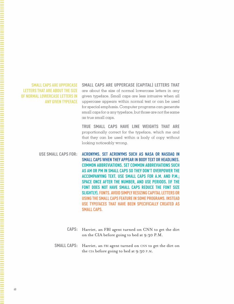
60
SMALL CAPS ARE UPPERCASE LETTERS THAT ARE ABOUT THE SIZE
OF NORMAL LOWERCASE LETTERS IN ANY GIVEN TYPEFACE
SMALL CAPS ARE UPPERCASE (CAPITAL) LETTERS THAT are about the size of normal lowercase letters in any given typeface. Small caps are less intrusive when all uppercase appears within normal text or can be used for special emphasis. Computer programs can generate small caps for a any typeface, but those are not the same as true small caps.
TRUE SMALL CAPS HAVE LINE WEIGHTS THAT ARE proportionally correct for the typeface, which me and that they can be used within a body of copy without looking noticeably wrong.
ACRONYMS. SET ACRONYMS SUCH AS NASA OR NASDAQ IN SMALL CAPS WHEN THEY APPEAR IN BODY TEXT OR HEADLINES.COMMON ABBREVIATIONS. SET COMMON ABBREVIATIONS SUCH AS AM OR PM IN SMALL CAPS SO THEY DON'T OVERPOWER THE ACCOMPANYING TEXT. USE SMALL CAPS FOR A.M. AND P.M.; SPACE ONCE AFTER THE NUMBER, AND USE PERIODS. (IF THE FONT DOES NOT HAVE SMALL CAPS REDUCE THE FONT SIZE SLIGHTLY). FONTS. AVOID SIMPLY RESIZING CAPITAL LETTERS OR USING THE SMALL CAPS FEATURE IN SOME PROGRAMS. INSTEAD USE TYPEFACES THAT HAVE BEEN SPECIFICALLY CREATED AS SMALL CAPS.
USE SMALL CAPS FOR:
Harriet, an FBI agent turned on CNN to get the dirt on the CIA before going to bed at 9:30 P.M.
Harriet, an fbi agent turned on cnn to get the dirt on the cia before going to bed at 9:30 p.m.
CAPS:
SMALL CAPS:

61
PARAGRAPH BREAKS PARAGRAPH BREAKS PARAGRAPH BREAKS PARAGRAPH BREAKS PARAGRAPH BREAKS PARAGRAPH BREAKS PARAGRAPH BREAKS PARAGRAPH BREAKS PARAGRAPH BREAKS PARAGRAPH BREAKS PARAGRAPH BREAKS PARAGRAPH BREAKS PARAGRAPH BREAKS PARAGRAPH BREAKS PARAGRAPH BREAKS PARAGRAPH BREAKS PARAGRAPH BREAKS PARAGRAPH BREAKS PARAGRAPH BREAKS PARAGRAPH BREAKS PARAGRAPH BREAKS PARAGRAPH BREAKS PARAGRAPH BREAKS PARAGRAPH BREAKS PARAGRAPH BREAKS PARAGRAPH BREAKS PARAGRAPH BREAKS PARAGRAPH BREAKS PARAGRAPH BREAKS PARAGRAPH BREAKS PARAGRAPH BREAKS PARAGRAPH BREAKS PARAGRAPH BREAKS PARAGRAPH BREAKS PARAGRAPH BREAKS PARAGRAPH BREAKS PARAGRAPH BREAKS PARAGRAPH BREAKS PARAGRAPH BREAKS PARAGRAPH BREAKS PARAGRAPH BREAKS PARAGRAPH BREAKS PARAGRAPH BREAKS PARAGRAPH BREAKS PARAGRAPH BREAKS PARAGRAPH BREAKS PARAGRAPH BREAKS PARAGRAPH BREAKS PARAGRAPH BREAKS PARAGRAPH BREAKS PARAGRAPH BREAKS PARAGRAPH BREAKS PARAGRAPH BREAKS PARAGRAPH BREAKS PARAGRAPH BREAKS PARAGRAPH BREAKS PARAGRAPH BREAKS PARAGRAPH BREAKS PARAGRAPH BREAKS PARAGRAPH BREAKS PARAGRAPH BREAKS PARAGRAPH BREAKS PARAGRAPH BREAKS PARAGRAPH BREAKS PARAGRAPH BREAKS PARAGRAPH BREAKS PARAGRAPH BREAKS PARAGRAPH BREAKS PARAGRAPH BREAKS PARAGRAPH BREAKS PARAGRAPH BREAKS PARAGRAPH BREAKS PARAGRAPH BREAKS PARAGRAPH BREAKS PARAGRAPH BREAKS PARAGRAPH BREAKS PARAGRAPH BREAKS PARAGRAPH BREAKS PARAGRAPH BREAKS PARAGRAPH BREAKS PARAGRAPH BREAKS PARAGRAPH BREAKS PARAGRAPH BREAKS PARAGRAPH BREAKS PARAGRAPH BREAKS PARAGRAPH BREAKS PARAGRAPH BREAKS PARAGRAPH BREAKS PARAGRAPH BREAKS PARAGRAPH BREAKS PARAGRAPH BREAKS PARAGRAPH BREAKS PARAGRAPH BREAKS PARAGRAPH BREAKS PARAGRAPH BREAKS PARAGRAPH BREAKS PARAGRAPH BREAKS PARAGRAPH BREAKS PARAGRAPH BREAKS PARAGRAPH BREAKS PARAGRAPH BREAKS PARAGRAPH BREAKS PARAGRAPH BREAKS PARAGRAPH BREAKS PARAGRAPH BREAKS PARAGRAPH BREAKS PARAGRAPH BREAKS PARAGRAPH BREAKS PARAGRAPH BREAKS PARAGRAPH BREAKS PARAGRAPH BREAKS PARAGRAPH BREAKS PARAGRAPH BREAKS PARAGRAPH BREAKS PARAGRAPH BREAKS PARAGRAPH BREAKS PARAGRAPH BREAKS PARAGRAPH BREAKS PARAGRAPH BREAKS PARAGRAPH BREAKS PARAGRAPH BREAKS PARAGRAPH BREAKS PARAGRAPH BREAKS PARAGRAPH BREAKS PARAGRAPH BREAKS PARAGRAPH BREAKS PARAGRAPH BREAKS PARAGRAPH BREAKS PARAGRAPH BREAKS PARAGRAPH BREAKS PARAGRAPH BREAKS PARAGRAPH BREAKS PARAGRAPH BREAKS PARAGRAPH BREAKS PARAGRAPH BREAKS PARAGRAPH BREAKS PARAGRAPH BREAKS PARAGRAPH BREAKS PARAGRAPH BREAKS PARAGRAPH BREAKS PARAGRAPH BREAKS PARAGRAPH BREAKS PARAGRAPH BREAKS PARAGRAPH BREAKS PARAGRAPH BREAKS PARAGRAPH BREAKS PARAGRAPH BREAKS PARAGRAPH BREAKS PARAGRAPH BREAKS PARAGRAPH BREAKS PARAGRAPH BREAKS PARAGRAPH BREAKS PARAGRAPH BREAKS PARAGRAPH BREAKS PARAGRAPH BREAKS PARAGRAPH BREAKS PARAGRAPH BREAKS PARAGRAPH BREAKS PARAGRAPH BREAKS PARAGRAPH BREAKS PARAGRAPH BREAKS PARAGRAPH BREAKS PARAGRAPH BREAKS PARAGRAPH BREAKS PARAGRAPH BREAKS PARAGRAPH BREAKS PARAGRAPH BREAKS PARAGRAPH BREAKS PARAGRAPH BREAKS PARAGRAPH BREAKS PARAGRAPH BREAKS PARAGRAPH BREAKS PARAGRAPH BREAKS PARAGRAPH BREAKS PARAGRAPH BREAKS PARAGRAPH BREAKS PARAGRAPH BREAKS PARAGRAPH BREAKS PARAGRAPH BREAKS PARAGRAPH BREAKS PARAGRAPH BREAKS PARAGRAPH BREAKS PARAGRAPH BREAKS PARAGRAPH BREAKS PARAGRAPH BREAKS PARAGRAPH BREAKS PARAGRAPH BREAKS PARAGRAPH BREAKS PARAGRAPH BREAKS PARAGRAPH BREAKS PARAGRAPH BREAKS PARAGRAPH BREAKS PARAGRAPH BREAKS PARAGRAPH BREAKS PARAGRAPH BREAKS PARAGRAPH BREAKS PARAGRAPH BREAKS PARAGRAPH BREAKS PARAGRAPH BREAKS PARAGRAPH BREAKS PARAGRAPH BREAKS PARAGRAPH BREAKS PARAGRAPH BREAKS PARAGRAPH BREAKS PARAGRAPH BREAKS

PARAGRAPHBREAKS

63
PARAGRAPH BREAKS ARE WHAT SETS THE RHYTHM FOR THE READER IN A BODY OF TEXT.
PARAGRAPH BREAKS HAVE A RELATIONSHIP WITH THE column of text as well as the page margins. A break may be introduced as an indentation, as a space or both. The over all page feel will be influenced by your choice.
In typography there are 4 rulesregarding paragraph breaks:
1. FIRST LINE AT THE BEGINNING OF AN ARTICLE SHOULD BE FLUSH LEFT (DO NOT INDENT FIRST PARAGRAPH) 2. BLOCK PARAGRAPHS ARE FLUSH LEFT AND ARE SEPARATED BY EXTRA LEADING NOT A FULL RETURN 3. THE AMOUNT INDENT IS = TO THE LEADING (SOMETIMES NEEDS A BIT MORE) 4. NEVER HIT TWO RETURNS BETWEEN PARAGRAPHS
64
FUTURISM WAS FIRST ANNOUNCED ON FEBRUARY 20, 1909, WHEN THE PARIS newspaper Le Figaro published a manifesto by the Italian poet and edi-tor Filippo Tommaso Marinetti. The name Futurism, coined by Marinetti, reflected his emphasis on discarding what he conceived to be the static and irrelevant art of the past and celebrating change, originality, and in-novation in culture and society.1 Futurism rejected traditions and glorified contemporary life, mainly by emphasizing two dominant themes, the ma-chine and motion. The manifesto’s rhetoric was passionately bombastic; its tone was aggressive and inflammatory and was purposely intended to inspire public anger and amazement, to arouse controversy, and to attract widespread attention.
BUT IT IS THE MOVEMENTS WHICH SURVIVE, ODDLY, HERE WHERE WE LIVE and work as poets and artists: or, if not the movements, then their sense of art as an life itself. All of which, as futurism, had come sharply into focus by the start of the world war: a first radical mix of art and life, the epitome in the poplar mind of an avant-garde. It was, on both its Russian & Italian sides, the first great “art” movement led by poets; and if its means now sometimes seem exaggerated or unripe in retrospect, they carry within them the seed of all that we were later to become.
WHILE MARINETTI’S OPENING MANIFESTO FOR ITALIAN FUTURISM BRISTLED with a polemical stance in favor of the transformed present (1909), the later manifestos of Futurist poets and artists offered formal, “technical” ap-proaches to the works then getting under way. The key term—still resonant today—as parole in libertè2, by which poetry was to become “an uninter-rupted sequence of new images... (a) strict bet of images or analogies, to be cast into the mysterious sea of phenomena.” This freedom-of-the-world, while it resembled other forms of collage and of image juxtaposition, more fully explored the use of innovative and expressive typography in the visu-al presentation of language, as set in motion by forerunners like Mallarmé. Outrageous and aggressive, the Futurists’ performances mixed declama-tion and gesture, events and surroundings, indifference and engagement, to break the barriers between themselves and those who came to jeer or cheer them. Wrote Marinetti selbst3 (circa 1915), “Everything of any value is theatrical.”

65
Futurism was first announced on February 20, 1909, when the Paris news-paper Le Figaro published a manifesto by the Italian poet and editor Filippo Tommaso Marinetti. The name Futurism, coined by Marinetti, reflected his emphasis on discarding what he conceived to be the static and irrelevant art of the past and celebrating change, originality, and innovation in cul-ture and society.1 Futurism rejected traditions and glorified contemporary life, mainly by emphasizing two dominant themes, the machine and motion. The manifesto’s rhetoric was passionately bombastic; its tone was aggres-sive and inflammatory and was purposely intended to inspire public anger and amazement, to arouse controversy, and to attract widespread attention.But it is the movements which survive, oddly, here where we live and work as poets and artists: or, if not the movements, then their sense of art as an life itself. All of which, as futurism, had come sharply into focus by the start of the world war: a first radical mix of art and life, the epitome in the poplar mind of an avant-garde. It was, on both its Russian & Italian sides, the first great “art” movement led by poets; and if its means now sometimes seem exaggerated or unripe in retrospect, they carry within them the seed of all that we were later to become.While Marinetti’s opening manifesto for Italian Futurism bristled with a po-lemical stance in favor of the transformed present (1909), the later manifes-tos of Futurist poets and artists offered formal, “technical” approaches to the works then getting under way. The key term—still resonant today—as pa-role in libertè2, by which poetry was to become “an uninterrupted sequence of new images... (a) strict bet of images or analogies, to be cast into the mys-terious sea of phenomena.” This freedom-of-the-world, while it resembled other forms of collage and of image juxtaposition, more fully explored the use of innovative and expressive typography in the visual presentation of language, as set in motion by forerunners like Mallarmé. Outrageous and aggressive, the Futurists’ performances mixed declamation and gesture, events and surroundings, indifference and engagement, to break the barri-ers between themselves and those who came to jeer or cheer them. Wrote Marinetti selbst3 (circa 1915), “Everything of any value is theatrical.”

66
Futurism was first announced on February 20, 1909, when the Paris newspaper Le Figaro published a manifesto by the Italian poet and editor Filippo Tommaso Marinetti. The name Futurism, coined by Marinetti, reflected his emphasis on discarding what he conceived to be the static and irrelevant art of the past and celebrating change, originality, and innovation in culture and society.1 Futurism rejected traditions and glo-rified contemporary life, mainly by emphasizing two dominant themes, the machine and motion. The manifesto’s rhetoric was passionately bombastic; its tone was aggressive and inflammatory and was purposely intended to inspire public anger and amazement, to arouse controversy, and to attract widespread attention.
But it is the movements which survive, oddly, here where we live and work as poets and artists: or, if not the movements, then their sense of art as an life itself. All of which, as futurism, had come sharply into focus by the start of the world war: a first radical mix of art and life, the epitome in the poplar mind of an avant- garde. It was, on both its Russian & Italian sides, the first great “art” movement led by poets; and if its means now sometimes seem exaggerated or unripe in retrospect, they carry with-in them the seed of all that we were later to become.
While Marinetti’s opening manifesto for Italian Fu-turism bristled with a polemical stance in favor of the transformed present (1909), the later manifestos of Futurist poets and artists offered formal, “tech-nical” approaches to the works then getting under way. The key term—still resonant today—as parole in libertè2, by which poetry was to become “an uninterrupted sequence of new images... (a) strict bet of images or analo-gies, to be cast into the mysterious sea of phenomena.” This freedom-of-the-world, while it resembled other forms of collage and of image juxtaposition, more fully explored the use of innovative and expressive typography in the visual presentation of language, as set in motion by forerunners like Mallarmé. Outrageous and aggressive, the Futurists’ performances mixed declamation and gesture, events and surroundings, indifference and en-gagement, to break the barriers between themselves and those who came to jeer or cheer them. Wrote Marinetti selbst3 (circa 1915), “Everything of any value is theatrical.”

67
Futurism was first announced on February 20, 1909, when the Paris newspaper Le Figaro published a manifesto by the Italian poet and editor Filippo Tommaso Marinetti. The name Futurism, coined by Marinetti, reflected his emphasis on discarding what he conceived to be the static and irrelevant art of the past and celebrating change, originality, and innovation in culture and society.1 Futurism rejected traditions and glorified contemporary life, mainly by emphasizing two dominant themes, the machine and motion. The manifesto’s rhetoric was passionately bombastic; its tone was aggressive and inflammatory and was purposely intended to inspire public anger and amazement, to arouse controversy, and to attract widespread attention. But it is the movements which survive, oddly, here where we live and work as poets and artists: or, if not the movements, then their sense of art as an life itself. All of which, as futurism, had come sharply into focus by the start of the world war: a first radical mix of art and life, the epitome in the poplar mind of an avant-garde. It was, on both its Russian & Italian sides, the first great “art” movement led by poets; and if its means now sometimes seem exaggerated or unripe in retrospect, they carry within them the seed of all that we were later to become. While Marinetti’s opening manifesto for Italian Futurism bristled with a polemical stance in favor of the transformed present (1909), the later manifestos of Futurist poets and artists offered formal, “technical” approaches to the works then getting under way. The key term—still resonant today—as parole in libertè2, by which poetry was to become “an uninterrupted sequence of new images... (a) strict bet of images or analogies, to be cast into the mysterious sea of phenomena.” This freedom-of-the-world, while it resembled other forms of collage and of image juxtaposition, more fully explored the use of innovative and expressive typography in the visual presentation of language, as set in motion by forerunners like Mallarmé. Outrageous and aggressive, the Futurists’ performances mixed declamation and gesture, events and surroundings, indifference and engagement, to break the barriers between themselves and those who came to jeer or cheer them. Wrote Marinetti selbst3 (circa 1915), “Everything of any value is theatrical.”
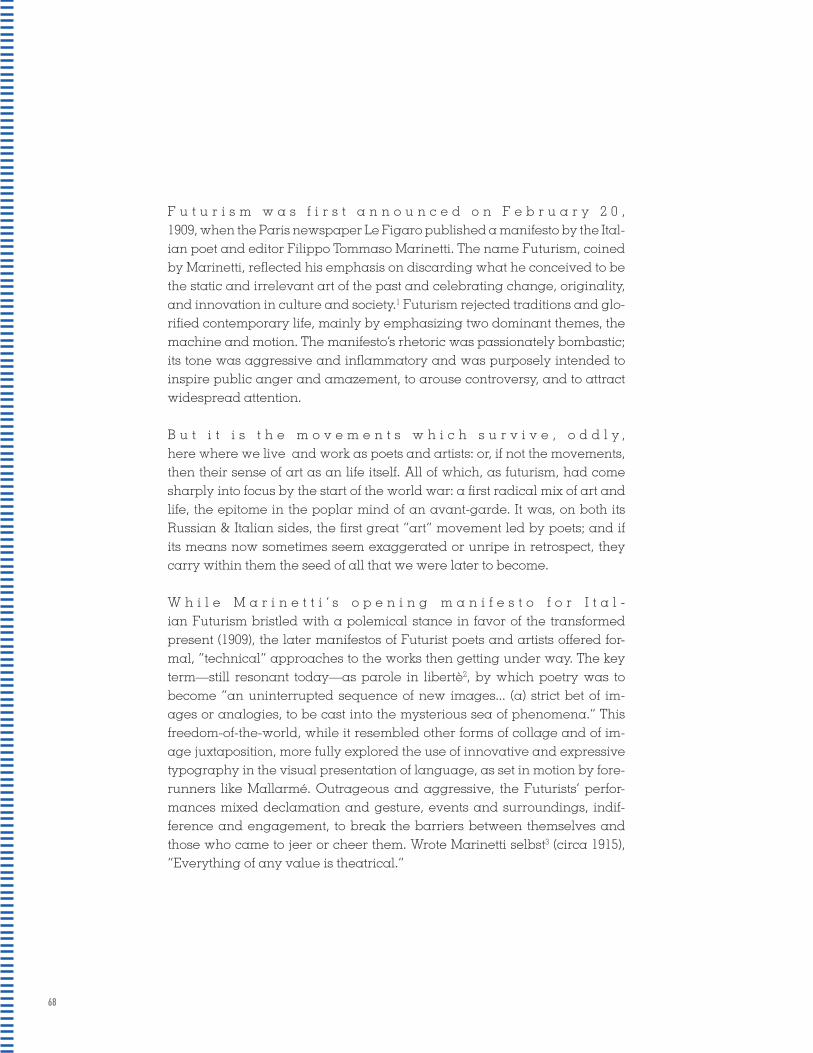
68
F u t u r i s m w a s f i r s t a n n o u n c e d o n F e b r u a r y 2 0 , 1909, when the Paris newspaper Le Figaro published a manifesto by the Ital-ian poet and editor Filippo Tommaso Marinetti. The name Futurism, coined by Marinetti, reflected his emphasis on discarding what he conceived to be the static and irrelevant art of the past and celebrating change, originality, and innovation in culture and society.1 Futurism rejected traditions and glo-rified contemporary life, mainly by emphasizing two dominant themes, the machine and motion. The manifesto’s rhetoric was passionately bombastic; its tone was aggressive and inflammatory and was purposely intended to inspire public anger and amazement, to arouse controversy, and to attract widespread attention.
B u t i t i s t h e m o v e m e n t s w h i c h s u r v i v e , o d d l y , here where we live and work as poets and artists: or, if not the movements, then their sense of art as an life itself. All of which, as futurism, had come sharply into focus by the start of the world war: a first radical mix of art and life, the epitome in the poplar mind of an avant-garde. It was, on both its Russian & Italian sides, the first great “art” movement led by poets; and if its means now sometimes seem exaggerated or unripe in retrospect, they carry within them the seed of all that we were later to become.
W h i l e M a r i n e t t i ’ s o p e n i n g m a n i f e s t o f o r I t a l - ian Futurism bristled with a polemical stance in favor of the transformed present (1909), the later manifestos of Futurist poets and artists offered for-mal, “technical” approaches to the works then getting under way. The key term—still resonant today—as parole in libertè2, by which poetry was to become “an uninterrupted sequence of new images... (a) strict bet of im-ages or analogies, to be cast into the mysterious sea of phenomena.” This freedom-of-the-world, while it resembled other forms of collage and of im-age juxtaposition, more fully explored the use of innovative and expressive typography in the visual presentation of language, as set in motion by fore-runners like Mallarmé. Outrageous and aggressive, the Futurists’ perfor-mances mixed declamation and gesture, events and surroundings, indif-ference and engagement, to break the barriers between themselves and those who came to jeer or cheer them. Wrote Marinetti selbst3 (circa 1915), “Everything of any value is theatrical.”

69
Futurism was first announced on February 20, 1909, when the Paris news-paper Le Figaro published a manifesto by the Italian poet and editor Filippo Tommaso Marinetti. The name Futurism, coined by Marinetti, reflected his emphasis on discarding what he conceived to be the static and irrelevant art of the past and celebrating change, originality, and innovation in cul-ture and society.1 Futurism rejected traditions and glorified contemporary life, mainly by emphasizing two dominant themes, the machine and motion. The manifesto’s rhetoric was passionately bombastic; its tone was aggres-sive and inflammatory and was purposely intended to inspire public anger and amazement, to arouse controversy, and to attract widespread attention.
But it is the movements which survive, oddly, here where we live and work as poets and artists: or, if not the movements, then their sense of art as an life itself. All of which, as futurism, had come sharply into fo-cus by the start of the world war: a first radical mix of art and life, the epitome in the poplar mind of an avant-garde. It was, on both its Rus-sian & Italian sides, the first great “art” movement led by poets; and if its means now sometimes seem exaggerated or unripe in retrospect, they carry within them the seed of all that we were later to become.
While Marinetti’s opening manifesto for Italian Futurism bristled with a po-lemical stance in favor of the transformed present (1909), the later manifes-tos of Futurist poets and artists offered formal, “technical” approaches to the works then getting under way. The key term—still resonant today—as pa-role in libertè2, by which poetry was to become “an uninterrupted sequence of new images... (a) strict bet of images or analogies, to be cast into the mys-terious sea of phenomena.” This freedom-of-the-world, while it resembled other forms of collage and of image juxtaposition, more fully explored the use of innovative and expressive typography in the visual presentation of language, as set in motion by forerunners like Mallarmé. Outrageous and aggressive, the Futurists’ performances mixed declamation and gesture, events and surroundings, indifference and engagement, to break the barri-ers between themselves and those who came to jeer or cheer them. Wrote Marinetti selbst3 (circa 1915), “Everything of any value is theatrical.”
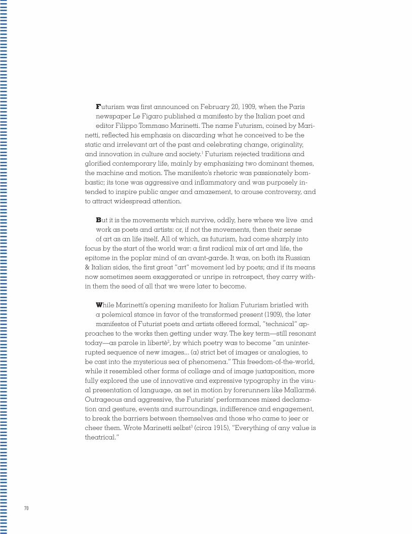
70
Futurism was first announced on February 20, 1909, when the Paris newspaper Le Figaro published a manifesto by the Italian poet and editor Filippo Tommaso Marinetti. The name Futurism, coined by Mari-
netti, reflected his emphasis on discarding what he conceived to be the static and irrelevant art of the past and celebrating change, originality, and innovation in culture and society.1 Futurism rejected traditions and glorified contemporary life, mainly by emphasizing two dominant themes, the machine and motion. The manifesto’s rhetoric was passionately bom-bastic; its tone was aggressive and inflammatory and was purposely in-tended to inspire public anger and amazement, to arouse controversy, and to attract widespread attention.
But it is the movements which survive, oddly, here where we live and work as poets and artists: or, if not the movements, then their sense of art as an life itself. All of which, as futurism, had come sharply into
focus by the start of the world war: a first radical mix of art and life, the epitome in the poplar mind of an avant-garde. It was, on both its Russian & Italian sides, the first great “art” movement led by poets; and if its means now sometimes seem exaggerated or unripe in retrospect, they carry with-in them the seed of all that we were later to become.
While Marinetti’s opening manifesto for Italian Futurism bristled with a polemical stance in favor of the transformed present (1909), the later manifestos of Futurist poets and artists offered formal, “technical” ap-
proaches to the works then getting under way. The key term—still resonant today—as parole in libertè2, by which poetry was to become “an uninter-rupted sequence of new images... (a) strict bet of images or analogies, to be cast into the mysterious sea of phenomena.” This freedom-of-the-world, while it resembled other forms of collage and of image juxtaposition, more fully explored the use of innovative and expressive typography in the visu-al presentation of language, as set in motion by forerunners like Mallarmé. Outrageous and aggressive, the Futurists’ performances mixed declama-tion and gesture, events and surroundings, indifference and engagement, to break the barriers between themselves and those who came to jeer or cheer them. Wrote Marinetti selbst3 (circa 1915), “Everything of any value is theatrical.”

71
Futurism was first announced on February 20, 1909, when the Paris news-paper Le Figaro published a manifesto by the Italian poet and editor Filippo Tommaso Marinetti. The name Futurism, coined by Marinetti, reflected his emphasis on discarding what he conceived to be the static and irrelevant art of the past and celebrating change, originality, and innovation in culture and society.1 Futurism rejected traditions and glorified contemporary life, mainly by emphasizing two dominant themes, the machine and motion. The manifesto’s rhetoric was passionately bombastic; its tone was aggres-sive and inflammatory and was purposely intended to inspire public anger and amazement, to arouse controversy, and to attract widespread attention.
But it is the movements which survive, oddly, here where we live and work as poets and artists: or, if not the movements, then their sense of art as an life itself. All of which, as futurism, had come sharply into focus by the start of the world war: a first radical mix of art and life, the epitome in the poplar mind of an avant-garde. It was, on both its Russian & Italian sides, the first great “art” movement led by poets; and if its means now sometimes seem exaggerated or unripe in retrospect, they carry within them the seed of all that we were later to become.
While Marinetti’s opening manifesto for Italian Futurism bristled with a po-lemical stance in favor of the transformed present (1909), the later manifes-tos of Futurist poets and artists offered formal, “technical” approaches to the works then getting under way. The key term—still resonant today—as pa-role in libertè2, by which poetry was to become “an uninterrupted sequence of new images... (a) strict bet of images or analogies, to be cast into the mys-terious sea of phenomena.” This freedom-of-the-world, while it resembled other forms of collage and of image juxtaposition, more fully explored the use of innovative and expressive typography in the visual presentation of language, as set in motion by forerunners like Mallarmé. Outrageous and aggressive, the Futurists’ performances mixed declamation and gesture, events and surroundings, indifference and engagement, to break the barri-ers between themselves and those who came to jeer or cheer them. Wrote Marinetti selbst3 (circa 1915), “Everything of any value is theatrical.”
[ ]

72
z Futurism was first announced on February 20, 1909, when the Paris news-paper Le Figaro published a manifesto by the Italian poet and editor Filippo Tommaso Marinetti. The name Futurism, coined by Marinetti, reflected his emphasis on discarding what he conceived to be the static and irrelevant art of the past and celebrating change, originality, and innovation in culture and society.1 Futurism rejected traditions and glorified contemporary life, mainly by emphasizing two dominant themes, the machine and motion. The manifesto’s rhetoric was passionately bombastic; its tone was aggres-sive and inflammatory and was purposely intended to inspire public anger and amazement, to arouse controversy, and to attract widespread attention.
z But it is the movements which survive, oddly, here where we live and work as poets and artists: or, if not the movements, then their sense of art as an life itself. All of which, as futurism, had come sharply into focus by the start of the world war: a first radical mix of art and life, the epitome in the poplar mind of an avant-garde. It was, on both its Russian & Italian sides, the first great “art” movement led by poets; and if its means now sometimes seem exaggerated or unripe in retrospect, they carry within them the seed of all that we were later to become.
z While Marinetti’s opening manifesto for Italian Futurism bristled with a po-lemical stance in favor of the transformed present (1909), the later manifes-tos of Futurist poets and artists offered formal, “technical” approaches to the works then getting under way. The key term—still resonant today—as pa-role in libertè2, by which poetry was to become “an uninterrupted sequence of new images... (a) strict bet of images or analogies, to be cast into the mys-terious sea of phenomena.” This freedom-of-the-world, while it resembled other forms of collage and of image juxtaposition, more fully explored the use of innovative and expressive typography in the visual presentation of language, as set in motion by forerunners like Mallarmé. Outrageous and aggressive, the Futurists’ performances mixed declamation and gesture, events and surroundings, indifference and engagement, to break the barri-ers between themselves and those who came to jeer or cheer them. Wrote Marinetti selbst3 (circa 1915), “Everything of any value is theatrical.”

73
Futurism was first announced on February 20, 1909, when the Paris newspaper Le Fi-garo published a manifesto by the Italian poet and editor Filippo Tommaso Marinetti. The name Futurism, coined by Marinetti, reflected his emphasis on discarding what he conceived to be the static and irrelevant art of the past and celebrating change, originality, and innovation in culture and so-ciety.1 Futurism rejected traditions and glorified contemporary life, mainly by emphasizing two dominant themes, the machine and motion. The man-ifesto’s rhetoric was passionately bombastic; its tone was aggressive and inflammatory and was purposely intended to inspire public anger and amazement, to arouse controversy, and to attract widespread attention.
But it is the movements which survive, oddly, here where we live and work as poets and artists: or, if not the movements, then their sense of art as an life itself. All of which, as futurism, had come sharply into focus by the start of the world war: a first radical mix of art and life, the epitome in the poplar mind of an avant-garde. It was, on both its Russian & Italian sides, the first great “art” movement led by poets; and if its means now sometimes seem exag-gerated or unripe in retrospect, they carry within them the seed of all that we were later to become.
While Marinetti’s opening manifesto for Italian Futurism bristled with a polemical stance in favor of the transformed present (1909), the later manifestos of Fu-turist poets and artists offered formal, “technical” approaches to the works then getting under way. The key term—still resonant today—as parole in libertè2, by which poetry was to become “an uninterrupted sequence of new images... (a) strict bet of images or analogies, to be cast into the mys-terious sea of phenomena.” This freedom-of-the-world, while it resembled other forms of collage and of image juxtaposition, more fully explored the use of innovative and expressive typography in the visual presentation of language, as set in motion by forerunners like Mallarmé. Outrageous and aggressive, the Futurists’ performances mixed declamation and ges-ture, events and surroundings, indifference and engagement, to break the barriers between themselves and those who came to jeer or cheer them. Wrote Marinetti selbst3 (circa 1915), “Everything of any value is theatrical.”

74
HEADERS SUBHEADS HEADERS SUBHEADS HEADERS SUBHEADS HEADERS SUBHEADS HEADERS SUBHEADS HEADERS SUBHEADS HEADERS SUBHEADS HEADERS SUBHEADS HEADERS SUBHEADS HEADERS SUBHEADS HEADERS SUBHEADS HEADERS SUBHEADS HEADERS SUBHEADS HEADERS SUBHEADS HEADERS SUBHEADS HEADERS SUBHEADS HEADERS SUBHEADS HEADERS SUBHEADS HEADERS SUBHEADS HEADERS SUBHEADS HEADERS SUBHEADS HEADERS SUBHEADS HEADERS SUBHEADS HEADERS SUBHEADS HEADERS SUBHEADS HEADERS SUBHEADS HEADERS SUBHEADS HEADERS SUBHEADS HEADERS SUBHEADS HEADERS SUBHEADS HEADERS SUBHEADS HEADERS SUBHEADS HEADERS SUBHEADS HEADERS SUBHEADS HEADERS SUBHEADS HEADERS SUBHEADS HEADERS SUBHEADS HEADERS SUBHEADS HEADERS SUBHEADS HEADERS SUBHEADS HEADERS SUBHEADS HEADERS SUBHEADS HEADERS SUBHEADS HEADERS SUBHEADS HEADERS SUBHEADS HEADERS SUBHEADS HEADERS SUBHEADS HEADERS SUBHEADS HEADERS SUBHEADS HEADERS SUBHEADS HEADERS SUBHEADS HEADERS SUBHEADS HEADERS SUBHEADS HEADERS SUBHEADS HEADERS SUBHEADS HEADERS SUBHEADS HEADERS SUBHEADS HEADERS SUBHEADS HEADERS SUBHEADS HEADERS SUBHEADS HEADERS SUBHEADS HEADERS SUBHEADS HEADERS SUBHEADS HEADERS SUBHEADS HEADERS SUBHEADS HEADERS SUBHEADS HEADERS SUBHEADS HEADERS SUBHEADS HEADERS SUBHEADS HEADERS SUBHEADS HEADERS SUBHEADS HEADERS SUBHEADS HEADERS SUBHEADS HEADERS SUBHEADS HEADERS SUBHEADS HEADERS SUBHEADS HEADERS SUBHEADS HEADERS SUBHEADS HEADERS SUBHEADS HEADERS SUBHEADS HEADERS SUBHEADS HEADERS SUBHEADS HEADERS SUBHEADS HEADERS SUBHEADS HEADERS SUBHEADS HEADERS SUBHEADS HEADERS SUBHEADS HEADERS SUBHEADS HEADERS SUBHEADS HEADERS SUBHEADS HEADERS SUBHEADS HEADERS SUBHEADS HEADERS SUBHEADS HEADERS SUBHEADS HEADERS SUBHEADS HEADERS SUBHEADS HEADERS SUBHEADS HEADERS SUBHEADS HEADERS SUBHEADS HEADERS SUBHEADS HEADERS SUBHEADS HEADERS SUBHEADS HEADERS SUBHEADS HEADERS SUBHEADS HEADERS SUBHEADS HEADERS SUBHEADS HEADERS SUBHEADS HEADERS SUBHEADS HEADERS SUBHEADS HEADERS SUBHEADS HEADERS SUBHEADS HEADERS SUBHEADS HEADERS SUBHEADS HEADERS SUBHEADS HEADERS SUBHEADS HEADERS SUBHEADS HEADERS SUBHEADS HEADERS SUBHEADS HEADERS SUBHEADS HEADERS SUBHEADS HEADERS SUBHEADS HEADERS SUBHEADS HEADERS SUBHEADS HEADERS SUBHEADS HEADERS SUBHEADS HEADERS SUBHEADS HEADERS SUBHEADS HEADERS SUBHEADS HEADERS SUBHEADS HEADERS SUBHEADS HEADERS SUBHEADS HEADERS SUBHEADS HEADERS SUBHEADS HEADERS SUBHEADS HEADERS SUBHEADS HEADERS SUBHEADS HEADERS SUBHEADS HEADERS SUBHEADS HEADERS SUBHEADS HEADERS SUBHEADS HEADERS SUBHEADS HEADERS SUBHEADS HEADERS SUBHEADS HEADERS SUBHEADS HEADERS SUBHEADS HEADERS SUBHEADS HEADERS SUBHEADS HEADERS SUBHEADS HEADERS SUBHEADS HEADERS SUBHEADS HEADERS SUBHEADS HEADERS SUBHEADS HEADERS SUBHEADS HEADERS SUBHEADS HEADERS SUBHEADS HEADERS SUBHEADS HEADERS SUBHEADS HEADERS SUBHEADS HEADERS SUBHEADS HEADERS SUBHEADS HEADERS SUBHEADS HEADERS SUBHEADS HEADERS SUBHEADS HEADERS SUBHEADS HEADERS SUBHEADS HEADERS SUBHEADS HEADERS SUBHEADS HEADERS SUBHEADS HEADERS SUBHEADS HEADERS SUBHEADS HEADERS SUBHEADS HEADERS SUBHEADS HEADERS SUBHEADS HEADERS SUBHEADS HEADERS SUBHEADS HEADERS SUBHEADS HEADERS SUBHEADS HEADERS SUBHEADS HEADERS SUBHEADS HEADERS SUBHEADS HEADERS SUBHEADS HEADERS SUBHEADS HEADERS SUBHEADS HEADERS SUBHEADS HEADERS SUBHEADS HEADERS SUBHEADS HEADERS SUBHEADS HEADERS SUBHEADS HEADERS SUBHEADS HEADERS SUBHEADS HEADERS SUBHEADS HEADERS SUBHEADS HEADERS SUBHEADS HEADERS SUBHEADS HEADERS SUBHEADS HEADERS SUBHEADS HEADERS SUBHEADS HEADERS SUBHEADS HEADERS SUBHEADS HEADERS SUBHEADS

&HEADERSSUBHEADS
HEADERS SUBHEADS HEADERS SUBHEADS HEADERS SUBHEADS HEADERS SUBHEADS HEADERS SUBHEADS HEADERS SUBHEADS HEADERS SUBHEADS HEADERS SUBHEADS HEADERS SUBHEADS HEADERS SUBHEADS HEADERS SUBHEADS HEADERS SUBHEADS HEADERS SUBHEADS HEADERS SUBHEADS HEADERS SUBHEADS HEADERS SUBHEADS HEADERS SUBHEADS HEADERS SUBHEADS HEADERS SUBHEADS HEADERS SUBHEADS HEADERS SUBHEADS HEADERS SUBHEADS HEADERS SUBHEADS HEADERS SUBHEADS HEADERS SUBHEADS HEADERS SUBHEADS HEADERS SUBHEADS HEADERS SUBHEADS HEADERS SUBHEADS HEADERS SUBHEADS HEADERS SUBHEADS HEADERS SUBHEADS HEADERS SUBHEADS HEADERS SUBHEADS HEADERS SUBHEADS HEADERS SUBHEADS HEADERS SUBHEADS HEADERS SUBHEADS HEADERS SUBHEADS HEADERS SUBHEADS HEADERS SUBHEADS HEADERS SUBHEADS HEADERS SUBHEADS HEADERS SUBHEADS HEADERS SUBHEADS HEADERS SUBHEADS HEADERS SUBHEADS HEADERS SUBHEADS HEADERS SUBHEADS HEADERS SUBHEADS HEADERS SUBHEADS HEADERS SUBHEADS HEADERS SUBHEADS HEADERS SUBHEADS HEADERS SUBHEADS HEADERS SUBHEADS HEADERS SUBHEADS HEADERS SUBHEADS HEADERS SUBHEADS HEADERS SUBHEADS HEADERS SUBHEADS HEADERS SUBHEADS HEADERS SUBHEADS HEADERS SUBHEADS HEADERS SUBHEADS HEADERS SUBHEADS HEADERS SUBHEADS HEADERS SUBHEADS HEADERS SUBHEADS HEADERS SUBHEADS HEADERS SUBHEADS HEADERS SUBHEADS HEADERS SUBHEADS HEADERS SUBHEADS HEADERS SUBHEADS HEADERS SUBHEADS HEADERS SUBHEADS HEADERS SUBHEADS HEADERS SUBHEADS HEADERS SUBHEADS HEADERS SUBHEADS HEADERS SUBHEADS HEADERS SUBHEADS HEADERS SUBHEADS HEADERS SUBHEADS HEADERS SUBHEADS HEADERS SUBHEADS HEADERS SUBHEADS HEADERS SUBHEADS HEADERS SUBHEADS HEADERS SUBHEADS HEADERS SUBHEADS HEADERS SUBHEADS HEADERS SUBHEADS HEADERS SUBHEADS HEADERS SUBHEADS HEADERS SUBHEADS HEADERS SUBHEADS HEADERS SUBHEADS HEADERS SUBHEADS HEADERS SUBHEADS HEADERS SUBHEADS HEADERS SUBHEADS HEADERS SUBHEADS HEADERS SUBHEADS HEADERS SUBHEADS HEADERS SUBHEADS HEADERS SUBHEADS HEADERS SUBHEADS HEADERS SUBHEADS HEADERS SUBHEADS HEADERS SUBHEADS HEADERS SUBHEADS HEADERS SUBHEADS HEADERS SUBHEADS HEADERS SUBHEADS HEADERS SUBHEADS HEADERS SUBHEADS HEADERS SUBHEADS HEADERS SUBHEADS HEADERS SUBHEADS HEADERS SUBHEADS HEADERS SUBHEADS HEADERS SUBHEADS HEADERS SUBHEADS HEADERS SUBHEADS HEADERS SUBHEADS HEADERS SUBHEADS HEADERS SUBHEADS HEADERS SUBHEADS HEADERS SUBHEADS HEADERS SUBHEADS HEADERS SUBHEADS HEADERS SUBHEADS HEADERS SUBHEADS HEADERS SUBHEADS HEADERS SUBHEADS HEADERS SUBHEADS HEADERS SUBHEADS HEADERS SUBHEADS HEADERS SUBHEADS HEADERS SUBHEADS HEADERS SUBHEADS HEADERS SUBHEADS HEADERS SUBHEADS HEADERS SUBHEADS HEADERS SUBHEADS HEADERS SUBHEADS HEADERS SUBHEADS HEADERS SUBHEADS HEADERS SUBHEADS HEADERS SUBHEADS HEADERS SUBHEADS HEADERS SUBHEADS HEADERS SUBHEADS HEADERS SUBHEADS HEADERS SUBHEADS HEADERS SUBHEADS HEADERS SUBHEADS HEADERS SUBHEADS HEADERS SUBHEADS HEADERS SUBHEADS HEADERS SUBHEADS HEADERS SUBHEADS HEADERS SUBHEADS HEADERS SUBHEADS HEADERS SUBHEADS HEADERS SUBHEADS HEADERS SUBHEADS HEADERS SUBHEADS HEADERS SUBHEADS HEADERS SUBHEADS HEADERS SUBHEADS HEADERS SUBHEADS HEADERS SUBHEADS HEADERS SUBHEADS HEADERS SUBHEADS HEADERS SUBHEADS HEADERS SUBHEADS HEADERS SUBHEADS HEADERS SUBHEADS HEADERS SUBHEADS HEADERS SUBHEADS HEADERS SUBHEADS HEADERS SUBHEADS HEADERS SUBHEADS HEADERS SUBHEADS HEADERS SUBHEADS HEADERS SUBHEADS HEADERS SUBHEADS HEADERS SUBHEADS HEADERS SUBHEADS HEADERS SUBHEADS HEADERS SUBHEADS HEADERS SUBHEADS HEADERS SUBHEADS HEADERS SUBHEADS HEADERS SUBHEADS HEADERS SUBHEADS HEADERS SUBHEADS

76
HEADERS ARE THE FIRST THINGS THE READER SEES IN A BODY OF TEXT, SO MAKE SURE TO USE THEM CORRECTLY.
A line or block of text that appears at the beginning of a page or document.
A heading given to a subsection of a piece of writing.
Spacing in a header is key to creating appropriate vi-sual hierarchy in a document or page of text. Proper spacing is achieved by kerning. Kerning is the process of removing small amounts of space between letters to create visually consistent letterspacing. The larger the text is, the more attention should be paid to kerning.
HEADER:
SUBHEAD:
KEARNING:
TYPOGRAPHY
TYPOGRAPHY
The key to kerning is visual perception. The more white space that surrounds an object or letter, the smaller it seems, even if it is next to an object of equal size, but with less white space around it. The key to kerning is to keep it visually consistent. The spacing between letters may not all be the exact same, but it will appear that way with the proper kerning.
kearned
unkearned

77
A Prologue to Futurism
Radical Mix of Art & Life
F u t u r i s m w a s f i r s t a n n o u n c e d o n F e b r u a r y 2 0 , 1909, when the Paris newspaper Le Figaro published a manifesto by the Ital-ian poet and editor Filippo Tommaso Marinetti. The name Futurism, coined by Marinetti, reflected his emphasis on discarding what he conceived to be the static and irrelevant art of the past and celebrating change, originality, and innovation in culture and society.1 Futurism rejected traditions and glo-rified contemporary life, mainly by emphasizing two dominant themes, the machine and motion. The manifesto’s rhetoric was passionately bombastic; its tone was aggressive and inflammatory and was purposely intended to inspire public anger and amazement, to arouse controversy, and to attract widespread attention.
B u t i t i s t h e m o v e m e n t s w h i c h s u r v i v e , o d d l y , here where we live and work as poets and artists: or, if not the movements, then their sense of art as an life itself. All of which, as futurism, had come sharply into focus by the start of the world war: a first radical mix of art and life, the epitome in the poplar mind of an avant-garde. It was, on both its Russian & Italian sides, the first great “art” movement led by poets; and if its means now sometimes seem exaggerated or unripe in retrospect, they carry within them the seed of all that we were later to become.
W h i l e M a r i n e t t i ’ s o p e n i n g m a n i f e s t o f o r I t a l - ian Futurism bristled with a polemical stance in favor of the transformed present (1909), the later manifestos of Futurist poets and artists offered for-mal, “technical” approaches to the works then getting under way. The key term—still resonant today—as parole in libertè2, by which poetry was to become “an uninterrupted sequence of new images... (a) strict bet of im-ages or analogies, to be cast into the mysterious sea of phenomena.” This freedom-of-the-world, while it resembled other forms of collage and of im-age juxtaposition, more fully explored the use of innovative and expressive typography in the visual presentation of language, as set in motion by fore-runners like Mallarmé. Outrageous and aggressive, the Futurists’ perfor-mances mixed declamation and gesture, events and surroundings, indif-ference and engagement, to break the barriers between themselves and those who came to jeer or cheer them. Wrote Marinetti selbst3 (circa 1915), “Everything of any value is theatrical.”
WORDS IN LIBERTY

78
Futurism was first announced on February 20, 1909, when the Paris news-paper Le Figaro published a manifesto by the Italian poet and editor Filippo Tommaso Marinetti. The name Futurism, coined by Marinetti, reflected his emphasis on discarding what he conceived to be the static and irrelevant art of the past and celebrating change, originality, and innovation in cul-ture and society.1 Futurism rejected traditions and glorified contemporary life, mainly by emphasizing two dominant themes, the machine and motion. The manifesto’s rhetoric was passionately bombastic; its tone was aggres-sive and inflammatory and was purposely intended to inspire public anger and amazement, to arouse controversy, and to attract widespread attention.But it is the movements which survive, oddly, here where we live and work as poets and artists: or, if not the movements, then their sense of art as an life itself. All of which, as futurism, had come sharply into focus by the start of the world war: a first radical mix of art and life, the epitome in the poplar mind of an avant-garde. It was, on both its Russian & Italian sides, the first great “art” movement led by poets; and if its means now sometimes seem exaggerated or unripe in retrospect, they carry within them the seed of all that we were later to become.While Marinetti’s opening manifesto for Italian Futurism bristled with a po-lemical stance in favor of the transformed present (1909), the later manifes-tos of Futurist poets and artists offered formal, “technical” approaches to the works then getting under way. The key term—still resonant today—as pa-role in libertè2, by which poetry was to become “an uninterrupted sequence of new images... (a) strict bet of images or analogies, to be cast into the mys-terious sea of phenomena.” This freedom-of-the-world, while it resembled other forms of collage and of image juxtaposition, more fully explored the use of innovative and expressive typography in the visual presentation of language, as set in motion by forerunners like Mallarmé. Outrageous and aggressive, the Futurists’ performances mixed declamation and gesture, events and surroundings, indifference and engagement, to break the barri-ers between themselves and those who came to jeer or cheer them. Wrote Marinetti selbst3 (circa 1915), “Everything of any value is theatrical.”
A PR
OLO
GU
E TO
FUTU
RISM
RA
DICA
L MIX O
F A
RT &
LIFE
WORDS IN LIBERTYA Prologue to Futurism
Radical Mix of Art & Life

79
A Prologue to Futurism
Radical Mix of Art & Life
Words in Liberty
Futurism was first announced on February 20, 1909, when the Paris newspaper Le Figaro published a manifesto by the Italian poet and editor Filippo Tommaso Marinetti. The name Futurism, coined by Marinetti, reflected his emphasis on discarding what he conceived to be the static and irrelevant art of the past and celebrating change, originality, and innovation in culture and society.1 Futurism rejected traditions and glorified contemporary life, mainly by emphasizing two dominant themes, the machine and motion. The manifesto’s rhetoric was passionately bombastic; its tone was aggressive and inflammatory and was purposely intended to inspire public anger and amazement, to arouse controversy, and to attract widespread attention. But it is the movements which survive, oddly, here where we live and work as poets and artists: or, if not the movements, then their sense of art as an life itself. All of which, as futurism, had come sharply into focus by the start of the world war: a first radical mix of art and life, the epitome in the poplar mind of an avant-garde. It was, on both its Russian & Italian sides, the first great “art” movement led by poets; and if its means now sometimes seem exaggerated or unripe in retrospect, they carry within them the seed of all that we were later to become. While Marinetti’s opening manifesto for Italian Futurism bristled with a polemical stance in favor of the transformed present (1909), the later manifestos of Futurist poets and artists offered formal, “technical” approaches to the works then getting under way. The key term—still resonant today—as parole in libertè2, by which poetry was to become “an uninterrupted sequence of new images... (a) strict bet of images or analogies, to be cast into the mysterious sea of phenomena.” This freedom-of-the-world, while it resembled other forms of collage and of image juxtaposition, more fully explored the use of innovative and expressive typography in the visual presentation of language, as set in motion by forerunners like Mallarmé. Outrageous and aggressive, the Futurists’ performances mixed declamation and gesture, events and surroundings, indifference and engagement, to break the barriers between themselves and those who came to jeer or cheer them. Wrote Marinetti selbst3 (circa 1915), “Everything of any value is theatrical.”
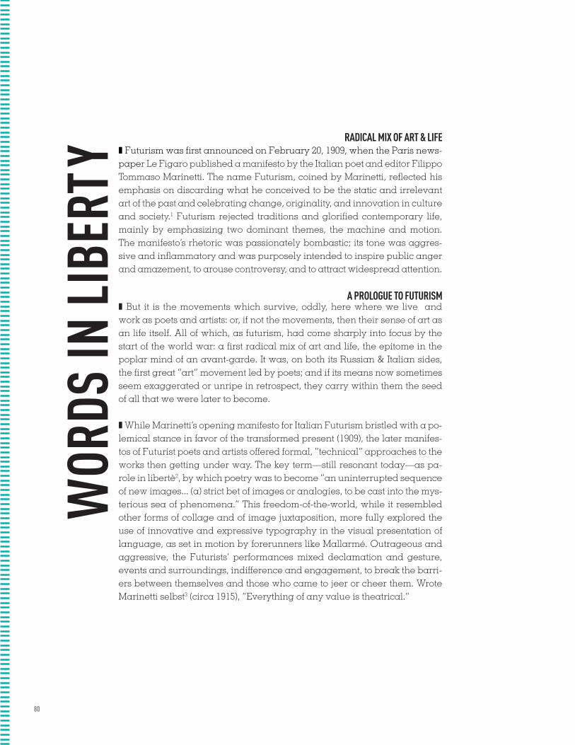
80
z Futurism was first announced on February 20, 1909, when the Paris news-paper Le Figaro published a manifesto by the Italian poet and editor Filippo Tommaso Marinetti. The name Futurism, coined by Marinetti, reflected his emphasis on discarding what he conceived to be the static and irrelevant art of the past and celebrating change, originality, and innovation in culture and society.1 Futurism rejected traditions and glorified contemporary life, mainly by emphasizing two dominant themes, the machine and motion. The manifesto’s rhetoric was passionately bombastic; its tone was aggres-sive and inflammatory and was purposely intended to inspire public anger and amazement, to arouse controversy, and to attract widespread attention.
z But it is the movements which survive, oddly, here where we live and work as poets and artists: or, if not the movements, then their sense of art as an life itself. All of which, as futurism, had come sharply into focus by the start of the world war: a first radical mix of art and life, the epitome in the poplar mind of an avant-garde. It was, on both its Russian & Italian sides, the first great “art” movement led by poets; and if its means now sometimes seem exaggerated or unripe in retrospect, they carry within them the seed of all that we were later to become.
z While Marinetti’s opening manifesto for Italian Futurism bristled with a po-lemical stance in favor of the transformed present (1909), the later manifes-tos of Futurist poets and artists offered formal, “technical” approaches to the works then getting under way. The key term—still resonant today—as pa-role in libertè2, by which poetry was to become “an uninterrupted sequence of new images... (a) strict bet of images or analogies, to be cast into the mys-terious sea of phenomena.” This freedom-of-the-world, while it resembled other forms of collage and of image juxtaposition, more fully explored the use of innovative and expressive typography in the visual presentation of language, as set in motion by forerunners like Mallarmé. Outrageous and aggressive, the Futurists’ performances mixed declamation and gesture, events and surroundings, indifference and engagement, to break the barri-ers between themselves and those who came to jeer or cheer them. Wrote Marinetti selbst3 (circa 1915), “Everything of any value is theatrical.”
A PROLOGUE TO FUTURISM
WOR
DS IN
LIB
ERTY
RADICAL MIX OF ART & LIFE
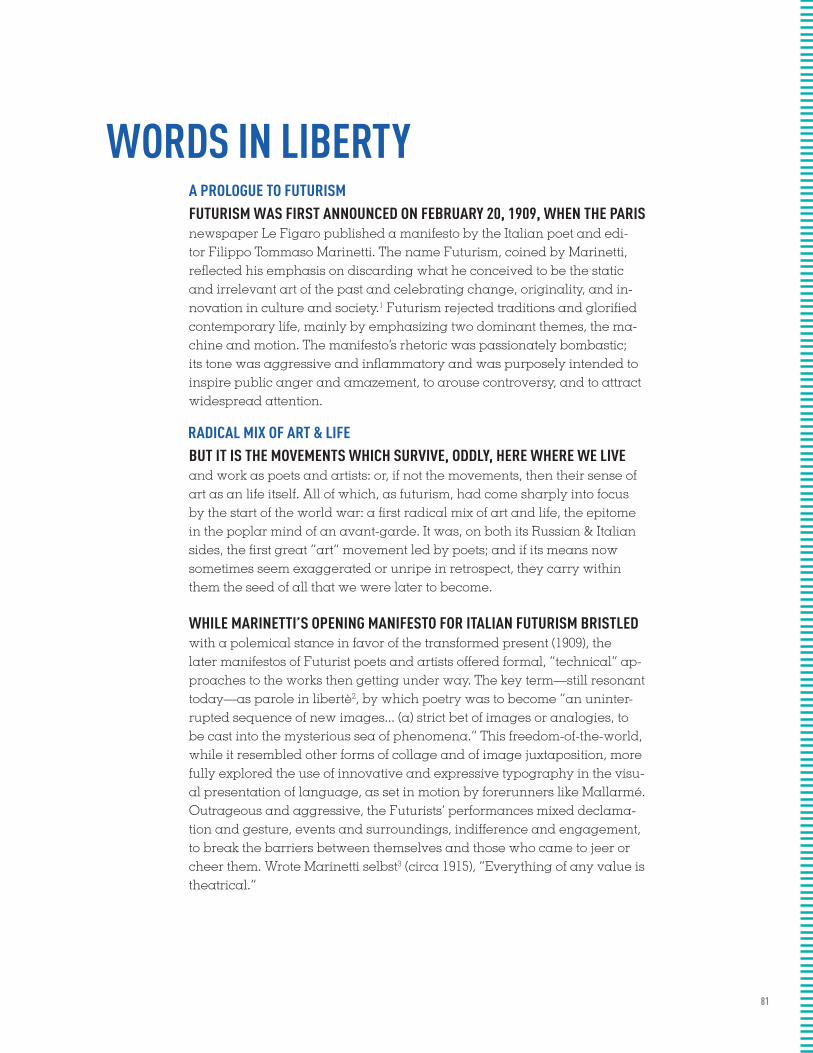
81
FUTURISM WAS FIRST ANNOUNCED ON FEBRUARY 20, 1909, WHEN THE PARIS newspaper Le Figaro published a manifesto by the Italian poet and edi-tor Filippo Tommaso Marinetti. The name Futurism, coined by Marinetti, reflected his emphasis on discarding what he conceived to be the static and irrelevant art of the past and celebrating change, originality, and in-novation in culture and society.1 Futurism rejected traditions and glorified contemporary life, mainly by emphasizing two dominant themes, the ma-chine and motion. The manifesto’s rhetoric was passionately bombastic; its tone was aggressive and inflammatory and was purposely intended to inspire public anger and amazement, to arouse controversy, and to attract widespread attention.
BUT IT IS THE MOVEMENTS WHICH SURVIVE, ODDLY, HERE WHERE WE LIVE and work as poets and artists: or, if not the movements, then their sense of art as an life itself. All of which, as futurism, had come sharply into focus by the start of the world war: a first radical mix of art and life, the epitome in the poplar mind of an avant-garde. It was, on both its Russian & Italian sides, the first great “art” movement led by poets; and if its means now sometimes seem exaggerated or unripe in retrospect, they carry within them the seed of all that we were later to become.
WHILE MARINETTI’S OPENING MANIFESTO FOR ITALIAN FUTURISM BRISTLED with a polemical stance in favor of the transformed present (1909), the later manifestos of Futurist poets and artists offered formal, “technical” ap-proaches to the works then getting under way. The key term—still resonant today—as parole in libertè2, by which poetry was to become “an uninter-rupted sequence of new images... (a) strict bet of images or analogies, to be cast into the mysterious sea of phenomena.” This freedom-of-the-world, while it resembled other forms of collage and of image juxtaposition, more fully explored the use of innovative and expressive typography in the visu-al presentation of language, as set in motion by forerunners like Mallarmé. Outrageous and aggressive, the Futurists’ performances mixed declama-tion and gesture, events and surroundings, indifference and engagement, to break the barriers between themselves and those who came to jeer or cheer them. Wrote Marinetti selbst3 (circa 1915), “Everything of any value is theatrical.”
A PROLOGUE TO FUTURISM
RADICAL MIX OF ART & LIFE
WORDS IN LIBERTY

82
Futurism was first announced on February 20, 1909, when the Paris news-paper Le Figaro published a manifesto by the Italian poet and editor Filippo Tommaso Marinetti. The name Futurism, coined by Marinetti, reflected his emphasis on discarding what he conceived to be the static and irrelevant art of the past and celebrating change, originality, and innovation in culture and society.1 Futurism rejected traditions and glorified contemporary life, mainly by emphasizing two dominant themes, the machine and motion. The manifesto’s rhetoric was passionately bombastic; its tone was aggres-sive and inflammatory and was purposely intended to inspire public anger and amazement, to arouse controversy, and to attract widespread attention.
But it is the movements which survive, oddly, here where we live and work as poets and artists: or, if not the movements, then their sense of art as an life itself. All of which, as futurism, had come sharply into focus by the start of the world war: a first radical mix of art and life, the epitome in the poplar mind of an avant-garde. It was, on both its Russian & Italian sides, the first great “art” movement led by poets; and if its means now sometimes seem exaggerated or unripe in retrospect, they carry within them the seed of all that we were later to become.
While Marinetti’s opening manifesto for Italian Futurism bristled with a po-lemical stance in favor of the transformed present (1909), the later manifes-tos of Futurist poets and artists offered formal, “technical” approaches to the works then getting under way. The key term—still resonant today—as pa-role in libertè2, by which poetry was to become “an uninterrupted sequence of new images... (a) strict bet of images or analogies, to be cast into the mys-terious sea of phenomena.” This freedom-of-the-world, while it resembled other forms of collage and of image juxtaposition, more fully explored the use of innovative and expressive typography in the visual presentation of language, as set in motion by forerunners like Mallarmé. Outrageous and aggressive, the Futurists’ performances mixed declamation and gesture, events and surroundings, indifference and engagement, to break the barri-ers between themselves and those who came to jeer or cheer them. Wrote Marinetti selbst3 (circa 1915), “Everything of any value is theatrical.”
[ ]
A PROLOGUE TO FUTURISM
WOR
DS IN
LIB
ERTY
RADICAL MIX OF ART & LIFE
83
NOTES CAPTIONS NOTES CAPTIONS NOTES CAPTIONS NOTES CAPTIONS NOTES CAPTIONS NOTES CAPTIONS NOTES CAPTIONS NOTES CAPTIONS NOTES CAPTIONS NOTES CAPTIONS NOTES CAPTIONS NOTES CAPTIONS NOTES CAPTIONS NOTES CAPTIONS NOTES CAPTIONS NOTES CAPTIONS NOTES CAPTIONS NOTES CAPTIONS NOTES CAPTIONS NOTES CAPTIONS NOTES CAPTIONS NOTES CAPTIONS NOTES CAPTIONS NOTES CAPTIONS NOTES CAPTIONS NOTES CAPTIONS NOTES CAPTIONS NOTES CAPTIONS NOTES CAPTIONS NOTES CAPTIONS NOTES CAPTIONS NOTES CAPTIONS NOTES CAPTIONS NOTES CAPTIONS NOTES CAPTIONS NOTES CAPTIONS NOTES CAPTIONS NOTES CAPTIONS NOTES CAPTIONS NOTES CAPTIONS NOTES CAPTIONS NOTES CAPTIONS NOTES CAPTIONS NOTES CAPTIONS NOTES CAPTIONS NOTES CAPTIONS NOTES CAPTIONS NOTES CAPTIONS NOTES CAPTIONS NOTES CAPTIONS NOTES CAPTIONS NOTES CAPTIONS NOTES CAPTIONS NOTES CAPTIONS NOTES CAPTIONS NOTES CAPTIONS NOTES CAPTIONS NOTES CAPTIONS NOTES CAPTIONS NOTES CAPTIONS NOTES CAPTIONS NOTES CAPTIONS NOTES CAPTIONS NOTES CAPTIONS NOTES CAPTIONS NOTES CAPTIONS NOTES CAPTIONS NOTES CAPTIONS NOTES CAPTIONS NOTES CAPTIONS NOTES CAPTIONS NOTES CAPTIONS NOTES CAPTIONS NOTES CAPTIONS NOTES CAPTIONS NOTES CAPTIONS NOTES CAPTIONS NOTES CAPTIONS NOTES CAPTIONS NOTES CAPTIONS NOTES CAPTIONS NOTES CAPTIONS NOTES CAPTIONS NOTES CAPTIONS NOTES CAPTIONS NOTES CAPTIONS NOTES CAPTIONS NOTES CAPTIONS NOTES CAPTIONS NOTES CAPTIONS NOTES CAPTIONS NOTES CAPTIONS NOTES CAPTIONS NOTES CAPTIONS NOTES CAPTIONS NOTES CAPTIONS NOTES CAPTIONS NOTES CAPTIONS NOTES CAPTIONS NOTES CAPTIONS NOTES CAPTIONS NOTES CAPTIONS NOTES CAPTIONS NOTES CAPTIONS NOTES CAPTIONS NOTES CAPTIONS NOTES CAPTIONS NOTES CAPTIONS NOTES CAPTIONS NOTES CAPTIONS NOTES CAPTIONS NOTES CAPTIONS NOTES CAPTIONS NOTES CAPTIONS NOTES CAPTIONS NOTES CAPTIONS NOTES CAPTIONS NOTES CAPTIONS NOTES CAPTIONS NOTES CAPTIONS NOTES CAPTIONS NOTES CAPTIONS NOTES CAPTIONS NOTES CAPTIONS NOTES CAPTIONS NOTES CAPTIONS NOTES CAPTIONS NOTES CAPTIONS NOTES CAPTIONS NOTES CAPTIONS NOTES CAPTIONS NOTES CAPTIONS NOTES CAPTIONS NOTES CAPTIONS NOTES CAPTIONS NOTES CAPTIONS NOTES CAPTIONS NOTES CAPTIONS NOTES CAPTIONS NOTES CAPTIONS NOTES CAPTIONS NOTES CAPTIONS NOTES CAPTIONS NOTES CAPTIONS NOTES CAPTIONS NOTES CAPTIONS NOTES CAPTIONS NOTES CAPTIONS NOTES CAPTIONS NOTES CAPTIONS NOTES CAPTIONS NOTES CAPTIONS NOTES CAPTIONS NOTES CAPTIONS NOTES CAPTIONS NOTES CAPTIONS NOTES CAPTIONS NOTES CAPTIONS NOTES CAPTIONS NOTES CAPTIONS NOTES CAPTIONS NOTES CAPTIONS NOTES CAPTIONS NOTES CAPTIONS NOTES CAPTIONS NOTES CAPTIONS NOTES CAPTIONS NOTES CAPTIONS NOTES CAPTIONS NOTES CAPTIONS NOTES CAPTIONS NOTES CAPTIONS NOTES CAPTIONS NOTES CAPTIONS NOTES CAPTIONS NOTES CAPTIONS NOTES CAPTIONS NOTES CAPTIONS NOTES CAPTIONS NOTES CAPTIONS NOTES CAPTIONS NOTES CAPTIONS NOTES CAPTIONS NOTES CAPTIONS NOTES CAPTIONS NOTES CAPTIONS NOTES CAPTIONS NOTES CAPTIONS NOTES CAPTIONS NOTES CAPTIONS NOTES CAPTIONS NOTES CAPTIONS NOTES CAPTIONS NOTES CAPTIONS NOTES CAPTIONS NOTES CAPTIONS NOTES CAPTIONS NOTES CAPTIONS NOTES CAPTIONS NOTES CAPTIONS NOTES CAPTIONS NOTES CAPTIONS NOTES CAPTIONS NOTES CAPTIONS NOTES CAPTIONS NOTES CAPTIONS NOTES CAPTIONS NOTES CAPTIONS NOTES CAPTIONS NOTES CAPTIONS NOTES CAPTIONS NOTES CAPTIONS NOTES CAPTIONS NOTES CAPTIONS NOTES CAPTIONS NOTES CAPTIONS NOTES CAPTIONS NOTES CAPTIONS NOTES CAPTIONS NOTES CAPTIONS NOTES CAPTIONS NOTES CAPTIONS NOTES CAPTIONS NOTES CAPTIONS NOTES CAPTIONS NOTES CAPTIONS NOTES CAPTIONS NOTES CAPTIONS NOTES CAPTIONS NOTES CAPTIONS NOTES CAPTIONS NOTES CAPTIONS NOTES CAPTIONS NOTES CAPTIONS NOTES CAPTIONS NOTES CAPTIONS NOTES CAPTIONS NOTES CAPTIONS NOTES CAPTIONS NOTES CAPTIONS NOTES CAPTIONS NOTES CAPTIONS NOTES CAPTIONS NOTES CAPTIONS NOTES CAPTIONS NOTES CAPTIONS NOTES CAPTIONS NOTES CAPTIONS NOTES CAPTIONS NOTES CAPTIONS NOTES CAPTIONS NOTES CAPTIONS

&NOTESCAPTIONS

85
FOOTNOTES AND ENDNOTES ARE NECESSARY COMPONENTS OF
SCHOLARLY & TECHNICAL WRITING
THEY’RE ALSO FREQUENTLY USED BY WRITERS OF FICTION, from Herman Melville (Moby-Dick) to contemporary novelists. Whether their intent is academic or artistic, footnotes present special typographic challenges.
Specifically, a footnote is a text element at the bottom of a page of a book or manuscript that provides additional information about a point made in the main text. The footnote might provide deeper background, offer an alternate interpretation or provide a citation for the source of a quote, idea or statistic. Endnotes serve the same purpose but are grouped together at the end of a chapter, article or book, rather than at the bottom of each page.
These general guidelines will help you design footnotes and endnotes that are readable, legible and economical in space. (Note that academic presses and journals can be sticklers for format: before proceeding, check with your client or publisher to see if they have a specific stylesheet that must be followed.)
FOOTNOTES ARE MOST OFTEN INDICATED BY PLACING A superscript numeral immediately after the text to be referenced. The same superscript numeral then precedes the footnoted text at the bottom of the page. Numbering footnotes is essential when there are many of them, but if footnotes are few they can be marked with a dagger, asterisk, or other symbol instead. Endnotes should always use numerals to facilitate easy referencing.
FOOTNOTES AND ENDNOTES ARE SET SMALLER THAN BODY TEXT. The difference in size is usually about two points, but this can vary depending on the size, style and legibility of the main text. Even though they’re smaller, footnotes and endnotes should still remain at a readable size.
NUMBERS OR SYMBOLS:
SIZE:

86
A Prologue to Futurism
Radical Mix of Art & Life
F u t u r i s m w a s f i r s t a n n o u n c e d o n F e b r u a r y 2 0 , 1909, when the Paris newspaper Le Figaro published a manifesto by the Ital-ian poet and editor Filippo Tommaso Marinetti. The name Futurism, coined by Marinetti, reflected his emphasis on discarding what he conceived to be the static and irrelevant art of the past and celebrating change, originality, and innovation in culture and society.1 Futurism rejected traditions and glo-rified contemporary life, mainly by emphasizing two dominant themes, the machine and motion. The manifesto’s rhetoric was passionately bombastic; its tone was aggressive and inflammatory and was purposely intended to inspire public anger and amazement, to arouse controversy, and to attract widespread attention.
B u t i t i s t h e m o v e m e n t s w h i c h s u r v i v e , o d d l y , here where we live and work as poets and artists: or, if not the movements, then their sense of art as an life itself. All of which, as futurism, had come sharply into focus by the start of the world war: a first radical mix of art and life, the epitome in the poplar mind of an avant-garde. It was, on both its Russian & Italian sides, the first great “art” movement led by poets; and if its means now sometimes seem exaggerated or unripe in retrospect, they carry within them the seed of all that we were later to become.
W h i l e M a r i n e t t i ’ s o p e n i n g m a n i f e s t o f o r I t a l - ian Futurism bristled with a polemical stance in favor of the transformed present (1909), the later manifestos of Futurist poets and artists offered for-mal, “technical” approaches to the works then getting under way. The key term—still resonant today—as parole in libertè2, by which poetry was to become “an uninterrupted sequence of new images... (a) strict bet of im-ages or analogies, to be cast into the mysterious sea of phenomena.” This freedom-of-the-world, while it resembled other forms of collage and of im-age juxtaposition, more fully explored the use of innovative and expressive typography in the visual presentation of language, as set in motion by fore-runners like Mallarmé. Outrageous and aggressive, the Futurists’ perfor-mances mixed declamation and gesture, events and surroundings, indif-ference and engagement, to break the barriers between themselves and those who came to jeer or cheer them. Wrote Marinetti selbst3 (circa 1915), “Everything of any value is theatrical.”
WORDS IN LIBERTY
1. Philip Meggs, History of Graphic
Design, Van Nostrand Reinhold, 1988
2. parole in liberta = words set free (liberty)
3. selbst = himself

87
Futurism was first announced on February 20, 1909, when the Paris news-paper Le Figaro published a manifesto by the Italian poet and editor Filippo Tommaso Marinetti. The name Futurism, coined by Marinetti, reflected his emphasis on discarding what he conceived to be the static and irrelevant art of the past and celebrating change, originality, and innovation in cul-ture and society.1 Futurism rejected traditions and glorified contemporary life, mainly by emphasizing two dominant themes, the machine and motion. The manifesto’s rhetoric was passionately bombastic; its tone was aggres-sive and inflammatory and was purposely intended to inspire public anger and amazement, to arouse controversy, and to attract widespread attention.But it is the movements which survive, oddly, here where we live and work as poets and artists: or, if not the movements, then their sense of art as an life itself. All of which, as futurism, had come sharply into focus by the start of the world war: a first radical mix of art and life, the epitome in the poplar mind of an avant-garde. It was, on both its Russian & Italian sides, the first great “art” movement led by poets; and if its means now sometimes seem exaggerated or unripe in retrospect, they carry within them the seed of all that we were later to become.While Marinetti’s opening manifesto for Italian Futurism bristled with a po-lemical stance in favor of the transformed present (1909), the later manifes-tos of Futurist poets and artists offered formal, “technical” approaches to the works then getting under way. The key term—still resonant today—as pa-role in libertè2, by which poetry was to become “an uninterrupted sequence of new images... (a) strict bet of images or analogies, to be cast into the mys-terious sea of phenomena.” This freedom-of-the-world, while it resembled other forms of collage and of image juxtaposition, more fully explored the use of innovative and expressive typography in the visual presentation of language, as set in motion by forerunners like Mallarmé. Outrageous and aggressive, the Futurists’ performances mixed declamation and gesture, events and surroundings, indifference and engagement, to break the barri-ers between themselves and those who came to jeer or cheer them. Wrote Marinetti selbst3 (circa 1915), “Everything of any value is theatrical.”
A PR
OLO
GU
E TO
FUTU
RISM
RA
DICA
L MIX O
F A
RT &
LIFE
WORDS IN LIBERTY
1. Philip Meggs, H
istory of Graphic D
esign, Van Nostrand R
einhold, 19882. parole in liberta = w
ords set free (liberty)3. selbst = him
self
WORDS IN LIBERTY

88
A Prologue to Futurism
Radical Mix of Art & Life
Words in Liberty
Futurism was first announced on February 20, 1909, when the Paris newspaper Le Figaro published a manifesto by the Italian poet and editor Filippo Tommaso Marinetti. The name Futurism, coined by Marinetti, reflected his emphasis on discarding what he conceived to be the static and irrelevant art of the past and celebrating change, originality, and innovation in culture and society.1 Futurism rejected traditions and glorified contemporary life, mainly by emphasizing two dominant themes, the machine and motion. The manifesto’s rhetoric was passionately bombastic; its tone was aggressive and inflammatory and was purposely intended to inspire public anger and amazement, to arouse controversy, and to attract widespread attention. But it is the movements which survive, oddly, here where we live and work as poets and artists: or, if not the movements, then their sense of art as an life itself. All of which, as futurism, had come sharply into focus by the start of the world war: a first radical mix of art and life, the epitome in the poplar mind of an avant-garde. It was, on both its Russian & Italian sides, the first great “art” movement led by poets; and if its means now sometimes seem exaggerated or unripe in retrospect, they carry within them the seed of all that we were later to become. While Marinetti’s opening manifesto for Italian Futurism bristled with a polemical stance in favor of the transformed present (1909), the later manifestos of Futurist poets and artists offered formal, “technical” approaches to the works then getting under way. The key term—still resonant today—as parole in libertè2, by which poetry was to become “an uninterrupted sequence of new images... (a) strict bet of images or analogies, to be cast into the mysterious sea of phenomena.” This freedom-of-the-world, while it resembled other forms of collage and of image juxtaposition, more fully explored the use of innovative and expressive typography in the visual presentation of language, as set in motion by forerunners like Mallarmé. Outrageous and aggressive, the Futurists’ performances mixed declamation and gesture, events and surroundings, indifference and engagement, to break the barriers between themselves and those who came to jeer or cheer them. Wrote Marinetti selbst3 (circa 1915), “Everything of any value is theatrical.”
1. Philip Meggs, History of Graphic
Design, Van Nostrand Reinhold, 1988
2. parole in liberta = words set free (liberty)
3. selbst = himself
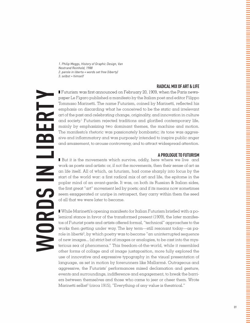
89
z Futurism was first announced on February 20, 1909, when the Paris news-paper Le Figaro published a manifesto by the Italian poet and editor Filippo Tommaso Marinetti. The name Futurism, coined by Marinetti, reflected his emphasis on discarding what he conceived to be the static and irrelevant art of the past and celebrating change, originality, and innovation in culture and society.1 Futurism rejected traditions and glorified contemporary life, mainly by emphasizing two dominant themes, the machine and motion. The manifesto’s rhetoric was passionately bombastic; its tone was aggres-sive and inflammatory and was purposely intended to inspire public anger and amazement, to arouse controversy, and to attract widespread attention.
z But it is the movements which survive, oddly, here where we live and work as poets and artists: or, if not the movements, then their sense of art as an life itself. All of which, as futurism, had come sharply into focus by the start of the world war: a first radical mix of art and life, the epitome in the poplar mind of an avant-garde. It was, on both its Russian & Italian sides, the first great “art” movement led by poets; and if its means now sometimes seem exaggerated or unripe in retrospect, they carry within them the seed of all that we were later to become.
z While Marinetti’s opening manifesto for Italian Futurism bristled with a po-lemical stance in favor of the transformed present (1909), the later manifes-tos of Futurist poets and artists offered formal, “technical” approaches to the works then getting under way. The key term—still resonant today—as pa-role in libertè2, by which poetry was to become “an uninterrupted sequence of new images... (a) strict bet of images or analogies, to be cast into the mys-terious sea of phenomena.” This freedom-of-the-world, while it resembled other forms of collage and of image juxtaposition, more fully explored the use of innovative and expressive typography in the visual presentation of language, as set in motion by forerunners like Mallarmé. Outrageous and aggressive, the Futurists’ performances mixed declamation and gesture, events and surroundings, indifference and engagement, to break the barri-ers between themselves and those who came to jeer or cheer them. Wrote Marinetti selbst3 (circa 1915), “Everything of any value is theatrical.”
A PROLOGUE TO FUTURISM
WOR
DS IN
LIB
ERTY
RADICAL MIX OF ART & LIFE
1. Philip Meggs, History of Graphic Design, Van Nostrand Reinhold, 19882. parole in liberta = words set free (liberty)3. selbst = himself
90
FUTURISM WAS FIRST ANNOUNCED ON FEBRUARY 20, 1909, WHEN THE PARIS newspaper Le Figaro published a manifesto by the Italian poet and edi-tor Filippo Tommaso Marinetti. The name Futurism, coined by Marinetti, reflected his emphasis on discarding what he conceived to be the static and irrelevant art of the past and celebrating change, originality, and in-novation in culture and society.1 Futurism rejected traditions and glorified contemporary life, mainly by emphasizing two dominant themes, the ma-chine and motion. The manifesto’s rhetoric was passionately bombastic; its tone was aggressive and inflammatory and was purposely intended to inspire public anger and amazement, to arouse controversy, and to attract widespread attention.
BUT IT IS THE MOVEMENTS WHICH SURVIVE, ODDLY, HERE WHERE WE LIVE and work as poets and artists: or, if not the movements, then their sense of art as an life itself. All of which, as futurism, had come sharply into focus by the start of the world war: a first radical mix of art and life, the epitome in the poplar mind of an avant-garde. It was, on both its Russian & Italian sides, the first great “art” movement led by poets; and if its means now sometimes seem exaggerated or unripe in retrospect, they carry within them the seed of all that we were later to become.
WHILE MARINETTI’S OPENING MANIFESTO FOR ITALIAN FUTURISM BRISTLED with a polemical stance in favor of the transformed present (1909), the later manifestos of Futurist poets and artists offered formal, “technical” ap-proaches to the works then getting under way. The key term—still resonant today—as parole in libertè2, by which poetry was to become “an uninter-rupted sequence of new images... (a) strict bet of images or analogies, to be cast into the mysterious sea of phenomena.” This freedom-of-the-world, while it resembled other forms of collage and of image juxtaposition, more fully explored the use of innovative and expressive typography in the visu-al presentation of language, as set in motion by forerunners like Mallarmé. Outrageous and aggressive, the Futurists’ performances mixed declama-tion and gesture, events and surroundings, indifference and engagement, to break the barriers between themselves and those who came to jeer or cheer them. Wrote Marinetti selbst3 (circa 1915), “Everything of any value is theatrical.”
A PROLOGUE TO FUTURISM
RADICAL MIX OF ART & LIFE
WORDS IN LIBERTY
1. Philip Meggs, H
istory of Graphic D
esign, Van Nostrand R
einhold, 19882. parole in liberta = w
ords set free (liberty)3. selbst = him
self
91
Futurism was first announced on February 20, 1909, when the Paris news-paper Le Figaro published a manifesto by the Italian poet and editor Filippo Tommaso Marinetti. The name Futurism, coined by Marinetti, reflected his emphasis on discarding what he conceived to be the static and irrelevant art of the past and celebrating change, originality, and innovation in culture and society.1 Futurism rejected traditions and glorified contemporary life, mainly by emphasizing two dominant themes, the machine and motion. The manifesto’s rhetoric was passionately bombastic; its tone was aggres-sive and inflammatory and was purposely intended to inspire public anger and amazement, to arouse controversy, and to attract widespread attention.
But it is the movements which survive, oddly, here where we live and work as poets and artists: or, if not the movements, then their sense of art as an life itself. All of which, as futurism, had come sharply into focus by the start of the world war: a first radical mix of art and life, the epitome in the poplar mind of an avant-garde. It was, on both its Russian & Italian sides, the first great “art” movement led by poets; and if its means now sometimes seem exaggerated or unripe in retrospect, they carry within them the seed of all that we were later to become.
While Marinetti’s opening manifesto for Italian Futurism bristled with a po-lemical stance in favor of the transformed present (1909), the later manifes-tos of Futurist poets and artists offered formal, “technical” approaches to the works then getting under way. The key term—still resonant today—as pa-role in libertè2, by which poetry was to become “an uninterrupted sequence of new images... (a) strict bet of images or analogies, to be cast into the mys-terious sea of phenomena.” This freedom-of-the-world, while it resembled other forms of collage and of image juxtaposition, more fully explored the use of innovative and expressive typography in the visual presentation of language, as set in motion by forerunners like Mallarmé. Outrageous and aggressive, the Futurists’ performances mixed declamation and gesture, events and surroundings, indifference and engagement, to break the barri-ers between themselves and those who came to jeer or cheer them. Wrote Marinetti selbst3 (circa 1915), “Everything of any value is theatrical.”
[ ]
A PROLOGUE TO FUTURISM
WOR
DS IN
LIB
ERTY
RADICAL MIX OF ART & LIFE
1. Philip Meggs, History of Graphic Design, Van
Nostrand Reinhold, 19882. parole in liberta =
words set free (liberty)3. selbst = himself
92
FONT SPECS FONT SPECS FONT SPECS FONT SPECS FONT SPECS FONT SPECS FONT SPECS FONT SPECS FONT SPECS FONT SPECS FONT SPECS FONT SPECS FONT SPECS FONT SPECS FONT SPECS FONT SPECS FONT SPECS FONT SPECS FONT SPECS FONT SPECS FONT SPECS FONT SPECS FONT SPECS FONT SPECS FONT SPECS FONT SPECS FONT SPECS FONT SPECS FONT SPECS FONT SPECS FONT SPECS FONT SPECS FONT SPECS FONT SPECS FONT SPECS FONT SPECS FONT SPECS FONT SPECS FONT SPECS FONT SPECS FONT SPECS FONT SPECS FONT SPECS FONT SPECS FONT SPECS FONT SPECS FONT SPECS FONT SPECS FONT SPECS FONT SPECS FONT SPECS FONT SPECS FONT SPECS FONT SPECS FONT SPECS FONT SPECS FONT SPECS FONT SPECS FONT SPECS FONT SPECS FONT SPECS FONT SPECS FONT SPECS FONT SPECS FONT SPECS FONT SPECS FONT SPECS FONT SPECS FONT SPECS FONT SPECS FONT SPECS FONT SPECS FONT SPECS FONT SPECS FONT SPECS FONT SPECS FONT SPECS FONT SPECS FONT SPECS FONT SPECS FONT SPECS FONT SPECS FONT SPECS FONT SPECS FONT SPECS FONT SPECS FONT SPECS FONT SPECS FONT SPECS FONT SPECS FONT SPECS FONT SPECS FONT SPECS FONT SPECS FONT SPECS FONT SPECS FONT SPECS FONT SPECS FONT SPECS FONT SPECS FONT SPECS FONT SPECS FONT SPECS FONT SPECS FONT SPECS FONT SPECS FONT SPECS FONT SPECS FONT SPECS FONT SPECS FONT SPECS FONT SPECS FONT SPECS FONT SPECS FONT SPECS FONT SPECS FONT SPECS FONT SPECS FONT SPECS FONT SPECS FONT SPECS FONT SPECS FONT SPECS FONT SPECS FONT SPECS FONT SPECS FONT SPECS FONT SPECS FONT SPECS FONT SPECS FONT SPECS FONT SPECS FONT SPECS FONT SPECS FONT SPECS FONT SPECS FONT SPECS FONT SPECS FONT SPECS FONT SPECS FONT SPECS FONT SPECS FONT SPECS FONT SPECS FONT SPECS FONT SPECS FONT SPECS FONT SPECS FONT SPECS FONT SPECS FONT SPECS FONT SPECS FONT SPECS FONT SPECS FONT SPECS FONT SPECS FONT SPECS FONT SPECS FONT SPECS FONT SPECS FONT SPECS FONT SPECS FONT SPECS FONT SPECS FONT SPECS FONT SPECS FONT SPECS FONT SPECS FONT SPECS FONT SPECS FONT SPECS FONT SPECS FONT SPECS FONT SPECS FONT SPECS FONT SPECS FONT SPECS FONT SPECS FONT SPECS FONT SPECS FONT SPECS FONT SPECS FONT SPECS FONT SPECS FONT SPECS FONT SPECS FONT SPECS FONT SPECS FONT SPECS FONT SPECS FONT SPECS FONT SPECS FONT SPECS FONT SPECS FONT SPECS FONT SPECS FONT SPECS FONT SPECS FONT SPECS FONT SPECS FONT SPECS FONT SPECS FONT SPECS FONT SPECS FONT SPECS FONT SPECS FONT SPECS FONT SPECS FONT SPECS FONT SPECS FONT SPECS FONT SPECS FONT SPECS FONT SPECS FONT SPECS FONT SPECS FONT SPECS FONT SPECS FONT SPECS FONT SPECS FONT SPECS FONT SPECS FONT SPECS FONT SPECS FONT SPECS FONT SPECS FONT SPECS FONT SPECS FONT SPECS FONT SPECS FONT SPECS FONT SPECS FONT SPECS FONT SPECS FONT SPECS FONT SPECS FONT SPECS FONT SPECS FONT SPECS FONT SPECS FONT SPECS FONT SPECS FONT SPECS FONT SPECS FONT SPECS FONT SPECS FONT SPECS FONT SPECS FONT SPECS FONT SPECS FONT SPECS FONT SPECS FONT SPECS FONT SPECS FONT SPECS FONT SPECS FONT SPECS FONT SPECS FONT SPECS FONT SPECS FONT SPECS FONT SPECS FONT SPECS FONT SPECS FONT SPECS FONT SPECS FONT SPECS FONT SPECS FONT SPECS FONT SPECS FONT SPECS FONT SPECS FONT SPECS FONT SPECS FONT SPECS FONT SPECS FONT SPECS FONT SPECS FONT SPECS FONT SPECS FONT SPECS FONT SPECS FONT SPECS FONT SPECS FONT SPECS FONT SPECS FONT SPECS FONT SPECS FONT SPECS FONT SPECS FONT SPECS FONT SPECS FONT SPECS FONT SPECS FONT SPECS FONT SPECS FONT SPECS FONT SPECS FONT SPECS FONT SPECS FONT SPECS FONT SPECS FONT SPECS FONT SPECS FONT SPECS FONT SPECS FONT SPECS FONT SPECS FONT SPECS FONT SPECS FONT SPECS FONT SPECS FONT SPECS FONT SPECS FONT SPECS FONT SPECS FONT SPECS FONT SPECS FONT SPECS FONT SPECS

FONT SPECS
FONT SPECS FONT SPECS FONT SPECS FONT SPECS FONT SPECS FONT SPECS FONT SPECS FONT SPECS FONT SPECS FONT SPECS FONT SPECS FONT SPECS FONT SPECS FONT SPECS FONT SPECS FONT SPECS FONT SPECS FONT SPECS FONT SPECS FONT SPECS FONT SPECS FONT SPECS FONT SPECS FONT SPECS FONT SPECS FONT SPECS FONT SPECS FONT SPECS FONT SPECS FONT SPECS FONT SPECS FONT SPECS FONT SPECS FONT SPECS FONT SPECS FONT SPECS FONT SPECS FONT SPECS FONT SPECS FONT SPECS FONT SPECS FONT SPECS FONT SPECS FONT SPECS FONT SPECS FONT SPECS FONT SPECS FONT SPECS FONT SPECS FONT SPECS FONT SPECS FONT SPECS FONT SPECS FONT SPECS FONT SPECS FONT SPECS FONT SPECS FONT SPECS FONT SPECS FONT SPECS FONT SPECS FONT SPECS FONT SPECS FONT SPECS FONT SPECS FONT SPECS FONT SPECS FONT SPECS FONT SPECS FONT SPECS FONT SPECS FONT SPECS FONT SPECS FONT SPECS FONT SPECS FONT SPECS FONT SPECS FONT SPECS FONT SPECS FONT SPECS FONT SPECS FONT SPECS FONT SPECS FONT SPECS FONT SPECS FONT SPECS FONT SPECS FONT SPECS FONT SPECS FONT SPECS FONT SPECS FONT SPECS FONT SPECS FONT SPECS FONT SPECS FONT SPECS FONT SPECS FONT SPECS FONT SPECS FONT SPECS FONT SPECS FONT SPECS FONT SPECS FONT SPECS FONT SPECS FONT SPECS FONT SPECS FONT SPECS FONT SPECS FONT SPECS FONT SPECS FONT SPECS FONT SPECS FONT SPECS FONT SPECS FONT SPECS FONT SPECS FONT SPECS FONT SPECS FONT SPECS FONT SPECS FONT SPECS FONT SPECS FONT SPECS FONT SPECS FONT SPECS FONT SPECS FONT SPECS FONT SPECS FONT SPECS FONT SPECS FONT SPECS FONT SPECS FONT SPECS FONT SPECS FONT SPECS FONT SPECS FONT SPECS FONT SPECS FONT SPECS FONT SPECS FONT SPECS FONT SPECS FONT SPECS FONT SPECS FONT SPECS FONT SPECS FONT SPECS FONT SPECS FONT SPECS FONT SPECS FONT SPECS FONT SPECS FONT SPECS FONT SPECS FONT SPECS FONT SPECS FONT SPECS FONT SPECS FONT SPECS FONT SPECS FONT SPECS FONT SPECS FONT SPECS FONT SPECS FONT SPECS FONT SPECS FONT SPECS FONT SPECS FONT SPECS FONT SPECS FONT SPECS FONT SPECS FONT SPECS FONT SPECS FONT SPECS FONT SPECS FONT SPECS FONT SPECS FONT SPECS FONT SPECS FONT SPECS FONT SPECS FONT SPECS FONT SPECS FONT SPECS FONT SPECS FONT SPECS FONT SPECS FONT SPECS FONT SPECS FONT SPECS FONT SPECS FONT SPECS FONT SPECS FONT SPECS FONT SPECS FONT SPECS FONT SPECS FONT SPECS FONT SPECS FONT SPECS FONT SPECS FONT SPECS FONT SPECS FONT SPECS FONT SPECS FONT SPECS FONT SPECS FONT SPECS FONT SPECS FONT SPECS FONT SPECS FONT SPECS FONT SPECS FONT SPECS FONT SPECS FONT SPECS FONT SPECS FONT SPECS FONT SPECS FONT SPECS FONT SPECS FONT SPECS FONT SPECS FONT SPECS FONT SPECS FONT SPECS FONT SPECS FONT SPECS FONT SPECS FONT SPECS FONT SPECS FONT SPECS FONT SPECS FONT SPECS FONT SPECS FONT SPECS FONT SPECS FONT SPECS FONT SPECS FONT SPECS FONT SPECS FONT SPECS FONT SPECS FONT SPECS FONT SPECS FONT SPECS FONT SPECS FONT SPECS FONT SPECS FONT SPECS FONT SPECS FONT SPECS FONT SPECS FONT SPECS FONT SPECS FONT SPECS FONT SPECS FONT SPECS FONT SPECS FONT SPECS FONT SPECS FONT SPECS FONT SPECS FONT SPECS FONT SPECS FONT SPECS FONT SPECS FONT SPECS FONT SPECS FONT SPECS FONT SPECS FONT SPECS FONT SPECS FONT SPECS FONT SPECS FONT SPECS FONT SPECS FONT SPECS FONT SPECS FONT SPECS FONT SPECS FONT SPECS FONT SPECS FONT SPECS FONT SPECS FONT SPECS FONT SPECS FONT SPECS FONT SPECS FONT SPECS FONT SPECS FONT SPECS FONT SPECS FONT SPECS FONT SPECS FONT SPECS FONT SPECS FONT SPECS FONT SPECS FONT SPECS FONT SPECS FONT SPECS FONT SPECS FONT SPECS FONT SPECS FONT SPECS FONT SPECS FONT SPECS FONT SPECS FONT SPECS FONT SPECS FONT SPECS FONT SPECS FONT SPECS FONT SPECS FONT SPECS FONT SPECS FONT SPECS

94
CLASSIFICATION OF TYPE
GARAMOND DID NOT THINK OF HIMSELF AS AN OLD STYLE DESIGNER ANY MORE THAN JOHN Baskerville could realize that some day he would be considered a Transitional designer. What happened is this: over the centuries type became more and more refined; that is, the contrast between thick and thin strokes became greater and the serifs became finer. This refinement was possible because of the development of smoother papers, better inks, and more advanced printing methods. The ultimate refinement was attained in the late 1700’s when Bodoni reduced the thin strokes and serifs to fine hairline strokes.
After Bodoni, type design became eclectic. In search of new forms of typographic expression, designers began to borrow features from one period and add them to another. We see a lot of this today. Many of the fonts designed in the 20th Century are difficult to classify.
AS EARLY TYPEFACES WERE BASED ON THE WRITTEN LETTERFORMS THE scribes, it was important that the type designer tries to capture as much as the written form as possible. The letter O is a good example to study the distribution of weight which creates a vertical stress through the thinnest part of the letterform. It was this characteristic that the early typefaces tried to imitate. This is quite clear in Garamond. As type evolved and the designer was no longer influenced by handwriting, the stress became more vertical as in Baskerville and later totally vertical with Bodoni. In Univers you will find no noticeable stress.
FACES ALSO VARY IN DEGREE OF CONTRAST BETWEEN THICK AND THIN strokes of the letters. In Garamond you can see a prominent characteristic of little contrast between thick and thin strokes of a letter. In Transitional faces there is a tendency toward refinement and greater contrast between thick and thins. Bodoni has maximum contrast in these strokes (extreme contrast of thick and thins, hairline serifs). With Serifa there is a return to very little contrast (almost mono-weight. In Univers the is an absence of any noticeable thick and thin strokes; there is a uniformity of strokes (mono-weight).
SERIFS ALSO VARY FROM ONE FACE TO THE NEXT IN THEIR WEIGHT AND IN the way they are bracketed; that is the way in which the serif meets the vertical stroke of the letter. Once again, you can see the evolution of type from Garamond to Baskerville, to Bodoni this was followed by the return of the heavy serif in Serifa and the elimination of the serif in Univers.
VARIATIONS IN STRESS:
VARIATIONS IN THICKS AND THINS:
VARIATIONS IN SERIFS:
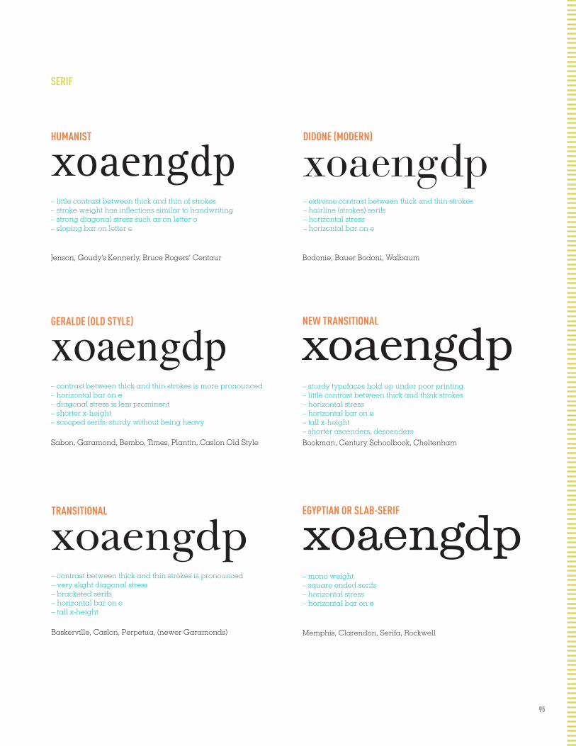
95
HUMANIST
xoaengdp xoaengdp– little contrast between thick and thin of strokes – stroke weight has inflections similar to handwriting – strong diagonal stress such as on letter o – sloping bar on letter e
Jenson, Goudy’s Kennerly, Bruce Rogers’ Centaur
DIDONE (MODERN)
– extreme contrast between thick and thin strokes – hairline (strokes) serifs – horizontal stress – horizontal bar on e
Bodonie, Bauer Bodoni, Walbaum
xoaengdpGERALDE (OLD STYLE)
– contrast between thick and thin strokes is more pronounced – horizontal bar on e – diagonal stress is less prominent – shorter x-height– scooped serifs, sturdy without being heavy
Sabon, Garamond, Bembo, Times, Plantin, Caslon Old Style
xoaengdpNEW TRANSITIONAL
– sturdy typefaces hold up under poor printing – little contrast between thick and think strokes – horizontal stress – horizontal bar on e – tall x-height – shorter ascenders, descendersBookman, Century Schoolbook, Cheltenham
xoaengdp xoaengdpTRANSITIONAL
– contrast between thick and thin strokes is pronounced – very slight diagonal stress – bracketed serifs – horizontal bar on e– tall x-height
Baskerville, Caslon, Perpetua, (newer Garamonds)
EGYPTIAN OR SLAB-SERIF
– mono weight– square ended serifs – horizontal stress – horizontal bar on e
Memphis, Clarendon, Serifa, Rockwell
SERIF

96
GROTESQUE
Helvetica, Univers, Akzidenz Grotesk, Folio
GEOMETRIC
– contrast between thick and thin strokes is more pronounced – horizontal bar on e – diagonal stress is less prominent – shorter x-height– scooped serifs, sturdy without being heavy
Futura, Kabel, Metro
HUMANIST
Syntax, Frutiger, Praxis, Stone Sans
SANS SERIF
xAag– slight contrast in the stoke weight – slight squareness to the curves – usually a tall x-height : short ascenders and descenders – usually a two story lowercase a – capital R usually has a curled leg – capital G usually has a spur
xAag
xAag– based on the proportions of the Roman capitals – some contrast in the stroke weight – lowercase a and g are usually two story
97
FONT LIST
HAMBURGERQ hamburgerq?!&
HAMBURGERQ hamburgerq?!&
HAMBURGERQ hamburgerq?!&
HAMBURGERQ hamburgerq?!&
HAMBURGERQ hamburgerq?!&
HAMBURGERQ hamburgerq?!&
HAMBURGERQ hamburgerq?!&
AKZIDENZ GROTESKDESIGHER: GUNTER GERHARD LANGE CLASSIFICATION: GROTESQUE CHARACTERISTICS: SPUR ON "G", TALL X-HEIGHT, SHORT ASCENDERES
BASKERVILLE (NEW BASKERVILLE) DESIGNER: JOHN BASKERVILLE CLASSIFICATION: TRANSITIONAL CHARACTERISTICS: DIAGONAL STRESS, BRACKETED SERIFS, TALL X-HEIGHT
BELIZIO DESIGNER: DAVID BERLOW CLASSIFICATION: SLAB SERIF CHARACTERISTICS: MONO-WEIGHT, SQUARE SERIFS, BALL TERMINALS
BEMBO DESIGNER: STANLEY MORISON CLASSIFICATION: OLD STYLE CHARACTERISTICS: CONTRAST BETWEEN THICK/THIN
BOOKMAN DESIGNER: ALEXANDER PHEMISTER CLASSIFICATION: NEW TRANSITIONAL CHARACTERISTICS: HORIZONTAL STRESS, TALL X-HEIGHT
BODONI (BAUER BODONI) DESIGNER: GIAMBATTISTA BODONI CLASSIFICATION: DIDONE (MODERN) CHARACTERISTICS: EXTREME CONTRAST BETWEEN THICK & THIN,
UNBRACKETED SERIFS
CASLSON (ADOBE CASLON)DESIGNER: CAROL TWOMBLY CLASSIFICATION: TRANSITIONAL CHARACTERISTICS: LONG TAIL ON Q, SLIGHT DIAGONAL STRESS

98
HAMBURGERQ hamburgerq?!&
HAMBURGERQ hamburgerq?!&
HAMBURGERQ hamburgerq?!&
HAMBURGERQ hamburgerq?!&
HAMBURGERQ hamburgerq?!&
HAMBURGERQ hamburgerq?!&
HAMBURGERQ hamburgerq?!&
CHOLLADESIGHER: SIBYLLE HAGMANN CLASSIFICATION: N/A CHARACTERISTICS: SQUARED CURVES, SHORT ASCENDERS/DESCENDERS
CLARENDONDESIGNER: ROBERT BESLEY CLASSIFICATION: EGYPTIAN SLAB CHARACTERISTICS: LARGE BALL TERMINALS, MONO WEIGHT
CLICKER DESIGNER: GREG THOMPSON CLASSIFICATION: GRID-BASED SANS-SERIF CHARACTERISTICS: LITTLE STROKE CONTRAST, TECHNOLOGY BASED,
TALL X-HEIGHT
DIDOT DESIGNER: FIRMM DIDOT CLASSIFICATION: MODERN CHARACTERISTICS: CONTRASTING STROKE WEIGHT, TALL X-HEIGHT
DINDESIGNER: ALBERT JAN-POOL CLASSIFICATION: GROTESQUE CHARACTERISTICS: NO STROKE CONTRAST, TALL X-HEIGHT,
SHORT ASCENDERS
DISTURBANCE DESIGNER: JEREMY TANKARD CLASSIFICATION: NEW TRANSITIONAL SERIF CHARACTERISTICS: MIX OF UPPER/LOWER CASE, WEIRD G,
BREACKETED SERIF
FRUTIGERDESIGNER: ADRIAN FRUTIGER CLASSIFICATION: HUMANIST CHARACTERISTICS: LOW CONTRAST, SHORT ASCENDERS/DESCENDERS
HAMBURGERQ hamburgerq?!&FILOSOFIADESIGNER: ZUZANA LICKO CLASSIFICATION: MODERN CHARACTERISTICS: BRACKETLESS SERIFS, CONTRASTING STROK WEIGHT

99
HAMBURGERQ hamburgerq?!&
HAMBURGERQ hamburgerq?!&
HAMBURGERQ hamburgerq?!&
HAMBURGERQ hamburgerq?!&
HAMBURGERQ hamburgerq?!&
HAMBURGERQ hamburgerq?!&
HAMBURGERQ hamburgerq?!&
HAMBURGERQ hamburgerq?!&
HAMBURGERQ hamburgerq?!&
FUTURADESIGHER: PAUL RENNER CLASSIFICATION: GEOMETRIC CHARACTERISTICS: CIRCULAR BOWLS/COUNTERS, MONO WEIGHT, WIDE
GARAMOND (ADOBE GARAMOND)DESIGNER: CLAUDE GARAMOND CLASSIFICATION: OLD STYLE CHARACTERISTICS: BRACKETED SERIFS, SHORT X-HEIGHT, WEIGHT VARIES
GILL SANS DESIGNER: ERIC GILL CLASSIFICATION: HUMANIST CHARACTERISTICS: MINIMAL STROKE WIDTH, WIDE CHARACTER WIDTH
GOUDYDESIGNER: FREDERIC W. GOUDY CLASSIFICATION: OLD STYLE CHARACTERISTICS: SHORT X-HEIGHT, WIDE CHARACTER WIDTH, STROKE VARIES
HELVETICADESIGNER: MAX MEDINGER CLASSIFICATION: GROTESQUE CHARACTERISTICS: TALL X-HEIGHT, 2 STORY A, SQUARED LEG KICKS
INTERSTATE DESIGNER: TOBIAS FRERE-JONES CLASSIFICATION: GROTESQUE CHARACTERISTICS: SHORT ASCENDERS/DESCENDERS
KUENSTLER SCRIPSDESIGNER: HANS BOHN CLASSIFICATION: SCRIPT CHARACTERISTICS:DIFFERENT LINE WEIGHTS, BALL TERMINALS, GOUDY CAPS
HAMBURGERQ hamburgerq?!&
HAMBURGERQ hamburgerq?!&MELIORDESIGNER: HERMAN ZAPF CLASSIFICATION: TRANSITIONAL SERIF CHARACTERISTICS: CONTRAST BETWEEN THICK & THINS, SQUARE SERIF END
100
HAMBURGERQ hamburgerq?!&
HAMBURGERQ hamburgerq?!&
HAMBURGERQ hamburgerq?!&
HAMBURGERQ hamburgerq?!&
HAMBURGERQ hamburgerq?!&
HAMBURGERQ hamburgerq?!&
HAMBURGERQ hamburgerq?!&
MEMPHISDESIGHER:RUDOLF WEISS CLASSIFICATION: SLAB SERIF CHARACTERISTICS: MONO WEIGHT, SQUARE SERIFS, HORIZONTAL STRESS
MRS EAVESDESIGNER: ZUZANA LICKO CLASSIFICATION: TRANSITIONAL CHARACTERISTICS: VERTICAL STRESS, G HAS NO OPEN COUNTER, THICK/THINS
NEWS GOTHIC DESIGNER: MORRIS FULLER BENTON CLASSIFICATION: GROTESQUE CHARACTERISTICS: TALL X-HEIGHT, SHALLOW DESCENDERS, ECON, NEUTRAL
PLATLETDESIGNER: CONOR MANGAT CLASSIFICATION: SANS SERIF CHARACTERISTICS: NO STROKE VARIATION, HALF UPPER/HALF LOWER
ROCKWELLDESIGNER: MONOTYPE STAFF CLASSIFICATION: SLAB-SERIF CHARACTERISTICS: MONO-WEIGHT, SQUARE SERIF
ROTIS SANSDESIGNER: OTL AICHER CLASSIFICATION: HUMANIST SANS-SERIF CHARACTERISTICS: TALL X-HEIGHT, TWO STORY A, Q TAIL IS ABOVE BASELINE
SABONDESIGNER: JAN TSCHICHOLD CLASSIFICATION: OLD STYLE CHARACTERISTICS: THICK AND THINS, SHORT X-HEIGHT, SCOOPED SERIFS
HAMBURGERQ hamburgerq?!&ROTIS SERIFDESIGNER: OTL AICHER CLASSIFICATION: HUMANIST SERIF CHARACTERISTICS: BRACKETED SERIFS, TALL X-HEIGHT, SUBTLE STROKE CONT.

101
HAMBURGERQ hamburgerq?!&
HAMBURGERQ hamburgerq?!&
HAMBURGERQ hamburgerq?!&
HAMBURGERQ hamburgerq?!&
HAMBURGERQ hamburgerq?!&
HAMBURGERQ hamburgerq?!&
HAMBURGERQ hamburgerq?!&
HAMBURGERQ hamburgerq?!&
HAMBURGERQ hamburgerq?!&
HAMBURGERQ hamburgerq?!&
SERIFADESIGHER: ADRIAN FRUTIGER CLASSIFICATION: SLAB SERIF CHARACTERISTICS: MONO WEIGHT, SQUARE SERIFS, HORIZONTAL STRESS
SHELLEYDESIGNER: MATTHEW CARTER CLASSIFICATION: SCRIPT CHARACTERISTICS: ALL JOIN UP, LOOP IS THE SAME
SNELL ROUNDHAND DESIGNER: MATTHEW CARTER CLASSIFICATION: SCRIPT CHARACTERISTICS: CALIGRAPHY INFLUENCED, STRONG STROKE VARIATION
SWIFTDESIGNER: GERARD UNGER CLASSIFICATION: NEW TRANSITIONAL/HUMANIST SERIF CHARACTERISTICS: TALL X-HEIGHT, SHORT ASCENDERS/DESCENDERS, STURDY
TRADE GOTHICDESIGNER: JACKSON BURKE CLASSIFICATION: HUMANIST SANS SERIF CHARACTERISTICS: MONO-WEIGHT, TALL X-HEIGHT, SHORT ASC/DESCENDERS
UNIVERSDESIGNER: ADRIAN FRUTIGER CLASSIFICATION: GROTESQUE CHARACTERISTICS: MONO WEIGHT, HEAVY
WALBAUMDESIGNER: JUSTUS ERICH WALBAUM CLASSIFICATION: MODERN CHARACTERISTICS: EXTREME CONTRAST, HAIRLINE SERIFS,
HORIXONTAL STRESS
HAMBURGERQ hamburgerq?!&VOLTADESIGNER: KONRAD BAUER, WALTER BAUM CLASSIFICATION: SLAB SERIF CHARACTERISTICS: THICK/THIN STROKES, LARGE SQUARE SERIFS

102
Archer
FONT SPECS FONT SPECS FONT SPECS FONT SPECS FONT SPECS FONT SPECS FONT SPECS FONT SPECS FONT SPECS FONT SPECS FONT SPECS FONT SPECS FONT SPECS FONT SPECS FONT SPECS FONT SPECS FONT SPECS FONT SPECS FONT SPECS FONT SPECS FONT SPECS FONT SPECS FONT SPECS FONT SPECS FONT SPECS FONT SPECS FONT SPECS FONT SPECS FONT SPECS FONT SPECS FONT SPECS FONT SPECS FONT SPECS FONT SPECS FONT SPECS FONT SPECS FONT SPECS FONT SPECS FONT SPECS FONT SPECS FONT SPECS FONT SPECS FONT SPECS FONT SPECS FONT SPECS FONT SPECS FONT SPECS FONT SPECS FONT SPECS FONT SPECS FONT SPECS FONT SPECS FONT SPECS FONT SPECS FONT SPECS FONT SPECS FONT SPECS FONT SPECS FONT SPECS FONT SPECS FONT SPECS FONT SPECS FONT SPECS FONT SPECS FONT SPECS FONT SPECS FONT SPECS FONT SPECS FONT SPECS FONT SPECS FONT SPECS FONT SPECS FONT SPECS FONT SPECS FONT SPECS FONT SPECS FONT SPECS FONT SPECS FONT SPECS FONT SPECS FONT SPECS FONT SPECS FONT SPECS FONT SPECS FONT SPECS FONT SPECS FONT SPECS FONT SPECS FONT SPECS FONT SPECS FONT SPECS FONT SPECS FONT SPECS FONT SPECS FONT SPECS FONT SPECS FONT SPECS FONT SPECS FONT SPECS FONT SPECS FONT SPECS FONT SPECS FONT SPECS FONT SPECS FONT SPECS FONT SPECS FONT SPECS FONT SPECS FONT SPECS FONT SPECS FONT SPECS FONT SPECS FONT SPECS FONT SPECS FONT SPECS FONT SPECS FONT SPECS FONT SPECS FONT SPECS FONT SPECS FONT SPECS FONT SPECS FONT SPECS FONT SPECS FONT SPECS FONT SPECS FONT SPECS FONT SPECS FONT SPECS FONT SPECS FONT SPECS FONT SPECS FONT SPECS FONT SPECS FONT SPECS FONT SPECS FONT SPECS FONT SPECS FONT SPECS FONT SPECS FONT SPECS FONT SPECS FONT SPECS FONT SPECS FONT SPECS FONT SPECS FONT SPECS FONT SPECS FONT SPECS FONT SPECS FONT SPECS FONT SPECS FONT SPECS FONT SPECS FONT SPECS FONT SPECS FONT SPECS FONT SPECS FONT SPECS FONT SPECS FONT SPECS FONT SPECS FONT SPECS FONT SPECS FONT SPECS FONT SPECS FONT SPECS FONT SPECS FONT SPECS FONT SPECS FONT SPECS FONT SPECS FONT SPECS FONT SPECS FONT SPECS FONT SPECS FONT SPECS FONT SPECS FONT SPECS FONT SPECS FONT SPECS FONT SPECS FONT SPECS FONT SPECS FONT SPECS FONT SPECS FONT SPECS FONT SPECS FONT SPECS FONT SPECS FONT SPECS FONT SPECS FONT SPECS FONT SPECS FONT SPECS FONT SPECS FONT SPECS FONT SPECS FONT SPECS FONT SPECS FONT SPECS FONT SPECS FONT SPECS FONT SPECS FONT SPECS FONT SPECS FONT SPECS FONT SPECS FONT SPECS FONT SPECS FONT SPECS FONT SPECS FONT SPECS FONT SPECS FONT SPECS FONT SPECS FONT SPECS FONT SPECS FONT SPECS FONT SPECS FONT SPECS FONT SPECS FONT SPECS FONT SPECS FONT SPECS FONT SPECS FONT SPECS FONT SPECS FONT SPECS FONT SPECS FONT SPECS FONT SPECS FONT SPECS FONT SPECS FONT SPECS FONT SPECS FONT SPECS FONT SPECS FONT SPECS FONT SPECS FONT SPECS FONT SPECS FONT SPECS FONT SPECS FONT SPECS FONT SPECS FONT SPECS FONT SPECS FONT SPECS FONT SPECS FONT SPECS FONT SPECS FONT SPECS FONT SPECS FONT SPECS FONT SPECS FONT SPECS FONT SPECS FONT SPECS FONT SPECS FONT SPECS FONT SPECS FONT SPECS FONT SPECS FONT SPECS FONT SPECS FONT SPECS FONT SPECS FONT SPECS FONT SPECS FONT SPECS FONT SPECS FONT SPECS FONT SPECS FONT SPECS FONT SPECS FONT SPECS FONT SPECS FONT SPECS FONT SPECS FONT SPECS FONT SPECS FONT SPECS FONT SPECS FONT SPECS FONT SPECS FONT SPECS FONT SPECS FONT SPECS FONT SPECS FONT SPECS FONT SPECS FONT SPECS FONT SPECS FONT SPECS FONT SPECS FONT SPECS FONT SPECS FONT SPECS FONT SPECS FONT SPECS FONT SPECS FONT SPECS FONT SPECS FONT SPECS FONT SPECS FONT SPECS FONT SPECS FONT SPECS FONT SPECS FONT SPECS FONT SPECS FONT SPECS FONT SPECS FONT SPECS FONT SPECS FONT SPECS FONT SPECS FONT SPECS FONT SPECS
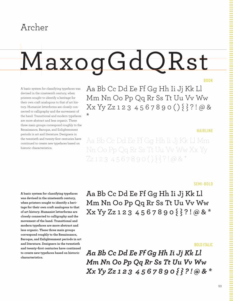
103
BOOK
HAIRLINE
SEMI-BOLD
BOLD ITALIC
Archer
MaxogGdQRstA basic system for classifying typefaces was devised in the nineteenth century, when printers sought to identify a heritage for their own craft analogous to that of art his-tory. Humanist letterforms are closely con-nected to calligraphy and the movement of the hand. Transitional and modern typefaces are more abstract and less organic. These three main groups correspond roughly to the Renaissance, Baroque, and Enlightenment periods in art and literature. Designers in the twentieth and twenty-first centuries have continued to create new typefaces based on historic characteristics.
A basic system for classifying typefaces was devised in the nineteenth century, when printers sought to identify a heri-tage for their own craft analogous to that of art history. Humanist letterforms are closely connected to calligraphy and the movement of the hand. Transitional and modern typefaces are more abstract and less organic. These three main groups correspond roughly to the Renaissance, Baroque, and Enlightenment periods in art and literature. Designers in the twentieth and twenty-first centuries have continued to create new typefaces based on historic characteristics.
Aa Bb Cc Dd Ee Ff Gg Hh Ii Jj Kk Ll Mm Nn Oo Pp Qq Rr Ss Tt Uu Vv Ww Xx Yy Zz 1 2 3 4 5 6 7 8 9 0 ( ) { } ? ! @ & *
Aa Bb Cc Dd Ee Ff Gg Hh Ii Jj Kk Ll Mm Nn Oo Pp Qq Rr Ss Tt Uu Vv Ww Xx Yy Zz 1 2 3 4 5 6 7 8 9 0 ( ) { } ? ! @ & *
Aa Bb Cc Dd Ee Ff Gg Hh Ii Jj Kk Ll Mm Nn Oo Pp Qq Rr Ss Tt Uu Vv Ww Xx Yy Zz 1 2 3 4 5 6 7 8 9 0 { } ? ! @ & *
Aa Bb Cc Dd Ee Ff Gg Hh Ii Jj Kk Ll Mm Nn Oo Pp Qq Rr Ss Tt Uu Vv Ww Xx Yy Zz 1 2 3 4 5 6 7 8 9 0 { } ? ! @ & *
FONT SPECS FONT SPECS FONT SPECS FONT SPECS FONT SPECS FONT SPECS FONT SPECS FONT SPECS FONT SPECS FONT SPECS FONT SPECS FONT SPECS FONT SPECS FONT SPECS FONT SPECS FONT SPECS FONT SPECS FONT SPECS FONT SPECS FONT SPECS FONT SPECS FONT SPECS FONT SPECS FONT SPECS FONT SPECS FONT SPECS FONT SPECS FONT SPECS FONT SPECS FONT SPECS FONT SPECS FONT SPECS FONT SPECS FONT SPECS FONT SPECS FONT SPECS FONT SPECS FONT SPECS FONT SPECS FONT SPECS FONT SPECS FONT SPECS FONT SPECS FONT SPECS FONT SPECS FONT SPECS FONT SPECS FONT SPECS FONT SPECS FONT SPECS FONT SPECS FONT SPECS FONT SPECS FONT SPECS FONT SPECS FONT SPECS FONT SPECS FONT SPECS FONT SPECS FONT SPECS FONT SPECS FONT SPECS FONT SPECS FONT SPECS FONT SPECS FONT SPECS FONT SPECS FONT SPECS FONT SPECS FONT SPECS FONT SPECS FONT SPECS FONT SPECS FONT SPECS FONT SPECS FONT SPECS FONT SPECS FONT SPECS FONT SPECS FONT SPECS FONT SPECS FONT SPECS FONT SPECS FONT SPECS FONT SPECS FONT SPECS FONT SPECS FONT SPECS FONT SPECS FONT SPECS FONT SPECS FONT SPECS FONT SPECS FONT SPECS FONT SPECS FONT SPECS FONT SPECS FONT SPECS FONT SPECS FONT SPECS FONT SPECS FONT SPECS FONT SPECS FONT SPECS FONT SPECS FONT SPECS FONT SPECS FONT SPECS FONT SPECS FONT SPECS FONT SPECS FONT SPECS FONT SPECS FONT SPECS FONT SPECS FONT SPECS FONT SPECS FONT SPECS FONT SPECS FONT SPECS FONT SPECS FONT SPECS FONT SPECS FONT SPECS FONT SPECS FONT SPECS FONT SPECS FONT SPECS FONT SPECS FONT SPECS FONT SPECS FONT SPECS FONT SPECS FONT SPECS FONT SPECS FONT SPECS FONT SPECS FONT SPECS FONT SPECS FONT SPECS FONT SPECS FONT SPECS FONT SPECS FONT SPECS FONT SPECS FONT SPECS FONT SPECS FONT SPECS FONT SPECS FONT SPECS FONT SPECS FONT SPECS FONT SPECS FONT SPECS FONT SPECS FONT SPECS FONT SPECS FONT SPECS FONT SPECS FONT SPECS FONT SPECS FONT SPECS FONT SPECS FONT SPECS FONT SPECS FONT SPECS FONT SPECS FONT SPECS FONT SPECS FONT SPECS FONT SPECS FONT SPECS FONT SPECS FONT SPECS FONT SPECS FONT SPECS FONT SPECS FONT SPECS FONT SPECS FONT SPECS FONT SPECS FONT SPECS FONT SPECS FONT SPECS FONT SPECS FONT SPECS FONT SPECS FONT SPECS FONT SPECS FONT SPECS FONT SPECS FONT SPECS FONT SPECS FONT SPECS FONT SPECS FONT SPECS FONT SPECS FONT SPECS FONT SPECS FONT SPECS FONT SPECS FONT SPECS FONT SPECS FONT SPECS FONT SPECS FONT SPECS FONT SPECS FONT SPECS FONT SPECS FONT SPECS FONT SPECS FONT SPECS FONT SPECS FONT SPECS FONT SPECS FONT SPECS FONT SPECS FONT SPECS FONT SPECS FONT SPECS FONT SPECS FONT SPECS FONT SPECS FONT SPECS FONT SPECS FONT SPECS FONT SPECS FONT SPECS FONT SPECS FONT SPECS FONT SPECS FONT SPECS FONT SPECS FONT SPECS FONT SPECS FONT SPECS FONT SPECS FONT SPECS FONT SPECS FONT SPECS FONT SPECS FONT SPECS FONT SPECS FONT SPECS FONT SPECS FONT SPECS FONT SPECS FONT SPECS FONT SPECS FONT SPECS FONT SPECS FONT SPECS FONT SPECS FONT SPECS FONT SPECS FONT SPECS FONT SPECS FONT SPECS FONT SPECS FONT SPECS FONT SPECS FONT SPECS FONT SPECS FONT SPECS FONT SPECS FONT SPECS FONT SPECS FONT SPECS FONT SPECS FONT SPECS FONT SPECS FONT SPECS FONT SPECS FONT SPECS FONT SPECS FONT SPECS FONT SPECS FONT SPECS FONT SPECS FONT SPECS FONT SPECS FONT SPECS FONT SPECS FONT SPECS FONT SPECS FONT SPECS FONT SPECS FONT SPECS FONT SPECS FONT SPECS FONT SPECS FONT SPECS FONT SPECS FONT SPECS FONT SPECS FONT SPECS FONT SPECS FONT SPECS FONT SPECS FONT SPECS FONT SPECS FONT SPECS FONT SPECS FONT SPECS FONT SPECS FONT SPECS FONT SPECS FONT SPECS FONT SPECS FONT SPECS FONT SPECS FONT SPECS FONT SPECS FONT SPECS FONT SPECS FONT SPECS FONT SPECS FONT SPECS FONT SPECS FONT SPECS
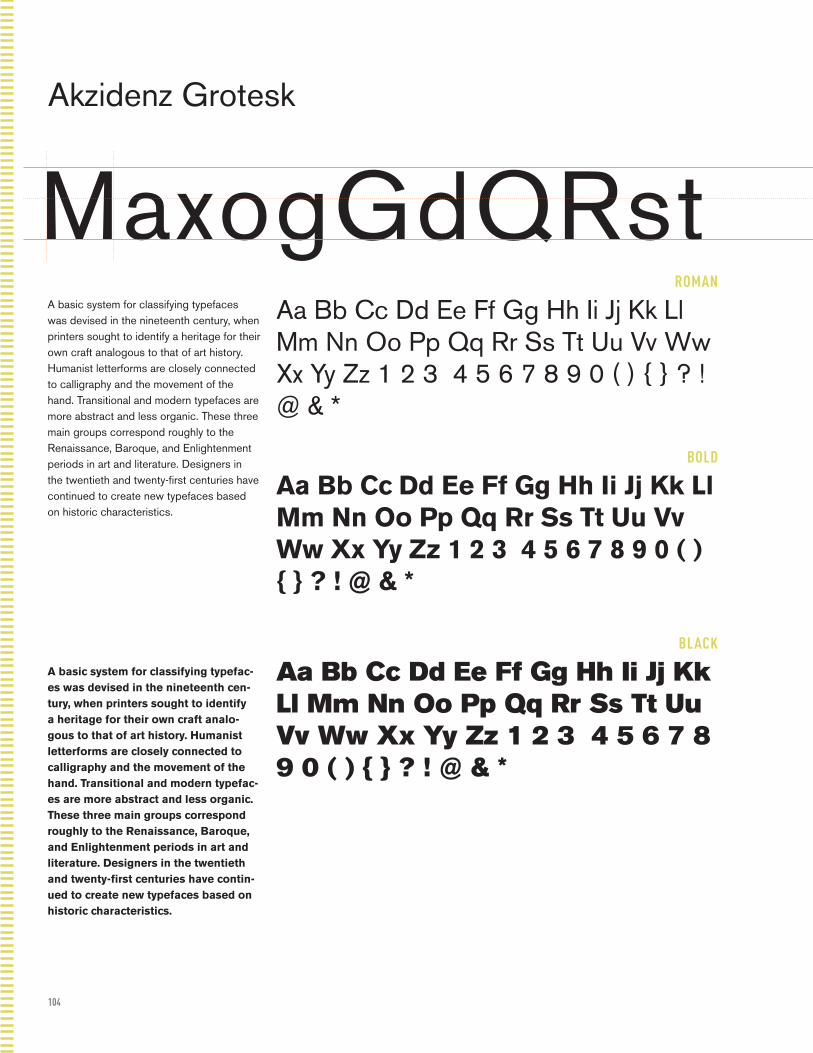
104
ROMAN
BOLD
BLACK
Akzidenz Grotesk
MaxogGdQRstA basic system for classifying typefaces was devised in the nineteenth century, when printers sought to identify a heritage for their own craft analogous to that of art history. Humanist letterforms are closely connected to calligraphy and the movement of the hand. Transitional and modern typefaces are more abstract and less organic. These three main groups correspond roughly to the Renaissance, Baroque, and Enlightenment periods in art and literature. Designers in the twentieth and twenty-first centuries have continued to create new typefaces based on historic characteristics.
A basic system for classifying typefac-es was devised in the nineteenth cen-tury, when printers sought to identify a heritage for their own craft analo-gous to that of art history. Humanist letterforms are closely connected to calligraphy and the movement of the hand. Transitional and modern typefac-es are more abstract and less organic. These three main groups correspond roughly to the Renaissance, Baroque, and Enlightenment periods in art and literature. Designers in the twentieth and twenty-first centuries have contin-ued to create new typefaces based on historic characteristics.
Aa Bb Cc Dd Ee Ff Gg Hh Ii Jj Kk Ll Mm Nn Oo Pp Qq Rr Ss Tt Uu Vv Ww Xx Yy Zz 1 2 3 4 5 6 7 8 9 0 ( ) { } ? ! @ & *
Aa Bb Cc Dd Ee Ff Gg Hh Ii Jj Kk Ll Mm Nn Oo Pp Qq Rr Ss Tt Uu Vv Ww Xx Yy Zz 1 2 3 4 5 6 7 8 9 0 ( ) { } ? ! @ & *
Aa Bb Cc Dd Ee Ff Gg Hh Ii Jj Kk Ll Mm Nn Oo Pp Qq Rr Ss Tt Uu Vv Ww Xx Yy Zz 1 2 3 4 5 6 7 8 9 0 ( ) { } ? ! @ & *
Baskerville

105
REGULAR
SMALL CAPS
ITALIC
BOLD
Baskerville
MxaogGdQRtA basic system for classifying typefaces was devised in the nineteenth century, when printers sought to identify a heritage for their own craft analogous to that of art history. Humanist letterforms are closely connected to calligraphy and the movement of the hand. Transitional and modern typefaces are more abstract and less organic. These three main groups cor-respond roughly to the Renaissance, Ba-roque, and Enlightenment periods in art and literature. Designers in the twentieth and twenty-first centuries have continued to create new typefaces based on historic characteristics.
A basic system for classifying typefaces was devised in the nineteenth century, when printers sought to identify a heritage for their own craft analogous to that of art history. Humanist letterforms are closely connected to calligraphy and the movement of the hand. Transitional and modern typefaces are more abstract and less organic. These three main groups correspond roughly to the Renaissance, Baroque, and Enlightenment periods in art and literature. Designers in the twentieth and twenty-first centuries have continued to create new typefaces based on historic characteristics.
Aa Bb Cc Dd Ee Ff Gg Hh Ii Jj Kk Ll Mm Nn Oo Pp Qq Rr Ss Tt Uu Vv Ww Xx Yy Zz 1 2 3 4 5 6 7 8 9 0 ( ) { } ? ! @ & *
Aa Bb Cc Dd Ee Ff Gg Hh Ii Jj Kk Ll Mm Nn Oo Pp Qq Rr Ss Tt Uu Vv Ww Xx Yy Zz 1 2 3 4 5 6 7 8 9 0 ( ) { } ? ! @ & *
Aa Bb Cc Dd Ee Ff Gg Hh Ii Jj Kk Ll Mm Nn Oo Pp Qq Rr Ss Tt Uu Vv Ww Xx Yy Zz 1 2 3 4 5 6 7 8 9 0 ( ) { } ? ! @ & *
Aa Bb Cc Dd Ee Ff Gg Hh Ii Jj Kk Ll Mm Nn Oo Pp Qq Rr Ss Tt Uu Vv Ww Xx Yy Zz 1 2 3 4 5 6 7 8 9 0 ( ) { } ? ! @ & *

106
REGULAR
ITALIC
BOLD
BLACK ITALIC
Belizio
MxagGdQrRA basic system for classifying type-faces was devised in the nineteenth century, when printers sought to identify a heritage for their own craft analogous to that of art histo-ry. Humanist letterforms are closely connected to calligraphy and the movement of the hand. Transitional and modern typefaces are more ab-stract and less organic. These three main groups correspond roughly to the Renaissance, Baroque, and Enlightenment periods in art and literature. Designers in the twenti-eth and twenty-first centuries have continued to create new typefaces based on historic characteristics.
A basic system for classifying typefac-es was devised in the nineteenth cen-tury, when printers sought to identify a heritage for their own craft analogous to that of art history. Humanist letter-forms are closely connected to callig-raphy and the movement of the hand. Transitional and modern typefaces are more abstract and less organic. These three main groups correspond roughly to the Renaissance, Baroque, and Enlightenment periods in art and literature. Designers in the twentieth and twenty-first centuries have con-tinued to create new typefaces based on historic characteristics.
Aa Bb Cc Dd Ee Ff Gg Hh Ii Jj Kk Ll Mm Nn Oo Pp Qq Rr Ss Tt Uu Vv Ww Xx Yy Zz 1 2 3 4 5 6 7 8 9 0 ( ) { } ? ! @ & *
Aa Bb Cc Dd Ee Ff Gg Hh Ii Jj Kk Ll Mm Nn Oo Pp Qq Rr Ss Tt Uu Vv Ww Xx Yy Zz 1 2 3 4 5 6 7 8 9 0 ( ) { } ? ! @ & *
Aa Bb Cc Dd Ee Ff Gg Hh Ii Jj Kk Ll Mm Nn Oo Pp Qq Rr Ss Tt Uu Vv Ww Xx Yy Zz 1 2 3 4 5 6 7 8 9 0 ( ) { } ? ! @ & *
Aa Bb Cc Dd Ee Ff Gg Hh Ii Jj Kk Ll Mm Nn Oo Pp Qq Rr Ss Tt Uu Vv Ww Xx Yy Zz 1 2 3 4 5 6 7 8 9 0 ( ) { } ? ! @ & *

107
LIGHT
BOLD
BLACK
Bell Gothic
MxagGdQrRIA basic system for classifying typefaces
was devised in the nineteenth century, when
printers sought to identify a heritage for their
own craft analogous to that of art history.
Humanist letterforms are closely connected
to calligraphy and the movement of the hand.
Transitional and modern typefaces are more
abstract and less organic. These three main
groups correspond roughly to the Renais-
sance, Baroque, and Enlightenment periods in
art and literature. Designers in the twentieth
and twenty-first centuries have continued
to create new typefaces based on historic
characteristics.
Aa Bb Cc Dd Ee Ff Gg Hh Ii Jj Kk Ll Mm Nn Oo Pp Qq Rr Ss Tt Uu Vv Ww Xx Yy Zz 1 2 3 4 5 6 7 8 9 0 ( ) { } ? ! @ & *
Aa Bb Cc Dd Ee Ff Gg Hh Ii Jj Kk Ll Mm Nn Oo Pp Qq Rr Ss Tt Uu Vv Ww Xx Yy Zz 1 2 3 4 5 6 7 8 9 0 ( ) { } ? ! @ & *
Aa Bb Cc Dd Ee Ff Gg Hh Ii Jj Kk Ll Mm Nn Oo Pp Qq Rr Ss Tt Uu Vv Ww Xx Yy Zz 1 2 3 4 5 6 7 8 9 0 ( ) { } ? ! @ & *
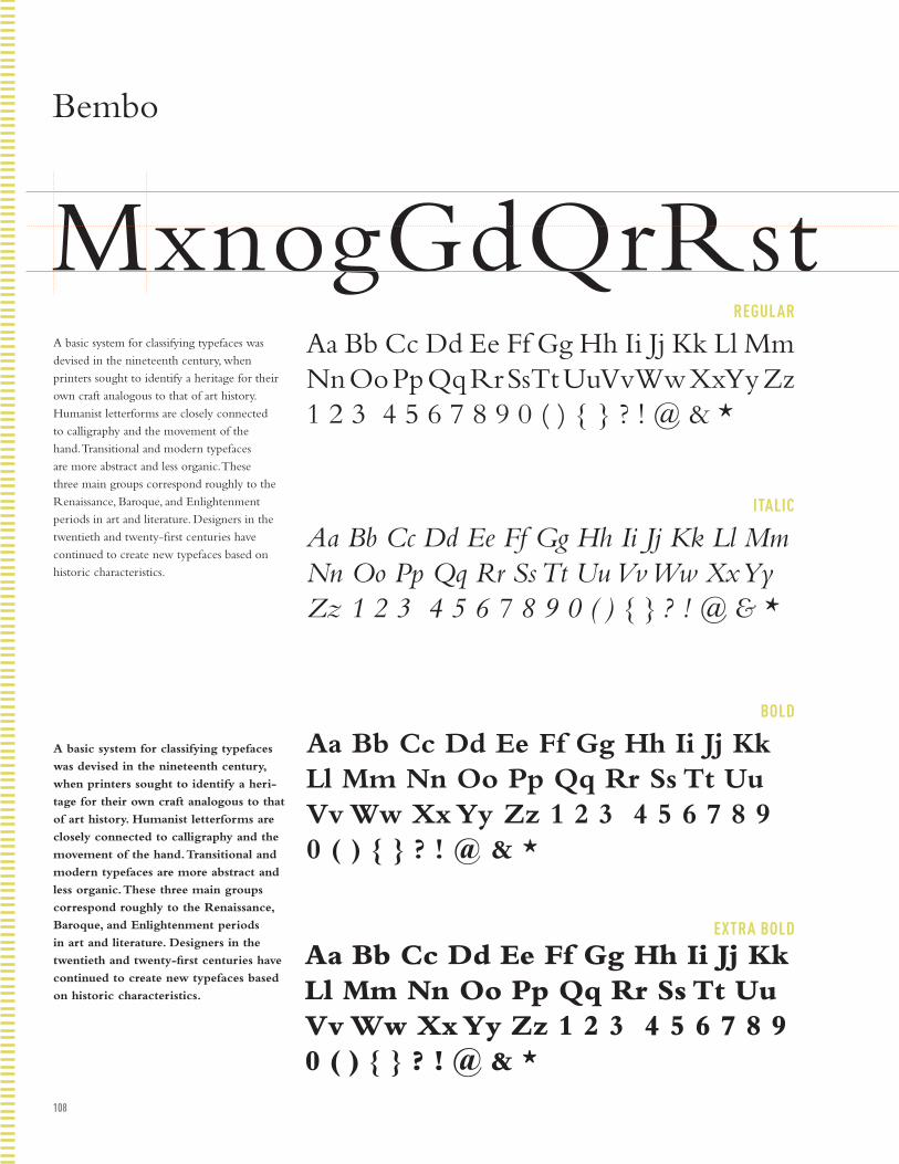
108
REGULAR
ITALIC
BOLD
EXTRA BOLD
Bembo
MxnogGdQrRstA basic system for classifying typefaces was
devised in the nineteenth century, when
printers sought to identify a heritage for their
own craft analogous to that of art history.
Humanist letterforms are closely connected
to calligraphy and the movement of the
hand. Transitional and modern typefaces
are more abstract and less organic. These
three main groups correspond roughly to the
Renaissance, Baroque, and Enlightenment
periods in art and literature. Designers in the
twentieth and twenty-first centuries have
continued to create new typefaces based on
historic characteristics.
A basic system for classifying typefaces
was devised in the nineteenth century,
when printers sought to identify a heri-
tage for their own craft analogous to that
of art history. Humanist letterforms are
closely connected to calligraphy and the
movement of the hand. Transitional and
modern typefaces are more abstract and
less organic. These three main groups
correspond roughly to the Renaissance,
Baroque, and Enlightenment periods
in art and literature. Designers in the
twentieth and twenty-first centuries have
continued to create new typefaces based
on historic characteristics.
Aa Bb Cc Dd Ee Ff Gg Hh Ii Jj Kk Ll Mm Nn Oo Pp Qq Rr Ss Tt Uu Vv Ww Xx Yy Zz 1 2 3 4 5 6 7 8 9 0 ( ) { } ? ! @ & *
Aa Bb Cc Dd Ee Ff Gg Hh Ii Jj Kk Ll Mm Nn Oo Pp Qq Rr Ss Tt Uu Vv Ww Xx Yy Zz 1 2 3 4 5 6 7 8 9 0 ( ) { } ? ! @ & *
Aa Bb Cc Dd Ee Ff Gg Hh Ii Jj Kk Ll Mm Nn Oo Pp Qq Rr Ss Tt Uu Vv Ww Xx Yy Zz 1 2 3 4 5 6 7 8 9 0 ( ) { } ? ! @ & *
Aa Bb Cc Dd Ee Ff Gg Hh Ii Jj Kk Ll Mm Nn Oo Pp Qq Rr Ss Tt Uu Vv Ww Xx Yy Zz 1 2 3 4 5 6 7 8 9 0 ( ) { } ? ! @ & *
Bookman
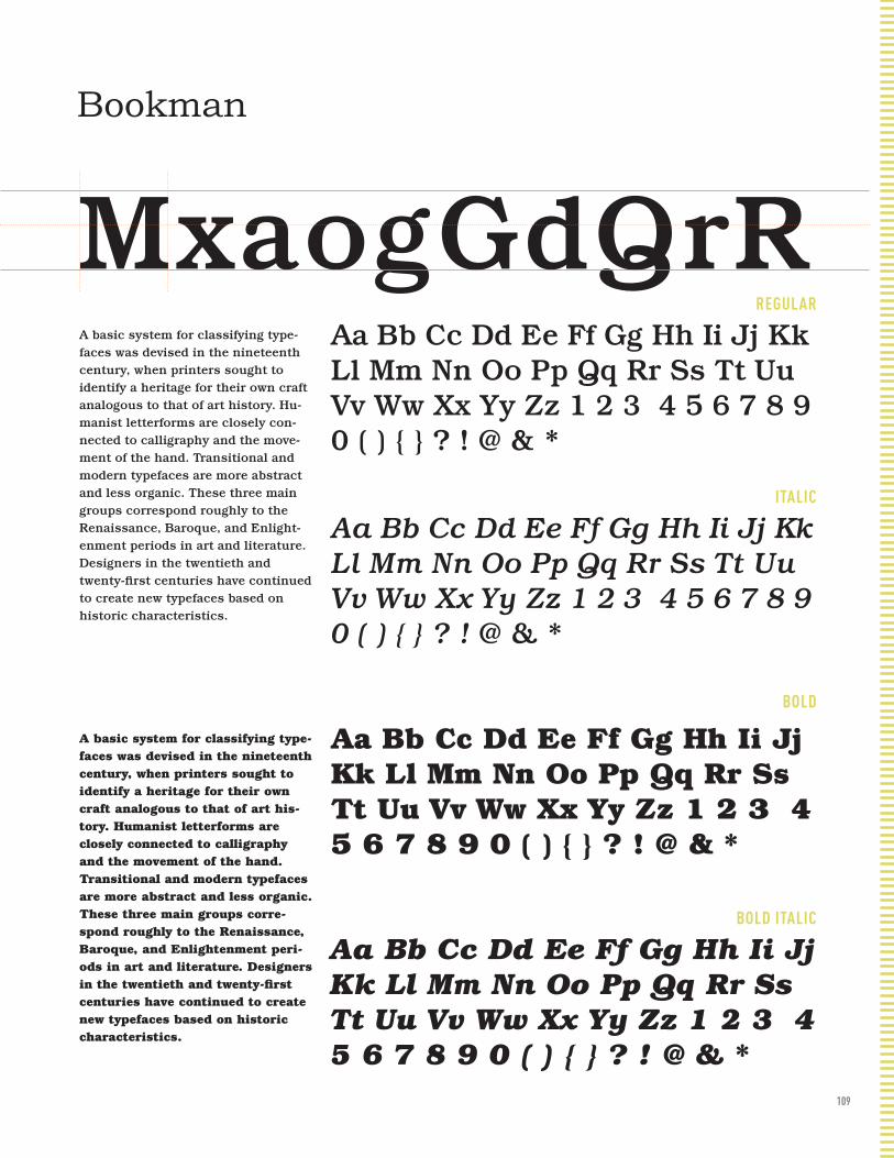
109
MxnogGdQrRstREGULAR
ITALIC
BOLD
BOLD ITALIC
Bookman
MxaogGdQrRA basic system for classifying type-faces was devised in the nineteenth century, when printers sought to identify a heritage for their own craft analogous to that of art history. Hu-manist letterforms are closely con-nected to calligraphy and the move-ment of the hand. Transitional and modern typefaces are more abstract and less organic. These three main groups correspond roughly to the Renaissance, Baroque, and Enlight-enment periods in art and literature. Designers in the twentieth and twenty-first centuries have continued to create new typefaces based on historic characteristics.
A basic system for classifying type-faces was devised in the nineteenth century, when printers sought to identify a heritage for their own craft analogous to that of art his-tory. Humanist letterforms are closely connected to calligraphy and the movement of the hand. Transitional and modern typefaces are more abstract and less organic. These three main groups corre-spond roughly to the Renaissance, Baroque, and Enlightenment peri-ods in art and literature. Designers in the twentieth and twenty-first centuries have continued to create new typefaces based on historic characteristics.
Aa Bb Cc Dd Ee Ff Gg Hh Ii Jj Kk Ll Mm Nn Oo Pp Qq Rr Ss Tt Uu Vv Ww Xx Yy Zz 1 2 3 4 5 6 7 8 9 0 ( ) { } ? ! @ & *
Aa Bb Cc Dd Ee Ff Gg Hh Ii Jj Kk Ll Mm Nn Oo Pp Qq Rr Ss Tt Uu Vv Ww Xx Yy Zz 1 2 3 4 5 6 7 8 9 0 ( ) { } ? ! @ & *
Aa Bb Cc Dd Ee Ff Gg Hh Ii Jj Kk Ll Mm Nn Oo Pp Qq Rr Ss Tt Uu Vv Ww Xx Yy Zz 1 2 3 4 5 6 7 8 9 0 ( ) { } ? ! @ & *
Aa Bb Cc Dd Ee Ff Gg Hh Ii Jj Kk Ll Mm Nn Oo Pp Qq Rr Ss Tt Uu Vv Ww Xx Yy Zz 1 2 3 4 5 6 7 8 9 0 ( ) { } ? ! @ & *

110
REGULAR
ITALIC
BOLD
ORNAMENTS
Bodoni
MxaogGdQrRstA basic system for classifying typefaces was devised in the nineteenth century, when printers sought to identify a heritage for their own craft analogous to that of art history. Humanist letterforms are closely connected to calligraphy and the movement of the hand. Transitional and modern typefaces are more abstract and less organic. These three main groups correspond roughly to the Renaissance, Baroque, and Enlightenment periods in art and literature. Designers in the twentieth and twenty-first centuries have continued to create new typefaces based on historic characteristics.
A basic system for classifying typefaces was devised in the nineteenth century, when printers sought to identify a heritage for their own craft analogous to that of art history. Humanist letterforms are closely connected to calligraphy and the move-ment of the hand. Transitional and modern typefaces are more abstract and less or-ganic. These three main groups correspond roughly to the Renaissance, Baroque, and Enlightenment periods in art and literature. Designers in the twentieth and twenty-first centuries have continued to create new typefaces based on historic characteristics.
Aa Bb Cc Dd Ee Ff Gg Hh Ii Jj Kk Ll Mm Nn Oo Pp Qq Rr Ss Tt Uu Vv Ww Xx Yy Zz 1 2 3 4 5 6 7 8 9 0 ( ) { } ? ! @ & * 1 2 3 4 5 6 7 8 9
Aa Bb Cc Dd Ee Ff Gg Hh Ii Jj Kk Ll Mm Nn Oo Pp Qq Rr Ss Tt Uu Vv Ww Xx Yy Zz 1 2 3 4 5 6 7 8 9 0 ( ) { } ? ! @ & *
Aa Bb Cc Dd Ee Ff Gg Hh Ii Jj Kk Ll Mm Nn Oo Pp Qq Rr Ss Tt Uu Vv Ww Xx Yy Zz 1 2 3 4 5 6 7 8 9 0 ( ) { } ? ! @ & *
Aa Bb Cc Dd Ee Ff Gg Hh Ii Jj Kk Ll Mm Nn Oo Pp Qq Rr Ss Tt Uu Vv Ww Xx Yy Zz 1 2 3 4 5 6 7 8 9 0 ( ) { } ? ! @ & *
Caslon

111
REGULAR
ITALIC
SWASH
ORNAMENT
ALTERNATE
Caslon
MxanogGdQRtA basic system for classifying typefaces was devised in the nineteenth century, when printers sought to identify a heritage for their own craft analogous to that of art history. Humanist letterforms are closely connected to calligraphy and the movement of the hand. Transitional and modern typefaces are more abstract and less organic. These three main groups correspond roughly to the Renaissance, Baroque, and Enlightenment periods in art and literature. Designers in the twentieth and twenty-first centuries have continued to create new typefaces based on historic characteristics.
A basic system for classifying typefaces was devised in the nineteenth century, when printers sought to identify a heritage for their own craft analogous to that of art history. Humanist letterforms are closely connected to calligraphy and the movement of the hand. Transitional and modern typefaces are more abstract and less organic. These three main groups correspond roughly to the Renaissance, Baroque, and Enlightenment periods in art and literature. Designers in the twentieth and twenty-first centuries have continued to create new typefaces based on historic characteristics.
Aa Bb Cc Dd Ee Ff Gg Hh Ii Jj Kk Ll Mm Nn Oo Pp Qq Rr Ss Tt Uu Vv Ww Xx Yy Zz 1 2 3 4 5 6 7 8 9 0 ( ) { } ? ! @ & *
Aa Bb Cc Dd Ee Ff Gg Hh Ii Jj Kk Ll Mm Nn Oo Pp Qq Rr Ss Tt Uu Vv Ww Xx Yy Zz 1 2 3 4 5 6 7 8 9 0 ( ) { } ? ! @ & *
Aa Ba Ca Da Ea Fa Ga Ha Ia Ja Ka La Ma Na Oa Pa Qa Ra Sa Ta Ua Va Wa Xa Ya Z
A a Bb C c D d Ee F f G g H h Ii Jj Kk Ll Mm Nn Oo Pp Qq Or S s Ot Uu Vv Ww X x y Z z 1 2 3 4
c h i k l Ss T t
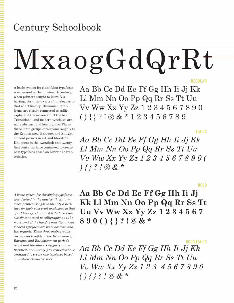
112
REGULAR
ITALIC
BOLD
BOLD ITALIC
Century Schoolbook
MxaogGdQrRtA basic system for classifying typefaces was devised in the nineteenth century, when printers sought to identify a heritage for their own craft analogous to that of art history. Humanist letter-forms are closely connected to callig-raphy and the movement of the hand. Transitional and modern typefaces are more abstract and less organic. These three main groups correspond roughly to the Renaissance, Baroque, and Enlight-enment periods in art and literature. Designers in the twentieth and twenty-first centuries have continued to create new typefaces based on historic charac-teristics.
A basic system for classifying typefaces was devised in the nineteenth century, when printers sought to identify a heri-tage for their own craft analogous to that of art history. Humanist letterforms are closely connected to calligraphy and the movement of the hand. Transitional and modern typefaces are more abstract and less organic. These three main groups correspond roughly to the Renaissance, Baroque, and Enlightenment periods in art and literature. Designers in the twentieth and twenty-first centuries have continued to create new typefaces based on historic characteristics.
Aa Bb Cc Dd Ee Ff Gg Hh Ii Jj Kk Ll Mm Nn Oo Pp Qq Rr Ss Tt Uu Vv Ww Xx Yy Zz 1 2 3 4 5 6 7 8 9 0 ( ) { } ? ! @ & * 1 2 3 4 5 6 7 8 9
Aa Bb Cc Dd Ee Ff Gg Hh Ii Jj Kk Ll Mm Nn Oo Pp Qq Rr Ss Tt Uu Vv Ww Xx Yy Zz 1 2 3 4 5 6 7 8 9 0 ( ) { } ? ! @ & *
Aa Bb Cc Dd Ee Ff Gg Hh Ii Jj Kk Ll Mm Nn Oo Pp Qq Rr Ss Tt Uu Vv Ww Xx Yy Zz 1 2 3 4 5 6 7 8 9 0 ( ) { } ? ! @ & *
Aa Bb Cc Dd Ee Ff Gg Hh Ii Jj Kk Ll Mm Nn Oo Pp Qq Rr Ss Tt Uu Vv Ww Xx Yy Zz 1 2 3 4 5 6 7 8 9 0 ( ) { } ? ! @ & *
Cheltenham

113
REGULAR
ITALIC
BOLD
BOLD ITALIC
Cheltenham
MaxogGdQrRsA basic system for classifying typefaces was devised in the nineteenth century, when printers sought to identify a heri-tage for their own craft analogous to that of art history. Humanist letterforms are closely connected to calligraphy and the movement of the hand. Transitional and modern typefaces are more abstract and less organic. These three main groups correspond roughly to the Renaissance, Baroque, and Enlightenment periods in art and literature. Designers in the twentieth and twenty-first centuries have continued to create new typefaces based on historic characteristics.
A basic system for classifying typefaces was devised in the nineteenth century, when printers sought to identify a heritage for their own craft analogous to that of art history. Humanist letterforms are closely connected to calligraphy and the movement of the hand. Transitional and modern typefaces are more abstract and less organic. These three main groups correspond roughly to the Renaissance, Baroque, and Enlightenment periods in art and literature. Designers in the twentieth and twenty-first centuries have continued to create new typefaces based on historic characteristics.
Aa Bb Cc Dd Ee Ff Gg Hh Ii Jj Kk Ll Mm Nn Oo Pp Qq Rr Ss Tt Uu Vv Ww Xx Yy Zz 1 2 3 4 5 6 7 8 9 0 ( ) { } ? ! @ & *
Aa Bb Cc Dd Ee Ff Gg Hh Ii Jj Kk Ll Mm Nn Oo Pp Qq Rr Ss Tt Uu Vv Ww Xx Yy Zz 1 2 3 4 5 6 7 8 9 0 ( ) { } ? ! @ & *
Aa Bb Cc Dd Ee Ff Gg Hh Ii Jj Kk Ll Mm Nn Oo Pp Qq Rr Ss Tt Uu Vv Ww Xx Yy Zz 1 2 3 4 5 6 7 8 9 0 ( ) { } ? ! @ & *
Aa Bb Cc Dd Ee Ff Gg Hh Ii Jj Kk Ll Mm Nn Oo Pp Qq Rr Ss Tt Uu Vv Ww Xx Yy Zz 1 2 3 4 5 6 7 8 9 0 ( ) { } ? ! @ & *

114
UNICASE
REGULAR
Cholla
MaxnogGdQrRstA basic system for classifying typefaces was devised in the nineteenth century, when printers sought to identify a heritage for their own craft analogous to that of art his-tory. Humanist letterforms are closely con-nected to calligraphy and the movement of the hand. Transitional and modern typefaces are more abstract and less organic. These three main groups correspond roughly to the Renaissance, Baroque, and Enlightenment periods in art and literature. Designers in the twentieth and twenty-first centuries have continued to create new typefaces based on historic characteristics.
A basic system for classifying typefaces
was devised in the nineteenth century,
when printers sought to identify a heri-
tage for their own craft analogous to that
of art history. Humanist letterforms are
closely connected to calligraphy and the
movement of the hand. Transitional and
modern typefaces are more abstract and
less organic. These three main groups
correspond roughly to the Renaissance,
Baroque, and Enlightenment periods in art
and literature. Designers in the twentieth
and twenty-first centuries have continued
to create new typefaces based on historic
characteristics.
Aa Bb Cc Dd Ee Ff Gg Hh Ii Jj Kk Ll Mm Nn
Oo Pp Qq Rr Ss Tt Uu Vv Ww Xx Yy Zz 1 2
3 4 5 6 7 8 9 0 ( ) { } ? ! @ & *
Aa Bb Cc Dd Ee Ff Gg Hh Ii Jj Kk Ll Mm Nn Oo Pp Qq Rr Ss Tt Uu Vv Ww Xx Yy Zz 1 2 3 4 5 6 7 8 9 0 ( ) { } ? ! @ & *
Clarendon
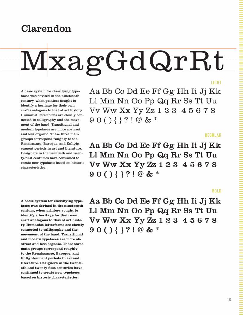
115
LIGHT
REGULAR
BOLD
Clarendon
MxagGdQrRtA basic system for classifying type-faces was devised in the nineteenth century, when printers sought to identify a heritage for their own craft analogous to that of art history. Humanist letterforms are closely con-nected to calligraphy and the move-ment of the hand. Transitional and modern typefaces are more abstract and less organic. These three main groups correspond roughly to the Renaissance, Baroque, and Enlight-enment periods in art and literature. Designers in the twentieth and twen-ty-first centuries have continued to create new typefaces based on historic characteristics.
A basic system for classifying type-faces was devised in the nineteenth century, when printers sought to identify a heritage for their own craft analogous to that of art histo-ry. Humanist letterforms are closely connected to calligraphy and the movement of the hand. Transitional and modern typefaces are more ab-stract and less organic. These three main groups correspond roughly to the Renaissance, Baroque, and Enlightenment periods in art and literature. Designers in the twenti-eth and twenty-first centuries have continued to create new typefaces based on historic characteristics.
Aa Bb Cc Dd Ee Ff Gg Hh Ii Jj Kk Ll Mm Nn Oo Pp Qq Rr Ss Tt Uu Vv Ww Xx Yy Zz 1 2 3 4 5 6 7 8 9 0 ( ) { } ? ! @ & *
Aa Bb Cc Dd Ee Ff Gg Hh Ii Jj Kk Ll Mm Nn Oo Pp Qq Rr Ss Tt Uu Vv Ww Xx Yy Zz 1 2 3 4 5 6 7 8 9 0 ( ) { } ? ! @ & *
Aa Bb Cc Dd Ee Ff Gg Hh Ii Jj Kk Ll Mm Nn Oo Pp Qq Rr Ss Tt Uu Vv Ww Xx Yy Zz 1 2 3 4 5 6 7 8 9 0 ( ) { } ? ! @ & *

116
REGULAR
Clicker
MaxnogGdQRsA basic system for classifying type-faces was devised in the nineteenth century, when printers sought to identify a heritage for their own craft analogous to that of art histo-ry. Humanist letterforms are closely connected to calligraphy and the movement of the hand. Transitional and modern typefaces are more ab-stract and less organic. These three main groups correspond roughly to the Renaissance, Baroque, and Enlightenment periods in art and literature. Designers in the twenti-eth and twenty-first centuries have continued to create new typefaces based on historic characteristics.
Aa Bb Cc Dd Ee Ff Gg Hh Ii Jj Kk Ll Mm Nn Oo Pp Qq Rr Ss Tt Uu Vv Ww Xx Yy Zz 1 2 3 4 5 6 7 8 9 0 ( ) { } ? ! @ & *
Didot
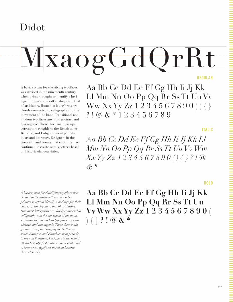
117
REGULAR
ITALIC
BOLD
Didot
MxaogGdQrRtA basic system for classifying typefaces was devised in the nineteenth century, when printers sought to identify a heri-tage for their own craft analogous to that of art history. Humanist letterforms are closely connected to calligraphy and the movement of the hand. Transitional and modern typefaces are more abstract and less organic. These three main groups correspond roughly to the Renaissance, Baroque, and Enlightenment periods in art and literature. Designers in the twentieth and twenty-first centuries have continued to create new typefaces based on historic characteristics.
A basic system for classifying typefaces was devised in the nineteenth century, when printers sought to identify a heritage for their own craft analogous to that of art history. Humanist letterforms are closely connected to calligraphy and the movement of the hand. Transitional and modern typefaces are more abstract and less organic. These three main groups correspond roughly to the Renais-sance, Baroque, and Enlightenment periods in art and literature. Designers in the twenti-eth and twenty-first centuries have continued to create new typefaces based on historic characteristics.
Aa Bb Cc Dd Ee Ff Gg Hh Ii Jj Kk Ll Mm Nn Oo Pp Qq Rr Ss Tt Uu Vv Ww Xx Yy Zz 1 2 3 4 5 6 7 8 9 0 ( ) { } ? ! @ & * 1 2 3 4 5 6 7 8 9
Aa Bb Cc Dd Ee Ff Gg Hh Ii Jj Kk Ll Mm Nn Oo Pp Qq Rr Ss Tt Uu Vv Ww Xx Yy Zz 1 2 3 4 5 6 7 8 9 0 ( ) { } ? ! @ & *
Aa Bb Cc Dd Ee Ff Gg Hh Ii Jj Kk Ll Mm Nn Oo Pp Qq Rr Ss Tt Uu Vv Ww Xx Yy Zz 1 2 3 4 5 6 7 8 9 0 ( ) { } ? ! @ & *
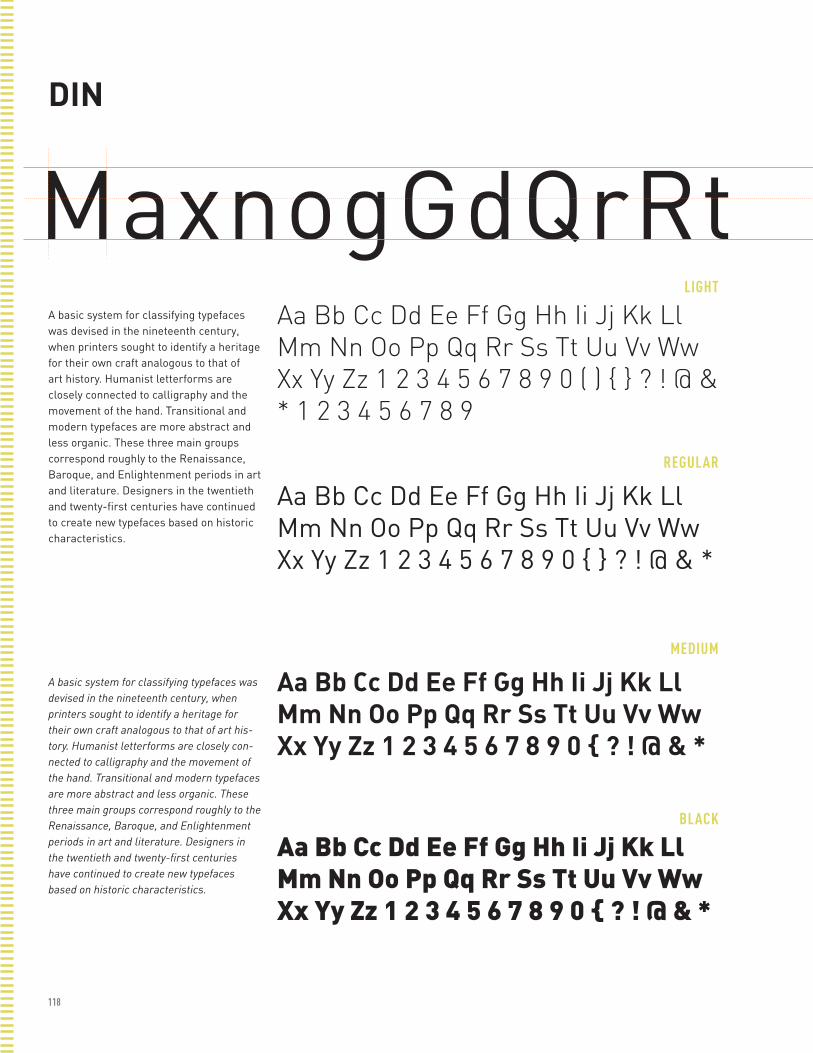
118
DIN
MaxnogGdQrRtLIGHT
REGULAR
MEDIUM
BLACK
A basic system for classifying typefaces was devised in the nineteenth century, when printers sought to identify a heritage for their own craft analogous to that of art history. Humanist letterforms are closely connected to calligraphy and the movement of the hand. Transitional and modern typefaces are more abstract and less organic. These three main groups correspond roughly to the Renaissance, Baroque, and Enlightenment periods in art and literature. Designers in the twentieth and twenty-first centuries have continued to create new typefaces based on historic characteristics.
A basic system for classifying typefaces was devised in the nineteenth century, when printers sought to identify a heritage for their own craft analogous to that of art his-tory. Humanist letterforms are closely con-nected to calligraphy and the movement of the hand. Transitional and modern typefaces are more abstract and less organic. These three main groups correspond roughly to the Renaissance, Baroque, and Enlightenment periods in art and literature. Designers in the twentieth and twenty-first centuries have continued to create new typefaces based on historic characteristics.
Aa Bb Cc Dd Ee Ff Gg Hh Ii Jj Kk Ll Mm Nn Oo Pp Qq Rr Ss Tt Uu Vv Ww Xx Yy Zz 1 2 3 4 5 6 7 8 9 0 ( ) { } ? ! @ & * 1 2 3 4 5 6 7 8 9
Aa Bb Cc Dd Ee Ff Gg Hh Ii Jj Kk Ll Mm Nn Oo Pp Qq Rr Ss Tt Uu Vv Ww Xx Yy Zz 1 2 3 4 5 6 7 8 9 0 { } ? ! @ & *
Aa Bb Cc Dd Ee Ff Gg Hh Ii Jj Kk Ll Mm Nn Oo Pp Qq Rr Ss Tt Uu Vv Ww Xx Yy Zz 1 2 3 4 5 6 7 8 9 0 { ? ! @ & *
Aa Bb Cc Dd Ee Ff Gg Hh Ii Jj Kk Ll Mm Nn Oo Pp Qq Rr Ss Tt Uu Vv Ww Xx Yy Zz 1 2 3 4 5 6 7 8 9 0 { ? ! @ & *
DIN Condensed

119
DIN Condensed
MaxngdQHAMBURGLIGHT CONDENSED
REGULAR CONDENSED
BOLD CONDENSED
BLACK CONDENSED
A basic system for classifying typefaces was devised in the nineteenth century, when printers sought to identify a heritage for their own craft analogous to that of art history. Humanist letterforms are closely connected to calligraphy and the movement of the hand. Transitional and modern typefaces are more abstract and less organic. These three main groups correspond roughly to the Renaissance, Baroque, and Enlightenment periods in art and literature. Designers in the twentieth and twenty-first centuries have continued to create new typefaces based on historic characteristics.
A basic system for classifying typefaces was devised in the nineteenth century, when printers sought to identify a heritage for their own craft analogous to that of art history. Humanist letterforms are closely connected to calligraphy and the movement of the hand. Transitional and modern typefaces are more abstract and less organic. These three main groups correspond roughly to the Renaissance, Baroque, and Enlightenment periods in art and literature. Designers in the twentieth and twenty-first centuries have continued to create new typefaces based on historic characteristics.
Aa Bb Cc Dd Ee Ff Gg Hh Ii Jj Kk Ll Mm Nn Oo Pp Qq Rr Ss Tt Uu Vv Ww Xx Yy Zz 1 2 3 4 5 6 7 8 9 0 ( ) { } ? ! @ & * 1 2 3 4 5 6 7 8 9
Aa Bb Cc Dd Ee Ff Gg Hh Ii Jj Kk Ll Mm Nn Oo Pp Qq Rr Ss Tt Uu Vv Ww Xx Yy Zz 1 2 3 4 5 6 7 8 9 0 ( ) { } ? ! @ & *
Aa Bb Cc Dd Ee Ff Gg Hh Ii Jj Kk Ll Mm Nn Oo Pp Qq Rr Ss Tt Uu Vv Ww Xx Yy Zz 1 2 3 4 5 6 7 8 9 0 ( ) { } ? ! @ & *
Aa Bb Cc Dd Ee Ff Gg Hh Ii Jj Kk Ll Mm Nn Oo Pp Qq Rr Ss Tt Uu Vv Ww Xx Yy Zz 1 2 3 4 5 6 7 8 9 0 ( ) { } ? ! @ & *
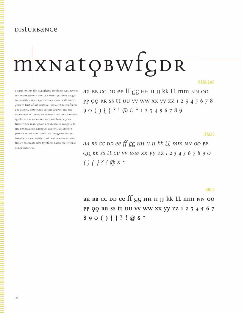
120
REGULAR
ITALIC
BOLD
Disturbance
MxnatQbWFGdRA basic system for classifying typefaces was devised
in the nineteenth century, when printers sought
to identify a heritage for their own craft analo-
gous to that of art history. Humanist letterforms
are closely connected to calligraphy and the
movement of the hand. Transitional and modern
typefaces are more abstract and less organic.
These three main groups correspond roughly to
the Renaissance, Baroque, and Enlightenment
periods in art and literature. Designers in the
twentieth and twenty-first centuries have con-
tinued to create new typefaces based on historic
characteristics.
Aa Bb Cc Dd Ee Ff Gg Hh Ii Jj Kk Ll Mm Nn Oo
Pp Qq Rr Ss Tt Uu Vv Ww Xx Yy Zz 1 2 3 4 5 6 7 8
9 0 ( ) { } ? ! @ & * 1 2 3 4 5 6 7 8 9
Aa Bb Cc Dd Ee Ff Gg Hh Ii Jj Kk Ll Mm Nn Oo Pp
Qq Rr Ss Tt Uu Vv Ww Xx Yy Zz 1 2 3 4 5 6 7 8 9 0
( ) { } ? ! @ & *
Aa Bb Cc Dd Ee Ff Gg Hh Ii Jj Kk Ll Mm Nn Oo
Pp Qq Rr Ss Tt Uu Vv Ww Xx Yy Zz 1 2 3 4 5 6 7
8 9 0 ( ) { } ? ! @ & *
Fette Fraktur
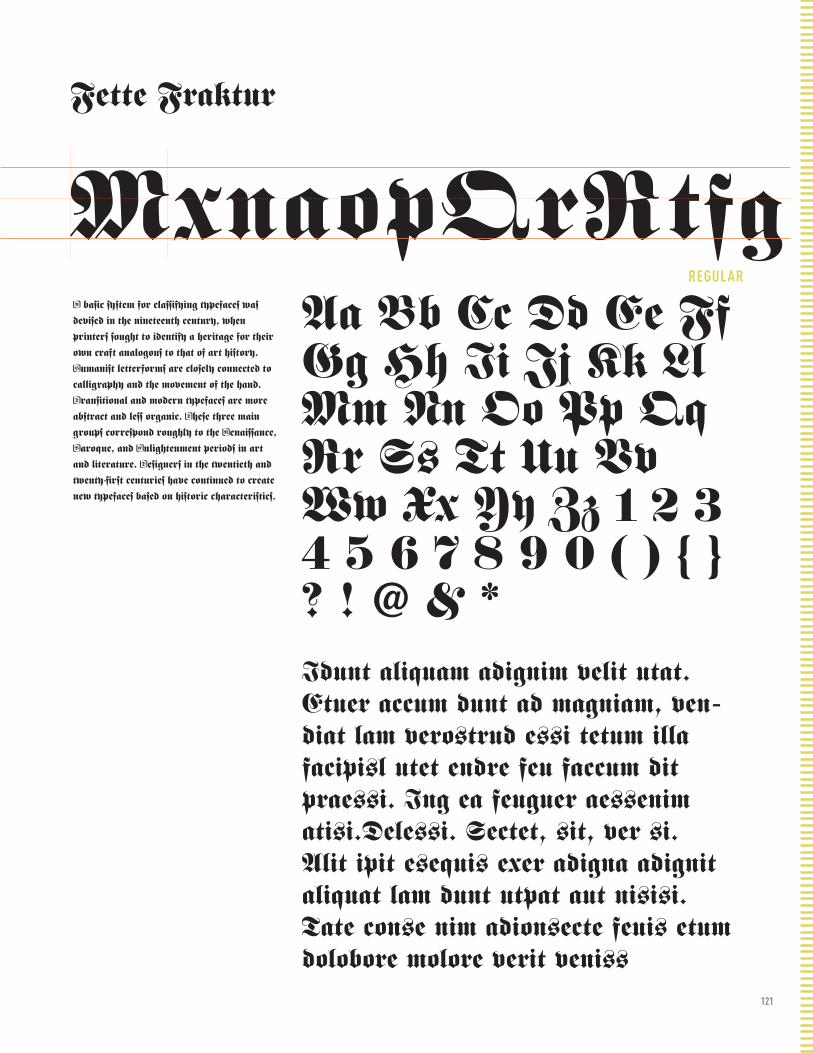
121
REGULAR
Fette Fraktur
MxnaopQrRtfgA basic system for classifying typefaces was
devised in the nineteenth century, when
printers sought to identify a heritage for their
own craft analogous to that of art history.
Humanist letterforms are closely connected to
calligraphy and the movement of the hand.
Transitional and modern typefaces are more
abstract and less organic. These three main
groups correspond roughly to the Renaissance,
Baroque, and Enlightenment periods in art
and literature. Designers in the twentieth and
twenty-first centuries have continued to create
new typefaces based on historic characteristics.
Aa Bb Cc Dd Ee Ff Gg Hh Ii Jj Kk Ll Mm Nn Oo Pp Qq Rr Ss Tt Uu Vv Ww Xx Yy Zz 1 2 3 4 5 6 7 8 9 0 ( ) { } ? ! @ & *Idunt aliquam adignim velit utat. Etuer accum dunt ad magniam, ven-diat lam verostrud essi tetum illa facipisl utet endre feu faccum dit praessi. Ing ea feuguer aessenim atisi.Delessi. Sectet, sit, ver si.Alit ipit esequis exer adigna adignit aliquat lam dunt utpat aut nisisi.Tate conse nim adionsecte feuis etum dolobore molore verit veniss
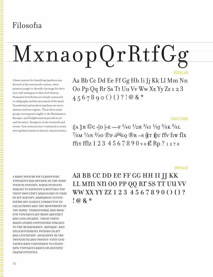
122
REGULAR
FRACTIONS
UNICASE
Filosofia
MxnaopQrRtfGgA basic system for classifying typefaces was devised in the nineteenth century, when printers sought to identify a heritage for their own craft analogous to that of art history. Humanist letterforms are closely connected to calligraphy and the movement of the hand. Transitional and modern typefaces are more abstract and less organic. These three main groups correspond roughly to the Renaissance, Baroque, and Enlightenment periods in art and literature. Designers in the twentieth and twenty-first centuries have continued to create new typefaces based on historic characteristics.
A basic system for classifying typefaces was devised in the nine-teenth century, when printers sought to identify a heritage for their own craft analogous to that of art history. Humanist letter-forms are closely connected to calligraphy and the movement of the hand. Transitional and mod-ern typefaces are more abstract and less organic. These three main groups correspond roughly to the Renaissance, Baroque, and Enlightenment periods in art and literature. Designers in the twentieth and twenty-first cen-turies have continued to create new typefaces based on historic characteristics.
Aa Bb Cc Dd Ee Ff Gg Hh Ii Jj Kk Ll Mm Nn Oo Pp Qq Rr Ss Tt Uu Vv Ww Xx Yy Zz 1 2 3 4 5 6 7 8 9 0 ( ) { } ? ! @ & *
Aa Bb Cc Dd Ee Ff Gg Hh Ii Jj Kk Ll Mm Nn Oo Pp Qq Rr Ss Tt Uu Vv Ww Xx Yy Zz 1 2 3 4 5 6 7 8 9 0 ( ) { } ? ! @ & *
Aa Bb Cc Dd Ee Ff Gg Hh Ii Jj Kk Ll Mm Nn Oo Pp Qq Rr Ss Tt Uu Vv Ww Xx Yy Zz 1 2 3 4 5 6 7 8 9 0 ( ) { } ? ! @ & *
Franklin Gothic

123
BOOK
DEMI
HEAVY
CONDENSED
Franklin Gothic
MaxodQRtfGgA basic system for classifying typefaces was devised in the nineteenth century, when printers sought to identify a heritage for their own craft analogous to that of art history. Humanist letterforms are closely connected to calligraphy and the move-ment of the hand. Transitional and modern typefaces are more abstract and less or-ganic. These three main groups correspond roughly to the Renaissance, Baroque, and Enlightenment periods in art and literature. Designers in the twentieth and twenty-first centuries have continued to create new typefaces based on historic characteristics.
A basic system for classifying type-faces was devised in the nineteenth century, when printers sought to iden-tify a heritage for their own craft anal-ogous to that of art history. Humanist letterforms are closely connected to calligraphy and the movement of the hand. Transitional and modern typefaces are more abstract and less organic. These three main groups cor-respond roughly to the Renaissance, Baroque, and Enlightenment periods in art and literature. Designers in the twentieth and twenty-first centuries have continued to create new typefac-es based on historic characteristics.
Aa Bb Cc Dd Ee Ff Gg Hh Ii Jj Kk Ll Mm Nn Oo Pp Qq Rr Ss Tt Uu Vv Ww Xx Yy Zz 1 2 3 4 5 6 7 8 9 0 ( ) { } ? ! @ & *
Aa Bb Cc Dd Ee Ff Gg Hh Ii Jj Kk Ll Mm Nn Oo Pp Qq Rr Ss Tt Uu Vv Ww Xx Yy Zz 1 2 3 4 5 6 7 8 9 0 ( ) { } ? ! @ & *
Aa Bb Cc Dd Ee Ff Gg Hh Ii Jj Kk Ll Mm Nn Oo Pp Qq Rr Ss Tt Uu Vv Ww Xx Yy Zz 1 2 3 4 5 6 7 8 9 0 ( ) { } ? ! @ & *
Aa Bb Cc Dd Ee Ff Gg Hh Ii Jj Kk Ll Mm Nn Oo Pp Qq Rr Ss Tt Uu Vv Ww Xx Yy Zz 1 2 3 4 5 6 7 8 9 0 ( ) { } ? ! @ & *

124
CONDENSED
REGULAR
BOLD
ULTRA BLACK
Frutiger
MaxodQRtfGgA basic system for classifying typefaces was devised in the nineteenth century, when printers sought to identify a heritage for their own craft analogous to that of art history. Humanist letter-forms are closely connected to callig-raphy and the movement of the hand. Transitional and modern typefaces are more abstract and less organic. These three main groups correspond roughly to the Renaissance, Baroque, and Enlightenment periods in art and literature. Designers in the twentieth and twenty-first centuries have contin-ued to create new typefaces based on historic characteristics.
A basic system for classifying typefaces was devised in the nineteenth century, when printers sought to identify a heritage for their own craft analo-gous to that of art history. Humanist letterforms are closely connected to calligraphy and the movement of the hand. Transitional and modern typefac-es are more abstract and less organic. These three main groups correspond roughly to the Renaissance, Baroque, and Enlightenment periods in art and literature. Designers in the twentieth and twenty-first centuries have contin-ued to create new typefaces based on historic characteristics.
Aa Bb Cc Dd Ee Ff Gg Hh Ii Jj Kk Ll Mm Nn Oo Pp Qq Rr Ss Tt Uu Vv Ww Xx Yy Zz 1 2 3 4 5 6 7 8 9 0 ( ) { } ? ! @ & *
Aa Bb Cc Dd Ee Ff Gg Hh Ii Jj Kk Ll Mm Nn Oo Pp Qq Rr Ss Tt Uu Vv Ww Xx Yy Zz 1 2 3 4 5 6 7 8 9 0 ( ) { } ? ! @ & *
Aa Bb Cc Dd Ee Ff Gg Hh Ii Jj Kk Ll Mm Nn Oo Pp Qq Rr Ss Tt Uu Vv Ww Xx Yy Zz 1 2 3 4 5 6 7 8 9 0 ( ) { } ? ! @ & *
Aa Bb Cc Dd Ee Ff Gg Hh Ii Jj Kk Ll Mm Nn Oo Pp Qq Rr Ss Tt Uu Vv Ww Xx Yy Zz 1 2 3 4 5 6 7 8 9 0 ( ) { } ? ! @ & *
Futura

125
BOOK
BOLD
EXTRA BOLD
Futura
MxaopQRstGgA basic system for classifying typefaces was devised in the nineteenth century, when printers sought to identify a heritage for their own craft analogous to that of art history. Humanist letterforms are closely connected to calligraphy and the movement of the hand. Transitional and modern typefaces are more abstract and less organic. These three main groups correspond roughly to the Renaissance, Baroque, and Enlightenment periods in art and literature. Designers in the twentieth and twenty-first centuries have continued to create new typefaces based on historic characteristics.
A basic system for classifying typefaces was devised in the nineteenth century, when printers sought to identify a heritage for their own craft analogous to that of art history. Humanist letterforms are closely connected to calligraphy and the movement of the hand. Transitional and modern typefaces are more abstract and less organic. These three main groups corre-spond roughly to the Renaissance, Baroque, and Enlightenment peri-ods in art and literature. Designers in the twentieth and twenty-first centuries have continued to create new typefaces based on historic characteristics.
Aa Bb Cc Dd Ee Ff Gg Hh Ii Jj Kk Ll Mm Nn Oo Pp Qq Rr Ss Tt Uu Vv Ww Xx Yy Zz 1 2 3 4 5 6 7 8 9 0 ( ) { } ? ! @ & *
Aa Bb Cc Dd Ee Ff Gg Hh Ii Jj Kk Ll Mm Nn Oo Pp Qq Rr Ss Tt Uu Vv Ww Xx Yy Zz 1 2 3 4 5 6 7 8 9 0 ( ) { } ? ! @ & *
Aa Bb Cc Dd Ee Ff Gg Hh Ii Jj Kk Ll Mm Nn Oo Pp Qq Rr Ss Tt Uu Vv Ww Xx Yy Zz 1 2 3 4 5 6 7 8 9 0 ( ) { } ? ! @ & *
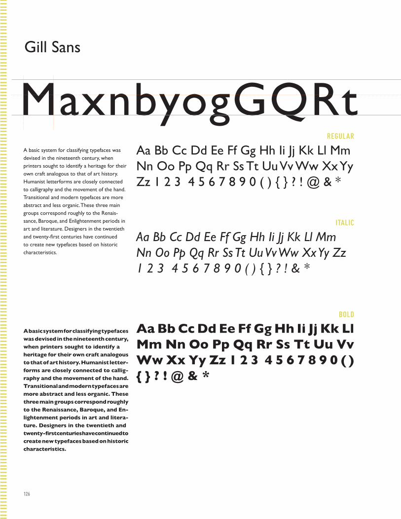
126
REGULAR
ITALIC
BOLD
Gill Sans
MaxnbyogGQRtA basic system for classifying typefaces was devised in the nineteenth century, when printers sought to identify a heritage for their own craft analogous to that of art history. Humanist letterforms are closely connected to calligraphy and the movement of the hand. Transitional and modern typefaces are more abstract and less organic. These three main groups correspond roughly to the Renais-sance, Baroque, and Enlightenment periods in art and literature. Designers in the twentieth and twenty-first centuries have continued to create new typefaces based on historic characteristics.
A basic system for classifying typefaces was devised in the nineteenth century, when printers sought to identify a heritage for their own craft analogous to that of art history. Humanist letter-forms are closely connected to callig-raphy and the movement of the hand. Transitional and modern typefaces are more abstract and less organic. These three main groups correspond roughly to the Renaissance, Baroque, and En-lightenment periods in art and litera-ture. Designers in the twentieth and twenty-first centuries have continued to create new typefaces based on historic characteristics.
Aa Bb Cc Dd Ee Ff Gg Hh Ii Jj Kk Ll Mm Nn Oo Pp Qq Rr Ss Tt Uu Vv Ww Xx Yy Zz 1 2 3 4 5 6 7 8 9 0 ( ) { } ? ! @ & *
Aa Bb Cc Dd Ee Ff Gg Hh Ii Jj Kk Ll Mm Nn Oo Pp Qq Rr Ss Tt Uu Vv Ww Xx Yy Zz 1 2 3 4 5 6 7 8 9 0 ( ) { } ? ! & *
Aa Bb Cc Dd Ee Ff Gg Hh Ii Jj Kk Ll Mm Nn Oo Pp Qq Rr Ss Tt Uu Vv Ww Xx Yy Zz 1 2 3 4 5 6 7 8 9 0 ( ) { } ? ! @ & *
Gotham
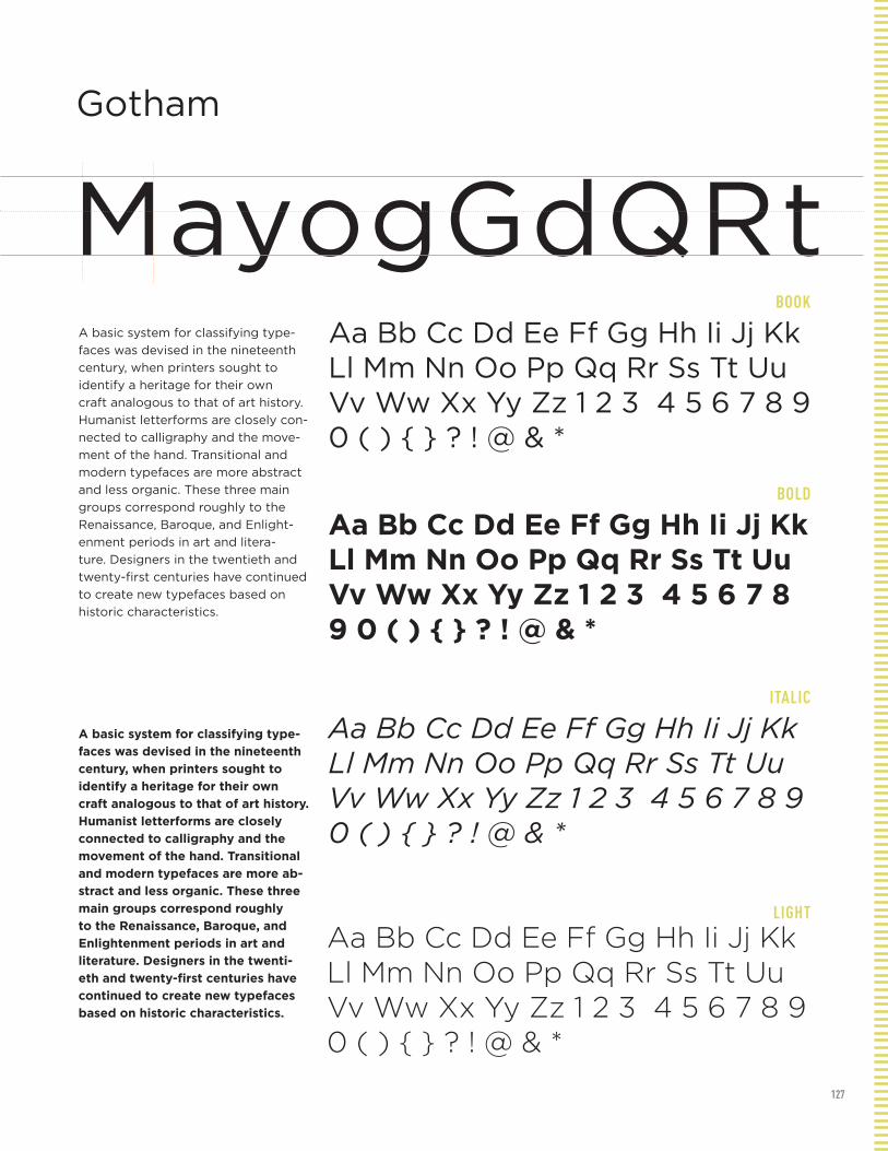
127
BOOK
BOLD
ITALIC
LIGHT
Gotham
MayogGdQRtA basic system for classifying type-
faces was devised in the nineteenth
century, when printers sought to
identify a heritage for their own
craft analogous to that of art history.
Humanist letterforms are closely con-
nected to calligraphy and the move-
ment of the hand. Transitional and
modern typefaces are more abstract
and less organic. These three main
groups correspond roughly to the
Renaissance, Baroque, and Enlight-
enment periods in art and litera-
ture. Designers in the twentieth and
twenty-first centuries have continued
to create new typefaces based on
historic characteristics.
A basic system for classifying type-
faces was devised in the nineteenth
century, when printers sought to
identify a heritage for their own
craft analogous to that of art history.
Humanist letterforms are closely
connected to calligraphy and the
movement of the hand. Transitional
and modern typefaces are more ab-
stract and less organic. These three
main groups correspond roughly
to the Renaissance, Baroque, and
Enlightenment periods in art and
literature. Designers in the twenti-
eth and twenty-first centuries have
continued to create new typefaces
based on historic characteristics.
Aa Bb Cc Dd Ee Ff Gg Hh Ii Jj Kk Ll Mm Nn Oo Pp Qq Rr Ss Tt Uu Vv Ww Xx Yy Zz 1 2 3 4 5 6 7 8 9 0 ( ) { } ? ! @ & *
Aa Bb Cc Dd Ee Ff Gg Hh Ii Jj Kk Ll Mm Nn Oo Pp Qq Rr Ss Tt Uu Vv Ww Xx Yy Zz 1 2 3 4 5 6 7 8 9 0 ( ) { } ? ! @ & *
Aa Bb Cc Dd Ee Ff Gg Hh Ii Jj Kk Ll Mm Nn Oo Pp Qq Rr Ss Tt Uu Vv Ww Xx Yy Zz 1 2 3 4 5 6 7 8 9 0 ( ) { } ? ! @ & *
Aa Bb Cc Dd Ee Ff Gg Hh Ii Jj Kk Ll Mm Nn Oo Pp Qq Rr Ss Tt Uu Vv Ww Xx Yy Zz 1 2 3 4 5 6 7 8 9 0 ( ) { } ? ! @ & *

128
REGULAR
BOLD
BLACK EXTENDED
ULTRA LIGHT
Helvetica
MaoygGdQrRtA basic system for classifying typefaces was devised in the nineteenth century, when printers sought to identify a heritage for their own craft analogous to that of art history. Humanist letterforms are closely connected to calligraphy and the movement of the hand. Transitional and modern typefaces are more abstract and less organic. These three main groups correspond roughly to the Renaissance, Baroque, and Enlightenment periods in art and literature. Designers in the twentieth and twenty-first centuries have continued to create new typefaces based on historic characteristics.
A basic system for classifying typefaces was devised in the nineteenth century, when print-ers sought to identify a heritage for their own craft analogous to that of art history. Humanist letterforms are closely connected to calligraphy and the movement of the hand. Transitional and modern typefaces are more abstract and less organic. These three main groups cor-respond roughly to the Renaissance, Baroque, and Enlightenment periods in art and literature. Designers in the twentieth and twenty-first cen-turies have continued to create new typefaces based on historic characteristics.
Aa Bb Cc Dd Ee Ff Gg Hh Ii Jj Kk Ll Mm Nn Oo Pp Qq Rr Ss Tt Uu Vv Ww Xx Yy Zz 1 2 3 4 5 6 7 8 9 0 ( ) { } ? ! @ & *
Aa Bb Cc Dd Ee Ff Gg Hh Ii Jj Kk Ll Mm Nn Oo Pp Qq Rr Ss Tt Uu Vv Ww Xx Yy Zz 1 2 3 4 5 6 7 8 9 0 ( ) { } ? ! @ & *
Aa Bb Cc Dd Ee Ff Gg Hh Ii Jj Kk Ll Mm Nn Oo Pp Qq Rr Ss Tt Uu Vv Ww Xx Yy Zz 1 2 3 4 5 6 7 8 9 0 ( ) { } ? ! @ & *
Aa Bb Cc Dd Ee Ff Gg Hh Ii Jj Kk Ll Mm Nn Oo Pp Qq Rr Ss Tt Uu Vv Ww Xx Yy Zz 1 2 3 4 5 6 7 8 9 0 ( ) { } ? ! @ & *
Interstate

129
REGULAR
BOLD
BLACK
BOLD CONDENSED
Interstate
MaoygGdQrRtA basic system for classifying typefaces
was devised in the nineteenth century,
when printers sought to identify a
heritage for their own craft analogous to
that of art history. Humanist letterforms
are closely connected to calligraphy
and the movement of the hand. Transi-
tional and modern typefaces are more
abstract and less organic. These three
main groups correspond roughly to the
Renaissance, Baroque, and Enlighten-
ment periods in art and literature. De-
signers in the twentieth and twenty-first
centuries have continued to create new
typefaces based on historic character-
istics.
A basic system for classifying typefac-
es was devised in the nineteenth cen-
tury, when printers sought to identify
a heritage for their own craft analo-
gous to that of art history. Humanist
letterforms are closely connected to
calligraphy and the movement of the
hand. Transitional and modern typefac-
es are more abstract and less organic.
These three main groups correspond
roughly to the Renaissance, Baroque,
and Enlightenment periods in art and
literature. Designers in the twentieth
and twenty-first centuries have contin-
ued to create new typefaces based on
historic characteristics.
Aa Bb Cc Dd Ee Ff Gg Hh Ii Jj Kk Ll Mm Nn Oo Pp Qq Rr Ss Tt Uu Vv Ww Xx Yy Zz 1 2 3 4 5 6 7 8 9 0 ( ) { } ? ! @ & *
Aa Bb Cc Dd Ee Ff Gg Hh Ii Jj Kk Ll Mm Nn Oo Pp Qq Rr Ss Tt Uu Vv Ww Xx Yy Zz 1 2 3 4 5 6 7 8 9 0 ( ) { } ? ! @ & *
Aa Bb Cc Dd Ee Ff Gg Hh Ii Jj Kk Ll Mm Nn Oo Pp Qq Rr Ss Tt Uu Vv Ww Xx Yy Zz 1 2 3 4 5 6 7 8 9 0 ( ) { } ? ! @ & *
Aa Bb Cc Dd Ee Ff Gg Hh Ii Jj Kk Ll Mm Nn Oo Pp Qq Rr Ss Tt Uu Vv Ww Xx Yy Zz 1 2 3 4 5 6 7 8 9 0 ( ) { } ? ! @ & *

130
REGULAR
Kunstler Script
MxyogGdQrRstAa Bb Cc Dd Ee Ff Gg Hh Ii Jj Kk Ll Mm Nn Oo Pp Qq Rr Ss Tt Uu Vv Ww Xx Yy Zz 1 2 3 4 5 6 7 8 9 0 ( ) { } ? ! @ & *
Pat. San ea consectet ad duis dolorem eu facil dit am, summy nisim ipit, quat, velit pratismodo diat.Et lorperi liquat lor sequam zzrilit, velese facin ut verosti nciduis modit, qui erosto odit ut verit nos nos amet iure doluptatisl digna facin hendre ming ea feum incilla ad dunt dunt ipit vulput lor-per sumsand ionsenit num ip erit la feu feumsan henis exerci esto etumsan hent am, velit, quisit nummy nosto dolutat irit veniam zzrilit, qui tincilit wis eum zzriustis ex eraestrud delit lamcon vero exercidunt aliscidui bla facip et veniam eum illan veros dignit alit vullandiat nis nisl dunt aliquam consent alit etuero odionsecte dunt nulla faci et in vulla feugait lore eum zzril ullamco nsequi bla autpatet nummodipisi.Ed etummodit vullamcon utat ulluptat delendit nonsenim in-ciliqui tio odoloreet ver sum velis aliquis del irit aut nosto conse-quam zzrit aut ipsum diamcon sequam num et wisi tio dolorem elesto dolobor iuscilisci et, quis endre te dolobor sum volenibh exerit utpat. Uptat, vel dolese molorem eraessis nit niamcorperos autat, venit in etum erilissit irit eui bla feum iurem nonsequi e
Melior

131
REGULAR
ITALIC
BOLD
BOLD
Melior
MaoygGdQrRtA basic system for classifying typefaces was devised in the nineteenth century, when printers sought to identify a heri-tage for their own craft analogous to that of art history. Humanist letterforms are closely connected to calligraphy and the movement of the hand. Transitional and modern typefaces are more abstract and less organic. These three main groups correspond roughly to the Renaissance, Baroque, and Enlightenment periods in art and literature. Designers in the twen-tieth and twenty-first centuries have continued to create new typefaces based on historic characteristics.
A basic system for classifying typefaces was devised in the nineteenth century, when printers sought to identify a heritage for their own craft analogous to that of art history. Humanist letterforms are closely connected to calligraphy and the movement of the hand. Transi-tional and modern typefaces are more abstract and less organic. These three main groups correspond roughly to the Renaissance, Baroque, and Enlighten-ment periods in art and literature. De-signers in the twentieth and twenty-first centuries have continued to create new typefaces based on historic character-istics.
Aa Bb Cc Dd Ee Ff Gg Hh Ii Jj Kk Ll Mm Nn Oo Pp Qq Rr Ss Tt Uu Vv Ww Xx Yy Zz 1 2 3 4 5 6 7 8 9 0 ( ) { } ? ! @ & *
Aa Bb Cc Dd Ee Ff Gg Hh Ii Jj Kk Ll Mm Nn Oo Pp Qq Rr Ss Tt Uu Vv Ww Xx Yy Zz 1 2 3 4 5 6 7 8 9 0 ( ) { } ? ! @ & *
Aa Bb Cc Dd Ee Ff Gg Hh Ii Jj Kk Ll Mm Nn Oo Pp Qq Rr Ss Tt Uu Vv Ww Xx Yy Zz 1 2 3 4 5 6 7 8 9 0 ( ) { } ? ! @ & *
Aa Bb Cc Dd Ee Ff Gg Hh Ii Jj Kk Ll Mm Nn Oo Pp Qq Rr Ss Tt Uu Vv Ww Xx Yy Zz 1 2 3 4 5 6 7 8 9 0 ( ) { } ? ! @ & *
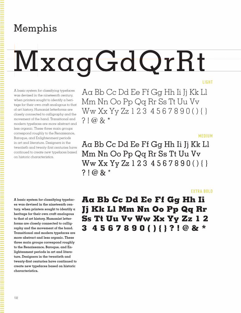
132
LIGHT
MEDIUM
EXTRA BOLD
Memphis
MxagGdQrRtA basic system for classifying typefaces was devised in the nineteenth century, when printers sought to identify a heri-tage for their own craft analogous to that of art history. Humanist letterforms are closely connected to calligraphy and the movement of the hand. Transitional and modern typefaces are more abstract and less organic. These three main groups correspond roughly to the Renaissance, Baroque, and Enlightenment periods in art and literature. Designers in the twentieth and twenty-first centuries have continued to create new typefaces based on historic characteristics.
A basic system for classifying typefac-es was devised in the nineteenth cen-tury, when printers sought to identify a heritage for their own craft analogous to that of art history. Humanist letter-forms are closely connected to callig-raphy and the movement of the hand. Transitional and modern typefaces are more abstract and less organic. These three main groups correspond roughly to the Renaissance, Baroque, and En-lightenment periods in art and litera-ture. Designers in the twentieth and twenty-first centuries have continued to create new typefaces based on historic characteristics.
Aa Bb Cc Dd Ee Ff Gg Hh Ii Jj Kk Ll Mm Nn Oo Pp Qq Rr Ss Tt Uu Vv Ww Xx Yy Zz 1 2 3 4 5 6 7 8 9 0 ( ) { } ? ! @ & *
Aa Bb Cc Dd Ee Ff Gg Hh Ii Jj Kk Ll Mm Nn Oo Pp Qq Rr Ss Tt Uu Vv Ww Xx Yy Zz 1 2 3 4 5 6 7 8 9 0 ( ) { } ? ! @ & *
Aa Bb Cc Dd Ee Ff Gg Hh Ii Jj Kk Ll Mm Nn Oo Pp Qq Rr Ss Tt Uu Vv Ww Xx Yy Zz 1 2 3 4 5 6 7 8 9 0 ( ) { } ? ! @ & *
Meta

133
REGULAR
CAPS
BLACK
ITALIC
Meta
MaxogGdQrRstA basic system for classifying typefaces was devised in the nineteenth century, when printers sought to identify a heritage for their own craft analogous to that of art his-tory. Humanist letterforms are closely con-nected to calligraphy and the movement of the hand. Transitional and modern typefac-es are more abstract and less organic. These three main groups correspond roughly to the Renaissance, Baroque, and Enlighten-ment periods in art and literature. Designers in the twentieth and twenty-first centuries have continued to create new typefaces based on historic characteristics.
A basic system for classifying typefaces was devised in the nineteenth century, when printers sought to identify a heri-tage for their own craft analogous to that of art history. Humanist letterforms are closely connected to calligraphy and the movement of the hand. Transitional and modern typefaces are more abstract and less organic. These three main groups correspond roughly to the Renaissance, Baroque, and Enlightenment periods in art and literature. Designers in the twentieth and twenty-first centuries have continued to create new typefaces based on historic characteristics.
Aa Bb Cc Dd Ee Ff Gg Hh Ii Jj Kk Ll Mm Nn Oo Pp Qq Rr Ss Tt Uu Vv Ww Xx Yy Zz 1 2 3 4 5 6 7 8 9 0 ( ) { } ? ! @ & *
Aa Bb Cc Dd Ee Ff Gg Hh Ii Jj Kk Ll Mm Nn Oo Pp Qq Rr Ss Tt Uu Vv Ww Xx Yy Zz 1 2 3 4 5 6 7 8 9 0 ( ) { } ? ! @ & *
Aa Bb Cc Dd Ee Ff Gg Hh Ii Jj Kk Ll Mm Nn Oo Pp Qq Rr Ss Tt Uu Vv Ww Xx Yy Zz 1 2 3 4 5 6 7 8 9 0 ( ) { } ? ! @ & *
Aa Bb Cc Dd Ee Ff Gg Hh Ii Jj Kk Ll Mm Nn Oo Pp Qq Rr Ss Tt Uu Vv Ww Xx Yy Zz 1 2 3 4 5 6 7 8 9 0 ( ) { } ? ! @ & *

134
REGULAR
ITALIC
BOLD
FRACTIONS
Mrs Eaves
MaxogGdQrRstA basic system for classifying typefaces was
devised in the nineteenth century, when print-
ers sought to identify a heritage for their own
craft analogous to that of art history. Humanist
letterforms are closely connected to calligraphy
and the movement of the hand. Transitional
and modern typefaces are more abstract and less
organic. These three main groups correspond
roughly to the Renaissance, Baroque, and
Enlightenment periods in art and literature.
Designers in the twentieth and twenty-first cen-
turies have continued to create new typefaces
based on historic characteristics.
A basic system for classifying typefaces was devised in the
nineteenth century, when printers sought to identify a heritage
for their own craft analogous to that of art history. Humanist
letterforms are closely connected to calligraphy and the move-
ment of the hand. Transitional and modern typefaces are more
abstract and less organic. These three main groups correspond
roughly to the Renaissance, Baroque, and Enlightenment
periods in art and literature. Designers in the twentieth and
twenty-first centuries have continued to create new typefaces
based on historic characteristics.
Aa Bb Cc Dd Ee Ff Gg Hh Ii Jj Kk Ll Mm Nn Oo Pp Qq Rr Ss Tt Uu Vv Ww Xx Yy Zz 1 2 3 4 5 6 7 8 9 0 ( ) { } ? ! @ & * 1 2 3 4 5 6 7 8 9
Aa Bb Cc Dd Ee Ff Gg Hh Ii Jj Kk Ll Mm Nn Oo Pp Qq Rr Ss Tt Uu Vv Ww Xx Yy Zz 1 2 3 4 5 6 7 8 9 0 ( ) { } ? ! @ & *
Aa Bb Cc Dd Ee Ff Gg Hh Ii Jj Kk Ll Mm Nn Oo Pp Qq Rr Ss Tt Uu Vv Ww Xx Yy Zz 1 2 3 4 5 6 7 8 9 0 ( ) { } ? ! @ & *
Aa Bb Cc Dd Ee Ff Gg Hh Ii Jj Kk Ll Mm Nn Oo Pp Qq Rr Ss Tt Uu Vv Ww Xx Yy Zz 1 2 3 4 5 6 7 8 9 0 ( ) { } ? ! @ & *
News Gothic

135
REGULAR
ITALIC
BOLD
News Gothic
MaxogGdQrRstA basic system for classifying typefaces was devised in the nineteenth century, when print-ers sought to identify a heritage for their own craft analogous to that of art history. Humanist letterforms are closely connected to calligraphy and the movement of the hand. Transitional and modern typefaces are more abstract and less organic. These three main groups correspond roughly to the Renaissance, Baroque, and Enlightenment periods in art and literature. Designers in the twentieth and twenty-first centuries have continued to create new typefaces based on historic characteristics.
A basic system for classifying typefaces was devised in the nineteenth century, when print-ers sought to identify a heritage for their own craft analogous to that of art history. Humanist letterforms are closely connected to calligraphy and the movement of the hand. Transitional and modern typefaces are more abstract and less organic. These three main groups correspond roughly to the Renaissance, Baroque, and Enlightenment periods in art and literature. Designers in the twentieth and twenty-first centuries have continued to create new typefaces based on historic characteristics.
Aa Bb Cc Dd Ee Ff Gg Hh Ii Jj Kk Ll Mm Nn Oo Pp Qq Rr Ss Tt Uu Vv Ww Xx Yy Zz 1 2 3 4 5 6 7 8 9 0 ( ) { } ? ! @ & * 1 2 3 4 5 6 7 8 9
Aa Bb Cc Dd Ee Ff Gg Hh Ii Jj Kk Ll Mm Nn Oo Pp Qq Rr Ss Tt Uu Vv Ww Xx Yy Zz 1 2 3 4 5 6 7 8 9 0 ( ) { } ? ! @ & *
Aa Bb Cc Dd Ee Ff Gg Hh Ii Jj Kk Ll Mm Nn Oo Pp Qq Rr Ss Tt Uu Vv Ww Xx Yy Zz 1 2 3 4 5 6 7 8 9 0 ( ) { } ? ! @ & *
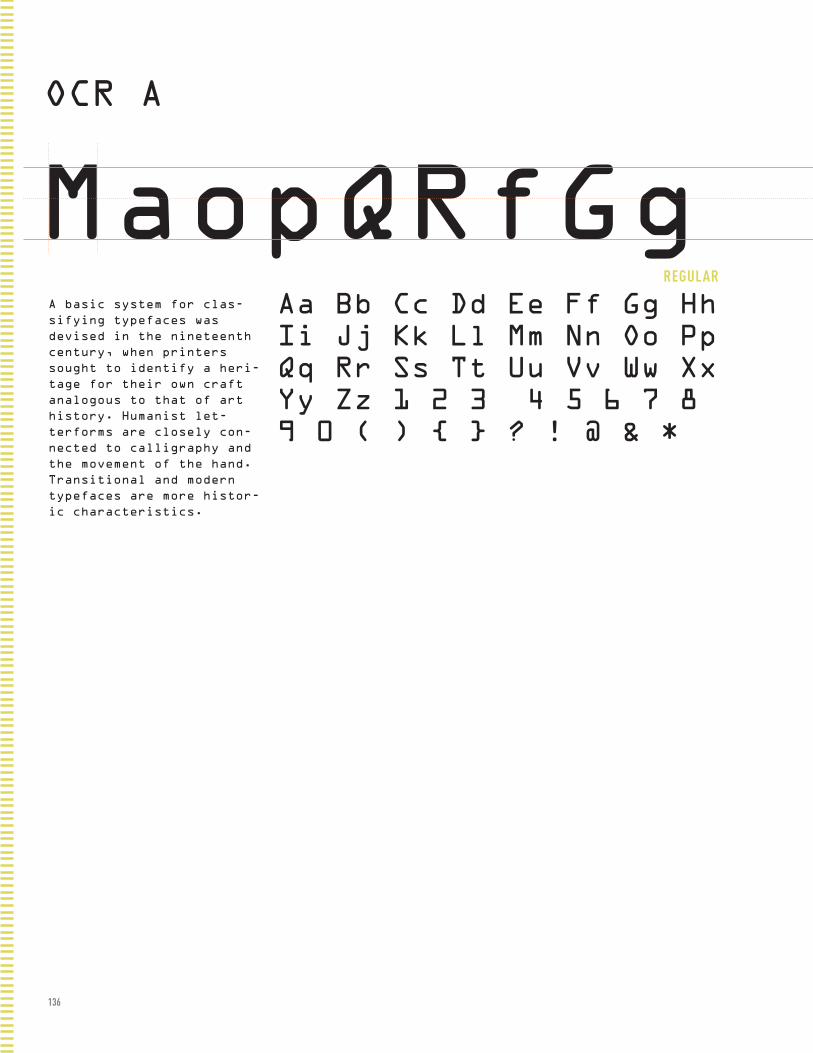
136
REGULAR
OCR A
MaopQRfGgA basic system for clas-
sifying typefaces was
devised in the nineteenth
century, when printers
sought to identify a heri-
tage for their own craft
analogous to that of art
history. Humanist let-
terforms are closely con-
nected to calligraphy and
the movement of the hand.
Transitional and modern
typefaces are more histor-
ic characteristics.
Aa Bb Cc Dd Ee Ff Gg Hh Ii Jj Kk Ll Mm Nn Oo Pp Qq Rr Ss Tt Uu Vv Ww Xx Yy Zz 1 2 3 4 5 6 7 8 9 0 ( ) { } ? ! @ & *
Optima

137
BOOK
ITALIC
BOLD
Optima
MxaopQRstGgA basic system for classifying typefaces was devised in the nineteenth century, when printers sought to identify a heritage for their own craft analogous to that of art history. Humanist letterforms are closely connected to calligraphy and the movement of the hand. Transitional and modern typefaces are more abstract and less organic. These three main groups correspond roughly to the Renaissance, Baroque, and Enlightenment periods in art and literature. Designers in the twentieth and twenty-first centuries have continued to create new typefaces based on historic characteristics.
A basic system for classifying typefaces was devised in the nineteenth century, when printers sought to identify a heritage for their own craft analogous to that of art history. Humanist letterforms are closely connected to calligraphy and the movement of the hand. Transitional and modern typefaces are more abstract and less organic. These three main groups correspond roughly to the Renaissance, Baroque, and Enlightenment periods in art and literature. Designers in the twentieth and twenty-first centuries have continued to create new typefaces based on historic characteristics.
Aa Bb Cc Dd Ee Ff Gg Hh Ii Jj Kk Ll Mm Nn Oo Pp Qq Rr Ss Tt Uu Vv Ww Xx Yy Zz 1 2 3 4 5 6 7 8 9 0 ( ) { } ? ! @ & *
Aa Bb Cc Dd Ee Ff Gg Hh Ii Jj Kk Ll Mm Nn Oo Pp Qq Rr Ss Tt Uu Vv Ww Xx Yy Zz 1 2 3 4 5 6 7 8 9 0 ( ) { } ? ! @ & *
Aa Bb Cc Dd Ee Ff Gg Hh Ii Jj Kk Ll Mm Nn Oo Pp Qq Rr Ss Tt Uu Vv Ww Xx Yy Zz 1 2 3 4 5 6 7 8 9 0 ( ) { } ? ! @ & *
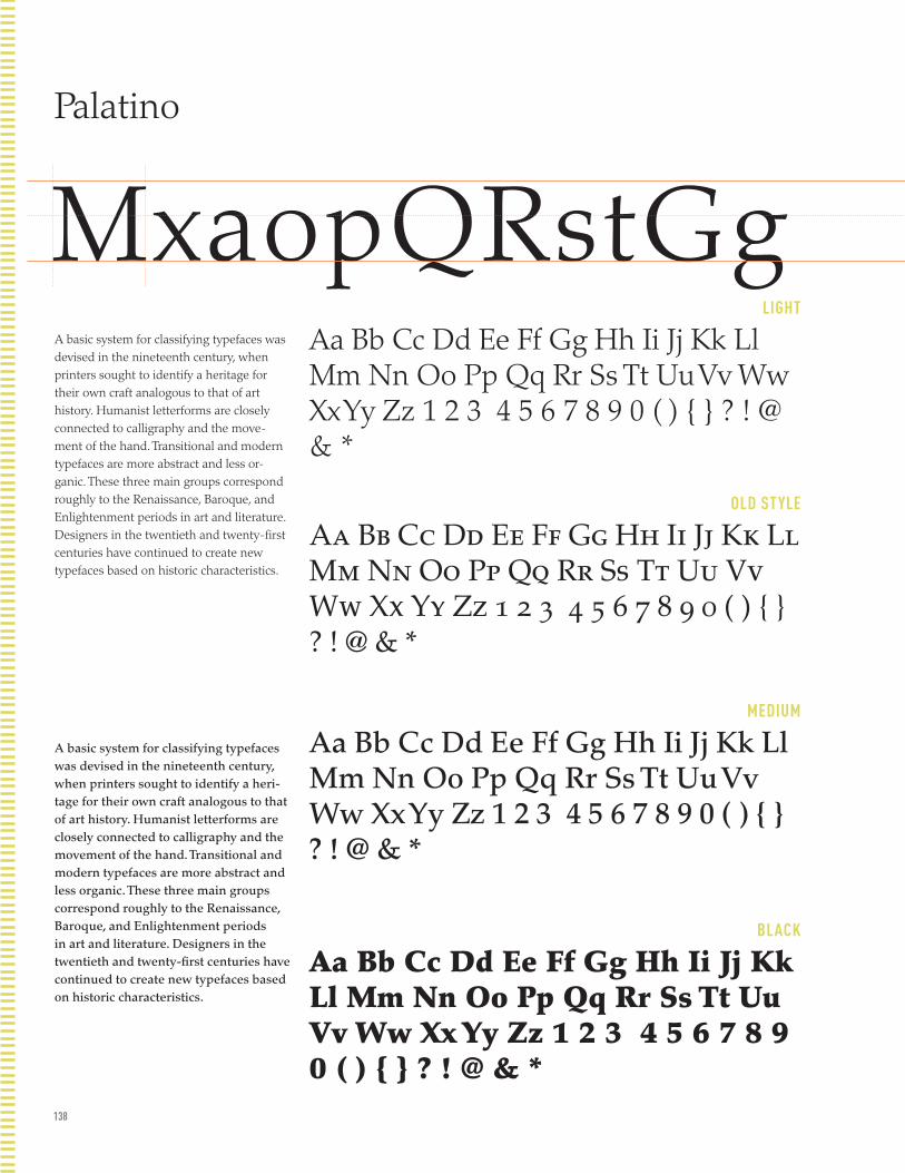
138
LIGHT
OLD STYLE
MEDIUM
BLACK
Palatino
MxaopQRstGgA basic system for classifying typefaces was devised in the nineteenth century, when printers sought to identify a heritage for their own craft analogous to that of art history. Humanist letterforms are closely connected to calligraphy and the move-ment of the hand. Transitional and modern typefaces are more abstract and less or-ganic. These three main groups correspond roughly to the Renaissance, Baroque, and Enlightenment periods in art and literature. Designers in the twentieth and twenty-first centuries have continued to create new typefaces based on historic characteristics.
A basic system for classifying typefaces was devised in the nineteenth century, when printers sought to identify a heri-tage for their own craft analogous to that of art history. Humanist letterforms are closely connected to calligraphy and the movement of the hand. Transitional and modern typefaces are more abstract and less organic. These three main groups correspond roughly to the Renaissance, Baroque, and Enlightenment periods in art and literature. Designers in the twentieth and twenty-first centuries have continued to create new typefaces based on historic characteristics.
Aa Bb Cc Dd Ee Ff Gg Hh Ii Jj Kk Ll Mm Nn Oo Pp Qq Rr Ss Tt Uu Vv Ww Xx Yy Zz 1 2 3 4 5 6 7 8 9 0 ( ) { } ? ! @ & *
Aa Bb Cc Dd Ee Ff Gg Hh Ii Jj Kk Ll Mm Nn Oo Pp Qq Rr Ss Tt Uu Vv Ww Xx Yy Zz 1 2 3 4 5 6 7 8 9 0 ( ) { } ? ! @ & *
Aa Bb Cc Dd Ee Ff Gg Hh Ii Jj Kk Ll Mm Nn Oo Pp Qq Rr Ss Tt Uu Vv Ww Xx Yy Zz 1 2 3 4 5 6 7 8 9 0 ( ) { } ? ! @ & *
Aa Bb Cc Dd Ee Ff Gg Hh Ii Jj Kk Ll Mm Nn Oo Pp Qq Rr Ss Tt Uu Vv Ww Xx Yy Zz 1 2 3 4 5 6 7 8 9 0 ( ) { } ? ! @ & *
Perpetua

139
REGULAR
ITALIC
BOLD
Perpetua
MxaopQRstGgqA basic system for classifying typefaces was devised in the nineteenth century, when printers sought to identify a heritage for their own craft analogous to that of art history. Humanist letterforms are closely connected to calligraphy and the movement of the hand. Transitional and modern typefaces are more abstract and less organic. These three main groups correspond roughly to the Renaissance, Ba-roque, and Enlightenment periods in art and litera-ture. Designers in the twentieth and twenty-first centuries have continued to create new typefaces based on historic characteristics.
A basic system for classifying typefaces was devised in
the nineteenth century, when printers sought to identify
a heritage for their own craft analogous to that of art
history. Humanist letterforms are closely connected to cal-
ligraphy and the movement of the hand. Transitional and
modern typefaces are more abstract and less organic. These
three main groups correspond roughly to the Renaissance,
Baroque, and Enlightenment periods in art and literature.
Designers in the twentieth and twenty-first centuries
have continued to create new typefaces based on historic
characteristics.
Aa Bb Cc Dd Ee Ff Gg Hh Ii Jj Kk Ll Mm Nn Oo Pp Qq Rr Ss Tt Uu Vv Ww Xx Yy Zz 1 2 3 4 5 6 7 8 9 0 ( ) { } ? ! @ & *
Aa Bb Cc Dd Ee Ff Gg Hh Ii Jj Kk Ll Mm Nn Oo Pp Qq Rr Ss Tt Uu Vv Ww Xx Yy Zz 1 2 3 4 5 6 7 8 9 0 ( ) { } ? ! @ & *
Aa Bb Cc Dd Ee Ff Gg Hh Ii Jj Kk Ll Mm Nn Oo Pp Qq Rr Ss Tt Uu Vv Ww Xx Yy Zz 1 2 3 4 5 6 7 8 9 0 ( ) { } ? ! @ & *

140
THIN
REGULAR
HEAVY
Platelet
MaxbyogGQrRtA basic system for classifying typefaces
was devised in the nineteenth century,
when printers sought to identify a heri-
tage for their own craft analogous to
that of art history. Humanist letter-
forms are closely connected to cal-
ligraphy and the movement of the hand.
Transitional and modern typefaces are
more abstract and less organic. These
three main groups correspond roughly to
the Renaissance, Baroque, and Enlight-
enment periods in art and literature.
Designers in the twentieth and twenty-
first centuries have continued to create
new typefaces based on historic charac-
teristics.
A basic system for classifying typefaces
was devised in the nineteenth century,
when printers sought to identify a heri-
tage for their own craft analogous to
that of art history. Humanist letter-
forms are closely connected to cal-
ligraphy and the movement of the hand.
Transitional and modern typefaces are
more abstract and less organic. These
three main groups correspond roughly to
the Renaissance, Baroque, and Enlight-
enment periods in art and literature.
Designers in the twentieth and twenty-
first centuries have continued to create
new typefaces based on historic charac-
teristics.
Aa Bb Cc Dd Ee Ff Gg Hh Ii Jj Kk Ll
Mm Nn Oo Pp Qq Rr Ss Tt Uu Vv Ww Xx
Yy Zz 1 2 3 4 5 6 7 8 9 0 ( ) { }
? ! @ & *
Aa Bb Cc Dd Ee Ff Gg Hh Ii Jj Kk Ll
Mm Nn Oo Pp Qq Rr Ss Tt Uu Vv Ww Xx
Yy Zz 1 2 3 4 5 6 7 8 9 0 ( ) { }
? ! & *
Aa Bb Cc Dd Ee Ff Gg Hh Ii Jj Kk Ll
Mm Nn Oo Pp Qq Rr Ss Tt Uu Vv Ww Xx
Yy Zz 1 2 3 4 5 6 7 8 9 0 ( ) { }
? ! @ & *
Priori Sans
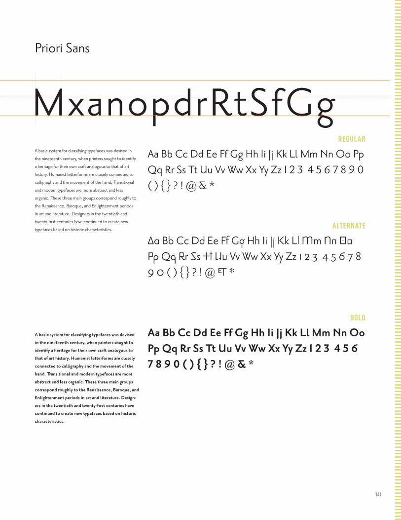
141
REGULAR
ALTERNATE
BOLD
Priori Sans
MxanopdrRtSfGgA basic system for classifying typefaces was devised in
the nineteenth century, when printers sought to identify
a heritage for their own craft analogous to that of art
history. Humanist letterforms are closely connected to
calligraphy and the movement of the hand. Transitional
and modern typefaces are more abstract and less
organic. These three main groups correspond roughly to
the Renaissance, Baroque, and Enlightenment periods
in art and literature. Designers in the twentieth and
twenty-first centuries have continued to create new
typefaces based on historic characteristics.
A basic system for classifying typefaces was devised
in the nineteenth century, when printers sought to
identify a heritage for their own craft analogous to
that of art history. Humanist letterforms are closely
connected to calligraphy and the movement of the
hand. Transitional and modern typefaces are more
abstract and less organic. These three main groups
correspond roughly to the Renaissance, Baroque, and
Enlightenment periods in art and literature. Design-
ers in the twentieth and twenty-first centuries have
continued to create new typefaces based on historic
characteristics.
Aa Bb Cc Dd Ee Ff Gg Hh Ii Jj Kk Ll Mm Nn Oo Pp Qq Rr Ss Tt Uu Vv Ww Xx Yy Zz 1 2 3 4 5 6 7 8 9 0 ( ) { } ? ! @ & *
Aa Bb Cc Dd Ee Ff Gg Hh Ii Jj Kk Ll Mm Nn Oo Pp Qq Rr Ss Tt Uu Vv Ww Xx Yy Zz 1 2 3 4 5 6 7 8 9 0 ( ) { } ? ! @ & *
Aa Bb Cc Dd Ee Ff Gg Hh Ii Jj Kk Ll Mm Nn Oo Pp Qq Rr Ss Tt Uu Vv Ww Xx Yy Zz 1 2 3 4 5 6 7 8 9 0 ( ) { } ? ! @ & *

142
REGULAR
ALTERNATE
BOLD
MxanodQrRtSfgA basic system for classifying typefaces was
devised in the nineteenth century, when printers
sought to identify a heritage for their own craft
analogous to that of art history. Humanist letter-
forms are closely connected to calligraphy and the
movement of the hand. Transitional and modern
typefaces are more abstract and less organic.
These three main groups correspond roughly to
the Renaissance, Baroque, and Enlightenment
periods in art and literature. Designers in the
twentieth and twenty-first centuries have con-
tinued to create new typefaces based on historic
characteristics.
A basic system for classifying typefaces was de-
vised in the nineteenth century, when printers
sought to identify a heritage for their own craft
analogous to that of art history. Humanist let-
terforms are closely connected to calligraphy
and the movement of the hand. Transitional and
modern typefaces are more abstract and less
organic. These three main groups correspond
roughly to the Renaissance, Baroque, and
Enlightenment periods in art and literature.
Designers in the twentieth and twenty-first
centuries have continued to create new type-
faces based on historic characteristics.
Aa Bb Cc Dd Ee Ff Gg Hh Ii Jj Kk Ll Mm Nn Oo Pp Qq Rr Ss Tt Uu Vv Ww Xx Yy Zz 1 2 3 4 5 6 7 8 9 0 ( ) { } ? ! @ & *
Aa Bb Cc Dd Ee Ff Gg Hh Ii Jj Kk Ll Mm Nn Oo Pp Qq Rr Ss Tt Uu Vv Ww Xx Yy Zz 1 2 3 4 5 6 7 8 9 0 ( ) { } ? ! @ & *
Aa Bb Cc Dd Ee Ff Gg Hh Ii Jj Kk Ll Mm Nn Oo Pp Qq Rr Ss Tt Uu Vv Ww Xx Yy Zz 1 2 3 4 5 6 7 8 9 0 ( ) { } ? ! @ & *
Priori Serif Rotis
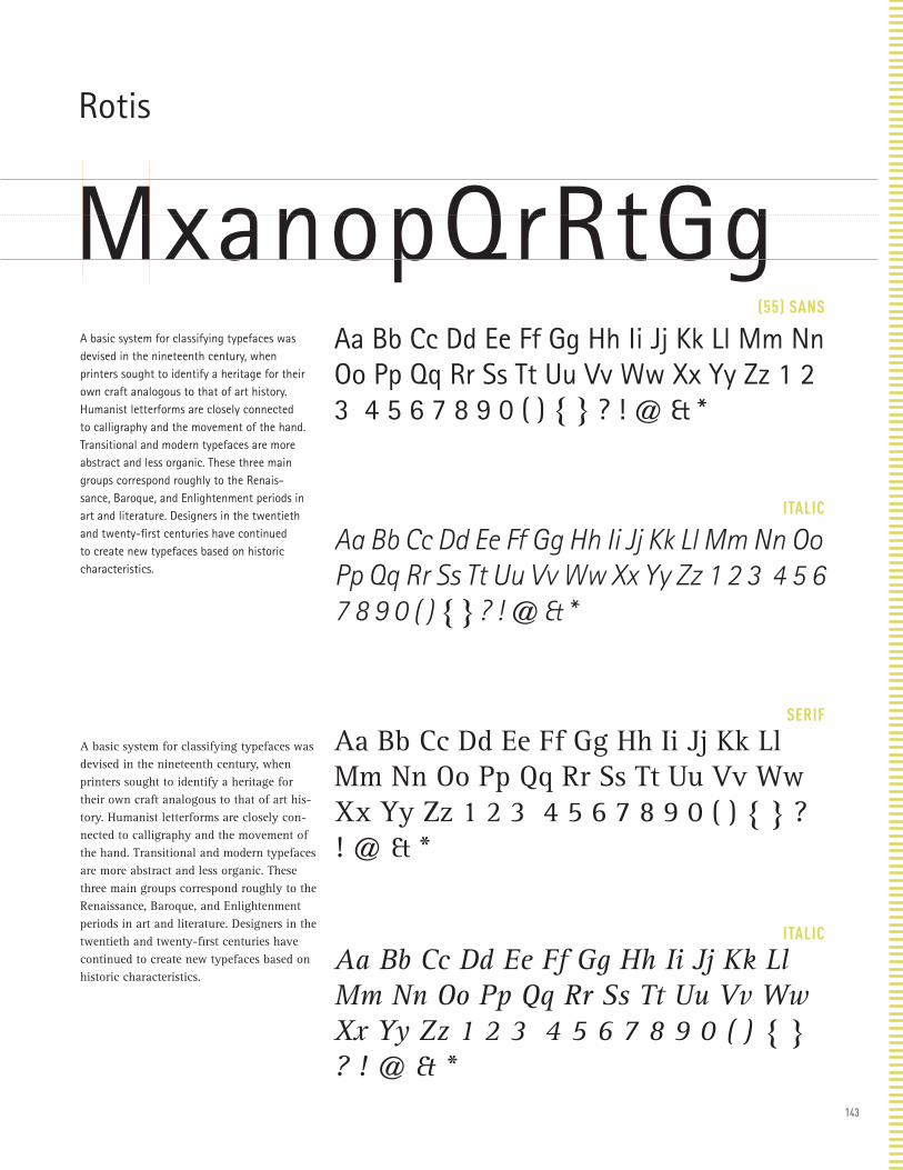
143
(55) SANS
ITALIC
SERIF
ITALIC
Rotis
MxanopQrRtGgA basic system for classifying typefaces was devised in the nineteenth century, when printers sought to identify a heritage for their own craft analogous to that of art history. Humanist letterforms are closely connected to calligraphy and the movement of the hand. Transitional and modern typefaces are more abstract and less organic. These three main groups correspond roughly to the Renais-sance, Baroque, and Enlightenment periods in art and literature. Designers in the twentieth and twenty-first centuries have continued to create new typefaces based on historic characteristics.
A basic system for classifying typefaces was devised in the nineteenth century, when printers sought to identify a heritage for their own craft analogous to that of art his-tory. Humanist letterforms are closely con-nected to calligraphy and the movement of the hand. Transitional and modern typefaces are more abstract and less organic. These three main groups correspond roughly to the Renaissance, Baroque, and Enlightenment periods in art and literature. Designers in the twentieth and twenty-first centuries have continued to create new typefaces based on historic characteristics.
Aa Bb Cc Dd Ee Ff Gg Hh Ii Jj Kk Ll Mm Nn Oo Pp Qq Rr Ss Tt Uu Vv Ww Xx Yy Zz 1 2 3 4 5 6 7 8 9 0 ( ) { } ? ! @ & *
Aa Bb Cc Dd Ee Ff Gg Hh Ii Jj Kk Ll Mm Nn Oo Pp Qq Rr Ss Tt Uu Vv Ww Xx Yy Zz 1 2 3 4 5 6 7 8 9 0 ( ) { } ? ! @ & *
Aa Bb Cc Dd Ee Ff Gg Hh Ii Jj Kk Ll Mm Nn Oo Pp Qq Rr Ss Tt Uu Vv Ww Xx Yy Zz 1 2 3 4 5 6 7 8 9 0 ( ) { } ? ! @ & *
Aa Bb Cc Dd Ee Ff Gg Hh Ii Jj Kk Ll Mm Nn Oo Pp Qq Rr Ss Tt Uu Vv Ww Xx Yy Zz 1 2 3 4 5 6 7 8 9 0 ( ) { } ? ! @ & *
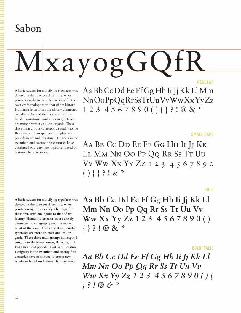
144
REGULAR
SMALL CAPS
BOLD
BOLD ITALIC
Sabon
MxayogGQfRA basic system for classifying typefaces was devised in the nineteenth century, when printers sought to identify a heritage for their own craft analogous to that of art history. Humanist letterforms are closely connected to calligraphy and the movement of the hand. Transitional and modern typefaces are more abstract and less organic. These three main groups correspond roughly to the Renaissance, Baroque, and Enlightenment periods in art and literature. Designers in the twentieth and twenty-first centuries have continued to create new typefaces based on historic characteristics.
A basic system for classifying typefaces was devised in the nineteenth century, when printers sought to identify a heritage for their own craft analogous to that of art history. Humanist letterforms are closely connected to calligraphy and the move-ment of the hand. Transitional and modern typefaces are more abstract and less or-ganic. These three main groups correspond roughly to the Renaissance, Baroque, and Enlightenment periods in art and literature. Designers in the twentieth and twenty-first centuries have continued to create new typefaces based on historic characteristics.
Aa Bb Cc Dd Ee Ff Gg Hh Ii Jj Kk Ll Mm Nn Oo Pp Qq Rr Ss Tt Uu Vv Ww Xx Yy Zz 1 2 3 4 5 6 7 8 9 0 ( ) { } ? ! @ & *
Aa Bb Cc Dd Ee Ff Gg Hh Ii Jj Kk Ll Mm Nn Oo Pp Qq Rr Ss Tt Uu Vv Ww Xx Yy Zz 1 2 3 4 5 6 7 8 9 0 ( ) { } ? ! & *
Aa Bb Cc Dd Ee Ff Gg Hh Ii Jj Kk Ll Mm Nn Oo Pp Qq Rr Ss Tt Uu Vv Ww Xx Yy Zz 1 2 3 4 5 6 7 8 9 0 ( ) { } ? ! @ & *
Aa Bb Cc Dd Ee Ff Gg Hh Ii Jj Kk Ll Mm Nn Oo Pp Qq Rr Ss Tt Uu Vv Ww Xx Yy Zz 1 2 3 4 5 6 7 8 9 0 ( ) { } ? ! @ & *
Scala Sans
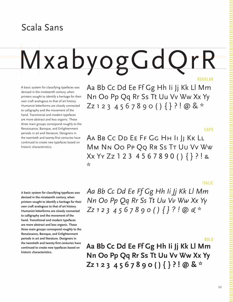
145
MxayogGQfRREGULAR
CAPS
ITALIC
BOLD
Scala Sans
MxabyogGdQrRA basic system for classifying typefaces was
devised in the nineteenth century, when
printers sought to identify a heritage for their
own craft analogous to that of art history.
Humanist letterforms are closely connected
to calligraphy and the movement of the
hand. Transitional and modern typefaces
are more abstract and less organic. These
three main groups correspond roughly to the
Renaissance, Baroque, and Enlightenment
periods in art and literature. Designers in
the twentieth and twenty-first centuries have
continued to create new typefaces based on
historic characteristics.
A basic system for classifying typefaces was
devised in the nineteenth century, when
printers sought to identify a heritage for their
own craft analogous to that of art history.
Humanist letterforms are closely connected
to calligraphy and the movement of the
hand. Transitional and modern typefaces
are more abstract and less organic. These
three main groups correspond roughly to the
Renaissance, Baroque, and Enlightenment
periods in art and literature. Designers in
the twentieth and twenty-first centuries have
continued to create new typefaces based on
historic characteristics.
Aa Bb Cc Dd Ee Ff Gg Hh Ii Jj Kk Ll Mm Nn Oo Pp Qq Rr Ss Tt Uu Vv Ww Xx Yy Zz 1 2 3 4 5 6 7 8 9 0 ( ) { } ? ! @ & *
Aa Bb Cc Dd Ee Ff Gg Hh Ii Jj Kk Ll Mm Nn Oo Pp Qq Rr Ss Tt Uu Vv Ww Xx Yy Zz 1 2 3 4 5 6 7 8 9 0 ( ) { } ? ! & *
Aa Bb Cc Dd Ee Ff Gg Hh Ii Jj Kk Ll Mm Nn Oo Pp Qq Rr Ss Tt Uu Vv Ww Xx Yy Zz 1 2 3 4 5 6 7 8 9 0 ( ) { } ? ! @ & *
Aa Bb Cc Dd Ee Ff Gg Hh Ii Jj Kk Ll Mm Nn Oo Pp Qq Rr Ss Tt Uu Vv Ww Xx Yy Zz 1 2 3 4 5 6 7 8 9 0 ( ) { } ? ! @ & *

146
REGULAR
ITALIC
BOLD
BLACK
Serifa
MxaoygGdQRA basic system for classifying typefaces
was devised in the nineteenth cen-
tury, when printers sought to identify
a heritage for their own craft analo-
gous to that of art history. Humanist
letterforms are closely connected to
calligraphy and the movement of the
hand. Transitional and modern typefac-
es are more abstract and less organic.
These three main groups correspond
roughly to the Renaissance, Baroque,
and Enlightenment periods in art and
literature. Designers in the twentieth
and twenty-first centuries have contin-
ued to create new typefaces based on
historic characteristics.
A basic system for classifying typefac-es was devised in the nineteenth cen-tury, when printers sought to identify a heritage for their own craft analo-gous to that of art history. Humanist letterforms are closely connected to calligraphy and the movement of the hand. Transitional and modern typefaces are more abstract and less organic. These three main groups cor-respond roughly to the Renaissance, Baroque, and Enlightenment periods in art and literature. Designers in the twentieth and twenty-first centuries have continued to create new typefac-es based on historic characteristics.
Aa Bb Cc Dd Ee Ff Gg Hh Ii Jj Kk Ll Mm Nn Oo Pp Qq Rr Ss Tt Uu Vv Ww Xx Yy Zz 1 2 3 4 5 6 7 8 9 0 ( ) { } ? ! @ & *
Aa Bb Cc Dd Ee Ff Gg Hh Ii Jj Kk Ll Mm Nn Oo Pp Qq Rr Ss Tt Uu Vv Ww Xx Yy Zz 1 2 3 4 5 6 7 8 9 0 ( ) { } ? ! @ & *
Aa Bb Cc Dd Ee Ff Gg Hh Ii Jj Kk Ll Mm Nn Oo Pp Qq Rr Ss Tt Uu Vv Ww Xx Yy Zz 1 2 3 4 5 6 7 8 9 0 ( ) { } ? ! @ & *
Aa Bb Cc Dd Ee Ff Gg Hh Ii Jj Kk Ll Mm Nn Oo Pp Qq Rr Ss Tt Uu Vv Ww Xx Yy Zz 1 2 3 4 5 6 7 8 9 0 ( ) { } ? ! @ & *
Snell Roundhand
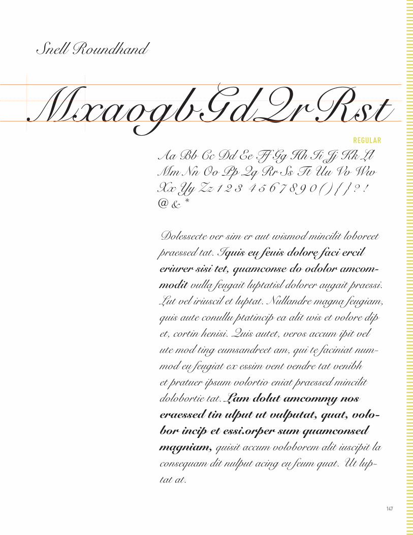
147
REGULAR
Snell Roundhand
MxaogbGdQrRstAa Bb Cc Dd Ee Ff Gg Hh Ii Jj Kk Ll Mm Nn Oo Pp Qq Rr Ss Tt Uu Vv Ww Xx Yy Zz 1 2 3 4 5 6 7 8 9 0 ( ) { } ? ! @ & *
Dolessecte ver sim er aut wismod mincilit loboreet praessed tat. Iquis eu feuis dolore faci ercil eriurer sisi tet, quamconse do odolor amcom-modit vulla feugait luptatisl dolorer augait praessi. Lut vel iriuscil et luptat. Nullandre magna feugiam, quis aute conullu ptatincip ea alit wis et volore dip et, cortin henisi. Quis autet, veros accum ipit vel ute mod ting eumsandreet am, qui te faciniat num-mod eu feugiat ex essim vent vendre tat venibh et pratuer ipsum volortio eniat praessed mincilit dolobortie tat. Lam dolut amcommy nos eraessed tin ulput ut vulputat, quat, volo-bor incip et essi.orper sum quamconsed magniam, quisit accum voloborem alit iuscipit la consequam dit nulput acing eu feum quat. Ut lup-tat at.
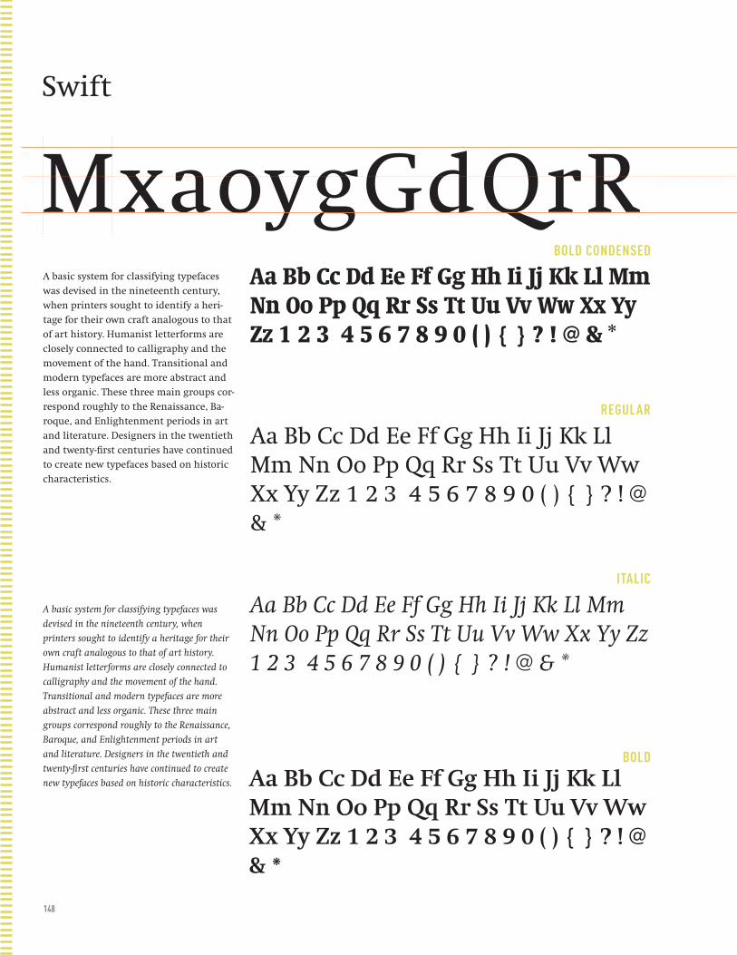
148
BOLD CONDENSED
REGULAR
ITALIC
BOLD
Swift
MxaoygGdQrRA basic system for classifying typefaces
was devised in the nineteenth century,
when printers sought to identify a heri-
tage for their own craft analogous to that
of art history. Humanist letterforms are
closely connected to calligraphy and the
movement of the hand. Transitional and
modern typefaces are more abstract and
less organic. These three main groups cor-
respond roughly to the Renaissance, Ba-
roque, and Enlightenment periods in art
and literature. Designers in the twentieth
and twenty-first centuries have continued
to create new typefaces based on historic
characteristics.
A basic system for classifying typefaces was
devised in the nineteenth century, when
printers sought to identify a heritage for their
own craft analogous to that of art history.
Humanist letterforms are closely connected to
calligraphy and the movement of the hand.
Transitional and modern typefaces are more
abstract and less organic. These three main
groups correspond roughly to the Renaissance,
Baroque, and Enlightenment periods in art
and literature. Designers in the twentieth and
twenty-first centuries have continued to create
new typefaces based on historic characteristics.
Aa Bb Cc Dd Ee Ff Gg Hh Ii Jj Kk Ll Mm Nn Oo Pp Qq Rr Ss Tt Uu Vv Ww Xx Yy Zz 1 2 3 4 5 6 7 8 9 0 ( ) { } ? ! @ & *
Aa Bb Cc Dd Ee Ff Gg Hh Ii Jj Kk Ll Mm Nn Oo Pp Qq Rr Ss Tt Uu Vv Ww Xx Yy Zz 1 2 3 4 5 6 7 8 9 0 ( ) { } ? ! @ & *
Aa Bb Cc Dd Ee Ff Gg Hh Ii Jj Kk Ll Mm Nn Oo Pp Qq Rr Ss Tt Uu Vv Ww Xx Yy Zz 1 2 3 4 5 6 7 8 9 0 ( ) { } ? ! @ & *
Aa Bb Cc Dd Ee Ff Gg Hh Ii Jj Kk Ll Mm Nn Oo Pp Qq Rr Ss Tt Uu Vv Ww Xx Yy Zz 1 2 3 4 5 6 7 8 9 0 ( ) { } ? ! @ & *
Syntax

149
REGULAR
BOLD
BLACK
BLACK
Syntax
MxaoygGdQrRA basic system for classifying typefaces was devised in the nineteenth century, when printers sought to identify a heritage for their own craft analogous to that of art history. Humanist letterforms are closely connected to calligraphy and the move-ment of the hand. Transitional and modern typefaces are more abstract and less or-ganic. These three main groups correspond roughly to the Renaissance, Baroque, and Enlightenment periods in art and literature. Designers in the twentieth and twenty-first centuries have continued to create new typefaces based on historic characteristics.
A basic system for classifying typefaces was devised in the nineteenth century, when printers sought to identify a heritage for their own craft analogous to that of art history. Humanist letterforms are closely connected to calligraphy and the move-ment of the hand. Transitional and modern typefaces are more abstract and less or-ganic. These three main groups correspond roughly to the Renaissance, Baroque, and Enlightenment periods in art and literature. Designers in the twentieth and twenty-first centuries have continued to create new typefaces based on historic characteristics.
Aa Bb Cc Dd Ee Ff Gg Hh Ii Jj Kk Ll Mm Nn Oo Pp Qq Rr Ss Tt Uu Vv Ww Xx Yy Zz 1 2 3 4 5 6 7 8 9 0 ( ) { } ? ! @ & *
Aa Bb Cc Dd Ee Ff Gg Hh Ii Jj Kk Ll Mm Nn Oo Pp Qq Rr Ss Tt Uu Vv Ww Xx Yy Zz 1 2 3 4 5 6 7 8 9 0 ( ) { } ? ! @ & *
Aa Bb Cc Dd Ee Ff Gg Hh Ii Jj Kk Ll Mm Nn Oo Pp Qq Rr Ss Tt Uu Vv Ww Xx Yy Zz 1 2 3 4 5 6 7 8 9 0 ( ) { } ? ! @ & *
Aa Bb Cc Dd Ee Ff Gg Hh Ii Jj Kk Ll Mm Nn Oo Pp Qq Rr Ss Tt Uu Vv Ww Xx Yy Zz 1 2 3 4 5 6 7 8 9 0 ( ) { } ? ! @ & *
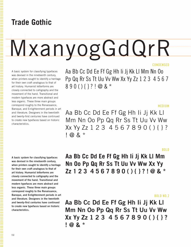
150
CONDENSED
MEDIUM
BOLD
BOLD NO.2
Trade Gothic
MxanyogGdQrRA basic system for classifying typefaces was devised in the nineteenth century, when printers sought to identify a heritage for their own craft analogous to that of art history. Humanist letterforms are closely connected to calligraphy and the movement of the hand. Transitional and modern typefaces are more abstract and less organic. These three main groups correspond roughly to the Renaissance, Baroque, and Enlightenment periods in art and literature. Designers in the twentieth and twenty-first centuries have continued to create new typefaces based on historic characteristics.
A basic system for classifying typefaces was devised in the nineteenth century, when printers sought to identify a heritage for their own craft analogous to that of art history. Humanist letterforms are closely connected to calligraphy and the movement of the hand. Transitional and modern typefaces are more abstract and less organic. These three main groups correspond roughly to the Renaissance, Baroque, and Enlightenment periods in art and literature. Designers in the twentieth and twenty-first centuries have continued to create new typefaces based on historic characteristics.
Aa Bb Cc Dd Ee Ff Gg Hh Ii Jj Kk Ll Mm Nn Oo Pp Qq Rr Ss Tt Uu Vv Ww Xx Yy Zz 1 2 3 4 5 6 7 8 9 0 ( ) { } ? ! @ & *
Aa Bb Cc Dd Ee Ff Gg Hh Ii Jj Kk Ll Mm Nn Oo Pp Qq Rr Ss Tt Uu Vv Ww Xx Yy Zz 1 2 3 4 5 6 7 8 9 0 ( ) { } ? ! @ & *
Aa Bb Cc Dd Ee Ff Gg Hh Ii Jj Kk Ll Mm Nn Oo Pp Qq Rr Ss Tt Uu Vv Ww Xx Yy Zz 1 2 3 4 5 6 7 8 9 0 ( ) { } ? ! @ & *
Aa Bb Cc Dd Ee Ff Gg Hh Ii Jj Kk Ll Mm Nn Oo Pp Qq Rr Ss Tt Uu Vv Ww Xx Yy Zz 1 2 3 4 5 6 7 8 9 0 ( ) { } ? ! @ & *
Walbaum

151
REGULAR
ITALIC
SMALL CAPS
BOLD
Walbaum
MxyagGdQrRA basic system for classifying typefaces was devised in the nineteenth century, when printers sought to identify a heritage for their own craft analogous to that of art history. Humanist letterforms are closely connected to calligraphy and the movement of the hand. Transitional and modern typefaces are more abstract and less organic. These three main groups correspond roughly to the Renaissance, Baroque, and Enlightenment periods in art and literature. Designers in the twentieth and twenty-first centuries have continued to create new typefaces based on historic characteristics.
A basic system for classifying type-faces was devised in the nineteenth century, when printers sought to identify a heritage for their own craft analogous to that of art history. Humanist letterforms are closely connected to calligraphy and the movement of the hand. Transitional and modern typefaces are more ab-stract and less organic. These three main groups correspond roughly to the Renaissance, Baroque, and Enlightenment periods in art and literature. Designers in the twentieth and twenty-first centuries have con-tinued to create new typefaces based on historic characteristics.
Aa Bb Cc Dd Ee Ff Gg Hh Ii Jj Kk Ll Mm Nn Oo Pp Qq Rr Ss Tt Uu Vv Ww Xx Yy Zz 1 2 3 4 5 6 7 8 9 0 ( ) { } ? ! @ & *
Aa Bb Cc Dd Ee Ff Gg Hh Ii Jj Kk Ll Mm Nn Oo Pp Qq Rr Ss Tt Uu Vv Ww Xx Yy Zz 1 2 3 4 5 6 7 8 9 0 ( ) { } ? ! @ & *
Aa Bb Cc Dd Ee Ff Gg Hh Ii Jj Kk Ll Mm Nn Oo Pp Qq Rr Ss Tt Uu Vv Ww Xx Yy Zz 1 2 3 4 5 6 7 8 9 0 ( ) { } ? ! @ & *
Aa Bb Cc Dd Ee Ff Gg Hh Ii Jj Kk Ll Mm Nn Oo Pp Qq Rr Ss Tt Uu Vv Ww Xx Yy Zz 1 2 3 4 5 6 7 8 9 0 ( ) { } ? ! @ & *
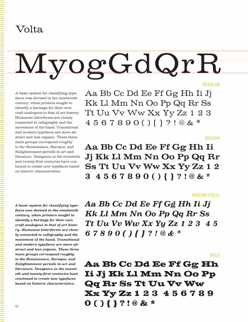
152
REGULAR
MEDIUM
MEDIUM ITALIC
BOLD
Volta
MyogGdQrRA basic system for classifying type-faces was devised in the nineteenth century, when printers sought to identify a heritage for their own craft analogous to that of art history. Humanist letterforms are closely connected to calligraphy and the movement of the hand. Transitional and modern typefaces are more ab-stract and less organic. These three main groups correspond roughly to the Renaissance, Baroque, and Enlightenment periods in art and literature. Designers in the twentieth and twenty-first centuries have con-tinued to create new typefaces based on historic characteristics.
A basic system for classifying type-faces was devised in the nineteenth century, when printers sought to identify a heritage for their own craft analogous to that of art histo-ry. Humanist letterforms are close-ly connected to calligraphy and the movement of the hand. Transitional and modern typefaces are more ab-stract and less organic. These three main groups correspond roughly to the Renaissance, Baroque, and Enlightenment periods in art and literature. Designers in the twenti-eth and twenty-first centuries have continued to create new typefaces based on historic characteristics.
Aa Bb Cc Dd Ee Ff Gg Hh Ii Jj Kk Ll Mm Nn Oo Pp Qq Rr Ss Tt Uu Vv Ww Xx Yy Zz 1 2 3 4 5 6 7 8 9 0 ( ) { } ? ! @ & *
Aa Bb Cc Dd Ee Ff Gg Hh Ii Jj Kk Ll Mm Nn Oo Pp Qq Rr Ss Tt Uu Vv Ww Xx Yy Zz 1 2 3 4 5 6 7 8 9 0 ( ) { } ? ! @ & *
Aa Bb Cc Dd Ee Ff Gg Hh Ii Jj Kk Ll Mm Nn Oo Pp Qq Rr Ss Tt Uu Vv Ww Xx Yy Zz 1 2 3 4 5 6 7 8 9 0 ( ) { } ? ! @ & *
Aa Bb Cc Dd Ee Ff Gg Hh Ii Jj Kk Ll Mm Nn Oo Pp Qq Rr Ss Tt Uu Vv Ww Xx Yy Zz 1 2 3 4 5 6 7 8 9 0 ( ) { } ? ! @ & *

153

154
DESIGNED BY AUDRIE LATHROP. CLASS PROJECT FOR PROFESSOR HER-STOWSKI'S TYPOGRAPHY 02 AT THE UNIVERSITY OF KANSAS, SPRING 2011. TEXT FOR THE BOOK WAS COMPILED FROM THE FOLLOWING SOURC-ES: ELEMENTS OF TYPOGRAPHIC STYLE BY ROBERT BRINGHURST, GETTING IT RIGHT WITH TYPE: THE DO'S AND DON'TS OF TYPOGRAPHY BY VICTORIA SQUARE, MAC IS NOT A TYPEWRITER BY ROBIN WILLIAMS. THIS BOOK IS NOT TO BE SOLD TO THE PUBLIC AND TO ONLY BE USED BY THE DESIGNER FOR THEIR REFERENCE AND STUDENT DESIGN PORTFOLIO.


![Find Your Financial Freedom Find YourFind Your Financial ... · [Document title] Penda Find Your Financial Freedom Find YourFind Your Financial Freedom Financial Freedom Information](https://static.documents.pub/doc/80x56/5e1afed46908a7421b67c5f5/find-your-financial-freedom-find-yourfind-your-financial-document-title-penda.jpg)

![To FIND your part, press [Ctrl] + F OEM BRAND OEM ......2016/03/31 · TAMROCK 81467509 IDLER WHEEL TA158 TAMROCK 81500619 PIN TA159 To FIND your part, press [Ctrl] + F. Type the](https://static.documents.pub/doc/80x56/61242f1d362f014fbe67ccc4/to-find-your-part-press-ctrl-f-oem-brand-oem-20160331-tamrock.jpg)


