Five principles of design (in fast forward) You can find this and other helpful PowerPoints on my teacher web site at Hillsboro R-3 under teacher web sites and English Department and Gillespie.
Transcript
Five principles of design (in fast forward)
You can find this and other helpful PowerPoints on my teacher web site at
Hillsboro R-3 under teacher web sites and English Department and Gillespie.
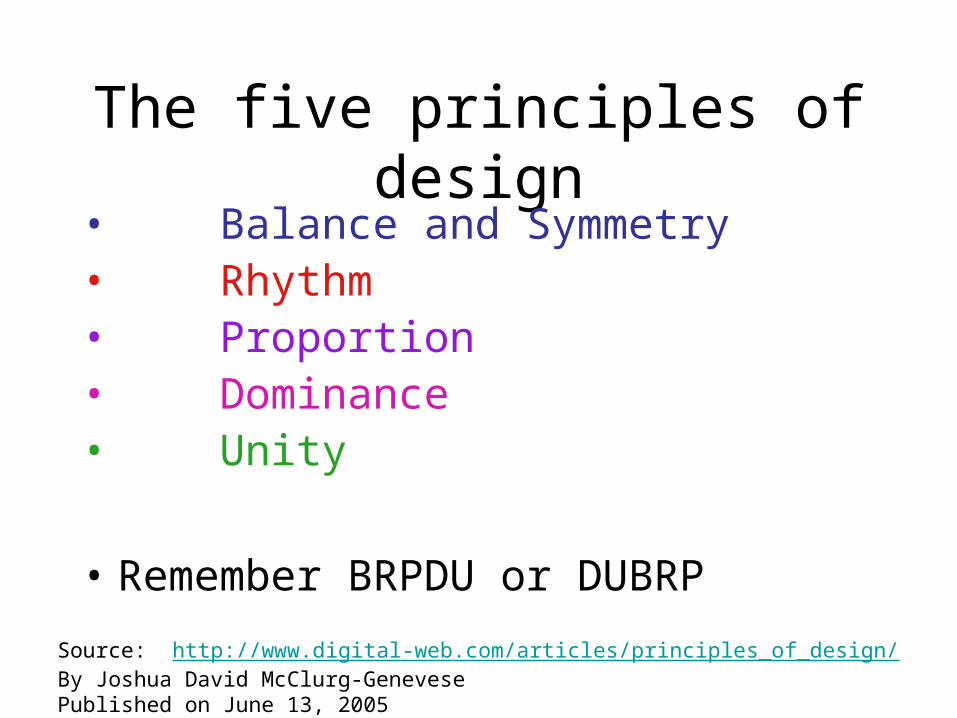
The five principles of design• Balance and Symmetry• Rhythm• Proportion• Dominance• Unity
• Remember BRPDU or DUBRP
Source: http://www.digital-web.com/articles/principles_of_design/By Joshua David McClurg-GenevesePublished on June 13, 2005
Balance is an equilibrium that results from looking at images and judging them against our ideas of physical structure (such as mass, gravity or the sides of a page).
It is the arrangement of the objects in a given design as it relates to their visual weight within a composition.
Balance usually comes in two forms: symmetrical and asymmetrical.
Symmetrical Balance
Symmetrical balance occurs when the weight of a composition is evenly distributed around a central
vertical or horizontal axis.
Under normal circumstances it assumes identical forms on both sides of the axis.
When symmetry occurs with similar, but not identical, forms it is called approximate symmetry.
In addition, it is possible to build a composition equally around a central point resulting in radial
symmetry.
Asymmetrical BalanceAsymmetrical balance occurs when the weight of a
composition is not evenly distributed around a central axis.
It involves the arranging of objects of differing size in a composition such that they balance one another
with their respective visual weights.
Often there is one dominant form that is offset by many smaller forms.
In general, asymmetrical compositions tend to have a greater sense of visual tension. Asymmetrical
balance is also known as informal balance.
This one is basically a reflection of itself.
QuickTime™ and a decompressor
are needed to see this picture.
This one is nearly a reflection of itself, but there are some
differences between the pages.
This one is symmetrical from the inside of the
spread to the outside of the
spread.
This one not symmetrical, but it still has an eyeline with the line that
crosses it.
Here are visuals of the four types of symmetry and balance:
RhythmRhythm is the repetition or alternation of elements,
often with defined intervals between them.
Rhythm can create a sense of movement, and can establish pattern and texture.
There are many different kinds of rhythm, often defined by the feeling it evokes when looking at
them.
There are three types of design rhythm.
Regular: A regular rhythm occurs when the intervals between the elements, and often the
elements themselves, are similar in size or length.
Flowing: A flowing rhythm gives a sense of movement and is often more organic in nature.
Progressive: A progressive rhythm shows a sequence of forms through a progression of steps.
Here’s a visual of the three types.
On the straight and narrow, this is the
traditional and dependable rhythm.
This one is your “hippie” rhythm giving a feeling
of freedom and relaxation.
This one is a marriage of the regular and flowing rhythms; it’s organized,
but it’s going places.
QuickTime™ and a decompressor
are needed to see this picture.
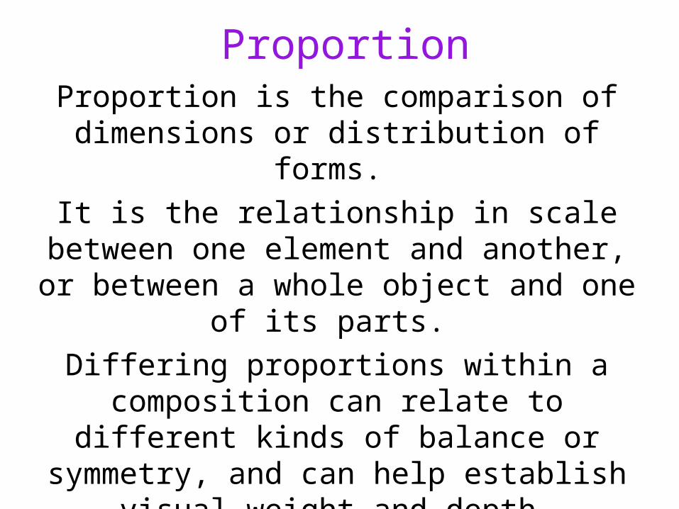
ProportionProportion is the comparison of dimensions or
distribution of forms.
It is the relationship in scale between one element and another, or between a whole object and one of
its parts.
Differing proportions within a composition can relate to different kinds of balance or symmetry, and can help establish visual weight and depth.
Here’s a visual of design proportions.
QuickTime™ and a decompressor
are needed to see this picture.
Notice how the smaller elements seem to recede into the background while the
larger elements come to the front.
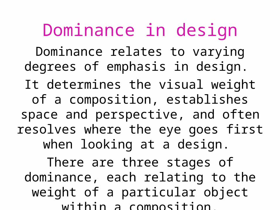
Dominance in designDominance relates to varying degrees of
emphasis in design.
It determines the visual weight of a composition, establishes space and perspective, and often
resolves where the eye goes first when looking at a design.
There are three stages of dominance, each relating to the weight of a particular object
within a composition.
Stages of design dominance Dominant: The object given the most visual weight, the
element of primary emphasis that advances to the foreground in the composition.
Sub-dominant: The element of secondary emphasis, the elements in the middle ground of the composition.
Subordinate: The object given the least visual weight, the element of tertiary emphasis that recedes to the
background of the composition.
Here’s a visual of design dominance.
The trees act as the dominant element, the house and hills as the secondary element, and the
mountains as the tertiary (subordinate) element.
QuickTime™ and a decompressor
are needed to see this picture.
Unity in designThe concept of unity describes the relationship between the individual parts and the whole of a
composition.
It investigates the aspects of a given design that are necessary to tie the composition together,
to give it a sense of wholeness,
or to break it apart and give it a sense of variety.
Unity in designThe Closure
Closure is the idea that the brain tends to fill in missing information when it perceives an object
is missing some of its pieces.
Objects can be deconstructed into groups of smaller parts, and when some of these parts are
missing the brain tends to add information about an object to achieve closure.
Unity in design - closure
In the below examples, we use closure to compulsively fill in the missing information to
create shape.
QuickTime™ and a decompressor
are needed to see this picture.
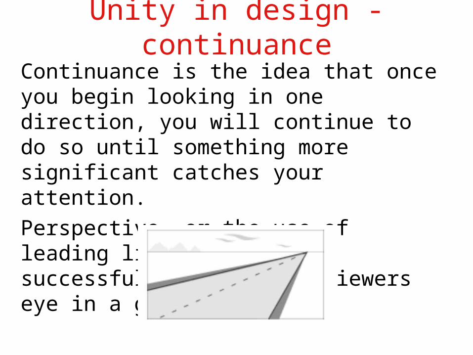
Unity in design - continuance
In the below example, the eye immediately
goes down the direction of the road ending up in the upper right corner of the frame of reference.
There is no other dominant object to catch and redirect the attention.
QuickTime™ and a decompressor
are needed to see this picture.
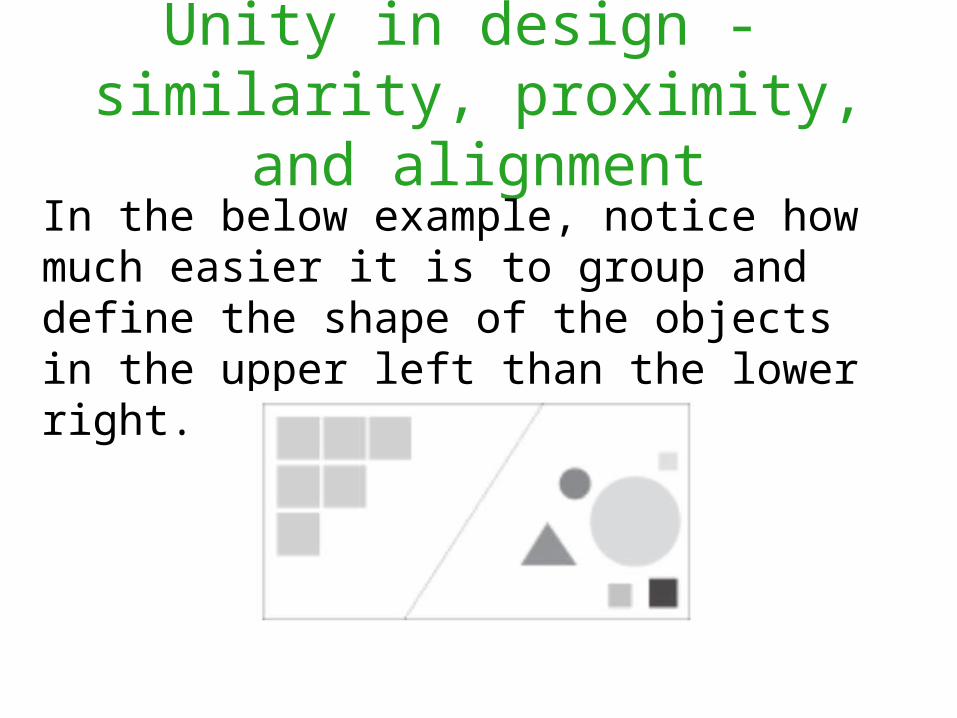
Unity in design - similarity, proximity, and alignmentItems of similar size, shape and color tend to be grouped together by the brain, and a relationship
between the items is formed.
In addition, items in close proximity to
or aligned with one another tend to be
grouped in a similar way.
Unity in design - similarity, proximity, and alignment
In the below example, notice how much easier it is to group and define the shape of the objects in the upper left than the lower right.
QuickTime™ and a decompressor
are needed to see this picture.
Related concepts
There are many additional concepts that are related to the principles of design. These can include specific terms and/or techniques that are in some way based on one or more of the
above tenets.
In they end, they add to the collection of compositional tools available for use by the
designer.
Related concepts: contrast or opposition
Contrast addresses the notion of dynamic tension--the degree of conflict that exists within a given design between the visual
elements in the composition.
Related concepts: positive and negative spacePositive and negative space refers to the juxtaposition of figure and ground in a
composition.
The objects in the environment represent the positive space, and the environment itself is
the negative space.
Related concepts: rule of thirds
The rule of thirds is a compositional tool that makes use of the notion that the most
interesting compositions are those in which the primary element is off center.
Basically, take any frame of reference and divide it into thirds placing the elements of
the composition on the lines in between.
Related concepts: visual center
The visual center of any page is just slightly above and to the right of the actual
(mathematical) center. This tends to be the natural placement of visual focus, and is also
sometimes referred to as museum height.
So let’s review…
• Balance and Symmetry
• Rhythm
• Proportion
• Dominance
• Unity
• Remember BRPDU or DUBRP
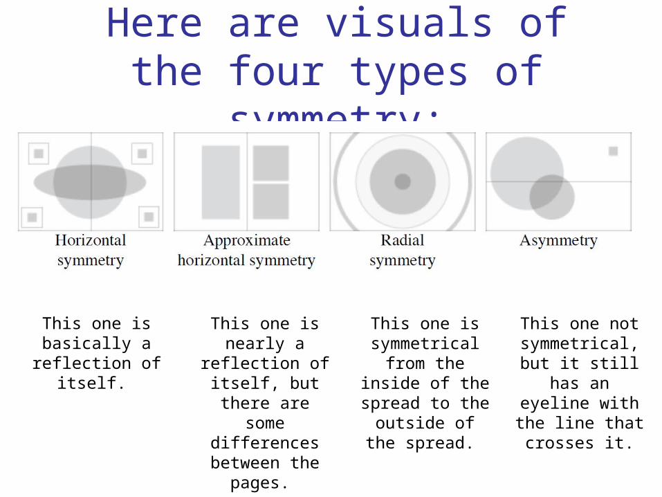
Here are visuals of the four types of symmetry:
This one is basically a reflection of itself.
QuickTime™ and a decompressor
are needed to see this picture.
This one is nearly a reflection of itself, but there are some
differences between the pages.
This one is symmetrical from the inside of the
spread to the outside of the
spread.
This one not symmetrical, but it still has an eyeline with the line that
crosses it.
Here’s a visual of the three types of rhythm
On the straight and narrow, this is the
traditional and dependable rhythm.
This one is your “hippie” rhythm giving a feeling
of freedom and relaxation.
This one is a marriage of the regular and flowing rhythms; it’s organized,
but it’s going places.
QuickTime™ and a decompressor
are needed to see this picture.
Here’s a visual of design proportions.
QuickTime™ and a decompressor
are needed to see this picture.
Notice how the smaller elements seem to recede into the background while the
larger elements come to the front.
Unity in design - continuance
Continuance is the idea that once you begin looking in one direction, you will continue to do so until something more significant catches your attention.
Perspective, or the use of leading lines, tends to successfully direct the viewers eye in a given direction.
Unity in design - similarity, proximity, and alignment
In the below example, notice how much easier it is to group and define the shape of the objects in the upper left than the lower right.