20
FORMS & CONVENTIONS
| Date post: | 30-Jul-2015 |
| Category: |
Education |
| Upload: | aimeearchibald |
| View: | 161 times |
| Download: | 0 times |
FORMS & CONVENTIONS

SIMILARITIES COMPARISON
As you can see the mastheads, are so similar, as I felt it was a strong design, and used the same sort of idea with the main letters abbreviated, with the full name below in a small font.
Nme My Product

Nme My ProductThe graphic features, in both of these, are circular as I tried other designs, and found this was much better and worked for what I needed. The Plug inside is also a similar layout.

I used some similar fonts, and the idea of a coloured cover line and a neutral kicker. This attracts attention and also fits better with the colour scheme, on the cover page this is the only similarities to this.
Nme My Product
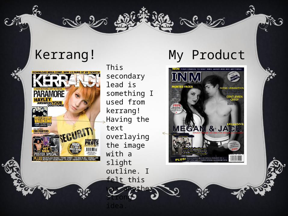
Kerrang! My ProductThis secondary lead is something I used from kerrang! Having the text overlaying the image with a slight outline. I felt this was another strong idea.

My ProductThe menu bar for my magazine is also similar to the one that kerrang! uses however there are differences, such as that I chose to use stars to separate the different aspects and the plus is not straight on.
Kerrang!

My ProductAs you can see I took the idea for my headline and anchorage from Q magazine, which I felt was the best looking idea I had seen through all of the ones I was looking at to gain inspiration.
Q

My ProductQI also used a central, picture which is the same as how Q tends to lay out their magazine, by using all the parts of the conventions that other magazines use I feel I was able to create a really strong cover.

SIMILARITIES COMPARISON
Nme My ProductFor the contents page I used the same approach as for the cover, using other magazines to help insipire me and to take the parts I felt were strongest, I used the subscription idea, that NME does to take up some of the page, and make it less daunting.

Nme My Product
I also used the Plus idea, from NME, this gives a more organised look I did however change it slightly to have the page numbers below the extra, which I feel makes the page look more interesting and presentable even though it goes against normal ideas

Kerrang! My ProductI used a few idea’s from Kerrang, including how they lay the artist name over the pictures, and give a small amout of information on the article, I think this works really well on my magazine.

Kerrang! My ProductI also used the editors not layout, and how it is off to the side, and is not central I did however change it to make it mine slightly by having it along side the picture references, and not below them. I think this works much more effectively.
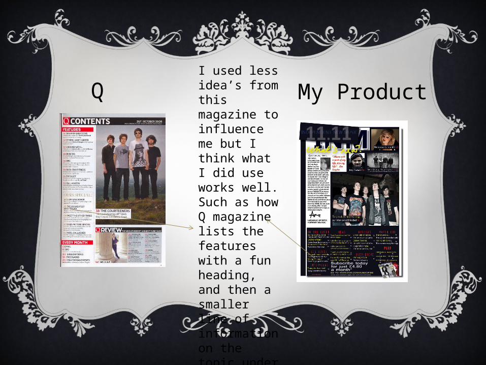
My ProductQI used less idea’s from this magazine to influence me but I think what I did use works well. Such as how Q magazine lists the features with a fun heading, and then a smaller line of information on the topic under it.

Nme
My Product
I also used the small summing up of the article, giving an overview which can be useful for the reader, as they know if the article will interest them.

My ProductQI also the use of more than one colour to write out my contents, I feel this makes it a little more fun which is something a music magazine should be, I however used more than two colours, and went for three I think this adds something different.

SIMILARITIES COMPARISON
Nme
My Product
I used the idea of the over the top title, which gives a lot of whitespace, so the reader doesn’t feel they are going to be reading on for a long time which can be off putting.
Kerrang!
My Product
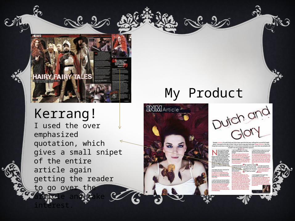
I used the over emphasized quotation, which gives a small snipet of the entire article again getting the reader to go over the article and take interest.

Kerrang!
My Product
Using the idea of putting the album that will be released is something which I saw in the kerrang article and thought would look really good on my own magazine.
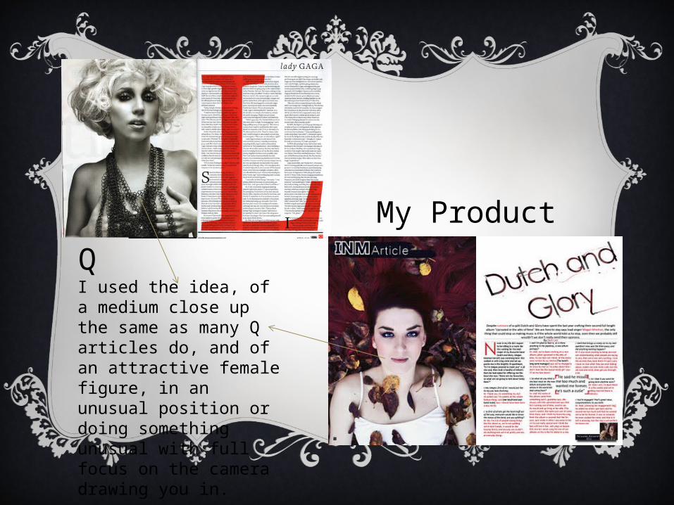
Q
My Product
I used the idea, of a medium close up the same as many Q articles do, and of an attractive female figure, in an unusual position or doing something unusual with full focus on the camera drawing you in.
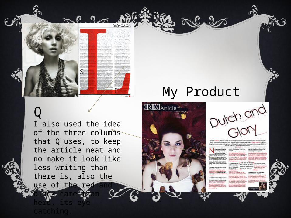
Q
My Product
I also used the idea of the three columns that Q uses, to keep the article neat and no make it look like less writing than there is, also the use of the red and black came from here, its eye catching.


