15
Forward O! Why visual branding matters for Obama by Nigel Smith www.kerrsmithdesign.com www.barackobama.com November 5 th 2012

Forward O! Why visual branding matters for Obama by Nigel Smith www.kerrsmithdesign.com
www.barackobama.com
November 5th 2012
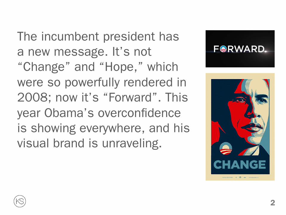
The incumbent president has a new message. It’s not “Change” and “Hope,” which were so powerfully rendered in 2008; now it’s “Forward”. This year Obama’s overconfidence is showing everywhere, and his visual brand is unraveling.
2

The Necktie Obama’s shiny gray necktie in the 2008 campaign was fantastic. Neither blue nor red, and not patterned, it was neutral, but not really. It was narrow too, which made it both conservative and progressive, 1964 and hip, Bible belt and iPhone.
3

2008 Difference Let’s face it, Obama not only had the strongest message (“Change”), endorsement (Oprah), use of language (“We”), song and video (from the Black Eyed Peas), he also had the best suits, website, social network, cool swag and undeniably the best-considered graphic design by a mile.
In 2008 the Obama campaign had
a fully considered and integrated brand, and the full spectrum of his difference put him miles ahead of the Republicans.
4
AP Photo/Jim Cole

The Logo Very early on, one of Obama’s first innovations was that he had a logo created by Sol Sender at mo/de. Most candidates don’t have logos, somebody just typesets the name.
Unlike his many corporate design challenges, Sender said it was easy to get the Obama proposition for the logo. “We understood the opportunity easily.” Three themes quickly came forward: hope, change and unity. They wanted to eliminate the idea of blue states and red states. (Remember Senator Obama’s gray necktie).
5

The Designers The truly amazing luck for the 2008 Obama campaign was that two designers were found who uniquely straddled traditional and new media seamlessly. Scott Thomas and John Slabyk were thinkers and organizers, not just amazing stylists. The ability to work across media and with deep technical knowledge of both worlds was, and still is, very, very rare. Their “roll out”, ongoing maintenance and refinement of the band was truly extraordinary.
6

Brand Architecture Obama’s full visual identity was powerful and complex. Mo/de designed a family of similar logos to talk to different groups. There was also a system of typographic treatments for all the state names. There was a tremendous level of well-handled integrated brand architecture. The architecture created hooks and entry points to the brand.
7

The Design Details: The Font In 2008 Barack Obama made the Gotham typeface famous. The original Gill Sans typeface was replaced by Gotham because it had more weights and as a result was more flexible. It is also an American design. Gotham is a crisp, slightly retro sans serif, new yet comfortable and familiar. You don’t think it matters? Why did Sara Palin and other Tea Partiers start using Gotham?
ABCDEFGHIJKLMNOPQRSTUVWXYZ abcdefghijklmnopqrstuvwxyz 1234567890
8
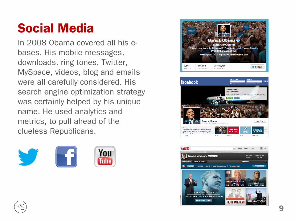
Social Media In 2008 Obama covered all his e-bases. His mobile messages, downloads, ring tones, Twitter, MySpace, videos, blog and emails were all carefully considered. His search engine optimization strategy was certainly helped by his unique name. He used analytics and metrics, to pull ahead of the clueless Republicans.
9
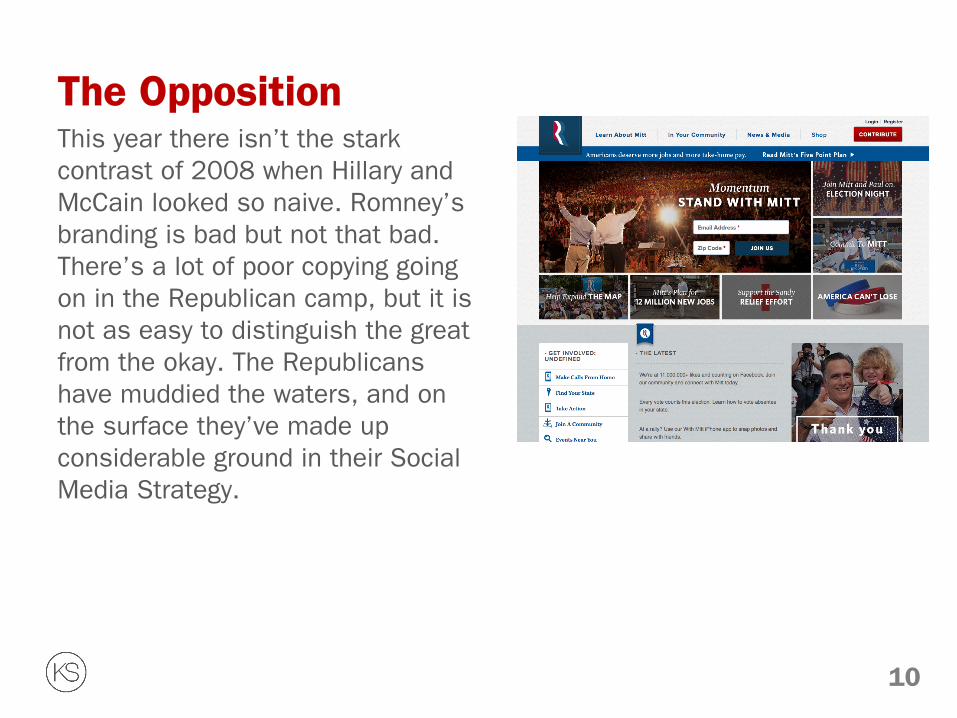
The Opposition This year there isn’t the stark contrast of 2008 when Hillary and McCain looked so naive. Romney’s branding is bad but not that bad. There’s a lot of poor copying going on in the Republican camp, but it is not as easy to distinguish the great from the okay. The Republicans have muddied the waters, and on the surface they’ve made up considerable ground in their Social Media Strategy.
10
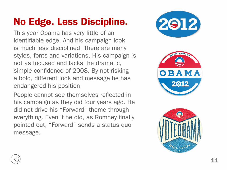
No Edge. Less Discipline. This year Obama has very little of an identifiable edge. And his campaign look is much less disciplined. There are many styles, fonts and variations. His campaign is not as focused and lacks the dramatic, simple confidence of 2008. By not risking a bold, different look and message he has endangered his position.
People cannot see themselves reflected in his campaign as they did four years ago. He did not drive his “Forward” theme through everything. Even if he did, as Romney finally pointed out, “Forward” sends a status quo message.
11

The 2012 Font The 2012 Obama/Biden campaign has made a new custom adjustment to Gotham, adding slab serif feet to the letters. “Yes we can – if the president asks”, says the type designer Frere-Jones on the Hoefler & Frere-Jones website. The letters are well rendered, but Obama’s team seems increasingly unsure when and how to use them. To a typographer the Obama/Biden visual brand is elegant, but to a strategist it is just too unsure and too low key.
12
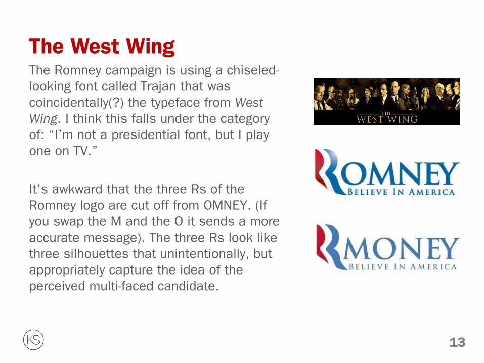
The West Wing The Romney campaign is using a chiseled-looking font called Trajan that was coincidentally(?) the typeface from West Wing. I think this falls under the category of: “I’m not a presidential font, but I play one on TV.”
It’s awkward that the three Rs of the Romney logo are cut off from OMNEY. (If you swap the M and the O it sends a more accurate message). The three Rs look like three silhouettes that unintentionally, but appropriately capture the idea of the perceived multi-faced candidate.
13

Why This Matters Because Steve Jobs, the master of brand, said packaging is very important. He said we should, in fact, judge a book by its cover. Because “design is thinking made visual” according to Saul Bass. And for Obama, it shows.
Strategically, Obama has not created a universal, powerful theme. His campaign has no emotional center. There is a lack of inspiration for people to hook onto. He has not asked Americans to stretch to a new, obtainable goal. His just released policy manifesto looks ill considered, unfocused and last minute.
14

Status Quo The whole thing feels like Obama has coasted. His campaign should have been more dramatically new. Many might feel, like his first debate performance, he’s been too nonchalant about his lead. His message should have been clearer and bolder – and it should have been designed that way. And this year, for better or worse – but I say worse – Obama’s neckties are not so different. They’re wider, colorful and patterned now.
Nigel Smith is a Creative Director at KerrSmith Design. He has worked in
Toronto, London and Milan, and taught at the Graduate School of Design at Harvard University.
15
![Forecasting support systems: ways forward (expert system) [Fildes et al., 2006, DSS] o Special events/promotions o Politically-related or budget targets o Ownership vs black box _](https://static.documents.pub/doc/80x56/5aa431337f8b9ab4788b8507/forecasting-support-systems-ways-forward-expert-system-fildes-et-al-2006.jpg)


![Thermodynamics Energy transformations. N 2 O 4 2 NO 2 Initially forward reaction rapid – As some reacts [N 2 O 4 ] so rate forward Initially Reverse.](https://static.documents.pub/doc/80x56/5697c01e1a28abf838cd11e9/thermodynamics-energy-transformations-n-2-o-4-2-no-2-initially-forward-reaction.jpg)


