Monetary Policy Interest Rates Have Responded to the Fed’s New Language Households and Consumers Recent Changes in the Relationship between Education and Male Labor Market Outcomes Banking and Financial Institutions A Slow Recovery in the Banking Sector Growth and Production The Global Slowdown and Central Banks’ Responses Labor Markets, Unemployment, and Wages Incomes Are Down, Poverty Is Up Regional Economics Recent Fourth District Foreclosure Trends Inflation and Price Statistics Market-Based Inflation Expectations Reflect No Fear of Inflation in the Medium and Long-Term In This Issue: October 2011 (September 9, 2011-October 11, 2011)
Transcript
Monetary Policy Interest Rates Have Responded to the Fed’s
New Language
Households and Consumers Recent Changes in the Relationship between
Education and Male Labor Market Outcomes
Banking and Financial Institutions A Slow Recovery in the Banking Sector
Growth and Production The Global Slowdown and Central Banks’
Responses
Labor Markets, Unemployment, and Wages Incomes Are Down, Poverty Is Up
Regional Economics Recent Fourth District Foreclosure Trends
Infl ation and Price Statistics Market-Based Infl ation Expectations Refl ect No
Fear of Infl ation in the Medium and Long-Term
In This Issue:
October 2011 (September 9, 2011-October 11, 2011)
2Federal Reserve Bank of Cleveland, Economic Trends | October 2011
Monetary PolicyInterest Rates Have Responded to the Fed’s New Language
09.21.11by Todd Clark and John Lindner
At its August policy meeting, the Federal Reserve took the unprecedented step of establishing a specifi c future date for policy action given current economic conditions. Th e intention was to clearly communicate to the public that, in light of what is currently known about the economic outlook, the Federal Reserve expects to keep interest rates extremely low for longer than the public previously believed. A quick look at some of the market reac-tion to the August Federal Open Market Commit-tee (FOMC) statement shows that the change in statement language was successful in altering public expectations of future interest rates and, in turn, current interest rates.
Th is was a unique move in the realm of FOMC policy changes, partly because it was only opera-tional through the language in the Committee’s statement, and partly because of the reference to a specifi c date. Th e FOMC made a similar move when it added the “extended period” language in March 2009. By making a tentative commitment to not raise interest rates until the middle of 2013, the Committee was attempting to alter the expecta-tions of market participants. It worked. Since the announcement, forecasts for a variety of interest rates have fallen, at least in part due to the lower expectations for future interest rates.
Despite the emphasis on expectations, this shift out in time for raising short-term interest rates has also had infl uences on current interest rates. Th e yields on Treasury securities maturing within one year were already at extremely low rates, but yields on maturities of 2 years or longer have fallen notice-ably since the announcement. Th e 2-year Treasury rate fell 8 basis points (bp) to 0.19 percent, while the rates on the 5-year and 10-year securities each fell 20 bp to 0.91 percent and 2.20 percent, respec-tively. So, even though no open market operations were used to adjust interest rates, the rates trad-ing today responded to a change in their expected future values.
3Federal Reserve Bank of Cleveland, Economic Trends | October 2011
Th is idea of a future market value is better high-lighted by looking at a type of derivative called a federal funds rate future contract. Th ese contracts allow banks to borrow interbank (federal) funds at a specifi ed rate at some date in the future. When the FOMC announced its commitment to keep the federal funds rate in the 0 to 25 bp range until the middle of 2013, the futures contracts shifted downward dramatically to incorporate the expecta-tion that the federal funds rate would remain low. For example, on the day before the announcement, the June 2013 future contract was trading at a price that implied a federal funds rate of 38 bp. Fol-lowing the meeting, the same June 2013 contract implied a federal funds rate of 20 bp, back in the target range currently adopted by the FOMC.
Another way to see how this policy has worked is to look at a similar Treasury yield curve as the picture above, this time with forecasts for future interest rates. Th e monthly forecasts highlighted below come from a survey of economic forecast-ers. Forecasts for Treasury yields at the end of 2011 have declined markedly from September to August, especially beginning at the 2-year maturity, where expected rates fell 40 bp to 0.30 percent. Larger monthly declines were also apparent for securi-ties with longer maturities. Forecasts for the end of 2012 were revised even more dramatically from August to September, falling by an average of more than 100 bp across the yield curve. Admittedly, though, the large changes in these forecasts from August to September refl ect more than just the Fed-eral Reserve’s policy change; factors such as disap-pointing news about the strength of the economic recovery also pushed down forecasts of interest rates from August to September.
One interesting aspect of these changes in forecasts of the yield curve is the shift in both short-term and long-term interest rates. Th is shift is especially visible in the forecasts for the end of 2012. Fore-casts for the federal funds rate in late 2012 fell from over 1.00 percent to less than 0.25 percent. Similar declines could be seen for other short-term rates like the 1-month commercial paper rate and the 3-month LIBOR, each of which shed 75 to 100 bp from their December 2012 forecasts. Th e change in policy seems to have shifted expectations for inter-est rates across the maturity spectrum.
Treasury Yield Curve
0.0
0.5
1.0
1.5
2.0
2.5
3.0
3.5
4.0
3 month 6 month 1 year 2 year 5 year 10 year 30 year
August 8
August 9
Percent
Source: Federal Reserve Board. Maturity
Fed Funds Futures Implied Rates
0.0
0.1
0.2
0.3
0.4
0.5
0.6
0.7
0.8
0.9
1.0
3/12 6/12 9/12 12/12 3/13 6/13 9/13 12/13 3/14
August 8
August 9
Percent
Source: Wall Street Journal.
Blue Chip Forecasted Yield Curve
0
1
2
3
4
5
6
3 month 6 month 1 year 2 year 5 year 10 year 30 year
August
September
Percent
Notes: Solid lines are 2012:Q4 forecasts. Dashed lines are 2011:Q4 forecasts. Sources: Blue Chip Financial Forecasts, Treasury securities.
Maturity
4Federal Reserve Bank of Cleveland, Economic Trends | October 2011
But since short-term rates are now expected to rise less quickly, long-term investors will demand lower long-term interest rates. Th is is apparent in the downward shift in forecasts for long-term inter-est rates. Highly-rated corporate bond yields in December 2012 were expected to be 5.60 percent in August, but September’s forecast is for a 4.80 percent yield at the end of 2012. Similar declines occurred for the forecasts of lower-rated corporate bond yields and for home mortgage rates.
Clearly, the August announcement comes with some caveats. Most importantly, this policy com-mitment is conditional on the economy evolving as expected based on the information available at the time of the August FOMC meeting. Should the economy improve more rapidly or slowly than expected today, or should infl ation prove either higher or lower than anticipated, the timing of the fi rst increase in the federal funds rate target could change. But as intended, the announcement has had signifi cant eff ects on current market interest rates, as well as the forecasts for those interest rates in the future.
Blue Chip Forecasted Long-Term Rates
4.25
4.50
4.75
5.00
5.25
5.50
5.75
6.00
6.25
6.50
6.75
9/11 12/11 3/12 6/12 9/12 12/12
Corporate Baa bonds
Home mortgage rate
Percent
Corporate Aaa bonds
Source: Blue Chip Financial Forecasts.
Solid lines are AugustDashed lines are September
Blue Chip Forecasted Short-Term Rates
0.00
0.25
0.50
0.75
1.00
1.25
1.50
9/11 12/11 3/12 6/12 9/12 12/12
3-month LIBOR
1-month commercial paper
Percent
Source: Blue Chip Financial Forecasts.
Federalfunds rate
Solid lines are AugustDashed lines are September
5Federal Reserve Bank of Cleveland, Economic Trends | October 2011
Monetary PolicyYield Curve and Predicted GDP Growth
Covering August 26, 2011—September 23, 2011by Joseph G. Haubrich and Margaret Jacobson
Overview of the Latest Yield Curve Figures
Since last month and in the wake of the Maturity Extension Program and Reinvestment Policy of the Federal Reserve, more colloquially known as Op-eration Twist, or Let’s Twist Again, the yield curve has fl attened as long rates fell. Short rates did not increase however, making it a somewhat one-sided twist. Th e three-month Treasury bill rate stayed at 0.01 percent (for the week ending September 23), even with August and down from July’s 0.03 percent. Th e ten-year rate dropped below 2 percent (1.86 percent), down from August’s 2.19 percent, and over a full 1 point below July’s 2.97. Naturally, the slope dropped, and at 186 it is the lowest it has been since early 2008.
Projecting forward using past values of the spread and GDP growth suggests that real GDP will grow at about a 0.8 percent rate over the next year, even with July and August’s projections. Th e strong infl uence of the recent recession is leading towards relatively low growth rates. Although the time horizons do not match exactly, the forecast comes in on the more pessimistic side of other predictions. But like them, it does show moderate growth for the year.
Following the usual pattern, the fl atter slope indi-cates a higher probability of recession. Using the yield curve to predict whether or not the economy will be in recession in the future, we estimate that the expected chance of the economy being in a recession next September is 7 percent, up from Au-gust’s 4.8 percent, and up noticeably from June and July’s 1.7 percent, albeit still a fairly low number. So although our approach is somewhat pessimistic as regards the level of growth over the next year, it is quite optimistic about the recovery continuing.
Th e slope of the yield curve—the diff erence be-tween the yields on short- and long-term maturity bonds—has achieved some notoriety as a simple forecaster of economic growth. Th e rule of thumb
Highlights September August July
3-month Treasury bill rate (percent)
0.01 0.01 0.03
10-year Treasury bond rate (percent)
1.87 2.19 2.97
Yield curve slope (basis points)
186 219 294
Prediction for GDP growth (percent)
0.80 0.08 0.82
Probabilty of recession in 1 year (percent)
7.0 4.8 1.7
-6
-4
-2
0
2
4
2002 2004 2006 2008 2010 2012
Predicted GDP growth
Percent
Sources: Bureau of Economic Analysis; Federal Reserve Board; authors’ calculations.
Yield-Curve-Predicted GDP Growth
GDP growth (year-over-year change)
Ten-year minusthree-month yield spread
6Federal Reserve Bank of Cleveland, Economic Trends | October 2011
is that an inverted yield curve (short rates above long rates) indicates a recession in about a year, and yield curve inversions have preceded each of the last seven recessions (as defi ned by the NBER). One of the recessions predicted by the yield curve was the most recent one. Th e yield curve inverted in August 2006, a bit more than a year before the current recession started in December 2007. Th ere have been two notable false positives: an inversion in late 1966 and a very fl at curve in late 1998.
More generally, a fl at curve indicates weak growth, and conversely, a steep curve indicates strong growth. One measure of slope, the spread between ten-year Treasury bonds and three-month Treasury bills, bears out this relation, particularly when real GDP growth is lagged a year to line up growth with the spread that predicts it.
Predicting GDP Growth
We use past values of the yield spread and GDP growth to project what real GDP will be in the fu-ture. We typically calculate and post the prediction for real GDP growth one year forward.
Predicting the Probability of Recession
While we can use the yield curve to predict whether future GDP growth will be above or below aver-age, it does not do so well in predicting an actual number, especially in the case of recessions. Alter-natively, we can employ features of the yield curve to predict whether or not the economy will be in a recession at a given point in the future. Typically, we calculate and post the probability of recession one year forward.
Of course, it might not be advisable to take these number quite so literally, for two reasons. First, this probability is itself subject to error, as is the case with all statistical estimates. Second, other research-ers have postulated that the underlying determi-nants of the yield spread today are materially dif-ferent from the determinants that generated yield spreads during prior decades. Diff erences could arise from changes in international capital fl ows and infl ation expectations, for example. Th e bot-tom line is that yield curves contain important in-formation for business cycle analysis, but, like other
Percent probability, as predicted by a probit model
Probability of recession
Forecast
-6
-4
-2
0
2
4
6
8
10
1953 1959 1965 1971 1977 1983 1989 1995 2001 2007
Yield Curve Spread and Real GDP Growth
Percent
Note: Shaded bars indicate recessions.Source: Bureau of Economic Analysis; Federal Reserve Board.
Ten-year minus three-month yield spread
GDP growth (year-over-year change)
7Federal Reserve Bank of Cleveland, Economic Trends | October 2011
indicators, should be interpreted with caution. For more detail on these and other issues related to using the yield curve to predict recessions, see the Commentary “Does the Yield Curve Signal Reces-sion?” Our friends at the Federal Reserve Bank of New York also maintain a website with much useful information on the topic, including their own esti-mate of recession probabilities.
-6
-4
-2
0
2
4
6
8
10
1953 1959 1965 1971 1977 1983 1989 1995 2001 2007
Percent
Yield Curve Spread and Lagged Real GDP Growth
Note: Shaded bars indicate recessions.Source: Bureau of Economic Analysis; Federal Reserve Board.
Ten-year minus three-month yield spread
One-year lag of GDP growth (year-over-year change)
8Federal Reserve Bank of Cleveland, Economic Trends | October 2011
Households and ConsumersRecent Changes in the Relationship between Education and Male Labor Market Outcomes
09.14.11by Dionissi Aliprantis and Mary Zenker
Th ere is reason to believe that educational attain-ment is one of the key determinants of outcomes in the labor market. For example, people who gradu-ate high school are more often unemployed on average than those who get a college degree, and a smaller proportion of high school graduates joins the workforce. Th ese labor market outcomes have been highly correlated with educational attainment over the last 20 years (as we showed in a recent article).
As a result, social scientists have devoted consider-able attention to understanding the relationship between educational attainment and labor market outcomes. A key fi nding has been that this relation-ship has changed in recent decades. In particular, there has been a well-documented increase in the wage premium for educational attainment: Th e more education one now obtains, the more one tends to earn.
Much of the work that has been done to under-stand the relationship between educational attain-ment and labor market outcomes has focused on individuals. But it is important to look at neighbor-hoods as well because the characteristics of a given neighborhood may infl uence the outcomes of the individuals who live there.
We examined decennial census data to study trends in educational attainment and labor market out-comes at the neighborhood level. Data on educa-tion and labor market outcomes are available at the level of the census tract from the National Histori-cal Geographic Information System (NHGIS). Census tracts are often used to defi ne neighbor-hoods because they typically have around 4,000 residents and are delineated so that each contains a relatively homogeneous population.
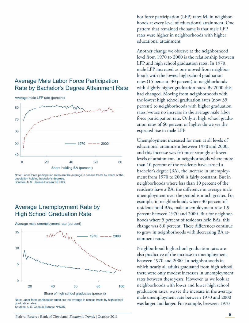
Th e data indicate a number of major changes for men between 1970 and 2000. First of all, male la-
20 40 60 80 100
Share of high school graduates (percent)
1970 2000
Average Male Labor Force ParticipationRate by High School Graduation RateAverage male LFP rate (percent)
50
60
70
80
90
Note: Labor force particpation rates are the average in census tracts by high school graduation rates.Sources: U.S. Census Bureau; NHGIS.
9Federal Reserve Bank of Cleveland, Economic Trends | October 2011
bor force participation (LFP) rates fell in neighbor-hoods at every level of educational attainment. One pattern that remained the same is that male LFP rates were higher in neighborhoods with higher educational attainment.
Another change we observe at the neighborhood level from 1970 to 2000 is the relationship between LFP and high school graduation rates. In 1970, male LFP increased as one moved from neighbor-hoods with the lowest high school graduation rates (15 percent–30 percent) to neighborhoods with slightly higher graduation rates. By 2000 this had changed. Moving from neighborhoods with the lowest high school graduation rates (now 35 percent) to neighborhoods with higher graduation rates, we see no increase in the average male labor force participation rate. Only at high school gradu-ation rates of 60 percent or higher do we see the expected rise in male LFP.
Unemployment increased for men at all levels of educational attainment between 1970 and 2000, and this increase was felt most strongly at lower levels of attainment. In neighborhoods where more than 10 percent of the residents have earned a bachelor’s degree (BA), the increase in unemploy-ment from 1970 to 2000 is fairly constant. But in neighborhoods where less than 10 percent of the residents have a BA, the diff erence in average male unemployment over the period is much greater. For example, in neighborhoods where 30 percent of residents hold BAs, male unemployment rose 1.9 percent between 1970 and 2000. But for neighbor-hoods where 5 percent of residents held BAs, this change was 8.0 percent. Th ese diff erences continue to grow in neighborhoods with decreasing BA at-tainment rates.
Neighborhood high school graduation rates are also predictive of the increase in unemployment between 1970 and 2000. In neighborhoods in which nearly all adults graduated from high school, there were only modest increases in unemployment rates between these years. However, as we look at neighborhoods with lower and lower high school graduation rates, we see the increase in the average male unemployment rate between 1970 and 2000 was larger and larger. For example, between 1970
0 20 40 60 80Share holding BA (percent)
1970 2000
Average Male Labor Force Participation Rate by Bachelor's Degree Attainment Rate
40
50
60
70
80
Average male LFP rate (percent)
Note: Labor force particpation rates are the average in census tracts by share of the population holding bachelor's degrees.Sources: U.S. Census Bureau; NHGIS.
20 40 60 80 100
Share of high school graduates (percent)
1970 2000
Average Unemployment Rate by High School Graduation RateAverage male unemployment rate (percent)
0
5
10
15
Note: Labor force particpation rates are the average in census tracts by high school graduation rates.Sources: U.S. Census Bureau; NHGIS.
10Federal Reserve Bank of Cleveland, Economic Trends | October 2011
and 2000, average male unemployment increased by 1.7 percentage points in neighborhoods with a high school graduation rate of 90 percent. Th is increase was 7.7 percent in neighborhoods with a high school graduation rate of 60 percent.
Overall, the data we have considered suggest that in recent decades educational attainment has become more important in determining labor market out-comes at the neighborhood level.
0 20 40 60 80
Share holding BA (percent)
1970 2000
Average Unemployment Rate by Bachelor'sDegree Attainment RateAverage male unemployment rate (percent)
0
5
10
15
20
25
Note: Labor force particpation rates are the average in census tracts by share of the population holding bachelor's degrees.Sources: U.S. Census Bureau; NHGIS.
11Federal Reserve Bank of Cleveland, Economic Trends | October 2011
Banking and Financial MarketsA Slow Recovery in the Banking Sector
09.30.11by Matthew Koepke and James B. Th omson
As the banking sector recovers from the fi nancial crisis and the subsequent recession, its recovery has mirrored the slow and fragile recovery of the gen-eral economy. According to the most recent data from the Federal Deposit Insurance Corporation (FDIC), assets at FDIC-insured institutions grew 1.4 percent in the second quarter of 2011 and are up 3.0 percent on a year-over-year basis. However, despite the growth in total assets, loans and leases at depository institutions actually fell from the fourth quarter of 2010 to the second quarter of 2011, de-clining 0.8 percent. Moreover, on a year-over-year basis, loans and leases at FDIC-insured institutions fell 1.1 percent, suggesting that the recovery in the banking sector has stalled.
In addition to stagnant loan growth, another sign of weakness in the banking sector is the large num-ber of problem institutions in the system. Problem institutions are FDIC-insured banks and thrifts with substandard examination ratings. According to the FDIC, year-to-date there are 865 problem insti-tutions with $372 billion in assets compared to 884 problem institutions with $390 billion in assets for all of 2010. While there has been a slight improve-ment in this number, the continued high level of problem depository institutions is another indicator that this sector of the fi nancial system remains very fragile.
One promising sign that the banking sector is on the mend is the decline in the amount of nonper-forming loans (loans 90 days or more past due and nonaccuring). Nonperforming loans spiked in 2009 to $395 billion, representing 5.4 percent of total loans and leases. Real estate loans—commercial and primary residence—drove the increase in nonper-forming loans through the end of 2009, account-ing for 80 percent of total nonperforming loans. According the FDIC’s second-quarter data, nonper-forming loans have fallen nearly 6.5 percent since the end of the fi rst quarter, going from $342 billion to $320 billion. Th eir share within total loans has
12Federal Reserve Bank of Cleveland, Economic Trends | October 2011
been steadily declining since the end of 2009, com-ing in at 4.4 percent at the end of the second quar-ter. However, it is important to note that while the total amount of nonperforming loans has declined since 2009, the share of real estate loans within the total has increased to 85 percent, suggesting that real estate loans are still having a deleterious impact on asset quality.
While nonperforming loans have been steadily declining, the percent of noncurrent loans seems to have stagnated at a high level. Again the problems in noncurrent loans stem from real estate loans, which accounted for 81 percent of total noncur-rent loans in the second quarter of 2011. Primary residence loans accounted for the largest proportion of noncurrent loans, representing 55 percent of the total. Moreover, primary residence noncurrent rates declined only 70 basis points from 2009 to the sec-ond quarter of 2011 (10.3 percent to 9.6 percent). Th e only other loan category where noncurrent rates fell less was agricultural loans, which declined 10 basis points (3.1 percent to 3.0 percent). As long as noncurrent rates continue to remain elevated for primary residence loans, it is likely that the bank-ing sector will continue to have a slow and fragile recovery.
For all loan categories, losses as represented by net charge-off s (loans charged-off less recoveries) as a percent of loans declined in the second quarter of 2011. Net charge-off s declined the most for con-sumer loans, falling 50 basis points from 2009 to the second quarter of 2011 (1.4 percent to 0.85 percent). Net charge-off rates for commercial real estate loans and primary residences seem to have leveled off after falling signifi cantly from 2009 to the fi rst quarter of 2011 Meanwhile, net charge-off s related to commercial and industrial loans continue to fall at a relatively high rate, declining nearly 50 basis points from 2009 to the second quarter of 2011.
Finally, despite some encouraging signs that the deterioration of loan quality is slowing and loan performance is stabilizing, concerns remain about the ability of FDIC-insured institutions to absorb loan losses going forward. From the fourth quarter of 2005 to the fourth quarter of 2009, the cover-
Loans 90 Days Past Due and Nonaccuring
0
100
200
300
400
500
Dollars in billions
Source: FDIC.
Commercial real estate loansConsumer loansPrimary residence loansCommercial and industrial loansAgricultural loansTotal other loans
Commercial real estate loansConsumer loansPrimary residence loansCommercial and industrial loansAgricultural loansTotal other loans
13Federal Reserve Bank of Cleveland, Economic Trends | October 2011
age ratio, which measures the ratio of loan loss reserves and equity capital to nonperforming loans, fell from 23.9 to 4.2. Since then, the coverage ratio has improved to 5.5; however, the coverage ratio at FDIC-insured institutions remains less than half of the average coverage ratio of 12.6 over the past decade.
So, even though there have been some improve-ments in loan performance at FDIC-insured institutions, the amount of nonperforming loans, noncurrent loans, and net charge off s remain relatively high and the ability of banks to cover the losses from those loans remains relatively low. Th is combination suggests that the banking system is still very fragile, three years after the fi nancial crisis.
Bank Coverage Ratio
0
5
10
15
20
25
30
0.0
0.4
0.8
1.2
1.6
2.0
Bank coverage ratio
Dollars in trillions Ratio
Allowance for loan lossesTotal bank equity capital
14Federal Reserve Bank of Cleveland, Economic Trends | October 2011
Growth and ProductionTh e Global Slowdown and Central Banks’ Responses
10.06.11by Pedro Amaral and Margaret Jacobson
After hitting a peak sometime in the middle of 2010, the economic recovery seems to have stalled. Th is observation seems to be true not only of the U.S. economy, but also of other developed econo-mies and some emerging economies.
Both developed and emerging economies are facing very uncertain times. As a result, consumers and businesses are wary of using their funds and are playing it safe. While consumers avoid expenditures in durables and increase their level of precautionary savings, businesses put investment and expansion plans on hold and choose instead to hold risk-free assets. Uncertainty about future macroeconomic variables is precisely one of the channels Margaret Jacobson and Filippo Occhino identify as contrib-uting to investment’s softness in the latest U.S. recovery.
In the developed world, the proximate source of this uncertainty seems to be tied to fi scal issues. In the United States the picture is stark: the fi s-cal year has just ended, but no formal budget has been approved (last year’s budget was not complete until April), the deadline for the super-committee charged with fi nding $1.5 trillion in debt cuts looms closer, the legal standing of the states’ chal-lenges to the healthcare reform legislation is uncer-tain, and the $450 billion presidential job initiative is still in legislative limbo. On top of all that, there is a presidential election in 13 months. But when it comes to uncertainty, the United States has nothing on the Euro Zone. Across the Atlantic, the status of the whole monetary union is being questioned as its debt crisis continues to unravel.
Th e source of uncertainty in emerging economies is not fi scal, at least not directly. Instead, many emerging economies are very dependent on exports. China, for example, exports roughly a quarter of its GDP according to offi cial statistics. Th e depen-dence on exports means that when the developed world’s growth prospects are uncertain, so are
-5
0
5
10
15
20
2009:Q22009:Q3
2009:Q42010:Q1
2010:Q22010:Q3
2010:Q42011:Q1
2011:Q2
U.S.Euro ZoneChinaBrazil
Percent (annual equivalent)
Sample Quarterly Growth Rates in Developed and Emerging Economies
Sources: Bureau of Economic Analysis, Eurostat, Instituto Brasileiro de Geografia e Estatistica.
15Federal Reserve Bank of Cleveland, Economic Trends | October 2011
those of emerging-market economies. Emerging economies depend on exports because their middle classes are still in the process of developing enough purchasing power to sustain continued domestic demand.
Central banks around the world fi nd themselves front and center in one of the largest contractions since the Great Depression. Th eir part is one that seems increasingly more diffi cult to play, as mea-sures of headline infl ation have not subsided since mid-2010, the time when output growth started to sputter. It should be noted that while the Federal Reserve’s explicit dual mandate is unusual as far as central banks go, even central banks that have only a strict infl ation target seek to achieve their goal while sacrifi cing as little output as possible.
Central banks around the world have been reacting to the slowdown. In the United States, the Federal Reserve’s stance has been rather accommodative since the start of the recession. Th e federal funds rate remains as low as it can be, and unorthodox balance sheet approaches have been taken to deal with concerns about output, unemployment, and housing markets. Such moves have continued even in the face of increasing infl ation (a core measure of U.S. infl ation is currently at 2 percent, below the headline measure, but on its way up).
Meanwhile, in the Euro Zone, the European Central Bank’s (ECB) stance has been arguably less accommodative. It tightened twice early this year, refl ecting infl ation concerns, but the tighten-ing cycle is likely over. Th e ECB has not tightened further in its last two meetings, and it is reportedly not doing so at its October meeting. Th e question is, rather, whether it will decrease its policy rate in the face of disappointing growth data and subdued infl ation.
In emerging economies, the picture is slightly dif-ferent. Some economies, like Brazil, experienced large increases in capital fl ows during 2009-2010, which, together with increases in commodity and energy prices, added to the infl ationary pressures. Th is resulted in a tightening cycle throughout the emerging-market world. On the year, policy rates are up 125 basis points in Brazil, 50 in Russia, 200
-4
-2
0
2
4
6
8
6/2009 12/2009 6/2010 12/2010 6/2011
U.S.Euro ZoneChinaBrazil
Percent (12-month change)
Selected Headline Inflation Rates
Sources: Bureau of Labor Statistics, Eurostat, Haver Analytics, Instituto Brasileiro de Geografia e Estatistica
0
2
4
6
8
10
12
14
4/1/20097/1/2009
10/1/20091/1/2009
4/1/20097/1/2010
10/1/20101/1/2011
4/1/20117/1/2011
U.S.Euro ZoneChinaBrazil
Selected Policy RatesPercent
Sources: Federal Reserve Board, European Central Bank, Banco Central doBrasil, Bloomberg.
16Federal Reserve Bank of Cleveland, Economic Trends | October 2011
in India, and 75 in China. More recently, though, the Banco Central do Brazil has started cutting its policy rate. Could the trend in emerging markets’ monetary policy be shifting?
17Federal Reserve Bank of Cleveland, Economic Trends | October 2011
Labor Markets, Unemployment, and WagesIncomes Are Down, Poverty Is Up
10.07.11by Daniel Hartley
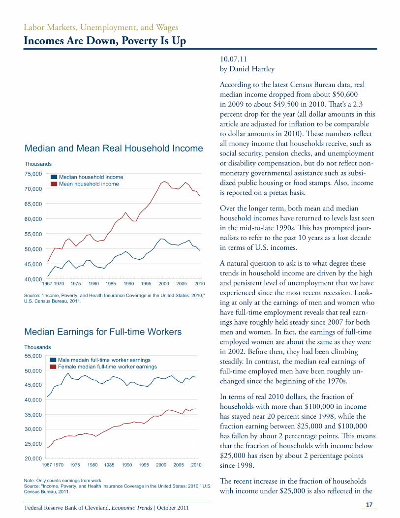
According to the latest Census Bureau data, real median income dropped from about $50,600 in 2009 to about $49,500 in 2010. Th at’s a 2.3 percent drop for the year (all dollar amounts in this article are adjusted for infl ation to be comparable to dollar amounts in 2010). Th ese numbers refl ect all money income that households receive, such as social security, pension checks, and unemployment or disability compensation, but do not refl ect non-monetary governmental assistance such as subsi-dized public housing or food stamps. Also, income is reported on a pretax basis.
Over the longer term, both mean and median household incomes have returned to levels last seen in the mid-to-late 1990s. Th is has prompted jour-nalists to refer to the past 10 years as a lost decade in terms of U.S. incomes.
A natural question to ask is to what degree these trends in household income are driven by the high and persistent level of unemployment that we have experienced since the most recent recession. Look-ing at only at the earnings of men and women who have full-time employment reveals that real earn-ings have roughly held steady since 2007 for both men and women. In fact, the earnings of full-time employed women are about the same as they were in 2002. Before then, they had been climbing steadily. In contrast, the median real earnings of full-time employed men have been roughly un-changed since the beginning of the 1970s.
In terms of real 2010 dollars, the fraction of households with more than $100,000 in income has stayed near 20 percent since 1998, while the fraction earning between $25,000 and $100,000 has fallen by about 2 percentage points. Th is means that the fraction of households with income below $25,000 has risen by about 2 percentage points since 1998.
Th e recent increase in the fraction of households with income under $25,000 is also refl ected in the
40,000
45,000
50,000
55,000
60,000
65,000
70,000
75,000 Median household incomeMean household income
Median and Mean Real Household IncomeThousands
1967 1970 1975 1980 1985 1990 1995 201020052000
Source: "Income, Poverty, and Health Insurance Coverage in the United States: 2010," U.S. Census Bureau, 2011.
20,000
25,000
30,000
35,000
40,000
45,000
50,000
55,000 Male medain full-time worker earningsFemale median full-time worker earnings
Median Earnings for Full-time WorkersThousands
1967 1970 1975 1980 1985 1990 1995 201020052000
Note: Only counts earnings from work. Source: "Income, Poverty, and Health Insurance Coverage in the United States: 2010," U.S. Census Bureau, 2011.
18Federal Reserve Bank of Cleveland, Economic Trends | October 2011
poverty rate, which has risen by about 2 percentage points since 2007.
Th e U.S. Census Bureau measures poverty by comparing a family’s income to a threshold which varies by the size of the family and the ages of its members, but does not vary geographically. Th e threshold is updated each year to refl ect infl ation. It was originally derived in the early 1960s and based on food budgets and the share of income that was spent on food at that time. Th e Census Bu-reau plans to begin releasing preliminary estimates using its new Supplemental Poverty Measure this month, which will address some of the critiques of the current measure. However, the current report is broadly consistent with anecdotal evidence that economic hardship has increased for many people since 2007. Incomes are down and poverty is up.
0.0
10.0
20.0
30.0
40.0
50.0
60.0
70.0
Households with $0-$25,000 incomeHouseholds with $25,000-$100,000 incomeHouseholds with $100,000+ income
Income DispersionPercent
1967 1970 1975 1980 1985 1990 1995 201020052000
Source: "Income, Poverty, and Health Insurance Coverage in the United States: 2010," U.S. Census Bureau, 2011.
7
8
9
10
11
12
13
Poverty RateThousands
1967 1970 1975 1980 1985 1990 1995 201020052000
Source: "Income, Poverty, and Health Insurance Coverage in the United States: 2010," U.S. Census Bureau, 2011.
19Federal Reserve Bank of Cleveland, Economic Trends | October 2011
Regional EconomicsRecent Fourth District Foreclosure Trends
10.11.11by Guhan Venkatu
Foreclosure rates among Fourth District states remain at or near historic highs. Outside of West Virginia, which has seen its rate remain elevated but stable, these rates have continued to trend up since the recovery began in the second quarter of 2009.
Th is pattern diff ers noticeably from trends in the so-called sand states—Arizona, California, Florida, and Nevada. Th ese states saw among the largest increases in foreclosure rates following the nation-wide bust in housing market activity around 2005; however, since mid-2009, with the exception of Florida, foreclosure rates in the sand states have fallen sharply.
Th e declines have been so signifi cant that Arizona and California, which had the nation’s third- and fourth-highest foreclosure rates in the second quar-ter of 2009, respectively, had the thirteenth- and seventeenth-highest rates, respectively, two years later. By contrast, Ohio has continued to have one of the nation’s highest state foreclosure rates—re-maining in the top ten—while Kentucky and Pennsylvania have each seen their rankings worsen, from twenty-second- to fi fteenth-worst for Ken-tucky and twenty-ninth- to twenty-fi fth-worst for Pennsylvania.
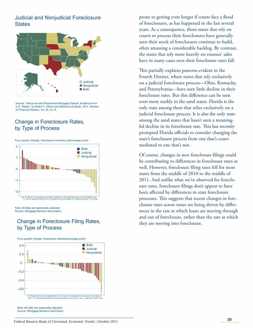
What accounts for this divergence? Broadly speak-ing, states can use two diff erent kinds of processes for resolving foreclosures, and these diff erences appear to be behind the diff ering patterns of recent foreclosure-rate changes. One approach, judicial, requires that a foreclosure proceed through the courts. Another approach, nonjudicial, is handled outside of court, generally by a third-party trustee who, at the time the loan was originated, was given the power to sell the property under certain con-ditions. States may employ one or both of these processes.
Judicial foreclosure timelines tend to be longer under normal circumstances. But they are also
0
5
10
15
1998:Q3 2001:Q3 2004:Q3 2007:Q3 2010:Q3
OhioKentuckyPennsylvaniaWest Virginia
2009:Q2
Foreclosure inventory (percent)
Foreclosure Rates, Fourth District States
Note: Each dot is associated with a data point for one of the 50 states.All data are seasonally adjusted.Source: Mortgage Bankers Association.
0
5
10
15Foreclosure inventory (percent)
1998:Q3 2001:Q3 2004:Q3 2007:Q3 2010:Q3
CaliforniaFloridaNevadaArizona
2009:Q2
Foreclosure Rates, Sand States
Notes: Each dot is associated with a data point for one of the 50 states. All data are seasonally adjusted.Source: Mortgage Bankers Association.
20Federal Reserve Bank of Cleveland, Economic Trends | October 2011
prone to getting even longer if courts face a fl ood of foreclosures, as has happened in the last several years. As a consequence, those states that rely on courts to process their foreclosures have generally seen their stock of foreclosures continue to build, often amassing a considerable backlog. By contrast, the states that rely more heavily on trustees’ sales have in many cases seen their foreclosure rates fall.
Th is partially explains patterns evident in the Fourth District, where states that rely exclusively on a judicial foreclosure process—Ohio, Kentucky, and Pennsylvania—have seen little decline in their foreclosure rates. But this diff erence can be seen even more starkly in the sand states. Florida is the only state among these that relies exclusively on a judicial foreclosure process. It is also the only state among the sand states that hasn’t seen a meaning-ful decline in its foreclosure rate. Th is has recently prompted Florida offi cials to consider changing the state’s foreclosure process from one that’s court-mediated to one that’s not.
Of course, changes in new foreclosure fi lings could be contributing to diff erences in foreclosure rates as well. However, foreclosure fi ling rates fell for most states from the middle of 2010 to the middle of 2011. And unlike what we’ve observed for foreclo-sure rates, foreclosure fi lings don’t appear to have been aff ected by diff erences in state foreclosure processes. Th is suggests that recent changes in fore-closure rates across states are being driven by diff er-ences in the rate at which loans are moving through and out of foreclosure, rather than the rate at which they are moving into foreclosure.
Judicial and Nonjudicial Foreclosure States
Source: “Recourse and Residential Mortgage Default: Evidence from U.S. States,” by Andra C. Ghent and Marianna Kudlyak, 2011. Review of Financial Studies, vol. 24, no. 9.
Change in Foreclosure Filing Rates, by Type of Process
Note: All data are seasonally adjusted.Source: Mortgage Bankers Association.
21Federal Reserve Bank of Cleveland, Economic Trends | October 2011
Infl ation and Price StatisticsMarket-Based Infl ation Expectations Refl ect No Fear of Infl ation in the Medium and Long-Term
10.14.11by Mehmet Pasaogullari
In normal times, the Federal Reserve can aff ect nominal and real interest rates by setting a target for the federal funds rate, an overnight rate for funds exchanged between banks. Because that rate has been near zero for some time, the Federal Reserve has turned to other policy tools. One such tool is the language used in policy statements and press releases. Another is the expansion of the types of securities it holds.
Some people have criticized these new actions, fear-ing that the Fed is going to create out-of-control infl ation. One way to check how widespread these fears are is to look at market-based measures of infl ation expectations. Market-based measures are useful in this regard because they refl ect what inves-tors expect future infl ation will be—in fact, they have bet their own money on their expectations. What we can see from these measures is that the markets put negligible weight on a high infl ationary environment in the medium- and long-term future. Actually, these expectations dropped signifi cantly even after the Fed announced its most recent policy change.
We use two types of market-based measures of infl ation expectations. One is the spread between nominal Treasuries and infl ation-indexed Treasur-ies, and the other is infl ation swap rates. Th e spread between nominal and infl ation-indexed Treasuries is called the “breakeven infl ation rate” or “infl ation compensation.”
First we look at medium-term infl ation expecta-tions from infl ation swaps (2 to 4-year maturity). Th ese expectations followed a declining trend from the end of April to late August. Since then, their movement has been volatile, though at a low level. On August 25, 2011, the 2-year infl ation swap was at 1.22 percent, about 1.5 percent lower than its peak in 2011. Th e same was also true for the 3- and 4-year infl ation swaps, which were about
22Federal Reserve Bank of Cleveland, Economic Trends | October 2011
1.2 percent and 0.9 percent lower than their peaks in 2011, respectively. We saw a very modest in-crease in all the medium-term swaps on the day the August FOMC statement was released, August 9. After the last week of August, swap rates started to increase. For example, the 2-year swap rate in-creased to 1.61 percent on September 21, about a 47 basis point increase from its lowest level in 2011 (on August 18). However, after the September 21 FOMC announcement, we again see a declining trend. Th e same 2-year infl ation swap rate had de-clined to 1.17 percent by the end of September.
Next, let’s turn to the 5- and 10-year infl ation swaps and breakeven infl ation rates. We see that infl ation swaps are higher than the breakeven infl a-tion rates for the same maturities. Th e diff erence is most likely related to a liquidity premium that is incorporated into the yields of the infl ation-indexed Treasury securities. Since the breakeven rate is the diff erence between the nominal and infl ation-indexed (real) yields, a positive liquidity premium in the latter may underestimate infl ation expecta-tions. In addition, there are other sources of bias in the breakeven rate such tax diff erences. On aver-age, the diff erence between the swap rates and the breakeven infl ation rates for 2011 is 31 basis points for the 5-year maturity and 35 basis points for the 10-year maturity.
When we look at the evolution of these rates, we see that they have been declining since late July. Th ere also have been no noticeable changes around the FOMC meetings. For example, the 5-year break-even rate declined from 2.11 percent on July 28, 2011, to 1.5 percent at the end of September. In the same period, the 10-year infl ation swap rate fell 61 basis points, from 2.81 to 2.20 percent. Although these crude measures for long-term infl a-tion expectations have fallen sizably recently, they are still about 20-30 basis points above their lowest level in the last two years. Th at level was reached in late August 2010, a period just before the Fed-eral Reserve Chairman Ben Bernanke hinted at a further monetary expansion, dubbed QE2.
When we look at even longer measures of infl ation expectations, we see that the decline of these expec-tations in the last two months is rather prevalent
Longer-Term Measures of Inflation ExpectationsPercent
Sources: Bloomberg; Federal Reserve Board.
01/102/10
3/104/10
5/106/10
7/108/10
9/1010/10
11/1012/10
01/1102/11
03/1104/11
05/1106/11
07/1108/11
09/11
8/9 FOMC meeting9/21 FOMC meeting
23Federal Reserve Bank of Cleveland, Economic Trends | October 2011
over the whole term structure. For instance, the 20-year infl ation swap declined more than 60 basis points between the end of July and September, whereas the 30-year breakeven rate for the same pe-riod declined about 85 basis points to 1.88 percent.
Finally, let’s look at the forward measures computed from the breakeven rates and the swap rates. Th ese measures look at the period between a point in fu-ture and a further point in the future. Th eir appeal is that they give a view of future infl ation abstract-ing from current short-term shocks. Th e evolution of these rates also refl ects the same general decline as in the other market-based infl ation expectations over the last two months.
Of course, we cannot associate all the swings in the market-based measures of infl ation expectations with the policies or the policy announcements of the Fed. Like any other macroeconomic variable, the expectations are aff ected by other variables and beliefs about future economic conditions. Even when we look at the eff ects of just the statements, we have to recognize that other information could be fi guring in, like the Federal Open Market Com-mittee’s assessment of recent economic conditions. It is very hard to disentangle the eff ects of such assessments from the announcements of the policy changes. However, looking at the data, it seems that market participants who actually bet their money on the future infl ation outlook did not see an infl a-tionary threat in the Fed’s recent policy actions.
24Federal Reserve Bank of Cleveland, Economic Trends | October 2011
Economic Trends is published by the Research Department of the Federal Reserve Bank of Cleveland.
Views stated in Economic Trends are those of individuals in the Research Department and not necessarily those of the Fed-eral Reserve Bank of Cleveland or of the Board of Governors of the Federal Reserve System. Materials may be reprinted provided that the source is credited.
If you’d like to subscribe to a free e-mail service that tells you when Trends is updated, please send an empty email mes-sage to [email protected]. No commands in either the subject header or message body are required.