API User Interface Guidelines Revit 2011 API User Manual 381 G. API User Interface Guidelines Introduction This section is intended to provide guidance and best practices for designing user interfaces for applications based on the Revit API. The following principles are followed by the Autodesk design and development staff when developing Revit and will provide a good starting point to the rest of this document. Consistency It is important for applications based on the API to provide a user experience that is consistent with Revit. This will allow the users of your application to leverage knowledge they developed while learning Revit. Consistency can be obtained by re-using certain dialog types, instead of creating or re-creating dialogs. See the dialog types section for examples of dialogs you can leverage when creating your application. Speak the Users’ Language Understanding and communicating within the user‘s language is always critical, but particul arly within a user interface. Users will need to provide as well as receive feedback from the application. The tone used in user interface language should be informal, helpful, and consultative in tone. The user interface should politely provide information that is clear and informative to the user, and that can be acted upon accordingly with confidence. Good Layout A well-balanced layout of information can be achieved by following Gestalt Principles: PROXIMITY: items placed close together are perceived as being closely associated SIMILARITY: items that share similar appearance are perceived as being closely associated CONTINUITY: humans tend to prefer simple, unbroken contours over more complex, yet similarly plausible forms Good Defaults When a user needs to edit data or change a setting, the lack of any or obvious default can lead to errors and force users to re-edit and re-enter information. Remember to: Set the control value with a reasonable default value for the current context by consulting usage data or using the previously entered values by the user. The appropriate default may be blank. Where appropriate, remember the last used setting of the user instead of always presenting the same system default A common example is pre-setting certain settings or options which would be the most often selected. Progressive Disclosure As an application's complexity increases, it becomes harder for the user to find what they need. To accommodate the complexity of a user interface, it is common to separate the data or options into groupings. The concept of Progressive Disclosure shows the needed information as necessary. Progressive Disclosure may be user-initiated, system initiated, or a hybrid of the two.
Transcript
API User Interface Guidelines
Revit 2011 API User Manual 381
G. API User Interface Guidelines
Introduction
This section is intended to provide guidance and best practices for designing user interfaces for
applications based on the Revit API. The following principles are followed by the Autodesk design
and development staff when developing Revit and will provide a good starting point to the rest of
this document.
Consistency
It is important for applications based on the API to provide a user experience that is consistent with
Revit. This will allow the users of your application to leverage knowledge they developed while
learning Revit. Consistency can be obtained by re-using certain dialog types, instead of creating or
re-creating dialogs. See the dialog types section for examples of dialogs you can leverage when
creating your application.
Speak the Users’ Language
Understanding and communicating within the user‘s language is always critical, but particularly
within a user interface. Users will need to provide as well as receive feedback from the application.
The tone used in user interface language should be informal, helpful, and consultative in tone. The
user interface should politely provide information that is clear and informative to the user, and that
can be acted upon accordingly with confidence.
Good Layout
A well-balanced layout of information can be achieved by following Gestalt Principles:
PROXIMITY: items placed close together are perceived as being closely associated
SIMILARITY: items that share similar appearance are perceived as being closely associated
CONTINUITY: humans tend to prefer simple, unbroken contours over more complex, yet similarly plausible forms
Good Defaults
When a user needs to edit data or change a setting, the lack of any or obvious default can lead to
errors and force users to re-edit and re-enter information. Remember to:
Set the control value with a reasonable default value for the current context by consulting usage data or using the previously entered values by the user. The appropriate default may be blank.
Where appropriate, remember the last used setting of the user instead of always presenting the same system default
A common example is pre-setting certain settings or options which would be the most often
selected.
Progressive Disclosure
As an application's complexity increases, it becomes harder for the user to find what they need. To
accommodate the complexity of a user interface, it is common to separate the data or options into
groupings. The concept of Progressive Disclosure shows the needed information as necessary.
Progressive Disclosure may be user-initiated, system initiated, or a hybrid of the two.
API User Interface Guidelines
Revit 2011 API User Manual 382
User initiated action
Examples here include a Show More button for launching a child dialog, TABS for chunking interface
elements into logical chunks, and a COLLECTION SEARCH / FILTER for selectively displaying items in a
collection by certain criteria.
System initiated action
These can either be:
Event based: An event within the product initiates the disclosure of more information, such as with a TASK
DIALOG.
Time based: More information is disclosed after specified amount of time passes, such as in an automatic slide show.
Hybrid (user and time initiated)
An example of a hybrid is Progressive TOOLTIPS, where the user initiates the initial tooltip by
hovering the mouse over the control, but after a set amount of time a more detailed tooltip
appears.
Localization of the User Interface
If you plan to localize the user interface into languages other than English, be aware of the space
requirements.
The English language is very compact, so translated text usually ends up taking up more space
(30% on average for longer strings, 100% or more on short strings (a word or short phrase)). This
can present problems if translated text is inserted into dialog boxes that were designed for an
English product, because there is not usually sufficient space in available to fit the translated text.
The common solution to this problem is to resize the dialog box so that the translated text fits
properly, but most times this isn't the best solution.
Instead, by careful design of the dialog box by the developer, the same dialog box resource can be
used for most if not all languages without the need for costly and time-consuming re-engineering.
This paper tells you how to design 'global' dialog boxes.
These following design rules must be adhered to at all times to prevent globalization and
localization problems.
The English dialog must be at least 30% smaller than the minimum screen size specified by the product.
A dialog must be designed with the following amounts of expansion in mind. This amount of extra space should
look good in English and avoid resizing for most localization.
CHARACTERS PERCENTAGE
1-5 characters 100%
6-10 characters 40%
11-100 characters 30%
100 characters or
greater
20%
Make the invisible control frame around text controls, frames etc. as large as possible to allow for longer
translated text. These frames should be at least 30% larger than the English text.
Refer to the USER INTERFACE TEXT GUIDELINES FOR MICROSOFT WINDOWS USER EXPERIENCE GUIDELINES for
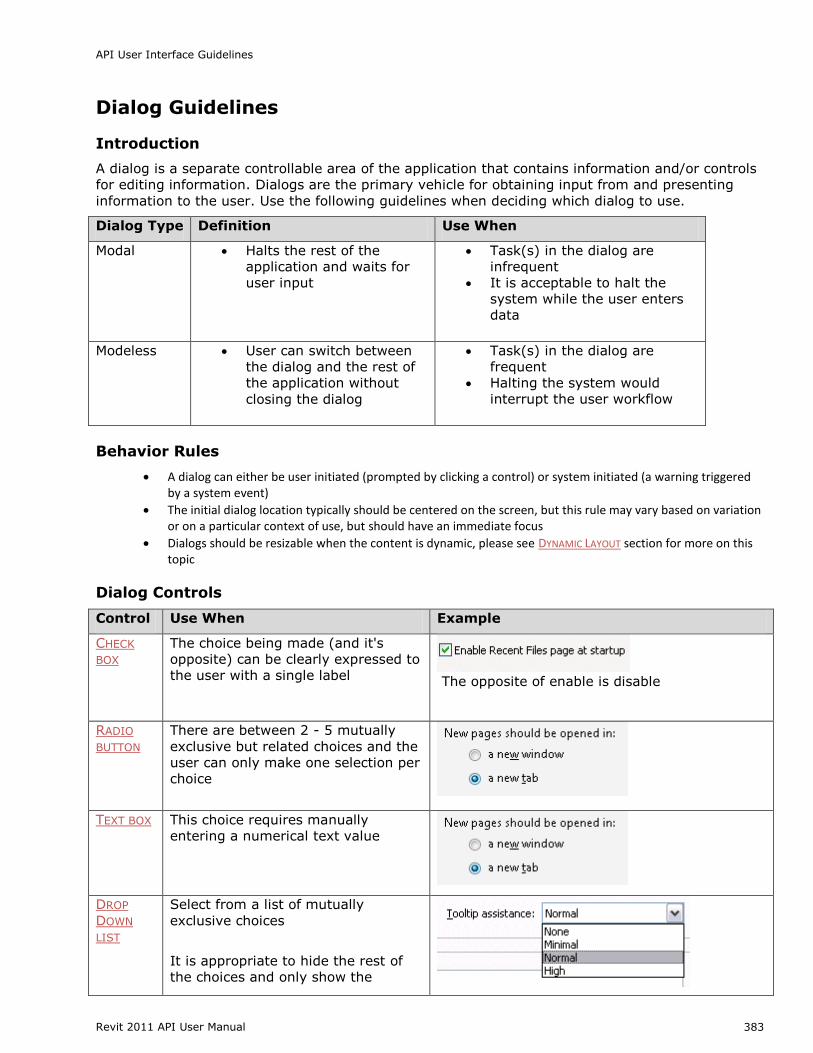
A dialog is a separate controllable area of the application that contains information and/or controls
for editing information. Dialogs are the primary vehicle for obtaining input from and presenting
information to the user. Use the following guidelines when deciding which dialog to use.
Dialog Type Definition Use When
Modal Halts the rest of the
application and waits for
user input
Task(s) in the dialog are
infrequent
It is acceptable to halt the
system while the user enters
data
Modeless User can switch between
the dialog and the rest of
the application without
closing the dialog
Task(s) in the dialog are
frequent
Halting the system would
interrupt the user workflow
Behavior Rules
A dialog can either be user initiated (prompted by clicking a control) or system initiated (a warning triggered by a system event)
The initial dialog location typically should be centered on the screen, but this rule may vary based on variation or on a particular context of use, but should have an immediate focus
Dialogs should be resizable when the content is dynamic, please see DYNAMIC LAYOUT section for more on this topic
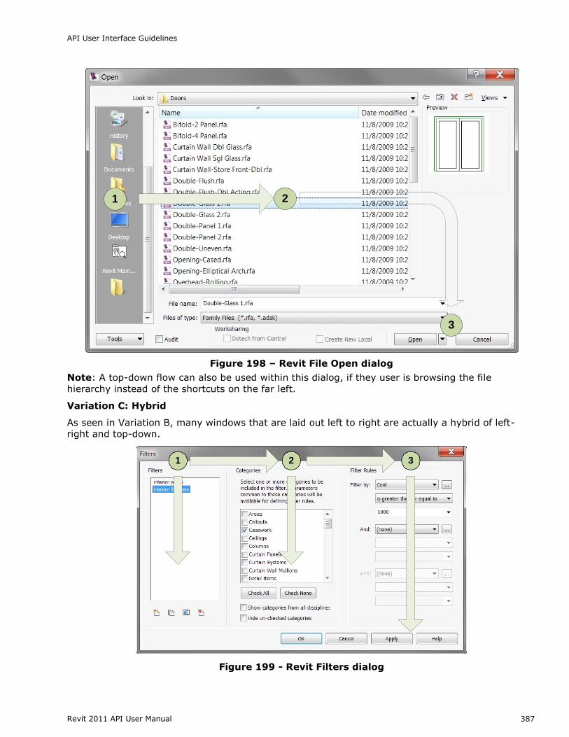
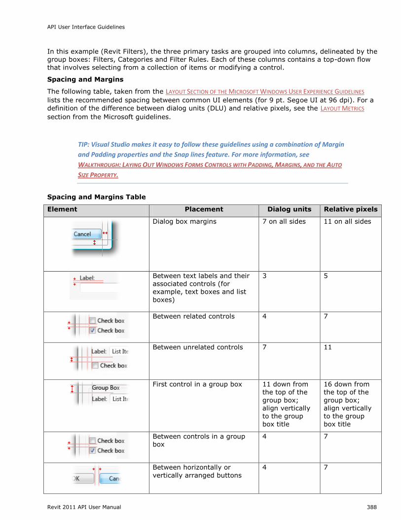
Group boxes are the most common solution used to explicitly group related controls together in a
dialog and give them a common grouping.
Figure 200 - Group box within a standard Print dialog
A group box should include:
Two or more related controls
Exists with at least one other group box
A label that:
o describes the group
o follows sentence style
o is in the form of a noun or noun phrase
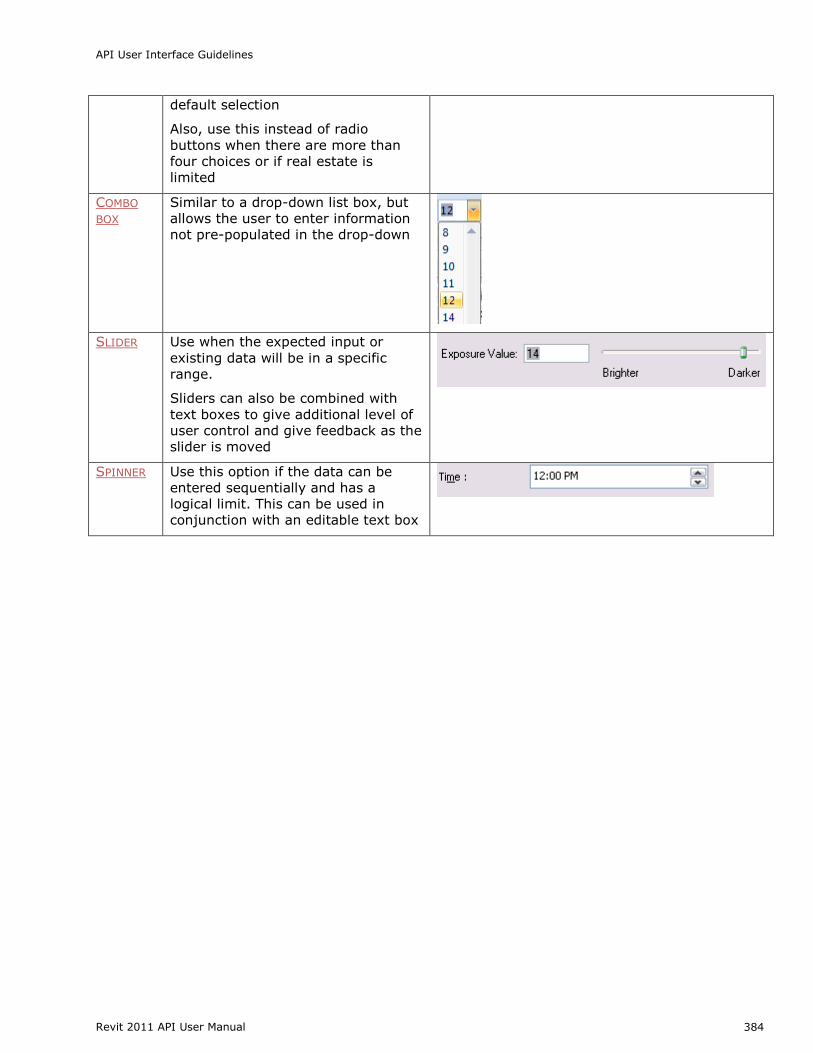
o does not use ending punctuation A Spacing and Margins section describes spacing rules
API User Interface Guidelines
Revit 2011 API User Manual 390
Poor Examples- What Not to Use
The following are examples of what should not be done:
Group boxes without a label or a group box with only one control.
One group box in a dialog.
The (Materials) single group box title is redundant with the dialog title and can be removed.
Figure 201 – Group box with no label and group box with one control and Group box with
title that is redundant with dialog title
Avoid ―nesting‖ two of more group boxes within one another and placing Commit buttons inside a
group box.
Horizontal Separator
An alternative to the traditional group box is a horizontal separator. Use this only when the groups
are stacked vertically in a single column.
The following example is from Microsoft Outlook 2007:
Figure 202 - Horizontal separators in Microsoft Outlook 2007
Spacing between the last control in the previous group and the next grouping line should be 12
DLUs (18 relative pixels).
Dynamic Layout
Content that is presented on different types or sizes of display devices usually requires the ability
to adapt to the form that it is displayed in. Using a dynamic layout can help when environment
API User Interface Guidelines
Revit 2011 API User Manual 391
changes such as localizing to other languages, changing the font size of content, and for allowing
user to manually expand the window to see more information.
To create a dynamic layout:
Treat the content of the window as dynamic and expand to fill the shape of its container unless constrained.
Add a resizing grip to the bottom right corner of the dialog.
The dialog should not be resizable to a size smaller than the default size.
The user defined size should be remembered within and between application sessions.
Elements in the dialog should maintain alignment during resizing based on the quadrant they are described in the following table:
Home Quadrant Alignment
1 Left and Top
2 Right and Top
3 Left and Bottom
4 Right and Bottom
Multiple If control is located in multiple quadrants, it should
anchor to quadrant 1 and/or 3 (to the left) and
expand/contract to the right to maintain alignments
Figure 203 - Four square grid applied to Revit View Templates dialog to demonstrate
how it should be resized
In this example, the list box is located in all four quadrants. So, it is anchored to the top-left and
expands to the right and to the bottom.
Implementation Notes
API User Interface Guidelines
Revit 2011 API User Manual 392
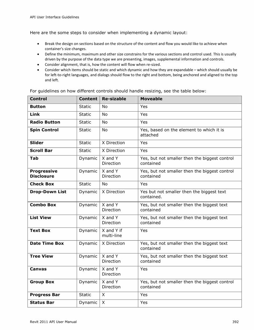
Here are the some steps to consider when implementing a dynamic layout:
Break the design on sections based on the structure of the content and flow you would like to achieve when container's size changes.
Define the minimum, maximum and other size constrains for the various sections and control used. This is usually driven by the purpose of the data type we are presenting, images, supplemental information and controls.
Consider alignment, that is, how the content will flow when re-sized.
Consider which items should be static and which dynamic and how they are expandable – which should usually be for left-to-right languages, and dialogs should flow to the right and bottom, being anchored and aligned to the top and left.
For guidelines on how different controls should handle resizing, see the table below:
Control Content Re-sizable Moveable
Button Static No Yes
Link Static No Yes
Radio Button Static No Yes
Spin Control Static No Yes, based on the element to which it is
attached
Slider Static X Direction Yes
Scroll Bar Static X Direction Yes
Tab Dynamic X and Y
Direction
Yes, but not smaller then the biggest control
contained
Progressive
Disclosure
Dynamic X and Y
Direction
Yes, but not smaller then the biggest control
contained
Check Box Static No Yes
Drop-Down List Dynamic X Direction Yes but not smaller then the biggest text
contained.
Combo Box Dynamic X and Y
Direction
Yes, but not smaller then the biggest text
contained
List View Dynamic X and Y
Direction
Yes, but not smaller then the biggest text
contained
Text Box Dynamic X and Y if
multi-line
Yes
Date Time Box Dynamic X Direction Yes, but not smaller then the biggest text
contained
Tree View Dynamic X and Y
Direction
Yes, but not smaller then the biggest text
contained
Canvas Dynamic X and Y
Direction
Yes
Group Box Dynamic X and Y
Direction
Yes, but not smaller then the biggest control
contained
Progress Bar Static X Yes
Status Bar Dynamic X Yes
API User Interface Guidelines
Revit 2011 API User Manual 393
Table or data grid Dynamic X and Y Yes, table columns should grow proportionally
in the X direction
TIP: For more detail on using a FlowLayoutPanel to build a resizable dialog, see: Walkthrough: Arranging Controls on Windows Forms Using a FlowLayoutPanel
Dialog Types
There are a handful of dialog types that persist throughout the Revit products. Utilizing these
standard types helps to drive consistency and leverage users‘ existing learning and knowledge
patterns.
Standard input dialog
This is the most basic dialog type. This should be used when the user needs to make a number of
choices and then perform a discrete operation based on those choices. Controls should follow rules
for
Grouping, SPACING AND MARGINS, and LAYOUT FLOW.
The Revit Export 2D DWF Options dialog is a good example of a Standard Input dialog.
Figure 204 - The Export 2D DWF Options dialog
Property Editor
Use when an item's properties need to be modified by the user. To create a property editor,
provide a TABLE VIEW that presents a name/property pair. The property field can be modified by a
Text Box, Check Box, Command Button, Drop-Down List, or even a slider.
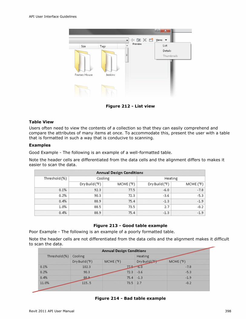
Users often need to view the contents of a collection so that they can easily comprehend and
compare the attributes of many items at once. To accommodate this, present the user with a table
that is formatted in such a way that is conducive to scanning.
Examples
Good Example - The following is an example of a well-formatted table.
Note the header cells are differentiated from the data cells and the alignment differs to makes it
easier to scan the data.
Figure 213 - Good table example
Poor Example - The following is an example of a poorly formatted table.
Note the header cells are not differentiated from the data cells and the alignment makes it difficult
to scan the data.
Figure 214 - Bad table example
API User Interface Guidelines
Revit 2011 API User Manual 399
Table title and header cells
Highlight and bold the table title to differentiate it from the data cells and the header cells
For columns that are sort able, clicking the header sorts the collection. To differentiate table
rows from each other, a different shade is used as background color for every second row.
Keep the difference between the two colors to a minimum to preserve a gentle feeling. The
colors should be similar in value and low in saturation - the one should be slightly darker or
lighter than the other. It is often seen that one of the two colors is the background color of
the page itself
Ensure that the colors are different than header and title rows
Title and header cells should be in title case
Columns containing numeric data
Right align the column headings for the data column
Right (decimal) align data in numeric columns
Format the values in percentage columns with percentage signs immediately to the right of
the values to ensure that users are aware that the values are percentages
NOTE: People can easily forget that they are looking at percentages so the redundancy is
important here, especially for tables with many values
Columns containing numerical data
Right align the column headings for the data column Right (decimal) align data in financial columns
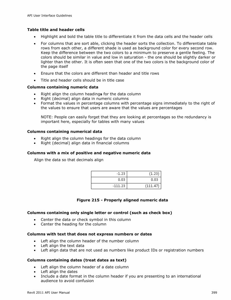
Columns with a mix of positive and negative numeric data
Align the data so that decimals align
Figure 215 - Properly aligned numeric data
Columns containing only single letter or control (such as check box)
Center the data or check symbol in this column Center the heading for the column
Columns with text that does not express numbers or dates
Left align the column header of the number column
Left align the text data Left align data that are not used as numbers like product IDs or registration numbers
Columns containing dates (treat dates as text)
Left align the column header of a date column
Left align the dates
Include a date format in the column header if you are presenting to an international audience to avoid confusion
API User Interface Guidelines
Revit 2011 API User Manual 400
Column Sorter
Use a column sorter when users are viewing a collection (such as a large table), possibly spanning
multiple pages, that they must scan for interesting values.
There are several meaningful possibilities for sorting the table and users may be more effective if
they can dynamically change the column that is used for sorting the values on.
Allow users to sort a collection of items by clicking on a column header
As users click on the column label, the table is sorted by that column
Another click reverses the order, which should be visualized using an up or down-wards
pointing arrow
Make sure it is visible which columns can be clicked on and which one is active now
Figure 216 - Column sorter
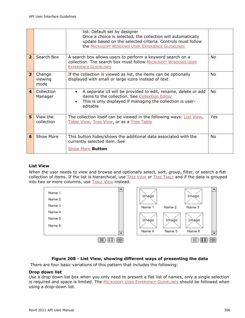
Tree View
Often a user may need to understand complex relationships within a hierarchy of items and this
can often best displayed within a ‗tree view.‘ The user may also need to select one or more of the
items. If the collection is a flat list, use the LIST VIEW and if the data is grouped into two or more
columns, use Table VIEW or TREE TABLE instead.
A tree UI follows the principle of user initiated PROGRESSIVE DISCLOSURE. Using a tree allows complex
hierarchical data to be presented in a simple, yet progressively complex manner. If the data
becomes too broad or deep, a search box should be considered.
Figure 217 - The Revit Project Browser is a good example of a tree view
API User Interface Guidelines
Revit 2011 API User Manual 401
Tree Table
As with a Tree View, the user may need to view and browse a hierarchically organized collection of
items with the intent of selecting one or more of the items. However, the user also needs to see
more properties of the item than just the name. To accommodate this, present the user with a tree
embedded within a table. Each row presents additional attributes of the item. Expanding a node
exposes another row.
Figure 218 - The Revit Visibility/Graphics dialog is a good example of a Tree Table
Collection Search / Filter
When the user is viewing a collection with many items, they may need to filter the number of
items. To accomplish this, provide a way for the user choose between either a system-provided list
of filter criteria and/or user-creatable criteria. Selecting the criteria automatically filters the
collection. The two most common ways are demonstrated in the Revit Materials dialog.
A search box allows the list to be filtered based on a keyword
A drop-down allows the list to be filtered based on a set of defined criteria
Collection Editor
In addition to viewing a collection of items, a user will also typically want to edit the collection. This
can be accomplished by associating a toolbar for editing, creating, duplicating, renaming, and
deleting items.
The Edit Bar
The buttons should be ordered left to right in the following order and with the following as tooltip
labels: Edit, New, Duplicate, Delete, Rename. If a feature does not utilize one or more buttons, the
rest move to the left.
Figure 219 - The Edit Bar
Action Context
1 Edit Use If an item can be edited. Editing an item may launch a separate dialog if there
are less than three properties to edit. See the Collection Viewer section for more
API User Interface Guidelines
Revit 2011 API User Manual 402
details on displaying collection items 2 New Use New if the application is creating a new item
3 Duplicate Use Duplicate if the feature can only duplicate existing items
4 Rename Use Rename if the feature allows items to be renamed
5 Delete Use Delete to remove the feature
To ensure that the primary UI element is placed first in the layout path, the following rules should
be followed when placing the manage controls:
Navigating list is primary task: place at the bottom-left of the list control
Managing list is primary task: place at top left of list control
When the main collection being managed is represented as a combo box: place to the right
of the combo box
Add/Remove
A slight variation on the Edit Bar is the use of Add and Remove buttons, denoted by plus and minus
icons, as shown below. Add and Remove is used when data is being added to an existing item in
the model.
The following is a good example of a Collection Editor dialog that uses both forms of the Edit Bar.
The Add (+) and Remove (-) buttons are used to add values to an already existing demand factor
type.
Figure 220 - Demand Factors dialog in Revit MEP 2011
API User Interface Guidelines
Revit 2011 API User Manual 403
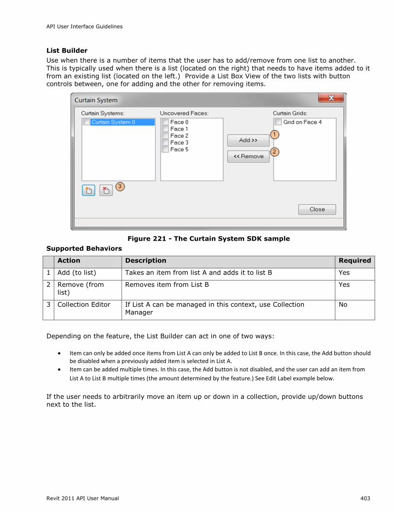
List Builder
Use when there is a number of items that the user has to add/remove from one list to another.
This is typically used when there is a list (located on the right) that needs to have items added to it
from an existing list (located on the left.) Provide a List Box View of the two lists with button
controls between, one for adding and the other for removing items.
Figure 221 - The Curtain System SDK sample
Supported Behaviors
Action Description Required
1 Add (to list) Takes an item from list A and adds it to list B Yes
2 Remove (from
list)
Removes item from List B Yes
3 Collection Editor If List A can be managed in this context, use Collection
Manager
No
Depending on the feature, the List Builder can act in one of two ways:
Item can only be added once items from List A can only be added to List B once. In this case, the Add button should be disabled when a previously added item is selected in List A.
Item can be added multiple times. In this case, the Add button is not disabled, and the user can add an item from
List A to List B multiple times (the amount determined by the feature.) See Edit Label example below.
If the user needs to arbitrarily move an item up or down in a collection, provide up/down buttons
All task dialogs require a title. Titles of task dialogs should be descriptive and as unique as
possible. Task dialog titles should take the format of the following:
<featureName> - <shortTitle>
Where <featureName> is the module from which the task dialog was triggered
And <shortTitle> is the action that resulted in the task dialog being shown
Examples: o Reference Edit – Version Conflict o Layer – Delete o BOM – Edit Formula
Where possible, use verbs on the second <shortTitle> part of the title such as Create, Delete,
Rename, Select, etc.
In cases where there is no obviously applicable feature name (or several) applying a short title
alone is sufficient.
A task dialog title should never be the product name, such as AutoCAD Architecture.
Title bar Icon
The icon appearing in the far left to the title bar should be that of the host application – this
includes third party plug-ins. Task dialogs may contain plug-in names in the title to specify the
source of the message, but the visual branding of all task dialogs should match the host
application; such as Revit Structure, Inventor, AutoCAD Electrical, etc.
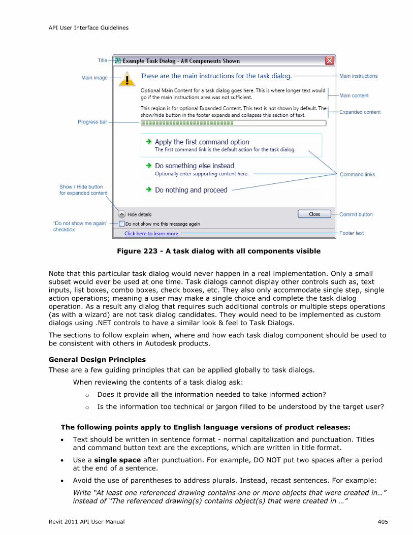
Main Instructions (required)
This is the large primary text that appears at the top of a task dialog.
Every task dialog should have main instructions of some kind
Text should not exceed three lines
[English Language Versions] Main instructions should be written in sentence format -
normal capitalization and punctuation
[English Language Versions] Address the user directly as ―you‖
[English Language Versions] When presented with multiple command link options the
standard final line for the main instructions should be, ―What do you want to do?‖
Figure 224 - A very simple task dialog with only main instructions for text
API User Interface Guidelines
Revit 2011 API User Manual 407
Main Content (optional – commonly used)
This is the smaller text that appears just below the main instructions.
Main content is optional. It‘s primarily used when all the required instructions for a task
dialog will not fit in the main instruction area
Main content should not simply restate the main instructions in a different way, it should
contain additional information that builds upon or reinforces the main instructions
[English Language Versions] Main instructions should be written in sentence format
(normal capitalization and punctuation)
[English Language Versions] Address the user directly as ―you‖ when needed
Figure 225 - A task dialog that uses both main instructions and main content
Expanded Content (optional – rarely used)
This text is hidden by default and will display at the bottom of the task dialog when the ―Show‖
button is pressed.
Expanded content is optional, and should be rarely used. It is used for information that is
not essential (advance or additional information), or that doesn‘t apply to most situations
[English Language Versions] Expanded content should be written in sentence format
(normal capitalization and punctuation)
[English Language Versions] Address the user directly as ―you‖ when needed
API User Interface Guidelines
Revit 2011 API User Manual 408
Figure 226 - The Show Details button displays additional Main Content text
Main Image (optional - low usage)
Task dialogs support the inclusion of an image to the left of the main instructions. Prior to task
dialogs it has been common for most dialogs to have some sort of icon to show that the
information it contained was informative, a warning, and error, etc.
Because images were used all the time the value of any image in a dialog was low.
For Autodesk products the warning icon (exclamation point in a yellow triangle) should
only be used in situations where a possible action will be destructive in some way and
likely cause loss of data or significant loss of time in rework.
A few examples include:
Overwriting a file
Saving to an older or different format where data may be lost
Permanently deleting data
Breaking associations between files through moving or renaming
This is only a partial list. With the exception of such situations usage of a main image should be
avoided. See Figure 228 for an example of a Task Dialog with a warning icon.
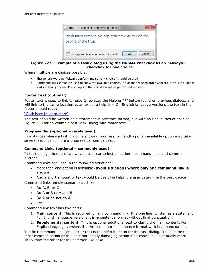
“Do not show me again” (DNSM) Checkbox (optional)
Task dialogs support a ―Do not show me again‖ checkbox that can be enabled on dialogs that users
can opt to not see in the future. The standard wording for the label on this checkbox for English
language versions is:
“Do not show me this message again”
Do not is not contracted to ―Don‘t‖ and there is no punctuation at the end of the line.
For the single action the working should be ―Always <action>‖ – for example
If the action is “Save current drawing” the checkbox label would read “Always save current drawing”
If the action is “Convert objects to linework” the checkbox label would read “Always convert objects to linework”
API User Interface Guidelines
Revit 2011 API User Manual 409
Figure 227 - Example of a task dialog using the DNSMA checkbox as an "Always..."
checkbox for one choice
Where multiple are choices possible:
The generic wording “Always perform my current choice” should be used
Command links should be used to show the available choices. If buttons are used and a Cancel button is included it looks as though “cancel” is an option that could always be performed in future
Footer Text (optional)
Footer text is used to link to help. It replaces the Help or ―?‖ button found on previous dialogs, and
will link to the same location as an existing help link. On English language versions the text in the
footer should read:
―Click here to learn more‖
The text should be written as a statement in sentence format, but with no final punctuation. See
Figure 226 for an example of a Task Dialog with footer text.
Progress Bar (optional – rarely used)
In instances where a task dialog is showing progress, or handling of an available option may take
several seconds or more a progress bar can be used.
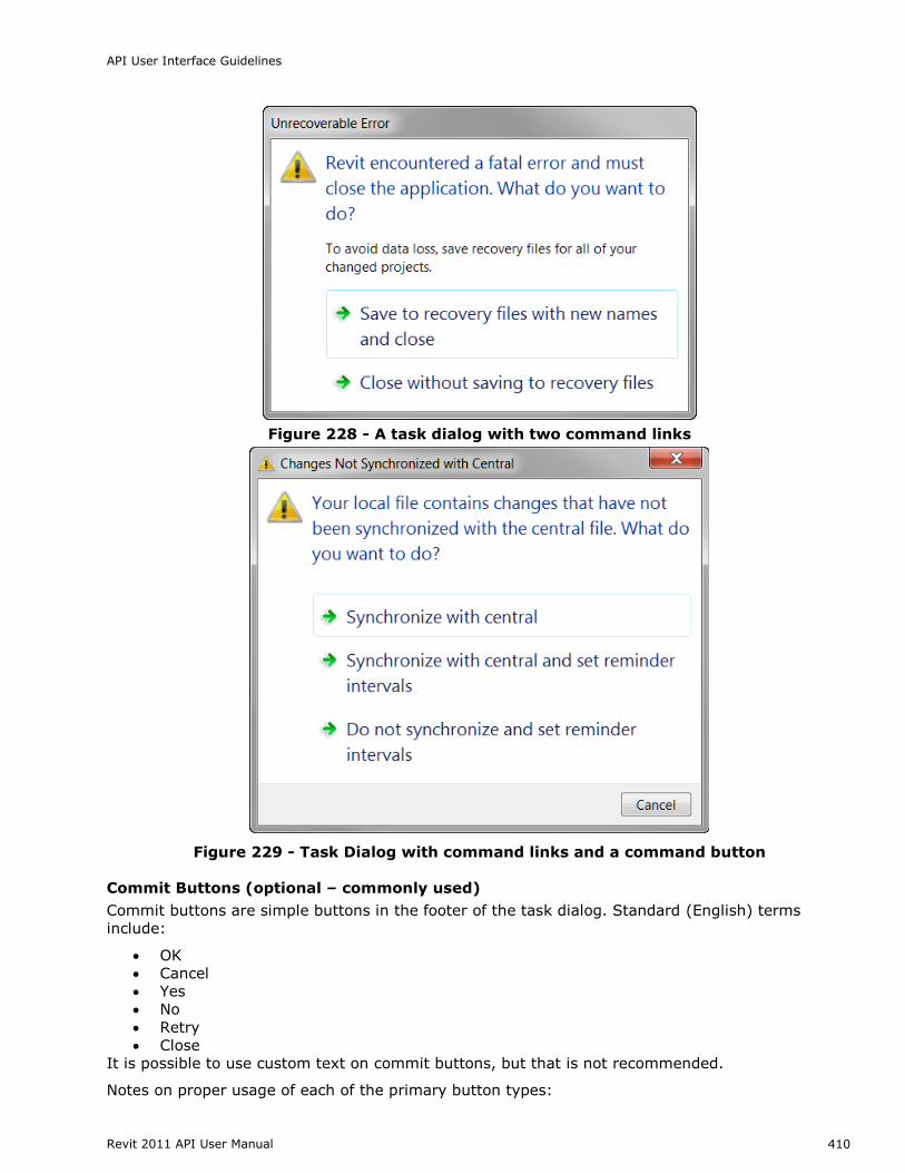
Command Links (optional – commonly used)
In task dialogs there are two ways a user can select an action – command links and commit
buttons.
Command links are used in the following situations:
More than one option is available (avoid situations where only one command link is
shown)
And a short amount of text would be useful in helping a user determine the best choice
Command links handle scenarios such as:
Do A, B, or C
Do A or B or A and B
Do A or do not do A
Etc
Command link text has two parts:
1. Main content: This is required for any command link. It is one line, written as a statement.
For English language versions it is in sentence format without final punctuation.
2. Supplemental content: This is optional additional text to clarify the main content. For
English language versions it is written in normal sentence format with final punctuation.
The first command link (one at the top) is the default action for the task dialog. It should be the
most common action or the least potentially damaging action if no choice is substantially more
likely than the other for the common use case.
API User Interface Guidelines
Revit 2011 API User Manual 410
Figure 228 - A task dialog with two command links
Figure 229 - Task Dialog with command links and a command button
Commit Buttons (optional – commonly used)
Commit buttons are simple buttons in the footer of the task dialog. Standard (English) terms
include:
OK
Cancel
Yes
No
Retry
Close
It is possible to use custom text on commit buttons, but that is not recommended.
Notes on proper usage of each of the primary button types:
API User Interface Guidelines
Revit 2011 API User Manual 411
The OK button should only be used in situations where a task dialog poses a question that
can be answered by OK.
The Cancel button should only be used when a task can truly be canceled, meaning the
action that triggered the task dialog will be aborted and no change will be committed. It can
be used in combination with other commit buttons or command links.
The Yes & No button(s) should always be used in combination, and the text in the main
instructions and / or main content should end in a yes / no question.
The Retry button must appear with at least a Cancel button as an alternate option, so a user
can choose not to retry.
The Close button is used on any purely informational task dialog; i.e. where the user has no
action to choose, but can just read the text and close the dialog.
Previously the OK button was often used on such dialogs. It should not be used in task
dialogs for this purpose.
The following are some examples of how commit buttons should be used:
See Figure 226 for an example of a Cancel button with command links
See Figure 224 for an example of a purely informative task dialog with a close button
See Figure 227 for an example of a task dialog with OK and Cancel buttons
Default button or link
All tasks dialogs should have a default button or link explicitly assigned. If the task dialog contains
an OK button, it should be the default.
Note: The exception is custom task dialogs with command links, which have actions that are
equally viable, with none being ―better‖ than the other, should not get assigned a default choice.
All dialogs using only commit buttons must be assigned a default button.
Navigation
Tabs
Use when there are loosely related, yet distinct "chunks" of information need to exist within the
same UI, but there is not enough room to display it all in a clear manner.
Separate the UI into distinct modal zones, each one represented by a "tab" with a descriptive label.
The entire dialog should be treated as a single window with a single set of Commit buttons.
All of the tabs should be visible at the same time
Never have a single tab in a static UI such as dialog. Instead, use the tab's title for the page
or dialog. Exception: if the number of tabs grows dynamically and the default is one. e.g.
Excel's open workbook tabs
Tabs are for navigation only. Selecting a tab should not perform any other action (such as a
commit) besides simply switching to that page in the window
Avoid nesting tabs within tabbed windows. In this case consider launching a child window Do not change the label on a tab dynamically based on interaction within the parent window
Avoid more than one row of horizontal tabs. If a second row is needed, consider a vertical tab.
Variation B: Vertical Tabs
Figure 231 - Vertical Tabs
Vertical tabs are useful:
In the Left-to-right Layout Flow
If there are enough tabs that would force a second row in a horizontal layout
Keyboard Accessibility
Tab Order
Pressing the tab key cycles the focus between each editable control in the dialog. The general rule
is left-to-right, top-to-bottom.
1. The default tab stop is at the control at the topmost, leftmost position in the dialog
2. Move right until there are no more controls in the current row
3. Move to the next row and start from the left-most control, moving right 4. Repeat step 2 until there are no more rows. Always end with the OK/Cancel/Apply row
API User Interface Guidelines
Revit 2011 API User Manual 413
Right and left arrow, down and up arrows, Tab and Shift-tab all have the same behavior,
respectively. Except for when the focus is on the following:
o List control or combo box: The right/left, down/up arrows move the cursor down/up
the list, respectively
o Grid control: The right/left move the cursor right/left across columns, And down/up
arrows move cursor down/up the list, respectively
o Slider: The right/left, down/up arrows move the slider right/left, respectively o Spinner: The right/left, down/up arrows move the spinner down/up, respectively
Treat each Group conceptually as a nested dialog, following the above rules within each
Group FIRST and moving from the top-left Group, moving to the right until no more groups are encountered and then moving to the next row of Groups.
If dialog is tabbed, default tab stop should be the default tab.
TIP: Visual Studio can assist with the creation and editing of tab order by toggling the Tab
Order visual helper (accessed from the View > Tab Order menu.)
Access Keys
Each editable control on a dialog should get a unique access key letter (which is represented
by an underlined letter in the control's label)
The user presses Alt key plus the assigned key and that control is activated as if it was
clicked
The default button does not require an access key since Enter is mapped to it
The Cancel or Close button also does not need access key since Esc is mapped to it. See
COMMITTING CHANGES for more detail
Show More Button
Following the principle of PROGRESSIVE DISCLOSURE, users may need a way of showing more data than is
presented as a default in the user interface. The Show More button is typically implemented in one
of two ways:
Expander Button: Provide a button with a label such as " << Preview " or "Show more >>" The
double brackets >> should point towards where the new information pane will be presented. When
opened, the double brackets should switch to indicate how the additional pane will be "closed."
See FIGURE 207 - MATERIALS DIALOG FROM REVIT for an example.
Dialog Launcher: A button with ellipses (…) that launches a separate dialog. This is typically used
to provide a separate UI for editing a selected item.
Figure 232 –Dialog launcher button, as implemented in the Revit View Filters dialog
API User Interface Guidelines
Revit 2011 API User Manual 414
Committing Changes
Modal dialogs are used to make changes to data within the project file. Use when there is an editor
a series of edits have been queued up in a modal dialog or form and need to be committed at once.
If the dialog is purely informational in nature, use a TASK DIALOG, which has its own committing rules.
Each modal dialog or web-form must have a set of commit buttons for committing the changes
and/or canceling the task and/or closing the dialog.
Sizing
Figure 233 - Commit Button sizes (taken from Microsoft Windows User Experience
Guidelines)
Layout
A summary of commit button styles for different window types
Pattern Commit Button style
Modal Dialog OK/Cancel or [Action]/Cancel
Modeless dialog Close button on dialog box and title bar
Progress
Indicator Use Cancel if returns the environment to its previous state (leaving no side
effect); otherwise, use Stop
Commit buttons should follow this layout pattern.
API User Interface Guidelines
Revit 2011 API User Manual 415
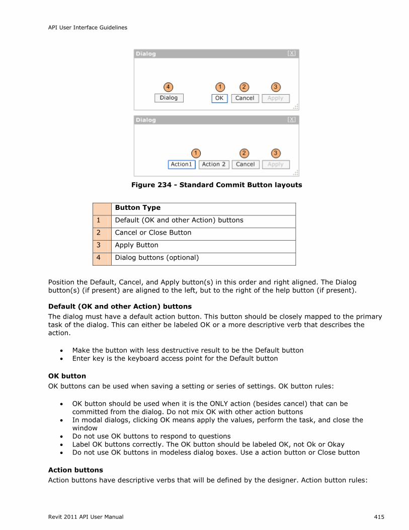
Figure 234 - Standard Commit Button layouts
Button Type
1 Default (OK and other Action) buttons
2 Cancel or Close Button
3 Apply Button
4 Dialog buttons (optional)
Position the Default, Cancel, and Apply button(s) in this order and right aligned. The Dialog
button(s) (if present) are aligned to the left, but to the right of the help button (if present).
Default (OK and other Action) buttons
The dialog must have a default action button. This button should be closely mapped to the primary
task of the dialog. This can either be labeled OK or a more descriptive verb that describes the
action.
Make the button with less destructive result to be the Default button
Enter key is the keyboard access point for the Default button
OK button
OK buttons can be used when saving a setting or series of settings. OK button rules:
OK button should be used when it is the ONLY action (besides cancel) that can be
committed from the dialog. Do not mix OK with other action buttons
In modal dialogs, clicking OK means apply the values, perform the task, and close the
window
Do not use OK buttons to respond to questions
Label OK buttons correctly. The OK button should be labeled OK, not Ok or Okay Do not use OK buttons in modeless dialog boxes. Use a action button or Close button
Action buttons
Action buttons have descriptive verbs that will be defined by the designer. Action button rules:
API User Interface Guidelines
Revit 2011 API User Manual 416
Action buttons can be used to describe more clearly the action that will be taken when
clicked
One action button must be set as the default. This should be the action most closely
mapped to the primary task of the dialog
There can be one or more action buttons, but do not mix OK button with action buttons
Use Cancel or Close button for negative commit buttons instead of specific responses to the
main instruction
Otherwise, if user wants to cancel, the negative commit would require more thinking than needed for this particular small task
Cancel or Close Button
Verify the Close button on the title bar has the same effect as Close or Cancel
Esc is the keyboard shortcut for Cancel or Close
Cancel button
Cancel button should only be used when a task will be aborted and no change will be
committed
Clicking the Cancel button means abandon all changes, cancel the task, close the window,
and return the environment to its previous state and leaving no side effect
For nested choice dialog boxes, clicking the Cancel button in the owner choice dialog
typically means any changes made by owned choice dialogs are also abandoned.
Don't use Cancel button in modeless dialog boxes. Use Close button instead
Close Button
Use Close button for modeless dialog boxes, as well as modal dialogs that cannot be
canceled Clicking Close button means close the dialog box window, leaving any existing side effects
Apply button (optional)
Apply button will commit any changes made within the dialog on all tabs, pages, or levels within a
hierarchy without closing the dialog. Optimally, the user will receive visual feedback of the applied
changes. Here are some basic Apply Button rules:
In modal or modeless dialogs, clicking Apply means apply the values, perform the task, and
do not close the window
In modeless dialog use Apply button only on those tasks that require significant or unknown
upfront time to be performed, otherwise data change should be applied immediately
The Apply button is disabled when no changes have been made. It becomes enabled when
changes have been made
Clicking cancel will NOT undo any changes that have been already committed with the Apply
button
Interacting with a child dialog (such as a confirmation) should not cause the Apply function
to become enabled
Clicking the Apply button after committing a child dialog (such as a confirmation message) will apply all the changes made previous to the action triggering the confirmation
Dialog Button (optional)
A dialog button performs an action on the dialog itself. Examples include: Reset and Tools for
managing Favorites in an Open Dialog. They should be aligned to the far left of the dialog (to the
right of the help button if present) and should never be the default.
API User Interface Guidelines
Revit 2011 API User Manual 417
Implementation Notes
Keyboard Access - each commit button should have a keyboard access key mapped to it.
The default button should be mapped to Enter
The close button (whether it is Cancel or Close) should be mapped to Esc If Apply exists, and is NOT the default button, it should be mapped to Alt-A
Ribbon Guidelines
The following are aspects of the ribbon UI that can be modified by individual API developers. These
guidelines must be followed to make your application‘s user interface (UI) compliant with standards
used by Autodesk.
Ribbon Tab Placement
To make more room on the ribbon, third-party applications can now add ribbon controls to the
Analyze tab as well as the Add-Ins tab.
Applications that add and/or modify elements within Revit should be added to the Add-Ins
tab.
Applications that analyze existing data within the Revit model should be added to the
Analyze tab.
Applications MUST NOT be added to both the Add-Ins and Analyze tabs.
Contextual Tab Focus User Option
The Revit 2011 product line now contains a user option (located on the User Interface tab of the
Options dialog) which allows users to choose whether or not to automatically switch to a contextual
tab upon selection. This option is set to automatically switch by default. For some API applications,
it may be favorable to have this option disabled, to prevent users from being switched away from
the Add-ins or Analyze tab. In these cases, it is best to inform users of this option in the
documentation and/or as informational text in the installer user interface.
Number of Panels per Tab
Each API application SHOULD add only one panel to either the Add-Ins tab.
Panel Layout
The following guidelines define the proper way to lay out a panel on the Add-ins tab. The following
panel under General Layout provides an example to follow.
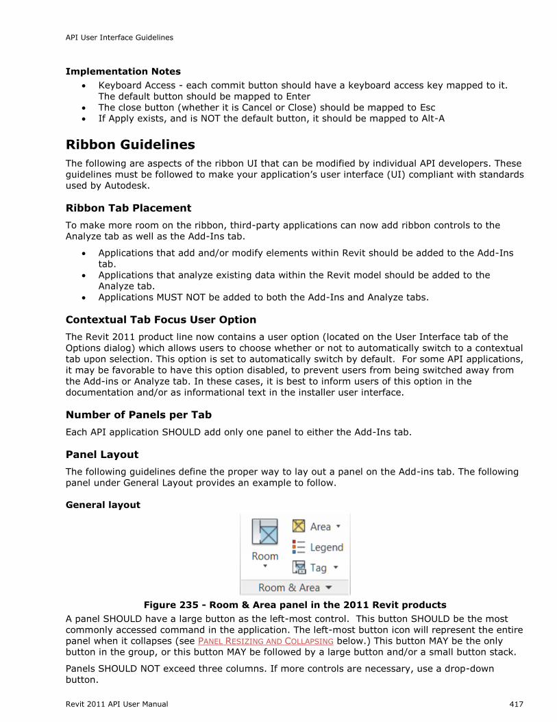
General layout
Figure 235 - Room & Area panel in the 2011 Revit products
A panel SHOULD have a large button as the left-most control. This button SHOULD be the most
commonly accessed command in the application. The left-most button icon will represent the entire
panel when it collapses (see PANEL RESIZING AND COLLAPSING below.) This button MAY be the only
button in the group, or this button MAY be followed by a large button and/or a small button stack.
Panels SHOULD NOT exceed three columns. If more controls are necessary, use a drop-down
button.
API User Interface Guidelines
Revit 2011 API User Manual 418
Panels SHOULD only contain controls for launching commands and controlling the application.
Controls for managing settings or launching help and ―about this application‖ should be located in a
SLIDE-OUT PANEL.
Small button stack
The stack MUST have at least two buttons and MUST NOT exceed three.
The order of the small buttons SHOULD follow most frequent on bottom to least frequent on
top. This is because the more frequently accessed command should be closer to the
modeling window.
Panel Resizing and Collapsing
By default, panels will be placed left to right in descending order left to right based on the order in
which they were installed by the customer. Once the width of the combined panels exceeds the
width of the current window, the panels will start to resize starting from the right in the following
order:
1. Panels with large buttons:
a. Small buttons lose their labels, then:
b. The panel collapses to a single large button (the icon representing the panel will be
the first icon on the left.)
2. Panels with ONLY small button stack(s):
a. Small buttons lose their labels and the panel label gets truncated to four characters
and an ellipsis (three periods in a row.)
b. If a small button stack is the left-most control in a panel, then the top button must
have a large icon associated with it. This icon will represent the panel when
collapsed.
The About button/link should be located within the main user interface and not on a ribbon panel.
Note: Panel resizing and collapsing is handled automatically by the ribbon component.
Ribbon Controls
Ribbon button
A Ribbon button is the most basic and most frequently-used control. Pressing a button invokes a
command.
Ribbon buttons can be one of the three sizes:
Large: MUST have a text label
Medium: MAY have a text label
Small: MAY have a text label
Radio Buttons
A radio button group represents a set of controls that are mutually exclusive; only one can be
chosen at a time. These groups can be stacked horizontally (as seen in the justification buttons in
the example below.)
Figure 236 - The Format text panel from Revit 2011
API User Interface Guidelines
Revit 2011 API User Manual 419
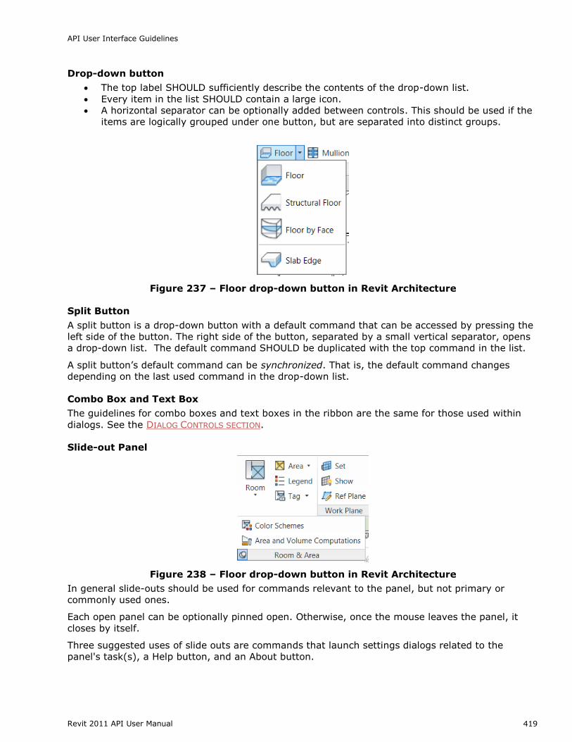
Drop-down button
The top label SHOULD sufficiently describe the contents of the drop-down list.
Every item in the list SHOULD contain a large icon.
A horizontal separator can be optionally added between controls. This should be used if the
items are logically grouped under one button, but are separated into distinct groups.
Figure 237 – Floor drop-down button in Revit Architecture
Split Button
A split button is a drop-down button with a default command that can be accessed by pressing the
left side of the button. The right side of the button, separated by a small vertical separator, opens
a drop-down list. The default command SHOULD be duplicated with the top command in the list.
A split button‘s default command can be synchronized. That is, the default command changes
depending on the last used command in the drop-down list.
Combo Box and Text Box
The guidelines for combo boxes and text boxes in the ribbon are the same for those used within
dialogs. See the DIALOG CONTROLS SECTION.
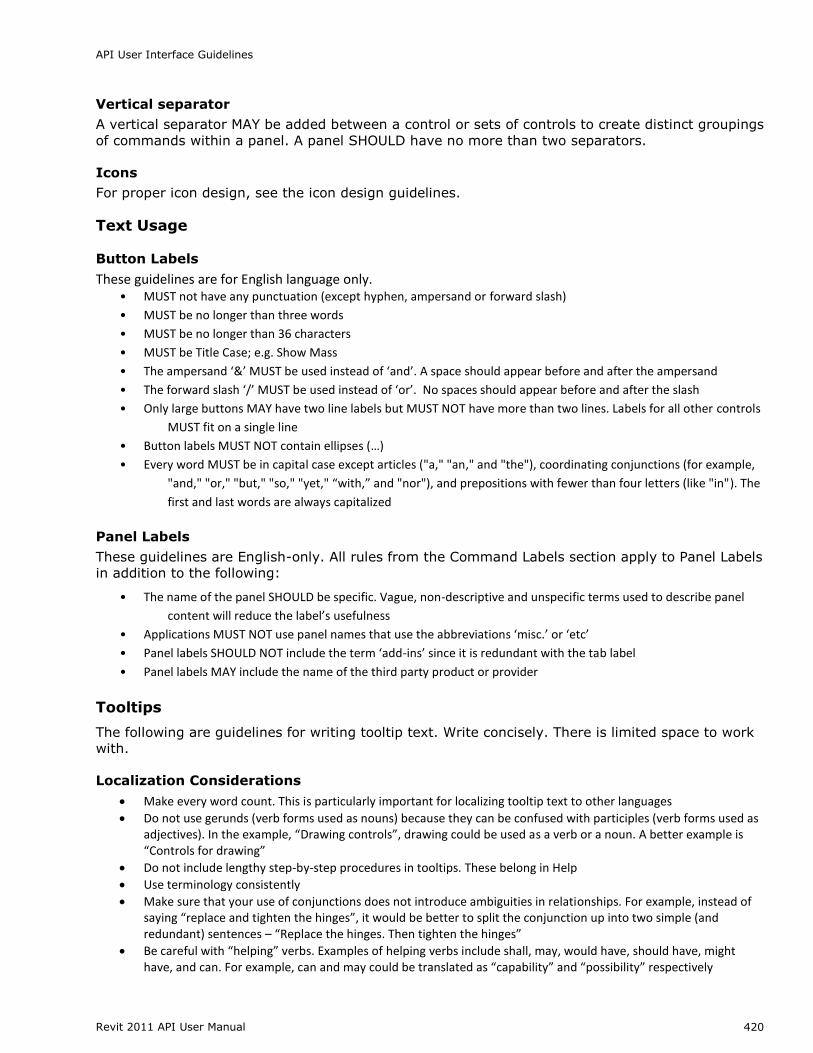
Slide-out Panel
Figure 238 – Floor drop-down button in Revit Architecture
In general slide-outs should be used for commands relevant to the panel, but not primary or
commonly used ones.
Each open panel can be optionally pinned open. Otherwise, once the mouse leaves the panel, it
closes by itself.
Three suggested uses of slide outs are commands that launch settings dialogs related to the
panel's task(s), a Help button, and an About button.
API User Interface Guidelines
Revit 2011 API User Manual 420
Vertical separator
A vertical separator MAY be added between a control or sets of controls to create distinct groupings
of commands within a panel. A panel SHOULD have no more than two separators.
Icons
For proper icon design, see the icon design guidelines.
Text Usage
Button Labels
These guidelines are for English language only. • MUST not have any punctuation (except hyphen, ampersand or forward slash)
• MUST be no longer than three words
• MUST be no longer than 36 characters
• MUST be Title Case; e.g. Show Mass
• The ampersand ‘&’ MUST be used instead of ‘and’. A space should appear before and after the ampersand
• The forward slash ‘/’ MUST be used instead of ‘or’. No spaces should appear before and after the slash
• Only large buttons MAY have two line labels but MUST NOT have more than two lines. Labels for all other controls
MUST fit on a single line
• Button labels MUST NOT contain ellipses (…)
• Every word MUST be in capital case except articles ("a," "an," and "the"), coordinating conjunctions (for example,
"and," "or," "but," "so," "yet," “with,” and "nor"), and prepositions with fewer than four letters (like "in"). The
first and last words are always capitalized
Panel Labels
These guidelines are English-only. All rules from the Command Labels section apply to Panel Labels
in addition to the following:
• The name of the panel SHOULD be specific. Vague, non-descriptive and unspecific terms used to describe panel
content will reduce the label’s usefulness
• Applications MUST NOT use panel names that use the abbreviations ‘misc.’ or ‘etc’
• Panel labels SHOULD NOT include the term ‘add-ins’ since it is redundant with the tab label
• Panel labels MAY include the name of the third party product or provider
Tooltips
The following are guidelines for writing tooltip text. Write concisely. There is limited space to work
with.
Localization Considerations
Make every word count. This is particularly important for localizing tooltip text to other languages
Do not use gerunds (verb forms used as nouns) because they can be confused with participles (verb forms used as adjectives). In the example, “Drawing controls”, drawing could be used as a verb or a noun. A better example is “Controls for drawing”
Do not include lengthy step-by-step procedures in tooltips. These belong in Help
Use terminology consistently
Make sure that your use of conjunctions does not introduce ambiguities in relationships. For example, instead of saying “replace and tighten the hinges”, it would be better to split the conjunction up into two simple (and redundant) sentences – “Replace the hinges. Then tighten the hinges”
Be careful with “helping” verbs. Examples of helping verbs include shall, may, would have, should have, might have, and can. For example, can and may could be translated as “capability” and “possibility” respectively
API User Interface Guidelines
Revit 2011 API User Manual 421
Watch for invisible plurals such as “object and attribute settings”. Does this mean “the settings for one object and one attribute” or “the settings for many objects and many attributes”?
Be cautious about words that can be either nouns or verbs. Use articles or rewrite phrases like “Model Display” where model can be a noun or a verb in our software. Another example is “empty file”. It can mean “to empty a file” or “a file with no content”
Be careful using metaphors. Metaphors can be subtle and are often discussed in the context of icons that are not culturally appropriate or understood across cultures. Text metaphors (such as “places the computer in a hibernating state”) can also be an issue. Instead, you might say “places the computer in a low-power state”
Writing/Wording Considerations
Use simple sentences. The “Verb-Object-Adverb” format is recommended
Use strong and specific verbs that describe a specific action (such as “tile”) rather than weak verbs (such as “use to…”)
Write in the active voice (for example, “Moves objects between model space and paper space”)
Use the descriptive style instead of the imperative style (“Opens an existing drawing file” vs. “Open an existing drawing file”)
Make the tooltip description easily recognizable by using the third person singular (for example – “Specifies the current color” instead of “Specify the current color”)
Don’t use slang, jargon, or hard to understand acronyms
Formatting Considerations
Use only one space between sentences.
Avoid repetitive text. The content in the tooltip should be unique and add value.
Focus on the quality and understandability of the tooltip. Is the description clear? Is it helpful?
Unless it’s a system variable or command, do not use bold. Although bold is supported in Asian languages, it is strongly recommended to avoid using bold and italics, because of readability and stylistic issues.
Avoid abbreviations. For example, the word “Number” has many common abbreviations: No., Nbr, Num, Numb. It is best to spell out terms.
Good Example:
An example of a more useful descriptive sentence might be ―Adds a file such as a .bmp or .jpg‖.
This provides more detailed information and gives the user more insight into the feature.
Poor Example:
In this example, the tooltip content repeats the tooltip title verbatim and does not add value to the
tooltip. Additionally, if the translator cannot identify whether this string is a name/title or a
descriptive sentence, it will be difficult for them to decide on the translation style.
As with other guideline issues, follow MICROSOFT GUIDELINES FOR TITLE AND SENTENCE CASE (listed
Capitalize all nouns, verbs (including is and other forms of to be), adverbs (including than and when), adjectives (including this and that), and pronouns (including its)
Capitalize the first and last words, regardless of their parts of speech (for example, The Text to Look For)
Capitalize prepositions that are part of a verb phrase (for example, Backing Up Your Disk)
Do not capitalize articles (a, an, the), unless the article is the first word in the title
Do not capitalize coordinate conjunctions (and, but, for, nor, or), unless the conjunction is the first word in the title
Do not capitalize prepositions of four or fewer letters, unless the preposition is the first word in the title
Do not capitalize to in an infinitive phrase (for example, How to Format Your Hard Disk), unless the phrase is the first word in the title
Capitalize the second word in compound words if it is a noun or proper adjective, an "e-word," or the words have equal weight (for example, E-Commerce, Cross-Reference, Pre-Microsoft Software, Read/Write Access, Run-Time). Do not capitalize the second word if it is another part of speech, such as a preposition or other minor word (for example, Add-in, How-to, Take-off)
Capitalize user interface and application programming interface terms that you would not ordinarily capitalize, unless they are case-sensitive (for example, The fdisk command)
Follow the traditional capitalization of keywords and other special terms in programming languages (for example, The printf function, Using the EVEN and ALIGN Directives)
Capitalize only the first word of each column heading
Sentence Case
Always capitalize the first word of a new sentence
Do not capitalize the word following a colon unless the word is a proper noun, or the text following the colon is a complete sentence
Do not capitalize the word following an em-dash unless it is a proper noun, even if the text following the dash is a complete sentence
Always capitalize the first word of a new sentence following any end punctuation. Rewrite sentences that start with a case-sensitive lowercase word
Common Definitions
Ribbon
The horizontally-tabbed user interface across the top of (the application frame in) Revit 2010 and
later.
Ribbon Tab
The ribbon is separated into tabs. The Add-Ins ribbon tab, which only appears when at least one
add-in is installed, is available for third party developers to add a panel.
Ribbon Panel
A ribbon tab is separated into horizontal groupings of commands. An Add-In panel represents the
commands available for a third party developer‘s application. The Add-In panel is equivalent to the
toolbar in Revit 2009.
Ribbon Button
The button is the mechanism for launching a command. They can either be large, medium or small
(Both large and small buttons can either be a simple push button or a drop-down button.
Menu button
The default first panel on the Add-Ins tab is the External Tools panel that contains one button titled
―External Tools.‖ The External Tools menu-button is equivalent to the Tools > External Tools menu
API User Interface Guidelines
Revit 2011 API User Manual 423
in Revit 2009. Any External Command registered in Revit.ini under [ExternalCommands] will
appear in this menu button.
Figure 239 - External Tools menu-button on Add-Ins tab
Drop-down button
A drop-down button expands to show two or more commands in a drop-down menu. Each sub-
command can have its own large icon.
Vertical Separator
A vertical separator is a thin vertical line that can be added between controls on a panel.
Tooltip
A tooltip is a small panel that appears when the user hovers the mouse pointer over a ribbon
button. Tooltips provide a brief explanation of the commands expected behavior.
Terminology Definitions
Several words are used to signify the requirements of the standards. These words are capitalized.
This section defines how these special words should be interpreted. The interpretation has been
copied from INTERNET ENGINEERING TASK FORCE RFC 2119.
WORD DEFINITION
MUST This word or the term ―SHALL‖, mean that the item is an absolute
requirement
MUST NOT This phrase, or the phrase ―SHALL NOT‖, means that the item is an
absolute prohibition
SHOULD This word, or the adjective ―RECOMMENDED‖, mean that there may
exist valid reasons in particular circumstances to ignore the item, but
the full implications must be understood and carefully weighed before
choosing a different course
SHOULD NOT This phrase, or the phrase ―NOT RECOMMENDED‖, mean that there
may exist valid reasons in particular circumstances when the particular
behavior is acceptable or even useful, but the full implications should
be understood and the case carefully weighed before implementing
any behavior described with this label
MAY This word, or the adjective ―OPTIONAL‖, means that the item is truly
optional. One product team may choose to include the item because a
particular type of user requires it or because the product team feels
that it enhances the product while another product team may omit the