10
BRAND USAGE GUIDE 05
| Date post: | 31-Mar-2016 |
| Category: |
Documents |
| Upload: | hector-batista |
| View: | 212 times |
| Download: | 0 times |
BRAND USAGE GUIDE 05

BRAND USAGE GUIDE01
Overview
This guide was developed to provide the foundation for consistency of the G4 brand across all media including broadcast, web, collateral, promotions, and advertising. Consistently expressing the G4 visual identity builds a strong brand awareness, allowing G4 to become a marketplace leader.
Please follow these guidelines for the most effective expression of the G4 brand.

THE G4 LOGO 02
Logo Configuration
The G4 logo is the most visible component of the overall brand identity.
The primary lockup consists of four parts: the "G4" wordmark, the "VIDEOGAME TV" sub head that appears directly below it, the distinct G4 holding shape and the registered trademark symbol.
A secondary lockup with URL may be used for print and other off-air applications.
The logo art should not be altered in any way, but used always as supplied.
The following copyright notice must be included on all materials (website, advertising, etc.). Place it at the end of documents or at the bottom of the web page. Update the year as necessary.
©2005 G4 Media, Inc. All rights reserved.
When using the name in text always write it in the following way: G4 videogame tv
When describing the network always use the following language:
G4 is the only 24/7 television network dedicated to all things videogames.
The G4 Media corporate logo
The G4 Media corporate logo
The G4 Media corporate logo with URL
The G4 Media corporate logo with URL

THE G4 LOGO 03
Logo Proportions
The G4 logo has been developed as a balanced whole. At no time may the shape, configuration, or proportions be altered. The correct proportions are shown here. Consistent use of the logo helps maintain the integrity of the brand and ensures greater brand recognition.
Clear Space
To preserve the integrity of the logo and ensuremaximum impact in environments where it appears with other elements, clear space must be maintained on all sides of the logo. The minimum clear space required is relative to the size of the logo. It is equal to twice the X-height of the "VIDEOGAME TV" type as indicated.
Minimum Size
When the logo is reduced, there is a point at which it becomes ineffective. By establishing a minimum size for the logo it is ensured the logo is always prominent and readable. The G4 logo should never be reproduced smaller than .5 inches across.
G4 Media logo proportions
Clear space
Minimum size

THE G4 LOGO 04
Color Specifications
The G4 logo utilizes three spot colors: black, red, and grey. This full-color version is the preferred usage for all printed materials or promotional items. PMS colors are specified here for those purposes. Yellow is also considered part of the G4 family but its usage should be limited. When 4-color offset printing is used for printed materials, the logo may be reproduced in the 4-color equivalents of the Pantone colors. RGB values are provided for onscreen usage.
NOTE: For accurate color matching, follow the color formulas specified. Do not attempt to visually match any of the printed swatches on this page.
Monochromatic Logo
When using the four G4 spot colors or their 4-color equivalents is not an option on printed materials, a monochromatic version of the logo may be used. Black is the preferred option.
The G4 Media corporate logo colors
Monochromatic logo: Black
G4 BLACKPantone BLACK C
C:40 M:40 Y:30 K:100R:7 G:0 B:4
RGB HEX - 070004
G4 REDPantone 186 C
C:2 M:100 Y:100 K:13R:205 G:25 B:32
RGB HEX - CD1920
G4 GREYPantone WARM GREY 5 C
C:21 M:17 Y:27 K:11R:182 G:179 B:166
RGB HEX - B6B3A6
G4 YELLOWPantone 123 C
C:0 M:19 Y:94 K:2R:250 G:200 B:34
RGB HEX - FAC822
THE G4 LOGO 05
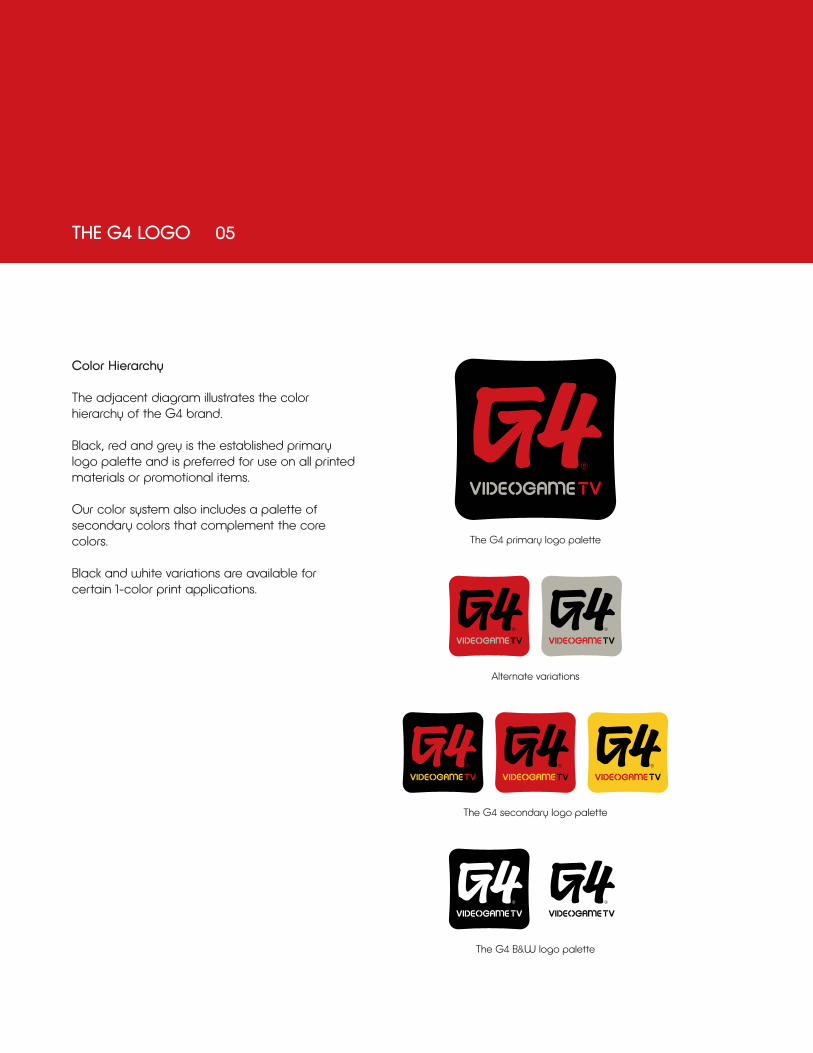
Color Hierarchy
The adjacent diagram illustrates the colorhierarchy of the G4 brand.
Black, red and grey is the established primary logo palette and is preferred for use on all printed materials or promotional items.
Our color system also includes a palette of secondary colors that complement the core colors.
Black and white variations are available for certain 1-color print applications.
The G4 primary logo palette
Alternate variations
The G4 B&W logo palette
The G4 secondary logo palette

THE G4 LOGO 06
Logo Application on Color Background
Although the 3-color logo on a white background is the preferred usage, there will be instances when the logo must appear on a color background. To maintain the legibility of the logo and brand integrity there always must be sufficient contrast between the logo and the background it appears on.
For application of the logo on a dark or black background it is acceptable use an approved color variation or remove the holding shape and reverse the logo to white for maximum legibility.
Background Control
The G4 logo may be printed on a color, pattern, or photographic background if there is adequate contrast with the logo. Shown here are examples of acceptable and unacceptable usage of the logo on various backgrounds.
Note: These rules also apply to black and white logo usage. Always maintain sufficient contrast between the logo and the background it appears on.
Background color must always provide sufficient contrast with the G4 colors.
The logo must reverse to white on dark backgrounds.
Photographic or patterned backgrounds must not be overly complex.

THE G4 LOGO 07
PROHIBITED LOGO USAGE
Do not alter the proportions of the logo components Do not apply graphic effects
Do not combine with other graphic elements
Do not apply outline to the logo, or use an outline only version of the logo.
Do not alter the logo lockup
A B
C
D E
A.
B.
C.
D.
E.

THE G4 TYPEFACES 08
PRINT USAGE
The DEFUSED font family is the approved typeface for the G4 brand.
DEFUSED REGULAR can be used for primary headlines online or in printed matter, and, at smaller sizes for short sidebars or captions. It should never be used for large areas of body copy.
DEFUSED LIGHT should be used for body copy. It can also be used for subheads, captions or whenever type must be set smaller than eight points.
Use these fonts as designed – do not artificially extend, or compress them.
ABCDEFGHIJKLMNOPQRSTUVWXYZabcdefghigklmnopqrstuvwxyz 1234567890(DEFUSED REGULAR)
ABCDEFGHIJKLMNOPQRSTUVWXYZabcdefghigklmnopqrstuvwxyz
1234567890(DEFUSED LIGHT)

THE G4 TYPEFACES 09
ON-AIR & WEB USAGE
CUT it OUT and the AAUX PRO font family are the approved on-air and web typeface for the G4 brand.
CUT it OUT can be used for primary headlines on-air or the web, and, at smaller sizes for short sidebars or captions. It should never be used for large areas of body copy.
AAUX PRO BOLD can be used for secondary headlines on-air or the web. It should never be used for large areas of body copy.
AAUX PRO REGULAR should be used for body copy. It can also be used for subheads, captions or whenever type must be set smaller than eight points.
Use these fonts as designed – do not artificially extend, or compress them.
PRIMARY ON-AIR & WEB USAGE
ABCDEFGHIJKLMNOPQRSTUVWXYZ1234567890CUT IT OUT
ABCDEFGHIJKLMNOPQRSTUVWXYZabcdefghigklmnopqrstuvwxyz 1234567890(AAUX PRO REGULAR)
SECONDARY ON-AIR & WEB USAGE
ABCDEFGHIJKLMNOPQRSTUVWXYZabcdefghigklmnopqrstuvwxyz 1234567890(AAUX PRO BOLD)