65
HAPPY SUPER PI DAY! 3.14.15… The number π is a mathematical constant, the ratio of a circle's circumference to its diameter, commonly approximated as 3.1415..9 NOT PIE DAY…
| Date post: | 16-Aug-2015 |
| Category: |
Data & Analytics |
| Upload: | hunter-whitney |
| View: | 151 times |
| Download: | 0 times |

INTRODUCTION 2
HAPPY SUPER PI DAY! 3.14.15…
The number π is a mathematical constant, the ratio of a circle's circumference to its diameter, commonly approximated as 3.1415..9
NOT PIE DAY…

DATA VISUALIZATION FROM A UX PERSPECTIVE
March 14, 2015 Hunter Whitney
1+ SXSW

INTRODUCTION
HUNTER WHITNEY2
! UX Design and Data Visualization Consultant
! Author and Contributing Editor
! @hunterwhitney"

Sections:
1) What is Data Visualization?
2) Data Visualization Purposes
3) Data and Design
4) UX Considerations for DV
3DATA VISUALIZATION FROM A UX PERSPECTIVE

INTRODUCTION TO DATA VISUALIZATION
SECTION 1: WHAT IS DATA VISUALIZATION?
4

6
VISUALIZATIONS MAKE IT EASIER TO SEE PATTERNS IN DATA
SECTION 1: WHAT IS DATA VISUALIZATION?
http://data.oecd.org/healthcare/child-vaccination-rates.htm

Selective encoding makes data easier to grasp and explore.
http://www.gapminder.org/
SECTION 1: WHAT IS DATA VISUALIZATION? 6
720349656089226535931140790070322302076958689027429003358787115045223998424533087922668417382319480046553364246202505406711172160430997890121737608183566145635519888049583302306957749597705315240714467203496560892265359311407900703223020769586890274290033587871150452239984245330879226684173823194800465533642462025054067111721604309978901217376081835661456355
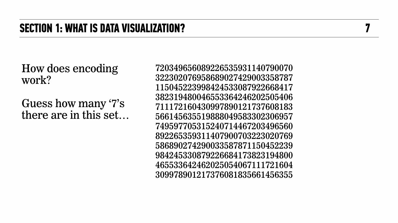
How does encoding work?
Guess how many ‘7’s there are in this set…
SECTION 1: WHAT IS DATA VISUALIZATION? 7

720349656089226535931140790070322302076958689027429003358787115045223998424533087922668417382319480046553364246202505406711172160430997890121737608183566145635519888049583302306957749597705315240714467203496560892265359311407900703223020769586890274290033587871150452239984245330879226684173823194800465533642462025054067111721604309978901217376081835661456355
They’re the same set numbers, but now the 7’s pop out at us.
Now, try guessing again…
SECTION 1: WHAT IS DATA VISUALIZATION? 8
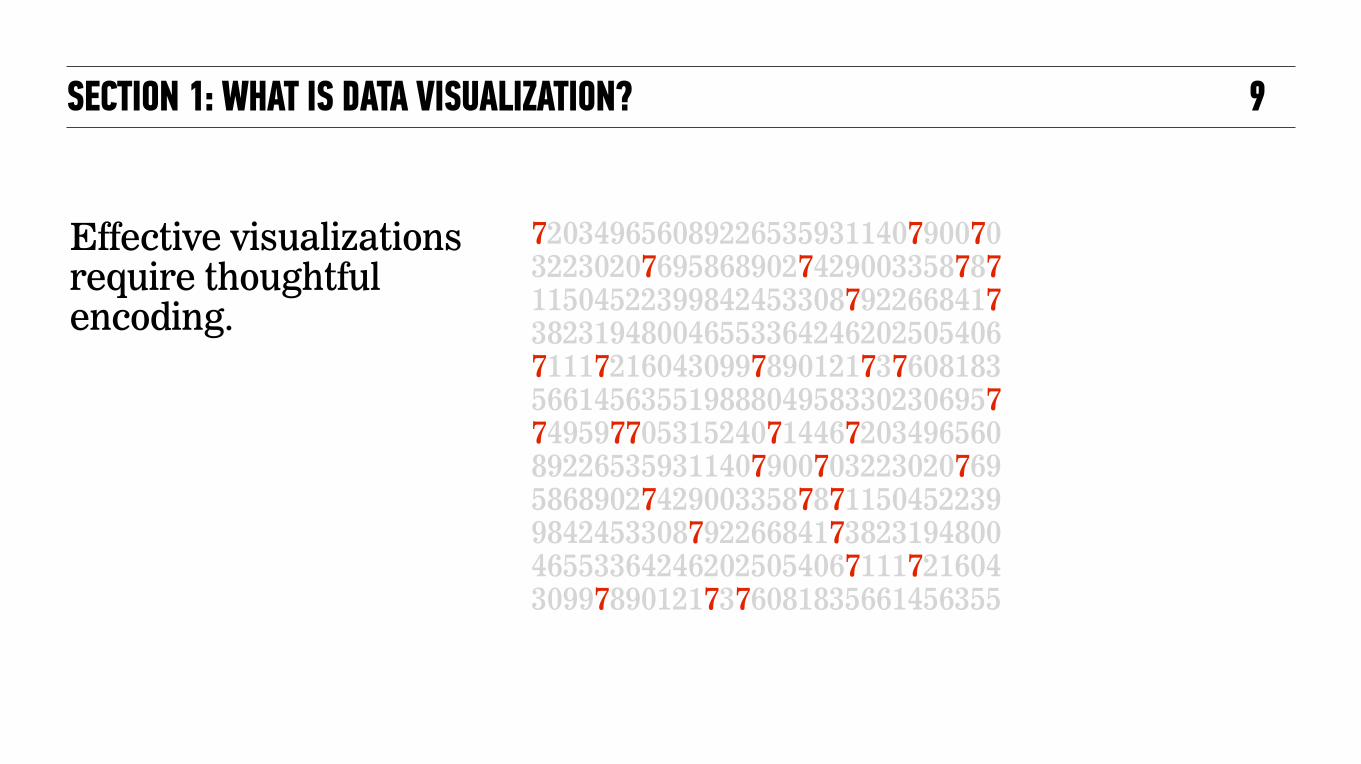
720349656089226535931140790070322302076958689027429003358787115045223998424533087922668417382319480046553364246202505406711172160430997890121737608183566145635519888049583302306957749597705315240714467203496560892265359311407900703223020769586890274290033587871150452239984245330879226684173823194800465533642462025054067111721604309978901217376081835661456355
Effective visualizations require thoughtful encoding.
SECTION 1: WHAT IS DATA VISUALIZATION? 9

Design decisions have a big impact on what people can find in the data.
SECTION 1: WHAT IS DATA VISUALIZATION? 10
720349656089226535931140790070
720349656089226535931140790070

12SECTION 1: WHAT IS DATA VISUALIZATION?
Scanning speed…
25 100500 75
Apple
Orange
Peach
Mango
Blueberry
Banana
Grapes
Chart Sub TitleBar Graph
Orange
25 100500 75
Apple
Orange
Peach
Mango
Blueberry
Banana
Grapes
Chart Sub TitleBar Graph
Orange

TAPPING IN TO OUR PERCEPTUAL POWERSThe “pop-out” effects are due to your brain’s pre-attentive processing.
SECTION 1: WHAT IS DATA VISUALIZATION? 12
COLOR HUE ORIENTATION TEXTURE POSITION & ALIGNMENT
COLOR BRIGHTNESS COLOR SATURATION SIZE SHAPE

What is easier to distinguish here - color or shape differences?
Combinations can tell a more layered story.
Some attributes pop out more than others.
13SECTION 1: WHAT IS DATA VISUALIZATION?
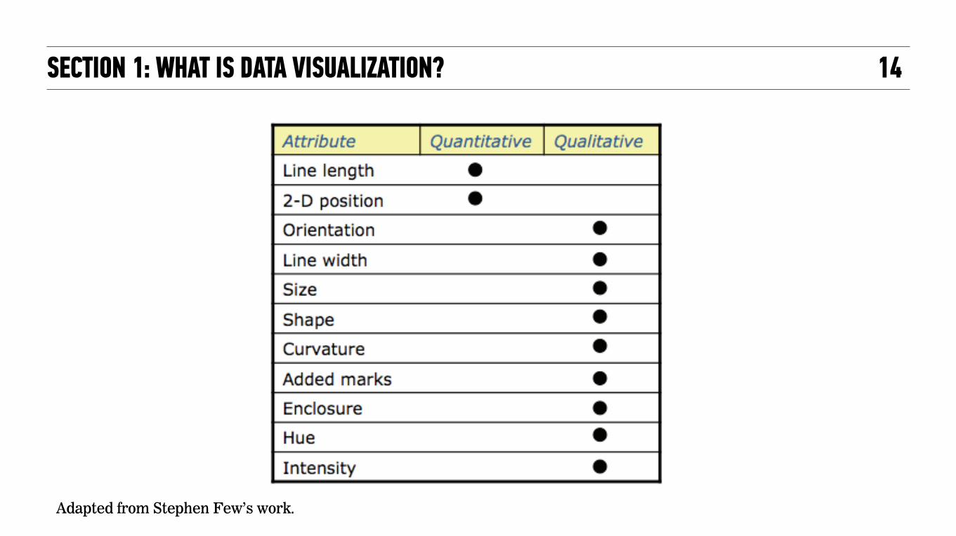
Adapted from Stephen Few’s work.
14SECTION 1: WHAT IS DATA VISUALIZATION?

16SECTION 1: WHAT IS DATA VISUALIZATION?
Consider encoding strategies to direct attention toward what’s critical.

A substantial portion of our brains is devoted to visual processing.
Source:http://www.flickr.com/photos/orangeacid/234358923/Creative Commons Attribution License
Source:http://en.wikipedia.org/wiki/File:Brodmann_areas_17_18_19.pngGNU Free Documentation License
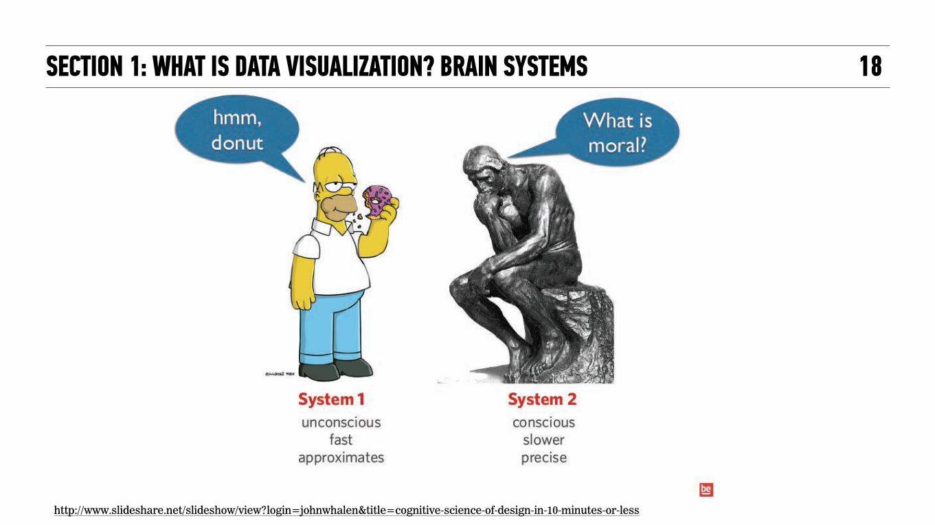
WE ARE WIRED FOR VISUALIZATION
10 Million Bits Per Second
Source:Current Biology (July 2006) by Judith McLean and Michael A. Freed
SECTION 1: WHAT IS DATA VISUALIZATION? HUMAN BRAIN 16

http://www.slideshare.net/slideshow/view?login=johnwhalen&title=cognitive-science-of-design-in-10-minutes-or-less
SECTION 1: WHAT IS DATA VISUALIZATION? PRE-ATTENTIVE PROCESSING
SHAPE
17
http://www.slideshare.net/slideshow/view?login=johnwhalen&title=cognitive-science-of-design-in-10-minutes-or-less
SECTION 1: WHAT IS DATA VISUALIZATION? BRAIN SYSTEMS 18
PUTTING THE PIECES TOGETHER The components of visualizations fit into a larger context of goals, users, and the media in which they are presented.
SECTION 1: WHAT IS DATA VISUALIZATION? BUILDING OUT 19

SECTION 2: DATA VISUALIZATION PURPOSES
INTRODUCTION TO DATA VISUALIZATION 20

Overview first, zoom and filter, then details-on-demand.‣ Time Series and Event Sequences ‣ Part-to-Whole ‣ Geospatial ‣ Ranking ‣ Distribution ‣ Correlation ‣ Deviation ‣ Nominal Comparison
There can be overlaps in what can be shown and related in one visualization.
CAN YOU RELATE? SECTION 2: DATA VISUALIZATION PURPOSES 21
23
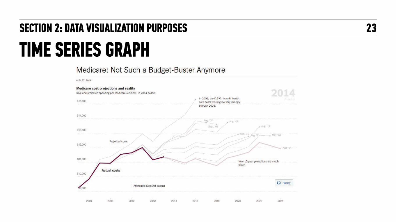
TIME SERIES GRAPHSECTION 2: DATA VISUALIZATION PURPOSES

23
STREAMGRAPHSECTION 2: DATA VISUALIZATION PURPOSES

24
TEMPORAL HEATMAPSECTION 2: DATA VISUALIZATION PURPOSES

SECTION 2: DATA VISUALIZATION USES 25
EARLY EXAMPLES OF TEMPORAL DATA VIS

26
NEAR REAL-TIME DATASECTION 2: DATA VISUALIZATION PURPOSES

28Class, Age, Sex, Survived, Quantity 1st,adult,male,yes,57 1st,adult,male,no,118 1st,adult,female,yes,140 1st,adult,female,no,4 1st,child,male,yes,5 1st,child,male,no,0 1st,child,female,yes,1 1st,child,female,no,0 2nd,adult,male,yes,14 2nd,adult,male,no,154 2nd,adult,female,yes,80 2nd,adult,female,no,13 2nd,child,male,yes,11 2nd,child,male,no,0 2nd,child,female,yes,13 2nd,child,female,no,0 3rd,adult,male,yes,75 3rd,adult,male,no,387 3rd,adult,female,yes,76 3rd,adult,female,no,89 3rd,child,male,yes,13 3rd,child,male,no,35 3rd,child,female,yes,14 3rd,child,female,no,17 crew,adult,male,yes,192 crew,adult,male,no,670 crew,adult,female,yes,20 crew,adult,female,no,3 crew,child,male,yes,0 crew,child,male,no,0 crew,child,female,yes,0 crew,child,female,no,0
SECTION 2: DATA VISUALIZATION PURPOSES
PART-TO-WHOLE
http://blog.visual.ly/the-whole-story-on-part-to-whole-relationships/
Here is some data about the makeup of the passengers and crew of the Titanic’s last voyage.
How would you visualize relationships between these groups?

29SECTION 2: DATA VISUALIZATION PURPOSES
PART-TO-WHOLE

Overview first, zoom and filter, then details-on-demand.
PART-TO-WHOLE: HIERARCHIES TREEMAP SECTION 2: DATA VISUALIZATION PURPOSES 29
Overview first, zoom and filter, then details-on-demand.
Source: http://blog.visual.ly/the-whole-story-on-part-to-whole-relationships/

TREEMAPS: HIERARCHY AND PROPORTIONSSECTION 2: DATA VISUALIZATION PURPOSES 30
Source: Data Insights: New Ways to Visualize and Make Sense of Data, by Hunter Whitney, Morgan Kaufmann; 2012."

PART-TO-WHOLE: OTHER EXAMPLESSECTION 2: DATA VISUALIZATION PURPOSES 31
* Source: http://blog.visual.ly/the-whole-story-on-part-to-whole-relationships/
**
Pie Stacked Area
Parallel Sets Sankey Diagram
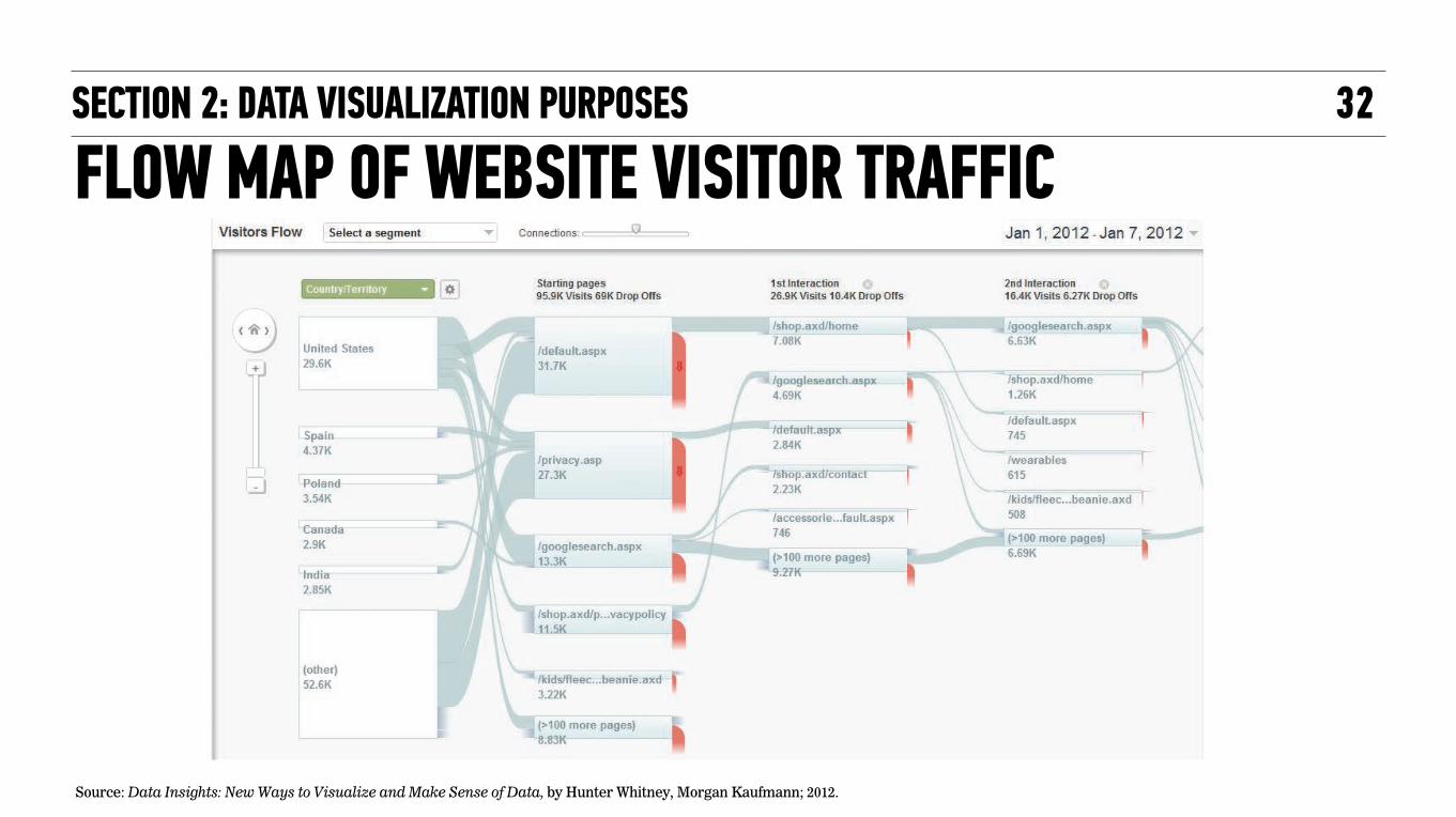
FLOW MAP OF WEBSITE VISITOR TRAFFIC32SECTION 2: DATA VISUALIZATION PURPOSES
Source: Data Insights: New Ways to Visualize and Make Sense of Data, by Hunter Whitney, Morgan Kaufmann; 2012."

GEOSPATIAL: EARLY EXAMPLE
Source:"http://en.wikipedia.org/wiki/1854_Broad_Street_cholera_outbreak "
SECTION 2: DATA VISUALIZATION PURPOSES 33

35
http://datavizblog.com/category/distribution/
SECTION 2: DATA VISUALIZATION PURPOSES
DISTRIBUTION

36
http://www.statsblogs.com/2014/08/20/creating-heat-maps-in-sasiml/
CORRELATIONSECTION 2: DATA VISUALIZATION PURPOSES

37SECTION 2: DATA VISUALIZATION PURPOSES
DEVIATION

SECTION 3: DATA AND DESIGN
INTRODUCTION TO DATA VISUALIZATION 37

THE MARRIAGE OF DATA AND DESIGN DATA CAN BE BROKEN INTO TWO MAJOR CLASSES: DISCRETE AND CONTINUOUS
38
Source: Data Insights: New Ways to Visualize and Make Sense of Data, by Hunter Whitney, Morgan Kaufmann; 2012."
SECTION 3: DATA AND DESIGN

39
Source: Data Insights: New Ways to Visualize and Make Sense of Data, by Hunter Whitney, Morgan Kaufmann; 2012."
SECTION 3: DATA AND DESIGN
THE MARRIAGE OF DATA AND DESIGN
SECTION 2: DATA VISUALIZATION PURPOSES 40
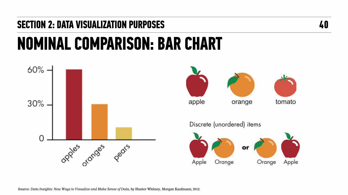
NOMINAL COMPARISON: BAR CHART
Source: Data Insights: New Ways to Visualize and Make Sense of Data, by Hunter Whitney, Morgan Kaufmann; 2012."

42
DIFFERENT VIEWS OF THE DATA
Source: Data Insights: New Ways to Visualize and Make Sense of Data, by Hunter Whitney, Morgan Kaufmann; 2012."
SECTION 2: DATA VISUALIZATION PURPOSES

SECTION 3: DATA VISUALIZATION PROCESS AND PRACTICES 42
Source: Reprinted in Data Insights: New Ways to Visualize and Make Sense of Data, by Hunter Whitney, Morgan Kaufmann; 2012."

44SECTION 3: DATA AND DESIGN
Source: Data Insights: New Ways to Visualize and Make Sense of Data, by Hunter Whitney, Morgan Kaufmann; 2012."
CONTEXT AND PERCEPTION
http://blog.visual.ly/building-effective-color-scales/

45
http://swiked.tumblr.com/post/112073818575/guys-please-help-me-is-this-dress-white-and
THE COLOR COMBO THAT BROKE THE INTERNET

CONTEXT AND PERCEPTION46
http://www.lottolab.org/articles/illusionsoflight.asp http://adaynotwasted.com/2010/02/light-and-color-illusionsgin-art/
SECTION 3: DATA AND DESIGN

47
COLOR CONSTANCYSECTION 3: DATA AND DESIGN

SECTION 4: UX CONSIDERATIONS FOR DV
INTRODUCTION TO DATA VISUALIZATION 47

SECTION 4: UX CONSIDERATIONS FOR DV 48
http://cnr.ncsu.edu/geospatial/wp-content/uploads/sites/6/2014/02/earth_observation-574_crop1-1500x600.jpg

50
Where did this come from? What can I do with it?What is it showing me ?
Do I have other options for visualizing these data?
SECTION 4: UX CONSIDERATIONS FOR DV

USER CONTROL: HIGH
STATIC
EXPLAINEXPLORE
(e.g., data-intensive research applications)
(e.g., print infographic advocacy )
(e.g., interactive infographic journalism)
(e.g., data-rich visualizations with limited interactivity)
DYNAMIC
USER CONTROL: LOW
50SECTION 4: UX CONSIDERATIONS FOR DV

52
http://www.oum.ox.ac.uk/visiting/images/Wallace_papilio.jpg http://images.nationalgeographic.com/wpf/media-live/photos/000/000/cache/blue-morpho-butterfly_89_600x450.jpg
SECTION 4: UX CONSIDERATIONS FOR DV
STATIC DYNAMIC

LET’S CONSIDER DYNAMIC HIGH USER CONTROL VISUALIZATIONS…
52
• Context and Transitions • Workflow and Pivoting • Strategically breaking out different views of data • Divide-and-Conquer Versus All-in-One Visualizations
SECTION 4: UX CONSIDERATIONS FOR DV

54SECTION 4: UX CONSIDERATIONS FOR DV (EXAMPLE 1)
Thank you Jeff Chang, MD.

55SECTION 4: UX CONSIDERATIONS FOR DV (EXAMPLE 2)
Thank you Brad Friedman, Ph.D. More info: http://bioconductor.org/packages/devel/bioc/html/AnalysisPageServer.html

56SECTION 4: UX CONSIDERATIONS FOR DV (EXAMPLE 3)
Thank you, Joe Preston, CXO Momentum Design Lab http://momentumdesignlab.com/

57
Courtesy of Joe Preston CXO Momentum Design Lab
SECTION 4: UX CONSIDERATIONS FOR DV (EXAMPLE 3)

VISUALIZATION IS ONLY THE TIP OF THE ICEBERGData visualization is only a part of a much larger process that includes identifying the purpose of the visualization, the kinds of people who will use it, the types of data that can be collected and analyzed, and good design choices.
62SECTION 4: UX CONSIDERATIONS FOR DV (EXAMPLE 3)

VISUALIZATION IS PART OF AN ITERATIVE PROCESS
63
Source: Data Insights: New Ways to Visualize and Make Sense of Data, by Hunter Whitney, Morgan Kaufmann; 2012."
SECTION 4: UX CONSIDERATIONS FOR DV (EXAMPLE 3)

THANK YOU!
63+ SXSW

RESOURCESINTRODUCTION TO DATA VISUALIZATION 86

DATA VISUALIZATION RESOURCESRESOURCES
‣ Flowing Data (http://flowingdata.com/
‣ Fast Company. Co.design. (http://www.fastcodesign.com/)
‣ UX Magazine (http://uxmag.com/)
‣ The Human-Computer Interaction Lab (http://www.cs.umd.edu/hcil/)
‣ A Periodic Table of Visualization Methods (www.visual-literacy.org/periodic_table/periodic_table.html)
Sites:
87

DATA VISUALIZATION BOOKS:
‣ Bertin, J. (2011). Semiology of graphics: Diagrams, networks, maps. (Berg, W. J., Trans.) Redlands, CA: Esri Press. (Original work published 1965)
‣ Card, S. K., Mackinlay, J. D., & Shneiderman, B. (Eds.). (1999). Readings in information visualization: Using vision to think. San Francisco, CA: Morgan Kaufmann Publishers.
‣ Few, S. C. (2009). Now you see it: Simple visualization techniques for quantitative analysis. Oakland, CA: Analytics Press.
‣ Few, S. C. (2004). Show me the numbers: Designing tables and graphs to enlighten. Oakland, CA: Analytics Press.
‣ Fry, B. (2008). Visualizing data. Sebastopol, CA: O’Reilly Media, Inc.
‣ Segaran, T., & Hammerbacher, J. (Eds.) (2009). Beautiful data: The stories behind elegant data solutions. Sebastopol, CA: O’Reilly Media, Inc.
‣ Tufte, E.R. (1997). Visual explanations: Images and quantities, evidence and narrative. Cheshire, CT: Graphics Press, LLC.
‣ Ware, C. (2008). Visual thinking for design. Burlington, MA: Morgan Kaufmann Publishers.
‣ Whitney, H. (2012) Data Insights New Ways to Visualize and Make Sense of Data Morgan Kaufmann/Elsevier 2012.
‣ Wilkinson, L. (2005). The grammar of graphics. Chicago, IL: Springer.
‣ Yau, N. (2011). Visualize this: The flowing data guide to design, visualization, and statistics. Indianapolis, IN: Wiley Publishing, Inc.
RESOURCES 88

A FEW DATA VISUALIZATION CREATION TOOLS:
62SECTION 3: DATA AND DESIGN

QUESTIONS?CONCLUSIONS - CLASS CLOSING / Q&A
CONTACT: HUNTER WHITNEY [email protected] @HUNTERWHITNEY
91


