Ertl et al. 281 GeoVis – From Terrain to Tweets and Movements Thomas Ertl, Thomas Müller, Dennis Thom, Stuttgart 1. INTRODUCTION Spatial data exhibits an outstanding value in a broad range of application areas. Waldo Tobler’s first law of geography highlights the phenomenon of spatial autocorrelation: “Everything is related to everything, but near things are more related than distant things.” In other words, the various properties of records of most data sources, such as meteorological data, health data, or even social media data, are frequently dependent variables of the spatial properties. It is thus no wonder that they also play an outstanding role in data visualization. If any feature can be visualized spatially, a visualization researcher will most probably implement a map view if he or she wants to find patterns, trends, and outliers in the data. Every visualization is based on placing graphical marks, such as points, lines, and areas with different properties, such as color, size, orientation, and shape into the so-called spatial substrate – the available space on the screen. Most of the features that can be perceived pre-attentively by a human observer relate to spatial position, spatial patterns, or the form of objects. Therefore, even if the data does not contain any spatial property, say a corpus of text documents, researchers still try to find means to visualize them in a spatial way. With a technique called multidimensional scaling, we can map text data into a two-dimensional pane such that near documents are more related than distant documents. In this paper, we demonstrate the relevance of spatial data by showing three examples, in which visualization approaches illustrate spatial data directly, or in which spatial data is used in order to drive and enhance visualization of other data properties. In the first part, we give an example of interactive visualization of digital elevation models used for systematic analyses of large distance correlations of geologic and geomorphic phenomena. In the second part, we turn to a different application domain and examine how geographic information can help to utilize social media as a source of sensor data for real world events. Every day, millions of tweets are provided with GPS-positions by the user. With the huge daily content information provided in this data, we have the unique possibility to enrich geographic context data with thoughts, opinions, knowledge, and observations from all over the world. We can thus examine the specifics of language use in certain locations, find unusual textual content based on statistical analysis, or even determine the geographic origin of a document by looking for correlating geographic frequencies in term usage and density. We will also show how such geo-textual enrichment can be used to detect natural disasters based on anomalous Twitter messages in a region. In the final part, we investigate how analysis challenges of temporal geographic data such as movement trajectories can be improved by incorporating Web 2.0 data. In services like Twitter and Foursquare, users also provide information about relevant Points of Interest (POI) in an environment. We can use this data to find out about the possible origin and destination of movements, their cause and effect, and to investigate how well people are supported in their mobility demands by given modes of transportation. In order to examine a large dataset of e-mobility trajectories we created a highly interactive visual analytics system that automatically collects social data from the Web to enrich trajectories with assumptions about the reasons for these movements. Photogrammetric Week '15 Dieter Fritsch (Ed.) Wichmann/VDE Verlag, Belin & Offenbach, 2015
Transcript
Ertl et al. 281
GeoVis – From Terrain to Tweets and Movements
Thomas Ertl, Thomas Müller, Dennis Thom, Stuttgart
1. INTRODUCTION
Spatial data exhibits an outstanding value in a broad range of application areas. Waldo Tobler’s first law of geography highlights the phenomenon of spatial autocorrelation: “Everything is related to everything, but near things are more related than distant things.” In other words, the various properties of records of most data sources, such as meteorological data, health data, or even social media data, are frequently dependent variables of the spatial properties. It is thus no wonder that they also play an outstanding role in data visualization. If any feature can be visualized spatially, a visualization researcher will most probably implement a map view if he or she wants to find patterns, trends, and outliers in the data. Every visualization is based on placing graphical marks, such as points, lines, and areas with different properties, such as color, size, orientation, and shape into the so-called spatial substrate – the available space on the screen. Most of the features that can be perceived pre-attentively by a human observer relate to spatial position, spatial patterns, or the form of objects. Therefore, even if the data does not contain any spatial property, say a corpus of text documents, researchers still try to find means to visualize them in a spatial way. With a technique called multidimensional scaling, we can map text data into a two-dimensional pane such that near documents are more related than distant documents. In this paper, we demonstrate the relevance of spatial data by showing three examples, in which visualization approaches illustrate spatial data directly, or in which spatial data is used in order to drive and enhance visualization of other data properties. In the first part, we give an example of interactive visualization of digital elevation models used for systematic analyses of large distance correlations of geologic and geomorphic phenomena. In the second part, we turn to a different application domain and examine how geographic information can help to utilize social media as a source of sensor data for real world events. Every day, millions of tweets are provided with GPS-positions by the user. With the huge daily content information provided in this data, we have the unique possibility to enrich geographic context data with thoughts, opinions, knowledge, and observations from all over the world. We can thus examine the specifics of language use in certain locations, find unusual textual content based on statistical analysis, or even determine the geographic origin of a document by looking for correlating geographic frequencies in term usage and density. We will also show how such geo-textual enrichment can be used to detect natural disasters based on anomalous Twitter messages in a region. In the final part, we investigate how analysis challenges of temporal geographic data such as movement trajectories can be improved by incorporating Web 2.0 data. In services like Twitter and Foursquare, users also provide information about relevant Points of Interest (POI) in an environment. We can use this data to find out about the possible origin and destination of movements, their cause and effect, and to investigate how well people are supported in their mobility demands by given modes of transportation. In order to examine a large dataset of e-mobility trajectories we created a highly interactive visual analytics system that automatically collects social data from the Web to enrich trajectories with assumptions about the reasons for these movements.
Early maps date back to about 2300 B.C. found at the ruins of Ga-Sur at Nuzi in present-day Iraq. The clay tablet shows some hills and watercourses or irrigation canals, one of them called Ra-hi-um [1, p. §11.3]. In 1570, Abraham Ortelius published the Theatrum Orbis Terrarum (“Theatre of the World”) which is considered one of the first true modern map of the world. Today, the most widely used cartographic map is Google Earth comprising satellite imagery, aerial photography and geographic information shown on top of digital elevation model on a 3D globe. The estimated data size is in the order of hundreds of terabytes. While the image data has resolutions down to 5-10 cm per pixel in some areas and about 15 m on average, the terrain model is based on the 90 m (30 m for North America) dataset produced by NASA's Shuttle Radar Topography Mission (SRTM) onboard the STS-99 Shuttle mission in February 2000. The freely available digital elevation model (DEM) dataset covers land surfaces between 60 degrees north and 54 degrees south latitude, which is about 80% of all the land on earth (http://www2.jpl.nasa.gov/srtm/index.html). Nowadays, also other planets are mapped by means of satellite missions like the Magellan spacecraft orbiting Venus and the Mars Global Surveyor. The SRTM data gives already a good overview of the earth topography. Detailed studies of terrain structures in local areas, however, make it necessary to capture DEMs in the order of meters. To achieve this accuracy, Interferometric Synthetic Aperture Radar (InSAR), Light Detection And Ranging (LiDAR), or photogrammetric techniques are used. For geologic or geomorphic studies, forest vegetation, buildings and other obstacles have to be removed in a complex procedure.
2.2. Terrain visualization
Terrain data given in form of scalar raster data consist of height values sampled at a uniform grid. If only elevation is of interest, color-coding assigns to each height value a particular gray value or a color by means of a color table. However, this mapping is only of minor relevance because it hardly shows any topographical structures. Contour lines depict not only lines of equal height but also indicate the direction of steepest slopes, which depends on how close contour lines are placed. Hachures are strokes that show the direction of the steepest slope where the strength is encoded in the stroke thickness. They also can give some impression of shading. Skeletal lines reveal geomorphologic details like rivers, ridges and valleys. The most appealing visualization of height fields make use of relief shading. For that, a light source commonly pointing from northwest to southeast and the normal map of the height field are used to simulate the sun illuminating the terrain but without any shadows. Systematic analyses of large-distance correlations of geologic and geomorphic phenomena require highly accurate data covering large connected areas. Previous commercial tools for digital terrain model (DTM) processing like ArcGIS, Rivertools, SCOP++ as well as free software like GRASS GIS are able to handle only a limited subset of a huge dataset at once. Hence, interactive explorations and morphological studies for large areas, where the complete dataset must be available to ensure detailed height information throughout, become cumbersome. Hence, we developed TerrainView, which is an OpenGL-based rendering platform for visualizing DTMs in orthographic and perspective projection with interactive navigation on very large datasets and special tools for geomorphologic analysis. To overcome memory limitations, the original dataset is resampled once in a preprocessing step into a quadtree data structure, which decomposes the spatial domain into uniform quads. Recursive bilinear interpolation from the full resolution down to the root tile of the quadtree yields a discrete set of level of details (LODs). Among these LODs, the user can freely navigate without any delay. Dynamic loading of tiles reduces memory usage and prevents jerking while navigating with the mouse. Color-
Ertl et al. 283
coding, relief shading and other visualization features are calculated at interactive frame rates directly on the GPU. Light direction and vertical exaggeration can be adapted to produce optimal shading and relief effects. Gradients are instantly available in normal and inverse mode and can be exaggerated to enhance steepness; contours can be spaced on individual criteria and draped as overlays on all types of view. Morphometric data (longitudinal sections, cross-sections, gradients) can be derived placing polygons and/or serial sections.
2.3. Geomorphic analysis of large terrains
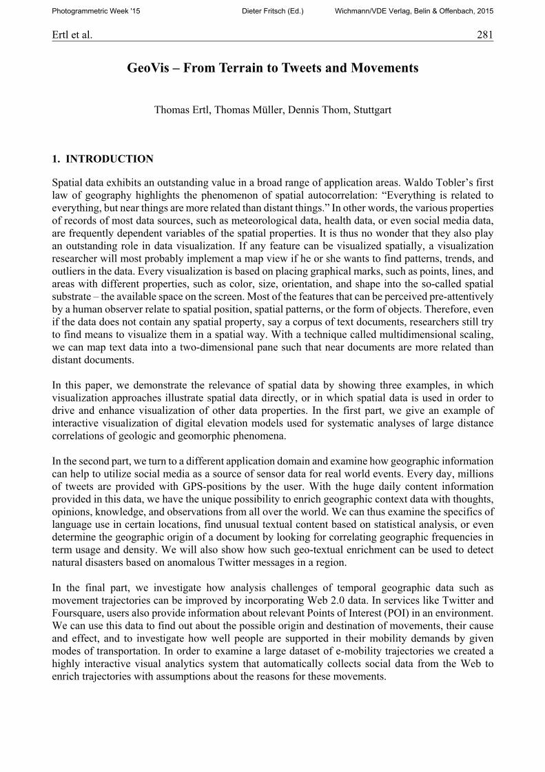
The digital terrain model of Baden-Württemberg provided by the Landesamt für Geoinformation und Landentwicklung (LGL, Stuttgart) has a resolution of 1 m in horizontal and 0.15 m in vertical direction. It is based on LiDAR data and delivered as 1001 x 1001 m2 tiles consisting of Gauss-Krüger coordinates and height values stored in ASCII format, where each data entry (easting, northing, height) covers 26 Bytes. The complete raw dataset with 37,676 tiles needs about one TB of disk space. Quadtree resampling reduces the memory footprint of the BaWü dataset down to 189 GB. This model is ideally suited for systematic geomorphological analyses, as it is extremely accurate and allows reliable large-distance correlation of geological and geomorphological phenomena. The figure below shows post-glacial recessional terraces in the Argen valley. The Argen is the third largest tributary to the Lake Constance in the southeast of Baden-Württemberg. It incised into a terrain of high-relief drumlins (gray-shaded regions), which are elongated hills in the shape of an inverted spoon formed by glacial ice acting on underlying unconsolidated till. Here, the drumlins are interspersed with peat swamps or small lakes. For detailed an explanation we refer the reader to [2].
284 Ertl et al.
3. TWEETS
The advent and recent popularity of location-enabled social media services like Twitter and Foursquare has brought a dataset of immense value to researchers in several domains ranging from theory validation in computational sociology, over market analysis, to situation awareness in disaster management. Based on this data, we nowadays have the unique capability of enriching traditional geographic data with situation-aware text, images, and video. In this section, we show two examples from recent research to demonstrate how the unique properties of location-information can be used to improve the understanding of geographic context based on aggregated social media data and to recognize unusual events in social media based on spatial relationships.
3.1. Geo-textual knowledge
Every time Twitter users write a message on their GPS-enabled mobile device, they can attach precise location information. Each day more than 3 million small documents are produced this way. Within one year, people from all over the world have generated a corpus comprising more than 1.3 billion geo-located messages. Such location-enriched text data has tremendous value for researchers and analysts in several fields ranging from theory validation in computer sociology to location aware market analysis. Most notably, this data source has opened important application domains for research in situation awareness and disaster management, since the community of social media users can serve as a global ‘sensor network’ of potential incident reporters of critical events [3]. In addition to that, the large communities of location-enabled social media networks have generated a unique dataset mapping language and content to geographic coordinates, thereby forming a digital sociocultural landscape of unprecedented richness and extent. Because of the high value of the provided data, social media mining has also become an important topic in different research areas ranging from practical applications of traditional NLP methods over computational sociology to stock market analysis and many more interesting developments are expected for in the near future. To utilize the unique richness of geo-enabled text we created a new method to map and aggregate large-scale online streaming content to respective GPS coordinates [4]. Thereby we created a geographic dictionary that works both ways: Given a coordinate, one can determine how common, frequent, or anomalous any word or combination of words in a sentence is at this location and we will see how this capability can be used to detect unusual events in social media. Given a term or a combination of terms, one can even find the most probable location of the origin of the text and thus augment tweets, which were generated with GPS turned off.
3.1.1. A map of thoughts, language, and opinion
Based on a combination of a common linguistic measure, the term-frequency inverse-document-frequency (tf-idf), with kernel density methods, a complete one-year corpus of geo-located Twitter messages was evaluated to determine the a priori probability that a given term is contained in a document composed at a given location. The intuition behind our measure is quite simple: In the idf-part of the tf-idf measure, the number of documents in which a term appears is counted in order to put the term frequency in relation to the sum of documents in the corpus. Similarly, our measure sums for a given location the derived probabilities that a document containing the term could have appeared at this point and puts it in relation to the sum of derived probabilities that any document could have appeared at this point. The outcome of this is the probability (and improbability) that a term is contained in a message appearing at any given point, allowing to assess the abnormality of observed
Ertl et al. 285
term occurrences in examined document sets as well as finding the most probable location of origin for a given term. To estimate this inverse document density for arbitrary map locations from the sparsely distributed message corpus, we utilize kernel-based density estimation (KDE), which approximates probability distributions from discrete point data, and integrate it with the traditional tf-idf measure. The basic measure of the inverse term density for a term at geo-coordinate hence reads
log∑ ,∈
∑ ,∈
where is the corpus of messages, is the subset messages that contain term , is the geographic distance, is the geo-coordinate of message , and is a Kernel function. In order to allow very fast computation of the densities for all terms in a given dictionary (e.g. all words of the English language), we employ a technique that originates from volume rendering and 3D graphics. First, we create a population-adaptive (non-regular) grid over the world map – i.e. the grid has a high resolution in densely populated areas and low resolution in sparsely populated areas. For each term, one grid is created in memory and serves as container for the values. Therefore, we reduce the number of locations for which we have to compute the from conceptually infinity to a number of cells somewhere between 200.000 and 300.000 for each term. Finally, we apply kernel splatting instead of direct kernel density estimation to compute the actual values. Thus, instead of calculating the kernel-weighted sums over the whole corpus for each cell, we only iterate through the messages in the corpus once and add values of a Gaussian (or similar) kernel at the respective location and for all terms in the message to the corresponding grid. An example result, in which the terms “love” and “amore” have been merged into one grid, can be seen in the following figure.
3.2. Geo-textual anomalies
Increasing amounts of situation reports in social media also establish an additional real-time information channel for situational awareness, as it is required in disaster management or general public safety. However, in contrast to structured sensor data and directed communication from emergency managers and responders the major challenge here is to separate relevant information from unrelated chatter and to allow a scalable overview and exploration of large amounts of data. In
286 Ertl et al.
this section, we show how relevant anomalies can immediately be detect in the data-stream by utilizing the presented geographic language normalization.
3.2.1. Automated local event identification
In analysis situations where the complexity of events and the sheer amounts of real-time data hinder a straightforward analysis of available information, means for automated identification and display of possibly relevant trails can be a key element in successful crisis management. In case of social media data, it is particularly important to find the few first-hand accounts (e.g. eyewitness information) of the on-going situation hidden below large amounts of irrelevant chatter and to provide visual aggregations of the provided topics and observations. In our approach, demonstrated first in [5], we build on the assumption that messages concerning local events are often of similar content and structure and that they are furthermore in close spatial and temporal proximity to each other. This ultimately leads to spatiotemporal clusters of messages reporting on the same situation related topics and keywords. With the -measure presented in the previous section, we can then evaluate whether these topics and keywords are particularly unusual (meaning improbable) for the region and whether they might thus indicate a relevant or even critical event. For example, a power outage in a distinct part of a city might lead to a cluster of messages containing the keyword “outage”. Since such clusters are not occurring frequently and are often a good indicator for unusual situations, we refer to them as spatiotemporal anomalies. Based on a modified X-means cluster analysis approach, which was adapted to the specifics of real-time data, we automatically detect spatiotemporal anomalies in the continuous data stream. As soon as a timeframe and a geographic region is interactively selected by the analyst, the system generates a map of detected anomalies within that region and timeframe by finding representative keywords in the message clusters and place them as labels at the corresponding cluster locations on the map. In order to avoid overlapping labels and at the same time show the analyst as much information as possible, we apply a collision avoidance technique that allows overlapping labels to move small distances from their designated locations. If a certain maximum distance for that zoom level is exceeded, the label is hidden from the selected zoom level.
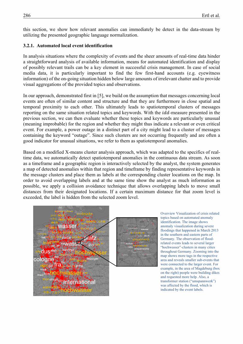
Overview Visualization of crisis related topics based on automated anomaly identification. The image shows anomaly visualization during severe floodings that happened in March 2013 in the southern and eastern parts of Germany. The observation of flood-related events leads to several larger “hochwasser”-clusters in many cities throughout Germany. Zooming into the map shows more tags in the respective area and reveals smaller sub-events that were connected to the larger event. For example, in the area of Magdeburg (box on the right) people were building dikes and requested more help. Also, a transformer station (“umspannwerk”) was affected by the flood, which is indicated by the event labels.
Ertl et al. 287
Our technique provides a broad overview of all events that occur in a given geographic region and, more importantly, an indication of keywords and topics that might be a good starting point for further investigation. This is particularly helpful if the analyst does not know in advance, what to search for, or to draw his attention to an unknown ongoing situation. By zooming into the map, our layout technique automatically provides more labels for the given area, as more screen space becomes available for the given region. The analyst thus receives more detailed indication of possible sub-events connected to a larger event and can use this as a basis to extend his investigation with traditional textual search, content analysis and focus and context visualizations.
4. MOVEMENT
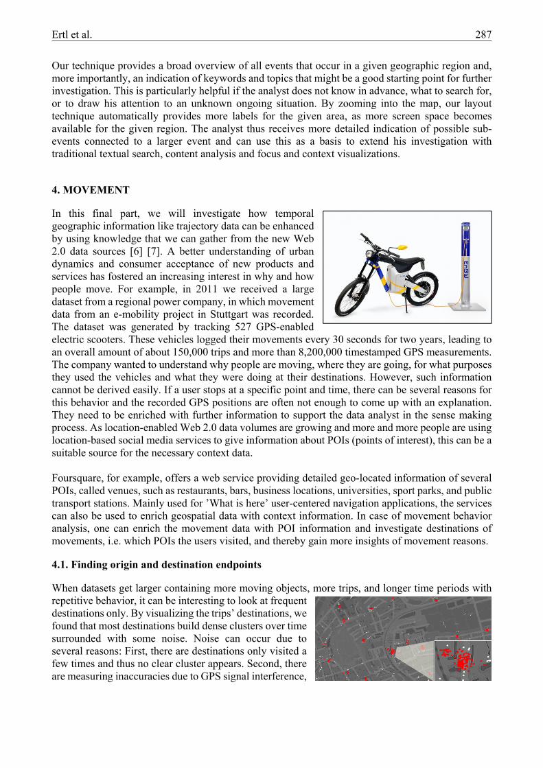
In this final part, we will investigate how temporal geographic information like trajectory data can be enhanced by using knowledge that we can gather from the new Web 2.0 data sources [6] [7]. A better understanding of urban dynamics and consumer acceptance of new products and services has fostered an increasing interest in why and how people move. For example, in 2011 we received a large dataset from a regional power company, in which movement data from an e-mobility project in Stuttgart was recorded. The dataset was generated by tracking 527 GPS-enabled electric scooters. These vehicles logged their movements every 30 seconds for two years, leading to an overall amount of about 150,000 trips and more than 8,200,000 timestamped GPS measurements. The company wanted to understand why people are moving, where they are going, for what purposes they used the vehicles and what they were doing at their destinations. However, such information cannot be derived easily. If a user stops at a specific point and time, there can be several reasons for this behavior and the recorded GPS positions are often not enough to come up with an explanation. They need to be enriched with further information to support the data analyst in the sense making process. As location-enabled Web 2.0 data volumes are growing and more and more people are using location-based social media services to give information about POIs (points of interest), this can be a suitable source for the necessary context data. Foursquare, for example, offers a web service providing detailed geo-located information of several POIs, called venues, such as restaurants, bars, business locations, universities, sport parks, and public transport stations. Mainly used for ’What is here’ user-centered navigation applications, the services can also be used to enrich geospatial data with context information. In case of movement behavior analysis, one can enrich the movement data with POI information and investigate destinations of movements, i.e. which POIs the users visited, and thereby gain more insights of movement reasons.
4.1. Finding origin and destination endpoints
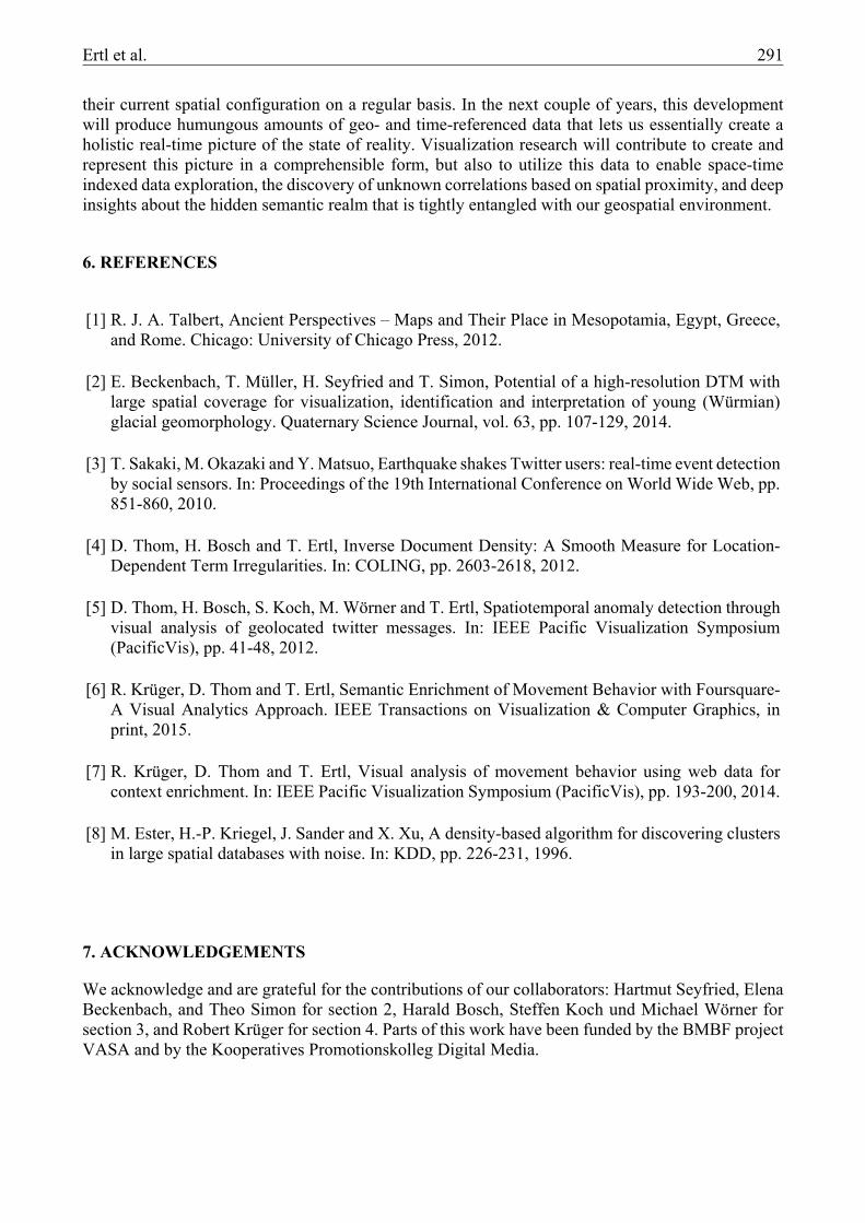
When datasets get larger containing more moving objects, more trips, and longer time periods with repetitive behavior, it can be interesting to look at frequent destinations only. By visualizing the trips’ destinations, we found that most destinations build dense clusters over time surrounded with some noise. Noise can occur due to several reasons: First, there are destinations only visited a few times and thus no clear cluster appears. Second, there are measuring inaccuracies due to GPS signal interference,
288 Ertl et al.
deficient receiver performance, data logging, or broadcasting issues. For an automated destination cluster detection, we apply DBScan [8], a density-based clustering technique with a geospatial distance measure. As a result, we detect 1,215 clusters containing 105,808 of the 150,000 total trip endpoints. Thus, about two of three endpoints have been often visited by a single user or have been visited at least once by several users. We assume that this will frequently be places of employment, shopping centers, homes, and service stations.
4.2. Semantic enrichment
To query up-to-date context information about the detected destinations, we employ Foursquare as an additional data source. Foursquare is a location-based social networking service with dense information about POIs in city areas. Venue information from Foursquare is often quite recent as the data is regularly updated by users, who can always add, delete, or update POIs (in Foursquare called
venues). Furthermore, it delivers additional information such as the number of users that visited a venue and the number of individual check-ins from users, which can help to determine the recent prominence of a location. While there are other providers offering similar services like Google, Microsoft and Facebook, the Foursquare API has fewer query limitations and the second highest POI density. These POIs are categorized into 3 hierarchical levels, which aggregate its child categories to more comprehensive ones. The highest level contains 9 overview categories, as shown in the figure to the left. Every POI belongs to one of these categories.
4.3. Interactive visual reasoning
Based on the data preprocessing and automated extraction of Foursquare POI data we provide a highly interactive system that can be used to evaluate and understand the movements in the dataset. As we want to characterize movements, we have to deal with the spatial and temporal dimensions at the same time. We therefore developed two components and integrated them in our movement analysis system: a geographic map view and a temporal view. The geographic map view shows routes and destinations for identified POIs, while the temporal view shows frequent temporal behavior patterns.
Ertl et al. 289
To visualize POI categories we use the Foursquare item-set and a gradient color mapping, which corresponds to the certainty of the POI. The closer it is to an endpoint that was detected by the clustering and the more frequently it is visited by Foursquare user, the higher is the certainty that the POI is the actual reason for peoples’ movements. Simply visualizing the most detailed POI information (420 different categories), however, hampers fluent analysis and renders fast situation assessment impossible. Instead we apply semantic aggregation by showing the main categories first, which can then be interactively explored by changing the current category level to see more or less
details. While in outer city areas and suburbs distances between destinations (or destination clusters) can be expected to be quite large, in downtown areas they can be much closer to each other, causing heavy visual clutter when an icon is displayed for each of them. Several grouping techniques have been proposed to allow aggregation of icons, which are now quite common in interactive map visualizations. In our case, we group nearby icons together to form representative icons showing the number of aggregated POIs.
To allow detail analysis of frequent movement behavior, we provide a temporal analysis component. If one or more objects are selected on the map, for example to investigate the typical usage behavior within a specific suburb, frequently visited POIs are highlighted within a linear temporal view. The view represents cyclically repeating POIs occurrences by aggregating them based on a definable timeframe, e.g. daily or weekly. For example, if the analyst is interested in daily behavior, the visualization subdivides the day in 24 sections. For each hour of the day, the most frequently visited POI is displayed on top, while less frequent ones are stacked below in descending order of frequency. The analyst can also switch to other cyclic aggregations, such as weekly patterns. By this means, the analyst can always identify the most probable current location for a given hour of the day. In addition to the vertical order we also map the frequency to a color scheme ranging from green (most frequent) to white (least frequent). Depending on the current level of detail, the POIs are aggregated according to respective categories. Thus, the temporal visualization unfolds on higher detail levels (i.e. shows more distinct destinations) and folds up when lower detail levels like the primary categories are selected. The map view and the temporal view are interactively linked. By investigating the destinations in the temporal view, details of the aggregated POIs (category type, number, frequency) are shown and all corresponding destinations are consistently highlighted in the map, revealing their geographic position.
290 Ertl et al.
4.4. Case study
To demonstrate the applicability of the method we present a case study on individual product usage. We start by selecting a scooter home location, which will highlight corresponding routes, visited POIs and typical behavior, as can be seen in the figure on the left. The map shows that the scooter is likely used to visit the shopping sites Penny Markt and Aldi, two supermarkets, and Bauhaus, a hardware store. While users can charge their scooters at home, this scooter was also charged at a public charging station. Further analysis suggests that the scooter was employed to drive to the hospital, to
a fast-food restaurant (McDonalds) and to a shopping outlet at Stylecode. However, there are more sites found near these POIs, all showing a lower certainty. There is also a business location found in the northwest of the map, but with expert knowledge, we are able to identify this location as repair and assembly shop for the scooters. Examining the place Grillwagen (hot-dog stand) reveals that there is also a different venue available here, like another hardware store. We thus zoom in on the map and indeed see a large OBI sign on the map as well. Using our background knowledge, we can infer that the scooter user went to this store rather than to the Grillwagen. Final investigations in the temporal behavior reveals that the user is not a frequent driver as well as that the scooter was rarely used for daily transportation means and primarily for shopping.
5. CONCLUSION
This paper highlighted the unique role that geo-spatial data and geo-spatial properties of data play in data visualization research. We have shown how visualization of digital elevation models can be used to find large-distance correlations of geologic and geomorphic phenomena based on highly accurate data covering large connected areas. While traditional software can only handle a limited subset of the dataset at once, hardware accelerated rendering and highly interactive navigation allow us to see landscapes in a different way and understand the specific properties and possibilities of land formation and use. Besides using visualizations to display such vast spatial data, the second part demonstrated how spatial properties of data can be used to enable new visualizations forms for abstract data. The map is a natural way to find relatedness – by aggregating large-scale data records to corresponding geospatial positions we can build a geographic dictionary of prevalent thoughts, opinions, and observations. This aggregation data can in turn be used to understand regional language specifics, map content to places, and highlight unusual behavior. In the final part, we demonstrated how analysis of inherently geospatial data, such as movement trajectories, which has long been subject to research, can be improved by incorporating additional data sources. We showed how the context knowledge that millions of people freely provide through social media can be used to provide the where, why, and how of geographic endpoints. Based on this enrichment we can understand the modes of transportations, the reasons of movement, and the acceptance of mobility products. With the cheap and broad availability of commodity position sensors in everyone’s pocket more and more cyber-social systems as well as cyber-physical systems are emerging that record and transmit
Ertl et al. 291
their current spatial configuration on a regular basis. In the next couple of years, this development will produce humungous amounts of geo- and time-referenced data that lets us essentially create a holistic real-time picture of the state of reality. Visualization research will contribute to create and represent this picture in a comprehensible form, but also to utilize this data to enable space-time indexed data exploration, the discovery of unknown correlations based on spatial proximity, and deep insights about the hidden semantic realm that is tightly entangled with our geospatial environment.
6. REFERENCES
[1] R. J. A. Talbert, Ancient Perspectives – Maps and Their Place in Mesopotamia, Egypt, Greece, and Rome. Chicago: University of Chicago Press, 2012.
[2] E. Beckenbach, T. Müller, H. Seyfried and T. Simon, Potential of a high-resolution DTM with large spatial coverage for visualization, identification and interpretation of young (Würmian) glacial geomorphology. Quaternary Science Journal, vol. 63, pp. 107-129, 2014.
[3] T. Sakaki, M. Okazaki and Y. Matsuo, Earthquake shakes Twitter users: real-time event detection by social sensors. In: Proceedings of the 19th International Conference on World Wide Web, pp. 851-860, 2010.
[4] D. Thom, H. Bosch and T. Ertl, Inverse Document Density: A Smooth Measure for Location-Dependent Term Irregularities. In: COLING, pp. 2603-2618, 2012.
[5] D. Thom, H. Bosch, S. Koch, M. Wörner and T. Ertl, Spatiotemporal anomaly detection through visual analysis of geolocated twitter messages. In: IEEE Pacific Visualization Symposium (PacificVis), pp. 41-48, 2012.
[6] R. Krüger, D. Thom and T. Ertl, Semantic Enrichment of Movement Behavior with Foursquare-A Visual Analytics Approach. IEEE Transactions on Visualization & Computer Graphics, in print, 2015.
[7] R. Krüger, D. Thom and T. Ertl, Visual analysis of movement behavior using web data for context enrichment. In: IEEE Pacific Visualization Symposium (PacificVis), pp. 193-200, 2014.
[8] M. Ester, H.-P. Kriegel, J. Sander and X. Xu, A density-based algorithm for discovering clusters in large spatial databases with noise. In: KDD, pp. 226-231, 1996.
7. ACKNOWLEDGEMENTS
We acknowledge and are grateful for the contributions of our collaborators: Hartmut Seyfried, Elena Beckenbach, and Theo Simon for section 2, Harald Bosch, Steffen Koch und Michael Wörner for section 3, and Robert Krüger for section 4. Parts of this work have been funded by the BMBF project VASA and by the Kooperatives Promotionskolleg Digital Media.