24
| Date post: | 24-Mar-2016 |
| Category: |
Documents |
| Upload: | liz-hewell |
| View: | 215 times |
| Download: | 0 times |


Gluten Free 2-3Introduction 4-5Key Characteristics 6-7Majuscule Issues 8-9Miniscule Issues 10-11Development 14-15Exhibition 16-20

2
Coffee houses are a common meeting place for most people to come together and reconnect. Whether friends haven’t seen each other in years, or just in days, a coffee house is a place to grab a cup of joe and chat. The feeling is comfortable, familiar, and natural; just like Gluten Free. Inspired by all natural organic cafés, Gluten free was born to complement this feeling.


4
All typefaces come from a specific need. Gluten Free was formed from the want to create a typeface for organic-based coffee shops. Gluten free feels organic, warm, and friendly. This quirky typeface was inspired from Livory, Archer, and Clarendon. It has a classic feel with natural attributes. To the right are some initial sketches of the inspiration type.
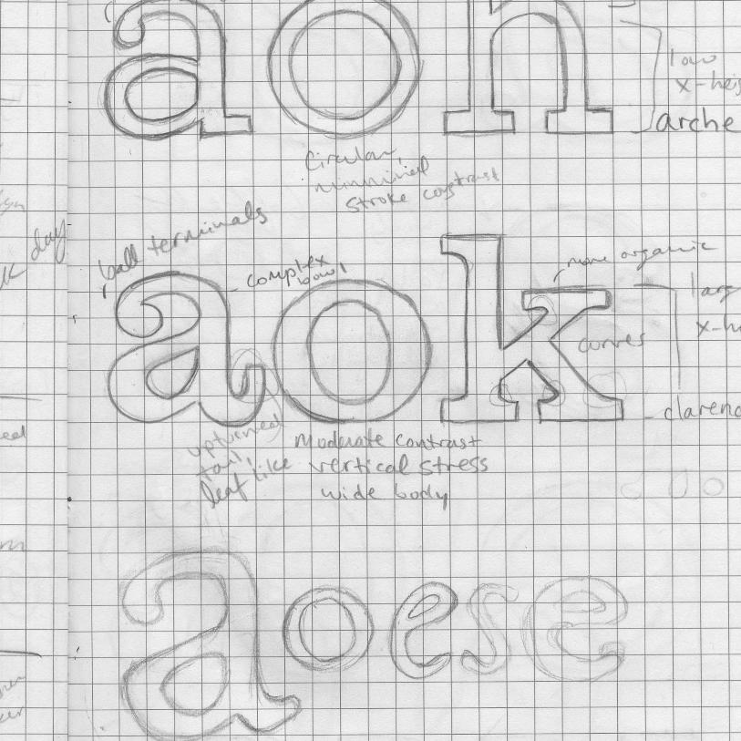
Certain elements of Gluten Free make it the unique typeface it is. The ball terminals, ovalesque “o”, and the uneven organic stem ending. The ball terminals mimic Archer’s. The stroke weight varies slightly throughout the round characters, typically being thinner at the vertical ends and thicker at the horizontal. The ovalesque shape can be seen in the o, a, q, b, and c to the right. There are no sharp corners to this typeface, every implied angle is actually a curve. The stem ending, as seen in the l, m, a, b, and B to the left, is also a prime element that is seen again and again throughout Gluten Free.

The Majuscule “B” proved to be difficult at the beginning. The original sketch was too fairy-tale like, and many edits were required to de-personalize the majuscule so that it could function properly for its intended use.

B

The “a” was extremely difficult to pin down. Oddly enough, the initial sketch for the “a” was what inspired the entire design for Gluten Free. However, the original “a” was too loose and personalized to function properly. So, after many different approaches, an “a” mimicked after the round bowl shape of the miniscule “o” was utilized with the stem end.

a


The x-height is half of the height between the cap height and the baseline. The ascender and descender heights are slightly taller than the x-height in length. The pairing to the right is a great example to show off the height differences and the ovalesque form key to this typeface. The Q, just like the O, is tall and lean. The majuscules as a whole mimic this approach to appear like the letterforms are growing. This re-enforces the organic atmosphere of Gluten Free. The pairing also showcases the unique stem ending and ball terminal present in Gluten Free.

cap height
x-height
baseline
descender

Beverages
Coffee �1.25Latt� �3.83Cappuccino �2.54Americano �3.32Espresso �2.00��Chai �3.45Tea �2.98Italian ice �4.29Frozen coffee �5.76Iced coffee �3.27


1 2 3 4 5 6 7 8 9 0 �

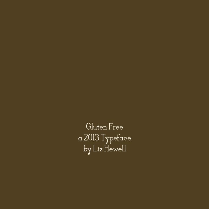
Gluten Freea 2013 Typeface
by Liz Hewell


