17
Good Web Design
| Date post: | 01-Jan-2016 |
| Category: |
Documents |
| Upload: | jordan-townsend |
| View: | 217 times |
| Download: | 2 times |
Good Web Design
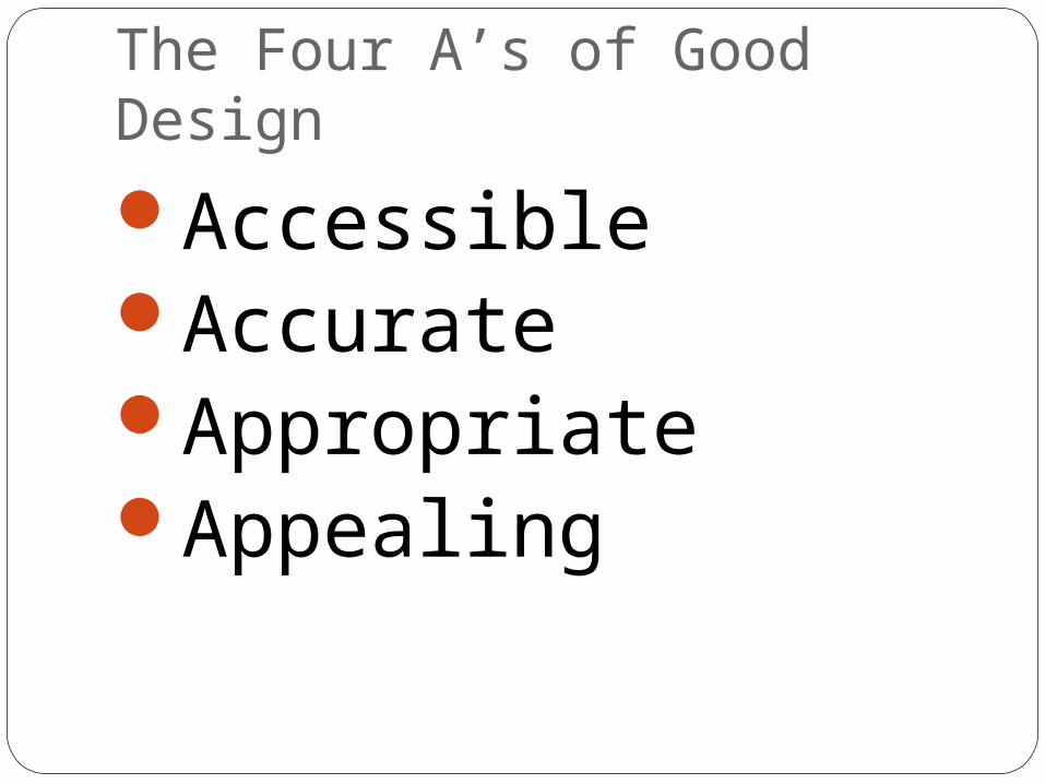
The Four A’s of Good Design
AccessibleAccurateAppropriateAppealing

Good Web Design
There are 3 key aspects to a well designed web page:
Presentation – how the page appears, e.g. use of background and text colour
Usability – how user friendly the page is, e.g. positioning of navigation buttons
Functionality – how thoroughly the page operates, how quickly images load

Good websites:Load quicklyMake the purpose of
the website immediately obvious
Grab attentionAre easy to navigateInclude links that
are easy to identifyProvide the option to
obtain further information
Use contrasting backgrounds and font colours
Are formatted for easy reading
Project an image relevant to the topic at hand
Limit interactivity and multimedia

Good Web Design
When you evaluate a web page or web site as well as assessing the web page or site based on presentation, usability and functionality you also assess on:
ContentCredibilityPurpose
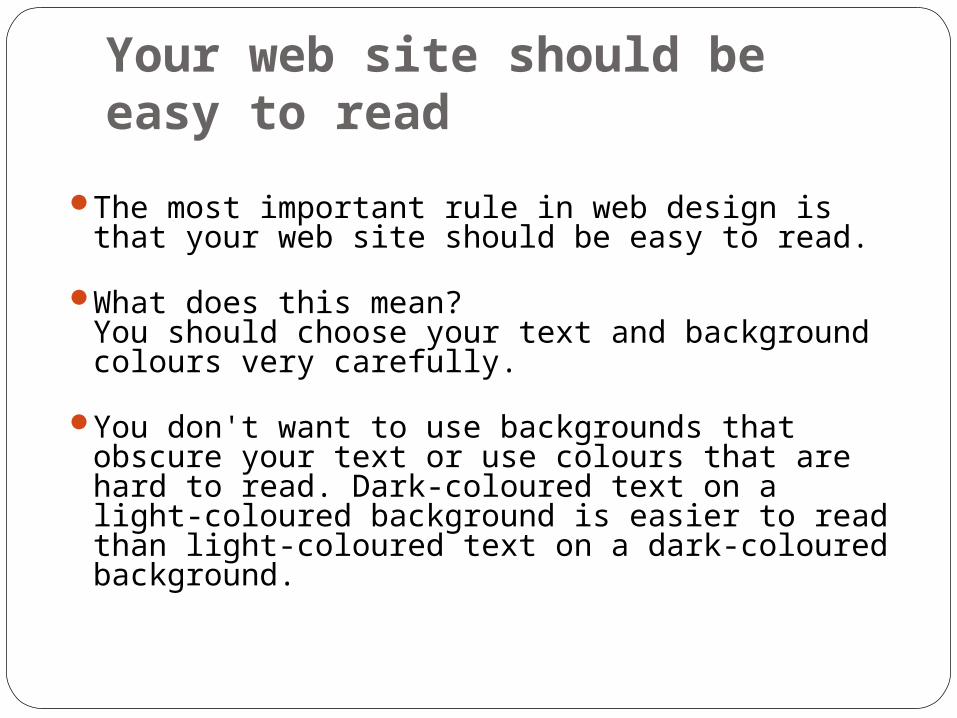
Your web site should be easy to read
The most important rule in web design is that your web site should be easy to read.
What does this mean? You should choose your text and background colours very carefully.
You don't want to use backgrounds that obscure your text or use colours that are hard to read. Dark-coloured text on a light-coloured background is easier to read than light-coloured text on a dark-coloured background.

Easy To Read
You also don't want to set your text size too small (hard to read) or too large (it will appear to shout at your visitors).
All capitalized letters give the appearance of shouting at your visitors.
Keep the alignment of your main text to the left, not centred.
Centre-aligned text is best used in headlines. You want your visitors to be comfortable with what they are reading, and most text (in the West) is left aligned.

Easy To Navigate
All of your hyperlinks should be clear to your visitors.
Graphic images, such as buttons or tabs, should be clearly labelled and easy to read.
Place tags on your images for those viewers who do not want to download the image
Your should select the colours, backgrounds, textures, and special effects on your web graphics very carefully.
It is more important that your navigational buttons and tabs be easy to read and understand than to have "flashy" effects.

Easy To Navigate
Link colours in your text should be familiar to your visitor (blue text usually indicates an unvisited link and purple or maroon text usually indicates a visited link), if possible.
If you elect not to use the default colours, your text links should be emphasized in some other way (boldfaced, a larger font size, set between small vertical lines, or a combination of these).
Text links should be unique, they should not look the same as any other text in your web pages. You do not want people clicking on your headings because they think the headings are links.
Your visitors should be able to find what they are looking for in your site within three clicks. If not, they are very likely to click off your site as quickly as they clicked on.

Easy to Find
How are your visitors finding you online? The myth, "If I build a web site, they will
come," is still a commonly held belief among companies and organizations new to the Internet.
People will not come to your web site unless you promote your site both online and offline.

Easy to Find
Not only should your web site be easy to find, but your contact information should be easy to find.
People like to know that there is a person at the other end of a web site who can help them in the event that:They need answers to questions which are not readily available on your web site ORSome element on your site is not working and end users need to be able to tell you about it

Easy to Find
By giving all relevant contact information (physical address, telephone numbers, fax numbers, and email address), you are also creating a sense of security for your end users. They can contact you in the way that makes them feel the most comfortable.

Your web page layout and design should be consistent throughout the site
Just as in any document formatted on a word processor or as in any brochure, newsletter, or newspaper formatted in a desktop publishing program, all graphic images and elements, typefaces, headings, and footers should remain consistent throughout your web site.
Consistency and coherence in any document, whether it be a report or a set of web pages, project a professional image.

Layout and design should be consistent
For example, if you use a drop shadow as a special effect in your bullet points, you should use drop shadows in all of your bullets.
Link-colours should be consistent throughout your web pages.
Typefaces and background colours, too, should remain the same throughout your site.
Typefaces, alignment in the main text and the headings, background effects, and the special effects on graphics should remain the same.
Only the colours should change.

Your web site should be quick to download
Studies have indicated that visitors will quickly lose interest in your web site if the majority of a page does not download within 15 seconds.
Artists' pages should have a warning at the top of their pages.
Even web sites that are marketed to high-end users need to consider download times.

Fast Download
A good application of this rule is adding animation to your site. Sure, animation looks "cool" and does initially catch your eye, but animation graphics tend to be large files.
Test the download time of your pages first. If the download time of your page is relatively short and the addition of animation does not unreasonably increase the download time of your page, then and ONLY then should animation be a consideration.

Fast Download
Finally, before you consider the personal preferences of your web page design, you should consider all of the above rules FIRST and adapt your personal preferences accordingly.
The attitude "I don't like how it looks" should always be secondary to your web site's function.
Which is more important: creative expression or meeting the needs of the target audience?


