38
judiee judiee / GRAPHIC DESIGN PORTFOLIO

judieejudiee/ GRAPHIC DESIGN PORTFOLIO
01

02
HELLO, TYPOGRAPHY characters include Mac, the apple,
QWERTY, the computer, and DEL, the delete key
HELLO TYPOGRAPHY

03
Hello, TypographyHello, Typography was a series to introduce children to the world of typography. A set included an introductory book, flash cards, stickers, pin back buttons, and a plush friend.
The concept of Hello, Typography was to take a “design only” subject matter and making it accessible to a non-design audience (including children), through the use of character design and storytelling.
The project was self-initated that was also featured in an exhibition show.
HELLO TYPOGRAPHY

04
HELLO, TYPOGRAPHY flashcards help distinguish the different typefaces
HELLO TYPOGRAPHY

05
HELLO, TYPOGRAPHY booklet introduced readers to the basics and rules of type in a accessible, nonthreat-ening format
HELLO TYPOGRAPHY

06
Angel Bear by Dayoung (4th grade)
DESIGN STUDIO

07
Design StudioDesign Studio was an art elective class at Covenant Fellowship Summer School.The class was open to students K-6th grade, and ran for five weeks.
The objective of the class was to empower students to create and design their own characters and stories. The ideation portion of the class included brainstorming, sketching, and sharing initial concepts. The ideas went into production and wererealized in plush form, accompanied by a storyboard and trading cards.
Students were challenged not to copy existing characters (such as Pokemon or Transformers) but instead to be creative with the entire process. Given the tools to create their own objects gave the students the vision to go beyond what they see in the media and to design things from their own imagination.
DESIGN STUDIO

08
Mr. Pencil by created by Isabel, 5th grade
DESIGN STUDIO

09
(starting with top left) Hope and Lopbunny, Jeremiah and Augi, Stephen and Wingbat, and Chloe with Sunflower
DESIGN STUDIO

10
Lent Battle, comic strip cover
LENT BATTLE
11
Lent BattleLent Battle was a system created to encourage Sunday School students to memorize scripture. The system included an interactive comic strip and trading cards. There are two sets of cards: one set is of the verses themselves and the second set featured biblical terms and characters that are tradable among the students.
After successfully reciting a passage, the student was awarded a corresponding “badge” along with the special character cards.
The objective was to reach the target audience in a familiar, exciting way while utilizing a visual style and culture that they are already immersed in.
LENT BATTLE

12
Lent Battle included reillustrated comics of bible stories
LENT BATTLE

13
Lent Battle trading cards and trading card holders
Pinback buttons worked as an incentive and a badge system
LENT BATTLE

14
Katie (age 4) is fingerpainting the pond that would become the base to a replica of Monet’s Waterlillies
MONET’S WATERLILLIES

15
Monet’s WaterlilliesMonet’s Waterlillies was the product of an art lesson revolving around the painter,Claude Monet. This lesson proved to be one of the more popular lessons among thestudents and the teachers.
The first day, the students sat on the floor with their classmates and fingerpainted on a long stretch of paper to recreate the pond.
The second day, students painted green and purple paper with textured brushes, which would later serve as the lillypads and waterlillies.
The four year olds used templates to trace and cut out the waterlilly and lillypad shapes, while younger students needed assistance with cutting.
On the final day, the students positioned the pieces on the pond, and we concluded the lesson with a fishing game. Using a play fishing rod with a magnet, students “fished” for paper fish that had paper clips attached to their mouths, all laid out on our Impressionistic pond.
Students were exposed to art pieces in the Impressionism-style and experienced the craft for themselves, while developing their gross motor and fine motor skills.
MONET’S WATERLILLIES

16
A caricature of Monet used to tell his story
MONET’S WATERLILLIES

17
(left) 4 year old class working together on the pond
(right) One of the completed ponds on display in a classroom
MONET’S WATERLILLIES

18
Next Generation, child’s shirt design
NEXT GENERATION

19
Next GenerationThe Next Generation School’s shirt series served as branding for the school as well as a fundraiser for the school’s art fund.
The children’s design was based on the different classrooms in the school, since each room is assigned an animal mascot. The star in the middle of the design represents “All Stars”, the four year old rooms. The other animals represent the other age levels such as Cuddly Cubs (infants), Little Lions (1 year olds), Penguins (2 year olds), and so on.
Along with the child’s design was a more mature design that was targeted for the parents of the students. Designs were printed on shirts and sweatshirts and raised over $1,500.
NEXT GENERATION

20
Next Generation, adult’s shirt design
NEXT GENERATION

21
Next Generation, child’s and adult’s design on Americam Apparel shirts
NEXT GENERATION

22
OIL’s 2010 Postcard
OIL2010

23
One in Love 2010One in Love (OIL) is an annual conference that serves over 100 college campuses and 300 churches that has been established since 1988. Speakers at OIL have included DA Carson, Joshua Harris, George Murray, Ajith Fernando, Paul Tripp among others.
Work for OIL included an identity system, website, print material (including postcards, posters, and flyers) and digital media (including slides and web banners).
The intensity of the winter conference was reflected in the choice of images as well as the textures seen in snow and ice. The cold imagery was countered with a bright type treatment of the OIL logo.
OIL2010

24
OIL’s 2010 Slide, used to present the keynote speaker
OIL’s 2010 Hoodie design
OIL2010

25OIL2010

26
OIL’s 2011 Logotype
OIL2011
27
One in Love 2011One in Love (OIL) is an annual conference that serves over 100 college campuses and 300 churches that has been established since 1988. Speakers at OIL have included DA Carson, Joshua Harris, George Murray, Ajith Fernando, Paul Tripp among others.
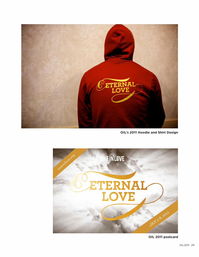
The warm colors in the color scheme reflected on OIL’s location change from Montrose, PA in the mountains to a resort in Sandycove, MA. Bright visuals and warm golds were used throughout the promotional material to create a cohesive identity.
The play on the script-like mark was used in both the theme’s type treatment as well as the OIL logo. Both marks were used throughout the digital and print material as well as the apparel design for 2011.
OIL2011

28
OIL’s 2011 website
OIL2011
29
OIL’s 2011 Hoodie and Shirt Design
OIL 2011 postcard
OIL2011

30
Pekara, Valentine’s Day photograph series
PEKARA

31
PekaraPekara Bakehouse and Bistro is a local eatery that is passionate about European breads and traditions. They have been a Champaign-Urbana staple for years, and bring a distinct flavor to downtown Champaign.
Work for Pekara included photography and print materials including menus, business cards, posters, flyers, advertisements, and other promotional items.
Pekara’s constant changing menu with seasonal goods and specialty treats needed a cohesive look while bringing visual interest to each updated offering.
The objective of Pekara’s visuals was to communicate their fresh, organic items while portraying the modern, urban feel of the downtown area.
PEKARA

32
Pekara, Cakes postcard
Pekara, Easter Mailer
PEKARA

33
Pekara, Valentine’s Day Menu
PEKARA

34
Stephanie Swick, promotional card
STEPHANIE SWICK

35
Stephanie SwickStephanie Swick is an emerging artist with a distinct voice an amazing range of musical talents. The cover design on her debut album reflected her unique musical presence as well as personal style. We worked together to create a whimsical treatment mixed with different textures and images. Work included original photography (photoshoot done in Allerton Park) along with album design and promotion materials for her concert (such as promotional cards, and buttons).
STEPHANIE SWICK

36
Stephanie Swick, album cover
STEPHANIE SWICK

37
Stephanie Swick, special thanks
Stephanie Swick, track list
STEPHANIE SWICK

thankyou
thankyou
FOR YOUR CONSIDERATION
38


