28


Graphic design is my world where I can step outside my comfort zone and see life with a different perspective.

07 PROJECT ONE: VIBESEEKER
16 PROJECT TWO: PREEN NATURAL
22 PROJECT THREE: LOOK UP
28 PROJECT FOUR: REVIVE
34 PROJECT FIVE: THE ART OF FREEDOM
40 PROJECT SIX: BRICK FAIR
46 PROJECT SEVEN: NIKE CSR
TABLE OF CONTENTS
YEAR: Fall 2018
CLASS: Graphic Design 3: Nature Of Interaction
INSTRUCTOR: Samantha Perkins
KIND OF PROJECT: Branding, UX/UI Design
DISCIPLINE: Branding, UX/UI Design, Deliverables,
Motion Graphic, App Design, Website Design
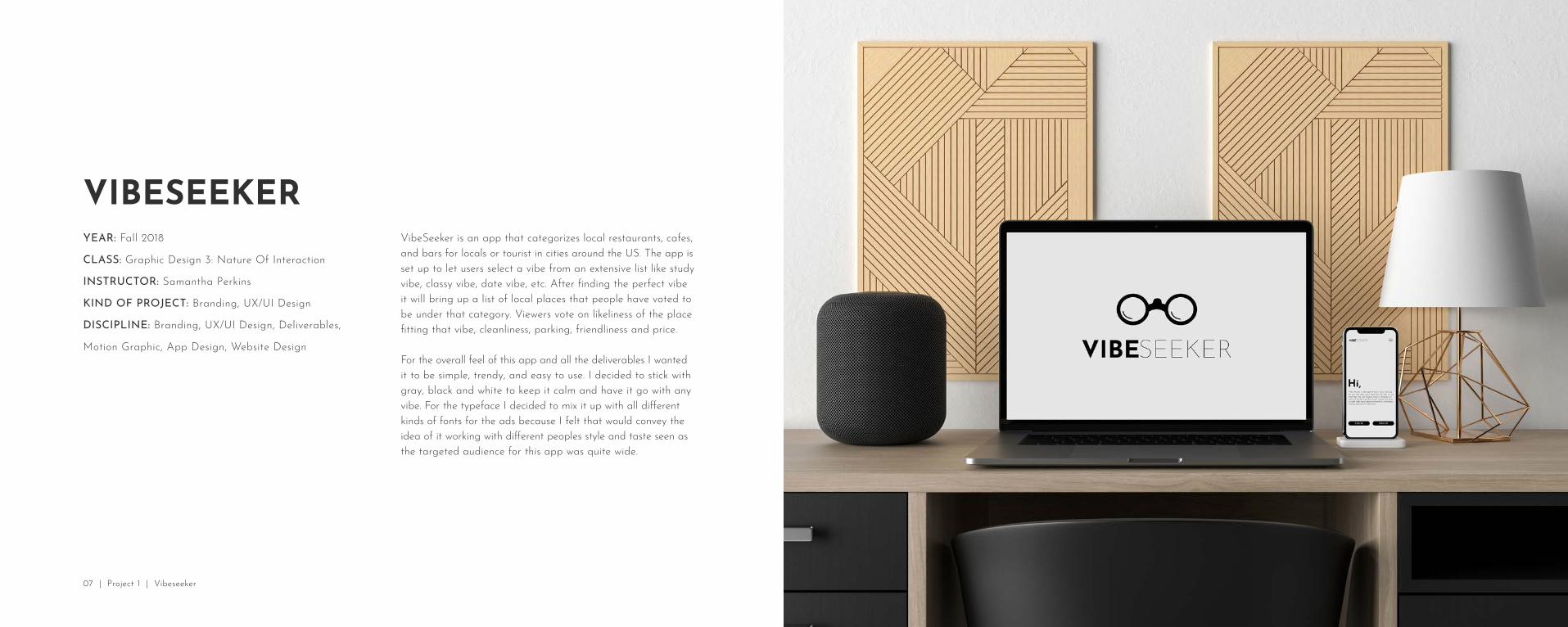
VIBESEEKERVibeSeeker is an app that categorizes local restaurants, cafes, and bars for locals or tourist in cities around the US. The app is set up to let users select a vibe from an extensive list like study vibe, classy vibe, date vibe, etc. After finding the perfect vibe it will bring up a list of local places that people have voted to be under that category. Viewers vote on likeliness of the place fitting that vibe, cleanliness, parking, friendliness and price.
For the overall feel of this app and all the deliverables I wanted it to be simple, trendy, and easy to use. I decided to stick with gray, black and white to keep it calm and have it go with any vibe. For the typeface I decided to mix it up with all different kinds of fonts for the ads because I felt that would convey the idea of it working with different peoples style and taste seen as the targeted audience for this app was quite wide.
07 | Project 1 | Vibeseeker


11 | Project 1 | Vibeseeker | Website

14 | Project 1 | Vibeseeker | Deliverables

15 | Project 1 | Vibeseeker

YEAR: Spring 2019
CLASS: Package Design 3
INSTRUCTOR: Thomas McNulty
KIND OF PROJECT: Branding, Package Design
DISCIPLINE: Branding, 3D Rendering, Products
PREEN NATURALI created a sub-branding for Blue Buffalo that was an all natural evnirmental friendly animal grooming product line which included shampoo and conditioner, toothpaste, toothbrush, lotion, dog treats, detangler, ear drops and eye whips. Blue Buffalo is all about putting the pets needs first and figuring out what’s good for them and that is what I wanted to do too while designing this line.
This design style took a bit to figure out exactly what direction I wanted to go in. I ended up loving the retro look and feel of the logo. My thought process behind designing these was to create something that doesn’t look like your typical pet grooming product. I wanted these to be able to stand out on a big shelve next to the other grooming supplies. The colors to me were within that retro style I was creating and I felt would pop off the product shelves. Also, to keep packaging simple and clean I decided to limit the colors and use monochromatic palette on each product.
17 | Project 2 | Preen Natural

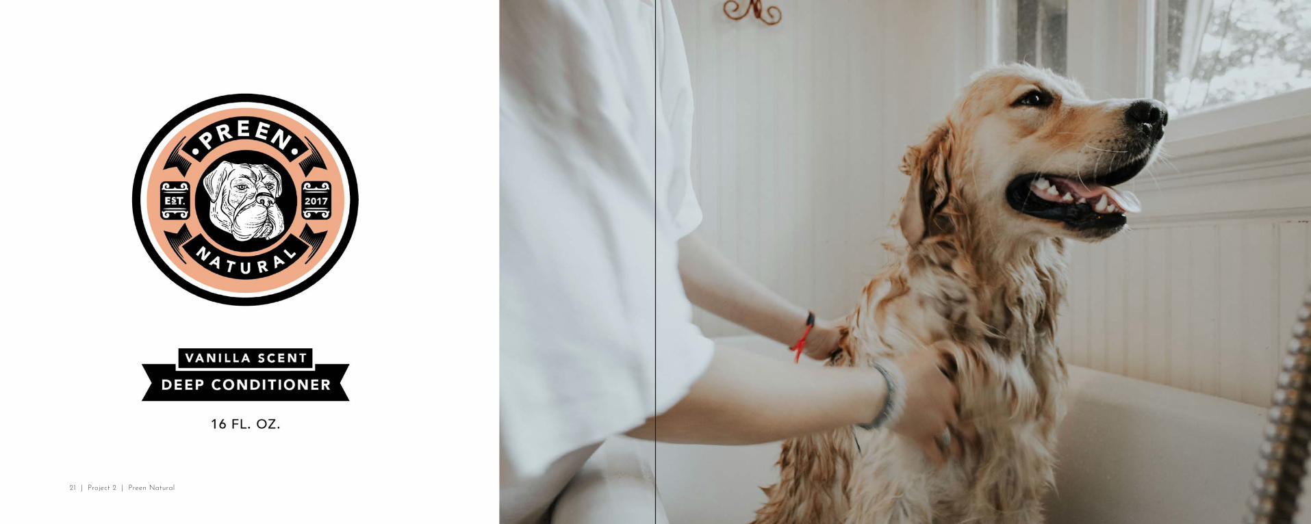
21 | Project 2 | Preen Natural

YEAR: Spring 2018
CLASS: Visual System 1
INSTRUCTOR: Troy Alders
KIND OF PROJECT: Branding, UX/UI Design
DISCIPLINE: Branding, UX/UI Design, Deliverables, Social Media Campagin
LOOK UPLook Up is a campaign I created to bring awareness to the addiction of social media. In our generation today many people don’t see the harm in just scroll through Instagram or Facebook or Twitter. It was become the new normal for our society, however, it is an addiction and something many people struggle with daily.
When beginning to sketch out ideas I wanted to create something that would catch a viewers eye whether they were walking, running, biking, in a car, in a bus, etc. I wanted something that would pop and the viewer really taken the information on it. I thought about how people look on the daily while walking around a big city. So that is what I wanted to capture. People looking down at their phones while real life was still going on around them. I made the background of the image black and white while having the people on the cross walk in full color. Then in big bold red letters I put a static about how many people suffer from addiction to social media and the internet.
23 | Project 3 | Look Up

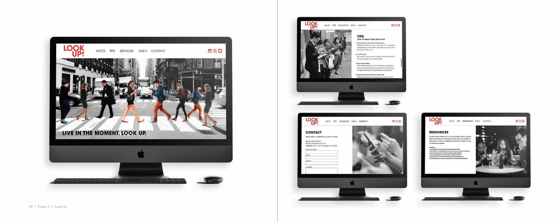
27 | Project 3 | Look Up

YEAR: Spring 2019
CLASS: Package Design 3: Advanced 3d Branding
INSTRUCTOR: Thomas McNulty
KIND OF PROJECT: Branding, Package Design
DISCIPLINE: Branding, 3D Rendering, Products
REVIVERevive was a skin care line sub-branding of Roxy. I designed a full skin care line based off of the amazing Roxy brand that focuses on active women of all ages. Focusing on a product that would be all natural, sweat proof, and also have SPF in it.
For this skin care line I wanted to create something that was fun, lively and tropical just like Roxy. I found this floral pattern that brought everything else together. After I did much research on skin care products and compared them all. I realized that a lot of the designs were very over whelming with type and weren’t designed the greatest. My goal was to design this so women could have them sitting on their counter and not have them look like a normal sunscreen bottle that you want to hide away in the cabinet.
29 | Project 4 | Revive

31 | Project 4 | Revive


YEAR: Fall 2018
CLASS: Typography 3: Complex Hierarchy
INSTRUCTOR: William Culpepper
KIND OF PROJECT: Book Design, Typography
DISCIPLINE: Book design, typography, deliverables, website
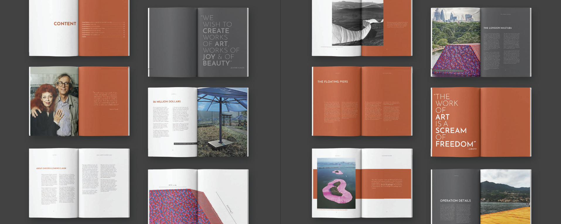
THE ARTS OF FREEDOM I designed a 7 chapter book that was dedicated to the Christo Javacheff and his wife Jeanne-Claude. They are brilliant and create amazing temporary art installations all around the world. I have been obsessed with their work for quite some time and I was able to do a semester-long project based on their incredible art.
When diving into designing this book my main priority was to create a layout that reflected their work but wasn’t to over-designed where it took the attention off their projects. I went with a bold color palette with colors from their projects to make it fun and vibrant which I thought brought their personality into play. For the pictures I wanted to add some effects so I created a plastic-looking layer to go on top of some photos and it reminded me of a few of their project where they tarped big things, etc. Overall, I was very happy with the outcome. I thought the design went well the Christo and Jeanne’s style and personalities.
34 | Project 5 | The Arts of Freedom


YEAR: Spring 2018
CLASS: Graphic Design 2: Integrating Principles
INSTRUCTOR: Hannah Coward
KIND OF PROJECT: Convention Deliverables
DISCIPLINE: Brochure, deliverables, website, social media
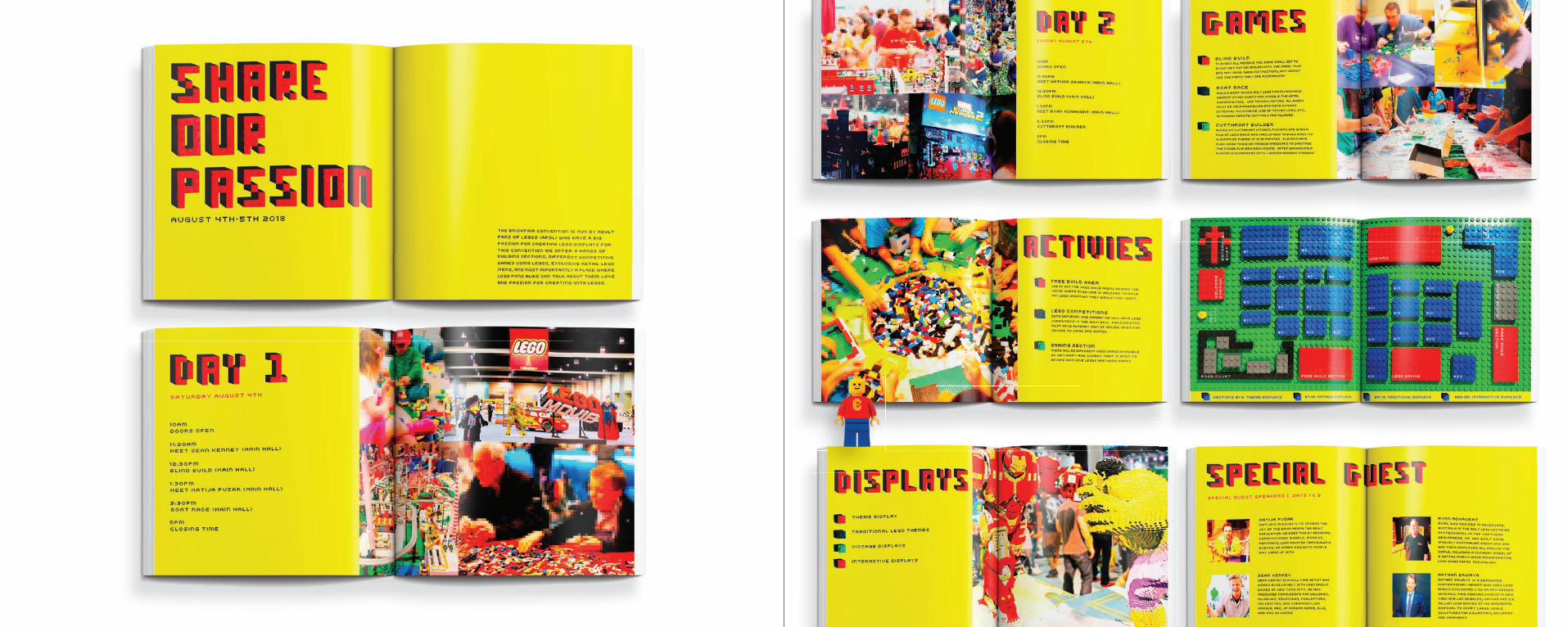
BRICK FAIRFor this project I designed out a brochure, website, social media profi le, and a few convention deliverables for the Brick Fair that was created by lego fans.
I wanted to take a unique approach to this project and have it relate with the lego fans. So, I went out and bought actual legos to create the entire cover, convention map, and all the headers in the brochure. The color palette I had match with the actual lego colors and for the images I added some pixelation to them to create a lego like look to them. This was defi nitely the most challenging project I have ever done but it really pushed me to think outside of the box and was so rewarding to see the fi nished product.
40 | Project 6 | Brick Fair

44 | Project 6 | Brick Fair
YEAR: Spring 2019
CLASS: Visual System 2
INSTRUCTOR: William Culpepper
KIND OF PROJECT: Brochure Design, Sub Branding
DISCIPLINE: Sub Branding, Brochure Design, UX/UI Deliverables, Social Media Campagin
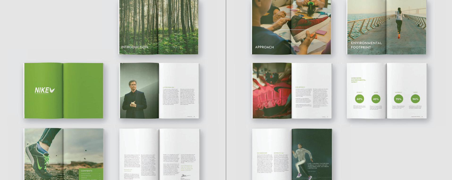
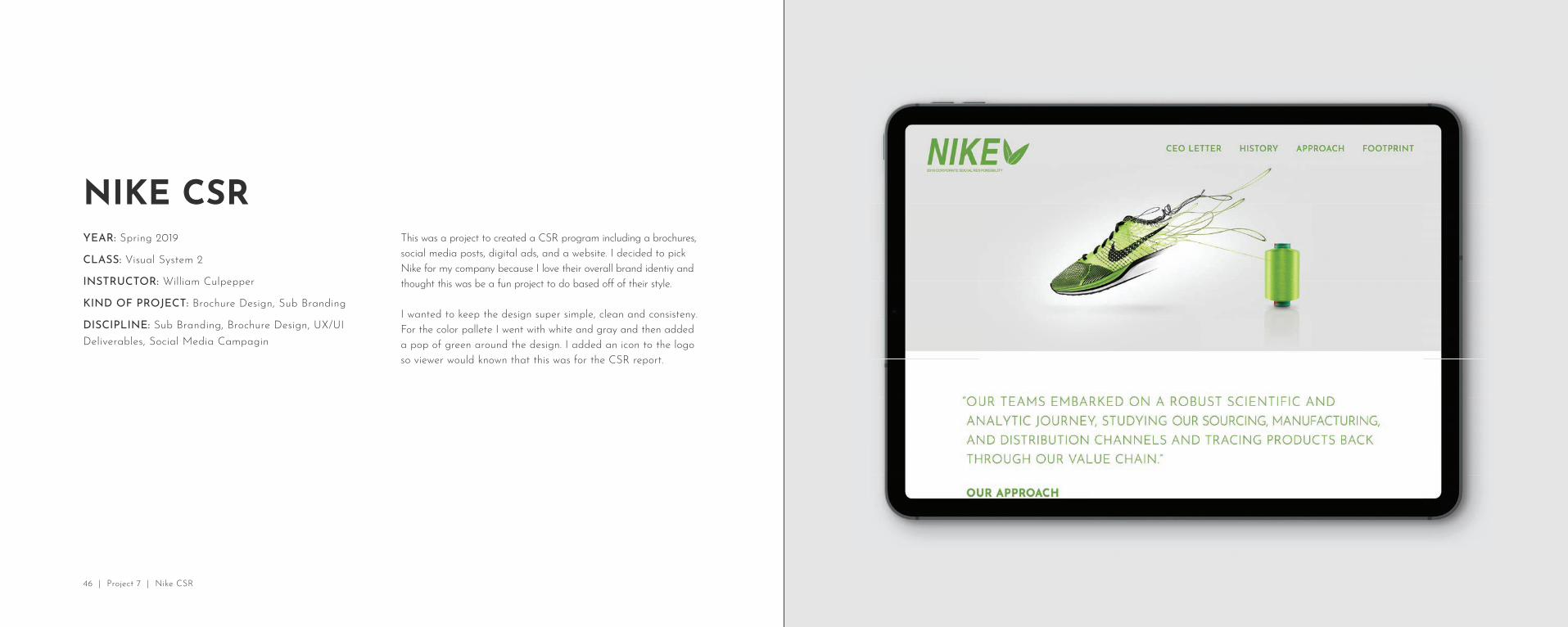
NIKE CSRThis was a project to created a CSR program including a brochures, social media posts, digital ads, and a website. I decided to pick Nike for my company because I love their overall brand identiy and thought this was be a fun project to do based off of their style.
I wanted to keep the design super simple, clean and consisteny. For the color pallete I went with white and gray and then added a pop of green around the design. I added an icon to the logo so viewer would known that this was for the CSR report.
46 | Project 7 | Nike CSR

48 | Project 7 | Nike CSR