29
| Date post: | 15-Mar-2016 |
| Category: |
Documents |
| Upload: | paulette-mumar |
| View: | 217 times |
| Download: | 1 times |

WHAT ARE GRAPHIC STANDARDS?
• Graphic Standards are used throughout
Key Club International
• The purpose of Graphic Standards is to a
have an uniformed look across KCI
• This includes fonts, colors, logos and
symbols to express who we are and
keeping “our look” consistent
LOGO & WORDMARK USAGE
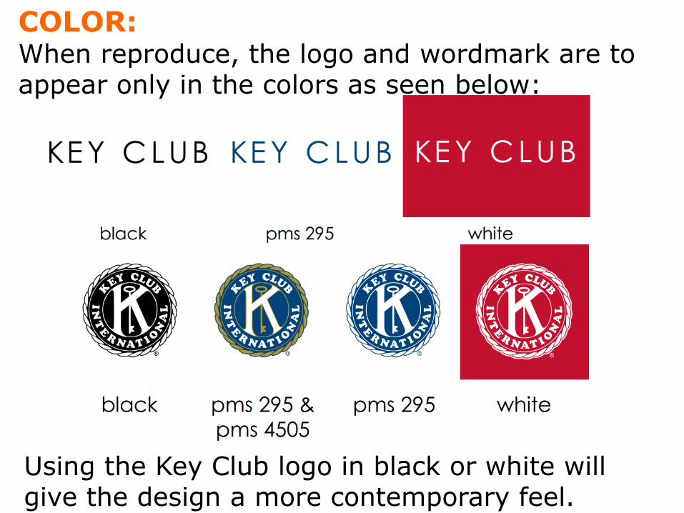
COLOR: When reproduce, the logo and wordmark are to appear only in the colors as seen below:
Using the Key Club logo in black or white will give the design a more contemporary feel.

SIZE:
Logo to be placed no larger than 1 ½ inches wide on anything smaller than a banner.
Wordmark to be formatted no larger than 5 inches on anything smaller than a banner logo must always as seen below:

BACKGROUND: Should be placed on a neutral background:
AREA OF ISOLATION: There should be nothing within a half inch of all sides of the logo.

FONTS

HEADER & SUBHEADS:
• Font–Century Gothic
• Try to keep the height and width of the lettering proportional
• Space between each letter – 0

ACCENT: • Font–To be used for some headers, subheads
and emphasized wording to make the piece more contemporary and personalized.
In Windows possible accent fonts: Goudy Stout, Juice, Tempus Sans, or Viner Hand ITC
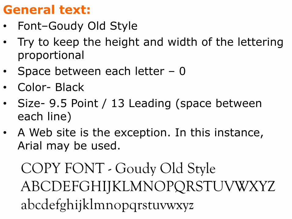
General text:
• Font–Goudy Old Style
• Try to keep the height and width of the lettering proportional
• Space between each letter – 0
• Color- Black
• Size- 9.5 Point / 13 Leading (space between each line)
• A Web site is the exception. In this instance, Arial may be used.


BACKGROUND: • The area above and below the pencil
can be a Key Club color, or an image (photo or illustration) in any combination.
PENCIL AREA: • Placement–Pencil should always be placed on
the cover or front of whatever is being produced.
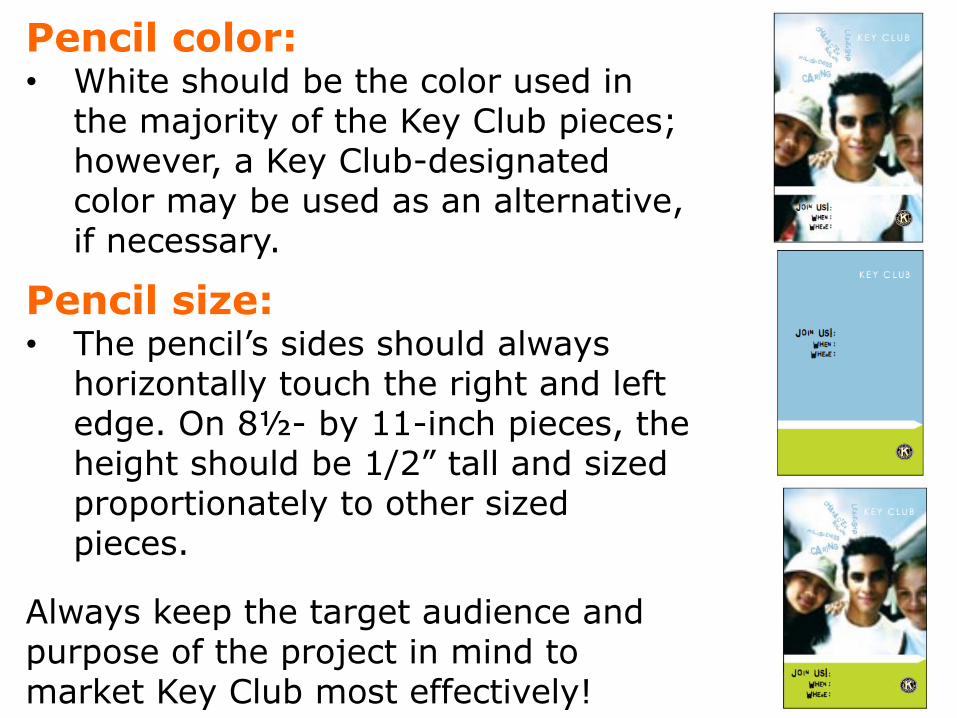
Pencil color: • White should be the color used in
the majority of the Key Club pieces; however, a Key Club-designated color may be used as an alternative, if necessary.
Pencil size: • The pencil’s sides should always
horizontally touch the right and left edge. On 8½- by 11-inch pieces, the height should be 1/2” tall and sized proportionately to other sized pieces.
Always keep the target audience and purpose of the project in mind to market Key Club most effectively!

THE LOOK

LOGO PLACEMENT:
• Key Club wordmark should always appear on the cover somewhere and the Key Club logo on the back cover.
• Key Club logo can be placed on the front, but not within five inches of the pencil.
• Club or district logo placement: Can be placed anywhere.

INSIDE LOOK:
• The use of the pencil and similar lines, as well as Key Club colors and fonts, will maximize the effectiveness of the piece.

• “a Kiwanis-family member,” Web site and contact information are to be placed below the logo in Century Gothic 9 Pt. Please keep upper/lowercase consistent as shown, and spacing between lines the same
Back Cover Look:
• Key Club logo is always centered on the lower back of the piece, not to exceed one inch in proportionate width.


COLORS: One or more accent colors should be used with black copy.

MORE COLORS…
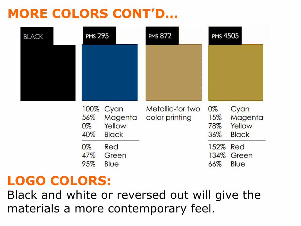
MORE COLORS CONT’D…
LOGO COLORS: Black and white or reversed out will give the materials a more contemporary feel.

To access Key Club color palette, go to templates.
If using a Mac: • Go to Microsoft Word • Click appropriate color fill box • Click “More fill colors” at bottom • Enter values of colors
If using a PC: • Go to Microsoft Word • Click color fill box • Click “More fill colors” at bottom • Enter values of colors

IMAGERY

The photos and illustrations used in marketing materials should communicate Key Club’s mission.
Photos and illustrations should:
• Be energetic.
• Have a call to action.
• Be diverse. • Have an area around the subject that is open to
attract the viewer’s eye and create an empowering feeling.
• Make sure image colors reflect the Key Club color palette
• Ensure core values are represented in the imagery
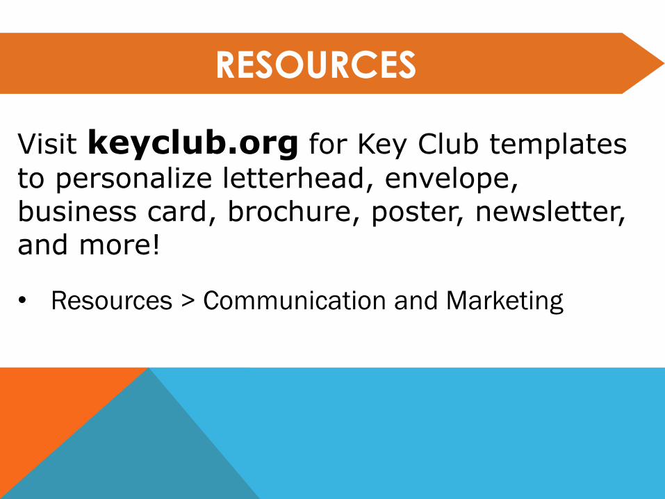
RESOURCES
Visit keyclub.org for Key Club templates
to personalize letterhead, envelope, business card, brochure, poster, newsletter, and more!
• Resources > Communication and Marketing
Any questions,
comments, or
concerns?


