19
One College. Many Opportunities. Graphic Standards Manual


Introduction ........................................... 1
Visual Elements ..................................... 2
Logo Applications ................................... 3
Open Space ....................................... 5
Color Usage ....................................... 6
Correct vs. Incorrect Usage ................ 8
Tag Line Usage ......................................... 9
Stationery ............................................. 10
Brochures and Pamphlets ................... 12
Ad Specialties and Apparel ................... 13
Other Applications ............................... 15
York Technical College Graphic Standards Manual
TABLE OF CONTENTS

York Technical College Graphic Standards Manual
PAGE 1
The following pages contain instructional guidelines for properly using the new graphic identity adopted for York Technical Collge (YTC).
This manual is not intended to provide rigid instructions for all logo applications and design approaches, but rather to give consistent direction for various uses while allowing for creative flexibility. These recommendations give a point of focus. When carefully coordinated, this focus will help to build a look and feel that is uniquely YTC.
In order for the new identity to be successful in building a strong brand, consistency is important. This consistency will influence how others perceive YTC as well as communicate to audiences the institution’s sense of organization and cohesiveness.
Instructions provided in the manual include logo applications, color treatments, tag line use and other basic applications. Please refer to this manual when making decisions about use of the new graphic identity.
If you have a question about guidelines contained in this manual or proper use of YTC’s new identity, please contact the Strategic Communications & Marketing Department.
INTRODUCTION
York Technical College Graphic Standards Manual
PAGE 2
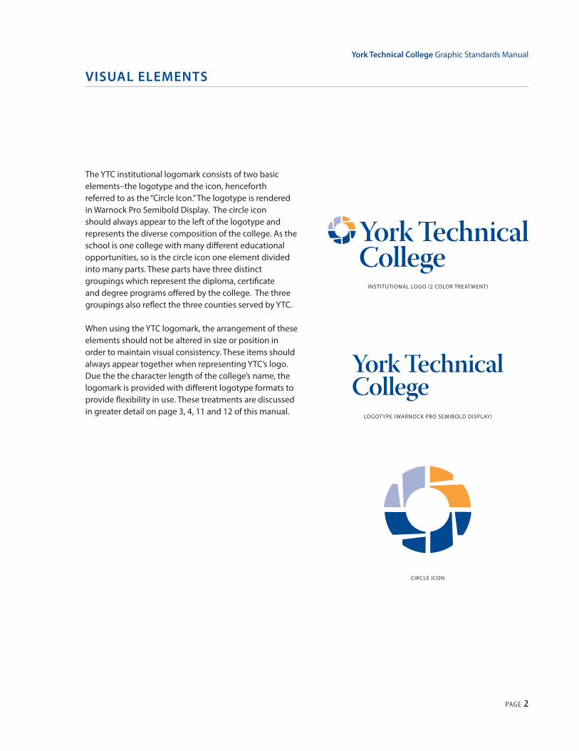
The YTC institutional logomark consists of two basic elements–the logotype and the icon, henceforth referred to as the “Circle Icon.” The logotype is rendered in Warnock Pro Semibold Display. The circle icon should always appear to the left of the logotype and represents the diverse composition of the college. As the school is one college with many different educational opportunities, so is the circle icon one element divided into many parts. These parts have three distinct groupings which represent the diploma, certificate and degree programs offered by the college. The three groupings also reflect the three counties served by YTC.
When using the YTC logomark, the arrangement of these elements should not be altered in size or position in order to maintain visual consistency. These items should always appear together when representing YTC’s logo. Due the the character length of the college’s name, the logomark is provided with different logotype formats to provide flexibility in use. These treatments are discussed in greater detail on page 3, 4, 11 and 12 of this manual.
VISUAL ELEMENTS
INSTITUTIONAL LOGO (2 COLOR TREATMENT)
CIRCLE ICON
LOGOTYPE (WARNOCK PRO SEMIBOLD DISPLAY)

York Technical College Graphic Standards Manual
PAGE 3
The circle icon or parts of the icon may be used as a graphic element apart from the logotype. This approach should only be used on communications where the entire logo is also visible. While the circle icon offers multiple possibilities for graphic applications, over use of this approach is not recommended.
Within this document are several examples of how this element can be rendered (solid reversed, gradient, screened and outlined). Each of these applications offers unique possibilities. See below for examples.
VISUAL ELEMENTS
CIRCLE ICON
CIRCLE ICON - OUTLINED CIRCLE ICON - SCREENED T WO COLORS
CIRCLE ICON - GRADIENT CIRCLE ICON - SCREENED ONE COLOR

York Technical College Graphic Standards Manual
PAGE 4
LOGO APPLICATIONS
As stated in the introduction to this manual, consistency is very important in establishing a strong visual brand. To ensure the institutional logo is communicated consistently across various applications and usage, a CD was provided with this manual containing the following electronic formats – EPS, PDF, GIF, JPEG, TIF, Photoshop and Adobe Illustrator. It is STRONGLY advised that no attempt should be made to reproduce the logo in any other way. The logo should never be shadowed or otherwise altered in any way that would misconstrue its original appearance.
T WO COLOR LOGO (T WO LINE LOGOTYPE TREATMENT)
BLACK & WHITE LOGO (T WO LINE LOGOTYPE TREATMENT)
BLACK & WHITE LOGO (SINGLE LINE LOGOTYPE TREATMENT)
T WO COLOR LOGO (SINGLE LINE LOGOTYPE TREATMENT)

York Technical College Graphic Standards Manual
PAGE 5
Open SpaceWhen used with other elements, the visibility of the logo is maximized by allowing an open space surrounding all sides of the logo. This space should be equal to the capital letter height in the YTC logotype and free of other graphic elements, type and the edge of the printed page (see examples below).
LOGO APPLICATIONS
CAP HEIGHT
OPEN SPACE AROUND LOGO
CAP HEIGHT
OPEN SPACE AROUND LOGO

York Technical College Graphic Standards Manual
PAGE 6
Color UsageAnother key to correct logo application is color usage. When reproducing the institutional logomark, always use YTC’s institutional blue (PMS 280) and orange (PMS 151). When the institutional blue and orange are not an option, black is preferred. When printing in a single PMS color use PMS 280 (blue). Additionally, the logo is provided in the reverse treatment. The reverse treatment should only be used against a dark background where the contrast between the white lettering and background color is strong enough for the logo to reproduce clearly.
When reproducing the institutional colors in CMYK, RGB, or Web Safe values, use the following formulas. Since the results may vary based on the type of equipment used to reproduce these colors, some modifications may be necessary to achieve the desired results.
CMYK PMS 280: Blue C:100 M:89 Y:24 K:19 PMS 151: Orange C:0 M:65 Y:100 K:0
RGB PMS 280: Blue R:0 G:40 B:120 PMS 151: Orange R:255 G:121 B:0
WEB PMS 280: Blue #012168 PMS 151: Orange #FF8300
LOGO APPLICATIONS
REVISED LOGO (WHITE ONLY)
T WO COLOR LOGO
ONE COLOR LOGO PMS 280
BLACK & WHITE GRAYSCALE LOGO
BLACK & WHITE LINEART LOGO
REVISED LOGO (W/ COLOR)

York Technical College Graphic Standards Manual
PAGE 7
LOGO APPLICATIONS
Recommended Color PalettesColor is an important design element for creatingengaging communications. When used properly itcan be an effective tool for establishing YTC’s visualbrand identity. On the previous page, there are coloroptions for properly reproducing the institutionallogomark using the primary institutional colors – PMS280 (blue) and PMS 151 (orange). The secondarycolor recommendations on this page are intended tocompliment the primary color palette while providingsuggestions for maintaining color consistency withvarious YTC advertising and printed collateral. Coloroptions are not entirely limited to these palettes, butrare exceptions should be made to avoid inconsistenciesand only be used when approved by the YTCmarketing department. The secondary color palettes areprovided in two categories – vibrant and neutral.
Use of Logo with BackgroundsClarity and visibility are important when reproducing thelogomark in graphic applications. To assist in this effort
it is preferred that background colors be white for solidtwo-color logo treatments and PMS 280 (blue) for thereverse two-color logo treatments. Textured, patternedor complex photo backgrounds should be avoided. Iftextures, patterned or photographic backgrounds areused, the intensity should be no more than 10% fordarker colors or 25% for lighter colors. When solid colorsother than PMS 280 are used, the logo should appear in
C: 80M:12Y: 1K: 0
R: 0 G: 168 B: 225#00A7E1
PMS 2995
C: 94M: 0Y: 100K: 0
R: 0 G: 168 B: 79#00AE41
PMS 354
C: 56M: 99Y: 0K: 0
R: 135 G: 43 B: 144#8B189B
PMS 2602
C: 9M: 98Y: 93K: 1
R: 217 G: 39 B: 45#D8262E
PMS 1795
C: 57M: 47Y: 48K: 14
R: 113 G: 114 B: 113#707170
PMS 424
C: 23M:56Y: 100K: 7
R: 186 G: 119 B: 42#BA7726
PMS 7511
C: 73M: 47Y: 33K: 7
R: 80 G: 116 B: 138#4F738A
PMS 5405
C: 44M: 39Y: 92K: 13
R: 140 G: 129 B: 59#8B803A
PMS 5825
PRIMARY COLOR PALETTE
SECONDARY COLOR PALETTE
PMS 280 PMS 151

York Technical College Graphic Standards Manual
PAGE 8
Correct vs. Incorrect UsageThe institutional logo must always be reproduced from approved electronic reproduction files. The color, size and proportions have been carefully selected and should not be altered in any way. To the right are examples of correct color, positioning and proportions. The below examples are common mistakes to avoid.
LOGO APPLICATIONS
CORRECT COLOR, POSITIONING AND PROPORTIONS
INCORRECT COLOR INCORRECT COLOR
INCORRECT TYPE PLACEMENT INCORRECT ICON SIZE
INCORRECT TYPE PLACEMENT INCORRECT TYPE & ICON PLACEMENT

York Technical College Graphic Standards Manual
PAGE 9
TAG LINE USAGE
This page provides a brief understanding of YTC’s brand tag line and suggestions for its graphic application. The tag line represents the brand promise condensed to two concise phrases. Correct use of the tag line is a very important part of the graphics platform. Incorporating the tag line with YTC’s collateral and advertising serves as an important reinforcement of the brand’s message.
One College. Many Opportunities.
While the graphic guidelines for using the tag line are flexible, there are a few points to keep in mind. First, when using the tag line graphically the type should appear in PMS 151 (orange) and PMS 280 (blue) or reversed when possible (see examples to the right). It’s also important to note the correct typeface is Oceans Sans Semibold Italic (as shown above). The tag line should be written as two phrases and not as a single phrase such as “One College and Many Opportunities.” It is preferred that the tag line be rendered on one or two lines as show on this page. However, on limited occasions it may be necessary to use a three lined approach as shown in figure 1 on page 12.
TAG LINE WITH ONE LINE LOGOTYPE
TAG LINE WITH T WO LINE LOGOTYPE
REVERSED TAG LINE ON COLLATERAL
One College. Many Opportunities.York Technical College
One College. Many Opportunities.
York TechnicalCollege
One College. Many Opportunities.York Technical College
One College. Many Opportunities.
York TechnicalCollege
One College. Many Opportunities.
One College. Many Opportunities.
REVERSED TAG LINE WITH W/ ONE & T WO LINE TREATMENTS
Publication TitleFall 2009
One College. Many Opportunities.York Technical College
One College. Many Opportunities.
York TechnicalCollege

York Technical College Graphic Standards Manual
PAGE 10
LetterheadStationery is an integral part of a graphic identity package. The following pages provide direction for print specification and how to use the stationery applications within the guidelines outlined in this manual.
An example of the YTC letterhead is shown below.
STATIONERY
SpecificationsSize: 8.5” x 11”Colors: 2/0 PMS 280 & 151 Bleeds: 3 sidedMargins: Top: 2” Bottom: 1.25” Left: 1” Right: 1”
One College. Many Opportunities.York Technical College
452 S. Anderson Road T: 803.327.8000 www.yorktech.comRock Hill, SC 29730 F: 803.325.2864 [email protected]
452 S. Anderson Road T: 803.327.8012Rock Hill, SC 29730 F: 803.325.2864www.yorktech.com [email protected]
Joe Polinski, Director of Public Information
452 S. Anderson RoadRock Hill, SC 29730
One College. Many Opportunities.York Technical College
One College. Many Opportunities.York Technical College
EXAMPLE SHOWN AT 50% OF ACTUAL SIZE.
Times or Times New Roman should be used on all letterhead communications.
York Technical College Graphic Standards Manual
PAGE 11
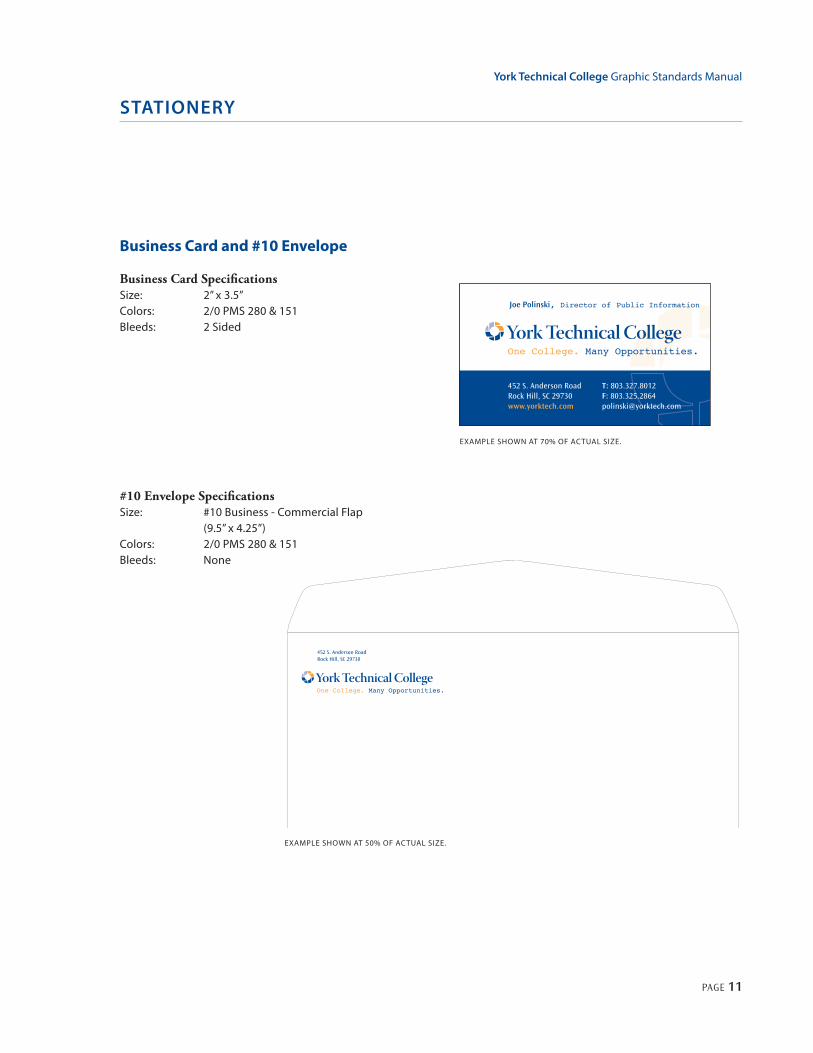
Business Card and #10 Envelope
Business Card SpecificationsSize: 2” x 3.5”Colors: 2/0 PMS 280 & 151Bleeds: 2 Sided
STATIONERY
#10 Envelope SpecificationsSize: #10 Business - Commercial Flap (9.5” x 4.25”)Colors: 2/0 PMS 280 & 151 Bleeds: None
EXAMPLE SHOWN AT 50% OF ACTUAL SIZE.
One College. Many Opportunities.York Technical College
452 S. Anderson Road T: 803.327.8000 www.yorktech.comRock Hill, SC 29730 F: 803.325.2864 [email protected]
452 S. Anderson Road T: 803.327.8012Rock Hill, SC 29730 F: 803.325.2864www.yorktech.com [email protected]
Joe Polinski, Director of Public Information
452 S. Anderson RoadRock Hill, SC 29730
One College. Many Opportunities.York Technical College
One College. Many Opportunities.York Technical College
EXAMPLE SHOWN AT 70% OF ACTUAL SIZE.
One College. Many Opportunities.York Technical College
452 S. Anderson Road T: 803.327.8000 www.yorktech.comRock Hill, SC 29730 F: 803.325.2864 [email protected]
452 S. Anderson Road T: 803.327.8012Rock Hill, SC 29730 F: 803.325.2864www.yorktech.com [email protected]
Joe Polinski, Director of Public Information
452 S. Anderson RoadRock Hill, SC 29730
One College. Many Opportunities.York Technical College
One College. Many Opportunities.York Technical College

York Technical College Graphic Standards Manual
PAGE 12
Brochure and pamphlets are effective tools for communicating to internal and external audiences. While look of these communications pieces need not be identical, they do need to reflect a common graphic approach. Size, number of colors, binding and the like will often be determined by need, audience and budget. However the logo placement and color choices should be consistent with the guidelines provided within the previous pages of this manual. With rare exception, the logo should appear on the front side of the brochure. Consistent placement of the logomark, such as on the bottom right of the cover, will also help establish a visual consistency between publications.
BROCHURES AND PAMPHLETS
FULL COLOR ONE COLOR - PMS 280 ONE COLOR - BLACK
One College. Many Opportunities.
Publication TitleFall 2009
One College. Many Opportunities.
Publication TitleFall 2009
One College. Many Opportunities.
Publication TitleFall 2009

York Technical College Graphic Standards Manual
PAGE 13
York Technical College
One College. Many Opportunities.
One College. Many Opportunities.
York Technical College
One
Coll
ege.
Many O
ppor
tuni
ties
.
York
Tec
hnic
alCo
llege
One College. Many Opportunities.
Apparel, give-aways and other advertising specialties can be an effective means of marketing to the public. When using this approach, incorporating your brand correctly is important. While we strongly suggest following the guidelines provided in the previous pages for all visual applications, sometimes the size and reproduction methods involved in specialty promotions can pose unique challenges. The flash drive illustration provided in Figure 1 is an example of how the size and proportions may warrant modifying the position of the logo elements. Please use caution when considering any such repositioning and placement to conform to vendor specifications.
AD SPECIALTIES AND APPAREL
FIGURE 1

York Technical College Graphic Standards Manual
PAGE 14
AD SPECIALTIES AND APPAREL
One College. Many Opportunities.
One College. Many Opportunities.
One College. Many Opportunities.
T-SHIRT
FLASH DRIVE
BALL CAP
SPORTS SHIRT W/ POCKET

York Technical College Graphic Standards Manual
PAGE 15
OTHER APPLICATIONS
7’
2’
One College.ManyOpportunities.
York
Tec
hnic
alCo
llege
One College.ManyOpportunities.
York
Tec
hnic
alCo
llege
7’
2’
One College.
Many Opport
unities.
One
Coll
ege.
Many
Oppo
rtun
itie
s.
7’
2’One College.
Many Opport
unities.
One
Coll
ege.
Many
Oppo
rtun
itie
s.
There are far too many opportunities for use of YTC logo to be covered in this guide. However, when the logomark is used in ways consistent with these guidelines, you will find the logomark to be flexible enough for most any graphic application. On this page, we’ve illustrated several possible banner applications. The logo has been applied in its preferred logotype treatment (see figure 1), as well as using a shortened “yorktech” logotype in figures 2 & 3. This “yorktech” version is not intended for widespread use, but does offer flexibility for applications where width, or in this case height, may be limited. When compairing figure 1 to figure 3, you will notice by using the shortened logotype treatment the letter size is much larger and ledgible despite the limited height.
FIGURE 1 FIGURE 3
FIGURE 2

York Technical College Graphic Standards Manual
PAGE 16
OTHER APPLICATIONS
452 South Anderson RoadRock Hill, South Carolina 29730(803) 327-8000 www.yorktech.com
Faculty / Staff
ID# 0000000
Robert C.Yorkman
One College. Many Opportunities.York Technical College
Robert C. YorkmanFaculty
One College. Many Opportunities.
York Technical College
452 South Anderson RoadRock Hill, South Carolina 29730(803) 327-8000 www.yorktech.com
Faculty / Staff
ID# 0000000
Robert C.Yorkman
One College. Many Opportunities.York Technical College
Robert C. YorkmanFaculty
One College. Many Opportunities.
York Technical College
EMAIL SIGNATURE BLOCK POWERPOINT TEMPLATE
CAMPUS ID CARD
NAME TAG
OUTDOOR AD

452 S. Anderson Road T: 803.327.8000Rock Hill, SC 29730 F: 803.325.2864www.yorktech.com


