28
Graphing
| Date post: | 22-Dec-2015 |
| Category: |
Documents |
| View: | 221 times |
| Download: | 1 times |
Graphing

Graphing
• Representing numerical information in a picture.
• Graph shows a picture of a relationship
-how two processes relate
-what happens when two events occur simultaneously
-how one factor influences another

Parts of a Graph
• Factors plotted along an axis
• Numeric or some measurable term
• Uses a scale• Horizontal = x-axis =
abscissa• Vertical = y-axis =
ordinate

• Independent variable on x-axis (horizontal)
• Variable that you manipulate
• Dependent variable on y-axis (vertical)
• Variable that responds

Types of Graphs
Bar Graphs
- used to compare amounts of the same type of measurement
0
10
20
30
40
50
60
70
80
90
1stQtr
2ndQtr
3rdQtr
4thQtr
East
West
North
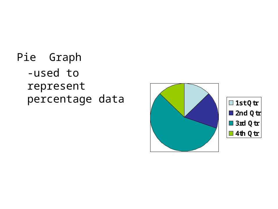
Pie Graph
-used to represent percentage data
1st Qtr
2nd Qtr
3rd Qtr
4th Qtr

Line Graphs
-used for representing data that constantly changes at regular intervals
- may not necessarily show a regular pattern
010
2030
4050
6070
8090
100
1stQtr
2ndQtr
3rdQtr
4thQtr
East
West
North

Data Table – data collected is organized in a table.
Independent Variable → Goes on X axis →data on left side of data table
Dependent Variable → Goes on Y axis → data on right side of data table

Analyzing a Graph
Relationship is Inversely Proportional
Relationship is Directly Proportional

Line Graphs – Kinds of Relationships

Relationship – steady increase over a period of time
Curve is a straight line ~ since both factors are increasing the relationship is directly proportional

Relationship – increases over period of time until a max is reached and then decreases

Relationship – change over period of time then remains constant
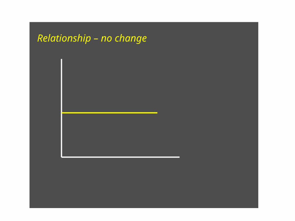
Relationship – no change
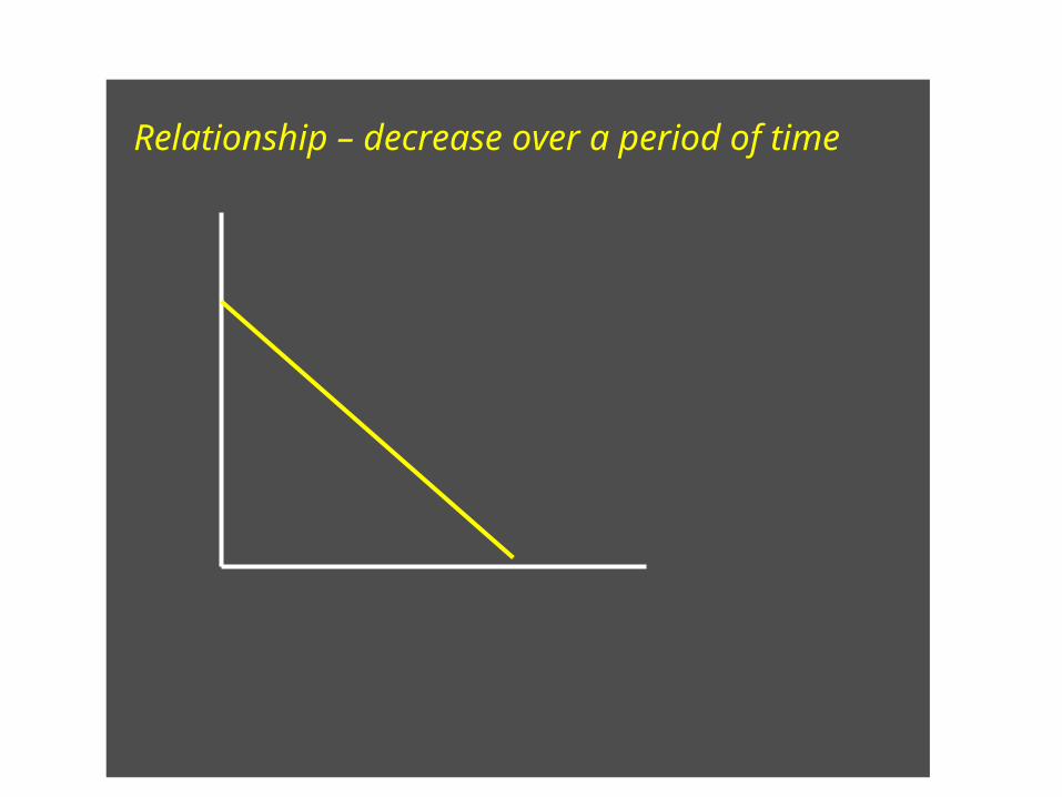
Relationship – decrease over a period of time

Relationship – unchanged, decrease, remains constant

Building a Graph
1. Identify the variables2. Determine the range of each variable3. Determine the scale (fill at least 2/3 of
paper)4. Number and label each axis5. Plot the data points6. Draw the graph7. Title the graph (provide a key if needed)
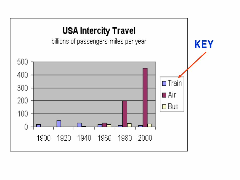
KEY
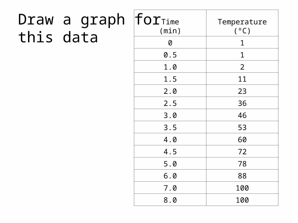
Draw a graph for this data
Time(min)
Temperature(ºC)
0 1
0.5 1
1.0 2
1.5 11
2.0 23
2.5 36
3.0 46
3.5 53
4.0 60
4.5 72
5.0 78
6.0 88
7.0 100
8.0 100
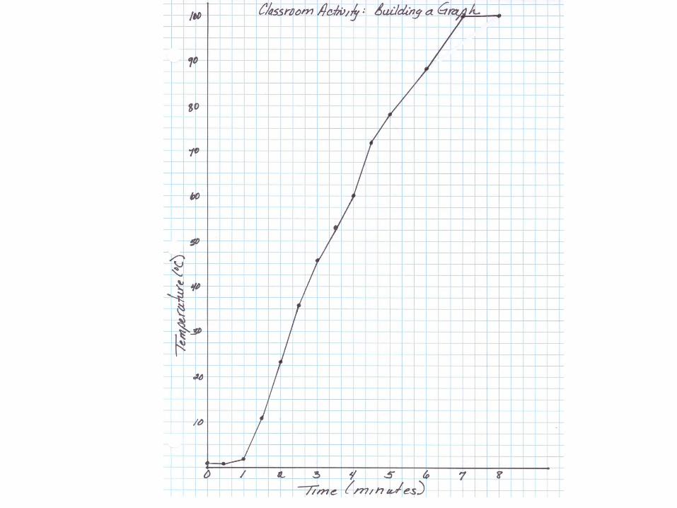

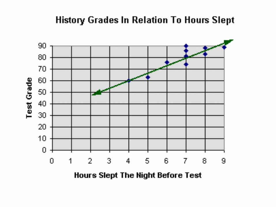
“Connecting the dots”
• A line of best fit or also called a “best fit line” is a straight line that best represents the data on a scatter plot.
• This line may pass through some of the points, none of the points, or all of the points.
• It may also be called a "trend" line.

Best Fit Line
Best fit line may not go through the “O” point
• Choose two points that you think will form the line of best fit.

Using a graph to determine information not directly measured
or calculated.
• Done with line graphs
• Is impossible to measure every point that exists on that line or a distance from either end of the line constructed from the experimental points.
• Use the processes of interpolation and/or extrapolation

• Interpolation –
• The process of obtaining a value from a graph or table that is located between data points plotted or major points given.
• You make a prediction about what would happen at a given point.

• How much money did the student earn after 5 hours?
• Since you know how the experiment worked before and after the point of interest, you have a better chance of making a correct prediction.
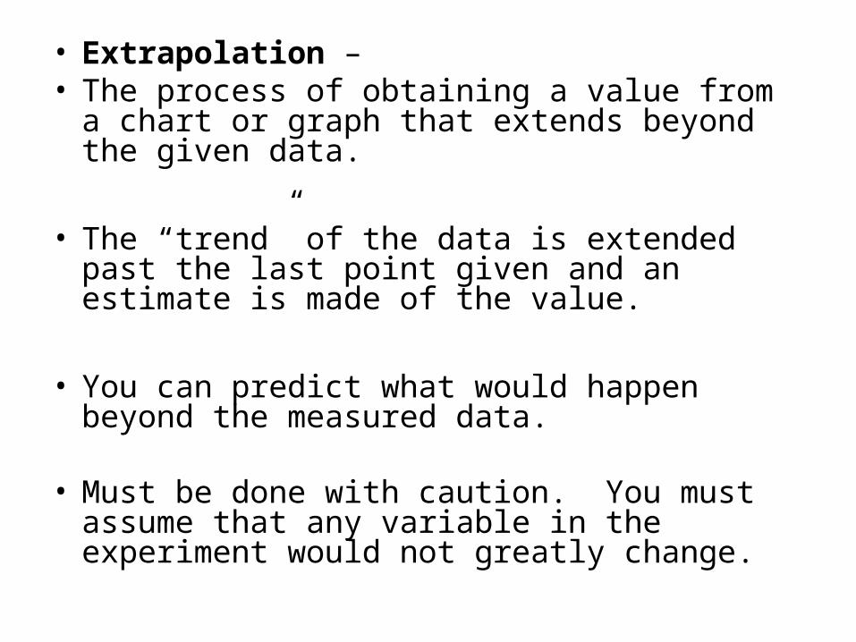
• Extrapolation – • The process of obtaining a value from a chart or
graph that extends beyond the given data.
• The “trend” of the data is extended past the last point given and an estimate is made of the value.
• You can predict what would happen beyond the measured data.
• Must be done with caution. You must assume that any variable in the experiment would not greatly change.

• How much money did the student earn after 10 hours?
• Extrapolation may not be very accurate since you are assuming the trend continues outside the boundaries of your data points


