Haan & Godley - R Lab Manual Dave Armstrong University of Western Ontario Department of Political Science e: [email protected]Much of what below comes from An Introduction to Statistics for Canadian Social Scientists, 3 rd ed. by Michael Haan and Jenny Godley (Oxford University Press, 2017). I have added the R-based content. Lab #1: Introduction to R The focus of this lab is to introduce you to R and the R Commander (a graphical user interface to R). To use R to analyze data, you will need to become familiar with the technical components of this software package. This lab will help familiarize you with the R software, including how to access data files, the various base components and how to define new variables and how to enter data. Since R is open-source, you can freely download it and all of its components on your computer. It is also available in the SSTS labs. Defining and Downloading R R is an open source statistical computing environment that is becoming increasingly popular among social scientists. It works by taking a series of commands and applying those commands to the data you specify. We will use the R commander initially to reduce the steepness of the learning curve for R which is notoriously steep. To use R, you will have to download it. Below are some instructions for downloading and installing R and the components you’ll need for now. • Download and install R v 3.4.1 from here: https://cran.r-project.org. • Open R, you should see something that looks like this: 1
Transcript
Haan & Godley - R Lab Manual
Dave ArmstrongUniversity of Western OntarioDepartment of Political Science
Much of what below comes from An Introduction to Statistics for Canadian Social Scientists, 3
rd
ed. byMichael Haan and Jenny Godley (Oxford University Press, 2017). I have added the R-based content.
Lab #1: Introduction to R
The focus of this lab is to introduce you to R and the R Commander (a graphical user interface to R). To useR to analyze data, you will need to become familiar with the technical components of this software package.This lab will help familiarize you with the R software, including how to access data files, the various basecomponents and how to define new variables and how to enter data.
Since R is open-source, you can freely download it and all of its components on your computer. It is alsoavailable in the SSTS labs.
Defining and Downloading R
R is an open source statistical computing environment that is becoming increasingly popular among socialscientists. It works by taking a series of commands and applying those commands to the data you specify.We will use the R commander initially to reduce the steepness of the learning curve for R which is notoriouslysteep.
To use R, you will have to download it. Below are some instructions for downloading and installing Rand the components you’ll need for now.
• Download and install R v 3.4.1 from here: https://cran.r-project.org.
• Open R, you should see something that looks like this:
• In R, type the following (in fact, you should be able to copy the line from the handout and paste itinto R):
install.packages("Rcmdr", dependencies=TRUE)
This will pop up a dialog box of CRAN Mirror sites from which you can choose. Pick site number 0(the first one on the list) and click “OK”. You will get a set of messages that look something like theone below. You might have more packages to install, so if your message is longer, that’s fine.
• Now, in R, type the following and hit enter:
library("Rcmdr")
You should get a window that looks like this:
2
You’ll notice that R Commander has both an input and output window. The input window is where you (ormore likely right now, R) will type the commands. The output window shows numerical output producedby the commands you issue either by typing in the input window, or by choosing menu options.
Saving Your Files
In the R Commander, you can save three di↵erent kinds of files through the file menu. You can choose“Save script” which will save the contents of the R Script (input) window. You can choose “Save output”which will save the contents of the output window to a text file. You can also choose “Save R workspace”which will save all of the data, models and other objects that you produce in your R session. It is a goodidea to keep track of all of your inputs in the script window and save them for every R session.
3
Lab #2: Identifying Types of Variables: Levels of Measurement
The focus of this lab is to introduce you to the four di↵erent levels of variable measurement, how to identifydi↵erent types of variables within R and nhow di↵erent levels of measurement are coded and organized withinR. This material corresponds with the material presented in Chapter 2.
Understanding Levels of Measurement
Variables are measured at four di↵erent levels: nominal, ordinal, interval and ratio. Each of these levels hasunique characteristics that define them. For nominal data, numeric values are typically used for identificationpurposes. It is not possible to rank the response categories and there is not a quantifiable di↵erence betweencategories. For ordinal data, the numeric values can signify an inherent ordering because you can rank theresponse categories, but you cannot measure the distance between those categories. For interval data, thedata can be organized into an order that can be added or subtracted, but (theoretically) not multiplied or di-vided, because there is no true zero. Ratio data are similar to interval data except they have a true zero value.
There are many ways to retrieve information about a variable’s level of measurement in R. The primarydistinction in R is between qualitative variables (nominal and ordinal) and quantitative variables (inter-val and ratio). The former are generally called factors in R. They can be ordered, but generally are notas there is no inherent di↵erence in the way those variables are treated in models relative to unordered factors.
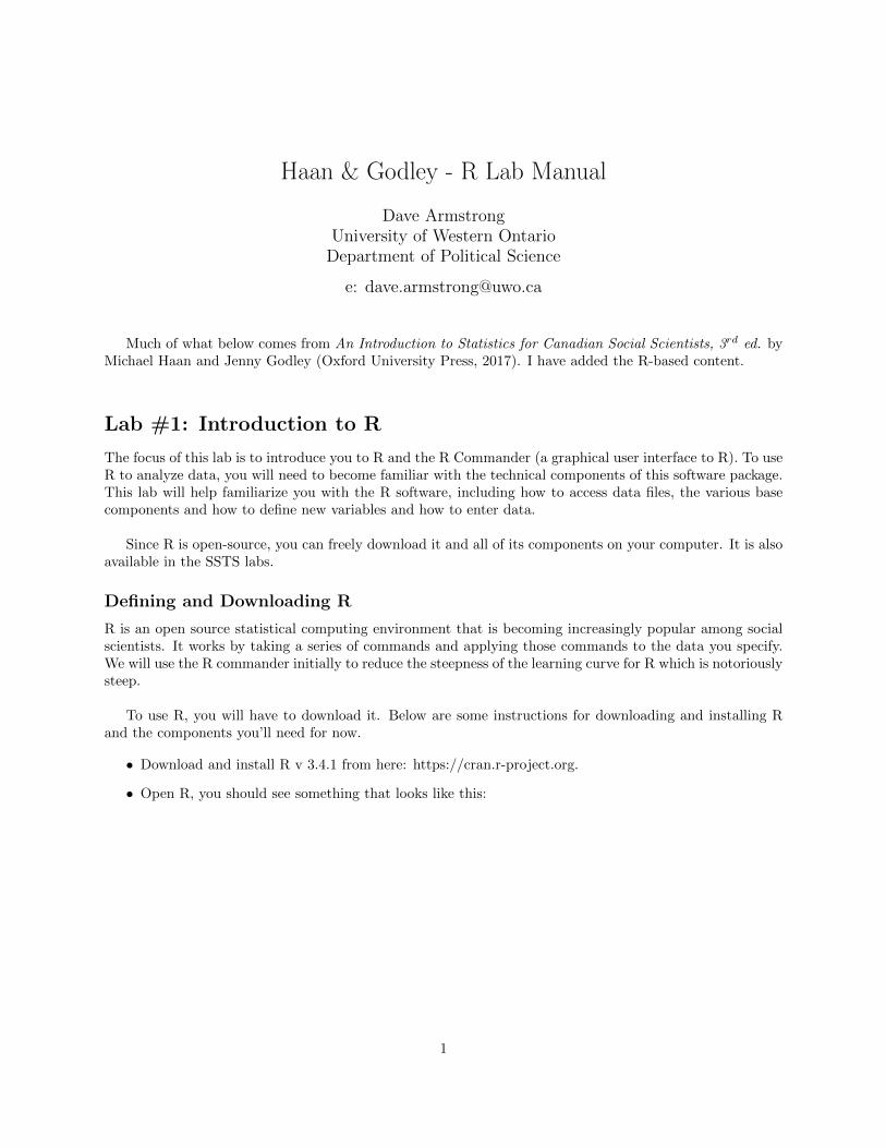
To open the Alberta survey, download the file alberta.rda from the course website. The codebook isalso there. The codebook tells you what each variable means and how it’s coded. Once the dataset has beendownloaded, you can open it in the R Commander by going to data!load data set.
This will bring up a dialog box that will allow you to browse to the data. Click on the data file and click“OK”, then you should see something like this (though presumably with a di↵erent path to the file).
4
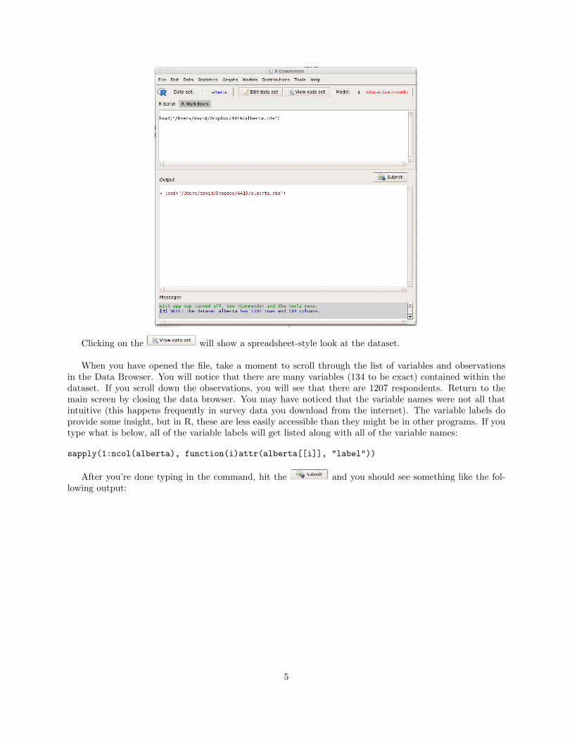
Clicking on the will show a spreadsheet-style look at the dataset.
When you have opened the file, take a moment to scroll through the list of variables and observationsin the Data Browser. You will notice that there are many variables (134 to be exact) contained within thedataset. If you scroll down the observations, you will see that there are 1207 respondents. Return to themain screen by closing the data browser. You may have noticed that the variable names were not all thatintuitive (this happens frequently in survey data you download from the internet). The variable labels doprovide some insight, but in R, these are less easily accessible than they might be in other programs. If youtype what is below, all of the variable labels will get listed along with all of the variable names:
After you’re done typing in the command, hit the and you should see something like the fol-lowing output:
5
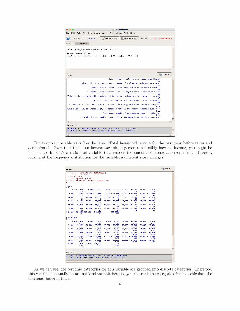
For example, variable k12a has the label “Total household income for the past year before taxes anddeductions.” Given that this is an income variable, a person can feasibly have no income, you might beinclined to think it’s a ratio-level variable that records the amount of money a person made. However,looking at the frequency distribution for the variable, a di↵erent story emerges.
As we can see, the response categories for this variable are grouped into discrete categories. Therefore,this variable is actually an ordinal level variable because you can rank the categories, but not calculate thedi↵erence between them.
6
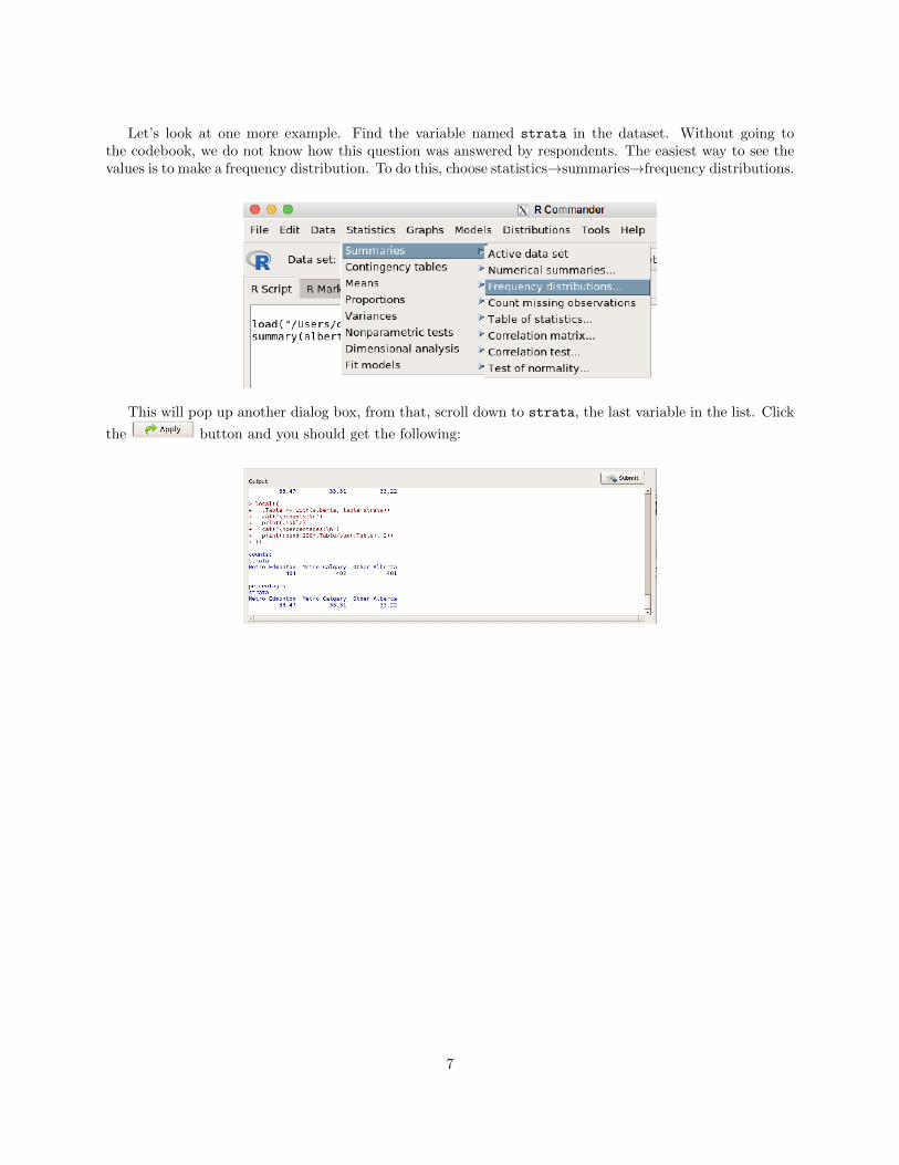
Let’s look at one more example. Find the variable named strata in the dataset. Without going tothe codebook, we do not know how this question was answered by respondents. The easiest way to see thevalues is to make a frequency distribution. To do this, choose statistics!summaries!frequency distributions.
This will pop up another dialog box, from that, scroll down to strata, the last variable in the list. Click
the button and you should get the following:
7
Lab #3: Univariate Statistics
The focus of this lab is to begin to introduce you to analysis with one variable. Generating frequencies is abasic procedure used to obtain a summary of a variable by looking at the number of cases associated witheach value of the variable. This material corresponds with the material presented in Chapter 3.
Learning Objectives:The following lab is directed at helping you understand ways of studying the characteristics of data. Specif-ically, this lab assignment challenges you to clarify your understanding of:
1. How to generate and interpret frequency distributions
2. Data presentation
3. The connection between data presentation and levels of measurement.
Part 1: Producing Frequency Distributions
We will first learn to produce a frequency table.
Producing a Frequency Distribution
Step 1: Open the Alberta Survey Data
Download the data from the Data folder in the Resources tab of the OWL site. The codebook is also there.The codebook tells you what each variable means and how it’s coded. Once the dataset has been downloaded,you can open it in the R Commander by going to data!load data set.
This will bring up a dialog box that will allow you to browse to the data. Click on the data file and click“OK”, then you should see something like this (though presumably with a di↵erent path to the file).
8
Step 2: Use menus to create a frequency distribution
In the R Commander, go to statistics!summaries!frequency distributions:
This will bring up a dialog box:
The dialog box has names in alphabetical order, you can scroll down to the variable sex and click on
the to produce the result. This leaves the window open for creating more frequencies. Clicking
9
will produce the frequency and close the dialog box. This will give you the following output:
This suggests that there are 595 males in the data (49.3% of the sample) and 612 females (50.7% of thesample). In total, there are 595 + 612 = 1207 observations in the dataset.
Part 2: Charts
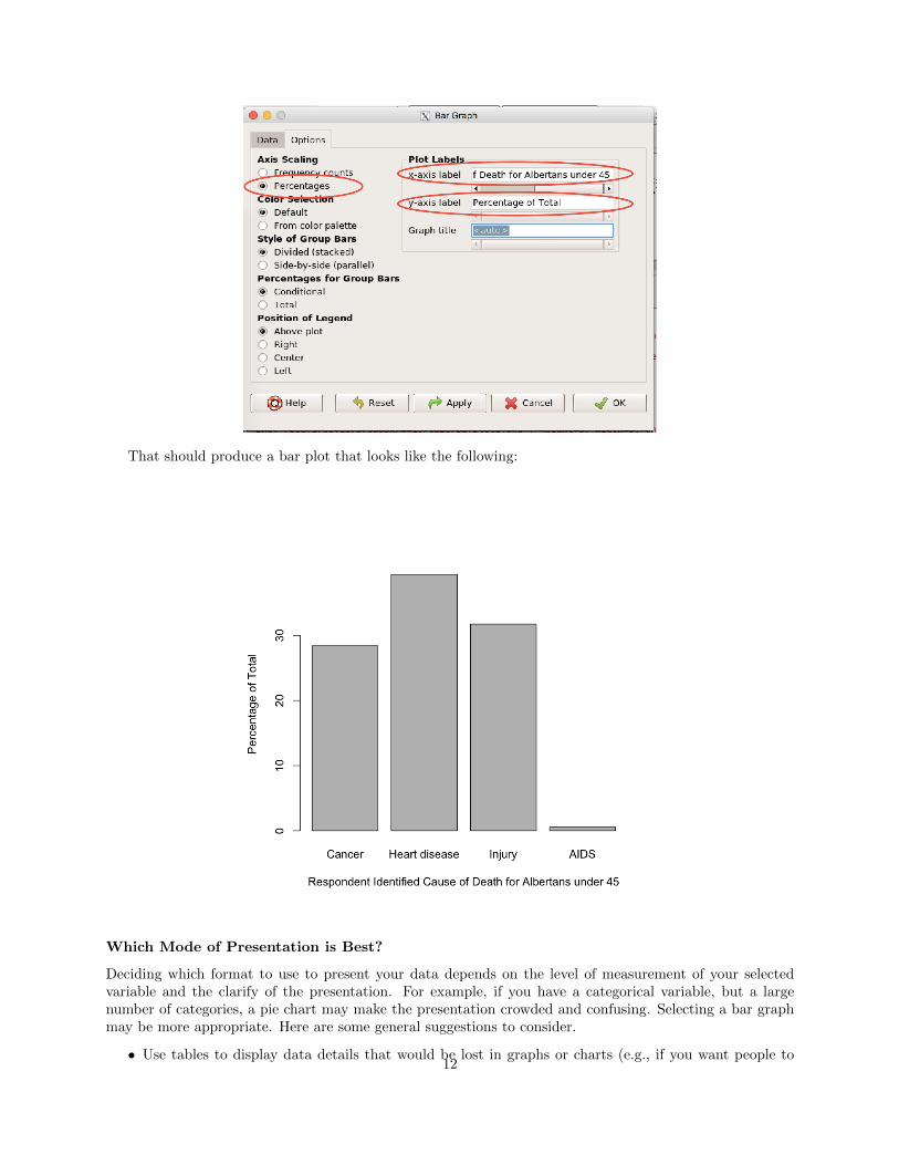
A bar chart is a way of summarizing a set of categorical data. It displays data using a number of rectangles ofthe same width, each of which represents a particular category. The length of each rectangle is proportionalto the number of cases in the category it represents. Below, we will make a figure of the question “To thebest of your knowledge, what is the leading cause of death for Albertans under the age of 45?”, question g1
in the survey. You can make a bar chart in the R Commander by choosing Graphs!Bar Graph from the RCommander menus.
10
That will open up a dialog box that looks like the following:
You can also choose di↵erent options for how the figure is constructed (e.g., frequencies or percentages)by clicking on the percentages tab, which switches the dialog to the one below:
11
That should produce a bar plot that looks like the following:
Which Mode of Presentation is Best?
Deciding which format to use to present your data depends on the level of measurement of your selectedvariable and the clarify of the presentation. For example, if you have a categorical variable, but a largenumber of categories, a pie chart may make the presentation crowded and confusing. Selecting a bar graphmay be more appropriate. Here are some general suggestions to consider.
• Use tables to display data details that would be lost in graphs or charts (e.g., if you want people to12
know the precise numerical values).
• Opt for a bar graph to compare data
• Focus on the main point and consider your audience.
• Use charts for non-technical audiences when possible.
Summary
In this section, you were introduced to the basics of data presentation. You explored two methods of datapresentation: frequency tables and bar graphs. Specifically, you learned how to generate and interpretfrequency distributions and how to create two modes of presentation, and the connection between datapresentation and levels of measurement.
Lab #4: Introduction to Probability
The focus of this lab is to review what you have already learned and to introduce you to the conceptof recoding variables. Recoding variables is an important component in conducting analysis because thecategories of a variable as they were asked in the questionnaire might not work for your specific needs. Forexample, if you are interested in comparing individuals who have a high school education or less with thosewho have a post-secondary education, you may not require a level of detail that looks at all the specific typesof post-secondary education available. This lab will show you how to manipulate variables. We will alsolook at how to calculate probabilities from R output. This material corresponds with the material presentedin Chapter 4.
Recoding Variables
Let’s assume you are interested in the opinions Albertans have regarding whether temporary foreign workersare needed to fill jobs in the Alberta labour market. Within the current data set, we have a variable thatasks, “Indicate how much you agree or disagree with the following statement: Temporary foreign workersare needed to fill jobs in the ALberta lobour market” (ft4). After obtaining a frequency distribution ofthe variable, you realize that you do not require this level of detail. You are interested in whether peopledisagree, neither agree nor disagree, or agree. Therefore, you realize you will need to collapse the firsttwo categories together (Strongly Disagree and Disagree) and the last two categories together (Agree andStrongly Agree). You can do this in the R commander by choosing Data!Manage variables in active dataset!Recode variables...
13
This will bring up a dialog box that will allow you to 1) choose the variable, 2) choose the name of thenew variable that will be created and 3) provide the recode directives. Fill in the dialog box as below:
While the first two fiels are mostly self explanatory, the third is not. Here, you want to tell R what todo in terms of <original value> = <new value> pairs. If the original value is a number, then you don’tneed quotation marks around it. If the original value is a factor label (e.g., “Strongly disagree”), then youneed double quote marks around it, as in the figure above. All other values not recoded will remain theiroriginal values. You can create a frequency distribution of the variable (as we learned above) to make surethat you did it right.
14
What you might notice now is that the levels are out of order. R will automatically put them in alpha-betical order. So the levels are Agree, Disagree and then Neither disagree nor agree. If you want to changethat, you can choose Data!Manage variables in active data set!Reorder factor levels.
This will pop up a dialog box that asks you to pick the variable the levels of which you would like to
reorder. Pick ft4_recode and click .
Clicking OK will pop up a warning, to which you should say “Yes”. The new dialog box that pops upwill have all of the factor levels and then boxes where you can place the integer values between 1 and thetotal number of levels (in this case, 3). Choose the ordering you want for the new variable.
15
Click and then create another frequency distribution of the recoded variable to make sure thateverything worked.
16
Lab #5: The Normal Curve
The focus of this lab is to introduce you to the concept of the normal curve. The distribution of data cantake on di↵erent forms. Understanding how data are distributed is important for more complex analysis,which you will learn as this course progresses. This lab corresponds with the material taught in Chapter 5.
Creating a Histogram in R
You can use the Graphs!Histogram dialog from the R Commander to make a histogram.
That will pop up a dialog box that allows you to pick the variable you want to use in the histogram. Inthis case, pick k7.
17
Next, click on the “Options” tab at the top of the dialog. There, you can specify the number of bins(i.e., groupings), label the axes and choose whether you want the heights of the bars to represent frequency,percentages or density (proportion divided by width of the bar).
Once you’ve filled in all of the relevant pieces, click the button and behold! You should getsomething that looks like the following:
18
If you wanted more resolution, you could go back to the “Options” tab and change the number of binsargument from <auto> to a big number, like 30. This would produce the histogram below.
Notice that the first graph we made looks unimodal with a slight right (positive) skew, the second graphwe made looks multimodal. We notice spikes as 12, 16, 18 and 20 - all times when degrees tend to get
19
awarded. The right skew is a bit more prominent in the second graph relative to the first. As we discussedin class, neither of these is necessarily “right”, either might be useful depending on the point you’re tryingto make. For example, if you were trying to highlight the fact that very few people were especially poorlyeducated, the first figure would be enough. If you were trying to highlight the fact that many people perse-vere until the end of their degree programs, the second figure would be much more useful.
If you wanted a numerical summary (rather than a graphical one), you could get that from the Statistics!Summaries!Numericalsummaries dialog.
You could pick di↵erent types of statistics to present in the “Statistics” tab, but for our purposes, thedefaults are fine. The results can be seen below:
For things like the mean and standard deviation, we’ll be tackling those in the coming weeks. Otherquantities, like the quartiles and the IQR, we’ve talked at least briefly about those already.
20
Lab #6: Measures of Central Tendency and Dispersion
The focus of this lab is to introduce you to various measures of central tendency. Measures of centraltendency allow you to further understand the distribution of a variable. In this lab, you will learn how togenerate various measures of central tendency in R. This lab corresponds with the material presented inChapter 6.
Generating Measures of Central Tendency
With the Alberta survey data open, the easiest way to generate a mean is to use the “numerical summaries”function. You can get there by going to Statistics!Summaries!Numerical summaries in R Commander.
Choose the variable you’re interested in, k7 in this case. Click the and you will get the followingresult.
We can see that the mean here is 15.433336. The median is also a measure of central tendency andthat value (the 50th percentile) is 15. Most statistical software doesn’t actually produce the mode (the mostfrequent value), which is also a measure of a distribution’s centre. This can be obtained with a frequencydistribution. Now, R Commander is a bit too smart for us, in that it only gives us options for frequencydistributions for factors. You’ll notice that k7 is not in the list of variables for frequency distributions.We can calculate a frequency distribution for k7 if we change it into a factor. We can do this by going toData!Manage variables in active dataset!Convert numeric variables to factors.
21
This will open a dialog box. You can pick the variable k7 from the list, click the “use numbers” optionin the factor levels and make sure to put a new name, like k7_fac.
Now, making a frequency distribution of k7_fac will give you the following:
We can see that the number that has the most observations is 16 with 177 observations. This is themodal value. So, we have a mean of 15.4, a median of 15 and a mode of 16. So, all three measures tell usroughly the same thing about the centre of the distribution.
Returning to the summary statistics, we see that the standard deviation is 3.33 and the variance is 11.09.As you progress through this course, the meaning of these statistics will become clearer. However, for now,knowing how to generate these statistics in R is su�cient. We also see that we have a range of 27, by sub-tracting the smallest value (3) from the highest value (30). This means that the distance between the highestlevel of education and the lowest level of education is 27 years. Since the number is plausible, we should havefaith that the data have no errors, or that we didn’t do anything wrong (not trivial occurrences in statistics!).
Let’s look at one more example to illustrate the di↵erence between the measures of central tendency.22
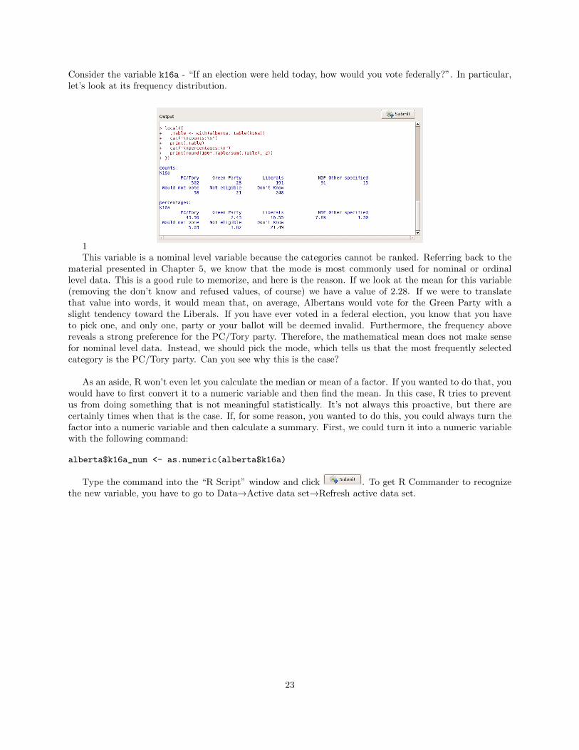
Consider the variable k16a - “If an election were held today, how would you vote federally?”. In particular,let’s look at its frequency distribution.
1This variable is a nominal level variable because the categories cannot be ranked. Referring back to the
material presented in Chapter 5, we know that the mode is most commonly used for nominal or ordinallevel data. This is a good rule to memorize, and here is the reason. If we look at the mean for this variable(removing the don’t know and refused values, of course) we have a value of 2.28. If we were to translatethat value into words, it would mean that, on average, Albertans would vote for the Green Party with aslight tendency toward the Liberals. If you have ever voted in a federal election, you know that you haveto pick one, and only one, party or your ballot will be deemed invalid. Furthermore, the frequency abovereveals a strong preference for the PC/Tory party. Therefore, the mathematical mean does not make sensefor nominal level data. Instead, we should pick the mode, which tells us that the most frequently selectedcategory is the PC/Tory party. Can you see why this is the case?
As an aside, R won’t even let you calculate the median or mean of a factor. If you wanted to do that, youwould have to first convert it to a numeric variable and then find the mean. In this case, R tries to preventus from doing something that is not meaningful statistically. It’s not always this proactive, but there arecertainly times when that is the case. If, for some reason, you wanted to do this, you could always turn thefactor into a numeric variable and then calculate a summary. First, we could turn it into a numeric variablewith the following command:
alberta$k16a_num <- as.numeric(alberta$k16a)
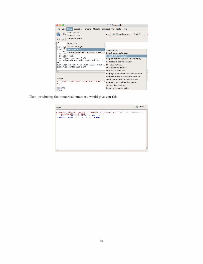
Type the command into the “R Script” window and click . To get R Commander to recognizethe new variable, you have to go to Data!Active data set!Refresh active data set.
23
Then, producing the numerical summary would give you this:
24
Lab #7: Standard Deviations, Standard Scores and the NormalDistribution
The focus of this lab is to introduce you to z-scores and help you further understand how the standarddeviation relates to the normal curve. The most commonly used standard score, the z-score, is a measureof the relative location in a distribution. Specifically, z-scores, in standard deviation units, give the distancethat a particular score is from the mean. In this lab, you will learn how to generate various z-scores with R.This lab corresponds with the material presented in Chapter 7.
Part 1: Reviewing the SHape and CHaracteristics of Distributions
Before learning to calculate z-scores, let’s first refresh our memories on the shape and characteristics ofdistributions. In the figure below is a histogram of the variable k7 - “In total, how many years of schoolingdo you have?” (We learned how to make this graph in Lab #5)
Now, what can we say about this distribution? It is multimodal because there are several spikes (12, 16,18 and 20). Since the two spikes as 12 and 16 are bigger, perhaps you could argue that the distribution isbimodal. The curve appears to have a slight positive skew because there are more people at higher levels ofeducation than at lower levels of education. When looking at the numerical summary (from Lab#5), we seethat on average, respondents have 15.43 years of school, with a standard deviation of 3.33.
25
All right, so now we have refreshed our memory regarding the shape and characteristics of distributions.Keeping these elements in mind will help us to further understand z-scores and what it means to standardizea distribution.
Part 2: Calculating z-scores
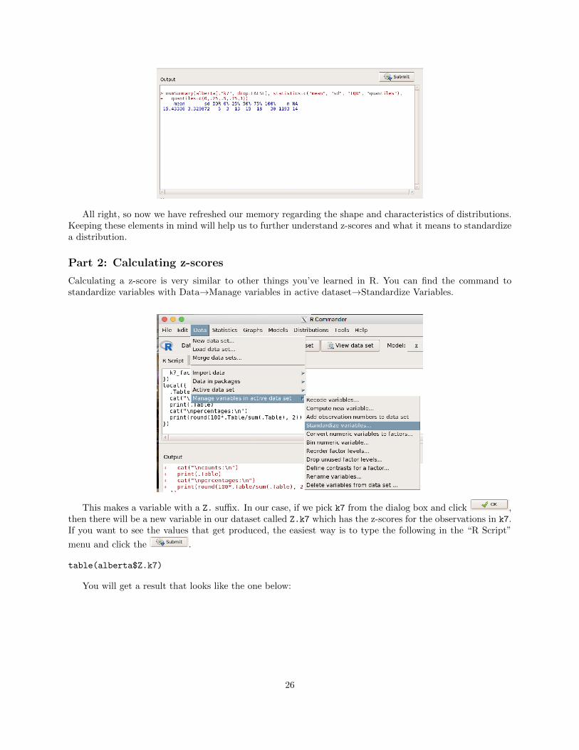
Calculating a z-score is very similar to other things you’ve learned in R. You can find the command tostandardize variables with Data!Manage variables in active dataset!Standardize Variables.
This makes a variable with a Z. su�x. In our case, if we pick k7 from the dialog box and click ,then there will be a new variable in our dataset called Z.k7 which has the z-scores for the observations in k7.If you want to see the values that get produced, the easiest way is to type the following in the “R Script”
menu and click the .
table(alberta$Z.k7)
You will get a result that looks like the one below:
26
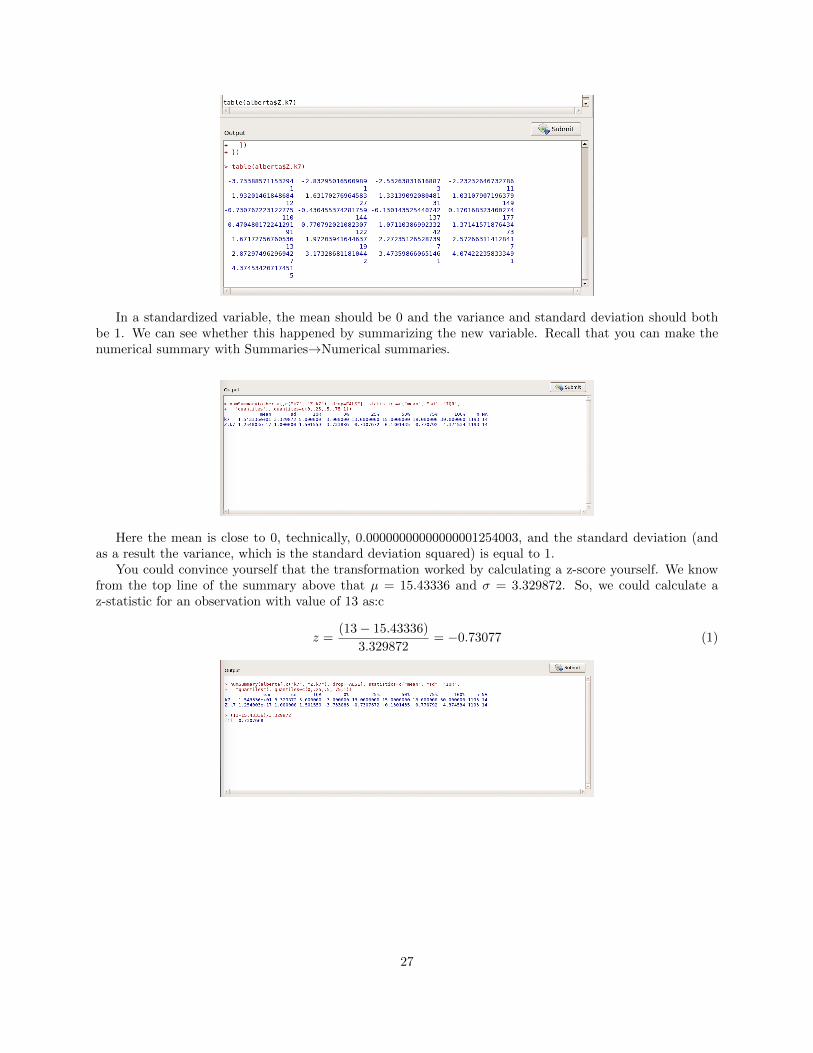
In a standardized variable, the mean should be 0 and the variance and standard deviation should bothbe 1. We can see whether this happened by summarizing the new variable. Recall that you can make thenumerical summary with Summaries!Numerical summaries.
Here the mean is close to 0, technically, 0.00000000000000001254003, and the standard deviation (andas a result the variance, which is the standard deviation squared) is equal to 1.
You could convince yourself that the transformation worked by calculating a z-score yourself. We knowfrom the top line of the summary above that µ = 15.43336 and � = 3.329872. So, we could calculate az-statistic for an observation with value of 13 as:c
z =(13� 15.43336)
3.329872= �0.73077 (1)
27
Lab #8: Sampling
The focus of this lab is to introduce you to case selection in R and to help you further understand how largersample sizes improve the accuracy of estimates. A sample that is accurately and carefully selected allowsfor a more precise analysis, without including the full population. Because we are often unable to surveyevery individual, we make decisions about how much of the population to include based on our knowledgeof the population parameter. In this lab, we are going to pretend that the total number of respondents whoparticipated in the survey represents the entire population of Alberta (as though the survey were a census).This lab corresponds with the material presented in chapters 8 and 9.
Installing the ISCSS Package
As I mentioned previously, I wrote a little package that produces a new menu structure for the R Commander.The ISCSS (Introductory Statistics for Canadian Social Scientists) package can be downloaded from github.To accomplish this, do the following things in R:
Now, the package is installed. To open the new menu, you can invoke the R Commander interface andload the new package:
library(Rcmdr)
library(RcmdrPlugin.ISCSS)
This should produce the R Commander window with a new ISCSS menu at the top:
This will help us perform some of the tasks needed for this lab.
How to Select Cases
There is a di↵erent frequency distribution function in the ISCSS menu. We can use that to make a frequencydistribution of sex from the Alberta data. To do this, go to ISCSS!Statistics!Frequency Distribution.
Pick the sex variable, click .
28
You should see the frequency distribution as below:
Note that we have 595 males and 612 females. This will be the basis of our population parameters.However, remember that these numbers, in reality, do not represent the true population of Alberta. Weare only using them as a population for illustrative purposes. We can imagine random sampling from this“population”. This can be done with ISCSS!Data!Subset data (including random sampling). In thesubset expression field, enter the following: sample 5% and use alberta5 as the new dataset.
Note that this has changed the active dataset to alberta5:
Now, we can create the frequency distribution of sex for this new, smaller dataset
29
Note here that we have 34 of 60 observations who are male (56.67%) whereas in our “population” wehave roughly 49.3% males. Since we’re drawing a random sample, it is possible that your values will bedi↵erent from mine.
Standard Error of a Sample Mean
The next thing we’re going to do is use R to help us calculate the standard error of a sample mean. Recallfrom chapter 9 that the equation is:
sx̄
=sxpn
Using this, it is possible to estimate the distance that your sample is likely to be from a population mean.You can do this even though you don’t know what the population mean actually is, using statistical theoryand what we know about the normal distribution.
Suppose that you wanted to know the average age of respondents. Remember that you would do thisby using the Numerical summaries command in R Commander. The resulting output would give you themean, standard deviation and number of observations (among other things). Note, we want to switch ouractive data set back to alberta and recode all values of 99 on age to NA.
We could calculate the standard error of the mean here as:
sx̄
=sxpn=
16.35p1176
= 0.477
30
If we activate the alberta5 dataset again, we could figure out the same sampling variable for a 5% samplefrom our population.
Here, the standard error is:
sx̄
=14.517p
58= 1.906
Notice that this value is a lot bigger.
Confidence Intervals
It is easy to make confidence intervals for the mean with the ISCSS menu in R Commander. Simply go toISCSS!Statistics!Confidence Interval.
Select the variable age, and you can optionally choose a confidence level other than 95% and you can
choose whether to use the normal or Student’s T distribution. Click and you should get the fol-lowing output. (make sure you switch your active dataset back to alberta)
You should get the following result:
31
This suggests that if this is one of the “lucky” 95% of means that is within ±2 standard errors from thetrue population mean, that the true population mean is in the interval [51.51, 53.38].
32
Lab #9: Hypothesis Testing: Testing the Significance of the Dif-ference Between Two Means
The focus of this lab is to introduce you to the “t-test” functions in R and help you further understand howwe use confidence intervals to determine generalizing our samples to populations.
Calculating a One-sample t-test in R
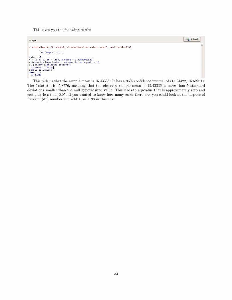
Let’s pretend we are interested in knowing whether the average years of schooling of our sample di↵erssignificantly from the population average (which is known to be 16 years, the equivalent of high school plusan undergraduate degree) at the 95% confidence level. Suppose that we got this number from the Canadiancensus and that it accurately represents the entire population. After loading the Alberta survey data, youcould go to Statistics!Means!Single-sample t-test.
Then, you could choose the variable k7, pick the population null hypothesized value as 16 and thenchoose whichever alternative hypothesis you’d like to evaluate. In this case, leaving the radio button for“Population mean != mu0” is the right answer because we only want to evaluate whether there is a di↵erence(not in any particular direction).
33
This gives you the following result:
This tells us that the sample mean is 15.43336. It has a 95% confidence interval of (15.24422, 15.62251).The t-statistic is -5.8776, meaning that the observed sample mean of 15.43336 is more than 5 standarddeviations smaller than the null hypothesized value. This leads to a p-value that is approximately zero andcertainly less than 0.05. If you wanted to know how many cases there are, you could look at the degrees offreedom (df) number and add 1, so 1193 in this case.
34
Lab #10: Hypothesis testing: One- and Two-tailed Tests
The focus of this lab is to introduce you to two-sample t-tests in R. For this type of analysis, you need adichotomous independent variable (i.e., one that only has two values) and an interval- or ratio-level dependentvariable. This lab corresponds with the material in Chapter 11.
Calculating a t-test with Two Samples in R
Let’s pretend we are interested in knowing whether the average years of schooling of our sample di↵erssignificantly between males and females. Since both are samples and since scores on the outcome of interestare independent of each other (presumably the total years of schooling among women has nothing to do withthe total years of schooling among men), it is most appropriate to conduct a t-test on independent samples.
In this case, we are going to test the alternative hypothesis that men’s average years of schooling willdi↵er from the average years of schooling for women. That is,
H0
: In the population, the mean years of schooling for men and women does not di↵er (µmen
= µwomen
)
HA
: In the population, the mean years of schooling for men di↵ers from that of women (µmen
6= µwomen
)
To do this in R, we would go to Statistics!Means!Independent samples t-test.
You will need to pick a grouping variable in the first variable box and a quantitative response in thesecond variable box (left pane below). Then, you can specify the options, though in this case we wouldprobably leave them how they are (right pane below).
This will give you the following result:
The result tells us that the two means are 15.64957 for males and 15.22533 for females. Note, not surpris-ingly, that these two means are on either side of the overall mean we calculated in the last lab of 15.43336. If
35
there were equal numbers of men and women, this number would be exactly between the two group means.The t-statistic is 2.204 on roughly 1191 degrees of freedom. The p-value is 0.02766 which is less than 0.05,meaning that there is a statistically significant di↵erence between the average education of men and women.
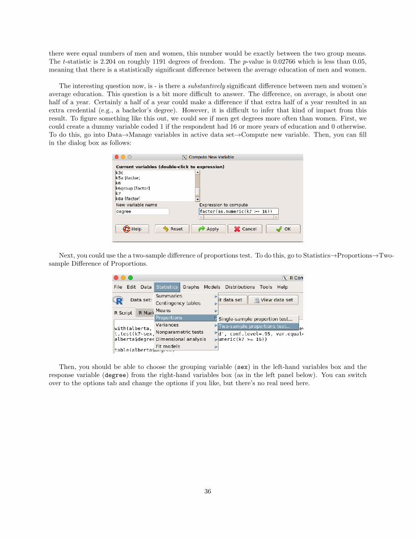
The interesting question now, is - is there a substantively significant di↵erence between men and women’saverage education. This question is a bit more di�cult to answer. The di↵erence, on average, is about onehalf of a year. Certainly a half of a year could make a di↵erence if that extra half of a year resulted in anextra credential (e.g., a bachelor’s degree). However, it is di�cult to infer that kind of impact from thisresult. To figure something like this out, we could see if men get degrees more often than women. First, wecould create a dummy variable coded 1 if the respondent had 16 or more years of education and 0 otherwise.To do this, go into Data!Manage variables in active data set!Compute new variable. Then, you can fillin the dialog box as follows:
Next, you could use the a two-sample di↵erence of proportions test. To do this, go to Statistics!Proportions!Two-sample Di↵erence of Proportions.
Then, you should be able to choose the grouping variable (sex) in the left-hand variables box and theresponse variable (degree) from the right-hand variables box (as in the left panel below). You can switchover to the options tab and change the options if you like, but there’s no real need here.
36
Clicking OK, you will get the following result:
This suggests that men get degrees at a rate of 53% and women at a rate of 42.3% (if having 16 years ofeducation is equivalent to a degree). This di↵erence in proportions of 10.7% is significant with a �2 statistic(which we haven’t talked much about yet) of 13.74 with 1 degree of freedom (more on this in a couple ofweeks). The p-value here is 0.0002, certainly less than 0.05, so we would reject the null hypothesis that menand women get bachelors degrees at the same rate. Here, the di↵erence seems quite substantial. In this case,getting another perspective on this question provides us more and perhaps more interesting information.
37
Lab #11: Bivariate Statistics for Nominal Data
The focus of this lab is to introduce you to the association or relationship between nominal variables.Specifically, this lab will help clarify your understanding of independent and dependent variables and howto interpret the �2 test of independence. This lab corresponds with the material in Chapter 12.
Creating Contingency Tables in R
Now, let’s learn how to create a contingency table in R. For this example, we will ask this question: “Who ismore likely to have been diagnosed with high blood pressure - males or females?” An independent variablecan be thought of as modifying the outcome. The dependent variable can be thought of as the outcomeof interest. In this situation, we are interested in seeing if gender (sex) will modify patterns of high bloodpressure (e14_1); therefore, it is our independent variable. The outcome we are interested in is high bloodpressure; therefore, it is our dependent variable.
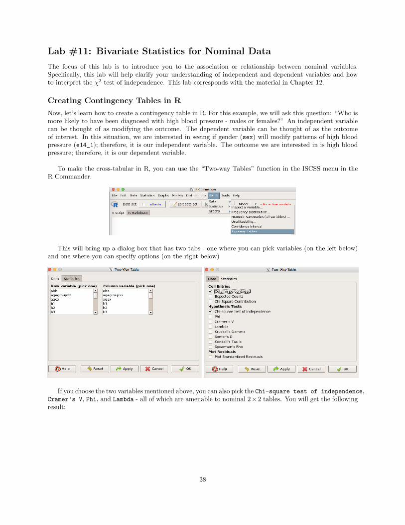
To make the cross-tabular in R, you can use the “Two-way Tables” function in the ISCSS menu in theR Commander.
This will bring up a dialog box that has two tabs - one where you can pick variables (on the left below)and one where you can specify options (on the right below)
If you choose the two variables mentioned above, you can also pick the Chi-square test of independence,Cramer's V, Phi, and Lambda - all of which are amenable to nominal 2⇥2 tables. You will get the followingresult:
38
Note that there’s not much of a relationship here. 28% of men have high blood pressure and 25% ofwomen have high blood pressure. This is certainly not a huge di↵erence. Measures of statistical significancewould suggest, similarly, that the result is not statistically reliable. That is to say, we cannot be su�cientlysure that in the population these two variables are not independent. This leads us to the inference thatgender and high blood pressure are not related.
39
Lab #12: Bivariate Statistics for Ordinal Data
The focus of this lab is to introduce you to the association or relationship between ordinal variables. Specif-ically, this lab will help clarify your understanding of independent and dependent variables, how to interpretthe �2 test as well as other measures of association. This lab corresponds with the material presented inChapter 13.
Establishing Your Research Question and Identifying Your Variables
In this example, we will ask this question: Does level of education a↵ect an individual’s opinion aboutwhether Alberta should build stronger ties with China?
An independent variable can be thought of as modifying the outcome, and the dependent variable canbe thought of as the outcome of interest. In this situation, we are interested in seeing if the highest level ofeducation will modify opinions about Alberta’s ties to China.
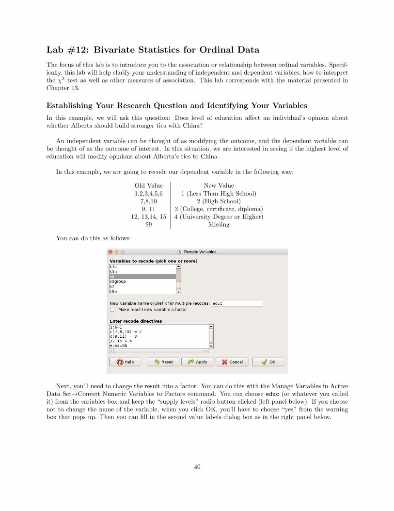
In this example, we are going to recode our dependent variable in the following way:
Old Value New Value1,2,3,4,5,6 1 (Less Than High School)7,8,10 2 (High School)9, 11 3 (College, certificate, diploma)
12, 13,14, 15 4 (University Degree or Higher)99 Missing
You can do this as follows:
Next, you’ll need to change the result into a factor. You can do this with the Manage Variables in ActiveData Set!Convert Numeric Variables to Factors command. You can choose educ (or whatever you calledit) from the variables box and keep the “supply levels” radio button clicked (left panel below). If you choosenot to change the name of the variable, when you click OK, you’ll have to choose “yes” from the warningbox that pops up. Then you can fill in the second value labels dialog box as in the right panel below.
40
Next, we can make the cross-tabulation between educ and b2 and ask for a number of measures of fit forthe table. The result is below:
The results suggest a weak ordinal relationship, though there is certainly an association between thetwo variables. If there is a positive relationship, looking at the table, higher column percentages should beseen moving from the upper-left to the lower-right of the table. If there is a negative relationship, it shouldbe moving from the lower-left to the upper-right of the table. In this case, the relationship looks vaguelypositive, but not strong. The numeric measures (�, d, ⌧
b
). We could also look at a plot of studentizedresiduals.
41
In the figure above (which you can get by checking the “plot standardized residuals” box on the optionspage in the two-way tables dialog), we see basically a pattern that makes sense. Moving in this case fromthe lower-left (low values on both variables) to the upper-right (high values on both variables), the valuesseem to be mostly blue (higher than expected counts) with lower than expected counts out toward the othercorners (upper-left and lower-right).
42
Lab #13: Bivariate Statistics for Interval/Ratio Data
The focus of this lab is to introduce you to the association or relationship between interval/ratio levelvariables. Specifically, this lab will help clarify your understanding of Pearson’s r and explained variance.This lab corresponds with the material presented in Chapter 14.
Calculating Pearson’s r in R
When calculating Pearson’s r, we make the assumption that the two variables we are correlating (evaluatingthe extent to which the variables are related) have a linear relationship. That is, the relationship between thetwo variables is the same, regardless of what the value of either of those variables is. So, the first step in calcu-lating Pearson’s r is to evaluate whether the relationship between the two variables is, in fact, roughly linear.
In this example, we are interested in whether an individual’s age is correlated with the number of yearsof schooling they have completed. In this case, our dependent variable is the number of years of schooling(k7) and our independent variable is an individual’s age (age).
The first thing we need to do is to figure out whether the variables have any values we need to recode tomissing. We could do this by using the ISCSS!Statistics!Inspect Variable option.
If you click the age variable and click , you should get the following result:
This shows that 99 is a variable that you need to remove. You will also find through the same procedure thatthe values 98 and 99 are missing for education, but those values don’t actually show up in the dataset, so wedon’t have to recode k7. Recoding age such that the 99s are NA should be old hat now, so I will assume thatyou can either do it, or go back to Lab 4 if you need some help. Put the recoded value of age in agerecode.
Next, we can make a scatterplot to see whether the variables are su�ciently linearly related. You can goto the scatterplot menu:
43
Then, you can fill in the scatterplot dialog box as follows:
That will produce the following:
44
Here are a few observations we could make about this scatterplot:
1. Though not as linear as we may have liked, the dots do not appear to be arranged in a non-linearpattern. There may be a weak relationship there, but whatever we find will not be a because ofnon-linearity.
2. There are quite a few outlying points on both sides of the point cloud.
Now that we’ve done the necessary diagnostics, we are ready to calculate Pearson’s r. The computationof Pearson’s r is done “behind the scenes” and is quite complex despite its easy implementation. In a nut-shell, it considers the amount of covariation between your X variable and your Y variable. As you know,Pearson’s r ranges from -1 to 1. To calculate the correlation you could use the ISCSS!Statistics!PairwiseCorrelation option to find the pairwise correlation with significance.
You can choose agerecode and holding the ctrl key down, click on k7, too. Keep the t-test option radio
button and click . That will produce the following result:
45
This shows that the correlation of -0.1 is statistically distinguishable from zero even if it is not substan-tively all that strong.
The focus of this lab is to introduce you to multiple regression analysis. Specifically, this lab will help clarifyyour understanding about when this procedure should be used, how to calculate and interpret OLS regressionand how to computed dummy variables. This lab corresponds with the material presented in Chapter 16.
Calculating OLS Regression
In this example, we are interested in which variables might a↵ect the number of years of schooling an indi-vidual has completed. For various reasons, we think that the number of years of schooling an individual hascompleted may vary by gender (sex) and by what part of Alberta they live in (strata).
Because of the conditions of OLS regression, all variables must be numeric, meaning we have to convertfactors with m categories into m� 1 dummy variables. The nice thing is that R will do this for us automati-cally. The only time we have to worry about this is when the variable is not a factor in our dataset. By usingthe inspect variables feature mentioned above, we can see that both sex and strata are categorical variables.
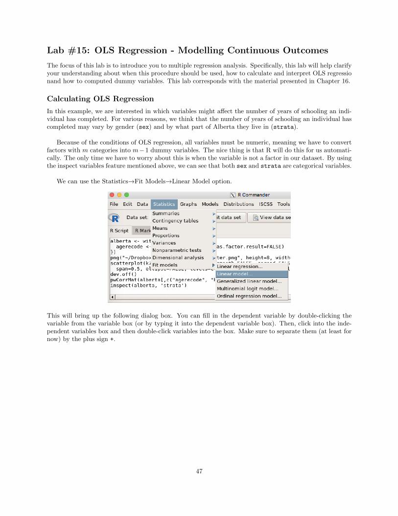
We can use the Statistics!Fit Models!Linear Model option.
This will bring up the following dialog box. You can fill in the dependent variable by double-clicking thevariable from the variable box (or by typing it into the dependent variable box). Then, click into the inde-pendent variables box and then double-click variables into the box. Make sure to separate them (at least fornow) by the plus sign +.
47
Clicking will produce the following output.
Note that we are explaining about 2% of the variance (Multiple R-squared: 0.02315). There are twocoe�cients for the strata variable. The reference category (the one left out) is the Metro Edmonton area.This would suggest that people in other parts of Alberta have get significantly less education than those inMetro Edmonton holding constant gender. Those in Metro Calgary get, on average, more education thanthose in Metro Edmonton holding constant gender, but that di↵erence is not statistically di↵erent fromzero. That is, we are not su�ciently confident that if we could survey everyone, that the average level ofeducation in Edmonton and Calgary would be any di↵erent. The coe�cient for sex suggests that womenget, on average, less education than men, holding region constant.