6
Hamish Foulton Connor Wake
| Date post: | 16-Apr-2017 |
| Category: |
Art & Photos |
| Upload: | connor-wake |
| View: | 28 times |
| Download: | 1 times |
Hamish FoultonConnor Wake
About him
Hamish foulton is a walking artist who takes his own photographs, illustrations and wall texts translating from his walks he endured on. He edits his own work and adds a text over the top of the image. He was born in 1946 and is still currently alive and well aged 70. He was born London and is still living there. Since 1994 he has organised group walks and says ‘walking is its own form of art’.
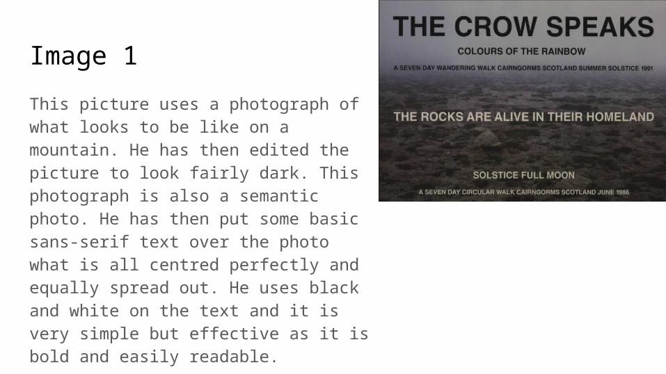
Image 1
This picture uses a photograph of what looks to be like on a mountain. He has then edited the picture to look fairly dark. This photograph is also a semantic photo. He has then put some basic sans-serif text over the photo what is all centred perfectly and equally spread out. He uses black and white on the text and it is very simple but effective as it is bold and easily readable.
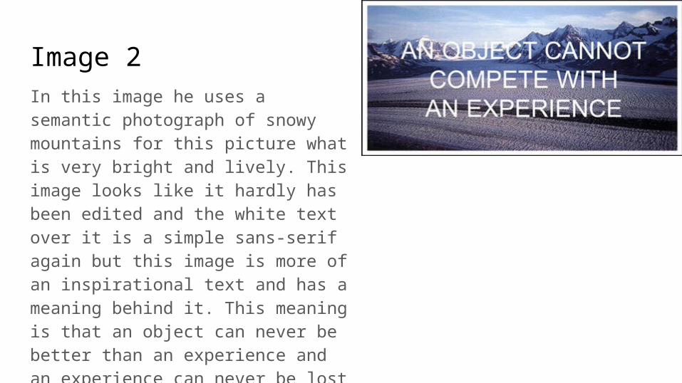
Image 2In this image he uses a semantic photograph of snowy mountains for this picture what is very bright and lively. This image looks like it hardly has been edited and the white text over it is a simple sans-serif again but this image is more of an inspirational text and has a meaning behind it. This meaning is that an object can never be better than an experience and an experience can never be lost or forgotten and is an souvenir in its own right.
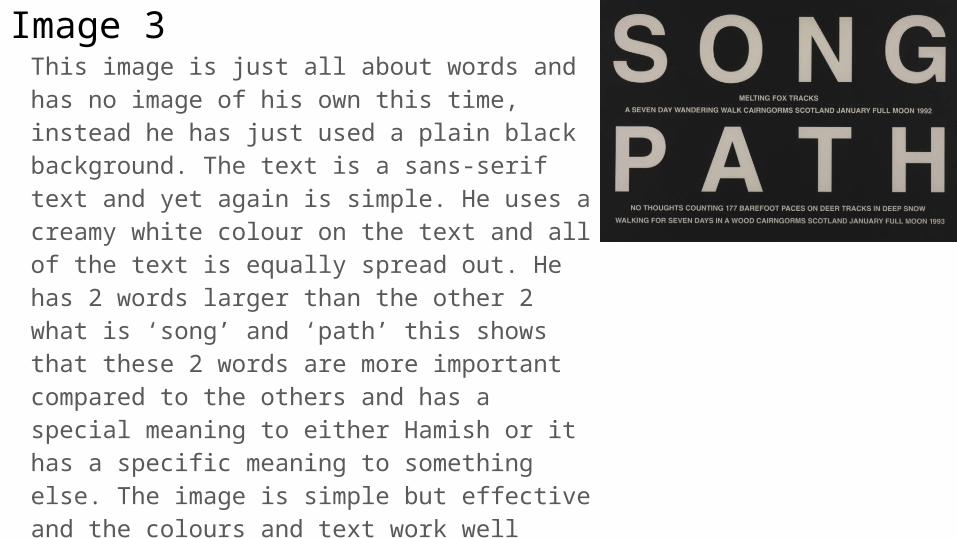
Image 3This image is just all about words and has no image of his own this time, instead he has just used a plain black background. The text is a sans-serif text and yet again is simple. He uses a creamy white colour on the text and all of the text is equally spread out. He has 2 words larger than the other 2 what is ‘song’ and ‘path’ this shows that these 2 words are more important compared to the others and has a special meaning to either Hamish or it has a specific meaning to something else. The image is simple but effective and the colours and text work well together and the 2 larger words are well seen and bring the attention of the reader to the photo as they would want to know what the other words say so they come closer to read the text so it is good in that aspect.
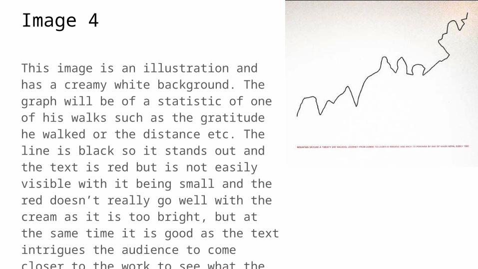
Image 4
This image is an illustration and has a creamy white background. The graph will be of a statistic of one of his walks such as the gratitude he walked or the distance etc. The line is black so it stands out and the text is red but is not easily visible with it being small and the red doesn’t really go well with the cream as it is too bright, but at the same time it is good as the text intrigues the audience to come closer to the work to see what the text says so in that aspect it is good.


