12
BRAND GUIDELINES
BRANDGUIDELINES
LOGO
10 | Harlequin Floors Brand Guidelines
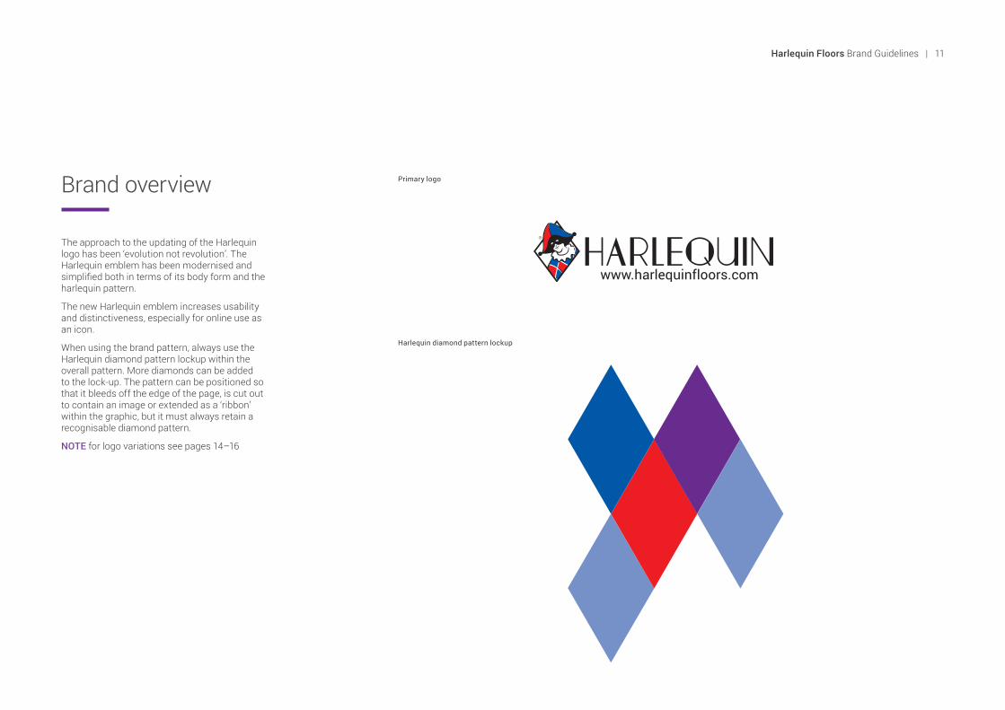
Brand overview
The approach to the updating of the Harlequin logo has been ‘evolution not revolution’. The Harlequin emblem has been modernised and simplified both in terms of its body form and the harlequin pattern.
The new Harlequin emblem increases usability and distinctiveness, especially for online use as an icon.
When using the brand pattern, always use the Harlequin diamond pattern lockup within the overall pattern. More diamonds can be added to the lock-up. The pattern can be positioned so that it bleeds off the edge of the page, is cut out to contain an image or extended as a ‘ribbon’ within the graphic, but it must always retain a recognisable diamond pattern.
NOTE for logo variations see pages 14–16
Primary logo
Harlequin diamond pattern lockup
Harlequin Floors Brand Guidelines | 11

Primary logo
Our logo is the most visible and recognisable part of our identity.
The logo consists of three elements: the Harlequin emblem, the wordmark ‘Harlequin’ and our website address. These elements appear together in a fixed relationship at all times.
The Harlequin emblem consists of a bespoke illustrated Harlequin within a diamond shaped frame.
The wordmark ‘Harlequin’ uses bespoke letterforms that can never be replaced by a typeface.
The wordmark and logo figure are registered trade marks. The registered trade mark symbol ® must always be visible.
A version of the logo without the website address is available to use, as an example, when the logo is being used on the Harlequin website or at a small size rendering the website address illegible or unnecessary.
Primary logo with url
Primary logo without url
12 | Harlequin Floors Brand Guidelines
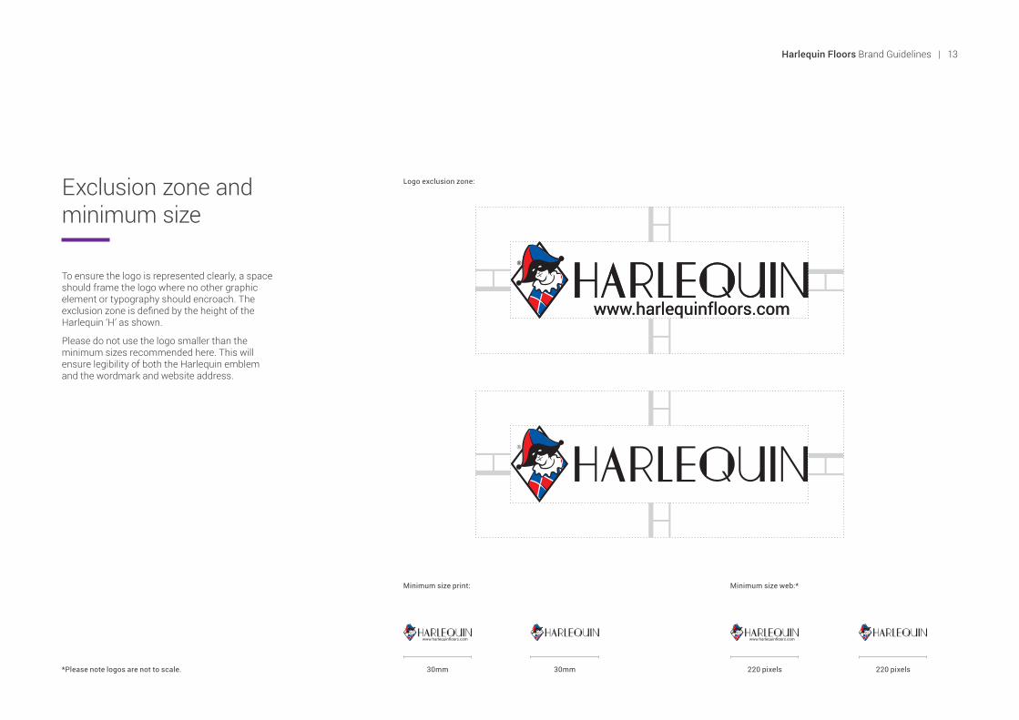
Exclusion zone and minimum size
Logo exclusion zone:
To ensure the logo is represented clearly, a space should frame the logo where no other graphic element or typography should encroach. The exclusion zone is defined by the height of the Harlequin ‘H’ as shown.
Please do not use the logo smaller than the minimum sizes recommended here. This will ensure legibility of both the Harlequin emblem and the wordmark and website address.
30mm 30mm 220 pixels220 pixels*Please note logos are not to scale.
Minimum size web:*Minimum size print:
Harlequin Floors Brand Guidelines | 13

Showcase logo
A full length Harlequin logo is available for use at large scale or when extra visual impact is needed.
Examples of times when the showcase logo could be used are:
• Exhibition stands• T-shirts• Labels or special packaging• Vehicle livery
Only use the showcase logo sparingly for unique occasions, it should not be used on general marketing collateral such as brochures, adverts or online banners, etc.
The exclusion zone for the showcase logo is defined by the height of the Harlequin ‘H’, as before.
150 pixels20mm 150 pixels20mm*Please note logos are not to scale.
Minimum size web:*Minimum size print:
14 | Harlequin Floors Brand Guidelines
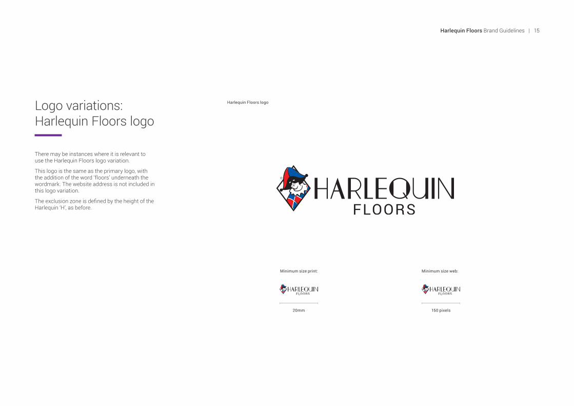
Logo variations: Harlequin Floors logo
There may be instances where it is relevant to use the Harlequin Floors logo variation.
This logo is the same as the primary logo, with the addition of the word ‘floors’ underneath the wordmark. The website address is not included in this logo variation.
The exclusion zone is defined by the height of the Harlequin ‘H’, as before.
Harlequin Floors logo
Minimum size print: Minimum size web:
20mm 150 pixels
Harlequin Floors Brand Guidelines | 15
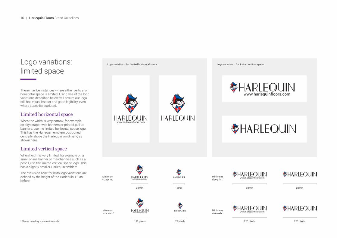
Logo variations: limited space
Logo variation – for limited horizontal space Logo variation – for limited vertical space
There may be instances where either vertical or horizontal space is limited. Using one of the logo variations described below will ensure our logo still has visual impact and good legibility, even where space is restricted.
Limited horizontal spaceWhen the width is very narrow, for example on skyscraper web banners or printed pull up banners, use the limited horizontal space logo. This has the Harlequin emblem positioned centrally above the Harlequin wordmark, as shown here.
Limited vertical spaceWhen height is very limited, for example on a small online banner or merchandise such as a pencil, use the limited vertical space logo. This has a slightly smaller Harlequin emblem
The exclusion zone for both logo variations are defined by the height of the Harlequin ‘H’, as before.
*Please note logos are not to scale. 150 pixels 220 pixels 220 pixels
20mm 30mm 30mm
70 pixels
10mm
Minimum size web:*
Minimum size web:*
Minimum size print:
Minimum size print:
16 | Harlequin Floors Brand Guidelines
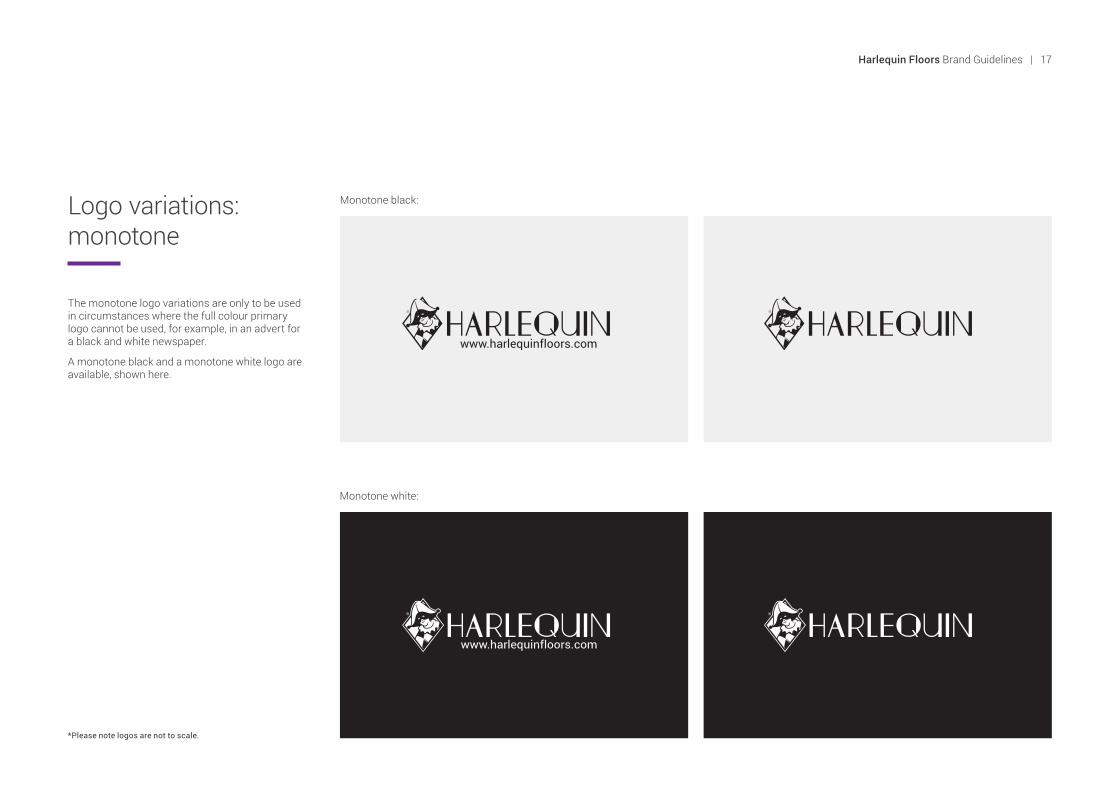
The monotone logo variations are only to be used in circumstances where the full colour primary logo cannot be used, for example, in an advert for a black and white newspaper.
A monotone black and a monotone white logo are available, shown here.
Logo variations: monotone
Monotone black:
Monotone white:
*Please note logos are not to scale.
Harlequin Floors Brand Guidelines | 17

Our logo can be used on a coloured background provided it is either the Harlequin red, blue or black from our colour palette.
The variations shown here have been created specifically for use on these background colours where a white keyline surrounds the Harlequin diamond emblem and Harlequin full body illustration. This will ensure our emblem stands out from the background colour.
Logo variations: coloured backgrounds
On red background:
On blue background:
On black background:
18 | Harlequin Floors Brand Guidelines

Do not stretch or distort the logo
Do not outline the workmark with a stroke, it should always be solid black
Do not change or rearrange the elements of the logo
Do not change or recreate the logo typeface
Do not alter any of the colours within the logo
Do not rotate the logo at an angleDo not alter the size of any of the logo elements
Do not position the logo on a coloured background unless it is black, blue or red from the Harlequin colour palette
Ensure legibility when placing the logo on top of an image
Logo restrictions
To ensure our logo is represented clearly, it should never be altered or manipulated. The spacing and relationship of its component parts have been carefully and intentionally established.
Placing the logo onto an image is acceptable in some circumstances, e.g. printed samples, but must be done in a way that ensures legibility of the logo.
To the right you can see examples of manipulation of the logo that are not allowed under any circumstance.
Harlequin Floors Brand Guidelines | 19

British Harlequin plcFestival House, Chapman Way, Tunbridge Wells, Kent TN2 3EF Tel: +44 (0)1892 514888 Fax: +44 (0)1892 514222Email: [email protected]
Harlequin Europe SA 29 rue Notre-Dame, L-2240 LuxembourgTel: +352 46 44 22 Fax: +352 46 44 40Email: [email protected]
Harlequin Deutschland GmbHMelanchthonstraße 16, 10557 Berlin, GermanyTel: +49 (0) 30 340 441 600 Fax: +49 (0) 30 340 441 649Email: [email protected]
American Harlequin Corporation1531 Glen Avenue, Moorestown, NJ 08057, USATel: +1 (856) 234 5505 Fax: +1 (856) 231 4403Email: [email protected]
Australian Harlequin Pty LtdUnit 1, 47 Prime Drive, Seven Hills, NSW 2147, AustraliaTel: +61 (2) 9620 7770 Fax: +61 (2) 9620 7771Email: [email protected]
Harlequin Asia Limited2/F The Strand, 49 Bonham Strand, Sheung Wan, Hong KongTel: +852 254 11 666 Fax: +852 254 11 999Email: [email protected]


