15
y Version 1.1 Hildon User Interface Style Guide Summary Copyright © 2002-2005 Nokia Corporation All rights reserved. Page 1

Hildon UI Style Guide - Summary
Version 1.1
Hildon User Interface Style Guide Summary
Copyright © 2002-2005 Nokia Corporation All rights reserved.
Page 1
Hildon UI Style Guide - Summary
Copyright © 2002-2005 Nokia Corporation All rights reserved.
Page 2
Table of contents:
1. Introduction to the Hildon UI Style....................................................................................................................................................3
2. Background and Constraints................................................................................................................................................................3
3. High-level UI Principles..........................................................................................................................................................................3
4. Ergonomics and Device Interaction...................................................................................................................................................4
5. Interaction Mechanisms........................................................................................................................................................................5 Touch screen...................................................................................................................................................................................................5 Mandatory hardware keys .........................................................................................................................................................................5 Optional hardware keys..............................................................................................................................................................................6
6. Basic Components parts of the Hildon UI ........................................................................................................................................7 Main screen layout........................................................................................................................................................................................7 Home screen ...................................................................................................................................................................................................7 Task Navigator ...............................................................................................................................................................................................7 Multitasking ....................................................................................................................................................................................................8
7. Application Views ....................................................................................................................................................................................8 List view ...........................................................................................................................................................................................................8 Split view..........................................................................................................................................................................................................8 Grid view ..........................................................................................................................................................................................................9 Toolbar..............................................................................................................................................................................................................9 Normal view vs. full screen view..............................................................................................................................................................9 Special view.....................................................................................................................................................................................................9
8. How to Structure Menus..................................................................................................................................................................... 10
9. Context Sensitive Menu ...................................................................................................................................................................... 10
10. How to Use Toolbars .................................................................................................................................................................. 11
11. Input Methods .............................................................................................................................................................................. 11 Virtual keyboard ......................................................................................................................................................................................... 11 Thumb keyboard ........................................................................................................................................................................................ 12 Handwriting recognition......................................................................................................................................................................... 12
12. Drag and Drop .............................................................................................................................................................................. 12
13. Dialogs ............................................................................................................................................................................................ 13 Single dialogs .............................................................................................................................................................................................. 13 Wizards dialogs........................................................................................................................................................................................... 13 Two-column dialogs.................................................................................................................................................................................. 13 Split dialogs.................................................................................................................................................................................................. 13 Multipage dialogs....................................................................................................................................................................................... 14 Subdialogs .................................................................................................................................................................................................... 14
14. Notifications.................................................................................................................................................................................. 14 Confirmation note...................................................................................................................................................................................... 14 Information note........................................................................................................................................................................................ 14 Information banner................................................................................................................................................................................... 14 Confirmation banner................................................................................................................................................................................. 15 Progress banner.......................................................................................................................................................................................... 15
15. What to Consider When Porting Existing Application to Hildon ................................................................................. 15
Hildon UI Style Guide - Summary
Copyright © 2002-2005 Nokia Corporation All rights reserved.
Page 3
1. Introduction to the Hildon UI Style
This UI Style Guide provides User Interface principles, guidelines and recommendations in order to ensure that all applications designed for the maemo platform can offer the same consistent experience to the user. It's intended for UI designers who would like to design a user interface for a new application as well as designers or developers who want to port an existing application to the Hildon UI.
If you consider being in the target audience or are otherwise interested, you can find the following main areas covered inside this guide:
• Hildon high-level UI principles;
• Interaction with the device;
• Basic components of Hildon UI and different application view types;
• Information on how to use menus and toolbars;
• Usage of dialogs, notifications, and information banners; and
• What to consider when porting existing application to Hildon UI style.
2. Background and Constraints
The Hildon user interface as well as maemo as a whole is based on open source components. Hildon is based on GTK+, the toolkit used in Gnome desktop, with several tweaks to make it more suitable for mobile devices.
The first product using the Hildon UI style is the Nokia 770 Internet Tablet.
The basic constraints for hardware and form-factors currently supported by Hildon are following:
• Screen resolution of 800x480 pixels and 16bit color depth (65 536 colors);
• 225 dpi screen resolution;
• Touch screen that the user interacts with mainly with a stylus; and
• Minimum of 64MBytes RAM.
3. High-level UI Principles
The Hildon user interface is highly driven by touch screen operations meaning the user interacts with the device by using a stylus, finger or thumb. Even thought there are a few mandatory hardware buttons, users are mostly interacting with the device by using the touch screen.
The Hildon user interface is task oriented, meaning that it is designed to help the users do common tasks as actions by using a focused and optimized set of applications and features. Examples of this kind of tasks are opening bookmarked browser sites by only 2 taps and sending new email with only 2 taps.
Hildon UI Style Guide - Summary
Copyright © 2002-2005 Nokia Corporation All rights reserved.
Page 4
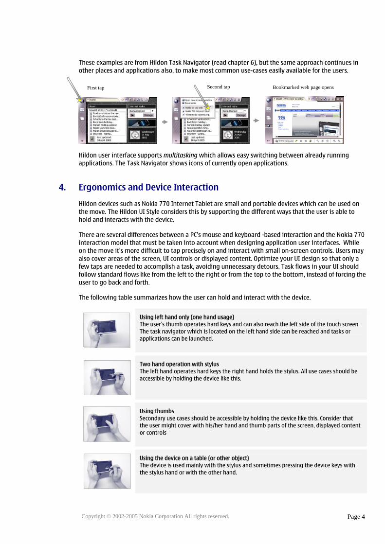
These examples are from Hildon Task Navigator (read chapter 6), but the same approach continues in other places and applications also, to make most common use-cases easily available for the users.
Hildon user interface supports multitasking which allows easy switching between already running applications. The Task Navigator shows icons of currently open applications.
4. Ergonomics and Device Interaction
Hildon devices such as Nokia 770 Internet Tablet are small and portable devices which can be used on the move. The Hildon UI Style considers this by supporting the different ways that the user is able to hold and interacts with the device.
There are several differences between a PC's mouse and keyboard -based interaction and the Nokia 770 interaction model that must be taken into account when designing application user interfaces. While on the move it’s more difficult to tap precisely on and interact with small on-screen controls. Users may also cover areas of the screen, UI controls or displayed content. Optimize your UI design so that only a few taps are needed to accomplish a task, avoiding unnecessary detours. Task flows in your UI should follow standard flows like from the left to the right or from the top to the bottom, instead of forcing the user to go back and forth.
The following table summarizes how the user can hold and interact with the device.
Using left hand only (one hand usage) The user’s thumb operates hard keys and can also reach the left side of the touch screen. The task navigator which is located on the left hand side can be reached and tasks or applications can be launched.
Two hand operation with stylus The left hand operates hard keys the right hand holds the stylus. All use cases should be accessible by holding the device like this.
Using thumbs Secondary use cases should be accessible by holding the device like this. Consider that the user might cover with his/her hand and thumb parts of the screen, displayed content or controls
Using the device on a table (or other object) The device is used mainly with the stylus and sometimes pressing the device keys with the stylus hand or with the other hand.
Second tap Bookmarked web page opensFirst tap

Hildon UI Style Guide - Summary
5. Interaction Mechanisms
The user is able to control the user interface with the touch screen or hard key interaction mechanisms. The Hildon user interface style is highly driven by touch screen mechanism meaning the hard keys rather support the user’s interaction. Consider also that both interaction mechanisms can be used at the same time, during the same task.
Touch screen
• Single Tap – The most common way to interact with the touch screen. Single taps are used to start applications, click buttons, open menus etc.
• Highlight and activate – The first tap highlights the object and the second tap activates or opens it. Highlight and activate is used so that operations on files and other items in list views and grid views can be carried out, such as copying, moving and deleting files. Highlight and activate is different from the double-click action used on personal computers so that there is no timeout interval between the two taps.
• Stylus down and hold – Holding the stylus down is used to open context sensitive menus. This is similar to in PCs right mouse button.
• Drag and drop – Drag and drop should be used when user can visually move objects or text in the screen.
• Panning – Panning is used in the Browser, World Clock, PDF Viewer and other places where the user needs to scroll a larger area which doesn't fit fully on the screen. Panning is quicker and more comfortable to use with the touch screen than scrollbars used in most PC applications.
• Stylus down – Stylus down events are listened for example when opening menus. This way the user can select something from the menu with just one 'click' (stylus down in menu title, select some menu item and raise the stylus up).
• Stylus Up – Stylus up is used together with stylus down to select entries from the menu or combobox lists.
• Stylus down and Cancel – A UI component is touched and then the stylus is dragged away. Once the stylus is outside the component, the action is canceled and the stylus-up action does not activate it.
Mandatory hardware keys
These keys should be available in every Hildon device :
Home key Minimizes all the applications and shows Home view. Second press returns to the minimized application. Long key press activates Application Switcher in the Task Navigator
Menu key Opens the menu of the active application. Second press closes the menu.
Copyright © 2002-2005 Nokia Corporation All rights reserved.
Page 5
Hildon UI Style Guide - Summary
Copyright © 2002-2005 Nokia Corporation All rights reserved.
Page 6
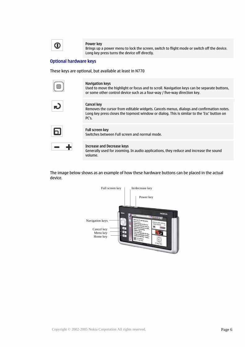
Power key Brings up a power menu to lock the screen, switch to flight mode or switch off the device. Long key press turns the device off directly.
Optional hardware keys
These keys are optional, but available at least in N770
Navigation keys Used to move the highlight or focus and to scroll. Navigation keys can be separate buttons, or some other control device such as a four-way / five-way direction key.
Cancel key Removes the cursor from editable widgets. Cancels menus, dialogs and confirmation notes. Long key press closes the topmost window or dialog. This is similar to the 'Esc' button on PC's.
Full screen key Switches between Full screen and normal mode.
Increase and Decrease keys Generally used for zooming. In audio applications, they reduce and increase the sound volume.
The image below shows as an example of how these hardware buttons can be placed in the actual device.
Full screen key In/decrease key
Power key
Navigation keys
Cancel keyMenu key Home key

Hildon UI Style Guide - Summary
6. Basic Components parts of the Hildon UI
This table shows the basic components of the Hildon UI and explains how they behave.
Main screen layout
1. Task Navigator – a global screen element located on the left side of the screen. Task Navigator is used to launch applications and to switch between them.
2. Title area – Contains the application title which opens application specific menu. The right side of the title area contains minimize and close buttons.
3. Status indicator area – Contains icons which indicate system states and behavior. Statusbar applets are located here.
4. Application Area – Applications can use this area in normal mode. In full screen mode all other parts disappear and this application area expands to fill the whole screen.
Home screen
User can access the home screen by pressing the Home key or, by closing or minimizing all running applications. Home background image is changeable and it can contain applets which are toggled visible from the Home title menu. The Home screen can be personalized by the user similar to the Desktop in PCs. The installation of personal applets is supported. The applets available in Nokia 770 by default are: - Clock applet – Displays the current date and time. Clicking the applet launches the World Clock application. - News Reader applet – Displays the latest RSS news headers which can be clicked to view the full story in the News reader. - Web Shortcut – Displays a configurable image which is linked to a browser web page. - Internet Radio applet – Allows the user to listen Internet to radio channels.
Task Navigator
The Task Navigator is located in the left side of the screen. It provides fast access to the most important one-hand use cases such as launching new applications, switching between them, going to a bookmarked web page, or reading incoming email messages. Task Navigator buttons open a menu on the right side of the Task Navigator. These menus come on top of application view and are dynamically sized to fit the contents. Applications can install their own entries to application launcher menu.
Copyright © 2002-2005 Nokia Corporation All rights reserved.
Page 7
Hildon UI Style Guide - Summary
Copyright © 2002-2005 Nokia Corporation All rights reserved.
Page 8
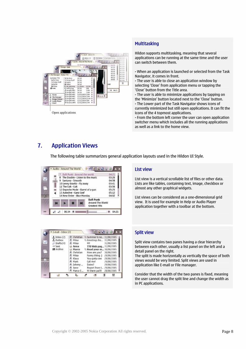
Multitasking
Hildon supports multitasking, meaning that several applications can be running at the same time and the user can switch between them. - When an application is launched or selected from the Task Navigator, it comes in front. - The user is able to close an application window by selecting ‘Close’ from application menu or tapping the ‘Close’ button from the Title area. - The user is able to minimize applications by tapping on the ‘Minimize’ button located next to the ‘Close’ button. - The Lower part of the Task Navigator shows icons of currently minimized but still open applications. It can fit the icons of the 4 topmost applications. - From the bottom left corner the user can open application switcher menu which includes all the running applications as well as a link to the home view.
7. Application Views
The following table summarizes general application layouts used in the Hildon UI Style.
List view
List view is a vertical scrollable list of files or other data. Lists are like tables, containing text, image, checkbox or almost any other graphical widgets. List views can be considered as a one-dimensional grid view. It is used for example in Help or Audio Player application together with a toolbar at the bottom.
Split view
Split view contains two panes having a clear hierarchy between each other, usually a list panel on the left and a detail panel on the right. The split is made horizontally as vertically the space of both views would be very limited. Split views are used in application like E-mail or File manager. Consider that the width of the two panes is fixed, meaning the user cannot drag the split line and change the width as in PC applications.
Open applications

Hildon UI Style Guide - Summary
Grid view
Grid view displays files or other data in multiple columns. Control panel is an example application using the grid view.
Toolbar
Toolbars of the Hildon UI Style is located in the bottom of the screen. It contains usually buttons, but it can also contain other widgets such as combo boxes or check boxes. Use the toolbar for providing the user fast access to most used and most important commands of your application Using the toolbar reduces the need for the user to open and search for commands in the application menu which results in less taps needed for accomplishing key use cases.
Normal view vs. full screen view
All application layouts may be displayed in a Normal mode and in Full screen mode. Normal mode displays Task Navigator and Title area which are not visible in the full screen mode. Toolbar may be shown or hidden in both modes, depending on the application needs.
Special view
In addition to these recommended views presented above Hildon applications can contain almost what ever interface you feel suit the application needs. Use this special view only in very exceptional cases, always start with recommended views like list, split or grid view. The special view is used in the Calculator application
Copyright © 2002-2005 Nokia Corporation All rights reserved.
Page 9
Hildon UI Style Guide - Summary
8. How to Structure Menus
Menu commands should be structured according to their priority and functional relationship. If you have a lot of commands, try to group functionally related commands to submenus and use only submenu headers at the highest menu level, like 'File'->'New' and 'File'->'Save'.
In the Hildon UI the menu layout is vertical as opposite to the horizontal layout of menus in PC environment. Most commonly used commands or submenus should be placed higher in the menu and less important on the bottom so that users will reach the frequently used features easily. Use separators for grouping within each menu, the related menu items. Avoid more then seven commands or submenu headers in vertically and three menus horizontally.
Commands which are not currently usable should be dimmed. One unique feature in Hildon is that applications can react also to selection of dimmed menu item selections, usually showing information banner which explains why the feature is not available e.g. “Nothing to undo”. This way user can be guided to use the application correctly.
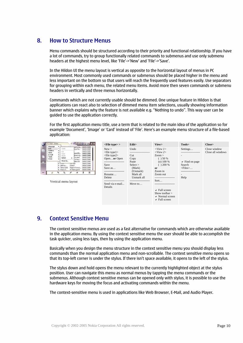
For the first application menu title, use a term that is related to the main idea of the application so for example ‘Document’, ‘Image’ or ‘Card’ instead of ‘File’. Here's an example menu structure of a file-based application:
<File type> > Edit> View> Tools> Close> New > <file type1> <file type2> Open…or Open --------------------- Save Save as… --------------------- Rename… Delete --------------------- Send via e-mail... Details
Undo ---------------------Cut Copy Paste Select > (Mark) (Unmark) Mark all Unmark all ---------------------Move to…
<View 1> <View 2> Zoom > ( ) 50 % (o) 100 % ( ) 200 % or Zoom in Zoom out --------------------- Sort… ---------------------
Full screen Show toolbar >
Normal screen Full screen
Settings… ---------------------
Find on page
Copyright © 2002-2005 Nokia Corporation All rights reserved.
Page 10
Search <Files>… --------------------- Help
Close window Close all windows
9. Context Sensitive Menu
The context sensitive menus are used as a fast alternative for commands which are otherwise available in the application menu. By using the context sensitive menu the user should be able to accomplish the task quicker, using less taps, then by using the application menu.
Vertical menu layout
Basically when you design the menu structure in the context sensitive menu you should display less commands than the normal application menu and non-scrollable. The context sensitive menu opens so that its top-left corner is under the stylus. If there isn't space available, it opens to the left of the stylus.
The stylus down and hold opens the menu relevant to the currently highlighted object at the stylus position. User can navigate this menu as normal menus by tapping the menu commands or the submenus. Although context sensitive menus can be opened only with stylus, it is possible to use the hardware keys for moving the focus and activating commands within the menu.
The context-sensitive menu is used in applications like Web Browser, E-Mail, and Audio Player.

Hildon UI Style Guide - Summary
10. How to Use Toolbars
The toolbar should provide the user easy access to most used and most important functions in your application. Here are some rules for designing and using toolbars:
• The number of items that can be placed on a toolbar depends on the width of each item and whether the Task Navigator is shown or not (switching from normal screen to full screen).
• If your application is using several views then consider changing and optimizing the displayed functions on the toolbar for each view.
• The most common icons for the basic functionalities should be provided.
• The metaphors of toolbar icons should be understandable, intuitive, and closely related to the action that they are referring to. Preferably they should be taken from everyday situations so that users can associate tasks on the device to those that are familiar to them from other situations.
• All displayed commands should be available in the application menu
• Because of limited screen space, there should be a possibility to hide a toolbar from the menu.
• Separator line should be used for grouping icons when necessary.
• Avoid using text which needs to be localized on the toolbar as different lengths may mess up the toolbar layout. Icons should be used instead of text whenever possible to save the toolbar space.
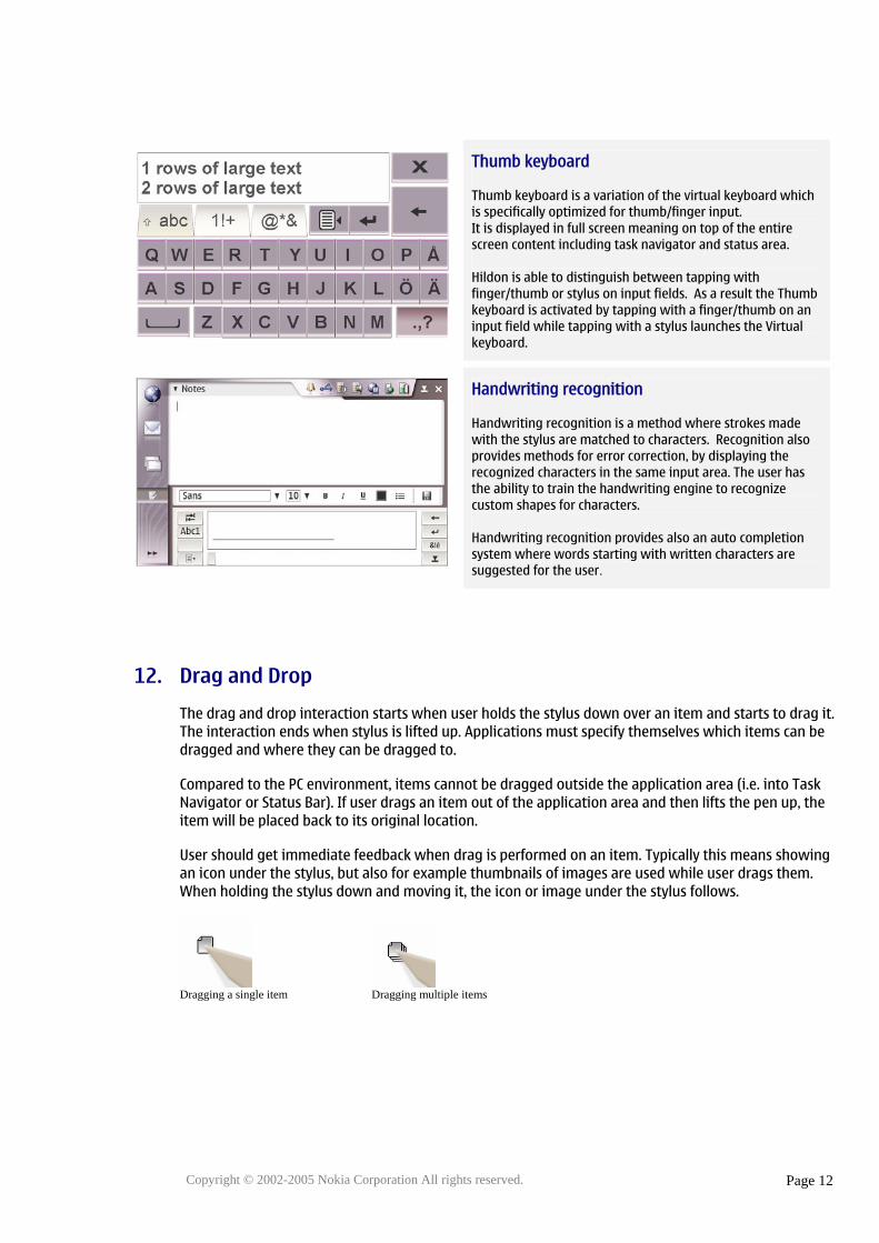
11. Input Methods
The Hildon UI supports three kinds of input mechanisms: Virtual keyboard, Thumb keyboard and Handwriting recognition. The input methods are not opened by default, but the user has to activate the input method separately for example tapping an input field on a screen. Then the application opens up the input method for the user.
Consider in your application design that Virtual keyboard and Handwriting recognition require a resized application area or a repositioning and resizing of currently displayed dialogs.
Virtual keyboard
Virtual keyboard represents the functionality of a physical keyboard. The keyboard is a “multilayered” application. Only the letters or most common symbols are available without extra tapping.
Copyright © 2002-2005 Nokia Corporation All rights reserved.
Page 11
Hildon UI Style Guide - Summary
Thumb keyboard
Thumb keyboard is a variation of the virtual keyboard which is specifically optimized for thumb/finger input. It is displayed in full screen meaning on top of the entire screen content including task navigator and status area. Hildon is able to distinguish between tapping with finger/thumb or stylus on input fields. As a result the Thumb keyboard is activated by tapping with a finger/thumb on an input field while tapping with a stylus launches the Virtual keyboard.
Handwriting recognition
Handwriting recognition is a method where strokes made with the stylus are matched to characters. Recognition also provides methods for error correction, by displaying the recognized characters in the same input area. The user has the ability to train the handwriting engine to recognize custom shapes for characters. Handwriting recognition provides also an auto completion system where words starting with written characters are suggested for the user.
12. Drag and Drop
The drag and drop interaction starts when user holds the stylus down over an item and starts to drag it. The interaction ends when stylus is lifted up. Applications must specify themselves which items can be dragged and where they can be dragged to.
Compared to the PC environment, items cannot be dragged outside the application area (i.e. into Task Navigator or Status Bar). If user drags an item out of the application area and then lifts the pen up, the item will be placed back to its original location.
User should get immediate feedback when drag is performed on an item. Typically this means showing an icon under the stylus, but also for example thumbnails of images are used while user drags them. When holding the stylus down and moving it, the icon or image under the stylus follows.
Dragging a single item Dragging multiple items
Copyright © 2002-2005 Nokia Corporation All rights reserved.
Page 12

Hildon UI Style Guide - Summary
13. Dialogs
Dialogs or longer dialog paths can be used to guide the user to finish certain tasks. Do not constitute long chains of dialogs and keep tasks simple. Sometimes it might be a good idea to use a new window for more complex tasks. If the task needs information from other applications and the information is not provided as a pre-set list it is more advisable to implement the task with a window than a modal dialog. Dialogs are displayed centred over the application area.
The dialogs have combination of controls to carry out the task and buttons in the bottom of the dialog to confirm or cancel actions. There are different types of dialogs all having their own specialties. The table below contains common types of dialogs and a short description about the places where they are good to be used in.
Single dialogs
Single dialog is typically used to carry out task using a combination of controls which are related to task. Buttons in the dialog are usually 'OK' and 'Cancel' or something more suitable to the dialog action.
Wizards dialogs
Wizards are used to carry out complex task in steps. Each step can contain it's own set of controls. The user is able to go backwards to change the settings in past steps or go forwards when controls in current and past steps are OK.
Two-column dialogs
Two-column dialogs are used when controls won't fit on a standard dialog. For example, small text fields and graphics and preview controls could be placed in two columns.
Split dialogs
Shared dialogs are used to select a subset from a list of existing items. The items can be added and removed between the two lists. Splitting is done horizontally as vertically the space of both views would be very limited.
Copyright © 2002-2005 Nokia Corporation All rights reserved.
Page 13
Hildon UI Style Guide - Summary
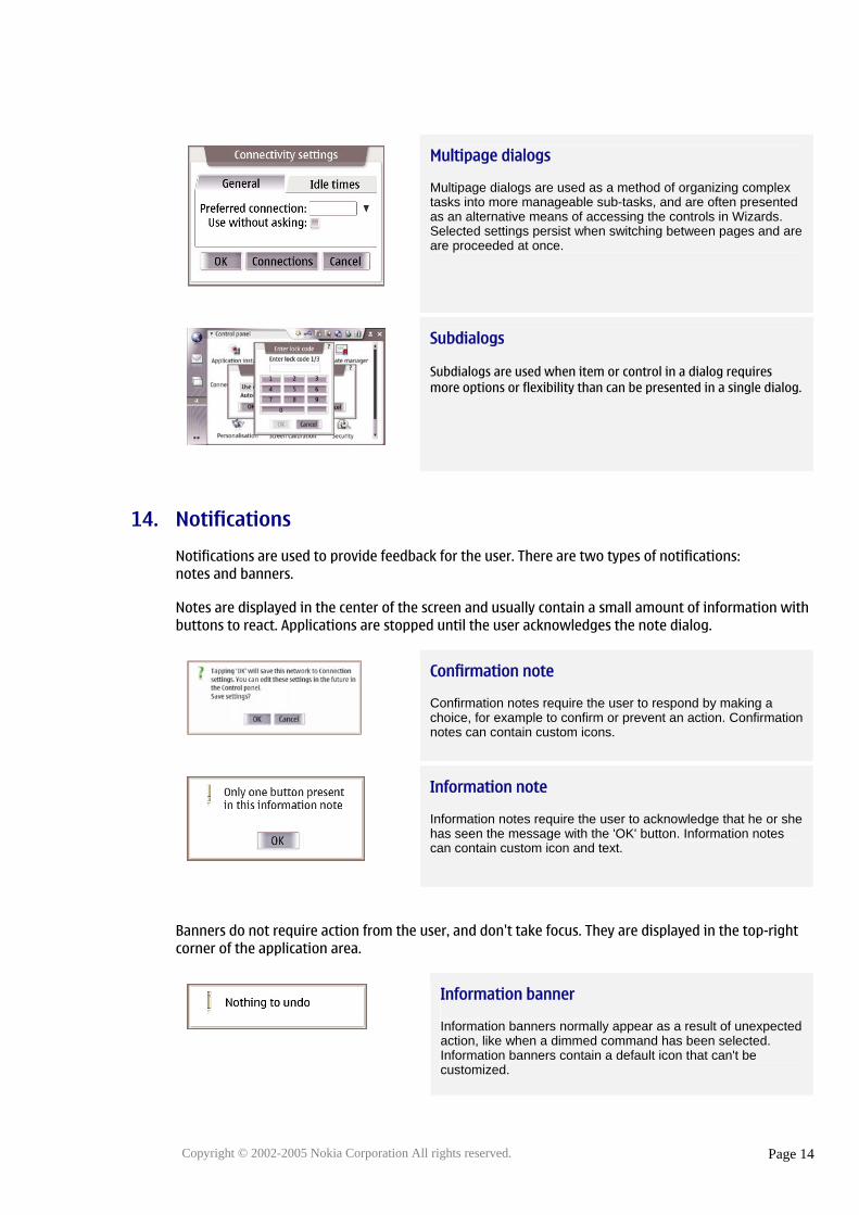
Multipage dialogs
Multipage dialogs are used as a method of organizing complex tasks into more manageable sub-tasks, and are often presented as an alternative means of accessing the controls in Wizards. Selected settings persist when switching between pages and are are proceeded at once.
Subdialogs
Subdialogs are used when item or control in a dialog requires more options or flexibility than can be presented in a single dialog.
14. Notifications
Notifications are used to provide feedback for the user. There are two types of notifications: notes and banners.
Notes are displayed in the center of the screen and usually contain a small amount of information with buttons to react. Applications are stopped until the user acknowledges the note dialog.
Confirmation note
Confirmation notes require the user to respond by making a choice, for example to confirm or prevent an action. Confirmation notes can contain custom icons.
Information note
Information notes require the user to acknowledge that he or she has seen the message with the 'OK' button. Information notes can contain custom icon and text.
Banners do not require action from the user, and don't take focus. They are displayed in the top-right corner of the application area.
Information banner
Information banners normally appear as a result of unexpected action, like when a dimmed command has been selected. Information banners contain a default icon that can't be customized.
Copyright © 2002-2005 Nokia Corporation All rights reserved.
Page 14
Hildon UI Style Guide - Summary
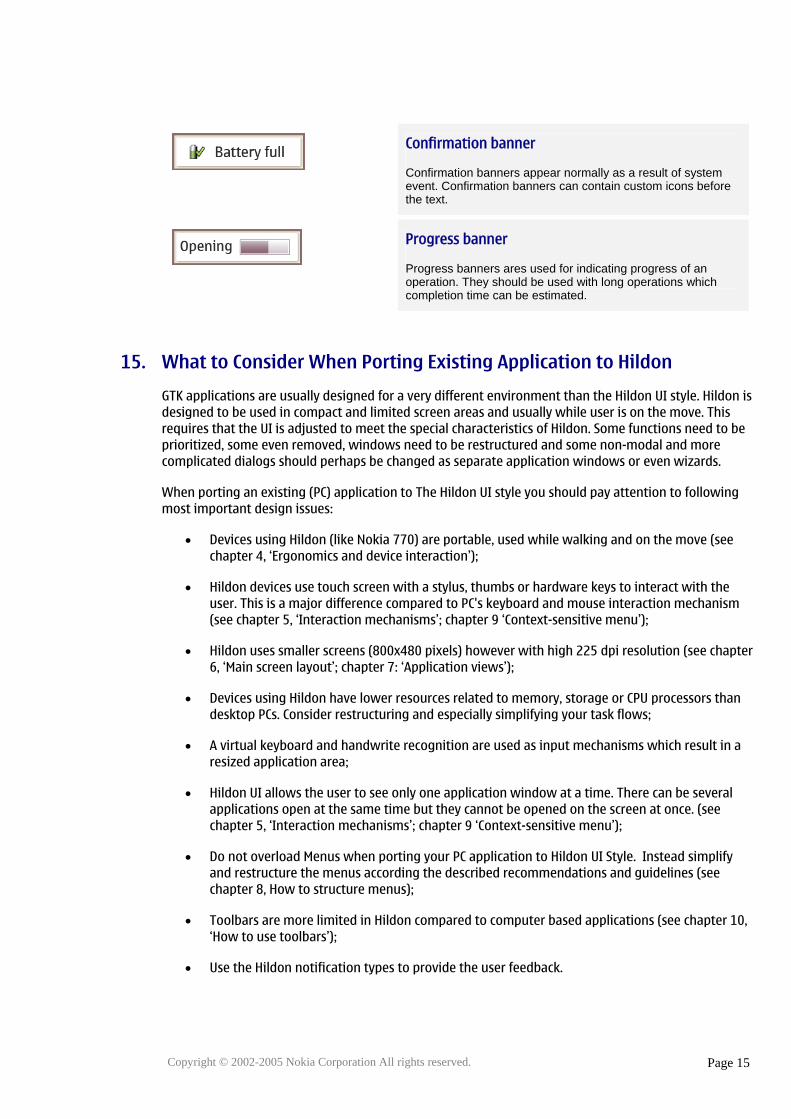
Confirmation banner
Confirmation banners appear normally as a result of system event. Confirmation banners can contain custom icons before the text.
Progress banner
Progress banners ares used for indicating progress of an operation. They should be used with long operations which completion time can be estimated.
15. What to Consider When Porting Existing Application to Hildon
GTK applications are usually designed for a very different environment than the Hildon UI style. Hildon is designed to be used in compact and limited screen areas and usually while user is on the move. This requires that the UI is adjusted to meet the special characteristics of Hildon. Some functions need to be prioritized, some even removed, windows need to be restructured and some non-modal and more complicated dialogs should perhaps be changed as separate application windows or even wizards.
When porting an existing (PC) application to The Hildon UI style you should pay attention to following most important design issues:
• Devices using Hildon (like Nokia 770) are portable, used while walking and on the move (see chapter 4, ‘Ergonomics and device interaction’);
• Hildon devices use touch screen with a stylus, thumbs or hardware keys to interact with the user. This is a major difference compared to PC's keyboard and mouse interaction mechanism (see chapter 5, ‘Interaction mechanisms’; chapter 9 ‘Context-sensitive menu’);
• Hildon uses smaller screens (800x480 pixels) however with high 225 dpi resolution (see chapter 6, ‘Main screen layout’; chapter 7: ‘Application views’);
• Devices using Hildon have lower resources related to memory, storage or CPU processors than desktop PCs. Consider restructuring and especially simplifying your task flows;
• A virtual keyboard and handwrite recognition are used as input mechanisms which result in a resized application area;
• Hildon UI allows the user to see only one application window at a time. There can be several applications open at the same time but they cannot be opened on the screen at once. (see chapter 5, ‘Interaction mechanisms’; chapter 9 ‘Context-sensitive menu’);
• Do not overload Menus when porting your PC application to Hildon UI Style. Instead simplify and restructure the menus according the described recommendations and guidelines (see chapter 8, How to structure menus);
• Toolbars are more limited in Hildon compared to computer based applications (see chapter 10, ‘How to use toolbars’);
• Use the Hildon notification types to provide the user feedback.
Copyright © 2002-2005 Nokia Corporation All rights reserved.
Page 15


