Homogeneous middles vs. heterogeneous tails, and the end of the ‘Inverted-U’: the share of the rich is what it’s all about José Gabriel Palma 1 Cambridge Working Papers in Economics (CWPE) 1111 (Available at http://www.econ.cam.ac.uk/dae/repec/cam/pdf/cwpe1111.pdf) Abstract This paper examines the current global scene of distributional disparities within-nations. There are six main conclusions. First, about 80 per cent of the world’s population now live in regions whose median country has a Gini not far from 40. Second, as outliers are now only located among middle-income and rich countries, the ‘upwards’ side of the ‘Inverted-U’ between inequality and income per capita has evaporated (and with it the statistical support there was for the hypothesis that posits that, for whatever reason, ‘things have to get worse before they can get better’). Third, among middle-income countries Latin America and mineral-rich Southern Africa are uniquely unequal, while Eastern Europe follows a distributional path similar to the Nordic countries. Fourth, among rich countries there is a large (and growing) distributional diversity. Fifth, within a global trend of rising inequality, there are two opposite forces at work. One is ‘centrifugal’, and leads to an increased diversity in the shares appropriated by the top 10 and bottom 40 per cent. The other is ‘centripetal’, and leads to a growing uniformity in the income-share appropriated by deciles 5 to 9. Therefore, half of the world’s population (the middle and upper-middle classes) have acquired strong ‘property rights’ over half of their respective national incomes; the other half, however, is increasingly up for grabs between the very rich and the poor. And sixth, Globalisation is thus creating a distributional scenario in which what really matters is the income-share of the rich — because the rest ‘follows’ (middle classes able to defend their shares, and workers with ever more precarious jobs in ever more ‘flexible’ labour markets). Therefore, anybody attempting to understand the within-nations disparity of inequality should always be reminded of this basic distributional fact following the example of Clinton’s campaign strategist: by sticking a note on their notice-boards saying “It’s the share of the rich, stupid”. Key words: income distribution; income polarisation; inequality; institutional persistence; ‘Inverted-U’; ideology; neo-liberalism; ‘new’ left; poverty; Latin America; Africa; Brazil; Chile; Mexico; South Africa; US. JEL classifications: D31, E11, E22, E24, E25, I32, J31, N16, N30, N36, O50, P16. A shortened version of this paper will be published in Development and Change 42(1) 1 To my Mother (who would have enjoyed reading this). Tony Atkinson, Carol Baltar, Stephanie Blankenburg, Jonathan DiJohn, Juliano Fiori, Samer Frangie, Jayati Ghosh, Daniel Hahn, Ricardo Infante, Mushtaq Khan, Alice Madeleine Hogan, Jesse Hogan, Isidoro Palma Matte, Hashem Pesaran, Carlota Pérez, Jonathan Pincus, Donald Robertson, Bob Rowthorn, Ignês Sodré, Jacobo Velaso, four anonymous referees and especially Pamela Jervis, Javier Núñez, Guillermo Paraje, Ashwani Saith and Bob Sutcliffe made very useful contributions. Participants at several conferences and seminars also made helpful suggestions. Lastly, I am very grateful to Andrew Glyn for the many lively discussions we had on this subject before his untimely death (he was particularly drawn in by the policy implications of the new stylised fact found in this paper regarding the ‘homogeneous middle’). The usual caveats apply.
Transcript
Homogeneous middles vs. heterogeneous tails, and the end of the ‘Inverted-U’:
the share of the rich is what it’s all about
José Gabriel Palma1
Cambridge Working Papers in Economics (CWPE) 1111 (Available at http://www.econ.cam.ac.uk/dae/repec/cam/pdf/cwpe1111.pdf)
Abstract
This paper examines the current global scene of distributional disparities within-nations. There are six main conclusions. First, about 80 per cent of the world’s population now live in regions whose median country has a Gini not far from 40. Second, as outliers are now only located among middle-income and rich countries, the ‘upwards’ side of the ‘Inverted-U’ between inequality and income per capita has evaporated (and with it the statistical support there was for the hypothesis that posits that, for whatever reason, ‘things have to get worse before they can get better’). Third, among middle-income countries Latin America and mineral-rich Southern Africa are uniquely unequal, while Eastern Europe follows a distributional path similar to the Nordic countries. Fourth, among rich countries there is a large (and growing) distributional diversity. Fifth, within a global trend of rising inequality, there are two opposite forces at work. One is ‘centrifugal’, and leads to an increased diversity in the shares appropriated by the top 10 and bottom 40 per cent. The other is ‘centripetal’, and leads to a growing uniformity in the income-share appropriated by deciles 5 to 9. Therefore, half of the world’s population (the middle and upper-middle classes) have acquired strong ‘property rights’ over half of their respective national incomes; the other half, however, is increasingly up for grabs between the very rich and the poor. And sixth, Globalisation is thus creating a distributional scenario in which what really matters is the income-share of the rich — because the rest ‘follows’ (middle classes able to defend their shares, and workers with ever more precarious jobs in ever more ‘flexible’ labour markets). Therefore, anybody attempting to understand the within-nations disparity of inequality should always be reminded of this basic distributional fact following the example of Clinton’s campaign strategist: by sticking a note on their notice-boards saying “It’s the share of the rich, stupid”.
Key words: income distribution; income polarisation; inequality; institutional persistence;
‘Inverted-U’; ideology; neo-liberalism; ‘new’ left; poverty; Latin America; Africa; Brazil; Chile; Mexico; South Africa; US.
A shortened version of this paper will be published in Development and Change 42(1)
1 To my Mother (who would have enjoyed reading this). Tony Atkinson, Carol Baltar, Stephanie Blankenburg, Jonathan DiJohn, Juliano Fiori, Samer Frangie, Jayati Ghosh, Daniel Hahn, Ricardo Infante, Mushtaq Khan, Alice Madeleine Hogan, Jesse Hogan, Isidoro Palma Matte, Hashem Pesaran, Carlota Pérez, Jonathan Pincus, Donald Robertson, Bob Rowthorn, Ignês Sodré, Jacobo Velaso, four anonymous referees and especially Pamela Jervis, Javier Núñez, Guillermo Paraje, Ashwani Saith and Bob Sutcliffe made very useful contributions. Participants at several conferences and seminars also made helpful suggestions. Lastly, I am very grateful to Andrew Glyn for the many lively discussions we had on this subject before his untimely death (he was particularly drawn in by the policy implications of the new stylised fact found in this paper regarding the ‘homogeneous middle’). The usual caveats apply.
2
“[...] in different stages of society, the proportions of the whole produce [...]
which will be allocated to each of these classes [rentiers, capitalists and labour],
under the name of rent, profits and wages, will be essentially different. [...]
To determine the laws which regulate this distribution is the principal problem in Political Economy.”
David Ricardo
It’s becoming so outrageously expensive
to be rich nowadays!!
Quino (Argentinian cartoonist).
1.- Introduction
As has been well documented, the period since the beginning of globalisation has been associated with increased inequality, leading to a significant upwards shift in overall global inequality. Oddly enough, as is evident in studies that use income tax statistics as their source, this trend began in high-income countries, notably the US and the UK, particularly after the elections of Reagan and Thatcher (see Atkinson, 2003; Piketty and Sáez, 2003). Soon after, inequality started to rise in low-income countries, mainly in Asia, and notably in China and Vietnam (and, in all probability, in India as well — although data is in short supply). Then came the turn of Eastern Europe and the former Soviet Union. And Latin America (always ready to join in a trend like this) did so in the wake of its neo-liberal reforms. As a result, within-country inequality — which for a long time had been a declining component of overall global inequality (probably since the industrial revolution) — is now again a growing component (Milanovic, 2002, 2009; Sutcliffe, 2001).
This shift towards greater inequality is also evident in household surveys; Cornia and Addison (2003), for example, found that between the 1960s and 1990s inequality increased in about two-thirds of the 73 countries they studied (accounting for about 80 per cent of the world’s population). They also found that in those where inequality increased, this was normally equivalent to at least 5 points in the Gini scale. Also, the turn toward rising inequality appears to have accelerated over time (i.e., more countries joined the rising-inequality group each year since the early 1980s). And several studies show that in many countries inequality continued to increase during the 2000s (Alderson and Doran, 2010).
This jump in within-country inequality associated with the period of increased globalisation is not exactly what Stolper and Samuelson (1941) predicted in their trade-related factor-price-equalisation theorem, nor what the many ‘optimistic’ predictions of the Washington Consensus anticipated (see, e.g., Krueger, 1983; Lal, 1983). According to the Stolper-Samuelson theorem a rapid increase in international economic integration should have a positive effect in both within-countries and between-nations inequality. In particular, an increase in international trade should have an unambiguous positive distributional effect in labour intensive developing countries that are not rich in natural resources. Following a Heckscher–Ohlin-logic, this would happen because more trade openness should change the relative prices of output and relative factor rewards (real wages and returns to capital) in favour of the abundant (and relatively cheap) factor in each country. That is, under the usual neo-classical assumptions, a trade-induced increase in the relative price of a good will lead to a rise in the return to the factor which is used most intensively in the production of that good. In countries where the abundant factor is capital or natural resources the distributional effects of this could be more ambiguous because it would depend on their ownership and in the nature of fiscal policy. But in countries where the only abundant factor is cheap labour, the positive effects on inequality should be unequivocal.
3
These are the types of issues that are now again at the core of the debate on the effects that increase international economic and financial integration would have on national and international income distribution and factor movements.2 In fact, of all Samuelson’s hypotheses, there is probably none that influenced US foreign policy in the early days of globalisation as much as the one that postulates (following the logic above) that an increased level of trade between two countries should reduce the incentive for labour to migrate across frontiers. In the case of the US’s relationship with Mexico, for example, following the 1982 ‘debt crisis’, the US — always frightened that worsening economic problems in Mexico could turn the flow of Mexican immigrants into a tidal wave — gave preferential access to Mexican exports, a process that led to the creation of NAFTA.3
As is well known, one of the main problems with any debate on income distribution is the difficulty of testing alternative hypotheses, especially time series formulations, due to the lack of appropriate historical data.4 From a cross-sectional perspective, at least, recent developments in household-surveys have improved the quantity and quality of the data substantially (for example, LIS, 2010; SEDLAC, 2010; WIDER, 2008; World Bank, 2010). The World Development Indicators (WDI), for example, now provides a relatively homogeneous set of data for 142 countries (WB, 2010). But there are still some significant problems with these new datasets (Székely and Hilgert, 1999). For example, some surveys report data on income and some on expenditure; this mix makes international comparison more difficult, as the distribution of consumption tends to be less unequal than that of income.5 The degree of accuracy of these surveys is still a problem too; in some sub-Saharan countries, surveys undertaken in the midst of civil wars claim to have ‘national’ coverage. Another problem is that many datasets still report data only in terms of quintiles (Q); for deciles (D), the WDI, for example, only reports the shares of D1 and D10. Although this is a marked improvement over traditional datasets (e.g., Deininger and Squire, 1996), and over many official organisations (such as the US Census Bureau), it is clearly unsatisfactory. As will be discussed in detail below, crucial distributional information is lost when data are aggregated in quintiles (particularly at the top).
The main aim of this paper is to use the WDI dataset to take another look at differences in within-nation income distribution in the current era of neo-liberal globalisation. The emphasis will be on the study of middle-income countries with high degrees of inequality, especially those that have implemented full-blown neo-liberal reforms, such as countries in Latin America and Southern Africa. Throughout the paper, unless otherwise stated, the WDI dataset will be used for all countries.6 The total number of observations included in this study is (a rather heterogeneous set of) 135 countries.7
2 See Kanbur (2000); Atkinson (1997); Aghion, Caroli and Garcia-Peñaloza (1999); IADB (1999), and UNCTAD (1996, and 2002). 3 At the time of the creation of NAFTA, there were already some ten million Mexicans living in the US. 4 One source that provides time-series coverage for inequality is the ‘University of Texas Inequality Project’ (UTIP, 2010). However, (surprisingly) their datasets have not been updated for many years. 5 The UK’s ‘Family Expenditure Survey’ reports that the difference between disposable income and expenditure is about two points in the Gini scale. See http://www.ofmdfmni.gov.uk/gini. pdf. The South African ‘Income and Expenditure of Households Survey for 2005/2006’, in turn, reports a difference of three points (IES, 2008). 6 It is important to keep to one source (that at least tries to homogenise data), because countries report distributional statistics using different definitions and methodologies. The South African 2005/06 survey, for example, reports four different Ginis (see Appendix 4) — and none is comparable with the ones reported in the WDI! 7 Following advice from World Bank staff, data for eight countries are excluded due to inconsistencies. I have also added Taiwan (2010).
4
2.- Inequality Ranking
Figure 1 illustrates how these 135 countries were ranked according to their Gini index in (or close to) 2005.8
FIGURE 1
● Median values (multiplied by 100).9 Latin American and three middle-income Southern African countries (Botswana, Namibia and South Africa) are shown in black (this will also be the case in similar graphs below).10 The last country in the ranking is Namibia (Gini=70.7)!
● Ca=Caribbean; Cn=China; EA1=East Asia-1 (Korea and Taiwan); EA1*=(Hong Kong and Singapore); EA2=East Asia-2; EE=Eastern Europe; EU*=Mediterranean EU; EU=rest of Continental Europe; In=India; Jp=Japan; LA=Latin America; NA=North Africa; No=Nordic countries; non-LA LDCs=non-Latin American developing countries; OECD-1=Anglophone OECD (excluding the US, which is shown separately); Ru=Russia; SS-A=Sub-Saharan Africa (excluding SAf); and SAf=middle-income Southern Africa. For the countries in each region, see Appendix 4.
● Sources: WB (2010). This will also be the case for the remaining graphs and tables.
8 I had to choose 2005 to have a large enough sample. As the WDI does not report data for 2005 for all countries, some correspond to a year after (e.g., for Chile 2006), and in some to one before (e.g., for Mexico 2004). Moreover, for a small number of countries the last reported data refer to an earlier date. Also, when the same source used by the WDI is available, I have updated data for which (surprisingly) the WDI stops doing so in 2000 (or even before) — such as the US, the UK and the Nordic countries. 9 For the non-specialist, the Gini coefficient is a measure of statistical dispersion, measuring the degree of inequality of an income distribution; it has a value of 0 when every person receives the same income (total equality), and a value of 100 when a single person receives all the income and the remaining people receive none). 10 In this paper I disaggregate the countries south of the Sahara into Sub-Saharan Africa (SS-A, 32 countries) and these three middle-income Southern African countries (SAf) due to the latter’s much worse income distribution (median Gini=59.8; for SS-A=43.1), and much higher income per capita.
5
Among several issues arising from this graph, there are two that stand out. First, there was a wide range of inequality across countries c. 2005 — from a Gini of 23 (Sweden) to 70.7 (Namibia). Second, middle-income Southern Africa and Latin America are clearly grouped at the very top end of the ranking; in the case of Latin America, with a median Gini of 53.7, the inequality is almost half as much again as the overall median for the rest of the sample (116 countries), and over one-third higher than that for the ‘developing-non-Latin-American’ group (70 countries).11
Another important issue is the difference between Anglophone and non-Anglophone OECD countries, with median Ginis of 36 and 30.9, respectively. The same contrast is found in the continental EU between the Mediterranean countries and the rest (35.3 and 30.9, respectively); and between the ex-communist countries of the former Soviet Union and those of Eastern Europe (35.7 and 30.6, respectively). Finally, in the so-called ‘first-tier NICs’ (EA1), there is an even bigger difference between Korea and Taiwan (31.6 and 34), and Hong-Kong and Singapore (42.5 and 43.4), respectively.12
Unfortunately, it is very difficult to make historical comparisons of income distributions as the WDI dataset provides very little information pre-1980. All that is possible is to compare the distributional ranking of eighty countries in 2005 with their ranking in 1985 (taking into consideration that by 1985 a significant proportion of the distributional deterioration mentioned above had already taken place); this is illustrated in Figure 2.
FIGURE 2
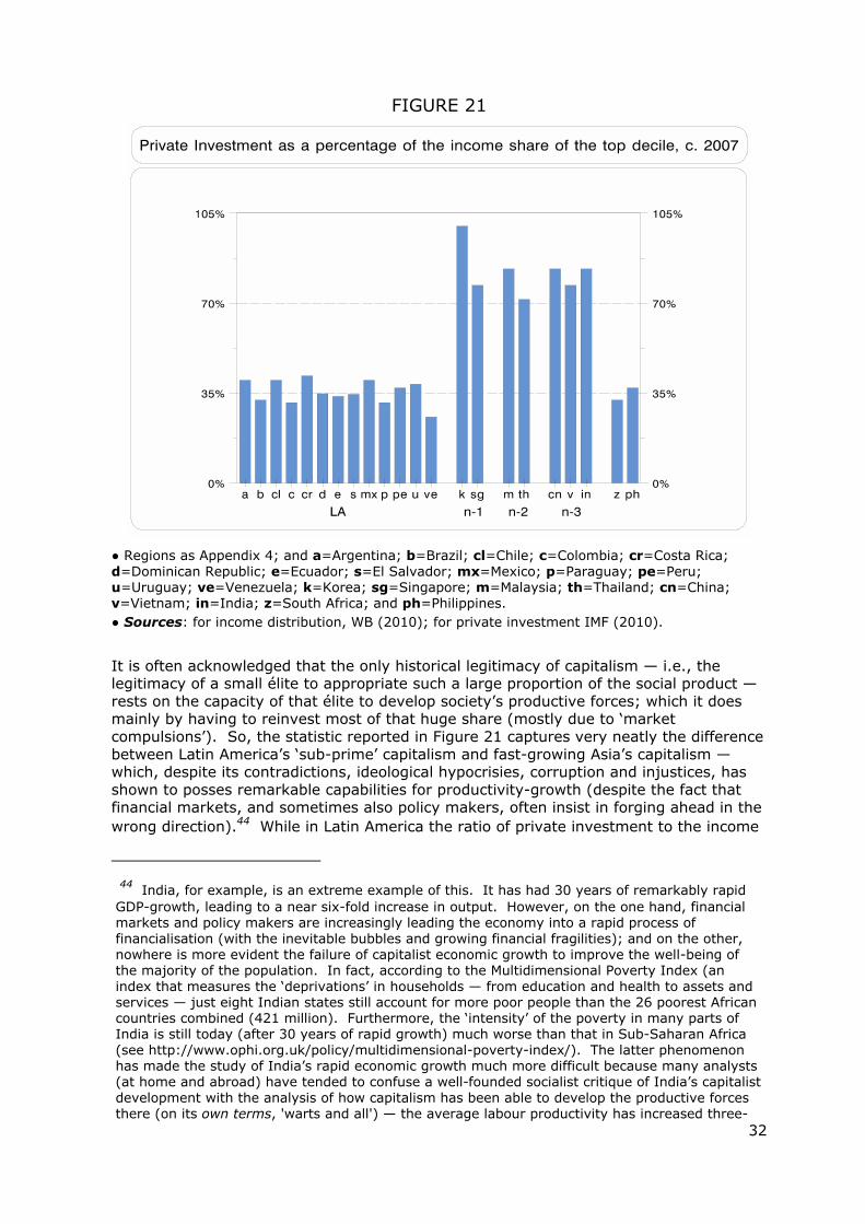
● Both rankings are made independently from the other.
● Br=Brazil; and Ma=Malaysia. In the c. 1985 distribution, the first two observations (the Czech and the Slovak Republics) have a Gini just under 20; and the last two (Zambia and Swaziland) have one just over 60.
Basically, in these two decades the distribution rotated clockwise around the median
11 Ex-communist countries are not classified here as ‘developing countries’. 12 On the First-tier NICs, see Amsden (2001); Chang (2006); and Wade (2003).
6
value; however, a remarkable deterioration at the low-inequality end (mostly due to ‘transition’ economies) contrasts with a relatively minor (but much heralded) improvement at the other end.13 As a result, although the median remained static (40.6 and 41, respectively), the harmonic mean increased significantly (from 35.7 to 40).14 And as there was a decline in the standard deviation, the coefficient of variation fell substantially (from 0.34 to 0.22). There are also important changes within the ranking, with some countries moving backwards (e.g., the US), and others forward (e.g., Malaysia). Also, others at the high-inequality end stayed still in their ranking despite some improvement in their inequality: Brazil, for example, improved its Gini from 59 to 56.4, but its ranking did so only from 77 to 75.
In turn, Figure 3 indicates a crucial (but in practice often ignored) distributional stylised fact: the contrasting behaviour of D9 and D10.
FIGURE 3
● Both rankings are made independently from the other.
● Br=Brazil; Cn=China; Ch=Chile; In=India; Ko=Korea; Na=Namibia; and ZA=South Africa. The last two observations in D10 are Botswana (51 per cent) and Namibia (65 per cent).
While the range for the income share of D9 in these 135 countries only extends across 4.5 percentage points (from 13.3 per cent in Namibia to 17.7 per cent in South Africa), D10 has a range 10 times larger (20.8 per cent in the Slovak Republic, 65 per cent in Namibia). This difference is also reflected in their coefficient of variation: that of D10 is more than four times larger than that of D9. Therefore, there is a major (and totally unnecessary) loss of information if distributive data are reported only in terms of quintiles, as the top quintile is made by the aggregation of two very different deciles.
This phenomenon is also corroborated by the fact that while the median value for
13 See, for example, López-Calva and Lustig (2010). 14 For the non-specialist, the harmonic mean is one of the three Pythagorean means; it is more appropriate for the average of ratios (it mitigates the impact of large outliers). It is calculated by the reciprocal of the arithmetic mean of the reciprocals.
7
the share of D10 in the Latin American and non-Latin American groups is very different (41.8 per cent and 29.5 per cent respectively), that for D9 is quite similar (15.8 per cent and 15.3 per cent, respectively). In other words, the key element that needs to be deciphered in order to understand within-country distributional diversity — and specially the huge degree of inequality in some middle-income countries — is the determinants of the share of D10; in fact, the real concentration of income is usually found within the first five percentiles of income recipients.15
There are also some interesting issues in the ranking of D9. For example, in Asia’s two major newly fast industrialising countries, China and India, there is significant contrast in their income-shares of D9. While these two countries have an almost identical ranking for their income-share of D10 (right in the middle of the distribution), they have opposite rankings for D9. The same type of contrast is found in Southern Africa between South Africa (and Angola) on the one hand, and Botswana and Namibia on the other. In D10 all four countries are located at the very end of the inequality ranking; however, in D9 the former are ranked as the two countries with the highest share for this decile in the whole sample, while the latter are the countries with the lowest share (Namibia) and fifth lowest (Botswana); see Appendix 3.
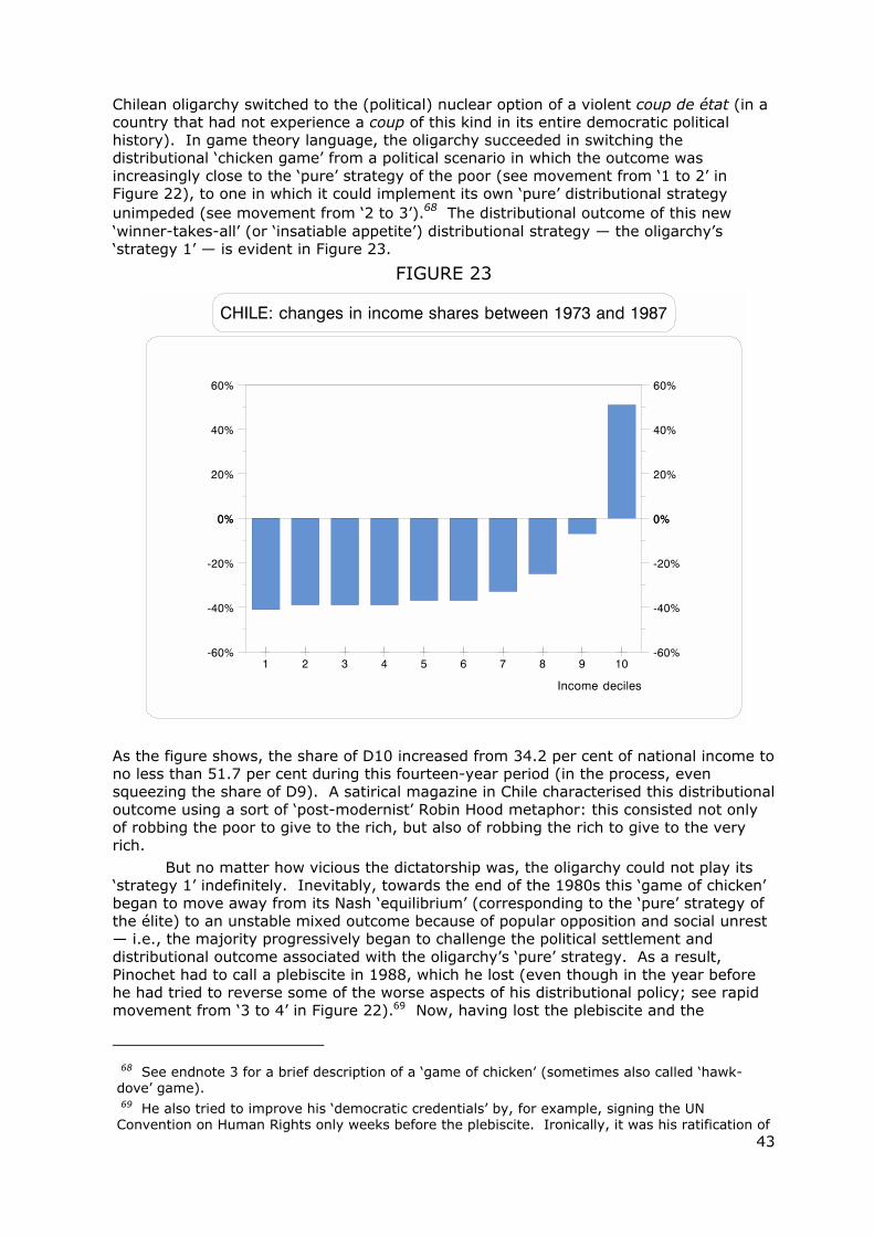
Figure 3 also gives an indication that the contrasting behaviour of D10 and D9 has become part of one of the key characteristics of neo-liberal economic reforms: its ‘winner-takes-all’ proclivity (see also Figure 22 below). For instance, in the case of Chile, after the 1973 coup d’état (which also marked the beginning of an uncompromising transformation towards open economy/close politics; see Díaz-Alejandro, 1984), its income distribution suffered one of the fastest deteriorations ever recorded. However, it was only D10 that benefited (see the interval between ‘2 and 3’ in Figure 4).
15 This point is evident in country-studies that use income tax statistics; see Atkinson (2003), Piketty and Sáez (2003), and Piketty (2003). This fact is also corroborated in works that use household surveys; see, for example, Ferreira and Litchfield (2000) for Brazil, Panuco (1988) for Mexico, Paraje (2002) for Argentina; and Gordon and Dew-Becker (2008), and Palma (2009b) for the US (the latter using data from Piketty and Sáez). See also Figure 13 below. Consequently, one would really like to know the detriments of the shares of the top 5 per cent, and the effects of the current style of globalisation on them. However, this is not possible with the available data from the WDI or any other similar sources.
8
FIGURE 4
● [Y1]=left-hand vertical axis (D9), and [Y2]=right-hand axis (D10). 1=election of Allende; 2=Pinochet’s coup d’état; 3=the year Pinochet had to call a plebiscite seeking a mandate to remain in power for another eight years; 4=first democratic government (centre-left coalition, the ‘Concertación’) that took office in 1990 after Pinochet lost his plebiscite (and was forced to call for presidential elections); 5=second democratic government (same coalition, but a return to more ‘free-market’ distributional policies); 6-7 and 7-8=next two governments by the same centre-left coalition.
● Source: calculations done by Pamela Jervis and author using the FACEA (2010) database. Unless otherwise stated, this will be the source of all historical data for Chile. Data refer to ‘household per capita income’, excluding from family incomes those of lodgers and domestic servants living in the house. We also exclude incomes when they are declared as ‘zero’, ‘does not know’, or ‘does not answer’.16 3-year moving averages.
While the income share of D10 increased by 51 per cent between 1973 and 1987 (from 34.2 per cent of national income to no less than 51.7 per cent), that of D9 actually fell from 17.5 per cent to 16.3 per cent. Not surprisingly, Chile’s D10 is currently ranked as the 124th largest among these 135 countries, while its D9 is only ranked 40th. Figure 4 also indicates another key characteristic of Latin America’s distributional struggle: how difficult it has been to sustain improvements in inequality; namely, the declines in inequality between ‘1’ to ‘2’ and ‘4’ to ‘5’ were followed by rapid deteriorations between ‘3’ to ‘4’ and ‘5’ to ‘6’ (the first under dictatorship, the second under democracy).
16 Chile is probably the only country in the Third World for which there is relatively systematic data on income distribution for this length of time.
9
3.- Income inequality and income per capita: the end of the “Inverted-U”?
The most common (and probably most meaningful) way of comparing income distribution across countries is in relation to the level of income per capita. This form of analysis started as a by-product of Kuznets’ 1955 “Inverted-U” time-path approach. However, as is well known, this debate has often confused some (often mixed) cross-section statistical evidence for an “inverted-U” path with Kuznets’ time-series ‘structural’ hypothesis. Furthermore, Kuznets’ hypothesis is, of course, only one of many possible explanations for a hypothetical “inverted-U” time-path (if this pattern were to exist at all).17 Furthermore, to extrapolate this hypothesis from a time-series to a cross-section scenario is no minor leap in the dark. Therefore, in this paper when I compare income distribution across countries vis-à-vis their income per capita I do so simply as a mechanism to visualise the geometry of within-country inequality across the world — i.e., it is just a cross-sectional description of cross-country differences in inequality, when categorised by income per capita; see Figure 5.
FIGURE 5
● [Y]=vertical axis (Gini indices); and [X]=horizontal axis (natural logarithm of income per capita — proxied here by GDP per capita). Regions and countries as Appendix 4. Regional figures are median values. However, in three regions where one country dominates, their data is used instead of the median; this is the case for Brazil in Latin America (Ecuador is the actual median country, Gini=53.7); South Africa in Southern Africa; and India in South Asia. Also, in the ‘Former Soviet Union’ the value for Russia and that for the median country (excluding Russia) are highlighted; as it is in the Anglophone OECD vis-à-vis the US. Unless otherwise stated, this will also be the case in figures below. Finally, continental EU is disaggregated between the Mediterranean countries (EU**), those with Ginis below 30 (EU*, Germany and Austria), and the rest (EU).
17 See Kanbur (2000); for an early critique, see Saith (1983). In Palma (2010a) I also conclude that Kuznets’ hypothesis is not relevant for explaining Latin America’s huge inequality.
10
As this graph suggests, by 2005 the statistical evidence that seems to have existed for an “Inverted-U” path between inequality and income per capita had all but disappeared. In fact, as the horizontal ellipse of Figure 5 indicates, the most remarkable current stylised fact is that the great majority of the regions/countries of the world have, on average, a relatively similar income-distribution. In part this is due to increased inequality at both ends of the spectrum, including the high-growth cum rising-inequality of many low-income Asian countries (which are moving in a north-eastern direction in the geography of Figure 5). Briefly, from Sub-Saharan Africa, through China and the Caribbean, to Singapore and Hong-Kong, the regional/country median index is now a Gini just above 40. And from India, through North Africa, Russia and the second-tier NICs, to the Mediterranean EU and the Anglophone OECD (excluding the US), the Gini is just below 40. Furthermore, some of the major economies not included within regions are also located within this narrow distributional band, such as Israel (Gini 39.2) and Iran (Gini 38.3). So, clearly there is not much statistical evidence here for an “Inverted-U” path between inequality and income per capita among these regions/countries, which represent about 80 per cent of the world’s population.
Figure 5 also indicates another remarkable stylised fact of current distributional outcomes: the increasing distributional diversity among rich countries (see vertical ellipse) — from the US, Singapore and Hong-Kong with a Gini above 40 (and in the US, well above 40), to Austria, Germany, the Nordic countries and Japan with Ginis well below 30 (with Sweden, Denmark, Norway and Japan below 25).
Finally, this Figure also shows that among middle-income countries there are two groups of countries that are clear outliers. One is Eastern Europe and most countries of the Former Soviet Union with significantly lower inequality. The other is Latin America and Southern Africa, countries that comprise a small share of the world population (under 10 per cent) and clearly live in a distributional world of their own; however, in all probability, some countries of the oil-producing Middle East (for which there are no data) share the inequality heights of the latter group).18
This uniqueness of Latin American and Southern African is crucial for the testing of the “Inverted-U”.19 If these two regions are either excluded, or (more appropriately) if they are controlled by a dummy variable, the “Inverted-U” hypothesis does not work. In the former case (reduced sample of 113), neither ‘t’ for the parameters of the two slopes is significant even at the 5 per cent level (see regression 1 in Appendix 5).20 The same happens in the latter case (see regression 2).21 In fact, it is when these two regions are included without a dummy variable to account for their exceptionality, that the “Inverted-U” hypothesis works statistically (i.e., the two slopes are significant at the 1 per cent level; see regression 3). Nevertheless, as is evident in Figure 5, for a regression of this type to be meaningful it should account for all three phenomena discussed above; namely, the diversity among high-income OECD countries, the huge
18 In 2003, I met by chance in Geneva a salesperson for one of the most exclusive watchmakers in Switzerland; in the conversation he mentioned that his wristwatches cost more than ten times an equivalent Cartier. When I asked who would buy such an expensive item, he replied (somehow surprised at my question) “mostly people from Latin America and the Middle East, of course”. And then he added that he was just back from a very successful trip to Argentina (even though this conversation took place a year after Argentina’s worst financial crisis in modern times). As the best Argentinian cartoonist said around that time, the problem for the Latin American oligarchy is that “[i]t’s becoming so outrageously expensive to be rich nowadays!!” (“¡¡Es una vergüenza lo caro que se está poniendo ser rico!!”), Quino (2000; see epigraph to this paper). 19 Where the logarithm of an inequality index (say, the Gini) is regressed on the logarithm of income per capita and income per capita squared. 20 All ‘t’ statistics reported in this paper are constructed using ‘White heteroscedasticity-consistent standard errors’. And the R2s are adjusted by the degrees of freedom. 21 In all regressions with a dummy variable for Southern Africa, Namibia is represented separately (dummy intercept), as its degree of inequality is “unequal” even for the remarkably unequal standards of Southern Africa.
11
inequality found in Latin America and Southern Africa, and the opposite phenomenon found in Eastern Europe and the former Soviet Union. Figure 6 shows that despite the usual structural instability of this type of cross-country regressions, and the added problems brought about by co-linearity between the two explanatory variables within the actual range of the sample, the result of such an exercise is statistically significant (i.e., unlikely to have occurred by chance).
However, it is important to emphasise from the start that this regression, and other similar regressions below, are simply meant to be a cross-sectional description of cross-country inequality differences, categorised by income per capita. That is, they should not be interpreted in a ‘predicting’ way, because there are a number of difficulties with a curve estimated from a single cross-section — especially regarding the homogeneity restrictions that are required to hold; see Pesaran, Haque and Sharma (2000). This is one reason why the use of regional dummies is so important, as they can provide crucial information regarding the required homogeneity restrictions — and as will become evident below, their evidence points in a different (heterogeneous) direction. Hence, regional dummies will be reported below only within the income per capita range of their members.22
FIGURE 6
● [X]=horizontal axis. Regions and countries as Appendix 4 and Figure 5. 1=dummy for SAf; 2=dummy for LA; 3=base regression; 4=dummy for EE and the FSU; 5=dummy for the OECD-1 and EA1*; and 6=dummy for EA1 and OECD countries with a Gini below 30 (No, EU*, and Japan). All dummies are on the income per capita squared variable, except for EE and FSU (income per capita). There is also an intercept dummy for Namibia, not reported in the graph. All ‘t’ are significant at the 1 per cent level; the R2=72. For the summary statistics, see regression 4 in Appendix 5.
What is most important in Figure 6 is that even when the two slopes of the ‘Inverted-U’
22 Moreover, one has to keep in mind as well that in any classification of this type there is a ‘pre-testing’ danger when determining the nature of regional dummies, as often there is more than one way to define a region.
12
are re-established as statistically significant (by adding the appropriate dummies), there is still no evidence for the “upwards” (or first half) part of the “Inverted-U” hypothesis. That is, for the idea that posits that (for whatever reason) “things have to get worse before being able to get better”.23 In the regional dummies there are two opposite paths. In one, inequality gets, on average, systematically worse as countries have higher income per capita (lines 1 and 2), even though some countries have already reached high middle-income levels.24 In the other, inequality gets, on average, systematically better; this happens both in EA1* and Anglophone OECD (line 5), and in EA1, EU*, the Nordic countries and Japan (line 6). Also note that in Figure 6 the base regression is equidistant from lines 5 and 6 (the slope-dummies are 0.002 and -0.002, respectively). However, it is important to emphasise that the downwards shape of lines 5 and 6 does not necessarily mean that the distribution of income within individual countries is currently improving as they get richer; it only means that although the distribution of income within many of these countries is currently deteriorating (notably in the US), it does so in a way that does not change the fact that the richer the country the lower the level of inequality (as a group). Finally, in Eastern Europe and Former Soviet Union (line 4), distributional outcomes are initially stable, and then improve. It is only in the base relationship (line 3) — with the oddest mixture of countries — that one finds a small initial distributional deterioration (of less than 2 points in the Gini scale) as countries move from low- to middle-income levels.
But the end to the upwards side of the “Inverted-U” comes at a statistical cost: the relationship between inequality and income per capita is not homogeneous across regions and countries. As income per capita increases, some regions/countries move in one direction, others in the opposite. So, the homogeneity restrictions that are required to hold for ‘prediction’ are visibly not fulfilled. In other words, not only analytically but also statistically there is no reason to ‘predict’, for example, that Latin America and Southern Africa will improve their remarkable inequality as their income per capita continues to increase simply because countries in other regions have done so before. So, unless some odd mechanical extrapolations are made of historical experiences from other regions, even in this ‘Inverted-U-friendly’ specification, there is no evidence that the distributional deterioration that has been taken place so far in Latin America and Southern Africa is a necessary prelude to a later improvement — the age-old excuse used by many middle-income countries to justify their high inequality.
And, as is often the case, when work of this nature produces such statistically interesting results, this ‘involves the evolution of knowledge as well as ignorance’ (Krugman, 2000). That is, while political oligarchies all over the Third World would be only too happy to appropriate such a high share of the national income, the question that still needs to be answered is why is it that only those of middle-income Latin America and Southern Africa are able to get away with it?
Figure 7 looks at the distributional picture ‘inside’ this Gini. As mentioned above, there are important benefits in focusing on changes throughout the distribution rather than on summary inequality statistics alone.25
23 In previous papers (studying data for the mid-1990s) I did find some statistical evidence for the first part of the “Inverted-U” path for that period; see Palma (2002 and 2003). For “Inverted-Us” at five points in time since 1960, see Alderson and Doran (2010). 24 In fact, as high as US$10,000 in Argentina (US$ of 2000 value; WB, 2010). Moreover, in PPP terms Argentina, Chile and Mexico have already reached around US$15,000; and Brazil, Colombia, Uruguay, Venezuela and South Africa around US$10,000 (EKS$ of 2009 value; see GGDC, 2010). 25 On this issue, see also Nielsen (2007); and Alderson and Doran (2010).
13
FIGURE 7
● [Y]=vertical axis; and [X]=horizontal axis. Regions and countries as Appendix 4, except for EU*=EU countries with a share below 23 per cent (Austria, Netherlands and Germany); EU is the rest of continental Europe. Note that in some regions the median country for D10 is different from that of the Gini in Figure 5.
As we might have expected, Figure 7 shows a particularly close correlation between the geography of regional Ginis and that of the income-shares of D10 (with the same three stylised facts). First, the horizontal ellipse of Figure 7 indicates that, on average, the great majority of the regions/countries have a relatively similar income-share for D10. Basically, from Sub-Saharan Africa to India, China, North Africa, Russia, the Caribbean, the ‘second-tier’ NICs, the Anglophone OECD, Hong-Kong and Singapore to the US, the top deciles are able, on average, to appropriate about one-third of national income. So, again, not much statistical evidence here for an “Inverted-U” among these regions/countries, representing about 80 per cent of the world population. Second, there is again a huge diversity among rich countries (see vertical ellipse) — from Hong-Kong, Singapore and the US (with well over 30 per cent of GDP), to the rest of the Anglophone OECD and most of continental Europe, to Korea and Taiwan, and the countries within the OECD with a share lower than 23 per cent (Germany and The Netherlands, Japan and the Nordic countries). Again, this distributional diversity is not found among low-income and low- to middle-income regions. Third, among middle-income countries the same two groups of countries are clear outliers at either side of ‘middle band’.
Figure 8 (and Regression 5) confirms the previous findings: the end of the statistical evidence for ‘upward side’ of the ‘Inverted-U’; and the capability of Latin America and middle-income Southern Africa at resisting progressive evolutionary change.
14
FIGURE 8
● [Y]=vertical axis; and [X]=horizontal axis. Regions and countries as Appendix 4. 1 to 6 as Figure 6 (but this time, EU*=EU countries with a share below 23 per cent=Austria, Netherlands and German). All ‘t’ are significant at the 1 per cent level; the R2=70 per cent (see regression 5 in Appendix 5).
Figure 9, in turn, shows the regional distributional structure of the shares of income of the bottom 40 per cent; this figure shows that the regional distributional structure of the share of income of ‘D1–D4’ is the mirror image of that of D10 above, with Latin America and Southern Africa in a similar iniquitous distributional world of their own.
15
FIGURE 9
● EU*=Mediterranean EU).
Yet again, the same three stylised facts apply. Figure 10, and Regression 6 in Appendix 5, confirms this (except for the countries in ‘dummy 6’).
FIGURE 10
● 1 to 5 as Figure 6 (dummy 6 is not significant at the 10 per cent). All ‘t’ are significant at the 1 per cent level; the R2=70 per cent (see regression 6 in Appendix 5).
16
It is therefore fairly obvious that the Gini-scene for regional inequality is reflected rather well at both ends of the distribution. But what about the other half of the distribution? Figure 11 shows one of the key contributions of this paper: that the distributional picture changes completely when one looks at the 50 per cent of the world’s population located in ‘D5–D9’ (the ‘middle and upper-middle classes’ — sometimes called the ‘administrative’ classes in institutional economics). Now the distributional geometry changes from huge disparity to remarkable similarity.
FIGURE 11
● The black square in the middle of the graph is Latin America’s median country (Peru=LA*).
Evidence from Figure 11 indicates two noteworthy facts. One is the high degree of homogeneity across regions/countries regarding the share of income that the middle and upper-middle classes are able to appropriate. This is most striking among rich countries — i.e., no more diversity here, as in the Gini and top and bottom deciles. Moreover, Eastern Europe and countries of the former Soviet Union are no longer outliers; and South Africa and Brazil (as well as Latin America’s median country, Peru) are close to India, Uganda (Sub-Saharan Africa’s median country), and Thailand (East Asia-2 median country). So, not surprisingly, if the same regression as above is applied, neither of the two slopes (income per capita and income per capita squared) are significant — with a ‘p’ value (or the probability of obtaining a test statistic at least as extreme as the one that was actually observed, assuming that the null hypothesis is true) of 36.3 per cent and 14.7 per cent, respectively. And if the regression is run with only one of the two slopes at a time, although the slope parameters and three of the five regional dummies become again significant at the 1 per cent level (the others are not significant even at 10 per cent), the resulting lines are practically horizontal and extremely close. In fact, in this case the intercepts have a ‘t’ value of no less than 225 and 383, respectively.
The other major stylised fact is that the share of this half of the population is about half of national income (the harmonic mean is 51.2 per cent, the average is 51.5 per cent and the median value is 52 per cent). So, perhaps rather than ‘middle classes’ from now on this group should be called the ‘median classes’. Basically, it seems that a
17
schoolteacher, a junior or mid-level civil servant, a young professional (other than economics graduates working in financial markets), a skilled worker, middle-manager or a taxi driver who owns his or her own car, all tend to earn the same income across the world — as long as their incomes are normalised by the income per capita of the respective country. Furthermore, as is evident in Figure 27 below (see Appendix 3), the change from the ‘heterogeneity’ at the top to the ‘homogeneity’ in the middle is remarkably abrupt, taking place as soon as one moves from the distributional scene of D10 to that of D9. Furthermore, this similarity in the income-shares of ‘D5–D9’ is even more extreme in the ‘upper middle’ 30 per cent of the population (‘D7–D9’) — see Figure 12.
FIGURE 12
● 0-1=OECD-1. The black square in the middle of the graph is Latin America’s median country (Peru=LA*).
In this case, the harmonic mean is 36.5 per cent, its average 36.6 per cent, and the median is 37 per cent. Now, in South Africa and Peru the share for this group is slightly above India, and is almost identical to Japan. Even Brazil is not far behind (at 34.9 per cent). So, as for the income share of ‘D5–D9’, neither of the two slopes have any significance (‘p’ values of 77.3 per cent and 52.4 per cent, respectively). Again, if the regression is run with only one of the two slopes at a time, although the parameter for either slope becomes significant at the 1 per cent level, in both specifications only the Latin American dummy has a significance below 10 per cent (but with numerical values of just -0.003 and -0.0003, and ‘p’ values of 3.6 per cent and 8.7 per cent, respectively). Furthermore, the base regressions are practically a horizontal straight lines at a share of about 36/37 per cent (‘t’ of the intercepts are 235 and 430, respectively).
As Tony Atkinson remarked in his comments on an earlier draft of this paper, one interesting result of this ‘homogeneity’ in the middle is that if the middle ‘D5–D9’ gets half the income, then the Gini coefficient (in percentage points) is 1.5 times the share of the top 10 per cent (in percentage points) minus 15. In this case the Gini has a maximum of 60 per cent (although it may be larger on account of inequality within the
18
groups, since this calculation linearises the Lorenz curve).
Table 1 presents a set of statistics for the whole sample, which emphasise the extraordinary contrast between the world distributional-heterogeneity at the top and bottom of the income distribution and the remarkable homogeneity in the middle.
TABLE 1 Measures of Centrality and Spread for Income Groups (133 countries)
range median h mean average variance st dev c o var
D10 27.0 30.8 30.4 32.0 41.3 7.1 0.22
D1-D4 17.1 17.0 15.3 16.6 16.4 4.2 0.25
D5-D9 13.0 52.2 51.2 51.7 12.2 2.9 0.05
D7-D9 6.6 37.0 36.5 36.7 3.2 1.4 0.04 ● The range is expressed in percentage points of income-shares; h mean=harmonic mean; st dev=standard deviation; c o var=coefficient of variation. Botswana and Namibia (extreme outliers) are excluded.
Of all the statistics in Table 1, the coefficient of variation best shows the distributional contrast between the homogeneous middles and the heterogeneous tails — the figures for both D10, and ‘D1–D4’ are four and five times greater than that for ‘D5–D9’. Furthermore, they are about six times larger than that for ‘D7–D9’. This suggests that middle (or ‘median’) classes across the world seem to be able to benefit (as a group) from a distributional safety net — i.e. regardless of the per capita income level of the country, the characteristics of the political regimes, the economic policies implemented, the structure of property rights, or whether or not they belong to countries that managed to get their prices ‘right’, their institutions ‘right’, or their social capital ‘right’, the 50 per cent of the population located in ‘D5–D9’ seems to have the capacity to appropriate as a group about half the national income.26 In other words, despite the remarkable variety of political-institutional settlements in the world, the resulting distributional outcomes have one major thing in common: half of the population in each country is able to acquire as a group a ‘property right’ to about half the national income.27
There is no such luck for the bottom 40 per cent of the population. For them, characteristics such as those mentioned above (such as the nature of political regimes and institutions, the economic policies implemented, and so on), can make the difference between getting as much as one-quarter of national income (as in Japan and the Nordic countries), or as little as one tenth or less: six countries in Latin America, including Brazil and Colombia, and middle-income Southern Africa have a share below 10 per cent. In turn, for D10 the sky is (almost) the limit, with oligarchies in five Latin American countries (again including Brazil and Colombia) and in Southern Africa managing to appropriate a share of about (and in some cases, well above) 45 per cent of national income. For Botswana and Namibia, and for some Latin American countries and South Africa at specific points in time, the figure is above 50 per cent (like in Brazil and Chile just before the presidential elections that marked their return to democracy; see Appendices 1 and 3).28
26 Surely the exceptions to this rule must be those countries with political regimes that do not even allow for household surveys in their own countries, such as many in the oil-producing Middle East. 27 Note that this seems to be a ‘group’s right’, rather than a right of the individuals within the group (which, as evidenced in household surveys, can be upwardly or downwardly mobile). 28 Brazil in 1989 (SEDLAC, 2010), and Chile in 1987 (FACEA, 2010). Also in South Africa, according to the source of Table 4 in Appendix 3, in 2008 this share reached 58 per cent.
19
In other words, what is crucial to remember is that the regional distributional structure suggested by the Gini index only reflects the income disparities of half the world’s population — those at the very top and at the bottom of the distribution — but it tells us little about the remarkable distributional homogeneity of the other half. This raises serious questions regarding how useful the Gini index is as an indicator of overall income inequality, especially because (from a statistical point of view) the Gini is supposed to be more responsive to changes in the middle of the distribution. That is, the most commonly used statistic for inequality is one that is best at reflecting distributional changes where changes are least likely to occur! As a result, the overall geometry of inequality as shown by the Gini is likely to underestimate income disparities across countries. The problem is that alternative inequality statistics that have the advantage of being more responsive to changes at the top and bottom of the distribution (such as the Theil) tend to have the huge disadvantage of being extremely vulnerable to measurement errors precisely at the tails of the distribution (and, above all, at the top; see Paraje, 2004).29
In terms of historical trends, the US seems to indicate that the cross-section ‘homogeneity in the middle vs. heterogeneity at the tails’ tends to translate into a historical path of ‘stability in the middle vs. instability at the tails’; see Figure 13.
FIGURE 13
● 3-year moving averages. P=percentile.
● Source: US Census Bureau (2010; right-hand panel, author estimates — see below).
29 As discussed below, in the case of Chile, for example, survey data are adjusted for the unreported income of the poor, but not of the rich. In the case of studies of wage inequality (e.g., UTIP, 2010), the key problem is that information usually relates only to the formal sector. And in terms of generalised entropy inequality measures (GE), the lower the weight given to distances between incomes at different parts of the income distribution, the GE is more sensitive to changes in the lower tail of the distribution. In turn, the higher these weights, the GE is more sensitive to changes that affect the upper tail. As a result, while the Theil is usually highly sensitive to measurement errors at the upper end of the distribution, the mean log deviation is vulnerable to measurement errors at the other end. In turn, the Atkinson index increases it sensitivity to changes at the bottom of the distribution the higher the parameter of aversion to inequality. Also, as Amartya Sen (1973) rightly remarks on the Theil “[...] the fact remains that it is an arbitrary formula, and the average of the logarithms of the reciprocals of income shares weighted by income shares is not a measure that is exactly overflowing with intuitive sense”.
20
As the source only reports data for quintiles and the top 5 per cent, the left-hand panel of Figure 13 divides the population in a slightly different way from the one discussed so far (top 5 per cent, ‘D5–D9’ plus ‘P91–P95’, and bottom 40 per cent). There are two remarkable features in this panel. One is the changing fortunes of the top 5 per cent and bottom 40 per cent: starting in 1947 from a situation in which both received about 17 per cent, by the mid-1970s the bottom 40 per cent was getting three percentage points more. However, after 1980 the top 5 per cent began their remarkable comeback (sometimes called the ‘revenge of the rentier’; see Palma, 2009), and ended up appropriating eight percentage points more than the bottom 40 per cent (21.5 per cent and 13.5 per cent). Oddly enough, according to these household surveys, a significant proportion of this distributive ‘damage’ took place during the Clinton administration. The other noteworthy feature is that the 55 per cent of the population who make up this ‘enlarged middle’ appropriates a remarkably stable share of income throughout (about two-thirds). In fact, the range in which the share of this 55 per cent of the population fluctuates in this 62-year period is just four percentage points of income (and its coefficient of variation is only 0.02 — compared with 0.13 for the top 5 per cent, and 0.09 for the bottom 40 per cent).
In the right-hand panel, I estimated D10 from the information provided by the US Census Bureau on the top 5 per cent and the top quintile, using information on the structure of D10 from Piketty and Sáez (2003). This tentative approximation is done only to show the distribution following the pattern analysed so far (D10, ‘D5-D9’ and ‘D1-D4’). In either case, ‘the stability in the middle vs. the instability at the tails’ is unmistakable.
However, a closer look at the limited historical evidence we have on some particularly highly unequal developing countries (e.g., Chile and South Africa; see Appendices 1 and 3) indicates a different picture: once the bottom 40 per cent has been squeezed almost out of existence, the only way that the seemingly unstoppable ‘centrifugal forces’ at the top can continue to operate is by squeezing the middle. Thus, the real question regarding the huge levels of inequality found in some Latin American countries and Southern Africa seems to be what makes the ‘centrifugal forces’ at the top so powerful that in a few cases the usual boundary for their operation — middle and upper-middle groups with a remarkable capacity to hold their own — seems to falter?
Nevertheless, even in Latin America this phenomenon is limited to a few countries, with six of the nineteen countries of this region in the sample (Uruguay, Venezuela, Costa Rica, El Salvador, Argentina, and Mexico) having share of income for the ‘D5-D9’ group above 50 per cant; and eight more above 47 per cent. In fact, it is only in Brazil, Chile, Colombia, and Haiti where this share is systematically below this level (SEDLAC, 2010).
So, with the exception of a few cases of particularly extreme inequality, recent political and economic developments (including neo-liberal globalisation) seem to have been associated with two very different distributional dynamics: a (better known) ‘centrifugal’ one in terms of the income-shares of the top and bottom deciles, and a (lesser known) ‘centripetal’ movement in terms of the income-share of the middle and upper-middle. Basically, with few exceptions, with few exceptions, rather than a ‘disappearing middle’ (or ‘squeezed’ middle), what one sees, from a historical perspective, is a ‘stable middle’ (with a remarkable capacity to hold their own); and from a cross-sectional one, a ‘homogeneous middle’ (see Figure 14).
21
FIGURE 14
● Botswana, Namibia and Haiti (the three main outliers) are excluded. Countries are ranked according to the income share of ‘D1-D4’.30
Regional distributional homogeneity in the middle and upper-middle of the distribution also casts doubts on the role that ‘human capital’ is supposed to have on income distribution according to mainstream economics and UN reports (see, for example, Neal and Rosen, 2000; see also ECLAC, 2010a and b). According to this theory, the level of education is a crucial variable (if not the most crucial variable) in the determination of income inequality. However, in all regions of the world (developed and developing; Latin American and non-Latin American), the top income decile is made up of individuals with relatively high levels of education, while those in the bottom four deciles have either relatively little schooling, or (in the more advanced countries), schooling of a very doubtful quality. So why do these two relatively homogeneously ‘educated’ groups (one homogenously ‘highly-educated’, the other homogenously ‘little-educated’) have the greatest distributional diversity across countries? In turn, if most of the world’s educational diversity (both in terms of quantity and quality) is found among the population in ‘D5–D9’ — e.g. in terms of the share of the population with secondary and (especially) tertiary education — why does one find extraordinary similarity across countries in the shares of national income appropriated by this educationally highly heterogeneous group?
For example, apart from Argentina and Cuba, Chile has the largest tertiary education enrolment among all developing countries, with more than 50 per cent enrolment (World Bank, 2010).31 However, in 2003 the 30 per cent of its population in
30 My friend Bob Sutcliffe suggested that I should graph in this way what he likes to call “Palma’s Law” of homogeneous middle vs. heterogeneous tails... 31 Despite the fact that normalised by income per capita, the fees charged by Chilean universities are the highest among OECD countries; see http://diario.elmercurio.com/ 2011/03/27/economia_y_negocios/enfoques/noticias/BFDA8F83-A3F2-456A-AC67-4C8B89070171.htm?id={BFDA8F83-A3F2-456A-AC67-4C8B89070171}.
22
‘D7–D9’ were only able to appropriate the third lowest income share in the whole sample of 135 countries, with only diamond-rich Botswana and Namibia posting lower shares. Despite the fall in overall inequality between 2003 and 2006 (the Gini fell from 0.55 to 0.52), Chile still ranked 6th lowest for this 30 per cent of the population (having only surpassed Mozambique, Haiti and Cote d'Ivoire in the intervening period). Furthermore, and despite the fact that the Gini remained stable afterwards (2006–09), the share of this group fell again between 2006 and 2009.32 So, in terms of the (overemphasised) rôle of education in the distribution of income, it is important not to lose sight of the multifaceted nature of the relationship between increased ‘equality of opportunities’ in education and increased ‘distributional equality’ in terms of income — and of the fact that education (or any other factor that may be influencing the distribution of income) can only operate within a broader institutional dynamic (see endnote 1).
Obviously, more research needs to be done on the forces shaping the income shares of different groups along such different paths, particularly in such opposite ‘centrifugal’ and ‘centripetal’ directions. Surprisingly, this simple observation does not seem to have been emphasised before. Moreover, it seems odd that most of the recent literature on income ‘polarisation’ has produced indices that emphasise distributional changes around the middle of the distribution, exactly where there is greater income-homogeneity.33 In fact, the higher degree of heterogeneity at the very top and bottom of the income distribution makes simple income ratios, particularly those of ‘D10/D2’ and ‘D10/(D1–D4)’, more statistically-sensitive indicators of distributional disparities across the world — highlighting even better, for example, Latin America’s and Southern Africa’s huge income inequality (and the unique voracity of their oligarchies); see below. Finally, for anyone aiming at lowering inequality the policy implications of this ‘homogeneity-in-the-middle vs. heterogeneity-in-the-tails’ are as crucial as they are straightforward (see the Conclusions).
32 Not surprisingly, regardless of the subject studied, university graduates in Chile take longer to recuperate the cost of their studies than in any comparable country (Ibid.). 33 Wolfson (1997), for example, started the whole ‘polarisation’ literature by developing an index that cuts the Lorenz curve right in the middle!
23
4.- Income polarisation
As there are many well-known problems with data reporting in D1, Figure 15 looks at income polarisation by the income shares ‘D10/D2’ and ‘D9/D2’.34
FIGURE 15
● As Figure 3; and Gh=Ghana (SS-A median country). The last observation in ‘D10/D2’ is Namibia=75.
Figure 15 shows the remarkable difference between these two multiples. The ranges for the rankings are very different: while ‘D10/D2’ extends from 3.6 to 75 (33.2 without Namibia), that of ‘D9/D2’ only does so from 2.3 to 15 (12.5 without Namibia). Moreover, while in ‘D10/D2’ income polarisation kicks in at the beginning of the last fourth of the sample (at ranking 100, exactly where Latin American countries start reporting), in ‘D9/D2’ there is a much smaller break in the trend, and this happens well after the appearance of Latin American countries.
Of the statistics measuring inequality, ‘D10/D2’ probably best reflects the uniqueness of income-polarisation in Latin America and Southern Africa. In the case of the former, at a median value of 19.4, its multiple for ‘D10/D2’ is more than twice the median value for the seventy ‘non-Latin-American LDCs’ (see Table 2). Latin America’s
34 Surveys are rarely able to report accurately incomes at the very bottom of the distribution (D1). For example, in the case of casual rural workers seasonal effects are crucial; and people working at the bottom end of the informal sector are usually not forthcoming with information. Also, information is very sensitive to the way in which questions are framed. For example, recently the Chilean government celebrated profusely an ‘historical record’ in employment creation: 400,000 new jobs in one year. It became known later that this figure came from a new employment survey, which had changed the relevant question from “during last week, were you mainly working, unemployed, searching for work, doing housework, studying, retired, or living from rents?”; to “during last week, did you work for at least one hour?” Furthermore, for control purposes the statistical office had carried out both surveys during the year, with the old survey reporting 145,000 new jobs, while the new one the ‘historical record’. See http:// elpost.cl/content/seamos-serios.
24
polarisation would be even higher, of course, if distributional data were properly adjusted by national accounts. As already mentioned, in Chile, for example, the official data for income distribution (reported in World Bank, 2010) adjust for the unreported incomes of the poor and the subsidies that they receive but, oddly enough, they do not correct for either the unreported monetary incomes of the rich, or for the many subsidies that they receive. It has been estimated that, as a result, the income distribution data for 2006 under-reported the national disposable income by no less than 41 per cent. In turn, if data were also adjusted for the unreported incomes of the rich (via national accounts), the ‘D10/D2’ multiple would more than double, and the multiple of ‘D10/D1’ would jump from 31 to 88 (for family income), or from 53 to 148 (income per capita).35
Table 2: Region Median Values for Different Income Ratios
D10/D1 D10/D2 D9/D2 D10/D1-D4 Q4/Q2 Q3/Q2
Southern Africa 35.1 25.2 10.0 5.2 3.4 1.8
Latin America 33.9 19.4 7.1 4.0 2.7 1.7
Caribbean 16.6 10.5 4.9 2.3 2.2 1.5
Sub-Saharan Africa 15.5 10.3 4.6 2.3 2.2 1.5
East Asia-1* 17.7 10.3 5.1 2.3 2.3 1.5
LDCs 15.5 10.2 4.7 2.2 2.2 1.5
United States 19.8 9.3 4.8 2.1 2.4 1.6
China 13.2 9.3 4.9 2.0 2.2 1.5
Non-LA LDCs 13.1 8.9 4.3 2.0 2.1 1.4
East Asia-2 11.0 7.8 4.2 1.8 2.1 1.5
North Africa 11.1 7.6 3.8 1.7 2.0 1.4
Russia 11.0 7.4 4.1 1.6 2.1 1.4
India 8.6 7.0 3.2 1.6 1.8 1.3
OECD-1 12.5 6.6 3.8 1.5 2.0 1.4
Former Soviet Union 9.4 6.5 3.5 1.5 1.9 1.4
European Union 9.2 5.6 3.3 1.3 1.8 1.3
Easter Europe 7.3 5.1 3.0 1.2 1.7 1.3
East Asia-1 7.8 4.5 3.0 1.0 1.7 1.3
Nordic countries 6.1 4.0 2.5 1.0 1.6 1.2
Japan 4.5 3.7 2.4 0.9 1.5 1.2
All 11.7 8.1 4.1 1.8 2.0 1.4 ● Regions are ranked according to ‘D10/D2’. Median values; but in East Asia-1, multiples correspond to Korea; in East Asia-1* to Singapore; and in Southern Africa to South Africa. OECD-1 excludes the US, and FSU Russia, as they are reported separately. OECD-1 excludes the US, and FSU Russia, as they are reported separately.
As Table 2 indicates, the greater inequality in Southern Africa and Latin America decreases rapidly closer to the middle of the distribution. For example, while Latin America’s multiples of ‘D10/D1’, ‘D10/D2’ and ‘D10/(D1–D4)’ are about twice those of the next three regions and China, there is little difference between them towards the middle of the distribution. Surprisingly, many theories purporting to explain Latin America’s greater inequality refer to phenomena in this middle of the distribution. That is the case, for example, with the 1960s’ import-substituting industrialisation related ‘labour aristocracy’ hypothesis, and with the 1990s’ import-liberalisation related ‘skill-biased technical change’ proposition.
The first hypothesis, widely invoked during the 1960s and 1970s, particularly by the World Bank and its many consultants and later on by the emerging ‘Washington Consensus’, argued that one of the main causes of inequality in Latin America was the price distortions associated with import-substituting industrialisation (ISI). These are supposed to have distorted the values of sectoral marginal productivities, allowing for
35 See http://www.archivochile.com/Chile_actual/columnist/claude/colum_claude00020.pdf.
25
artificially high wages in manufacturing (à la Stolper and Samuelson). That is, wage differentials were higher than if free trade predominated (see, e.g., Krueger, 1983; World Bank, 1987). However, there was little then (as now) to differentiate Latin America from the rest of the world — developing and developed, ISI and non-ISI — in terms of the income distribution among groups that would include ‘aristocratic’ and ‘non-aristocratic’ labour (found in, say, the ratio of ‘Q3/Q2’ in Table 2, or ‘D5/D3’ in Figure 16 below).
The second proposition basically recycled the ‘labour-aristocracy’ hypothesis for the post-1980 globalisation era, as a way of explaining the supposedly unexpected increase in inequality in many developing countries after the implementation of economic reforms and greater integration with the world economy. This was the exact opposite of the predictions of the ‘Washington Consensus’ (see, e.g., Lal, 1983). Hence, it was argued that this (previously unforeseen) reform-related increase in inequality took place because import liberalisation had allowed for new production techniques which were intensive in the use of skilled workers (a scarce factor in most LDCs), therefore increasing wage differentials. However, as is obvious from previous graphs, Table 2 and Figure 16 below, what really differentiates Latin America’s inequality is located at the tails of the distribution of income — hardly where skilled workers are located. Therefore, even if import liberalisation did introduce the new production techniques, evidence suggests that this, by itself, does not account for much of the region’s increased inequality.36 Again, the case of Chile provides a good example (Figure 16).
FIGURE 16
● As Figure 4. 3-year moving averages.
Even though Chile implemented one of the most radical (and swift) trade and financial liberalisation policies, and in spite of the fact that this policy has now been in place for four decades, there is nothing in Chile’s data regarding the relative income of skilled and
36 For proponents of this hypothesis, see Juhn and Pierce (1993); Revenga (1995); Cline (1997, this book has a very useful survey of the literature); Haskel (1999); and Melendez (2001). For critiques of this literature, see Krugman and Lawrence (1993), Robinson (1996), Atkinson (1997), Paraje (2004) and Levy and Temin (2007).
26
unskilled labour (proxied in Figure 16 by ‘D5/D3’ — or, in an extreme scenario, by ‘D9/D2’) to support the recycled ‘labour-aristocracy’ hypothesis (i.e., the ‘skill-biased technical change’ proposition). In fact, even ‘D9/D2’ has hardly had any change, ending in the 2000s exactly where it began in the (‘import-substituting’) 1950s. Moreover, in the cross-sectional scenario above there is no statistical evidence either of any significant diversity in ‘D5/D3’ or ‘D9/D2’ between countries where skilled labour is abundant or scarce.
Basically, the message from Figure 16 is that massive political upheavals, together with radical economic reforms and greater integration with the world economy and finance, have tended to have significant effects at the tail ends of the distribution, but little effect in between. In other words, one of the most important lessons emerging from Latin America is that the traditional mainstream explanations for income disparities are looking at the wrong side of the distribution, and at factors that are not the fundamental causes of the huge inequalities found there. As with the case of the influence of education discussed above, the distributional impacts of the ‘skill-biased technical change’ phenomenon should be understood as factors operating within a broader political economy and institutional dynamics — none more important than the centrifugal forces that are squeezing income from the bottom and directing it to the very top (including, of course, the political economy of Latin America’s labour markets).37
Perhaps those following the Washington Consensus should give their ideology a sabbatical and go back to their drawing boards, and start thinking again about why the capitalist élites in Latin America and South Africa are able to appropriate a share of national income that is so much higher than anybody else’s. In particular, so much higher than in other middle-income countries — such as those in North Africa, the former Soviet Union, Eastern Europe, the Caribbean, and the second-tier NICs — where often there are more markets rigidities; where prices, institutions and social capital are less ‘right’; where property-rights are often less well-defined and less well-enforced; where there is often more educational segmentation; where the educational systems for the poor are even more dismal; where there is even greater gender discrimination; even more shortages of skilled labour; where democracy could be described as more ‘low-intensity’; where there are more problems of ‘governance’; where success or failure in business depends even more on political connections and corruption, and so on.
In fact, the monotonous insistence of so many mainstream economists in blaming Latin America’s huge inequality on ‘exogenous’ factors, such as the nature of technology, the abundance of natural resources, market distortions, or the unfortunate institutions created at the start of the colonial past, half a millennium ago, such as the mita and the encomienda (an institution that was already pretty much gone by the end of the sixteenth century), reminds us of Edmund’s speech in King Lear:
“This is the excellent foppery of the world, that, when we are sick in fortune — often the surfeit of our own behaviour — we make guilty of our disasters the sun, the moon, and the stars: as if we were villains by necessity, fools by heavenly compulsion, knaves, thieves, and treachers, by spherical predominance, drunkards, liars, and adulterers, by an enforced obedience of planetary influence; and all that we are evil in, by a divine thrusting on: an admirable evasion of whoremaster man, to lay his goatish disposition to the charge of a star!” (1.2.132)
In other words, as Figures 17 and 18 show (and Adam Smith’s quote below on the issue of ‘vanity’ helps to illuminate), any new distributional theory that attempts to understand the huge inequality of Latin America and South Africa needs to grasp the basic distributional stylised fact that, as the middle classes in Latin America are able to hold their own, the ‘excess’ vanity of Latin America’s oligarchies can only be subsidised with the income of the bottom 40 per cent. And since what really matters in distributional terms is the income-share of the rich — while the rest ‘follows’ — perhaps, whilst constructing the much-needed new distributional theories, mainstream economists and everybody else should follow the example of Clinton’s campaign strategist by sticking a
37 On this issue, see Palma (2010b, section 4).
27
note on their notice boards saying, “It’s the share of the rich, stupid!”.
Furthermore, another crucial issue that any new distributional theory should address is why — as the Chilean case shows — distributional gains in Latin America seem to be rather difficult to sustain (see Figures 4 and 16 above, and Appendix 1 below). In Mexico as well, most of the distributional gains made between 2002 and 2006 were also reversed afterwards. Therefore, improvements in inequality have had so far a tendency to be temporal, while deteriorations have been more permanent. From this perspective, the jury is still out regarding the sustainability of the widely reported recent (relatively minor) decrease in Latin America’s huge inequality (see especially ECLAC, 2010a; Gasparini et al., 2009; López-Calva and Lustig, 2010). Moreover, the evidence of the dataset collected for Figure 2 above (updated to the late 2000s with SEDLAC, 2010) indicates that, rather than a decrease in the region’s inequality, what is really happening is a movement towards a greater degree of homogeneity in inequality. That is, countries with the worst income distribution in 1985 (Brazil, Chile, Guatemala, Nicaragua and Panama) have had a tendency to reduce their inequality (although often by a relatively minor amount), while those with lower inequality in 1985 (Uruguay, Costa Rica, Argentina and Mexico) have had a tendency to increase their inequality in this twenty-five year period. As a result, both the Gini’s harmonic mean and median have remained practically unchanged (50.6 and 50.2, 51.8 and 51.2, respectively), but its coefficient of variation has declined (from 0.11 to 0.08).38
Figure 17 shows the overall regional geography for the multiple of ‘D10/D2’.
FIGURE 17
● EU*=continental Europe with a multiple of less than 4.5 (Germany and Austria). Black squares within the circle in the middle of the graph indicate the ‘D9/D2’ multiple for South Africa and Brazil (Latin America’s median value for ‘D9/D2’ is El Salvador=7.1).
38 For these calculations I excluded Bolivia and Paraguay, as the WDI dataset reports an unlikely low Gini for 1985; also, for Costa Rica I used the earliest SEDLAC figure of 44.3 (1989) rather than the unlikely WDI one of 34.5 for 1985. If one does not do this, both the median Gini and its harmonic mean would actually have deteriorated between 1985 and 2009 (49.7 and 51.3; 49.3 and 50.5, respectively). According to Gasparini et al (2009) estimated that Latin America’s average Gini changed from 48.8 (1970s), to 51.2 (1980s), 52.5 (1990s) and 52.1 (2000s).
28
If anybody still doubted that Latin America and Southern Africa live in a distributional limbo of their own — as if they were on a different planet — Figure 17 should make them think again. In fact, if their D10 (and appropriate level of national income) were to disappear altogether, and their current multiples for ‘D9/D2’ became magically their ‘D10/D2’ ones, even then these new multiples would be larger than most ‘D10/D2’ ones for other regions — see black squares within the circle in Figure 17.39 For example, if South Africa’s multiple for ‘D9/D2’ became its ‘D10/D2’, it would still rank as the 88th highest ‘D10/D2’ within the sample; Brazil would rank 76th. The same happens with their multiples for ‘D10/(D1–D4)’ (see Figure 18); in this case, if one replaces South Africa’s multiple ‘D10/(D1–D4)’ for its multiple ‘D9/(D1–D4)’, it would still rank as the 84th highest; Brazil would be 60th highest.
FIGURE 18
● EU*=continental Europe with a multiple of less than 1.05 (Germany and Austria). Black squares within the circle indicate the multiple of ‘D9/D1-D4’ for South Africa and Brazil (median value for Latin America for this multiple is Guatemala=1.5).
These are such unique income polarisations, and analytically present such a challenging issue (how can these oligarchies get away with this, even after many years in democracy, and often with the ‘new’ left in government?), that their study would require a separate paper — one that would go beyond mechanical ‘path-dependency’ explanations.40 Briefly, in my view Latin America’s and Southern Africa’s distributional
39 When I analyse what would happen if the top decile in Latin America and Southern Africa would disappear altogether, this is just a logical exercise, not a policy proposal... 40 Can ‘path-dependency’ be the omnipresent explanation for every complex social and ideological process that occurs? As it is often the case, a very useful concept can easily be misused as an analytical equivalent of cutting a knot that cannot be unravelled. In fact, as the ‘excessive’ use of mathematics in economics, the over-reliance on this concept is often a substitute for the messy process of trying to understand the complexities of the real world. For an analysis that stretches the concept of path dependency well beyond its breaking point, see Sokoloff and Engerman (2000). For a view (which I endorse) that attributing Latin America’s
29
settlements are unique not simply because somehow the rich are able to appropriate a larger share of national income than their counterparts in other regions. They are unique because the rich there do not seem to have proper counterparts elsewhere, except, in all probability, for countries in the oil-producing Middle East for which there are no data. One could even use as a metaphor the Darwinian term of ‘living fossils’, both in the sense that these oligarchies do not seem to have close living relatives, and that they appear to be similar to social and political ‘organisms’ otherwise only known to us from the study of (social and political) fossils.41 In other words, these ‘species’ may only be in existence today because they are better equipped than oligarchies in other regions in the world to survive (and resist) major (social and political) evolutionary upheavals (see Appendix 1 for the case of Chile). Many economic and political institutions have changed (some significantly), but the underlying distribution of political power has not — and neither have the narrow interests of the élite (see also Oliveira, 2003, and Arantes, 2007). In fact, the unique comparative advantage of the Latin American oligarchies lies precisely in being able to use different institutions (sometimes quite astutely) to achieve their fairly immutable goals. Few oligarchies in the world have shown such skills in their struggle for the ‘persistence of élites’ despite significant institutional change (Acemoglu and Robinson, 2006). Of course they have used violence for this (sometimes extreme violence; in some cases so extreme that the outcome can only we describe as genocide, as in Guatemala), but oligarchies in many other parts of the world have been equally vicious at times, and the outcome has been different.
At the same time, the distributional outcomes of Latin America and Southern Africa are so extremely unequal that (following Pigou) the welfare implications for a hypothetical improvement in their degree of inequality are rather obvious:
“[...] it is evident that any transference of income from a relatively rich man to a relatively poor man of similar temperament, since it enables more intense wants, to be satisfied at the expense of less intense wants, must increase the aggregate sum of satisfaction. The old "law of diminishing utility" thus leads securely to the proposition: Any cause which increases the absolute share of real income in the hands of the poor, [...] will, in general, increase economic welfare.” (Pigou, 1920)
However, there is not much evidence for the law of ‘diminishing marginal utility’ (or ‘less intense wants’) at work in my part of the world, or Southern Africa — which is such an important cornerstone of neo-classical analysis, particularly as far as income distribution (and status, power, or greed) is concerned. Perhaps Adam Smith can give us a better clue:
“[W]hat is the end of avarice and ambition, of the pursuit of wealth, of power, and pre-eminence? Is it to supply the necessities of nature? The wages of the meanest labourer can supply them [...]. [W]hy should those who have been educated in the higher ranks of life, regard it as worse than death, to be reduced to live, even without labour, upon the same simple fare with him, to dwell under the same lowly roof, and to be clothed in the same humble attire? [...] It is the vanity, not the ease, or the pleasure, which interests us.” (1759; emphasis added).
Vanity indeed!42 As the Argentinian cartoonist quoted above once said, for Latin
current inequality to historical persistence is just a myth, see Williamson (2009). In any case, as discussed in Appendix 1, if path-dependency is what is taking place, it is one with a rather short memory... In fact, as mentioned above, it is really difficult to understand how so many still look at the institutions created at the start of Latin America’s colonial past for mechanical answers to this issue. 41 According to Darwin (1859), ‘“living fossils” [...] like fossils, connect to [...] orders now widely separated in the natural scale. [...] they have endured to the present day, from [...] having been exposed to less severe competition’. 42 The New York Times reported recently on a meeting with a Chilean businessman, describing him in the following way: “With his custom-designed Zegna suits, pink tie with matching Brioni handkerchief and colored diamond cufflinks [...] [he] boasted of having five Hummers, a private jet, a Caribbean island getaway, a wristwatch designed for him by Cartier at the request of Prince
30
American oligarchies the problem with ‘vanity’ is that ‘it’s becoming so outrageously expensive to be rich nowadays!’ (Quino, 2000; see epigraph to this paper). Nearly a century ago, Ortega y Gasset found in his visit to the region that “[Latin America] has a narcissistic tendency to use reality as a mirror for self-contemplation” (1918). He was struck to find ‘so many self-satisfied individuals’ — a phenomenon that for him was a major obstacle for progress, since ‘human history is the product of discontent’ (ibid.). Perhaps there is no better way to summarise what is wrong with Latin America’s current political settlement and distributive outcome than Ortega’s observations, as (for reasons beyond the scope of this paper) with the new ideological, political and economic (‘Anglo-Iberian’) neo-liberal paradigm these regional features have been revitalised with a vengeance.43 This becomes evident in Figure 19, when the multiples of ‘D10/D2’ and ‘D10/(D1–D4)’ are tested as the dependent variables against income per capita.
FIGURE 19
● 1 to 6 as Figure 6 (but this time EU*=EU countries with multiples of less than 4.5 and 1.05, respectively= Germany and Austria). Except for the intercept, all ‘t’ are significant at the 1 per cent level. The R2=72 per cent and 68 per cent, respectively (see regressions 7 and 8 in Appendix 5).
Once again, these regressions are highly significant — and there is no evidence in sight for the ‘upward’ left-hand-side of an ‘Inverted-U’, as lines ‘3’ and ‘4’ are first flat and then fall. Lines ‘1’ and ‘2’ in Figure 19, instead, belong to a different world. In fact, these specifications of income polarisation are the ones in which the extreme inequality
Albert of Monaco, even a Rolls-Royce Phantom Drophead convertible [for which] he paid $2.2 million [...]. [Also] he paid more than $400,000 to be the first South American to travel into space as part of Richard Branson’s Virgin Galactic tour next May. [...] He built a large home overlooking Santiago with 24-carat-gold-trimmed tiles in the swimming pool. He threw outlandish parties, including a 15th wedding anniversary celebration for 200 guests last November that cost $4 million and involved 600 entertainers, including Brazilian carnival dancers, and the musical acts Donna Summer and Air Supply. [...] he was now considering offers from companies to buy a majority of his mining assets [because] “I am not so happy working so much, it is very stressful,” he said.” (http://www.nytimes.com/2010/11/20/world/americas/20chile. html). As Nietzsche said, "vanity is the fear of appearing original: it is thus a lack of pride, but not necessarily a lack of originality”... 43 For an analysis of this issue, and of the main features of what I call the ‘Anglo-Iberian’ neo-liberal paradigm, see Palma (2010b); see also Frangie and Palma (2011).
31
of Southern Africa and Latin America is shown more transparently — except, of course, for the ‘D10/D1’ multiple which (taking into account all the problems regarding the measurement of D1) shows this phenomenon in an even more acute form (particularly for Latin America; see Figure 20).
FIGURE 20
● 1 to 5 as Figure 6 (in this regression, the dummy 6 is not included as it is not significant even at the 10 per cent). Crosses within the circle indicate the multiple of ‘D9/D1’ for Brazil and South Africa (median value for Latin America for this multiple is Argentina=14.1). Except for the intercept, all ‘t’ are significant at the 1 per cent level. The R2=65 per cent (see regression 9 in Appendix 5).
As James Bond would probably suggest, for the Latin American and Southern African oligarchies an appropriate family motto could be ‘the world is not enough’, as they move into a distributional outer space propelled into dark matter by neo-liberal energy and insatiable greed.
However, income polarisation in Latin America and Southern Africa — no matter how extreme — only tells us half of the story. The other half is that (despite the huge share of national income appropriated by the top earners, currently well-defined and enforced property-rights, and ‘pro-market’ reforms) every time that private investment in Latin America or South Africa manages to rise much above 15 per cent of GDP the capitalist élite starts experiencing sensations of vertigo! From this perspective, the most striking difference between these countries and fast-growing Asia is found in their contrasting relationships between investment and income distribution (see Figure 21).
32
FIGURE 21
● Regions as Appendix 4; and a=Argentina; b=Brazil; cl=Chile; c=Colombia; cr=Costa Rica; d=Dominican Republic; e=Ecuador; s=El Salvador; mx=Mexico; p=Paraguay; pe=Peru; u=Uruguay; ve=Venezuela; k=Korea; sg=Singapore; m=Malaysia; th=Thailand; cn=China; v=Vietnam; in=India; z=South Africa; and ph=Philippines. ● Sources: for income distribution, WB (2010); for private investment IMF (2010).
It is often acknowledged that the only historical legitimacy of capitalism — i.e., the legitimacy of a small élite to appropriate such a large proportion of the social product — rests on the capacity of that élite to develop society’s productive forces; which it does mainly by having to reinvest most of that huge share (mostly due to ‘market compulsions’). So, the statistic reported in Figure 21 captures very neatly the difference between Latin America’s ‘sub-prime’ capitalism and fast-growing Asia’s capitalism — which, despite its contradictions, ideological hypocrisies, corruption and injustices, has shown to posses remarkable capabilities for productivity-growth (despite the fact that financial markets, and sometimes also policy makers, often insist in forging ahead in the wrong direction).44 While in Latin America the ratio of private investment to the income
44 India, for example, is an extreme example of this. It has had 30 years of remarkably rapid GDP-growth, leading to a near six-fold increase in output. However, on the one hand, financial markets and policy makers are increasingly leading the economy into a rapid process of financialisation (with the inevitable bubbles and growing financial fragilities); and on the other, nowhere is more evident the failure of capitalist economic growth to improve the well-being of the majority of the population. In fact, according to the Multidimensional Poverty Index (an index that measures the ‘deprivations’ in households — from education and health to assets and services — just eight Indian states still account for more poor people than the 26 poorest African countries combined (421 million). Furthermore, the ‘intensity’ of the poverty in many parts of India is still today (after 30 years of rapid growth) much worse than that in Sub-Saharan Africa (see http://www.ophi.org.uk/policy/multidimensional-poverty-index/). The latter phenomenon has made the study of India’s rapid economic growth much more difficult because many analysts (at home and abroad) have tended to confuse a well-founded socialist critique of India’s capitalist development with the analysis of how capitalism has been able to develop the productive forces there (on its own terms, 'warts and all') — the average labour productivity has increased three-
33
share of D10 hovers around 35 per cent, in most of Asia it has a value of at least double that (Thailand), or even higher (with Korea’s ratio even above 100 per cent!). So our ‘note in the notice-board’ should actually read ‘It’s the share of the rich — and what they do with it, stupid’!
In South Africa, meantime (in so many respects, Latin America’s honorary middle-income country in Africa), and in The Philippines (the honorary one in Asia) a similar low ratio for private investment as a proportion of the income share of the top decile indicates that their capitalist élites have the same Latin preference for having their cake and eating it. It is fairly obvious that LA’s capitalist élites, and their few close living relatives, seem to have a unique preference for sumptuous consumption and for accumulation via mobile assets (financial ones and capital flight) rather than via ‘fixed’ capital formation. However, on the positive side, easy access to mobile assets has at least helped these oligarchies to become more democratic (see especially Boix, 2003; see also Shaxson, 2011).
Conclusions
So far, globalisation has provided little support for the Stolper-Samuelson trade-related factor-price-equalisation theorem. But on this issue the jury should still be out due to the (surprisingly) little-known fact that, despite all the fanfare and the huge increase in capital movement, neo-liberal globalisation has not yet delivered the much-promised increase in overall exports: the 6.1 per cent p.a. rate of growth of world exports between 1980 and 2007 has not yet even reached, let alone surpassed, the 6.8 per cent p.a. achieved between 1960 and 1980 (World Bank, 2010).45
Although the Gini-picture of the income distribution for different regions of the world may well underestimate the disparities in within-nation inequalities, at least it shows clearly three stylised facts: that 80 per cent of the world’s population live in regions/countries with a median Gini around a value of 40; that there is an important distributional diversity among developed countries; and that there are two major groups of middle-income outliers at either side of the distribution. However, these phenomena are only the reflection of what happens in the half the population at the very top and bottom of the distribution. The other half, found in the middle and upper-middle deciles of the distribution (‘D5-D9’), offers a rather different picture — one of unexpected homogeneity; and this homogeneity also includes those regions/countries which are outliers in terms of D10 and ‘D1-D4’.
Basically, in those middle income countries with huge inequality what is happening is that while the top 10 per cent has succeed in (a premature) ‘catching-up’ with their counterparts in rich nations (in absolute terms), the middle and upper-middle have done so at least in relative terms (shares in national income). Meanwhile, the bottom 40 per cent has a long way to go. “Convergence”, therefore, seems to be a far more complex phenomenon than implicit in neo-classical models... This is a truly remarkable fact that has so far not been properly emphasised in the literature. Clearly more research needs to be done into the forces behind these opposite ‘centrifugal’ and ‘centripetal’ movements — and into why the ‘centrifugal’ forces are so extreme in Latin America and Southern Africa.46
For anybody seriously concerned with lowering inequality the policy implications of this ‘homogeneity in the middle vs. heterogeneity in the tails’ are as crucial as they
fold since 1980 (GGDC, 2010). 45 The breakdown of the growth-rates by decades is: 7.7 per cent in the 1960s; 6 per cent in the 1970s; 5.1 per cent in the 1980s; 6.9 per cent in the 1990s; and 6.4 per cent in the 2000s. 46 In Mexico, for example, the neo-liberal ‘centrifugal’ forces have been so powerful that by 2000 the level of the real minimum wage had fallen by a remarkable four fifths vis-à-vis 1976 (see Appendix 2).
34
are straightforward. Since the middle classes are normally able to appropriate — and defend — a share of national income that is similar to their counterparts in other parts of the world, countries with high inequality are simply those in which the rich are more successful at subsidising their insatiable appetite with the income of the bottom 40 per cent. The direction for policies that genuinely aim to reverse this state of affairs is therefore clear. In other words, this is one of those few issues on which the problem is not ‘knowing what to do’, or ‘knowing how to do it’, but of having the conviction and the capability to do what is obvious.
For example, while in Latin America the difference between the Ginis pre-taxes and after-taxes and transferences is negligible (on average, just 3.8 per cent), in the EU it falls by nearly one-third (from 45 to 31, respectively; see Goñi et al., 2008). Basically, while in the high-income OECD countries income tax collection reaches nearly 9 per cent of GDP, in Latin America it amasses less than one per cent. In fact, according to ECLAC (2010a) income tax evasion in Latin American countries fluctuates between 40 per cent and 65 per cent, equivalent on average to 4.5 per cent of GDP. This is thus an obvious place to start. From this perspective, there is little doubt that Latin America confirms Schumpeter’s hypothesis that:
“[t]he fiscal history of a people is above all an essential part of its general history. […] The budget is the skeleton of the state stripped of all misleading ideologies. […] The spirit of a people, its cultural level, its social structure, the deeds its policy may prepare — all this and more is written in its fiscal history, stripped of all phrases. He who knows how to listen to its message here discerns the thunder of world history more clearly than anywhere else.” Schumpeter (1918/1954).
This also clearly illuminates the two opposite understandings of how to make capitalism to work at its best: we might call them the ‘Anglo-Iberian’ neo-liberal way vs. the ‘Keynesian and Foucauldian’ way. According to the latter (with several examples in fast-growing Asia), it is necessary to keep capitalists ‘on their toes’.47 According to the former (with many examples around the world, but particularly the US, UK, Latin America and South Africa), it is more effective ‘to keep them sweet’. And — as if more evidence were necessary — the current global financial crisis has shown exactly what happens when one does just keep them sweet.
The ‘homogeneous middles vs. heterogeneous tails’ phenomenon also highlights the benefit of focusing on change throughout the distribution of income, as opposed to focusing on summary inequality statistics alone. This is particularly true for the Gini; as mentioned above, the ‘homogeneity in the middle’ raises serious questions regarding its usefulness as an indicator of income inequality, as the Gini is supposed be more responsive to changes in the middle of the distribution (i.e., where changes are actually least likely to occur).
The similar income shares in the middle and upper-middle deciles across regions also raise some serious doubts about many mainstream distributional theories, especially those that give pride of place either to education, or to ‘skill-biased’ technological change. In terms of the (overemphasised) rôle of education in the distribution of income, it is important to note that an improved ‘equality of opportunities’ may affect the distribution of income (as opposed to the generation of income) in a far more complex way than is usually assumed in conventional analyses. Moreover, groups with the highest degree of homogeneity in educational terms are more likely to have higher heterogeneity in distributional terms, and vice-versa. Looking at technology-related wage differentials, there seems to be little distributional disparity in that part of the distribution where ‘skilled’ and ‘unskilled’ labour are most likely to be found. In fact, most mainstream theories — in particular those that try to explain Latin America’s huge inequality — remind us of Coase’s criticism of the state of current economics: ‘Existing economics is a theoretical system which floats in the air and which bears little relation to
47 As I have argued elsewhere (Frangie and Palma, 2011; Palma, 2009), from a Foucauldian perspective the interrelation of progress, discipline, freedom and compulsion also supports such a view.
35
what actually happens in the real world’.48
At the risk of stating the obvious, political-institutional factors and the nature of the political settlement in the real world are likely to have a far greater influence on the determination of income distribution than purely economic factors. The latter may well be part of the conditions that give Latin America’s inequality its specificity, but this can only be understood through the movement of its institutional dynamics.49 That is, rather than thinking in terms of the concrete effects that certain economic factors may have on Latin America’s inequality, it would be more illuminating to understand the concrete expressions that these factors may find in that inequality. Some of the (economic) pieces of the distributional puzzle in Latin America and Southern Africa may well be the same as those of other parts of the world, but the way they fit together is certainly different. The specificity of inequality in these regions stems from the particular ways in which distributional struggles have manifested there, the different ways in which countries in these regions have faced and temporarily overcome these challenges, and the ways in which this process has created further contradictions, and so on.
For example, many Latin American middle and upper middle classes may get the same share of income as other regions of the world, but the political implications of this have been specific to the region. For instance, this might help to explain the ‘popularity’ of neo-liberalism among these groups: not only are some elements of the neo-liberal discourse particularly appealing to them given some historical characteristics of the region (the promotion of ‘order’ based on freedom, individual initiative, strong enforcement of property rights over physical capital, sound macroeconomics, fighting paternalism vis-à-vis the poor, etc.), but equally important, neo-liberalism has not really threatened their share of income. This is because, in most cases, the Latin American ‘centrifugal’ forces have also been constrained to finance the ‘excess’ share of income at the top almost entirely by squeezing the bottom 40 per cent.
In other words, in Latin America the middle classes seek to defend their share of income with different forms of alliances with the élite (some more successfully than others). This is different to India, for example, where the administrative classes defend their position mostly via alliances with the poor (which gives them the political power to mediate in the different conflicts between the capitalist élite and the state).50 In turn in South Africa the fortunes of the middle classes appear to be almost uniquely different as here the dominant (redistributive) political alliance has turned out to be that between the new ‘empowered’ élite, the upper stratum of the new administrative classes and the bottom 40 per cent (see Appendix 3 below). This alliance, although has succeeded in increasing the income-share of the top (at the expense of the middle), it has failed so far vis-à-vis the poor. That is, while the poor has been able to get much-needed ‘political empowerment’ out of this alliance, it has so far achieved little or no ‘economic empowerment’: its share of income has remained stable at its absurdly low level, and unemployment has rocketed to 50 per cent among the bottom 40 per cent of the population.
In terms of the relationship between poverty and inequality, as the Chilean case exemplifies, this can also be more complex than often assumed because significant poverty reduction can go hand-in-hand with little or no overall distributional change. According to the official household survey, during the first ten-year rule of the post-dictatorship centre-left governments (1990–2000) the Gini remained static (0.551 and 0.552), but the number of people with incomes below this important (albeit, for a high middle-income country, rather unambitious) line fell by nearly half — from 39 per cent of the population to 20 per cent. Over the next decade (2000–2009, with two more centre-left governments of the same coalition), poverty fell again by nearly half (from 20
48 See http://www.coase.org/coaseinterview.htm. 49 See Krugman and Lawrence (1993). This issue is also discussed in more detail for the Latin American context in Palma (2010b). 50 On this issue regarding India, see especially Khan (2004). The above phenomenon is analysed further in Frangie and Palma (2011).
36
per cent to 11.5 per cent), but this time alongside a relatively minor improvement in the Gini (which fell by three percentage points).51 What is equally remarkable is how little these programmes of poverty reduction have cost (and how little else has been done to continue improving the lot of those helped by these programmes). In Brazil, for example, the much-heralded ‘Bolsa Familia’ programme had a total annual cost in 2007 of just 0.5 per cent of GDP.52 If poverty reduction in middle-income countries is relatively so cheap, it beggars belief why so many countries have done so little in this respect. To turn Churchill’s famous phrase on its head, ‘never was so much owed by so few to so many’.
In terms of the supposed ‘Inverted-U’ relationships between income distribution and income per capita, the relevant regressions seem to support several hypotheses. First, the statistical evidence for the ‘upwards’ side of the ‘Inverted-U’ has evaporated in this era of neo-liberal globalisation. That is, there is no statistical excuse for the idea that posits that (for whatever reason) ‘things have to get worse before they get better’. In fact, the relationship between income distribution and income per capita only takes shape in the ‘downwards’ (or second half) side of the cross-section — which, in turn, is the one that makes analytical sense. Second, in the relationships between income distribution and income per capita there are significant regional effects. Third, among middle-income countries, Eastern Europe and many countries of the former Soviet Union are following a distributional path (vis-à-vis income per capita) that is similar to the one now followed by the OECD countries with the lowest levels of inequality (such as the Nordic countries, Japan, two first-tier NICs and a few continental European countries). Fourth, Latin America and ‘mineral-rich’ Southern Africa live in a distributional world of their own. Furthermore, as the Chilean experience indicates, the recent (and often relatively minor) improvements in inequality found in some Latin American countries may be difficult to sustain (let alone develop any further). Latin America may be characterised as ‘middle-income’, but while the top 10 per cent are able to live the equivalent of a modern European élite lifestyle, the bottom 40 per cent are still living what could be considered a medieval lifestyle. In fact, the middle and upper-middle half of the population are the only ones to whom the label ‘middle-income’ actually applies.
While political oligarchies all over the Third World would be very happy to appropriate such a high share of the national income, the question that still needs to be answered is why only the ‘living fossils’ of middle-income Latin America and Southern Africa have managed to defy (in ever more imaginative ways) progressive evolutionary change, to the extent that they are now able to get away with it even within democracies (making military regimes passé). Why is it that for these oligarchies the odds are so good? Could it be because their ‘goods’ are so odd?
Finally, as discussed in detail elsewhere (Palma, 2009), it seems that now, with neo-liberal globalisation, there is some distributional ‘Latin-contagion’ going on. It is fairly clear that Latin America is now exporting some crucial features of its political settlement and distributional outcome to the US. In terms of political settlement, for
51 This comparison uses the same real measurement for the poverty line for the whole period. The rapid fall in the number of people below the poverty line was quickly reversed by the earthquake of February 2010; an extra half a million people fell below the line as a result! See http:// www.emol.com/noticias/nacional/detalle/detallenoticias.asp?idnoticia=460537. 52 See Fiori (2008). In 2007, through the ‘Bolsa Familia’, 11 million families received a subsidy of on average about 50 dollars a month (on a trip to Brazil, I met a senior British diplomat who thought that the ‘Bolsa Familia’ would mean that no one would ever want to work in Brazil again!). For an analysis of the impact of globalisation on poverty in Latin America, see the papers in the special issue of WD (2010). For how little it would cost to eradicate poverty altogether in a middle-income country with half of its population below the poverty line, see Appendix 3 below. According to ECLAC (2010a), in Latin America the cost of a subsidy equal to the amount of income of the poverty line to each unemployed person is below 1 per cent of GDP for eleven of the sixteen countries studied — and below half a percentage point of GDP in six of them. For an analysis of the ample scope that middle-income countries have to eradicate poverty, see Ravillion (2010).
37
example, the electoral fraud engineered in Florida during the 2000 presidential election could have come straight from the electoral-tricks toolbox of the Mexican Partido Revolucionario Institucional (PRI) just across the border. And it was just a sign of things to come: not only did it happen all over again in Ohio in 2004, but in that presidential election one-third of all votes in the US were unverifiable, unauditable and unrecountable due to the paperless, direct-recording electronic voting systems.53 In distributional terms, the fortunes of the richest 1 per cent in the US sky-rocketed after the appointment of Paul Volcker (with his flamboyant monetarism) as Chairman of the Federal Reserve in 1979, and the election of Reagan as president a year later. Including realised capital gains, the share in national income of this 1 per cent increased from 9 per cent to 24 per cent between then and 2007 (the year before the financial crisis) — thus returning to its pre-1929 levels (or, more precisely, returning to a level only found in its ‘fossil records’ from a previous period of civilisation). This new distributional outcome played a crucial role in the 2007/2008 financial crisis, in particular via the close connection between increased inequality and asset bubbles.54 In turn, in real terms the average annual income of the bottom 90 per cent remained stagnant during the thirty-four year period between the 1973 oil crisis and 2007 — thus, as in Mexico, breaking a long-standing close relationship between productivity growth and wage growth (see Appendix 2). So, while about 1.5 million families got hold of 24 per cent of taxable income (and the next 13.5 million acquired 26 per cent of the total), 135 million families (bottom 90 per cent) received the remaining 50 per cent. Furthermore, at the time of the financial crisis the federal minimum wage stood at 20 per cent below (in real terms) its level at the time of the election of Reagan.55 During the same period the average annual income of the top 1 per cent increased 3.3 fold (and the share of the richest 0.1 per cent 5.5 fold, and that of the 0.01 per cent 8.2 fold)..56 Kennedy may have been right in 1963 when he said that ‘a rising tide should lift all boats’ — but that is clearly not true anymore!
Again, the obvious question is, how was it politically feasible in the US (as in most of Latin America and Southern Africa) to construct this type of ‘winner-takes-all’ distributional scenario within a democracy? How could the US’s capitalist élite transform such an asymmetric set of distributive strategic choices, and the corresponding payoffs, into a Nash equilibrium? How could it convince the majority that there was no point in trying to challenge its distributional strategy? How could it construct a scenario that could deliver its own ‘pure’ distributional strategy so neatly? How could it achieve this (as in Latin America since the 1980s) mostly by ideological conviction rather than by the usual ‘old-fashioned’ forms of social conflict resolution? And how could this go practically unchallenged by the huge majority, despite the fact that the average real wage of the bottom 90 per cent remained stagnant for thirty years?
These are complex issues with many facets and they involve a variety of carrots and sticks (see Palma, 2009a). Very briefly, on the economic side, the carrots included the mirage of an ever-increasing household net worth due to multiple asset price bubbles, which was also the foundation for an ever-increasing access to credit.57 On the
53 In Alabama, furthermore, it was ruled that under state law anyone recounting the ballots would be subject to arrest (see http://www.thenation.com/article/how-they-could-steal-election-time). In this the US is also copying election practices from across the Rio Grande, as in Mexico, by law, there is no recount, and votes have to be destroyed after the first count. 54 For a detailed analysis of this, see Palma (2009). See also Pérez (2002) for the relationship between technological change and increased inequality. 55 See http://www.dol.gov/dol/topic/wages/minimumwage.htm 56 See Piketty and Sáez (2003, and updates). For income tax based distributional data on France, see Piketty (2003; and on the UK, see Atkinson (2003). For the US, see also Gordon and Dew-Becker (2008); and Palma (2009b). 57 The average income of the bottom 90 per cent may have stagnated, but the rate of growth of personal consumption expenditure continued unabated: 3.6 per cent in 1950-80, and 3.4 per cent in 1980-07. This synthesises a key neo-liberal rent-seeking economic law: rather than paying the level of wages that are necessary to achieve the growth of aggregate demand
38
political and ideological sides, the carrots included some remarkably effective ‘bait and switch’ topics, such as the ‘refocusing passion’ of what Karl Rove once called ‘wedge issues’, including the ‘3-Gs’ (God, guns and gays), and the usual military adventures and the war on terror. The sticks included, of course, the constant threats of transferring jobs to China, India and Mexico.
Within this scenario, the differences between periods of Republican administrations and those of Democrats were more of degree than of kind. During the seven-year period of economic expansion under the Clinton administration (1993–2000), the top 1 per cent of income earners captured 45 per cent of the total growth in (pre-tax) income. During George W. Bush’s four-year period of growth (2002–06), 73 per cent of total income growth accrued to the top 1 per cent (Piketty and Sáez, 2003, and updates).
As Tony Lawson has argued (in a different context), “[...] a central and great Darwinian insight is that a subset of members of a population may come to flourish relative to other members simply because they possess a feature, which others do not, that renders them relatively suited to some local environment. The question of the intrinsic worth of those who flourish most is not relevant to the story” (Lawson, 2003). Natural selection mechanisms of this sort are crucial to understanding what neo-liberalism is really about: it is about deliberately creating an artificial economic environment that is most suited to those features that capital has and others do not. The neo-liberal discourse may be apparently about promoting ‘order’ based on individual initiative and tough macroeconomics, and about fighting paternalism. But what it is really about is promoting a special type of ‘disorder’ that can help legitimise the supremacy of capital, as in a high-risk and unstable environment only it can thrive — in this jungle, capital is king!
Equally importantly, using the tax return data for income distribution, private investment as a percentage of the income share of the top decile fell in the US from about half (between the end of the war and Reagan) to a more relaxed Latin level of a third. In fact, by 2007 (the year before the financial crisis) the income share of just the top 0.5 per cent (700,000 families out of a total of about 140 million) had risen above the share of all private investment in GDP (a ‘sub-prime’ Latin 15.5 per cent). So here too, it is not just about the share of the rich, but also what they do with it, which count.
In other words, and in contrast to Marx’s prediction, in this neo-liberal globalisation it is the less developed countries that seem to be showing the more advanced ones the image of their own future. And that image may also have more than superficial similarities with what would have probably happened in the US had the South won the Civil War — except that instead of plantations now there is finance, with manufacturing being relegated to the role of an ‘optional extra’, within a rapid process of de-industrialisation (Palma, 2008). However, this should not be confused with ‘reverse-evolution’: it is proper evolution, but one in which some of the disagreeable ghosts of the past have re-emerged. In particular, the ruling élite has succeeded so much in its post-1980 process of re-legitimisation that (as described for Latin America by Ortega y Gasset, 1918) now they are full of ‘self-satisfied individuals’, with a narcissistic tendency ‘to use reality as a mirror for self-contemplation’.58 As the CEO of Goldman Sachs
required to sustain the process of capital accumulation (as in the period between 1950-80), it is much more fun to ‘part-pay/part-lend’ this level of wages. So, while average income of the bottom 90 per cent stagnated, consumer credit of the household sector and home mortgage debt soared (Palma, 2009a). And as is well known, a significant component of the increase in mortgage debt was devoted to finance consumption, because US households were allowed to transform the capital gains in their homes into ATM machines. 58 This phenomenon seems to be taking place in many parts of the world, both developed and developing. A common characteristic is that the ‘oligarchs’ have reappeared with the same arrogance as in the past, but often with more dubious taste. An example of the former is the comment made by billionaire real estate baroness Leona Helmsley: “We don’t pay taxes; the little people do.” (http://www.toomuchonline.org/tmweekly.html; see also Shaxson, 2011). And of the latter, the comments made by one of the guests at the inaugural party of a 27-storey ‘tower-
39
remarked in November 2009, they are even convinced that their mission in life is nothing short of ‘doing God’s work’.59
In this one-sided scenario, where capital clearly has the upper hand, most of the vigorous economic, social and political struggles that brought us so much civilisation since the London Dock Strike of 1889, the Ford-T, the fear of contagion from the utopian ideals of the first ‘soviets’, the New Deal and Keynes, have ‘gone with the wind’. Events of the last three decades have demonstrated how right Adam Smith was when he said that ‘without competition there can be no progress’ — and, so far, few seem to have understood that this also applies to politics!
In what could be one of the supreme political ironies of all times, Latin America’s ‘living fossils’ may end up having the last (evolutionary) laugh, as the US’s oligarchy (and other lost relatives) may be experiencing what in palaeontology is called a ‘Lazarus taxon’: an organism that, having disappeared from the fossil record, inexplicably reappears sometime later.
-------------------------------------- Appendix 1.- Chile’s distributional ‘ratchet effect’. A case of Parrondo’s paradox?
The reasons why Latin America’s income distribution is so unequal are, obviously, complex and in much need of further research. As mentioned above, some of the most popular explanations either overstate (sometimes quite unimaginatively) relevant issues (such as education, or ‘skill-biased’ technological change brought in by import-liberalisation). Others, oddly enough, insist on looking at what happened in Latin America’s distant colonial past.60 And others go as far as blaming the ‘lack of major wars’ — as supposedly in OECD countries and some of the first-tier NICs income distribution improved only in the aftermath of major conflicts.61 In this Appendix I shall analyse briefly just one distributional issue (mostly ignored so far in the literature) that has proved to be an important distributional stylised fact in post-war Latin America: the ‘distributional-ratchet’ effect resulting from the fact, mentioned above, that improvements in inequality have tended to be temporal, while deteriorations have tended to have more permanent effects. That is, the well-known difficulties in human history for the reversal of social dynamics seem to apply only to increases in inequality. What has happened in Chile in the last forty years clearly indicates this (see Figure 22).62
house’ built by one of the Ambanis brothers in Mumbai at a cost of US$ 1 billion (the first caller to have made a top secret visit to the home was President Obama) — according to the guest, the dreary house “[...] is the modern day Taj Mahal, [...] the Palace of Versailles is a poor cousin." See: http: //www.bbc.co.uk/news/world-south-asia-11854177. 59 See: http://www.timesonline.co.uk/tol/news/world/us_and americas/article6907681.ece. 60 Although it is perfectly true that there is probably only one fate worse than having been colonised by the British, the French, the Italians or the Portuguese — and that is to have been colonised by the Spaniards (or the Belgians, or the Japanese) — it is far too simplistic to keep blaming the ‘the eternal persistence of institutions’ for all our ills (in countries that have already gone through two centuries of independent political life). On different long-term views on inequality, see works quoted above and Acemoglu, Johnson and Robinson (2002); Milanovic (2009); and Prados de la Escosura (2009). See also Coatsworth (2008); López and Perry (2008); Sutcliffe (2001), and Williamson (1999). 61 Argument put forward (among others) by the Brazilian economists Antonio Barros de Castro in a seminar organised by FIESP (Federação das Indústrias do Estado de São Paulo) in 2005. 62 Among other distributional ‘ratchets’, that of Brazil stands out. There was a massive increase
40
FIGURE 22
● Averages are harmonic means (1957-73, and 1990-2009); (a)=1990-09 average according to the official household survey.63 Periods as Figure 4 (1973=coup d’état; 1990=first post-dictatorship government). 3-year moving averages.
● Source: as Figure 4.
What is most striking is that this ‘ratchet effect’ occurred despite the fact that in the second (post-1990) period there were four consecutive ‘centre-left’ governments (with a political coalition that even included President Allende’s Socialist Party). Moreover, this political coalition had the support of a clear majority in both presidential and parliamentary elections throughout, and one prominent issue in their manifestos was to improve inequality. How was it that they failed so badly in this aim?
This brings us back to the complex issue of ‘persistence and change in institutions’, and in particular to the so-called ‘iron law of oligarchies’ — i.e., how dysfunctional institutions are so effective in creating incentives for their own re-creation. As in the US, when the traditional landed élites were able to sustain their political control of the South for another century after loosing the Civil War (blocking economic reforms that might have undermined their power, and using their local political power to disenfranchise blacks and re-exert control over the labour force), the Chilean oligarchy, despite losing the 1988 Plebiscite and the subsequent four presidential and parliamentary elections, were also able to sustain something resembling a “Southern
in inequality after the 1964 coup de état; significantly, the Brazilian oligarchy (as in Chile) was not only able to sustain this during the long dictatorship, but was also able to carry on enjoying these gains after the return to democracy. 63 In Chile, there are two household surveys. One is the source of this Figure (and Figures on Chile above, carried out annually since 1957); the other started in 1987, and is only carried out every two or three years (see http://www.mideplan.cl/casen). The data in WB (2010) and SEDLAC (2010) correspond to the latter survey. In this, the cycles from ‘4 to 5’ and ‘5 to 6’ are far less sharp, and the decline from ‘6 to 7’ started three years later (thus the higher 1990-09 average, at 54.3).
41
equilibrium” (and block economic reforms that might have helped change one of the worst income distributions in the world in a sustainable way). Specific economic and political institutions certainly did change (some quite drastically), but the underlying distribution of political power did not — and neither did the narrow interests of the élite. Basically, the oligarchy was able to use vastly different institutions to achieve the same narrow goals, co-opting a critical mass of the Chilean ‘new’ left on the way. Here the similarities with what happened in South Africa after 1994 are more than superficial: the Afrikaner political elite may have lost a battle as big as they come, but the white capitalist élite is still appropriating one of the highest income shares in the world — and have now co-opted a critical mass of the ANC élite in the process (see Appendix 3)
As Acemoglu and Robinson insist (2006), one should never lose sight of the distinction between the two components of political power, the de jure (institutional) and de facto political power. The political drama of Latin America is that the de facto political power of the oligarchy is such that, so far, their dysfunctional institutions have been able to survive ‘shocks’ fairly unscathed (like the return to democracy). In essence, the oligarchy has been remarkably efficient at generating powerful incentives to help their own re-creation; and so far, the Latin American ‘new’ left has proved to be just a chapter in that history.
What is crucial to understand here is that (on top of the usual de facto political power that the capitalist élite has from asset concentration, their resources for lobbying, the ease they usually have in solving problems of ‘collective action’, their skills at building political alliances, and so on) an important component of the success of the oligarchy in bringing about the distributional ratchet shown in Figure 22 was the help given by the ‘new’ left. Basically, the ‘new’ left in Latin America (and many other parts of the world) is characterised by having come to the conclusion (a bit too eagerly) that, under the current domestic and international constraints, the assemblage of the necessary social constituencies for progressive agendas was off the political map. As a result, it gave up its progressive agenda, and abandoned the economy as the fundamental site of the struggle, eventually conceding practically all the terms of the economic and distributional debates. In other words, as the ‘new’ left believed that it could not get political power to implement its own progressive agenda, it then tried to gain power to implement someone else’s political agenda (with the crucial difference that it wanted to do so in a more civilised manner). It thus sought political power to implement de facto what Chico de Oliveira has called ‘upside-down hegemony’ (Oliveira, 2006).64
One crucial element in the ideological capturing of the ‘new’ left, and its newfound pragmatism, resembles the argument put forward long ago by Callicles (a character in Plato’s dialogue Gorgias), when he tried to talk Socrates out of philosophising:
“[...] for philosophy, Socrates, if pursued in moderation and at the proper age, is an elegant accomplishment, but too much philosophy is the ruin of human life. Take my advice, abandon argument. Learn the philosophy of business, and acquire the reputation of wisdom. But leave to others these niceties, whether they are to be described as follies or absurdities. Take for your models not those people who spend their time on these petty quibbles but those who have a good livelihood and reputation and many other blessings. Cease, then, emulating these paltry splitters of words, and emulate only the man of substance and honour, who is well to do.”
In sum, quit philosophising, get real, do an MBA.65
In the case of the ‘new’ left, it is not about quitting philosophising, but mostly about quitting critical thinking (see Palma 2009b). The problem with critical thinking, of
64 On how the Latin American ‘new-left’ has lost its ideological compass, see Arantes (2007); Oliveira (2006); and Palma (2008). See also endnote 2. 65 See http://www.classicallibrary.org/plato/dialogues/15_gorgias.htm. See also http:// www.bbc.co.uk/iplayer/episode/b00xz0pv/Justice_The_Moral_Side_of_Murder.
42
course, is that it is a distancing, even debilitating, activity. It distances us from conventions, from established assumptions and from settled beliefs. It takes what we know from familiar, unquestioned settings and makes it strange. And it does so not by supplying new information, but by inviting and provoking a new way of seeing. The risk is that once the familiar becomes strange, it is never quite the same again. However unsettling, it can never be undone — it can never be un-thought or un-known. As many in the Latin American left know only too well, there are also huge risks involved, both personal and political. One way of avoiding those risks (particularly after so many disappointments and terror) is through a characteristic evasion: evasion as scepticism. In this context, although it is true that issues such as inequality in a middle-income country (i.e., a country which could easily afford the alternative) may become far more complex than they should given the current political environment, the very fact that they recur and persist suggests that they are also unavoidable. Scepticism in this context can mean simply to give up on moral reflection. As Immanuel Kant wrote (1787):
“Scepticism is a resting place for human reason, where it can reflect upon its dogmatic wanderings, and gain some knowledge of the region in which it happens to be [...], but it is no dwelling place for permanent settlement. [...] Simply to acquiesce in scepticism can never suffice to overcome the restlessness of reason”.
One possible explanation of the ‘micro-foundations’ of Chile’s post-1990 distributional ratchet is that it somehow resembles ‘Parrondo’s paradox’, in the sense that the Chilean capitalist élite seems to have successfully followed a complex distributional strategy which could be associated to its logic (Parrondo, 1996). Basically, in game theory this is the paradox of ‘a losing strategy that wins’. In its original formulation, this paradox consists of two games that are played in an alternating sequence. An analysis of each game in isolation shows them to be losing games if played indefinitely (i.e., they have a negative expectation). However, when they are played in an alternating sequence, the resulting compound game is, paradoxically, a winning game. In other words, it is possible to construct a winning strategy by playing the losing games alternately.66 In the case of Chile, this specific political scenario is rather transparent — although the oligarchy’s ‘winning strategy’ has involved more than two games, so its mathematical solution would imply a more complex convex scenario than the usual linear combination of two games.67
The basic political dilemma for any oligarchy determined to hold on to such degrees of inequality (or even to increase it) is how to construct a winning strategy that is sustainable when in a democracy — given the fact that the oligarchy forms such a tiny minority, and that the distributional outcome that it seeks is so remarkably unequal. One possible solution is, precisely, to play sequentially alternative distributional games; i.e., to switch between strategies that have a high probability of losing if played indefinitely. These strategies may well be useful in the short-term to open new distributional spaces, or (crucially in the case of Chile) to sustain already achieved gains. That would be the paradox of creating a winning strategy for the oligarchy’s insatiable appetite from potentially losing components. What is needed is the flexibility to switch between strategies as soon as they have achieved their aims (and could become counterproductive), and the capacity to solve any internal ‘collective action’ problem that may emerge along the way: ensuring cohesion — so that members act together, even when individuals may have an incentive to free ride — is a crucial component of the oligarchy’s ability to ‘persist’.
Very briefly, first, when Chile elected a left-wing government in 1970 (point 1 in Figure 22) — and that government (oddly enough) was prepared to implement the radical distributional programme for which it had been democratically elected — the
66 There are many examples of these counter-intuitive reversals; in financial markets, for example, one can think of games that would guarantee a player to lose all his money [usually it is a he], but they could generate a winning streak if played alternately (see http://www. nytimes.com/2000/01/25/science/paradox-in-game-theory-losing-strategy-that-wins.html). 67 For an example of a 3–periodic game, see Key, et al, 2002.
43
Chilean oligarchy switched to the (political) nuclear option of a violent coup de état (in a country that had not experience a coup of this kind in its entire democratic political history). In game theory language, the oligarchy succeeded in switching the distributional ‘chicken game’ from a political scenario in which the outcome was increasingly close to the ‘pure’ strategy of the poor (see movement from ‘1 to 2’ in Figure 22), to one in which it could implement its own ‘pure’ distributional strategy unimpeded (see movement from ‘2 to 3’).68 The distributional outcome of this new ‘winner-takes-all’ (or ‘insatiable appetite’) distributional strategy — the oligarchy’s ‘strategy 1’ — is evident in Figure 23.
FIGURE 23
As the figure shows, the share of D10 increased from 34.2 per cent of national income to no less than 51.7 per cent during this fourteen-year period (in the process, even squeezing the share of D9). A satirical magazine in Chile characterised this distributional outcome using a sort of ‘post-modernist’ Robin Hood metaphor: this consisted not only of robbing the poor to give to the rich, but also of robbing the rich to give to the very rich.
But no matter how vicious the dictatorship was, the oligarchy could not play its ‘strategy 1’ indefinitely. Inevitably, towards the end of the 1980s this ‘game of chicken’ began to move away from its Nash ‘equilibrium’ (corresponding to the ‘pure’ strategy of the élite) to an unstable mixed outcome because of popular opposition and social unrest — i.e., the majority progressively began to challenge the political settlement and distributional outcome associated with the oligarchy’s ‘pure’ strategy. As a result, Pinochet had to call a plebiscite in 1988, which he lost (even though in the year before he had tried to reverse some of the worse aspects of his distributional policy; see rapid movement from ‘3 to 4’ in Figure 22).69 Now, having lost the plebiscite and the
68 See endnote 3 for a brief description of a ‘game of chicken’ (sometimes also called ‘hawk-dove’ game). 69 He also tried to improve his ‘democratic credentials’ by, for example, signing the UN Convention on Human Rights only weeks before the plebiscite. Ironically, it was his ratification of
44
subsequent presidential and parliamentary elections, the élite quickly switched its distributional strategy to ‘strategy 2’: they became ‘born-again’ democrats, even in favour of several aspects of the progressive distributional policies of the new democratic government — see movement from ‘4 to 5’ in Figure 22.70 For example, they supported a progressive tax reform (although with the condition that it was temporary), an increased minimum wage and other policies for poverty reduction, a mild reform of the labour legislation that tried to redress at least some of the worst excesses of Pinochet’s labour market ‘flexibilisation’, and so on. Furthermore, crucial to ‘strategy 2’ was the need for the oligarchy to rebuild their traditional distributional alliance with the middle and upper-middle; therefore, it also supported the government in this. So, according to the official data in the ten ‘CASEN’ surveys undertaken between 1987 and 2009 there was no further squeezing of this group — and the share of ‘D5-D9’ stabilised at its low level (45 per cent; the standard deviation during this 22-year period was just 0.6, and the coefficient of variation 0.01. SEDLAC, 2010).
An important by-product of ‘strategy 2’, which is important to mention here (although briefly), is that for the first time in Chilean modern history there was a huge consensus on economic policy and strategy among the political classes that represented some 90 per cent of the Chilean population; a consensus that emerged around a ‘free-markets-supremacy-cum-trickle-down’ discourse. This, plus the urgent need of the oligarchy to ‘re-legitimise’ capital (after its rôle during the dictatorship), created both the support and the sense of urgency that were the foundations for the rapid economic growth during this period — giving support to Díaz-Alejandro’s proposition (1983) that in terms of growth and stability what matters is not so much the nature of the policies implemented, but the degree of support that they managed to gather.
But, obviously, the oligarchy was not going to play the ‘progressive’ components of ‘strategy 2’ indefinitely: in fact, these elements of ‘strategy 2’ were just like a sacrifice in a game of chess, where deliberately losing a piece could help in winning the game. As soon as it had recovered the minimum democratic legitimacy necessary to move credibly to a new (more aggressive) strategy, the oligarchy moved to ‘strategy 3’.71
‘Strategy 3’ consisted of trying to stabilise the distributional outcome at a level at which the élite could sustain most of the gains achieved during the dictatorship. Despite being a political minority, it succeeded in doing so. Among other things, the right-wing parties managed to stop a further reform of the labour market, and were able to reverse the tax reforms of the first democratic government — in a country in which, even with these reforms, the higher the income decile, the lower the proportion of income paid in taxes (see Engel et al., 1999; López and Miller, 2008). In fact, according to the World Bank report mentioned above, while in Chile there is a small difference between the Ginis pre-taxes and after taxes and transferences (just 4.2 per cent), in the EU it falls by nearly one-third (Goñi et al., 2008).72 But, more importantly than anything else, the capitalist élite succeeded during this period in building a hegemonic consensus of the supposed advantages of ‘free-market’ distributional policies.
The key question is why was ‘strategy 3’ so successful for an oligarchy operating within a democracy, even though it was a political minority? And why, in all probability, will the oligarchy not be able to continue playing its currently successful ‘strategy 3’
this convention that allowed Spain to ask the British government for his extradition in 1998 — the first time that a former head of government was arrested on the principle of ‘universal jurisdiction’. 70 Remember than in the other survey (CASEN) the movement from ‘4 to 5’ is less sharp. 71 ‘Strategy 2’ had an element of the ancient Roman Catholic practice of ‘indulgences’, in which sinners could get certificates that recognised that their penance had washed them free of sin. Once the oligarchy got its certificate of ‘born-again democrats’, it was ready to move into ‘strategy 3’. 72 Also, as mentioned above, income tax evasion in Latin American countries fluctuates between 40 and 65 per cent — an amount equivalent on average to 4.5 per cent of GDP.
45
indefinitely (at least in a winning mode)?
As discussed in detail elsewhere (Palma 2009a; Frangie and Palma, 2011), the oligarchy’s remarkable success in ‘strategy 3’ tends to confirm the hypothesis that neo-liberalism may well have become the most effective technology of power ever. Perhaps in Latin America the neo-liberal ideology (with its extremely successful process of ‘re-legitimisation’ of capital) is just shorthand for ‘the art of getting away with remarkable asymmetric distributional outcomes within democracies’. Or, in the language of game theory, a technology of power capable of transforming a particularly asymmetric set of distributive strategic choices, and the corresponding payoffs, into a Nash equilibrium by convincing the majority that there is no point in trying to challenge these strategies while the all-too-powerful top income players keep their strategies unchanged. What is particularly remarkable about neo-liberalism (and ‘strategy 3’ in this case) is its capacity to achieve this by means other than the ‘old-fashioned’ forms of social conflict resolution. Neo-liberals were able to achieve this Nash equilibrium mostly by ideological conviction. There was no longer any need to threaten the majority credibly (for example, within a game of ‘chicken’) with the idea that they have too much to lose and little chance of winning by challenging the top player’s strategy. By ideologically convincing the majority that neo-liberalism is the only workable game in town (or, in Mrs. Thatcher’s terms that there is no alternative), the capitalist élite can now get away with this remarkably asymmetric distributional outcome through a spontaneous consensus type of hegemony (in the Gramscian sense). A hegemony that is built around a ‘free-markets-supremacy-cum-trickle-down’ discourse — one able to deliver such an unequal distribution of income through non-openly-violent means.73 As a result, (with the exception of some Central American countries that insist on behaving as Banana Republics, such as Honduras) military regimes — the traditional hedge against a progressive distributional challenge by the majority — have become (temporarily) obsolete.
The point here is that there is a big difference between the great majority entering into such an unfavourable Nash equilibrium because they are faced with overwhelming odds against the likelihood of succeeding in challenging the ‘pure’ distributional strategy of the capitalist élite (as happened in ‘strategy 1’), and what is happening now, when the majority seems to have entered into this Nash equilibrium out of ideological conviction. If this is the case, the game would have ceased to be one of ‘chicken’. The astounding aspect of this most unlikely of Nash equilibria is that it takes place despite the obvious ‘collective action’ conundrum by which the majority could clearly improve their payoffs if only they could somehow agree among their members on a strategy different from the current one. In fact, the great majority are now ideologically prepared to put up with such an unequal distributive outcome as if it was simply their lot in life.
Indeed, it could be argued that this component of the ideology ingrained in ‘strategy 3’ (and in the belief that there is no alternative) synthesises one of the fundamental core beliefs of the ‘Anglo-Iberian’ neo-liberal discourse, as put into practice by the Latin American capitalist élite. This resembles another argument by Callicles (in Plato’s Gorgias): ‘it is natural and just for the strong to dominate the weak, and … it is unfair for the weak to resist such oppression by establishing laws to limit the power of the strong’. In Callicles’ opinion (as, for example, in the neo-liberal critique of the welfare state), ‘the stronger, more aggressive and domineering by nature, had been defanged and domesticated by the new legal institutions of the weak demos’. (Ibid.) The point here, of course, is that (despite delusional fantasies) the ‘strong’ are not so by ‘nature’ but by ‘environment’. This is the core issue of the Darwinian insight mentioned above, that a subset of members of a population may come to flourish relative to other members simply because they possess a feature, which others do not, that renders them relatively suited to some local environment. What is crucial to the understanding of what
73 One of the baits of a Nash equilibrium of this type is, of course, the promise that it would eventually be able to bring a better pay-off for the majority through ‘trickle-down’ effects.
46
neo-liberalism is really about is that it deliberately attempts to create a specific economic environment that is most suited to those features that it has and others do not — as mentioned above, in the jungle, capital is king! (And extremely mobile). For having achieved this most unlikely of Nash equilibria by a spontaneous consensus type of hegemony, the Latin American élite (and its re-emerging lost relatives, as in the US) surely deserves an entry in the Guinness Book of Political Records.
When the capitalist élite succeeded in convincing the ‘centre-left’ democratic governments of its ‘free-markets-supremacy cum-trickle-down’ distributional discourse (‘strategy 3’), there could be only one outcome, as in Latin America’s ‘free’ markets there can only be one distributional winner. Gains from multiple asset bubbles and easy access to an almost unlimited amount of credit may have helped confirm the ‘trickle-down potentials’ part of the story of ‘strategy 3’, and facilitate enough popular support for the free-market-supremacy discourse.
As noted, the élite does not have a high probability of winning in any of these games if it plays them indefinitely. Neither was the military dictatorship sustainable in the long run (in particular, in a post-Cold-War scenario a Pinochet or two would not do anymore). Its support for the post-dictatorship progressive distributional policies was, by definition, temporary — until capital could reconstruct a more sophisticated form of legitimacy, which would enable the oligarchy to rule again but via a more refined technology of power. Ultimately, ‘strategy 3’ is probably also unsustainable in the long run — you can fool some of the people all of the time, but (hopefully) you can't fool all of the people (‘that there is no alternative’) all of the time. However, by cleverly switching strategies, the oligarchy has been able to construct a most remarkable distributional winning game, à-la Parrondo’s Paradox. In this way, it has been able to consolidate most of the distributional gains it made during the dictatorship, leading to a new distributional status quo that avoided a return to the status quo ante (the status quo ante atrocitas). In this way the Chilean oligarchy showed the world one of the finest examples of the distributional politics of the ‘Gattopardo’, in which ‘everything had got to change, for everything to stay just as it was’.
Thus, a key lesson to be learned from the Chilean experience is that one has to exercise considerable caution when looking at recent (often relatively minor) distributional successes in other Latin American countries. Chile’s experience shows that it is one thing to succeed in moving in this direction; it is quite another to be able to sustain distributional gains over time. Another lesson from Chile is that distributional progress in the hands of governments inspired by the current ‘new’ left (such as Chile’s Concertación, or Brazil’s Workers’ Party) seems to be particularly fragile as these distributional gains have to survive in a political scenario in which the neo-liberal ideology has an even stronger hegemonic influence in policy-making, especially given the way in which ‘flexible’ labour markets are able to respond to them in this context.
In terms of the latter, in Chile during the fast-growing 1990s, for example, the cornerstone for poverty reduction was the twin policy of a rapid increase in the minimum wage, and a significant reduction in the rate of unemployment. As a result, the purchasing power of the minimum wage increased by 73 per cent (the fastest growth-rate in Latin America), and unemployment fell from the double digits of the 1980s to a low of 6 per cent in 1997. In terms of the minimum wage, the amount necessary to cover a ‘basket of basic needs’ for an average-sized family (i.e., the poverty line for the average family) fell from 4.3 minimum wages to 2.4 during this decade (reaching the landmark of 2 in 2005).
However, this policy also led to a rapid increase in the number of workers earning only around the minimum wage, and to a significant decline in the gap between the minimum wage and the average wage of the economy (which grew at a rate well below that of GDP per capita). In the agricultural sector, for example, 78 per cent of wage earners ended up in 2000 being paid 1.5 minimum wages or less; 62 per cent of workers in the non-agricultural sector employed in firms with five workers or fewer also earned within that small range (and so did half of those employed in firms with between six and nine workers). In all, two thirds of unskilled workers, 61 per cent of young workers, and
47
43 per cent of all workers in the economy ended up earning within this tiny range (see Infante et al., 2003). And the minimum wage as a percentage of the average wage increased rapidly to reach 47 per cent in manufacturing, 55 per cent in commerce, and over 62 per cent in construction.74 In sum, the combination of a ‘flexible’ labour market operating in a fast-growing economy with a progressive minimum wage generated a trend towards low unemployment and significant poverty reduction. However, it also led to a rapidly narrowing gap between the average and the minimum wage, and a scenario in which by 2003 no less than 60 per cent of all workers were earning two minimum wages or less (i.e., less than the amount necessary at the time to cover a ‘basket of basic needs’ for an average-sized family). And all this in an economy that (in PPP terms) by 2003 had already reached a GDP per capita of US$12,500 (GGDC, 2010; dollars of 2009 EKS value).75
In this way, during the 1990s the Chilean (more civilised but unwavering) neo-liberal-style capitalism was able to cut poverty rates by half while ending the decade with a Gini at the same level as that left by Pinochet in 1990 (0.55 — a Gini that according to official statistics continued until 2006; i.e., 16 years after the election of the first post-dictatorship centre-left government). Moreover, the 1990s also ended with a growth spurt that had totally run out of steam mostly due to an unstable international economy, lack of compulsions for continued investment and productivity growth, and a chronic deficiency of effective demand for its non-commodities tradable sector (especially manufacturing).76 From the point of view of the latter, the end of the ‘Chilean miracle’ was the direct outcome of the deadly triad of undervalued labour, overvalued exchange rates and ‘sterilised’ governments. These were the direct outcomes of, respectively, ‘flexible’ labour markets, open capital accounts with ‘tough’ macros and governments with their hands (institutionally) tied for implementing effective counter-cyclical action and pro-active public investment. And from the point of view of the lack of compulsions, as Joan Robinson argued long ago, in the absence of industrial policy the necessity for continued investment and productivity growth only becomes real when the labour market gets tight.
It could be argued that Chile actually helps us to visualise what would constitute the neo-liberal ‘distributive paradise’, which well-behaved and ‘prudent’ middle-income economies (those welcome at Davos, and at the annual meeting of the Boards of Governors of the IMF and World Bank) should be striving for in this globalised world: a minimum wage able to cover the cost of a basket of basic necessities; all blue-collar workers on that minimum wage (but with fully ‘flexible’ labour contracts); the administrative classes just above that; some obliging professionals doing a bit better; and all the rest of the social product becoming surplus that is appropriated by the owners of capital and their ever-expanding financial markets. Paraphrasing a genius of letters, ‘such is the stuff that (‘progressive’ neoliberal) dreams are made of.’
In this world, the value of the marginal productivity of labour would only determine the amount of formal employment, with a ‘flexible’ informal sector having to fulfil the crucial task of becoming the reservoir of cheap labour (à-la Lewis); in this way, capitalists need not compete with each other in the formal labour market. In sum: a low-intensity economy as a perfect match for a low-intensity democracy — and no one below the poverty line.
In other words, Latin America’s ‘market capitalism’ has ended up as a system in
74 Chile’s ratios for the minimum wage as a percentage of the average wage are far higher than Brazil’s overall ratio (30 per cent), and Argentina’s (about 25 per cent) — let alone Uruguay’s (15 per cent); see Marinakis and Velasco (2006). 75 The EKS PPP is a geometric average of the direct PPP between a pair of countries and all the indirect PPPs derived through third countries, with the direct PPP having twice the weight of each indirect PPP. 76 The rate of GDP growth of the Chilean economy fell from a yearly average of 6 per cent (1990–98) to just 2.3 per cent (1998–2009); see GGDC (2010).
48
which only workers, small firms and some tradable activities have to operate in what constitutes a proper capitalist market economy: one in which they continuously have to struggle to improve their performance just to survive. That is, only they are forced to operate within the rules that gave capitalism its unique capacities to develop the productive forces of society — with Chile’s minimum wage and poverty reduction policies since 1990 making this more bearable than in most other middle-income economies. Big capital (and in particular its financial arm) has managed to rig this most fundamental rule of the capitalist game in a way that has made life far more agreeable to them (i.e., they have been able to create a specific local environment in which they are protected from similar compulsions for productivity growth — one with a rather large supply of “low-hanging fruit”-type profitable activities). What the new neo-liberal paradigm (and neo-liberal aficionados) seem not to grasp is that it is one thing to implement reforms in order to create market opportunities, but quite another to ensure that there are sufficient market compulsions to guarantee that these opportunities are taken up (see, for example, Khan, 2005; Wood, 2002). As a result, Latin America’s current brand of capitalism is characterised as much by its capacity to generate market opportunities as by its ability not to take proper advantage of them (with increased inequality having in part to compensate for that; see Palma, 2010b). What Latin America urgently needs is new institutions to help create both the required capabilities and the necessary compulsions for productivity growth, especially those that would help to ‘discipline’ the capitalist elite à-la East Asia. It also needs a new structure of property rights — including well-defined and enforced rights on skills as in Japan or Germany (so that labour can actually end up appropriating the value of its improved marginal productivity). And, of course, the ideology to back this up would also help; as Gramsci said, more often than not battles are won or lost on the field of ideology.
Appendix 2.- A brief case study of Mexico
A short analysis of Mexico could help us understand another aspect of Latin America’s inequality: why increased integration into the world economy, after economic reform in general and trade and financial liberalisation in particular, had the effect of further increasing inequality (on an already highly unequal distributional scene), especially in terms of the share of wages in the national income.77
Although political and economic reforms began in Mexico during the presidency of Lopez Portillo (1976–82), trade liberalisation proper (leading to NAFTA) began with President De la Madrid, who took office in the midst of the 1982 debt crisis. On the positive side, Mexico has never looked back in terms of growth of manufacturing exports: manufactured exports, including those of so-called maquila activities (exports which consist mostly of assembly-type operations, which are highly intensive in the use of imported inputs) grew from US$ 3 billion in 1981 to nearly US$ 200 billion in 2010 (a 58-fold increase in real terms; World Bank, 2010).
Even though Mexican history shows that proximity to the US is at best a mixed blessing (as Mexicans like to say, their country may be far from God, but it is certainly close to the US), as far as exports are concerned, no developing country has such a convenient geographical position, and has had such preferential access to the US market (via NAFTA). Even bearing this in mind (as well as taking into account the related flood of FDI)78, the growth record of Mexican manufactured exports in this period has been remarkable. Yet, this export expansion has had a complex (and much weaker) impact than expected on the Mexican economy as a whole, especially on growth, investment and productivity — and, most importantly from the point of view of this paper, on
77 At least until 2000; unfortunately, a change in national accounts does not allow us to update the information after 2000 with compatible data. 78 In per capita terms, the net inflows of FDI received by Mexico since 1982 are the highest in the world.
49
wages. In particular, it has been associated with both a collapse of the export multiplier and the de-linking of the export sector from the rest of the economy. This has produced a situation in which increasing export competitiveness has had little effect on growth and living standards.79
In this Appendix I will briefly analyse just one distributional issue that has proved to be a trademark of the ‘liberalisation package’ in Mexico (as in the rest of Latin America): a remarkable fall in the share of wages and salaries in GDP. In all, the share of wages fell from 40 per cent of GDP in 1976 to just 18.9 per cent in 2000 (see Figure 24, left-hand panel).
FIGURE 24
● [P]=average productivity; and [W]=average real wage and salaries. Intervals between circles correspond to presidential periods. Wages and salaries include social security contributions and other similar payments done by employers. 3-year moving averages.
● Source: Palma (2005, using data from http://www.inegi.org.mx; 1980 System of National Accounts, domestic currency, 1980 prices). This will also be the source for Figures 25 and 26.
The right-hand panel of Figure 24 shows the root cause of this fall: the emergence of a ‘scissors’ effect between wages and productivity after the neo-liberal reforms. Three distinct periods can be identified over the second half of the twentieth century. First, up to the Echeverría government (1970–76), one can see the essential characteristic of the traditional PRI’s distributive policy: wages were able to grow at a pace similar to that of productivity growth. That is, increased bargaining power in a corporatist environment enabled labour to gain the ‘property right’ to share in the benefits of economic growth — a right that most workers in other parts of Latin America did not have. In the second period, during Lopez Portillo’s term of office (1976–82), marking the beginning of politico-ideological and institutional change in Mexico, there was a progressive stagnation of wages, despite the vast new oil-riches of the country.80 When economic
79 For analyses of the Mexican economy after trade liberalisation, see Dussel Peters (2000); Moreno-Brid and Ros (2009); Palma (2005). 80 At the end of his period in office, President (Echeverría) had said that due to oil “in Mexico economic policy is not going to be an issue of allocation of scarce resources among multiple needs anymore, but one of the distribution of abundance” (or, as Garcia Marquez would probably say, “the economics of magical realism”). As it happened, this ‘abundance’ clearly did not reach wages.
50
crisis struck Mexico in 1982, and with the ascendance to power of President De la Madrid and his neo-liberal economic reform team, a third period started that was characterised by a rapidly growing gap between productivity and wages. By 2000, two presidents and another economic crisis later, this gap had reached approximately 30 percentage points.
So, Mexico clearly confirms the pattern discussed by a former chief economist of the IMF:
“The simple truth is that [...] capital [...] has been the single biggest winner in the modern era of globalisation. Corporate profits are bursting at the seams of investors’ expectations in virtually every corner of the world. [...] with capitalists everywhere gaining an ever larger share of the economic pie. [...] Many policymakers seem to be under the impression that surging profits are a purely cyclical phenomenon. [...] Wait a bit, they predict, and wages will fully catch up later in the cycle. Not likely. Capital’s piece of the pie has been getting bigger for more than 20 years, and the trend looks set to continue.” Rogoff (2005; also quoted in Vandemoortele, 2009).
Perhaps the most remarkable aspect of Figure 24, right-hand panel, is that at first, between the end of the war and the mid-1970s, the corporatists distributive policy of the PRI led wages to grow at the same pace as productivity growth, lending support to Marshall’s hypothesis that “[...] highly paid labour is generally efficient and therefore not dear labour” (1890). It was only later that this close relationship was broken; in fact, it was one of the stated aims of neo-liberal reforms to de-link wages and productivity (another ‘rigidity’ to tackle). They certainly succeeded in this; and (as Marshall would probably have predicted) productivity growth collapsed, leading Mexico to fall from the rank of 25th in the world in terms of productivity growth (1950-1981), to that of 83rd (1981–2009; see GGDC, 2010). Thus the decline/stagnation of wages has been associated with a remarkable fall in productivity growth, from an average of 3.2 per cent between 1950 and 1981, to -0.2 per cent between 1981 and 2009 (see Ibid.; and Palma, 2010b).81 Therefore, if between 1950 and 1981 Mexico was doubling its level of productivity every 20 years, its more tranquil pace afterwards would have to wait for the ‘holy coming’ to achieve this.
Another crucial aspect of this process of de-linking the growth wages and productivity is that it took a different form in manufacturing than in non-tradables; see Figure 25.
81 Note that in order to make an international comparison, these rates relate to data in 2009 EKS-US$ (from GGDC, 2010), while Figure 24, right-hand panel, indicates productivity measured in domestic currency according to the 1980 System of National Accounts (constant 1980 pesos). In actual fact, according to the new 1993 National Accounts, Mexico’s productivity growth between 1981 and 2000 is also negative when measured in domestic currency at 1993 prices, and with the employment statistics of this new national accounts — in fact, even more so than in PPP terms (-0.9 per cent p.a.; see GGDC, 2007).
51
FIGURE 25
● [P]=average productivity; and [W]=average real wage and salaries. Intervals between circles correspond to presidential periods. 3-year moving averages.
Prior to 1976 there was a close relationship between productivity growth and wage growth in manufacturing (see left-hand panel); this pattern subsequently changed due to a sharp break in the trend of wage growth. In fact, by 2000 the average wage was only just recovering its 1976 level, while in the meantime productivity had increased by about 80 per cent: a clear case of a ‘winner (capital) takes all’ new pattern of distribution (by way of increased profit margins).
As Kalecki would have predicted, the two crises (1982 and 1994) contributed to the new distributional environment, by drastically weakening the bargaining power of labour. So much so, that distributional change in Mexico after the 1982 crisis resemble what happened in Pinochet’s Chile (see Figure 23 above). As in Chile between 1973 and 1987, in Mexico between 1984 and 1989 it was only the top decile that increased its share in national income (by nearly 20 per cent) — and the top 5 per cent did so by nearly 30 per cent, and the top 1 per cent by more than 50 per cent — while all other deciles had a decline in their shares. It is customary in Latin America to call the 1980s ‘the lost decade’; well, it was not equally ‘lost’ for everybody! In fact, in Mexico Samuelson’s trade-related wage equalisation theorem seems to have worked the other way round, as wages in (rapidly-growing) export-oriented manufacturing first declined, and then took 24 years just to be able to return to their ‘pre-liberalisation’ level. Moreover, if nominal manufacturing wages are adjusted by the appropriate deflator (the consumer price index for those earning between one and three minimum wages), real manufacturing wages actually fell by more than 25 per cent during this period (1981-2000; Palma, 2005). In the ‘capital-intensive’ trading partner, meanwhile at least during the Clinton years wages increased (Palma, 2009).
And what about the relationship between wages and productivity in non-tradables a sector unable to deliver productivity growth? The right-hand panel in Figure 25, indicates that non-tradables also find a way to generate a new gap between productivity-growth and wage-growth, despite the stagnation of productivity. Here there was a similar ‘scissors’ pattern as in manufacturing, but this time with a downward trend in wages, as in non-tradables, given the stagnation of productivity, for the gap to emerge (and profit margins to increase), wages had to fall substantially.
Figure 25, right-hand panel, also indicates that this decline in wages in non-tradable sectors (services and construction) contrasts sharply with the situation before
52
1976, when there was another gap (then in favour of labour), with wages growing faster than productivity. This was one of the characteristics of the previous ‘corporatist’ structure of property rights in the labour market: wages in manufacturing (which grew at a rate roughly similar to productivity growth in their sector) set the pace for wage-growth in the whole economy — even in sectors (such as non-tradables) where productivity-growth was much slower.
In this way, with neo-liberal economic reform a new pattern of accumulation emerged in Mexico. If there was productivity-growth (manufacturing), 'winner takes all'; if there was none, capital benefits anyway via the contraction of wages.82 In fact, as mentioned above, in Mexico the neo-liberal ‘centrifugal’ forces were so powerful that by 2000 the level of the real minimum wage had fallen by a remarkable four-fifths vis-à-vis its level in 1976 (http://www.inegi.org.mx). In this way, the stagnation of wages in some activities, and their decline in others, have proved to be an effective (and so much simpler — and so far, practically trouble free) mechanism for capital to increase profit margins in this era of globalisation. So much simpler that, to a certain extent, it may well have acted as a substitute for investment and technological change. What is truly remarkable is that even in the most successful activity within manufacturing the neo-liberal ‘centrifugal’ forces were equally busy at work (see Figure 26).
FIGURE 26
● [P]=average productivity; and [W]=average real wage and salaries. Intervals between circles correspond to presidential periods. 3-year moving averages. Data available from 1970.
Who was the economist who predicted that in a ‘flexible’ labour market workers would by paid the value of their marginal productivity?
82 Latin American neo-liberals have clearly not paid much attention to Churchill’s views that low wages only subsidise inefficient producers: ‘the good employer is undercut by the bad, and the bad employer is undercut by the worst’ (see http://www.iatge.de/aktuell/veroeff/2005/ gr2005-01.pdf).
53
Appendix 3.- The distributional consequences of South Africa’s ‘asymmetrical’ black empowerment policy. There have hardly ever been such high expectations — and such admiration for a political leader — as those that accompanied the start of South Africa’s democratic life in 1994. Among many other issues, there were high expectations in terms of poverty alleviation and income distribution, in an economy in which poverty and inequality have such an overbearing racial stamp. At the time of writing, some seventeen years later, there is a growing disappointment on these two fronts.
One of the key problems when studying these issues is the lack of properly comparable historical data; furthermore, different studies report indices built with different methodologies. For example, the South African 2005/06 Income and Expenditure survey (not included in the WDI dataset) is unusually informative in that it reports no fewer than four different Ginis: 0.80 for ‘income from work’; 0.72 for ‘income from work and social security benefits’; 0.69 for ‘expenditure including taxes’; and 0.67 for ‘expenditure excluding taxes’ (see IES, 2008). However, none of these is constructed with a methodology that would make them comparable with the previous Ginis reported in the WDI! So, Bosch et al. (2010; the first two authors from the South African Reserve Bank) attempted this task and conclude:
“[w]hen using the methodology of the World Bank, the South African Gini coefficient is calculated to be 0.70. When adding social grants the Gini coefficient declines to 0.65. By further including free water, free sanitation and free electricity the Gini coefficient declines to 0.61. And by adjusting incomes for direct personal income tax, the Gini coefficient declines to 0.59”.
But, oddly enough (and for no apparent reason), in their calculations they exclude household weights, making their results unsatisfactory.83 So, we must wait for the World Bank to do its homework, update its dataset, and report its own calculations using the 2005/06 survey.84
Despite these problems, however, South Africa does have a rich empirical tradition in attempting to track longer-run changes since 1970.85 Most of the studies reach the same conclusion — one that has been confirmed by the afore-mentioned study (IES, 2008). As Table 3 indicates (and with the caveats mentioned above), the conclusion is that both aggregate inequality, and inequality within each race group, has continued to increase through the 1990s and the 2000s.
83 According to one the authors, they demonstrate that “inequality in South Africa is not as bad as we are led to believe! [...] Our calculation brings this index of inequality/equality in South African society down from a very high 0.7 to a very respectable 0.59.” (http://blogs.fin24.com/bertieduplessis/inequality-in-south-africa-is-not-as-bad-as-we-are-led-to-believe). Respectable indeed! So much so, that a Gini of 0.59 would bring South Africa to the very respectable rank of the 132nd most unequal country among the 135 countries in our sample. In fact, only Haiti, Botswana and Namibia would do worse. 84 As the new data have been available for several years, it is difficult to understand this delay; can the World Bank’s Development Data Group really have 118 professionals among its staff? 85 For a summary of this literature, see the OECD report by Leibbrandt et al. (2010).
54
TABLE 3
Gini coefficients for income per capita by race and geotype
1993 2000 2008
African 0.54 0.60 0.62
Coloured 0.44 0.53 0.54
Asian/Indian 0.47 0.51 0.61
White 0.43 0.47 0.50
Rural 0.58 0.62 0.56
Urban 0.61 0.64 0.67
Overall 0.66 0.68 0.70
●Source: Leibbrandt, et al (2010).86
Of the many issues that arise from the large body of work on South Africa’s inequality, there are two that I want to discuss briefly in this Appendix. One is that according to the sources of Table 3, South Africa apparently contradicts the ‘homogeneity in the middle’ characteristic discussed in this paper (see Table 4).
TABLE 4
Income distribution by income groups, 1993-2008
1993 2000 2008
D1-D4 5.2 5.2 5.0
D5-D9 40.9 38.1 36.9
D10 53.9 56.7 58.1
South Africa’s share for D5–D9 not only seems to be well below everybody else’s in the world (except for Namibia), but its middle and upper-middle classes seem to be practically the only ones that are unable to defend their already reduced share (losing four percentage points of income since the beginning of democracy). However, a closer look at Table 4 indicates that what may really be happening is that as the bottom 40 per cent had already been squeezed almost out of existence pre-democracy, the only way that the seemingly unstoppable ‘centrifugal forces’ at the top can continue to operate in South Africa, post-democracy, is by squeezing the middle. Thus, the real question here is what makes the ‘centrifugal forces’ at the top so powerful that no obstacle (including democracy, increased racial equality, and the traditional capacity of the middle and upper-middle to hold their own) seems capable of withstanding them?
However, a closer look at the data indicates that a significant proportion of the ‘damage’ done by the ever-increasing share of D10 affects ‘D5–D8’ rather than D9, leaving the latter at a still remarkably high level compared with the rest of the world. This brings us to the next issue, which was already evident above in Figure 3 above (the rankings of D10 and D9).
As mentioned above, it was quite remarkable that the opposite extreme observations for D9 were found in middle-income Southern Africa — South Africa having
86 Note these authors use three different datasets (SALDRU for 1993, IES for 2000, and NIDS for 2008; for a detailed discussion of this issue, see the source). And, again, the methodology used to construct these Ginis is not compatible with the one preferred by the WDI.
55
the highest share in the world, Namibia the lowest (and Botswana next to it). While the low shares of D9 in diamond-rich Namibia and Botswana are relatively straightforward phenomena (insofar as social and political phenomena of this type are ever easy to explain), that is certainly not the case for the large share of D9 in South Africa. In fact, it would have also been relatively straightforward to explain South Africa’s large D9 share when the country was saddled with Apartheid, and the population share of whites was above 16 per cent (1980s). Then (not surprisingly) South Africa not only had one of the largest shares for D10, but also for D9. However, these phenomena have continued well beyond both the end of Apartheid, and the rapid fall in the share of whites in South Africa’s population to below 10 per cent (a level that is now not very different from Namibia’s).87
Briefly, as in the case of Chile above, the persistence of the high share of D10 (as part of the general issue of the ‘persistence of elites’ and ‘the iron law of oligarchies’) may be easier to explain. Particular circumstances give rise to a specific institution which then persists even though the circumstances that brought it about change.88 Yet, even in this context, the relative persistence of the high share of D9 is a more remarkable phenomenon. Furthermore, as this case is one of ‘persistence with change’, the path dependency, QWERTY-type metaphor is inappropriate here. Among other underlying reasons (and certainly more relevant as an explanation than this being part of the outcome of the ANC abandoning radical economic policies for ‘prudent’ market-friendly ones), perhaps South Africa’s (asymmetric) ‘black-empowerment’ policy has something to do with its ‘micro-foundation’.
As is well known, this policy has clearly succeeded in both bringing many new individuals into D10 (including many prominent ANC politicians, their spouses and relatives), and in keeping the share of D10 among the highest in the world. The policy has also succeeded in creating a powerful vested interest within the ANC for ‘persistence’ (and firmly against ‘change’ — in this case, against radical distributional change). But what about D9? Figure 27, using the WDI dataset, shows that the contrast between the world’s geography of D10 (see Figures 7 and 8 above) and D9 is striking, with a sudden change from a highly heterogeneous D10 to a remarkably homogeneous distributional scene for D9; however, South Africa and Namibia (as well as Botswana) are out of tune.
87 The current shares are 9.2 per cent and 7 per cent, respectively. 88 On the general issue of ‘persistence and change’, see Acemoglu and Robinson (2006); Khan (2004).
56
FIGURE 27
● [Y]=vertical axis; and [X]=horizontal axis. Regions and countries as Appendix 4 (and Bo=Botswana; Na=Namibia; O-1=Oecd-1; and Za=South Africa). 1=dummy for Latin America; 2=dummy for the OECD-1 and EA1*; and 3=base regression (both dummies are on the income per capita squared variable). The ‘t’ for both dummies is significant at the 1 per cent level, but the base regression is such a straight line that the slopes’ ‘p’ values are just 5 per cent and 3.8 per cent, respectively. The R2=20 per cent (see regression 10 in Appendix 5).
As is clear in Figure 27, the regression for D9 is practically a straight line at a share of 15.2 per cent (the ‘t’ for the intercept=25), only beginning to decline slowly after an income per capita of about US$ 10,000. Of all the regional dummies, only Latin America and the Anglophone OECD (including EA1*) are significant below 10 per cent (and even then, the numerical values of the parameters are just 0.0007 and 0.0006, respectively). In fact, with any other combination of regional dummies the parameters of the main explanatory variables become not significant at the 10 per cent level.
So, what is happening in South Africa in terms of D9 long after the end of Apartheid? Basically, democracy has not only opened up opportunities for new professionals and business people, but the ‘black empowerment’ policy has succeeded in both bringing a large number of new entrants into much enlarged administrative class, and in bringing them to the same relatively high level of income (and benefits) held previously by white bureaucrats when these administrative jobs were reserved for whites (mainly Afrikaners). 89 No such luck, however, for Black Africans that make up the great majority of South Africa’s poorest 40 per cent: after more than a decade and a half of democracy and ANC governments (and despite the radical rhetoric), in the WDI dataset the share of income of this large group is still the 6th lowest in the world (8.7). In our sample of 135 countries, only the poor in Namibia, Angola, Bolivia, Colombia and Haiti
89 At the time of Mandela’s release from prison, one third of the economically active white population was employed in the public sector, with Afrikaners constituting the largest number of public employees “[...] to such an extent that it was surprising to hear English being spoken in the halls of government” (Miller, 2005).
57
do worse.90 Moreover, according to the OECD report quoted above (Leibbrandt et al., 2010) not only has the share of income of the bottom 40 per cent remained basically at its (unbelievably) low level since the end of Apartheid, but the average unemployment rate of this large group of people has increased from 33 per cent in 1993 to 50 per cent in 2008 (see also Tregenna, forthcoming, 2011).
If poverty reduction in middle-income countries is relatively so cheap, it beggars belief why so many countries — including South Africa — have done so little in this respect. According to one author, in South Africa the poverty headcount ratio is 52.5 per cent (using expenditure) and 49.6 per cent (using income). However, despite these huge ratios, the aggregate poverty gap is just 3 per cent of GDP (Tregenna, 2009).91 That is, excluding administrative costs and assuming perfect targeting, the total cost of bringing this half of the South African population from below to just onto the poverty line is just 3 per cent of GDP. Therefore, despite the major ‘black political empowerment’ breakthrough at this end of the South African income scale, there is not much evidence of ‘black economic empowerment’. There is, however, very powerful overall evidence in South Africa for how dysfunctional institutions are so remarkably efficient (and so amazingly imaginative) at generating incentives for their own re-creation.
90 In the full WDI sample (144 countries; see footnote 7 above) Comoros is also below South Africa — with an aggregate share for ‘D1-D4’ of just 7.9 per cent. 91 For another study on South Africa’s appalling poverty scene, see Leibbrandt, et al (2010).
58
Appendix 4.-
Ca=Caribbean=Guyana, Jamaica, St. Lucia and Trinidad and Tobago.
EA1=East Asia-1= Korea and Taiwan.
EA1*=East Asia-1*=Singapore and Hong Kong.
EA2=East Asia-2=Indonesia, Malaysia and Thailand.
EE=Eastern Europe=Albania, Belarus, Bosnia and Herzegovina, Bulgaria, Croatia, Czech Republic, Hungary, Macedonia, Poland, Romania, Slovak Republic and Slovenia.
EU=Continental Europe, including Switzerland (i.e., non-Anglophone European Union, excluding the Nordic countries, which are reported separately, and Switzerland)=Austria, Belgium, France, Germany, Greece, Italy, Luxembourg, Netherlands, Portugal, Spain and Switzerland.
FSU=Former Soviet Union=Armenia, Azerbaijan, Estonia, Georgia, Kazakhstan, Kyrgyz Republic, Latvia, Lithuania, Moldova, Mongolia, Tajikistan, Russian Federation, Ukraine and Uzbekistan.
LA=Latin America=Argentina, Bolivia, Brazil, Chile, Colombia, Costa Rica, Dominican Republic, Ecuador, El Salvador, Guatemala, Haiti, Honduras, Mexico, Nicaragua, Panama, Paraguay, Peru, Uruguay and Venezuela.
No=Nordic countries=Denmark, Finland, Norway and Sweden.
NA=North Africa=Algeria, Egypt, Morocco and Tunisia.
Not classified in regions=Cambodia, Canada, Djibouti, Ethiopia, Iran, Israel, Jordan, Lao PDR, Philippines, Timor-Leste, Turkey and Yemen.
OECD-1=Anglophone OECD and EA1*=Australia, Ireland, New Zealand, United Kingdom and United States (Canada was not included in Anglophone OECDas its income distribution is different from the rest of this group; in any case, it is officially bilingual, with almost one-fourth of its population having French as its mother tongue), and Singapore and Hong Kong.
OECD-2=OECD countries with the lowest inequality=Japan, the Nordic countries, and Korea and Taiwan (as discussed above, in some inequality statistics includes part of the EU, especially Germany and Austria).
SS-A=Sub-Saharan Africa (excluding middle-income Southern Africa)=Benin, Burkina Faso, Burundi, Cameroon, Cape Verde, Central African Republic, Chad, Congo, Rep., Cote d'Ivoire, Gabon, Gambia, The Ghana, Guinea, Guinea-Bissau, Kenya, Lesotho, Malawi, Mali, Mauritania, Mozambique, Niger, Nigeria, Papua New Guinea, Rwanda, Senegal, Sierra Leone, Swaziland, Tanzania, Togo, Uganda, Zambia, and Zimbabwe.
SA=South Asia=Bangladesh, India, Pakistan, and Sri Lanka.
SAf=Southern Africa=Botswana, Namibia, and South Africa.
?Parameters for the intercept and income per capita, and respective dummies, are reported with two decimal points; those for income per capita squared, and respective dummies, with three decimal points.
1.- It is quite remarkable how mainstream economics assumes that better ‘equality of opportunities’ in terms of access to education would necessarily lead to a more equal distribution of income. First, in a hypothetical scenario in which the more able individuals are the ones that have access to the high-quality part of the educational system (and if factors are paid the value of their marginal productivities), equality of opportunities in education could actually result in income distribution being more unequal. Second, even if higher equality of opportunities leads to an overall improvement in education, there is still the crucial issue of how well the system of property rights over knowledge and skills is defined and enforced. That is, income distribution would improve only if individuals could appropriate the increased productivity via higher levels of wages. On the issue of rights over knowledge and skills, see especially Pagano (1991).
2.- On how the Latin American ‘new-left’ has lost its ideological compass, see Arantes (2007); Oliveira (2003, and 2006); and Palma (2009b). To understand Latin America’s ‘new left’, it is crucial to understand the political pressure put on left-wing parties by the transitions to democracy. Democratic governments became possible in Latin America thanks in part to controversial political settlements based on an agreement (partly explicit, partly implicit) that, once in power, the new democratic forces would not challenge existing structures of property rights and incentives. Probably the best way to comprehend the nature of these transitions to democracy is to imagine that there was an implicit understanding that Latin Americans would get their much-desired freedom of speech, provided that in practice they would not demand, and eventually they would not even think, most of what they had previously been forbidden to say. In other words, following Sartre’s concept of mauvaise foi (bad faith; Sartre, 1993), I believe that a key component of the ‘urgent necessities’ argument used by the ‘new’ left everywhere in Latin America, but especially in Chile and Brazil (and also in South Africa, incidentally) to justify abandoning radical economic policies (including income redistribution) for ‘prudent’ market-friendly ones, was an exercise destined to deceive others as well as themselves into believing that the transformation of society had become the ultimate unacceptable risk. Thus a key component of its ‘new-look’ pragmatism was never to say or do anything that could wake the socialist ghosts of the past (see Arantes, 2007). Eventually, for them to be or not to be ‘left wing’ became a biographical fact. It also helped to convince themselves and the rest of society that the ‘dissident’ left-wing camp was just made up of pedantic doctrinaires. It would not be an exaggeration to suggest that there was an important similarity here between (former best friends) Mrs Thatcher and Pinochet. In one of her last interviews, the Conservation former Prime Minister said that her greatest political achievement was ‘New Labour’. Likewise, perhaps the greatest political achievement of Latin America’s military dictators is the Latin American ‘new’ left. In sum, even if one were to agree with the majority of the ‘new’ left that there was little option but to accept a political settlement of the kind found in Latin America and South Africa — and even if it possible to understand that part of the logic of this strategy was both to tell ‘stories’ to their base, and to tell ‘stories’ to the capitalist elite and international financial markets (in order to conceal their initial reluctant acceptance of the neo-liberal model) — what is truly amazing is how easily the ‘story-telling’ convinced the story-tellers themselves!
3.- In the ‘chicken game’ (sometimes also called ‘hawk–dove’ game), is a model of conflict associated with a diverse range of social conflicts. In this game the key issue is which player yields first (blinks first). The best-known example takes place in the 1955 film Rebel Without a Cause. Stolen cars are raced towards an abyss, and whoever jumps out first will be deemed a ‘chicken’. Bertrand Russell also made it famous as a metaphor for the psychotically dangerous game of nuclear stalemate. This is an ‘anti-coordination’ game because the shared resource is rivalrous (although non-excludable). Namely, sharing comes at a cost; i.e., it is subject to a negative externality (although in an income distribution game this does not have to be the case if the players are involved in a Marshallian ‘efficiency wage’ scenario — but try explaining that to a neo-liberal). The unstable situation that characterises a game of chicken leads to a situation in which there are two opposite Nash equilibria (corresponding to the ‘pure’ strategy of each player). In this game, the strategic space for both players would be ‘demand redistribution’ and ‘not demand redistribution’ for the majority player, and ‘yield to redistribution’ and ‘not yield to redistribution’ for the capitalist élite one. So one effective tactic in this game (relevant for this story) would be for one party to signal his or her intentions convincingly enough — in other words, it could easily become a game of ‘brinkmanship’ (a strategic move designed to avert the possibility of the opponent switching to aggressive behaviour). This is one reason why in a ‘game of chicken’ scenario an ‘irrational’ player tends to have the upper hand.
61
Bibliography
Acemoglu, D., S. Johnson, and J. Robinson (2002). ‘Reversal of fortune', QJE (4). Acemoglu, D. and J.A. Robinson (2006). Economic Origins of Dictatorship and Democracy,
Cambridge University Press. Aghion, P., E. Caroli and C. Garcia-Peñaloza (1999). ‘Inequality and Economic Growth: The
perspective of the New Growth Theories’, Journal of Economic Literature, 37(4). Alderson, A.S. and K. Doran (2010). ‘How Has Income Inequality Grown? The Reshaping of
the Income Distribution in LIS Countries’, available at http://www.lisproject.org/ conference.
Amsden, A.H. (2001). The Rise of the Rest: Challenges to the West from Late-industrializing Economies, Oxford University Press.
Arantes, P. (2007). Extinção, Boitempo Editorial. Atkinson, A.B. (1997). ‘Bringing income distribution in from the cold’, The EJ 107(4). ---------------- (2003). ‘Top Incomes in the United Kingdom over the Twentieth Century’,
available at http://www.nuffield.ox.ac.uk/users/atkinson/TopIncomes 20033.pdf. Atkinson, A.B. and F. Bourguignon (2000), Handbook of Income Distribution, V.1. North-
Holland. Boix, C. (2003). Democracy and Redistribution, Cambridge University Press. Bosch, A., J. Rossouw, T. Claassens, and B. du Plessis (2010). ‘A Second look at measuring
inequality in South Africa’, available at http://mindpilot.co.za/GiniRevisited.pdf. Chang, H.J. (2006). The East Asian Development Experience – The Miracle, the Crisis, and
the Future, Zed Press. Cline, W. (1997). Trade and Income Distribution, Institute for International Economics. Coatsworth, J.H. (2008). ‘Inequality, institutions and economic growth in Latin America,’
Journal of Latin American Studies 40 (August). Cornia, G.A. and T. Addison (2003). ‘Income Distribution Changes and their Impact in the
Post-World War II Period.’ WIDER Discussion Paper No. 2003/28. Darwin, C. (1859). On the Origin of Species by Means of Natural Selection. Or the
Preservation of Favoured Races in the Struggle for Life, John Murray. Deininger, K. and L. Squire (1996). ‘A new data set measuring income inequality’, World
Bank Economic Review, 10. Díaz-Alejandro, C.F. (1983). ‘Some aspects of the 1982-83 Brazilian payments crisis’,
Brookings Paper on Economic Activity, No. 2. Díaz-Alejandro, C.F. (1984). 'Open economy, closed polity?', in D. Tussie (ed.), Latin America
in the World Economy: new perspectives, Gower. Dussel Peters, E. (2000). Polarizing Mexico. The Impact of Liberalization Strategy, Lynne
Rienner ECLAC (2010a). La Hora de la Igualdad. Brechas por Cerrar, Caminos por Abrir, available at
http://www.eclac.org/publicaciones. -------- (2010b). Social Panorama of Latin America, available at http://www.eclac.org. Engel E., A. Galetovic and C.E. Raddatz (1999). ‘Chile: some unpleasant redistributive
arithmetic’, Journal of Development Economics 59 (1). FACEA (2010). Encuesta Trimestral de Ocupación y Desocupación en el Gran Santiago’,
available at http://www.empleo.microdatos.cl/encuesta_ocupacion/. Ferreira, F. and J. Litchfield (2000). ‘Desigualdade, Pobreza e Bem-Estar Social no Brasil:
1981/95’, in R. Henriques (ed.). Desigualdade e Pobreza no Brasil, IPEA. Fiori, J. (2008). ‘The ‘New Left’ in power: neo-liberal continuities with social safety nets in
Lula’s Brazil’, M Phil dissertation, Cambridge University. Frangie S. and J.G. Palma (2011). ‘What is neo-liberalism really about’? Cambridge, mimeo. Gasparini, L., G. Cruces, L. Tornarolli and M. Marchionni (2009). ‘A Turning Point? Recent
Developments on Inequality in Latin America and the Caribbean’, available at http://cedlas.econo.unlp.edu.ar/. See also http://www.development.wne.uw.edu. pl/uploads/.
GGDC, (2007), Groningen Growth and Development Centre, 10-sector database, available at
62
http://www.ggdc.net/. GGDC, (2010). Groningen Growth and Development Centre, Total Economy Database,
available at http://www.ggdc.net. Goñi, E., H. López and L. Servén (2008). “Fiscal redistribution and income inequality in Latin
America”, World Bank, Policy Research Working Paper, No. WPS 4487. Goesling, B. (2001). ‘Changing Income Inequalities within and between Nations: New
Evidence.’ American Sociological Review 66(3). Gordon, R.J. and I. Dew-Becker (2008). ‘Controversies about the rise of American inequality:
a survey’, NBER Working Paper 13,982. Haskel, J. (1999). ‘The trade and labour approaches to wage inequality’, Queen Mary and
Westfield College, Working Paper No. 405. IADB (1999). Economic and Social Progress in Latin America, available at www.iadb.org/. IES (2008). Income and expenditure of households 2005/2006. Analysis of results, available
at http://www.statssa.gov.za/publications/. IMF (2010). WEO database, available at www.imf.org. Infante, R., A. Marinakis and J. Velasco (2003). ‘Minimum wage in Chile’, ILO Employment
Paper 2003/52; available at http://www.ilo.org/employment/Whatwedo/ Publications/lang--en/docName--WCMS_142316/index.htm.
Juhn, C.K., and B. Pierce (1993). ‘Wage Inequality and the Rise of Returns to Skill’, Journal of Political Economy, 101, (3).
Kanbur, R. (2000). ‘Income distribution and development’, in Atkinson and Bourguignon (2000).
Kant, I (1787). Critique of Pure Reason, Penguin Books (2007). Key, E.S., M.M. Klosek and D. Abbott (2002). ‘On Parrondo’s paradox: how to construct
unfair games by composing fair games’, available at http://arxiv.org/PS_cache/ math/pdf/0206/0206151v1.pdf.
Khan, M. (2000). ‘Rent-Seeking as Process’, in M. Khan and Jomo K.S. (eds.), Rents, Rent-Seeking and Economic Development: Theory and Evidence in Asia, Cambridge University Press.
---------- (2004). ‘State Failure in Developing Countries and Institutional Reform Strategies’, in B. Tungodden, N. Stern and I. Kolstad (eds.), Toward Pro-Poor Policies. Aid, Institutions, and Globalization, Oxford University Press.
---------- (2005). ‘The Capitalist Transformation’, in Jomo, KS and E.S. Reinert, (eds.), The Origins of Development Economics, Zed Press.
Krueger, A. (1983). Trade and Employment in Developing Countries, NBER. Krugman, P. (2000). ‘The fall and rise of development economics’, available at http://web.
mit.edu/krugman/www/dishpan.html. Krugman, P. and R. Lawrence (1993). ‘Trade, jobs and wages’, NBER Working Paper No.
4,478. Kuznets, S. (1955). ‘Economic growth and income inequality’, AER 45(1). Lall, D. (1983). The Poverty of ‘Development Economics’, Institute of Economic Affairs. Lawson, T (2003), Reorienting Economics, Routledge. Leibbrandt, M., I. Woolard, A. Finn and J. Argent (2010). ‘Trends in South African Income
Distribution and Poverty since the Fall of Apartheid’, OECD Working Papers, No. 101. Levy, F. and P. Temin (2007). ‘Inequality and institutions in 20th century America’, NBER,
Working Paper 13,106. LIS, (2010). ‘Luxembourg Income Study’, available at http://www.lisproject.org. López, R. and J. Miller (2008). ‘Chile: the unbearable burden of inequality’, WD 36(12). López, J. H. and Perry, G. (2008). ‘Inequality in Latin America: determinants and
consequences,’ Policy Research Working Paper 4504, The World Bank. López-Calva, L.F., and N. Lustig (ed.) (2010). Declining Inequality in Latin America A Decade
of Progress?, Brookings Institution Press. Marinakis, A. and J. Velasco (eds.) (2006). ¿Para qué sirve el salario mínimo?, available at
http://oit.org.pe/WDMS/bib/publ/libros/salario_minimo_ConoSur%5BAM%5D.pdf. Marshall, A. (1890). Principles of Economics, Macmillan and Co., Ltd., 3rd edition.
63
Melendez, J. (2001). ‘The structure of wages under trade liberalisation: Mexico from 1984 to 1998’, mimeo.
Milanovic, B. (2002). ‘True World Income Distribution, 1988 and 1993: First Calculation Based on Household Surveys Alone.’ Economic Journal 112(1).
-------------- (2009). ‘Global inequality and the global inequality extraction ratio: the story of the past two centuries’, World Bank Policy Research Working Paper No 5044.
Miller, K. (2005). Public Sector Reform and Governance in South Africa, Ashgate. Moreno-Brid, J.C. and J. Ros (2009). Development and Growth in the Mexican Economy. A
Historical Perspective, Oxford University Press. Neal, D. and S Rosen (2000). ‘Theories of the Distribution of Earnings’, in Atkinson et al
(2000). Nielsen, F. (2007). ‘Income Inequality in the Global Economy: The Myth of Rising World
Inequality’, Harvard College Economics Review, 1(2). Oliveira, F. de (2003). ‘The duckbilled platypus’, New Left Review, 24. Oliveira, F de (2006), ‘Lula in the labyrinth’, New Left Review, 42. Ortega y Gasset, J (1918), ‘Impresiones de un viajero’, Hebe, 5. Pagano, U (1991), ‘Property rights, asset specificity, and the division of labour under
alternative capitalist relations’, Cambridge Journal of Economics 15(3). Palma, J.G. (2002). ‘The Kuznets curve revisited’, International Journal of Development
Issues, 1(1). ------------ (2003). ‘National inequality in the era of globalisation: what do recent data tell
us?’, in Michie, J. (ed.) (2003), Handbook of Globalisation, Edward Elgar. ------------ (2005). ‘The seven main stylised facts of the Mexican economy since trade
liberalisation and NAFTA’, Journal of Industrial and Corporate Change, 14(6). ------------ (2008). ‘De-industrialisation, premature de-industrialisation and the Dutch
Disease’, The New Palgrave Dictionary of Economics, 2nd edition, Palgrave Macmillan. ------------ (2009a). ‘Why Did the Latin American Critical Tradition in the Social Sciences
Become Practically Extinct? From structural adjustment to ideological adjustment’, in Mark Blyth (ed.), The Handbook of International Political Economy, Routledge.
------------ (2009b). ‘The Revenge of the market on the rentiers: why neo-liberal reports of the end of history turned out to be premature’, Cambridge Journal of Economics 33(4). An extended version is available at http://www.econ.cam.ac.uk/dae/repec/ cam/pdf/cwpe0927.pdf.
------------ (2010a). ‘Are the rich in Latin America (relatively) richer, or is there a group of rich people there simply not found elsewhere?’ (Or how to rob the rich to give to the very rich), mimeo, Cambridge.
------------ (2010b). ‘Why has productivity growth stagnated in most Latin American countries since the neo-liberal reforms?, in J.A. Ocampo and J. Ros (eds.), The Handbook of Latin American Economics, forthcoming, Oxford University Press. An extended version is available at http://www.econ.cam.ac.uk/dae/repec/cam/pdf/ cwpe1030.pdf.
Panuco, H. (1988). Economic Policy and the Distribution of Income in Mexico: 1984-1992, Ph. D. thesis, London University.
Paraje, G. (2004). Inequality, Welfare and Polarisation in the Greater Buenos Aires, 1986-1999, Ph D thesis, Cambridge University.
Parrondo J.M.R. (1996). ‘How to cheat a bad mathematician’, available at http://seneca.fis. ucm.es/parr/GAMES/cheat.pdf.
Pérez, C. 2002. Technological Revolutions and Financial Capital, Elgar. Pesaran, H., N.U. Haque and S. Sharma (2000). ‘Neglected heterogeneity and dynamics in
cross-country savings regressions’, in J. Krishnakumar and E. Ronchetti, (eds.) Panel Data Econometrics — Future Direction, Elsevier Science.
Pigou, A.C. (1920), The Economics of Welfare, Macmillan and Co. Piketty, T. and Sáez, E. (2003). ‘Income Inequality in the United States, 1913–1998’, QJE,
118(1), data updated to 2008 at http://elsa.berkeley.edu/~saez/TabFig2008.xls. Piketty, T. (2003). ‘Income Inequality in France, 1901-1998’, JPE, 111(6). Prados de la Escosura, L. (2009). ‘Lost decades? Economic performance in post-
64
independence Latin America’, Journal of Latin American Studies 41(2). Quino (2000). ¡Yo no Fui!, Ediciones de la Flor. Ravillion, M (2010). ‘Do Poorer Countries Have Less Capacity for Redistribution?’, Journal of
Globalization and Development, 1(2). Revenga, A. (1995). ‘Employment and wage effects of trade liberalization: the case of
Mexican Manufacturing’, World Bank Policy Research Working Paper No. 1524. Robinson, D.J. (1996). ‘HOS hits facts: facts win. Evidence on trade and wages in the
developing world’, Development Discussion Paper No. 557, Harvard-IID. Rogoff, K. (2005), ‘Hollywood’s favorite villains’, available at http://www.project-syndicate.
org/commentary/rogoff8/English. Saith, A (1983). ‘Development and distribution. A Critique of the Cross-country U-
Hypothesis’, Journal of Development Economics, 13(2). Sartre, J.P. (1993). Essays in Existentialism, Citadel Press. Shaxson, N. (2011). Treasure Islands: Tax Havens and the Men who Stole the World, The
Bodley Head. Schumpeter, J. (1918). ‘The Crisis of the Tax State’, International Economic Papers, 2(4),
1954. SEDLAC (2010). Socio-Economic Database for Latin America and the Caribbean, available at
http://sedlac.econo.unlp.edu.ar/eng/. Smith, A. (1759). The Theory of Moral Sentiments, A. Millar. Sen, A. (1973). On Economic Inequality, Oxford University Press. Sokoloff K.L. and S.L. Engerman (2000). ‘Institutions, factor endowments, and paths of
development in the New World’, Journal of Economic Perspectives, 14(3). Stolper, W.F. and P.A. Samuelson (1941). ‘Protection and real wages’, Review of Economic
Studies, 9(1). Sutcliffe, B. (2001). 100 ways of seeing an unequal World, Zed Books. Székely, M., and M. Hilgert (1999). ‘What’s Behind the Inequality We Measure? An
Investigation Using Latin American Data’. IADB, Working Paper No. 409. Taiwan (2010). National Statistics, available at http://eng.stat.gov.tw/mp.asp?mp=5. Tregenna, F. (2009). ‘Distributional Implications of Halving Poverty in South Africa’, CWPE
0923; forthcoming Applied Economics. -------------- (2011). ‘Earnings inequality and unemployment in South Africa’, forthcoming,
International Review of Applied Economics. UNCTAD (1996) and (2002). Trade and Development Report. U.S. Census Bureau (2010). Available at http://www.census.gov/compendia/statab/cats/
income_expenditures_poverty_wealth/household_income.html. UTIP (2010), University of Texas Inequality Project; databases available at http://utip.gov.
utexas.edu/data.html. Vandemoortele, M. (2009). ‘Within-Country Inequality, Global Imbalances and Financial
Instability’, available at http://www.odi.org.uk/resources/download/4165.pdf. Wade, R.H. (2003). Governing the Market: Economic Theory and the Role of Government in
East Asian Industrialization, Princeton University Press. WIDER (2008). World Income Inequality Database V2.0c, available at http://www.wider.
unu.edu/research/Database/en_GB/database. Williamson, J.G. (1999). ‘Real wages, inequality, and globalization in Latin America before
1940’, Revista de Historia Económica 17. ------------------ (2009). ‘Five centuries of Latin American inequality’, NBER WP No. 15,305. Wolfson, M. (1997). ‘Divergent inequalities: theory and empirical results’, RIW 43(4). Wood C.H., and J.A. Magno de Carvalho (1988). The Demography of Inequality in Brazil,
Cambridge University Press. Wood, E.M. (2002). The Origins of Capitalism: A Longer View, Verso. World Bank (1987) and (1996). World Development Report. ------------- (2010). World Development Indicators. WD (2010). World Development, special issue on ‘Globalization, Poverty, and Inequality in