29

How Does Psychology
A�ect the Design of
your Landing Page?

What separates high
converting landing pages
from low-performing ones
may not be complex
design secrets.
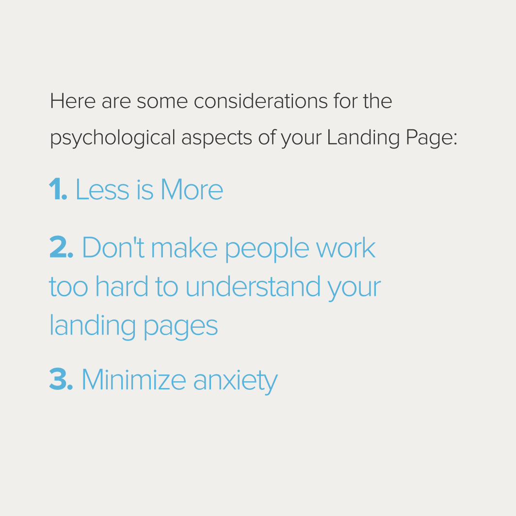
1. Less is More
3. Minimize anxiety
2. Don't make people work too hard to understand your landing pages
Here are some considerations for the
psychological aspects of your Landing Page:
Less is More

1. Less is MoreAccording to a 2012 study from Google,
users think simpler sites are more visually
appealing than complicated ones.
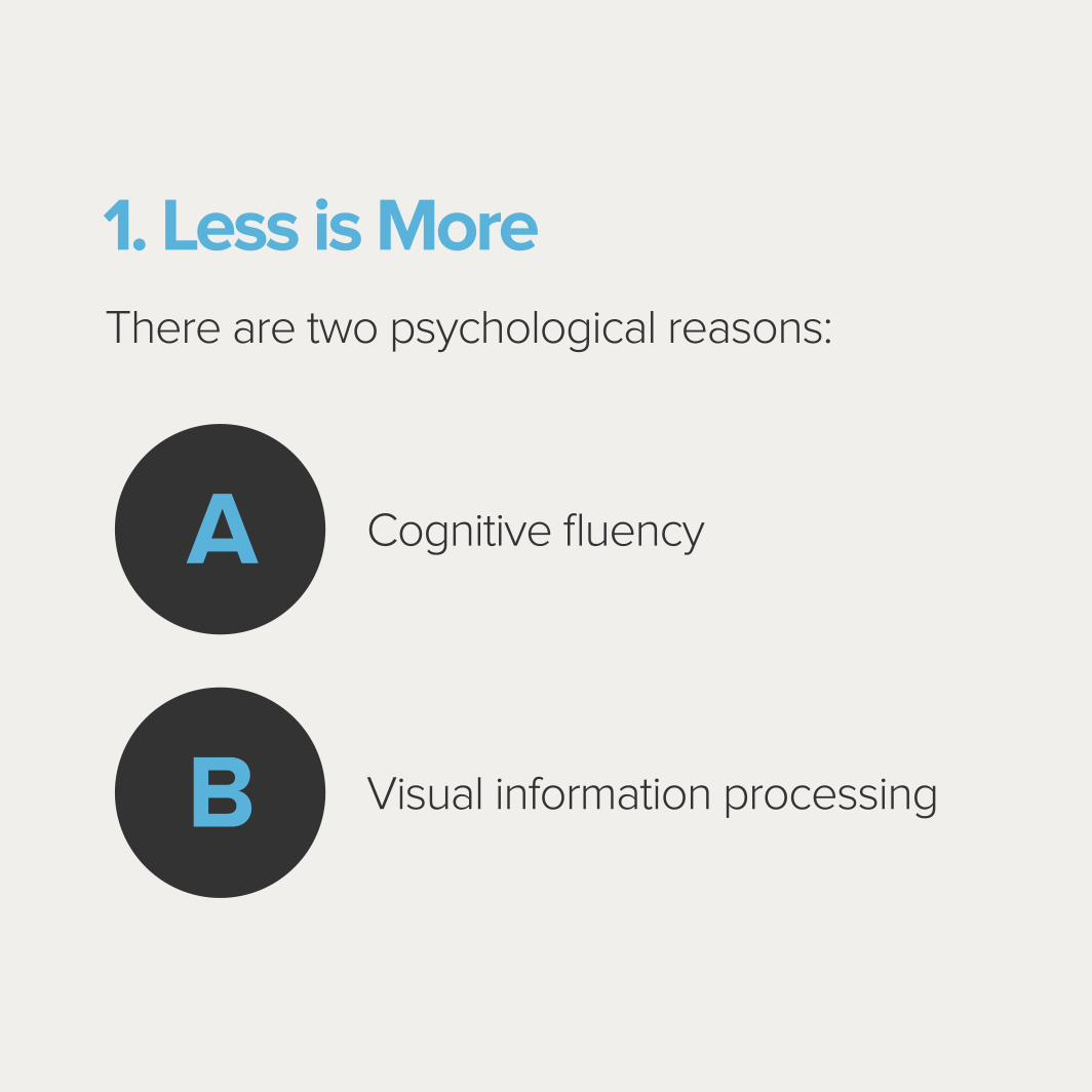
1. Less is More There are two psychological reasons:
Cognitive fluency
Visual information processing
A
B

1. Less is More
Cognitive fluency
People are able to make strong associations with certain colors because the
brain establishes cognitive fluency. It's easier to quickly process information
on a Landing Page that acts as a prototype because it's familiar. Cognitive
fluency occurs when you're exposed to something similar repeatedly.
The brain tends to prefer the familiar. Many Landing Pages share the same
elements, and stepping outside of this can confuse users and lead to
lower conversion rates.

1. Less is More
Visual information processing
To evoke cognitive fluency in your visitors, your Landing Page needs
to be easy to process visually. The article cited a study from Harvard,
which revealed di�erent demographics have varied opinions on
aesthetically appealing Web design, but one factor remained the same:
The more visually complicated a Landing Page was, the less people found
it visually appealing. A simpler layout allows you to impress a wider
audience instead of one specific demographic.

1. Less is More
Why is simple, so much easier to process?
It comes down to the science of how the eye transmits information to
the brain. The retina transforms visual information into electrical impulses
and sends them to the brain, which translates them to perceptions of
colors and light.
1. Less is MoreIf there are more color and light variations on a
landing page, the eyes have to work harder to
turn it into impulses. The brain also has to work
harder to process this information and store
it in the short-term memory.
1. Less is MoreWithout even realizing it, conflicting elements
on your page can cause visitors to reject your
page. Every part of the Landing Page sends
a signal to viewers, so it's important to
understand the basic psychology that goes into
Landing Page design.
“The real trick to conversion rate optimization is communicating the most information with the smallest number of elements”.

Don't Make People Work Too Hard to Understand Your
Landing Pages

2. Don't Make People Work Too Hardto Understand Your Landing Pages
Visitors shouldn't have to play a guessing game
on your Landing Page. It should be immediately
obvious that they are on a landing page,
according to Marketing Land.
2. Don't Make People Work Too Hardto Understand Your Landing Pages
People should be able to quickly to determine
the purpose of the page and the o�er. To
achieve that you need to:
• Quickly communicate the benefits
• Have a specific call to action.
• Use design elements to point visitors in the right direction.
• Make headlines bold.
• Call attention to the most important points in the text.
• Make sure the headline contains strong, clear language.
2. Don't Make People Work Too Hardto Understand Your Landing Pages
People click on a call to action because they
have a desire to learn more or purchase
something. This action is motivated by desire,
and people are curious about what happens
when they follow the CTA.
“The real trick to conversion rate optimization is communicating the most information with the smallest number of elements”.

2. Don't Make People Work Too Hardto Understand Your Landing Pages
To maximize CRO, you need to provide
enough information to compel visitors to click
on the CTA without giving away too much.
Tell them the nature of the o�er, but don't go
into more detail.
2. Don't Make People Work Too Hardto Understand Your Landing Pages
Your landing page needs to speak to customers'
emotions. Use the copy to remind visitors of
their specific pain points. This will make them
want to find a solution to this issue. The most
e�ective landing pages remind visitors that this
pain point exists and o�er a solution.
2. Don't Make People Work Too Hardto Understand Your Landing Pages
“Don't focus too much on how consuming the
problem is because it can be a source of
anxiety, which harms conversion rates.”
Minimize anxiety
3. Minimize anxiety
Anyone with a basic knowledge of psychology
understands anxiety is meant to be avoided.
In Landing Page design, anxiety emerges
when an element in the conversion process
causes a visitor to pause in concern.

3. Minimize anxiety
Anxiety won't make customers rush to the
call to action any faster. In fact, this can be as
harmful as friction, which is when readability
issues on the page interrupt the flow to the CTA.
If you want to maximize conversion rate, you
need to minimize anxiety.

3. Minimize anxiety
Anxiety can come from the layout of the page,
a conflicting color scheme or too much text.
Anything that interferes with the user's
experience can be a source of stress.
3. Minimize anxiety
However, this Landing Page problem is tricky
to understand because approaching it rationally
isn't always the best course of action. Although
anxiety can arise from glaring issues in the
design and layout of your page, it often stems
from less rational elements.
3. Minimize anxiety
Specificity is a great way to combat anxiety.
Leaving room for ambiguity can stress visitors out and cause them not to
convert. You need to consider the message you want the landing page to
convey and include some elements that send this message.
3. Minimize anxiety
For example, if you want to highlight the
quality of your product, include a satisfaction
guarantee. If you want to portray a sense of
reliability, utilize customer testimonials.
However, these features need to be placed
near elements on the page that have the
potential to provoke anxiety

3. Minimize anxiety
All the aspects of your landing pages interact
with each other and send a di�erent message
to visitors. You need to have understand what
subtle signals your pages may be conveying
to improve CRO.
What other elements of
psychology go into
e�ective Web design?


![[MozCon] How Gender and Cultural Differences in Web Psychology Affect the Customer Experience](https://static.documents.pub/doc/80x56/54c7338a4a7959d67c8b461a/mozcon-how-gender-and-cultural-differences-in-web-psychology-affect-the-customer-experience.jpg)


