93
How to create good looking documents? © 2007, Abonyi-Tóth Zsolt Szent István University Faculty of Veterinary Science Budapest
| Date post: | 31-Dec-2015 |
| Category: |
Documents |
| Upload: | sabrina-casey |
| View: | 218 times |
| Download: | 1 times |

How to create good looking documents?
© 2007, Abonyi-Tóth Zsolt
Szent István University
Faculty of Veterinary Science
Budapest
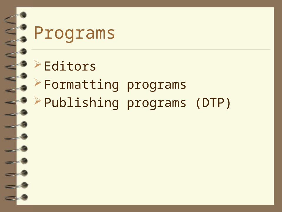
Programs
EditorsFormatting programsPublishing programs (DTP)

Typography
(typos) graven figure (grapho) to write
Typography:– Developing of printed materials– Forming the text, aligning the text and pictures
Typography: developing letters and developing with letters

Point size
Inch based (pica)– 0,352 mm
Didot-Förster – 0,376 mm

Point size
Inch based (pica)– 1 inch = 6 picas = 25,4 mm– 1 pica = 12 points = 4,233 mm– 1 point = 0,352 mm

Point size
Didot-Förster– 1 point = 0,376 mm = point– 4 points = 1,504 mm = diamond– 8 points = 3,008 mm = petit– 10 points = 3,761 mm = garamond– 12 points = 4,513 mm = cicero– ...

Why is it important?
You need a new assistant. Who do you trust?

Who do you trust?
Name: John SmithsPlace of Birth: LondonDate of Birth: 12.09.1978.
Education:Blackwell College, EaswickveterinarianNDA High School
Hobby:swimming
name: John Smiths Place of Birth: LondonDate of Birth: 12..09. 1978Education : Blackwell College,
Easwick veterinarian, NDA High School
Hobby: swimming

Parts of the document
LetterWord SentenceParagraphChapterDocument

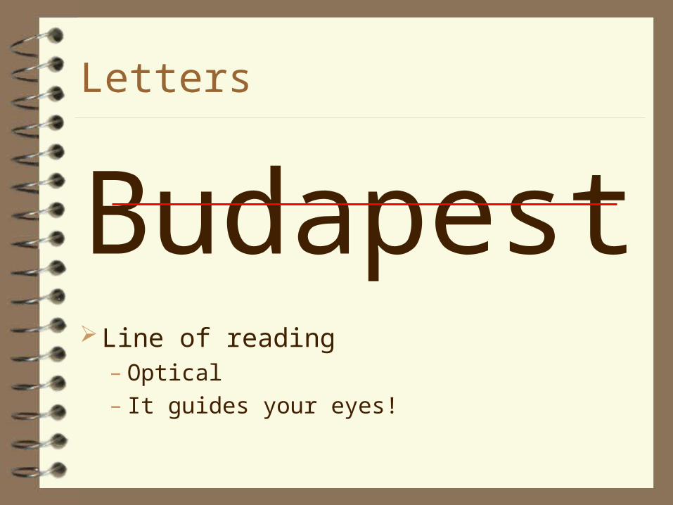
Letters
BudapestBase line
– Optical
Letters
BudapestLine of reading
– Optical– It guides your eyes!

Letters
Budapest Font size
– more 10-20% place between rows• Less space is confusing (you miss the rows)
• More space is a wastage, and breaks the train of thought
Letters
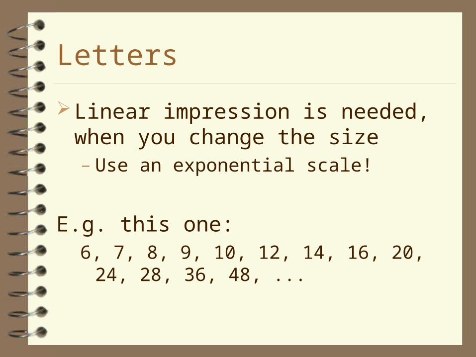
Linear impression is needed, when you change the size– Use an exponential scale!
E.g. this one:6, 7, 8, 9, 10, 12, 14, 16, 20, 24, 28, 36, 48, ...

Letters
Traditional font size:– 8-10 in newspaper– 10-12 in books
– (12 with A/4 paper size)
Letters
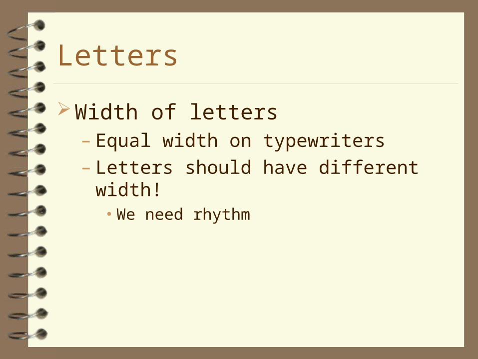
Width of letters– Equal width on typewriters– Letters should have different width!
• We need rhythm

Letters
Font type: letters have been developed by the same graphical idea
The needs:– Easy to read– Nice shape– Own, special looking

Letters
The needs of easy reading:– The looking should be uniform, but the letters
must be easy to distinguish– The picture of words should be good-looking– The shape of the letters should produce a good
rhythm of lines• DON’T WRITE WITH UPPERCASE LETTERS!
Letters
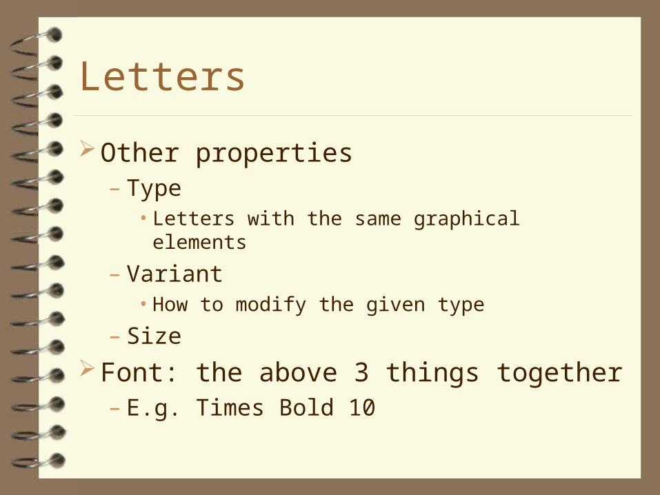
Other properties– Type
• Letters with the same graphical elements
– Variant• How to modify the given type
– Size
Font: the above 3 things together– E.g. Times Bold 10
Letters
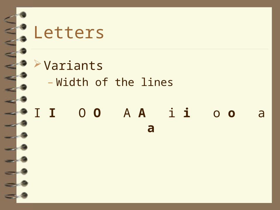
Variants– Width of the lines
I I O O A A i i o o a a
Letters
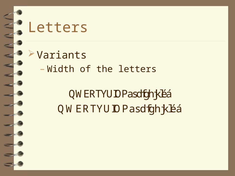
Variants– Width of the letters
QWERTYUIOPasdfghjkléá QWERTYUIOPasdfghjkléá

Letters
Variants– Italic
• Letters may become unreadable
• Oblique (cursive), if it has been developed separately
QWERTYUIOPasdfghjkléá QWERTYUIOPasdfghjkléá

Letters
Variants– Small capitals
• The shape of the letters is uppercase
• Wrong line width transforming by the computer!
QWERTYUIOPasdfghjkléáQWERTYUIOPasdfghjkléá

Letters
Special effectsHyphenation and dash is not the same!
- – .
n-dash with space, orm-dash without space

Letters
KerningSometimes we should to move letters to create a
uniform spot-effect
.
Letters
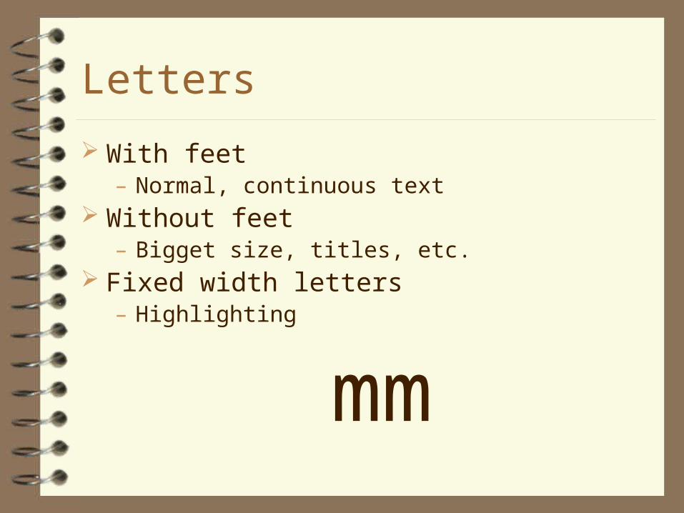
With feet– Normal, continuous text
Without feet– Bigget size, titles, etc.
Fixed width letters– Highlighting
mm

Do we read letters or words?
Veetrinarnais paly a mjoar rloe in the halethcrae of ptes, lviseoctk, and zoo, spronitg, and loabarrtoy amnalis. Smoe veeritniarans use tiher silkls to ptocert hmunas aagnist disseaes cierrad by amanils.

Letters
Renaissance types– Varied lines – Simulate quill-pen– Feet– Axle is not vertical
• E.g. Gaudy, Garamond

Letters
Baroque types– Bigger difference between the width of the
lines– Axes are nearly vertical
• E.g. Times, Plantin, Baskerville

Letters
„Classical” types– Don’t follow handwriting– Light feet– Very different line widths– Thin horizontal, thick vertical lines– Axes nearly vertical
• E.g. Bodoni, Walbaum, Primous


Letters
Linear with feet (Egyptienne)– Line widths are nearly the same– The end of the lines are angled– Axes are vertical
• E.g. Memphis, Figaro, Courier New

Letters
Clarendon (newspaper)– Uniform line width– The end of the lines are angled– Axes are vertical
• E.g. Clarendon, Volta


Letters
Grotesque (linear without feet)– Exactly the same line widths– Regular development (geometrical forms)– No feet
• E.g. Helvetia, Futura, Reform, Univerz, Arial


Letters
Handwriting– Simulates handwriting– Movement in lines, in the connection between
letters– Don’t use for long text! Hard to read!
• E.g. Ariston, Signal, Slogan


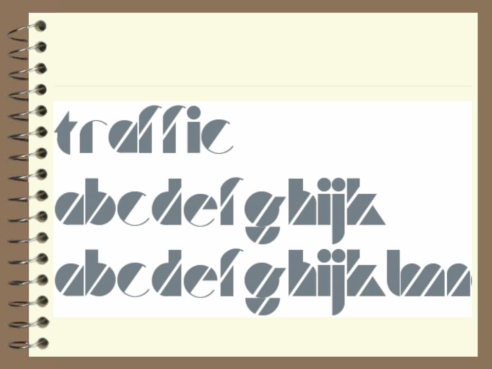
Letters
Decorative types (advertisement, decoration)– Not easy to read– Unusual form
• E.g. Broadway, Stencil, Uncial


Letters
Other types– Everything else
• E.g. black letters, Russian and Greek letters


Letters
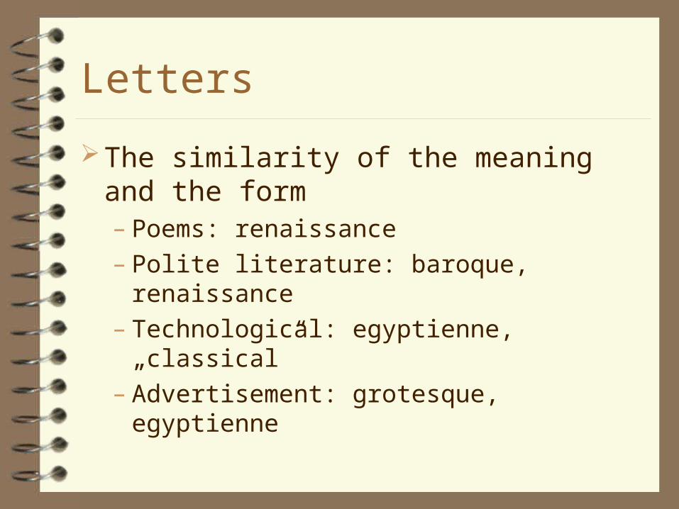
The similarity of the meaning and the form– Poems: renaissance– Polite literature: baroque, renaissance– Technological: egyptienne, „classical” – Advertisement: grotesque, egyptienne

Rules of typography
Don’t use several font types, it suggests unstability
Small difference is no difference, only „dramatic” changes are acceptable
Few text on big surface: dependable, worthy of note

Rules of typographySpaces: the same size in the same lineToo big spaces brake the textDon’t allow „channels” I n e x p a n d e d t e x t spaces should be
expanded also space between letters < space < space
between paragraphs < margin size

Rules of typography
Hyphenation– Not more than 4 consecutive hyphenations or
signs at the end of the lines– Minimum 3 letters together– Compound words at the composition
Check grammar– Algorithm + exception dictionary
Rules of typography
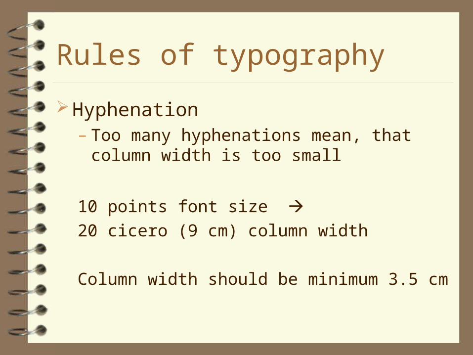
Hyphenation– Too many hyphenations mean, that column
width is too small
10 points font size 20 cicero (9 cm) column width
Column width should be minimum 3.5 cm

Highlighting
A light highlighting (cursive) A s t r o n g e r highlighting (expanded) More STRONGER highlighting (small capitals) A STRONG highlighting (all capitals) Very strong highlighting (bold)
Others: Unuseful, UnofficialUnofficial, UnofficialUnofficial
Drop Caps
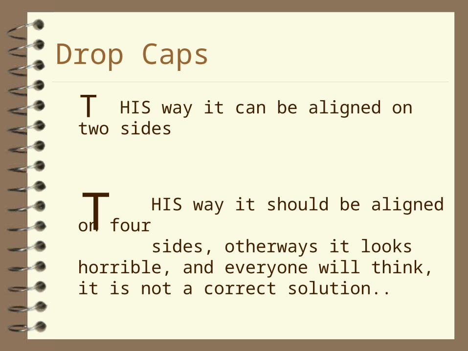
HIS way it can be aligned on two sides
HIS way it should be aligned on four sides, otherways it looks horrible, and everyone will think, it is not a correct solution..
T
T

Drop Caps
If you start one chapter that way, do the same with all chapters
Connect it to the first word: move closer or use small capitals
Use the second way (previous slide) if it was higher than two lines
The top of the Drop Caps shouldn’t below the top of the first line

Be careful
Don’t use handwriting and capital lettersDon’t expand coursive handwritingDon’t use light Drop Caps with dark fontsDon’t type ‘dot’ at the end of titlesDark text on dark background: max. 30%Light text on dark background: min. 50%White paper: no light text

Parts of the document
LettersWords SentencesParagraphsChaptersDocument

How to type
There is no space between the words and the following signs!– Exception: opening braces

Parts of the document
LettersWords SentencesParagraphsChaptersDocument

Paragraph
The set of sentences about the same topic.
Paragraphs
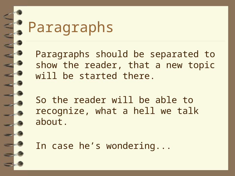
Paragraphs should be separated to show the reader, that a new topic will be started there.
So the reader will be able to recognize, what a hell we talk about.
In case he’s wondering...

Paragraphs
Paragraphs should be separated to show the reader, that a new topic will be started there.
So the reader will be able to recognize, what a hell we talk about.
In case he’s wondering...

Indentation is usually 2 or 3 times the font size
All indentations should have the same size in the document, independently of different font sizes

Paragraphs
Indent (list)
– 1 kg bred– 0,5 kg sugar– 10 apples– 1 bottle of milk

Paragraphs
Numbered list
1. Britney Spears
2. Prodigy
3. Modern Talking
4. Metallica
– Correct form: 1. a)• (might be different in different languages)

To highlight longer text
Align to the centerLeft and right indentationLeft indentationSummary: bold (bigger)

IMPORTANT
ENTER means the end of the paragraph only. Never use to start a new line only!
Tabulator, space should not be used for indentation!

Parts of the document
LettersWords SentencesParagraphsChaptersDocument

Chapters
Chapters separate the document by subjects. It is important to give the same looking to the chapters.

Titles
If the document could be separated to smaller parts, titles and subtitles should be used.
Highlighting usually with size and alignment Visible contrast between title and regular text Don’t align to center a coursive line (the whole
page seems to be turned) Decimal numbering in scientific documents

Titles
No more space below the titles than above them
Title should be on the same page as the text below
In case of two-line titles don’t use very similar or very different line width
For more-line titles use the rules on next slide for every three lines
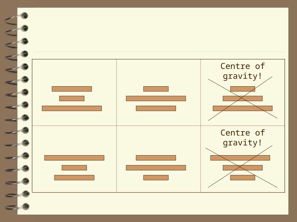
Centre of gravity!
Centre of gravity!

Picture titles
It should be different from regular textSame size or smallerClose to the pictureUsually the coursive or smaller and bold
variant of regular letters

Orphan and widow control
Last page should contain min. four linesNo single line on the bottom of pageNo first line of a paragraph above a pictureNo last line of paragraph on the top of a
page or below a pictureOne or two lines should not be separated

Parts of the document
LettersWords SentencesParagraphsChaptersDocument
Alignment
Free alignment– One side or the middle of the lines are closed.
Justified alignment– Both sides of the lines are closed (to a vertical
line)
Symmetry
Symmetry: calm, balanced lookingAsymmetric: more freedom, but hard to
determine the place of the axis. Dinamical, lively looking.

Spots
The most important parts should be the most conspicuous
White areas are also important – the negative should also be harmonical

Contrast
Makes the document lively and good for the eyes Avoid minor changes in size Details are more visible on big pictures. They
seem to be bigger if they had a smaller picture in the neighborhood size is relative
Portrait and landscape pictures Rounded and angular Dark and bright

Balance
Dark asymmetrical spot breaks the balance find a counterpoint

Geometrical and optical centre
Raise what you want to see in the middleBottom margin should be bigger than top
margin

Two-sided documents
Symmetry (mirror margins)

The order of reading
1 3 5
2 4 6

The order of reading
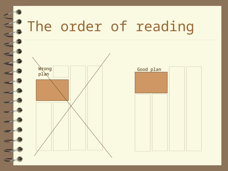
The order of reading
Wrong plan
Good plan
Columns
Not more than 60-70 letters in one lineSeparator line between columns if they
contain different articles

Paper size
A0 - 1m2 – Ratio of sides 1:2– 841x1189 mm– A1 – fold it in half– A2 – fold it in half again– …– A4 210x297 mm

Paper size
B0– Ratio of sides 1:2– 1000x1414 mm– B1 – fold it in half– B2 – fold it in half again– …– B5 ‘írólap’ in Hungarian shops

Paper size
C0 – The envelope for A-size– Ratio of sides 1:2– 917x1297 mm

Mirror
Inner margin
Outer margin
Outer margin
Bottom margin
Top margin
1 2
1,5
2,5-3
Mirror
Should be the same in the whole document

Diplom work
Chapters Heading Highlighting Pictures, picture titles Title page Bibliography Table of contents


