Identifying Web Usability Criteria: The 'Scanmic' Model
Shahizan Hassan and Feng Li
Research Paper No. 2001/3Shahizan Hassan is a Phd candidate and Dr Feng Li a Senior Lecturer at the Management ScienceDepartment, Strathclyde Business School, Glasgow, Scotland.
AbstractEvaluation is very important both during the web site development process and after a web site hasbeen published. However, web designers often face problems in identifying the appropriate criteria forevaluation purposes. Despite the growing number of guidelines and other literature on web design andevaluation, each of them varies in terms of quality, coverage, and suitability; and not all criteria can beeasily measured especially those that are subjective and difficult to control. The main purpose of thispaper is to illustrate the process of identifying web usability criteria from the content analysis ofcurrent literature on web design and development. The results of the study include a comprehensivelist of the identified criteria, which are grouped into 7 categories - screen design, content,accessibility, navigation, media use, interactivity and consistency. The paper ends with a discussionon the main issues which emerged from this study and its limitations.
Research NewsJoin our email list to receive details of when new research papers are published and the quarterlydepartmental newsletter. To subscribe send a blank email to [email protected].
Details of our research papers can be found at www.mansci.strath.ac.uk/papers.html.Management Science, University of Strathclyde, Graham Hills Building, 40 George Street, Glasgow,Scotland. Email: [email protected] Tel: +44 (0)141 548 3613 Fax: +44 (0)141 552 6686
2
Introduction
Web usability is one of the important factors that determine the success of a web site of any
type. It is related to the design aspects of web pages that make sense to people who use them.
It not only allows surfers to navigate easily and conveniently but also helps them find the
information they wanted within a particular web site. Various studies show that web usability
problems has caused firms a lot of money as well as potential customers. Rowland’s study
(Rowland, 2000 March 10), for example, reveals that an online clothing retailer in the United
Kingdom suffers huge losses due to low number of site visitors, despite spending millions on
advertising. As a result, the company announces job cuts and huge price reductions. Another
example is a study by Zona Research (Seminerio, 1998 September 10), which conducts a
survey on 239 long-time Internet users’ behaviour while shopping on-line. From this study,
one in three experienced users finds online shopping difficult and 62 per cent of the
participants has given up looking for a specific product online.
This argument highlights the need for designers and web developers to put some effort and
money on improving the usability of their web sites. This involves among other things,
evaluating key aspects of web design that affect usability. Assessing web usability is not as
easy as one would predict. In order to do the evaluation work, designers should consider a lot
of things including the criteria to be used for the evaluation. This is where the problem might
arise. Although there are abundance of web design guides and usability literature where
designers and evaluators can refer to, each of them varies in terms of coverage, clarity,
suitability, quality and comprehensiveness. With this in mind, this paper attempts to address
the key criteria of web design that affect the usability of web sites with the following
objectives:
a) identify the generic criteria of web usability
b) classify the criteria into group of factors
c) differentiate between objective and subjective criteria
3
Methodology
Content analysis is used as a tool to analyse various literatures on web usability mainly web
design guides currently available online. Several guides are selected as well as articles in
journals and texts books, some of which are listed in the bibliography section. The content
analysis in this study involves 5 steps: first, decide what to analyse, second, decide on the
level of analysis, third, decide whether to code for existence or frequency of concept, fourth,
code the text, and finally, analyse the results.
Step 1: decide what to analyse
The researcher decides to analyse the selected text that are relevant to web usability. The
main objective is to identify as many as possible the web usability criteria within the text.
However, the criteria that are too technical will be excluded to allow both technical and non-
technical people to use them in web evaluation, for example, ‘the frame rate for animation
clip should be no more than 15fps’.
Step 2: decide the level of analysis
Since different authors use different writing styles in conveying information, the researcher
decides to code for sets of words rather than single words. The main objective of the analysis
is to discover web usability criteria, which normally need more than one word for one
particular criterion. For example, ‘contrast use of colour for background and foreground’ (8
words), ‘simple language’ (2 words), and ‘the availability of list of contents’ (6 words).
Step 3: decide whether to code for existence or frequency of concept
In this analysis, the researcher chooses to code for concept existence, not concept frequency.
This means that any usability criteria identified within the text will be coded only once. This
also applies to two or more sets of words that carry the same meaning, where only one code
will be used. For example, the criteria ‘use short paragraph’ has the same meaning as ‘the
number of sentences within a paragraph should be no more than 6’, hence only the former
will be coded.
4
Step 4: code the text
The coding process is done manually and not by the computer programs. Manual coding is
more practical because the computer program could not identify different phrases or sets of
words that carry the same meanings. The coding process involves readings through the text
and writing down phrases or sets of words that relate to web usability criteria.
Step 5: analyse the results
This is the final step and the most difficult one. From the list of criteria that has been finalised
in step 4, the researcher analyses each of them and classify them into groups of factors. From
the literature review, which will be discussed later, there are at least seven main factors of
web usability. Hence, this final step mainly involves placing each criteria into the right
category of factors. For example, ‘up-to-date links’ is categorised under the group
‘navigation’, which is one of the main factors of web usability. After all criteria have been
categorised accordingly, the next stage is to differentiate between objective and subjective
criteria.
Factors Determining Web Usability – A Critical Review of Literature
Gathering from various literatures on web design and usability, the researcher has identified
many criteria of web usability. These criteria are then clustered into seven main factors,
abbreviated by the researcher as SCANMIC. These factors are as follows;
Figure 1: Seven factors that determine the usability of web sites (these factors are far from
exhaustive as there might also be other factors involved).
1. Screen design
2. Content
3. Accessibility
4. Navigation
5. Media use
6. Interactivity
7. Consistency
Web Site USABILITY
5
a) Screen design
In her article ‘Effective Electronic Materials’, Shirley (1999) divides screen design or layout
into 3 categories, space provision, choice of colour, and readability. All of these are briefly
described below;
Space provision
This refers to proper allocation of space for functions and content display provided in a web
page to help users focusing their attention.
Choice of colour
Proper use of colour not only attracts users to visit a web site but also improves learnability
and ease of use. In contrast, improper use of colour may degrade usability and thus hinders a
first time visitor to revisit a web site. Proper use of colour is emphasised in almost all design
guides.
Readability
One of the main objectives of a web site is to provide a readable content. This is not easy to
be achieved. The reason is that reading from a computer screen is different from reading from
a paper. Therefore, if a designer were writing for a web page by using a conventional paper
writing format, the page could be a failure. Nielsen (1997a, March) argues that users read 25
per cent slower from a computer screen than a paper.
Readability is related mostly to choice of fonts and text. Hypermedic.Com (1998, July 14),
outlines a detail discussion about typography on the web. Issues on type of fonts, leading and
legibility, page appearance, word and letter spacing, and typographic colour are explained.
However, this guide, as also found in other design guides, fails to clearly argue the difference
between san serif and serif fonts in improving readability. Furthermore, the issue of culture,
age difference, and environment within which the application is being used that might affect
the preference for fonts and text are not specified. To complicate the matter, the issue of
readability can be very subjective. A readable text for one person might not necessarily be the
case for others.
Unlike most Web Design Guides, Shirley does not include scannability issue in her screen
design guide. Designers should not only design for readability but also for scannability.
6
Basically, scannability is indirectly associated with readability. Based on their on-going
research on usability, Morkes and Nielsen (1998) states:
“as users find it difficult to read large volumes of information on screen, they prefer to scan
text and pick out keywords, sentences, and paragraph of interest while skipping others, which
are not related to their interest. In other words, users always skim rather than read web
documents”.
b) Content
The question of what should be on a web page depends largely on the goals of the web site.
Some intend to sell products and service, some offer free entertainment, some provide
government information and so on. However, one should bear in mind that providing content
in a web page is not as easy as providing a printed page in a book. Yet, a designer should not
run away from the basic elements of a document to ensure a web site's usefulness.
In their 'Web Design Guide', Lynch and Horton (1999) outlines four basic elements of a
document which are not complicated, and have almost nothing to do with Internet
technology: who, what, when, and where.
Who
The first basic element is the question of "Who is speaking?" or "who is speaking this to
me?" if we put it in users' perspective. This question is very important because it will
determine the owner or originator of a web site. People are looking for information that is
reliable and being originated by those whom they can trust. Therefore, a designer must tell
the users who initiate a web site, be it an individual, an institution, a company or any other
organisation.
What
This is the second basic element that refers to the question of "what is a web site offering?".
One thing for certain is that users will not browse a web site without knowing what the site is
offering. They must have some kind of ideas of what to browse. In relation to this, every web
page should have a proper title to capture reader's attention. The document title is often the
first thing browsers of World Wide Web documents see as the page comes up. Additionally,
7
the page title will become the text of a browser "bookmark" if the user chooses to add his or
her page to their list of URLs.
After title, come other important things that include list of contents a web site is offering.
This can be presented in a lot of ways such as icons and bulleted list. The list in the main
page will give ideas to users of several different categories of information a site is about to
present.
When
This third element highlights the need of currency or timeliness of an information in a web
page. No doubt that timeliness is an important element in evaluating the worth of a document.
Frequent users will look for the date the information is updated. This is not uncommon as
people are reading up-to-date newspapers, magazines and articles. One must remember that
the aim of a web site is not only to attract first time surfers but also frequent users.
Where
The final element is 'Where' that relates to the need to inform users on the whereabouts of
servers they are browsing from. The Web is the place where surfers virtually travel all around
the world. Several keystrokes by a user will give connections to servers located in different
countries. One moment a user is connected to a server in New York, minutes later, he or she
travels to Tokyo. Hence, users should be informed about the country of origin or location of a
web server.
Despite lengthy explanation on how to design good content, Lynch and Horton do not clearly
emphasise the question of “what to publish?”. Apart from title and list of contents, the actual
contents and text should also be discussed because they represent the main attraction of web
surfers.
Potomac Knowledgeway Web Design Guide(2000) highlights the need for relevant, useful,
interesting, up-to-date and accurate information. Whereas, Comber(1996, November) discuss
the importance of short page titles, meaningful headings and signed pages. Mounty(1999,
May) also includes other elements of good content such as appropriate breadth and depth,
challenging and content that evokes emotion.
8
One thing for certain here is that some elements described above are absolute and some are
relative. Up-to-date information for example is crystal clear in its meaning. However, other
elements, for example, valuable content is very subjective and they depend on the goals of
users. For example, a user looking for a downloadable audio clip of a song might not consider
the song’s lyric as useful.
c) Accessibility
One of the goals of having a web site is to attract visitors as many as possible from various
locations. The basic way to achieve this is to ensure that the site is accessible to target users.
By the word 'accessible', it means that users would not only be able to get connection to a
web site but also able to browse all contents available. The higher the degree of accessibility,
the higher the level of usability.
Benjamin (1996, August 29) advises web site developer to take into consideration different
Personal Computer(PC) platform, network connection, browsers, and browser versions in
their design process. There are three elements of accessibility: loading time, browser
compatibility, and search facility.
Loading Time
Loading time is the time it takes for a network PC to download data and files from a server.
In a much simpler word, it refers to how long users have to wait for a browser to download
data and files from a web server. Logically, users could not tolerate long loading time.
Nielsen says,
“web users are impatient: they want to get their answers immediately and do not want to be
slowed down by cool features, mission statements, or self-promoting grandstanding”.
(Nielsen, 1997b, December)
Yale Style Manual (1999) ranks ‘design for speed’ as top priority by stating that the threshold
of frustration for most computing tasks is around 10 seconds. Loading time is something that
cannot be avoided by users and therefore design for speed should be one of the objectives in
any web site development.
9
Browser compatibility
As suggested by CNET Builder Web Design Guide and several others, designers should also
consider different browsers used by surfers across the world. Additionally, although users
might use two popular browsers of Microsoft Internet Explorer and Netscape Navigator, the
browsers might differ in terms of their product versions. If a user has lower browser version,
he or she might not be able to view certain graphics and java applets applications.
Search facility
Search facility has become of a necessity for a web site of a larger size. Providing this facility
will speed up users search for information in a web site. One of studies run by Nielsen in the
Sunsoft usability laboratories in 1994 found that search facility is highly recommended by the
participants (Nielsen, 1997c).
d) Navigation
Some people believe that the best site contains lots of graphics, animation, and colours.
However, not many realise that the basic of an effective web site is its navigability. In her
'Designing Electronic Material' article, Parker (1999, November) states that good navigation
in a Web site is comparable to a good road map. With good navigation, users know where
they are, where they’ve been, and where they can go from their current position. In short,
navigation is the key to making the experience enjoyable and efficient.
CNET Builder Web Design Guide (Benjamin, 1999, August 29) outlines several elements of
good web navigation including logical tree-like structure, limited list of contents or menu (not
more than 7), limited number of linkages to the desired content (not more than 5) and
navigational tools in all pages. Apart from these, other elements such as summary screen,
button or text bar for “PREVIOUS”, “NEXT” and “MAIN MENU” and unbroken links are
suggested by Yale Style Manual (1999). While Comber (1996, November), highlights the
need for meaningful link names, index of pages of topics and contextual links.
While these guides are general in nature, the applicability of the navigation elements depends
on many factors including user environment, user experience, technology platform, and
culture.
10
e) Consistency
There is an element of 'fear of the unknown' when users visit a web site for the first time.
Although they might be familiar with the browser and hypertext application environment, the
design of a web site is different from others. Some web sites might put the menu bar at the
top of screen, while others might use a horizontal hypertext button at bottom of the screen.
Some web sites prefer using frames to divide functional areas while others merely use colour
boxes. Therefore, there will always be some elements of unfamiliarity on behalf of users
when the visit a web site for the first time. In considering this, design consistency is
important to speed up user's learning.
Yale Web Style Manual (1999) provides good insights on web design consistency. The guide
suggests designers to provide consistent layout for title, subtitle, page footers, background,
and navigation links and icons in terms of colour, size, space and fonts used.
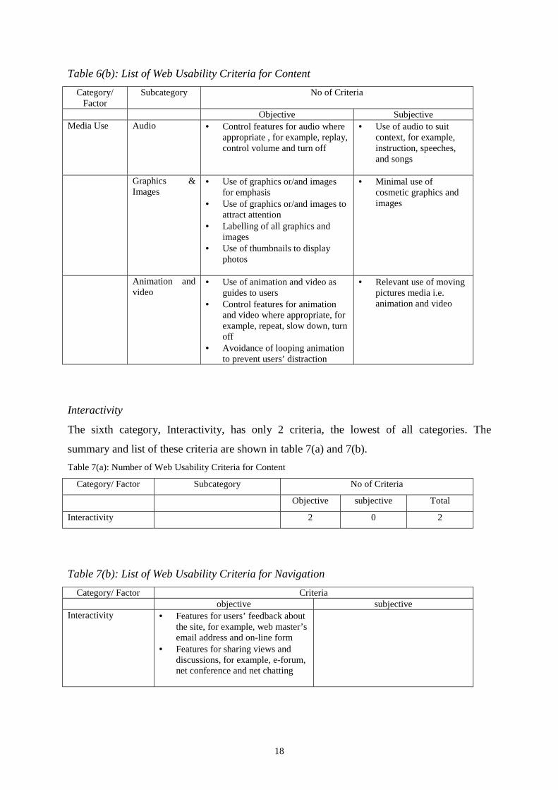
f) Interactivity
Interactivity is a broad term and can be misleading. However, the researcher is referring this
word to features in a web site that facilitate a two-way communication between users and site
owners or other pre-assigned personnel. Additionally, the features allow users to give
feedback and comments on any issues raised by the web site. The introduction of the
interactivity features such as email, guess book, on-line forms and net conference might
enhance a web site's worthiness.
However, most web design guides such as NETBuilder, Yale Style Manual, and WCA do not
have a good coverage on this factor. They only emphasise the need for web sites to use
interactive elements such as online-forms and email for feedback purposes only. Yet,
interactivity should be considered among the most important factor that contribute towards a
highly usable web sites.
g) Media use
The use of media such as graphics, images, animation and audio in web pages distinguishes it
from information presentation on papers. Studies on on-line electronic materials have shown
that the integration of this media keeps users attention and, when used effectively, can
enhance usability. However, designers should take extra care when introducing all these
elements as improper use of them may distract users and affect usability. Additionally, heavy
11
utilisation of media elements consumes web site server's hard disk space and lengthens the
downloading time. Web Workshop (1999, July 24) provides a good introduction on how to
properly manage multimedia elements on web. The main multimedia elements are sound,
graphics, images, audio and video.
Sound
Some web sites embed audio as background music, downloadable audio files or on-the-fly
audio clips. Sound may also be used in conjunction with animation or video. As with colour,
sound can help improve or degrade usability.
Graphics and Images
There are things that cannot be described by words and thus the use of graphics and images is
very helpful. Furthermore in certain cases, graphics are used to emphasise text. As the saying
goes: "A picture is worth a thousand words." But that’s only true if the picture is right.
Animation and Video
The use of animation is normally for drawing the attention of users or assisting with
understanding by demonstration. But, heavy use of animation causes long downloading time
and use up web servers' disk space. Political web sites should also utilise the benefit of
multimedia elements. Graphics could be used for banners, logo, charts, and menu icons,
audio clips could be used for speeches of political leaders and video could be used for
political forum or discussions.
Main Findings
There are 68 criteria of web usability identified in this study. From this figure, 54 of them are
considered objective criteria and the remaining 14 are subjective. These criteria are group
into 7 SCANMIC categories summarised in table 1.
12
Table 1: Number of Web Usability Criteria of SCANMIC Factors
Category/ SCANMIC Factors No of Criteria
Objective subjective total
Screen Design 13 3 16
Content 18 5 23
Accessibility 5 1 6
Navigation 6 2 8
Media use 7 3 10
Interactivity 2 0 2
Consistency 3 0 3
Total 54 14 68
Screen Design
The first category, Screen Design, is divided into 4 sub-categories: Space allocation, Choice
of colour, Readability and Scannability. There are 16 criteria in Screen Design, out of which
13 are objective and only 3 are subjective. The summary and list of these criteria are
presented in Table 2(a) and 2(b) respectively.
Table 2(a): Number of Web Usability Criteria for screen Design
Category/ Factor Subcategory No of Criteria
Objective Subjective Total
Screen Design Space allocation 2 1 3
Choice of colour 4 1 5
Readability 3 1 4
Scannability 4 0 4
Total 13 3 16
13
Table 2(b): List of Web Usability Criteria for screen Design
Category/Factor
Subcategory No of Criteria
Objective SubjectiveScreenDesign
Spaceallocation
• Position of menu/ list of contents onscreen (left or right hand site of thescreen)
• Location of menu bar/ tools bar/navigation bar (at the top or bottom of thescreen)
• Proper allocation of screenspaces for content display,menu bar, list of contents,and advertisement
Choice ofcolour
• Sharp colour contrast between backgroundand foreground
• Use of colour to differentiate functionalarea (e.g. tool bar, menu bar and list ofcontents) with content display area
• Use of conservative colour• Use of light colour (white/yellow) colour
for background
• Minimal use of colourexcept for photos andgraphics
Readability • Use a mixture of upper and lower case fortext
• Use of all capital letters for captions andlabels
• Different text sizes to differentiatebetween titles, headings and texts
• Use of fonts that are easyto read
Scannability • Clear titles for each pages• Clear headings, sub headings for text/
document• Short paragraphs (not more than 6
sentences)• Use of typography and skimming layout,
for example, bold fonts and highlightedwords
-
Content
The second category, Content, is divided into 6 sub-categories: Scope, Accuracy, Authority,
Currency, Uniqueness, and Linkages. There are 23 criteria in Content, the highest of all
categories, where 13 of them are objective and only 3 are subjective. The summary and list of
these criteria are shown in table 3(a) and 3(b) respectively.
14
Table 3(a): Number of Web Usability Criteria for Content
Category/ Factor Subcategory No of Criteria
Objective subjective total
Content Scope 3 3 6
Accuracy 0 2 2
Authority 4 0 4
Currency 2 0 2
Uniqueness 6 0 6
Linkages 3 0 3
Total 18 5 23
15
Table 3(b) : List of Web Usability Criteria for Content
Category/Factor
Subcategory No of Criteria
Objective SubjectiveContent Scope • Suitable language for audience
• Publication and press release• Archive of previously published
materials
• Breadth of subjectcoverage
• Depth of subjectcoverage
• Intrinsic value ofinformation
Accuracy • High quality writing, forexample, good grammarand no spelling andtypographical error