Page 1
1
IIT Bombay – PoCRA MoU III
Phase III Delivery Report
Part B – Contingency and Dashboard
IIT Bombay
August 2020
Table of Contents
1. Development of Scale-Analysis-Trigger-Action Framework for Contingency Planning 2
2. Phase-3 Delivery report on GIS-Dashboard development status 17
Page 2
2
Development of Scale-Analysis-Trigger-
Action Framework for Contingency
Planning
Prepared By
Shubhada Sali
Supported By
Vidyadhar Konde, Sharad Kumar, Vishal Dubey, Hemant Belsare
Reviewed By
Prof. Milind Sohoni
Dated 09th August 2020
Page 3
3
Table of Contents 1. Introduction 4
2. SATA Framework 4
3. Sample Contingencies 7
4. AWS missing data issue for intermittent skymet circles 12
5. Conclusion and Future Work 13
Table of Tables Table 1 Example Datasets 4
Table 2 Sample Contingencies 7
Table 3 Plot Table 14
Table 4 Crop details 14
Table 5 Visits Table 15
Table of Figures Figure 1 SATA Framework and Tasks Overview 5
Figure 2 Sample weather scenarios for Contingency by TNAU 6
Figure 3 Entity Relationship Diagram for Datasets on SATA Framework 6
Figure 4 soybean FFS plots 2020 8
Figure 5 Cotton FFS Plots 2020 8
Figure 6 FFS plots with week of sowing 2020 9
Figure 7 GW deficit daily model to monitor cumulative contingency 10
Figure 7 Total rainfall during harvesting stage of crop - soybean 2019 (last 15 days in crop duration)10
Figure 8 Graphs showing total rainfall in various stages of crop 10
Figure 9 Temperature related contingency – daily resolution 11
Figure 10 – GW-Deficit daily model – to monitor cumulative contingency 11
Figure 11 Intermittent no data issues 12
Figure 12 June 2020 Comparative Rainfall maps after analysis and correction 12
Page 4
4
1. Introduction
This is a report of the C1-C3 components of MoU-III. The main objectives were to develop a
prototype framework for the development of an IT framework which would (i) present planning,
weather and other data sets in an integrated manner, and (ii) enable experts to contribute to the
development of advisories.
Towards this, a Scale-Analysis-Trigger-Action (SATA) Framework was developed for
contingency planning purpose through PoCRA IITB - MoU III. This framework mainly caters to
the development of an integrated database environment suitable for overlay of contingencies,
which can be visualized on map and delivered in the form of advisories. For this, contingencies
are to be listed by their geographical scale, temporal conditions which define the contingency, the
response and the actions which are required.
The SATA framework allows us to integrate various models, their inputs and outputs which
operate at different spatial and temporal scales. A requirement of the framework is to allow various
data-sets to be available to experts to formulate triggers. These data-sets are weather-related, field
and farmer data such as crops chosen, sowing date, phenological conditions, infrastructure related,
such as wells or percolation tanks in the vicinity, and finally, crop-water model data such as soil
moisture, run-off etc. This is summarized in Table 1.
Table 1 Example Datasets
Dataset Name Spatial scale Temporal
scale
Attributes
FFS Selected
locations
Monthly Distribution, crop data, phenology
AWS Circle Hourly Weather – Rain, Temperature,
Windspeed, Humidity
Weather Forecast District 5 days ?
MLP Village Quarterly Engg. infrastructure, cropping pattern
Crop-Water Point-level Hourly AET, Crop PET, Soil Moisture.
Geomorphology Extensive Fixed Soil type, depth, slope
2. SATA Framework This framework mainly consists of four main activities as follows –
Page 5
5
1. Scale: This phase involves database infrastructure development which forms the basic building block for
contingency. There are various input datasets available with the project which must be studied and arranged
in a way so as to enable analysis for contingency formulation.
Figure 1 SATA Framework and Tasks Overview
Scale – Analysis phase is the IT part which involves preparation of a backend database. This has been done
for MLP, AWS, Geomorphology and crop water datasets. The FFS database gathering is in process. New
datasets like weather forecast, contingency scenarios lookups etc will be added to this when available.
2. Analysis: This phase involves spatial and temporal matching of databases to enable implementation of
contingency queries and advisories at selected temporal and spatial scale. Currently the AWS hourly
weather database has been aggregated to daily level to match the crop water model daily temporal
resolution. Spatially the weather and crop water model outputs may be aggregated at village level/AWS
circle level/FFS plot level/ cluster level depending on the spatial resolution of data attributes and selected
scale of contingency in consultation with PMU.
Critical work done in this phase is the setting up of temporal automatic update mechanisms for real time
view on dashboard.
3. Trigger: This phase involves interlinking of the databases to generate queries for selected contingency
scenarios. The scenarios would consist of input conditions on weather, ffs, crop water model or another
database. The occurrence of which will denote presence of contingency. Intermediate tables will be
developed in this phase, which will be useful to display contingencies on dashboard.
Example scenarios as given by TNAU are –
Page 6
6
Figure 2 Sample weather scenarios for Contingency by TNAU
Each of this contingency will be mapped as an indicator showing the project areas affected by it. The
contingency-scenarios are crop based, dependent mainly on weather parameters during various stages of
crop cycle. Such contingency studies have been conducted by CRIDA to develop district level contingency
plans. Other than this, insurance agencies also set triggers for weather-based insurance.
Figure 3 below – shows the entity relationship diagram of various datasets to implement contingency
scenario-based triggers. Till now we have constructed an AWS dataset with its automatic updating
mechanism. The task of incorporating FFS dataset and updated crop water balance using refined hourly
model for contingency purpose is ongoing and will be done in Phase IV. The FFS database was studied and
basic FFS tables - plot table, crop details table, visit table were designed to enable integration into
dashboard. The schemas for these tables are added in appendix 1.
Figure 3 Entity Relationship Diagram for Datasets in SATA Framework
Temp,
Windspeed
Humidity
Page 7
7
4. Action: This phase involves linking actionable advisories for various stakeholders to each of the trigger
scenarios. So that advisories can be delivered in presence of contingency to respective stakeholders. Sample
contingencies are presented in Section 3.
Based on the inputs from experts (SAU’s, KVK’s) the triggers and action advisories in the form of look up
tables may be incorporated into the dashboard through SATA framework for visualizing contingencies by
the PMU.
A prototype IT architecture for SATA framework may be demonstrated with sample contingencies, which
can be extended further.
3. Sample Contingencies Datasets were prepared and analysis was conducted to demonstrate sample contingencies for ground level
data. FFS data was utilized to obtain date of sowing for major crops in the project area and weather dataset
was analysed with linkage to crop stages. Few maps were prepared to show how contingency can be
displayed and identified.
Table 2 Sample Contingencies
Sr.no. Category
Contingency Maps -
cotton/soybean Conditions Scale Data
1 Rainfall
mm of rainfall before
sowing
Total rainfall from
June to sowing date is
shown FFS plots Rainfall+FFS
2 Rainfall
Number of days of dry
spell after 7 days of sowing
consider all dry spell
which occur between
7th to 14th day after
sowing FFS plots Rainfall+FFS
3 Rainfall
longest dry spell during
reproductive stage
Crop stages defined
for soybean/cotton as
per TNAU FFS plots Rainfall+FFS+Crop
4 Rainfall
excess rainfall during
harvesting stage
Excess rainfall
amount trigger needed FFS plots Rainfall+FFS+Crop
5 Rainfall
highest rainfall event in
harvesting stage for selected
crop
Rainfall per day in
mm will be shown FFS plots Rainfall+FFS+Crop
Disease and Pest - Current week
6 Temperature Cotton - kavadi 29 – 30 ° Celsius FFS plots Temperature +FFS
7
Temperature
+ humidity Cotton - Dahiya disease
20 – 30 ° Celsius +
humidity >80% FFS plots
Temperature +
humidity+FFS
8
Temperature
+ humidity Cotton - Karapa disease
30 – 40 ° Celsius +
humidity >85% FFS plots
Temperature +
humidity+FFS
9 Temperature
Soybean – Khodkuj,
Mulkuj
Temperature above 30
° Celsius FFS plots Temperature +FFS
Model – from planning perspective - Cumulative till date
10
Areas with
crop deficit
Model parameters are
shown for cotton and
Crop deficit > GW by
x FFS plots Model
Page 8
8
and low GW
recharge
soybean on the dashboard.
GW recharge/runoff for
main crop in different areas
can be compared with crop
deficit for this.
11
Areas with
crop deficit
and low
runoff
Crop deficit > x and
runoff < 0.5*storage
capacity FFS plots Model+MLP
Sample Maps
1. mm of rainfall before sowing – Soybean
Figure 4 soybean FFS plots 2020 soybean FFS plots 2019
2.mm of rainfall before sowing – Cotton
Figure 5 Cotton FFS lots 2020 Cotton FFS plots 2019
Both plots show that there has been a higher amount of early rainfall in 2020.
Page 9
9
3.FFS plots with week of sowing 2020
Figure 6 FFS plots with week of sowing 2020
This map shows cotton and soybean predominated areas. We can see that cotton has been predominantly
sown in Marathwada region with sowing happening in the first week of June. Similarly soybean sowing
can be seen to happen mainly in the second and third week of June.
3. Total rainfall during harvesting stage of crop - soybean 2019 (last 15 days in crop duration)
Page 10
10
Figure 7 Total rainfall during harvesting stage of crop - soybean 2019 (last 15 days in crop duration)
The map shows considerable areas in the central region of the project receiving 50-100 mm of rainfall.
4. Graphs showing total rainfall in various stages of crop
Figure 8 Graphs showing total rainfall in various stages of crop
These graphs show daily rainfall coloured by crop stages and also show total rainfall during different crop
stages. These maps and graphs show the capability to demonstrate trigger based contingencies on
availability of trigger scenarios – advisory inputs from agriculture experts.
5. Graphs showing temperature variation to monitor related contingencies
Page 11
11
Figure 9 Temperature related contingency – daily resolution
This figure shows daily minimum and maximum temperature during various stages of crop - showing the
conditions for various pest attacks.
6. Model related Contingencies
Figure 10 – GW-Deficit daily model – to monitor cumulative contingency
Seasonal cumulative monitoring of GW- Deficit can be done to map model related contingencies.
Khodkuj – Temp > 30° C
probable conditions
Page 12
12
4. AWS missing data issue for intermittent skymet circles This issue was analysed and it was found that it occurred due to null values obtained for respective skymet
stations from skymet API, while if lower rainfall is seen, that is due to lower rainfall recorded for that
skymet stations. Currently the skymet data is updated on dashboard with 2 day lag and fetched between 5-
6 pm. Still there are missing data issues.
Figure 11 Intermittent no data issues
Steps for analysis and correction of missing data/null values-
1. First 10 nearest skymet stations to each station were located
2. Each skymet station was analysed date wise and the data for dates having null values was replaced with
the data from nearest non-null skymet station.
Following maps show the variation after these correction steps –
Figure 12 June 2020 Comparative Rainfall maps after analysis and correction
It was analysed to see how many circles had missing data issues in last year – 2019 and this year upto
19th July 2020.
Page 13
13
1. 19th July 2020: 59 out of 928 circle
2. for 2019 : 98 out of 948 circles
Solutions required –
1. The weather data for the dashboard was updated in mid July 2020 to find that most of the missing data
issues got resolved. This shows that weather data at skymet side is being updated later as well leading to
such issues. Dashboard needs a fixed update mechanism with decided time of update. Inputs will be
required from PMU to coordinate with Skymet for a time during the day when Skymet data should be
fetched for the dashboard to lower the missing data issue.
2. The lower rainfall recorded is true to the data available through skymet.
5. Conclusion and Future Work The Scale and Analysis phase of SATA framework has been demonstrated and implemented by building
up a database for weather, MLP, model (daily version).The IT architecture for its visualization on dashboard
is ready. Most of the databases are in Postgress/Post-GIS format and are easily viewed by any GIS system.
All maps in this document were prepared by QGIS or other data analytic tools.
The ongoing work includes – integration of FFS database, display of database interlinked indicators to
demonstrate scalable prototype of SATA framework. Sample contingencies based on interlinked indicators
will be incorporated for demonstration in phase IV.
Page 14
14
Appendix I: FFS database Basic Tables
Table 3 Plot Table
Plot
code season_name
Farmer
id
year of
inclusion Latitude Longitude
Census
code District Taluka
Cluster
code
Village
Name
Circle
Name
Farmer
Name Gat_number Plot_area_ha
Soil
type
Table 4 Crop details
Plot
_co
de
Y
e
ar
Seas
on_n
ame
Cro
ppi
ng
sys
tem
Far
mer
_id
Major_
crop_n
ame
Major_cr
op_sowin
g_date
Major_crop
_method_s
owing
Major_
crop_va
riety
Major_
crop_y
ield
Major_cr
op_visit_
count
Inter_
crop_n
ame
Inter_cro
p_sowing
_date
Inter_crop
_method_s
owing
Inter_c
rop_va
riety
Inter_cro
p_yield_
count
Inter_cro
p_visit_c
ount
Har
vest
ing
Dat
e
is
har
vest
ing
don
e
vis
its
pla
nn
ed
Irri
gati
on
Me
tho
d
Irri
gati
on
sou
rce
s
co
ntr
ol
Cr
op
pin
g
sys
te
m
control_
Major_cr
op_name
control_Ma
jor_crop_so
wing_date
control_Maj
or_crop_met
hod_sowing
control_
Major_cr
op_variet
y
control_
Major_cr
op_yield
control_M
ajor_crop_
visit_count
control_
Inter_cr
op_nam
e
control_Int
er_crop_so
wing_date
control_Inte
r_crop_meth
od_sowing
control_I
nter_crop
_variety
control_Int
er_crop_yi
eld_count
control_Int
er_crop_vi
sit_count
contro
l_Har
vestin
g Date
con
trol
is
har
ves
tin
g
do
ne
co
ntr
ol
Irri
gat
ion
Me
tho
d
contro
l_Irrig
ation
source
s
Page 15
15
Table 5 Visits Table
Plot
_cod
e
Y
ea
r
Seaso
n_nam
e
Visit_
numbe
r
Far
mer_
id
visit
_dat
e
Facil
itato
r id
Facil
itato
r
nam
e
major_Days
_afer_sowin
g
major
_Heig
ht
major_
Canop
y
major_ir
rigations
major_Bra
nches_tota
l
major_Bran
ches_damag
e
major_
Bud_tot
al
major_Bu
d_damag
e
major_Flo
wers_total
major_Flo
wers_dama
ge
major_Fr
uits_total
major_Fruit
s_damage
major_B
oll_total
major_Bol
l_damage
major
_Pests
majo
r_PD
ratio
major_Crop
_condition
major
_Soil
condi
tion
major
_Wind
conditi
on
major_Weath
er_condition
major_
Disease
major_Disea
se_severity
inter_Days_a
fer_sowing
inter_
Height
inter_C
anopy
inter_irri
gations
inter_Bran
ches_total
inter_Bran
ches_dama
ge
inter_
Bud_t
otal
inter_B
ud_dam
age
inter_Fl
owers_t
otal
inter_Flo
wers_dam
age
inter_F
ruits_to
tal
inter_Fru
its_dama
ge
inter_
Boll_t
otal
inter_Bo
ll_dama
ge
inter
_Pes
ts
inter_No_o
f_insect_pe
sts
inter_
Defend
ers
inter_No_of_
natural_defen
ders
inte
r_P
D
rati
o
inter_Cro
p_conditi
on
inte
r_S
oil
con
diti
on
inter
_Wi
nd
cond
ition
inter_Weat
her_conditi
on
inter
_Dis
ease
inter_Dis
ease_sev
erity
Roden
t_dam
age
Control_major
_Days_afer_s
owing
Control_
major_H
eight
Control_
major_Ca
nopy
Control_m
ajor_irriga
tions
Control_maj
or_Branches
_total
Control_majo
r_Branches_d
amage
Control_m
ajor_Bud_
total
Control_ma
jor_Bud_da
mage
Control_maj
or_Flowers_
total
Control_majo
r_Flowers_da
mage
Control_m
ajor_Fruits
_total
Page 16
16
Control_
major_Fr
uits_dama
ge
Control
_major_
Boll_tot
al
Control_
major_B
oll_dama
ge
Contro
l_majo
r_Pest
s
Contr
ol_ma
jor_P
D
ratio
Control_
major_Cr
op_conditi
on
Contr
ol_ma
jor_So
il
condit
ion
Contro
l_majo
r_Win
d
conditi
on
Control_m
ajor_Weath
er_conditio
n
Control
_major
_Diseas
e
Control_m
ajor_Disea
se_severit
y
Control_in
ter_Days_
afer_sowin
g
Contro
l_inter
_Heig
ht
Control
_inter_
Canop
y
Control
_inter_i
rrigatio
ns
Control_i
nter_Bran
ches_tota
l
Control_in
ter_Branch
es_damage
Control_
inter_Bu
d_total
Control_i
nter_Bud
_damage
Control_i
nter_Flow
ers_total
Control_int
er_Flowers
_damage
Control_
inter_Fru
its_total
Control_i
nter_Fruit
s_damage
Control_
inter_Bo
ll_total
Control_i
nter_Boll
_damage
Contro
l_inter
_Pests
Control_int
er_No_of_i
nsect_pests
Control_
inter_De
fenders
Control_inter
_No_of_natur
al_defenders
Contr
ol_int
er_PD
ratio
Control_in
ter_Crop_
condition
Contr
ol_int
er_Soi
l
condit
ion
Contro
l_inter
_Wind
conditi
on
Control_inter_Weather_condition Control_inter_Disease Control_inter_Disease_severity Control_Rodent_damage
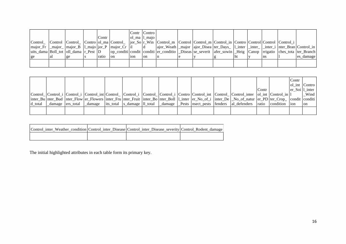
The initial highlighted attributes in each table form its primary key.
Page 17
17
Phase-3 Delivery report on GIS-Dashboard
development status Prepared by - Rahul Gokhale
Date: 12-08-20
1. Introduction 19
Recapitulation 19
Deliverables for phase-3 19
Outline of the report 21
2. Conceptual Design 21
GIS-datasets 21
Maps/Geo-visualization 21
Project Indicators 22
Data 22
3. Facilities 23
Browsing maps 23
Layers Panel 24
Zooming and Panning 24
Legend Control 25
Location-/Point-level details 27
Tabular Data 28
Role-based data-access 28
Data Download 29
4. GIS-Datasets 30
Weather 30
Automated Weather-monitoring Stations (AWSs) 30
Voronoi Partitioning 30
Data Availability 30
Crop Water-Balance Estimates 31
Model 31
Daily estimation 31
Micro-Level Planning 31
Page 18
18
PoCRA villages water balance 31
Drainage 32
Water-structures 32
Farmer Field Schools 32
Cross-dataset indicator 32
5. Technical design 32
Frontend 33
Backend 33
Database 34
Web-service 34
GeoServer 34
6. Summary 35
Page 19
19
IT-related deliverables and support forms a significant part of the MoU signed between PoCRA
and IITB. In particular, components B1-B6 of the MoU are completely concerned with a
GIS-dashboard web-application whose prototype implementation was submitted in the previous
MoU.
1. Introduction This document presents the work done on the development of the GIS-dashboard during phase-3 of the
MoU. In this introductory section, we first recapitulate the development course and the work that was done
before phase-3. Then we describe the tasks and targets that were set to be delivered in phase-3. Finally, we
sketch an outline of this report.
Recapitulation Based on the prototype implementation of a GIS-dashboard for PoCRA in the previous MoU, an extended
and full-fledged implementation of a GIS-dashboard was planned in the current MoU. After the inception
of the MoU, a change in the delivery-schedule done by PMU with respect to the phase-wise deliveries. In
particular, while the original schedule required the inclusion of project-based indicators on the dashboard
in phase-2 of the MoU, and that of other project-databases like FFS, DBT, etc. in phase-3 of the MoU, As
per PMU’s requirement, inclusion of FFS was preponed to phase-2 and project-based indicators was
postponed to a later phase. The letter in this regard was sent on 18th May 2020 to the PMU for confirmation
from IITB side.
Owing to issues with incorporating the existing live FFS database into the dashboard, such an incorporation
was delivered in phase-2 in a demonstrative form using snapshot FFS data stored in the dashboard’s
backend database. It was also decided to iron out the issues with live incorporation during phase-3. As
phase-3 evolved, it was realized that the issues with incorporation were a result not just of the differences
in implementation but also of differences in the conceptualization of the FFS data (and FFS field-level
activities to a certain extent).
Consequent to these observations, the deliverables for phase-3 were also refined, wherein although the
overall deliverable remained the same, the details were decided through frequent meetings and other
exchanges between PMU and IITB in order to deliver based on common understanding. This report
documents the completion of these refined deliverables.
Deliverables for phase-3 Work in phase-3 was characterized by a change in the development paradigm, where the intervals between
updates given to PMU on development work were shortened considerably. Frequent meetings and
exchanges led implicitly to the setting of a work-schedule that was controlled at a micro-level.
Consequently, the deliverables were submitted in the form of a stream of incremental (test-)releases of the
dashboard (hosted at http://gis.mahapocra.gov.in/dashboard_testing); each release being a step forward in
the development work from the previous one. This essentially was akin to the continuous-integration
development paradigm and was used right from the nascent stages of the dashboard development.
Page 20
20
The release stages (hence the deliverables) were as follows.
● “Base” Release: Also termed R0, this was a version that would lay out the overall web-page design
for the dashboard. The basic elements for navigation and geo-visualization were put in place. These
included the web-page title-bar, the left-panel for listing the datasets made available on the
dashboard and a section for map-viewing that should be the centrepiece of user’s attention. Basic
layers like some base-layer (OpenStreetMap was chosen) and the administrative boundaries were
included. Zoom-cum-pan facilities were also included for map-browsing.
● “Weather” Release: Also termed R1, this version incorporated the GIS-dataset of Skymet’s
automated weather-monitoring stations. This included the task of daily updation of weather data by
fetching new data from Skymet’s API and adding it to the dashboard’s backend database for use
anytime later. The processing necessary to update the project-indicators based on weather data was
also incorporated. The legend for the available indicator-layers was developed to be manipulatable
in order to enable geo-visual analysis.
● “Water-Balance Estimates” Release: Also termed R2, this version incorporated the GIS-dataset
of the rasters estimated using the soil-water model being developed under PoCRA. While the user-
facing part of this release added no more than another GIS-dataset and its indicators, the scope and
amount of addition to the backend was the largest among all the datasets added so far. This included
the use of weather data, incorporating the model-estimation code, developing an updation routine
that would compute the model estimates and storing them for use in updation again for the next day
and finally exporting and publication of these as raster layers.
● Series of R2+ releases: While the issues with incorporating the live FFS database were being
resolved, it was decided to push out a series of 3-4 micro-releases, each of which would include
more and more project-indicators that were based on weather and water-balance estimates. This led
to the inclusion of sub-items under weather for the past data; viz, a set of weather-indicators each
for the last (meteorological) week, the last (calendar) month and the cumulative-indicators based
on the data for the entire period of the current season.
● “Micro-Level Planning” village water balance Release: The initial MLP exercise had been
completed at the field-level in phase-1 villages. The generation of zone-wise water-balance
estimates and of a part of water-budget charts required for the exercise in these villages had been
done by the IITB team earlier. This prompted the decision to include the MLP dataset next. This
included the GIS-layer of phase-wise PoCRA villages and project-indicators related to them. Two
other GIS-datasets closely linked to MLP were also included; viz the drainage pattern and the geo-
tagged set of field-structures built to manage surface-water.
● “Snapshot FFS” Release: Since the issues with the live FFS database were still under discussion
and resolution, it was recently decided to include a snapshot version of the FFS database as a
placeholder. The project indicators related to FFS have also been included but are based on the
snapshot data and hence do not need daily updation.
● “Cross-database indicator and Role-based Data Access” Release: An important and useful
inclusion in this final release of phase-3 is that of an illustrative cross-database indicator that can
highlight dry-spell contingency during reproductive stages of a crop sown in an FFS plot. This
release also includes the facility to display tabular data along with an illustrative example of role-
based authenticated access to it.
While the above release-list mentions only the content of the additions/modifications done on the
dashboard, with every previous release, there would be feedback related to the form of the dashboard’s
Page 21
21
facilities. The current form of the dashboard includes many of those suggestions that have been
implemented.
It should also be noted that while the release-based schedule was aligned to visible additions to the
dashboard, it was common that the work required to develop the corresponding backend in order to achieve
the release was disproportionate (and usually greater) compared to what additions would be visible on the
dashboard.
Outline of the report First, we describe the design and architecture of the dashboard at a conceptual level from the user’s
perspective. Next, we provide an illustrative description of the facilities made available on the dashboard.
Following that, a brief account of the technical/IT design and implementation is presented with linkages to
the user’s perspective. The work done in this phase and to be done in later phases is summarized in the final
section in order to provide a picture about the overall development work and schedule.
2. Conceptual Design Like any utility software/website, the GIS-dashboard has multiple aspects though which users comprehend
it. The current design of the dashboard has focussed on the following conceptual aspects relevant to a user.
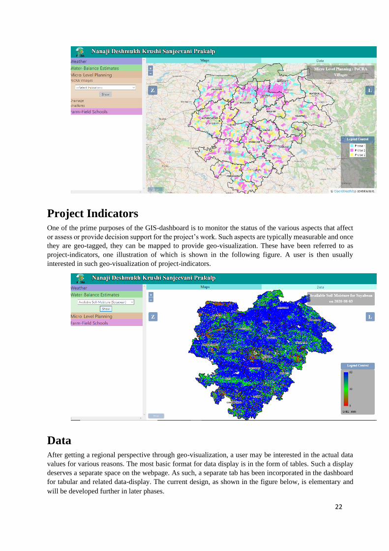
GIS-datasets A user to the GIS-dashboard website for PoCRA is expected to look for GIS information about the various
aspects within the scope of the project. The scope
of the PoCRA’s work is wide enough and
includes data collection, research, field-level
knowledge transfer as well as field-level
interventions. The data/information about each
such aspect forms a separate dataset that deserves
its own management. Currently the dashboard
hosts four datasets of the project in its left panel
(cropped image seen in the adjoining figure).
Their details will be presented in a later section.
Maps/Geo-visualization GIS and geo-visualization being the central theme of the dashboard, GIS plays a central role in each dataset.
For example, the weather data obtained from weather stations is linked to their locations, thus forming a
geo-tagged/GIS dataset. For this reason, as illustrated in the figure below, every dataset and its contents
listed in the left panel of the dashboard have various map-layers associated with it.
Page 22
22
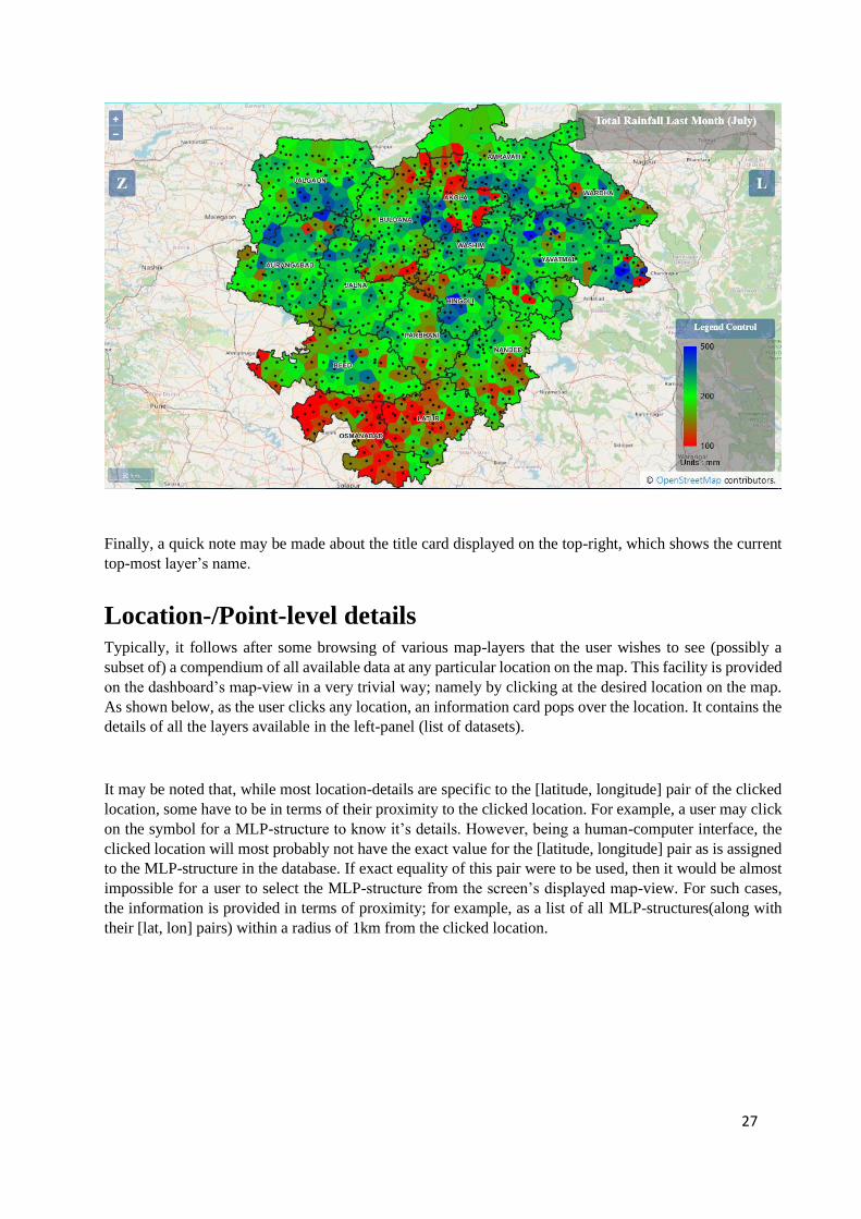
Project Indicators One of the prime purposes of the GIS-dashboard is to monitor the status of the various aspects that affect
or assess or provide decision support for the project’s work. Such aspects are typically measurable and once
they are geo-tagged, they can be mapped to provide geo-visualization. These have been referred to as
project-indicators, one illustration of which is shown in the following figure. A user is then usually
interested in such geo-visualization of project-indicators.
Data After getting a regional perspective through geo-visualization, a user may be interested in the actual data
values for various reasons. The most basic format for data display is in the form of tables. Such a display
deserves a separate space on the webpage. As such, a separate tab has been incorporated in the dashboard
for tabular and related data-display. The current design, as shown in the figure below, is elementary and
will be developed further in later phases.
Page 23
23
3. Facilities As a web-GIS application the GIS-dashboard provides various facilities for browsing and probing maps
related to the project. Additionally, it also provides data-listing and download facilities for particular
datasets.
Browsing maps The ‘Maps’-view takes the largest space on the dashboard and is meant to be the centre of user’s attention.
In its default state(for example, just after loading the webpage), it shows the (map-)layer that displays
boundaries of the 15 PoCRA districts. Various layers can be added to this view from the left panel by
selecting various datasets or indicators therein.
Page 24
24
For various forms of map-browsing, the following control buttons, panels and information cards have been
placed within the view.
Layers Panel
When the bluish button on the top-right marked with an ‘L’ is
hovered-over, the layers-panel pops over left of the button as shown
in the adjoining figure. This panel maintains a current list of (map-
)layers that have been loaded into the maps-view.
It has three sections: base-map layers section (presently, only
OpenStreetMap), administrative boundaries layers section and
user-requested layers section. Each layer in the panel overlays all
the others listed below it. Each newly requested layer by the user
gets added to the top of the list. Each layer also has a visibility
switch, displayed as a checkbox, that allows the user to toggle the
layer’s visibility. Clicking the layer-name expands a layer-details
section. It currently only has a ‘Remove’ button to remove the layer
from the dashboard(both from the map and the layers-list), but is
intended to accommodate layer-specific information and actions.
The title ‘Layers’ of the user-requested layers section is active and when hovered-over,
a small menu pops-over. Presently, it only provides a ‘Hide All’ (layers) action to hide
(uncheck visibility) all layers in one go.
Zooming and Panning
On the top-left, is a pair of buttons for zooming into (+) and out (-) of the map-view’s centre. A user having
a mouse with a scroll can use it while pointing the mouse at a location in the map’s view to zoom in and
out for that location. Panning is achieved using the mouse’s drag-n-drop action-sequence within the map-
view.
The project’s administration is based on a hierarchy of regional units. A three-level regional-hierarchy
consisting of district, taluka and (PoCRA-)village is of frequent interest and deserves a corresponding
region-based zoom-cum-pan facility on the dashboard. The button marked ‘Z’ on the top-left provides such
a facility when clicked. As each region is selected, the map’s view is zoomed and panned to present that
particular region to cover the map’s extent. Simultaneously, the lower-level regional units become available
for further narrowing-down.
Page 25
25
It may also be noted that the layers of taluka and (PoCRA-)village boundaries used in the above hierarchy
have an zoom-based automatic visibility control, wherein for example, the taluka boundaries are made
visible automatically when zoomed in sufficiently and invisible when zoomed out. Similar automatic
visibility control is enabled for some other layers where appropriate; for example the drainage layer in the
Micro-Level Planning dataset where the lower-order drainage starts becoming visible as the user zooms in.
Legend Control
The quality of any geo-visualization facility can be improved by allowing the user to control the styling of
the map-layers. This is especially true for PoCRA’s GIS-dashboard, since there is a lot of GIS content that
is displayed as pseudo-colour layers where the colouring of the layer’s regions is determined by the layer’s
parameter values in that region. For example, the layer representing last month’s total rainfall is colour-
styled using the values of total rainfall in the previous month. The details of this styling are informed to the
user through the legend on the bottom-right.
Page 26
26
Exploratory geo-visualization can be enabled by allowing the user to control the legend. For example to
check if there were any regions that had about 500mm rainfall in the last month, it would be useful to set
the upper-limit of the legend to 500.
Such a facility can be availed on the dashboard by
clicking the ‘Legend Control’ button just above the
legend. Setting the upper-limit value to 500 (and
changing any colours if desired) and clicking the
‘Apply’ button will produce a re-styled map as
shown below. As can be seen below, there indeed
are a few pockets coloured blue that indicates that
the total rainfall in those pockets had been about
500mm.
Page 27
27
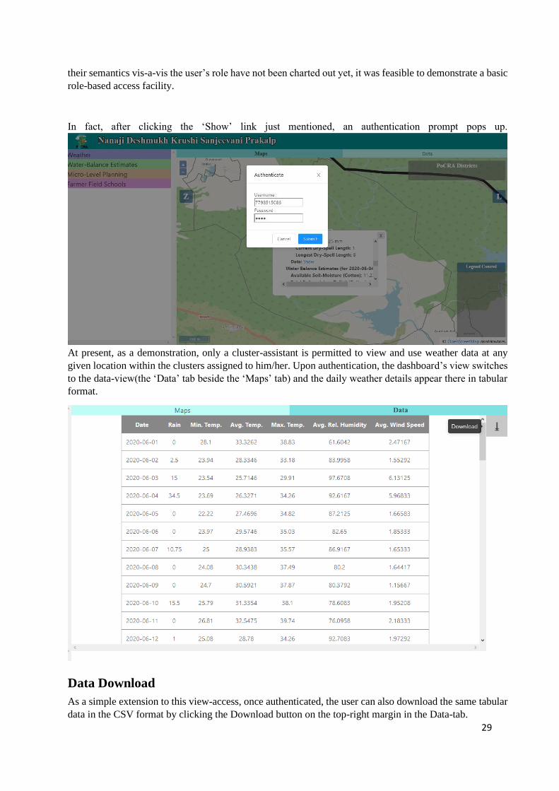
Finally, a quick note may be made about the title card displayed on the top-right, which shows the current
top-most layer’s name.
Location-/Point-level details Typically, it follows after some browsing of various map-layers that the user wishes to see (possibly a
subset of) a compendium of all available data at any particular location on the map. This facility is provided
on the dashboard’s map-view in a very trivial way; namely by clicking at the desired location on the map.
As shown below, as the user clicks any location, an information card pops over the location. It contains the
details of all the layers available in the left-panel (list of datasets).
It may be noted that, while most location-details are specific to the [latitude, longitude] pair of the clicked
location, some have to be in terms of their proximity to the clicked location. For example, a user may click
on the symbol for a MLP-structure to know it’s details. However, being a human-computer interface, the
clicked location will most probably not have the exact value for the [latitude, longitude] pair as is assigned
to the MLP-structure in the database. If exact equality of this pair were to be used, then it would be almost
impossible for a user to select the MLP-structure from the screen’s displayed map-view. For such cases,
the information is provided in terms of proximity; for example, as a list of all MLP-structures(along with
their [lat, lon] pairs) within a radius of 1km from the clicked location.
Page 28
28
Tabular Data Apart from the basic compendium at a location, data may also be desired in a tabular format for various
use-cases. One generic use-case may be a listing of the data that was used to generate a particular layer. For
example, the total rainfall in the last month at each of the weather-monitoring stations which were used to
generate the corresponding map-layer.
Instead, however, a user may also
desire to dig deeper into the data for a
given location.
For example, after seeing the map of
longest dry-spell, the user may be
interested in checking the sequence of
daily rainfall values in the current
monsoon season at a particular
location of interest. The dashboard
presently caters to this and related
use-cases by providing a tabular
listing of all daily weather parameters
at any clicked location. Such a listing
may be obtained for a location by clicking it, scrolling through the consequent pop-over’s details and
clicking the ‘Show’ link against the ‘Data’ key, that is listed under the Weather’ section.
Role-based data-access
The viewing or use of detailed data for a region has been considered as privileged access that should be
permitted only to the concerned authorities. As mentioned earlier, although the levels of data-details and
Page 29
29
their semantics vis-a-vis the user’s role have not been charted out yet, it was feasible to demonstrate a basic
role-based access facility.
In fact, after clicking the ‘Show’ link just mentioned, an authentication prompt pops up.
At present, as a demonstration, only a cluster-assistant is permitted to view and use weather data at any
given location within the clusters assigned to him/her. Upon authentication, the dashboard’s view switches
to the data-view(the ‘Data’ tab beside the ‘Maps’ tab) and the daily weather details appear there in tabular
format.
Data Download
As a simple extension to this view-access, once authenticated, the user can also download the same tabular
data in the CSV format by clicking the Download button on the top-right margin in the Data-tab.
Page 30
30
4. GIS-Datasets As mentioned in the description of conceptual design, the notion of grouping GIS data into fairly
independent GIS-datasets is basic to the understanding and usage of dashboard’s facilities. While the GIS-
datasets currently listed in the left-panel of the dashboard are largely self-explanatory, we describe their
salient details below.
Weather Weather data is being collected and stored for consequent use in various analytical and decision-making
tasks within PoCRA. Data is available for the following weather parameters: rainfall, temperature, relative
humidity and wind speed. Described below are various aspects of the weather database related to collecting,
processing and using it for the purpose of geo-visualization.
Automated Weather-monitoring Stations (AWS)
Skymet has installed Automated Weather-monitoring Stations (AWS) throughout the state of Maharashtra
and made hourly data for 21 districts (that include PoCRA’s 15 districts) available to PoCRA through a
web-API. The dashboard application is designed to auto-update the weather data in its database on a daily
basis by using this API.
Voronoi Partitioning
There are a total of about 950 AWSs installed in PoCRA’s 15 districts. For geo-visualization, it is desirable
to have a map-layer that covers the Entire Region(ER) of PoCRA’s districts. This calls for a need to
interpolate using the AWSs’ values to generate a layer that covers ER. While interpolation methods usually
generate a raster map, it has been an established practice during the dashboard’s development to use nearest
neighbour interpolation method, which generates a vector layer of the so-termed Voronoi polygons which
cover the ER. There is a one-to-one mapping between the AWSs and the Voronoi polygons such that each
Voronoi polygon contains exactly the AWS mapped to it. These Voronoi polygons are computed such that
the AWS that each contains is the closest AWS for every point within that Voronoi polygon. For the purpose
of diligent geo-visualization, the polygon-layer of pseudo-coloured Voronoi polygons is mapped along with
the point-layer of AWSs overlaying it.
Data Availability
Each AWS is installed in a field-environment and apart from the quality of the AWS itself, the field-
environment may present various situations when the AWS may not be able to record or transmit weather
data to the Skymet’s databases. Other times, some garbled data may be received, which needs to be weeded
out. Also, it is possible that some AWSs are decommissioned and others newly installed in other locations.
Such cases result in missing data. As such, when requested from Skymet’s API service, the response may
not contain data for every AWS that was ever installed.
The indicator-layers provided in the dropdown menu of the weather dataset have been generated using
AWSs that provided data for the entire duration implied by the layer. For example, the layer representing
maximum temperature in the last week is generated using AWSs which provided uninterrupted data for the
entire duration of the last week. Due to this data availability issue, it should be noted that the set of AWSs
for each of the following set of layers may be mutually different:
● Latest date’s layers
Page 31
31
● Last week’s layers
● Last month’s layers
● Cumulative layers
Crop Water-Balance Estimates Water-balance estimates for the entire region are computed for display on the dashboard on a daily basis
using a particular water-balance model that is under in-house development. Following is a brief description
of the model and how it is used for generating region-wide estimates for publication on the dashboard.
Model
A simulation model meant to estimate the water-balance at a cropped location has been under development,
right from the beginning of PoCRA as a project. This model is a daily time-step model that estimates the
daily amount of various water-components at the soil-level like soil-moisture, runoff, crop’s
evapotranspiration and groundwater recharge. It uses various field-level parameters at the location like the
soil-texture, soil-depth, land-use/land-cover, terrain-slope and daily weather parameters like temperature
(min, max, avg), rainfall in order to simulate the model.
Daily estimation
In order to generate a picture for the entire region, this location-based model may be simulated for the set
of all points of a uniform grid that covers the entire region. In GIS terms, it would effectively mean that the
inputs and outputs will be rasters having the same resolution as the grid. The model is thus effectively run
using raster inputs to generate raster outputs.
The model is run daily to apply the newly available weather data to the last estimated water-balance state
in order to generate the next day’s water-balance. The results are again stored back into the database to be
used on the next day when new weather data would be available. Simultaneously, to serve their main
purpose, these results are used daily to update the project-indicator layers that are published on the
dashboard under the ‘Water-Balance Estimates’ dataset.
Micro-Level Planning A Micro-Level Planning (MLP) exercise is carried out in each of the 5142 PoCRA villages. Under this
exercise, zone-wise water-budgeting is done in the village along with allied water-management plans and
activities in order to improve resilience to variations in year-long water-availability to the crops. The
following GIS-datasets related to MLP have consequently been incorporated on the dashboard.
PoCRA villages water balance
This is the set of 5142 villages that have been included in the project. The villages have been categorized
into three phases according to when the MLP exercises were planned to begin in the village during the
overall project’s duration. As the MLP exercise is carried out and its implementation begins, it becomes
possible to assess the progress in each village in terms of MLP-related project-indicators. These indicators
are consequently published on the dashboard as layers with village-wise pseudo-colouring(colouring based
on indicator values).
Page 32
32
Drainage
The availability and use of water from overland flows is basic to any form of water-budgeting in a village.
As such the drainage pattern in the entire region is a GIS-dataset that will have a significant use in planning
any water-bearing or impounding structures. This dataset has thus been incorporated on the dashboard and
in addition to the geometry of flows, it includes information on the hydrological-order of all drainage-
segments which can enable more refined planning.
Water-structures
One of the important activities ensuing the planning stage is the construction of water impounding and
storage structures within the village at suitable locations. For the purpose of assessment of effectiveness of
these structures and hence the MLP exercise, it is a significant value-addition to have the structures geo-
tagged and geo-visualizable. This has been done and a GIS-layer generated therefrom has been published
on the dashboard. The layer shows the locations as well as the construction-type(like KT-weir, Gabion
Bandhara, etc.) of all these structures.
Farmer Field Schools The idea of Farmer Field Schools (FFSs) has been incorporated in the project as a significant means of
knowledge sharing and dissemination to the farmers. The plan is to have one FFS in each PoCRA village.
This is essentially a farm-plot selected to be cultivated and monitored throughout the project duration and
used for knowledge exchange through farmer meetings prompted by a facilitator. As a research-extension
to this idea, a ‘control’-plot is also selected within the village and conceptually paired with the FFS plot in
the village for monitoring.
At present the base-database for FFS is under development. As such, in order to simultaneously continue
work on incorporating it on the dashboard, a snapshot copy of some FFS data was used to get started. This
snapshot contains static data related to the FFS plots and their locations and current season’s dynamic data
related to cropping in these plots. Using this data a few project-indicator layers have been incorporated on
the dashboard for initiation.
Cross-dataset indicator
While many of the project-indicators rely on the data only within a single dataset listed in the left-panel,
many other project-indicators of interest need to use data from multiple datasets. At the same time, when it
comes to geo-visualization, each of these cross-database indicators will have a natural GIS-entity-set to
map their values to. As a start, one such indicator named ‘Longest Dry-Spell In Reproductive Stage’ has
been incorporated into the dashboard. This indicator essentially uses the daily-rainfall data for each farmer
field school plot, as obtained from the nearest available automated weather-station(s) to find the longest
duration (in days) when there was negligible ( < 2.5mm ) rainfall everyday at the FFS plot during the
reproductive stage of the major-crop sown there. It thus harnesses data from both Weather dataset as well
as the Farmer Field Schools dataset.
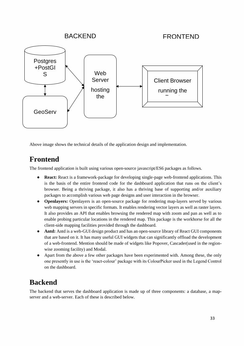
5. Technical design Like any web-application, the GIS-dashboard application has to address concerns at two ends: the client-
browser with which the user interacts and the server which handles client’s requests for data and maps. As
shown in the figure below, the dashboard application has been designed with a clear separation of these
two concerns.
Page 33
33
Above image shows the technical details of the application design and implementation.
Frontend The frontend application is built using various open-source javascript/ES6 packages as follows.
● React: React is a framework-package for developing single-page web-frontend applications. This
is the basis of the entire frontend code for the dashboard application that runs on the client’s
browser. Being a thriving package, it also has a thriving base of supporting and/or auxiliary
packages to accomplish various web page designs and user interaction in the browser.
● Openlayers: Openlayers is an open-source package for rendering map-layers served by various
web mapping servers in specific formats. It enables rendering vector layers as well as raster layers.
It also provides an API that enables browsing the rendered map with zoom and pan as well as to
enable probing particular locations in the rendered map. This package is the workhorse for all the
client-side mapping facilities provided through the dashboard.
● Antd: Antd is a web-GUI design product and has an open-source library of React GUI components
that are based on it. It has many useful GUI widgets that can significantly offload the development
of a web-frontend. Mention should be made of widgets like Popover, Cascader(used in the region-
wise zooming facility) and Modal.
● Apart from the above a few other packages have been experimented with. Among these, the only
one presently in use is the ‘react-colour’ package with its ColourPicker used in the Legend Control
on the dashboard.
Backend The backend that serves the dashboard application is made up of three components: a database, a map-
server and a web-server. Each of these is described below.
Client Browser
running the React
Web Server
hosting the
Flask
Postgres+PostGI
S
GeoServer
BACKEND FRONTEND
Page 34
34
Database
The dashboard uses the Postgres Relational DataBase Management System (RDBMS) to store its datasets.
It is a free and open-source product. It has an extension called PostGIS that supports storing as well as
processing of spatial data.
A single database object(as a RDBMS-programming data-structure) has served all the purposes of the
dashboard till now. There is one schema object within this database for each of the GIS-datasets described
above(Weather, MLP, etc.). Each of these schemas hold the data-tables for its respective GIS-dataset.
The MLP and FFS GIS-datasets are managed by other partners in the project and have their own databases
on different Postgres server instances in PoCRA’s cloud platform. To use the required spatial and other
data from these databases, the foreign-data-wrapper technology provided by Postgres has been used.
Specifically, the ‘postgres_fdw’ extension to the postgres database allows (almost-)transparent access to
other postgres databases, possibly on different servers, from within one postgres database. This only
requires a one-time setup wherein the database-connection details required to access the other databases
need to be specified.
There are two ways in which the database is modified. One is during the initial set-up and any subsequent
modifications to the schemas as per dashboard’s data requirements. The other is the daily automatic updates
that are required to reflect the latest situation on the dashboard. This, in particular, includes updating the
weather schema by adding newly available latest data, and adding result rasters generated by the daily
model-based water-balance estimation.
Web-service
The user interacts with the dashboard’s frontend and requests various data/maps. This process of handling
requests is managed on the backend by the web-server and the application code. Presently, the instance of
the dashboard application is hosted on an Apache httpd web-server. A server-side python application
processes the requests and is based on the Flask web-development framework.
Currently, there are only a handful of requests that need to be handled by the Flask-based server-code. They
are as follows:
● meta-data about the incorporated GIS-datasets and their various project-indicators; this is used to
populate the left-panel on the dashboard.
● Extent of the entire PoCRA region as required to set the map-view when the dashboard-application
loads initially.
● Information about the extents of each administrative region, which is used to zoom-cum-pan to the
requested region (using the button marked ‘Z’)
● All the details at the user-clicked location to be served in a pop-up at the location
● Daily weather data at a location as served in the data-view.
GeoServer
GeoServer is a map-server that provides reference implementation for, among others, the Web Map Service
(WMS) and Styled Layer Descriptor (SLD) standards published by the Open Geospatial Consortium
Page 35
35
(OGC). The dashboard application uses WMS to request map-layers and (static-)legends and SLD to style
the layers.
All the map-layers displayed on the dashboard are requested (routed through Apache), from GeoServer,
which generates them using its connection with the PostGIS geometry tables for vector data and the
connection with GeoTIFF files (exported from PostGIS) for raster data. In order to maintain a separate
namespace that avoids interference with other applications using GeoServer, a separate workspace for the
dashboard’s map-layers and styles has been created in the installed GeoServer instance.
6. Summary Phase-3 has witnessed a significant change in the development paradigm used for the dashboard. The basic
idea in the new paradigm is to decide on the set of requirements to be fulfilled in the next release through
liasoning and thus rolling out releases in a series of incremental changes.
Following the new paradigm, the dashboard in its present state of development provides services for geo-
visualization of various layers in the project’s GIS-datasets. An illustrative case of a cross-database
indicator-layer has also been included. Most of the basic and a couple of advanced facilities for map
browsing and geo-visual analysis have also been provided. Illustrative use-cases for role-based data-access,
tabular data-display and data download have also been included.
In the remaining phases of the MoU, along with the basic maintenance and improvements like providing
role-based functionalities, the dashboard is to be developed in two new conceptual ways. First is the
incorporation of services for contingency-management based on a Scale-Analysis-Trigger-Action (SATA)
framework. The other is to develop desktop tools for use by authorized PMU staff that would allow
basic/simple but direct management of the contents of the dashboard and its backend. The details of these
will be decided on the way as per the new development paradigm.


![Report of the 2nd MoU Conference - United Nations...Report of the Mons Second MoU Conference – Mons, 3 and 4 May 2012 [July 2012] III- Programme of the conference . 7. The conference](https://static.documents.pub/doc/80x56/60e10bd50821f90496514fca/report-of-the-2nd-mou-conference-united-nations-report-of-the-mons-second.jpg)


