8
Information Services Corporation Brand Identity Guide

Information Services Corporation
Brand Identity Guide

Information Services Corporation | Brand Identity Guide 3
Glyph Word mark
of the ISC brand. The logo consists
of a glyph and a wordmark. The glyph
is an outlined circle with a graphic
representation of the letters ISC in the
inside. The wordmark is set in a stylized
version of Lubalin and appears to the
right of the circle. These elements have
been brought together to create a
symbol that represents an innovative and
contemporary look that mirrors the ISC
brand. The logo is uniquely rendered
way . This logo is the only mark to be
used when identifying ISC services, and
products.
The logo glyph and word mark should
always remain one unit. Separating
the glyph from the word mark is not
recommended and should not be made
without the explicit written permission
by ISC Communications.
The Logo

Information Services Corporation of Saskatchewan | Brand Identity Guide 4
The ISC logo is available in the
following formats:
EPS (.eps)
designers or anyone requiring the ability
to reproduce the logo in various scales,
resolutions and formats. This is a source
vector graphic format by which all other
formats (e.g., .gif, .tif, jpeg, etc.) are
derived from.
GIF (.gif)Preferred use in
PowerPoint presentations,
Word documents and online.
Logo UsageAcceptable Versions
One colour black version
Reverse white version

Information Services Corporation | Brand Identity Guide 5
Logo UsageColour
The ISC logo is provided in two colour
options: black or white. It will appear
predominantly in black on a white or light
background. In the event that the logo
must appear on a dark background it
should appear in white.
Please use your best discretion when
choosing a black or white logo to be
placed on a background that is in a middle
“grey” area of the colour spectrum.
Alternate colouring of logo
There are special circumstances where
the ISC logo can be produced in a
colour other than black or white. ISC
Communications must be contacted for
production of an alternately coloured logo.
An example of a special circumstance is
an alternate coloured logo placement on
branded apparel to improve legibility and
visual appeal.
100% Black
C 0 M 0 Y 0 K 100 R 35 G 31 B 32
Hex: 231f20
White
C 0 M 0 Y 0 K 0 R 255 G 255 B 255
Hex: ���

Information Services Corporation | Brand Identity Guide 6
Clear ZoneIn order for the logo to stand out in
branded ISC materials there should
be an area of space around it. No copy
or imagery should encroach into this
clear zone.
The optimum minimum clear zone around
the logo should be the same dimension
as the height of the wordmark in the
logo (shown as “x” in the illustration
to the right).
Logo UsageMargin Allowance
X
X
X
X
X clear zone
clear zone

Information Services Corporation | Brand Identity Guide 7
Logo Usage Unacceptable Variations
The logo is uniquely rendered and should
computer technology allows for easy
the logo should not be made without
the explicit written permission by ISC
Communications.
This page illustrates improper logo
XDO NOT add a drop shadow
to the logo.
XDO NOT rotate the logo.
XDO NOT horizontally
scale the logo.
XDO NOT use di�erent
colour schemes.
XX
DO NOT place objects behind the logo.
DO NOT change the
XDO NOT vertically scale
the logo.
Information Services Corporation | Brand Identity Guide 9
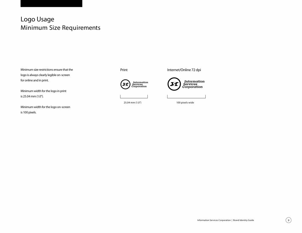
Minimum size restrictions ensure that the
logo is always clearly legible on-screen
for online and in print.
Minimum width for the logo in print
is 25.04 mm (1.0”).
Minimum width for the logo on-screen
is 100 pixels.
Logo UsageMinimum Size Requirements
25.04 mm (1.0”) 100 pixels wide
Print Internet/Online 72 dpi

Information Services Corporation | Brand Identity Guide 10
When a secondary or sponsor logo is
used on ISC materials it should be no
larger then the height of the ISC logo.
The secondary logo should be positioned
to the left of the ISC logo and be
positioned outside of the clear zone
established by the height of the ISC
wordmark.
Logo UsageSizing and placement of secondary logos
X
X
X
X
X clear zone
clear zone


