24
INFORMATION TECHNOLOGY IN BUSINESS AND SOCIETY SESSION 19 – GETTING DATA AND VISUALIZING IT SEAN J. TAYLOR
| Date post: | 24-Dec-2015 |
| Category: |
Documents |
| Upload: | charles-lamb |
| View: | 216 times |
| Download: | 1 times |
INFORMATION TECHNOLOGY IN BUSINESS AND SOCIETYSESSION 19 – GETTING DATA AND VISUALIZING IT
SEAN J. TAYLOR

ADMINISTRATIVIA
• Assignment 3: Still Grading
• Assignment 4: GREAT JOB EVERYONE!

GROUP PROJECT 1 (DUE 4/13)
1. Find some data
2. Load it into Access and/or Excel (or anything)
3. Explore the data set, find something interesting
4. Create interesting visualizations of the data
5. Use your exploration to help define a question you’d like to answer.
6. Answer that question as best you can using the data.

FINDING DATA1. Infochimps [http://www.infochimps.com/]
2. NYC Open Data [https://nycopendata.socrata.com/]
3. ScraperWiki [https://scraperwiki.com/]
4. Google Insights for Search [http://www.google.com/insights/search/]
5. World Bank Data [http://data.worldbank.org/]
6. Many more: [https://bitly.com/bundles/hmason/1]
• Million song data set• Movies and ratings• Census data, Enron emails, Tweets, Bit.ly link clicks, etc.

LOADING DATA
• Formats: csv, tab-delimited, fixed-width, many more
• Unstructured: html or web API data
• Import into Excel first, then Access
• May have to clean it first!

TOOLS
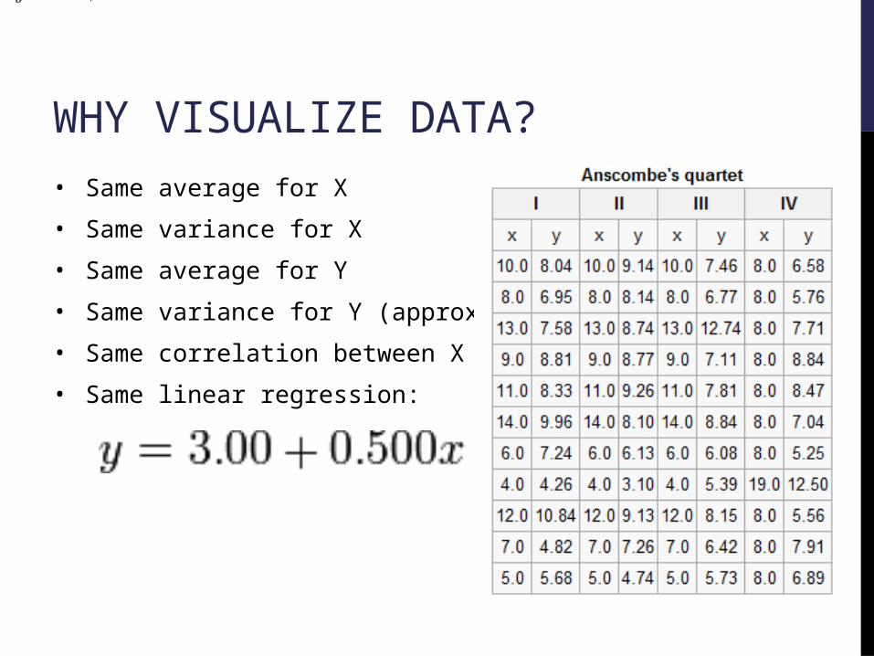
WHY VISUALIZE DATA?• Same average for X
• Same variance for X
• Same average for Y
• Same variance for Y (approx)
• Same correlation between X and Y
• Same linear regression:
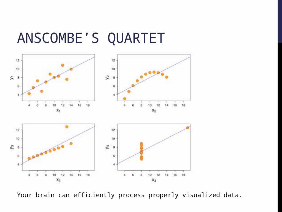
ANSCOMBE’S QUARTET
Your brain can efficiently process properly visualized data.

EDA:EXPLORATORY DATA ANALYSIS
• An approach to analyzing data sets to summarize their main characteristics in easy-to-understand form.
• Often with visual graphs, without using a statistical model or having formulated a hypothesis.
• Helps to formulate hypotheses that could be tested on new data-sets.

RULE #1: NO PIE CHARTS!
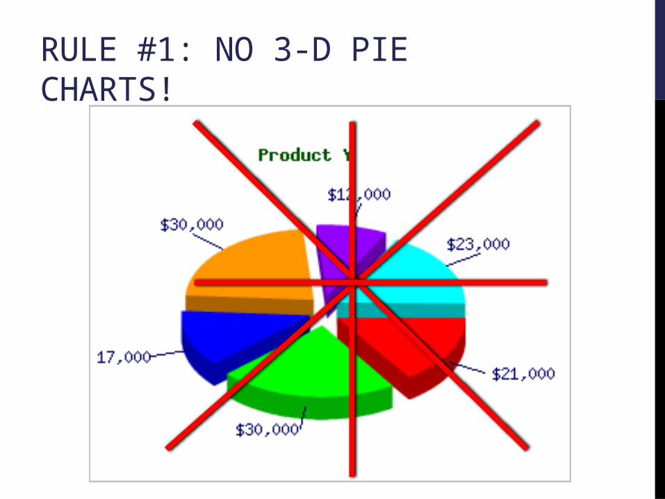
RULE #1: NO 3-D PIE CHARTS!
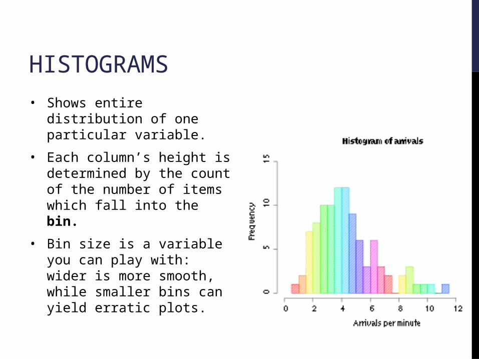
HISTOGRAMS• Shows entire distribution of one
particular variable.
• Each column’s height is determined by the count of the number of items which fall into the bin.
• Bin size is a variable you can play with: wider is more smooth, while smaller bins can yield erratic plots.

DENSITY PLOTSA population of women who were at least 21 years old, of Pima Indian heritage and living near Phoenix, Arizona, was tested for diabetes according to World Health Organization criteria. The data were collected by the US National Institute of Diabetes and Digestive and Kidney Diseases. We used the 532 complete records.
Red: Diabetes = 0Blue: Diabetes = 1Black: Diabetes = 0 or 1

BOX PLOTS• Display differences between
subpopulations in your data.
• Furthest lines are min/max.
• Box shows 25th to 75th percentiles.
• Thick line shows the 50th percentile (the median).

SCATTER PLOTS• Suggests correlation between two
variables.
• Correlations may be positive (rising), negative (falling), or null (uncorrelated).
• A line of best fit (alternatively called 'trendline') can be drawn.
• Ability to show nonlinear relationships between variables.

PARETO CHARTSMUCH better than a pie chart.
Shows individual components as well as cumulative total.

RUN CHART• Shows a variable over
time.
• Allows comparison between different variables.
• Can show trends or time-relationships between variables.

USING AREA/VOLUME/SHAPE• Don’t: hard for our brains to compare total area of odd shapes
• If you must, use regular bars (in some kind of… bar chart )
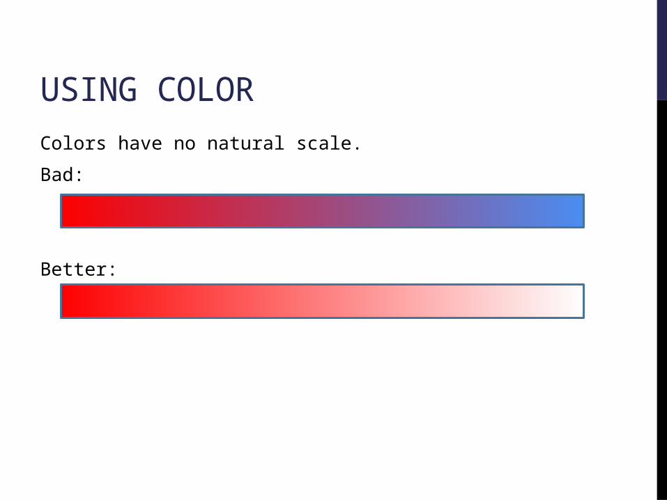
USING COLORColors have no natural scale.
Bad:
Better:

USING PLACEMENT
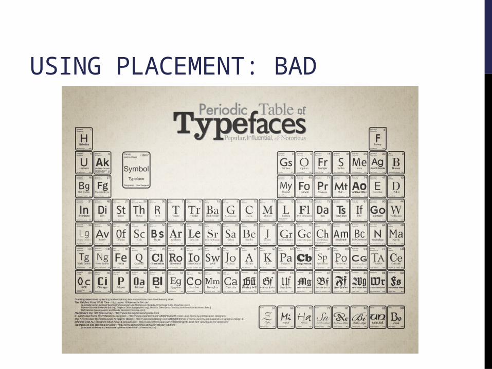
USING PLACEMENT: BAD

TRANSFORM/COMBINE YOUR VARIABLES!• Relationships can exist between your variables and computed
variables.
• Height => Height^2
• Skewed variables (counts) => take log (e.g. number of friends)
• Running backs in the NFLWeight / (40 yard dash time) = Speed Score
• Make categories out of continuous variables:Good performance: 1 if > 5% return in the last year, 0 otherwise.

“BEAUTIFUL VISUALIZATION”“THE VISUAL DISPLAY OF QUANTITATIVE INFORMATION”

NEXT CLASS:SOFTWARE ENGINEERING
• Read “No Silver Bullet”


