+ All Categories
Home > Documents > inner pages research

inner pages research

Date post: 29-Jul-2015
Category:
Upload: jessheap
View: 52 times
Download: 1 times
Share this document with a friend
1
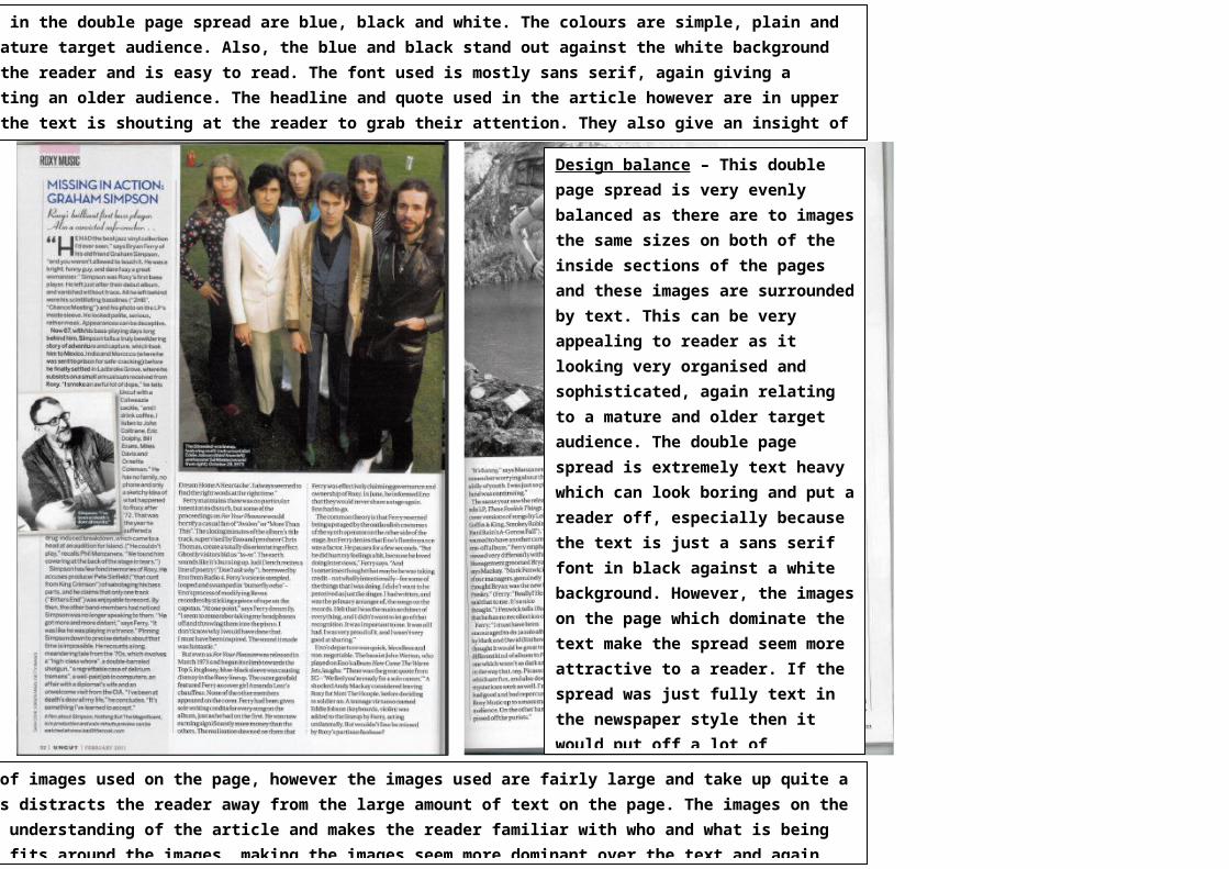
d in the double page spread are blue, black and white. The colours are simple, plain and mature target audience. Also, the blue and black stand out against the white background the reader and is easy to read. The font used is mostly sans serif, again giving a cting an older audience. The headline and quote used in the article however are in upper the text is shouting at the reader to grab their attention. They also give an insight of of images used on the page, however the images used are fairly large and take up quite a s distracts the reader away from the large amount of text on the page. The images on the understanding of the article and makes the reader familiar with who and what is being fits around the images, making the images seem more dominant over the text and again Design balance – This double page spread is very evenly balanced as there are to images the same sizes on both of the inside sections of the pages and these images are surrounded by text. This can be very appealing to reader as it looking very organised and sophisticated, again relating to a mature and older target audience. The double page spread is extremely text heavy which can look boring and put a reader off, especially because the text is just a sans serif font in black against a white background. However, the images on the page which dominate the text make the spread seem more attractive to a reader. If the spread was just fully text in the newspaper style then it would put off a lot of
Transcript

– The main colours used in the double page spread are blue, black and white. The colours are simple, plain and sophisticated, relating to a more mature target audience. Also, the blue and black stand out against the white background which may be seen as attractive to the reader and is easy to read. The font used is mostly sans serif, again giving a sophisticated impression and attracting an older audience. The headline and quote used in the article however are in upper case letters. This is almost as if the text is shouting at the reader to grab their attention. They also give an insight of what is to come. The text is set out in columns, making it easy for the reader to understand and read and once again giving a more mature feel to the magazine.

– There are a small amount of images used on the page, however the images used are fairly large and take up quite a big amount of room on the page. This distracts the reader away from the large amount of text on the page. The images on the page help give the reader a clearer understanding of the article and makes the reader familiar with who and what is being spoke about. The text surrounds and fits around the images, making the images seem more dominant over the text and again this may be to distract the reader away from the large amount of text on the page.

Design balance – This double page spread is very evenly balanced as there are to images the same sizes on both of the inside sections of the pages and these images are surrounded by text. This can be very appealing to reader as it looking very organised and sophisticated, again relating to a mature and older target audience. The double page spread is extremely text heavy which can look boring and put a reader off, especially because the text is just a sans serif font in black against a white background. However, the images on the page which dominate the text make the spread seem more attractive to a reader. If the spread was just fully text in the newspaper style then it would put off a lot of audiences, even a more mature audience.

Recommended