Anza Ghaffar Integration of Business Intelligence Dashboard for Enhanced Data Analytics Capabilities Vaasa 2020 School of Technology and Innovation Master’s thesis in Communications and Systems Engineering
Transcript
Anza Ghaffar
Integration of Business Intelligence Dashboard for Enhanced Data Analytics Capabilities
Vaasa 2020
School of Technology and Innovation Master’s thesis in Communications and Systems Engineering
2
3
TABLE OF CONTENTS
ABBREVIATIONS 6
1 INTRODUCTION 8
1.1 Thesis Statement 8
1.2 Thesis Outline 10
2 DATA ANALYTICS AND BUSINESS INTELLIGENCE 11
2.1 Impact and Scale of Data 11
2.2 Data and Information 13
2.3 Data Analytics 13
2.3.1 Data Ingestion 14
2.3.2 Data Cleaning and Transformation 16
2.3.3 Dimensionality Reduction 17
2.3.4 Data Analysis 17
2.3.5 Data Visualization 18
2.4 Business Intelligence 19
2.4.1 Data Gathering and Integration 20
2.4.2 Data Storage 21
2.4.3 Data Representation and Knowledge Management 23
2.5 Importance of Data Analytics and Business Intelligence 25
2.6 Possibilities 26
3 BUSINESS INTELLIGENCE PLATFORMS AND FEATURES 28
3.1 Magic Quadrant 30
3.1.1 Ability to Execute 32
3.1.2 Completeness of Vision 33
3.2 Business Intelligence Platform Features 34
3.2.1 Security & Manageability 35
3.2.2 Cloud 35
3.2.3 Data Source Connectivity 35
3.2.4 Data Preparation 35
3.2.5 Automated or Augmented Insights 36
4
3.2.6 Advanced Analytics 36
3.2.7 Data Visualization and Storytelling 36
3.2.8 Natural Language Query and Generation 36
3.3 Business Intelligence Platforms 37
3.3.1 Power BI 37
3.3.2 Tableau 40
3.3.3 Qlik 44
4 OPEN SOURCE LIBRARIES FOR DEVELOPING BI APPLICATIONS 48
4.1 Shiny from R Studio 48
4.2 Bokeh 49
4.3 Dash 49
5 SIMULATIONS AND DASHBOARD PROTOTYPING 50
5.1 Data Explanation 50
5.1.1 Andon Calls 50
5.1.2 Logistic Request 52
5.2 Microsoft Power BI 53
5.3 Tableau 55
5.4 Qlik Sense 59
5.5 Dashboard Using Plotly (Dash) and Python 62
5.6 Comparison of Business Intelligence Dashboards 68
6 Platform Integration 72
6.1 Running the Script Externally 72
6.2 Using the Concurrently Package 73
6.3 Using Docker 73
7 CONCLUSION AND FUTURE WORK 74
7.1 Conclusion 74
7.2 Future Work 75
REFERENCES 77
5
Figures Figure 1. CIO Top Priority for 2020(State of the CIO 2020) ........................................... 12
Figure 2. Data Analytics Workflow ............................................................................... 14
Figure 3. Different Data Sources (EMC, E. S. (2018)) .................................................... 15
Figure 4. Data Categorize (EMC, E. S. (2018)) ............................................................... 15
Figure 24. Qlik Data Editor ........................................................................................... 60
Figure 25. Qlik New Column Generation...................................................................... 60
Figure 26. Qlik Sense SS BI ........................................................................................... 61
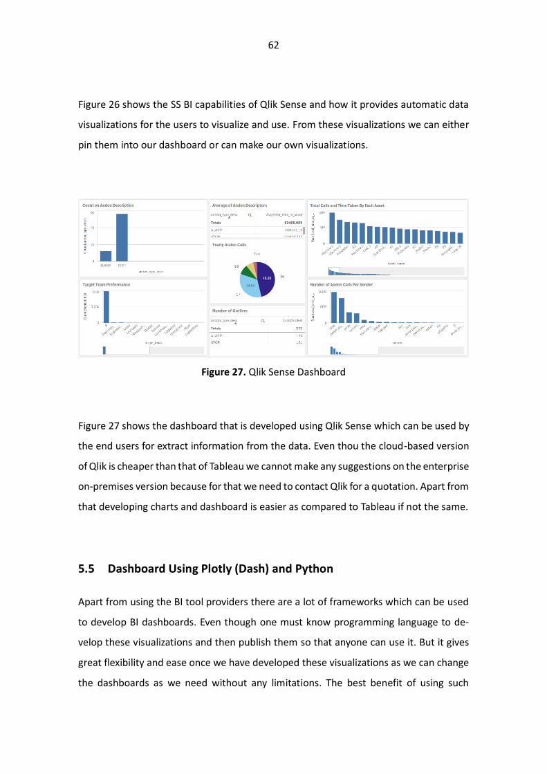
Figure 27. Qlik Sense Dashboard ................................................................................. 62
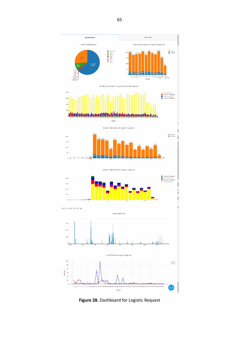
Figure 28. Dashboard for Logistic Request ................................................................... 65
Figure 29. Dashboard for Andon Calls.......................................................................... 67
6
ABBREVIATIONS
AI
API
AWS
BI
CIO
DAX
DW
DB
DBMS
DW
ETL
GCP
IOT
LDA
OLAP
PCA
QS
QV
RDBMS
SQL
SaaS
SS-BI
TDWI
Artificial Intelligence
Application Programming Interface
Amazon Web Services
Business Intelligence
Chief Information Officer
Data Analysis Expression
Data Warehouse
Database
Database Management System
Data Warehouse
Extract Transform Load
Google Cloud Platform
Internet of Things
Linear Discriminant Analysis
Online Analytical Processing
Principal Component Analysis
Qlik Sense
Qlik View
Relational Database Management System
Structured Query Language
Software as a Service
Self Service Business Intelligence
Transforming Data with Intelligence
7
UNIVERSITY OF VAASA School of Technology and Innovation Author: Anza Ghaffar Title of the Thesis: Integration of Business Intelligence Dashboard for Enhanced Data Analytics Capabilities Degree: Master of Science in Technology Programme: Communication and System Engineering Supervisor: Timo Mantere Year of entering the University: 2016 Year of completing the Thesis: 2020 Number of Pages: 78
ABSTRACT: Digitilization has taken the world by storm which has lead to the development of automation and smart technologies which are driven by data and in return are generating even more data. With the volume of data being created it has become essential to store and analyze the data through which better decisions can be taken. It is not just essential to store this data the real benifit lies if we can convert this data into information through which knowledge can be gained for actionable insights. This the where the Buisness Intelligence and Data Analytics ecosystem has a very crucial part to play. In this research first we do a pre-study of the process involved in building BI ecosystem and the features that are offered by the BI tools SaaS and if there are options other than BI SaaS which could help in delivering the same value. This research also includes how BI and DA are related to eachother and which one is important in what scenario. Lastly we study the criteria which should be taken into account while chosing and BI tool and a comparison of how the best available BI SaaS tools compete with eachother along with their strengths and weeknesses. The BI SaaS tools compared in the pre-study are then used to develop Interactive Dashboards to get a more of a hands on experiance with the BI tools and also match the requirements of the case organization for delivering the BI dashboard. Apart from only relying on the BI tool providors we have also developed Interactive Dashboards using open source frameworks to have an inhouse solution which delivers the same value for the case organization as the other BI tools available in the market. According to this study, BI is a very valuable tool for the organizations for analyzing their data but the decision to choose or develop a BI tool totally depends on the organizations requirements of what do they want to achieve with these tools.
KEYWORDS: Andon, Business Intelligence, Data Analytics, Dash, Power BI, Plotly, Python, Qlik, Self Service BI, Tableau.
8
1 INTRODUCTION
Technological advancements have led to an exponential increase in the data being pro-
duced by the systems. In today’s world data is said to be the new oil, with this statement
utilization of data has become a crucial part of any organization’s success and develop-
ment. Every day the need of data engineers is increasing as we started to develop sys-
tems which generate complex data that must be utilized. With the new wave of Digitali-
zation which has become a new trend within our society we are moving towards Digital
Society because the benefits of becoming digitalized are enormous starting from man-
aging the team within a company to delivering a product to the customer. Digitalization
has led to the development of numerous new sectors within the current Business Eco-
system like fintech, regtech etc. Every organization has developed in house data analytics
teams which help them in making better data driven solutions in their everyday work.
Alongside that we have a boom in startups which have started to challenge the existing
players as they have developed a better solution to the already existing customer prob-
lems. Challenging the companies to improve their services to be able to compete with
the new players. Every industry has included data analytics into the backbone of their
current existing solutions for example Airbnb, Walmart, Facebook, Wolt, Wartsila. Data
has become a crucial part of our life and we human beings have become a part of this
cycle either we are utilizing the data, or we are helping in developing better data. To
preform data analytics and have better understanding of the data we use BI tools which
help us deliver analytics faster and in easy way.
1.1 Thesis Statement
The main purpose of BI tools is to provide data analytics capabilities to a team so that
they can visualize their data and make better data driven decisions. The purpose of this
thesis is to develop a BI Dashboard with data visualization and interactivity for a cus-
tomer and integrate it into the existing FLIQ platform running of Angular. The first task is
to do a pre study on the existing BI tools and compare the capabilities that are being
offered by those tools. Secondly develop Dashboards using different BI platforms to get
9
a better understanding of the features being offered. Thirdly to look for other open
source options available which can be used to deliver BI capabilities to the customer.
There are some features that are required within the dashboard and the BI tools should
be able to fulfill them. The main idea behind our research is that we need to provide
Business Intelligence capabilities to the customers. Fliq is providing a platform for data
monitoring and visualization. It provides capabilities to customer to visualize their indus-
try specific data coming from multiple sources. The features that should be available
within the BI tool are:
1. Multiple Data Source Integration:
Currently FLIQ is utilizing two different databases for storing data. My SQL/ Maria
Db and PostgreSQL. The BI tool should be compatible with both data bases.
2. Cloud and On-Premises:
FLIQ platform is cloud based and can be offered as an on-premises solution so
the BI tool should be able to support both.
3. Agility and Scalability:
BI tool should be easily scalable as it is going to be provided for different custom-
ers with different requirements, it should be agile enough to be adaptable to
different industry requirements.
4. User Interface:
Interactivity and visualizations should be easy to interact with so that a non-tech-
nical person is able to use the BI tool.
5. OLAP Capabilities:
The BI tool should offer OLAP capabilities so that the user is able to dig down into
the data.
6. Data Preprocessing:
The BI tool should be able to offer data preprocessing capabilities or integration
of scripts to be able to preprocess the data before making visualizations.
7. Reporting:
10
The BI tool should offer reporting capabilities so that the user can extract infor-
mation in different formats.
1.2 Thesis Outline
Chapter 1 is on the introduction of the Data Analytics. It also discusses the thesis state-
ment and feature requirements for the development of the BI Dashboard.
Chapter 2 mainly focuses on the back ground of Data Analytics along with the introduc-
tion of the BI ecosystem which explains the different stages to successfully utilize a BI
tools and in the end it gives an overview of the intersection of Data Analytics and Busi-
ness Intelligence.
Chapter 3 describes what should be the features of a BI platform and how we can judge
if a BI platform is good enough depending upon its offerings and how the BI platforms
have evolved over time. In the end it provides a theoretical overview of three BI plat-
forms Power BI, Tableau and Qlik.
Chapter 4 discuss different open source frameworks to develop BI Dashboards using dif-
ferent programming languages.
Chapter 5 describes the development of BI Dashboards firstly using the services of the
BI tool providers Power BI, Tableau and Qlik and lastly the development of BI Dashboard
using Python and Dash framework.
Chapter 6 discusses the conclusion of the 4 BI Dashboards that are developed and what
future enhancements can be done.
11
2 DATA ANALYTICS AND BUSINESS INTELLIGENCE
2.1 Impact and Scale of Data
With the advent of time we have started to create a huge amount of data. Studies show
that almost 90% of the data that we have today was created in the last two decades.
Previously we had data that was coming from backend offices and spread sheets but
now we are acquiring data from every source possible. With the amount of data being
created we have new technologies that are emerging to store, handle and analyze this
data. It is not only the volume when it comes to data we are also dealing with the velocity
and variety of data that is being generated.
As the world has started to move towards digitalization, we are creating 2.5 quintillion
bytes of data every day and the pace is increasing with the growth in the use of IoT
devices. And this is going to increase in the future with no sign of stopping (Frobes).
When we talk about variety in data, we can see that now we have data coming from
• Internet
Google on average processes 40000 searches every second that is 3.5 searches
every day
• Social Media
Now we have more social media apps than ever before like Facebook, Twitter,
Snapchat, Tinder and YouTube. The scale of these social media apps is increasing
every day.
• Communication
Apps like Skype, Messenger and WhatsApp are creating a totally different type
of data.
• Internet of Things
With the world moving towards digitalization and industries integrating automa-
tion into their business they are creating a huge amount of data that can be used
for optimization.
12
With the volume, velocity and variety of data the need for business intelligence and data
analytics is increasing every day. One of the most important thing in today’s world is that
we are good at saving data but the thing that is most important is that how we organize
and analyze the data to our benefit. This is where data analytics and business Intelligence
comes into play (Sahay, 2017, p. 28-30).
Figure 1. CIO Top Priority for 2020(State of the CIO 2020)
Today the top priority of Chief Information Officer around the world is to develop data
analytics and business intelligence competence within their organization and have data
driven approach.
13
2.2 Data and Information
With the scale of data that we are having today it is becoming more and more important
to make of use that data and have a data driven approach. As we saw that most of the
CIO around the world have a top priority to invest in data analytics. The reason behind
this is that it does not mean that to have access amount of data will lead one to have a
better data driven strategy (CIO).
Data and Information are terms which are used interchangeably but they are different
from each other. Because data in its raw form is random and unorganized. It must be
processed and analyzed to make value out of it. From data we need to get the infor-
mation which can help us to gain knowledge about our systems. We can take the analogy
that we human being cannot eat raw meat, baking powder and cheese but if it is pro-
cessed into a pizza it is much easier to eat and it also makes much more sense than in its
raw form. It is the same case with raw data it must refined and processed with different
techniques and strategies to get the important information which can in turn drive
change. There is a famous saying Garbage in Garbage out so, whatever we put into our
strategies and models they won’t do any magic but will process what is given to it. So,
the need to convert data is very important so it is interpretable for our needs. Once we
have the information from out data, we can gain the knowledge to make informed busi-
ness decisions.
2.3 Data Analytics
Today data analytics has become an integral part of every business setup. Every industry
is using data to optimize their operations and deliver better services to their customers.
Data being a crucial element for success within businesses, the need for data analytics is
increasing every day. To develop a data analytics ecosystem every company is investing
in training their teams to become more data driven then before and give them access of
the tools which are required to compete in today’s challenging environments (Vin B.
(2014)).
14
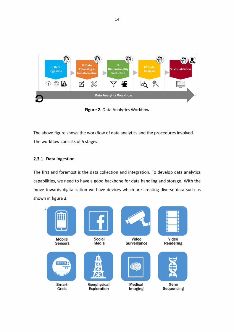
Figure 2. Data Analytics Workflow
The above figure shows the workflow of data analytics and the procedures involved.
The workflow consists of 5 stages:
The first and foremost is the data collection and integration. To develop data analytics
capabilities, we need to have a good backbone for data handling and storage. With the
move towards digitalization we have devices which are creating diverse data such as
shown in figure 3.
15
Figure 3. Different Data Sources (EMC, E. S. (2018))
From different data sources the data that is being created can be categorized into 4:
• Structured Data, this category contains data that has a defined type, format and
structure.
• Unstructured Data, data with no structure such as text documents, images and
videos.
• Semi-structured data, data with a pattern which enables parsing such as XML data.
• Quasi-structured data, data from web clickstream which may have inconsistent
data that takes time to format (EMC, E. S, 2018. p. 5-9).
Figure 4. Data Categorize (EMC, E. S. (2018))
Figure 4 shows different data categories and volume of each category that is being gen-
erated. With different types of data being created there are different devices which are
16
used to store and manage these datasets. The tools which are used for this purpose are
databases. There are two types of databases which are used to store data Relational
databases and Non-Relational Databases. The difference majorly in both is the type of
data that they can store and for this task there are a couple of databases which can be
used such as Mango dB, PostgreSQL, MySQL and Neo4j. Once the data is stored within
these databases data can be retrieved or accessed by using query languages. This is the
most important part of the data analytics workflow as without this stage there will not
be any data to be analyzed.
After data collection and storing we can retrieve data from those sources either by using
SQL queries or by using different data injectors which are available with almost every
programming languages and the BI tools so that the data can be used for further pro-
cessing.
Once we have the data retrieved and injected, the second step is to clean and transform
data. We can also say this stage as the ETL that is Extract Transform Load. This is the stage
where most of the work starts in the data analytics workflow, as at this stage the data is
being understood meaning what are we dealing with and what is that we require to cre-
ate value for our business . We transform our data into the required format and deal
with the missing values within the data or any discrepancies (Mourya, 2012, p 32). As
this the stage from where we start to develop the data that will be used to develop the
features.
The techniques used to transform the data includes statistical and mathematical model-
ling to get meaning out of raw data. The output of this stage is the features which are
developed from the data that will help us in prescriptive and predictive analytics.
17
This stage is also important in a way because if we remove some important data within
this stage it will have impact on the results. Most of the time is taken within this stage to
understand, clean and transform data for the further analysis.
After we have developed our features from the cleaned and transformed data next stage
is the dimensionality reduction. In this stage we reduce the features to the ones which
will have the most impact on our model. Dimensionality reduction is the process of re-
ducing the number of random variables under consideration with the principal variables.
As there are some features which can be removed or combined to have a better expla-
nation of the data. There are different techniques that can be used for dimensionality
reduction like
• Principal Component Analysis (PCA)
• Linear Discriminant Analysis (LDA)
Dimensionality reduction has a huge impact when we are dealing with multi-dimen-
sional data such as data from figures where we have a huge number of data points and
using different techniques, we can reduce our variables.
This has a lot of advantages firstly we have low storage to store data, secondly it is easier
to visualize 2D data rather than 3D. Apart from that it helps us in feature selection which
is very helpful because having extra or irrelevant data can make our model to give false
predictions.
This is the stage where we preform the analysis, we can say that the data analysis can be
done for different reasons at this stage. It can be done to create visualizations which
18
would help in representing the data for the other users that would be descriptive ana-
lytics or it is being done for statistical modelling which would be the basis for the pre-
scriptive or predictive analytics (Prath W (2017)). Whatever the reason is for doing the
analytics this is an important stage because from here onwards we use the data which
would either run different models or for the team members to view the data through
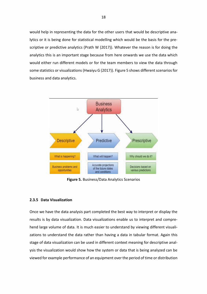
some statistics or visualizations (Hwaiyu G (2017)). Figure 5 shows different scenarios for
business and data analytics.
Figure 5. Business/Data Analytics Scenarios
Once we have the data analysis part completed the best way to interpret or display the
results is by data visualization. Data visualizations enable us to interpret and compre-
hend large volume of data. It is much easier to understand by viewing different visuali-
zations to understand the data rather than having a data in tabular format. Again this
stage of data visualization can be used in different context meaning for descriptive anal-
ysis the visualization would show how the system or data that is being analyzed can be
viewed for example performance of an equipment over the period of time or distribution
19
of workload on different employees. The second option is to see the results of a predic-
tive modeling task and how does our model projects the task for instance viewing the
output of churn analysis that how many customers will the company retain depending
upon the past history of the customers or forecasting the trend of the financial market
these type of visualizations would be the ones coming from the models created for pre-
diction.
Figure 6. Different type and Purpose of Visualization (Sandra (2019))
Figure 6 shows us the different type of visualizations that can be used to represent data
and what type of properties of data can be represented from different visualizations.
2.4 Business Intelligence
The term Business intelligence was first coined in the 1865 in the book ““Cyclopaedia of
Commercial and Business Anecdotes” by Richard Devens, since then it has become the
backbone of every data driven organization (Balakrishnan, 2018). The need for actiona-
ble information is increasing exponentially, with the advent of smartphones and tablets
20
the business managers are always looking for real time analytics through which they can
stay informed. With today’s volume, velocity, and variety of data the traditional systems
cannot cope with the ever-increasing demands of business managers. It must be under-
stood that giving data to a business analyst will make actionable information, the data
needs to be cleaned, processed, and verified before it can give any actionable insight
(Sherman, R.).
BI is the process of converting data to actionable insight. According to Solomon Negash
and Paul Grey, The BI as systems include
• Data Gathering and Integration
• Data Storage
• Data Representation and Knowledge Management
Figure 7. BI Ecosystem (Business Intelligence Guidebook: From Data Integration to Ana-
lytics)
Every organization nowadays is gathering huge amount of data, which they can use to
improve their businesses. Today data is being sold as a product by the companies which
21
can be used by others to either drive their business in a smarter way or to provide better
services to the end user by having access to different types of data.
This is the initial step which every organization works with to have a data driven ap-
proach for their business. With the volume, velocity and variety of data being produced
today it is easy to be overwhelmed by the opportunities that the data can bring for their
organization. But it is also very easy to be lost in the ocean of data while looking for
answers. So, the data gathering becomes a crucial stage for a business success because
wrong data can be misleading and very dangerous. It is easy than ever before to gather
data from different sources as most of it can be accessed using open API and if more
specific data is required that can be bought from different stakeholders. We can take the
example from the social media nowadays whenever we make a search or request over
the internet that information is being captured and w.r.t that data we get personalized
recommendations through different platforms in the form of ads. This is a good example
of data being gathered by someone and then used by different service providers so that
they can provide better experience to their customers.
The data gathering starts once we have a business need and with that, we map out the
data required to make the product or service a success. Without having thorough under-
standing of the business product, it will be very difficult to acquire the right data to make
it a success.
Once we have gathered the required data the next stage is the data storage. How and
what to store from the data that we have gathered. DW is the most common term that
comes a mind when referring to data storage. DW is the backend of every system which
requires data for further processing. Meaning DW is the place where data is requested
from for analysis (Ivan K, 2018). DW is only the storage tool that is used to save and
access data, but the most important part of the data storage is the data strategy. Every
22
organization needs to have a data strategy in place if they are going to have data driven
approach within their organization. The data strategy answers the following questions
• What data should be kept?
• How the data should be structured?
• How the data should be stored?
• How the data should be integrated?
• How the data should be secured and accessed?
While developing the data strategy for an organization the above questions should be
kept in mind. Because of the huge volume of data, it is neither feasible nor required to
all of it at real time, we can store the data that is most beneficial. The data strategy must
be in line with the business strategy this will help in defining what is required and what
can be left out.
Secondly there is no point of keeping all the data in its raw we can have only the related
data available and other in the form of a summary. Also, when the data needs to be
updated must be kept in mind so that we have recent data for our analysis. Next thing is
how should the data be stored should it be in the cloud or on premises, because with
the advancements in technology and virtual data warehouse it is very easy to access
without moving into data warehouse. But this has its own implications. Some data is
needed on request other is might not be needed on real time. This also brings in the
concept of data lake which has been a new trend in the recent years through which there
is a possibility to save everything in its raw format. But with this the problem of data
standardization occurs because the data should reflect the business plan. That is why it
is important to have structured data. Data strategy should also be able to answer if the
data should be left in silos within the organization or it should be integrated so everyone
can access it.
23
The question also arises who should own the data because the data is the lifeline of any
organization it must well managed. There should be workflows and processes to gain
access to the data, otherwise it will be very difficult to keep record of the data. Lastly the
data needs to be secure and data quality needs to be maintained. Apart from that it is
also important to follow the rules of what type of data can be stored because every
country has different rules like in Europe the GDPR plays a role in safeguarding the rights
of its citizen when it comes to data. These are some of the points that need to keep in
mind while devising the data strategy but there are a lot more things that one can also
consider like how to deal with new data sources in the future? Would it be possible to
sell the data that we have if so, then how, when and where? So, these rules and regula-
tions need to be kept in mind while designing the data strategy for an organization or a
business case.
This is where the data is converted into meaningful information through which we can
gain knowledge which will affect the performance in general of an organization. Data
storage and data gathering are the fundamental part of the BI process so that data driven
decisions can be made for an organization. But the most important is how does that data
is being utilized if it is not able to create actionable insights which will have impact on
the future of the business that can be in terms of revenue and value, defining risk ad-
verse strategies, cost reduction or giving a competitive edge over other competitors
through data driven innovation (Lei C (2011)).
To deliver the information from the data there are SaaS tools like Tableau, Qlik, Power BI
and Sisense which can be used as these tools give a competitive edge to the data users
as it helps them in
• Data Discovery
• Data Representation
• Dashboard
24
• Data Visualization
• OLAP
• Predictive Modelling
The users can utilize these tools for data discovery and understanding which would help
in creating visualizations thorough which the information can be provided to the busi-
ness managers to gain knowledge (Zhou Q (2018)). These tools also provide the user
with OLAP capabilities which helps to understand the information in an interactive way
by filtering or slicing different features on real time. These tools are powerful way to
represent and visualize data. Apart from these tools there are some programming lan-
guages like python and R which are famous for data analysis, but one needs to be profi-
cient to use these. These languages can be used for data analysis and exploration but
they have built in libraries like Matplotlib, Seaborn, Ggplot for data visualization but yet
again they don’t provide the interactivity that the BI tools can provide but to cater for
this problem again there are some libraries which can provide interactivity and OLAP
capabilities but it takes time and effort to get them up and running. Libraries like plotly,
Dash, rshiny and Cubes give the user capabilities to design their own dashboards with
interactive features which can be used by multiple users to visualize and interact with
the data.
25
Figure 8. Business Intelligence Ecosystem
The above figure shows different task and features and BI ecosystem and how are they
interlinked with each other (Jui-Yu W. (2010)).
2.5 Importance of Data Analytics and Business Intelligence
Business Intelligence and Data Analytics are a part of the same ecosystem because they
are used for data discovery and data representation. Both are used in exploring data and
extract information, but the difference lies in what type of data is being analyzed. In
Business Intelligence we look at the data which drives the business of an organization
and representing that so that the business analyst can make decision on how to improve
the performance of the organization. Most of this analysis is done around the business
metrics such as different trends showing why there was rise in the sales during a certain
time period or why the cost of a product increases for certain time. The main idea behind
this to develop strategies to for improving the business. With Business Intelligence we
are mostly dealing with descriptive analytics. On the other hand, data analytics is not
26
focused on any type of business or metrics, it is done to retrieve information from the
data and then develop models for predictive analytics. While using data analytics we can
develop new products which could help the organization in moving forward. We can in-
tegrate multiple data sources to develop new and better products by using data analytics
such as providing predictions for the future or having recommendations on the next
trend that has a possibility to happen.
To have a recap we can say that the Business Intelligence is used to deliver information
from the data that can be used to help the business in making data driven decisions by
extracting actionable insights (Loshin, 2003, p 7-8). And data analytics is used to develop
future predictions and recommendations for the user to act on.
2.6 Possibilities
There are multiple BI tools currently being offered to the users which can be used as
SaaS to enhance their capabilities within descriptive analytics. By using these tools with-
out writing a single line of code users can develop visualizations to extract information
from their data. These types of tools are mostly used by the organizations to give a com-
petitive edge to their employees through which they can save time and at the same time
have a universal platform to work with. Apart from SaaS BI tools there are some pro-
gramming languages such as Python and R which can be used for statistical analysis, de-
velop visualizations and have predictive analytics. But one needs to know how to code
and how to use different libraries. Another option is to develop in-house data visualiza-
tion dashboards using open source frameworks which can be published online to be
used by multiple people.
The power of BI tools lies in being user friendly and easy to use, to use these tools there
is no need to have any programming knowledge as everything is so interactive and easily
understandable. Some of these tools offer features for advanced analytics which can be
used for predictive and prescriptive analytics. With programming languages like R and
27
Python which have become very famous in working with data, every company is looking
for people who have knowledge within these languages. The reason being even though
the BI tools are a great tool for representing data they do not have the power to develop
libraries and tools which are required to preprocess and manipulate data. We can take
the examples of Bioinformatics, in this field most of the data discover and data manipu-
lation is done in the R language as there are multiple libraries and tools which are re-
quired to process data and BI tools don’t have these offering at the moment.
Even though the BI tools give us great possibilities and power to represent our data but
still the programming languages have an edge when it comes to data preparation and
processing. These programming languages now also offers possibilities to have interac-
tive dashboards through open source libraries which can be used to develop visualization
with interactivity libraries such as Rshiny, Bokeh and Plotly can used alongside program-
ming languages to deliver the same options which the BI tools have to offer in terms of
interactivity but to work with these options one need to have understanding of the pro-
gramming languages.
In the next chapter we describe different BI tools currently available in the market, what
features do they offer and how do they compare with each other.
28
3 BUSINESS INTELLIGENCE PLATFORMS AND FEATURES
Today there are a lot of business intelligence platforms available which are being used in
the industry. Most of them offer more or less the same capabilities for data analysis.
While choosing a BI tool some features should be kept in mind depending upon the re-
quirements according to the business needs. There are some BI tools which are clearly
leading in the BI ecosystem. According to Gartner the BI tools can be divided into 4 cat-
egories according to their offerings. The four categories are Niche Players, Visionaries,
Challengers and Leaders. The below figure shows the categorization of the current BI
tools.
Figure 9. Gartner 2020 Magic Quadrant for Analytics and Business Intelligence Plat-
forms (Gartner)
29
As we can see that Microsoft and Tableau are clearly the leaders in providing Analytics
and Business Intelligence Platforms. With every passing day we are seeing new players
into the market for providing BI tools. This is an active area of research and all the play-
ers are developing their tools by bringing innovation and emerging technologies into
their offerings. We can have a comparison from the last two-year Gartner magic quad-
rant which shoes that these tools are being developed everyday while new players are
From the Magic Quadrant the tools which are leading the BI ecosystem are Microsoft
Power BI, Tableau and Qlik. Most of the BI tool providers are equipping their tools with
the concept of self-service BI. In 2011, an organization TDWI which provides educational
research on data and BI described the phenomenon of self-service BI as:
“Self-service BI is defined as the facilities within the BI environment that enable BI users to be more self-reliant and less dependent on the IT organisation.”
30
The idea behind SS BI is to be self-reliant and reduce dependency. This is so that the
involvement of the IT is reduced within the BI ecosystem because within an organization
business teams understands best how to extract value from its own data and what in-
sights would be beneficial for the organization. Being able to modify BI dashboards
themselves not only they will be able to personalize their reports but time to market will
also be reduced significantly. According to TDWI key objectives that SS BI should focus
on are
• Simple and Customizable end-user interfaces.
• Easy access to diverse data sources.
• Easy to use and understand
• Quick deployment and manageable architecture
3.1 Magic Quadrant
Magic Quadrant is a market research report that is published every year for different
industries released by the IT consulting firm Gartner. These reports are developed using
qualitative data analysis to demonstrate the market trends. In other words, it a graphical
representation of the performance and ability to deliver based on their vision for com-
panies in a specific technology-based market.
The Magic Quadrant uses two-dimensional matrix to represent the strength and differ-
ences between companies rather than providing a ranking system. In this way it is easy
to visualize the competitiveness of the companies/products within the magic quadrant.
Magic Quadrant is divided into 4 different categories and their competitiveness is deter-
mined by their vision and ability to execute (Gartner).
31
Niche Players:
In this quadrant lie the products/companies which are either focused on a region or new
businesses. They do well in a specific market segment. They score low on both ability to
execute and the completeness of their vision.
Challengers:
This is the quadrant which include products/companies which have a good ability to ex-
ecute but they lack the vision to become leaders. They are well positioned to succeed in
the market. They are limited to specific use cases and application domains. They fall
short of the leaders in terms of effective marketing, geographic positioning and business
specific products and innovation.
Visionaries:
This is the quadrant which includes products/companies which have a good vision and
understanding of the market along with innovative capabilities but lack the ability to
execute. The early stage startups or larger business which are trying to compete lie in
this quadrant. They are thought leaders and innovators but the lack in scaling and ability
to execute but still provide consistent execution.
Leaders:
This the quadrant which includes the market leaders scoring high on both ability to exe-
cute and are future driven with a vision to be innovative. These include products/com-
panies which have a huge customer base and have mature markets. The leaders also can
affect the market trend. Leaders tend to have solid understanding of market needs and
offer products with an attractive pricing model which supports proof of value. Their
products deliver clear business value and have the ease of use that it can be used with
least involvement of the IT department or experts. Leaders have a roadmap to solidify
their position in market by constantly evolving the product with innovative features.
32
The Magic Quadrant doesn’t mean that only the leaders are the ones which would cap-
ture the whole market. It totally depends on the business needs and current require-
ments because it can be that the challengers or the niche players are offering enough
capabilities for a business to meet its demands.
The Magic Quadrant reports are used by investors to look for companies which fit their
needs and business/companies to have a comparison with their competitors and gain an
upper hand. As the market is evolving with time it can be the case that the Magic Quad-
rant assessment may be valid for one point in time. The readers can have different defi-
nition for Completeness of Vision and Ability to Execute so it must be defined so the
users can understand the used features.
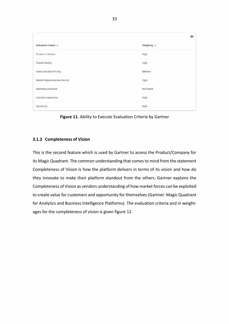
Gartner’s magic quadrant has two features one of which is Ability to Execute. As the
name suggest it describes the ability of a product/company to deliver platforms with
ease of use. The points which are kept in mind by Gartner to assess Ability to Execute is
given below in figure 11 along with their weightages.
33
Figure 11. Ability to Execute Evaluation Criteria by Gartner
This is the second feature which is used by Gartner to assess the Product/Company for
its Magic Quadrant. The common understanding that comes to mind from the statement
Completeness of Vision is how the platform delivers in terms of its vision and how do
they innovate to make their platform standout from the others. Gartner explains the
Completeness of Vision as vendors understanding of how market forces can be exploited
to create value for customers and opportunity for themselves (Gartner: Magic Quadrant
for Analytics and Business Intelligence Platforms). The evaluation criteria and in weight-
ages for the completeness of vision is given figure 12.
34
Figure 12. Completeness of Vision Evaluation Criteria by Gartner
Next, I will give an overview of the features that should be in the BI Platforms and what
is the focus of today’s BI platforms. This will also give us an understanding of how differ-
ent platforms are differentiated into different quadrants.
3.2 Business Intelligence Platform Features
Today Business Intelligence platforms are characterized by the ease of use that provides
full analytical capabilities from data preparation to data exploration and insight genera-
tion. Vendors of BI platform include both large technology firms and startups. The large
technology firms have wider offering capabilities then their counterparts. In today’s fast
evolving world, the BI platforms are not measured only on their data visualization capa-
bilities. If we make a comparison of today’s Gartner Magic Quadrant for BI platforms
with the one of 2015 the BI platforms have developed further and depreciated from their
previous positions over the years. It is clear from to stay competitive and ahead of others
they must continuously innovate and develop products which will be required by the
35
customers by having a long term and futuristic vision of their products. In 2020 the most
important features that the BI platform providers are investing in are.
With the excess of data, the most important thing is its security and who has the access
and readability of this data. Along with that comes the authentication and user admin-
istration of the users to the platform. So that only the people with right access grants
can view the data. As these reports and dashboards can be shared with external people
so it is important the customers have access of who can access the platform. Apart from
the security of the platform is also very crucial.
With the ease of access and storage of data with cloud services. It is important for the BI
platforms that they support multi cloud deployments across cloud providers. Meaning
the user should be able to store and access data from different cloud providers.
Another important feature is that the connectivity of data from multiple sources. There
are multiple data storage platforms which store data in different formats. It is very im-
portant to have access and connectivity to these storage platforms so that the data re-
quest and data ingestion in these platforms is made easy. Apart from having connectivity
with different type of source it is vital to have access to the famously know data sources
if not all.
Once we have the data connectivity the next step is the data preparation for the visuali-
zations. As these platforms are being used by people from every walk of life it is not
compulsory that the user have knowledge of data manipulation using query languages.
36
It is very important for the platforms to provide options like drag-and-drop or recom-
mendations so that users can prepare the data for their visualizations easily.
This is one of the modern features in the BI platforms that is being implemented and
improving with time. It is the capability of the platform to automatically generate insights
using machine learning and Artificial Intelligence. It gives the user reports and analytics
of how the businesspeople analyze their data. This is an active area of research and has
become a key differentiator between different platform providers.
BI platforms today are offering advanced analytics option to their users by having built
in options or by import, integration of externally developed models. So that the user can
use the BI platform as one stop shop as they will have everything, they need in one place.
BI platforms provide the users with interactive dashboards which are used to manipulate
the charts in real time for data exploration. Options included in the charts are beyond
the normal pie, bar, and line charts they now have charts such as heat, tree, and geo-
graphic maps and some specialized maps for different industries. This gives the platform
an opportunity to work multidimensional customers. These interactive dashboards give
the user an opportunity for data storytelling which makes it easier to understand and
explain.
The concept of Natural Language Query gives the user an opportunity to query the data
using the business terms by searching for it within the dashboard. While the NLG gener-
ates text from the data insights within the dashboard as the user interacts with data.
37
These are some of the most important features that should be present within the mod-
ern-day BI platform. And it is also not just that these features should be available within
a platform but how easy and useable these features are for the user as these are features
which put the BI platforms in different quadrants.
3.3 Business Intelligence Platforms
There are hundreds of BI platforms which are offering their services to the users today.
Some of them are industry specific while others are multi-purpose. It is a very a very
challenging task to decide which platform will fulfill ones needs. One can say that the
leaders from the Gartner’s magic quadrant will be good enough for all the organizations
which want to implement data analytics capabilities. But it must be considered that the
BI platforms charge for their services and apart from there can be some options that the
organizations are looking for but are not offered by those BI platforms. For my pre-study
on BI platforms I worked with 3 platforms Microsoft Power BI, Tableau and Qlik.
This is a BI tool that is provided by Microsoft. It has been a leader for the last couple of
years in the Gartner’s magic quadrant for analytics and business intelligence platform
because of its visionary product roadmap and massive market due to the Microsoft Of-
fice. Power BI as a BI tool was made available for the general public in July 2015, before
the official Power BI was launched there were some versions available since 2011 under
the name of Project Crescent. In 2013 it was named Power BI and was offered as Power
BI for Office 365 during that time it was based as Microsoft Excel add-ins.
Microsoft Power BI is a cloud based BI tool, which has data warehousing capabilities
along with data wrangling/manipulation/cleansing, data modelling, data discovery, in-
teractive data visualizations dashboards and augmented analytics. Power BI is offered as
SaaS with the Azure cloud services or as an on-premises solution and there are mobile
38
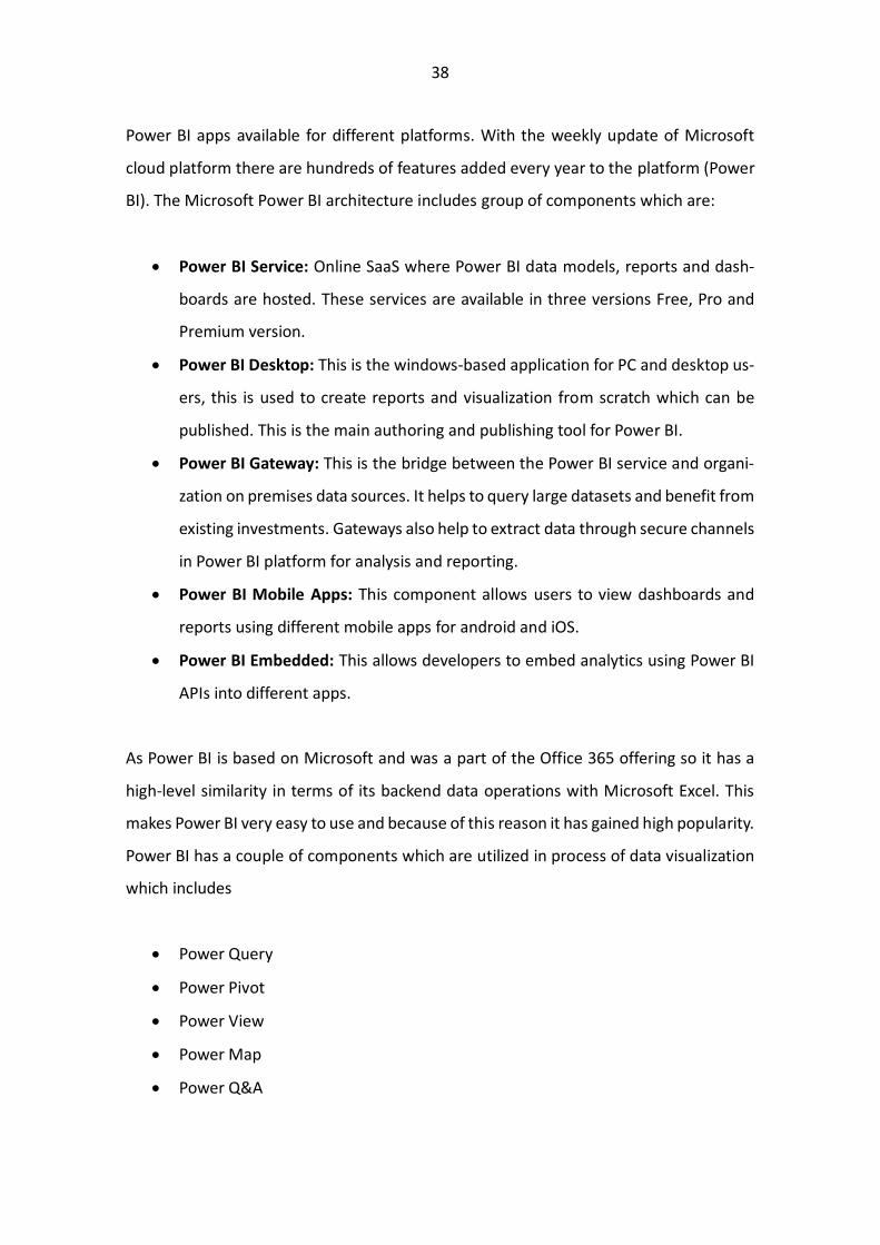
Power BI apps available for different platforms. With the weekly update of Microsoft
cloud platform there are hundreds of features added every year to the platform (Power
BI). The Microsoft Power BI architecture includes group of components which are:
• Power BI Service: Online SaaS where Power BI data models, reports and dash-
boards are hosted. These services are available in three versions Free, Pro and
Premium version.
• Power BI Desktop: This is the windows-based application for PC and desktop us-
ers, this is used to create reports and visualization from scratch which can be
published. This is the main authoring and publishing tool for Power BI.
• Power BI Gateway: This is the bridge between the Power BI service and organi-
zation on premises data sources. It helps to query large datasets and benefit from
existing investments. Gateways also help to extract data through secure channels
in Power BI platform for analysis and reporting.
• Power BI Mobile Apps: This component allows users to view dashboards and
reports using different mobile apps for android and iOS.
• Power BI Embedded: This allows developers to embed analytics using Power BI
APIs into different apps.
As Power BI is based on Microsoft and was a part of the Office 365 offering so it has a
high-level similarity in terms of its backend data operations with Microsoft Excel. This
makes Power BI very easy to use and because of this reason it has gained high popularity.
Power BI has a couple of components which are utilized in process of data visualization
which includes
• Power Query
• Power Pivot
• Power View
• Power Map
• Power Q&A
39
With the utilization of these components we can develop successful Power BI applica-
tions. We can import data from multiple data sources then preform data discovery and
data exploration using the DAX language and data visualizations. And from there dash-
boards can be developed within the Power BI platform. Power BI being a Leader within
Gartner’s magic quadrant has some strengths which makes the more competitive as
compared to its counterparts. The main strengths being
• The low price and the inclusion in the office 365 makes Power BI a default BI tool
for the organization who are working with the Microsoft office products, and its
similarity with Excel makes it easy for the users to get started with.
• After being a follower in 2013 when Power BI was launched it has come a long
way in terms delivering products to its customers. As now it is offering AI capa-
bilities through its Azure cloud which makes Power Bi standout from other plat-
forms.
• Apart from the offerings the most important thing is the vision that Microsoft
must deliver solutions to its customer which makes it a leader in providing busi-
ness intelligence services.
Even though Power BI is a leader in the Gartner’s magic quadrant there are some draw-
backs in Power BI offerings such as:
• With multiple cloud platforms available like AWS, GCP and Azure Power BI only
offers one cloud connectivity which reduces the flexibility of the customers from
different cloud platforms as they need to switch to Azure.
• The difference in the offering between Power BI Pro version and Premium version
makes it difficult for the users to adapt the tool on a higher level. Because the
storage capacity of the Pro version is limited, and more storage is required the
user needs to switch to a higher version which has a huge price difference.
40
Tableau was developed as SaaS data visualization tool by three researchers from Stan-
ford University in 2003. The idea behind tableau was to deliver a solution which will help
people understand data in an easy way. They wanted to combine the field of computer
graphics and databases which led to the invention of VizQL which gave an opportunity
to the people to analyze their data just by drag and drop of pictures and graph they want
to see. Since its creation tableau has always been a strong competitor by providing inno-
vative solutions to their customers. Tableau is one of the leaders in Gartner’s magic
quadrant for the last couple of years. According to tableau it is not enough to be on a
mission that matters it is also important to have the technology to support the vision. To
enhance its customer offerings and integrate the emerging AI technologies Tableau ac-
quired a startup in 2018 which helps them to deliver AI technology along with their plat-
form. Later in 2019 tableau was acquired by Salesforce (Tableau).
41
Figure 13. Tableau Workflow (Tableau)
The workflow of Tableau software is shown in figure 13. These are the different steps
that a user needs to go through in order to develop and share data visualization dash-
boards. As we can see in the deployment stage there are a couple of options available
like on premises, cloud, and hosted environments to use the Tableau software. Tableau
provides the complete ecosystem for data analytics starting from data ingestion/integra-
tion from multiple data sources, data preparation for keeping the data UpToDate and in
the correct format for the data visualization, then providing an easy and interactive so-
42
lution to develop data visualizations and finally publishing those visualizations on a dash-
board which can be utilized by others. Tableau provides different products in its offerings
which can be utilized depending upon the requirements (Murray, 2016).
• Tableau Desktop
It is the design tool for creating visual analytics and dashboards. It has two versions
Personal and Professional version. The difference between the two is the data con-
nectivity options, so if the user wants to access some specific data type it should
consider utilizing the professional version.
• Tableau Server/Online/Public
There are three tools provided by Tableau for sharing and storing information. The
most basic one is the Tableau Public it is used by users who do not have any issue in
storing the data in public cloud which is accessible by anyone. The second one is the
Tableau Online in which data security is provided to the user and there is no need for
any software or hardware as the data is stored and managed by Tableau and is only
accessible by people who have the right access. The last one is the Tableau Server
which is used by the users who want control over their data in terms of how it is
stored and managed. It can be installed on the on-premises servers or on the cloud
services that the user is working with.
• Tableau Prep
This product from Tableau provides a visual and direct way to combine, reshape and
clean data. It provides ease for preparing data without applying any queries over the
data. Apart from that it can be used for building data flows, so the data remains Up-
ToDate.
43
Figure 14. Tableau Prep Data Flow (Tableau)
Figure 14 shows how a data flow can be developed within the Tableau Prep. Further
Tableau Prep consists of two products Tableau Prep Builder and Tableau Prep Conductor.
Builder is used to create data flows and the conductor is used to run the data flows on
the servers or cloud platforms (Tableau Prep).
Including the three features above there are a couple of more features like Tableau Mo-
bile for visualizing the dashboards on handheld devices. Tableau Developer tools for giv-
ing the users a possibility to connect with the external APIs and develop the Tableau
software customized for your organization.
All these products have a different pricing range and depends upon the user require-
ments to devise a plan. The points which makes Tableau to stand out from its competi-
tors and be a leader in the Gartner’s magic quadrat are
44
• The ease of data manipulation and visual exploration with broad range of data
source ingestion and graph options gives the user an opportunity to work with
the data without any problems.
• The momentum with which Tableau has grown shows that they have a vision and
the ability to execute by driving innovation within their product offerings.
• The most important is that the customers have a fanlike attitude towards tableau
because of its ease of use and visual analytics which has made Tableau to rank
well above the average in the overall experience.
Formerly known as Qliktech the company was founded in 1993 in Lund, Sweden. The
first version known as QuikView was developed to equip people with a tool do retrieve
detailed data analysis from various systems. QUIK the original name of the product stood
for Quality, Understanding, Interaction and Knowledge. Now the company is named Qlik
and has two product offerings Qlik View and Qlik Sense. The legacy tool which was pro-
vided by Qlik was Qlik View but to compete with the emerging competitors and the de-
mand for self-service BI Qlik reinvented itself by building next generation BI tool to cap-
ture the new trend while keeping in mind the following points to create QS (Vitantonio,
2018).
• QS should be visually beautiful so that the user can leverage the full power of the
BI tool.
• QS should be more agile that it can be accessed from any device and location
rather being on locally installed client.
• QS should be more collaborative in terms of consuming data from multiple
sources and real time capabilities to provide users with up to date information.
• QS should have improved capabilities like security, reliability, and scalability so
that the tool can be used by both SME and large enterprises. So that the power
of data can be leveraged by everyone regardless of the size.
• QS should have short development and deployment time.
45
The reason for inventing QS is because the business users wish to be in more control and
get faster access to BI. Today QS is the primary tool that is being offered by Qlik which is
totally new as compared to its earlier version QV. QS provides an end to end platform
which includes data integration, business intelligence and conversational analytics. Qlik
is a leader in the Gartner’s magic quadrant because of the strong product vision for ML
and AI driven features but lies behind some the other competitors in the leader’s quad-
rant such as Tableau and Microsoft Power BI. The products offered by Qlik the QV and
QS are totally different from each other and it needs to made clear that transition from
QV to QS is not straight forward as QS is not an upgraded version of QV rather a com-
pletely new tool while having some similarities such as the security model called section
access, Qlik’s associative engine and data aggregation techniques(Qlik Sense).
Figure 15. Qlik Sense as SS BI (Qlik)
46
In a SS BI ecosystem there are four interdependent areas which cumulatively provide
one successful solution. Even though it is the front end that is advertised and usually
visually presented but it is the combination of all four areas which creates tool to SS BI.
Figure 16. Feature Comparison QS and QV (Qlik)
In figure 16 we can see a comparison of the features being offered by QS and QV. The
QV is termed as more of a guided analytics platform where applications are created by
developers in which they consider the data model, layouts and charts. The end user can
interact with the dashboard but is limited to the visualizations available in the dashboard.
While on the other end QS is a SS BI where the user has the freedom to create layouts
and new visualizations which the end user finds informative.
Being a leader in Gartner’s magic quadrant there are some features which make Qlik
stand out from its competitors.
47
• Qlik’s flexibility of deployment being one of the first vendor to offer management
capabilities across multi-cloud deployments and flexibility to deploy on-premises
or any major cloud provider or a combination of both make Qlik standout.
• Qlik offers augmentation and data literacy providing a unique associative experi-
ence to uncover insights on data that be missed by other query-based tools.
• With the expansion in the offerings by the Qlik platform to provide tools to be-
come a SS BI and along with its standalone options like Qlik Data Integration Plat-
form gives Qlik a competitive edge over service providers.
In the next section we will get an overview of the other options available for developing
BI platforms rather than using BI tools as SaaS. What the possibilities that can be used
to develop in-house BI applications.
48
4 OPEN SOURCE LIBRARIES FOR DEVELOPING BI APPLICA-
TIONS
Today there are many BI tools available in the market which are being offered my differ-
ent vendors. These BI tools are easy to use and can be used by almost every industry but
alongside that there are other options available which can be used to develop Dash-
boards with interactive visualizations, which can be used by multiple people within in an
organization. Even though one must program and develop these dashboards but with
the interactive visualizations framework available today we can develop BI dashboards.
Some of the most common programming languages used for data analysis are python
and R as these are easy to understand and get started with. We can develop these inter-
active visualizations using the open source frameworks along with the data analysis lan-
guages like R and python and publishing these dashboards on an angular or flask
frontend so that it can be used by other users. One of the most famous open source
frameworks are
• Shiny by R Studio
• Bokeh
• Plotly (Dash)
4.1 Shiny from R Studio
Shiny is an R package to build interactive web applications directly from R. Using shiny
we can make dashboards, host standalone app or webpages or embedded them in the
R markdown. R is one of the best statistical language for data processing and data ma-
nipulation, using R it becomes very easy to crunch data and get meaningful insights from
it and then we can develop shiny app for the end users to have interactive visualiza-
tions(Shiny).
49
4.2 Bokeh
Bokeh is a Python library which is used to develop interactive charts, dashboards and
data applications. It provides graphics similar to that of D3.js so that the users can create
high performance interactive visualizations over large and streaming datasets. Python is
the best language when it comes to processing data and have multiple APIs which can
be used to create Interactive dashboards starting from data integration till dashboard
creation everything can be done within Python (Bokeh).
4.3 Dash
Dash is an open source Python framework for building web applications, it is written on
top of Flask, Plotly.js and React.js. Dash is a product that is offered by Plotly which pro-
vides data analytics and visualization tools. It is a great tool for developing interactive
data visualizations for people who work with data and Python. It gives the user flexibility
to develop dashboards with interactivity and integrating them into existing frontend ap-
plications.
Dash apps are rendered in the web browser so we can deploy our apps to servers and
share them using URLs. Dash can also be used along with R language and we can repre-
sent data visualizations using Dash. Dash uses React on the frontend and Flask on the
backend (Dash).
50
5 SIMULATIONS AND DASHBOARD PROTOTYPING
After doing my research on different BI tools, I was given the task to develop dash boards
using test dummy data to get a better understand the working of the dashboards, how
to import data, data manipulation, data visualization and dashboard creation. There
were some requirements while developing the BI dashboard.
• The BI tool/application should be interactive and must have OLAP capabilities.
• The BI tool/application should be able to integrate data from MySQL data bases.
• The data should not be published on a public cloud platform.
• The user can export the dashboards in the form of a report.
• The BI tool/application should be able to integrate into the existing angular app
provided by the company.
With the above requirements in mind I developed 3 BI dashboards using Microsoft
Power BI, Tableau and Qlik and one BI dashboard using Dash library which is built on
Plotly.js framework using python language. To have a good comparison between the BI
platforms the dashboards that are developed have a similar structure.
5.1 Data Explanation
The data that I have is the andon calls and logistic request of an organization. The data
which was provided was completely raw and had to go through data cleaning and data
manipulation so that required features can be developed.
Andon is a term that is used in manufacturing it refers to the process of alerting the
management, workers or system of a problem or an issue within the system. This can be
a manual trigger which is initiated to alert others or it can be generated automatically by
51
the production equipment itself. Andon can also be thought of as a signal which identi-
fies where action needs to be performed (Rachaelle).
Andon is a Japanese term which means paper lantern, this concept was introduced by
the Japanese factories where the employees can pull a trigger that would stop the
production and alarm the management(Lucidcharts).
Our Andon calls dataset refers to the same concept of alerting the team when there is a
status update whenever there is a change in the system. It can be generated triggered
both by the system or manually by a user. In our dataset there is a column specified as
andon_color_code which represents the andon call. There are three types of data points
in the andon_color_code column 0, 1 and 2.
• 0 represents the start of an andon call. Meaning whenever the andon call is
triggered it is represented by a 0.
• 1 represents the end of the andon call.
• 2 represents that the andon call has been given a high priority.
As this information is represented in a single column it is difficult to capture the
information of when the andon call starts and when does it end. Because looking at it in
the perfect world we can have only 2 sequences:
• 0 -> 1
• 0 -> 2 -> 1
But that is not the case as this column is based on time so at a particular time multiple
scenarios can take place which makes it difficult to extract this information. To solve this,
I developed a mathematical model which considered different scenarios and gave me
data which I can further analyze for data visualization. Apart from the andon_color_code
column the information that was available was:
52
• Equipment ID, showing which equipment generated the andon call.
• Sender, showing was the andon call generated by the system automatically or
was generated by someone.
• Time, showing when different data points of andon call were created based on
time.
These were some of the major features that I had in andon call dataset.
The second dataset was for the logistic requests made by different users within the
organization. The most important information in this dataset was when the logistic
request was placed and when was it completed apart from that the information whether
the request was an urgent or normal request as that will change the time allocated for
the logistic request to complete. Features in the logistic request dataset were:
• Sender, showing who sent the logistic request.
• Logreq_color_code, shows if the logistic request is labelled as urgent or normal.
• Created_time & Modified_time, showing when the logistic request was
generated and when it was completed.
• Created_by & Modified_by, showing who created the request and modified
showing who resolved it.
53
5.2 Microsoft Power BI
Power BI as a tool is very easy to get started with if one has experience working with
Microsoft Excel. Power BI uses DAX as query language for data manipulation which uses
most of the formulas from excel and some additional ones.
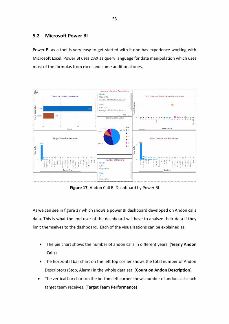
Figure 17. Andon Call BI Dashboard by Power BI
As we can see in figure 17 which shows a power BI dashboard developed on Andon calls
data. This is what the end user of the dashboard will have to analyze their data if they
limit themselves to the dashboard. Each of the visualizations can be explained as,
• The pie chart shows the number of andon calls in different years. (Yearly Andon
Calls)
• The horizontal bar chart on the left top corner shows the total number of Andon
Descriptors (Stop, Alarm) in the whole data set. (Count on Andon Description)
• The vertical bar chart on the bottom left corner shows number of andon calls each
target team receives. (Target Team Performance)
54
• The vertical bar chart on the bottom right corner shows the number of andon calls
per sender. (No of Andon Calls Per Sender)
• The scatter plot on the top right corner shows the time taken by each asset. (Total
calls and Time Taken by Each Asset)
• The table in the center top shows the average time taken to resolve the andon call.
(Average of Andon Descriptors)
• The table in the center bottom shows the number of andon calls which took more
time than the average. (Number of Outliers)
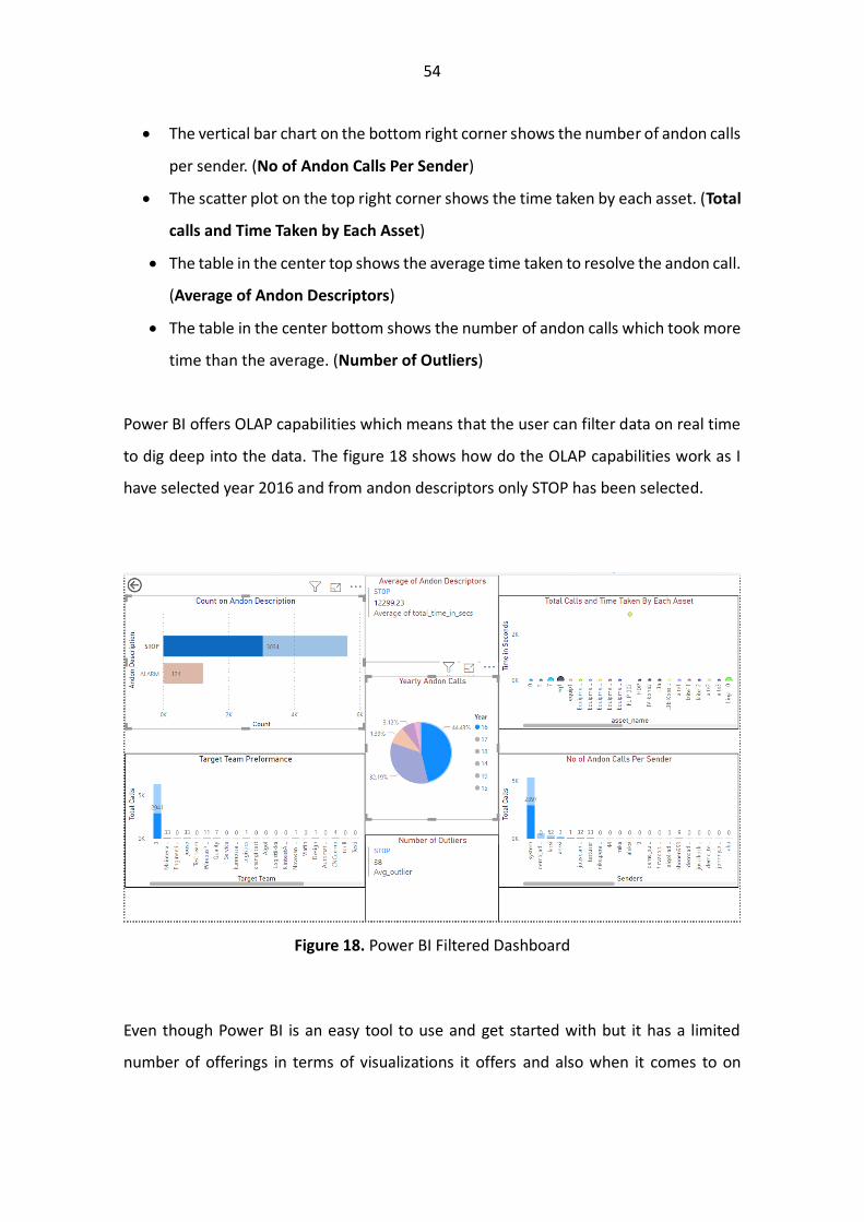
Power BI offers OLAP capabilities which means that the user can filter data on real time
to dig deep into the data. The figure 18 shows how do the OLAP capabilities work as I
have selected year 2016 and from andon descriptors only STOP has been selected.
Figure 18. Power BI Filtered Dashboard
Even though Power BI is an easy tool to use and get started with but it has a limited
number of offerings in terms of visualizations it offers and also when it comes to on
55
premises option the price is quite high and the number of offerings are also reduced.
The strength of Power BI lies because of the similarity with Microsoft Excel when it
comes to data manipulation.
5.3 Tableau
Tableau is another leader in Gartner’s magic quadrant which means they have a good
vision for the future in terms of upgrading their tool and score high when it comes to
execution. While developing a prototype with tableau it was quite easy to use and un-
derstand. The power of SS BI that is offered my tableau in data manipulation and chart
generation is very useful as we do not have to make the connections within the data
ourselves. This was all done in Tableau Desktop I believe the Tableau prep feature given
by Tableau would even make it easier to manipulate data and develop features.
Figure 19. Tableau Data Integration
In figure 19 we can see once I have imported two csv files, Tableau gives me an option
and recommendation of how I can connect these two files. The options like Outer Join,
56
Inner Join which are used to make a relation between two data sources by using SQL
language or any other language is only a click away in Tableau. The second thing that is
important when it comes to data manipulation and feature engineering is the query lan-
guage used by the tool. This is also a strong point within Tableau as the query language
is like Microsoft Excel scripting. If I want to develop a new column based on some calcu-
lations the script would look like in the figure 20 below where we make a column named
outlier.
Figure 20. Tableau Scripting
Once we have developed our features the next step is the data visualizations for the
dashboard. Tableau provides a drag and drop option to develop visualizations using the
imported data and also provide recommendations on the type of chart that would be
appropriate on the selected data for the visualization along with different type of visual-
izations. This feature gives tableau an edge over Power BI as the number of charts avail-
able for visualization and the ease of developing those charts is much greater when using
Tableau.
57
Figure 21. Tableau Data Visualization
Figure 21 shows once we have selected the data to be represented Tableau generates a
chart which it thinks would be most appropriate to visualize the data that is selected and
alongside that it gives other recommendations which can be used if the selected type is
not appropriate for the user. As we can see in the above figure it is very easy to visualize
the data and the chart and it is quite clear of how select different options and change
the chart type. Unlike Power BI where we must extend different tabs to get to the options,
we can select. Another great option within Tableau is that we do not have to develop a
dashboard directly rather we need to make different charts on different sheets which
then available as options for drag and drop to make a dashboard. It gives the user a
chance to explore different charts and options within before finalizing the dashboard.
58
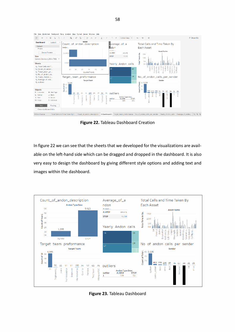
Figure 22. Tableau Dashboard Creation
In figure 22 we can see that the sheets that we developed for the visualizations are avail-
able on the left-hand side which can be dragged and dropped in the dashboard. It is also
very easy to design the dashboard by giving different style options and adding text and
images within the dashboard.
Figure 23. Tableau Dashboard
59
In figure 23 we can see Tableau dashboard which is viewed by the end user who are the
Explorer and Viewer in terms of the Tableau licensing options.
5.4 Qlik Sense
Qlik sense is a SS BI tool provided by Qlik which is also one of the leaders in Gartner’s
magic Quadrant. The structure and working of Qlik is very similar that of tableau. One of
the major difference in Qlik is that if we want to load a single file it is very easy but if we
want to make transformations within the data set it becomes a little complicated as the
query language of Qlik is quite strict and the syntax is somewhat different as compared
to that of powerbi and tableau. To load and transform data in qlik we need to first import
the data into the data editor and then write the query for the data transformation to
generate a new table with the required data. Below shows the data editor in which we
have two tables Year and Fliq data and we are mapping a column. Apart from using the
Data Editor option we can also use the visual data preparation option to connect two
data sources and make it easy.
60
Figure 24. Qlik Data Editor
Once the data is imported into Qlik and the connections are made in between the data.
We can develop different columns by using a similar query language to Tableau.
Figure 25. Qlik New Column Generation
61
In figure 25 we can see the query language that is used to develop a new column called
Outlier. The query language is simple and easy to understand. Once the data is loaded
into Qlik making data visualizations is quite easy. We just need to select a parameter and
SS BI will show how the data is represented using different graphs. The SS BI in Qlik also
gives and overview of our data by using the features and making different visualizations
from them.
Figure 26. Qlik Sense SS BI
62
Figure 26 shows the SS BI capabilities of Qlik Sense and how it provides automatic data
visualizations for the users to visualize and use. From these visualizations we can either
pin them into our dashboard or can make our own visualizations.
Figure 27. Qlik Sense Dashboard
Figure 27 shows the dashboard that is developed using Qlik Sense which can be used by
the end users for extract information from the data. Even thou the cloud-based version
of Qlik is cheaper than that of Tableau we cannot make any suggestions on the enterprise
on-premises version because for that we need to contact Qlik for a quotation. Apart from
that developing charts and dashboard is easier as compared to Tableau if not the same.
5.5 Dashboard Using Plotly (Dash) and Python
Apart from using the BI tool providers there are a lot of frameworks which can be used
to develop BI dashboards. Even though one must know programming language to de-
velop these visualizations and then publish them so that anyone can use it. But it gives
great flexibility and ease once we have developed these visualizations as we can change
the dashboards as we need without any limitations. The best benefit of using such
63
frameworks is that it can be published anywhere either on the on-premises server or the
cloud platform and there is no limitation of how many users can access it.
The previous 3 dashboards were developed using dummy data as I was not allowed to
publish the data over the cloud. The dummy data was mostly clean, and I did not have
to clean the data that much. But once we start to deal with the real-world data it must
be preprocessed so that we can develop features from it. By cleaning data, we mean
• Identifying the null values and analyze them to see if they are important or can
be removed.
• Converting the data to the right format like date and time should be in a format
which can be easily analyzed.
• Deciding which data is important and if there is any connection between two
columns to create value from the data.
• Developing features from the existing data that will be more meaningful once
visualized.
For cleaning and analyzing the data I worked with python using the Jupyter notebook
because it is easy to use and gives you a great flexibility while exploring data. This was
the first step as I needed to understand what feature will give the most information and
in which chart type. Along with that I had to transform the data as there were multiple
replications of different variables so to make them categorical variables, I had to join
multiple variables. One of the most difficult and grueling task was to convert a single
column in to multiple columns because a sequence of number in that column can mean
different meaning as it was generated by a computer system there are multiple combi-
nations which needed to be taken into account. After cleaning the data and having a
good understanding of different features I developed a python app which was first pre-
processing the data and then it was using Dash framework by plotly to develop the charts
which can be embedded into an existing angular app. The biggest benefit of using python
64
and Dash was that I can develop different charts according to my need and then embed
them into any existing app.
65
Figure 28. Dashboard for Logistic Request
66
In figure 28 we can see the dashboard that is developed using python and dash. As we
can see in the figure it is much clearer and understandable as compared to the previous
dashboards developed. The above dashboard has similar OLAP capabilities which means
that we can filter the data based on our requirements. In the above dashboard different
charts are:
• Sender Distribution: Pie chart for explaining how much request were sent by each
user.
• Monthly Distribution of Logistic Requests: Stacked bar chart showing the distri-
bution of Normal and Urgent in every month.
• Weekly Distribution of Urgent & Normal Requests : Stacked and Grouped bar
chart showing the distribution on many total request came in a week for Urgent
and Normal and then out of those how many were solved in time and how many
breached the set time.
• Hourly Distribution of Logistic Requests: Stacked Bar chart showing the hourly
distribution of logistic request.
• Hourly Distribution of Logistic Requests with Intime & Time Breach Classification:
Stacked bar chart showing the total number of logistic requests and classification
over intime and time breach.
• Organization ID: Bar chart showing the total number of logistic requests for every
Organization.
• Time Taken by Logistic Request: Line chart showing total time taken by for the
urgent and normal logistic request within a week.
These are visualizations which are represented in the above dashboard after analyzing
the dataset and keeping in mind the requirements. We can add any type of chart we
want in this dashboard but there should be enough data to support it. Along with that
we can also give styling to the dashboard as in Dash we can design our app according to
our requirements as Dash supports HTML functions.
67
Figure 29. Dashboard for Andon Calls
As I had two different data sets which were not related to each other figure 29 shows
the dashboard for Andon Calls which is similar to in terms of design with Logistic Request
dashboard. These two dashboards are a part of a single dashboard separated by a tab if
you see on the top of figure 20 the tabs can be seen. The charts in the above dashboard
are:
68
• Created Distribution: Pie chart for showing total andon calls created by every ID.
• Monthly Distribution: Stacked bar chart showing total number of andon calls in
every month.
• Weekly Distribution: Stacked and Grouped bar chart showing the distribution on
many total andon calls in a week for different years and how many were Urgent
and Normal.
• Equipment ID: Bar chart showing the total number of andon calls were created
from each Equipment.
• Andon Call Average Time of Completion: Line chart showing average time taken
in seconds in a week for both Urgent and Normal.
• Sender Distribution: Bar chart showing the number of Andon Calls from different
Senders. As the Number of Sender are huge in number and difficult to visualize
so the top 20 are selected.
Using Python language, it becomes very easy to analyze and manipulate the data for
feature engineering and Dash framework provides a great tool for developing interactive
visualizations which can be represented as Dashboard for the end user to analyze data.
Secondly because of the popularity of Python language we can integrate any data source
to extract information in real time and secondly we can use the python code as a backend
and using angular frontend can give access of the dashboard to multiple people. Python
also gives us the flexibility to export the Dashboard as a report if required.
5.6 Comparison of Business Intelligence Dashboards
After developing dashboards using different SaaS tools and open source frameworks. It
is easy to deduce that the selection of the tool for developing dashboard completely
depends on the requirements of the user. Because every tool offers different opportuni-
ties and limitations.
69
The first thing that needs to be considered I believe is in what context the tool is going
to be used. Meaning whether the end user is going to use the tool for exploring different
opportunities within the business or if it is going to be used to further enhance the ca-
pabilities to explore further into a single problem.
The second thing that is important to consider is whether the tool is going to offered as
a service by a third party if so then in what way or if the organization is going to provide
the BI tool for the team or organization. Because if it is the first case then the integration
with the third party applications and what value the customers are looking for when it
comes to BI applications needs to be taken into account for this case I would suggest
developing the BI dashboard inhouse and integrating it with the application. This option
gives the service provider more control over the services that can be offered. If it is the
second case where the whole organization needs to use the BI tool for different purposes
it is better to have a BI SaaS but to select a particular one totally depends on the user
requirements.
Once we have decided on the above two points, we can take into consideration the fea-
tures that are offered by the BI tools. To have a comparison between the BI tools I have
made three categories
• Average
• Good
• Excellent
Average is given to the feature of a given tool if there are some limitations in the offering
as compared to the other BI tools and can become a bottle neck.
Good is given to the feature either if it is the same for all the BI tools or if it is lagging as
compared to the opportunities offered by other BI tools.
Excellent is given if the feature is the best as compared to the other BI tools.
70
Dashboards
Properties
Power BI Tableau Qlik Dash
(Python)
Data
Integration
Good Excellent Excellent Excellent
OLAP
Capabilities
Good Good Good Good
Cloud
Integration &
Scalability
Average,
Limited to Az-
ure
Excellent Excellent Excellent
Data
Preparation
Good Excellent,
Visual Data
Prep
Excellent,
Visual Data
Prep
Good
Data
Visualization
Good Excellent Excellent Excellent
Data Analytics Average Good Excellent Excellent
Third Party
Integration
Good Good Good Excellent
Pricing Excellent
(Cheap)
Good Good Excellent
(Free)
Table 1. Comparison of Business Intelligence Tools
In table 1 we can see the comparison of different features of BI tools. The offering by
Tableau and Qlik are at par with each other. The only feature that they are lagging in is
the third-party integration and pricing. But when compared with other BI SaaS tools they
have the same capabilities in terms of third-party integration but when compared to
Plotly Dash with Python they score low because Python as a backend can be integrated
71
into any language and the Dashboard can be presented with most of the frontend lan-
guages.
For BI SaaS tool Tableau and Qlik are the leaders with minimalist differences but these
services to come at cost. But when it comes developing highly interactive dashboards
and having most of the features similar to that of the other SaaS BI tools it is good option
to develop Dashboards using Dash as it offers flexibility and scalability for integrating
multiple libraries for data analytics and it is free of cost.
72
6 Platform Integration
Once the BI dashboard is developed the last stage of the project was to integrate the
dashboard with the existing Fliq software. The frontend of Fliq is based on Angular
framework while the data is being stored within My SQL/ Maria Db and PostgreSQL is
used for the time series data. The whole code base is running over Microsoft Azure.
The challenge was how can we integrate the BI dashboard along with the Angular
frontend. Dashboards developed using Power BI, Tableau and Qlik can be integrated into
the Angular frontend by using their API which are available for most of the famous lan-
guages. But the dashboard that we finalized was based on python backend for data pro-
cessing and Plotly dash for data visualization.
There are a couple of ways in which we can integrate the Python based code into Angular
frontend. The most common approach would be to develop a Flask app from the Python
code and embed the URL of the Flask app within Angular which will be displayed on an
event. To embed the Flask URL, we can use the HTML Inline Frame Element <iframe>
which is used to represent a nested HTML page within a current one. But there is no
need to develop a Flask app as the visualizations developed using Dash Plotly is built on
top of Flask so whenever we execute the code it will create a URL similar to that created
by the Flask app which can be accessed in the browser. With this issue resolved the next
is how do we run the Python based backend code with the Angular frontend. First idea
that comes to mind is to initiate the Python script on the click of a button. There are
different strategies that can be used to run the Python Backend with the Angular
Frontend.
6.1 Running the Script Externally
The first approach is that we run the Python Backend script externally before executing
the Angular Frontend script. As once the Python script is executed, we can access the
73
URL in the <iframe> within the Angular HTML page. Displaying the <iframe> can be trig-
gered based on an event.
6.2 Using the Concurrently Package
Concurrently is a package which can run multiple scripts on run time. So we can use this
package and add the python script with the angular script and in this way we won’t have
to run the Python script externally as whenever we will execute the Angular script the
Python script will also be executed without giving any other command.
6.3 Using Docker
Docker is an open source virtualization software platform which is used to create, deploy
and run applications using containers. Developers can use these containers to develop
their application along with all the parts like dependencies and libraries and publish
them as one package. Once the docker image is created it can be used by anyone as they
only need to run that docker image as it contains all the dependencies and requirements
to run that application.
In our case we can develop a docker image of the Python backend and put that image
within our Angular codebase whenever the Angular script will be initiated the Python
script URL will be accessible as the docker image is running as a virtual machine. In this
way we wont have to run the Python script externally.
74
7 CONCLUSION AND FUTURE WORK
7.1 Conclusion
In this master’s thesis, different BI tools have been analyzed first by getting a theoretical
overview and then by creating Dashboards to get a hands on experience of what the BI
tools have to offer as features for creating data visualization Dashboards. The BI tools
were analyzed on the below points
• Data Integration of different sources into the BI platform.
• Data Cleaning and Manipulation for feature generation.
• Type of data visualization charts available for explaining data.
• OLAP capabilities within BI platforms for interactive Dashboards.
• Price of the BI platforms while having a on-premises solution.
• Integration of BI platform in the currently running Angular App provided by click.
• Data Export in the form of reports from the BI Dashboard.
Apart from the BI platforms which are provided by third parties SaaS, searching for other
open source frameworks which can be used to develop similar Dashboards and which
can provide with the same capabilities which the BI platforms have to offer.
After developing the Dashboards with different BI platforms, it is easy to say that Tableau
and Qlik have a very strong product which is being offered as compared to Power BI. But
because of the data visualization offerings by Qlik gives it has an upper hand over Tab-
leau. Even though these platforms provide a great BI SaaS but looking at the project re-
quirements while taking into account the price of the BI platforms, the integration with
Angular front end and Dashboard export capabilities it is easy to say that it would be
better if we develop our own BI Dashboard and provide it to the customer as a service.
75
The point is as the customer need to visualize the data for a defined problem which
means that the data will remain the same for the Dashboard and secondly the Dash-
board needs to solve a particular problem so it is better that we develop our own Dash-
board using Python and Dash library which fulfills all the requirements for the BI Dash-
board to successfully analyze the data for a particular problem. As python provides the
flexibility to integrate any data source then data cleaning and manipulation is also easy
and understandable after this using the Dash framework to develop interactive data vis-
ualization and integrating it into the Angular app is possible. This solution is free, and we
can offer this solution to multiple number of end user without having to buy the license
for it.
The main task of the BI tool is to provide an opportunity for the end user to analyze data
and extract information from it, there is no fixed requirement that a particular BI tool
should be used until it is easy to use and integrate into the currently running ecosystem.
For this purpose, BI Dashboards developed using Python and Dash are great because of
its flexibility and scalability. This is dependent on how the user is planning to use the BI
tool and it can change if the end user wants to have the complete control over the whole
process and wants to use the BI tool for multiple purposes.
7.2 Future Work
While having a python backend for our BI Dashboard it gives us a great power if we want
to include any type of data analytics into the Dashboard because of the vast number of
open source libraries available we can enhance the capabilities of the Dashboard by
providing the end users with descriptive, predictive and prescriptive analytics. Apart
from that we can enhance the physical appearance of the Dashboard by adding multiple
features for the end user to interact with data to extract information.
76
77
REFERENCES
Balakrishnan, S. & Rahul, R. (2018). Big Data in Business Intelligence, CSI Communica-