45
Interactive Cues in FLAT DESIGN Dec. 2014
| Date post: | 13-Jul-2015 |
| Category: |
Design |
| Upload: | ming-liang-liu |
| View: | 249 times |
| Download: | 1 times |

Interactive Cues
in FLAT DESIGN
Dec. 2014
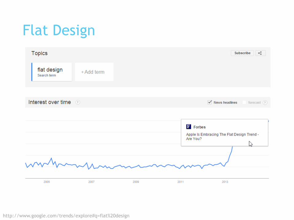
Flat Design
http://www.google.com/trends/explore#q=flat%20design

Flat Design
http://www.google.com/trends/explore#q=flat%20design
Zune HD Windows
Phone 7
Windows 8 Material
Design
iOS7

What about affordance?
http://www.doctordisruption.com/wp-content/uploads/2013/09/Sensory_Feedback_in_Brain_Computer_Interfaces1.jpg

Affordance
Note: The book title changed to “The Design of Everyday Things” in 1990.
“The perceived and actual properties of the thing, primarily those
fundamental properties that determine just how the thing could possibly be
used. (e.g. a chair affords sitting; glass affords seeing through, breaking;
wood affords solidity, opacity, support, carving)”
The Psychology of Everyday Things, 1988
Donald A. Norman

You know that it can be clicked, because it has affordance?
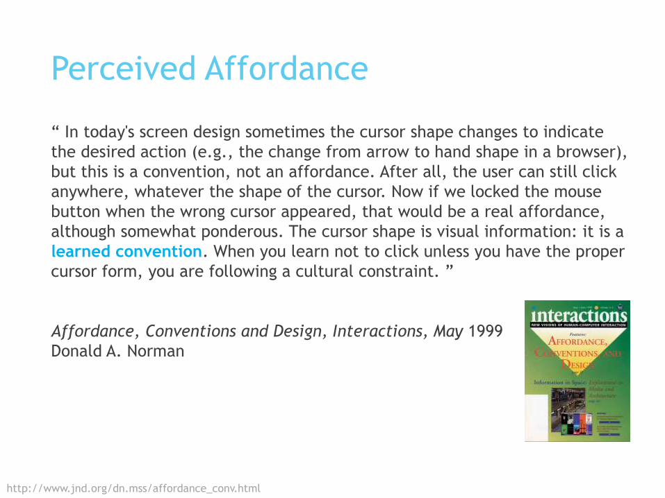
Perceived Affordance
http://www.jnd.org/dn.mss/affordance_conv.html
“ In today's screen design sometimes the cursor shape changes to indicate
the desired action (e.g., the change from arrow to hand shape in a browser),
but this is a convention, not an affordance. After all, the user can still click
anywhere, whatever the shape of the cursor. Now if we locked the mouse
button when the wrong cursor appeared, that would be a real affordance,
although somewhat ponderous. The cursor shape is visual information: it is a
learned convention. When you learn not to click unless you have the proper
cursor form, you are following a cultural constraint. ”
Affordance, Conventions and Design, Interactions, May 1999
Donald A. Norman

Learned Conventions
We learned how to use modern technology.
http://coverhound.com/system/posts/images/000/000/050/original/baby-internet-1200.png?1357952480

Are there interactive cues that make
use of learned conventions helping us
perceive interactivity in UI design?
http://www.3ders.org/images/3d-printed-pool-cue-1.jpg

Observation
Disclaimer: Just personal observation and opinions
on UI designs. No research to back my opinions.
http://cdn.iphonehacks.com/wp-content/uploads/2013/06/ios-7-new-icons-iphone.png
http://www.google.com/design/spec/material-design/introduction.html

Button Shape
Visual Cue
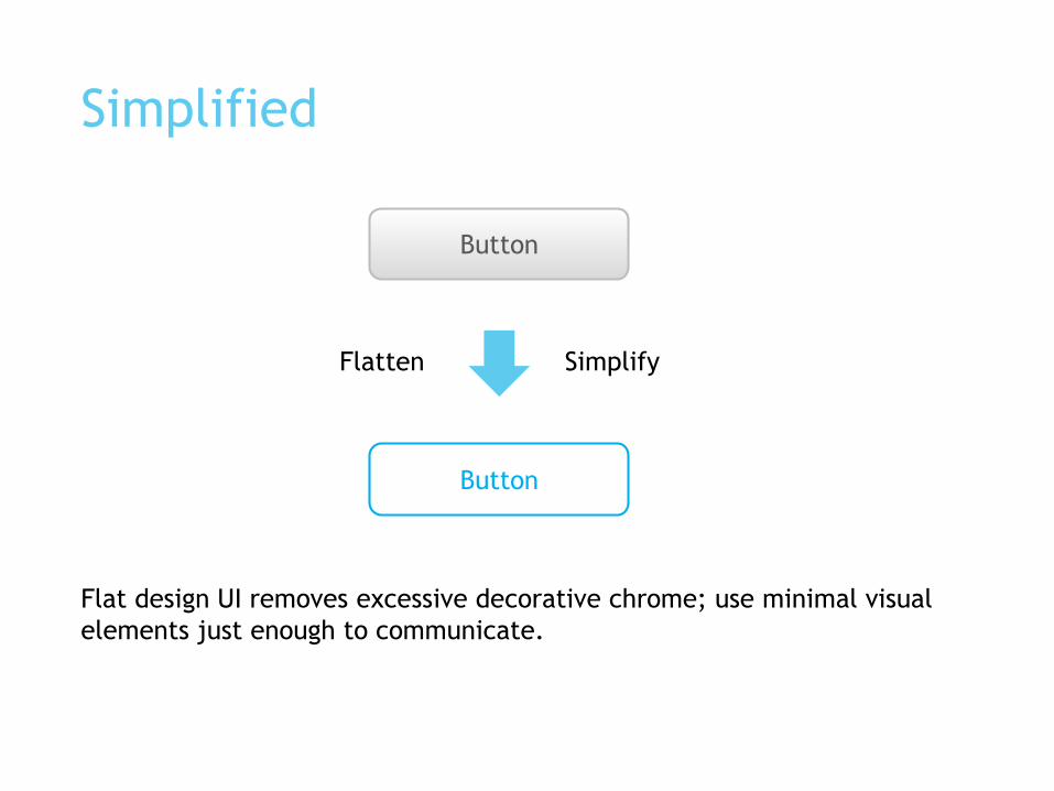
Simplified
Button
Button
Flat design UI removes excessive decorative chrome; use minimal visual
elements just enough to communicate.
Flatten Simplify

Rectangle and circle
Rectangular and circular shapes are commonly used button shapes.
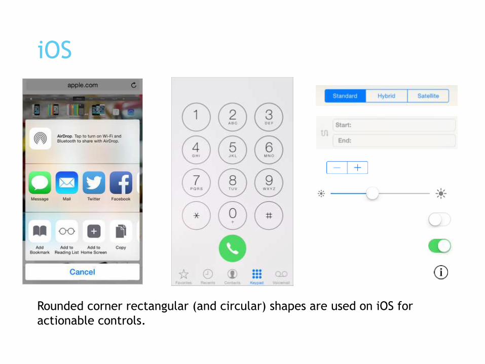
iOS
Rounded corner rectangular (and circular) shapes are used on iOS for
actionable controls.

Android (Material Design)
Rectangular (and circle) shapes are used on Material Design for actionable
controls.

Windows Phone
Rectangular (and circular) shapes are used on Windows 8 devices for
actionable controls.

Size matters
Too BiG
It looks like a backgound.

Size matters
Too small,
It is less likely to be seen as actionable.
(Especially on touch input devices.)

Distinctive ColorVisual Cue

Blue is a commonly used distinctive font color for actionable text (link) on
web UI.
Distinct Color for actionable text
Google+ (left), Facebook (right)

Distinct Color for actionable text
Blue is also commonly used as distinctive font color on mobiles.
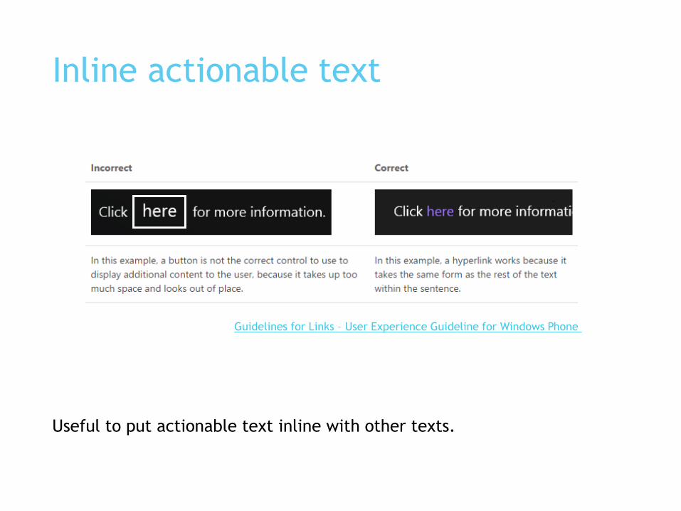
Inline actionable text
Useful to put actionable text inline with other texts.
Guidelines for Links – User Experience Guideline for Windows Phone

Not just blue
12/4/201
42
“Consider choosing a key color to indicate interactivity and
state. Key colors in the built-in apps include yellow in Notes and
red in Calendar. If you define a key color to indicate interactivity
and state, make sure that the other colors in your app don’t
compete with it.”
iOS Human Interface Guideline

Not just blue
“Avoid using the same color in both interactive and
noninteractive elements. Color is one of the ways that a UI
element indicates its interactivity. If interactive and noninteractive
elements have the same color, it’s harder for users to know
where to tap.”
iOS Human Interface Guideline

Actionable VerbSemantic Cue

Click Here

Actionable text label or control label mostly starts with a verb.

Symbol / iconSemantic Cue

Actionable pictograms
Some icons become actionable (when put in right context) because years of
user education in modern UI.

Platform Conventions
iOS system icons
Android system icons
UI ConventionsLeaned language
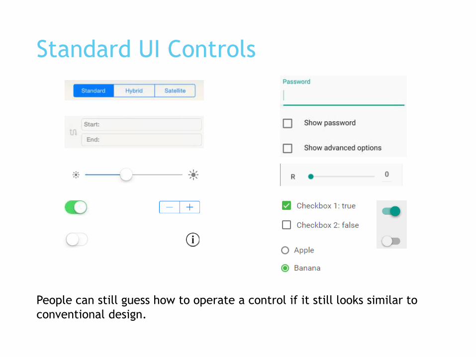
Standard UI Controls
People can still guess how to operate a control if it still looks similar to
conventional design.
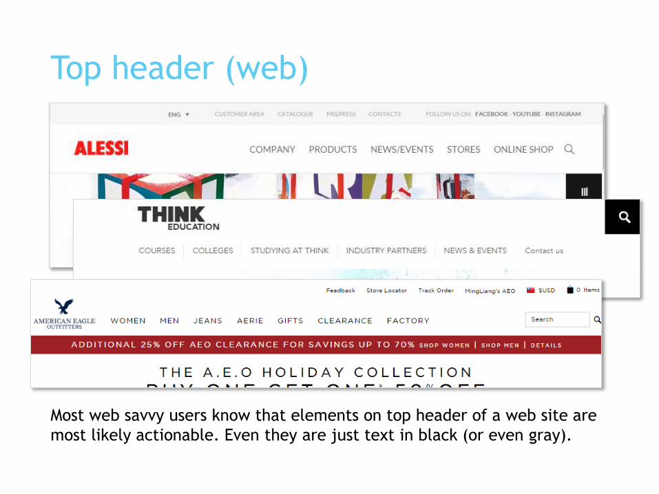
Top header (web)
Most web savvy users know that elements on top header of a web site are
most likely actionable. Even they are just text in black (or even gray).

Top and bottom bars (mobile)
App bar
Tool bar
Navigation
/ tool bar

Tab bars (mobile)

List/Menu (mobile)

List/Menu (web)

Grid Menu

Reinforce perceived interactivity

Drop shadow to create depth
Subtle drop shadow can also be seen on some UI control design to create
depth and reinforce interactivity.
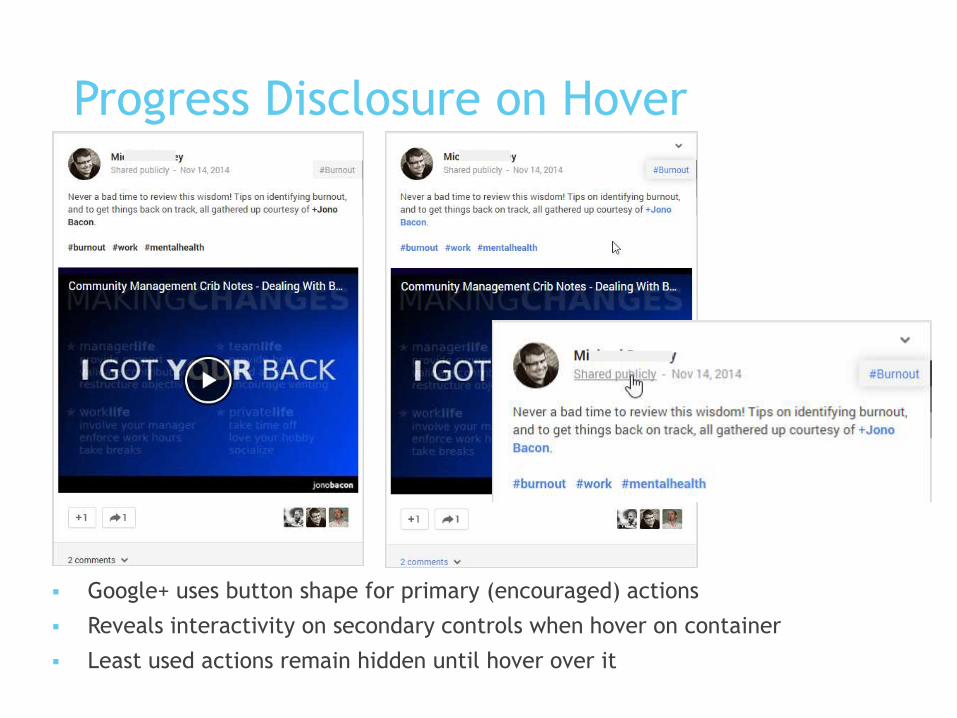
Progress Disclosure on Hover
Google+ uses button shape for primary (encouraged) actions
Reveals interactivity on secondary controls when hover on container
Least used actions remain hidden until hover over it
Confidential | Copyright 2013 TrendMicro Inc.

Use multiple cues to emphasize primary
actions
Visual cues help users scan and locate actionable
elements on screen
Verb helps users confirm that it’s actionable
Save
Summary
Perceived affordance is learned convention in screen
design.
Distinctive color, shape (rectangular and circular),
size, action verbs are commonly used to indicate
interactivity.
Leverage user’s existing knowledge:
Learned conventions
Standard UI controls, layout, icons

Recommendations
Strategically use visual treatment to create visual
hierarchy for interactivity.
The more encouraging an action is, the stronger visual
treatment is applied.
So that users can easily scan and find primary actions.
Combine multiple interactivity cue (shape, color) for stronger
treatments.
Use verb for actionable text whenever possible, especially
when there is no visual cues. Verb suggests action.
Use platform standard controls.
Make use user’s known knowledge: learned conventions.
Reference
Most UI screenshots are collected from:
iOS Human Interface Guideline
Material Design
User Experience Guideline for Windows Phone
Perceived Affordance
Affordance, Conventions and Design


