Introducing Page Templates Page templates allow us to specify the structure of the pages in our application through a single entity: the page template. In this template we can specify the layout structure - top bar, footer, side bar, logo’s, copyright message etc. Pages can be created based on the page template. The page specifies the content that is pasted in the designated areas in the template. When we want to change the overall look & feel of our application, we only need to make those changes in the page template, and all pages automatically display with those changes. Objective We will create a new Page Template with two facetRefs and a parameter. The pages based on the template have to provide the content for the two facets and the parameter. We will create two pages based on the template. We run the application. Then we decide to make a change in the template. And re-run the pages to see the changes applied. Steps 1. Create a new JDeveloper Application IntroductionPageTemplate - Generic Application; Choose the ADF Faces library. 2. Go to the New Gallery. Click on the JSF Category and select the JSF Page Template item.
Transcript
Introducing Page Templates
Page templates allow us to specify the structure of the pages in our application through a single
entity: the page template. In this template we can specify the layout structure - top bar, footer, side
bar, logo’s, copyright message etc. Pages can be created based on the page template. The page
specifies the content that is pasted in the designated areas in the template.
When we want to change the overall look & feel of our application, we only need to make those
changes in the page template, and all pages automatically display with those changes.
Objective We will create a new Page Template with two facetRefs and a parameter. The pages based on the
template have to provide the content for the two facets and the parameter. We will create two
pages based on the template. We run the application. Then we decide to make a change in the
template. And re-run the pages to see the changes applied.
Steps
1. Create a new JDeveloper Application IntroductionPageTemplate - Generic Application;
Choose the ADF Faces library.
2. Go to the New Gallery. Click on the JSF Category and select the JSF Page Template item.
Create JSF Page Template. Call it mainDataTemplate.jspx
Specify two facets: body and aboutWindow.
Go to the attributes page. Define three attributes: pageTitle, showGlobalSearch and
selectedMenuItem.
Now we will create the look and feel of our application. Or at least of the main template used in the
application. However, it does not need to look good at this point. As long as the right number of
facets is defined as well as the required attributes, we can leave the pageTemplate as ugly as we like.
This is because we can change it any time, without having to modify any of the pages. So although
our developers would probably prefer to have a decent template early on, there is no real need for it.
3. Create the main layout in the pageTemplate. Here are some steps that may give you a
reasonable idea of what you could do in a template (it does not really matter what you do, as
long as you use the two facets and ideally the three attributes as well)
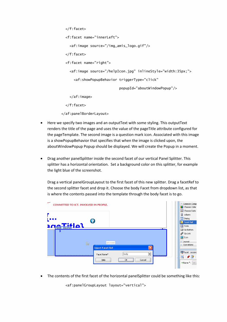
Drag a PanelSplitter to the template page; drop it inside the af:pageTemplateDef
element (in the Structure Window); set the orientation attribute to Vertical
Drag a panelGroupLayout to the first panelSplitter facet. Drag a panelBorderLayout inside
the panelGroupLayout.
The content of the panelBorderLayout could be like this:
The most interesting bit is the panelList with three imaginary menu options. The styling of
these menu options depends on the value of the selectedMenuItem attribute that is
specified by the pageTemplate and whose value is to be passed to the template from each
based based on it. The idea is that the page indicates which menu option should be
highlighted.
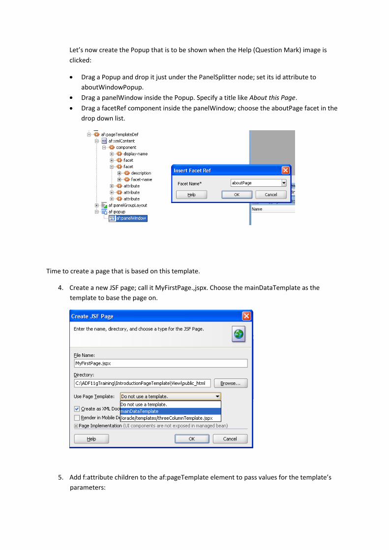
Let’s now create the Popup that is to be shown when the Help (Question Mark) image is
clicked:
Drag a Popup and drop it just under the PanelSplitter node; set its id attribute to
aboutWindowPopup.
Drag a panelWindow inside the Popup. Specify a title like About this Page.
Drag a facetRef component inside the panelWindow; choose the aboutPage facet in the
drop down list.
Time to create a page that is based on this template.
4. Create a new JSF page; call it MyFirstPage.,jspx. Choose the mainDataTemplate as the
template to base the page on.
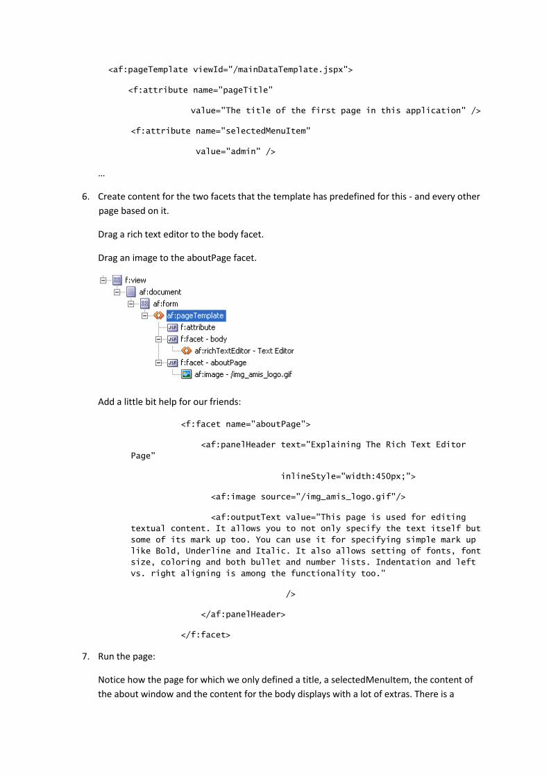
5. Add f:attribute children to the af:pageTemplate element to pass values for the template’s
parameters:
<af:pageTemplate viewId="/mainDataTemplate.jspx">
<f:attribute name="pageTitle"
value="The title of the first page in this application" />
<f:attribute name="selectedMenuItem"
value="admin" />
…
6. Create content for the two facets that the template has predefined for this - and every other
page based on it.
Drag a rich text editor to the body facet.
Drag an image to the aboutPage facet.
Add a little bit help for our friends:
<f:facet name="aboutPage">
<af:panelHeader text="Explaining The Rich Text Editor
Page"
inlineStyle="width:450px;">
<af:image source="/img_amis_logo.gif"/>
<af:outputText value="This page is used for editing
textual content. It allows you to not only specify the text itself but
some of its mark up too. You can use it for specifying simple mark up
like Bold, Underline and Italic. It also allows setting of fonts, font
size, coloring and both bullet and number lists. Indentation and left
vs. right aligning is among the functionality too."
/>
</af:panelHeader>
</f:facet>
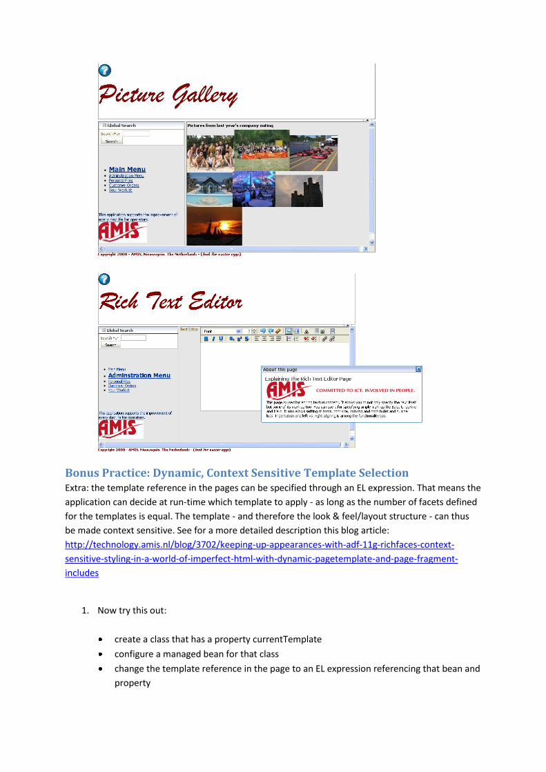
7. Run the page:
Notice how the page for which we only defined a title, a selectedMenuItem, the content of
the about window and the content for the body displays with a lot of extras. There is a
structure to the page, with a header with a logo and a sidebar with a menu. Of course that is
all added by the template that is applied at runtime.
Click on the big question mark. Now the popup behavior kicks in and opens the aboutPage
popup, that displays the content that we injected through the about facet - the little help for
our friends.
8. Let’s quickly create a second page, now that we get the hang of it.
Create a new JSF Page, select the same mainDataTemplate template. Provide values for the
attributes:
To quickly throw something together, I have dragged a panelGrid (JSF HTML library) to the
body facet and included image links into it (just random images from a Google Image search).
I provided content for the about facet with a PanelHeader and some OutputFormat text.
9. Run this page too.
10. Although the overall look & feel is consistent between “all” pages, it is consistently lousy. So
we need some changes.
Go to the page template and make for example the following changes:
Choose another Font and Style for the Page Title.
Use a different logo in the header and/or show the logo in the footer of the side bar.
Add a footer with a copyright message
Change the background color
Add one or two menu options
Add a global search item in the side bar - that is only shown when the
showGlobalSearch attribute has the value true
11. Now run the pages again - see how by changing a single template we impacted our entire
application! (the value of that statement increases with the number of pages in your
application, obviously)
Bonus Practice: Dynamic, Context Sensitive Template Selection Extra: the template reference in the pages can be specified through an EL expression. That means the
application can decide at run-time which template to apply - as long as the number of facets defined
for the templates is equal. The template - and therefore the look & feel/layout structure - can thus
be made context sensitive. See for a more detailed description this blog article:
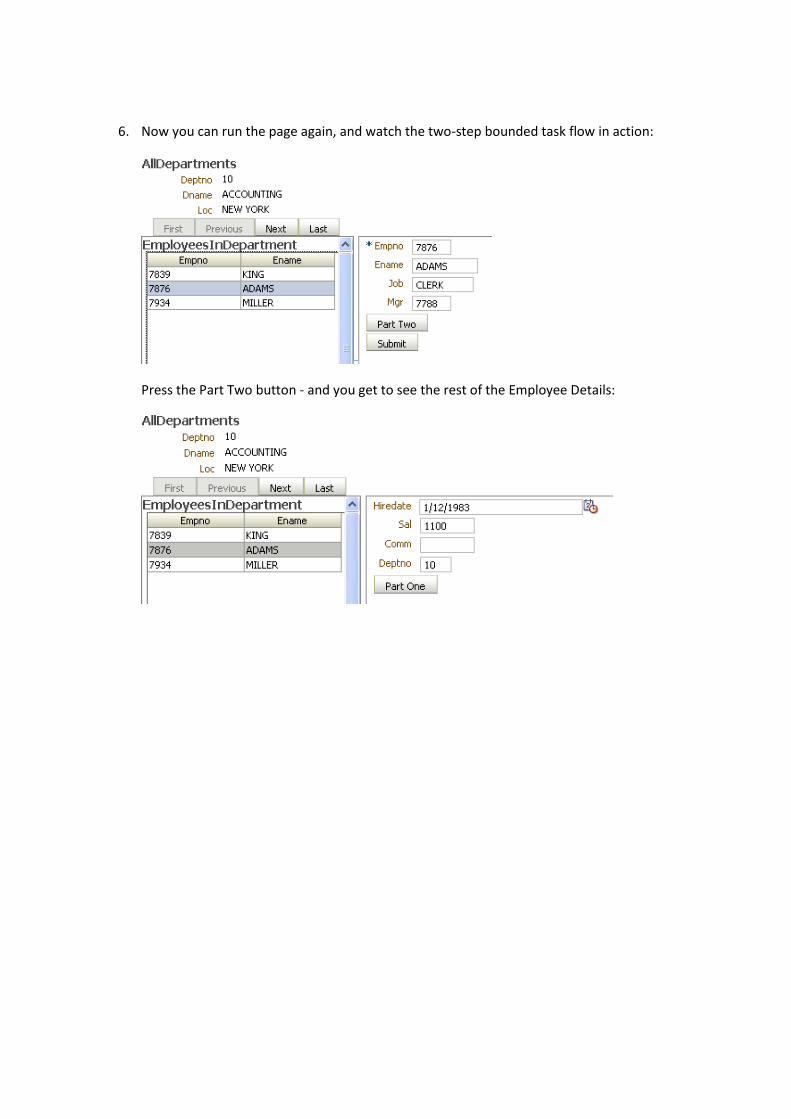
3. Now run the page and see that whenever you navigate to a different Department, the region
with the embedded employee-form task flow is synchronized.
Bonus Practice: Split the Employee Form into a two-page overview One of the interesting features of the Bounded Task Flow infrastructure is that it allows the creation
of a multi-step, multi-page task flow that can be embedded in its entirety in another page. That
means that we can navigate between the steps in the task flow within the context of the host page.
We will see that in action.
1. Open the employee-form task-flow.
Add a new View activity. Call it EmployeeFormPartTwo.
Create Control Flow Case from EmployeeForm to EmployeeFormPartTwo; set the from-
outcome to parttwo. Create Control Flow Case from EmployeeFormPartTwo to
EmployeeForm; set the from-outcome to partone.
The task flow diagram should now look like this:
2. Double click on the new View activity. Accept the dialog that appears and go to the editor for
the EmployeeFormPartTwo.jsff page fragment.
Copy the entire contents from EmployeeForm.jsff and paste it in EmployeeFormPartTwo.jsff.
3. Go to the file DataBindings.cpx and copy the line for EmployeeForm.jsff in the pageMap
element. Change EmployeeForm.jsff to EmployeeFormPartTwo.jsff in the new line: