18
Introduction
| Date post: | 04-Jan-2016 |
| Category: |
Documents |
| Upload: | amber-ashlynn-hill |
| View: | 212 times |
| Download: | 0 times |

Introduction

2Chartbook 2000
Hospitals face a challenging health care environment, fueled by changes in both the public and private sectors. Medicare continues to struggle with ways to ensure future solvency, and the full impact of the Balanced Budget Act of 1997 (BBA) remains to be seen. Meanwhile, against a backdrop of the strong economy, the end of a period of low health insurance premium growth, increasing concern about the cost of prescription drugs, and a tight labor market, private sector priorities are changing. The “managed care backlash” has raised concerns around choice and access and for the first time HMO enrollment as a percent of total private enrollment has declined.
The proportion of hospitals with negative total margins grew to over 26 percent in 1998, due to private market pressures, BBA payment reductions, and increasing expense per adjusted admission. After steady increases for a number of years, the Medicare payment-to-cost ratio fell in 1998, joining the continued downward trend in the payment-to-cost ratio for private payers. Early data indicate that margins continue to trend down in 1999. In 1999, bond rating agencies reported more downgrades than upgrades of non-profit hospital bond ratings, and the composite earnings projections of publicly traded hospital companies fell 16 percent.
After a period of declining increases in health insurance premium levels, the rate of growth in health insurance premiums is on the rise again. Premiums increased five percent in 1999 and are expected to increase more next year. But, higher premium levels do not translate into higher payments to hospitals. Much of the increase is going to fund prior health plan losses rather than to increase provider payments. The managed care backlash has led health plans to relax utilization control policies and back off from capitation as a form of payment. Any growth in utilization, however, may be offset by increased plan pressure on provider payment rates to control costs and maintain premium growth at levels palatable to employers.
Introduction
Introduction
3Chartbook 2000
Hospital strategies appear to be changing in response to these pressures. Over the past two years, there has been a striking reversal in a longstanding upward trend in hospital pursuit of varied horizontal and vertical integration strategies. These strategies were pursued both to prepare for managing covered lives and to increase market power. After peaking in 1997, however, fewer hospitals reported being in a system, having an ownership interest in an insurance product, or offering home health or long-term care services. Since 1996, the number of hospitals using various physician affiliation models has been declining. “Disintegration” seems to be a theme of recent news reports as hospital CEOs talk about returning to “core” lines of business.
Meanwhile the shift in hospital volume and revenues from inpatient to outpatient continues. Outpatient services now account for 33 percent of total hospital revenues up from 13 percent in 1980.
Recently, attention has been focused on prescription drug spending, which has been increasing much more rapidly than physician and hospital spending in the United States. Even though prescription drugs make up only 8.1 percent of total health care spending nationally, they were responsible for 20 percent of the total increase in health care spending between 1997 and 1998.
The hospital field also is affected by larger societal factors. Technological advances and lifestyle changes have decreased mortality rates. As a result, people are living longer. By 2050, 20 percent of the population will be 65 or older and five percent of the population will be 85 or older. Utilization for the over 65 population is significantly higher than for those under 65. At the same time, the aging population means fewer workers per Medicare recipient. This trend will put greater pressure on the solvency of Medicare, leading policy-makers to continue to find ways to control the cost of care.
The following charts present an analysis of trends in the hospital field within the context of the broader environment for health care. Hospital data is drawn primarily from the American Hospital Association Annual Surveys. Other data comes from a variety of sources. The chartbook begins with a chapter on overall trends in health care spending, financing, and coverage. The next four chapters look at trends specific to the hospital field, including organizational trends, volume and utilization, financing, and workforce issues. The final chapter looks at selected community health indicators.
Introduction


Chapter 1:Trends in the OverallHealth Care Market

6Chartbook 2000
National Health Spending
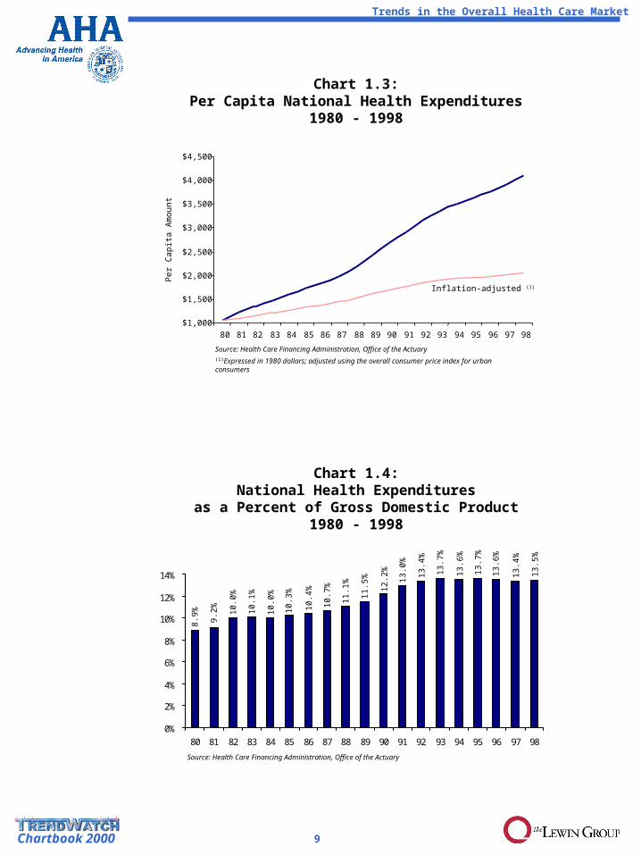
Total national spending on health and spending per capita continued to rise through 1998, but the rate of increase has slowed considerably since the 1980s. This slower growth during a time of general economic expansion has meant that health spending as a percentage of Gross Domestic Product has been relatively flat since 1993 (Charts 1.1 - 1.4).
The distribution of national health spending by category has changed significantly. Between 1980 and 1998, spending for hospital care declined from 44 percent to 34 percent of total expenditures. By comparison, spending on physician services increased from 19 percent to 21 percent. The percent spent on home health tripled, while the percent spent on nursing home care declined, and prescription drug spending rose from five percent to eight percent of the total (Chart 1.5).
While the rate of increase in overall spending has declined, growth in spending on pharmaceuticals is accelerating. Growth in prescription drug spending now represents 20 percent of overall growth in national health spending. Private health insurance currently is paying for a larger share of prescription drug spending than are consumers (Charts 1.6 - 1.8).
Trends in Health Care Coverage and Premiums
Since 1980, Medicare and Medicaid together have gone from paying 26 percent to 34 percent of total national health expenditures. The share paid by private insurance has also risen. Meanwhile the share paid out of pocket has declined from 24 percent to 17 percent (Chart 1.9).
The percentage of individuals under private coverage has decreased slightly, while that under public coverage has remained fairly steady since 1990. The number of uninsured has grown by 28 percent since 1985 to 44.3 million, or from 14 percent to 16 percent of the total US population. The percent uninsured varies from a low of nine percent in Nebraska to a high of 25 percent in Texas (Charts 1.10 - 1.12).
Trends in the Overall Health Care Market
Chapter 1:Trends in the Overall Health Care
Market

7Chartbook 2000
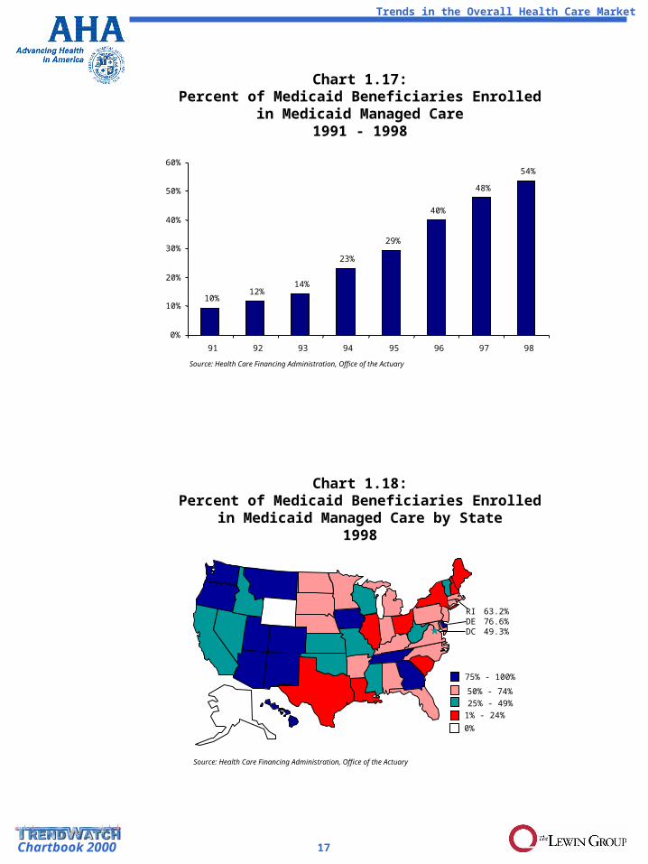
Traditional indemnity type coverage has all but disappeared. In 1999 only 14 percent of those under private insurance could choose an indemnity option and only nine percent enrolled in one. HMO enrollment, however, peaked at 33 percent of private health coverage in 1996. Since that time, enrollment has shifted away from HMOs toward less restrictive products like PPOs and point-of-service options (Charts 1.13 - 1.14). At the same time, Medicare and Medicaid have used HMOs as a vehicle to expand access and reduce health care costs. The percent of beneficiaries enrolled in Medicare and Medicaid HMOs rose significantly in the 1990s, especially in Medicaid with 54 percent enrolled in HMOs in 1998 (Charts 1.15, 1.17 - 1.18).
While moderating significantly overall, the change in per-enrollee Medicare and private health spending has varied considerably over time. From 1984 to 1991, Medicare experienced lower growth in per-enrollee spending, likely due to the introduction of the hospital prospective payment system. Between 1992 and 1997, private sector costs increased more slowly than those of Medicare. This reversal was likely due to the massive shift of the privately insured population into managed care products. Now the rate of change for the private sector is trending up for a variety of reasons, while Medicare is trending down as the Balanced Budget Act of 1997 takes effect (Chart 1.16).
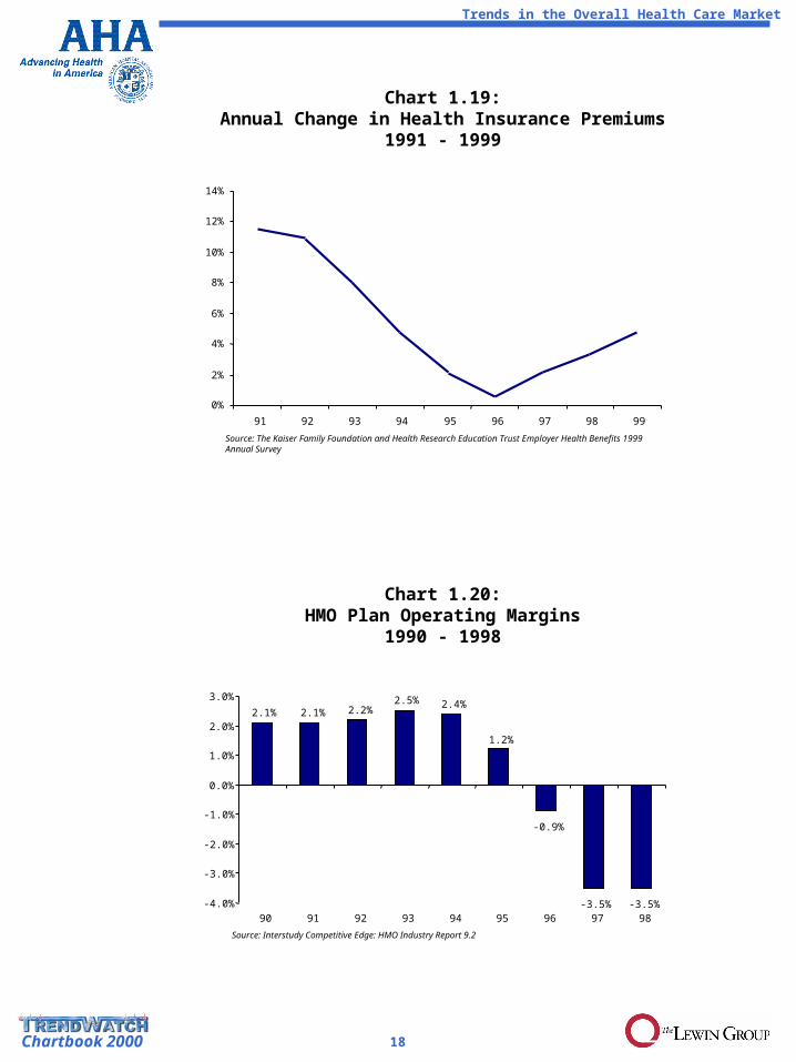
The annual change in private health insurance premiums hit a low of 0.5 percent in 1996, but is now rebounding as health plans, particularly HMOs, try to recoup recent losses in 1997 and 1998. (Charts 1.19 - 1.20).
Trends in the Overall Health Care Market

8Chartbook 2000
Chart 1.1:Total National Health Expenditures
1980 - 1998
Chart 1.2:Percent Change in Total National Health
Expenditures1981 - 1998
0.0%
5.0%
10.0%
15.0%
20.0%
81 82 83 84 85 86 87 88 89 90 91 92 93 94 95 96 97 98
$200
$400
$600
$800
$1,000
$1,200
80 81 82 83 84 85 86 87 88 89 90 91 92 93 94 95 96 97 98
Bill
ion
s
Source: Health Care Financing Administration, Office of the Actuary(1)Expressed in 1980 dollars; adjusted using the overall consumer price index for urban consumers
Inflation-adjusted (1)
Source: Health Care Financing Administration, Office of the Actuary
16
.0%
5.6
%
4.7
%
4.6
%
4.8
%
5.5
%
7.4
%9.1
%
9.6
%
12
.2%
11
.3%
12
.0%
8.5
%
7.6
%
9.9
%
9.8
%
10
.0%
12
.6%
Trends in the Overall Health Care Market
9Chartbook 2000
Chart 1.4:National Health Expenditures
as a Percent of Gross Domestic Product1980 - 1998
$1,000
$1,500
$2,000
$2,500
$3,000
$3,500
$4,000
$4,500
80 81 82 83 84 85 86 87 88 89 90 91 92 93 94 95 96 97 98
Chart 1.3:Per Capita National Health Expenditures
1980 - 1998
Per
Cap
ita A
mou
nt
Source: Health Care Financing Administration, Office of the Actuary(1)Expressed in 1980 dollars; adjusted using the overall consumer price index for urban consumers
Source: Health Care Financing Administration, Office of the Actuary
0%
2%
4%
6%
8%
10%
12%
14%
80 81 82 83 84 85 86 87 88 89 90 91 92 93 94 95 96 97 98
Inflation-adjusted (1)
8.9
%
9.2
%
10.0
%
10.1
%
10.0
%
10.3
%
10.4
%
10.7
%
11.1
%
11.5
%
12.2
%
13.0
%
13.4
%
13.7
%
13.6
%
13.7
%
13.6
%
13.4
%
13.5
%
Trends in the Overall Health Care Market

10Chartbook 2000
Chart 1.5:National Health Expenditures for Health
Servicesand Supplies(1) by Category
1980 and 1998
Source: Health Care Financing Administration, Office of the Actuary
(1) Excludes medical research and medical facilities construction(2) “Other” includes net cost of insurance and administration, government public
health activities, and other health services(3) “Other professional” includes dental and other non-physician professional
services
Physician Services - 20.6%
Hospital Care - 34.4%
Prescription Drugs - 8.1%
Nursing Home Care - 7.9%
Other (2) - 11.4%
Other Medical Durables andNon-durables - 4.2%
Home Health Care - 2.6%
Other Professional(3) - 10.8%
Prescription Drugs - 5.1%
Physician Services - 19.2%
Hospital Care - 43.6%
Nursing Home Care - 7.5%
Other(2) - 9.6%
Other Medical Durables andNon-durables - 5.7%
Home Health Care - 1.0%
Other Professional(3) - 8.4%
$235.6 B $1,113.7 B
80 98
Trends in the Overall Health Care Market

11Chartbook 2000
Chart 1.6:Total Prescription Drug Spending
1980 - 1998
0%
5%
10%
15%
20%
25%
81 82 83 84 85 86 87 88 89 90 91 92 93 94 95 96 97 98
Chart 1.7:Growth in Total Prescription Drug Spending
as a Percent of Total Growth in National Health Expenditures1981 - 1998
Source: Health Care Financing Administration, National Health Accounts
$0
$10
$20
$30
$40
$50
$60
$70
$80
$90
$100
80 81 82 83 84 85 86 87 88 89 90 91 92 93 94 95 96 97 98Source: Health Care Financing Administration, National Health Accounts(1)Expressed in 1980 dollars; adjusted using the overall consumer price index for urban consumers
Bill
ion
s
Inflation-adjusted (1)
Trends in the Overall Health Care Market

12Chartbook 2000
Chart 1.8:Consumer Out of Pocket Spending
vs. Private Health Insurance Spendingfor Prescription Drugs
1980 - 1998
$0
$10
$20
$30
$40
$50
$60
80 81 82 83 84 85 86 87 88 89 90 91 92 93 94 95 96 97 98Source: Health Care Financing Administration, National Health Accounts
Out of Pocket
Private Health Insurance
Bill
ion
s
Trends in the Overall Health Care Market

13Chartbook 2000
Chart 1.9:Distribution of National Health
Expendituresby Source of Payment
1980 and 1998
Source: Health Care Financing Administration, Office of the Actuary
Medicare - 18.8%
Medicaid - 14.8%
Other Government - 11.8%
Other Private - 4.5%
Out of Pocket - 17.4%
Private Insurance - 32.6%
Medicare - 15.2%
Medicaid - 10.6%
Other Government - 16.6%
Other Private - 5.0%
Out of Pocket - 24.4%
Private Insurance - 28.2%
80 98
$247.3 B $1,149.1 B
Chart 1.10:Distribution of Health Insurance
Percent of Population Covered by Payer1990 and 1998
16.3%
3.2%
10.3%
13.2%
70.2%
13.9%
4.0%
9.7%
13.0%
73.2%
0% 10% 20% 30% 40% 50% 60% 70% 80%
Uninsured
Other Government
Medicaid
Medicare
Private
1990 1998Source: US Bureau of the Census
Trends in the Overall Health Care Market

14Chartbook 2000
0
5
10
15
20
25
30
35
40
45
50
85 86 87 88 89 90 91 92 93 94 95 96 97 980%
2%
4%
6%
8%
10%
12%
14%
16%
18%
Chart 1.11:Number and Percent Uninsured
1985 - 1998
Nu
mber
of
Un
insu
red
in
Mill
ions
Source: US Bureau of the Census
Perc
en
t of
Tota
l Popu
lati
on
Number Percent
Chart 1.12:Percent Uninsured by State
1998
15.0% to 19.9%10.0% to 14.9%
< 10.0%
20.0% to 25.0%
Source: US Bureau of the Census
RI 10.0%DE 14.7%DC 17.0%
Trends in the Overall Health Care Market

15Chartbook 2000
Chart 1.13:Percentage of Employees with Employer-based
CoverageWho Can Choose Conventional, PPO, HMO and POS
Plans1988 - 1998
0%
20%
40%
60%
80%
100%
88(1) 93 98
Source: KPMG Compensation & Benefits Health Care Group, Health Benefits 1998(1)Point-of-service plans not separately identified
TraditionalIndemnity
HMO
PPO
POS
0%
10%
20%
30%
40%
50%
60%
70%
80%
90%
100%
88 91 92 93 94 95 96 97 98 99
Source: 1988-1998 The Kaiser Family Foundation, Trends and Indicators in the Changing Health Care Marketplace; and 1999 from the Health Research Education Trust Employer Health Benefits 1999 Annual Survey
(1) Point-of-service plans not separately identified
Chart 1.14:Distribution of Medium and Large Firm Employer-sponsored Health Insurance Enrollment by Type of
Plan1988 - 1999
TraditionalIndemnity
PPO
HMO
POS
(1)
Trends in the Overall Health Care Market

16Chartbook 2000
Source: Health Care Financing Administration, Office of the Actuary
Chart 1.15:Percent of Medicare Beneficiaries Enrolled
in Medicare Managed Care1988 - 1999
4% 4%5%
6%
8%
10%
13%
16%17%
0%
2%
4%
6%
8%
10%
12%
14%
16%
91 92 93 94 95 96 97 98 99
Source: Health Care Financing Administration, Office of the Actuary
* Percentages are risk enrollees divided by enrollees who have both hospital insurance and supplementary medical insurance
Chart 1.16:Growth in Medicare Spending per Beneficiary
vs. Private Health Insurance Spending per Enrollee1980 - 1998
Private Health Insurance
Medicare
0%
2%
4%
6%
8%
10%
12%
14%
16%
18%
20%
9490 92 96 9888 91 93 95 9780 82 84 8681 83 85 87 89
Trends in the Overall Health Care Market
17Chartbook 2000
Chart 1.17:Percent of Medicaid Beneficiaries Enrolled
in Medicaid Managed Care1991 - 1998
Chart 1.18:Percent of Medicaid Beneficiaries Enrolled
in Medicaid Managed Care by State1998
10%12%
14%
23%
29%
40%
48%
54%
0%
10%
20%
30%
40%
50%
60%
91 92 93 94 95 96 97 98
Source: Health Care Financing Administration, Office of the Actuary
25% - 49%50% - 74%
Source: Health Care Financing Administration, Office of the Actuary
75% - 100%
1% - 24%
0%
Trends in the Overall Health Care Market
RI 63.2%DE 76.6%DC 49.3%
18Chartbook 2000
-4.0%
-3.0%
-2.0%
-1.0%
0.0%
1.0%
2.0%
3.0%
90 91 92 93 94 95 96 97 98
Source: Interstudy Competitive Edge: HMO Industry Report 9.2
Chart 1.20:HMO Plan Operating Margins
1990 - 1998
0%
2%
4%
6%
8%
10%
12%
14%
91 92 93 94 95 96 97 98 99
Source: The Kaiser Family Foundation and Health Research Education Trust Employer Health Benefits 1999 Annual Survey
Chart 1.19:Annual Change in Health Insurance Premiums
1991 - 1999
2.1% 2.1% 2.2%2.5% 2.4%
1.2%
-0.9%
-3.5% -3.5%
Trends in the Overall Health Care Market


