Introduction to R and Exploratory data analysis Gavin Simpson November 2006 Summary In this practical class we will introduce you to working with R. You will complete an introductory session with R and then use a data set of Spheroidal Carbonaceous Particle (SCP) surface chemistry and demonstrate some of the Exploratory Data Analysis (EDA) functions in R. Finally, we introduce the concept of statistical tests in R through a small study of fecudity in a predatory gastropod on intertidal shores. 1 Your first R session R can be used as a glorified calculator; you enter calculations at the prompt, R works out the answer and displays it to you. Try the following sequence of commands. Remember, only type the commands on lines starting with the prompt “>” below. In each case, the output from R is shown. >3 * 5 [1] 15 >7+2 [1] 9 > 100/5 [1] 20 > 99 - 1 [1] 98 1
Transcript
Introduction to R and Exploratory data analysis
Gavin Simpson
November 2006
Summary
In this practical class we will introduce you to working with R. You will complete anintroductory session with R and then use a data set of Spheroidal Carbonaceous Particle(SCP) surface chemistry and demonstrate some of the Exploratory Data Analysis (EDA)functions in R. Finally, we introduce the concept of statistical tests in R through a smallstudy of fecudity in a predatory gastropod on intertidal shores.
1 Your first R session
R can be used as a glorified calculator; you enter calculations at the prompt, R works out theanswer and displays it to you. Try the following sequence of commands. Remember, only typethe commands on lines starting with the prompt “>” below. In each case, the output from R isshown.
> 3 * 5
[1] 15
> 7 + 2
[1] 9
> 100/5
[1] 20
> 99 - 1
[1] 98
1
After each sum R prints out the result with a [1] at the start of the line. This means the resultis a vector of length 1. As you will see later, this string shows you which entry in the vector isdisplayed at the beginning of each line.
This isn’t much use if you can’t store results though. To store the result of a calculation, theassignment operator “<-” is used.
> a <- 3 * 5
Notice that this time R does not print the answer to the console. You have just created an objectin R with the name “a”. To print out the object to the console you just have to type the name ofthe object and press Enter.
> a
[1] 15
We can now use this to do sums like you would on a calculator using the memory functions.
> b <- 7 + 2> a + b
[1] 24
> a * b
[1] 135
> c <- a * b> c
[1] 135
To see a list of the objects in the current workspace use the ls() function:
> ls()
[1] "a" "b" "c"
2
2 Exploratory Data Analysis
Use R’s EDA functions to examine the SCP data with a view to answering the following ques-tions:
1. Suggest which chemical elements give the best discrimination between coal and oil par-ticles;
2. Suggest which variables are highly correlated and may be dropped from the analysis;
3. Suggest which particles (either coal or oil) have an unusual chemical composition – i. e.,are outliers;
SCP’s are produced by the high temperature combustion of fossil fuels in oil and coal-firedpower stations. Since SCP’s and sulphur (as SO2) are emitted from the same sources and aredispersed in the same way, the record of SCP’s in lake sediments may be used to infer the spa-tial and temporal patterns of sulphur deposition, an acid loading on lake systems. In addition,SCP’s produced by the combustion of coal and oil have different chemical signatures, so char-acterization of particles in a sediment core can be used to partition the pollution loading intodistinct sources.
The data set consists of a sample of 100 SCP’s from two power stations (50 SCP’s from each).One, Pembroke, is an oil-fired station, the other, Drax, is coal-fired. The data form a trainingset that was used to generate a discriminant function for classifying SCP’s derived from lakesediments into fuel type. The samples of fly-ash from power station flues were analysed usingEnergy Dispersive Spectroscopy (EDS) and the chemical composition was measured.
These data are available in the file scp.txt, a standard comma-delimited ASCII text file. Youwill use R in this practical class, learn how to read the data into R and how to use the softwareto perform standard EDA and graphics.
3 Reading the data into R
Firstly, start R on the system you are using in the prac1 directory that contains the files forthis practical, instructions on how to do this have been circulated on a separate handout. Yourscreen should look similar (but not the same) to the one shown in Figure 1. The R prompt isa “>” character and commands are entered via the keyboard and subsequently evaluated afterthe user presses the return key.
The following commands read the data from the scp.txt file into a R object called scp.datand perform some rudimentary manipulation of the data:
The read.csv() function reads the data into an object, scp.dat. The argument row.namesinstructs R to use the first column of data as the row names.
3
Figure 1: The R interface; in this case the R GUI interface under MicroSoft Windows
By default R assigns names to each observation. As the scp.txt file contains a column la-belled "SampleID", which contains the sample names, we now convert the first column ofthe scp.dat object to characters (text) and then assign these as the sample names using therownames function. Note that we subset the scp.dat object using the following notation:
object[r,c]
Here r and c represent the row and column required, respectively. To select the first column ofscp.dat we use scp.dat[,1]), leaving the row identifier blank.
The last variable in scp.dat is FuelType. This variable is currently coded as "1", "0". R has aspecial way of dealing with “factors”, but we need to tell R that FuelType is a factor (FuelTypeis currently a numeric variable). The function as.factor() is used to coerce a vector of datafrom one type into a factor (scp.dat[,18] <- as.factor(scp.dat[,18]). The “levels” ofFuelType are still coded as 1, 0. We can replace the current levels with something more use-ful using levels(scp.dat[,18]) <- c("Coal", "Oil"). Note the use of the concatenatefunction, c(), to create a character vector of length 2.
Simply typing the name of an object followed by return prints the contents of that object tothe screen (increase the size of your R console window before doing this otherwise the printedcontents will extend over many pages).
> scp.dat> names(scp.dat)> str(scp.dat)
The names() function prints out the names describing the contents of the object. The output
4
from names depends on the class of the object passed as an argument1 to names(). For a dataframe like scp.dat, names() prints out the labels for the columns, the variables. The str()
function prints out the structure of the object. The output from str() shows that scp.datcontains 17 numeric variables and one (FuelType) factor variable with the levels "Coal" and"Oil".
4 Summary statistics
Simple summary statistics can be generated using summary():
> summary(scp.dat)
summary() is a generic function, used to summarize an object passed as an argument to it. Fordata frames, numeric matrices and vectors, summary() prints out the minimum and maximumvalues, the mean, the median and the upper and lower quartiles for each variable in the object.For factor variables, the number of observations of each level is displayed.
Another way of generating specific summary information is to use the corresponding function,e.g. mean(), min(), range() or median():
> mean(scp.dat[, 1])
[1] -12.0025
Doing this for all 17 variables and for each of the descriptive statistical functions could quicklybecome tedious. R contains many functions that allow us to quickly apply functions acrosseach variable in a data frame. For example, to get the mean for each variable in the scp.dat
data frame you would type:
> apply(scp.dat[, -18], 2, mean)
Na Mg Al Si P S Cl-12.0025 -7.4240 9.8417 6.9593 3.5364 56.2859 -1.0291
K Ca Ti V Cr Mn Fe1.5607 -0.4613 0.5897 0.8021 -0.0081 -0.3536 3.9651
Ni Cu Zn0.2438 0.3103 0.1268
As its name suggests, apply() takes as it argument a vector or array and applies a named func-tion on either the rows, or the columns of that vector or array (the 2 in the above call indicatethat we want to work on the columns). Apply can be used to run any appropriate functionincluding a users own custom functions. As an example, we now calculate the trimmed mean:
1Arguments are the values entered between the brackets of a call to a function, and indicate a variety of options,such as the name of an object to work on or which method to use. A function’s arguments are documented in thehelp pages for that function
5
> apply(scp.dat[, -18], 2, mean, trim = 0.1)
Na Mg Al Si P-11.462000 -6.672250 9.327625 6.749750 3.650125
S Cl K Ca Ti57.069125 -2.711250 1.527250 -0.712250 0.460250
V Cr Mn Fe Ni0.853000 -0.168125 -0.377375 2.768500 0.244750
Cu Zn0.129500 0.117875
In the above code snippet, we pass an additional argument to mean(), trim = 0.1, whichcalculates the trimmed mean, by trimming 10% of the data off each end of the distributionand then calculating the mean of the remaining data points. How this works is quite simple.apply() is told to work on columns 1 through 17 of the scp.dat object. Each column in turnis passed to our function and mean() calculates the trimmed mean.
Try using apply() to calculate the range (range()), the variance (var()) and the standarddeviation (sd()) for variables 1 through 17 in scp.dat.
Having now looked at the summary statistics for the entire data set, we can now start to lookfor differences in SCP surface chemistry between the two fuel types. This time we need tosubset the data and calculate the summary statistics for each level in FuelType. The are manyways of subsetting a data frame, but the easiest way is to use the aggregatey() function.
First, attach scp.dat to the search path2 using:
> attach(scp.dat)
Now try the following code snippet:
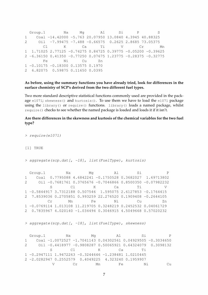
> aggregate(scp.dat[, -18], list(FuelType), mean)
Group.1 Na Mg Al Si P S Cl1 Coal -15.482 -6.6932 20.0824 13.2710 4.0560 40.4590 4.22422 Oil -8.523 -8.1548 -0.3990 0.6476 3.0168 72.1128 -6.2824
K Ca Ti V Cr Mn Fe Ni1 2.6146 -1.2518 1.0392 0.3276 0.1092 -0.2356 0.3748 -0.11742 0.5068 0.3292 0.1402 1.2766 -0.1254 -0.4716 7.5554 0.6050
Cu Zn1 0.2378 0.21982 0.3828 0.0338
> aggregate(scp.dat[, -18], list(FuelType), mean, trim = 0.1)
2Attaching an object to the search path tells R to look inside that object for variables as well as in the standardenvironment. By attaching scp.dat to the search path we can use the variable names directly.
6
Group.1 Na Mg Al Si P S1 Coal -14.42000 -5.763 20.07950 13.0840 4.3945 40.883252 Oil -7.99475 -7.488 -0.66575 0.2625 2.8685 73.05375
Cl K Ca Ti V Cr Mn1 1.71025 2.77125 -0.74275 0.84725 0.39775 -0.05200 -0.396252 -6.36150 0.41350 -0.77250 0.07675 1.23775 -0.28375 -0.32775
Fe Ni Cu Zn1 -0.10175 -0.18300 0.13575 0.19702 6.82075 0.59875 0.11650 0.0395
As before, using the summary functions you have already tried, look for differences in thesurface chemistry of SCP’s derived from the two different fuel types.
Two more standard descriptive statistical functions commonly used are provided in the pack-age e1071; skewness() and kurtosis(). To use them we have to load the e1071 packageusing the library() or require() functions. library() loads a named package, whilstrequire() checks to see whether the named package is loaded and loads it if it isn’t.
Are there differences in the skewness and kurtosis of the chemical variables for the two fueltype?
This section of the practical will demonstrate the graphical abilities of R for exploratory dataanalysis for univariate data.
5.1 Stem and leaf plots
A stem and leaf plot is a useful way of describing data. Like a histogram, a stem and leaf plotvisualizes the distribution. In R, a stem and leaf plot is produced using stem().
> stem(Na)
The decimal point is 1 digit(s) to the right of the |
Using stem() look at the distribution of some of the other variables in scp.dat.
5.2 Histograms
Like stem and leaf plots, histograms can be used to get a rough impression of the distribution.Histograms are drawn by breaking the distribution into a number of sections or bins, which aregenerally of equal width. You will probably have seen frequency histograms used where thenumber of observations per bin is calculated and graphed. An alternative approach is to plotthe relative frequency of observation per bin width (probability density estimates – more ondensity estimates later). Graphs showing histograms of the same data using the two methodslook identical, except for the scaling on the y axis.
8
In R, the histogram function is called hist(). For this practical, however, you will use thetruehist() function from the MASS package, because it offers a wider range of options fordrawing histograms. MASS should be distributed as a recommended package in your R distri-bution.
> require(MASS)
[1] TRUE
> oldpar <- par(mfrow = c(3, 1))> hist(Na, col = "grey", main = "R default", ylab = "Frequency",+ freq = FALSE)> truehist(Na, nbins = "FD", col = "grey", main = "Freedman-Diaconis rule",+ ylab = "Frequency")> truehist(Na, nbins = "scott", col = "grey", main = "Scott's rule",+ ylab = "Frequency")> par(oldpar)> rm(oldpar)
Note the use of the par() function above to split the display into three rows and 1 columnusing the mfrow argument. By assigning the current contents of par() to oldpar and thensetting mfrow = c(3,1) we can reset the original par() settings using par(oldpar) when weare finished. The figure produced should look similar to Figure 2.
For sodium (Na), Scott’s rule and the default setting for calculating the number of bins producethe same result. The Freedman-Diaconis rule, however, produces a histogram with a greaternumber of bins. Note also that we have restricted this example to frequency histograms. In thenext section probability density histograms will be required.
The recommended number of bins using the Freedman-Diaconis rule is generated using:
⌈n1/3(max−min)
2(Q3 −Q1
⌉,
where n is the number of observations, max−min is the range of the data, Q3 − Q1 is theinterquartile range. The brackets represent the ceiling, which indicates that you round up to thenext integer (so you don’t end up with 5.7 bins for example!)
5.3 Density estimation
A useful alternative to histograms is nonparametric density estimation, which results in asmoothing of the histogram. The kernel-density estimate at the value x of a variable X is givenby:
f̂(x) =1b
n∑
j=1
K
(x− xj
b
),
9
Figure 2: Histograms illustrating the use of different methods for calculating the number ofbins.
−50 −40 −30 −20 −10 0 10
05
1020
30
R default
Na
Fre
quen
cy
−40 −30 −20 −10 0 10
05
1015
20
Freedman−Diaconis rule
Na
Fre
quen
cy
−50 −40 −30 −20 −10 0 10
05
1020
30
Scott’s rule
Na
Fre
quen
cy
Figure 3: Comparison between histogram and density estimation techniques.
−40 −30 −20 −10 0 10
0.00
0.01
0.02
0.03
0.04
Freedman−Diaconis rule
Na
Den
sity
10
Figure 4: A quantile quantile plot of Sodium from the SCP surface chemistry data set.
−2 −1 0 1 2
−40
−30
−20
−10
0
Normal Q−Q Plot
Theoretical Quantiles
Sam
ple
Qua
ntile
s
where xj are the n observations of X , K is a kernel function (such as the normal density) andb is a bandwidth parameter controlling the degree of smoothing. Small bandwidths producerough density estimates whilst large bandwidths produce smoother estimates.
It is easier to illustrate the features of density estimation than to explain them mathematically.The code snippet below draws a histogram and then overlays two density estimates usingdifferent bandwidths. The code also illustrates the use of the lines() functions to build upsuccessive layers of graphics on a single plot.
Note the use of the argument prob = TRUE in the truehist() call above, which draws a his-togram so that it is scaled similarly to the density estimates. You should see something similarto Figure 3.
Examine the probability density estimates for some of the other SCP surface chemistry vari-ables.
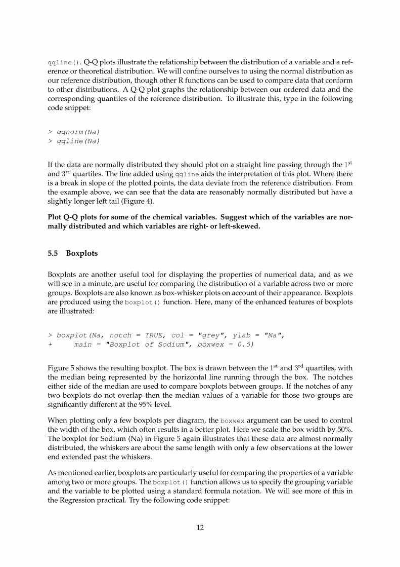
5.4 Quantile quantile plots
Quantile quantile or Q-Q plots are a useful tool for determining whether your data are normallydistributed or not. Q-Q plots are produced using the function qqnorm() and its counterpart
11
qqline(). Q-Q plots illustrate the relationship between the distribution of a variable and a ref-erence or theoretical distribution. We will confine ourselves to using the normal distribution asour reference distribution, though other R functions can be used to compare data that conformto other distributions. A Q-Q plot graphs the relationship between our ordered data and thecorresponding quantiles of the reference distribution. To illustrate this, type in the followingcode snippet:
> qqnorm(Na)> qqline(Na)
If the data are normally distributed they should plot on a straight line passing through the 1st
and 3rd quartiles. The line added using qqline aids the interpretation of this plot. Where thereis a break in slope of the plotted points, the data deviate from the reference distribution. Fromthe example above, we can see that the data are reasonably normally distributed but have aslightly longer left tail (Figure 4).
Plot Q-Q plots for some of the chemical variables. Suggest which of the variables are nor-mally distributed and which variables are right- or left-skewed.
5.5 Boxplots
Boxplots are another useful tool for displaying the properties of numerical data, and as wewill see in a minute, are useful for comparing the distribution of a variable across two or moregroups. Boxplots are also known as box-whisker plots on account of their appearance. Boxplotsare produced using the boxplot() function. Here, many of the enhanced features of boxplotsare illustrated:
> boxplot(Na, notch = TRUE, col = "grey", ylab = "Na",+ main = "Boxplot of Sodium", boxwex = 0.5)
Figure 5 shows the resulting boxplot. The box is drawn between the 1st and 3rd quartiles, withthe median being represented by the horizontal line running through the box. The notcheseither side of the median are used to compare boxplots between groups. If the notches of anytwo boxplots do not overlap then the median values of a variable for those two groups aresignificantly different at the 95% level.
When plotting only a few boxplots per diagram, the boxwex argument can be used to controlthe width of the box, which often results in a better plot. Here we scale the box width by 50%.The boxplot for Sodium (Na) in Figure 5 again illustrates that these data are almost normallydistributed, the whiskers are about the same length with only a few observations at the lowerend extended past the whiskers.
As mentioned earlier, boxplots are particularly useful for comparing the properties of a variableamong two or more groups. The boxplot() function allows us to specify the grouping variableand the variable to be plotted using a standard formula notation. We will see more of this inthe Regression practical. Try the following code snippet:
12
Figure 5: A boxplot of Sodium from the SCPsurface chemistry data set.
−40
−30
−20
−10
0
Boxplot of Sodium
Na
Figure 6: A boxplot of Sodium from the SCPsurface chemistry data set by fuel type.
Coal Oil
−40
−30
−20
−10
0
Boxplot of Sodium surface chemistry by Fuel Type
Na
> boxplot(Na ~ FuelType, notch = TRUE, col = "grey",+ ylab = "Na", main = "Boxplot of Sodium surface chemistry by fuel type",+ boxwex = 0.5, varwidth = TRUE)
Figure 6 shows the resulting plot. The formula notation takes the form:
variable ∼ grouping variable
The only new argument used above is varwidth = TRUE, which plots the widths of the boxesproportionally to the variance of the data. This can visually illustrate differences in a varianceamong groups.
Are the median values for Na split by FuelType significantly different at the 95 % level?.
Plot boxplots for some of the other variables by FuelType. Suggest which variables showdifferent distributions between fuel types.
Before we move on to bivariate and multivariate graphical EDA, lets look at an extended ex-ample that illustrates the methods we learned above and demonstrates how to put together acomposite figure using R’s plotting functions. Type the entire code snippet into the R console:
> oldpar <- par(mfrow = c(2, 2), oma = c(0, 0, 2, 0) ++ 0.1)> truehist(Na, nbins = "FD", col = "gray", main = "Histogram of Na",+ ylab = "Frequency", prob = FALSE)> box()
13
Figure 7: Bringing together the univariate descriptive statistical tools learned so far.
−40 −30 −20 −10 0 10
05
1015
20
Histogram of Na
Na
Fre
quen
cy
−50 −40 −30 −20 −10 0 10 20
0.00
0.01
0.02
0.03
0.04
Kernel density estimation
N = 100 Bandwidth = 3.412D
ensi
ty
−2 −1 0 1 2
−40
−30
−20
−10
0
Normal Q−Q Plot
Theoretical Quantiles
Sam
ple
Qua
ntile
s
−40
−30
−20
−10
0Boxplot of Sodium
Na
Graphical Exploratory Data Analysis for Sodium
> plot(density(Na), lwd = 1, main = "Kernel density estimation")> rug(Na)> qqnorm(Na)> qqline(Na)> boxplot(Na, notch = TRUE, col = "gray", ylab = "Na",+ main = "Boxplot of Sodium")> mtext("Graphical Exploratory Data Analysis for Sodium",+ font = 4, outer = TRUE)> par(oldpar)> rm(oldpar)
The resulting plot is shown in Figure 7.
Most of the code you just used should be familiar to you by now. Each plotting region has amargin, determined by the mar argument to par(). Because we split the plotting device into4 plotting regions each of these regions has a margin for the axis annotation. To get an outermargin we need to set the oma parameter. The oma = c(0, 0, 2, 0) + 0.1 argument topar() sets up an outer margin around the entire plot, of 0.1 lines on the bottom and both sides,
14
and 2.1 lines on the top. The next seven commands draw the individual plots and then the lastnew function, mtext() is used to add a title to the outer plot margin (denoted by the outer =
TRUE argument) in a bold italic font (denoted by the font = 4 argument).
6 Bivariate and multivariate graphical data analysis
This section of the practical will demonstrate the graphical abilities of R for exploratory dataanalysis of bivariate and multivariate data. The standard R plotting function is plot(). plotis a generic function and works in different ways depending upon what type of data is passedas an argument to it.
6.1 Scatter plots
The most simple bivariate plot is a scatter plot:
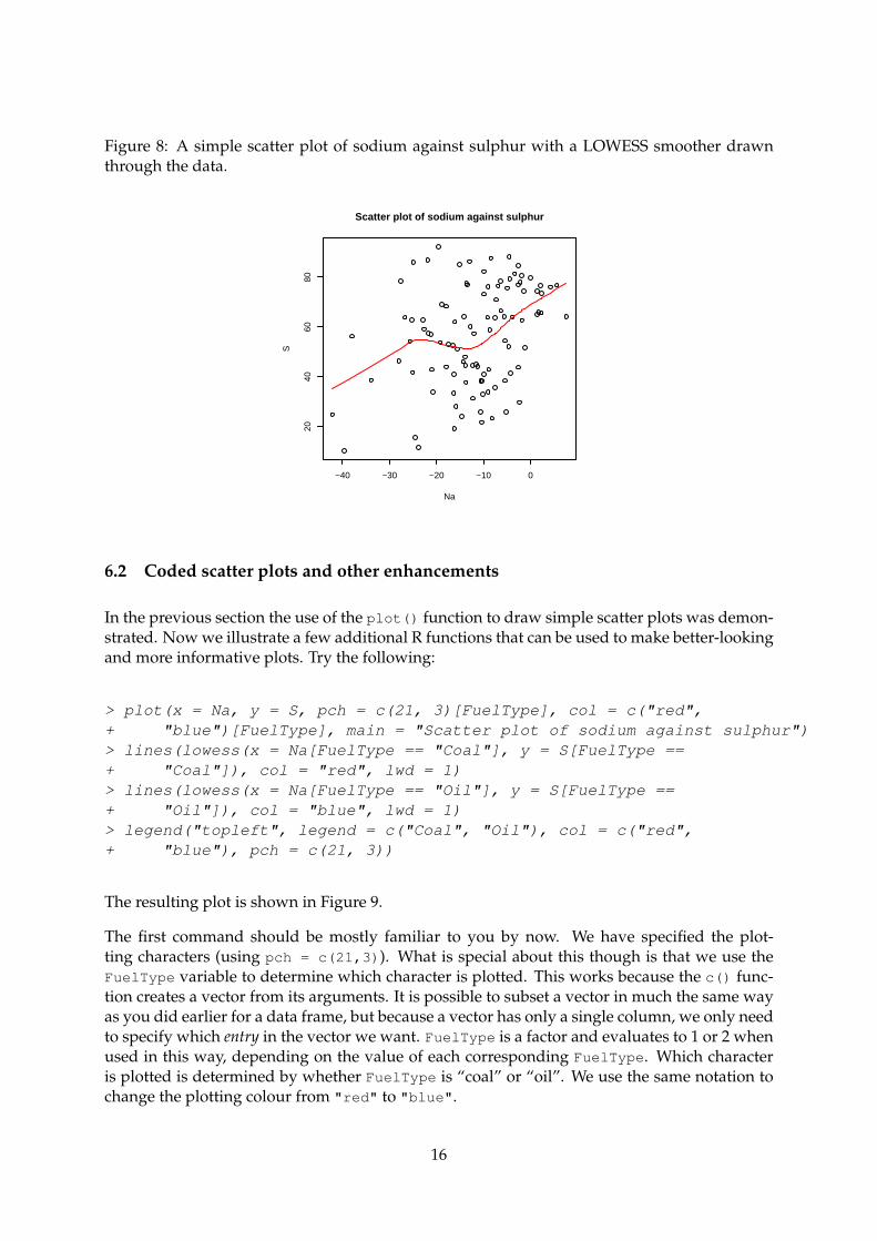
> plot(x = Na, y = S, main = "Scatter plot of sodium against sulphur")
The x and y variables are passed as arguments to plot() and we define a main title for theplot. There are lots of embellishments one can use to alter the appearance of the plot, but oneof the most useful is a scatter plot smoother, which should highlight the relationship betweenthe two plotted variables.
> plot(x = Na, y = S, main = "Scatter plot of sodium against sulphur")> lines(lowess(x = Na, y = S), col = "red", lwd = 1)
Here we just renew the original plot for clarity, but technically you only need to enter thelines() command if the scatter plot is still visible in the plotting device and was the lastplot made. The resulting plot is shown in Figure 8. To understand how this works type thefollowing at the R prompt3:
> lowess(x = Na, y = S)
The lowess() function takes as its arguments (in its most simplest form) two vectors, x and y
corresponding to the two variables or interest, and returns an object with two vectors of pointscorresponding to the smoothed value fitted at each pair of x and y. The lines() functionexpects to be passed pairs of coordinates (x and y), and in our example draws a line of width 1(lwd = 1, which isn’t strictly necessary as the default is to use whatever lwd is set to in par())in red (col = "red"). So you can see that we do not need to save the results of lowess() inorder to plot them. This is a very useful feature of R, being able to nest function calls inside oneanother, and will be used more frequently throughout the remaining practical classes.
3Note that your output will look slightly different depending on the width of your console window
15
Figure 8: A simple scatter plot of sodium against sulphur with a LOWESS smoother drawnthrough the data.
−40 −30 −20 −10 0
2040
6080
Scatter plot of sodium against sulphur
Na
S
6.2 Coded scatter plots and other enhancements
In the previous section the use of the plot() function to draw simple scatter plots was demon-strated. Now we illustrate a few additional R functions that can be used to make better-lookingand more informative plots. Try the following:
> plot(x = Na, y = S, pch = c(21, 3)[FuelType], col = c("red",+ "blue")[FuelType], main = "Scatter plot of sodium against sulphur")> lines(lowess(x = Na[FuelType == "Coal"], y = S[FuelType ==+ "Coal"]), col = "red", lwd = 1)> lines(lowess(x = Na[FuelType == "Oil"], y = S[FuelType ==+ "Oil"]), col = "blue", lwd = 1)> legend("topleft", legend = c("Coal", "Oil"), col = c("red",+ "blue"), pch = c(21, 3))
The resulting plot is shown in Figure 9.
The first command should be mostly familiar to you by now. We have specified the plot-ting characters (using pch = c(21,3)). What is special about this though is that we use theFuelType variable to determine which character is plotted. This works because the c() func-tion creates a vector from its arguments. It is possible to subset a vector in much the same wayas you did earlier for a data frame, but because a vector has only a single column, we only needto specify which entry in the vector we want. FuelType is a factor and evaluates to 1 or 2 whenused in this way, depending on the value of each corresponding FuelType. Which characteris plotted is determined by whether FuelType is “coal” or “oil”. We use the same notation tochange the plotting colour from "red" to "blue".
16
Figure 9: A coded scatter plot of sodium against sulphur by fuel type. A LOWESS smoother isdrawn through the data points for each fuel type.
−40 −30 −20 −10 0
2040
6080
Scatter plot of sodium against sulphur
Na
S
CoalOil
A similar method is used to plot the LOWESS scatter plot smoothers for each fuel type. Thistime however, we only want to fit a LOWESS a single fuel type at a time. So we select valuesfrom Na and S where the corresponding FuelType is either “coal” or “oil”. We have to repeatthis twice, once of each level in FuelType4.
The final command make use of the legend() function to create a legend for the plot. Thefirst argument to legend() should be a vector of coordinates for the upper left corner of thebox that will contain the legend. These coordinates need to be given in terms of the scale of thecurrent plot region. Instead we use the locator() function to set the location of the legendinteractively.
Draw coded scatter plots in the same way for other variables in the SCP data set. Whichvariables seem to best discriminate between the two fuel types?
6.3 Scatter plot matrices
When there are more than two variables of interest it is useful to plot a scatter plot matrix,which plots each variable against every other one. The pairs() function is the standard Rgraphics function for plotting scatter plot matrices5.
Enter the following code snippet and look at the resulting plot:
4There are ways of automating this in R code, but this involves writing a custom function using a loop and so isbeyond the scope of this practical
5I mentioned earlier that plot() was a generic function. If you were to pass plot() a matrix ordata frame containing three or more variables, plot() would call pairs to perform the plot instead of sayplot.default() say, which was used behind the scenes to produce the plots in Figure 9
17
Figure 10: A scatter plot matrix showing therelationship between Sodium, Nickel, Sul-phur and Iron. A LOWESS smoother is plot-ted though each individual plot.
Na
−6 −2 2 4 6 −5 5 15 25
−40
−20
0
−6
−2
24
6
Ni
S20
4060
80
−40 −20 0
−5
515
25
20 40 60 80
Fe
Figure 11: A scatter plot matrix showing therelationship between Sodium, Nickel, Sul-phur and Iron. Red circles denote Coal-firedpower stations and blue crosses, Oil-firedones.
Lets take a moment to explain the above functions. Firstly, the cbind() function (columnbind) has been used to stitch together the four named vectors (variables) into a matrix (or dataframe). cbind() works in a similar way to c() but instead of creating a vector from its argu-ments, cbind() takes vectors (and other R objects) and creates a matrix or data frame from thearguments. We have done this, because pairs() needs to work on a matrix or data frame ofvariables.
The final argument in the call to pairs() is the panel argument. The details of panel arebeyond the scope of this practical, but suffice it to say that panel is used to plot any appropriatefunction on the upper and lower panels of the scatter plot matrix (the individual scatter plots).Later in the practical you will use a custom panel function to add features to the diagonal panelwhere currently only the variable label is displayed. In the above code snippet we make useof an existing panel function, panel.smooth which plots a LOWESS smoother through each ofthe panels using the default span (bandwidth6).
As an alternative to Figure 10, we can plot coded scatter plot matrices like so:
> pairs(cbind(Na, Ni, S, Fe), pch = c(21, 3)[FuelType],+ col = c("red", "blue")[FuelType], gap = 0)
6You will learn more about the bandwidth parameter in lowess() in the practical on Advanced Regressiontechniques.
18
This example should be much more familiar to you than the previous one, as the structure ofthe commands are similar to the single coded scatter plot earlier. The same syntax is used tosubset data into each fuel type and are plotted in different characters and colours. The resultingplot is shown in Figure 11.
Plot different combinations of the variables in the SCP data set in scatter plot matrices.Which variables seem to best discriminate between the two fuel types?
7 Univariate statistical tests
Ward and Quinn (1988) collected 37 egg capsules of the intertidal predatory gastropod Lepsiellavinosa from the litorinid zone on a rocky intertidal shore and 42 capsules from the mussel zone.Other data indicated that rates of energy consumption by L. vinosa were much greater in themussel zone so there was interest in differences of fecundity between the mussel zone and thelitorinid zone. Our null hypothesis, H0s, is that there is no difference between the zones in themean number of eggs per capsule. This is an independent comparison becasue individual eggcapsules can only be in either of the two zones. As such, a two-sample t test is appropriate totest for a difference in mean number of eggs per capsule between the zones. Begin by readingin the gastropod data, display the number of egg capsules collected in each zone and finallycalculate the mean eggs per capsule of the two zones:
Notice that the two groups have similar variance (the widths of the boxes are quite similar),and the notches do not overlap, suggesting that there is a significanct difference in the meaneggs per capsule of the two zones. We can test this formally, using the t.test() function,which can be used to perform a variety of t tests.
19
> egg.ttest <- t.test(eggs ~ zone, data = gastropod)> egg.ttest
Welch Two Sample t-test
data: eggs by zonet = -5.4358, df = 76.998, p-value = 6.192e-07alternative hypothesis: true difference in means is not equal to 095 percent confidence interval:-3.626816 -1.682065sample estimates:mean in group Littor mean in group Mussel
8.702703 11.357143
Look at the output from the function. Identify the t statistic and the number of degrees offreedom for the test. Is there a significant difference between the mean number of eggs percapsule from the two zones? The 95 per cent confidence interval is for the difference in means,and does not include 0, suggesting a significiant difference in the means of the two zones.
8 Summing up
In this practical you have seen how R can be used to perform a range of exploratory data anal-ysis tasks and simple statistical tests. You have also seen how to produce publication qualitygraphics using R commands.