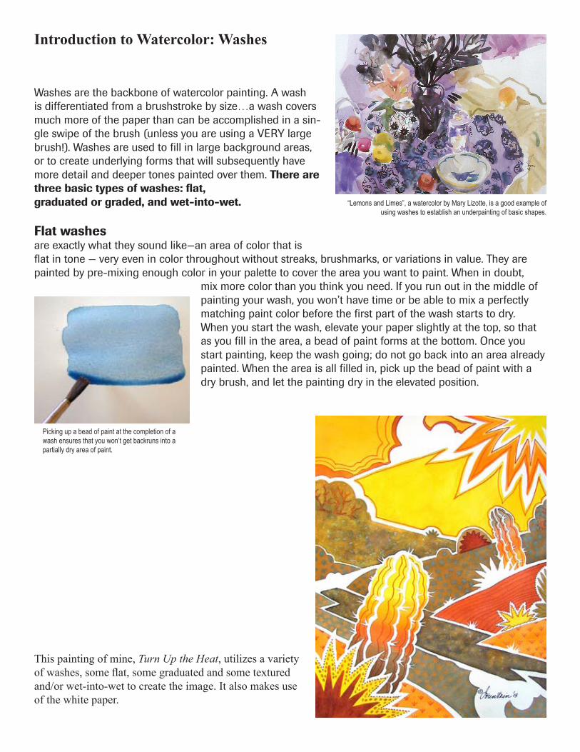
Washes are the backbone of watercolor painting. A wash is differentiated from a brushstroke by size…a wash covers much more of the paper than can be accomplished in a sin- gle swipe of the brush (unless you are using a VERY large brush!). Washes are used to fill in large background areas, or to create underlying forms that will subsequently have more detail and deeper tones painted over them. There are three basic types of washes: flat, graduated or graded, and wet-into-wet. Flat washes are exactly what they sound like—an area of color that is flat in tone — very even in color throughout without streaks, brushmarks, or variations in value. They are painted by pre-mixing enough color in your palette to cover the area you want to paint. When in doubt, mix more color than you think you need. If you run out in the middle of painting your wash, you won’t have time or be able to mix a perfectly matching paint color before the first part of the wash starts to dry. When you start the wash, elevate your paper slightly at the top, so that as you fill in the area, a bead of paint forms at the bottom. Once you start painting, keep the wash going; do not go back into an area already painted. When the area is all filled in, pick up the bead of paint with a dry brush, and let the painting dry in the elevated position. Picking up a bead of paint at the completion of a wash ensures that you won’t get backruns into a partially dry area of paint. “Lemons and Limes”, a watercolor by Mary Lizotte, is a good example of using washes to establish an underpainting of basic shapes. Introduction to Watercolor: Washes This painting of mine, Turn Up the Heat, utilizes a variety of washes, some flat, some graduated and some textured and/or wet-into-wet to create the image. It also makes use of the white paper.
Transcript
Washes are the backbone of watercolor painting. A wash is differentiated from a brushstroke by size…a wash covers much more of the paper than can be accomplished in a sin-gle swipe of the brush (unless you are using a VERY large brush!). Washes are used to fill in large background areas, or to create underlying forms that will subsequently have more detail and deeper tones painted over them. There are three basic types of washes: flat, graduated or graded, and wet-into-wet.
Flat washesare exactly what they sound like—an area of color that is flat in tone — very even in color throughout without streaks, brushmarks, or variations in value. They are painted by pre-mixing enough color in your palette to cover the area you want to paint. When in doubt,
mix more color than you think you need. If you run out in the middle of painting your wash, you won’t have time or be able to mix a perfectly matching paint color before the first part of the wash starts to dry. When you start the wash, elevate your paper slightly at the top, so that as you fill in the area, a bead of paint forms at the bottom. Once you start painting, keep the wash going; do not go back into an area already painted. When the area is all filled in, pick up the bead of paint with a dry brush, and let the painting dry in the elevated position.
Picking up a bead of paint at the completion of a wash ensures that you won’t get backruns into a partially dry area of paint.
“Lemons and Limes”, a watercolor by Mary Lizotte, is a good example of using washes to establish an underpainting of basic shapes.
Introduction to Watercolor: Washes
This painting of mine, Turn Up the Heat, utilizes a variety of washes, some flat, some graduated and some textured and/or wet-into-wet to create the image. It also makes use of the white paper.
Exercise: Flat washes
Work from observation of your subject, and REDUCE it to simple outline shapes (think coloring book). Lightly pencil in your drawing on your watercolor paper, then paint, using only flat washes (no modeling of form). Leave some parts of your image unpainted, white paper. In order to avoid backruns or bleeding colors, once you lay down a wash, let it dry completely before painting next to it, OR, leave a tiny white space of unpainted paper between each flat wash.
Caution: if you touch one wet wash into another wet/damp wash, the two colors will bleed together, (right) and you will no longer have a flat wash. The images illustrate some ways to simplify shapes and use flat areas of color. Paint each area just once. Try to anticipate how much the color will lighten as it dries and adjust the amount of pigment in your wash accordingly. If you are unsure, mix your wash, paint a small sample on scrap paper and let it dry before applying to your painting.
Pigments to use for this exercise:• Permanent Alizarin Crimson (or equivalent purple-biased red)• Winsor Lemon (or equivalent green-biased yellow)• French Ultramarine (or equivalent purple-biased blue)
Vary the values of each color by adjusting the pigment/water ra-tio. More water = lighter values. You may use any two or three of the above colors to mix additional hues, but to get an even-toned flat wash, mix in your palette, not on your paper.
This exercise is about controlling the evenness of your washes.A “perfect” flat wash
will have an even tonality throughout...no streaks, brush marks or lighter/darker areas.
Evaluation:• Did you achieve an even tone through-out each wash?• Did your colors dry to the color satura-tion that you expected?
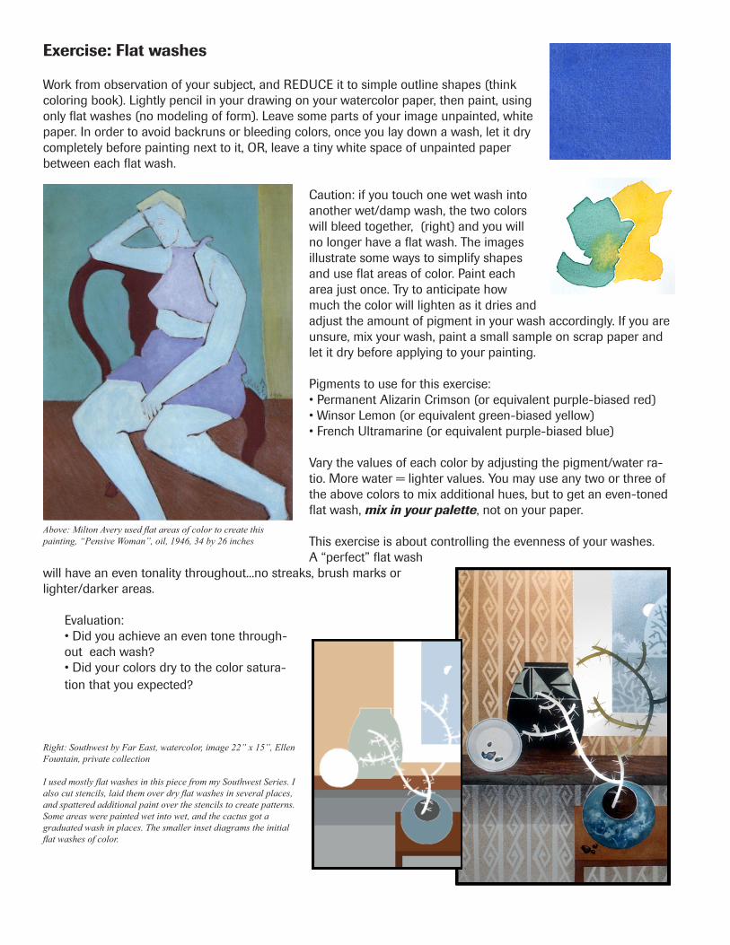
Above: Milton Avery used flat areas of color to create this painting, “Pensive Woman”, oil, 1946, 34 by 26 inches
Right: Southwest by Far East, watercolor, image 22” x 15”, Ellen Fountain, private collection
I used mostly flat washes in this piece from my Southwest Series. I also cut stencils, laid them over dry flat washes in several places, and spattered additional paint over the stencils to create patterns. Some areas were painted wet into wet, and the cactus got a graduated wash in places. The smaller inset diagrams the initial flat washes of color.
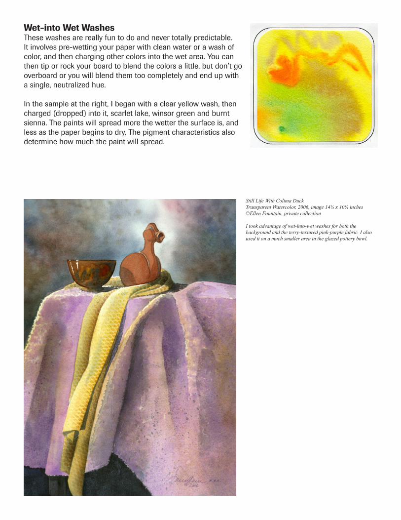
Wet-into Wet WashesThese washes are really fun to do and never totally predictable. It involves pre-wetting your paper with clean water or a wash of color, and then charging other colors into the wet area. You can then tip or rock your board to blend the colors a little, but don’t go overboard or you will blend them too completely and end up with a single, neutralized hue.
In the sample at the right, I began with a clear yellow wash, then charged (dropped) into it, scarlet lake, winsor green and burnt sienna. The paints will spread more the wetter the surface is, and less as the paper begins to dry. The pigment characteristics also determine how much the paint will spread.
I took advantage of wet-into-wet washes for both the background and the terry-textured pink-purple fabric. I also used it on a much smaller area in the glazed pottery bowl.
Exercise: Wet-into-Wet Background
Choose a subject, and simplify its contour. You can use a single flower or plant, a building shape, an animal, insect, fish shape, etc. Lightly pencil in your simplified shape’s contour (outline) on a half sheet of scrap paper. Cut out this shape. Now place it on your watercolor paper and lightly trace around it, then move it to a new position that slightly overlaps the first outline and retrace. Repeat once more - let some of your design go off the edges of your watercolor paper. Plan to leave some area(s) of your painting unpainted white paper (you can mark the white areas with a small X to remind you where they are if you wish).
In your palette, mix up three puddles of each color, using a good rich pigment/water saturation (not too thin, as you will be work-ing on very wet paper which will dilute the mixtures). These are powerful and staining colors...you won’t need much to make a rich mixture. Then, pre-wet only the background area (the area around your subject) with clean water, and working very quickly before this pre-wet area dries, add your pre-mixed colors one at a time by touching your paint-loaded brush to the wet paper in several places. Rinse and blot your brush between colors. Let one color dominate. Slightly mix the colors by tilting the paper – don’t use a brush. If you want white in the background, don’t drop paint into
that area, or lift by blotting with a paper towel. Don’t overmix, or everything will turn a gray/brown. As the paper dries, you can add drops of clean water to make lighter areas if you wish and give the background a “mottled” ef-fect, or load the tip of your brush with more concentrated paint and touch it to the paper for more “intense” spots of color. Let this background dry thoroughly before going on to Exercise 2.
This exercise will give you practice in:• Creating wet-in-wet washes• Controlling the blending of colors on wet paper• Estimating how saturated to make your washes so they will dry the value you want• Timing the addition of colors to a wet wash to control “spread” or “creep”
Evaluation:• Did your colors dry to the saturation that you expected?• Do the colors in your wet-in-wet areas still maintain some of their individuality, or did you overmix (and get gray/brown)?• Does one color (red, yellow or blue) dominate?
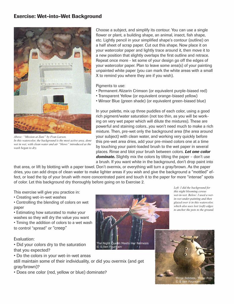
Left: I did the background for this night blooming cereus wet-in-wet. Below: I used a wet-in-wet under-painting and then glazed over it in this watercolor, which also uses lost (soft) edges to anchor the pots to the ground.
Above: “Mission at Zuni” by Fran Larsen.In this watercolor, the background is the most active area, done wet in wet, with clean water and air “blows” introduced as the wash began to dry.
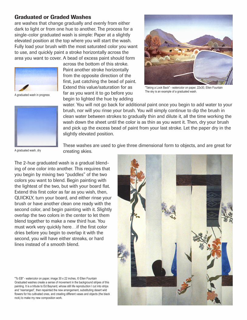
Graduated or Graded Washesare washes that change gradually and evenly from either dark to light or from one hue to another. The process for a single-color graduated wash is simple: Paper at a slightly elevated position at the top where you will start the wash. Fully load your brush with the most saturated color you want to use, and quickly paint a stroke horizontally across the area you want to cover. A bead of excess paint should form
across the bottom of this stroke. Paint another stroke horizontally from the opposite direction of the first, just catching the bead of paint. Extend this value/saturation for as far as you want it to go before you begin to lighted the hue by adding water. You will not go back for additional paint once you begin to add water to your brush, nor will you rinse your brush. You will simply continue to dip the brush in clean water between strokes to gradually thin and dilute it, all the time working the wash down the sheet until the color is as thin as you want it. Then, dry your brush and pick up the excess bead of paint from your last stroke. Let the paper dry in the slightly elevated position.
These washes are used to give three dimensional form to objects, and are great for creating skies.
The 2-hue graduated wash is a gradual blend-ing of one color into another. This requires that you begin by mixing two “puddles” of the two colors you want to blend. Begin painting with the lightest of the two, but with your board flat. Extend this first color as far as you wish, then, QUICKLY, turn your board, and either rinse your brush or have another clean one ready with the second color, and begin painting with it. Slightly overlap the two colors in the center to let them blend together to make a new third hue. You must work very quickly here…if the first color dries before you begin to overlap it with the second, you will have either streaks, or hard lines instead of a smooth blend.
A graduated wash in progress
A graduated wash, dry
"Taking a Look Back" - watercolor on paper, 22x30, Ellen FountainThe sky is an example of a graduated wash.
Use your painting from Exercise 1 (Wet-in-Wet Washes). Be sure the wet-in-wet background is completely dry. In this exercise, you’re going to concentrate on the unpainted subject you drew in assignment 1 and left unpainted.
Decide on at least one or two parts of your subject that can be painted using a graduated wash. Rotate your paper/board so that the part that will receive the beginning stroke of the graduated wash is placed at the top (away from you) and elevated about ¾ inch. Use a large round brush or your aquarelle/flat brush used on the wide side for this wash. Mix a fairly saturated patch of color (enough to saturate your brush). Lay in the first stroke of very wet color, working from one direction horizontally across the shape in a single stroke. The color should be fluid enough to form a bead of paint along the bottom of the stroke. Dip the bottom third of your brush in clean water, wipe it on the edge of your water container, and make another stroke, catching the bead of paint from the first stroke. Repeat the previous step. Each stroke should slightly lighten the value of the color until it disappears into white paper. Work as quickly as you can. Timing is critical, as is the amount of water in your brush. If you make the mixture in your brush wetter than what is on your paper, you run the risk of back runs (this is minimized by keeping your paper elevated on one edge).
For the remainder of your subject, do some hard to soft edge painting. This means that you are going to begin with a stroke on dry paper and then soften its opposite edge. There are two ways to accomplish this. One is to prewet with clean water an area 1/8 to 1/4 inch away from where you will have the hard edge of your stroke. As you pull your paint-loaded brush across the paper, the part of the brush on dry paper will make a hard edge, while the part of the brush that contacts the prewet area will soften and spread. The second method is to make a stroke on dry paper, then IMMEDIATELY take a brush dampened with clean water and touch the stroke on one side, pulling the color out to soften it. Knowing how wet to have your brush will require practice. Keep a pad of folded paper towel or a damp sponge next to your palette so you can remove excess water from your brush easily and quickly.
Evaluation:• Did your graduated wash change gradually and smoothly from saturated to unsaturated color, or did you have streaks or large jumps in value?• Did you sucessfully create some hard tosoft edged shapes?
Soft edges
Hard edges
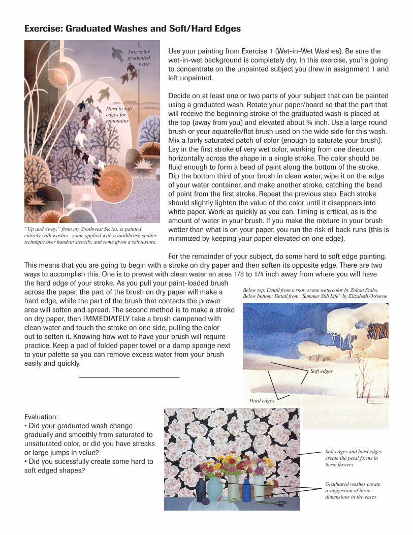
Below top: Detail from a snow scene watercolor by Zoltan Szabo.Below bottom: Detail from “Summer Still Life” by Elizabeth Osborne
Soft edges and hard edgescreate the petal forms in these flowers
Graduated washes create a suggestion of three-dimensions in the vases
“Up and Away,” from my Southwest Series, is painted entirely with washes...some applied with a toothbrush spatter technique over handcut stencils, and some given a salt texture.
Two-colorgraduated
wash
Hard to soft edges formountains
Washes, Edges and Paper
PapersPapers for watercolor affect how the paint behaves as it is applied, and how it looks when it is dry. Watercolors are designed to be thinned out with varying amounts of water and to be applied to the paper in a manner that allows light to reflect back up through the color, once dry. This reflectivity from the paper surface is what gives watercolors their unique luminosity.
Paper surfaces influence this reflectivity. There are three basic surfaces for watercolor paper: rough, cold press and hot press. Some watercolor paper manufacturers have added a third surface, not press, which is somewhere between cold press and hot press. Visualize your paper on a scale from bumpy to smooth:
Rough paper is particularly suited to direct painting, where color is put down once and not reworked, or for using the heavier pigments (cadmiums, cobalts, etc.) as it accentuates their sedimentary qualities.
Hot press is a very smooth surfaced paper, which allows the paint to “slide around” on the paper more, and will tend to record each brush mark you make...leaving unpredictable accumulations of paint. It can be a very expressive surface in the hands of an experienced direct painter. For beginners, it can present real challenges for painting smooth, non-streaky areas. It is a good paper surface for dry-brush or hightly detailed approaches to watercolor.
Cold press paper is a good, all around paper surface, as it has enough “bumpiness” to take advantage of sedimentary pigments when you use them, but is smooth enough for detail work.
Exercise 1:Use an 1/8 sheet of each of your papers — hot press, cold press and rough — and do these test samples, painting the sample patches up toward the top of the sheet placed vertically:• Use a sedimentary color (like ultramarine blue) and paint a 2”x2” patch of color on each of your papers.• Use a non-sedimentary color (like permanent alizarin crimson) and do the same test patch on each piece of paper. Compare the results.
The other thing that affects reflectivity is sizing. All good watercolor paper is sized, during the pulp stage of the paper making, after the sheet is formed, or both times. The amount and type of sizing determine how absorbant the paper will be, how easy it will be to lift off (remove) dry paint, and ultimately, how luminous the color will appear. The less absorbent the paper is, the more the paint sits on the surface and the brighter it will appear. The downside to paint sitting on the surface comes when you want to glaze or layer over it...as watercolor is always resoluable, paint that sits completely on the surface is very easily disturbed and blended into subsequent washes, sometimes making a muddy mess!
Find the paper surface, through experimentation, that suits your painting style.