16
IS 213 Presentation IS 213 Presentation Healthy Communities Healthy Communities Florance Gee, Ran Li, Nettie Florance Gee, Ran Li, Nettie Ng Ng April 29, 2004 April 29, 2004
| Date post: | 20-Dec-2015 |
| Category: |
Documents |
| View: | 217 times |
| Download: | 0 times |

IS 213 PresentationIS 213 PresentationHealthy CommunitiesHealthy Communities
Florance Gee, Ran Li, Nettie NgFlorance Gee, Ran Li, Nettie NgApril 29, 2004April 29, 2004
IS 213 PresentationIS 213 PresentationHealthy CommunitiesHealthy Communities
Florance Gee, Ran Li, Nettie NgFlorance Gee, Ran Li, Nettie NgApril 29, 2004April 29, 2004
Problem Statement
• Most of the community-based websites fail to provide community health information or ratings
• Require navigation to external websites to obtain the information
• Not community specific
• A community-specific Information Network System
• Tracks community health issues • Promote awareness of community issues• Support community involvement• Focus on Community indicators
Proposed System &
Project Goal
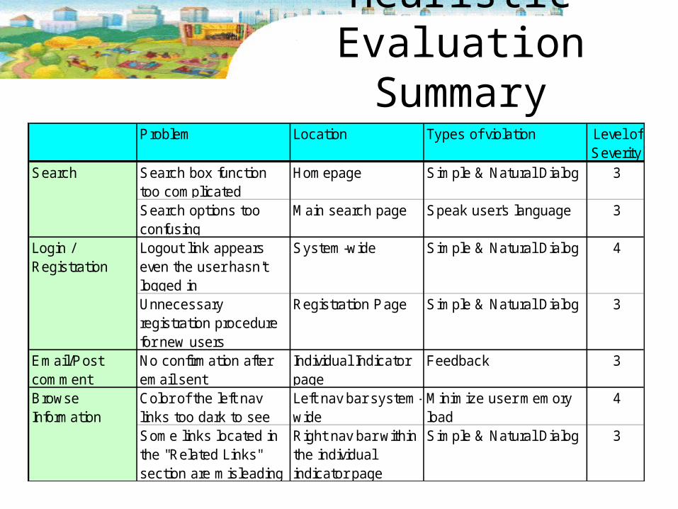
Heuristic Evaluation Summary
Problem Location Types of violation Level of Severity
Search Search box function too complicated
Homepage Simple & Natural Dialog 3
Search options too confusing
Main search page Speak user's language 3
Login / Registration
Logout link appears even the user hasn't logged in
System-wide Simple & Natural Dialog 4
Unnecessary registration procedure for new users
Registration Page Simple & Natural Dialog 3
Email/Post comment
No confirmation after email sent
Individual Indicator page
Feedback 3
Browse Information
Color of the left nav links too dark to see
Left nav bar system-wide
Minimize user memory load
4
Some links located in the "Related Links" section are misleading
Right nav bar within the individual indicator page
Simple & Natural Dialog 3
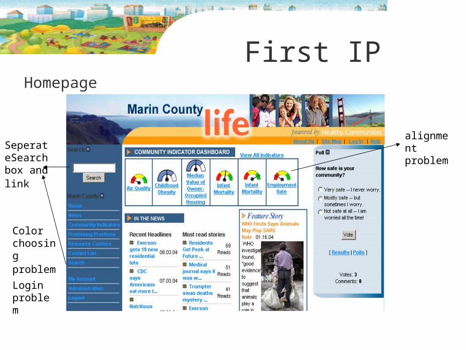
First IPHomepage
Color choosing problem Login problem
SeperateSearch box and link
alignment problem
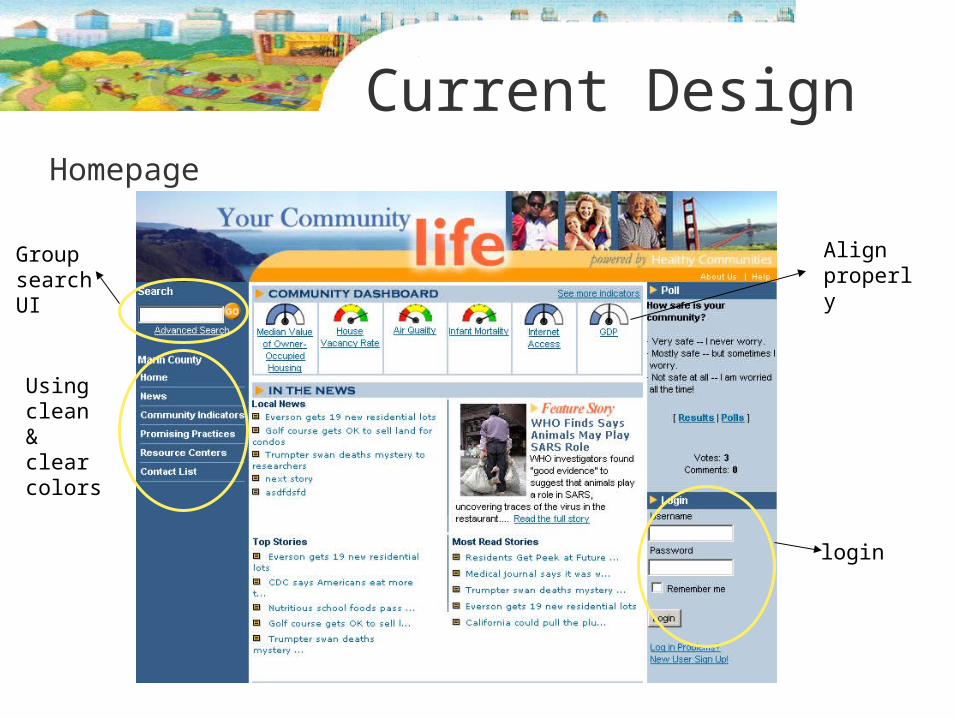
Current DesignHomepage
Group search UI
Using clean & clear colors
Align properly
login
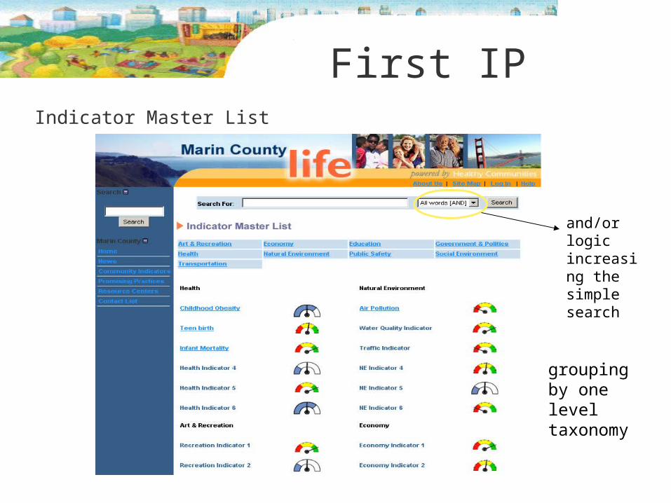
First IPIndicator Master List
and/or logic increasing the simple search
grouping by one level taxonomy
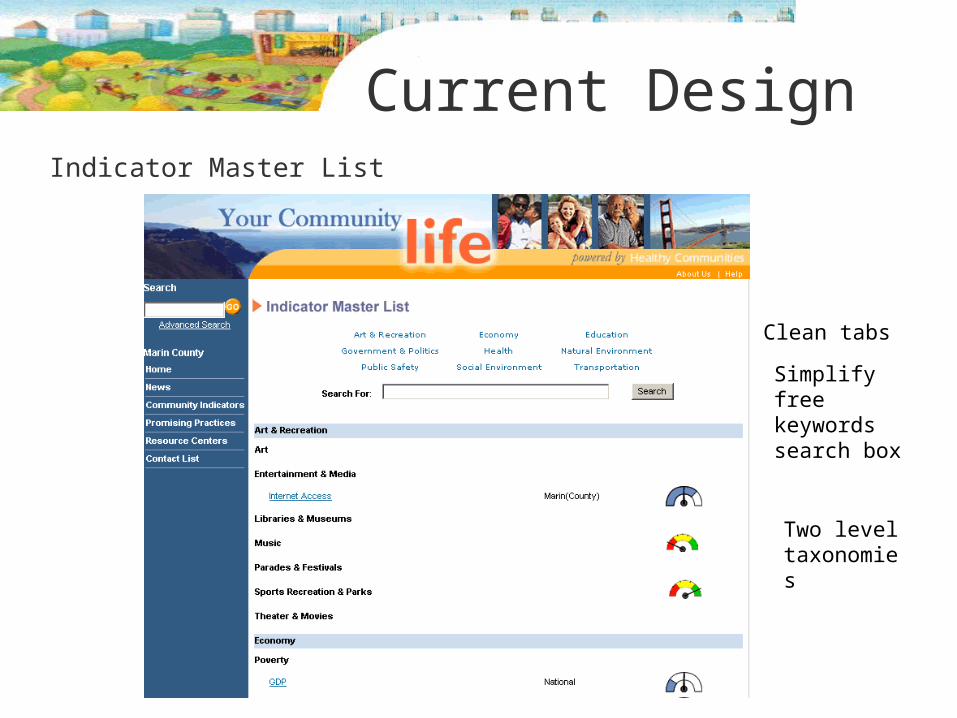
Current DesignIndicator Master List
Simplify free keywords search box
Two level taxonomies
Clean tabs
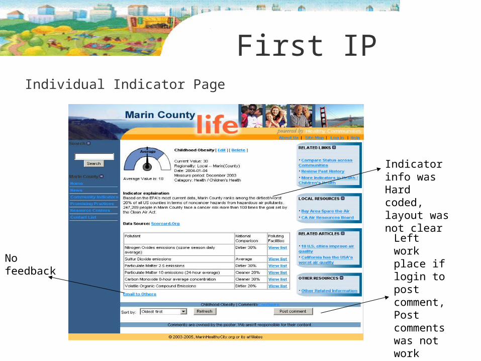
First IPIndividual Indicator Page
No feedback
Indicator info was Hard coded, layout was not clear
Left work place if login to post comment,Post comments was not work then
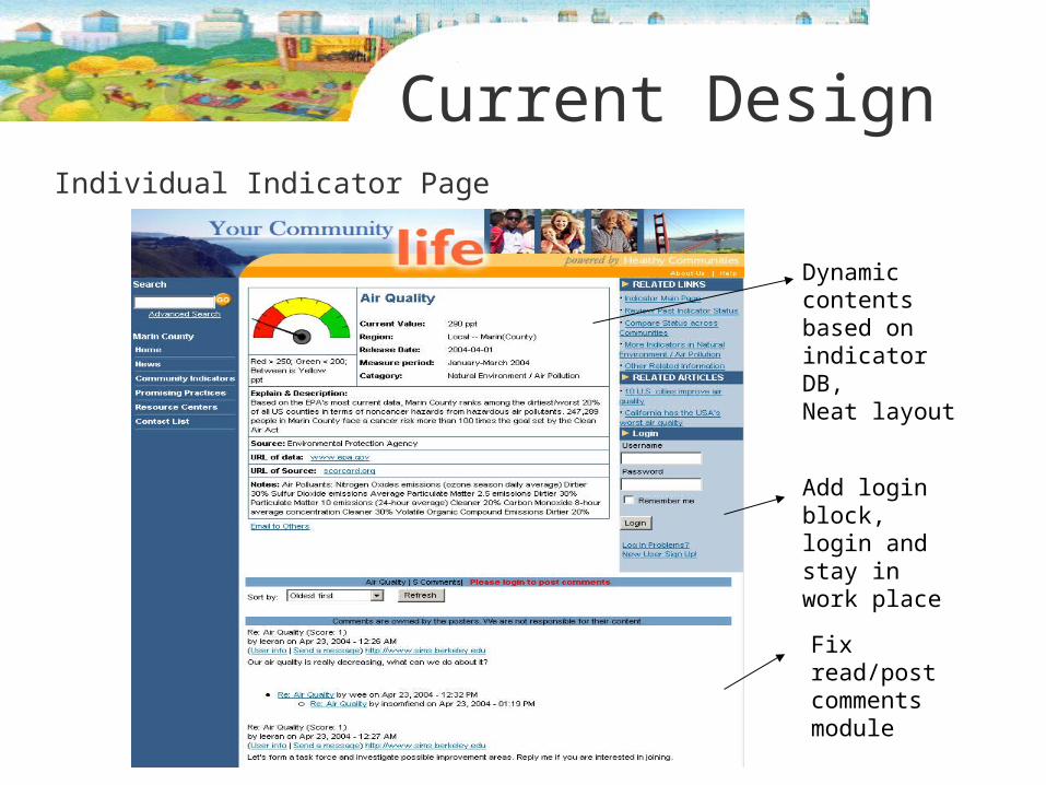
Current DesignIndividual Indicator Page
Dynamic contents based on indicator DB,Neat layout
Add login block, login and stay in work place
Fix read/post comments module
Demo
http://dream.sims.berkeley.edu/~leeran/healthyc/Marin/prototype2/index.php
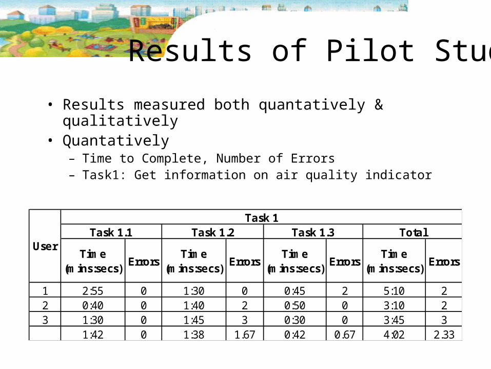
Results of Pilot Study
• Results measured both quantatively & qualitatively
• Quantatively– Time to Complete, Number of Errors– Task1: Get information on air quality indicator
Time (mins:secs)
ErrorsTime
(mins:secs)Errors
Time (mins:secs)
ErrorsTime
(mins:secs)Errors
1 2:55 0 1:30 0 0:45 2 5:10 22 0:40 0 1:40 2 0:50 0 3:10 23 1:30 0 1:45 3 0:30 0 3:45 3
1:42 0 1:38 1.67 0:42 0.67 4:02 2.33
Task 1
UserTask 1.1 Task 1.2 Task 1.3 Total
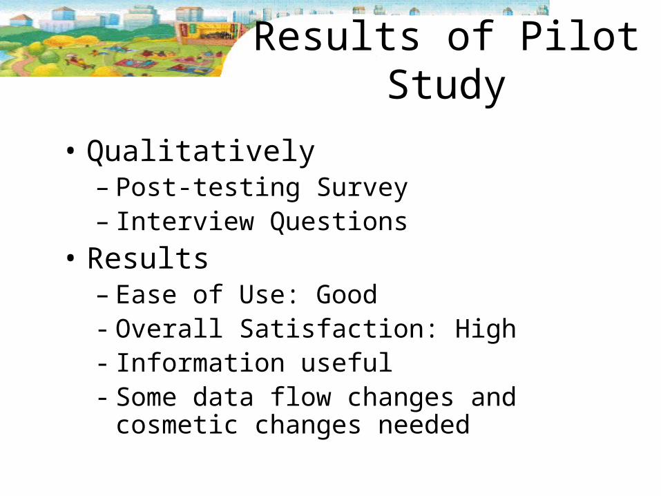
Results of Pilot Study
• Qualitatively– Post-testing Survey– Interview Questions
• Results– Ease of Use: Good- Overall Satisfaction: High- Information useful- Some data flow changes and
cosmetic changes needed
Lessons Learned
• Diverse computer skill levels – difficult to meet all needs
• User friendly important – easy to navigate & understand
• Prevent errors at first place – Password criteria stated– Bring users back after login
• Help should be available
Last Iteration
• Improve indicator dials• Filter function on indicator master
list page• Better registration flow • Functions, titles more obvious• More explanations and help
Questions??


