Changing Pigments Historical media and its sensitivity to pH A case study on the treatment of Alexander Scott Carter’s sketch book Written by: Jennifer Pascoa Completed under the guidance of Linda Joy at the Thomas Fisher Rare Book Library in concordance with Fleming College’s Cultural Heritage and Conservation Management internship requirement November 20, 2015 1
Transcript
Changing PigmentsHistorical media and its sensitivity to pHA case study on the treatment of Alexander Scott Carter’s sketch book
Written by: Jennifer Pascoa
Completed under the guidance of Linda Joy at the Thomas Fisher Rare Book Library in concordance with Fleming College’s Cultural Heritage and Conservation Management internship requirement
November 20, 2015
� 1
Table of Contents
Introduction
Scott Carter the artist
20th century inks and their components
De-acidification treatment and its effects on media
Case study: the treatment of Alexander Scott Carter’s Sketch Book
Condition report Treatment method
Testing the pigments for solubility
Final treatment results
� 2
Introduction
Libraries and archives are repositories of information, they collectively preserve our cultural and
social history, while always balancing accessibility. The “artifacts” are part of a living collection
that must be maintained through cataloguing, digitization, preservation and proper storage.
These concepts inform the actions of the conservator, forcing them to consider the outcomes of
preservation versus accessibility. This dichotomy drives the everyday operations of a library or
archive, encouraging innovative ideas to flourish in a continuously fluctuating environment as a
means to establish a balance.
Paper and book conservators are often combating the affects of acid hydrolysis in
cellulosic materials. Neutralization of acids and changing the pH of paper to reflect a more
stable alkaline state is the end goal and reason why de-acidification is such a widely practiced
treatment method. Various alkalization solutions have been experimented with to determine their
merits and effectiveness on removing harmful acids from paper artifacts. When it comes to de-
acidification and types of media there seems to be a lack of information regarding the effects it
may have on pigments and ink in the long term. This paper is aimed at theoretically analyzing
the mechanism that causes colour to change at differing pH levels and whether treating paper
with a buffering solution has the potential to alter original media. In order to understand the
potential risk, a knowledge of the components found in drawing inks and coloured ink washes
is necessary. Research into historic and modern ink formulations, will bring to light its potential
vulnerabilities. The role organic pigments play in the history of artist materials will be discussed
because their fugitive nature is a cause for concern when treating works of art on paper. The
pigment Prussian blue, will take precedence during the discussion because of its widespread use
� 3
in artist materials, and because of its severe sensitivity to high pH. To further this trajectory of
analysis de-acidification as a treatment method will be discussed, weighing the pros and cons of
its use when considering the effect it may have on different types of media. Finally the treatment
of Scott Carter’s sketch book will act as a case study, reflecting the practical application of de-
acidification and its effectiveness.
Scott Carter the Artist
In order to give context to the arguments presented below, a brief look into the life and
technique of the artist in question is necessary. Alexander Scott Carter was a talented artist and
architect, who developed a substantial body of work designing and fabricating heraldic
ornaments. His talent was utilized to produce coat of arms and or heraldic crests for various
municipalities, churches, and families within Canada and internationally. Carter was born in
Harrow, Middlesex Co., England 1881. He studied art at the Bournemouth School of Art, and 1
later studied architecture at the Royal Academy Schools between 1905-08, where some of the
leading architects in the field taught. Carter emigrated to Canada in 1912, settling in Toronto 2
and dedicating most of his work to the decorative arts. Carter became well known for his
excellent drafting skills and heraldic designs, working on projects commissioned by “Lady
Eaton, Sir Joseph Flavelle, E.R. Wood, Gerald Larkin, the Hon. Vincent Massey, Sir Edmund
Walker, Sir Vincent Meredith, J.P. Bickell, and Sir Frederick Williams-Taylor.” The project he 3
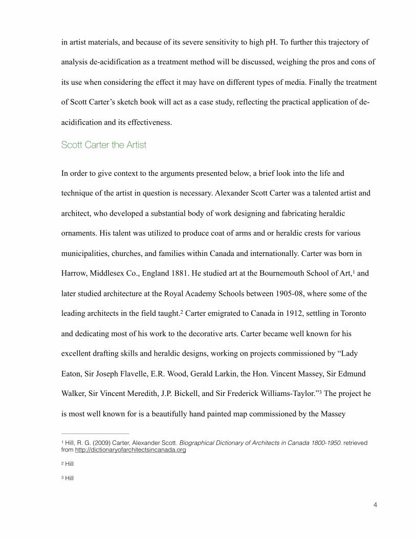
is most well known for is a beautifully hand painted map commissioned by the Massey
Hill, R. G. (2009) Carter, Alexander Scott. Biographical Dictionary of Architects in Canada 1800-1950. retrieved 1
foundation. The work of art hangs in the map room in Hart House. Carter continued to work in 4
the Toronto area between the years of 1912 and 1950. His studio was situated on Washington
avenue, a street located at the north western end of the University of Toronto campus. It is
fitting that he would work so closely to UofT since many of his designs were commissioned by
the university.
Carter’s use of material and artistic approach to architectural renderings was no doubt
influenced by the Beaux-Arts style (1890-1930). According to the article “Fabrication of
Architectural Drawings” by Price “artistic appearance” was emphasized forcing draftsmen to
rely on their artistry, using handmade paper and watercolour to really sell their design. Carter 5
clearly followed this school of thought, completing large scale renderings of his heraldic
ornaments in watercolour and ink. Even within his sketchbooks beautiful miniatures in coloured
Toews 34
Price, L O. (n.d.). Fabrication of Architectural Drawings. Conservation Center for art & historic artifacts.1-12 5
Retrieved from http://www.ccaha.org/uploads/media_items/the-fabrication-of-architectural-drawings-to-1950.original.pdf. 2
� 5
Fig. 1 Alexander Scott Carter. Map, illustrating the history and geographical location of the University if Toronto. 1937. Located in the Map Room of Hart House
light source. On the other hand Tyrian purple is considered a very stable permanent colour, but
because harvesting the dye is so expensive cheaper and more economical sources had to be
considered. 23
The desire to find more stable colourants that are both light and colourfast helped evolve
the pigment industry, advancing towards a chemically synthetic era of colour production. In
1704, Diesbach a german colourmaker successfully made a synthetic version of Prussian blue. 24
Diesbach accidentally synthesized the pigment during an experiment involving the oxidation of
Iron, that was intended to create the pigment cochineal lake. The synthesized product is 25
essentially a hydrated iron(III) hexacyanoferrate(II) complex. This compound is manufactured
by reacting a solution of iron(III) salt, such as ferric chloride FeIIICl3 with a solution of
hexacyanoferrate(II) salt K4[FeII(CN)6]. The resulting formula is represented as 26
FeIII4[FeII(CN)6]3.14H2O. The colour produced from this reaction is a very deep blue that
almost looks black. Painters would mix in lead white in order to achieve a more desirable blue
tint. The addition of white pigment is one reason why the permanence of Prussian blue began 27
to be questioned. Mixtures that contain a higher percentage of white pigment to blue result in a
decrease in lightfastness. This could be attributed to the increased absorption of visible light and
Ultraviolet Radiation. Black is a colour because it absorbs every wavelength on the visible light
Plenderleith 24923
Kirby, J., & Saunders, D. (2004). Fading and Colour Change of Prussian Blue: Methods of Manufacture and the 24
Influence of Extenders. National Gallery Technical Bulletin. (25) 73-99 Retrieved from http://www.nationalgallery.org.uk/fading-and-colour-change-of-prussian-blue-methods-of-manufacture-and-the-influence-of-extenders 73
- Prussian blue- madder- chrome green- Hookers green- yellow lake- van dyke brown
spot testing may reveal the media to be insoluble. It is important to test all paints, especially 37
when de-acidifying. Writing Inks on that other hand, tend to be more soluble with age because
of the binders used. Modern India ink contains a shellac binder that is not water soluble but can
be dissolved in alcohol. If the shellac binder were to breakdown, the water resistant ink would 38
become vulnerable to aqueous treatments.
Case study: The treatment of Alexander Scott Carter’s Sketch Book
The Thomas Fisher Rare Book Library has accumulated through donation the majority of
Alexander Scott Carter Esquire’s art work and ephemeral documents. The Halcyon newsletter
published by the Fisher library publicly details the contents of the collection stating that works
of art include “preliminary pencil sketches on parchment and scrap paper, large finished
sketches in pencil and coloured wash on parchment, board and paper.” In addition to the 39
drawings are blueprints, photographs and original correspondence with clients regarding
commissioned work. The sketchbook that was brought in for treatment, was one of 5 books part
of the collection. All of the sketchbooks exhibited deterioration and so it was deemed by the
conservator Linda Joy that an aqueous de-acidification treatment, followed by re-mounting of
the drawings on acid-free paper would prolong the life of the object and make it more accessible
to the public. The sketchbook is such an important aspect of the artist, it reveals so much about
their process. Therefore preserving the contents of Scott Carter’s sketch book, by removing each
item from the acidic paper support outweighs the desire to keep them in the original binding.
Ash 1337
Ash 1038
Toews, J. (2002). Paint, Gesso, Silver, Gold and Stone: Alexander Scott Carter, Artist and Architect. The Halcyon: 39
the newsletter of the friends of the Thomas Fisher Rare Book Library, No. 30 1-8.. 2
� 15
This case study focuses on one sketchbook from the collection that is titled Sketches & notes by
A. Scott Carter R.C.A Vol. 1.
The sketchbook dates from 1914-1939 and contains 17 pages with drawings
adhered to the front and back of each page, except for three photographs that were
found loose at the back of the book. In total there are 169 items, ranging from
watercolour renderings, pencil sketches and ink drawings found on machine made,
laid and tracing paper, silver gelatin photographs and magazine clippings. Each item
was attached at multiple contact points with an unknown adhesive that has
discoloured to yellow brown and is very brittle. In order to properly document the
treatment and record all the different types of media Carter used, I developed a
temporary condition report form.
The Thomas Fisher Library has a condition report form that is geared towards
documenting books on loan for exhibition purposes. The form is simple, allowing the
conservator to manually fill in information regarding the type of binding, page count,
dimensions and overall condition of the book. Each item that is condition reported is also photo
documented to provide a more accurate visual representation, saving time that would otherwise
be spent filling out an over detailed form. By expanding on the general outline, I was able to
create a slightly more detailed version that could be used to document works of art on paper.
The form is designed as a checklist to quickly record the primary support material and media
present in the artifact. A section for condition remarks and treatment method is included to
briefly describe the conservation efforts.
� 16
Condition form
� 17
Thomas Fisher Rare Book LibraryUniversity of Toronto
Works of art on paper condition report form
Binding:
Support material:
X Laid paper X Tracing paper ! Woven paper X Machine made ! Handmade X Sized ! Unsized X Sketching ! Newsprint X Magazine ! Other ______________
Secondary Support material
X Paper X Board ! Animal ! Fabric ! Other ___________________
Photographs: Silver Gelatine developing out paper
Media: X Graphite X Carbon ink X Watercolour X Pencil ! Pencil Crayon ! Charcoal
X Pastel ! Chalk X coloured Ink ! Printing Ink ! Ballpoint pen ! Fountain Pen Ink ! Iron Gall Ink X Felt tip Marker ! Typewriter ! Acrylic ! Oil Paint ! Ink
Unknown
Format: Manuscript Dimensions: h: 16” w: 11” thickness:Artist: Alexander Scott Carter
Date: 1914-1939 Page count: 29
Accession #: MSS 09274 General Description: Sketch bookDonor:
Examination date: October 6, 2015
� 18
Thomas Fisher Rare Book LibraryUniversity of Toronto
Photographic Documentation: Yes
Treatment: Mechanical removal of photographs and water soluble drawings from the backing paper. Also mechanical removal of adhesive using a scalpel.
Immersion in magnesium bicarbonate de-acidification solution for 30 to 60 mins. Once the aged adhesive has softened each drawing is detached using a micro spatula from the acidic paper backing. The items are blotted dry then transferred to a wool matt and dried under weight.
Mix the ingredients for 60 minutes with constant agitation, and carbon dioxide to ensure the magnesium carbonate dissolves.
Adhere the treated items to white acid-free paper using wheat starch paste and encapsulate.
Description of Condition: The sketch book is considered the secondary support material. original drawings and photographs have been adhered to with the pages with an unknown adhesive.
The sketchbook paper is very acidic and brittle from acid hydrolysis. It is yellow in colour indicating the presence of lignin characteristic to wood pulped machine made paper.
Many of the drawings were completed on more stable paper, but because of their proximity to the deteriorated support backing they too have become acidic. Any drawings that were adhered right to the edge of the support paper have suffered losses due to breakage of the brittle support backing.
The photographs included in the sketchbook exhibit deterioration of the silver gelatin image through silver mirroring. Some of the photographs seem to have been previously removed and therefore exhibit areas of loss at the corners. The paper substrate of the photos are discoloured from the absorption of acids and have become brittle along the edges of the image.
Date Treatment Completed: _______________________________________________________________________
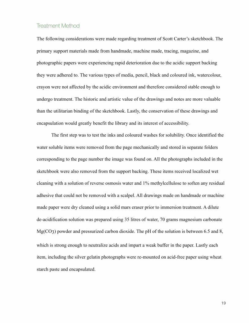
Treatment Method
The following considerations were made regarding treatment of Scott Carter’s sketchbook. The
primary support materials made from handmade, machine made, tracing, magazine, and
photographic papers were experiencing rapid deterioration due to the acidic support backing
they were adhered to. The various types of media, pencil, black and coloured ink, watercolour,
crayon were not affected by the acidic environment and therefore considered stable enough to
undergo treatment. The historic and artistic value of the drawings and notes are more valuable
than the utilitarian binding of the sketchbook. Lastly, the conservation of these drawings and
encapsulation would greatly benefit the library and its interest of accessibility.
The first step was to test the inks and coloured washes for solubility. Once identified the
water soluble items were removed from the page mechanically and stored in separate folders
corresponding to the page number the image was found on. All the photographs included in the
sketchbook were also removed from the support backing. These items received localized wet
cleaning with a solution of reverse osmosis water and 1% methylcellulose to soften any residual
adhesive that could not be removed with a scalpel. All drawings made on handmade or machine
made paper were dry cleaned using a solid mars eraser prior to immersion treatment. A dilute
de-acidification solution was prepared using 35 litres of water, 70 grams magnesium carbonate
Mg(CO3) powder and pressurized carbon dioxide. The pH of the solution is between 6.5 and 8,
which is strong enough to neutralize acids and impart a weak buffer in the paper. Lastly each
item, including the silver gelatin photographs were re-mounted on acid-free paper using wheat
starch paste and encapsulated.
� 19
Testing media for Solubility
Using a cotton swab socked in the de-acidifying solution, I tested multiple coloured and
monochrome media that I believed to be water-soluble. Most of the watercolour drawings, like
the one featured below solubilized immediately. Localized neutralization treatment could have
been used for items like this where large areas did not contain pigments, but to prevent any
cockling or uneven cleaning, eraser was used instead to remove surface dirt. In some cases the
black ink that appeared insoluble during spot tests, behaved differently during immersion. The
areas where the paper has darkened indicating a higher acidity have caused the ink to solubilize.
The only exception is the smallest square motif that looks to be on an area that did not discolour.
It is curious that these two areas would dissolve during washing, while the other motifs on this
page seem untouched. Again this could be due to pH changing the stability of the ink, the
� 20
Fig 7. Scott Carter. Greetings card. [Watercolour and india ink on handmade paper.]
formulation of the ink and application. Carter could have substituted a different ink pen, but the
most likely scenario is the chemical deterioration of the media which failed to present itself
during testing.
� 21
Fig 8. Scott Carter. Sketch. [India ink?]
Detail of figure 8
Final Treatment Results
The majority of the 169 items were able to undergo aqueous cleaning, which helped to improve
their condition. Even though there were several drawings that could not benefit from
neutralization and alkalization treatment because of their soluble media, they were still
improved by removing the source of the acid. Generally it is not advised to encapsulate
photographs, because it may cause loss of the image layer. But in the case of Carter’s
sketchbook, the photographs were considered studies or notes that he took as inspiration for his
designs. Their value lies in the context of the book. If they were removed and placed in a
separate file, their meaning would be lost or more tragically they could become disassociated
from the original accession. In a effort to maintain as much of the original layout of the sketch
book as possible, I elected to keep the photographs encapsulating them along side their fellow
sketches. The original sketchbook had drawings pasted on either side of the page. This was not
duplicated, instead items were laid out on one page doubling the original page count. This
allowed drawings that contained additional doodles on the back that were originally hidden from
view to be exposed, seen through a window cut out of the acid-free paper. The most rewarding
aspect is knowing that the beautiful drawings can now be accessed by the public. Prior to
treatment this sketchbook would not have been allowed to be viewed, the pages were so brittle
that valuable material was being lost every time the book was handled. Now researchers and
Scott Carter enthusiasts can admire his beautiful drawings. He played a significant role in
creating the heraldic symbols we take for granted, and my only hope is that more people will
discover and appreciate his work.
� 22
Bibliography
Ash, N. (1985). Media Problems. Conservation OnLine, 1-34. Retrieved from http://cool.conservation-us.org/coolaic/sg/bpg/pcc/03_media-problems.pdf
Cosentino, A. (2015). Effects of Different Binders on Technical Photography and Infrared Reflectography of 54 Historical Pigments. International Journal of Conservation Science, 6(3): 287-298.
Hill, R. G. (2009) Carter, Alexander Scott. Biographical Dictionary of Architects in Canada 1800-1950. retrieved from http://dictionaryofarchitectsincanada.org
Kirby, J., & Saunders, D. (2004). Fading and Colour Change of Prussian Blue: Methods of Manufacture and the Influence of Extenders. National Gallery Technical Bulletin. (25) 73-99 Retrieved from http://www.nationalgallery.org.uk/fading-and-colour-change-of-prussian-blue-methods-of-manufacture-and-the-influence-of-extenders
Mitchell, C. A., & Hepworth, T.C. (1904). Inks: Their composition and manufacture, including methods of examination and a full list of English patents. London: Charles Griffin & company, ltd.
Plenderleith, H. J.. (1950). The History Of Artists' Pigments. Science Progress (1933- ), 38(150), 246–256. Retrieved from http://www.jstor.org/stable/43422835
Price, L O. (n.d.). Fabrication of Architectural Drawings. Conservation Center for art & historic artifacts.1-12 Retrieved from http://www.ccaha.org/uploads/media_items/the-fabrication-of-architectural-drawings-to-1950.original.pdf.
Ritzenthaler, M. L. (2010). Preserving archives & manuscripts. Chicago: Society of American Archivists.
Rose, J. (n.d.) Pigments: Historical, Chemical and Artistic Importance of coloring agents. Retrieved from http://www.jcsparks.com/painted/pigment-chem.html
Seymour, A. (1910). Modern printing inks, a practical handbook for printing ink manufacturers and printers. London: Scott, Greenwood & Son.
Toews, J. (2002). Paint, Gesso, Silver, Gold and Stone: Alexander Scott Carter, Artist and Architect. The Halcyon: the newsletter of the friends of the Thomas Fisher Rare Book Library, No. 30 1-8.
Ware, M. (2014). Cyanomicon: History, Science and Art of Cyanotype: photographic printing in Prussian blue.1-298. Retrieved from http://www.mikeware.co.uk/downloads/Cyanomicon.pdf.
Winsor & Newton. (2013) Spotlight on Indian Ink. Retrieved from http://www.winsornewton.com/uk/discover/articles-and-inspiration/spotlight-on-indian-ink
Figure 1 Alexander Scott Carter. Map, illustrating the history and geographical location of the University if Toronto. 1937. Located in the Map Room of Hart House Retrieved from http://www.greatpast.utoronto.ca/GalleryOfImages/InteractiveTour/CampusTour.htm
Figure 2 Scott Carter. (1910). Sketches. [Ink concept drawings on tracing paper.] Personal photograph by Jennifer Pascoa, October 2015
Figure 3 Scott carter. Architectural rendering. [Black ink, with blue ink wash on tracing paper.] Personal photograph by Jennifer Pascoa, October 2015
Figure 4 Scott Carter. Preliminary sketch of Laurier House decoration. [Pencil, Brown ink on tracing paper.] Personal photograph by Jennifer Pascoa, October 2015
Figure 5 Photo. “Sample Prussian blue mixed with lead white”. Taken from Kirby, J., & Saunders, D. (2004). Fading and Colour Change of Prussian Blue:
Methods of Manufacture and the Influence of Extenders. National Gallery Technical Bulletin. (25) 73-99
Figure 6 Photo. “Colour change occurring in Prussian blue when combined with a strong base”. Taken from Cosentino, A. (2015). Effects of Different Binders on Technical Photography and Infrared Reflectography of 54 Historical Pigments. International Journal of Conservation Science, 6(3): 287-298.
Figure 7 Scott Carter. Greetings card. [Watercolour and india ink on handmade paper.] Personal photograph by Jennifer Pascoa, October 2015
Figure 8 Scott Carter. Sketch. [India ink?] Personal photograph by Jennifer Pascoa, October 2015