72
Control charts 2WS02 Industrial Statistics A. Di Bucchianico
| Date post: | 15-Dec-2015 |
| Category: |
Documents |
| Upload: | lexie-hoosier |
| View: | 216 times |
| Download: | 0 times |

Control charts
2WS02 Industrial Statistics
A. Di Bucchianico

Goals of this lecture
Further discussion of control charts:
– variable charts
• Shewhart charts
– rational subgrouping
– runs rules
– performance
• CUSUM charts
• EWMA charts
– attribute charts (c, p and np charts)
– special charts (tool wear charts, short-run charts)

Statistically versus technically in control
“Statistically in
control”
• stable over time /
• predictable
“Technically in control”
• within specifications
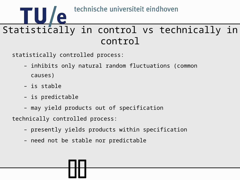
Statistically in control vs technically in control
statistically controlled process:
– inhibits only natural random fluctuations (common causes)
– is stable
– is predictable
– may yield products out of specification
technically controlled process:
– presently yields products within specification
– need not be stable nor predictable

Shewhart control chart
graphical display of product characteristic which is important for
product quality
X-bar Chart for yield
Subgroup
X-b
ar
0 4 8 12 16 2013,6
13,8
14
14,2
14,4
UpperControl Limit
Centre Line
Lower Control
Limit

Control charts

Basic principles
take samples and compute statistic
if statistic falls above UCL or below LCL, then out-of-control signal:
X-bar Chart for yield
Subgroup
X-b
ar
0 4 8 12 16 2013,6
13,8
14
14,2
14,4
how to choose control limits?

Meaning of control limits
limits at 3 x standard deviation of plotted statistic
basic example:
9973.0)33(
)33(
)33(
)(
ZP
XP
XP
UCLXLCLP
XX
XX
UCL
LCL
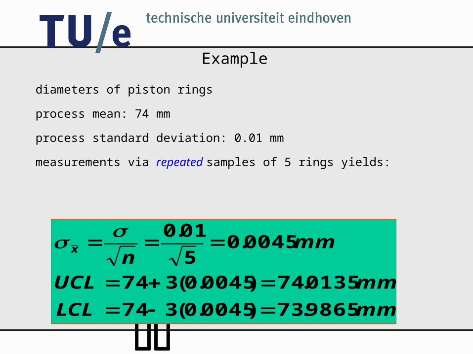
Example
diameters of piston rings
process mean: 74 mm
process standard deviation: 0.01 mm
measurements via repeated samples of 5 rings yields:
mmLCL
mmUCL
mmn
x
9865.73)0045.0(374
0135.74)0045.0(374
0045.05
01.0
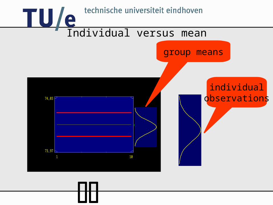
Individual versus mean
Centre line
1 1073,97
74,03
group means
individualobservations

Range chart• need to monitor both mean and variance
• traditionally use range to monitor variance
• chart may also be based on S or S2
• for normal distribution:
– E R = d2 E S (Hartley’s constant)
– tables exist
• preferred practice:
– first check range chart for violations of control limits
– then check mean chart

Design control chart
• sample size
– larger sample size leads to faster detection
• setting control limits
• time between samples
– sample frequently few items or
– sample infrequently many items?
• choice of measurement

Rational subgroups
how must samples be chosen?
choose sample size frequency such that if a special cause
occurs
– between-subgroup variation is maximal
– within-subgroup variation is minimal.
between subgroup variation
within subgroup variation

Strategy 1
• leads to accurate estimate of
• maximises between-subgroup variation
• minimises within-subgroup variation
process mean

Strategy 2
•detects contrary to strategy 1 also temporary changes of process
mean
process mean

Phase I (Initial study): in control (1)

Phase I (Initial study): in control (2)

Phase I (Initial Study): not in-control

Trial versus control
•if process needs to be started and no relevant historic data is
available, then estimate µ and or R from data (trial or initial study)
•if points fall outside the control limits, then possibly revise control
limits after inspection. Look for patterns!
•if relevant historical data on µ and or R are available, then use
these data (control to standard)

Control chart patterns (1)
Cyclic pattern,
three arrows with different weight
Control chart of height
Observation
Heig
ht
CTR = 0.00
UCL = 10.00
LCL = -10.00
0 3 6 9 12 15 18-10
-6
-2
2
6
10

Control chart patterns (2)
Trend,
course of pin
Control chart of height
Observation
Heig
ht CTR = 0.00
UCL = 10.00
LCL = -10.00
0 4 8 12 16 20-10
-6
-2
2
6
10

Control chart patterns (3)
Shifted mean,
Adjusted height Dartec
Control chart of height
Observation
Heig
ht CTR = 0.00
UCL = 10.00
LCL = -10.00
0 4 8 12 16 20-10
-6
-2
2
6
10

Control chart patterns (4)
A pattern can give explanation of the cause
Cyclic different arrows, different weight
Trend course of pin
Shifted mean adjusted height Dartec
Assumption: a cause can be verified by a pattern
The feather of one arrow is damaged outliers below

Phase II: Control to standard (1)

Phase II: Control to standard (2)

Runs and zone rules
•if observations fall within control limits, then process may still be
statistically out-of-control:
– patterns (runs, cyclic behaviour) may indicate special causes
– observations do not fill up space between control limits
•extra rules to speed up detection of special causes
•Western Electric Handbook rules:
– 1 point outside 3-limits
– 2 out of 3 consecutive points outside 2 -limits
– 4 out of 5 consecutive points outside 1 -limits
– 8 consecutive points on one side of centre line
•too many rules leads to too high false alarm rate


Warning limits
•crossing 3 -limits yields alarm
•sometimes warning limits by adding 2 -limits; no alarm but
collecting extra information by:
– adjustment time between taking samples and/or
– adjustment sample size
•warning limits increase detection performance of control chart

Detection: meter stick production
• mean 1000 mm, standard deviation 0.2 mm
• mean shifts from 1000 mm to 0.3 mm?
• how long does it take before control chart signals?

Performance of control charts
expressed in terms of time to alarm (run length)
two types:
– in-control run length
– out-of-control run length
X-bar Chart for yield
Subgroup
X-b
ar
0 4 8 12 16 2013,6
13,8
14
14,2
14,4

Statistical control and control charts
•statistical control: observations
– are normally distributed with mean and variance 2
– are independent
•out of (statistical) control:
– change in probability distribution
•observation within control limits:
– process is considered to be in control
•observation beyond control limits:
– process is considered to be out-of-control

In-control run length
•process is in statistical control
•small probability that process will go beyond 3 limits (in spite of
being in control) -> false alarm!
•run length is first time that process goes beyond 3 limits
•compare with type I error

Out-of-control run length
•process is not in statistical control
•increased probability that process will go beyond 3 limits (in spite
of being in control) -> true alarm!
•run length is first time that process goes beyond 3 sigma limits
•until control charts signals, we make type II errors

Metrics for run lengths
•run lengths are random variables
– ARL = Average Run Length
– SRL = Standard Deviation of Run Length

Run lengths for Shewhart Xbar- chart
in-control: p = 0.0027
UCL
LCL0.99730.99730.99730.0027
• time to alarm follows geometric distribution:– mean 1/p = 370.4– standard deviation: ((1-p))/p = 369.9

Geometric distribution
Event prob.0.0027
Geometric Distribution
probab
ility
0 0.1 0.2 0.3 0.4 0.5 0.6 0.7 0.8 0.9 1(X 1000)
00.5
11.5
22.5
3(X 0.001)

Numerical values
Shewhart chart for mean (n=1)
single shift of mean: P(|X|>3) ARL SRL
0 0.0027 370.4 369.9
1 0.022 43.9 43.4
2 0.15 6.3 5.3
3 0.5 2 1.4

Scale in Statgraphics
Are our calculations wrong???
ARL Curve for X-bar
Process mean
Avera
ge ru
n len
gth
-2 -1.5 -1 -0.5 0 0.5 1 1.5 20
50100
150
200
250
300350
400

Sample size and run lengths
increase of sample size + corresponding control limits:
– same in-control run length
– decrease of out-of-control run length

Numerical values
Shewhart chart for mean (n=5)
single change of standard deviation ( -> c)
c P(|Xbar|>3 ARL SRL
1 0.0027 370.4 369.9
1.1 0.0064 156.6 156.1
1.2 0.012 80.5 80.0
1.3 0.021 47.6 47.0
1.4 0.032 31.1 30.6
1.5 0.046 22.0 21.4

Runs rules and run lengths• in-control run length: decreases (why?)
• out-of-control run length: decreases (why?)

Performance Shewhart chart
•in-control run length OK
•out-of-control run length
– OK for shifts > 2 standard deviation group average
– Bad for shifts < 2 standard deviation group average
•extra run tests
– decrease in-control length
– decrease out-of-control length

CUSUM Chart
plot cumulative sums of observation
change point
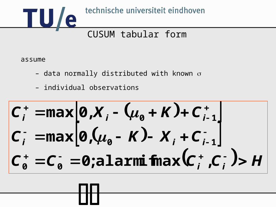
CUSUM tabular form
assume
– data normally distributed with known
– individual observations
HCCCC
CXKC
CKXC
ii
iii
iii
,max if alarm ;0
,0max
,0max
00
10
10

Choice K and H
•K is reference value (allowance, slack value)
•C+ measures cumulative upward deviations of µ0+K
•C- measures cumulative downward deviations of µ0-K
•for fast detection of change process mean µ1 :
– K=½ |µ0- µ1|
•H=5 is good choice

CUSUM V-mask form
UCL
LCL
CL
change point

Drawbacks V-mask
• only for two-sided schemes
•headstart cannot be implemented
•range of arms V-mask unclear
• interpretation parameters (angle, ...) not well determined


Rational subgroups and CUSUM
• extension to samples:
– replace by /n
• contrary to Shewhart chart , CUSUM works best with individuals

Combination•CUSUM charts appropriate for small shifts (<1.5)
•CUSUM charts are inferior to Shewhart charts for large
shifts(>1.5)
•use both charts simultaneously with ±3.5 control limits
for Shewhart chart

Headstart (Fast Initial Response)
•increase detection power by restart process
•esp. useful when process mean at restart is not equal at target
value
•set C+0 and C-
0 to non-zero value (often H/2 )
•if process equals target value µ0 is, then CUSUMs quickly return
to 0
•if process mean does not equal target value µ0, then faster alarm

CUSUM for variability
•define Yi = (Xi-µ0)/ (standardise)•define Vi = (|Yi|-0.822)/0.349
•CUSUMs for variability are:
HSSSS
SVKS
SKVS
ii
iii
iii
,max if alarm ;0
/,0max
/,0max
00
1
1

Exponentially Weighted Moving Average chart
•good alternative for Shewhart charts in case of small shifts of mean
•performs almost as good as CUSUM
•mostly used for individual observations (like CUSUM)
•is rather insensitive to non-normality


EWMA Chart for Col_1
Observation
EW
MA
CTR = 10.00
UCL = 11.00
LCL = 9.00
0 3 6 9 12 159
9.4
9.8
10.2
10.6
11
11.4

Why control charts for attribute data
•to view process/product across several characteristics
•for characteristics that are logically defined on a classification
scale of measure
N.B. Use variable charts whenever possible!

Control charts for attributes
Three widely used control charts for attributes:
• p-chart: fraction non-conforming items
• c-chart: number of non-conforming items
• u-chart: number of non-conforming items per unit
For attributes one chart only suffices (why?).
Attributes are characteristics which have a countable number of possible outcomes.

p-chart
xnx ppx
nxDP
1}{ nx ,...,1,0
Number of nonconforming products is binomially distributed
n
Dp ˆsample fraction of nonconforming:
n
ppp
)1(ˆ 2
ˆ
mean: p variance

p-chart
m
p
mn
Dp
m
ii
m
ii
1 1
ˆ
average of sample fractions:
n
pppLCL
pCLn
pppUCL
13
13
Fraction Nonconforming Control Chart:

Assumptions for p chart
• item is defect or not defect (conforming or non-conforming)
• each experiment consists of n repeated trials/units
• probability p of non-conformance is constant
• trials are independent of each other

•Counts the number of non-conformities in sample.
•Each non-conforming item contains at least one non-
conformity (cf. p chart).
•Each sample must have comparable opportunities for non-
conformities
•Based on Poisson distribution:
Prob(# nonconf. = k) =
c-chart
!k
ce kc

c-chart
Poisson distribution: mean=c and variance=c
ccLCL
cCL
ccUCL
3
3
Control Limits for Nonconformities:
is average number of nonconformities in samplec

u-chart
monitors number of non-conformities per unit.
n
cu
•n is number of inspected units per sample• c is total number of non-conformities
n
uuLCL
uCLn
uuUCL
3
3
Control Chart for Average Number of Non-conformities Per Unit:

Moving Range Chartuse when sample size is 1indication of spread: moving range
Situations:automated inspection of all unitslow production rateexpensive measurementsrepeated measurements differ only because of laboratory error

Moving Range Chart
calculation of moving range:
d2, D3 and D4 are constants depending number of observations
1 iii xxMR
2
2
3
3
d
MRxLCL
xCL
d
MRxUCL
MRDLCL
MRCL
MRDUCL
3
4
individualmeasurements
moving range
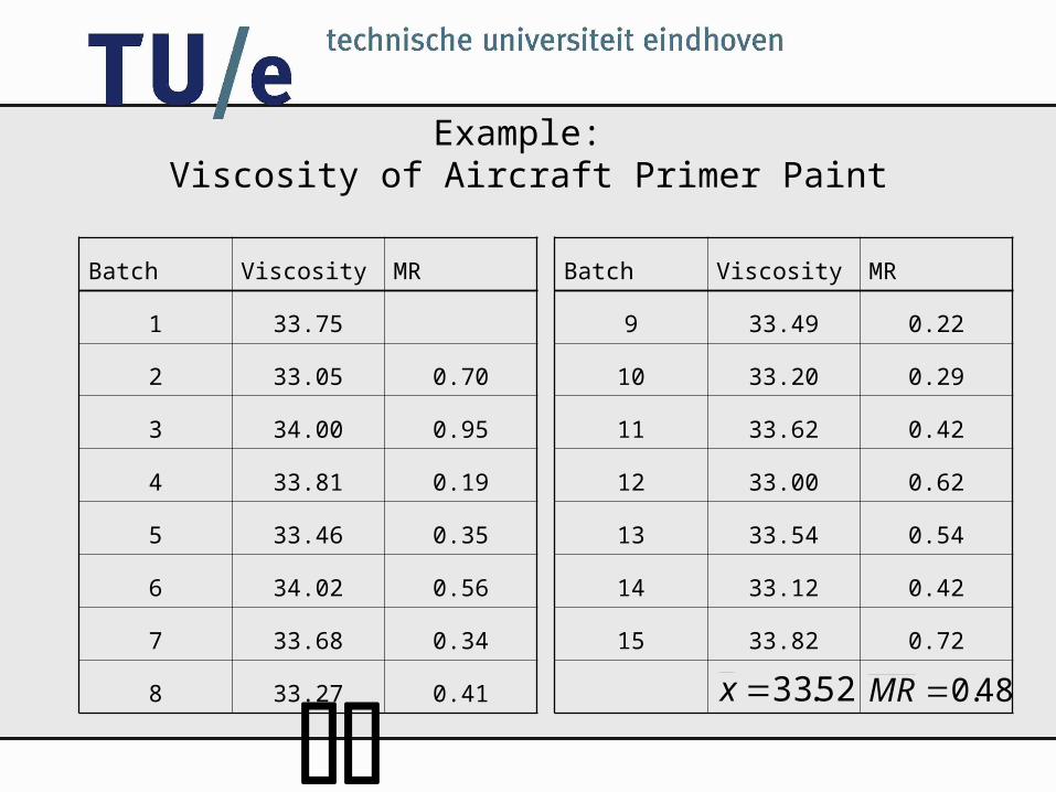
Example: Viscosity of Aircraft Primer Paint
Batch Viscosity MR
9 33.49 0.22
10 33.20 0.29
11 33.62 0.42
12 33.00 0.62
13 33.54 0.54
14 33.12 0.42
15 33.82 0.72
Batch Viscosity MR
1 33.75
2 33.05 0.70
3 34.00 0.95
4 33.81 0.19
5 33.46 0.35
6 34.02 0.56
7 33.68 0.34
8 33.27 0.41 52.33x 48.0MR

Viscosity of Aircraft Primer Paint
since a moving range is calculated of n=2 observations, d2=1.128,
D3=0 and D4=3.267
24.32128.1
48.0352.33
52.33
80.34128.1
48.0352.33
LCL
CL
UCL
CC for individuals CC for moving range
048.00
48.0
57.148.0267.3
LCL
CL
UCL

Viscosity of Aircraft Primer Paint
X
0 3 6 9 12 1532
32.5
33
33.5
34
34.5
35
CTR = 0.48
UCL = 1.57
LCL = 0.00
0 3 6 9 12 150
0.4
0.8
1.2
1.6
X
MR


Tool wear chart
known trend is removed (regression)
trend is allowed until maximum
slanted control limits
LSL
USL
LCL
UCL reset


Pitfalls
bad measurement system
bad subgrouping
autocorrelation
wrong quality characteristic
pattern analysis on individuals/moving range
too many run tests
too low detection power (ARL)
control chart is not appropriate tool (small ppms, incidents, ...)
confuse standard deviation of mean with individual


![[1] MA4104 Business Statistics Spring 2008, Lecture 06 Process Monitoring Using Statistical Control Charts [ Examples Class ]](https://static.documents.pub/doc/80x56/56649c9e5503460f9495dfa4/1-ma4104-business-statistics-spring-2008-lecture-06-process-monitoring-using.jpg)


