66
THAT [ALMOST] ALWAYS TESTS SPLIT 43 BOOSTS CONVERSIONS Digital Marketer Increase Engagement Series
| Date post: | 07-Dec-2015 |
| Category: |
Documents |
| Upload: | hello-world |
| View: | 212 times |
| Download: | 0 times |

THAT [ALMOST] ALWAYSTESTSSPLIT 43 BOOSTS CONVERSIONS
Digital Marketer Increase Engagement Series

Brought To You By: Digital Marketer
43 SPLIT TESTSTHAT [ALMOST] ALWAYSBOOST CONVERSIONS

3
PUBLISHED BY:
Digital Marketer4330 Gaines Ranch LoopSuite 120Austin, TX 78735
c Copyright 2014 Digital Marketer LLC. All Rights Reserved.May be shared with copyright and credit left intact.
DigitalMarketer.com
THIS 3-PART EMAIL SERIES CONSISTENTLY DOUBLES SALES
If you’re looking for a simple
way to bump your conversions
(without having to write new
sales copy), then download this
copy-and-paste followup series
today...

4
ABOUT DIGITAL MARKETER
DigitalMarketer.com is a community where marketers, growth hackers, entrepreneurs and small business owners
come to get ideas on:
Driving More TrafficIncreasing Conversion Rates, and…
Boosting Social Engagement
NOTE: If you’re new to DM, you can click one of the links below for free, instant access to our most popular articles and case studies on the subject that interests you most:
Traffic, Conversion or Engagement.
If you like what you see, you can subscribe to our Digital Marketer Newsletter and get new case studies and
reports in your inbox every week…

43 SPLIT TESTSTHAT (ALMOST)ALWAYS BOOSTCONVERSIONS

6
At Digital Marketer we’ve conducted 1000’s of split tests.
Today, we’ll show you what we’ve spent a lot of time and money to learn.
These are the background colors, fonts, etc., that have won almost every time in our testing.
Here are 43 marketing elements we’ve tested time and time again, along with the winning variables for each.

SPLIT TESTS THAT WIN ON A PRINT SALES PAGE

8
These are tests we run on traditional print sales pages.
While the typeface you use on your sales page may seem trivial,
we’ve seen up to a 30% higher conversion rate by simply using a san
serif font. For those of you not familiar with typographer terminology,
that means a font without those little “feet” at the bottom.
That means OUT with Times New Roman, and IN with Arial. We’ve
found that Arial with a size 12pt font (or larger) gets the best results.
Remember, readability is everything. If a prospect has trouble
reading your message, you’re screwed.
FONT SELECTION/SIZE1

9
San serif fonts increase readability (and conversions)

10
Here’s another variable we get asked about time and time again. For
some reason, people are just fascinated with the psychology behind
background colors.
We were too, so we tested this variable pretty extensively. Robin’s
egg blue (Hex={6495ED}) was the clear winner. We actually saw a
31% increase in conversions over dark backgrounds. White and gray
backgrounds are also effective.
The theory here is that blue and brown are “trust colors,” i.e. colors
that trigger feelings of confidence and, in turn, increase conversions.
That’s why so many news agencies use blue and/or brown on
their sets.
BACKGROUND COLOR2

11
Robin’s egg blue is the optimal background color
Notice these blue/brown color palettes.

12
Sales page audio is another area where we’ve done a lot of testing. Oddly enough, we’ve seen anything from a small bump (+2%), to a huge drop off (-40%), as a result of including an autoplay message.
Let’s start with what NOT to do. Each time we’ve used an overhyped sales message—you know, like something you might hear on a late night infomercial—we’ve seen a hugedecline in conversions.
Autoplay audio works best when it features a testimonial from an “average Joe” or “Jane,” explaining how your product helped them. Audio can be tricky, so, as always, test the heck out of it.
AUTOPLAY AUDIO3

13
While it’s tempting to revert to the old “bigger is better” theory, our
testing shows that 700 pixels is that best size for tables. Make them
any wider and your tables lose readability.
In our testing, 700–pixel wide tables improve conversions by 19%
over 800-pixel tables.
If your market skews older, you may consider a 600-pixel width.
Remember, more left-to-right scanning = harder to read = not good
TABLE WIDTH4

14
Split test the table width at 700 pixels wide

15
This one’s easy; big headers suck. Even though they may look more
polished and professional, our testing has shown that they almost
always decrease conversions. They just seem to detract from
the headline.
BIG HEADERS5

16
Repeating backgrounds are another no-no when it comes to sales
pages. These tiled backgrounds seem to consistently hurt response
rates. So avoid them like the plague.
We used both a big header AND a repeat background on this
hotdog cart sales page and got disappointing results.
Then we switched to a white background with a small header, and
we saw an 88% increase in conversions.
TILED BACKGROUNDS6

17
The header and background on the right converted much better.

18
TAHOMA RED 36PT7
This font just seems to work great in headlines,
partly because its san serif and partly because
it scrunches up more than a font like Arial,
fitting more words per line. Red 36pt Tahoma
outperforms all other fonts, increasing
conversions by 17%.
Readability is key.

19
San serif fonts like Tahoma can give your headline a boost

20
Adding a drop shadow to your red Tahoma font
can give you another 5% boost.
DROP SHADOW8

21
As you know, your lead copy is crucial. It’s where a visitor decides
whether they’re going to continue reading your sales page, or head
for the exit.
Using a “drop cap” increases readability and usually gives us
a boost.
On the flipside, if your lead paragraph is less than stellar, the drop
cap will highlight that fact for readers. So only use a drop cap with
copy that’s tested well.
DROP CAP IN YOUR LEAD9

22
Drop caps attract attention, for better or worse

23
Including a signature usually increases conversions, but not by much
(+8%). Our advice is to use it only when it makes sense in the context
of your offer. If not, a signature just kinda sticks out as weird.
Signatures rarely hurt conversions but they don’t always make sense.
SIGNATURE “ABOVE THE FOLD”10

24
Not everyone can be a headline–writing mastermind, but that’s okay.
In fact, creativity can sometimes backfire. These fill–in–the–blank
headlines outperform more “creative” headlines by up to 44%:
How to _______
Who Else Wants _______?
_______ in 3 Simple Steps! (numbered headlines are great)
Also, a headline with a negative slant can give your conversions a
20% bump. That’s because, unfortunately, good news doesn’t sell.
Frank Kern calls this the “rubberneck effect.”
PROVEN HEADLINE TEMPLATES11
25
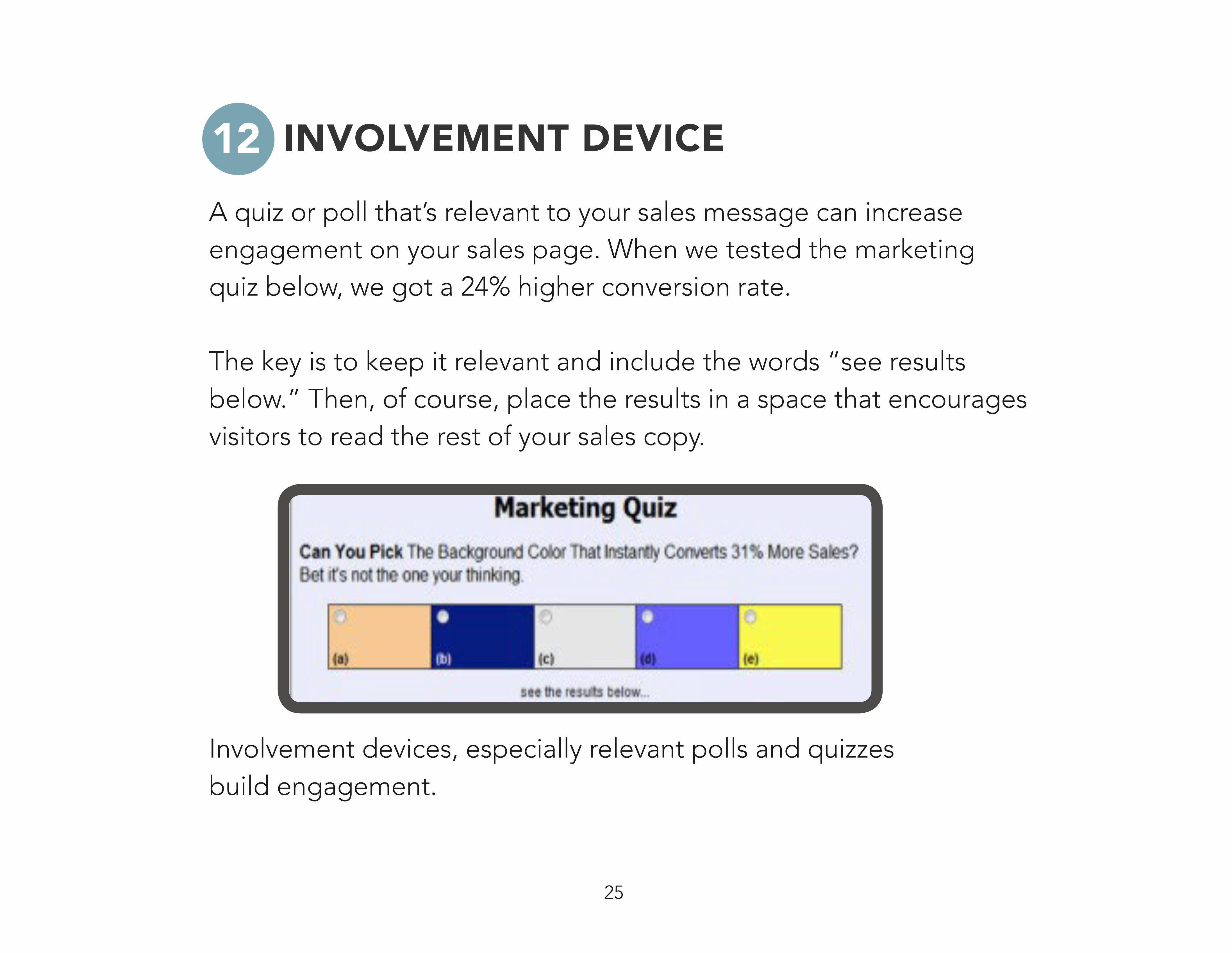
A quiz or poll that’s relevant to your sales message can increase engagement on your sales page. When we tested the marketing quiz below, we got a 24% higher conversion rate.
The key is to keep it relevant and include the words “see results below.” Then, of course, place the results in a space that encourages visitors to read the rest of your sales copy.
Involvement devices, especially relevant polls and quizzes build engagement.
INVOLVEMENT DEVICE12

26
These can have a HUGE impact (+145%), if done correctly.
Poor product images, however, are worse than none at all. We
recommend you hire a professional to do your product images. Poor
quality images will make you look bush–league.
VIRTUAL PRODUCT IMAGES13

27
Here’s an example of a nice, professional product shot.

28
According to our testing, a moving or flashing graphic WILL draw
attention to your links.
We’ve seen as much as a 12% bump in conversions using this tactic.
Be careful with this one though; you want to make sure that the
content or link you’re drawing attention to is VERY strong.
If you send a prospect to an order form too soon, they may not be
ready to convert and you may lose the sale.
ANIMATED ARROW14

29
Our own marketing genius Perry Belcher gets credit for this one.
He was one of the first to test order buttons extensively and now
hundreds of sites use his formula.
As you can see in the image, this ugly little button includes 5 major
elements: The orange “Add To Cart” button, red dashed border,
marked down retail price, a blue underlined link, and clickable major
credit card icons.
Believe it or not, the “Belcher Button” can boost conversions by as
much as 300%!
BELCHER BUTTON15

30
See, you almost clicked Add to Cart. That’s how powerful the Belcher Button is.

SPLIT TESTS THAT WIN ON A VIDEO SALES PAGE

32
As you can imagine, many of the same test results that apply to print
sales pages also apply to video sales pages—especially those that
deal with background colors, order buttons, etc.
To reduce the overlap, this section will focus on tests that deal
with video sales pages specifically. And just so you know, we’ve
transitioned a lot of our long–form sales letters to video sales letters
(VSLs)… if that tells you anything about their effectiveness.
33
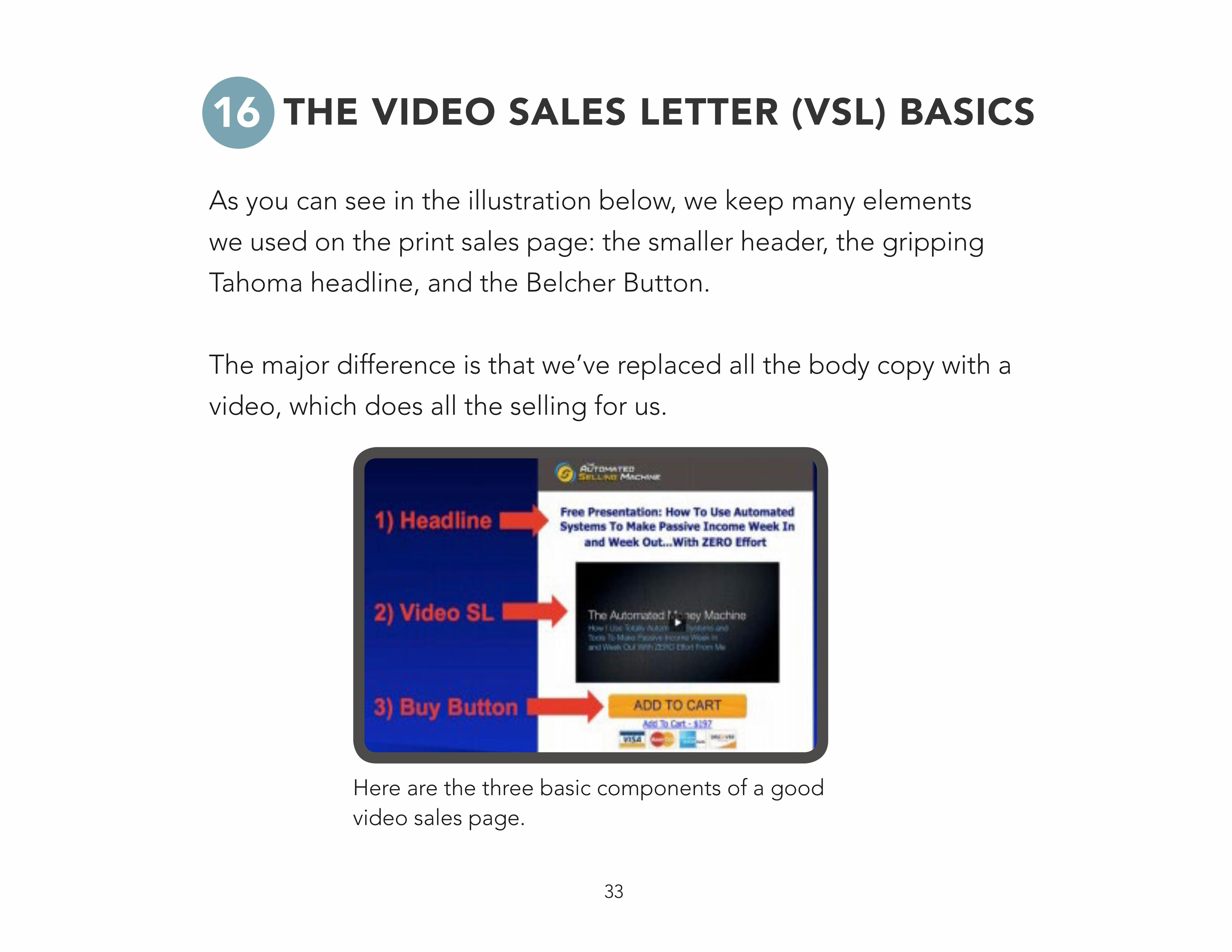
Here are the three basic components of a good video sales page.
As you can see in the illustration below, we keep many elements
we used on the print sales page: the smaller header, the gripping
Tahoma headline, and the Belcher Button.
The major difference is that we’ve replaced all the body copy with a
video, which does all the selling for us.
THE VIDEO SALES LETTER (VSL) BASICS16

34
We’ve tested both short VSLs and super long, 90–
minutes videos. But the sweet spot seems to be
somewhere between the 12 and 24 minute marks.
Results drop off when your video is too long or
too short.
12-24 MINUTE VIDEO LENGTH17

35
Remove these controls from your VSL’s
With sales videos, it’s important to control the message. You don’t
really want your prospect to have the ability to fast forward or skip
around.
It may sound strange, but you want your visitors to have virtually NO
control. Set your videos to autoplay, and axe the video control bar.
REMOVING THE VIDEO CONTROLS18

36
Much like the video control buttons, a click–to–play video reduces
the control you have over your message. More often than not, click-
to-play allows the prospect to procrastinate watching the video…
and they never actually watch it.
AUTOPLAY BEATS CLICK-TO-PLAY 80% 19

37
Strangely, we’ve found that ugly looking video players with minimal
design convert better than more polished examples. Our highest
converting videos have no headers, no borders, etc… just a plain
white background with text.
There are a few variables to consider however,
Price point – High–ticket items tend to convert better
with “pretty” design.
Target market – Ugly often doesn’t work well in tech
and B2B markets.
Traffic Source – Ugly works better with cold traffic
because it’s disarming. However, pretty things up for
warmer traffic (familiarity breeds contempt).
UGLY BEATS PRETTY20

38
Beauty (on the right) rarely outperforms the beast (on the left)

39
What do you think we found when we tested a short–form video
sales page against a long–form version, which included high–
converting bullet points, product shots, and a second buy button?
The answer: It depends on the traffic source.
The short–form video sales page (headline and video only)
converted better with our cold traffic (i.e. PPC, affiliates, etc.),
because it allowed us to control the message. They couldn’t really
be sure at first that we were even trying to sell something.
The long-form version performed better with customers and active
subscribers, because it offered more information and felt
less restrictive.
TEXT VS. NO TEXT21

40
Oddly enough, borderless videos consistently
beat videos with a border. At Digital Marketer, our
theory is that a borderless video is unusual and it
doesn’t even look like a video at first. Eventually,
this “novelty factor” will probably wear off, but
right now it works.
BORDERS VS. NO BORDERS22

41
This buy button was invisible until the exact right moment, then POOF!
MAGIC BUY BUTTONS23
When it comes to variables that whisper, rarely do you find one that
DOUBLES conversions, but the magic buy button does. When the
order button isn’t visible when the prospect first arrives, your video
sales page looks like regular content… not a sales page.
When your VSL reaches its call to action, shazam! Your buy
button magically appears. But prospects have kept an open mind
throughout your video.

SPLIT TESTS THAT WIN ON SQUEEZE PAGES

43
SQUEEZE PAGE BASICS24
Here are a few of the most important factors to check on your
squeeze page.
Above the fold design – Keep your opt-in form above
the fold, i.e. in the area where visitors can see it
WITHOUT having to scroll.
Attention-grabbing headline – Use a proven headline
formula to grab attention.
Ultra–specific, benefit rich bullet points – Don’t list
features; list what those features will do for people.
Definite call-to-action – Say something like “Get free
instant access!” right inside your order button.

44
VIDEO FAKEOUT25
We’ve been able to get as much as 48% more opt-ins using this
technique. It’s easy to execute, just grab a screenshot of your paused
video content.
By nature, people like to click on play buttons… you just need to
program a javascript warning to say something like “Whoa now!
Enter your email address in the box to the right for instant access to
watch the video!”
Any entry–level programmer can set this up for you.

45
The video on this squeeze page isn’t really a video, it’s an image with a javascript warning.

46
Notice the two, subtle arrows that direct your eye toward the email form?
SUBTLE ARROWS INCREASE OPT-INS 26
Subtle arrows draw the eye toward back to the opt–in form on your
page, and they can be surprisingly effective. As you can see in
the picture, these are just design elements that resemble arrows,
pointing to the email form.
47
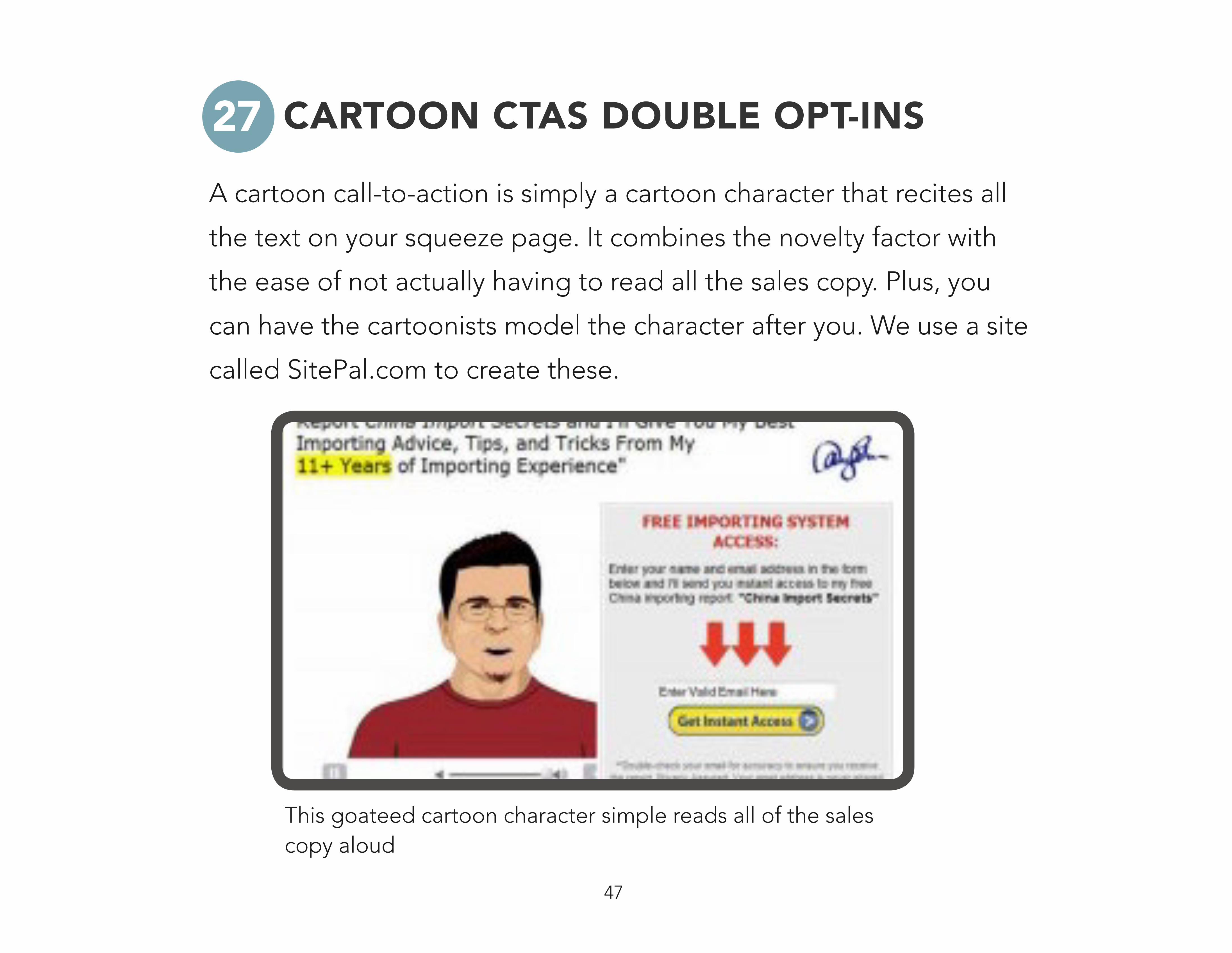
This goateed cartoon character simple reads all of the sales copy aloud
CARTOON CTAS DOUBLE OPT-INS27A cartoon call-to-action is simply a cartoon character that recites all
the text on your squeeze page. It combines the novelty factor with
the ease of not actually having to read all the sales copy. Plus, you
can have the cartoonists model the character after you. We use a site
called SitePal.com to create these.

48
REPORTS VS. VIDEOS28
This may surprise you, but our split–tests have shown that “special
reports” make much more attractive lead magnets than videos.
Simply put, written reports have a higher perceived value. These
consistently get us 20% higher opt–in rates than video content,
which has become commonplace in the tech, forex, and
marketing spaces.
Even better, presenting the exact same content in a hand–drawn
format got us a 128% increase in opt–ins over a video lead magnet.
Hand drawn illustrations and mind maps are golden right now.

49
If there’s a way to reimagine your content as a hand drawn flow-chart, do it!

50
DITCHING THE “FIRST NAMES” FIELD29
Our testing shows that using a prospect’s first name no longer
increases conversion rates. So there’s really no reason to collect first
names in an opt-in form. Deleting the “first name” field actually
increased opt–ins by 18%.

SPLIT TESTS THAT WIN ON AN ORDER FORM

52
Split testing your order form can be very productive. Here are some variables that almost always win.
Trust seals are an expected part of a secure order form.
TRUST SEALS30As you can imagine, many prospects are concerned with online
security. Satisfaction guarantees and trust seals, even the
inexpensive ones, boost conversions by 28%. Consumers just expect
to see them on your order page.

53
SUCCESS STORIES31
If you can fit a success story into your order form, maybe along the
margin, it will boost your conversions by up to 33%. Social proof
helps put prospects at ease by validating their decision to buy.

54
Use a professional product image whenever possible. BONUS TIP: See that progress bar at the top? That puts minds at ease and boosts conversions by 15%.
PRODUCT IMAGES32This one’s simple, including a product image on your order form
boosts conversions by 22%. The image reassures customers about
whatever product their buying.
55
SPLIT TESTS THAT WIN IN EMAIL MARKETING
33
In an email marketing campaign, nothing happens until the message
gets opened and your links get clicked. Our split–testing is focused
around getting those magical things to happen.

56
PROVEN SUBJECT LINES34The purpose of an email subject line boils down to one thing and one thing ONLY: Getting the message opened.
Use these proven headline strategies to help boost your open rates:
Oddly Specific Numbers - Example, “Why He Paid Google $5,129,346.21”
Question Marks - Example, “Google Made Me Slap Proof?”
Percentages (%) - Example, “99% of People Dieting Need This”
Add [Video] - Example, “Make Your Lead Magnet Sexy [Video]”
Include a (free report) - Example, “Seven Deadly SEO Mistakes (free report)”
RE: – Example, “Re: Watch Me Build Your Membership”
Use Personal Pronouns - Example, “You Need to See This”

57
In addition, confusing, shocking, or just plain weird subject lines can boost open rates as well. Here are a few examples of random subject lines that, for whatever reason, got great open rates:
When all else fails, go negative.
Photos Enclosed Do Not Bend
Ryan Deiss Retires?
Forced Continuity Dishonest?
Why I Love Hotel Bars
Chuckle–head Does $3.8M First Two Years Online
Things Are Bad… (Maybe)
Don’t take it personally, but…
I Hate Technology
One Word… “Crazy”

58
BEST TIMES TO SEND36
Email timing does matter. According to our testing, the absolute
best time to send is 4:30AM CST, Tuesday–Thursday.
This time works because your email hits inboxes in Asia just before
bedtime and inboxes in the western hemisphere just as recipients
are waking up.
Contrary to popular belief, weekends are a great time to mail small-
ticket offers—but don’t waste your time with big, expensive offers.
59
SHORTER EMAILS = HIGHER CTRS37
Short and sweet gets high click-through rates. It’s that simple.
Even if you put a link at the top of your email, people will often
reserve clicking on it until they’ve skimmed the entire body. So the
longer you ramble, the lower the CTRs. Try to limit yourself to 4 or 5
paragraphs.
HIGHEST CTR LINK PLACEMENT38
When it comes to placing links in your email, we recommend at least
3 links, at the beginning, middle, and end.

60
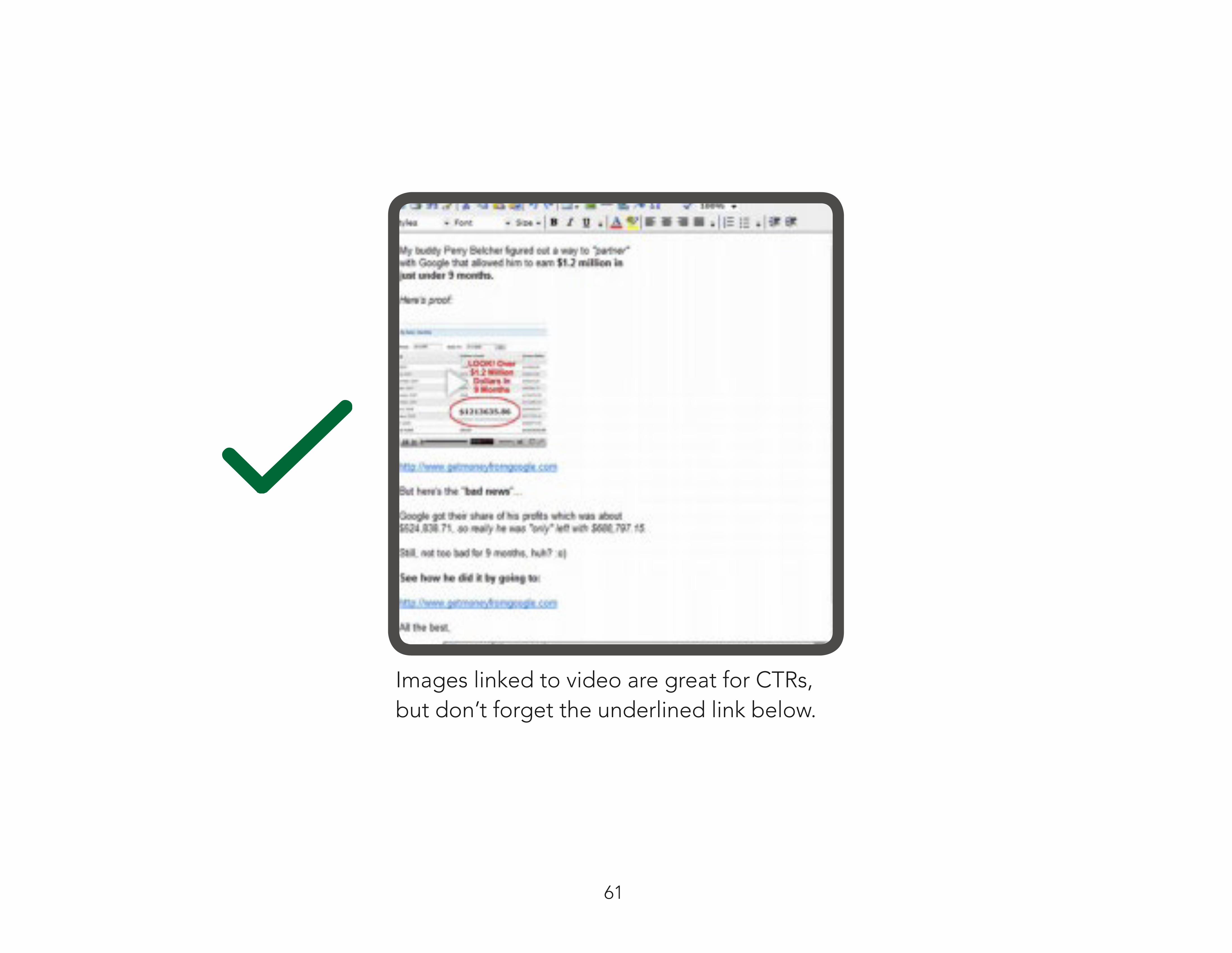
IMAGES INCREASE CTRS39
According to our split-testing, your emails should include an image
whenever possible. That said, don’t overdo it and don’t format the
entire email as one big image. BUT a couple of small images won’t
hurt deliverability.
If there’s a video included in your offer, we recommend using a
screen shot of that video (play button visible) in your email. That
image should be link #2.
Then, underneath that image, include a blue, underlined text link.
This has increased our CTRs by 120%.
61
Images linked to video are great for CTRs, but don’t forget the underlined link below.

62
PERSONAL SUCCESS COACH
ADDING VIDEO INSTRUCTIONAL MESSAGES
SPLIT TESTS THAT WIN ON BANNER ADS
40
41
42
By rewriting your autoresponder campaign as a 6–part, instructional
course from a “Personal Success Coach,” you can boost reduce return
rates by 17%.
Instructional messages, teaching customers how to use the product
effectively, will reduce returns by about 24%.
Many people in the online marketing world have stopped using banner
ads, but we love them.

63
BANNER AD DESIGN BASICS43
Here are a few rules of good banner design: Your banner ad should
seek to either Blend In (look like regular content) or Stand Out (be
super ugly). The more your banner ad looks like a banner ad, the
more it will be ignored. We call this “banner blindness.”
Sell the CLICK, not the offer. The purpose of the banner is to get CLICKS. It doesn’t need to convince a prospect to do anything else but that. Focus on grabbing curiosity or offering something for free.
Tell them WHERE to click, with arrows, buttons, or underlined links. We assume that people know your ads are clickable, but that’s not necessarily true. Always put a button or link.
Text still sells. Banner ads that consist of simple text on a plain background convert incredibly well. Images are window dressing.

64
This banner blended in so well, the website actually forced us to change it.
These banners converted extremely well with minimal images.

65
YOUR TURN43
We know you are testing — that’s why you read Digital Marketer.
Take 2 minutes and let us know what is working for you in the
comments section.
Add the 44th split test that almost always works below.

CONCLUSIONConversion testing is the cornerstone of success for any digital marketing effort.
This document represents thousands of hours and millions of dollars spent on conversion rate optimization.
Use the variables that have worked for us as your starting point and conduct your own testing to find the sweet spot for your campaigns.
You’ll find that these variables (almost) always win.


